The Visual Effects of The Abyss

It’s time for one of my occasional asides celebrating the world of traditional visual effects – miniatures, matte paintings, rear projection, stop motion and the like. For a film using all of those techniques, look no further than The Abyss (1989). Arguably James Cameron’s most underrated film, it can also be considered his most ambitious. Whereas Terminator 2 had bigger action scenes, Titanic had a bigger set and Avatar had more cutting edge technology, these concerns all pale in comparison to the sheer difficulty of shooting so much material underwater.

The hour-long documentary Under Pressure makes the risks and challenges faced by Cameron and his crew very clear.

The Abyss won an Oscar for Best Visual Effects, and is remembered chiefly for the then-cutting-edge CG water tentacle. But it also ran the gamut of traditional effects techniques.

The film follows the crew of an experimental underwater drilling platform, led by Bud (Ed Harris), as they are roped into helping a team of navy divers, led by Lt. Coffey (Michael Biehn), investigate the sinking of a submarine. Underwater-dwelling aliens and cold war tensions become involved, and soon an unhinged Coffey is setting off in a submersible to dispatch a nuke to the bottom of the Cayman Trench and blow up the extra-terrestrials.

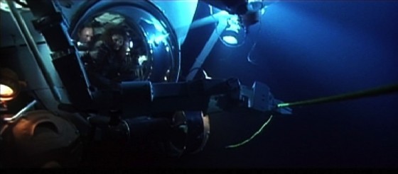
When Bud and his wife Lindsey (Mary Elizabeth Mastrantonio) give chase in a second submersible, a visual effects tour de force ensues. The following methods were used to build the sequence:

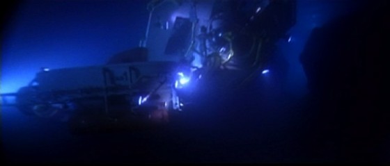
abyss1

  • Medium-wide shots of the actors in real submersibles shot in an abandoned power station that had been converted by the production into the world’s largest fresh-water filtered tank, equal in capacity to about eleven Olympic swimming pools.

abyss2

  • Close-ups of the actors in a submersible mock-up on stage.

abyss3

  • Over-the-shoulder shots of the actors in the submersible mock-up, with a rear projection screen  outside the craft’s dome, showing miniature footage accomplished with….

abyss4

  • Quarter-scale radio-controlled submarines, shot in a smaller tank. These miniatures were remarkably powerful and, due to the lights and batteries on board, weighed around 450lb (204kg). In order to see what they were doing, the operators were underwater as well, using sealed waterproof joysticks to direct the craft. The RC miniatures were used when the craft needed to collide with each other, or with the underwater landscape, and whenever the audience was not going to get a good look at the domes on the front of the submersibles and notice the lack of actors within.

abyss5

  • One of the custom film projectors inserted into the miniature subs
    One of the custom film projectors inserted into the miniature subs

    Where a more controlled camera move was required, or the actors needed to be visible inside the subs, but it was not practical to shoot full-scale, motion control was used. This is the same technique used to shoot spaceships in, for example, the original Star Wars trilogy. A computer-controlled camera moves around a static model (or vice versa), exposing film very slowly in order to maintain a large depth of field. The move is repeated several times for each different vehicle under different lighting conditions, before compositing all of the “passes” together on the optical printer in the desired ratios, to achieve the final look. For The Abyss’s motion control work, the illusion of being underwater was created with smoke. In shots featuring the submersibles’ robot arms, stop motion was employed to animate these appendages. But perhaps the neatest trick was in making the miniature subs appear to be inhabited; the models were fitted with tiny projectors which would throw pre-filmed footage of the actors onto a circular screen behind the dome.

The sub chase demonstrates perfectly how visual effects should work: mixing a range of techniques so that the audience never has time to figure out how each one is done, and using an appropriate technique for each individual shot so that you’re making things no more and no less complicated than necessary to tell that little piece of the story.

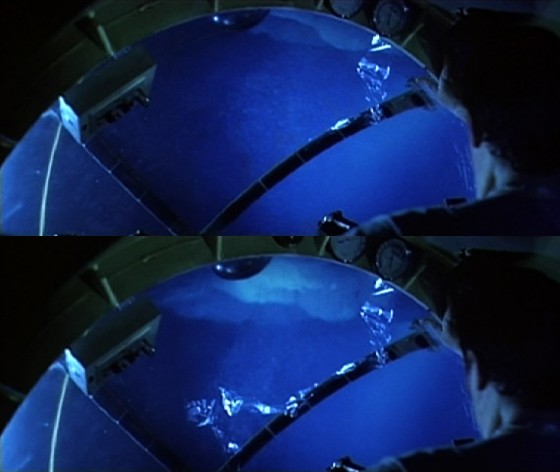
My favourite effect in the sequence is near the end, when the dome of Coffey’s sub cracks under the water pressure. This was filmed over-the-shoulder using rear projection for the view outside of the dome. But the dome was taken from a real submersible, and as such was too thick and too valuable to be genuinely cracked. So someone, and whoever he or she is is an absolute genius, came up with the idea of using an arrangement of backlit sellotape on the dome to create the appearance of a crack. A flag was then set in front of the backlight, rendering the sellotape invisible. On cue, the flag was slid aside, gradually illuminating the “crack”.

crack

Now that, my friends, is thinking outside the box.
The Visual Effects of The Abyss

Blackmagic Production Camera 4K: Pros and Cons

My BMPC on a Pro-Aim shoulder rig

I recently bought a Blackmagic Production Camera, having twice found myself in the position where I was scrambling about trying to hire one at short notice. Blackmagic Design have since announced the Ursa and the Studio Camera, but for now even the Production Camera is still pretty hard to get hold of.

I haven’t yet used the camera enough to review it in any depth, but I thought this summary of its pros and cons might be useful to those out there considering their own purchase.

The BMPC has two advantages over its predecessor, the BMCC (Blackmagic Cinema Camera):

  • 4K resolution (or 3840×2160 to be precise) rather than 2.5K.
  • Global shutter rather than rolling shutter, so you don’t get any of that “jello” effect in handheld footage, quick pans, etc.

But the BMPC also has several disadvantages over its predecessor, namely:

  • Native ISO of 400, rather than 800, meaning it needs more light.
  • Twelve stops of dynamic range rather than thirteen.
  • Greater power consumption, though not as horrific as I’d been led to believe. My 6.9Ah battery goes dead about seven hours after call time.
  • ProRes is currently the only recording format. No DNxHD, no raw – though presumably that will come as a free firmware update at some point.
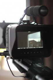
The screen is sharp but reflective.

The  BMPC shares many of its predecessor’s problems:

  • Highly reflective screen that is unuseable in daylight or any well-lit space, unless you put a cloth over your head like you’re using a Box Brownie.
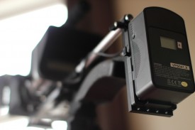
  • Internal battery has a very short lifespan and isn’t removeable.
  • Utterly unergonomic form factor, but that’s true of many cameras nowadays. Even supposedly ergonomic ones like the Sony F3 and the Canon C300 are in reality too heavy to handhold for any length of time.
  • Terrible audio circuits, but again that’s par for the course.
  • For monitoring, SDI and Thunderbolt outputs only, no HDMI. (Though if you’re upgrading from a DSLR, any monitor output that doesn’t shut off the camera’s own screen is a bonus.)
  • Can’t shoot highspeed.

But it also shares many of the BMCC’s strengths:

  • Excellent value for money. (The BMPC is currently £2,300 inc VAT.)
  • Lovely organic image with relatively little moiréing and a logarithmic look for the most flexibility in the grade.
  • Comes with a free copy of DaVinci Resolve.
  • No need to transcode footage before editing.
  • Although reflective, the screen is sharp and good for focusing.
  • Simple, uncluttered menus.
  • EF lens mount, so if you’re upgrading from a Canon DSLR you can keep your old lenses.
  • Uses ordinary 2.5″ solid state drives to record onto, rather than proprietary media.
One of my V-lock batteries, mounted on the back of the rig in a vain attempt to make it balance.

The look of this camera’s images are definitely its greatest asset, and coupled with the affordable price tag, it’s hard to beat.

If you’re going to buy one, bear in mind that you’ll also need to buy:

  • SSDs – at least £70 each, depending on the speed and capacity you go for.
  • Docking station for the SSDs (at least £20), unless you want to open up your laptop every time you ingest footage.
  • Battery system – I paid £500 for two unbranded 6.9Ah V-lock batteries, a charger, a plate and a D-tap cable. (Thanks to Richard Roberts for his advice on this.)
  • Rig – even if you’re never going to shoot handheld, you’ll need something to keep the camera and battery together.
  • Either an electronic viewfinder, a monitor or a cloth to put over your head so you can see the built-in screen.
  • An HDMI converter (at least £25) if you don’t have access to an SDI monitor.

More on this camera coming soon.

Blackmagic Production Camera 4K: Pros and Cons

Designing Amelia’s Letter

Amy Nicholson
Amy Nicholson. Photo: Colin Smith

Production designer Amy Nicholson is no stranger to period settings and low budgets. I spent all of last September in France lighting her impressive work, so when I came to crew up Amelia’s Letter, she was the only person I considered to create the script’s four distinct periods. I’ve asked her to share her experiences of the design process on this demanding short film. 

I met Neil as a DOP on The First Musketeer, a rather intense but wonderful project. He instantly won my respect and acclaim with consistently superb lighting, a real appreciation for prop details and generally being a nice guy to work with. [Neil quietly slips Amy a tenner.] So when he approached me about designing Amelia’s Letter which he would be directing, I couldn’t help but say yes, despite a recent promise to myself not to take on any more freebies.    

Amelia (Georgia Winters) in 1903
The eponymous Amelia (Georgia Winters) and her equally eponymous letter, in 1903

The script filled me with a mix of excitement and dread. On the one hand it was my dream job with four different time periods (including my favourite, 1930s) and a gothic style, but on the other hand the level of art required to do this project was massive.

The original budget set by the production wouldn’t cover the acquisition of the named props let alone any effective dressing. Luckily for me they listened to my cause and agreed to increase the figure to a point my most optimistic budget might stretch to. This was fantastic but of course still set me up on my biggest challenge ever! 

Barbara (Tina Harris) in 1939

I was part of early conversations and visits to locations, and with Neil agreed what could work best.  This collaboration between a director and production designer is fantastic and really builds the strength and vision of a piece. The chosen location was a little semi derelict cottage at Newstead Abbey. The architecture was stunning and although the worn state and small size of the building would present big challenges, the opportunity to do whatever we wanted and really transform the main room for each time period was incredible. 

Charles (Francis Adams) in 1969

The main focus of the design and plot revolved around a period desk. Therefore it was important to get this piece right and plan all other design factors around this key item. I spent days searching for the right one, regularly sending images back and forth to Neil for an opinion. I wouldn’t normally bug a director in this way but the desk really had to support the action and shots effectively, so was crucial. I was pleased to learn that Neil was of the opinion that in this case the look of something was more important than the true accuracy of period, so this gave me a little flexibility. I eventually found the perfect piece, a 1909 roll top desk. The age and style was ever so slightly too modern but the detail and quality of wood far outweighed the five years of inaccuracy. Unfortunately the desk was 150 miles away and featured quite a bit of damage. So a road trip to collect the desk and some renovations by my dad ensued. Dad also constructed a bespoke locking drawer needed for the action. This proved a great deal of effort but worth it to get the right piece. 

There were a few other items I had to buy, including a 1930s radio, but on the whole I was able to source everything else from my personal prop store and generally doing a bit of beg, steal and borrow from friends, family and the crew. I also befriended a local antique shop and was able to hire many dressing items really cheaply. Having many sources in this way really makes a budget stretch but always involves a lot of time spent collecting, sorting and returning.

Choosing paint colours should have been quite easy but the best colours are always the most expensive and with four colours required in just three days it took careful consideration. Neil and I agreed a pallet of colours which would look good on camera and distinguish each period. He requested that the colours get bolder throughout to suit the narrative, but on a practical front this also ensured only a single coat was needed on the walls, saving time and money. I bought patterned rollers to achieve an easy wallpaper effect for both 1903 and 1969. This was a new toy for me and proved a fantastic effect that I will certainly be using again. 

Some of the present day set dressing

On set I had a superb team to support with all the redressing. It was like 60-minute makeover each time we transformed to a new period and I was so impressed and grateful that all the crew got involved at some point to help us out. Once each transformation was complete the cast and crew consistently let out a genuine ‘wow’ making the art team feel very proud. 

I was truly pleased with each of the sets and it was really special seeing them combined with some effective costume design by Sophie Black, impressive lighting by Alex Nevill and intense actor performances. I can’t wait to see the finished film, as I’m confident it will be something of beauty!

Visit Amy’s website at www.amynicholson.net.

For the latest updates on Amelia’s Letter, like the Facebook page. The film is produced by Sophia Ramcharan of Stella Vision Productions.

Designing Amelia’s Letter

Firelight: Revenge of the Cyclotron

Back in early 2012, gaffer Colin Smith and I built a wagon light – or Cyclotron, as it was soon dubbed. Alright, Colin did most… all of the building, despite what this video may appear to show.

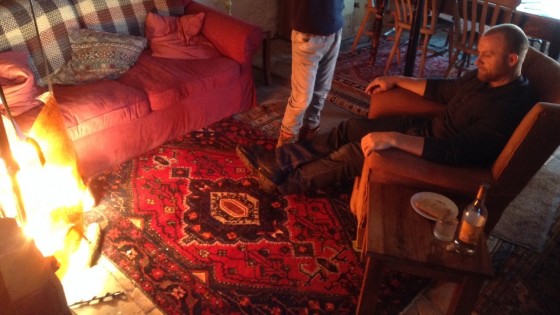
The dimmer board controlling the Cyclotron sits on the arm of the sofa next to the tungsten avenger itself.

Somehow, the Cyclotron never got used. The 100W bulbs and clip-on fixtures that comprised it did get used, however. They were scattered throughout the shop in Stop/Eject, hidden behind a bed in Ashes, and used to create a sunset in The One That Got Away. And last weekend, they got turned into something which the moniker “Cyclotron” seems to fit even better.

Shooting Coffin Grabber, directed by Claire Elizabeth Alberie, we needed firelight to play on the face of a character called Phil. I asked Col to rig up a bank of eight 100W bulbs, running two of them into each of the four channels on his dimmer board. During the takes he would oscillate the faders in random patterns to suggest the flicker of flames.

In front of the bulbs I hung a sheet of Urban Sodium gel. Given Phil’s character, I didn’t want the sunny feel of a straw colour or the homely orange of CTO (Colour Temperature Orange). I happened to have some Urban Sodium in my gels bin and I felt that had just the right dirty, gritty and a little bit hell-ish look for Phil.

There are many ways to simulate firelight. Check out this blog by Shane Hurlbut about how he built an elaborate rig using gooseneck microphone mounts for The Greatest Game Ever Played. And look out for a forthcoming post from me on simulating candlelight when The First Musketeer is released.

Phil (Ross O'Hennessy) basks in the warm glow of the Cyclotron.
Phil (Ross O’Hennessy) basks in the warm glow of the Cyclotron.
Firelight: Revenge of the Cyclotron

Thank You

Georgina Sherrington ("Kate") and Oliver Park ("Dan") during the weir scene
Georgina Sherrington (“Kate”) and Oliver Park (“Dan”) during the weir scene

Thank you to everyone who made Stop/Eject‘s third crowd-funding campaign such a huge success. We set a target of £400, but we smashed through that early on and ended up at £600 when the campaign ended on Sunday. That makes £4,800 raised in total for this little fantasy-drama since 2012. The new funds will pay for entry into another 20 or so film festivals around the world.

It was also an opportunity for the small but loyal fanbase we’ve built up over the last couple of years to get their own copies of the film. I’m now in the process of getting the extra discs duplicated and I’ll be posting them out as soon as they’re ready.

Thanks again for your support, everyone.

Thank You

Stop/Eject According to Therese

When we shot Therese Collins‘ behind-the-scenes interview for Stop/Eject, back in March last year, it proved … shall we say… challenging to get a sensible answer out of her. Here are some of the surreal and hilarious out-takes. Therese plays Alice, the mysterious shopkeeper who knows more than she’s telling about the time-travelling cassette recorder.

If you want to see the more sensible bits, plus interviews with all the rest of the cast and crew, you need to snap up one of the last few Blu-ray copies of Stop/Eject. They’re loaded with extra material including a half-hour “making of” documentary, featurettes on crowd-funding, the Belper locations and post-production sound, commentaries, bonus shorts, an extended rough cut and an interview with Georgina Sherrington about her time on The Worst Witch.

Go to stopejectmovie.com to get your copy before our campaign ends at 6pm BST this Sunday (13/4/14).

Stop/Eject According to Therese

Stop/Eject Postproduction Budget Breakdown

Back in November 2012 I posted and analysed the preproduction and production budget for my short film Stop/Eject, a 17 minute fantasy-drama which was shot on a DSLR. Now I’m going to do the same for the postproduction budget, including distribution and marketing. We’re currently selling Blu-rays and digital rentals of Stop/Eject, to raise money for further film festival entries, so please support us by buying a copy if you find this blog useful.

Download the budget here as a PDF (35kb).

As you can see, we had almost £2,000 available to us in post, some of which was left over from production, but most of which came from a crowd-funding campaign. You can read my evaluation of that campaign in an earlier post.

Mixing Stop/Eject at Alchemea College in Islington
Sound mix

None of the cast or crew were paid at any stage of making Stop/Eject, and indeed I tried not to spend anything at all on postproduction. The VFX artists worked on their home computers, editor Miguel Ferros used his own Mac-based Avid system, colourist Michael Stirling used his company‘s DaVinci Resolve projection grading suite, sound editor and designer Henning Knoepfel used his own Mac for the audio work and pulled in a favour to get a free studio day for the ADR, and re-recording mixer Jose Pereira used the studio at the college where he lectures. Scott Benzie composed the music in his home studio and we recorded it for free with four live players at Worcester Tech College.

Georgina does some ADR
ADR

So except for a suite of clock sound effects, which Henning convinced me were necessary to help the audio tell the story, the main costs in postproduction were those incurred by people travelling so that we could be in the same room for some of the work, and eating lunch on those occasions. It’s important to at least make sure people are fed when you can’t pay them a fee. The most expensive of these days was the ADR session, which involved me and two lead actors travelling from Hereford, Birmingham and Bath respectively to the studio in east London.

Even in today’s digital world, some files are just too damn big to send online, and such was the case with the Avid media output by Miguel ready for the grade. I therefore purchased a USB hard drive, which ended up being couriered across London a couple of times to get to where it needed to be. After the film was completed, I used the same drive to archive all of the Stop/Eject assets and project files.

In order to run the crowd-funding campaign, which lasted for most of postproduction, we needed to build our own website and cut a trailer using library music. We also attended several events to promote the campaign and the film in general, one of which charged an entry fee.

Glossy script book
Glossy script book

The £79.47 spent on producing the crowd-funding rewards (a.k.a. perks or gifts) was racked up mostly by the hardback glossy script books, costing about £25 each (ex. VAT). The sponsorship level required to qualify for one of these books was £100, and since you also got a DVD, Blu-ray and premiere invite for that amount, there can scarcely have been £60 left of the donation for us to spend on actually making the film! It just goes to show that you should carefully cost up your rewards before you offer them.

DVDs & Blu-rays
DVDs & Blu-rays

That £79.47 isn’t the whole story though, since the next three items listed – the screening venue hire, Blu-ray stock and dupes – were all partly for sponsors as well. (A £10 donation got you an invite to the premiere, £30 got you a DVD and an invite, and £50 got you a Blu-ray, a DVD and an invite.)

£25.61 bought me fourteen blank Blu-ray discs, most of which I got through in trial and error as I authored and tested my first ever BD. The £265.30 spent on dupes got us 60 DVDs and 50 BDs, all with full colour on-disc artwork, inlays and cases. 20 of those discs went to sponsors and approximately 50 to cast and crew, with the rest being reserved for press and festivals.

I deliberately completed the discs in time for the premiere so that I could hand many of them out in person and reduce postage costs. For those that I did post, I used only pre-loved jiffy bags which I had been collecting for some time.

All in all, I’d say almost 11% of the £1,584 raised through crowd-funding was spent on creating and delivering rewards, a little more than I would have liked. Ideally you want to spend no more than 10% of your budget on rewards.

Stop/Eject press kit

As detailed in another post, I created Stop/Eject’s Digital Cinema Package at home using free software, but did have to buy a hard drive for it and a flight case, since I intended to ship it to international festivals for screenings.

To promote the film at festivals and beyond, we had 50 full colour folders printed, each containing five single-sided monochrome pages of text. We also paid £10 to submit Stop/Eject to The London Film Review, the hope being that good reviews would increase our chances of festival selection.

And that only really leaves the festival entry fees themselves. We’ve entered 25 to date, and the money we’re raising now should allow us to enter another 20 or so. In a future post I’ll provide a list of the festivals entered, their deadlines and fees, and the selection results.

Stop/Eject Postproduction Budget Breakdown