“Kingsman: The Golden Circle” and the Glorification of Sexual Assault

The first Kingsman film made me very angry – in fact I wrote a blog post explaining exactly why it was so misogynous. I was therefore planning to avoid the sequel like the plague, and instead a friend and I set off for the local Vue this afternoon with  a voucher for two free tickets and the intention of seeing A.A. Milne biopic Goodbye Christopher Robin. Unfortunately, on arriving we were told that a broken projector meant that the screening of Goodbye Christopher Robin was cancelled. Neither of us were very enthusiastic about anything else that was showing, but Kingsman: The Golden Circle was starting soonest, so we plumped for that.

Though silly, and providing little screen time to women, the movie was tolerable until it reached the middle with a sequence set at Glastonbury. The scene required our “hero” Eggsy to implant a tracking device on a woman called Clara. For reasons not explained, and extremely difficult to imagine, the tracking device must be implanted in her vagina. That’s tantamount to rape with a foreign object, isn’t it? Or some equally serious and horrifying crime.

Eggsy sets about seducing Clara. She offers to pee on him. He declines, pops to the loo and rings his girlfriend Tilde (yes, somehow that reprehensible anal sex reward at the end of the first movie became a long-term relationship) to warn her that he is about to sleep with another woman because it’s necessary to his mission. Her response boils down to: that’s fine, so long as you marry me afterwards. (What?! It’s 2017 and we’re still portraying women as being fine with cheating men, and wanting nothing more in life than to “snare a man” by getting married?)

At around this point I got up and walked out, shaking with anger and sick to my stomach. I felt dirty, like I had just stood by and watched a gang rape. With the exception of my friend, everyone else in the audience was laughing and (seemingly) enjoying it. It was not an experience I wanted to continue to participate in. I can’t imagine how it made female viewers feel.

I’m told that the next scene featured an uncomfortable sequence in which Eggsy gradually reaches into Clara’s knickers, followed by a CGI zoom into her vagina as the tracking device enters. It sounds like the camera kind of raped her. Ugh.

Now look, I’m not saying that movies shouldn’t have scenes of rape or sexual assault, or whatever strange and abhorrent crime Eggsy commits by placing a foreign object in an unwitting woman’s vagina. Kingsman is loathsome and unacceptable because of two things:

1. Eggsy is the “hero” of the film, the “good guy”, the one who is meant to be loved and idolised. If he was the villain, it would be clear to all viewers that his actions were wrong, but because he is the hero the film implies that his behaviour is not only acceptable, but “heroic” and “good”. Kingsman teaches its teenage audience that the objectification and violation of women is to be admired.

2. Clara is completely unaware of what is being done to her. At least in a rape scene the woman knows she is being violated and can try to fight back. Here the whole thing is played for comedy. Not only is Clara ignorant and completely powerless, but the audience is made complicit in her assault by being encouraged to laugh at her because she doesn’t know what’s going on. It’s like the whole thing is a sick game; indeed there is dialogue between Eggsy and his fellow agent Whiskey in which it is made clear that they are competing to assault Clara. She is humiliated and degraded in every possible way.

Director Matthew Vaughan responded to criticism of the first Kingsman’s misogyny by saying that it was a joke, pushing the sexist tropes of Bond films to the extreme. The backlash should have informed him that this was a bad idea. Instead of taking the hint, he went even further with the sequel. The only possible conclusion is that Vaughan and his fellow filmmakers genuinely hate women. It is simply staggering to think of the number of people involved in the movie who apparently thought this sequence was perfectly okay.

Come to think of it, who else do we know that likes being peed on and grabbing women by the vagina? Perhaps I shouldn’t be so surprised that, in a world whose most powerful man believes he can do what he wants with women’s bodies, movies will express the same ideology. It’s sickening and depressing.

“Kingsman: The Golden Circle” and the Glorification of Sexual Assault

Lighting I Like: “The Man in the High Castle”

The second episode in the latest run of Lighting I Like is now out, looking at some of the cinematography in The Man in the High Castle.

Based on the Philip K. Dick novel, The Man in the High Castle is set in an alternate reality where Japan and Nazi Germany won the Second World War. Both seasons of the show are available on Amazon in the UK.

The scenes I focus on use powerful light sources coming in through windows and bouncing off furnishings to softly uplight the talent. For more on this technique, see my article on 5 Ways to Use Hard Light Through a Window.

New episodes of Lighting I Like are released at 8pm BST every Wednesday. Next week I’ll look at a scene from 12 Monkeys the series. Click here to see the playlist of all Lighting I Like episodes.

Lighting I Like: “The Man in the High Castle”

Lighting I Like: “Breaking Bad”

My YouTube series Lighting I Like is back for a second season of six episodes. It’s a very short and simple show, aimed at raising awareness of the art of lighting amongst non-cinematographers, or those at the very start of their cinematography career. Each week I look at the lighting choices made in one or two scenes of a TV/VOD show and how those choices help tell the story.

First up is Breaking Bad, the critically acclaimed series about a high-school chemistry teacher who, after being diagnosed with leukaemia, resorts to manufacturing drugs to ensure his family’s financial future. All five seasons of the show are available on Netflix in the UK.

Breaking Bad is dark and gritty, shot on 35mm film, and features some beautiful cinematography, one example of which I recently covered in my post on modifying window light. You can read an interesting analysis of the show’s photography on Cinevenger.

In the above video I also provide additions and corrections to some episodes of Lighting I Like‘s first season. Click here to see the playlist of all Lighting I Like episodes.

New episodes of Lighting I Like will be released at 8pm BST every Wednesday. Next week I’ll look at a couple of scenes from The Man in the High Castle.

Lighting I Like: “Breaking Bad”

Negative Lighting

There were no practicals in this corner of the pub, so we placed an 800 open-face outside the window, gelled with Midnight Blue, and a 1×1′ LED panel in the wood-burner, gelled with CTO.

This year I’ve shot a couple of productions on the Sony FS7, a camera I’ve been very impressed by. Its most interesting feature is its high native ISO of 2000, which makes quite an impact on how you go about lighting. The light shed by practicals is often enough to illuminate a scene, or a large part of it, and sometimes you need to take existing practicals away in order to maintain contrast and shape, similar to how you take ambient light away (negative fill) when shooting exteriors.

It’s a strange thing about being a DP that, yes, sometimes you’re required to plan a mammoth lighting set-up using tens of kilowatts of power, but other times it’s just a case of saying, “Take the bulb out of that sconce.” You’re working to exactly the same principles, using your creative eye just as much in both scenarios.

Let’s look at some examples from a promotional film I shot with director Oliver Park for Closer Each Day, an improvised stage soap.

Our location was a pub, which had a large number of existing practicals: mainly wall sconces, but some overheads above the bar and in the corridors too. The film had to be shot in a single night, entirely on Steadicam, with some shots revealing almost the whole room, and to further complicate matters I was a last-minute hire due to another DP having to step down. Keeping the lighting simple, and avoiding putting any “film lights” on the floor where the roving camera might see them, was clearly the way to go.

I identified the darker areas of the room and added a few extra sources: two blue-gelled 800s outside the windows, an orange-gelled 1×1′ LED panel in the wood-burner, an LED reporter light in one key corner, and a small tungsten fresnel toplight onto a key table, firing down from the mezzanine so it would never be in shot. Other than those, and a low level of fill bounced off the ceiling, we relied exclusively on the existing practicals. (They were mainly fluorescent, and ideally we would have reglobed these all with tungsten, but it wasn’t possible.)

This view from the mezzanine shows the diffused 300W fresnel top-lighting the drinking contest table, and the black-wrapped 650 firing into the ceiling for fill.


So, that’s the “positive” lighting. Here are three examples of “negative” lighting in the film…

When Big Dick Johnson (yep, that’s the character’s name) first enters the pub, I put a piece of tape over a little halogen spotlight just above his point of entry. This was partly because it was very bright and I didn’t want him to blow out as he walked under it, but it also made for a much better sense of depth in the overall shot. As I’ve often mentioned on this blog, the best depth in an image is usually achieved by having the foreground dark, the mid-ground at key and the background bright. Killing the halogen spotlight helped create this progression of brightness and therefore depth. It’s also just nice in a shot like this to come out of darkness into the light, enhancing the reveal of the new space to the viewers.

When Billy De Burgh scrambles to buy a ticket at the box office, there are two practicals just above his head. Depending on which way we were shooting, I de-globed one of the fixtures – always the one closest to camera. This ensured that Billy always had backlight, and never had a really hot, toppy front-light shining harshly down on him.

On a side note, the blue light inside the box office was existing – I guess they were using cool white LED bulbs in there – and I really like the way it differentiates the spaces on camera. It puts the bored ticket-seller in a cold, detached world very separate to Billy’s warmer, more urgent world.

This doorway where Big Dick ends the film had sconces on both sides. It’s never very interesting to have an actor evenly lit on both sides of their face, and especially as Dick is such a tough, unpleasant character, I felt that more contrast was required. I chose to remove the globe from the righthand sconce, so that when he turns camera left to look at the sign he turns into the remaining sconce, his key-light. We filled in the other side of his face a tiny touch with a reflector.

I would love to have been able to exercise the same control over the street-lamps in the opening scene of the film – some of them are quite flat and frontal – but unfortunately time, budget and permissions made that impossible. We would have needed huge flags, or a council-approved electrician to switch the lamps off.

That’s all for today. Next time you’re in Bristol, check out Closer Each Day. I didn’t get chance to see it, but I hear it’s brilliant.

Negative Lighting

5 Lighting Modifiers You Can Put on Windows

Lighting through windows is the cornerstone of a DP’s day interior work. I’ve previously written about the various ways that hard light through a window can be used. Today I’m going to look at some examples of how dressing on the windows – anything from curtains to paint or newspaper – can create interesting lighting looks and help you tell the story.

Please note: there are some minor spoilers in this post, and a quite big one for the season two finale of Mr Robot.


1. PAINTS AND STAINS

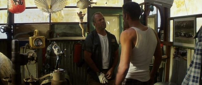
Director Michael Bay and DP John Schwartzman, ASC recycled many techniques they had used on commercials when they shot Armaggeddon. One of these was to create coloured light, not by arbitrarily gelling lamps, but by having the art department paint the windows. In an early scene on the oil rig, the windows are yellowed to give a warm feel to a romantic scene between AJ and Grace, contrasting with the cool, monochromatic look of the asteroid later on in the film. “The windows here are like a Filon fibreglass that we then threw some orange asphaltum stain on to give it that warm tone,” Schwartzman explains in the commentary.


2.NEWSPAPER

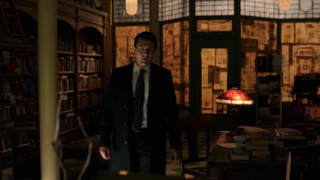
During the first season of time travel thriller 12 Monkeys, our heroes James Cole and Dr Cassandra Railly base themselves out of a disused shop. It’s a safe place they retreat to when they need to plan or regroup, and a womb-like feeling of warmth and security is created visually by the orange newspaper covering the shop’s front windows.

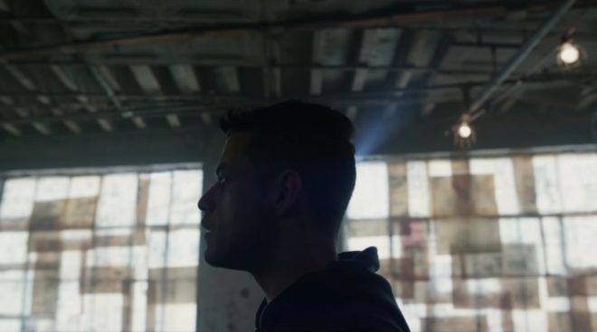
The season two finale of Mr Robot uses a similar technique to a very different end. Gaps in the paper here allow violent shafts of light to pierce the room, foreshadowing the bullet which is about to pierce Elliot’s body.


3. Blinds

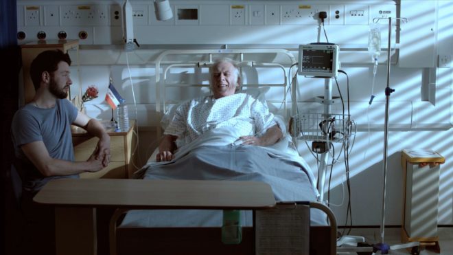
When I lensed the race drama Exile Incessant in 2015, director James Reynolds wanted to visually represent the ideological differences between the older and younger South Africans. I decided to bathe the progressive youngsters in soft, low-contrast light, while throwing hard light and deep shadows onto the more narrow-minded adults, whose world is black and white in more ways than one. For the hospital scene pictured below, I adjusted the venetian blinds – with a 2.5K HMI behind them – to give a contrasty pattern of light and shade on the old man.

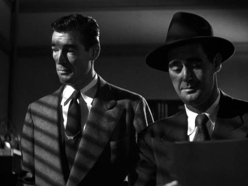
Lighting through blinds is of course a famous feature of film noir cinematography, and has found its way into countless movies of all genres over the last several decades.

He Walked by Night (1948, dir. Alfred L. Werker)


4. Diffusing curtains

Placing sheer curtains on a window can solve two problems for filmmakers: disguising an unwanted or non-existent (if on stage) background, and softening the light. This is a widely-used technique; in fact it’s common practice for art departments to consult with DPs about curtains to ensure that the right options are available for the style of lighting that will be employed.

In an episode of my YouTube series Lighting I Like, I discussed a scene from The Crown – Netflix’s dramatisation of Queen Elizabeth II’s reign – in which King George VI is found dead. Unlike many daylight interiors in the series which feature hard shafts of sunlight, the scene in question employed net curtains to create a softer, more subdued light, appropriate to the sombre content.


5. Billowing curtains

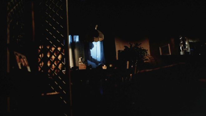
The season two Breaking Bad episode “Grilled” sees out-of-their-depth crystal meth cooks Walter White and Jesse Pinkman taken hostage by crazy drug lord Tuco Salamanca. Realising that their only hope of escape lies in killing Tuco, Walter and Jesse plot to poison his burrito. The episode bristles with tension, generated not just through the script and performances, but also by flapping curtains which paint the scene with restless shadows. The scene appears to have been shot on location, so whether the wind was artificial or just a happy accident I don’t know, but either way it adds immeasurably to the atmosphere.

Both Breaking Bad and 12 Monkeys feature in the second season of Lighting I Like – coming soon!

5 Lighting Modifiers You Can Put on Windows