“Harvey Greenfield is Running Late”: Week 3 Part 1

Photo by Jonnie Howard

Day 17

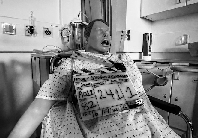
Our first location was a medical training ward populated by creepy dummies; we had a brief flashback scene to do around a hospital bed. When we arrived there was nice warm sunlight coming in through the frosted glass behind the bed, so we made sure that stuck around by putting an orange-gelled Aputure 600D out there. Inside we wrapped this with a FalconEyes and Stephen added some soft fill because I wanted the scene to feel romantic. To get some green into the frame (a calming colour in the film’s visual language) we stuck a couple of Nanlite PavoTubes into the background as practicals.

While Hamish (our new 1st AC) and Fifi were building the camera I faffed about with the Prosup Tango slider, trying to figure out a way to have the track go over the bed so we could pull straight back from Paul. It proved impossible simply because the track also ended up in frame, and instead we simply set it up beside the bed. It took a bit of clever blocking by director Jonnie to ensure that the camera could point directly along the axis of the track, rather than at an angle, which would have broken the established visual grammar of the film. This is the sort of thing that takes a bit of time to get back into after months away from the project, but it’s important to get it right.

Next we moved into the foyer, which we were playing as a bank. There was plenty of natural light but we made sure to keep that in the background, neg-filling behind the camera, and adding a key (a Rayzr MC 200) at 90° to the talent (Alex Wilber), who was partly facing towards a computer monitor on that side of camera anyway. A heavily dimmed 2K served as backlight.

After a brief panic when we thought we were missing our favourite lens, the 14mm, we moved to Cambridge 105’s studio a couple of blocks away. A special guest star played a Tony Blackburn-esque DJ and threw in some brilliant improvs.

We fought a battle against the high, bright sun that kept trying to come in the south-facing window, despite us having diffed a lot of it, and blacked out the whole top section, and having blinds partly lowered, and the windows having some special solar coating on them anyway. Once again we fired in the 600D, which probably did very little compared with that sun, and wrapped it inside with a FalconEyes, and added the PavoTubes into the background for colour. The DJ’s computer monitors were set to 60Hz, but I’d learnt my lesson from last year and immediately set the shutter to 144° to sort that out.


Day 18

We were at Anglia Ruskin University for the day, mostly in one of their media studios. Here we had to shoot a number of things against a black backdrop, mainly to cut into the climax of the film. These included a 180° camera move using the university’s track and dolly. I thought briefly about doing some elaborate lighting rig in which lamps would have to be dimmed up and down to maintain backlight and eliminate front-light as the camera circled, but then I came to my senses and we just fired a Source Four straight down onto the makeshift table that the two actors were hunched over so that it would bounce back up to them. I was using the Soft FX 1 to match the look of the Happy Place scenes from Day 3, which helped to take the harshness out of the highlights where the Source Four was directly hitting the cast.

A little later Jonnie started flinging things in front of the camera. Had he finally cracked? No, he just wanted some lovely slo-mo shots of key props arcing through a black void. We went to 120fps, the Red Gemini’s maximum 4K frame rate, and the higher native ISO of 3200. We were able to make a stop of somewhere between T4 and T5.6 by bouncing two 2Ks into an 8×4′ poly just out of frame, and using three triple banks of the uni’s linear cyc lights in the grid as backlight.

After lunch we came to a couple of crucial shots that were dropped from the night shoot on Day 10, meaning we had to replicate the lighting from Vinery Park. We used the cycs again, a Source Four on a stand as a special flaring backlight simulating the park’s streetlamp, and a couple of 2Ks through a diffusion frame as the key. Although we were back to 24fps we still needed loads of light because one of the set-ups was on an f/14 probe lens sliding into Harvey’s mouth! “It feels really weird,” Paul remarked. Yep. And sorry for bashing you in the teeth with it.

As our time on the campus ticked down we moved across to another building to shoot a call centre scene. We went for our 24mm “tableau” frame that we’ve used to establish all the characters who ring Harvey in their own environments, followed by a couple of other set-ups. We kept the talent’s (Kate Madison) eye-line between the camera and the windows for a nice short key, beefing it up with a FalconEyes, and added a dimmed 2K backlight and some warm PavoTubes in the background (orange being the stress colour in the film’s visual language).


Day 19

The good folks at BBC Breakfast were up bright and early, set up at the Granta beside Sheep’s Green, shooting live news footage of what was widely forecast to be a record-breakingly hot day. We were up pretty early too, watching from the banks of the Cam at 5:30am as the BBC drone flew over, and hoping that it wouldn’t ruin a take (which it didn’t).

We were shooting Harvey Greenfield‘s only stunt, which I probably shouldn’t spoil by describing. We’d given Stephen the day off, and my trusty 5-in-1 reflector was our only lighting gear, but of course there was no shortage of sunlight. I used the white side for most set-ups, running along beside the Steadicam later in the day to keep Paul’s face filled in when he wasn’t facing the sun.

There was an interesting moment when we had the sun in the background of a low-angle shot. As I’ve experienced before, the Soft FX filter reflected a rectangle of light onto the subject. But even when we took it out, the IRND filter did the same thing. Do all filters do it, I wonder? Must test that one day.

We wrapped a little after 3pm, as the heat was reaching its maximum. Despite all the dire warnings (and drone-worthy news coverage) it hadn’t been too hot to work. We were all sensible with hydration, shade and sunblock, and I even swam in the Cam a couple of times during the day to cool off. You don’t get to do that very often on a shoot!

Straight after wrap I went for another swim in Jesus Green Lido, whence a Channel 5 news crew were broadcasting live weather reports with the pool in the background. The presenter was positioned in the shade and they’d set up a 600D on either side of him to fill him in. Believe it or not, that would inspire the next day’s lighting.


Day 20

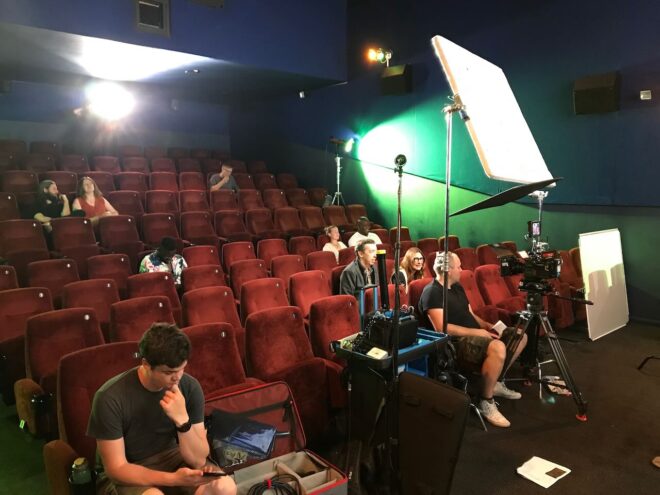
First up was a one-shot flashback scene at the Arts Picturehouse. We used the 600D as the “projector”, positioning it just barely out of the top of frame, and a 4×4′ poly armed over the camera as the screen bounce. During the takes Jeremy wiggled his hand in front of the 600D to create dynamics in the flare.

The day’s main scene was a fake advert starring a nineties keep-fit icon. The aim was a cheesy infomercial vibe, with a 4:3 aspect ratio and over-the-top acting. We cross-front-lit the scene with the Aputures 300D and 200X (thank you, Channel 5), with only a bit of diff on them. I over-exposed by a stop and took out the Soft FX filter to make the image even less filmic. I framed with a lot of headroom and even did a deliberately late tilt-down at one point. When the actual aerobics start, we went even more naff by adding two PavoTubes into the background and the Rayzr MC behind camera, all flashing nasty disco colours. It was great fun.

By the time we moved onto the last scene – another 24mm phone call, in a GP’s waiting room – it was at least 39°C in Cambridge and the UK’s temperature record had been broken.

There’ll be more from this shoot in next week’s post. In the meantime, you can read all the Harvey posts here. Note that the link will display them in reverse chronological order, so scroll down for the older ones.

“Harvey Greenfield is Running Late”: Week 3 Part 1

Is Modern Cinematography too Dark?

“Why are things so dimly lit today? Can barely see anything.” Such was a comment on a frame of my cinematography that I posted on Instagram last year. It was a night scene but far from the darkest image I’ve ever posted.

“The First Musketeer” (2015, DP: Neil Oseman)

I remembered the comment recently when double Oscar-winning cinematographer Janusz Kamiński said something similar in an interview with British Cinematographer. He lamented what he perceives as a loss of lighting skills that accompanied the transition from celluloid to digital filmmaking: “Now everyone shoots dark… Pictures are so murky you need to crank up the TV to see it… They just don’t know how to light.”

I think there’s a tremendous amount of talent in today’s world of digital cinematography, but the technology might have encouraged a trend towards darker images. With celluloid it was always better to err on the side of over-exposure, as highlights would fall off attractively but shadows could get lost in the grain. With digital it is more advisable to lean towards under-exposure, to avoid the harsh clipping of highlights.

We should also consider that modern digital cameras have more dynamic range than film, so there is less risk inherent in under-exposing a scene, especially as you can see on your histogram exactly what detail you’re retaining. But the same should be true of over-exposure too.

The demand from streaming platforms for HDR delivery also encourages DPs and colourists to play more with very dark (or very bright) images. Most viewers will still see the results in SDR, however, and some crucial information at the edges of the dynamic range could get lost in the transfer.

“Crimson Tide” (1995, DP: Dariusz Wolski, ASC)

The trend for darker images may have started even before the digital revolution though. “I think contemporary photography is going away from pretty pictures,” Dariusz Wolski told American Cinematographer in 1996, well over a decade before digital capture became the norm. “Something that is dark is really dark, and something that is bright is very bright. The idea is to stretch photography, to make it more extreme.”

Wolski may have been onto something there: a trend towards more naturalistic images. You have only to look at a film made in the first half of the 20th century to see that lighting has become much more realistic and less stylised since then. Darker doesn’t necessarily mean more realistic, but perhaps it has become a convenient trick to suggest realism, much like blue lighting is a convenient trick to suggest night that has very little basis in how things look in the real world.

The most noticeable increase in darker images has been in TV – traditionally bright and flat because of the inherently contrasty nature of the cathode ray tube and the many lights and reflections contaminating the screen in a typical living room. Flat-screens are less reflective, less contrasty and generally bigger – and a dimmer image is easier for the eye to interpret when it’s bigger.

Perhaps people are more likely to draw the curtains or turn off the lights if they’ve splashed out on a TV so large that it feels a bit like a cinema, but what about all the mobile devices we have today? I went through a phase of watching a lot of Netflix shows on an iPad Mini on trains, and I was forever trying to keep the daylight off the screen so that I could see what was going on. It was annoying, but it was my own fault for watching it in a form that the programme-makers couldn’t reasonably be expected to cater for.

A shot from “Games of Thrones: The Long Night” (2019, DP: Fabian Wagner, ASC, BSC) which has been brightened by disgruntled fans

“A lot of people… watch it on small iPads, which in no way can do justice to a show like that anyway,” said DP Fabian Wagner in defence of the infamously dark Battle of Winterfell in Game of Thrones. I’ve never seen it, and I’m all for a DP’s right to shoot an image the way they see fit, but it sounds like he might have gone too far in this case. After all, surely any technique that distracts the audience or takes them out of the story has defeated its purpose.

So, the odd extreme case like this aside, is modern cinematography too dark? I think there is an over-reliance on moodiness sometimes, a bit like how early DSLR filmmakers were too reliant on a tiny depth of field. DPs today have so much choice in all aspects of crafting an image; it is a shame to discount the option of a bright frame, which can be just as expressive as a dark one.

But if a DP wants to choose darkness, that is up to them. Risks like Fabian Wagner took are an important part of any art-form. Without them, cinematography would go stale. And I for one would certainly not want that, the odd negative Instagram comment notwithstanding.

Is Modern Cinematography too Dark?

“Red Dwarf VI”: Making a Sci-fi Sitcom in 1993

I have been a huge fan of the British sci-fi sitcom Red Dwarf since the age of 12 or 13. The show has undergone many changes over the years, and every fan has their own view about which era is the best, but for me seasons V and VI will always be my favourites. I discovered the show during season V and I remember the huge anticipation for the next season. During this time the show’s production values were very high but it was still extremely funny, with the main characters all well established and well rounded.

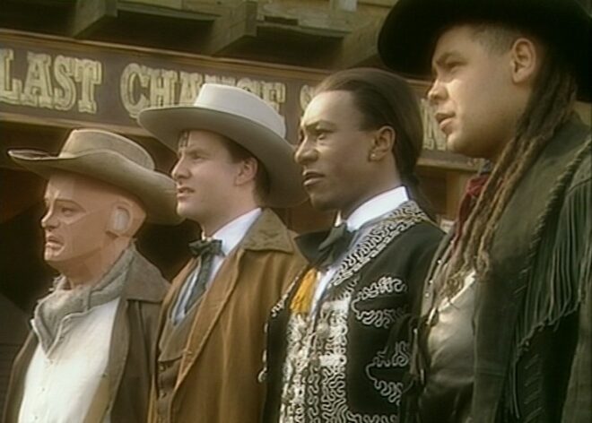
So I was delighted to come across Joe Nazzaro’s book The Making of Red Dwarf in a charity shop recently. It focuses on the production of the series’ most lauded episode, the International Emmy-winning “Gunmen of the Apocalypse” from 1993. The episode sees mechanoid Kryten deliberately contract a computer virus in order to save the Red Dwarf posse, and their efforts to help him battle the infection within the framework of a Wild West VR game representing his consciousness.

What I find fascinating is that the series, at that time at least, was made in such a different way to modern high-end TV or film, following instead the multi-camera sitcom pattern of rehearsing all week and recording in the evening on Saturday.

The cycle began on a Sunday, with production designer Mel Bibby removing the previous episode’s sets from Stage G at Shepperton and installing the new ones.

On Monday the director, writers and cast rehearsed on the set while certain crew members travelled to location – the Laredo Western Club in Kent – to pre-rig. A British sitcom at this time had no director of photography; instead the camera angles were chosen purely by the director and technically executed under the purview of the camera supervisor, while illumination was provided by the lighting director, in this case John Pomphrey. His work at Laredo included putting warm lights inside the buildings to match the look of the interiors which he planned for the studio.

Pomphrey lit a lot of rock and pop shows, and was inspired by concert lighting for such bands as Iron Maiden:

“If you look at them they’re into the same colours I am: oranges, deep blues; powerful colours. I don’t believe in understating something, because you’re generally watching it on a small screen in a well-lit room, so you’ve got to overstate the colours. In the cinema, you can get away with subtle tones, but I don’t think you can on this show… I’m a frustrated cinematographer: I want to make ‘Aliens’.”

Tuesday was the location shoot, conducted with multiple cameras (though not for every set-up) as director Andy DeEmmony worked through his storyboards. At this time all UK TV was 4:3 standard definition. While a high-end drama would have used 16mm film, most shows, including Red Dwarf, were captured on a tape format like Betacam SP. “Gunmen of the Apocalypse” saw the series make rare use of a crane, and behind-the-scenes photos also show at least one HMI shining through a diffusion frame. It was common practice at this time to use large HMIs to fill in shadows on sunny day exteriors.

On Wednesday rehearsals continued on stage, culminating in a tech run during which camera supervisor Rocket previewed shots using the classic hand-framing method. In the evening the production team convened to discuss the next episode, “Polymorph II: Emohawk”.

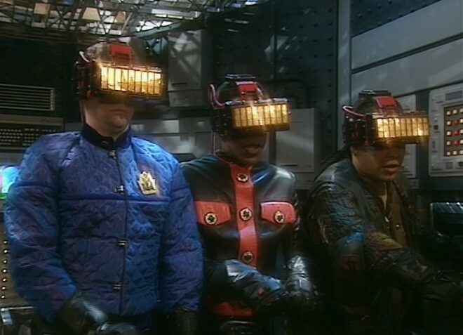
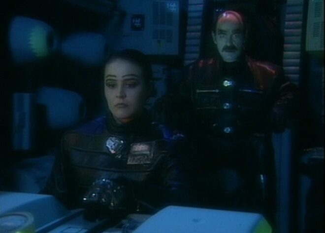
Thursday was known as the Pre-VT day: the day when all scenes too complex to shoot in front of the live audience must be recorded. With “Gunmen” this meant scenes inside the Last Chance Saloon which required such camera tricks as pulling knives out of antagonist Jimmy’s jacket on nylon wires so that in reverse it looked like the knives were pinning him to the wall, Rimmer’s bar fight with four cowboys, and a scene aboard the Simulant ship which is the source of Kryten’s infection.

Pomphrey would communicate by radio with Dai Thomas, who spent studio days in a darkened cabin operating a lighting desk while watching the action on two monitors.

Friday saw more rehearsals, while Tuesday and Thursday’s footage was edited to show to the live audience tomorrow.

Saturday began with blocking and camera rehearsals, before the doors opened to the public at 7pm and recording commenced at 7:30.

It seems that Shepperton Stage G was not equipped with a gallery like a dedicated TV studio; instead, vision mixing was done from the scanner – an outside broadcast truck. For those who don’t know, vision mixing is live editing, cutting from one camera to another in real time as a production assistant calls the shots from the director’s camera script. Elsewhere in the scanner, an engineer monitored the images, doing something akin to the job of a modern DIT, adjusting colours, sharpness and even remotely controlling the cameras’ irises. (Zoom and focus were controlled by the camera operators.)

It’s a testament to all concerned that the show looked so cinematic despite being made this way. Later seasons became even more cinematic, doing away with the live audience for a little while, then bringing it back and later kick-starting Ed Moore BSC’s career when he shot seasons XI and XII beautifully. By this time the show was produced by Dave (a channel named, appropriately enough, after Red Dwarf‘s slobbish hero Dave Lister). It was now captured in HD, on Red cameras of some flavour if I remember rightly, with a focus puller for each one and a more film-like crew structure .

It’s unclear at present if any more seasons will follow 2020’s “The Promised Land”, but if they do I’m sure the series will continue to evolve and embrace new technologies and working practices. Which is a very dull way to end a post about a very funny show, so instead I’ll leave you with one of my favourite jokes from the series, which will make no sense whatsoever unless you remember the set-up.

Kryten, no kitchen appliance should give a human being a double polaroid.

“Red Dwarf VI”: Making a Sci-fi Sitcom in 1993

What Makes a Good Shot?

It’s a very difficult question to answer, but let’s look at a few major things a cinematographer considers each time they set up their camera.


Tonal Range

“Above the Clouds” (2020, dir: Leon Chambers, DP: Neil Oseman)

TV sets and other moving-image devices, especially if they are non-HDR, cannot display as wide a dynamic range as most scenes have in real life. So it is often seen as desirable to make the most of what contrast a screen can reproduce by including at least one area of the blackest black and one of the whitest white, with a good distribution of all the tones in between.

Contrast makes an image richer and also easier for the viewer’s brain to interpret, but as with all of these rules, it is perfectly possible to break it with excellent results. For example, you may want to keep a scene in a prison entirely in the shadows, so that when the prisoner escapes into the daylight the viewer will feel the impact of the highlights. Tonal distribution has a big impact on mood, and thought should be given to what mood a DP wants to convey. 


Colour Schemes

“Alder” (2019, dir: Vanda Ladeira, DP: Neil Oseman)

Since Isaac Newton invented the colour wheel in 1704, artists have devised several colour schemes which can evoke different feelings, the most common in cinematography being complementary and analogous.

A complementary colour scheme uses two hues on opposite sides of the wheel for maximum colour contrast, punch and vibrancy. Think Ripley’s yellow power loader against the blue lighting of Aliens, or the infamous teal-and-orange grading of Michael Bay’s films.

An analogous colour scheme uses hues adjacent to each other on the wheel for a harmonious or oppressive effect. Think the greens of The Matrix, or the reds of Mars in Paul Verhoeven’s Total Recall.

There’s more on colour schemes in this post.


Composition

“Perplexed Music” (2018, dir: Mark McGann, DP: Neil Oseman)

“The so-called rules of photographic composition are, in my opinion, invalid, irrelevant and immaterial,” said the great American photographer Ansel Adams. I might not go that far, but they can certainly be overrated.

The Rule of Thirds, for example, is intended to produce a balanced image, but what if you don’t want a balanced image? Placing a character in an unusual part of the frame, as is frequently done in Amazon’s Mr. Robot, can be powerfully unsettling and say much about the character’s status and mindset. Breaking rules for the sake of breaking rules may not be wise, but breaking them in a single shot to make the viewer sit up and take notice, or breaking them subtly but consistently throughout a film to subconsciously cue the audience into a theme or character trait, is a good use of cinematic technique.

As for camera moves, some believe that they should always be motivated. Some like them to be expressive. Some simply like to keep dollying the camera back and forth to add energy to a scene. As long as the movement helps to immerse rather than distract the viewer, it is serving its purpose.


Depth

“The Gong Fu Connection” (2016, dir. Ted Duran, DP: Neil Oseman)

As film and TV are usually monoscopic media, cinematographers often aim to compensate by enhancing other types of depth cues. Commonly this is through lighting – using backlight to cut a layer out from the background, using colour to separate layers, or alternating light and dark layers. Haze and camera movement can also be used to create a greater sense of depth, as can lens choice, be it a wide lens which exaggerates perspective, or a long lens that throws backgrounds out of focus.

The result is not just impact but clarity, ensuring the viewer is not distracted from the story trying to figure out what they’re seeing. Again though, you may sometimes want just the opposite, to disorientate the viewer or make them work to find the important element in the frame.

This post has some good examples of depth cues.


Production Value

“The Little Mermaid” (2018, dir: Blake Harris, DP: Neil Oseman)

A DP has the responsibility of capturing on film or digital media the work of every other department on the production (except sound!). If the costumers have spent weeks sewing beads onto a period dress, a cross-light to bring out the texture is the least the DP can do. If the make-up department are struggling to hide the joins in a prosthetic, softening or dimming the lighting will help. If a huge set has been built or an expensive location hired, showing it off in at least one wide shot is probably advisable.


Story and Character

“Ren: The Girl with the Mark” (2016, dir: Kate Madison, DP: Neil Oseman)

As I’ve hinted throughout, the most important thing is that every aspect of the shot is working towards telling the story, revealing or enhancing character, and conveying the right overall mood. This might be by keeping everything quiet and conventional to let the performances shine through, or it might be through crazy framing, crunchy contrast and dramatic movements. The possibilities are endless.

What Makes a Good Shot?