How Colour Works

Colour is a powerful thing. It can identify a brand, imply eco-friendliness, gender a toy, raise our blood pressure, calm us down. But what exactly is colour? How and why do we see it? And how do cameras record it? Let’s find out.


The Meaning of “Light”

One of the many weird and wonderful phenomena of our universe is the electromagnetic wave, an electric and magnetic oscillation which travels at 186,000 miles per second. Like all waves, EM radiation has the inversely-proportional properties of wavelength and frequency, and we humans have devised different names for it based on these properties.

The electromagnetic spectrum

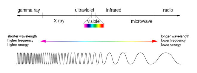
EM waves with a low frequency and therefore a long wavelength are known as radio waves or, slightly higher in frequency, microwaves; we used them to broadcast information and heat ready-meals. EM waves with a high frequency and a short wavelength are known as x-rays and gamma rays; we use them to see inside people and treat cancer.

In the middle of the electromagnetic spectrum, sandwiched between infrared and ultraviolet, is a range of frequencies between 430 and 750 terahertz (wavelengths 400-700 nanometres). We call these frequencies “light”, and they are the frequencies which the receptors in our eyes can detect.

If your retinae were instead sensitive to electromagnetic radiation of between 88 and 91 megahertz, you would be able to see BBC Radio 2. I’m not talking about magically seeing into Ken Bruce’s studio, but perceiving the FM radio waves which are encoded with his silky-smooth Scottish brogue. Since radio waves can pass through solid objects though, perceiving them would not help you to understand your environment much, whereas light waves are absorbed or reflected by most solid objects, and pass through most non-solid objects, making them perfect for building a picture of the world around you.

Within the range of human vision, we have subdivided and named smaller ranges of frequencies. For example, we describe light of about 590-620nm as “orange”, and below about 450nm as “violet”. This is all colour really is: a small range of wavelengths (or frequencies) of electromagnetic radiation, or a combination of them.


In the eye of the beholder

Scanning electron micrograph of a retina

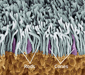
The inside rear surfaces of your eyeballs are coated with light-sensitive cells called rods and cones, named for their shapes.

The human eye has about five or six million cones. They come in three types: short, medium and long, referring to the wavelengths to which they are sensitive. Short cones have peak sensitivity at about 420nm, medium at 530nm and long at 560nm, roughly what we call blue, green and red respectively. The ratios of the three cone types vary from person to person, but short (blue) ones are always in the minority.

Rods are far more numerous – about 90 million per eye – and around a hundred times more sensitive than cones. (You can think of your eyes as having dual native ISOs like a Panasonic Varicam, with your rods having an ISO six or seven stops faster than your cones.) The trade-off is that they are less temporally and spatially accurate than cones, making it harder to see detail and fast movement with rods. However, rods only really come into play in dark conditions. Because there is just one type of rod, we cannot distinguish colours in low light, and because rods are most sensitive to wavelengths of 500nm, cyan shades appear brightest. That’s why cinematographers have been painting night scenes with everything from steel grey to candy blue light since the advent of colour film.

The spectral sensitivity of short (blue), medium (green) and long (red) cones

The three types of cone are what allow us – in well-lit conditions – to have colour vision. This trichromatic vision is not universal, however. Many animals have tetrachromatic (four channel) vision, and research has discovered some rare humans with it too. On the other hand, some animals, and “colour-blind” humans, are dichromats, having only two types of cone in their retinae. But in most people, perceptions of colour result from combinations of red, green and blue. A combination of red and blue light, for example, appears as magenta. All three of the primaries together make white.

Compared with the hair cells in the cochlea of your ears, which are capable of sensing a continuous spectrum of audio frequencies, trichromacy is quite a crude system, and it can be fooled. If your red and green cones are triggered equally, for example, you have no way of telling whether you are seeing a combination of red and green light, or pure yellow light, which falls between red and green in the spectrum. Both will appear yellow to you, but only one really is. That’s like being unable to hear the difference between, say, the note D and a combination of the notes C and E. (For more info on these colour metamers and how they can cause problems with certain types of lighting, check out Phil Rhode’s excellent article on Red Shark News.)


Artificial eye

A Bayer filter

Mimicking your eyes, video sensors also use a trichromatic system. This is convenient because it means that although a camera and TV can’t record or display yellow, for example, they can produce a mix of red and green which, as we’ve just established, is indistinguishable from yellow to the human eye.

Rather than using three different types of receptor, each sensitive to different frequencies of light, electronic sensors all rely on separating different wavelengths of light before they hit the receptors. The most common method is a colour filter array (CFA) placed immediately over the photosites, and the most common type of CFA is the Bayer filter, patented in 1976 by an Eastman Kodak employee named Dr Bryce Bayer.

The Bayer filter is a colour mosaic which allows only green light through to 50% of the photosites, only red light through to 25%, and only blue to the remaining 25%. The logic is that green is the colour your eyes are most sensitive to overall, and that your vision is much more dependent on luminance than chrominance.

A RAW, non-debayered image

The resulting image must be debayered (or more generally, demosaiced) by an algorithm to produce a viewable image. If you’re recording log or linear then this happens in-camera, whereas if you’re shooting RAW it must be done in post.

This system has implications for resolution. Let’s say your sensor is 2880×1620. You might think that’s the number of pixels, but strictly speaking it isn’t. It’s the number of photosites, and due to the Bayer filter no single one of those photosites has more than a third of the necessary colour information to form a pixel of the final image. Calculating that final image – by debayering the RAW data – reduces the real resolution of the image by 20-33%. That’s why cameras like the Arri Alexa or the Blackmagic Cinema Camera shoot at 2.8K or 2.5K, because once it’s debayered you’re left with an image of 2K (cinema standard) resolution.


colour Compression

Your optic nerve can only transmit about one percent of the information captured by the retina, so a huge amount of data compression is carried out within the eye. Similarly, video data from an electronic sensor is usually compressed, be it within the camera or afterwards. Luminance information is often prioritised over chrominance during compression.

Examples of chroma subsampling ratios

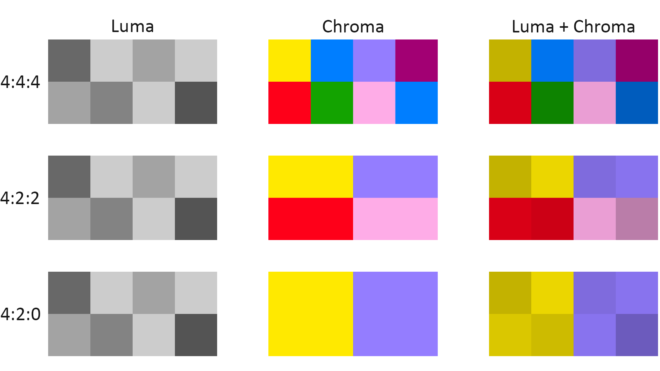
You have probably come across chroma subsampling expressed as, for example, 444 or 422, as in ProRes 4444 (the final 4 being transparency information, only relevant to files generated in postproduction) and ProRes 422. The three digits describe the ratios of colour and luminance information: a file with 444 chroma subsampling has no colour compression; a 422 file retains colour information only in every second pixel; a 420 file, such as those on a DVD or BluRay, contains one pixel of blue info and one of red info (the green being derived from those two and the luminance) to every four pixels of luma.

Whether every pixel, or only a fraction of them, has colour information, the precision of that colour info can vary. This is known as bit depth or colour depth. The more bits allocated to describing the colour of each pixel (or group of pixels), the more precise the colours of the image will be. DSLRs typically record video in 24-bit colour, more commonly described as 8bpc or 8 bits per (colour) channel. Images of this bit depth fall apart pretty quickly when you try to grade them. Professional cinema cameras record 10 or 12 bits per channel, which is much more flexible in postproduction.

CIE diagram showing the gamuts of three video standards. D65 is the standard for white.

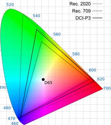
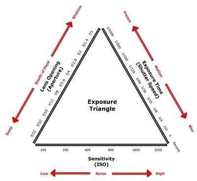
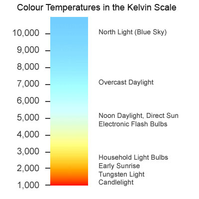
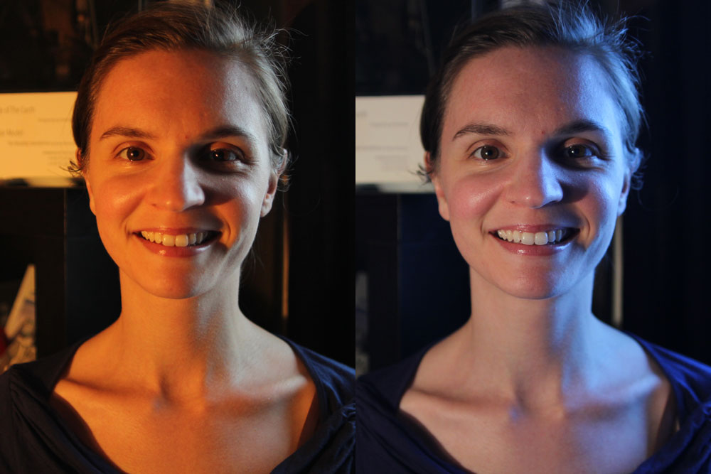
The third attribute of recorded colour is gamut, the breadth of the spectrum of colours. You may have seen a CIE (Commission Internationale de l’Eclairage) diagram, which depicts the range of colours perceptible by human vision. Triangles are often superimposed on this diagram to illustrate the gamut (range of colours) that can be described by various colour spaces. The three colour spaces you are most likely to come across are, in ascending order of gamut size: Rec.709, an old standard that is still used by many monitors; P3, used by digital cinema projectors; and Rec.2020. The latter is the standard for ultra-HD, and Netflix are already requiring that some of their shows are delivered in it, even though monitors capable of displaying Rec.2020 do not yet exist. Most cinema cameras today can record images in Rec.709 (known as “video” mode on Blackmagic cameras) or a proprietary wide gamut (“film” mode on a Blackmagic, or “log” on others) which allows more flexibility in the grading suite. Note that the two modes also alter the recording of luminance and dynamic range.

To summarise as simply as possible: chroma subsampling is the proportion of pixels which have colour information, bit depth is the accuracy of that information and gamut is the limits of that info.

That’s all for today. In future posts I will look at how some of the above science leads to colour theory and how cinematographers can make practical use of it.

SaveSave

How Colour Works

6 Ways to Judge Exposure

Exposing the image correctly is one of the most important parts of a cinematographer’s job. Choosing the T-stop can be a complex technical and creative decision, but fortunately there are many ways we can measure light to inform that decision.

First, let’s remind ourselves of the journey light makes: photons are emitted from a source, they strike a surface which absorbs some and reflects others – creating the impressions of colour and shade; then if the reflected light reaches an eye or camera lens it forms an image. We’ll look at the various ways of measuring light in the order the measurements occur along this light path, which is also roughly the order in which these measurements are typically used by a director of photography.


1. Photometrics data

You can use data supplied by the lamp manufacturer to calculate the exposure it will provide, which is very useful in preproduction when deciding what size of lamps you need to hire. There are apps for this, such as the Arri Photometrics App, which allows you to choose one of their fixtures, specify its spot/flood setting and distance from the subject, and then tells you the resulting light level in lux or foot-candles. An exposure table or exposure calculation app will translate that number into a T-stop at any given ISO and shutter interval.


2. Incident meter

Some believe that light meters are unnecessary in today’s digital landscape, but I disagree. Most of the methods listed below require the camera, but the camera may not always be handy – on a location recce, for example. Or during production, it would be inconvenient to interrupt the ACs while they’re rigging the camera onto a crane or Steadicam. This is when having a light meter on your belt becomes very useful.

An incident meter is designed to measure the amount of light reaching the subject. It is recognisable by its white dome, which diffuses and averages the light striking its sensor. Typically it is used to measure the key, fill and backlight levels falling on the talent. Once you have input your ISO and shutter interval, you hold the incident meter next to the actor’s face (or ask them to step aside!) and point it at each source in turn, shading the dome from the other sources with your free hand. You can then decide if you’re happy with the contrast ratios between the sources, and set your lens to the T-stop indicated by the key-light reading, to ensure correct exposure of the subject’s face.


3. Spot meter (a.k.a. reflectance meter)

Now we move along the light path and consider light after it has been reflected off the subject. This is what a spot meter measures. It has a viewfinder with which you target the area you want to read, and it is capable of metering things that would be impractical or impossible to measure with an incident meter. If you had a bright hillside in the background of your shot, you would need to drive over to that hill and climb it to measure the incident light; with a spot meter you would simply stand at the camera position and point it in the right direction. A spot meter can also be used to measure light sources themselves: the sky, a practical lamp, a flame and so on.

But there are disadvantages too. If you spot meter a Caucasian face, you will get a stop that results in underexposure, because a Caucasian face reflects quite a lot of light. Conversely, if you spot meter an African face, you will get a stop that results in overexposure, because an African face reflects relatively little light. For this reason a spot meter is most commonly used to check whether areas of the frame other than the subject – a patch of sunlight in the background, for example – will blow out.

Your smartphone can be turned into a spot meter with a suitable app, such as Cine Meter II, though you will need to configure it using a traditional meter and a grey card. With the addition of a Luxiball attachment for your phone’s camera, it can also become an incident meter.

The remaining three methods of judging exposure which I will cover all use the camera’s sensor itself to measure the light. Therefore they take into account any filters you’re using as well transmission loss within the lens (which can be an issue when shooting on stills glass, where the marked f-stops don’t factor in transmission loss).


4. Monitors and viewfinders

The letter. Photo: Amy Nicholson

In the world of digital image capture, it can be argued that the simplest and best way to judge exposure is to just observe the picture on the monitor. The problem is, not all screens are equal. Cheap monitors can misrepresent the image in all kinds of ways, and even a high-end OLED can deceive you, displaying shadows blacker than any cinema or home entertainment system will ever match. There are only really two scenarios in which you can reliably judge exposure from the image itself: if you’ve owned a camera for a while and you’ve become very familiar with how the images in the viewfinder relate to the finished product; or if the monitor has been properly calibrated by a DIT (Digital Imaging Technician) and the screen is shielded from light.

Most cameras and monitors have built-in tools which graphically represent the luminance of the image in a much more accurate way, and we’ll look at those next. Beware that if you’re monitoring a log or RAW image in Rec.709, these tools will usually take their data from the Rec.709 image.


5. Waveforms and histograms

These are graphs which show the prevalence of different tones within the frame. Histograms are the simplest and most common. In a histogram, the horizontal axis represents luminance and the vertical axis shows the number of pixels which have that luminance. It makes it easy to see at a glance whether you’re capturing the greatest possible amount of detail, making best use of the dynamic range. A “properly” exposed image, with a full range of tones, should show an even distribution across the width of the graph, with nothing hitting the two sides, which would indicate clipped shadows and highlights. A night exterior would have a histogram crowded towards the left (darker) side, whereas a bright, low contrast scene would be crowded on the right.

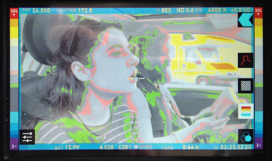
A waveform plots luminance on the vertical axis, with the horizontal axis matching the horizontal position of those luminance values within the frame. The density of the plotting reveals the prevalence of the values. A waveform that was dense in the bottom left, for example, would indicate a lot of dark tones on the lefthand side of frame. Since the vertical (luminance) axis represents IRE (Institute of Radio Engineers) values, waveforms are ideal when you need to expose to a given IRE, for example when calibrating a system by shooting a grey card. Another common example would be a visual effects supervisor requesting that a green screen be lit to 50 IRE.


6. Zebras and false colours

Almost all cameras have zebras, a setting which superimposes diagonal stripes on parts of the image which are over a certain IRE, or within a certain range of IREs. By digging into the menus you can find and adjust what those IRE levels are. Typically zebras are used to flag up highlights which are clipping (theoretically 100 IRE), or close to clipping.

Exposing an image correctly is not just about controlling highlight clipping however, it’s about balancing the whole range of tones – which brings us to false colours. A false colour overlay looks a little like a weather forecaster’s temperature map, with a code of colours assigned to various luminance values. Clipped highlights are typically red, while bright areas still retaining detail (known as the “knee” or “shoulder”) are yellow. Middle grey is often represented by green, while pink indicates the ideal level for caucasian skin tones (usually around 55 IRE). At the bottom end of the scale, blue represents the “toe” – the darkest area that still has detail – while purple is underexposed. The advantage of zebras and false colours over waveforms and histograms is that the former two show you exactly where the problem areas are in the frame.

I hope this article has given you a useful overview of the tools available for judging exposure. Some DPs have a single tool they rely on at all times, but many will use all of these methods at one time or another to produce an image that balances maximising detail with creative intent. I’ll leave you with a quote from the late, great Douglas Slocombe, BSC who ultimately used none of the above six methods!

I used to use a light meter – I used one for years. Through the years I found that, as schedules got tighter and tighter, I had less and less time to light a set. I found myself not checking the meter until I had finished the set and decided on the proper stop. It would usually say exactly what I thought it should. If it didn’t, I wouldn’t believe it, or I would hold it in such a way as to make it say my stop. After a time I decided this was ridiculous and stopped using it entirely. The “Raiders” pictures were all shot without a meter. I just got used to using my eyes.

6 Ways to Judge Exposure

Alexa ProRes ISO Tests

My Cousin Rachel

I’ve shot three features on Arri Alexas, but I’ve never moved the ISO away from its native setting of 800 for fear of noise and general image degradation. Recently I read an article about the cinematography of My Cousin Rachel, in which DP Mike Eley mentioned shooting the night scenes at ISO 1600. I deliberately set off for the cinema in order to analyse the image quality of this ISO on the big screen. Undoubtedly I’ve unwittingly seen many things that were shot on an Alexa at ISO 1600 over the past few years, but this was the first time I’d given it any real thought.

To my eye, My Cousin Rachel looked great. So when I was at Arri Rental the other week testing some lenses, I decided to shoot a quick ISO test to see exactly what would happen when I moved away from the native 800.

But before we get to the test footage, for those of you unsure exactly what ISO is, here’s an introduction. The more experienced amongst you may wish to skip down to the video and analysis.


What is ISO?

A revised and updated version of this section is available.

ISO is a measure of a camera’s light sensitivity; the higher the ISO, the less light it requires to expose an image.

The acronym actually stands for International Organization for Standardization [sic], the body which in 1974 combined the old ASA (American Standards Association) units of film speed with the German DIN standard. That’s why you’ll often hear the terms ISO and ASA used interchangeably. On some cameras, like the Alexa, you’ll see it called EI (Exposure Index) in the menus.

A common ISO to shoot at today is 800. One way of defining ISO 800 is that it’s the sensitivity required to correctly expose a key-light of 3 foot-candles with a lens of T-stop 1.4 and a 180° shutter at 24fps, as we saw in my Barry Lyndon blog.

If we double the ISO we double the effective sensitivity of the camera, or halve the amount of light it requires. So at ISO 1600 we would only need 1.5 foot-candles of light (all the other settings being the same), and at ISO 3200 we would need just 0.75 foot-candles. Conversely, at ISO 400 we would need 6 foot-candles, or 12 at ISO 200. Check out this exposure chart if it’s still unclear.

ISO is one of the three corners of the Exposure Triangle, well-known to stills photographers the world over. You can read my posts on the other two corners: Understanding Shutter Angles and F-stops, T-stops and Optical Density.

Just as altering the shutter angle (exposure time) has the side effect of changing the amount of motion blur, and altering the aperture affects the depth of field, so ISO has its own side effect: noise. Increase the ISO and you increase the electronic noise in the picture.

This is because turning the ISO up causes the camera to electronically boost the signals it’s receiving from the sensor. It’s exactly the same as turning up the volume on an amplifier; you hear more hiss because the noise floor is being boosted along with the signal itself.

I remember the days of Mini-DV cameras, which instead of ISO had gain; my Canon XL1 had gain settings of -3dB, +6dB and +12dB. It was the exact same thing, just with a different name. What the XL1 called 0dB of gain was what today we call the native ISO. It’s the ISO at which the camera is designed to give the best images.


ISO and Dynamic Range

The Alexa has a dynamic range of 14 stops. That means it can simultaneously record detail in an area of brightness x and an area of brightness times 2 to the power 14. At its native ISO of 800, those 14 stops of dynamic range are equally distributed above and below “correct” exposure (known as middle grey), so you can overexpose by up to 7 stops, and underexpose by up to 7 stops, without losing detail.

If you increase the ISO, those limits of under- and overexposure still apply, but they’re effectively shifted around middle grey, as the graphic to the left illustrates. (The Pro Video Coalition post this graphic comes from is a great read if you want more detail.) You will see the effects of this shifting of dynamic range very clearly in the test video and images below.

In principle, shooting at ISO 1600 is the same as shooting at ISO 800, underexposing by a stop (giving you more highlight detail) and then bringing it back up a stop in post. The boosting of the signal in that case would come right at the end of the image path instead of near the beginning, so the results would never be identical, but they’d be close. If you were on a bigger project with a DIT, you could create a LUT to bring the exposure up a stop which again would achieve much the same thing.

All of the above assumes you’re shooting log ProRes. If you’re shooting Raw then everything is simply recorded at the native ISO and any other ISO you select is merely metadata. But again, assuming you exposed for that other ISO (in terms of iris, shutter and ND filters), you will effectively get that same dynamic range shift, just further along the pipeline.

If this all got a bit too technical for you, don’t worry. Just remember:

Doubling the ISO

  • increases overall exposure by one stop,
  • gives you one more stop of detail in the highlights,
  • gives you one less stop of detail in the shadows, and
  • increases picture noise.

Halving the ISO

  • decreases overall exposure by one stop,
  • gives you one less stop of detail in the highlights,
  • gives you one more stop of detail in the shadows, and
  • decreases picture noise.


The Test

I lit the subject, Rupert “Are You Ready?” Peddle, with a 650W tungsten fresnel bounced off poly, and placed a 40W candle globe and some LED fairy lights in the background to show highlight clipping. We shot the tests in ProRes 4444 XQ on an Alexa XT Plus with a 32mm Cooke S4, altering the shutter angle to compensate for the changing ISOs. At ISO 400 the shutter angle was maxed out, so we opened the lens a stop for ISO 200.

We tested five settings, the ones corresponding to a series of stops (i.e. doublings or halvings of sensitivity): 200, 400, 800, 1600 and 3200. I have presented the tests in the video both as recorded in the original log C, and with a standard Rec.709 LUT.

You’ll need to watch the video at full-screen at 1080P to have any chance of seeing the differences, and even then you might see the compression artefacts caused by the noise more than the noise itself. Check out the stills below for a clearer picture of what’s going on. (Click on them for full resolution.)


Analysis

To me, the most important thing with every test is how skin tones are rendered. Looking at the original ProRes of these comparisons I think I see a little more life and vibrance in the skin tones at lower ISOs, but it’s extremely subtle. More noticeable is a magenta shift at the lower ISOs versus a green shift at higher ones. The contrast also increases with the ISO, as you can see most clearly in the log images.

At the lower ISOs you are not really aware of any noise in the picture. It’s only at ISO 1600 that it becomes noticeable, but I have to say that I really liked this level of noise; it gives the image a texture reminiscent of film grain. At ISO 3200 the noise is quite significant, and would probably be unacceptable to many people.

The really interesting thing for me was the shifting of the dynamic range. In the above comparison image, look at the globe in log – see how it starts off as one big white blob at ISO 200 and becomes more detailed as the ISO rises? Now look at the dark wall around the globe, both here and in the previous image – see how it subtly and smoothly graduates into darkness at the lower ISOs, but becomes a grainy mess at the higher ones?

I can see an immediate benefit to shooting at ISO 1600 in scenes lit predominantly with practicals. Such scenes tend to have a low overall level of illumination, while the practicals themselves often blow out on camera. Going to ISO 1600 would give me extra exposure and extra detail in the practicals. I would be sacrificing shadow detail, so I would have to be a little more careful not to underexpose any faces or other important elements of the frame, but I can deal with that. In fact, I often find myself determining my exposure in these types of scenes by how blown out the practicals are, wishing I could open up a little more to see the faces better but not wanting to turn the lamps into big white blobs. Increasing the ISO would be the perfect solution, so I’m very glad I did this test to alleviate my ungrounded fears.

What about scenarios in which a lower-than-native ISO would be useful? Perhaps a scene outside a building with an open door, where the dark interior is visible in the background and more detail is required in it. Or maybe one of those night scenes which in reality would be pitch black but for movie purposes have a low level of ambient light with no highlights.

I hope you’ve found this test as useful and interesting as I have. Watch this space or subscribe to my YouTube Channel for the lens test.

Thanks to Rupert Peddle, awesome steadicam op and focus puller – check out his site at pedhead.net – for appearing in front of the lens. Thanks also to Bex Clives, who was busy wrangling data from the lens tests while we were shooting these ISO tests, and of course Arri Rental UK.

Alexa ProRes ISO Tests

The 2:1 Aspect Ratio

Last autumn I wrote a post about aspect ratio, covering the three main ratios in use today: 16:9, 1.85:1 and 2.39:1. The post briefly mentioned a few non-standard ratios, including 2:1. Since then, I’ve noticed this ratio popping up all over the place. Could it be on its way to becoming a standard?

Today I’ll give you a little background on this ratio, followed by a gallery of frame grabs from 2:1 productions. The aim is simply to raise awareness of this new(ish) tool in the aspect ratio toolkit. As ever, it’s up to the director and DP to decide whether their particular project is right for this, or any other, ratio. However, I would caution low-budget filmmakers against picking what is still not a common ratio without considering that smaller distribution companies may crop your work to a more standard ratio either because of convenience or negligence.

Woody Allen and Vittorio Storaro shooting Café Society

Vittorio Storaro, ASC, AIC – the highly-regarded cinematographer of Last Tango in Paris and Apocalypse Now amongst many others – began championing the 2:1 ratio around the turn of the millennium. It was one of the most complicated times in the history of aspect ratios. The horror of pan-and-scan (butchering a movie to fit its 1.85:1 or 2.39:1 ratio into 4:3 without bars) was starting to recede with the introduction of DVD, which was in fact still 4:3 but could contain squeezed 16:9 content. Widescreen television sets were starting to build in popularity, but some programmes and films were being broadcast in the middle-ground ratio of 14:9 so as not to offend the majority of viewers who still had 4:3 sets. And Storaro recognised that HD would soon supplant celluloid as the primary capture and exhibition method for cinema, likely bringing with it fresh aspect ratio nightmares.

Storaro proposed “Univisium”, a 2:1 aspect ratio that fell between the two cinema standards of 1.85:1 and 2.39:1. It was a compromise, designed to make everyone’s life easier, to produce images that would need only minor letterboxing no matter where or how they were screened. However, the industry did not share his vision, and until recently 2:1 productions were relatively rare, most of them lensed by Storaro himself, such as Frank Herbert’s Dune, Exorcist: The Beginning and Storaro’s first digital picture, Café Society.

John Schwartzman shooting Jurassic World

Perhaps the biggest 2:1 movie to date is Jurassic World. DP John Schwartzman, ASC wanted to shoot anamorphic 2.39:1, while Steven Spielberg, exec producing, advocated 1.85:1 (like his original Jurassic Park) to provide more height for the dinosaurs. 2:1 was arrived at, again, as a compromise.

And compromise is likely what has driven the recent explosion in 2:1 material – not in the cinema, but online. Recent shows produced in this ratio include The Crown, A Series of Unfortunate Events, Stranger Things and House of Cards on Netflix, and Transparent on Amazon. I expect the producers of these series were looking to give their audience a more cinematic experience without putting off those who dislike big black bars on their screen, not unlike the reasoning behind the 14:9 broadcasts in the noughties.

2:1 may be a ratio born out of compromise, but then so was 16:9 (invented by SMPTE in the early eighties as a halfway house between 2.35:1 and  4:3). It certainly doesn’t mean that shooting in 2:1 isn’t a valid creative choice. Perhaps its most interesting attribute is its lack of baggage; 16:9 is sometimes seen as “the TV ratio” and 2.39:1 as “the big movie ratio”, but 2:1 has no such associations. One day perhaps it may be thought of as “the streaming ratio”, but for now it is simply something other.

Anyway, enough of the history and theory. Here are some examples of the cinematography that can be achieved in 2:1.


Cafe Society

DP: Vittorio Storaro, ASC, AIC


Jurassic World

DP: John Schwartzman, ASC


House of Cards

Season 5 DP: David M. Dunlap


Stranger Things

Season 1 DP: Tim Ives


The Crown

Season 1 DPs: Adriano Goldman, ASC, ABC & Ole Bratt Birkeland


Broadchurch

Season 3 DP: Carlos Catalan


A Series of Unfortunate Events

Season 1 DP: Bernard Couture

The 2:1 Aspect Ratio

24fps or 25fps?

Menu

It’s a common dilemma in the UK for filmmakers: do you shoot at 24 or 25 frames per second? Until a couple of years ago, I would have said 25 every time, but with DCPs and Blu-rays now about, and most TVs capable of handling a range of frame rates, the answer is not so clear-cut. Unlike aspect ratio or shooting format, the decision has no discernible creative impact on your project, merely a technical one. And it’s so easy to convert between the two that it often feels like it makes no odds. Nonetheless, to help anyone on the horns on this dilemma, here’s my round-up of the respective advantages of each frame rate.

The Case for 25fps

  • If you need to record to any kind of tape format at any point in your process, 25fps is what you need.
  • The same goes for PAL DVDs.
  • If your film is going to be broadcast on UK TV, it will be transmitted at 25fps.
  • Since your camera’s running in sync with the UK mains supply’s alternating current, you don’t need flicker-free ballasts for your HMIs. Having said that, pretty much every time I’ve hired an HMI, it’s come with a flicker-free ballast as standard anyway.
  • If you’ve made a 25fps feature film that isn’t quite long enough for distributors to classify it as a feature, the extra running time you squeeze from exhibiting it at 24fps might make the difference.

The Case for 24fps

  • For maximum compatibility, Digital Cinema Packages should be authored at 24fps.
  • The same goes for Blu-rays. (Blu-rays do not technically support 25P, but they support 50i, which can contain progressive 25fps content. However, discs authored to the 50i spec apparently will not play on most US machines.)
  • If you shoot at 24fps and need to convert to 25fps for any reason, your film will become 4% shorter, making it that extra bit pacier and able to squeeze into a shorter slot at a film festival.
  • If shooting on film, your postproduction facilities will be much more comfortable with 24fps material. We really freaked out our lab on The Dark Side of the Earth by shooting 25.
  • Many traditional film projectors will only run at 24fps.

Can you think of any other factors that I’ve missed?

I’d say the balance has tipped in favour of 24fps. However, I think you’ll find that many people in the UK (outside of the celluloid world) are still more comfortable with 25…. for now.

24fps or 25fps?

Understanding Shutter Angles

A revised and updated version of this article is available.

How many of us see that 1/50 or 1/48 in the bottom of our viewfinders and aren’t really sure what it means? Shutter angles or shutter intervals are part of the cinematographer’s toolkit, but to use them most effectively an understanding of what’s going on under the hood is useful. And that begins with celluloid.

This animation from Wikipedia shows how the shutter's rotation works in tandem with the claw moving the film through the gate.
This animation from Wikipedia shows how the shutter’s rotation works in tandem with the claw moving the film through the gate. The shutter angle here is 180 degrees.

Let’s imagine we’re shooting on film at 24fps, the most common frame rate. Clearly the film can’t move continuously through the gate (the opening behind the lens where the focused light strikes the film) or we would end up with just a long vertical streak. The film must remain stationary long enough to expose an image, before being moved on four perforations (the standard height of a 35mm film frame) so the next frame can be exposed. And crucially light must not hit the film while it is being moved or vertical streaking will occur.

This is where the shutter comes in. The shutter is a portion of a disc that spins in front of the gate. The standard shutter angle is 180°, meaning that the shutter is a semi-circle. A 270° shutter would be a quarter of a circle; we always talk about shutter angles in terms of the portion of the disc which is absent.

The shutter spins continuously at the same speed as the frame rate – so at 24fps the shutter makes 24 revolutions per second. So with a 180° shutter, each 24th of a second is divided into two halves, or 48ths of a second:

  • During one 48th of a second, the missing part of the shutter is over the gate, allowing the stationary film to be exposed.
  • During the other 48th of a second, the shutter blocks the gate to prevent light hitting the film as it is advanced. The shutter has a mirrored surface so that light from the lens is reflected up the viewfinder, allowing the camera operator to see what they’re shooting.

Frame rate * (360/shutter angle) = shutter interval denominator

24 * (360/180) = 48

So we can see that a film running at 24fps, shot with a 180° shutter, shows us only a 48th of a second’s worth of light on each frame. And this has been the standard frame rate and shutter angle in cinema since the introduction of sound in the late 1920s. The amount of motion blur captured in a 48th of a second is the amount that we as an audience have been trained to expect from motion pictures all our lives.

Saving Private Ryan's Normandy beach sequence uses a decreased shutter interval
Saving Private Ryan’s Normandy beach sequence uses a decreased shutter interval

A greater (larger shutter angle, longer shutter interval) or lesser (smaller shutter angle, shorter shutter interval) amount of motion blur looks unusual to us and thus can be used to creative effect. Saving Private Ryan features perhaps the best-known example of a small shutter angle in its D-day landing sequence, where the lack of motion blur creates a crisp, hyper-real effect that draws you into the horror of the battle. Many action movies since have copied the effect in their fight scenes.

Large shutter angles are less common, but the extra motion blur can imply a drugged, fatigued or dream-like state.

In today’s digital environment, only the top-end cameras like the Arri Alexa have a physical shutter. In other models the effect is replicated electronically (with some nasty side effects like the rolling shutter “jello” effect) but the same principles apply. The camera will allow you to select a shutter interval of your choice, and on some models like the Canon C300 you can adjust the preferences so that it’s displayed in your viewfinder as a shutter angle rather than interval.

I advise always keeping your shutter angle at 180° unless you have a solid creative reason to do otherwise. Don’t shorten your shutter interval to prevent over-exposure on a sunny day; instead use the iris, ISO/gain or better still ND filters to cut out some light. And if you shoot slow motion, maintain that 180° angle for the best-looking motion blur – e.g. at 96fps set your shutter interval to 1/192.

Understanding Shutter Angles

Understanding Colour Temperature

An updated version of this article is available.

As I was writing my last entry, in which I mentioned the range of colour temperatures in a shot, it occurred to me that some readers might find an explanation of this concept useful. What is colour temperature and why are different light sources different colours?

The answer is more literal than you may expect. It’s based on the simple principal that the hotter something burns, the bluer the light it emits. (Remember from chemistry lessons how the tip of the blue flame was always the sweet spot of the Bunsen Burner?)

Tungsten bulbs emit an orange light - dim them down and it gets even more orangey.
Tungsten bulbs emit an orange light – dim them down and it gets even more orangey.

Colour temperature is measured in kelvins, a scale of temperature that begins at absolute zero (-273°C), the coldest temperature physically possible in the universe. To convert centigrade to kelvin, simply add 273. So the temperature here in Hereford right now is 296 kelvin (23°C).

The filament of a tungsten light bulb reaches a temperature of roughly 3,200K (2,927°C). This means that the light it emits is orange in colour. The surface of the sun is about 5,778K (5,505°C), so it gives us much bluer light.

Colour temperature isn’t necessarily the same as actual temperature. The atmosphere isn’t 7,100K hot, but the light from the sky (as opposed to the sun) is as blue as something burning at that temperature would be.

Digital cameras have a setting called “white balance” which compensates for these differing colour temperatures and makes them appear white. Typical settings include tungsten, daylight, shade and manual, which allows you to callibrate the white balance by holding a white piece of paper in front of the lens as a reference.

Colour temperature chart

Today there are many types of artificial light around other than tungsten – fluorescent and LED being the main two. In the film industry, both of these can be obtained in flavours that match daylight or tungsten, though outside of the industry (if you’re working with existing practical sources) the temperatures can range dramatically.

There is also the issue of how green/magenta the light is, the classic example being that fluorescent tubes – particularly older ones – can make people look green and unhealthy. If you’re buying fluorescent lamps to light a scene with, check the CRI (colour rendering index) on the packaging and get the one with the highest number you can find for the fullest spectrum of light output.

The Magic Lantern hacks for Canon DSLRs allow you not only to dial in the exact colour temperature you want, but also to adjust the green/magenta balance to compensate for fluorescent lighting. But if two light sources are giving out different temperatures and/or CRIs, no amount of white balancing can make them the same.

Left: daylight white balance preset (5,600K). Right: tungsten white balance preset (3,200K)

The classic practical example of all this is a person standing in a room with a window on one side of them and a table lamp on the other. Set your camera’s white balance to daylight and the window side of their face looks correct, but the other side looks a nasty orange (above left), or maybe yellowy-green if the lamp has an energy-saving bulb in it. Change the white balance to tungsten or fluorescent and you will correct that side of the subject’s face, but the daylight side will now look blue (above right) or magenta.

This is where gels come in, but that’s a topic for another day.

The beauty of modern digital cinematography is that you can see how it looks in the viewfinder and adjust as necessary. But the more you understand the kind of theory I’ve outlined above, the more you can get it right straight away and save time on set.

Understanding Colour Temperature