The Art and Science of White Balance

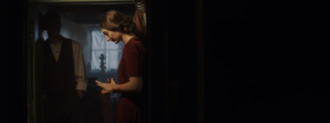
Mixed colour temperatures in “Annabel Lee”

Colour temperature starts with something mysterious called a “black body”, a theoretical object which absorbs all frequencies of electromagnetic radiation and emits it according to Planck’s Law. Put simply, Planck’s Law states that as the temperature of such a body increases, the light which it emits moves toward the blue end of the spectrum. (Remember from chemistry lessons how the tip of the blue flame was the hottest part of the Bunsen Burner?)

Colour temperature is measured in kelvins, a scale of temperature that begins at absolute zero (-273°C), the coldest temperature physically possible in the universe. To convert centigrade to kelvin, simply add 273.

Tungsten bulbs emit an orange light - dim them down and it gets even more orangey.The surface of the sun has a temperature of 5,778K (5,505°C), so it emits a relatively blue light. The filament of a tungsten studio lamp reaches roughly 3,200K (2,927°C), providing more of an orange light. Connect that fixture to a dimmer and bring it down to 50% intensity and you might get a colour temperature of 2,950K, even more orange.

Incandescent lamps and the sun’s surface follow Planck’s Law fairly closely, but not all light sources rely on thermal radiation, and so their colour output is not dependent on temperature alone. This leads us to the concept of “correlated colour temperature”.
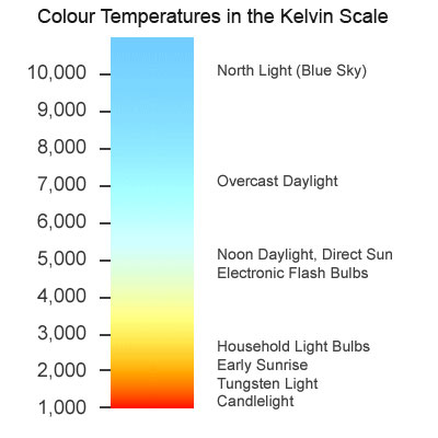
Colour temperature chartThe correlated colour temperature of a source is the temperature which a black body would have to be at in order to emit the same colour of light as that source. For example, the earth’s atmosphere isn’t 7,100K hot, but the light from a clear sky is as blue as a Planckian body glowing at that temperature would be. Therefore a clear blue sky has a correlated colour temperature (CCT) of 7,100K.

LED and fluorescent lights can have their colour cast at least partly defined by CCT, though since CCT is one-dimensional, measuring only the amount of blue versus red, it may give us an incomplete picture. The amounts of green and magenta which LEDs and fluorescents emit varies too, and some parts of the spectrum might be missing altogether, but that’s a whole other can of worms.

The human eye-brain system ignores most differences of colour temperature in daily life, accepting all but the most extreme examples as white light. In professional cinematography, we choose a white balance either to render colours as our eyes perceive them or for creative effect.
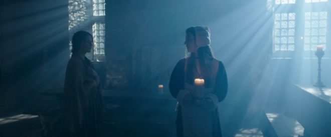
6000K HMI lighting photographed at 3200K to give a moonlight feel to “Heretiks”

Most cameras today have a number of white balance presets, such as tungsten, sunny day and cloudy day, and the options to dial in a numerical colour temperature directly or to tell the camera that what it’s currently looking at (typically a white sheet of paper) is indeed white. These work by applying or reducing gain to the red or blue channels of the electronic image.

Interestingly, this means that all cameras have a “native” white balance, a white balance setting at which the least total gain is applied to the colour channels. Arri quotes 5,600K for the Alexa, and indeed the silicon in all digital sensors is inherently less sensitive to blue light than red, making large amounts of blue gain necessary under tungsten lighting. In an extreme scenario – shooting dark, saturated blues in tungsten mode, for example – this might result in objectionable picture noise, but the vast majority of the time it isn’t an issue.

Left: daylight white balance preset (5,600K). Right: tungsten white balance preset (3,200K)

The difficulty with white balance is mixed lighting. A typical example is a person standing in a room with a window on one side of them and a tungsten lamp on the other. Set your camera’s white balance to daylight (perhaps 5,600K) and the window side of their face looks correct, but the other side looks orange. Change the white balance to tungsten (3,200K) and you will correct that side of the subject’s face, but the daylight side will now look blue.

Throughout much of the history of colour cinematography, this sort of thing was considered to be an error. To correct it, you would add CTB (colour temperature blue) gel to the tungsten lamp or perhaps even place CTO (colour temperature orange) gel over the window. Nowadays, of course, we have bi-colour and RGB LED fixtures whose colour temperature can be instantly changed, but more importantly there has been a shift in taste. We’re no longer tied to making all light look white.
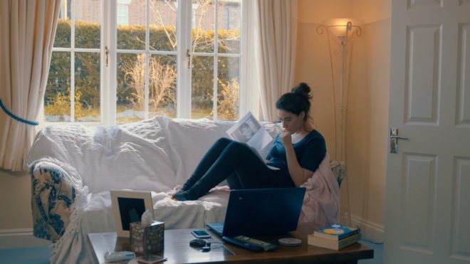
A practical light of the “wrong” colour temperatures in “Finding Hope”

To give just one example, Suzie Lavelle, award-winning DP of Normal People, almost always shoots at 4,300K, halfway between typical tungsten and daylight temperatures. She allows her practical lamps to look warm and cozy, while daylight sources come out as a contrasting blue.

It is important to understand colour temperature as a DP, so that you can plan your lighting set-ups and know what colours will be obtained from different sources. However, the choice of white balance is ultimately a creative one, perhaps made at the monitor, dialling through the kelvins to see what you like, or even changed completely in post-production.

The Art and Science of White Balance

Working with White Walls

White walls are the bane of a DP’s existence. They bounce light around everywhere, killing the mood, and they look cheap and boring in the background of your shot. Nonetheless, with so many contemporary buildings decorated this way, it’s a challenge we all have to face. Today I’m going to look back on two short films I’ve photographed, and explain the different approaches I took to get the white-walled locations looking nice.

Finding Hope is a moving drama about a couple grieving for the baby they have lost. It was shot largely at the home of the producer, Jean Maye, on a Sony FS7 with Sigma and Pentax stills glass.

Exit Eve is a non-linear narrative about the dehumanisation of an au pair by her wealthy employers. With a fairly respectable budget for a short, this production shot in a luxurious Battersea townhouse on an Arri Alexa Classic with Ultra Primes.


“Crown”-inspired colour contrast

Cheap 300W dimmers like these are great for practicals.

It was January 2017 when we made Finding Hope, and I’d recently been watching a lot of The Crown. I liked how that series punctuated its daylight interior frames with pools of orange light from practicals. We couldn’t afford much of a lighting package, and I thought that pairing existing pracs with dimmers and tungsten bulbs would be a cheap and easy way to break up the white walls and bring some warmth – perhaps a visual representation of the titular hope – into the heavy story.

I shot all the daylight interiors at 5600K to get that warmth out of the pracs. Meanwhile I shaped the natural light as far as possible with the existing curtains, and beefed it up with a 1.2K HMI where I could. I used no haze or lens diffusion on the film because I felt it needed the unforgiving edges.

For close-ups, I often cheated the pracs a little closer and tweaked the angle, but I chose not to supplement them with movie lamps. The FS7’s native ISO of 2500 helped a lot, especially in a nighttime scene where the grieving parents finally let each other in. Director Krysten Resnick had decided that there would be tea-lights on the kitchen counter, and I asked art director Justine Arbuthnot to increase the number as much as she dared. They became the key-light, and again I tweaked them around for the close-ups.

My favourite scene in Finding Hope is another nighttime one, in which Crystal Leaity sits at a piano while Kevin Leslie watches from the doorway. I continued the theme of warm practicals, bouncing a bare 100W globe off the wall as Crystal’s key, and shaping the existing hall light with some black wrap, but I alternated that with layers of contrasting blue light: the HMI’s “moonlight” coming in through the window, and the flicker of a TV in the deep background. This latter was a blue-gelled 800W tungsten lamp bounced off a wobbling reflector.

When I saw the finished film, I was very pleased that the colourist had leant into the warm/cool contrast throughout the piece, even teasing it out of the daylight exteriors.


Trapped in a stark white townhouse

I took a different approach to colour in Exit Eve. Director Charlie Parham already knew that he wanted strong red lighting in party scenes, and I felt that this would be most effective if I kept colour out of the lighting elsewhere. As the film approaches its climax, I did start to bring in the orange of outside streetlamps, and glimpses of the party’s red, but otherwise I kept the light stark and white.

Converted from a Victorian schoolhouse, the location had high ceilings, huge windows and multiple floors, so I knew that I would mostly have to live with whatever natural light did or didn’t shine in. We were shooting during the heatwave of 2018, with many long handheld takes following lead actor Thalissa Teixeria from room to room and floor to floor, so even the Alexa’s dynamic range struggled to cope with the variations in light level.

For a night scene in the top floor bedroom, I found that the existing practicals were perfectly placed to provide shape and backlight. I white-balanced to 3600K to keep most of the colour out of them, and rigged black solids behind the camera to prevent the white walls from filling in the shadows.

(Incidentally, the night portions of this sequence were shot as one continuous take, despite comprising two different scenes set months apart. The actors did a quick-change and the bed was redressed by the art department while it was out frame, but sadly this tour de force was chopped up in the final cut.)

I had most control over the lighting when it came to the denouement in the ground floor living area. Here I was inspired by the work of Bradford Young, ASC to backlight the closed blinds (with tungsten units gelled to represent streetlights) and allow the actors inside to go a bit dim and murky. For a key moment we put a red gel on one of the existing spotlights in the living room and let the cast step into it.

So there we have it, two different approaches to lighting in a while-walled location: creating colour contrast with dimmed practicals, or embracing the starkness and saving the colour for dramatic moments. How will you tackle your next magnolia-hued background?

For another example of how I’ve tackled white-walled locations, see my Forever Alone blog.

Working with White Walls

Colour Rendering Index

Many light sources we come across today have a CRI rating. Most of us realise that the higher the number, the better the quality of light, but is it really that simple? What exactly is Colour Rendering Index, how is it measured and can we trust it as cinematographers? Let’s find out.


What is C.R.I.?

CRI was created in 1965 by the CIE – Commission Internationale de l’Eclairage – the same body responsible for the colour-space diagram we met in my post about How Colour Works. The CIE wanted to define a standard method of measuring and rating the colour-rendering properties of light sources, particularly those which don’t emit a full spectrum of light, like fluorescent tubes which were becoming popular in the sixties. The aim was to meet the needs of architects deciding what kind of lighting to install in factories, supermarkets and the like, with little or no thought given to cinematography.

As we saw in How Colour Works, colour is caused by the absorption of certain wavelengths of light by a surface, and the reflection of others. For this to work properly, the light shining on the surface in the first place needs to consist of all the visible wavelengths. The graphs below show that daylight indeed consists of a full spectrum, as does incandescent lighting (e.g. tungsten), although its skew to the red end means that white-balancing is necessary to restore the correct proportions of colours to a photographed image. (See my article on Understanding Colour Temperature.)

Fluorescent and LED sources, however, have huge peaks and troughs in their spectral output, with some wavelengths missing completely. If the wavelengths aren’t there to begin with, they can’t reflect off the subject, so the colour of the subject will look wrong.

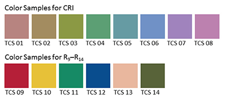
Analysing the spectrum of a light source to produce graphs like this required expensive equipment, so the CIE devised a simpler method of determining CRI, based on how the source reflected off a set of eight colour patches. These patches were murky pastel shades taken from the Munsell colour wheel (see my Colour Schemes post for more on colour wheels). In 2004, six more-saturated patches were added.

The maths which is used to arrive at a CRI value goes right over my head, but the testing process boils down to this:

  1. Illuminate a patch with daylight (if the source being tested has a correlated colour temperature of 5,000K or above) or incandescent light (if below 5,000K).
  2. Compare the colour of the patch to a colour-space CIE diagram and note the coordinates of the corresponding colour on the diagram.
  3. Now illuminate the patch with the source being tested.
  4. Compare the new colour of the patch to the CIE diagram and note the coordinates of the corresponding colour.
  5. Calculate the distance between the two sets of coordinates, i.e. the difference in colour under the two light sources.
  6. Repeat with the remaining patches and calculate the average difference.

Here are a few CRI ratings gleaned from around the web:

Source CRI
Sodium streetlight -44
Standard fluorescent 50-75
Standard LED 83
LitePanels 1×1 LED 90
Arri HMI 90+
Kino Flo 95
Tungsten 100 (maximum)


Problems with C.R.I.

There have been many criticisms of the CRI system. One is that the use of mean averaging results in a lamp with mediocre performance across all the patches scoring the same CRI as a lamp that does terrible rendering of one colour but good rendering of all the others.

Demonstrating the non-continuous spectrum of a fluorescent lamp, versus the continuous spectrum of incandescent, using a prism.

Further criticisms relate to the colour patches themselves. The eight standard patches are low in saturation, making them easier to render accurately than bright colours. An unscrupulous manufacturer could design their lamp to render the test colours well without worrying about the rest of the spectrum.

In practice this all means that CRI ratings sometimes don’t correspond to the evidence of your own eyes. For example, I’d wager that an HMI with a quoted CRI in the low nineties is going to render more natural skin-tones than an LED panel with the same rating.

I prefer to assess the quality of a light source by eye rather than relying on any quoted CRI value. Holding my hand up in front of an LED fixture, I can quickly tell whether the skin tones looks right or not. Unfortunately even this system is flawed.

The fundamental issue is the trichromatic nature of our eyes and of cameras: both work out what colour things are based on sensory input of only red, green and blue. As an analogy, imagine a wall with a number of cracks in it. Imagine that you can only inspect it through an opaque barrier with three slits in it. Through those three slits, the wall may look completely unblemished. The cracks are there, but since they’re not aligned with the slits, you’re not aware of them. And the “slits” of the human eye are not in the same place as the slits of a camera’s sensor, i.e. the respective sensitivities of our long, medium and short cones do not quite match the red, green and blue dyes in the Bayer filters of cameras. Under continuous-spectrum lighting (“smooth wall”) this doesn’t matter, but with non-continuous-spectrum sources (“cracked wall”) it can lead to something looking right to the eye but not on camera, or vice-versa.


Conclusion

Given its age and its intended use, it’s not surprising that CRI is a pretty poor indicator of light quality for a modern DP or gaffer. Various alternative systems exist, including GAI (Gamut Area Index) and TLCI (Television Lighting Consistency Index), the latter similar to CRI but introducing a camera into the process rather than relying solely on human observation. The Academy of Motion Picture Arts and Sciences recently invented a system, Spectral Similarity Index (SSI), which involves measuring the source itself with a spectrometer, rather than reflected light. At the time of writing, however, we are still stuck with CRI as the dominant quantitative measure.

So what is the solution? Test, test, test. Take your chosen camera and lens system and shoot some footage with the fixtures in question. For the moment at least, that is the only way to really know what kind of light you’re getting.

SaveSave

SaveSaveSaveSave

SaveSave

SaveSave

SaveSave

SaveSave

SaveSave

SaveSave

SaveSave

SaveSave

Colour Rendering Index

Colour Schemes

Last week I looked at the science of colour: what it is, how our eyes see it, and how cameras see and process it. Now I’m going to look at colour theory – that is, schemes of mixing colours to produce aesthetically pleasing results.


The Colour wheel

The first colour wheel was drawn by Sir Isaac Newton in 1704, and it’s a precursor of the CIE diagram we met last week. It’s a method of arranging hues so that useful relationships between them – like primaries and secondaries, and the schemes we’ll cover below – can be understood. As we know from last week, colour is in reality a linear spectrum which we humans perceive by deducing it from the amounts of light triggering our red, green and blue cones, but certain quirks of our visual system make a wheel in many ways a more useful arrangement of the colours than a linear spectrum.

One of these quirks is that our long (red) cones, although having peak sensitivity to red light, have a smaller peak in sensitivity at the opposite (violet) end of the spectrum. This may be what causes our perception of colour to “wrap around”.

Another quirk is in the way that colour information is encoded in the retina before being piped along the optic nerve to the brain. Rather than producing red, green and blue signals, the retina compares the levels of red to green, and of blue to yellow (the sum of red and green cones), and sends these colour opponency channels along with a luminance channel to the brain.

You can test these opposites yourself by staring at a solid block of one of the colours for around 30 seconds and then looking at something white. The white will initially take on the opposing colour, so if you stared at red then you will see green.

Hering’s colour wheels

19th century physiologist Ewald Hering was the first to theorise about this colour opponency, and he designed his own colour wheel to match it, having red/green on the vertical axis and blue/yellow on the horizontal.

RGB colour wheel

Today we are more familiar with the RGB colour wheel, which spaces red, green and blue equally around the circle. But both wheels – the first dealing with colour perception in the eye-brain system, and the second dealing with colour representation on an RGB screen – are relevant to cinematography.

On both wheels, colours directly opposite each other are considered to cancel each other out. (In RGB they make white when combined.) These pairs are known as complementary colours.


Complementary

A complementary scheme provides maximum colour contrast, each of the two hues making the other more vibrant. Take “The Snail” by modernist French artist Henri Matisse, which you can currently see at the Tate Modern; Matisse placed complementary colours next to each other to make them all pop.

“The Snail” by Henri Matisse (1953)

In cinematography, a single pair of complementary colours is often used, for example the yellows and blues of Aliens‘ power loader scene:

“Aliens” DP: Adrian Biddle, BSC

Or this scene from Life on Mars which I covered on my YouTube show Lighting I Like:

I frequently use a blue/orange colour scheme, because it’s the natural result of mixing tungsten with cool daylight or “moonlight”.

“The First Musketeer”, DP: Neil Oseman

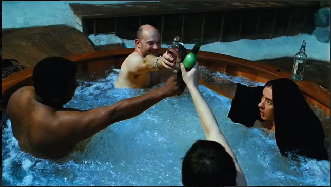
And then of course there’s the orange-and-teal grading so common in Hollywood:

“Hot Tub Time Machine” DP: Jack N. Green, ASC

Amélie uses a less common complementary pairing of red and green:

“Amélie” DP: Bruno Belbonnel, AFC, ASC


Analogous

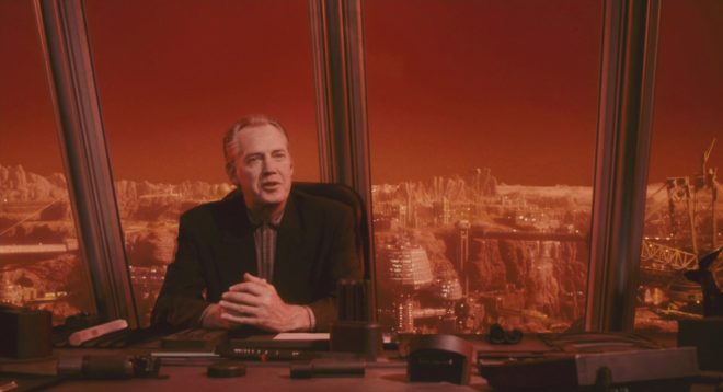
An analogous colour scheme uses hues adjacent to each other on the wheel. It lacks the punch and vibrancy of a complementary scheme, instead having a harmonious, unifying effect. In the examples below it seems to enhance the single-mindedness of the characters. Sometimes filmmakers push analogous colours to the extreme of using literally just one hue, at which point it is technically monochrome.

“The Matrix” DP: Bill Pope, ASC
“Terminator 2: Judgment Day” DP: Adam Greenberg, ASC
“The Double” DP: Erik Alexander Wilson
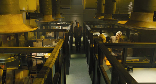
“Total Recall” (1990) DP: Jost Vacano, ASC, BVK


There are other colour schemes, such as triadic, but complementary and analogous colours are by far the most common in cinematography. In a future post I’ll look at the psychological effects of individual colours and how they can be used to enhance the themes and emotions of a film.

SaveSave

Colour Schemes

Know Your Lamps: Overview

Welcome to the first in a series of posts looking at the many types of lighting instruments in use on film and TV sets today. This is not intended to be an exhaustive or comprehensive list, but it will give you a good idea of your options, particularly if you’re moving up from smaller productions – where lighting kit is mostly borrowed – to larger ones, where you’re required to submit a lighting list to a rental house.

Some of the key considerations when choosing a lamp are:

  • Colour temperature – how orange or blue the light appears – see this post for more info
  • CRI – Colour Rendering Index – how full a spectrum of light is emitted, and therefore how accurately colours are rendered
  • Light quality – how hard or soft the light is
  • Power consumption
  • Hire cost

Lamps can be divided into categories according to the means by which they produce light. Here is an overview of the main types.


Redheads draw 800W each

Incandescent (view detailed post)

Incandescent lamps work by passing electrical current through a wire filament which becomes so hot that it glows. In the film industry they are generally referred to as ‘tungsten‘ units after the metal which the filament is made from. Common tungsten lamps include Dedolites, 1K ‘babies’ and open-face 800W and 2KW units (which have misogynous nicknames I shall not repeat here).

Pros: cheap, dimmable, extremely high CRI

Cons: very inefficient, get very hot, colour temperature changes when dimmed

Colour temperature: 3,200K

Light quality: generally hard (although certain units like Space Lights are softer)


HMI fresnel

HMI (view detailed post)

The HMI (hydragyrum medium-arc iodide) is the most common form of high intensity discharge lamp used in the industry. It operates by creating an electrical arc between two electrodes which excites a gas. You may occasionally hear about an MSR (medium source rare-earth), which is slightly different technology, but as far as a cinematographer is concerned MSRs and HMIs are the same. They require a ballast to ignite the arc and regulate the current and voltage.

Pros: good CRI, good match for daylight, efficient

Cons: only dimmable down to 50%, expensive, heads and ballasts sometimes hum or ‘squeal’, older bulbs can vary in colour, flicker issues at certain shutter angles with magnetic ballasts

Colour temperature: 5,600K

Light quality: hard


Kino4x4Fluorescent (view detailed post)

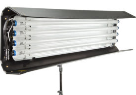
Fluorescent lamps are found almost everywhere today, as strip lights in supermarkets and offices, and energy-saver bulbs in the home. Similar in principle to HMIs, electric current causes mercury vapour to emit UV light which is translated into the visible spectrum by the phosphor coating on the tube. Kino Flo pretty much has the monopoly on fluorescent lighting for the film industry. Like HMIs, fluorescents require a ballast.

Pros: reasonable CRI from Kino Flos (appalling CRI from domestic/commercial fixtures), very efficient, get warm but not hot

Cons: limited dimming, high fall-off of light

Colour temperature: 5,500K and 3,200K tubes available

Light quality: soft


LED copyLED (view detailed post)

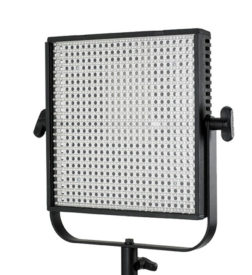
Gradually replacing tungsten as the most common lamps found on no-budget shoots, LED (light emitting diode) units contain semi-conductors that emit light when their electrons reconfigure. The technology is advancing rapidly, but there is currently a wide range of LED lamps on the market, varying greatly in price and corresponding quality.

Pros: extremely efficient, barely get warm, can run off batteries, almost fully dimmable, some models have adjustable colour temperature

Cons: CRI ranges from almost acceptable in the expensive models to downright shocking in the cheaper ones

Colour temperature: varies

Light quality: varies


Though there are other types of lighting, like xenon, metal-halide and HEP (high efficiency plasma), the above four are the main ones you will encounter on film and TV sets today. Over the next few weeks I’ll look at each of those types in more detail, listing many of the specific units available in each category and their applications.

By the way, if your budget is too tight to hire film lamps of any kind, you may want to check out my post on lighting without movie lamps.

Know Your Lamps: Overview

Period Cinematography

White "daylight" (a 2.5K HMI outside the window and a Kinolfo Barfly behind the actor) and warm "candlelight" (a Dedolight off camera right)
White “daylight” (a 2.5K HMI outside the window and a Kinolfo Barfly behind the actor) and warm “candlelight” (a Dedolight off camera right)

The First Musketeer was my first period production as DP. It’s a genre that brings its own set of challenges and opportunities, most obviously for sets and costumes, and also sound (we spent a lot of time waiting for cars and planes to pass by), but for cinematography too. The first thing that hit me was the restrictiveness of it. Back in the day there were only three sources of light: the sun, the moon and fire. And maybe, at a pinch, starlight.

Blue "moonlight" and orange "firelight" - in this case both created by gelled Dedolights
Paul McMaster as Ghislain. Blue “moonlight” and orange “firelight” – in this case both created by gelled Dedolights

I kept colour temperatures simple by deciding that daylight would always appear white, moonlight would be +2,400K (blue) and firelight would be -2,400K (orange). In practice this meant that daylight scenes were white-balanced at 5,600K using natural light, HMIs and kinoflos, with ungelled redheads or dedos for candlelight, while night scenes were typically white-balanced at 3,200K which turned HMIs and kinos blue for moonlight/starlight, with redheads or dedos gelled with full CTO to turn them orange on camera.

This night exterior shot of Lazare (Tony Sams) and Athos (Edward Mitchell) was shot with a white balance of 3,200K, turning the HMI backlight blue, while the warm light around the taven entrance was provided by CTO-gelled Dedos and redheads.
This night exterior shot of Lazare (Tony Sams) and Athos (Edward Mitchell) was shot with a white balance of 3,200K, turning the HMI backlight blue, while the warm light around the tavern entrance was provided by CTO-gelled dedos and redheads.

Occasionally I used straw gels to give “firelight” more of a yellow hue than an orange one, and in one scene involving a church I introduced strongly yellow light and some pink backlight, the theory being that stained glass windows could be held accountable.

A 2.5K provides the frontal keylight here, while a redhead sporting Minus Green gel provides the pink backlight. A second redhead double-gelled with Light Straw uplights the figure of Christ on the back wall, and finally a 1.2K HMI at the rear of the building illuminates the stained glass window.

I think it’s very important to soften the images when shooting a period piece digitally. Initially we hoped to do this by using Cooke lenses, but they proved unobtainable on our budget. It was too late to look into filters by this point, so instead I relied on smoke in most scenes to diffuse and age the image.

Like everyone, I continue to learn with every project that I do. Reviewing the rushes towards the end of the shoot, I realised (a little too late) that texture was the key to making the period convincing. There was bags of it in front of me – in the stone walls of the locations, in the beautifully-aged costumes, in the detailed set dressing. It was an era before smooth surfaces. I can now see that my cinematography was most successful when the lighting brought the textures out.

A 1.2K HMI outside the door cross-lights the stonework, while smoke volumizes this light, resulting in a very satisfying depth and texture. The only other light sources are two kinoflo Barflies hanging from polecats above the bench at the back of shot. This backlight is reflected back at the foreground characters by a sheet of silver foamcore beneath the camera.
A 1.2K HMI outside the door cross-lights the stonework, while smoke volumizes this light, resulting in a very satisfying depth and texture. The only other light sources are two Kinoflo Barflies hanging from polecats above the bench at the back of shot. This backlight is reflected back at the foreground characters by a sheet of silver foamcore beneath the camera.

Contrast the shot above with the one below. This location had equally nice stonework, but because I didn’t cross-light it it looks flat and artificial, like a cheap panto set.

A 2.5K HMI supplies the backlight here, while a blue-gelled redhead out of the top right of frame is aimed down the steps to pick out the characters as they descend. An orange-gelled Dedo creates a pool of light around the candle, and everything else is natural bounce off the surrounding stonework. A second blue-gelled redhead at the foot of the stairs firing across the stonework would have made all the difference to the believability of the environment, but hindsight is 20/20.
A 2.5K HMI supplies the backlight here, while a blue-gelled redhead out of the top right of frame is aimed down the steps to pick out the characters as they descend. An orange-gelled Dedo creates a pool of light around the candle, and everything else is natural bounce off the surrounding walls. A second blue-gelled redhead at the foot of the stairs firing across the stonework would have made all the difference to the believability of the environment, but hindsight is 20/20.

So that’s an important lesson I’ve learnt to take forward to the next season. Next time around I also want to play more with different colours of daylight, using more straw, amber and pink gels to stretch out the colour palette and suggest different times of day.

And then there’s the whole candlelight thing – but I’ll save that for my next post.

All images copyright 2013 The First Musketeer. Find out more about the series at www.firstmusketeer.com

Period Cinematography