Mixing Amelia’s Letter

IMG_1841
Nico Metten works on the mix of Amelia’s Letter

Yesterday I attended the final sound mix for Amelia’s Letter, the short supernatural drama I directed last year for writer Steve Deery and producer Sophia Ramcharan. This is always one of my favourite parts of the filmmaking process; all the hard work of generating the material is done, and it’s just about arranging those materials in the right proportions to create a whole larger than the sum of its parts.

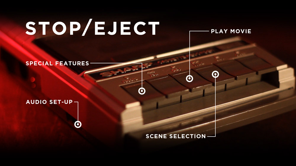
Mixing is harder the more tracks of sound you have. It took Neil Douek and I forever to wrangle the layers and layers of audio I’d laid into a decent mix for Soul Searcher (listen to a breakdown here), and The Dark Side of the Earth‘s pilot was a delicate balancing act with swordfight SFX, dialogue and a big orchestral score all going on at the same time (watch an interview with the mixer here). Stop/Eject, being quieter and less complex, was a breeze to mix (read the blog post here).

Amelia’s Letter was a little more complex than Stop/Eject, but not much. It was my third collaboration with gifted sound designer Henning Knoepfel, and my fourth with the equally gifted composer Scott Benzie, who both gave us excellent material to work with. In the pilot’s seat for the mix was Nico Metten of Picture Sound. Although I hadn’t worked with him before, he was very much in tune with what I wanted from the mix. In a nutshell, the brief was: make it scary.

If Amelia’s Letter succeeds, and I think it does, it should be by turns unnervingly scary and heart-breakingly sad. I did research the horror genre when I embarked on the project, but for the latter stages of preproduction and during the shoot (basically, whenever I was dealing with the actors) the important thing was that the characters worked and were empathetic; the sadness would naturally follow. I tried to avoid thinking of the film in horror terms at all during that stage.

Recording one last sound effect...
Recording one last sound effect…

But once we got to post, it was time to start thinking about creeping out the audience, and downright scaring them. As the last stage in the audio chain, the mix needed to play a big part in this. Nico agreed, and had already added some extra creepy sounds by the time I arrived. As we went through, we added in more impacts to the jumpy moments, not forgetting to keep things quiet in the run-up to those moments to make them seem even louder by comparison.

Just as, during the picture edit, Tristan and I had been reminded of the power of NOT cutting, during the sound mix I was reminded of the power of subtracting sound, rather than always adding it. In a couple of key places we discovered that muting the first few bars of a music cue to let the SFX do the job made for much more impact when the music did come in.

But the mix wasn’t just about making it scary. The film climaxes with a sequence of flashbacks and revelations that was tricky to edit and still wasn’t quite doing what I wanted. It was only at the scoring and mixing stage that I was finally able to realise that a clear transition was needed halfway through the sequence; as I said to Nico, “At this point it needs to stop being scary and become sad.” In practice this meant dropping out the dissonant sounds and the ominous rumbling, even dropping out the ambience, and letting Scott’s beautifully sad music carry the rest of the scene.

It never ceases to amaze me how the story shines through in the end. You hack away at this lump of stone all through production and post, and at the end you’ve revealed a sculpture that – though in detail it may be different – follows all the important lines of the writer’s original blueprint.
Now begins the process of entering Amelia’s Letter into festivals…

Amelia’s Letter is a Stella Vision production in association with Pondweed Productions. Find out more at facebook.com/ameliasletter

Mixing Amelia’s Letter

Amelia’s Letter: The Edit Continues

Tristan, Steve and insufficient chairs.

A week after the test screening, I sat down with editor Tristan Ofield in a corner of Steve Deery’s book depot to take a final pass at Amelia’s Letter. Steve balanced on a pile of boxes beside us. Who says exec producers get all the luxury?

The main aim of the day was to make the film clearer. This became a fascinating exercise with notes from the test screening like, “I didn’t get that Barbara was a writer,” although she spends most of her screen-time sitting at a typewriter. How could we configure these images to more effectively tell the audience that Barbara is a writer, without the benefit of dialogue or ridiculous captions? And without showing her actually writing, because the whole crux of the film is that she’s suffering from writer’s block – and that needs to come across too. How? By really getting into the nuts and bolts of how motion picture editing tells a story, that’s how.

The previous evening I’d been watching 2 Reel Guys, a YouTube series about the creative filmmaking process. It’s incredibly cheesy, and a little bit soporific, but it does make some excellent points. Like how just two different shots can be edited together in three different ways for very different effects.

So how did we make it clearer that Barbara was a writer suffering from block? First, Tristan altered the scene to open on a shot of Barbara standing thoughtfully over the typewriter, with the machine dominant in frame. He held the shot for quite a while to let the audience take it all in. “A reminder of the power of not cutting,” he pointed out.

The Letter of Undue Importance

The second step was for us to really consider when to cut to the keyboard, or to the blank paper. The scene’s previous iteration had started on the blank paper, but I think that image failed to sink in for viewers, who were too busy trying to work out where they were and what was going on. Moving it later in the scene made it much more powerful.

It was also important not to cut to something else at the wrong time. There was a cutaway of a letter that had to be included somewhere for plot reasons, but I was convinced that if we showed that immediately before the typewriter CU then we would be telling the audience that Barbara was trying to compose a reply to the letter. Context is everything in editing. Put a different shot before or after a certain shot and you can completely change the meaning of that shot. By cutting to the letter as Barbara puts a teacup down next to it, Tristan was able to avoid it gaining undue importance.

Tristan's got one of those proper, colour-coded editing keyboards. Cool.
Tristan’s got one of those proper, colour-coded editing keyboards. Cool.

Another big lesson/reminder of the day was: less is more. I had been feeling for a while that Amelia’s Letter had one too many layers of supernatural mystery. Would the film be clearer if one was removed?

Steve was sceptical, and understandably so. No writer loves having chunks of their material hacked out. But to his credit, he let Tristan and I try it. After watching this revised version through, all three of us were convinced it was the right decision. Everything else in the film had become stronger because this one thread had been removed. Minor characters gained more importance because they weren’t competing with the removed element, and major characters’ challenges and emotions shone through more clearly. And the audience would have a much better chance of solving the film’s two remaining mysteries without scatching their heads over the third one too.

At the end of the day, we left greatly satisfied with what we had accomplished. Soon Amelia’s Letter will enter the next phase of postproduction: sound design, music composition, grading and visual effects. Stay tuned.

Amelia’s Letter is written by Steven Deery, directed by me and produced by Sophia Ramcharan of Stella Vision Productions. Visit the Amelia’s Letter Facebook page.

Amelia’s Letter: The Edit Continues

The Visual Effects of The Abyss

It’s time for one of my occasional asides celebrating the world of traditional visual effects – miniatures, matte paintings, rear projection, stop motion and the like. For a film using all of those techniques, look no further than The Abyss (1989). Arguably James Cameron’s most underrated film, it can also be considered his most ambitious. Whereas Terminator 2 had bigger action scenes, Titanic had a bigger set and Avatar had more cutting edge technology, these concerns all pale in comparison to the sheer difficulty of shooting so much material underwater.

The hour-long documentary Under Pressure makes the risks and challenges faced by Cameron and his crew very clear.

The Abyss won an Oscar for Best Visual Effects, and is remembered chiefly for the then-cutting-edge CG water tentacle. But it also ran the gamut of traditional effects techniques.

The film follows the crew of an experimental underwater drilling platform, led by Bud (Ed Harris), as they are roped into helping a team of navy divers, led by Lt. Coffey (Michael Biehn), investigate the sinking of a submarine. Underwater-dwelling aliens and cold war tensions become involved, and soon an unhinged Coffey is setting off in a submersible to dispatch a nuke to the bottom of the Cayman Trench and blow up the extra-terrestrials.

When Bud and his wife Lindsey (Mary Elizabeth Mastrantonio) give chase in a second submersible, a visual effects tour de force ensues. The following methods were used to build the sequence:

abyss1

  • Medium-wide shots of the actors in real submersibles shot in an abandoned power station that had been converted by the production into the world’s largest fresh-water filtered tank, equal in capacity to about eleven Olympic swimming pools.

abyss2

  • Close-ups of the actors in a submersible mock-up on stage.

abyss3

  • Over-the-shoulder shots of the actors in the submersible mock-up, with a rear projection screen  outside the craft’s dome, showing miniature footage accomplished with….

abyss4

  • Quarter-scale radio-controlled submarines, shot in a smaller tank. These miniatures were remarkably powerful and, due to the lights and batteries on board, weighed around 450lb (204kg). In order to see what they were doing, the operators were underwater as well, using sealed waterproof joysticks to direct the craft. The RC miniatures were used when the craft needed to collide with each other, or with the underwater landscape, and whenever the audience was not going to get a good look at the domes on the front of the submersibles and notice the lack of actors within.

abyss5

  • One of the custom film projectors inserted into the miniature subs
    One of the custom film projectors inserted into the miniature subs

    Where a more controlled camera move was required, or the actors needed to be visible inside the subs, but it was not practical to shoot full-scale, motion control was used. This is the same technique used to shoot spaceships in, for example, the original Star Wars trilogy. A computer-controlled camera moves around a static model (or vice versa), exposing film very slowly in order to maintain a large depth of field. The move is repeated several times for each different vehicle under different lighting conditions, before compositing all of the “passes” together on the optical printer in the desired ratios, to achieve the final look. For The Abyss’s motion control work, the illusion of being underwater was created with smoke. In shots featuring the submersibles’ robot arms, stop motion was employed to animate these appendages. But perhaps the neatest trick was in making the miniature subs appear to be inhabited; the models were fitted with tiny projectors which would throw pre-filmed footage of the actors onto a circular screen behind the dome.

The sub chase demonstrates perfectly how visual effects should work: mixing a range of techniques so that the audience never has time to figure out how each one is done, and using an appropriate technique for each individual shot so that you’re making things no more and no less complicated than necessary to tell that little piece of the story.

My favourite effect in the sequence is near the end, when the dome of Coffey’s sub cracks under the water pressure. This was filmed over-the-shoulder using rear projection for the view outside of the dome. But the dome was taken from a real submersible, and as such was too thick and too valuable to be genuinely cracked. So someone, and whoever he or she is is an absolute genius, came up with the idea of using an arrangement of backlit sellotape on the dome to create the appearance of a crack. A flag was then set in front of the backlight, rendering the sellotape invisible. On cue, the flag was slid aside, gradually illuminating the “crack”.

crack

Now that, my friends, is thinking outside the box.

The Visual Effects of The Abyss

24fps or 25fps?

Menu

It’s a common dilemma in the UK for filmmakers: do you shoot at 24 or 25 frames per second? Until a couple of years ago, I would have said 25 every time, but with DCPs and Blu-rays now about, and most TVs capable of handling a range of frame rates, the answer is not so clear-cut. Unlike aspect ratio or shooting format, the decision has no discernible creative impact on your project, merely a technical one. And it’s so easy to convert between the two that it often feels like it makes no odds. Nonetheless, to help anyone on the horns on this dilemma, here’s my round-up of the respective advantages of each frame rate.

The Case for 25fps

  • If you need to record to any kind of tape format at any point in your process, 25fps is what you need.
  • The same goes for PAL DVDs.
  • If your film is going to be broadcast on UK TV, it will be transmitted at 25fps.
  • Since your camera’s running in sync with the UK mains supply’s alternating current, you don’t need flicker-free ballasts for your HMIs. Having said that, pretty much every time I’ve hired an HMI, it’s come with a flicker-free ballast as standard anyway.
  • If you’ve made a 25fps feature film that isn’t quite long enough for distributors to classify it as a feature, the extra running time you squeeze from exhibiting it at 24fps might make the difference.

The Case for 24fps

  • For maximum compatibility, Digital Cinema Packages should be authored at 24fps.
  • The same goes for Blu-rays. (Blu-rays do not technically support 25P, but they support 50i, which can contain progressive 25fps content. However, discs authored to the 50i spec apparently will not play on most US machines.)
  • If you shoot at 24fps and need to convert to 25fps for any reason, your film will become 4% shorter, making it that extra bit pacier and able to squeeze into a shorter slot at a film festival.
  • If shooting on film, your postproduction facilities will be much more comfortable with 24fps material. We really freaked out our lab on The Dark Side of the Earth by shooting 25.
  • Many traditional film projectors will only run at 24fps.

Can you think of any other factors that I’ve missed?

I’d say the balance has tipped in favour of 24fps. However, I think you’ll find that many people in the UK (outside of the celluloid world) are still more comfortable with 25…. for now.

24fps or 25fps?

Soul Searcher: Low Tech FX

In this 2005 featurette I break down many of the visual effects in my feature film Soul Searcher, revealing how they were created using old school techniques, like pouring milk into a fishtank for apocalyptic clouds. Watch the shots being built up layer by layer, starting with mundane elements like the water from a kitchen tap or drinking straws stuck to a piece of cardboard.

Soul Searcher: Low Tech FX

What to Look For in a Distribution Contract

Should you sign?
Should you sign?

What follows should not be construed as legal advice, and you should ALWAYS get legal advice before signing a contract. However, if you’ve been offered your first distribution deal and money is tight, these basic tips might help you reach a rough understanding of what exactly is on the table before you splash out on a solicitor.

rAs an example I’m going to use one of the contracts I was offered for my feature Soul Searcher, but not the one I signed.

Download the contract (PDF, 143KB) – I cannot be held responsible for any losses arising from the use of this contract or the following blog post.

Grant of Rights

Producer hereby grants to Distributor, with respect to the Term and the Territory set out below, the exclusive distribution and exhibition rights in all media now known or devised later including, but not limited to Theatrical, and Non Theatrical rights, Video/DVD rights, rights pertaining to all forms of Television syndicated or non syndicated, ancillary rights, and all kinds of internet rights pertaining to the feature film entitled “SOUL SEARCHER” (the “Picture”) a film by Neil Oseman, shot in Mini DV.

Territory: The World excluding U.K.

Term: Commencing immediately and expiring 25 years from the Date of Complete Delivery.

First of all check out the TERRITORY and MEDIA, i.e. what countries are you allowing the sales agent to distribute the film in and in what form (theatrical, DVD, TV, VOD…), but be aware that just because the contract grants them the right to release your film in cinemas, for example, it doesn’t mean they are under any obligation to do that. Also check out the TERM – how long will they get these rights for? The 25 year term in this contract is unusually long; five would be more typical.

Minimum Guarantee (“ Advance”)

Distributor agrees to pay Producer Fifteen thousand dollars ($15,000.00 USD) as a Minimum Guarantee of Producer’s share of Gross Receipts payable 20% on signing of this agreement and approval of Chain of title. The remaining 80% balance will be on complete delivery and acceptance, in terms of technical specifications, of all the items noted under Schedule “ A”. 

This contract offers an ADVANCE – meaning that they pay you upfront, later recouping this advance out of the profits. But if your film doesn’t make any profits you’ve still got the advance. This is a great deal for a low budget filmmaker.

Distribution Fees, Expenses and Reporting

Distributor shall be entitled to a distribution fee of 25% of gross receipts net of withholding tax from exploitation of the Rights. 

The crux of the contract is the PERCENTAGE of any earnings that the sales agent will pass on to you the producer, the higher the better. Here they are proposing to take 25%. That leaves 75% for me –  pretty good, huh? But wait….

Distributor shall also be entitled to distribution expenses to a maximum cap of U.S. $ 75,000.00 excluding deliverables, unless additional expenses are approved in writing by Producer, which approval will not be unreasonably withheld (“Distribution Expenses”). Distribution Expenses mean out-of-pocket costs incurred by the Distributor, directly or indirectly, in specific connection with distribution, promotion, and marketing of the Picture including any costs which can reasonably and proportionately be allocated to the Picture in accordance with normal accounting practices of the motion picture industry.

Gross receipts shall be disbursed in the following order: (1) Distributor’s fee (2) To recoup Distributor’s costs for creating or correcting any deficient materials as set forth above (3) Distribution Expenses (4) Balance to Producer

Check out that last paragraph. When the money comes in, the sales agent creams off their 25%, then they recoup any costs in correcting the delivery materials (more on that later), then they recoup their EXPENSES, and only then does the producer get what’s left of the pie. So they can swan off to Cannes, Berlin, the American Film Market and so on, to promote their catalogue of films, and take the cost of all their lunches and air fares and slap-up dinners out of the profits before the producers of those films get to see a penny.

You should look for an EXPENSES CAP in the contract, limiting the amount the sales agent can claim out of the profits before they’re passed to you. Here it’s $75,000. The chances of a microbudget film ever making more than that are extremely slim. Result? You never see any money (except the advance, if you’re lucky enough to have been offered one).

Representations and Warranties

Producer warrants, represents and agrees that it is the holder of the copyright, and has the right to convey all of the rights, licenses and privileges granted herein; that it has not entered and will not enter into any agreement, commitment, arrangement or other grant of rights competing with, interfering with, affecting or diminishing any of the rights and licenses granted herein, and that the Picture, insofar as the Rights granted herein are concerned, are free and clear of any encumbrance and do not infringe upon the rights of any party or parties whomsoever. 

If you sign this contract, what you’re saying via the paragraph above is that you haven’t already sold the rights to anyone else and that your film doesn’t infringe anyone else’s copyright. You’re WARRANTING that you’ve cleared all the music and branding that appears in your film. You got Apple’s permission to show that logo on the iPhone your lead character’s always using, right? And you got WHSmith’s permission to have their shopfront in the background of that highstreet scene?

Now we come to the reason I didn’t sign this contract: the DELIVERY MATERIALS, the list of which occupies five full pages of this contract, so check out the PDF download above to see them.

When you sell a film, you can’t just hand over one master copy of it. The sales agent wants all kinds of different versions – eleven different submasters in this contract, plus all the film elements (those would have been expensive – I didn’t shoot on film!), sound elements, press kits…. And then the documents. Some of the things listed on pages eight and nine (especially the E&O insurance) are serious legal documents that could have cost thousands of pounds to have drawn up. The delivery materials could easily have eaten up the whole $15,000 advance and might even have cost more than the whole production budget of the film. I recommend getting quotes for all delivery materials before signing any distribution deal.

I hope this has given you some idea of what to look for, but let me say again, GET PROFESSIONAL LEGAL ADVICE BEFORE YOU SIGN ANYTHING!

What to Look For in a Distribution Contract

Making a Digital Cinema Package

The finished Stop/Eject DCP. Not as cool as a roll of 35mm.

Now that huge reels of 35mm film are all but obsolete, Digital Cinema Packages (DCPs) are the new means of getting a film to a cinema. Many top film festivals will only screen off a DCP or 35mm print, and in terms of picture and sound quality and compatibility it is your best option for screening at theatrical venues in general. Much has been written about how you can make a DCP at home for nothing, but having just gone through the process myself for Stop/Eject I’m going to round up some of the best sources of information I came across and enlarge on the area of disc formatting which hasn’t been too well covered elsewhere.

To ensure maximum compatibility of your DCP you need to:

  • convert your film to 24fps if it isn’t already at that frame rate
  • use a standard 2K aspect ratio, 2048×1080 or 2048×858
  • put it on a disc that is EXT3 formatted
  • supply that disc in a Cru Dataport DX-115

I’ve spoken to filmmakers who have ignored many or all of the above and still run their DCPs successfully in cinemas, but I decided to play it safe and do all of the above, except the Cru Dataport, which was a little too expensive. Instead I bought a 500GB LaCie Rugged USB drive and put my DCP on there. Read Knut Erik Evensen’s excellent blog post on DCP delivery for more info on Dataports and USB compatibility.

The formatted drive as seen in Ubuntu, with the DCP files copied over
Step 5: the formatted drive as seen in Ubuntu, with the DCP files copied over

So, here is the process I went through. I was starting out with 25,409 uncompressed 16-bit TIFF files representing each individual frame of Stop/Eject, and six mono 24-bit linear PCM WAV files for the 5.1 surround soundtrack. The TIFFs were in 1080P (1920×1080) letterboxed to an aspect ratio of 2.35:1.

  1. First of all I used Photoshop to batch convert all the TIFFs to the 2048×858 aspect ratio. This is actually 2.39:1 rather than the 2.35:1, so it meant cropping a sliver of the actual picture off the top and bottom, not just the black bars, as well as enlarging the picture slightly. It took my poor iMac about 12 hours to convert the 25,409 frames. I’m sure there’s quicker batch conversion software out there than Photoshop if you hunt around though.
  2. Next I used a free piece of audio software called Audacity to slow down each of the six audio files by 4% so that they will match the images when they run at 24fps. (Stop/Eject was shot and edited at 25fps.) Thanks to Matt Cameron’s blog for this tip.
  3. Then I downloaded and ran OpenDCP, the brilliant free software that actually creates the Digital Cinema Package for you. It’s very simple to use, but check out the help Wiki and Danny Lacey’s seminal blog post to guide you through it. The end result was six files: four XML files and two MXF files, one for sound and one for picture. Encoding at the default bitrate of 125mb/s, which the Wiki says is more than good enough for 2K at 24fps, Stop/Eject’s DCP was just under 17GB, so about 1GB per minute.
  4. Now the tricky bit – copying those six files onto an EXT3 formatted drive. EXT3 is a Linux file system, and is not supported by MacOS. So I downloaded Ubuntu, a free operating system which does support it. (Choose the 64-bit download unless you have quite an old computer.) The downloaded file is a disc image (.ISO) which you can burn to DVD using Disk Utlity (found in the utilities sub-folder of MacOS’s Applications folder). Then restart your Mac, with the DVD still in the drive, and hold down C when you hear the chimes. This will boot up your Mac in the Ubuntu operating system. (You can release C when you see the black screen and Ubuntu logo.)
  5. Once Ubuntu was running, I right-clicked the LaCie Rugged in the list of drives in the lower left of the desktop and chose format from the contextual menu. To get more than the default options, I clicked Disk Utility in the dialogue box that came up. I could now select EXT3 as the file system (leaving the other settings at their default values). When I clicked format, Ubuntu didn’t seem to be doing anything, but after a few minutes the Disk Utility showed that the volume had been created. I could then close the Disk Utility, and drag and drop the six DCP files from another hard drive (MacOS formatted) onto my newly EXT3 formatted LaCie. Apparently you can put these files inside a folder if you want, but again to be extra safe I put them in the root directory.

After completing the DCP I took it to the Courtyard, my local arts centre, where head projectionist Simon Nicholls was kind enough to let me test it. To my very pleasant surprise it worked perfectly, uploading at about real time via the Doremi server’s USB 2 socket and playing shortly afterwards with superb sound and picture quality. Much as I love celluloid, the ease and cheapness of this process are breathtaking, the purchase of the hard drive being the only cost. I’ll let you know how I get on running it at other cinemas.

Making a Digital Cinema Package

How to Create a Blu-ray Motion Menu in Adobe Encore

Today I thought I’d share the process I figured out for creating looping menus in Encore for DVD and Blu-ray. If, like me, you want to do it all from scratch rather than using any of the built-in templates, the process isn’t particularly intuitive, and was sufficiently different from DVD Studio Pro (the software I’m used to) to leave me scratching my head from time to time, but here’s how I did it in the end. I’ll use Stop/Eject‘s main menu as the example. I’m going to assume you already know the basics of Encore and can find your way around Photoshop.

First of all you have to understand how DVDs and Blu-rays (henceforth collectively referred to simply as “discs”) work. They’re not like websites or Flash movies where you can do anything you want; the specifications are quite narrow. A motion menu consists of two elements:

  1. The background, which is a video (typically with audio) that you can create in Final Cut Pro, Premiere, or whatever.
  2. The button highlights, which show the user which button is currently selected. The user will only ever see one of these at a time.

Hang on – background, button hightlights…. but what about the buttons themselves? These have to be part of the background. Yes, you can import your background movie as a Quicktime into Encore and then add buttons to it within Encore, but when you come to build your disc the software will render those buttons into the background movie. All the disc player can deal with is a background movie and the highlights.

I prefer to build my buttons into the background movie in my editing software (Final Cut) rather than add them in Encore, and that’s the approach I’ll outline here.

Another crucial point to understand is that each button highlight can only be one colour. So look at the Stop/Eject main menu below. The button highlights are the white rings. They could not be red-and-white striped rings, like life preservers; they can only be one solid colour.

Stop/Eject's main menu with all the button highlights visible
Stop/Eject’s main menu with all the button highlights visible

So, now you appreciate all of the above you can get started on your menu. The first step for me was shooting and editing the background movie, although for most people this will be a computer-generated graphic rather than something shot with a camera. It’s important to think about where your loop point is going to be so that the menu will loop smoothly.

The following video shows my edited background movie. The buttons were created in Photoshop and added to the movie in Final Cut, before exporting as a ProRes Quicktime (with these buttons now baked in) ready to be imported into Encore.

In Encore I can now create a new menu and use the pick-whip in the properties panel to select my Quicktime file as the source for both the video and the audio. I can also set the loop point in the same panel.

I need to make sure that the loop point is at a place in the video where the audio track is silent or at least is playing a constant background noise – e.g. an air conditioning hum – that will not jump unpleasantly when the menu loops. You’ll notice that my menu’s audio track has a beat or two of silence around the loop point. If you’re using music, don’t start it immediately at the loop point as many players take a fraction of a second to kick in the audio after they loop.

I also need to ensure that all of the buttons have appeared before the loop point. This is because the loop point is the place at which the player will start displaying the button highlight. If your menu loops back to a point before the buttons have appeared, the user will momentarily see the highlight without the corresponding button.

To create the button highlights, right-click (or ctrl-click if you’re using a single button mouse) on the menu and choose “edit menu in Photoshop” from the contextual menu. Photoshop will open with a still of your menu as it appears at the loop point. Annoyingly, this still will be in standard definition even if you’re creating a Blu-ray disc, so the first thing you’ll need to do in Photoshop is to change the pixel aspect ratio to square and re-size the image to 1920×1080.

For each button, create a new group in the layers palette and give it a name that starts with (+). When you go back to Encore it will recognise this folder as pertaining to a button. Within the group, make a new layer and call it (=1)highlight. Draw your button highlight on this layer, remembering that it can only be one colour.

Now we need to pause a moment and consider hit areas. When your disc is played in a computer, the user can select buttons with the mouse. The hit area determines what part of the screen the user must hover the mouse pointer over for the button to be considered selected. This area MUST be rectangular. For each button, Encore will look at all the layers within the relevant group and draw the smallest possible rectangle that will completely enclose all those layers; that will be your button’s hit area.

In my case, right now the only layers in my groups are the white rings which are the button highlights themselves. But what if someone hovers the mouse over the words “special features”? I want the button to be selected then too, so in the (+)special features group I’ll create a second layer (critically, it must be below the highlight layer) and draw a rectangle where I want my hit area to be. I can then click the eye icon next to this in the layer palette so it becomes invisible and doesn’t ruin the look of my menu.

The main menu with the hit areas visible

Another restriction of the DVD/Blu-ray specs is that button hit areas can’t overlap. Given the restriction I mentioned earlier, that they must be rectangular, you can see from the layout of my menu that it isn’t possible for the hit areas of Play Movie and Scene Selection to include the text for those buttons without overlapping each other. I choose not to compromise the design of the menu and trust that users will soon find the hit area with a quick sweep of the mouse over the whole image.

I save the image in Photoshop and return to Encore. I can now see the button hit areas outlined on the menu. If I click the icon for “show selected subpicture highlights” (see below image) I can see the highlights too. It’s now simply a case of setting the target for each button using the pick-whip in the properties panel.

The Encore interface with the button to view the highlights hovered over

When users return to the main menu, after they’ve visited the special features menu, for example, I don’t want them to have to sit through the intro part of the menu again; I want them to go straight to the loop point. So I’ll go to the main menu button in the special features menu and set the target – not using the pick-whip, but through the pull-down menu. I’ll select “specifiy link” and in the dialogue box which appears I make sure to tick the “set to loop point” checkbox.

One final point. The version of Encore I used (CS5.1) has a bug whereby any motion menu longer than 70 seconds will not loop smoothly; a second or so of black will appear each time the player gets to the end of the loop. This issue does not occur in Encore’s preview, only when you’ve burnt the disc. There’s no workaround that I can find other than shortening the menu.

I hope this has been some help to those of you out there who are still burning your films onto physical discs. Let me know if you’d like to hear more about any part of the disc authoring process.

How to Create a Blu-ray Motion Menu in Adobe Encore