Cinematic Lighting: An Online Course Available Now

My online course, Cinematic Lighting, is available now on Udemy. It’s an advanced and in-depth guide to arguably the most important part of a director of photography’s job: designing the illumination.

The course is aimed at cinematography students, camera operators looking to move up to DP, corporate/industrial filmmakers looking to move into drama, and indie filmmakers looking to increase their production values.

Rather than demonstrating techniques in isolation in a studio, the course takes place entirely on location. The intent is to show the realities of creating beautiful lighting while dealing with the usual challenges of real independent film production, like time, weather and equipment, as well as meeting the requirements of the script.

Cinematic Lighting consists of four hour-long modules: Day Exterior, Day Interior, Night Interior and Night Exterior. Each module follows the blocking, lighting and shooting of a short scripted scene (inspired by the fantasy web series Ren: The Girl with the Mark) with two actors in full costume. Watch me and my team set up all the fixtures, control the light with flags and rags, and make adjustments when the camera moves around for the coverage. Every step of the way, I explain what I’m doing and why, as well as the alternatives you could consider for your own films. Each module concludes with the final edited scene so that you can see the end result.

Students should already have a grasp of basic cinematography concepts like white balance and depth of field. A familiarity with the principle of three-point lighting will be useful, but not essential.

You will learn:

  • how to create depth and contrast in your shots;
  • how to light for both the master shot and the coverage;
  • how and when to use HMI, fluorescent, LED and traditional tungsten lighting;
  • how to use natural light to your advantage, and how to mould it;
  • how to use a light meter and false colours to correctly expose your image;
  • how to use smoke or haze to create atmosphere, and
  • how to simulate sunlight, moonlight and firelight.

Get lifetime access to Cinematic Lighting now.

Below is a full breakdown of the course content.


MODULE 1: DAY EXTERIOR

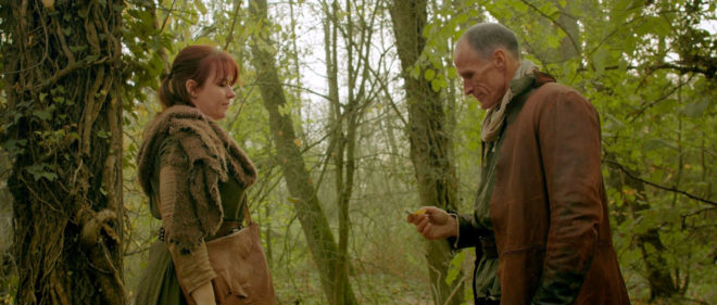
Learn how to block your scene to make the most of the natural light, and how to modify that light with flags, bounce and diffusion, as well as how to expose your image correctly.

1.1 Principles & Prep

  • What to look for on a recce/scout
  • How to predict the sun path using apps or a compass
  • How to block action relative to the sun
  • Three-point lighting
  • The importance of depth in cinematography
  • When to shoot in cross-light vs. backlight
  • How to get rippling reflections off water

1.2 Blocking for Success

  • Observing a rehearsal with actors Kate and Ivan
  • What to look for in the blocking
  • How to get reflections off a blade
  • When to shoot the master shot
  • How to choose what order to shoot your coverage in
  • Using a white poly/bead-board as bounce

1.3 Exposure

  • Why light meters are still important
  • Dynamic range and log recording
  • How to use an incident meter and a spot reflectance meter
  • The f-stop series
  • How to use false colours
  • How to arrive at the right exposure from all this information
  • How to select the appropriate ND (neutral density) filter
  • Shooting the wide shot

1.4 Shaping the Singles

  • Short- and broad-key lighting
  • Types of reflector
  • Positioning a reflector
  • Paying attention to eye reflections
  • Negative fill
  • How to use 4×4 floppy flags
  • Shooting Ivan’s close-up
  • Using a trace frame
  • “Health bounce”
  • Shooting Kate’s close-up
  • Summary
  • The final edited scene

MODULE 2: DAY INTERIOR

This module introduces some common lighting instruments, demonstrates how to imitate natural light entering a room, and how to create depth and contrast with black-out and smoke.

2.1 Scouting & Equipment

  • Identifying light sources in the room
  • Using apps or a compass to predict how sun will enter through the windows
  • The principle of dark-to-light depth
  • Using curtains to modify interior light
  • Introduction to some common lighting instruments: Dedolights, Kino Flos, an HMI and a Rayzr MC LED panel

2.2 Lighting through a Window

  • Observing the blocking with actors Kate and Ivan
  • Direct lighting using an HMI
  • Controlling contrast with black-out
  • Diffusing the light with a trace frame
  • Bouncing the light off poly/bead-board
  • Bouncing the light off parts of the set
  • Use of a light meter and false colours to set the correct exposure

2.3 Atmosphere

  • Use of smoke or haze to add atmosphere to the scene
  • Reasons to add atmosphere
  • The concept of aerial perspective
  • Shooting the master shot
  • Comparison of the final shot to the other versions demonstrated in 2.2 and 2.3

2.4 Lighting the Reverse

  • Use of viewfinder apps to find a frame and select a lens
  • Challenges of front-light
  • Adjusting the window light to highlight certain areas
  • Demonstrating a “window wrap” using a Kino Flo
  • Using light readings and ND filters to arrive at the correct exposure
  • Shooting the reverse
  • Summary
  • The final edited scene

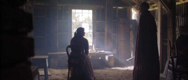
MODULE 3: NIGHT INTERIOR

Create a moody night-time look indoors using practical sources, toplight, and simulated moonlight and firelight.

3.1 Internal vs. External Light

  • Observing the blocking with actors Kate and Ivan
  • Approaches to lighting a night interior scene
  • Lighting from outside with an HMI “moon”
  • Working with bounced “moonlight” inside the room
  • Choosing an overhead source as the key light

3.2 Working with Toplight

  • Time and safety considerations of working with top-light
  • Rigging a top-light safely
  • Controlling top-light spill on the set walls
  • Using unbleached muslin to soften and warm up the light
  • The inverse square law

3.3 Firelight & Moonlight

  • Working with practical candles
  • Reinforcing candles with a hidden LED fixture
  • Simulating an off-camera fireplace
  • Lighting the view outside the window
  • Bringing moonlight into the room to add colour contrast and depth
  • Shooting the master shot

3.4 Tweaking for the Coverage

  • Checking the blocking for the first single
  • Filling in shadows using additional unbleached muslin
  • Flagging the top-light to control the background
  • Adjusting the external light to maintain colour contrast
  • Shooting Kate’s single
  • Adjusting the fireplace effect to work for a close-up
  • Shooting Ivan’s single
  • Summary
  • The final edited scene

MODULE 4: NIGHT EXTERIOR

Paint with light on the blank canvas of night; set up an artificial moon; create depth, contrast and colour contrast; and use shadows to your advantage.

4.1 Setting the Moon

  • Observing the blocking with actors Kate and Ivan
  • Principles of night exterior lighting
  • Creating believable moonlight
  • Features of HMI lighting
  • Choosing a position and height for the HMI “moon”

4.2 Finessing the Master

  • Use of a practical fire source
  • Reinforcing a practical fire with an LED fixture
  • Colour contrast
  • Using a Kino Flo as an additional soft source
  • Tackling a difficult shadow
  • Reading and adjusting lighting ratios using an incident meter
  • Working with smoke/atmos outdoors
  • Shooting the master shot

4.3 Shooting the Singles

  • Adjusting the existing sources to work for a close-up
  • Shooting Ivan’s single
  • Diffusing the HMI
  • Monitoring exposure using false colours
  • Shooting Kate’s single

4.4 Lighting the Reverse

  • The pros and cons of flipping the backlight
  • Example of cheating the moonlight around
  • Using established sources to your advantage
  • Adding diffusion vs. a gobo to the HMI
  • Creating a “branch-a-loris”
  • Shooting the reverse
  • Summary
  • The final edited scene

APPENDICES

Useful links, a full kit list and a deleted scene

Get lifetime access to Cinematic Lighting now.

Cinematic Lighting: An Online Course Available Now

Where to Place Your Horizon

I once had an argument with a director about the composition of a wide shot. I wanted to put the horizon nearer the top of the frame than the bottom, and he felt that this was the wrong way around. In reality there is no right and wrong in composition, only a myriad of possibilities that are all valid and can all make your viewers feel different ways. In this article I will take a metaphorical ramble through these possibilities, and ponder their effects.

You would think that the most natural position for the horizon would be in the vertical centre of the frame. After all, in our day-to-day life, when we look straight ahead, this is where it appears to be.

In practice, a central horizon is not a popular choice. This article by Art Wolfe, for example, argues that it robs the image of dynamism, sending the eye straight to the horizon rather than letting it wander around the frame. The technique is also at odds with the Rule of Thirds, though as I’ve written before, that’s not a rule I place much stock in.

The talented photographer and vlogger Arian Vila, however, describes the merits of a central horizon when composing for a square aspect ratio. And this is an excellent reminder that the horizon does not exist in a vacuum; like anything else, it must be judged in the context of the aspect ratio and the other compositional elements of the frame.

For Leon Chambers’ Above the Clouds (out now on Amazon Prime and other platforms!), I placed the horizon centrally several times:

This was a deliberate echo of the painting “Above the Clouds” which appears in the film and provides the thematic backbone.

A year or two after shooting Clouds, I came across Photograms of the Year: 1949 in a charity shop. Amongst its pages I found another diptych, one created by the book designer rather than the two entirely separate photographers:

These two images, perfectly paired, demonstrate contrasting horizon placement. At Grey Dawn emphasises the sky by placing the horizon low in the frame, creating a sense of space. Meanwhile, Homeward Bound positions its horizon somewhere beyond the trees near the top of frame, drawing attention to the sand and the wheel ruts and indeed to the figures of the caravan itself, rather than to the destination or surroundings.

Horizon placement is closely tied to two other creative choices: headroom, which I dedicated a whole article to, and lens height, i.e. is this a low or a high angle? Even a GCSE media student can tell you that a low angle imbues power while a high angle implies vulnerability, but these are terms most applicable to closer shots. When we think of horizon placement we are probably concerned with big wides, where creating a mood for the scene or setting is more important than visualising a character’s power or lack thereof.

Breaking Bad is an example of a series that predominantly chooses low horizons to show off the big skies of its New Mexico locations. “[Showrunner] Vince [Gilligan] is a student of cinema and knows movies like the back of his hand,” says DP Michael Slovis, ASC. “It was always in his mind that this was a Western in the style of Sergio Leone and the Italian Neo-realists.”

Incidentally, there’s an amazing desert scene in the episode “Crawl Space” where a sunlit close-up cuts to a big wide. The wide holds as clouds roll over the sun. The action continues and the shot still holds, the line between sunlight and shade visible as it rolls away across the desert, until finally a new line slides under the camera and sun breaks over the actors once more. Only then are we permitted to see the scene up close again.

This creative choice, to set the character’s small concerns against the vast immutability of nature, comes from the same place as the choice to put the horizon low in frame.

Returning to Photograms of the Year: 1949, my eyes light upon another pair of contrasting images:

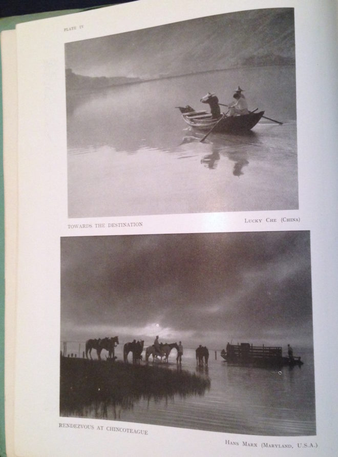
Despite its title, Towards the Destination shows us little of where the sailors are heading, by placing the horizon high in the frame and focusing on the water and the reflections therein. Rendezvous at Chincoteague, by placing its horizon low in the frame, radiates a feeling of isolation that is in contrast to the meeting of the title.

As we consider the figures in these photographs I am forced to concede that the argument I alluded to in the introduction may have been less about the position of the horizon and more about the position of the actor. I think the director felt that it was unnatural for an person to appear in the top half of the frame rather than the bottom half.

I can see his point. The vision of our naked eyes is definitely framed along the bottom by the ground, while the top remains open and unlimited – outdoors, at least. So if a person is standing on the ground, we naturally expect them to appear low down in an image.

But this – like nose room, the Rule of Thirds, the 180° Rule, short-key lighting, so many things in cinematography – is merely a guideline. There are times when it just isn’t helpful, when it can lead to wasted opportunities.

Here is a shot of mine from The Gong Fu Connection (dir. Ted Duran) where the horizon and the cast are placed in the upper half of frame:

Would it really have been better to frame them lower, losing out on the reflections and the foreround rushes, and gaining just empty sky? I think not. This composition was especially important to me, because the film’s titular connection is all about man and the natural world. By showing the water and greenery, we root the characters in it. A composition with more sky might have made them seem dwarfed by nature, lost in it.

This article has been something of a stream of consciousness, but the point I’m trying to make is this: always consider the content and meaning of your shot; reflecting those in your composition is infinitely more important than adhering to any guidelines.

If you enjoyed this, you may be interested in some of my other articles on composition:

Where to Place Your Horizon

How Analogue Photography Can Make You a Better Cinematographer

With many of us looking for new hobbies to see us through the zombie apocalypse Covid-19 lockdown, analogue photography may be the perfect one for an out-of-work DP. While few of us may get to experience the magic and discipline of shooting motion picture film, stills film is accessible to all. With a range of stocks on the market, bargain second-hand cameras on eBay, seemingly no end of vintage glass, and even home starter kits for processing your own images, there’s nothing to stop you giving it a go.

Since taking them up again In 2018, I’ve found that 35mm and 120 photography have had a positive impact on my digital cinematography. Here are five ways in which I think celluloid photography can help you too sharpen your filmmaking skills.


1. Thinking before you click

When you only have 36 shots on your roll and that roll cost you money, you suddenly have a different attitude to clicking the shutter. Is this image worthy of a place amongst those 36? If you’re shooting medium or large-format then the effect is multiplied. In fact, given that we all carry phone cameras with us everywhere we go, there has to be a pretty compelling reason to lug an SLR or view camera around. That’s bound to raise your game, making you think longer and harder about composition and content, to make every frame of celluloid a minor work of art.


2. Judging exposure

I know a gaffer who can step outside and tell you what f-stop the light is, using only his naked eye. This is largely because he is a keen analogue photographer. You can expose film by relying on your camera’s built-in TTL (through the lens) meter, but since you can’t see the results until the film is processed, analogue photographers tend to use other methods as well, or instead, to ensure a well-exposed negative. Rules like “Sunny Sixteen” (on a sunny day, set the aperture to f/16 and the shutter speed reciprocal to match the ISO, e.g. 1/200th of a second at ISO 200) and the use of handheld incident meters make you more aware of the light levels around you. A DP with this experience can get their lighting right more quickly.


3. Pre-visualising results

We digital DPs can fall into the habit of not looking at things with our eyes, always going straight to the viewfinder or the monitor to judge how things look. Since the optical viewfinder of an analogue camera tells you little more than the framing, you tend to spend less time looking through the camera and more using your eye and your mind to visualise how the image will look. This is especially true when it comes to white balance, exposure and the distribution of tones across a finished print, none of which are revealed by an analogue viewfinder. Exercising your mind like this gives you better intuition and increases your ability to plan a shoot, through storyboarding, for example.


4. Grading

If you take your analogue ethic through to post production by processing and printing your own photographs, there is even more to learn. Although detailed manipulation of motion pictures in post is relatively new, people have been doctoring still photos pretty much since the birth of the medium in the mid-19th century. Discovering the low-tech origins of Photoshop’s dodge and burn tools to adjust highlights and shadows is a pure joy, like waving a magic wand over your prints. More importantly, although the printing process is quick, it’s not instantaneous like Resolve or Baselight, so you do need to look carefully at your print, visualise the changes you’d like to make, and then execute them. As a DP, this makes you more critical of your own work and as a colourist, it enables you to work more efficiently by quickly identifying how a shot can be improved.


5. Understanding

Finally, working with the medium which digital was designed to imitate gives you a better understanding of that imitation. It was only when I learnt about push- and pull-processing – varying the development time of a film to alter the brightness of the final image – that my understanding of digital ISO really clicked. Indeed, some argue that electronic cameras don’t really have ISO, that it’s just a simulation to help users from an analogue background to understand what’s going on. If all you’ve ever used is the simulation (digital), then you’re unlikely to grasp the concepts in the same way that you would if you’ve tried the original (analogue).

How Analogue Photography Can Make You a Better Cinematographer

How to Make a Zoetrope for 35mm Contact Prints

Are you an analogue photographer looking for a different way to present your images? Have you ever thought about shooting a sequence of stills and reanimating them in a zoetrope, an optical device from the Victorian era that pre-figured cinema? That is exactly what I decided to do as a project to occupy myself during the zombie apocalypse Covid-19 lockdown. Contact prints are aesthetically pleasing in themselves, and I wanted to tap into the history of the zoetrope by creating a movie-like continuous filmstrip of sequential images and bringing them to life.

In the first part of my blog about this project, I covered the background and setting up a time-lapse of my cherry tree as content for the device. This weekend I shot the final image of the time-lapse, the last of the blossom having dropped. No-one stole my camera while it sat in my front garden for three weeks, and I was blessed with consistently sunny weather until the very last few days, when I was forced to adjust the exposure time to give me one or two extra stops. I’ll be interested to see how the images have come out, once I can get into the darkroom.

Meanwhile, I’ve been constructing the zoetrope itself, following this excellent article on Reframing Photography. Based on this, I’ve put together my own instructions specifically for making a device that holds 18 frames of contact-printed 35mm film. I chose a frame count of 18 for a few reasons:

  1. The resultant diameter, 220mm, seemed like a comfortable size, similar to a table lamp.
  2. Two image series of 18 frames fit neatly onto a 36 exposure film.
  3. Negatives are commonly cut into strips of six frames for storage and contact-printing, so a number divisible by six makes constructing the image loop a little more convenient.


You Will Need

  • Contact sheet containing 18 sequential 35mm images across three rows
  • A1 sheet of 300gsm card, ideally black
  • PVA glue
  • Ruler (the longer the better)
  • Set square
  • Compass
  • Pencil & eraser
  • Scissors
  • Craft knife or stanley knife
  • Paper clips or clothes pegs for clamping while glue dries
  • Rotating stand like a lazy susan or record player


Making the image loop

First, cut out the three rows of contact prints, leaving a bit of blank paper at one end of each row for overlap. Now glue them together into one long strip of 18 sequential images. The strip should measure 684mm plus overlap, because a 35mm negative or contact print measures 38mm in width including the border on one side: 38×18=684.

Glue the strip together into a loop with the images on the inside. This loop should have a diameter of 218mm. Note that we must make our zoetrope’s drum to a slightly bigger diameter, or the image loop won’t fit inside it. We’ll use our image loop to check the size of the drum; that’s why we’ve made it first. (If you don’t have your images ready yet, use an old contact sheet – as I did – or any strip of paper or light card of the correct size, 35mmx684mm.)


Making the side wall

Cut a strip of the black card measuring 723x90mm. This will be the side wall of your drum. Wrap this strip around your image loop, as tightly as you can without distorting the circular shape of the image loop. Mark where the card strip overlaps itself to find the circumference of the drum, which will be slightly bigger than the 684mm circumference of the image loop. In my case the drum circumference was 688mm – as illustrated in the diagram above. (You can click on it to enlarge it.)

Now we can measure and cut out the slots, one per image. Reframing Photography recommends a 1/8″ width, and initially I went with this, rounding it to 3mm. As with making a pinhole, a smaller slot means a sharper but darker image, while a bigger slot means a brighter but blurrier one. Once my zoetrope was complete, I felt that there was too much motion blur, so I retrofitted it with 1mm slots.

Let’s stick with 3x35mm (the same height as the images) for our slot size. How far apart should the slots be? They need to be evenly spaced around the circumference, so in my case 688÷18=38.2mm, i.e. a gap of 35.2mm between each slot and then 3mm for the slot itself. If your drum circumference is different to mine, you’ll have to do your own maths to work out the spacing.

(It was impossible to measure 38.2mm accurately, but I made a spreadsheet to give me values for the cumulative slot positions to the nearest millimetre: 38, 76, 115, 153, 191, 229, 268, 306, 344, 382, 420, 459, 497, 535, 573, 612, 650 and 688.)

Mark out your 18 slots, positioning them 15mm from the top of the side wall and 40mm from the bottom, then cut them out carefully using a knife and a ruler.

Now you can glue your side wall into a loop, using paper clips or clothes peg to hold it while the glue dries. I recommend double-checking your image loop fits inside beforehand. (Do not glue your image loop into the drum; this way you can swap it out for another image series whenever you like.)


Making the connector

The connector, as the name suggests, will connect the side wall to the base of the drum. (When I made a prototype, I tried skipping this stage, simply building the connecting teeth into the side wall, but this made it much harder to keep the drum a neat circle.)

Go back to your black card and cut another strip measuring 725x60mm. Score it all the way along the middle (i.e. 30mm from the edge) so that it can be folded in two, long-ways. Now cut triangular teeth into one half of the strip. Each triangle should have a 30mm base along the scored line.

As with the side wall, you should check the circumference of the connector to ensure that it will fit around the side wall and image loop, and adjust it if necessary. My connector’s circumference, as shown on the diagram above, was 690mm.

Glue the strip into a loop, clamping it with clips or pegs while it dries. Again, it doesn’t hurt to double-check that it still fits around the side wall first.


Making the base

Use a compass to draw a circle of 220mm in diameter on your remaining card, and cut it out. (If your connector is signficantly different in circumference to mine, divide that circumference by pi [3.14] to find the diameter that will work for you.)

Now you can glue the connector to the base. I suggest starting with a single tooth, putting a bottle of water or something heavy on it to keep it in place while it dries, then do the tooth directly opposite. Once that’s dry, do the ones at 90° and so on. This way you should prevent distortions creeping into the shape of the circle as you go around.

When that’s all dry, apply glue all around the inside of the upright section of the connector. Squish your side wall into a kidney bean shape to fit it inside the connector, then allow it to expand to its usual shape. If you have made it a tight enough fit, it will naturally press against the glue and the connector.


Making it Spin

The critical part of your zoetrope, the drum, is now complete. But to animate the images, you need to make it spin. There are a few ways you can do this:

  • Mount it on an old record player, making a hole in the centre of the base for the centre spindle.
  • Mount it on a rotating cake decoration stand or lazy susan.
  • Make your own custom stand.

I chose the latter, ordering some plywood discs cut to size, an unfinished candlestick and a lazy susan bearing, then assembling and varnishing them before gluing my drum to the top.

How to Make a Zoetrope for 35mm Contact Prints