What angle the key light hits a character at is a KEY (groan) decision for a director of photography. The lighting featurette in my last post looked at some of the options, but today I’d like to expand on those with some more up-to-date examples.
Imagine a clock face. You’re looking down on the scene and your talent is at the centre with their eyeline to twelve o’clock.
The key light clock
With that in mind, consider the following shots. The camera is at between twelve and one o’clock in each case.
Key light at almost twelve o’clockHalf past elevenEleven o’clockQuarter to elevenHalf past nine (view the See Saw trailer)
Clearly the level of fill makes a big difference, but you can already see that a key light at noon gives a flawless, evenly lit look which is great for a leading lady, while a half-past-nine casts half of the face into darkness for a threatening or mysterious feel. There is a sweet spot I love at about quarter to eleven where, on one side of the face, only the eye and a triangle on the cheek are lit. But generally between half past ten and half past eleven models the face nicely.
In all of the above examples, with the camera at one-ish, the key was between nine and twelve, i.e. the key was on the opposite side of the eyeline to the camera. This is known as lighting the “downside” – the side away from camera. Most cinematographers, myself included, consider this the most pleasing side to light from, as it shows the shape of the face and gives a nice shadow area on the camera side into which you can dial your preferred amount of fill.
In many scenes, the position of the keylight will be dictated by the layout of the set or location, so a DP should consider this in pre-production discussions with the production designer, on location scouts or when the director is blocking the actors.
How many of us see that 1/50 or 1/48 in the bottom of our viewfinders and aren’t really sure what it means? Shutter angles or shutter intervals are part of the cinematographer’s toolkit, but to use them most effectively an understanding of what’s going on under the hood is useful. And that begins with celluloid.
This animation from Wikipedia shows how the shutter’s rotation works in tandem with the claw moving the film through the gate. The shutter angle here is 180 degrees.
Let’s imagine we’re shooting on film at 24fps, the most common frame rate. Clearly the film can’t move continuously through the gate (the opening behind the lens where the focused light strikes the film) or we would end up with just a long vertical streak. The film must remain stationary long enough to expose an image, before being moved on four perforations (the standard height of a 35mm film frame) so the next frame can be exposed. And crucially light must not hit the film while it is being moved or vertical streaking will occur.
This is where the shutter comes in. The shutter is a portion of a disc that spins in front of the gate. The standard shutter angle is 180°, meaning that the shutter is a semi-circle. A 270° shutter would be a quarter of a circle; we always talk about shutter angles in terms of the portion of the disc which is absent.
The shutter spins continuously at the same speed as the frame rate – so at 24fps the shutter makes 24 revolutions per second. So with a 180° shutter, each 24th of a second is divided into two halves, or 48ths of a second:
During one 48th of a second, the missing part of the shutter is over the gate, allowing the stationary film to be exposed.
During the other 48th of a second, the shutter blocks the gate to prevent light hitting the film as it is advanced. The shutter has a mirrored surface so that light from the lens is reflected up the viewfinder, allowing the camera operator to see what they’re shooting.
So we can see that a film running at 24fps, shot with a 180° shutter, shows us only a 48th of a second’s worth of light on each frame. And this has been the standard frame rate and shutter angle in cinema since the introduction of sound in the late 1920s. The amount of motion blur captured in a 48th of a second is the amount that we as an audience have been trained to expect from motion pictures all our lives.
A greater (larger shutter angle, longer shutter interval) or lesser (smaller shutter angle, shorter shutter interval) amount of motion blur looks unusual to us and thus can be used to creative effect. Saving Private Ryan features perhaps the best-known example of a small shutter angle in its D-day landing sequence, where the lack of motion blur creates a crisp, hyper-real effect that draws you into the horror of the battle. Many action movies since have copied the effect in their fight scenes.
Large shutter angles are less common, but the extra motion blur can imply a drugged, fatigued or dream-like state.
In today’s digital environment, only the top-end cameras like the Arri Alexa have a physical shutter. In other models the effect is replicated electronically (with some nasty side effects like the rolling shutter “jello” effect) but the same principles apply. The camera will allow you to select a shutter interval of your choice, and on some models like the Canon C300 you can adjust the preferences so that it’s displayed in your viewfinder as a shutter angle rather than interval.
I advise always keeping your shutter angle at 180° unless you have a solid creative reason to do otherwise. Don’t shorten your shutter interval to prevent over-exposure on a sunny day; instead use the iris, ISO/gain or better still ND filters to cut out some light. And if you shoot slow motion, maintain that 180° angle for the best-looking motion blur – e.g. at 96fps set your shutter interval to 1/192.
Roger Harding (left) and Jeremy Heynes in The Deaths of John Smith. A 1.2K HMI punches through the window on the right, while a fluorescent softbox illuiminates the arches on the left. Background light comes from two 500W halogen work-lights rigged to a dimmer, while fill (given that it was getting dark outside at this point) comes from a blue-gelled 1K Arrilite behind and to the left of camera.
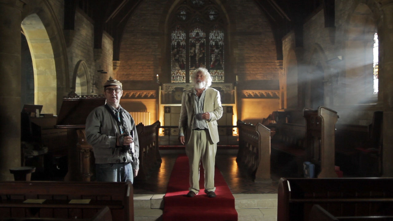
This weekend shooting began on Roger Harding and Darren Scott’s feature-length comedy The Deaths of John Smith. As director of photography I was called on to light a beautiful rural church on a limited budget. Here are some tips for ecclesial cinematography:
Hire HMIs – powerful, daylight-balanced lamps. Without at least one you will never have enough light to illuminate anything but the tiniest of churches. As a backlight on a mezzanine level, a 2.5K HMI will illuminate most churches. Better still, put them outside the windows and create artificial sunbeams. (A blue-gelled blonde or redhead outside a stained glass window is pretty much useless; those windows cut out so much light.)
Use smoke. A £50 disco smoke machine is perfectly sufficient – use it to volumize the light and emphasise the depth and scale of the building. If you’re struggling to expose a bright enough image, smoke helps there too – because it catches the backlight and lightens up the shadows.
Candlelight is a good way to introduce colour contrast into your scene. Dedos are the best lamps to fake candelight with, as they can produce a small circular pool of light. Failing that, any tungsten source will do, ideally rigged to a dimmer board for a bit of flickering.
Assuming you’ve got your HMIs punching directly in through all the windows on one side of your church (that’s the side the “sun” is on), you now need soft light coming in through the opposite windows. Ideally these would be larger HMIs playing off bounce boards, but you might get away with soft boxes or bounced tungsten sources (gelled blue, of course) hidden behind pillars inside the building.
Sellotape together some old bits of coloured gel and rig them in front of a fresnel to simulate daylight through a stained glass window. Note that this doesn’t really work with unfocused lamps like redheads.
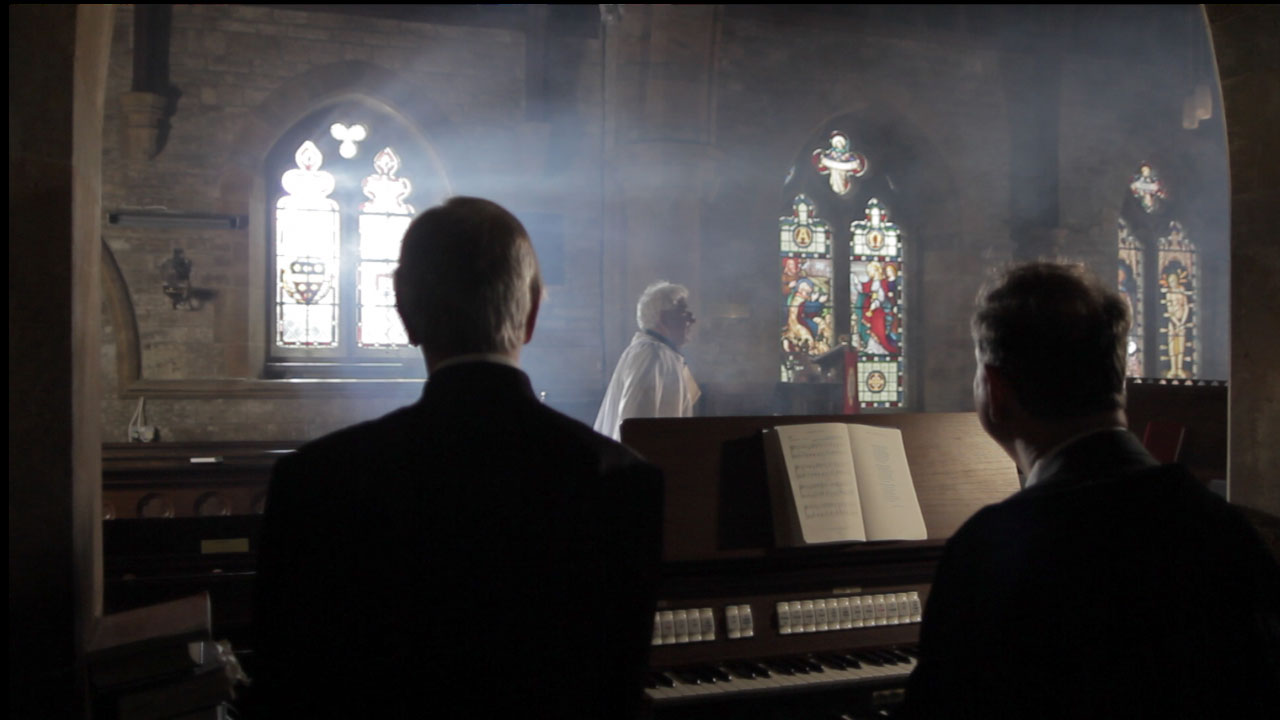
Left to right: David Draper, Bryan Ferriman and Adrian Moore. Our single HMI shines through the lefthand window, suitably volumized with smoke, leaving natural light to deal with the other two. A blue-gelled 1K Arrilite off to the right of frame creates the edge-light on the righthand side of each character. An existing halogen spotlight over the organ was gelled with half CTB to cool it down a little. I chose to leave the nearside of the characters dark to contrast the foreground with the brighter background.
On The Deaths of John Smith I only had access to one HMI, so for every shot I needed to carefully choose which window to put it outside of for the maximum impact. I relied on natural light as well as blue-gelled redheads and fluorescent softboxes just out of frame for fill light. Nonetheless, I’m very pleased with the results. Next weekend we have to repeat the performance with a large congregation….
Here the “sun” (HMI) is outside of the lefthand background window, but I couldn’t resist cheating a little and pushing a 1K Arrilite through a nice yellow stained glass window in the top centre background. Additional backlight comes from a blue-gelled Arrilite off frame right, while a softbox behind and to the left of camera illuminates the actor’s face.
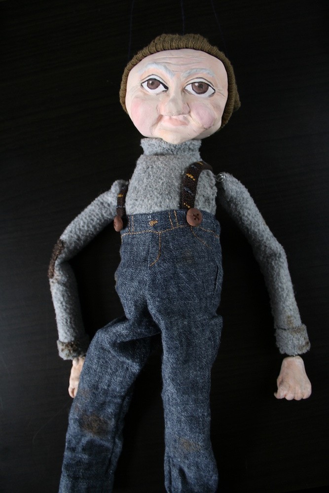
Guest blogger Katie Lake tells the story of how Henry Otto, the marionette star of The One That Got Away, came into this world. Click here to watch the film and please tweet about it to help us make the competition shortlist.
1. The head
It started as a whim, a crazy idea. I have wanted to do a puppet film with Neil for a while. But if I couldn’t make a puppet, there would be no puppet film. No pressure.
I started with his head. I wound newspaper around metal wire that would become his controls, then covered the newspaper ball with a layer of air-drying clay, shaping his head, and face. I did a test with lights to see if I liked the shape I got (1).
2. Body, hands, arms and legs
I then made his body. This started out as a toilet roll tube, covered in papier-mâché, and his arms and legs were rolled up newspaper “beads”. I then painted them beige, and sculpted hands using more clay over wire. I fit the legs and arms with wire, and before I put him together this was how he was looking (2). I liked the big head, spindly legs and long arms. So together he went.
I made the start of a neck, and then painted his face. He now had an expression, a look, a character. I (hesitantly) fell in love with Henry when I first sculpted his head and face, but was really worried that I wouldn’t be able to do him justice with paint. Thankfully I was pleased with the results. And this is when I knew the name swirling around in my head, was the name he was going to be. There is something about him that reminds me of my maternal grandfather’s side of the family, so Henry is sort of an homage.
3. Strung up, with trousers
He then needed some clothes. Despite, or maybe because of my costume background, deciding what clothes to make for him was by far the hardest bit. In the end we decided jeans were a good place to start. I drafted a pattern in cloth, then altered it, and cut them out of an old charity shop skirt. I also gave him some hand stitched details around the waist. I temporarily strung him up, and tested out what we could get him to do. This was also his first camera test (3).
4. Hat and sweater
It was now that we realised he needed lateral head controls (one on either side of his head so we could make him look left and right). Oops. I attached lateral controls to the outside of his head as I didn’t want to risk drilling, so he now needed a hat or wisps of hair to hide the wire. He also needed a top, and boots.
5. Boots
Enter Jo Henshaw, who kindly offered to come and help out. She helped finalize costume design decisions, and made him his cute beanie (out of an old sleeve) and started his sweater (out of an old sweater) (4).
I made boots (out of more toilet roll tubes cut and bent, glued into shape and then papier-mâchéd, and then painted black) (5). I should also mention stop-motion animator Emily Currie, another helpful volunteer, who used her expertise to ensure the lateral controls stayed put.
6. The finished puppet
Henry’s sweater was then sewn onto him, covering the multiple pieces. I kept the arms separate for greater movement. I finished him off with braces made out of old shoe laces, made buttons out of clay which I painted brown, sewed a patch onto his arm from an old scrap and aged his costume with some brown and black paint.
Lastly I strung him up using extra strong navy thread. The T bar I made using a piece of flat doweling, some screw eyes (upcycled from old curtain rings) and nails to make the cross bars removable. And Henry was ready for his debut (6).
The finished Stop/Eject DCP. Not as cool as a roll of 35mm.
Now that huge reels of 35mm film are all but obsolete, Digital Cinema Packages (DCPs) are the new means of getting a film to a cinema. Many top film festivals will only screen off a DCP or 35mm print, and in terms of picture and sound quality and compatibility it is your best option for screening at theatrical venues in general. Much has been written about how you can make a DCP at home for nothing, but having just gone through the process myself for Stop/Eject I’m going to round up some of the best sources of information I came across and enlarge on the area of disc formatting which hasn’t been too well covered elsewhere.
To ensure maximum compatibility of your DCP you need to:
convert your film to 24fps if it isn’t already at that frame rate
use a standard 2K aspect ratio, 2048×1080 or 2048×858
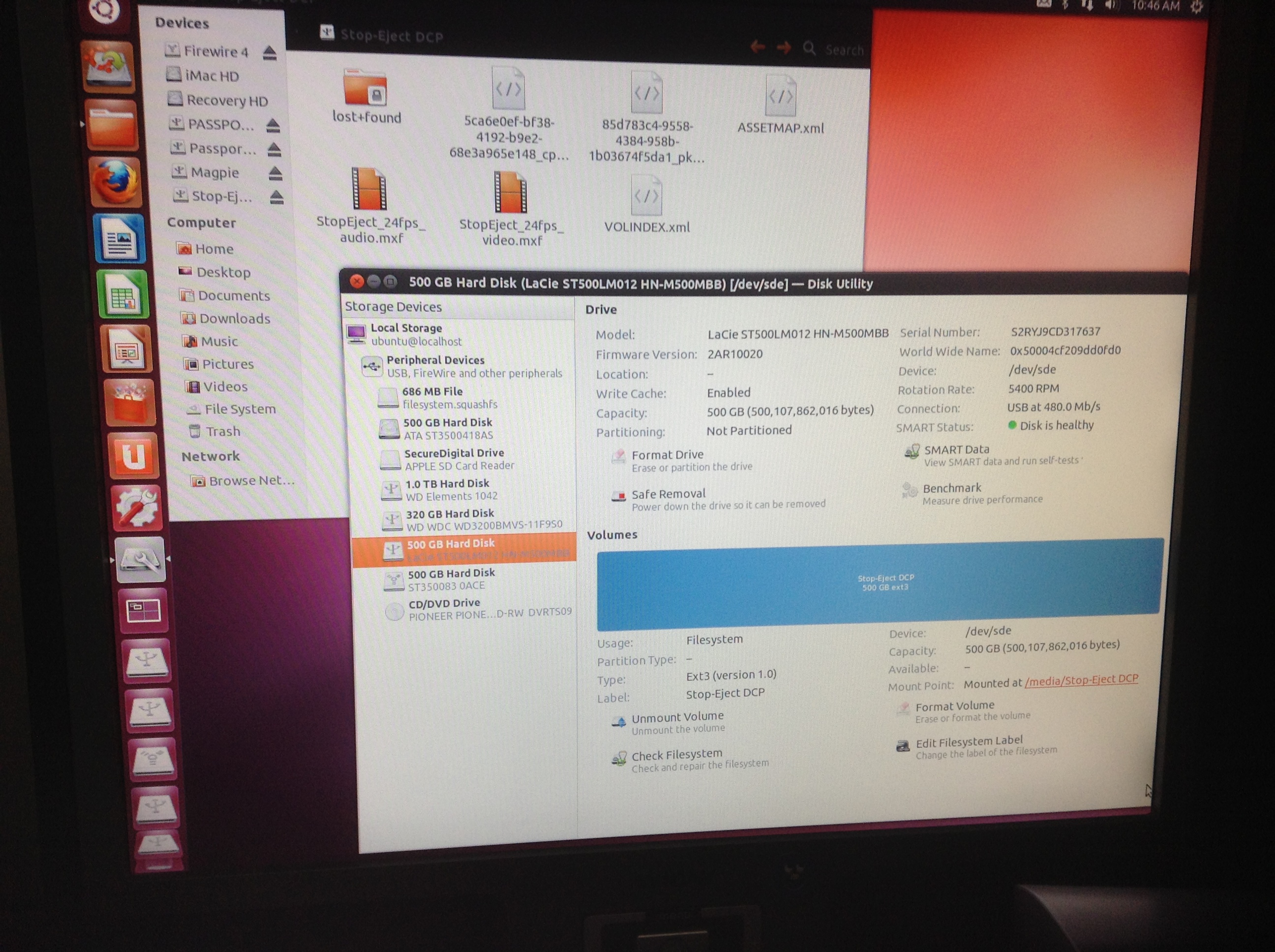
Step 5: the formatted drive as seen in Ubuntu, with the DCP files copied over
So, here is the process I went through. I was starting out with 25,409 uncompressed 16-bit TIFF files representing each individual frame of Stop/Eject, and six mono 24-bit linear PCM WAV files for the 5.1 surround soundtrack. The TIFFs were in 1080P (1920×1080) letterboxed to an aspect ratio of 2.35:1.
First of all I used Photoshop to batch convert all the TIFFs to the 2048×858 aspect ratio. This is actually 2.39:1 rather than the 2.35:1, so it meant cropping a sliver of the actual picture off the top and bottom, not just the black bars, as well as enlarging the picture slightly. It took my poor iMac about 12 hours to convert the 25,409 frames. I’m sure there’s quicker batch conversion software out there than Photoshop if you hunt around though.
Next I used a free piece of audio software called Audacity to slow down each of the six audio files by 4% so that they will match the images when they run at 24fps. (Stop/Eject was shot and edited at 25fps.) Thanks to Matt Cameron’s blog for this tip.
Then I downloaded and ran OpenDCP, the brilliant free software that actually creates the Digital Cinema Package for you. It’s very simple to use, but check out the help Wiki and Danny Lacey’s seminal blog post to guide you through it. The end result was six files: four XML files and two MXF files, one for sound and one for picture. Encoding at the default bitrate of 125mb/s, which the Wiki says is more than good enough for 2K at 24fps, Stop/Eject’s DCP was just under 17GB, so about 1GB per minute.
Now the tricky bit – copying those six files onto an EXT3 formatted drive. EXT3 is a Linux file system, and is not supported by MacOS. So I downloaded Ubuntu, a free operating system which does support it. (Choose the 64-bit download unless you have quite an old computer.) The downloaded file is a disc image (.ISO) which you can burn to DVD using Disk Utlity (found in the utilities sub-folder of MacOS’s Applications folder). Then restart your Mac, with the DVD still in the drive, and hold down C when you hear the chimes. This will boot up your Mac in the Ubuntu operating system. (You can release C when you see the black screen and Ubuntu logo.)
Once Ubuntu was running, I right-clicked the LaCie Rugged in the list of drives in the lower left of the desktop and chose format from the contextual menu. To get more than the default options, I clicked Disk Utility in the dialogue box that came up. I could now select EXT3 as the file system (leaving the other settings at their default values). When I clicked format, Ubuntu didn’t seem to be doing anything, but after a few minutes the Disk Utility showed that the volume had been created. I could then close the Disk Utility, and drag and drop the six DCP files from another hard drive (MacOS formatted) onto my newly EXT3 formatted LaCie. Apparently you can put these files inside a folder if you want, but again to be extra safe I put them in the root directory.
After completing the DCP I took it to the Courtyard, my local arts centre, where head projectionist Simon Nicholls was kind enough to let me test it. To my very pleasant surprise it worked perfectly, uploading at about real time via the Doremi server’s USB 2 socket and playing shortly afterwards with superb sound and picture quality. Much as I love celluloid, the ease and cheapness of this process are breathtaking, the purchase of the hard drive being the only cost. I’ll let you know how I get on running it at other cinemas.
Today I thought I’d share the process I figured out for creating looping menus in Encore for DVD and Blu-ray. If, like me, you want to do it all from scratch rather than using any of the built-in templates, the process isn’t particularly intuitive, and was sufficiently different from DVD Studio Pro (the software I’m used to) to leave me scratching my head from time to time, but here’s how I did it in the end. I’ll use Stop/Eject‘s main menu as the example. I’m going to assume you already know the basics of Encore and can find your way around Photoshop.
First of all you have to understand how DVDs and Blu-rays (henceforth collectively referred to simply as “discs”) work. They’re not like websites or Flash movies where you can do anything you want; the specifications are quite narrow. A motion menu consists of two elements:
The background, which is a video (typically with audio) that you can create in Final Cut Pro, Premiere, or whatever.
The button highlights, which show the user which button is currently selected. The user will only ever see one of these at a time.
Hang on – background, button hightlights…. but what about the buttons themselves? These have to be part of the background. Yes, you can import your background movie as a Quicktime into Encore and then add buttons to it within Encore, but when you come to build your disc the software will render those buttons into the background movie. All the disc player can deal with is a background movie and the highlights.
I prefer to build my buttons into the background movie in my editing software (Final Cut) rather than add them in Encore, and that’s the approach I’ll outline here.
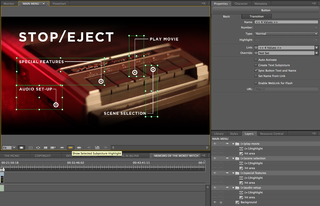
Another crucial point to understand is that each button highlight can only be one colour. So look at the Stop/Eject main menu below. The button highlights are the white rings. They could not be red-and-white striped rings, like life preservers; they can only be one solid colour.
Stop/Eject’s main menu with all the button highlights visible
So, now you appreciate all of the above you can get started on your menu. The first step for me was shooting and editing the background movie, although for most people this will be a computer-generated graphic rather than something shot with a camera. It’s important to think about where your loop point is going to be so that the menu will loop smoothly.
The following video shows my edited background movie. The buttons were created in Photoshop and added to the movie in Final Cut, before exporting as a ProRes Quicktime (with these buttons now baked in) ready to be imported into Encore.
In Encore I can now create a new menu and use the pick-whip in the properties panel to select my Quicktime file as the source for both the video and the audio. I can also set the loop point in the same panel.
I need to make sure that the loop point is at a place in the video where the audio track is silent or at least is playing a constant background noise – e.g. an air conditioning hum – that will not jump unpleasantly when the menu loops. You’ll notice that my menu’s audio track has a beat or two of silence around the loop point. If you’re using music, don’t start it immediately at the loop point as many players take a fraction of a second to kick in the audio after they loop.
I also need to ensure that all of the buttons have appeared before the loop point. This is because the loop point is the place at which the player will start displaying the button highlight. If your menu loops back to a point before the buttons have appeared, the user will momentarily see the highlight without the corresponding button.
To create the button highlights, right-click (or ctrl-click if you’re using a single button mouse) on the menu and choose “edit menu in Photoshop” from the contextual menu. Photoshop will open with a still of your menu as it appears at the loop point. Annoyingly, this still will be in standard definition even if you’re creating a Blu-ray disc, so the first thing you’ll need to do in Photoshop is to change the pixel aspect ratio to square and re-size the image to 1920×1080.
For each button, create a new group in the layers palette and give it a name that starts with (+). When you go back to Encore it will recognise this folder as pertaining to a button. Within the group, make a new layer and call it (=1)highlight. Draw your button highlight on this layer, remembering that it can only be one colour.
Now we need to pause a moment and consider hit areas. When your disc is played in a computer, the user can select buttons with the mouse. The hit area determines what part of the screen the user must hover the mouse pointer over for the button to be considered selected. This area MUST be rectangular. For each button, Encore will look at all the layers within the relevant group and draw the smallest possible rectangle that will completely enclose all those layers; that will be your button’s hit area.
In my case, right now the only layers in my groups are the white rings which are the button highlights themselves. But what if someone hovers the mouse over the words “special features”? I want the button to be selected then too, so in the (+)special features group I’ll create a second layer (critically, it must be below the highlight layer) and draw a rectangle where I want my hit area to be. I can then click the eye icon next to this in the layer palette so it becomes invisible and doesn’t ruin the look of my menu.
The main menu with the hit areas visible
Another restriction of the DVD/Blu-ray specs is that button hit areas can’t overlap. Given the restriction I mentioned earlier, that they must be rectangular, you can see from the layout of my menu that it isn’t possible for the hit areas of Play Movie and Scene Selection to include the text for those buttons without overlapping each other. I choose not to compromise the design of the menu and trust that users will soon find the hit area with a quick sweep of the mouse over the whole image.
I save the image in Photoshop and return to Encore. I can now see the button hit areas outlined on the menu. If I click the icon for “show selected subpicture highlights” (see below image) I can see the highlights too. It’s now simply a case of setting the target for each button using the pick-whip in the properties panel.
The Encore interface with the button to view the highlights hovered over
When users return to the main menu, after they’ve visited the special features menu, for example, I don’t want them to have to sit through the intro part of the menu again; I want them to go straight to the loop point. So I’ll go to the main menu button in the special features menu and set the target – not using the pick-whip, but through the pull-down menu. I’ll select “specifiy link” and in the dialogue box which appears I make sure to tick the “set to loop point” checkbox.
One final point. The version of Encore I used (CS5.1) has a bug whereby any motion menu longer than 70 seconds will not loop smoothly; a second or so of black will appear each time the player gets to the end of the loop. This issue does not occur in Encore’s preview, only when you’ve burnt the disc. There’s no workaround that I can find other than shortening the menu.
I hope this has been some help to those of you out there who are still burning your films onto physical discs. Let me know if you’d like to hear more about any part of the disc authoring process.
This is a pretty esoteric post, I’ll warn you now.
Some of the Stop/Eject behind-the-scenes footage was shot on a Canon camcorder set to “24P Cinema Mode”. It took me ages to figure out how to convert this material to 25 frames per second without the motion becoming very jerky. So I’m going to set down how I eventually did it, in case it can help any other poor souls in the same situation. I was working on an iMac with Lion and FCP Studio 7.
The 24P footage I converted includes a dual interview with Kate (Georgina Sherrington) and Copy-Kate (Katie Lake), shot by Laura Iles and Kurt Baker.
What is 24P Cinema Mode? It’s aimed at American users, and emulates how “real” movies look when they’re broadcast on US TV. Real movies are shot at 24fps and telecined to 30fps (actually 29.97fps, but we’ll say 30 for simplicity’s sake) which is the standard frame-rate of American TVs, DVD players and so on. 24P Cinema Mode captures 24 frames per second and converts them, as the camera is recording, to 30fps. It essentially does this by duplicating every fifth frame and using interlacing to smooth out the motion. This is known as 2:3 pulldown. More expensive cameras embed metadata in their 2:3 pulldown footage so that software like Final Cut Pro can automatically restore it to genuine 24fps, but the material I was working with had no such metadata. I believe it was shot on a Canon Vixia HF10 or similar.
Step 1: Converting to 1080i60 Quicktimes using Adobe Media Encoder
The other problem I had with the footage in question was its format: AVCHD (identified by a .MTS file extension), which Macs don’t really like. Final Cut Pro will convert them via the Log and Transfer window, but only if they’re on an SD card or a disc image of an SD card. But I’d been given the footage on a data DVD, and copying it to an SD card did not fool Final Cut. After much trawling of the magical interweb and trying various free applications that didn’t work very well, I discovered that Adobe Media Encoder accepts MTS files. (If you don’t have the Adobe suite, you can buy an application called VoltaicHD that will apparently do the job.)
So here are the three transcoding stages I went through to convert the material into editable 1080P25:
Step 2: reversing the telecine effect using Compressor
I used Adobe Media Encoder to convert the source files to Quicktimes. I chose the HDV 1080i60 codec and retained the interlacing, field order (upper first), frame size (1440×1080 anamorphic) and frame rate (29.97fps) of the original material.
I followed the method on this web page using Apple Compressor. In a nutshell, you take an existing preset – say one of the ProRes ones, if that’s the format you like to edit footage in – and alter two things: the frame rate, found by clicking the video Settings button in the Encoder tab, and the deinterlace option, found in the Frame Controls tab. Set the former to 23.976 and the latter to Reverse Telecine (after first enabling the Frame Controls by clicking the small gear next to the on/off pulldown menu, and selecting On from said menu). At this stage you can also resize the image to true HD, 1920×1080. The resulting video file should be genuine 24fps with no interlacing.
Next bring your 24fps file back into Compressor and drop another preset onto it. Again, use ProRes or whatever your codec of choice is, but this time make sure the frame rate is set to 25fps, deinterlace is NOT set to Reverse Telecine and, at the bottom of the Frame Controls tab, where it says “Set Duration to”, click the last radio button, “so source frames play at 25.00 fps”. What this does is to speed up your video about 4% so that it runs at 25fps. This is the smoothest way to convert 24fps to 25fps, and the speed difference will not be noticeable on playback. In fact, whenever you watch a movie on UK TV it is sped up like this.
Step 3: retiming to 25fps with Compressor
If you’re in any doubt as to whether it’s worked, step through the video frame by frame in Final Cut and see if there are any duplicated, skipped or interlaced frames.
Of course, after all this transcoding, the image quality will have suffered a bit, but at least the motion should be smooth. Has anyone out there found a better method of doing this? I’d love to hear from you if so. Alternatively, if you want any more details on the steps above, just leave a comment and I’ll be happy to share them.
The moral of the story is, if you’re in the UK, don’t use 24P Cine Mode. Just like shooting 24fps on celluloid, it unnecessarily complicates post-production. Stick to 25fps and everything will come up smelling of roses.


 and Copy-Kate (Katie Lake).")


