Aspect Ratio and the Marvel Cinematic Universe

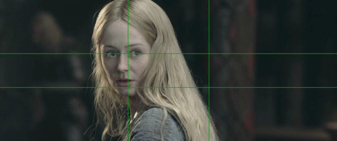
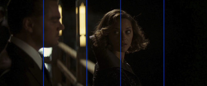
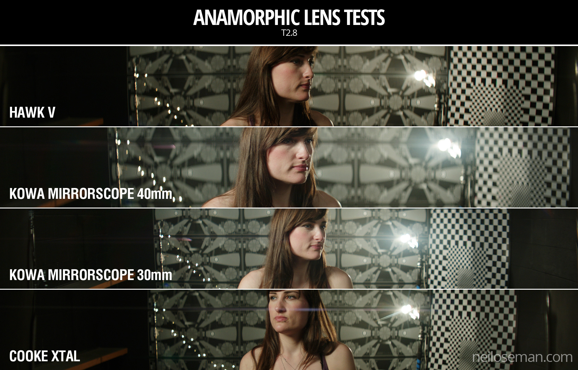
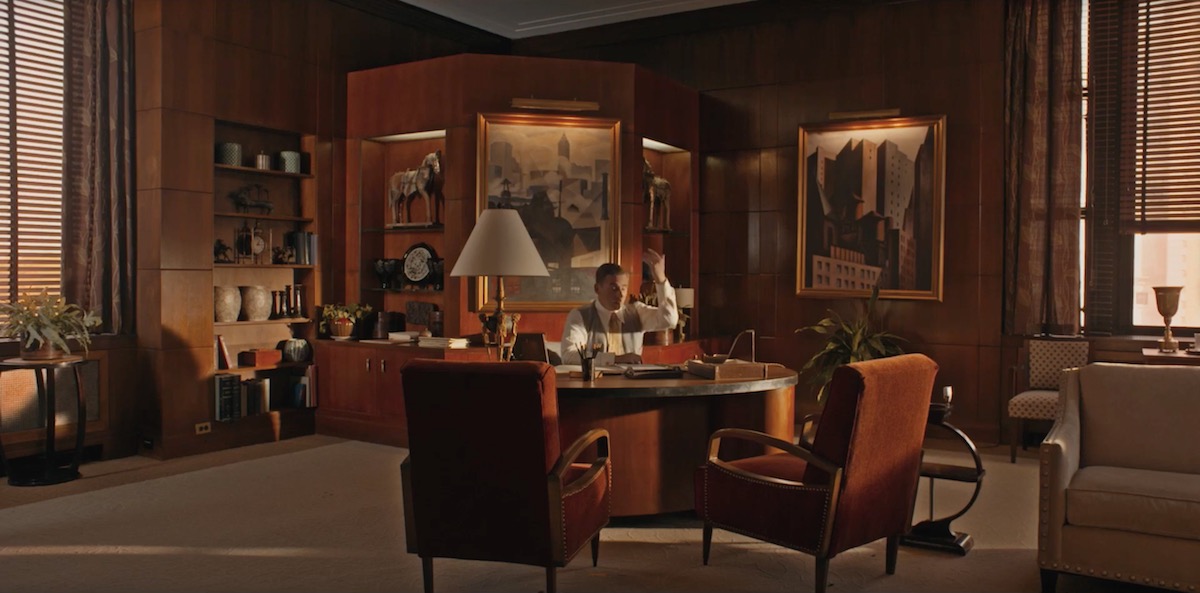
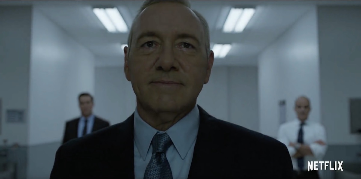
I used to be a casual follower of superhero films, until I was inducted into the Marvel Cinematic Universe via a movie marathon. Despite different directors for each instalment, the MCU has a fairly consistent look and feel, so I was a little surprised when we got to The Avengers to note that it differs visually in one significant way from all of its predecessors. Whereas the five previous films (and indeed most of the subsequent ones) were in the 2.39:1 aspect ratio, The Avengers was presented in the taller 1.85:1 ratio.

This initially struck me as counterintuitive. 2.39:1 was introduced in the 1950s to tempt watchers of the new-fangled TV back into the cinemas, and ever since then it has been associated with the biggest, most epic, most cinematic of movies. It seems like the natural choice for a superhero franchise, so it’s no surprise that the MCU adopted this ratio for most of its instalments. But if wider images mean a more epic movie, then surely The Avengers, the climax of Phase One and the coming-together of a whole team of superheroes, should be, if anything, even wider than its 2.39:1 predecessors?

“The Avengers” (2012, DP: Seamus McGarvey, BSC, ASC)

I’m certainly not the first person to be nonplussed by the choice. A quick google later on threw up plenty of forums where fans complained that The Avengers was “not cinematic enough” because of its aspect ratio. Some linked the choice of ratio to director Joss Whedon’s TV background, claiming he was more comfortable with that shape of frame.

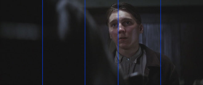
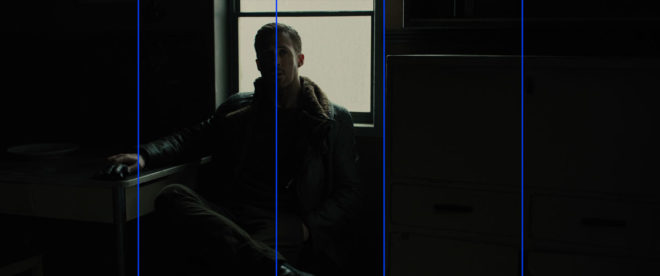
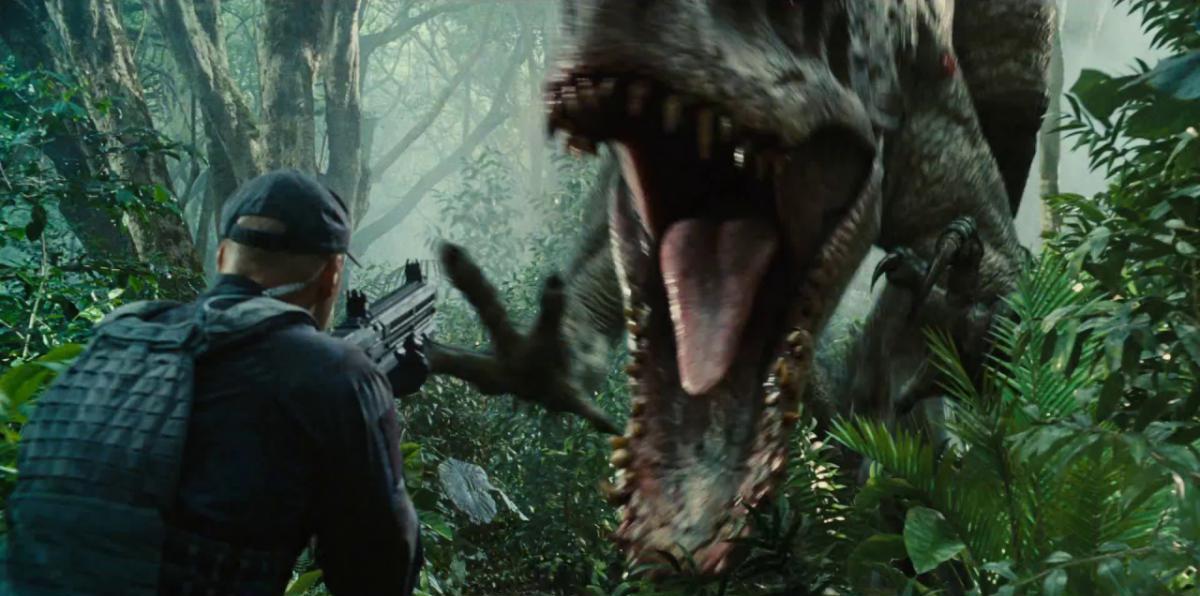
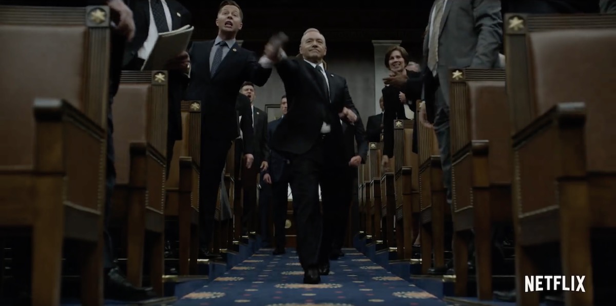
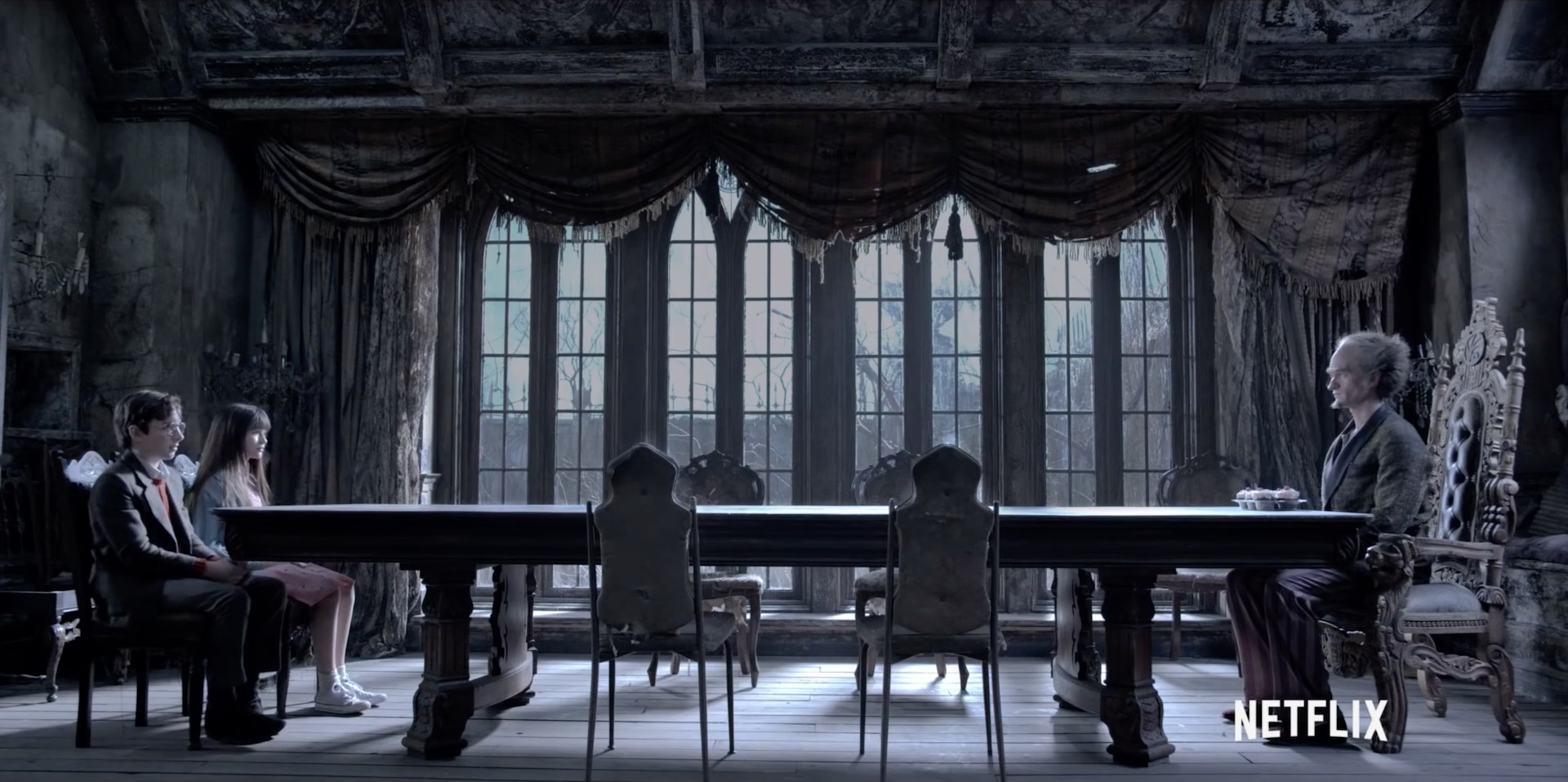
The real reason for Whedon’s decision became clear as the action ramped up into the third act. The battle of New York is not a two-dimensional conflict; Thor and Iron Man are flying around, the Hulk climbs up buildings, the Chitauri ships float above the streets, and Stark Tower plays a key part in the action. The extra frame height of 1.85 was essential to tell that story.

“I wanted to feel the space around us, and use wider lenses,” said Whedon. “That’s why I went 1.85 instead of wider. In IMAX, I wanted it to fill your eyeball completely.”

“Ant-Man” (2015, DP: Russell Carpenter, ASC)

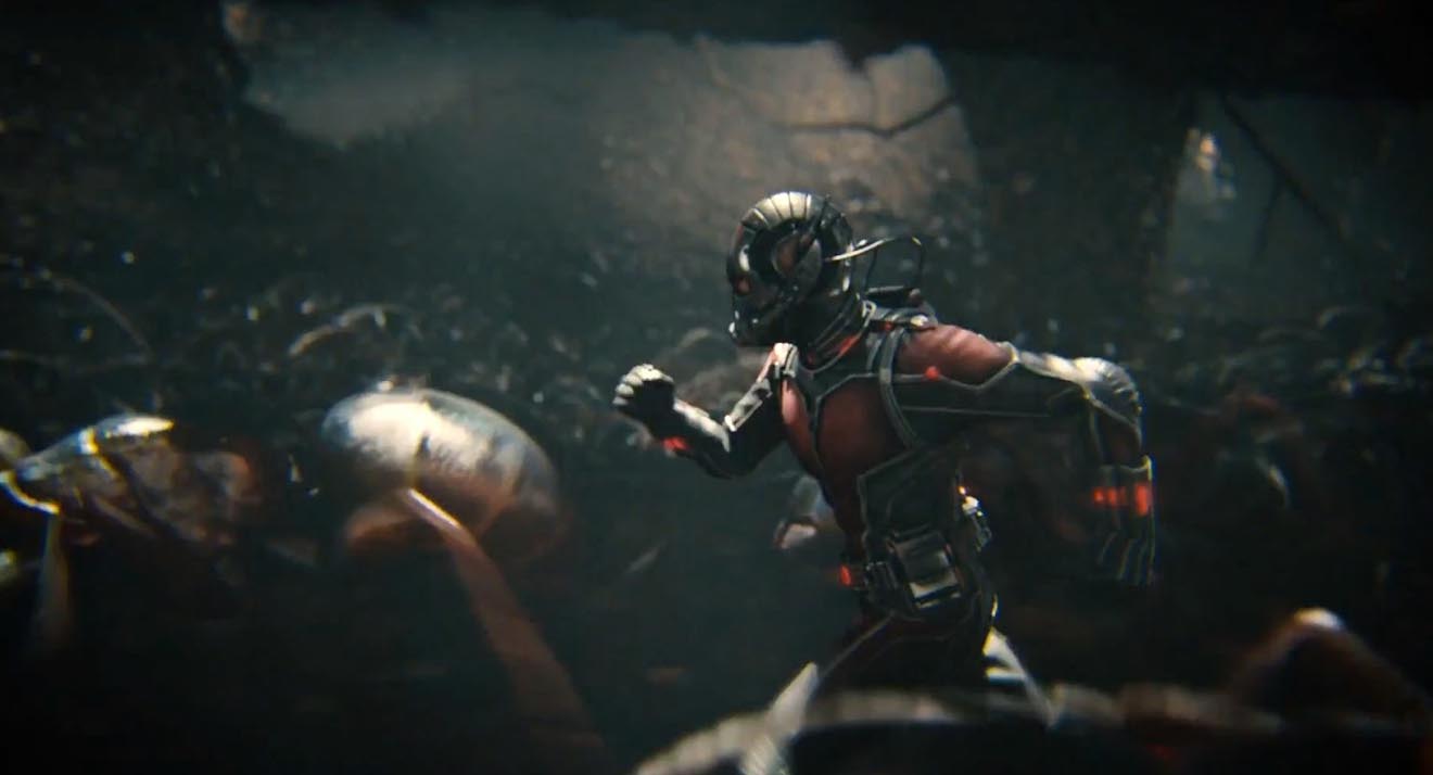
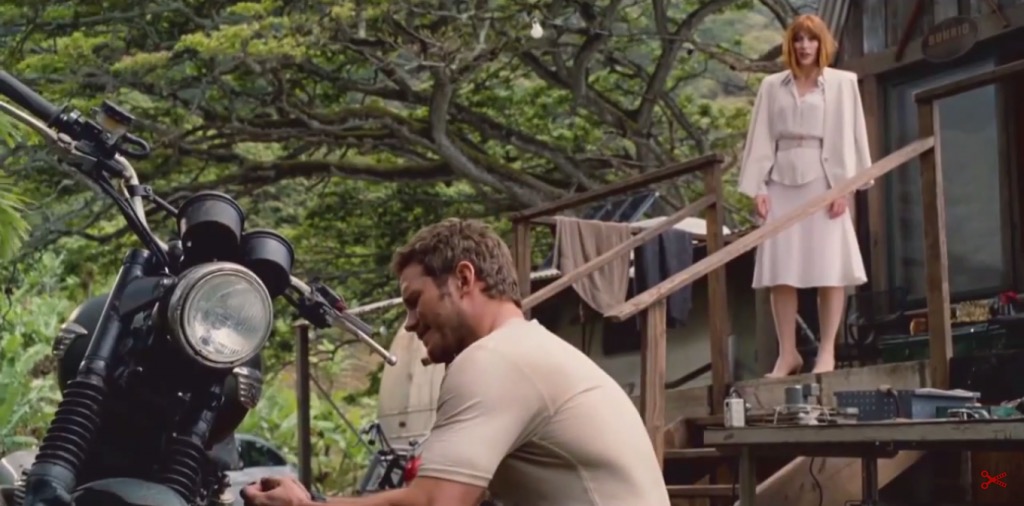
Continuing the movie marathon, the MCU does not return to 1.85 until Ant-Man, and director Peyton Reed initially encountered resistance from the studio when he advocated this ratio. “It’s a big conversation because it affects production design. It affects everything. And it felt to me… that shrinking was a vertical act and it was going to serve the movie even more. And I had to make a case for the fact that it was still going to be epic.”

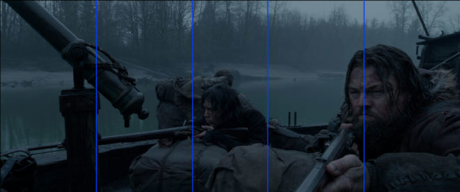
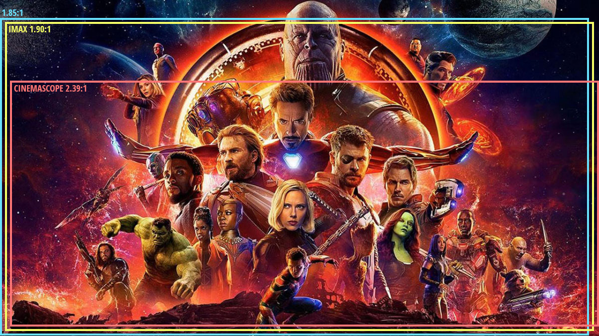
I wonder if the days of wider aspect ratios being perceived as more epic are numbered. IMAX sequences are becoming more and more common in blockbusters, including the Marvel films. Digital IMAX has an aspect ratio of 1.90:1, very similar to the 1.85 which is so often perceived as the small-scale, poor man’s ratio. (To confuse matters, the 1.90 sequences are often cropped to 2.39 for ordinary cinemas and home entertainment release.) An epic feel is very much what the IMAX brand is selling, so the traditional perception is being turned on its head. Both Avengers: Infinity War and the recent Endgame were shot entirely in Imax 1.90:1, and are sure to be the very definition of epic for a while to come.

Things seem to be going the same way over in the DC universe too. On the social media platform Vevo, director Zak Snyder had this to say about Batman v. Superman and Justice League: “I had so much fun shooting the IMAX sections of my movie (BvS) [that I] sort of fell in love with that giant less rectangular aspect ratio and so that’s why I shot JL 1:85”.

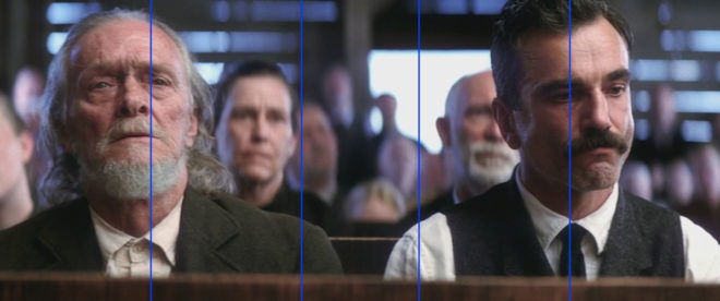
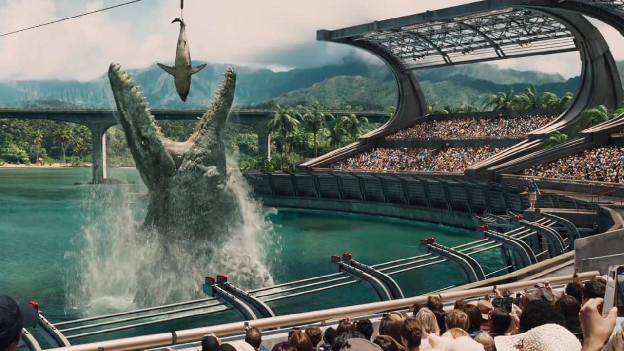
Image size may have something to do with this shifting trend. After all, a larger image is surely more epic than a smaller one. In theory, 2.39 should result in the largest image, with curtains or masks at the sides of a cinema screen opening up for these widescreen presentations. In practice though, many smaller multiplex auditoria mask the top and bottom of their screens for 2.39, making for a smaller overall image than 1.85, just like when you watch 2.39 content at home on your TV or monitor (which is 1.78:1). My local multiplex recently converted its largest auditorium to IMAX, which involved no change to the width of the screen, but an increase in height.

Add to this the fact that 2.39 overtook 1.85 as the most common aspect ratio for top-grossing films over a decade ago, and it’s small wonder that filmmakers seeking to make their work stand out from the crowd are turning to taller frames.

“Avengers: Infinity War” (2018, DP: Trent Opaloch)

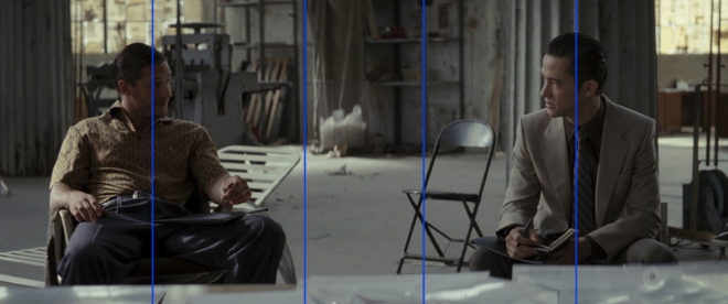
However the trend of aspect ratios ends up going, it’s important to remember that there’s no wrong or right. I’ve done jobs where directors have told me, “It’s a movie, it’s got to be 2.39,” or, “It’s a series, it’s got to be 1.78,” but there is always a choice. Are your sets tall or wide? Are your lead characters similar or dissimilar in height? Are landscapes or body language most important to this story? It’s factors like these that should really determine the best ratio for your movie, just as Whedon and Reed both realised.

See also:

Aspect Ratio and the Marvel Cinematic Universe

Is the Rule of Thirds Right for 2.39:1?

The Rule of Thirds is the most well-known guide for framing an image. Simply imagine the frame divided into equal horizontal and vertical thirds – or don’t even bother imagining, just turn on your camera’s built-in overlay – and place your subject on one of those lines to get a pleasantly composed picture every time. Some filmmakers believe in the Rule so much that they refuse to even consider any other type of composition.

The Rule of Thirds in action on “The Aviator” (2004, DP: Robert Richardson, ASC), winner of the 2005 Best Cinematography Oscar

As I’ve previously written, I find the Rule of Thirds grossly overrated. In particular, when composing for a widescreen aspect ratio like Scope (CinemaScope, i.e.. 2.39:1), the Rule often doesn’t work for me at all.

In this post I’m going to look at an alternative compositional technique, but first let’s step back and find out where the Rule of Thirds actually comes from and why it’s so popular.


Origins of the Rule of Thirds

The first known appearance of the term “Rule of Thirds” is in a 1797 treatise Remarks on Rural Scenery by the English painter John Thomas Smith. It seems he read too much into a simple statement by fellow artist Sir Joshua Reynolds to the effect that, if a picture has two clear areas of differing brightness, one should be bigger than the other. Hardly a robust and auspicious start for a rule that dominates the teaching and discussion of composition today.

I suspect that the Rule has gained strength over the last two centuries from the fact that it encourages novice painters, designers and photographers to overcome their natural tendency to frame everything centrally. Another factor in the Rule’s ubiquity is undoubtedly its similarity to a much older and more reasoned rule: the Golden Ratio.


The Golden Ratio and the Phi Grid

A mathematical concept that’s been around since the time of the ancient Greeks, the Golden Ratio is approximately 1.6:1. It’s a special ratio because if you add the two numbers together, 1.6+1, you get 2.6, and 2.6:1.6 turns out to be, when boiled down, the same ratio you started with, 1.6:1.

Wikipedia puts it this way:

Two quantities are in the Golden Ratio if their ratio is the same as the ratio of their sum to the larger of the two quantities.

It’s difficult to get your head around, I know!

The Golden Ratio is found in nature, in the spiral leaves of some plants for example, and even in certain crystals at the atomic level. There is a long history of artists believing that using the Ratio produces a more aesthetically pleasing image.

The Golden Ratio is most simply applied to composition in the form of a Phi Grid, which resembles a Rule of Thirds grid, but in different proportions, namely 1.6:1:1.6 rather than 1:1:1.

Andrew Lesnie, ACS, ASC applies the Phi Grid – though not necessarily deliberately – to “The Lord of the Rings: The Two Towers”

The Rule of Thirds and the Phi Grid both feel quite limiting in Scope because out of all that horizontal space you’ve only got two vertical lines to place your subject on. There is another technique though, one which provides more options.


The Squares within the rectangle

In his book The Mind of the Photographer, Michael Freeman writes about a composition guideline which dates back to the Middle Ages. You imagine two squares, the same height as the frame, and aligned with either side of the frame, then place your subject on the centre or inner edge of one of these squares.

Applied to a Scope frame it looks like this:

We can simplify it down to this:

When I first read about this technique, it really chimed with me. I’ve long believed that a “Rule of Fifths” would be a more effective guide for Scope composition than the Rule of Thirds, and the above diagram isn’t far away from fifths.

Below I’ve overlaid this grid on a few shots from Scope movies that won Best Cinematography Oscars: There Will Be Blood (DP: Robert Elswit, ASC), Slumdog Millionaire (Anthony Dod Mantle, DFF, ASC, BSC), Inception (Wally Pfister, ASC), The Revenant (Emmanuel Lubezki, ASC, AMC) and Blade Runner 2049 (Roger Deakins, CBE, ASC, BSC).

Let me provide a disclaimer first, though. You could draw any grid you wanted and find some shots from movies that matched it. The purpose of this article is not to convince you to ditch the Rule of Thirds and start following this “rule of squares within a rectangle” instead. (For a start, that name is never going to catch on.) This “rule” chimes with me because it’s similar to the way that I was already instinctively composing, but if it doesn’t work for you then don’t use it. Develop your own eye. It’s a creative medium, so compose creatively, not like a robot programmed with simple rules.

I’ll leave you with this quote from the great photographer Ansel Adams:

The so-called rules of photographic composition are, in my opinion, invalid, irrelevant and immaterial.

See also:

And if you want to read a thorough debunking of the Rule of Thirds, check out this article on Pro Video Coalition.

Is the Rule of Thirds Right for 2.39:1?

The 4:3 Aspect Ratio is Not Dead

This summer I shot Exit Eve, a short film from director Charlie Parham dealing with the exhausting and demeaning life of an au pair. We took the unusual decision to shoot it in 4:3, a ratio all but obsolete, but one which felt right for this particular story. Before I look at some of the ratio’s strengths and challenges, let’s remind ourselves of the history behind it.


History

William Kennedy Dickson

The 4:3 motion picture aspect ratio, a.k.a. 1.33:1, was created about 120 years ago by William Kennedy Dickson. This Thomas Edison employee was developing a forerunner to the movie projector, and decided that an image height of four perforations on 35mm film gave the ideal shape. In 1909 the ratio was declared the official standard for all US films by the Motion Picture Patent Company.

When the talkies arrived two decades later, room needed to be made on the film prints for the optical soundtrack. The Academy of Motion Pictures Arts and Sciences responded by determining a new, very slightly wider ratio of 1.37:1, known fittingly enough as the Academy Ratio. It’s so similar to 4:3 that I’m going to lump them together from hereon in.

When television was invented it naturally adopted the same 4:3 ratio as the big screen. The popularity of TV led to falling cinema attendance in the 1950s, to which the Hollywood studios responded with a range of enticing gimmicks including widescreen aspect ratios. Widescreen stuck, and for the next generation 1.85:1 and 2.39:1 were the ratios of cinema, while the narrower 4:3 was the ratio of TV.

By the time I entered the industry in the late 1990s, 4:3 was much maligned by filmmakers. It seemed boxy and restrictive compared with widescreen, and reminded those of us in the guerrilla world that we didn’t have the budgets and equipment of the Hollywood studios. Meanwhile, the wide compositions of big movies were butchered by pan-and-scan, the practice of cropping during the telecine process to fit the image onto a 4:3 TV without letterboxing. 4:3 was ruining our favourite movies, we felt.

Then, in the 21st century, 16:9 television became the norm, and the 4:3 aspect ratio quietly disappeared, unmourned…. Or did it?


Contemporary Cinema

Although they are firmly in a minority, a number of filmmakers have experimented with 4:3 or Academy Ratio in recent years. Some, like Andrea Arnold and the late Éric Rohmer, rarely shot anything else.

Arnold wanted a combination of intimacy and claustrophobia for her Bafta-winning 2009 drama Fish Tank. She carried the ratio over to her next film, an adaptation of Wuthering Heights, despite the prevalence of big landscapes which would have prompted most directors to choose 2.39:1. The Academy Ratio focuses the viewer’s attention much more on the characters and their inner worlds.

“Fish Tank” – DP: Robbie Ryan, BSC

Mark Kermode has this to say about the 1.37:1 work of Arnold and her DP Robbie Ryan: “What’s wonderful about it is the way [Ryan] uses that squarer format not to make the picture seem compressed but to make it seem taller, to make it seem larger, to make it seem oddly more expansive.”

Meek’s Cutoff (2010), a modern western by Kelly Reichardt, recalls the early Academy classics of the genre. As with Wuthering Heights, characters are placed in the landscape without being dominated by it, while the height of the frame produces bigger skies and an airier feel.

“Meek’s Cutoff” – DP: Chris Blauvelt

Pawel Pawlikowski’s 2013 Oscar-winner Ida deliberately goes against the grain, shooting not only in 4:3 but in black and white as well. It’s the perfect format to convey the timeless, spartan existence of the titular Ida and her fellow nuns. The tall frame allows for copious headroom, inspiring thoughts of Heaven and God, beneath which the mortal characters seem small.

The 2017 animated feature Loving Vincent, meanwhile, adopted 4:3 because it was closer to the shape of Van Gogh’s paintings.

David Lowery, director of last year’s A Ghost Story, wanted to trap his deceased title character in the boxy ratio. “It gave me a good opportunity to really hammer home the circumstances this ghost finds himself trapped in, and to dig into and break down the claustrophobia of his life within these four walls… And it was also a way to tap into some degree of nostalgia, because it feels old-fashioned when you see a movie in a square aspect ratio.”

4:3’s nostalgia factor has allowed it to be used very effectively for flashbacks, such as those in the recent Channel 4/Netflix series The End of the F***ing World. Wes Anderson delineated the three time periods of The Grand Budapest Hotel (2014) with different aspect ratios, using 1.37:1 for scenes set in 1932, the very same year in which that ratio was standardised by the Academy.


“Exit Eve”

Nostalgia, intimacy, claustrophobia, isolation – these are just some of the feelings which cinema’s original aspect ratio can evoke. For Charlie and I on Exit Eve, it was the sense of being trapped which made the ratio really fit our story. 

I’m also a great believer in choosing a ratio that fits the shape of your primary location, and the converted schoolhouse which we were shooting in had very high ceilings. 4:3 allowed us to show the oppressive scale of these rooms, while giving the eponymous Eve little horizontal freedom to move around it. One additional practical consideration was that, when lensing a party scene, the narrower ratio made it easier to fill the frame with supporting artists!

It wasn’t hard to get used to framing in 4:3 again. A lot of Exit Eve was handheld, making for fluid compositions. There were a couple of tripod set-ups where I couldn’t help thinking that the extra width of 1.85:1 would be useful, but for the most part 4:3 worked well. 

We were shooting on an Alexa Plus with a 16:9 sensor, meaning we were cropping the image at the sides, whereas ideally we would have hired a 4:3 model to use the full width of the sensor and a larger proportion of our lenses’ image circles. This would have allowed us to get slightly wider frames in some of the location’s smaller rooms.

Our sound department had to adapt a little. The boom op was used to being able to get in just above the actors’ heads, but with the generous headroom I was often giving, she had to re-learn her instincts.

Classic 4:3 overs in “Star Trek: The Next Generation”

I had forgotten how well dialogue scenes are suited to 4:3. With wider ratios, over-the-shoulder shots can sometimes be tricky; you can end up with a lot of space between the foreground shoulder and the other actor, and the eye-line ends up way off camera. 4:3 perfectly fits a face, along with that ideal L-shape of the foreground shoulder and side of head, while keeping the eye-line tight to camera.

Not every project is right for 4:3, far from it. But I believe that the ratio has served its sentence in the wilderness for its pan-and-scan crimes against cinema, and should now be returned to the fold as a valid and expressive option for filmmakers.

See also:

The 4:3 Aspect Ratio is Not Dead

Anamorphic Lens Tests

Anamorphic cinematography, first dabbled with in the 1920s, was popularised by Twentieth Century Fox in the fifties as CinemaScope. Television was growing in popularity and the studios were inventing gimmicks left, right and centre to encourage audiences back into cinemas. Fox’s idea was to immerse viewers in an image far wider than they were used to, but with minimal modifications to existing 4-perf 35mm projectors. They developed a system of anamorphic lenses containing elements which compressed the image horizontally by a factor of two. By placing a corresponding anamorphosing lens onto existing projectors, the image was unsqueezed into an aspect ratio of 2.55:1, or later 2.39:1.

Since those early days of CinemaScope, anamorphic cinematography has become associated with the biggest Hollywood blockbusters. Its optical features – streak flares, oval bokeh and curved horizontal lines – have been seared into our collective consciousness, indelibly associated with high production values.

I’ve not yet been fortunate enough to shoot anamorphic, but I was able to test a few lenses at Arri Rental recently, with the help of Rupert Peddle and Bex Clives. Last week I wrote about the spherical lenses which we tested; our anamorphic tests followed the same methodology.

Again we were shooting on an Alexa XT Plus in log C ProRes 4444 XQ, this time in 4:3 mode, a resolution of 2048×1536. Since all of the lenses had a standard 2:1 anamorphosing ratio, the images unsqueezed to a super-wide 2.66:1 ratio. (This is because the lenses were designed to be used on 35mm film with space left to one side for the optical soundtrack.) You can see the full width of this ratio in the first split-screen image in the video, at 2:08, and in the second image below, but otherwise I have horizontally cropped the footage to the standard 2.39:1 ratio.

We tested the following glass:

Series Length Speed CF* Weight
Hawk V 35mm T2.2 30″ 5.6kg
Cooke Xtal 30mm T2.8 ? 3kg
Kowa Mirrorscope 40mm T2.2 36″ 1.15kg
Kowa Mirrorscope 30mm T2.3 ? ?

* CF = close focus

For consistency with the spherical lenses, we used lengths around 32mm, but in the anamorphic format this is a pretty wide lens, not a mid-range lens. We shot at T2.8, again for consistency, but I hear that many anamorphics don’t perform well wider than T4.

We were only able to test what Arri Rental happened to have on the shelves that day. The biggest and presumably most expensive was the Hawk V-series. Next  in size and weight was the Cooke Xtal – pronounced “crystal” – a 1970s lens based on the much-loved Speed Panchros. The smallest and lightest, was the Kowa Mirrorscope, with a list price of £1,200 per week for a set of four. (Sorry, I couldn’t find any pricing info for the others online.) Note that there isn’t really a 30mm Mirrorscope; to get this length you put a wide angle adapter on the 40mm. As this extra element decreases the optical performance, we tested it with and without, hence the two lengths.

Here’s the video…


Skin tones

Click on the image to see it at full quality.

To my eye, the Hawk has a fairly rich, warm skin tone, while the Cooke – as with the spherical S4 tested last week – seems a little grey and flat. The Kowa is inexplicably brighter than the other two lenses, which makes it hard to compare, but perhaps it’s a little cooler in tone?


Sharpness

Focus is more critical with anamorphic lenses than spherical ones. From a forum posting by Max Jacoby:

Anamorphic lenses have what is known as a “curved field of focus” that works similarly to the curved movie screens in some large Cinerama theatres. This is one reason that one needs to expose these lenses at a deeper stop. If one doesn’t, the curved field will not be covered by depth of field and either the edges or centre of the frame will be soft.

One day I’d like to re-test these lenses at a lower stop, T4 or T5.6, where they will all undoubtedly perform much better. But in this T2.8 test, on Bex’s face in the centre of frame, the Hawk V and the Kowa Mirrorscope 40mm – both almost a full stop from their maximum apertures – are clearly the sharpest of the bunch. The Cooke Xtal, which is wide open, is unsurprisingly softer. The 30mm adapter on the Mirrorscope completely destroys the image, not only making it very soft but also introducing colour aberration.

Now let’s look at the checkerboard at the side of frame and see if we can spot any differences in sharpness there…

It seems to me that the Kowa, both with and without the adapter, has a greater difference in sharpness between the centre and edges of frame than the the Hawk and Cooke. With the latter two lenses, the checkerboard is reasonably sharp, at least on the lefthand side, with some ghosting/blur visible towards the righthand side. The same thing can be observed on the chart in the flare tests at the end of the video.


Breathing & Bokeh

All of these lenses have a noticeable degree of breathe, which I suppose is to be expected from anamorphics. The Hawk V has roughly oval bokeh, the Cooke’s is more circular, while the Mirrorscope has interesting D-shaped bokeh.


Flare

The Hawk V doesn’t flare much at all, which is apparently due to the anamorphic element being in the middle of the lens, rather than at the front. The Kowa has a nice streak and glow around the light source, with a funky purple artefact on the opposite side of frame. But it’s the Cooke Xtal which provides the most classic lens flare, with a horizontal line across most of the frame and a partial star pattern around the source, despite the lens being wide open.

At the end of the video you can see how the flares develop on each lens as the light source moves horizontally across frame.


Distortion

A bulging effect is very obvious on all of these lenses, due to the focal lengths being quite wide for anamorphic. Notice how at 40mm on the Kowa Mirrorscope this curvature of the image is significantly reduced.

It’s hard to compare the levels of distortion because none of the focal lengths are exactly the same, except for the Cooke Xtal and the Kowa Mirrorscope with the 30mm adapter on. The Cooke’s top right and bottom left corners appear to be stretched away from the centre relative to the other two corners. I suppose that strange and funky stuff like this is exactly why you choose vintage glass.

Interestingly, the Cooke’s image appears a little tighter than the Kowa’s, which combined with my inability to find any evidence online of the existence of a 30mm Xtal, leads me to suspect we may have been given a mislabelled 32mm.


Conclusions

When we got to the end of our spherical tests and started putting the anamorphics on, I was shocked by the drop in sharpness. But as noted earlier, this is because anamorphics really need to be used with a smaller aperture than the T2.8 I often shoot at. If I learnt nothing else from this test, I learnt that anamorphic needs more light!

I would love to put the Cooke Xtal’s lovely flares and general vintage look to good use on a period movie one day. The Hawk V would be a good choice if I wanted the anamorphic look with warm, dynamic skin tones. The Kowa system seemed a little cheap and cobbled-together, but could well be a good solution for anamorphic on a budget, as long as I stayed away from the 30mm adapter!

I hope you’ve found these tests useful. Thanks again to 1st AC Rupert Peddle, 2nd AC Bex Clives and Arri Rental UK for making them possible.

Anamorphic Lens Tests

8 Ways “Barry Lyndon” Emulates Paintings

Stanley Kubrick’s 1975 period epic Barry Lyndon, although indifferently received upon its original release, is considered a masterpiece by many today. This is largely due to its painterly photography with strong, precisely composed frames that leave the viewer feeling more like they’ve wandered through an art gallery than watched a movie. Today I’m going to look at eight methods that Kubrick and his team used to create this feel. It’s an excellent example of how a director with a strong vision can use the many aspects of filmmaking to realise that vision.


1. Storytelling

The American Cinematographer article on Barry Lyndon notes that “Kubrick has taken a basically talky novel and magically transformed it into an intensely visual film.” You have only to look at a series of frame-grabs from the movie to see just how much of the story is contained in the images. Just like a painter, Kubrick reveals a wealth of narrative within a single frame. The shot above, for example, while recalling the landscapes of artists like Constable in its background and composition, also clearly tells the story of a courtship threatened by a third party with violent designs.


2. Design

Kubrick was keen for Lyndon to feature the type of rich fabrics which are often seen in 18th century art. He referred costume designer Milena Canonero to various painters of the period. “Stanley wanted beautiful materials,” she recalls in the documentary Stanley Kubrick: A Life in Pictures, “because as he quite rightly said, that’s why in those paintings they gave that wonderful light.”


3. Aspect ratio

There was much confusion and controversy surrounding Kubrick’s intended ratio for Lyndon. The negative was apparently hard-masked to 1.6:1, with the result that VHS and DVDs used this ratio, while the images were vertically cropped to 1.78:1 for the later Blu-ray release. However, the discovery in 2011 of a letter from Kubrick to cinema projectionists finally proved that 1.66:1 was the ratio he wanted audiences to see the film in.

1.66:1 was a standard ratio in parts of Europe, but unusual in the UK and USA. It’s not far off the golden ratio (1.6180:1) – a mathematically significant ratio which some artists believe to be aesthetically pleasing. There is evidence that Kubrick was not a fan of wide aspect ratios in general, perhaps because of his background as a photographer, but it can be no coincidence that Lyndon distances itself from the cinematic ratios of 1.85 and 2.39, and instead takes a shape closer to that of a typical painting.

(Most of the images in this post come from Evan Richards’ Cinematographers Index, and he in turn grabbed them from the 1.78:1 Blu-ray. The image above is in 1.66:1 but shows the 1.78:1 crop-lines.)


4. Composition

“The actual compositions of our setups were very authentic to the drawings of the period,” says DP John Alcott, BSC in his interview with American Cinematographer. Perhaps the film’s most obvious compositional nod to classical art is the large amount of headroom seen in the wide shots. As this article by Art Adams explains, the concept of placing the subject’s head at the top of the frame is fairly new in the history of image creation. Plenty of traditional art includes lots of headroom, and Lyndon does the same.


5. Camera movement

There is little camera movement in Barry Lyndon, but there are 36 zoom shots. Unlike a physical dolly move, in which the parallax effect causes different planes of the image to shrink or enlarge at differing rates, a zoom merely magnifies or reduces the whole image as a single element. This of course only serves to enhance the impression of a two-dimensional piece of art. In fact, the zooms resemble nothing so much as the rostrum camera moves a documentary filmmaker might make across a painting – what today we’d call a Ken Burns effect.

It’s interesting to note that, although Barry Lyndon is famous for its fast lenses – the f/0.7 Zeiss Planar primes – the movie also used a very slow lens, a custom-built T9 24-480mm zoom. From various accounts, other zooms used seem to include a Cooke T3.1 20-100mm and possibly a 25-250mm of some description. Of course, none of the zoom lenses were anywhere near fast enough for the candlelit scenes, so in those instances the filmmakers were forced to use a Planar and pull back physically on a dolly.


6. Lighting

“In preparation for Barry Lyndon we studied the lighting effects achieved in the paintings of the Dutch masters,” Alcott says. “In most instances we were trying to create the feeling of natural light within the houses, mostly stately homes, that we used as shooting locations.”  The DP closely observed how natural light would come in through the windows and emulate that using diffused mini-brutes outside. This made it possible to shoot long days during the British winter when natural light was in short supply. Last week I covered in detail the technical innovations which allowed Alcott and Kubrick to shoot night scenes with just genuine candlelight, as 18th century painters would have seen and depicted them.


7. Contrast

Film stock in the seventies was quite contrasty, so Alcott employed a few methods to adjust his images to a tonal range more in keeping with 18th century paintings. He used a Tiffen No. 3 Low Contrast Filter at all times, with an additional brown net for the wedding scene “where I wanted to control the highlights on the faces a bit more,” he explains. He also used graduated ND filters (as in the above frame) both outdoors and indoors, if one side of the room was too bright. Most interestingly, he even went so far as to cover white fireplaces and doorways with fine black nets – not on the lens but on the objects themselves.


8. Blocking

The blocking in Barry Lyndon is often static. While this is certainly a creative decision by Kubrick, again recalling painted canvases and their frozen figures, it was also technically necessary in the candlelit scenes. Whenever the f/0.7 lenses were in use, the cast were apparently instructed to move as little as possible, to prevent them going out of focus. As one YouTube commenter points out, the stillness imposed by these lenses mirrors the stillness required of a painter’s model.

8 Ways “Barry Lyndon” Emulates Paintings

The 2:1 Aspect Ratio

Last autumn I wrote a post about aspect ratio, covering the three main ratios in use today: 16:9, 1.85:1 and 2.39:1. The post briefly mentioned a few non-standard ratios, including 2:1. Since then, I’ve noticed this ratio popping up all over the place. Could it be on its way to becoming a standard?

Today I’ll give you a little background on this ratio, followed by a gallery of frame grabs from 2:1 productions. The aim is simply to raise awareness of this new(ish) tool in the aspect ratio toolkit. As ever, it’s up to the director and DP to decide whether their particular project is right for this, or any other, ratio. However, I would caution low-budget filmmakers against picking what is still not a common ratio without considering that smaller distribution companies may crop your work to a more standard ratio either because of convenience or negligence.

Woody Allen and Vittorio Storaro shooting Café Society

Vittorio Storaro, ASC, AIC – the highly-regarded cinematographer of Last Tango in Paris and Apocalypse Now amongst many others – began championing the 2:1 ratio around the turn of the millennium. It was one of the most complicated times in the history of aspect ratios. The horror of pan-and-scan (butchering a movie to fit its 1.85:1 or 2.39:1 ratio into 4:3 without bars) was starting to recede with the introduction of DVD, which was in fact still 4:3 but could contain squeezed 16:9 content. Widescreen television sets were starting to build in popularity, but some programmes and films were being broadcast in the middle-ground ratio of 14:9 so as not to offend the majority of viewers who still had 4:3 sets. And Storaro recognised that HD would soon supplant celluloid as the primary capture and exhibition method for cinema, likely bringing with it fresh aspect ratio nightmares.

Storaro proposed “Univisium”, a 2:1 aspect ratio that fell between the two cinema standards of 1.85:1 and 2.39:1. It was a compromise, designed to make everyone’s life easier, to produce images that would need only minor letterboxing no matter where or how they were screened. However, the industry did not share his vision, and until recently 2:1 productions were relatively rare, most of them lensed by Storaro himself, such as Frank Herbert’s Dune, Exorcist: The Beginning and Storaro’s first digital picture, Café Society.

John Schwartzman shooting Jurassic World

Perhaps the biggest 2:1 movie to date is Jurassic World. DP John Schwartzman, ASC wanted to shoot anamorphic 2.39:1, while Steven Spielberg, exec producing, advocated 1.85:1 (like his original Jurassic Park) to provide more height for the dinosaurs. 2:1 was arrived at, again, as a compromise.

And compromise is likely what has driven the recent explosion in 2:1 material – not in the cinema, but online. Recent shows produced in this ratio include The Crown, A Series of Unfortunate Events, Stranger Things and House of Cards on Netflix, and Transparent on Amazon. I expect the producers of these series were looking to give their audience a more cinematic experience without putting off those who dislike big black bars on their screen, not unlike the reasoning behind the 14:9 broadcasts in the noughties.

2:1 may be a ratio born out of compromise, but then so was 16:9 (invented by SMPTE in the early eighties as a halfway house between 2.35:1 and  4:3). It certainly doesn’t mean that shooting in 2:1 isn’t a valid creative choice. Perhaps its most interesting attribute is its lack of baggage; 16:9 is sometimes seen as “the TV ratio” and 2.39:1 as “the big movie ratio”, but 2:1 has no such associations. One day perhaps it may be thought of as “the streaming ratio”, but for now it is simply something other.

Anyway, enough of the history and theory. Here are some examples of the cinematography that can be achieved in 2:1.


Cafe Society

DP: Vittorio Storaro, ASC, AIC


Jurassic World

DP: John Schwartzman, ASC


House of Cards

Season 5 DP: David M. Dunlap


Stranger Things

Season 1 DP: Tim Ives


The Crown

Season 1 DPs: Adriano Goldman, ASC, ABC & Ole Bratt Birkeland


Broadchurch

Season 3 DP: Carlos Catalan


A Series of Unfortunate Events

Season 1 DP: Bernard Couture

The 2:1 Aspect Ratio

Headroom

One of the first things that amateur photographers and cinematographers are taught is  “correct” headroom. Don’t put people’s heads in the middle of the frame, we’re told, but at the top. Rules are made to be broken though, and here are three examples of beautiful cinematography which do just that.


Broadchurch

“A town wrapped in secrets” is the tag-line of this critically-acclaimed ITV detective serial. In classic murder mystery fashion, every character is hiding something, causing suspicion to rest on each of them for a little while until the the person hiding the right secret is found.

David Tennant’s DI Alec Hardy complains of the small coastal town’s “endless sky”, an observation which could equally apply to the cinematography, framing the action as it often does with expansive headroom. While this may be partly an attempt to emphasise the isolation of the titular town, where people are small in the face of nature, its primary effect is to evoke the secrecy so integral to the storyline. Just as the police – and viewers – are figuratively misdirected by the suspects’ lies, so the camera is literally misdirected. The message from Matt Gray, BSC’s cinematography is: look at the beautiful sky and the paintings high up on the wall, because if you look too hard at what’s in front of you, you’ll see that the surface perfection of the bucket-and-spade idyll is built on foundations of sand.


Utopia

This stylish, stunningly-photographed thriller ran for two seasons on Channel 4 in 2013 and 2014. It featured a group of disparate characters following clues in a cult graphic novel to uncover a chilling conspiracy. It was the first TV show I’d ever seen in 2.39:1, it had a garish, digitally-manipulated palette, and its composition broke all the rules.

Amongst Utopia‘s visual hallmarks was the use of plentiful headroom. Characters were frequently crushed into the lower half of the frame, a symbol of the powerful conspiracy looming over them. The overall look crafted by director Marc Munden and DP Ole Bratt Birkeland placed the viewer completely outside of the comfort zone of TV’s visual conventions, into a world where you couldn’t trust or rely on anything. (The Amazon series Mr. Robot uses similar techniques for similar reasons.)

Both seasons of Utopia can be viewed free at channel4.com


IDA

The makers of the Oscar-winning Polish indie feature Ida also chose an unusual aspect ratio; 4:3 had not been commonly used in features for decades. It was director Pawel Pawlikowski who wanted to try framing his subjects low down within the boxy ratio, leaving lots of headroom.

DP Lukasz Zal, PSC embraced the idea. “We saw that [the odd framing] created the feeling of loss, isolation and that it wasn’t just a strange mannerism but it conveyed so much more,” he told The LA Times.

Many interpretations have been placed on the meaning of the extra headroom in this tale of a young novitiate nun who comes to question her lifestyle. Most commonly it is seen as implying heaven above and therefore the nuns’ thoughts of the divine. To me it also conveys a sense of helplessness, of free will being overcome by larger forces above and around Ida.

Read this post on the ASC website for more on the cinematography of Ida.

If you want to delve deeper into the topic of headroom, I highly recommend this article by Art Adams: A Short History of Headroom, and How to Use It.

I’ll leave you with Pawel Pawlikowski’s thoughts on the ambiguity of his framing in Ida

Some audiences have said the sky was crushing them. When you do something that’s formally strong, it elicits all kinds of responses. When you make these decisions, they’re kind of intuitive. You don’t intellectualize what it means; it feels right.

Headroom

Aspect Ratio

Aspect ratio is a large and potentially confusing subject, but the good news is that there are only a few things you need to know to get by 99% of the time. Today I’ll go over those things, and show you where to look if you want to cover that last 1%.

Put simply, aspect ratio is the ratio of an image’s width to its height. For example, a 1.85:1 image is 1.85 times as wide as it is high.

Caption: the three main aspect ratios, plus 4:3 for reference. 4:3 is, more or less, the ratio most movies were shot in until the 1950s and all TV was shot in until the late 1990s.

The diagram above shows four aspect ratios. 4:3 is, more or less, the ratio most movies were shot in until the 1950s and all TV was shot in until the late 1990s, but today it’s virtually obsolete. So let’s look at the other three…

  • 16:9 – This is the standard ratio for TV, DVD (sort of), Blu-ray, YouTube and other video sharing and VOD platforms. It is sometimes written as 1.77:1 or 1.78:1. Almost all digital cameras shoot natively in this ratio. In the TV industry, this ratio was often called widescreen to distinguish it from 4:3.
  • 1.85:1 – One of two standard ratios for digital cinema projection. It is very similar to 16:9, but slightly wider. In practice, 1.85:1 movies may be shot and framed for 16:9, and delivered in 16:9 for TV, DVD and so on, but cropped very slightly at the top and bottom to achieve the 1.85:1 ratio for cinema projection.
  • 2.39:1 – A.k.a. Cinemascope (“Scope” for short) or widescreen (in the film industry), this is the other standard ratio for cinema projection. It is achieved either by cropping a 16:9 frame or by using anamorphic lenses to squeeze the image horizontally. Note that many cameras offer 2.35:1 framing guides rather than 2.39:1, but the difference is negligible, and these two designations are used pretty much interchangeably, as well as 2.40:1. On TV, VOD and so on, 2.39:1 movies are generally letterboxed to fit the ratio onto the 16:9 screen.
A 2.39:1 image letterboxed to 16:9, from The Gong Fu Connection (dir. Ted Duran)
A 2.39:1 image letterboxed to 16:9, from an action-comedy feature I shot called The Gong Fu Connection (dir. Ted Duran)


This graph by Stephen Follows shows how 2.39:1 movies have become more common in recent years, with around 70% of the 100 top grossing Hollywood films produced in this ratio.
This graph by Stephen Follows shows how Scope movies have become more common in the last two decades, with around 70% of the 100 top grossing Hollywood films produced in the 2.35:1 / 2.39:1  ratio. I suspect that a survey of lower grossing films would show a higher proportion of 1.85:1 material.

There is a temptation to choose 2.39:1 because it looks more “cinematic“, but it’s important to think carefully before selecting your aspect ratio. Here are some reasons to consider:

Some advantages of 2.39:1

  • Better for landscapes
  • More composition options with group shots and over-the-shoulder shots in terms of horizontal placement and separation of the two characters
  • Better for wide sets, or sets lacking height

(See also my article on 2:39:1 composition.)

Ren: The Girl with the Mark (2.35:1)
The 2.39:1 aspect ratio helps me to frame out the unfinished roofs of the buildings behind the title character in Ren: The Girl with the Mark (dir. Kate Madison).

Some advantages of 1.85:1 or 16:9

  • Shows more body language in singles
  • Better for shots containing characters of very different heights – e.g. two-shot of an adult and a child
  • Better for tall or narrow sets, and car interiors
The 16:9 aspect ratio allows me to show the nice, oak beam ceiling and the raised stage in this shot from The First Musketeer (dir. Harriet Sams).

Although your project will almost certainly be delivered in one of the three ratios listed above, it is of course possible to frame and mask your footage to any aspect ratio you can imagine. This should always be cleared with the producer though, because sales agents may reject films not presented in a standard ratio.

Some recent films using non-standard ratios are:

  • The Hateful Eight – 2.76:1 – Tarantino’s latest was lensed in Ultra Panavision 70, an obsolete, super-wide 70mm celluloid format. But unless you were lucky enough to catch one of the much-publicised roadshow screenings, or you own the Blu-ray, you probably saw it cropped to 2.39:1.
  • Jurassic World – 2:1 – The filmmakers felt that 1.85:1 was too TV, but 2.39:1 lacked enough height for the dinosaurs, so they used a halfway house. In practice, the movie was delivered to cinemas in 1.85:1 with letterboxing at the top and bottom to achieve the 2:1 ratio. I have a whole post about 2:1 here.
  • Ida – 4:3 – Set in a convent, this film symbolises its nuns’ and novices’ thoughts of God and heaven above by using this tall aspect ratio and framing with lots of head room. I have a whole post about 4:3 here.
aspect_ratios
The Grand Budapest Hotel

A surprising number of films use multiple aspect ratios, which we often don’t even notice on a conscious level. Here are just a few examples:

  • The Grand Budapest Hotel – Wes Anderson differentiated the three time periods featured in the story by giving each a different aspect ratio: 1.375:1 (“Academy” ratio, similar to 4:3) for the 1930s, 2.35:1 for the 1960s and 1.85:1 for the more contemporary bookends.
  • The Dark Knight – Parts of this film, such as the opening bank robbery and aerial city footage, were shot in Imax at 1.44:1, while the rest is in 2.35:1.
  • Scott Pilgrim vs. the World – To recall the comic book format of this film’s source material, the aspect ratio changes on a shot-by-shot basis during the fight scenes.

The aspect ratio of a film is agreed by the director, the DP and sometimes the producer, in preproduction. However, it is very easy for a director, producer, editor or colourist to alter the aspect ratio in postproduction. This is far from ideal, and since it changes the composition of every image in the movie, the DP should always be consulted and should ideally work with the post team to ensure that he or she retains authorship of the frame. After all, his or her name is on the film as director of photography.

Regrettably, this doesn’t always happen. I did a short last year which I agreed with the director and producer we would shoot in 4:3, but to my dismay when I saw the finished film it had been reformatted to 2.39:1, a drastically different ratio. To minimise the chances of this happening to you, make sure in preproduction that your director and producer fully understand the consequences of the selected ratio, and make your best effort to attend the grading so you can at least see if any re-framing has occurred before it’s too late.

If you want to know more about aspect ratio, here are a couple of videos you might find useful. The first is a guide I made a few years ago to shooting on celluloid, and it covers (at timecode 2:00) the aspect ratios native to the various gauges of film.

The second is a comprehensive history of aspect ratios in film and TV from Filmmaker IQ.

Aspect Ratio

Lensing Ren – episode 3

It’s the mid-point of season one of Ren: The Girl with the Mark and here’s my video breaking down the cinematography of that third episode. Topics covered this week include grip equipment, aspect ratio, smoke and faking candlelight.

Here is the lighting plan for Ren’s bedroom:

Rens-bedroom-1080p

There is more on simulating firelight in my First Musketeer blog post Candlelight.

For my thoughts on composing for the cinemascope aspect ratio, take a look at 2.39:1 Composition.

Want to know more about smoke? Check out Lighting Techniques #5: Smoke.

Check back next Saturday for another instalment of Lensing Ren, and meanwhile watch the next episode of Ren itself from Tuesday at 8pm GMT at rentheseries.com

Lensing Ren – episode 3

2.39:1 Composition

In the days of 4:3 cameras, many filmmakers chose to mask off their viewfinders and shoot in 16:9 widescreen. Now that 16:9 is ubiquitous, those of us wanting something more cinematic turn to the glorious 2.39:1, a.k.a. Scope. Choose your aspect ratio carefully though, not just because it “looks cooler”. 2.39 works well if you have lots of landscapes, lots of extras or a wide set. It’s not so great if one of your main sets is a tall, narrow booth, as I found out the hard way on Stop/Eject.

I love composing for the 2.39 ratio. You have so much flexibility on where to put your subject in the frame. The rule of thirds is obsolete here. You can put someone almost anywhere in the 2.39 frame and have it look good. They can be short-sided (placed on the “wrong” side of frame) but still have looking space. They can be just off centre, or they can be squeezed right to the edge. And if it’s a two-shot or a dirty single, you can illustrate the closeness of the characters’ relationship by choosing the distance between them in the frame – anywhere from overlapping (a couple madly in love?) to facing each other across the full width of the widescreen frame (enemies with no common ground?).

Here are some of my favourite examples of 2.39 composition. First up, The Matrix, lensed by Bill Bope. Look at how he uses black space to create a stark minimalism. One of the most powerful things you can do with all that horizontal space is to not use half of it!

Matrix-black1

Matrix-door

Matrix-Morpheus

In this close-up (below), Morpheus starts off conventionally framed on the left, but leans forward at a key point, crossing the width of the frame to become short-sided, as pictured. It really makes it feel like he’s getting in your face.

Matrix-Morpheus-shortside

Symmetrical shots become more powerful in 2.39. These ones really help reinforce the rigid, computer-generated nature of the matrix.

Matrix-chairs-symmetry

Matrix-agents-symmetry

In Donnie Darko (DP: Steven Poster), formal composition (framing characters centrally) is used as a stylistic device in the dream sequences. Again, a powerful symmetry in this wide format.

Donnie1 Donnie2

I love the composition of this shot from Armaggedon (DP: John Schwartzman). He’s on the “wrong” side of frame and he’s barely off centre, but somehow it works beautifully. It almost looks like he’s surging forwards with the flag, rather than seeming dominated by it, like he would if he was on the right of frame.

Armageddon

Jan de Bont’s cinematography in Die Hard is a masterclass in 2.39 composition. Check out the depth in these raking shots.

DieHard-Bonnie

DieHard-mirror

Below, De Bont uses the doorway as a symmetrical frame for the composition, which gives Willis license to be anywhere within it.

DieHard-CU-shortside

Here’s an interesting lesson in shooting over-the-shoulders in 2.39. Put the foreground actor on the edge of frame and you’ll find it very hard to keep a sense of depth if you put the background actor over on the other side of frame. You need them nearer so the perspective can continue off into the other side of frame, perhaps with other characters (or a statue, in this case) in the deep background or just the set.

DieHard-overshoulder

Here’s a nice bit of short-siding, balanced out by the car.

DieHard-shortside-ext

And finally, I utterly adore this shot/reverse from Alien (DP: Derek Vanlint). If ever a director tells you that shot/reverses have to match, show them this scene. Every rule in the book is broken. He’s shot from a low angle, she’s shot from head height. He’s in a mid, she’s in an MCU. His single is dirty, hers is clean. He’s on the left of frame, and so’s she! But isn’t it gorgeous? Both characters are given power through composition, but in different ways. His power comes from the low angle of the camera. Hers comes from her being placed towards the closer end of the horizontal lines in the set. If she’d been placed on the tapering end, on the right of frame, she would have no power in this scene at all, compositionally. I can’t say whether it’s intentional, but the fact that this compositional power – equal but different – matches the power the characters have in the dialogue and performance, is just exquisite.

Alien-HurtAlien-Weaver

What are your favourite 2.39 movies, and how do they use the frame to help tell the story?

2.39:1 Composition