5 Lighting Modifiers You Can Put on Windows

Lighting through windows is the cornerstone of a DP’s day interior work. I’ve previously written about the various ways that hard light through a window can be used. Today I’m going to look at some examples of how dressing on the windows – anything from curtains to paint or newspaper – can create interesting lighting looks and help you tell the story.

Please note: there are some minor spoilers in this post, and a quite big one for the season two finale of Mr Robot.


1. PAINTS AND STAINS

Director Michael Bay and DP John Schwartzman, ASC recycled many techniques they had used on commercials when they shot Armaggeddon. One of these was to create coloured light, not by arbitrarily gelling lamps, but by having the art department paint the windows. In an early scene on the oil rig, the windows are yellowed to give a warm feel to a romantic scene between AJ and Grace, contrasting with the cool, monochromatic look of the asteroid later on in the film. “The windows here are like a Filon fibreglass that we then threw some orange asphaltum stain on to give it that warm tone,” Schwartzman explains in the commentary.


2.NEWSPAPER

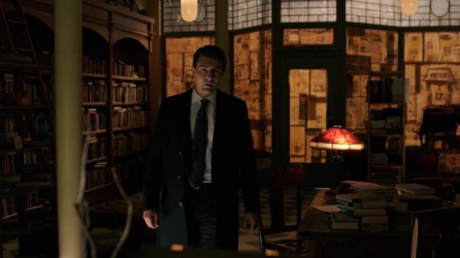
During the first season of time travel thriller 12 Monkeys, our heroes James Cole and Dr Cassandra Railly base themselves out of a disused shop. It’s a safe place they retreat to when they need to plan or regroup, and a womb-like feeling of warmth and security is created visually by the orange newspaper covering the shop’s front windows.

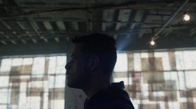
The season two finale of Mr Robot uses a similar technique to a very different end. Gaps in the paper here allow violent shafts of light to pierce the room, foreshadowing the bullet which is about to pierce Elliot’s body.


3. Blinds

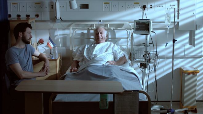
When I lensed the race drama Exile Incessant in 2015, director James Reynolds wanted to visually represent the ideological differences between the older and younger South Africans. I decided to bathe the progressive youngsters in soft, low-contrast light, while throwing hard light and deep shadows onto the more narrow-minded adults, whose world is black and white in more ways than one. For the hospital scene pictured below, I adjusted the venetian blinds – with a 2.5K HMI behind them – to give a contrasty pattern of light and shade on the old man.

Lighting through blinds is of course a famous feature of film noir cinematography, and has found its way into countless movies of all genres over the last several decades.
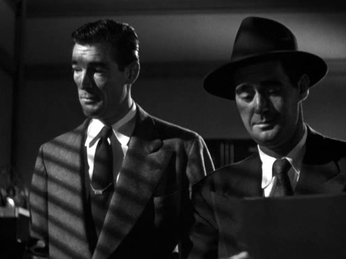
He Walked by Night (1948, dir. Alfred L. Werker)


4. Diffusing curtains

Placing sheer curtains on a window can solve two problems for filmmakers: disguising an unwanted or non-existent (if on stage) background, and softening the light. This is a widely-used technique; in fact it’s common practice for art departments to consult with DPs about curtains to ensure that the right options are available for the style of lighting that will be employed.

In an episode of my YouTube series Lighting I Like, I discussed a scene from The Crown – Netflix’s dramatisation of Queen Elizabeth II’s reign – in which King George VI is found dead. Unlike many daylight interiors in the series which feature hard shafts of sunlight, the scene in question employed net curtains to create a softer, more subdued light, appropriate to the sombre content.


5. Billowing curtains
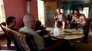
The season two Breaking Bad episode “Grilled” sees out-of-their-depth crystal meth cooks Walter White and Jesse Pinkman taken hostage by crazy drug lord Tuco Salamanca. Realising that their only hope of escape lies in killing Tuco, Walter and Jesse plot to poison his burrito. The episode bristles with tension, generated not just through the script and performances, but also by flapping curtains which paint the scene with restless shadows. The scene appears to have been shot on location, so whether the wind was artificial or just a happy accident I don’t know, but either way it adds immeasurably to the atmosphere.

Both Breaking Bad and 12 Monkeys feature in the second season of Lighting I Like – coming soon!
5 Lighting Modifiers You Can Put on Windows

5 Lighting Tips from Classic Art

A few weeks ago I discussed compositional techniques which we can learn from the work of JMW Turner. This time I’m looking at the use of light, and I’m broadening the scope to cover a few other classical artists whose works have caught my eye at galleries lately.

Without artificial illumination, these old masters had to make the most of the light God gave them. Here are five examples of their techniques which we can trace directly forward to cinematographic techniques of today.


Cross-light

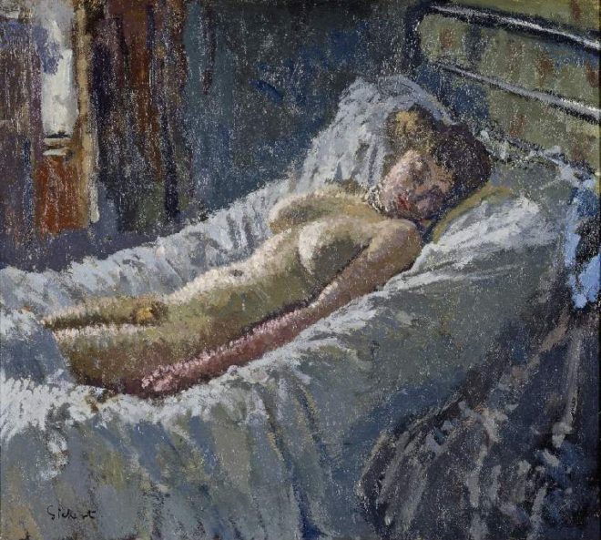
“Mornington Crescent Nude” (circa 1907) – Walter Richard Sickert

Decades before DPs started encouraging directors to shoot interior scenes towards windows to achieve the most interesting modelling, Sickert had the same idea. See how the light from the window in the background throws the model’s body into relief, giving it form and dimension? Cross-light is commonly used today in commercials for sport and fitness products, to emphasise muscle tone.

See also: Lighting Techniques #6: Cross-light


Background strokes

“Tancred’s Servant Presenting the Heart of Guiscard in a Golden Cup to Guismond” (circa 1675) – Adriaen van der Werff

What caught my eye about this painting was the slash of light on the background wall in the top left corner. It may seem trivial, but a little stroke of background light like this can really elevate the quality of a shot. Here it anchors the corner of the composition and gives us a hint of the room’s decor, adding interest to what would otherwise be a black void behind Guismond.

While lighting the subject of the shot is clearly a DP’s priority, it’s important to find time to paint in the surroundings even if they’re in the deep background or extreme foreground.

“Drive” (DP: Newton Thomas Sigel)

See also: 5 Ways to Use Hard Light Through a Window


Haze

“Chloe Idille” (1811) – Salomon Gessner & Carl Wilhelm Kolbe

This monochrome etching has a tremendous feeling of depth, and it is achieved purely through contrast. The further away an object is, the more air there is between that object and your eye. Since air isn’t 100% transparent, that distant object appears lighter and lower-contrast than closer objects. Gessner and Kolbe capture this effect beautifully here.

Many cinematographers today use hazers to create or enhance this atmospheric effect, even for interiors. In the days of miniature effects, smoke was often used to create atmospheric haze and increase the feeling of scale. On Blade Runner, for example, Douglas Trumbull’s VFX crew sealed the motion control stage and used infra-red sensors linked to hazers to automatically keep the smoke level constant during the long-exposure passes over the futuristic cityscape.

“Blade Runner” (DP: Jordan Cronenweth)

See also: Depth Cues in Cinematography


Golden hour

“Abingdon” (1806) – Joseph Mallord William Turner

Painters figured out centuries ago that the most beautiful light is found at the beginning and end of the day. It’s partly due to the cross-light effect (see above) of the lower sun, and partly due to the beautiful orange colour caused by the greater amount of atmosphere the sun’s rays must pass through. To shoot the perfect sunset, you’ll need patience, and a sun-tracker app or at least a compass. Ensure the schedule permits you to try again another day if clouds spoil the view.

“Raiders of the Lost Ark” (DP: Douglas Slocombe)

See also: Sun Paths


Wet-Downs

“The Boulevard Montmartre” (1897) – Camille Pissarro

This is the only night image in a series of impressionist oil paintings which Pissarro executed from a hotel window overlooking the Boulevard Montmartre. What makes it particularly beautiful is the wet street, turning what might otherwise have been a dull grey central swathe of the image into an arena of alternately shadowy and glittering reflections.

Cinematographers shooting night exteriors on streets will often have the tarmac hosed down for four reasons: (1) as already noted, the beauty of the reflections; (2) the deeper blacks and increased contrast; (3) the extra exposure gained by the light sources bouncing off the water; and (4) avoidance of continuity problems if it rains.

A scene from “Terminator 2” (DP: Adam Greenberg) on a street that’s been wetted down

See also: 7 Considerations for Night Shooting

5 Lighting Tips from Classic Art

“Above the Clouds”: February 2017 Pick-ups

Last weekend saw many of the crew of Above the Clouds reunite to shoot the remaining scenes of this comedy road movie. Principal photography was captured on an Alexa Mini during summer 2016 on location in Kent, on the Isle of Skye, and at Longcross Studio in Buckinghamshire, with additional location shooting on a Blackmagic Micro Cinema Camera in October.

The outstanding scenes were to be photographed on stage, at Halliford Studio in Shepperton, this time on an Arri Amira. The Amira uses the same sensor as the Alexas, allowing us to match the look from principal photography in the most cost-effective way. With the addition of a Premium license, the camera is capable of the same ProRes 4444 recording codec as the Alexas too. As per last summer, our glass was a set of Arri/Zeiss Ultra Primes, with a half Soft FX filter to take the digital edge off.

Director Leon Chambers designed and built the set himself, sending me photos of a scale model well in advance. He was also specific about certain lighting cues and states that were required across the two sets and six scenes we would be recording to complete the movie. Based on this information, I concocted a lighting plan, which I communicated to Halliford’s in-house gaffer Micky Reeves by Photoshopping stock images of lamps onto Leon’s set model photos.

Last Saturday was devoted to pre-lighting the sets, mainly the kitchen, while construction work continued on the second set.


Day 24 / Sunday

We begin with a morning scene. A 5K fresnel serves as a low sun, streaking across the back wall of the set (see my post about lighting through windows). Even with this direct light four stops over, the natural bounce off the set isn’t enough to bring actor Philip Jackson – with his back to the window – up to key. Micky rigs a Dedo firing into a soft silver bounce just out of frame to solve the problem.

Also coming through the window are two 4×4 kinos, rigged on goalposts above the window. Their daylight tubes reflect off the blinds, serendipitously creating the illusion of a blue sky “outdoors”, where in fact there is only a wall and a white backdrop.

Philip exits into the hallway and disappears from view, supposedly to go out through the front door. No door exists. Instead there is a flag which spark Amir Moulfi rotates in front of a 2K, creating a momentary oblong of light in which Philip’s shadow appears.

The next scene follows on from an exterior captured last October at dusk, when the natural light was soft, flat and cool in colour, cheated even cooler with the white balance. This failing daylight is to be the only source of illumination now in the kitchen set, until Philip enters and turns on the lights. This is the main reason that the daylight 4×4 kinos outside the window were rigged. A third kino from the direction of the front door is added, plus a small LED reporter light to pick an important prop out of the shadows.

Lead actress Naomi Morris enters, silhouetted against the windows. Then Philip enters and hits the lights. Simultaneously, Amir flips a breaker on a lunchbox, activating a hanging practical fixture above the breakfast bar and the 5K which that practical motivates.

Generally I don’t like toplight. It throws the eyes – those windows to the soul… or windows to the performance – into shadow. But with the hanging practical in shot, whatever I was going to use to beef it up had to be somewhat toppy or it wouldn’t make sense. I considered space-lights and Jem balls, but in consultation with Micky I ultimately picked a 5K with a chimera, coming in at a 45 degree back/toplight angle. As you can see from the photos, this looks almost comically large. But large and close means soft, which is what I want. It had to be soft enough to wrap both actors when they faced each other across the bar.


But why such a large lamp? Why not use a 2K, like Micky suggested yesterday? Bitter experience has always taught me to go with a bigger unit than you think you need, particularly if you’re softening it, and particularly if it’s going to take a while to rig. (The 5K was hung from another goalposts set-up.) We ended up dimming the 5K to 50% and scrimming it down a stop and a half. But having too much light like that is easy to deal with. If we had put up a 2K and it wasn’t bright enough, we would have to have taken the whole thing down and re-rigged with a 5K. And even if the 2K had seemed sufficient to begin with, blocking can often take actors into unexpected, dark corners of the set. Being able to turn up a dimmer a couple of notches to handle that kind of situation is very useful.

Besides the 5K, there are a few other sources playing: some 300W hairlights, a pup bouncing off the side of a cupboard to bring up the area around the cooker, a China ball in the hallway, and Leon’s Rosco LitePads serving as practical under-cabinet down-lighters.


Day 25 / Monday

I probably shouldn’t say what today’s set is, because it’s a little bit of a spoiler. There are some lighting similarities to the kitchen: again we have a character flicking a light switch, bringing on two hanging overhead practicals and a 2K with a chimera to beef them up.

A practical lamp on a desk was supposed to be turned on during the scene as well, but we all forget until it’s too late. It would have bounced off the desk and given Philip a little eye-light, and at first I regret losing this. But soon I realise that it is more appropriate for the scene not to have that level of refinement, for the lighting to be a little raw. The toppy, “broken key” angle of the chimera’s light works well for this tone too.

We wrap just before noon, releasing Naomi to high-tail it to Oxford to appear on stage in a musical this evening. Eventually there will be second-unit-style GVs and establishing shots to do, but there will only be three or four of us for that. For the cast and most of the crew, today brings Above the Clouds to an end, eight months after the camera first rolled.

See all my Above the Clouds posts here, or visit the official website.

“Above the Clouds”: February 2017 Pick-ups

Lighting I Like: “The Crown”

It’s Wednesday, and that means it’s time for another episode of my YouTube series Lighting I Like. This one is about The Crown, one of the most beautifully shot shows of 2016.

You can read more about how the cinematography reflects the burden of the wearing the Crown in my post “How The Crown Uses Broad Key Lighting to Evoke Tradition“.

There are also examples from The Crown in my recent post on using shafts of light through windows.

I hope you enjoyed the show. Episode five goes out at the same time next week: 8pm GMT on Wednesday, and will cover a scene from my all-time favourite TV series, Life on Mars. Subscribe to my YouTube channel to make sure you never miss an episode of Lighting I Like.

Lighting I Like: “The Crown”

Crossing Paths: Daylight Interior

IMG_2653
Col winds up the M18.

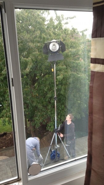
The final scene of Crossing Paths to go before the camera was a sombre daylight interior in a bedroom. If you’ve read my last two blog posts you’ll know that backlight is the central pillar of my approach to lighting both day exteriors and night exteriors. Daylight interiors are no different.

For day exteriors your backlight is the sun. For night exteriors it’s usually the moon. For day interiors it’s windows.

On the location recce I’d agreed with director Ben Bloore and production designer Sophie Black that we were going to shoot mostly towards the bedroom’s window. Given that the bed was the focal point of the scene, this decision was also cinematographically sound because it made for the most depth in the image, the window being in a dormer that distanced it from the bed.

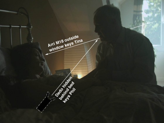
To punch up the natural light coming in through the window – which was on the second floor –  I had my crew clamber up on the flat roof of the extension and erect our Arri M18 on a double wind-up stand. Luckily the geography of the room and the blocking permitted the M18’s light to hit Tina’s face as she lay in the bed.

Sophie had dressed a floor lamp in next to the bed, which gave me the perfect motivation to clamp a dedo to the bedframe, uplighting Phil’s face. The cool M18 coming in from the rear right and the warm dedo coming in from the rear left picked out the actors’ profiles nicely, as you can see below. This is a kind of cross-backlight set-up, as explained in Lighting Techniques #2.

Frame grab (C) 2015 B Squared Productions
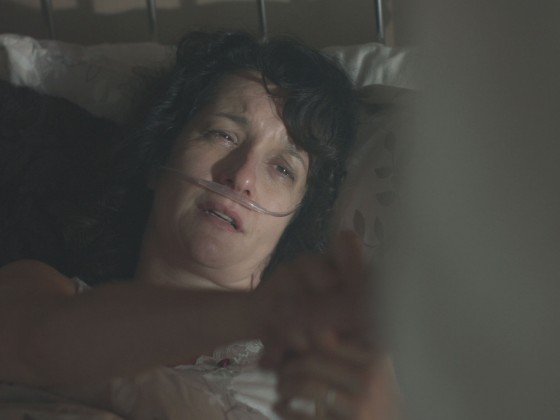
This CU of Tina shows how the M18 coming through the window worked as her key. (C) 2015 B Squared Productions

Immediately above the camera position there was a skylight with a roller blind. By opening or closing the blind I could effectively increase or decrease the level of fill in the lighting. For most of the scene I chose none. Some would argue that it’s best to add fill and then crush it out in post if you don’t like it, but I like to make decisions on the set wherever possible, to deliver the most cinematic image straight out of the camera.

The Magnum 650, a worthy successor to the classic 550

To soften the scene I pumped in lots of smoke. Col had kindly gifted me a Magnum 650 (to fill the smoke machine void in my life since my Magnum 550 packed up last year) and we let that baby rip in that tiny little room! The smoke helped add to the sense of decay and reacted beautifully to the curtains being opened mid-scene.

That’s all from the set of Crossing Paths. I believe the edit is now underway, and I look forward to seeing how this lovely little short film turns out.

Crossing Paths is a B Squared production (C) 2015. Find out more at facebook.com/Crossing-Paths-Short-Film-697385557065699/timeline/

Crossing Paths: Daylight Interior