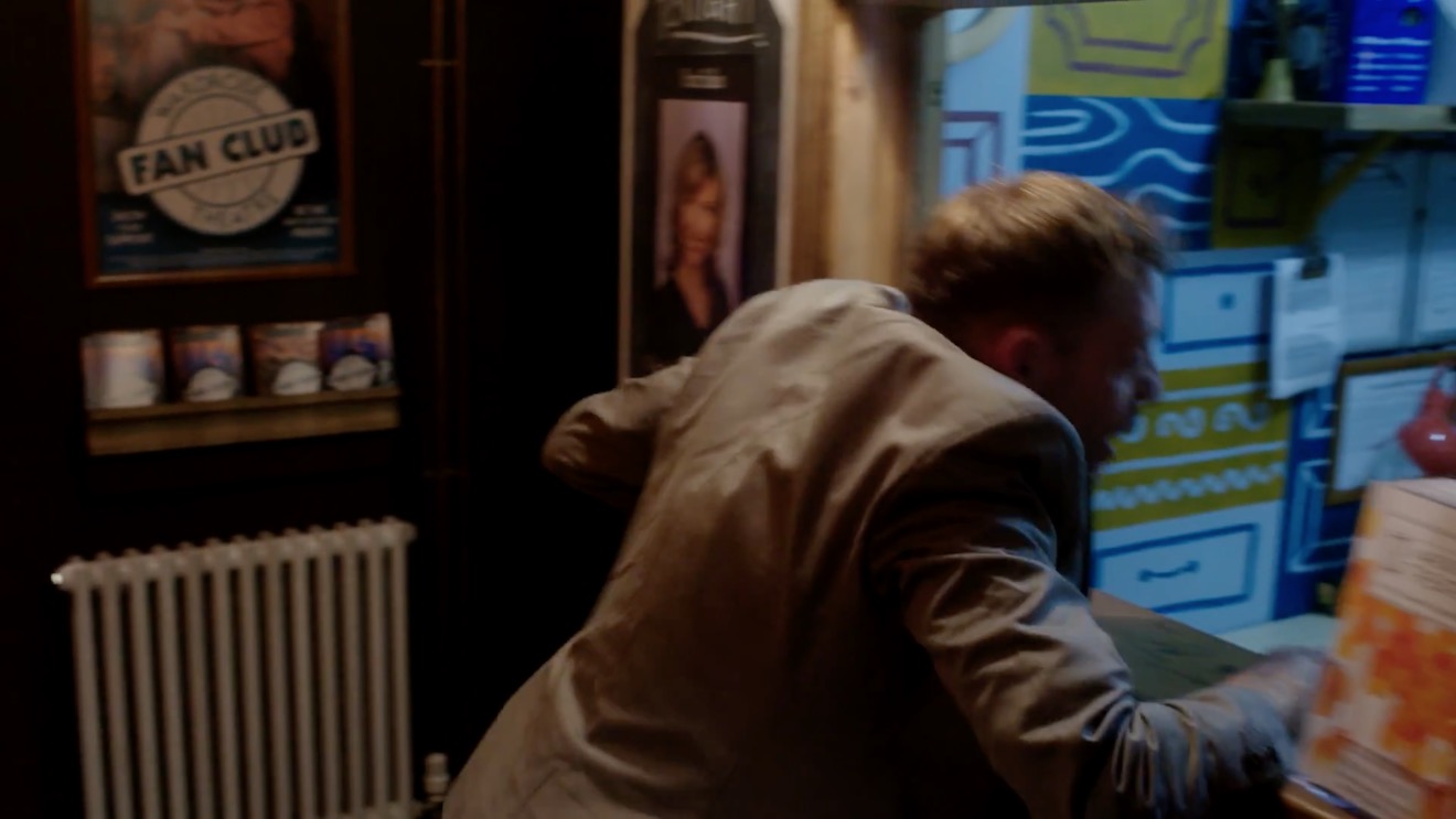
Preacher is the subject of this week’s episode of Lighting I Like. I discuss two scenes, from the second episode of the second season, “Mumbai Sky Tower”, which demonstrate the over-the-top, comic-book style of the show.
Both seasons of Preacher can be seen on Amazon Video in the UK.
The latest episode of Lighting I Like is out, analysing how the “Splinter Chamber” set is lit in time travel thriller 12 Monkeys. This adaptation of the Terry Gilliam movie can be seen on Netflix in the UK.
I found out lots about the lighting of this scene from this article on the American Society of Cinematographers website. It didn’t mention the source inside the time machine though, but my guess is that it’s a Panibeam 70, as used in the Cine Reflect Lighting System.
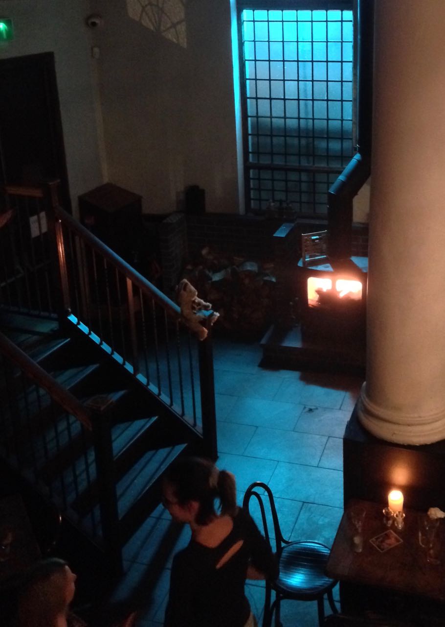
There were no practicals in this corner of the pub, so we placed an 800 open-face outside the window, gelled with Midnight Blue, and a 1×1′ LED panel in the wood-burner, gelled with CTO.
This year I’ve shot a couple of productions on the Sony FS7, a camera I’ve been very impressed by. Its most interesting feature is its high native ISO of 2000, which makes quite an impact on how you go about lighting. The light shed by practicals is often enough to illuminate a scene, or a large part of it, and sometimes you need to take existing practicals away in order to maintain contrast and shape, similar to how you take ambient light away (negative fill) when shooting exteriors.
It’s a strange thing about being a DP that, yes, sometimes you’re required to plan a mammoth lighting set-up using tens of kilowatts of power, but other times it’s just a case of saying, “Take the bulb out of that sconce.” You’re working to exactly the same principles, using your creative eye just as much in both scenarios.
Let’s look at some examples from a promotional film I shot with director Oliver Park for Closer Each Day, an improvised stage soap.
Our location was a pub, which had a large number of existing practicals: mainly wall sconces, but some overheads above the bar and in the corridors too. The film had to be shot in a single night, entirely on Steadicam, with some shots revealing almost the whole room, and to further complicate matters I was a last-minute hire due to another DP having to step down. Keeping the lighting simple, and avoiding putting any “film lights” on the floor where the roving camera might see them, was clearly the way to go.
I identified the darker areas of the room and added a few extra sources: two blue-gelled 800s outside the windows, an orange-gelled 1×1′ LED panel in the wood-burner, an LED reporter light in one key corner, and a small tungsten fresnel toplight onto a key table, firing down from the mezzanine so it would never be in shot. Other than those, and a low level of fill bounced off the ceiling, we relied exclusively on the existing practicals. (They were mainly fluorescent, and ideally we would have reglobed these all with tungsten, but it wasn’t possible.)
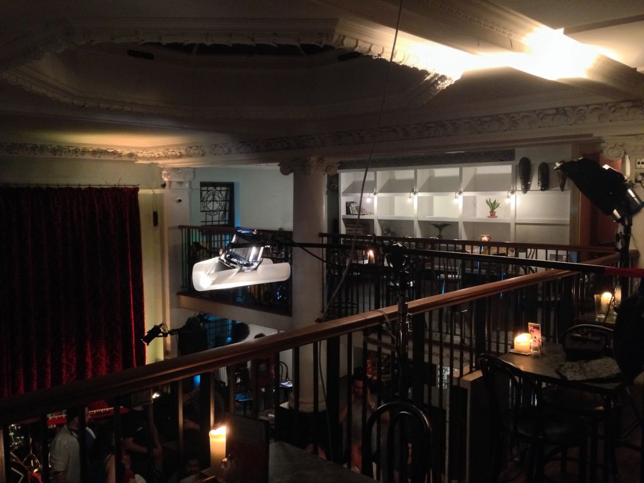
This view from the mezzanine shows the diffused 300W fresnel top-lighting the drinking contest table, and the black-wrapped 650 firing into the ceiling for fill.
So, that’s the “positive” lighting. Here are three examples of “negative” lighting in the film…
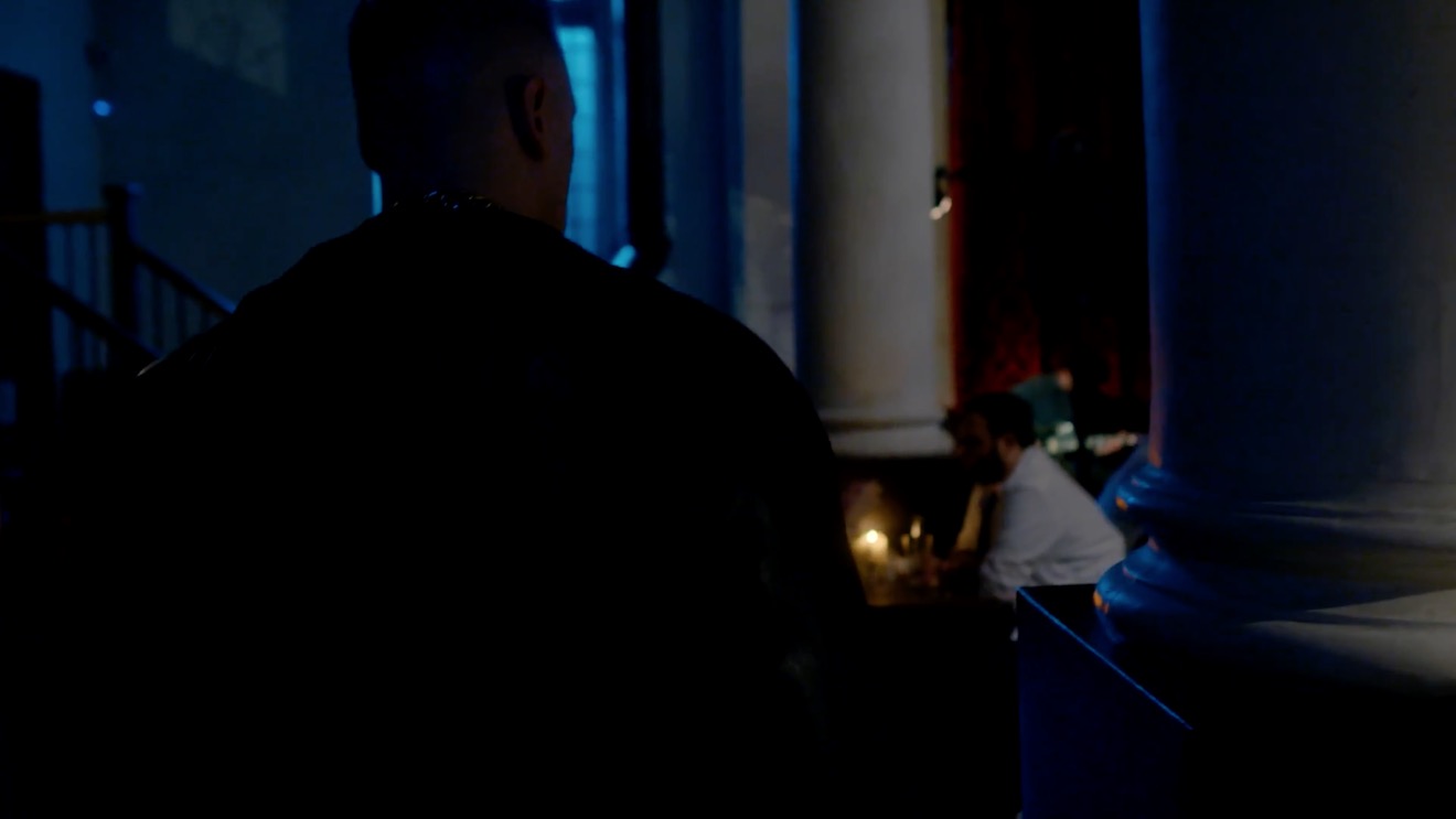
When Big Dick Johnson (yep, that’s the character’s name) first enters the pub, I put a piece of tape over a little halogen spotlight just above his point of entry. This was partly because it was very bright and I didn’t want him to blow out as he walked under it, but it also made for a much better sense of depth in the overall shot. As I’ve often mentioned on this blog, the best depth in an image is usually achieved by having the foreground dark, the mid-ground at key and the background bright. Killing the halogen spotlight helped create this progression of brightness and therefore depth. It’s also just nice in a shot like this to come out of darkness into the light, enhancing the reveal of the new space to the viewers.
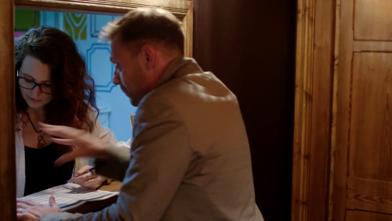
When Billy De Burgh scrambles to buy a ticket at the box office, there are two practicals just above his head. Depending on which way we were shooting, I de-globed one of the fixtures – always the one closest to camera. This ensured that Billy always had backlight, and never had a really hot, toppy front-light shining harshly down on him.
On a side note, the blue light inside the box office was existing – I guess they were using cool white LED bulbs in there – and I really like the way it differentiates the spaces on camera. It puts the bored ticket-seller in a cold, detached world very separate to Billy’s warmer, more urgent world.
This doorway where Big Dick ends the film had sconces on both sides. It’s never very interesting to have an actor evenly lit on both sides of their face, and especially as Dick is such a tough, unpleasant character, I felt that more contrast was required. I chose to remove the globe from the righthand sconce, so that when he turns camera left to look at the sign he turns into the remaining sconce, his key-light. We filled in the other side of his face a tiny touch with a reflector.
I would love to have been able to exercise the same control over the street-lamps in the opening scene of the film – some of them are quite flat and frontal – but unfortunately time, budget and permissions made that impossible. We would have needed huge flags, or a council-approved electrician to switch the lamps off.
That’s all for today. Next time you’re in Bristol, check out Closer Each Day. I didn’t get chance to see it, but I hear it’s brilliant.
This week’s edition of Lighting I Like focuses on a scene from Life on Mars, my all-time favourite TV show. Broadcast on the BBC in 2006 and 2007, this was a police procedural with a twist: John Simm’s protagonist D.I. Sam Tyler had somehow travelled back in time to the 1970s… or was he just in a coma imagining it all? Each week his politically correct noughties policing style would clash with the seventies “bang ’em up first, ask questions later” approach of Philip Glenister’s iconic Gene Hunt.
I must get around to doing a proper post on colour theory one of these days, but in the meantime, there’s a bit about colour contrast in this post. And you can read more about using practicals in this post.
I hope you enjoyed the show. The sixth and final episode goes out at the same time next week: 8pm GMT on Wednesday, and will feature perhaps the most stunning scene yet, from the Starz series Outlander.Subscribe to my YouTube channel to make sure you never miss an episode of Lighting I Like.
It’s Wednesday, and that means it’s time for another episode of my YouTube series Lighting I Like. This one is about The Crown, one of the most beautifully shot shows of 2016.
I hope you enjoyed the show. Episode five goes out at the same time next week: 8pm GMT on Wednesday, and will cover a scene from my all-time favourite TV series, Life on Mars.Subscribe to my YouTube channel to make sure you never miss an episode of Lighting I Like.
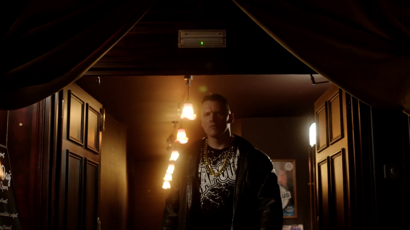
The second episode of Lighting I Like looks at a scene from the season four premiere of Victorian crime drama Ripper Street, available on Amazon Prime in the UK.
On closer inspection, the “tungsten fill” I mention in the video is more of a soft tungsten toplight – perhaps a Chimera Pancake – rigged to the ceiling in the centre of the room. When Jackson exits at 2:00 you can see him walk under it.
Here’s some further reading if you want to know more about using practicals, and candlelight in particular:
Candlelight – how I tackled multiple candlelight scenes in my first period production, The First Musketeer, including a video blog from the set.
I hope you enjoyed the show. Episode three goes out at the same time next week: 8pm GMT on Wednesday, and will cover a scene from the 2001 movie Harry Potter and the Philosopher’s Stone. Subscribe to my YouTube channel to make sure you never miss an episode.
As the sensitivity and dynamic range of cameras has increased, practicals have become a more and more important and popular tool in the cinematographer’s arsenal. A practical is any light source that appears in the frame. It could be a fluorescent strip-light, a table lamp, car headlights, candles, a fireplace, an iPad, fairy lights, street lamps, a torch, a security light… any light that could be realistically found in the place where your scene is set.
Here are five pieces of advice I’ve put together from my own experiences working with practical lights.
1. Liaise continually with the director and art department.
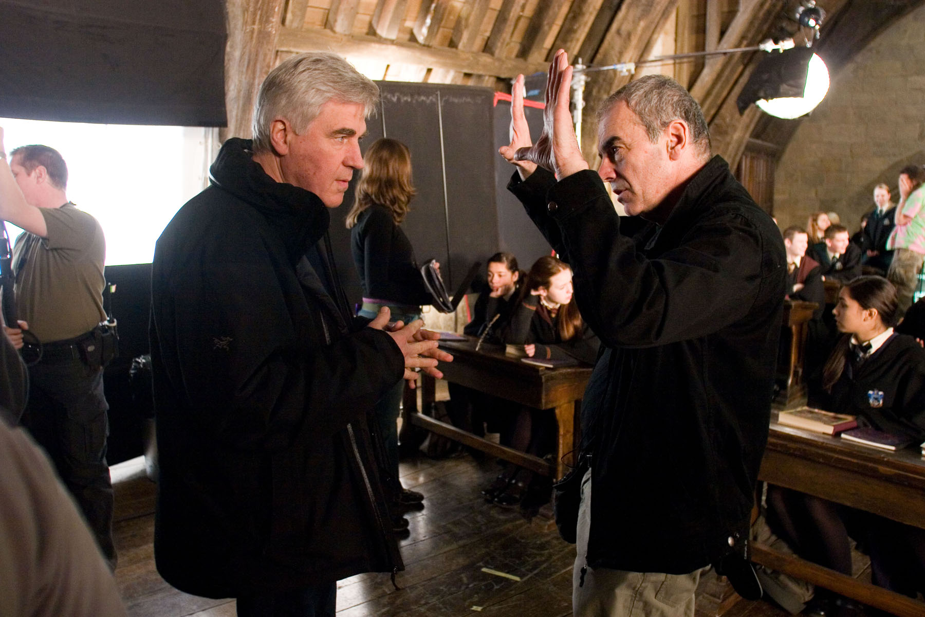
Production Designer Stuart Craig and Cinematographer Slawomir Idziak PSC confer on the set of Harry Potter and the Order of the Phoenix.
Although the bulb, wiring and power supply are the responsibility of the lighting department, the fixture itself falls under the purview of the art department. A good production designer will be thinking of light sources from the very beginning of their set design process. This is the start of a conversation which will continue throughout preproduction, as you the DP ask for fixtures in certain positions to make the set and actors look good, and the designer either says yes or asks for compromises so as not to ruin the aesthetics or believability (or budget!) of their design. The places a DP wants light sources in order to get the best modelling of the talent are often not the places a real human being would choose to install a light source in their home/office/dungeon etc. Some designers will demand realism and fight you on these decisions; others are open to artistic license. Either way, you must respect the symbiotic relationship between your two departments and do your best to reach a solution that works for both of you.
Keeping the director in the loop is also very important. When it comes to lighting, practicals are one of the things most likely to cause disagreement between the director and DP. You may have spent an hour lighting the set to be motivated by the candles all around, only for the director to walk onto set and say that they feel it makes no sense within the story for someone to have lit the candles in this scene. At which point, if you can’t change the director’s mind, you will find yourself hastily relighting the set while the 1st AD shakes their head in despair.
2. Sometimes it’s as simple as turning it on.
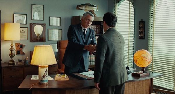
A Serious Man (DP: Roger Deakins CBE, ASC, BSC)
Earlier in my career, whenever I saw a practical, I felt that I had to set up a movie light somewhere out of frame in order to beef up the amount of light apparently coming from that practical. And traditionally, this is indeed the way DPs have worked, because film stocks weren’t sensitive enough to get an acceptable exposure from typical practicals like table lamps. Or it was impossible to find a level for the practical where it was bright enough to expose the talent but dim enough that the lamp itself didn’t read on camera as an ugly, over-exposed white blob.
But today’s digital cameras have a wider dynamic range, making it much easier to expose both the source and the subject acceptably. So ask yourself, do you really need that movie light? Roger Deakins, the world’s most celebrated living cinematographer, says he commonly lights his sets now with predominantly practical sources. Take a look at your scene without any additional lights, and only add extra sources if your practical’s illumination isn’t reaching the distance it needs to.
And practicals don’t even need to light the talent. Sometimes you have a scene perfectly well illuminated with other sources, but turning on a practical in the background just adds the icing on the cake. It may not illuminate anything but a small pool immediately around itself, but that little pool of orange light might add colour contrast, production value and interest. I’ve often seen daylight interior scenes on TV or in movies where bright shafts of “sunlight” are blasting in through a window, and no-one would realistically need to turn an artificial light on, but nonetheless several table lamps are glowing away in the background – because it looks great!
3. Always use dimmers.
As I’ve already said, finding that perfect brightness for your practical can be a delicate balancing act, so always have your crew put practicals on dimmers (a.k.a. “squeezers”) to make it easy to find that right level. Besides, practicals often look best with a warmer colour temperature, and you can get that by dimming them down, if they’re tungsten, adding to the cosy feel.
4. Keep other sources off the practical.
One of the reasons practicals look good is because they create contrast in the frame: a bright patch spreading out into darkness. If other light is falling on the practical, this effect will be washed out and reduced. If the other source is bright, it may even make the practical look like it’s not switched on. (Just like if you take a torch outside in daylight and turn it on, it doesn’t look like it’s on at all because the sun is so overpowering.)
If possible, other sources should be flagged so that they don’t hit the practical. This is something that an experienced gaffer will often have done as a matter of course.
5. Dim the camera side of the practical.
O Brother, Where Art Thou? (DP: Roger Deakins CBE, ASC, BSC)
Even with the wide dynamic range of today’s cameras, the flame or bulb of a practical may still look unpleasantly bright on camera. To deal with this, depending on the design of the fixture, you may be able to hide a small piece of ND gel inside it on the camera side. If properly arranged, this will cut the light travelling directly into the camera lens, but not the light shining in other directions and illuminating the talent.
Alternatively, the glass case of a lantern can be sprayed black on the camera side. The paint will not be picked up by the camera because there will still be a lot of light coming through it, but it should cut enough brightness to eliminate lens flare and reduce highlight clipping.
I hope these tips are helpful next time you shoot with practicals. Happy lighting, and merry Christmas!