If you’re a fan of early Steven Spielberg films, you’ve probably heard of split diopter shots (also spelt “dioptre” in the UK). Brian de Palma used them a lot too, and Robert Wise’s Star Trek: The Motion Picture is absolutely riddled with them.
A split diopter allows half the image to be focused at one distance and half at another. Shallow depth of field is sought after by many filmmakers today, but it wasn’t always so popular. Sometimes a director or DP wanted both characters in a deep two-shot simultaneously in focus, and slow film stock and/or lenses meant that it wasn’t possible to just stop down the iris.
So what is a split diopter (a.k.a. split-field diopter)? It’s a convex lens of a semi-circular shape that can be slotted into your matte box. Light passing through this lens is converged so that it focuses closer, while light passing through the empty half of course goes unaltered to the main lens.
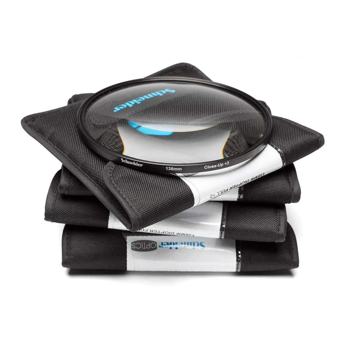
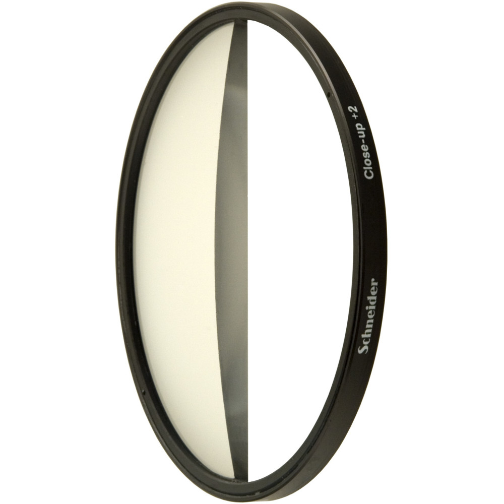
Bog-standard diopters are available too, with no missing half, enabling the entire image to be focused closer than normal. (In stills photography they are sometimes called close-up lenses or macro filters.) These are especially useful with anamorphic and zoom lenses, which tend to have greater close-focus distances than spherical primes. There’s no stop loss, so you don’t have to compensate with more light.
I carried a set of diopters with me on Hamlet and we used them for a couple of shots with the vintage Cooke Cinetal 25-250mm zoom (CF: 5’6″) when I was shooting quite tight and quite close to the talent.
So that’s what the physical object is. But a diopter is also a unit of measurement. A typical set of physical diopters (full or split) contains ½, 1, 2 and 3 strengths. What do those numbers mean?
A diopter is defined as a reciprocal metre, or 1 over the focal length. It’s the same unit used to define prescriptions for glasses. The important thing in cinematography is what effect a diopter of a given strength has on your minimum and maximum focus distances. Apps like pCAM Pro will work these out for you, but let’s do the maths ourselves because it’s my blog and I said so.
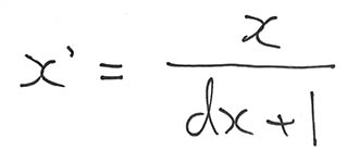
The formula for minimum focal distance is
where
x is the normal minimum focus of the lens (in metres),
x’ is the new minimum focus,
and d is the strength of the diopter.
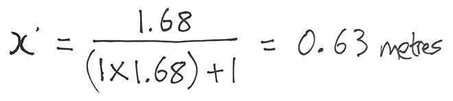
Let’s take my Cooke Cinetal as an example. The 5’6″ close focus in metres is 1.68, so with a number 1 diopter…
… or with a number 3 diopter…
Diopters can be stacked; simply add the strengths together and then drop that number into the formula, so in the above case we’d have a total of 4 diopters (diopters the units, not diopters the objects!) which would produce a close focus of 0.22m. Keep the strongest diopter closest to the camera when stacking.
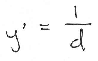
You have to be careful that you don’t reduce your maximum focal distance too much and find you can’t hold focus on a character as they move away. Your new maximum focal distance y’ (when the main lens is set to infinity) is
So that would be 1m with a number 1 diopter! Pretty restrictive, huh? A number 3 diopter gives you a maximum focal distance of 0.33m, even worse! I remember having to cheat Ian McKellen (CLANG!!!) a little closer to camera when we did a diopter shot on Hamlet, so that we could pull focus to him from a foreground actor’s hands.
If you bear that caveat in mind, however, a set of diopters is a very useful thing to have with you.
Inside a lens, amongst the various glass elements, is an ingenious mechanism which we call the iris. Just like your biological iris, it controls the amount of light passing through the pupil to form an image. I’ve written about the iris’s use to control exposure before, and its well-known side effect of controlling depth of field. But here are five things that aren’t so commonly known about irises.
1. f-stops and the entrance pupil
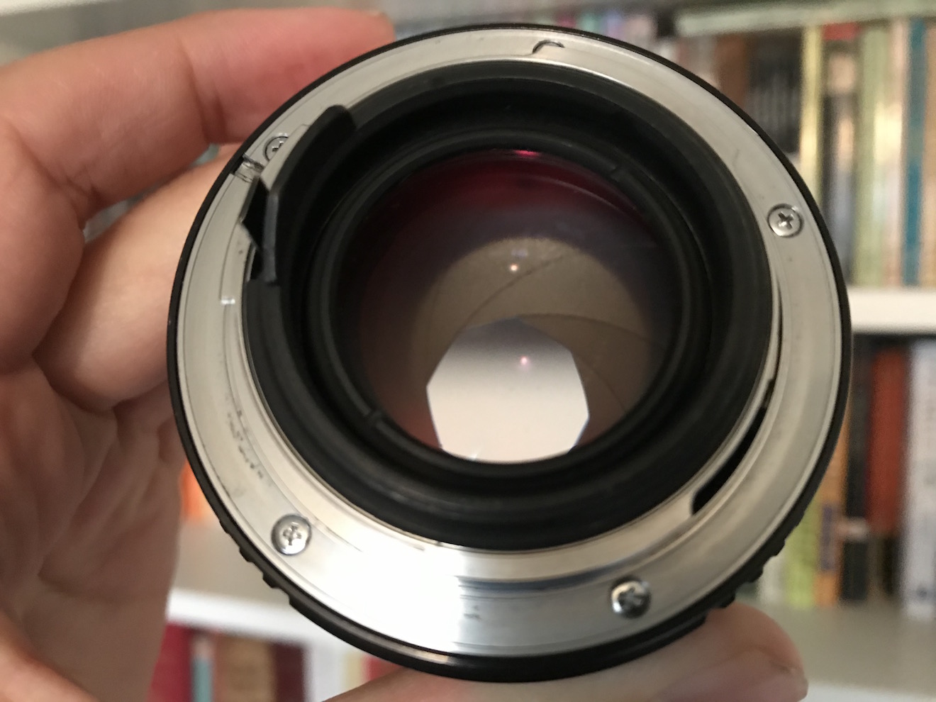
This image shows the exit pupil because it’s seen through the rear element of the lens. A view through the front element would show the entrance pupil.
The f-number of a lens is the ratio of the focal length to the diameter of the aperture, but did you know that it isn’t the actual diameter of the aperture that’s used in this calculation? It’s the apparent diameter as viewed through the front of the lens. A lens might have a magnifying front element, causing the aperture to appear larger than its physical size, or a reducing one, causing it to appear smaller. Either way, it’s this apparent aperture – known as the entrance pupil – which is used to find the f-number.
2. No-parallax point
The no-parallax point of a lens is located at its entrance pupil. Sometimes called the nodal point, although that’s technically something different, this is the point around which the camera must pan and tilt if you want to eliminate all parallax. This is important for forced perspective work, for panoramas stitched together from multiple shots, and other types of VFX.
3. Focus
If you need to check your focal distance with a tape measure, many cameras have a handy Phi symbol on the side indicating where the sensor plane is located so that you can measure from that point. But technically you should be measuring to the entrance pupil. The sensor plane marker is just a convenient shortcut because the entrance pupil is in a different place for every lens and changes when the lens is refocused or zoomed. In most cases the depth of field is large enough for the shortcut to give perfectly acceptable results, however.
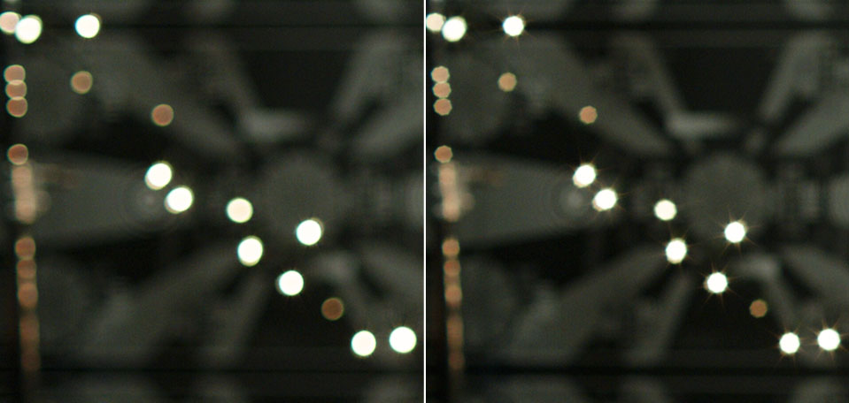
4. Bokeh shape
The bokeh of a 32mm Cooke S4 wide open at T2 (left) and stopped down to T2.8 (right). Note also the diffraction spikes visible in the righthand image.
The shape of the entrance pupil determines the shape of the image’s bokeh (out of focus areas), most noticeable in small highlights such as background fairy lights. The pupil’s shape is determined both by the number of iris blades and the shape of their edges. The edges are often curved to approximate a circle when the iris is wide open, but form more of a polygon when stopped down. For example, a Cooke S4 produces octagonal bokeh at most aperture settings, indicating eight iris blades. Incidentally, an anamorphic lens has a roughly circular aperture like any other lens, but the entrance pupil (and hence the bokeh) is typically oval because of the anamorphosing effect of the front elements.
5. Diffraction spikes
When the edge of an iris blade is straight or roughly straight, it spreads out the light in a perpendicular direction, creating a diffraction spike. The result is a star pattern around bright lights, typically most visible at high f-stops. Every blade produces a pair of spikes in opposite directions, so the number of points in the star is equal to twice the number of iris blades – as long as that number is odd. If the number of blades is even, diffraction spikes from opposite sides of the iris overlap, so the number of apparent spikes is the same as the number of blades, as in the eight-pointed Cooke diffraction pictured above right.
“The Handmaid’s Tale: Offred” (2017, DP: Colin Watkinson, ASC, BSC)
When DSLR video exploded onto the indie filmmaking scene a decade ago, film festivals were soon awash with shorts with ultra-blurry backgrounds. Now that we have some distance from that first novelty of large-sensor cinematography we can think more intelligently about how depth of field – be it shallow or deep – is best used to help tell our stories.
First, let’s recap the basics. Depth of field is the distance between the nearest and farthest points from camera that are in focus. The smaller the depth of field, the less the subject has to move before they go out of focus, and the blurrier any background and foreground objects appear. On the other hand, a very large depth of field may make everything from the foreground to infinity acceptably sharp.
Everyone’s favourite time machine at f/5 (left) and f/1.8 (right)
Depth of field is affected by four things: sensor (or film) size, focal length (i.e. lens length), focal distance, and aperture. In the days of tiny Mini-DV sensors, I was often asked by a director to zoom in (increase the focal length) to decrease the depth of field, but sometimes that was counter-productive because it meant moving the camera physically further away, thus increasing the focal distance, thus increasing the depth of field.
It was the large 35mm sensors of DSLRs, compared with the smaller 1/3” or 2/3” chips of traditional video cameras, that made them so popular with filmmakers. Suddenly the shallow depth of field seen in a Super-35 movie could be achieved on a micro-budget. It is worth noting for the purists, however, that a larger sensor technically makes for a deeper depth of field. The shallower depth of field associated with larger sensors is actually a product of the longer lenses required to obtain the same field of view.
Once a camera is selected and filming is underway, aperture is the main tool that DPs tend to use to control depth of field. A small aperture (large f- or T-number) gives a large depth of field; a large aperture (small f- or T-number) gives a narrow depth of field. What all those early DSLR filmmakers, high on bokeh, failed to notice is that aperture is, and always has been, a creative choice. Plenty of directors and DPs throughout the history of cinema have chosen deep focus when they felt it was the best way of telling their particular story.
“Citizen Kane” (1941, DP: Gregg Toland, ASC)
One of the most famous deep-focus films is 1941’s Citizen Kane, frequently voted the greatest movie ever made. First-time director Orson Welles came from a theatre background, and instructed DP Gregg Toland to keep everything in focus so that the audience could choose what to look at just as they could in a theatre. “What if they don’t look at what they’re supposed to look at?” Welles was apparently asked. “If that happens, I would be a very bad director,” was his reply.
Stanley Kubrick was also fond of crisp backgrounds. The infamous f/0.7 NASA lenses used for the candlelight scenes in Barry Lyndon were a rare and extreme exception borne of low-light necessity. A typical Kubrick shot has a formal, symmetrical composition with a single-point perspective and everything in focus right into the distance. Take the barracks in Full Metal Jacket, for example, where the background soldiers are just as sharp as the foreground ones. Like Welles, Kubrick’s reasons may have lain in a desire to emulate traditional art-forms, in this case paintings, where nothing is ever blurry.
“Full Metal Jacket” (1987, DP: Douglas Milsome, ASC, BSC)
The Indiana Jones trilogy was shot at a surprisingly slow stop by the late, great Douglas Slocombe. “I prefer to work in the aperture range of T14-T14.5 when I am shooting an anamorphic film like Raiders,” he said at the time. “The feeling of depth contributed to the look.” Janusz Kamiński continued that deep-focus look, shooting at T8-T11 when he inherited the franchise for Kingdom of the Crystal Skull.
At the other end of the aperture scale, the current Hulu series The Handmaid’s Tale makes great creative use of a shallow depth of field, creating a private world for the oppressed protagonist which works in tandem with voiceovers to put the viewer inside her head, the only place where she is free.
A director called James Reynolds had a similar idea in mind when I shot his short film, Exile Incessant. He wanted to photograph closed-minded characters with shallow focus, and show the more tolerant characters in deep focus, symbolising their openness and connection with the world. (Unfortunately the tiny lighting budget made deep focus impossible, so we instead achieved the symbolism by varying the harshness of the lighting.)
“Ren: The Girl with the Mark” (2016, DP: Neil Oseman)
One production where I did vary the depth of field was Ren: The Girl with the Mark, where I chose f/4 as my standard working stop, but reduced it to as little as f/1.4 when the lead character was bonding with the mysterious spirit inside her. It was the same principle again of separating the subject from the world around her.
Depth of field is a fantastic creative tool, and one which we are lucky to have so much control over with today’s cameras. But it will always be most effective when it’s used expressively, not just aesthetically.
Ever since digital cinematography became the norm, DPs have sought to counter the format’s perfection with characterful vintage lenses. Having just completed a feature film shoot, Hamlet, on Cooke Panchros and a Cooke 10:1 Varotal, I’m over the moon with the beautiful, creamy, organic look they brought to the production. However, I can’t deny that they have some disadvantages over modern glass which you should take into consideration before choosing the vintage approach.
1. Softness
Vintage lenses simply aren’t as sharp as their modern counterparts, particularly at the edges of frame and particularly when the iris is wide open. On Hamlet I deliberately shot with the Panchros wide open to soften the image, rather than adding a diffusion filter like I’ve often done in the past, but that look is not for everyone, and it does make things a little harder for your focus puller. Be sure to test the sharpness and view the results on a large screen before committing.
2. BreathING
https://www.youtube.com/watch?v=YcpLAk34fkk
Breathe is the phenomenon whereby a lens appears to zoom slightly in or out when the focus is pulled. The Cooke Varotal is especially prone to this. As a result, my focus puller Aristide Russo had to be very gentle with his pulls otherwise the breathing was distracting.
3. Veiling
Many DPs love lens flares, and beautiful, natural flares were one of the reasons I picked the vintage Cooke glass. But look out for veiling flare – a milkiness and lift in the shadows affecting the whole frame. I noticed this a lot when shooting under the practical fluorescents in Hamlet‘s stage set, especially with handheld shots where the veiling would appear and disappear depending on the camera’s angle to the lights. I decided to embrace it and make it part of the film’s look, but if maintaining high contrast at all times is important to you, lenses without modern coatings may not be the right choice.
4. Vignetting
Check for dark patches in the corners of your image. The Varotal I used vignetted at certain parts of the zoom range and not at others, so the dark corners would appear and disappear during a zoom. Although not ideal, it isn’t noticeable most of the time. Besides, I figured that most colourists add vignettes to most shots anyway, so I was simply saving them a little time!
5. Mechanics
Older lenses are, quite naturally, less reliable. Even if they have been rehoused, like our Cooke “Century” Panchros had been in 2000, you may find that the iris and/or focus sticks sometimes. Our 25mm started to play up halfway through our shoot, forcing Aris to use the rosettes to support the matte box, otherwise the motor wasn’t powerful enough to turn the focus ring. This possibility was flagged for me during testing when we had a similar issue with the 50mm. Even if all your lenses seem to be fine during prep, know that a vintage lens could start misbehaving at any time, and your rental house may not have another on the shelf to replace it with.
6. Uniformity
Don’t expect a set of vintage primes to all have the same maximum aperture or the same external configuration. The iris ring might be buried in the matte box, the matte box might not fit on at all, or it may be impossible to engage both iris and focus motors at the same time.
All this sounds quite negative, but the flares, softness, breathing and vignettes can be absolutely beautiful. Be aware of the downsides of using vintage glass, absolutely, but if they suit your story then embrace the flaws and get ready to be blown away by your dailies.
In case you missed them the first time, I’ll leave you with some highlights from my Hamlet lens tests.
The main event of last week’s prep was a test at Panavision of the Arri Alexa XT, Red Gemini and Sony F55, along with Cooke Panchro, Cooke Varotal, Zeiss Superspeed and Angenieux glass. More on that below, along with footage.
The week started with Zoom meetings with the costume designer, the make-up artist, potential fight choeographers and a theatrical lighting designer. The latter is handling a number of scenes which take place on a stage, which is a new and exciting collaboration for me. I met with her at the location the next day, along with the gaffer and best boy. After discussing the stage scenes and what extra sources we might need – even as some of them were starting to be rigged – I left the lighting designer to it. The rest of us then toured the various rooms of the location, with the best boy making notes and lighting plans on his tablet as the gaffer and I discussed them. They also took measurements and worked out what distro they would need, delivering a lighting kit list to production the next day.
Meanwhile, at the request of the producer, I began a shot list, beginning with two logistically complex scenes. Despite all the recces so far, I’ve not thought about shots as much as you might think, except where they are specified in the script or where they jumped out at me when viewing the location. I expect that much of the shot planning will be done during the rehearsals, using Artemis Pro. That’s much better and easier than sitting at home trying to imagine things, but it’s useful for other departments to be able to see a shot list as early as possible.
So, the camera tests. I knew all along that I wanted to test multiple cameras and lenses to find the right ones for this project, a practice that is common on features but which, for one reason and another, I’ve never had a proper chance to do before. So I was very excited to spend Wednesday at Panavision, not far from my old stomping ground in Perivale, playing around with expensive equipment.
Specifically we had: an Arri Alexa – a camera I’m very familiar with, and my gut instinct for shooting this project on; a Sony F55 – which I was curious to test because it was used to shoot the beautiful Outlander series; and a Red Gemini – because I haven’t used a Red in years and I wanted to check I wasn’t missing out on something awesome.
For lenses we had: a set of Cooke Panchros – again a gut instinct (I’ve never used them, but from what I’ve read they seemed to fit); a set of Zeiss Superspeeds – selected after reviewing my 2017 test footage from Arri Rental; a couple of Cooke Varotal zooms, and the equivalents by the ever-reliable Angenieux. Other than the Angenieux we used on the B-camera for The Little Mermaid (which I don’t think we ever zoomed during a take), I’ve not used cinema zooms before, but I want the old-fashioned look for this project.
Here are the edited highlights from the tests…
You’ll notice that the Sony F55 disappears from the video quite early on. This is because, although I quite liked the camera on the day, as soon as I looked at the images side by side I could see that the Sony was significantly softer than the other two.
So it was down to the Alexa vs. the Gemini, and the Cookes vs. the Superspeeds. I spent most of Thursday and all of Friday morning playing with the footage in DaVinci Resolve, trying to decide between these two pairs of very close contenders. I tried various LUTs, did some rough grading (very badly, because I’m not a colourist), tested how far I could brighten the footage before it broke down, and examined flares and bokeh obsessively.
Ultimately I chose the Cooke Panchros because (a) they have a beautiful and very natural-looking flare pattern, (b) the bokeh has a slight glow to it which I like, (c) the bokeh remains a nice shape when stopped down, unlike the Superspeeds’, which goes a bit geometric, (d) they seem sharper than the Superspeeds at the edges of frame when wide open, and (e) more lengths are available.
As for the zoom lenses (not included in the video), the Cooke and the Angenieux were very similar indeed. I chose the former because it focuses a little closer and the bokeh again has that nice glow.
I came very close to picking the Gemini as my camera. I think you’d have to say, objectively, it produces a better image than the Alexa, heretical as that may sound. The colours seem more realistic (although we didn’t shoot a colour chart, which was a major oversight) and it grades extremely well. But…
I’m not making a documentary. I want a cinematic look, and while the Gemini is by no means un-cinematic, the Alexa was clearly engineered by people who loved the look of film and strove to recreate it. When comparing the footage with the Godfather and Fanny and Alexander screen-grabs that are the touchstone of the look I want to create, the Alexa was just a little bit closer. My familiarity and comfort level with the Alexa was a factor too, and the ACs felt the same way.
I’m very glad to have tested the Gemini though, and next time I’m called upon to shoot something great and deliver in 4K (not a requirement on this project) I will know exactly where to turn. A couple of interesting things I learnt about it are: (1) whichever resolution (and concomitant crop factor) you select, you can record a down-scaled 2K ProRes file, and this goes for the Helium too; (2) 4K gives the Super-35 field of view, whereas 5K shows more, resulting in some lenses vignetting at this resolution.
Anamorphic cinematography, first dabbled with in the 1920s, was popularised by Twentieth Century Fox in the fifties as CinemaScope. Television was growing in popularity and the studios were inventing gimmicks left, right and centre to encourage audiences back into cinemas. Fox’s idea was to immerse viewers in an image far wider than they were used to, but with minimal modifications to existing 4-perf 35mm projectors. They developed a system of anamorphic lenses containing elements which compressed the image horizontally by a factor of two. By placing a corresponding anamorphosing lens onto existing projectors, the image was unsqueezed into an aspect ratio of 2.55:1, or later 2.39:1.
Since those early days of CinemaScope, anamorphic cinematography has become associated with the biggest Hollywood blockbusters. Its optical features – streak flares, oval bokeh and curved horizontal lines – have been seared into our collective consciousness, indelibly associated with high production values.
Again we were shooting on an Alexa XT Plus in log C ProRes 4444 XQ, this time in 4:3 mode, a resolution of 2048×1536. Since all of the lenses had a standard 2:1 anamorphosing ratio, the images unsqueezed to a super-wide 2.66:1 ratio. (This is because the lenses were designed to be used on 35mm film with space left to one side for the optical soundtrack.) You can see the full width of this ratio in the first split-screen image in the video, at 2:08, and in the second image below, but otherwise I have horizontally cropped the footage to the standard 2.39:1 ratio.
We tested the following glass:
Series
Length
Speed
CF*
Weight
Hawk V
35mm
T2.2
30″
5.6kg
Cooke Xtal
30mm
T2.8
?
3kg
Kowa Mirrorscope
40mm
T2.2
36″
1.15kg
Kowa Mirrorscope
30mm
T2.3
?
?
* CF = close focus
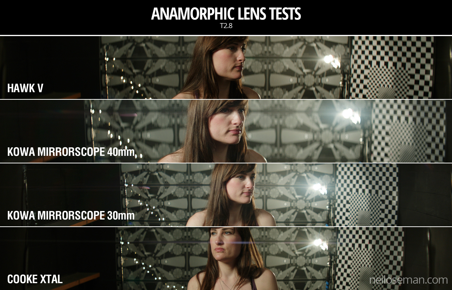
For consistency with the spherical lenses, we used lengths around 32mm, but in the anamorphic format this is a pretty wide lens, not a mid-range lens. We shot at T2.8, again for consistency, but I hear that many anamorphics don’t perform well wider than T4.
We were only able to test what Arri Rental happened to have on the shelves that day. The biggest and presumably most expensive was the Hawk V-series. Next in size and weight was the Cooke Xtal – pronounced “crystal” – a 1970s lens based on the much-loved Speed Panchros. The smallest and lightest, was the Kowa Mirrorscope, with a list price of £1,200 per week for a set of four. (Sorry, I couldn’t find any pricing info for the others online.) Note that there isn’t really a 30mm Mirrorscope; to get this length you put a wide angle adapter on the 40mm. As this extra element decreases the optical performance, we tested it with and without, hence the two lengths.
Here’s the video…
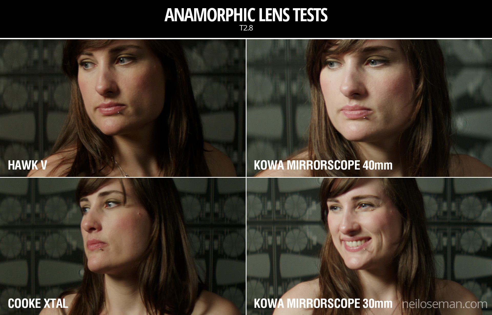
Skin tones
Click on the image to see it at full quality.
To my eye, the Hawk has a fairly rich, warm skin tone, while the Cooke – as with the spherical S4 tested last week – seems a little grey and flat. The Kowa is inexplicably brighter than the other two lenses, which makes it hard to compare, but perhaps it’s a little cooler in tone?
Anamorphic lenses have what is known as a “curved field of focus” that works similarly to the curved movie screens in some large Cinerama theatres. This is one reason that one needs to expose these lenses at a deeper stop. If one doesn’t, the curved field will not be covered by depth of field and either the edges or centre of the frame will be soft.
One day I’d like to re-test these lenses at a lower stop, T4 or T5.6, where they will all undoubtedly perform much better. But in this T2.8 test, on Bex’s face in the centre of frame, the Hawk V and the Kowa Mirrorscope 40mm – both almost a full stop from their maximum apertures – are clearly the sharpest of the bunch. The Cooke Xtal, which is wide open, is unsurprisingly softer. The 30mm adapter on the Mirrorscope completely destroys the image, not only making it very soft but also introducing colour aberration.
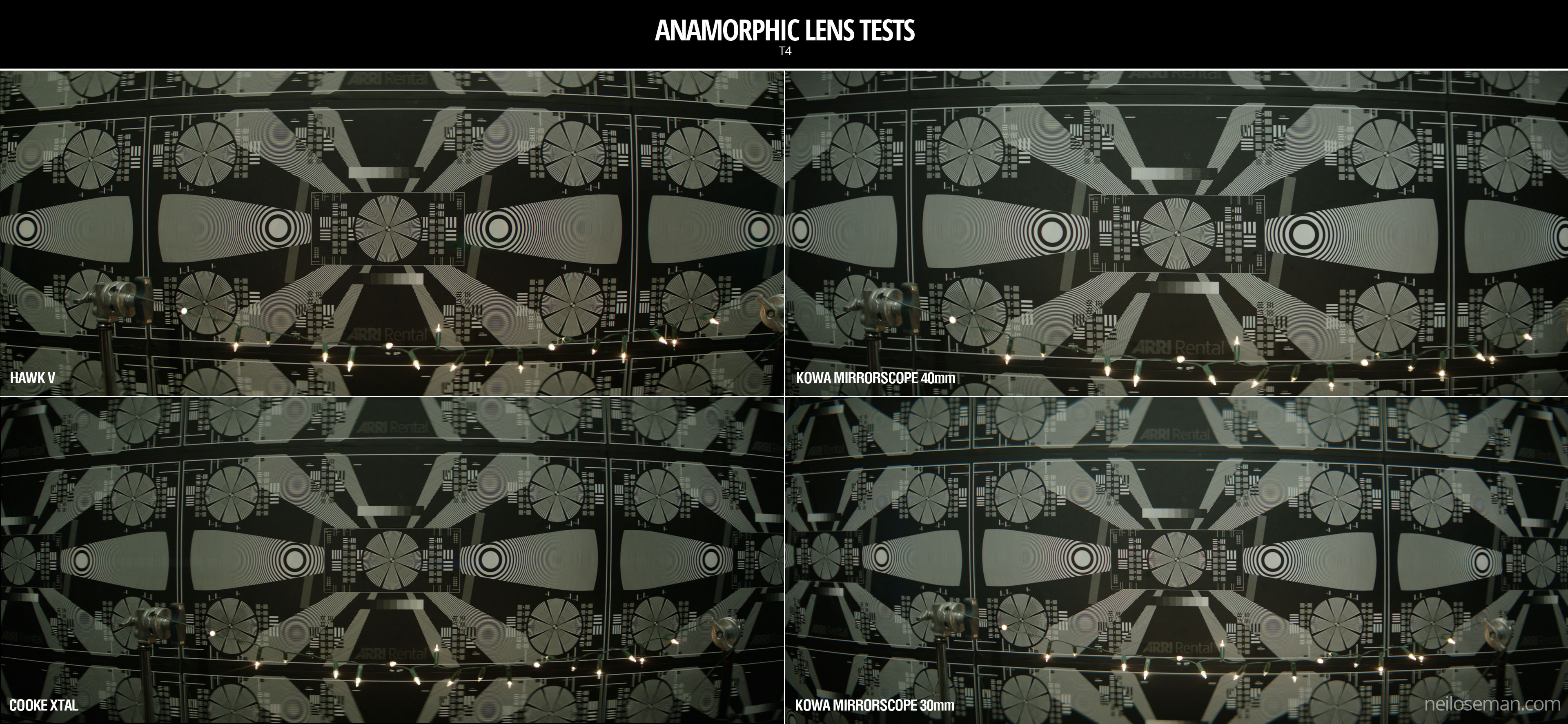
Now let’s look at the checkerboard at the side of frame and see if we can spot any differences in sharpness there…
It seems to me that the Kowa, both with and without the adapter, has a greater difference in sharpness between the centre and edges of frame than the the Hawk and Cooke. With the latter two lenses, the checkerboard is reasonably sharp, at least on the lefthand side, with some ghosting/blur visible towards the righthand side. The same thing can be observed on the chart in the flare tests at the end of the video.
Breathing & Bokeh
All of these lenses have a noticeable degree of breathe, which I suppose is to be expected from anamorphics. The Hawk V has roughly oval bokeh, the Cooke’s is more circular, while the Mirrorscope has interesting D-shaped bokeh.
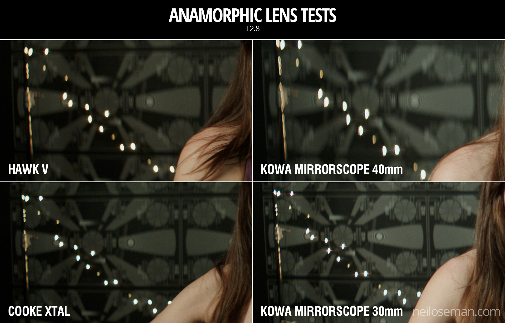
Flare
The Hawk V doesn’t flare much at all, which is apparently due to the anamorphic element being in the middle of the lens, rather than at the front. The Kowa has a nice streak and glow around the light source, with a funky purple artefact on the opposite side of frame. But it’s the Cooke Xtal which provides the most classic lens flare, with a horizontal line across most of the frame and a partial star pattern around the source, despite the lens being wide open.
At the end of the video you can see how the flares develop on each lens as the light source moves horizontally across frame.
Distortion
A bulging effect is very obvious on all of these lenses, due to the focal lengths being quite wide for anamorphic. Notice how at 40mm on the Kowa Mirrorscope this curvature of the image is significantly reduced.
It’s hard to compare the levels of distortion because none of the focal lengths are exactly the same, except for the Cooke Xtal and the Kowa Mirrorscope with the 30mm adapter on. The Cooke’s top right and bottom left corners appear to be stretched away from the centre relative to the other two corners. I suppose that strange and funky stuff like this is exactly why you choose vintage glass.
Interestingly, the Cooke’s image appears a little tighter than the Kowa’s, which combined with my inability to find any evidence online of the existence of a 30mm Xtal, leads me to suspect we may have been given a mislabelled 32mm.
Conclusions
When we got to the end of our spherical tests and started putting the anamorphics on, I was shocked by the drop in sharpness. But as noted earlier, this is because anamorphics really need to be used with a smaller aperture than the T2.8 I often shoot at. If I learnt nothing else from this test, I learnt that anamorphic needs more light!
I would love to put the Cooke Xtal’s lovely flares and general vintage look to good use on a period movie one day. The Hawk V would be a good choice if I wanted the anamorphic look with warm, dynamic skin tones. The Kowa system seemed a little cheap and cobbled-together, but could well be a good solution for anamorphic on a budget, as long as I stayed away from the 30mm adapter!
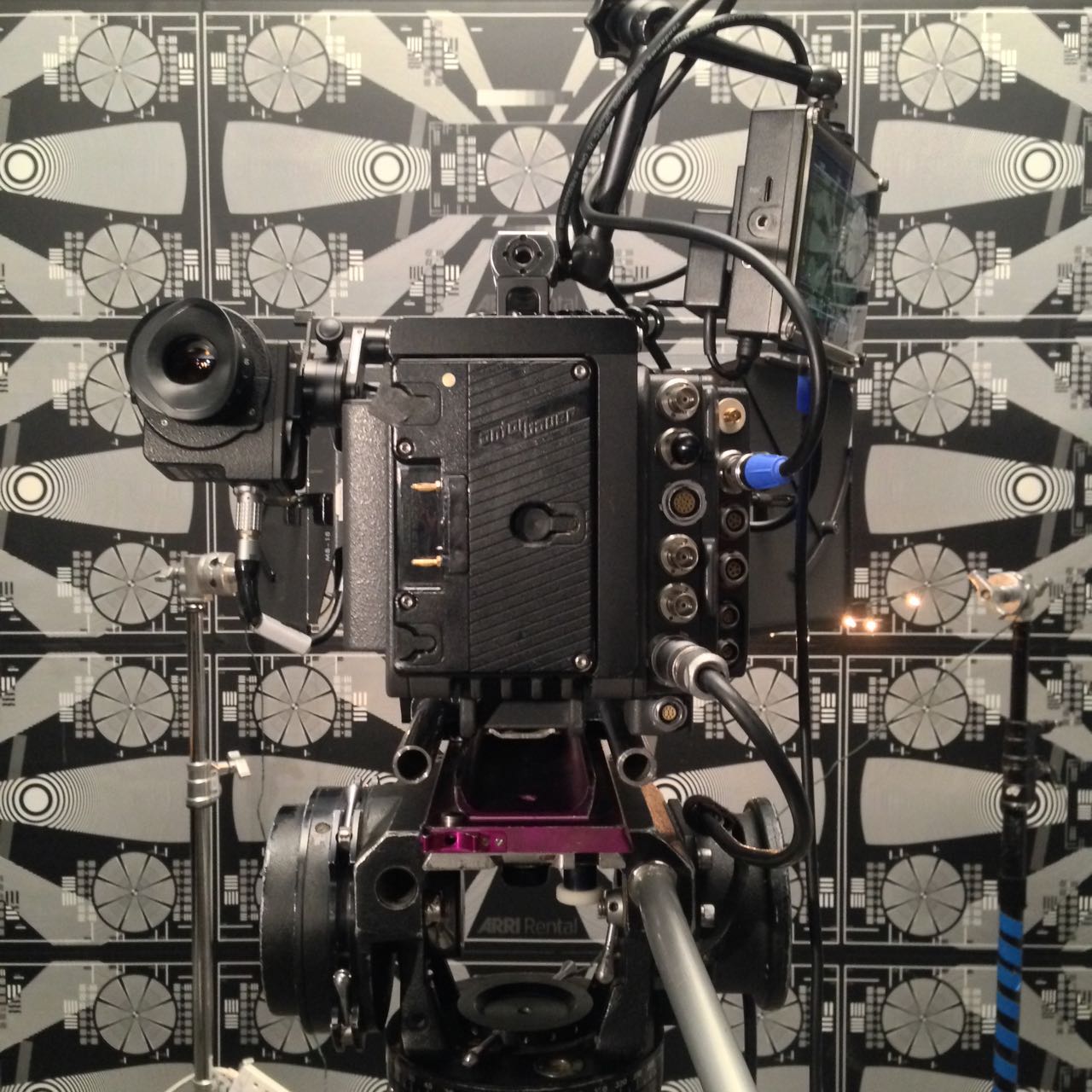
The other week I spent a day at Arri Rental in Uxbridge, in the Bafta Room no less, conducting various camera and lens tests. I’ve done a number a productions now where I wanted to test but there wasn’t the time or money, so for a while I’ve been meaning to go into Arri on my own time and do some general tests for my education and edification. An upcoming short provided the catalyst for me to get around to it at last.
Aided by 1st AC Rupert Peddle and 2nd AC Bex Clives, I tested a dozen lenses, some spherical, some anamorphic. Today I will cover the spherical lenses; next time I’ll look at the anamorphics.
Method
We shot on an Alexa XT Plus in log C ProRes 4444 XQ at 3.2K. In the video the image has been downscaled to 1080P and a standard Rec.709 LUT has been added.
I set the Alexa to ISO 800 and lit Bex to a T2.8 using a 650W tungsten fresnel bounced off poly. For fill I caught a little of the spill from the fresnel with a matte silver bounce board on the opposite side of camera. I placed fairy lights in the background to observe the bokeh (out of focus areas) and turned on a 100W globe during each take to see what the flare did.
We shot all the lenses at 2.8 – the stop I most commonly use – and also wide open (compensating with the shutter angle), but the direct 2.8 comparison proved most useful, so that’s mainly what you’ll see in the video. We tested a single length: 35mm or the closest available to it.
What we didn’t do was shoot grey-scale or colour charts, or do any testing of vignettes or distortion. (The day after doing these tests, Shane Hurlbut, ASC published an Inner Circle post about how to tests lenses, so I immediately learnt what my omissions were!)
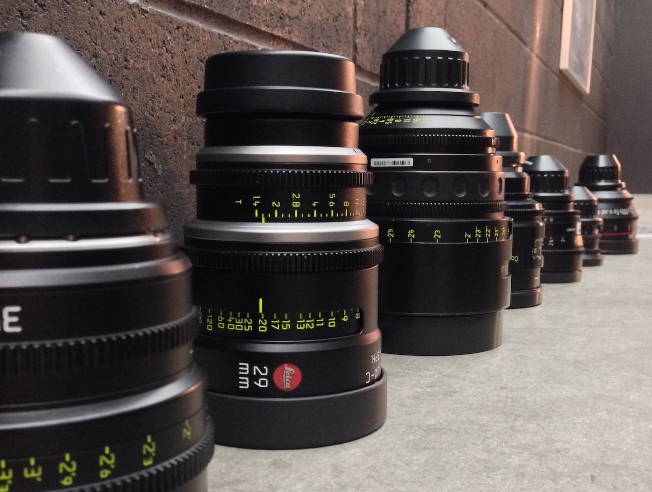
We tested the following lenses:
Series
Length
Speed
CF*
Weight
Price
Leica Summilux-C
29mm
T1.4
18″
1.7kg
£27K
Arri/Zeiss Master Prime
35mm
T1.3
14″
2.2kg
£16K
Cooke S4
32mm
T2
6″
1.85kg
£14K
Leica Summicron-C
35mm
T2
14″
1.3kg
£13K
Zeiss High Speed
(a.k.a. Superspeed Mk III)
35mm
T1.3
14″
0.79kg
£12K
(refurb)
Arri/Zeiss Ultra Prime
32mm
T1.9
15″
1.1kg
£10K
Zeiss T2.1
32mm
T2.1
24″
0.45kg
£4K
(used)
Canon
35mm
T1.5
12″
1.1kg
£3K
* CF = close focus
Here’s the video…
Skin tones
Click the image to see it at best quality.
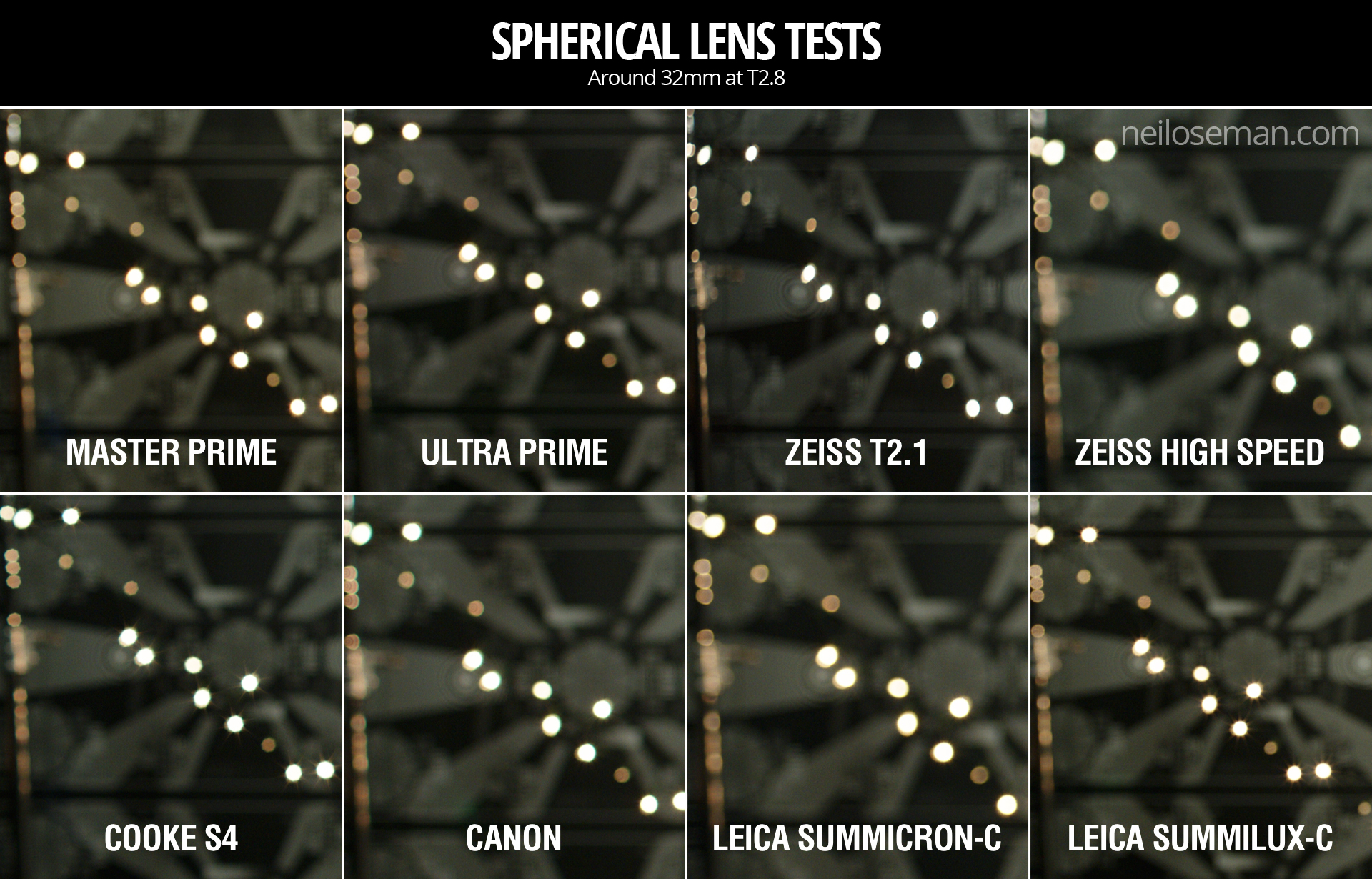
The Arri/Zeiss Master Prime and the two Leicas seem to have the most vibrant skin tones. To my eye, the Leicas have a slight creaminess that’s very pleasing. The Canon looks just a little cooler and less dynamic. I was surprised to find that the Cooke S4, the lens I’ve used most, appears to have a grey, flat skin tone compared with the Master Prime, Leicas and Canon. I would rank the Ultra Prime and Superspeed next, on a par except that the Ultra Prime has a noticeable magenta cast. My least favourite skin tones are on the Zeiss T2.1, which comparatively makes poor Bex look a little bit ill!
Some of the nuances will be lost in the YouTube and Jpeg compression, but this is a very subjective assessment anyway, so feel free to completely disagree with all of the above. Any of the differences noted above could be corrected by grading, to some extent . But remember that the lens is at the very start of the light’s journey from set to screen, and any wavelengths that don’t get through it are lost forever. It’s like fluorescent lamps with colours missing from the spectrum; you can’t put those back in in post.
Sharpness
I have to say, I’m unable to detect any difference in sharpness between the Master Prime, Cooke S4, Canon and Leicas. The Ultra Prime and Superspeed both look a hair softer, while the T2.1 is very soft.
Breathing
Breathing is the slight zooming effect that you get with some lenses when you pull focus. Looking at 4:44 in the video you can clearly see the differences in breathing between the eight lenses. Because this part of the video is showing a crop of the bottom left corner of the image, the breathing manifests as a shift to the left (zoom in) as the lens is racked closer (goes soft) and a shift to the right (zoom out) as it’s racked deeper (goes sharp).
All the Zeiss lenses except the Master Prime have a significant amount of breath when seen in isolation like this, but not enough to be noticeable to an audience in most real-world situations. The Cooke S4 has a little bit of breathe, and the Canon a hair less. The Master Prime and the Leicas are rock solid.
Bokeh
Small points of light, when thrown out of focus, most clearly demonstrate the bokeh pattern of a lens. The shape of the bokeh is determined by the number of iris blades and the shape of those blades. Generally a circle is preferred, because it’s a natural shape, but for certain stories a more unusual shape might be appropriate. The shape of the iris changes with the T-stop, hence the T2.8 and wide open images above.
Immediately noticeable is the difference in the Cooke S4’s bokeh between wide open (circular) and T2.8 (octagonal). All of the other lenses have round bokeh at T2.8, apart from the Superspeed, which has heptagonal (seven-sided) bokeh.
It’s entirely subjective which bokeh you prefer. The only other thing I’ll point out is that the Canon’s bokeh wide open is very fuzzy, with noticeable colour aberration, though this may be due to the bright highlight rather than the defocusing.
Flare
Flare patterns also vary with aperture. The smaller the aperture, the more of a star effect you will get, as the light interacts with the corners in the iris blades. The Summilux shows this most clearly, with a pronounced star at T2.8 (two stops down from its maximum aperture) and almost none when wide open. The Cooke S4 also has a nice star pattern at T2.8. With the other lenses it’s much more subtle, and the Canon has almost none.
Conclusions
The real revelations in these tests, for me, were the Leicas. The Summilux in particular is a beautiful lens, with rich, dynamic skin tones, nice bokeh, no breathing, plus the bonus of nice star flares. I will definitely be looking to work with this glass in the future, although given the price tag that may be optimistic!
The Summicron also performed incredibly well, matching the more expensive Summilux and Master Prime in every respect except speed. I can see this becoming my new go-to lens.
The Master Prime of course produced a beautiful, sharp, clean image, but it lacks character. It might work nicely for science fiction, a drama requiring a neutral look, or something where filtration was being used to give the image character.
The Canon impressed me too – no mean feat given that it’s the cheapest lens we tested. With nice skin tones and attractive flares, I could see this working well for a romantic movie.
The Zeiss T2.1 did not appeal to me, with poor sharpness and cold, washed-out skin tones, so I would avoid it.
The Superspeed is a decent lens, but in most cases I’d plump for an Ultra Prime instead. Ultra Primes are certainly easier to work with for the 1st AC, and have proven to be a good workhorse lens for drama. (I shot Above the Clouds on them.)
The Cooke S4 has been my go-to glass up to now, and while it will probably remain my first choice for period pieces, due to its gentle focus fall-off, I’m excited to try some of the other glass in this test on other productions.
I’ll say it one last time: this is all subjective. Our visual preferences are what make every director of photography unique.
Tune in next week when I’ll look at the anamorphic lenses: Hawk-V, Cooke Xtal and Kowa Mirrorscope.

 So what is a split diopter (a.k.a. split-field diopter)? It’s a convex lens of a semi-circular shape that can be slotted into your matte box. Light passing through this lens is converged so that it focuses closer, while light passing through the empty half of course goes unaltered to the main lens.