The Long Lenses of the 90s

Lately, having run out of interesting series, I’ve found myself watching a lot of nineties blockbusters: Outbreak, Twister, Dante’s Peak, Backdraft, Daylight. Whilst eighties movies were the background to my childhood, and will always have a place in my heart, it was the cinema of the nineties that I was immersed in as I began my own amateur filmmaking. So, looking back on those movies now, while certain clichés stand out like sore thumbs, they still feel to me like solid examples of how to make a summer crowd-pleaser.

Let’s get those clichés out of the way first. The lead character always has a failed marriage. There’s usually an opening scene in which they witness the death of a spouse or close relative, before the legend “X years later” fades up. The dog will be saved, but the crotchety elderly character will die nobly. Buildings instantly explode towards camera when touched by lava, hurricanes, floods or fires. A stubborn senior authority figure will refuse to listen to the disgraced lead character who will ultimately be proven correct, to no-one’s surprise.

Practical effects in action on “Twister”

There’s an intensity to nineties action scenes, born of the largely practical approach to creating them. The decade was punctuated by historic advances in digital effects: the liquid metal T-1000 in Terminator 2 (1991), digital dinosaurs in Jurassic Park (1993), motion-captured passengers aboard the miniature Titanic (1997), Bullet Time in The Matrix (1999). Yet these techniques remained expensive and time-consuming, and could not match traditional methods of creating explosions, floods, fire or debris. The result was that the characters in jeopardy were generally surrounded by real set-pieces and practical effects, a far more nerve-wracking experience for the viewer than today, when we can tell that our heroes are merely imagining their peril on a green-screen stage.

One thing I was looking out for during these movie meanders down memory lane was lens selection. A few weeks back, a director friend had asked me to suggest examples of films that preferred long lenses. He had mentioned that such lenses were more in vogue in the nineties, which I’d never thought about before.

As soon as I started to consider it, I realised how right my friend was. And how much that long-lens look had influenced me. When I started out making films, I was working with the tiny sensors of Mini-DV cameras. I would often try to make my shots look more cinematic by shooting on the long end of the zoom. This was partly to reduce the depth of field, but also because I instinctively felt that the compressed perspective was more in keeping with what I saw at the cinema.

I remember being surprised by something that James Cameron said in his commentary on the Aliens DVD:

I went to school on Ridley [Scott]’s style of photography, which was actually quite a bit different from mine, because he used a lot of long lenses, much more so than I was used to working with.

I had assumed that Cameron used long lenses too, because I felt his films looked incredibly cinematic, and because I was so sure that cinematic meant telephoto. I’ve discussed in the past what I think people tend to mean by the term “cinematic”, and there’s hardly a definitive answer, but I’m now sure that lens length has little to do with it.

“Above the Clouds” (dir. Leon Chambers)

And yet… are those nineties films influencing me still? I have to confess, I struggle with short lenses to this day. I find it hard to make wide-angle shots look as good. On Above the Clouds, to take just one example, I frequently found that I preferred the wide shots on a 32mm than a 24mm. Director Leon Chambers agreed; perhaps those same films influenced him?

A deleted scene from Ren: The Girl with the Mark ends with some great close-ups shot on my old Sigma 105mm still lens, complete with the slight wobble of wind buffeting the camera, which to my mind only adds to the cinematic look! On a more recent project, War of the Worlds: The Attack, I definitely got a kick from scenes where we shot the heroes walking towards us down the middle of the street on a 135mm.

Apart from the nice bokeh, what does a long lens do for an image? I’ve already mentioned that it compresses perspective, and because this is such a different look to human vision, it arguably provides a pleasing unreality. You could describe it as doing for the image spatially what the flicker of 24fps (versus high frame rates) does for it temporally. Perhaps I shy away from short lenses because they look too much like real life, they’re too unforgiving, like many people find 48fps to be.

The compression applies to people’s faces too. Dustin Hoffman is not known for his small nose, yet it appears positively petite in the close-up below from Outbreak. While this look flatters many actors, others benefit from the rounding of their features caused by a shorter lens.

Perhaps the chief reason to be cautious of long lenses is that they necessitate placing the camera further from the action, and the viewer will sense this, if only on a subconscious level. A long lens, if misused, can rob a scene of intimacy, and if overused could even cause the viewer to disengage with the characters and story.

I’ll leave you with some examples of long-lens shots from the nineties classics I mentioned at the start of this post. Make no mistake, these films employed shorter lenses too, but it certainly looks to me like they used longer lenses on average than contemporary movies.
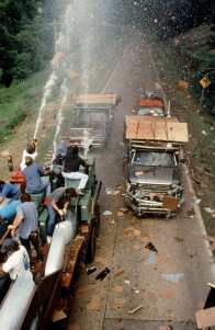
 

Outbreak

DP: Michael Ballhaus, ASC


Twister

DP: Jack N. Green, ASC
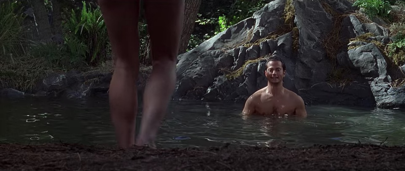
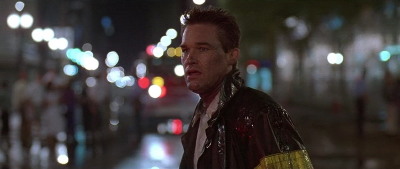
 

Daylight

DP: David Eggby, ACS


Dante’s Peak

DP: Andrzej Bartkowiak, ASC
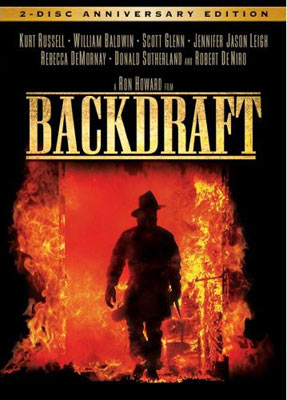
 

Backdraft

DP: Mikael Salomon, ASC

For more on this topic, see my article about “The Normal Lens”.

The Long Lenses of the 90s

Working with White Walls

White walls are the bane of a DP’s existence. They bounce light around everywhere, killing the mood, and they look cheap and boring in the background of your shot. Nonetheless, with so many contemporary buildings decorated this way, it’s a challenge we all have to face. Today I’m going to look back on two short films I’ve photographed, and explain the different approaches I took to get the white-walled locations looking nice.

Finding Hope is a moving drama about a couple grieving for the baby they have lost. It was shot largely at the home of the producer, Jean Maye, on a Sony FS7 with Sigma and Pentax stills glass.

Exit Eve is a non-linear narrative about the dehumanisation of an au pair by her wealthy employers. With a fairly respectable budget for a short, this production shot in a luxurious Battersea townhouse on an Arri Alexa Classic with Ultra Primes.


“Crown”-inspired colour contrast

Cheap 300W dimmers like these are great for practicals.

It was January 2017 when we made Finding Hope, and I’d recently been watching a lot of The Crown. I liked how that series punctuated its daylight interior frames with pools of orange light from practicals. We couldn’t afford much of a lighting package, and I thought that pairing existing pracs with dimmers and tungsten bulbs would be a cheap and easy way to break up the white walls and bring some warmth – perhaps a visual representation of the titular hope – into the heavy story.

I shot all the daylight interiors at 5600K to get that warmth out of the pracs. Meanwhile I shaped the natural light as far as possible with the existing curtains, and beefed it up with a 1.2K HMI where I could. I used no haze or lens diffusion on the film because I felt it needed the unforgiving edges.

For close-ups, I often cheated the pracs a little closer and tweaked the angle, but I chose not to supplement them with movie lamps. The FS7’s native ISO of 2500 helped a lot, especially in a nighttime scene where the grieving parents finally let each other in. Director Krysten Resnick had decided that there would be tea-lights on the kitchen counter, and I asked art director Justine Arbuthnot to increase the number as much as she dared. They became the key-light, and again I tweaked them around for the close-ups.

My favourite scene in Finding Hope is another nighttime one, in which Crystal Leaity sits at a piano while Kevin Leslie watches from the doorway. I continued the theme of warm practicals, bouncing a bare 100W globe off the wall as Crystal’s key, and shaping the existing hall light with some black wrap, but I alternated that with layers of contrasting blue light: the HMI’s “moonlight” coming in through the window, and the flicker of a TV in the deep background. This latter was a blue-gelled 800W tungsten lamp bounced off a wobbling reflector.

When I saw the finished film, I was very pleased that the colourist had leant into the warm/cool contrast throughout the piece, even teasing it out of the daylight exteriors.


Trapped in a stark white townhouse

I took a different approach to colour in Exit Eve. Director Charlie Parham already knew that he wanted strong red lighting in party scenes, and I felt that this would be most effective if I kept colour out of the lighting elsewhere. As the film approaches its climax, I did start to bring in the orange of outside streetlamps, and glimpses of the party’s red, but otherwise I kept the light stark and white.

Converted from a Victorian schoolhouse, the location had high ceilings, huge windows and multiple floors, so I knew that I would mostly have to live with whatever natural light did or didn’t shine in. We were shooting during the heatwave of 2018, with many long handheld takes following lead actor Thalissa Teixeria from room to room and floor to floor, so even the Alexa’s dynamic range struggled to cope with the variations in light level.

For a night scene in the top floor bedroom, I found that the existing practicals were perfectly placed to provide shape and backlight. I white-balanced to 3600K to keep most of the colour out of them, and rigged black solids behind the camera to prevent the white walls from filling in the shadows.

(Incidentally, the night portions of this sequence were shot as one continuous take, despite comprising two different scenes set months apart. The actors did a quick-change and the bed was redressed by the art department while it was out frame, but sadly this tour de force was chopped up in the final cut.)

I had most control over the lighting when it came to the denouement in the ground floor living area. Here I was inspired by the work of Bradford Young, ASC to backlight the closed blinds (with tungsten units gelled to represent streetlights) and allow the actors inside to go a bit dim and murky. For a key moment we put a red gel on one of the existing spotlights in the living room and let the cast step into it.

So there we have it, two different approaches to lighting in a while-walled location: creating colour contrast with dimmed practicals, or embracing the starkness and saving the colour for dramatic moments. How will you tackle your next magnolia-hued background?

For another example of how I’ve tackled white-walled locations, see my Forever Alone blog.

Working with White Walls

Making an Analogue Print

This is the latest in my series about analogue photography. Previously, I’ve covered the science behind film capture, and how to develop your own black-and-white film. Now we’ll proceed to the next step: taking your negative and producing a print from it. Along the way we’ll discover the analogue origins of Photoshop’s dodge and burn tools.


Contact printing

35mm contact sheet

To briefly summarise my earlier posts, we’ve seen that photographic emulsion – with the exception of colour slide film – turns black when exposed to light, and remains transparent when not. This is how we end up with a negative, in which dark areas correspond to the highlights in the scene, and light areas correspond with the shadows.

The simplest way to make a positive print from a negative is contact-printing, so called because the negative is placed in direct contact with the photographic printing paper. This is typically done in a spring-loaded contact printing frame, the top of which is made of glass. You shine light through the glass, usually from an enlarger – see below – for a measured period of time, determined by trial and error. Where the negative is dark (highlights) the light can’t get through, and the photographic emulsion on the paper remains transparent, allowing the white paper base to show through. Where the negative is transparent (shadows) the light passes through, and the emulsion – once developed and fixed in the same way as the original film – turns black. Thus a positive image is produced.

Normally you would contact-print multiple strips of negative at the same time, perhaps an entire roll of film’s worth, if your paper is large enough to fit them all. Then you can examine them through a loupe to decide which ones are worth enlarging. You have probably seen contact sheets, complete with circled images, stars and arrows indicating which frames the photographer or picture editor likes, where they might crop it, and which areas need doctoring. In fact, contact sheets are so aesthetically pleasing that it’s not uncommon these days for graphic designers to create fake digital ones.

The correct exposure time for a contact print can be found by exposing the whole sheet for, say, ten seconds, then covering a third of it with a piece of card, exposing it for another ten seconds, then covering that same third plus another third and exposing it for ten seconds more. Once developed, you can decide which exposure you like best, or try another set of timings.

120 contact sheet


Making an enlargement

Contact prints are all well and good, but they’re always the same size as the camera negative, which usually isn’t big enough for a finished product, especially with 35mm. This is where an enlarger comes in.

An enlarger is essentially a projector mounted on a stand. You place the negative of your chosen image into a drawer called the negative carrier. Above this is a bulb, and below it is a lens. When the bulb is turned on, light shines through the negative, and the lens focuses the image (upside-down of course) onto the paper below. By adjusting the height of the enlarger’s stand, you can alter the size of the projected image.

Just like a camera lens, an enlarger’s lens has adjustable focus and aperture. You can scrutinise the projected image using a loupe; if you can see the grain of the film, you know that the image is sharply focused.

The aperture is marked in f-stops as you would expect, and just like when shooting, you can trade off the iris size against the exposure time. For example, a print exposed for 30 seconds at f/8 will have the same brightness as one exposed for 15 seconds at f/5.6. (Opening from f/8 to f/5.6 doubles the light, or increases exposure by one stop, while halving the time cuts the light back to its original value.)


Dodging and burning

As with contact-printing, the optimum exposure for an enlargement can be found by test-printing strips for different lengths of time. This brings us to dodging and burning, which are respectively methods of decreasing or increasing the exposure time of specific parts of the image.

Remember that the printing paper starts off bright white, and turns black with exposure, so to brighten part of the image you need to reduce its exposure. This can be achieved by placing anything opaque between the projector lens and the paper for part of the exposure time. Typically a circle of cardboard on a piece of wire is used; this is known as a dodger. That’s the “lollipop” you see in the Photoshop icon. It’s important to keep the dodger moving during the exposure, otherwise you’ll end up with a sharply-defined bright area (not to mention a visible line where the wire handle was) rather than something subtle.

I dodged the robin in this image, to help him stand out.

Let me just say that dodging is a joyful thing to do. It’s such a primitive-looking tool, but you feel like a child with a magic wand when you’re using it, and it can improve an image no end. It’s common practice today for digital colourists to power-window a face and increase its luminance to draw the eye to it; photographers have been doing this for decades and decades.

Burning is of couse the opposite of dodging, i.e. increasing the exposure time of part of the picture to make it darker. One common application is to bring back detail in a bright sky. To do this you would first of all expose the entire image in such a way that the land will look good. Then, before developing, you would use a piece of card to cover the land, and expose the sky for maybe five or ten seconds more. Again, you would keep the card in constant motion to blend the edges of the effect.

To burn a smaller area, you would cut a hole in a piece of card, or simply form your hands into a rough hole, as depicted in the Photoshop icon.


Requirements of a darkroom

The crucial thing which I haven’t yet mentioned is that all of the above needs to take place in near-darkness. Black-and-white photographic paper is less sensitive to the red end of the spectrum, so a dim red lamp known as a safe-light can be used to see what you’re doing. Anything brighter – even your phone’s screen – will fog your photographic paper as soon as you take it out of its lightproof box.

Once your print is exposed, you need to agitate it in a tray of diluted developer for a couple of minutes, then dip it in a tray of water, then place it in a tray of diluted fixer. Only then can you turn on the main lights, but you must still fix the image for five minutes, then leave it in running water for ten minutes before drying it. (This all assumes you’re using resin-coated paper.)

Because you need an enlarger, which is fairly bulky, and space for the trays of chemicals, and running water, all in a room that is one hundred per cent lightproof, printing is a difficult thing to do at home. Fortunately there are a number of darkrooms available for hire around the country, so why not search for a local one and give analogue printing a go?

Some enlargements from 35mm on 8×10″ paper


Making an Analogue Print

8 Things to Look For When Buying a Cinema Camera

A couple of weeks ago I shared my thoughts about whether a director of photography should own equipment. My conclusion was that it can be useful early in your career, when you’re shooting corporates or tiny films with no hire budget. So what is the best camera for indie cinematography?

I’m not going to answer that, but I will tell you what to look for when investing in a camera. Hopefully these tips will help you choose the one that’s right for you from the huge and ever-changing array of professional cameras on the market, from the humble DSLR to the ubiquitous Reds and everything in between.


1. Image quality

Shooting on a Sony FS7 for “Finding Hope”

The quality of the image is of course the most imporant attribute of any camera. Rather than any technical specifications, I’m talking about the aesthetic quality here: how does it feel? Does it have that elusive “cinematic” quality? Is it “filmic”? Does it remind you of certain kinds of movies?

A good place to start is to look up sample footage on YouTube, or better still Vimeo for less compression muddying the issue. If you can borrow the camera and try it out before you buy, even better. Take away some test footage and try grading it too.


2. Resolution

Resolution, the sheer number of pixels a camera can record, is part of image quality, but I include it as a separate point because I see it as more of a technical consideration than an aesthetic one. You should ask yourself what longevity you require from your films – will people still be watching them, say two or three years from now, and if so what sort of resolution might be the norm by then?

Also consider your delivery platform. If everything you shoot is going on YouTube, perhaps you don’t need more than 1080P (standard HD).


3. Dynamic Range

Dynamic range is a measure of how much contrast a camera can handle. Too small a dynamic range and you will frequently struggle with bright areas “clipping” – i.e. losing details – or dark areas getting lost in the image noise. Also, the wider the dynamic range, the more flexibility you will have in grading.

For a cinematic image, 12 stops of dynamic range is the absolute minimum, with 14 or more being ideal.


4. Maximum ISO

Some ISO tests I conducted on an Arri Alexa Classic in 2017

The ISO (International Standards Organisation) scale rates the light sensitivity of a camera. The most important thing is the native ISO, the one at which the camera is optimised to give the cleanest image with the most detail. On some cameras, setting an ISO other than the native one reduces the image quality considerably.

The higher the ISO, the less light will be required to expose an image correctly. 800 is typical these days, but many cameras go much higher than that. It is worth thinking about spending more money to get a camera with a higher native ISO, because you may save a lot of money on lighting.


5. Lens Mount

This is crucial because you may already have a collection of lenses, or you may intend to hire certain lenses, and you need to be sure that they will fit your new camera’s mount.

The Canon EF mount is extremely common and will open up a huge range of options for stills glass as well as some low-end cinema glass. The smaller MFT (micro four-thirds) mount also has a wide range of lenses.

Top-end cameras have PL mounts which take all the beautiful cinema lenses used on big movies, but only choose this route if you are willing to part with a lot of cash!


6. Form Factor

A Blackmagic Micro Cinema Camera, not so micro once it’s rigged with rails, matte box, wireless follow focus, battery, monitor and video transmitter!

When I started in the industry, cameras were all ergonomically designed to sit on your shoulder, with a nice handgrip to the right of the lens and an EVF (electronic viewfinder) to provide a third point of stabilising contact. Nowadays cameras tend to be boxy, heavy and uncomfortable to hold without additional accessories (see below).

Again, try to gets your hands on the camera in a shop and see how it feels before you purchase. As well as handheld shooting, consider how easy it will be to rig onto dollies, sliders, gimbals, etc.


7. Required Accessories

Buying the camera body itself is unlikely to be the end of your expenditure. You will need lenses, batteries, a battery charger, cards, a card reader and almost certainly some kind of stabilising system, be it a simple shoulder rig or an electronic gimbal.

You may also want an EVF, a tripod, matte box, follow focus – the list can seem endless! Be careful to budget your essential accessories before buying the camera. Some cameras seem like bargains until you add up all the extras. Pay particular attention to the media, and to exactly what speed of media you need in order to shoot at the resolution and frame rate that you require, as this can get very expensive.


8. Codec

What file type and codec does the camera shoot? Does your editing system support that format? If not, how time-consuming will it be to convert everything?

What compression ratios does the camera support? How much hard drive space will you need to store an hour of footage at that ratio? What about ten hours, plus back-ups? Often there is a trade-off between a highly compressed format like H.264 which is light on disc space but may need converting before you can edit it, and a lightly compressed format like ProRes which burns through disc space but can be dropped straight into most editing software.

8 Things to Look For When Buying a Cinema Camera