Last week I looked at the science of colour: what it is, how our eyes see it, and how cameras see and process it. Now I’m going to look at colour theory – that is, schemes of mixing colours to produce aesthetically pleasing results.
The Colour wheel
The first colour wheel was drawn by Sir Isaac Newton in 1704, and it’s a precursor of the CIE diagram we met last week. It’s a method of arranging hues so that useful relationships between them – like primaries and secondaries, and the schemes we’ll cover below – can be understood. As we know from last week, colour is in reality a linear spectrum which we humans perceive by deducing it from the amounts of light triggering our red, green and blue cones, but certain quirks of our visual system make a wheel in many ways a more useful arrangement of the colours than a linear spectrum.
One of these quirks is that our long (red) cones, although having peak sensitivity to red light, have a smaller peak in sensitivity at the opposite (violet) end of the spectrum. This may be what causes our perception of colour to “wrap around”.
Another quirk is in the way that colour information is encoded in the retina before being piped along the optic nerve to the brain. Rather than producing red, green and blue signals, the retina compares the levels of red to green, and of blue to yellow (the sum of red and green cones), and sends these colour opponency channels along with a luminance channel to the brain.
You can test these opposites yourself by staring at a solid block of one of the colours for around 30 seconds and then looking at something white. The white will initially take on the opposing colour, so if you stared at red then you will see green.
Hering’s colour wheels
19th century physiologist Ewald Hering was the first to theorise about this colour opponency, and he designed his own colour wheel to match it, having red/green on the vertical axis and blue/yellow on the horizontal.
RGB colour wheel
Today we are more familiar with the RGB colour wheel, which spaces red, green and blue equally around the circle. But both wheels – the first dealing with colour perception in the eye-brain system, and the second dealing with colour representation on an RGB screen – are relevant to cinematography.
On both wheels, colours directly opposite each other are considered to cancel each other out. (In RGB they make white when combined.) These pairs are known as complementary colours.
Complementary
A complementary scheme provides maximum colour contrast, each of the two hues making the other more vibrant. Take “The Snail” by modernist French artist Henri Matisse, which you can currently see at the Tate Modern; Matisse placed complementary colours next to each other to make them all pop.
“The Snail” by Henri Matisse (1953)
In cinematography, a single pair of complementary colours is often used, for example the yellows and blues of Aliens‘ power loader scene:
“Aliens” DP: Adrian Biddle, BSC
Or this scene from Life on Mars which I covered on my YouTube show Lighting I Like:
I frequently use a blue/orange colour scheme, because it’s the natural result of mixing tungsten with cool daylight or “moonlight”.
“The First Musketeer”, DP: Neil Oseman
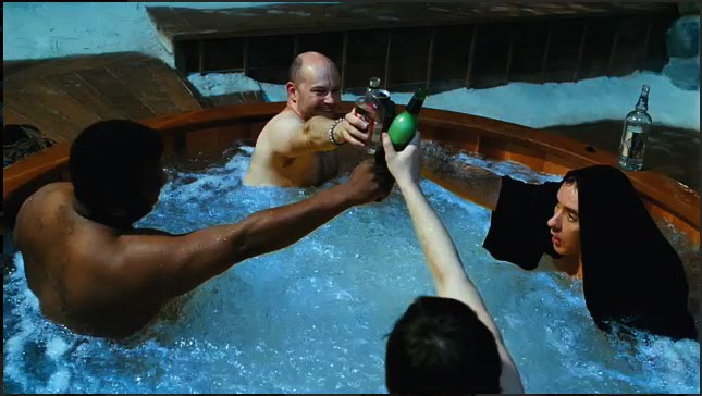
And then of course there’s the orange-and-teal grading so common in Hollywood:
“Hot Tub Time Machine” DP: Jack N. Green, ASC
Amélie uses a less common complementary pairing of red and green:
“Amélie” DP: Bruno Belbonnel, AFC, ASC
Analogous
An analogous colour scheme uses hues adjacent to each other on the wheel. It lacks the punch and vibrancy of a complementary scheme, instead having a harmonious, unifying effect. In the examples below it seems to enhance the single-mindedness of the characters. Sometimes filmmakers push analogous colours to the extreme of using literally just one hue, at which point it is technically monochrome.
“The Matrix” DP: Bill Pope, ASC“Terminator 2: Judgment Day” DP: Adam Greenberg, ASC“The Double” DP: Erik Alexander Wilson“Total Recall” (1990) DP: Jost Vacano, ASC, BVK
There are other colour schemes, such as triadic, but complementary and analogous colours are by far the most common in cinematography. In a future post I’ll look at the psychological effects of individual colours and how they can be used to enhance the themes and emotions of a film.
Stasis is a personal photography project about time and light. You can view all the images here, and in this post I’ll take you through the technical and creative process of making them.
I got into cinematography directly through a love of movies and filmmaking, rather than from a fine art background. To plug this gap, over the past few of years I’ve been trying to give myself an education in art by going to galleries, and reading art and photography books. I’ve previously written about how JMW Turner’s work captured my imagination, but another artist whose work stood out to me was Gerrit (a.k.a. Gerard) Dou. Whereas most of the Dutch 17th century masters painted daylight scenes, Dou often portrayed people lit by only a single candle.
“A Girl Watering Plants” by Gerrit Dou
At around the same time as I discovered Dou, I researched and wrote a blog post about Barry Lyndon‘s groundbreaking candlelit scenes. This got me fascinated by the idea that you can correctly expose an image without once looking at a light meter or digital monitor, because tables exist giving the appropriate stop, shutter and ISO for any given light level… as measured in foot-candles. (One foot-candle is the amount of light received from a standard candle that is one foot away.)
So when I bought a 35mm SLR (a Pentax P30T) last autumn, my first thought was to recreate some of Dou’s scenes. It would be primarily an exercise in exposure discipline, training me to judge light levels and fall-off without recourse to false colours, histograms or any of the other tools available to a modern DP.
I conducted tests with Kate Madison, who had also agreed to furnish period props and costumes from the large collection which she had built up while making Born of Hope and Ren: The Girl with the Mark. Both the tests and the final images were captured on Fujifilm Superia X-tra 400. Ideally I would have tested multiple stocks, but I must confess that the costs of buying and processing several rolls were off-putting. I’d previously shot some basic latitude tests with Superia, so I had some confidence about what it could and couldn’t do. (It can be over-exposed at least five stops and still look good, but more than a stop under and it falls apart.) I therefore confined myself to experimenting with candle-to-subject distances, exposure times and filtration.
The tests showed that the concept was going to work, and also confirmed that I would need to use an 80B filter to cool the “white balance” of the film from its native daylight to tungsten (3400K). (As far as I can tell, tungsten-balanced stills film is no longer on the market.) Candlelight has a colour temperature of about 1800K, so it still reads as orange through an 80B, but without the filter it’s an ugly red.
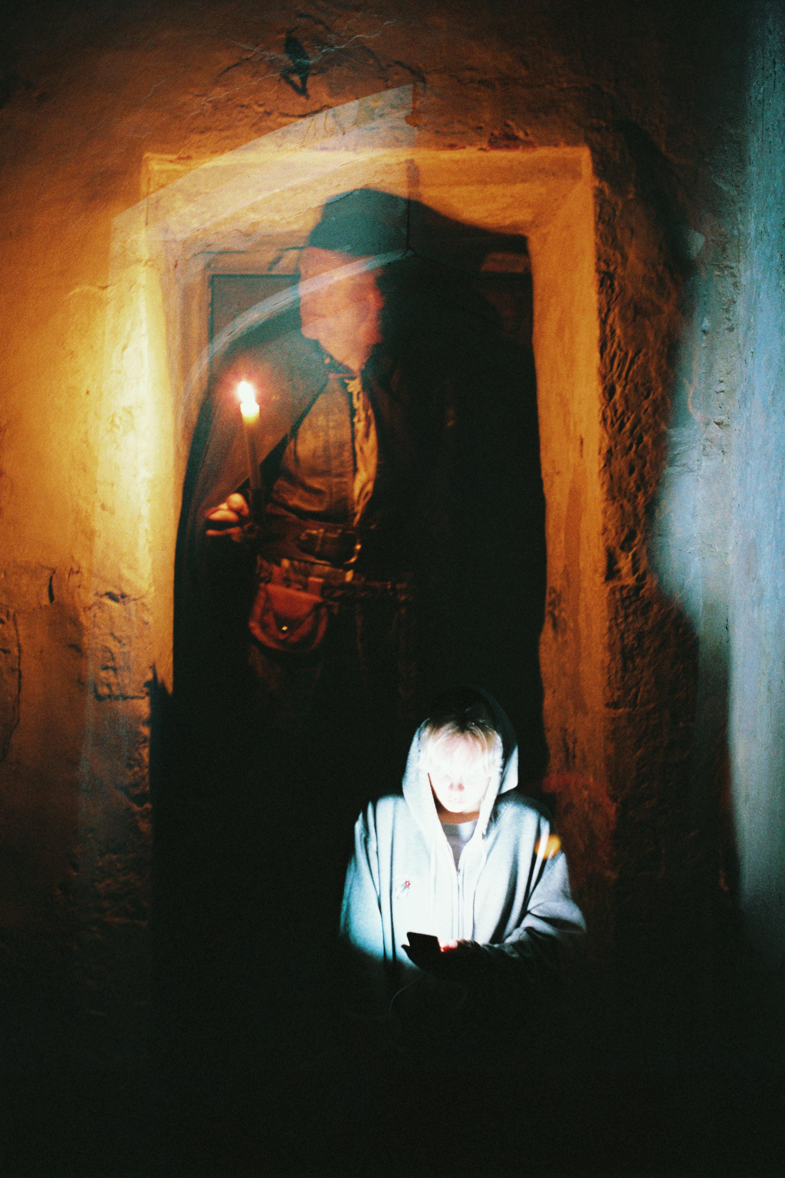
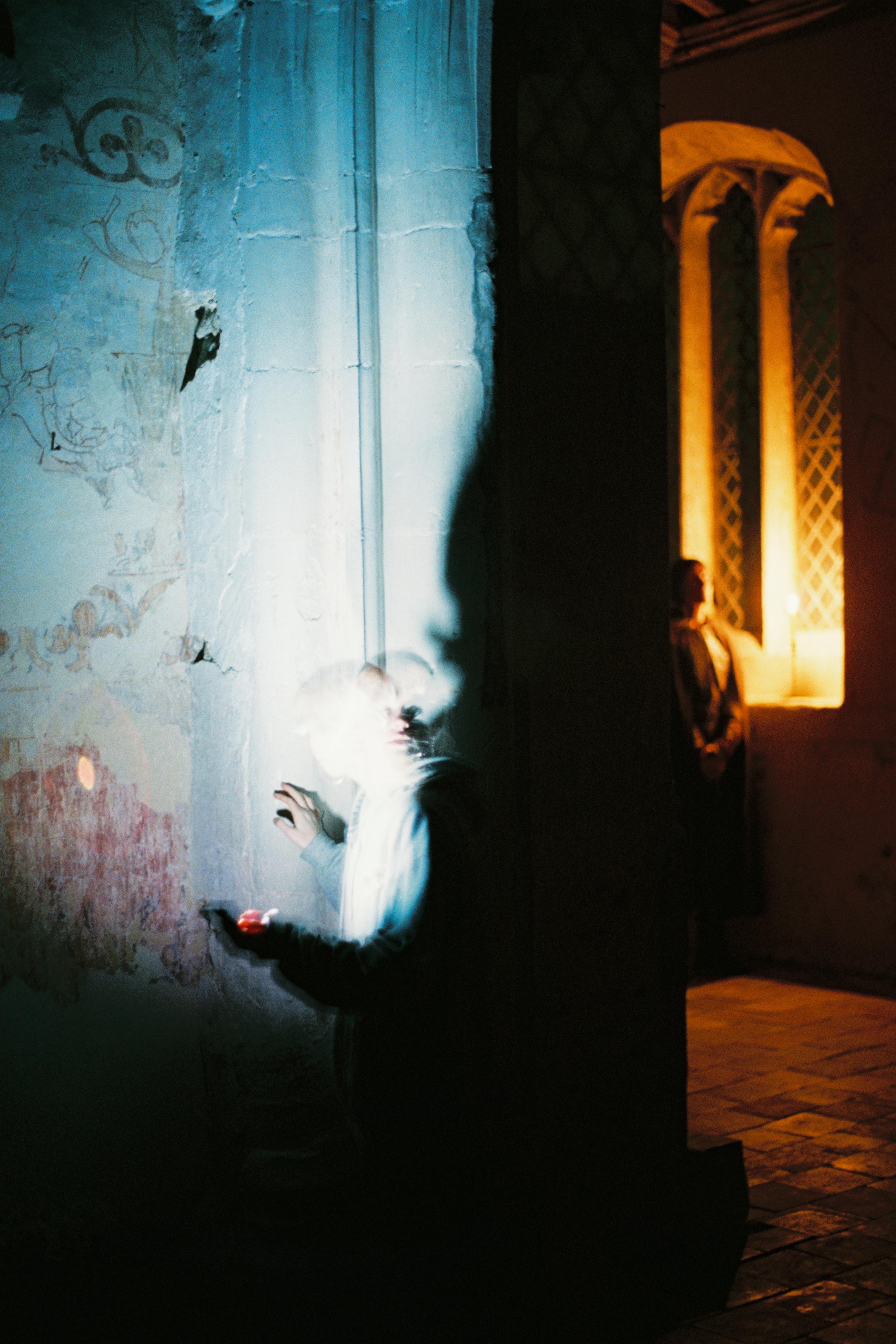
Meanwhile, the concept had developed beyond simply recreating Gerrit Dou’s scenes. I decided to add a second character, contrasting the historical man lit only by his candle with a modern girl lit only by her phone. Flames have a hypnotic power, tapping into our ancient attraction to light, and today’s smartphones have a similarly powerful draw.
The candlelight was 1600K warmer than the filtered film, so I used an app called Colour Temp to set my iPhone to 5000K, making it 1600K cooler than the film; the phone would therefore look as blue as the candle looked orange. (Unfortunately my phone died quickly and I had trouble recharging it, so some of the last shots were done with Izzi’s non-white-balanced phone.) To match the respective colours of light, we dressed Ivan in earthy browns and Izzi in blues and greys.
Artemis recce image
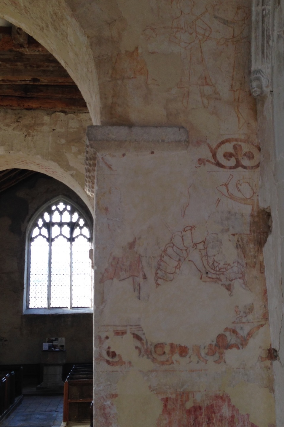
We shot in St. John’s Church in Duxford, Cambridgeshire, which hasn’t been used as a place of worship since the mid-1800s. Unique markings, paintings and graffiti from the middle ages up to the present give it simultaneously a history and a timelessness, making it a perfect match to the clash of eras represented by my two characters. It resonated with the feelings I’d had when I started learning about art and realised the continuity of techniques and aims from me in my cinematography back through time via all the great artists of the past to the earliest cave paintings.
I knew from the tests that long exposures would be needed. Extrapolating from the exposure table, one foot-candle would require a 1/8th of a second shutter with my f1.4 lens wide open and the Fujifilm’s ISO of 400. The 80B has a filter factor of three, meaning you need three times more light, or, to put it another way, it cuts 1 and 2/3rds of a stop. Accounting for this, and the fact that the candle would often be more than a foot away, or that I’d want to see further into the shadows, the exposures were all at least a second long.
As time had become very much the theme of the project, I decided to make the most of these long exposures by playing with motion blur. Not only does this allow a static image – paradoxically – to show a passage of time, but it recalls 19th century photography, when faces would often blur during the long exposures required by early emulsions. Thus the history of photography itself now played a part in this time-fluid project.
I decided to shoot everything in portrait, to make it as different as possible from my cinematography work. Heavily inspired by all the classical art I’d been discovering, I used eye-level framing, often flat-on and framed architecturally with generous headroom, and a normal lens (an Asahi SMC Pentax-M 50mm/f1.4) to provide a natural field of view.
I ended up using my light meter quite a lot, though not necessarily exposing as it indicated. It was all educated guesswork, based on what the meter said and the tests I’d conducted.
I was tempted more than once to tell a definite story with the images, and had to remind myself that I was not making a movie. In the end I opted for a very vague story which can be interpreted many ways. Which of the two characters is the ghost? Or is it both of them? Are we all just ghosts, as transient as motion blur? Do we unwittingly leave an intangible imprint on the universe, like the trails of light my characters produce, or must we consciously carve our mark upon the world, as Ivan does on the wall?
Models: Izzi Godley & Ivan Moy. Stylist: Kate Madison. Assistant: Ash Maharaj. Location courtesy of the Churches Conservation Trust. Film processing and scanning by Aperture, London.
If you’ve ever read or been taught about lighting, you’ve probably heard of the Inverse Square Law. It states that light fades in proportion to the square of the distance from the source. But lately I started to wonder if this really applies in all situations. Join me as I attempt to get to the bottom of this…
Knowing the law
The seed of this post was sown almost a year ago, when I read Herbert McKay’s 1947 book The Tricks of Light and Colour, which described the Inverse Square Law in terms of light spreading out. (Check out my post about The Tricks of Light and Colour here.)
But before we go into that, let’s get the Law straight in our minds. What, precisely, does it say? Another excellent book, Gerald Millerson’s Lighting for Television and Film, defines it thusly:
With increased distance, the light emitted from a given point source will fall rapidly, as it spreads over a progressively larger area. This fall-off in light level is inversely proportional to the distance square, i.e. 1/d². Thus, doubling the lamp distance would reduce the light to ¼.
The operative word, for our purposes, is “spreads”.
If you’d asked me a couple of years ago what causes the Inverse Square Law, I probably would have mumbled something about light naturally losing energy as it travels. But that is hogwash of the highest order. Assuming the light doesn’t strike any objects to absorb it, there is nothing to reduce its energy. (Air does scatter – and presumably absorb – a very small amount of light, hence atmospheric haze, but this amount will never be significant on the scale a cinematographer deals with.)
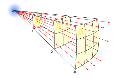
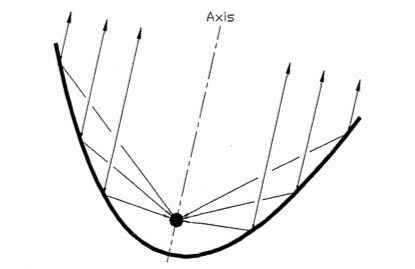
In fact, as the Millerson quote above makes clear, the Inverse Square Law is a result of how light spreads out from its source. It’s purely geometry. In this diagram you can see how fewer and fewer rays strike the ‘A’ square as it gets further and further away from the source ‘S’:
Illustration by Borb, CC BY-SA 3.0
Each light ray (dodgy term, I know, but sufficient for our purposes) retains the same level of energy, and there are the same number of them overall, it’s just that there are fewer of them passing through any given area.
So far, so good.
Taking the Law into my own hands
During season two of my YouTube series Lighting I Like, I discussed Dedo’s Panibeam 70 HMI. This fixture produces collimated light, light of which all the waves are travelling in parallel. It occurred to me that this must prevent them spreading out, and therefore render the Inverse Square Law void.
This in turn got me thinking about more common fixtures – par cans, for example.
Par lamps are so named for the Parabolic Aluminised Reflectors they contain. These collect the light radiated from the rear and sides of the filament and reflect it as parallel rays. So to my mind, although light radiated from the very front of the filament must still spread and obey the Inverse Square Law, that which bounces off the reflector should theoretically never diminish. You can imagine that the ‘A’ square in our first diagram would have the same number of light rays passing through it every time if they are travelling in parallel.
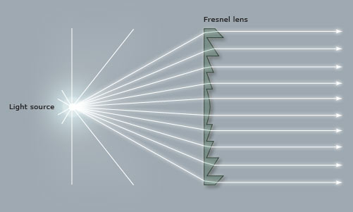
Similarly, fresnel lenses are designed to divert the spreading light waves into a parallel pattern:
Even simple open-face fixtures have a reflector which can be moved back and forth using the flood/spot control, affecting both the spread and the intensity of the light. Hopefully by now you can see why these two things are related. More spread = more divergence of light rays = more fall-off. Less spread = less divergence of light rays = more throw.
So, I wondered, am I right? Do these focused sources disobey the Inverse Square Law?
Breaking the law
To find the answer, I waded through a number of fora.
Firstly, and crucially, everyone agrees that the Law describes light radiated from a point source, so any source which isn’t infinitely small will technically not be governed by the Law. In practice, says the general consensus, the results predicted by the Law hold true for most sources, unless they are quite large or very close to the subject.
If you are using a softbox, a Kinoflo or a trace frame at short range though, the Inverse Square Law will not apply.
The above photometric data for a Filmgear LED Flo-box indeed shows a slower fall-off than the Law predicts. (Based on the 1m intensity, the Law predicts the 2m and 3m intensities as 970÷2²=243 lux and 970÷3²=108 lux respectively.)
A Flickr forum contributor called Severin Sadjina puts it like this:
In general, the light will fall off as 1/d² if the size of the light source is negligible compared to the distance d to the light source. If, on the other hand, the light source is significantly larger than the distance d to the light source, the light will fall off as 1/d – in other words: slower than the Inverse Square Law predicts.
Another contributor, Ftir, claims that a large source will start to follow the Law above distances equal to about five times the largest side of the source, so a 4ft Kinoflo would obey the Law very closely after about 20ft. This claim is confirmed by Wikipedia, citing A. Ryer’s The Light Measurement Handbook.
But what about those pesky parallel light beams from the pars and fresnels?
Every forum had a lot of disagreement on this. Most people agree that parallel light rays don’t really exist in real life. They will always diverge or converge, slightly, and therefore the Law applies. However, many claim that it doesn’t apply in quite the same way.
Diagram from a tutorial PDF on light-measurement.com showing a virtual point source behind the bulb of a torch.
A fresnel, according to John E. Clark on Cinematography.com, can still be treated as a point source, but that point source is actually located somewhere behind the lamp-head! It’s a virtual point source. (Light radiating from a distant point source has approximately parallel rays with consequently negligible fall-off, e.g. sunlight.) So if this virtual source is 10m behind the fixture, then moving the lamp from 1m from the subject to 2m is not doubling the distance (and therefore not quartering the intensity). In fact it is multiplying the distance by 1.09 (12÷11=1.09), so the light would only drop to 84% of its former intensity (1÷1.09²=0.84).
I tried to confirm this using the Arri Photometrics App, but the data it gives for Arri’s fresnel fixtures conforms perfectly with an ordinary point source under the Law, leaving me somewhat confused. However, I did find some data for LED fresnels that broke the Law, for example the Lumi Studio 300:
As you can see, at full flood (bottom graphic) the Law is obeyed as expected; the 8m intensity of 2,500 lux is a quarter of the 4m intensity of 10,000 lux. But when spotted (top graphic) it falls off more rapidly. Again, very confusing, as I was expecting it to fall off less rapidly if the rays are diverging but close to parallel.
A more rapid fall-off suggests a virtual point source somewhere in front of the lamp-head. This was mentioned in several places on the fora as well. The light is converging, so the intensity increases as you move further from the fixture, reaching a maximum at the focal point, then diverging again from that point as per the Inverse Square Law. In fact, reverse-engineering the above data using the Law tells me – if my maths is correct – that the focal point is 1.93m in front of the fixture. Or, to put it another way, spotting this fixture is equivalent to moving it almost 2m closer to the subject. However, this doesn’t seem to tally with the beam spread data in the above graphics. More confusion!
I decided to look up ETC’s Source Four photometrics, since these units contain an ellipsoidal reflector which should focus the light (and therefore create a virtual point source) in front of themselves. However, the data shows no deviation from the Law and no evidence of a virtual point source displaced from the actual source.
I fought the law and the law won
I fear this investigation has left me more confused than when I started! Clearly there are factors at work here beyond what I’ve considered.
However, I’ve learnt that the Inverse Square Law is a useful means of estimating light fall-off for most lighting fixtures – even those that really seem like they should act differently! If you double the distance from lamp to subject, you’re usually going to quarter the intensity, or near as damn it. And that rule of thumb is all we cinematographers need 99% of the time. If in doubt, refer to photometrics data like that linked above.
And if anyone out there can shed any light (haha) on the confusion, I’d be very happy to hear from you!
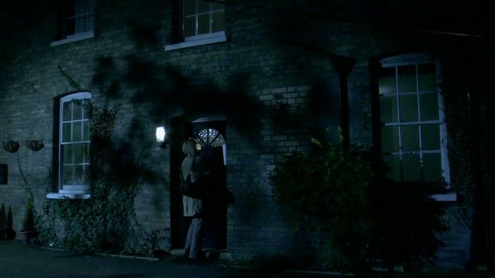
A front-lit shot of mine from “The First Musketeer” (2015, dir. Harriet Sams)
Front-light is a bit of a dirty word in cinematography. DPs will commonly be heard rhapsodising about beautiful backlight or moody sidelight, but rarely does the humble front-light get any love. But there is no right or wrong in cinematography. Just because front-light is less popular, doesn’t mean it can’t make a great shot.
Why do we avoid front-light so often? Because it usually flattens things out, reducing or eliminating any sense of depth in the image, and giving no shape to faces or objects. Sometimes this might be the perfect look: for a character who is shallow, or who feels like their life is dull and uneventful, perhaps; a live-action scene to be intercut with two-dimensional animation; or a stylised flashback like the image above. And sometimes, of course, front-light is unavoidable for logical reasons – if a character is looking out of a window, say. The trouble is, it can make for un-engaging or un-cinematic images, and that’s when you may want to pull some other tricks out of the box.
Here are six ways to bring some interest back into a frontally-lit frame.
1. Cut the light.
A shot of mine from “Crossing Paths” (2015, dir. Ben Bloore)
If you can flag some of the front-light, reducing the area of the frame it’s hitting, and leave the rest to the fill light or to fall into shadow, you’ll get some contrast back into your image.
2. Use a gobo.
Another shot of mine, this one from “Lebensraum” way back in 2007.
If it doesn’t make sense to cut the light, try breaking it up with a gobo. You can make a gobo from almost anything. Commonly on night exteriors I send a spark off to liberate a branch from a nearby tree and rig that in front of the key-light. If I need to create a window-frame effect I’ve been known to clamp a chair or stool to a C-stand to get a suitable pattern of perpendicular lines.
3. Add dynamics.
Front-light is often more interesting if it’s not there all the time. If you can find an excuse to have it flicker or move somehow, you’ll get a lot more mood and shape in your shot. Firelight, TVs, rippling water, panning searchlights or the headlights of a passing car can all safely come from the front and remain dramatic. Create a moving gobo and you’ve got something really interesting. The tree branch example from earlier – if that blows around in the wind then it will add a lot of tension to the visuals. Here’s a firelight example from Ren: The Girl with the Mark…
(Check out my Instagram feed for more lighting breakdowns like this.)
4. Darken the background.
“Magnolia” (DP: Robert Elswit, ASC)
You can combat the lack of depth by keeping the background dark, so that the front-lit subject stands out against it. This will happen automatically due to the Inverse-square Law (a post on that is coming soon) if the subject is close to the source, e.g. standing right by a window. Due to the nature of front-light, you probably can’t flag the background without flagging the subject too, so bringing your source closer to the subject or redressing the background may be your only options.
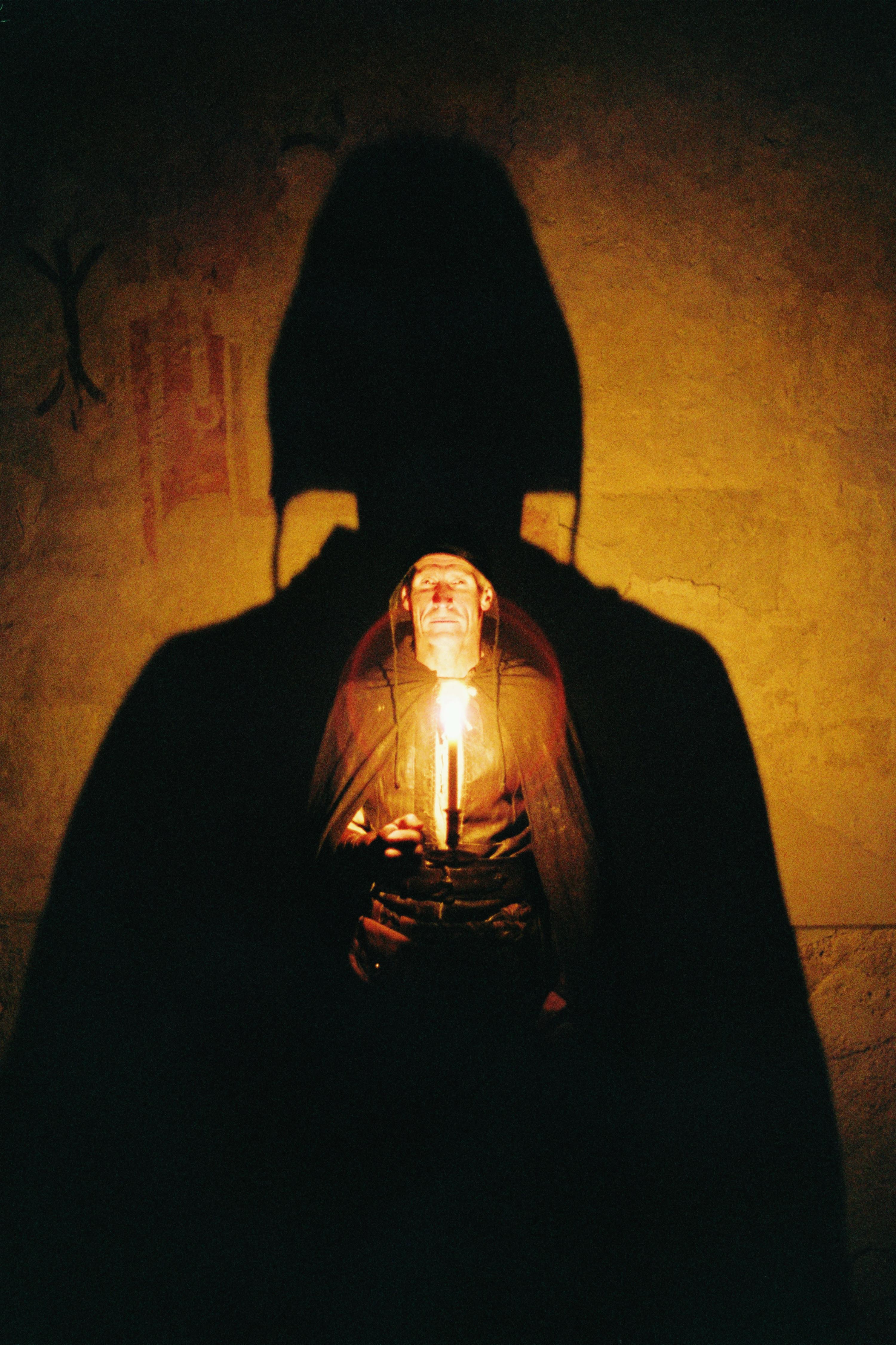
5. Make a virtue of the subject’s shadow.
“The Shadow of Death” by William Holman Hunt, 1873
One reason to avoid front-light is the distracting shadow which the subject will cast on the background. But sometimes this can be a great benefit to the shot, almost becoming another character, or adding subtext as in this painting.
6. Use a strong backlight.
A still of mine from “Stop/Eject”. The red backlight and the kicker from the practical help mitigate the flat front-light.
If there’s nothing you can do to modify the front-light, then pumping up the backlight might well save the day. The most flatly-illuminated shots suddenly become deep and appealing when the subject has a halo of over-exposed light. Indeed, this is what commonly happens with day exteriors: you shoot into the sun to get the nice backlight, and ambient light flatly fills in the faces.
So next time you’re faced with front-light, remember, it’s not the end of the world!
At the end of last summer I started a regular #ShotOfTheWeek on my Twitter feed. It’s very simple: each week I post a frame grab (or sometimes a GIF if I can find one) of a great shot from a film or series I’ve been watching. Sometimes these are new productions, just out, and sometimes they’re older pieces which I’m revisiting or viewing for the first time.
For those of you who aren’t among the Twitterati, here is a round-up of last year’s Shots of the Week. On the other hand, if you are a Twitterist, why not post your own inspirational frame grabs, using the hashtag #ShotOfTheWeek?
Powerful Close-ups
Cinema is arguably at its most potent when showing us the tiny nuances of emotion that only a big close-up can provide.
“Anne with an E” DP: Bobby Shore
This example from the moving Netflix series Anne with an E makes the most of Anne’s freckled face and puts us right in her headspace… literally. Shots like this were captured with a 27mm Primo, as opposed to the vintage Panavision glass used for other coverage. For more on the cinematography of Anne with an E, check out the Varicam section in my report from Camerimage 2017.
“Black Narcissus” DP: Jack Cardiff
I love the shadows in this shot by legendary DP Jack Cardiff; they almost suggest a crucifix or prison bars. Either would be appropriate for this story of a nun sent to a remote Indian palace to establish a school and hospital. The low-angle eye-light adds to the unsettling feel.
“The Crown” DP: Stuart Howell
The key promotional art for The Crown is an edge-lit profile shot of the Queen, evoking the regal image on stamps and coins. Here DP Stuart Howell has paid homage to the artwork, channelling the same connotations of a figurehead carrying a country on her shoulders.
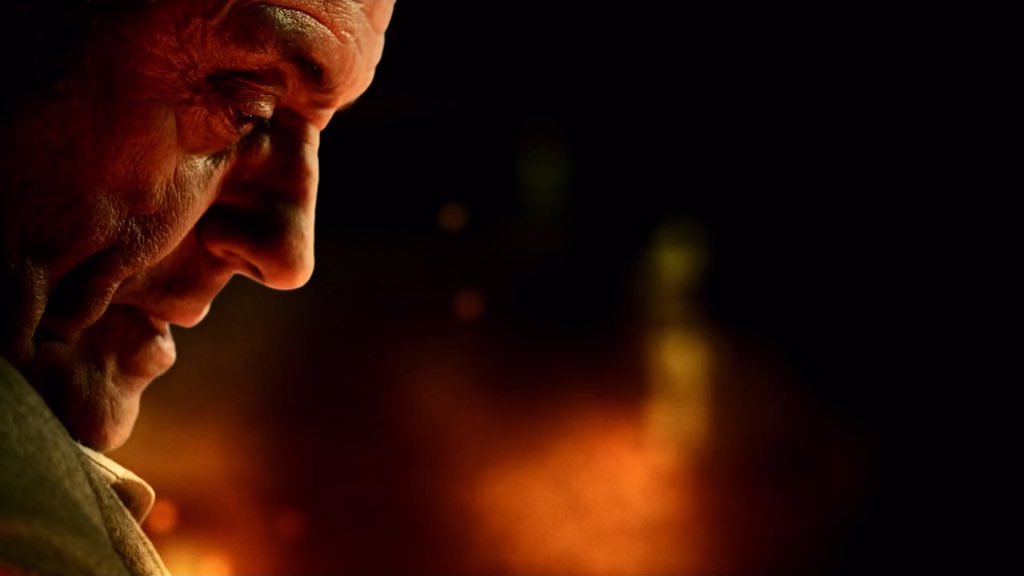
“American Gods” DP: Aaron Morton
What can I say? I’m a sucker for a good profile shot. The hellish colours here are perfect given what the erstwhile Lovejoy has just done. (I won’t give you any spoilers, but let’s just say it doesn’t involve cheeky antiques dealing.)
Symbolism
“The Handmaid’s Tale” DP: Colin Watkinson
This was the shot that inspired me to start #ShotOfTheWeek. The Handmaid’s Tale is set in a Christian fundamentalist society, so evoking classical religious paintings with the angel-wing-like headboard and the muted, brown colour scheme was a clever move.
“The Ipcress File” DP: Otto Heller
This classic spy thriller has a lot of unusual compositions with domineering foreground objects. Here the cross and circle shapes of the light-shade suggest the crosshairs of a gun, while the bulb tastefully obscures the actual bullet wound.
“Mr Robot” DP: Tod Campbell
This one is almost too on-the-nose to be called symbolism. Only a drama as quirky as Mr Robot could get away with this kind of (literal) signposting, but I love how bold it is. The rigid geometric lines and excessive headroom used throughout the series are also in evidence here, reflecting how we’re seeing everything from Elliot’s mentally ill point of view.
Negative Space
“Mission: Impossible – Rogue Nation” DP: Robert Elswit
A forgettable film, but a shot with much to admire. The dark back of the bench creates negative space in the composition, reducing the already-wide Scope frame to a ratio of about 4:1, echoing the short, wide shape of the House of Commons. On the lighting front, negative fill has been employed to render both that bench and the cast very dark, almost silhouettes, imparting a lot of depth to an otherwise flat image.
“Stranger Things” DP: Tim Ives
Again, negative space here creates a geometrical frame within a frame. What I particularly liked was the placement of the bulb above the sheriff’s head, rather than on the right of frame, which would have produced a more balanced but much less interesting shot.
“Better Call Saul” DP: Arthur Albert
Every time Better Call Saul returned to this location I scanned the background of each angle, trying to figure out what on earth could be motivating the bold slash of light on the right of this image. It remains a mystery! The show is full of uncompromisingly dark images with crisp, pure blacks, but perhaps none so overtly noirish as this one.
Intersecting Lines
“Metropolis” DPs: Karl Freund, Günther Rittau & Walter Ruttmann
All credit to Otto Hunte, the production designer on this 1920s sci-fi classic, as every line in this set leads us to the figure of Maria, fittingly for a character who has captured the imaginations of the dystopian underclass. The cinematographers have helped by framing her centrally and making her the brightest part of the image.
“Jardin d’hiver” DP: Darius Khondji
Jardin d’hiver was sponsored by CW Sonderoptic to promote their new large-format Leica Thalia glass (see my Camerimage post for more info). I have to admit that most of the film’s imagery did nothing for me, but this shot of bold, contrasty lines softened by the milkiness of the foreground window has a graphical quality I find very appealing.
“Little Miss Sunshine” DP: Tim Suhrstedt
This is a shot of two halves: the upper half busy, confused and oppressive, the lower half reassuringly simple with its one-point perspective. It was only after filming wrapped on Above the Clouds that I realised just how much this shot and others like it in Little Miss Sunshine had influenced my cinematography of Leon Chambers’ comedy road movie. (Check out the second still on the Above the Clouds page and you’ll see what I mean!)
Iconic Reveals
“The 39 Steps” (1935) DP: Bernard Knowles
Richard Hannay and the audience both discover the cause of Annabella’s distress simultaneously, in a reveal that’s shocking and also funny! The chiaroscuro of the lighting beautifully highlights the bright knife against the deep shadows of the background.
“Terminator 2: Judgment Day” DP: Adam Greenberg
These two gifs are both parts of the same shot, which cranes up from the shockingly unexpected crushing of the skull to reveal the endoskeleton puppet in mid-shot as a perfectly timed explosion goes off in the background. As well as being a remarkable technical achievement, the arts and sciences of cinematography, practical effects and animatronics all working in harmony, it’s a great piece of visual storytelling.
And finally…
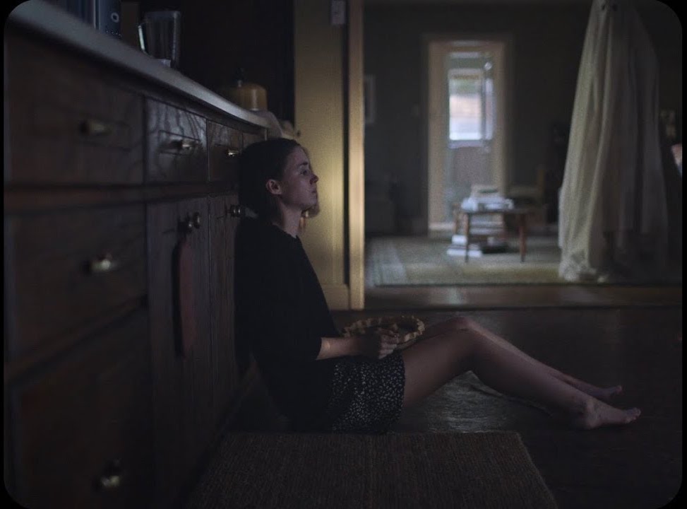
“A Ghost Story” DP: Andrew Droz Palermo
A Ghost Story didn’t get a very wide release, and won’t be to everyone’s taste. A lyrical meditation on the nature of time, its slow pace becomes glacial during a grief-filled, ten-minute pie-eating scene containing only one cut. There is plenty of time to consider the composition, and I loved how casually the ghost is placed within the frame, with the top of his head even cut off. (I later discovered he was composited in, to reduce the chances of anything spoiling the ultra-long, ultra-emotional take.) The lines of the cupboards lead our eyes always back to Rooney Mara, the painterly splash of light on the wall (which I believe was natural) throwing her profile into relief. When she starts to cry, it takes a while to spot the tears, but somehow that makes it all the more powerful.
It’s interesting to note that no fewer than four aspect ratios are represented by all these Shots of the Week: from the traditional Academy ratio of 4:3, through the standard 16:9, to the Netflix-favoured 2:1 and of course 2.39:1 Cinemascope. It’s an exciting time to be working in cinematography, when we have so many choices open to us to create the most fitting images for any given story. Here’s to many more inspiring #ShotOfTheWeek images in 2018. Follow me on Twitter to see them first!
One of the things which I believe separates a good director of photography from a bad one is preparation. On a big production you may have weeks of paid, full-time prep, but on a micro-budget movie you may be lucky to have a single meeting before the shoot. In the latter case you’ll have to use your initiative, put in the time for free, and use Skype a lot, but either way the quality of the prep can make or break the production.
Here are ten things a DP should do to set themselves up for success before the camera rolls. This is not intended to be an exhaustive list, rather it’s a run-down of the things which I have found to bear most fruit later on in the production.
1. Get inside the director’s head.
Some directors will come to you with a beautiful set of storyboards, concept art and reference images, but many won’t. Many will simply have an idea in their head of how they want it to look, and it’s your job to find out what that vision is. Often this will happen before full-time prep begins. It will consist of watching movies together, pouring over books of photos, sharing Pinterest boards or Dropboxes full of images, all the while discussing what they do and don’t like. The aim is to get such a clear idea of their vision that when you set up a shot you’ll deliver the mood they’re looking for first time.
2. Work with the art department.
Chatting over a set model helps identify potential lighting or lensing problems before construction begins.
The next person to get in sync with is the production designer. This is an incredibly important and symbiotic relationship; you have the power to completely destroy each others’ work, or to make each other look like geniuses! Two things you should talk about early on with the designer are the colour palette of the film (and any palettes specific to certain locations, plot threads or characters) and the aspect ratio: does the shape of the sets being designed fit the shape of the frame you’re planning to compose? Next you’ll want to discuss each set and the position of windows and practicals within it, to ensure that you’ll be able to get the lighting angles you need. For their part, the designer will want to quiz you on where the key camera positions will be, and the rough lens lengths you’ll be using, so they know where to put in the most detail and the important bits of dressing.
3. Get to know the needs of the other H.o.D.s.
Although the production designer is the most important head of department for a DP to work with, they are by no means the only one. The visual effects supervisor is increasingly a key collaborator; you should discuss the look you’re going for and how that will integrate with the VFX, and whether plates need to be shot at a higher resolution, in RAW, or any other technical requirements. You should familiarise yourself with the costume designs and discuss how those will integrate with the overall look. Similarly the make-up department will want to talk about about lens filtration, coloured lighting and anything else that may affect how their work looks. The line producer is a crucial person to get on the good side of. Sooner or later you’ll have to ask them for something expensive and unexpected, and they’re much more likely to say yes if you have tried to help them earlier on, by reducing your equipment list for example, or by hiring local camera assistants to save on accommodation costs.
When you start to scout the locations, you’ll want to pay careful attention to the direction of the sun. Which windows will it come through as it moves around over the course of the day? Are those trees or buildings likely to shadow that park bench where the characters will be sitting? With a bit of experience – and a compass, if it’s cloudy – you can estimate this, or use apps like Sun Tracker and Helios which are designed for exactly this purpose. For interiors, windows that never get direct sunlight are most convenient, allowing you to light them artificially, and thus constantly, without having to flag the real sun. For exteriors, shooting into the sun is generally most desirable, for the beauty of the backlight and the softness of the reflected fill. Of course, there will always be compromises with the other demands of the production.
Each director has a different process, but often they will draft a shot list on their own before passing it to you for feedback. There are many things for a DP to consider when going through this list. Do the shots reflect the style and visual grammar you both discussed earlier? (If not, has the director had a change of heart, or have they simply forgotten? Directors have a lot to think about!) Do the shots provide enough coverage for the editor? Are there too many shots to realistically accomplish on schedule? (Very often there are!) What grip equipment will the camera movements require? Are any special lenses or filters required, e.g. a macro lens for an extreme close-up of an eye?
6. Shoot tests.
Testing is a crucial part of the prep for both technical and creative reasons. Usually you will want to test a few different cameras and lens sets, to see which best serve the story. For example, a period film lit with a lot of genuine candlelight may work best on a sensitive camera like the Panasonic Varicam combined with soft fall-off lenses like Cooke S4s, while a sci-fi thriller might be suited to a Red or Alexa and a set of anamorphics for those classic flares. Until you’ve tested them and compared the images side by side though, you can’t be sure, and neither can the director and producers. Often costume and make-up tests will be requested, which may be combined with the camera tests to see how the different sensors render them, or maybe done separately once the camera kit is locked down. These tests are also a great opportunity for the DP to demonstrate for the director the type of lighting you plan to use to, and to make sure you really are on the same page. Ideally a DIT (digital imaging technician) will be available to grade the test footage, developing LUTs (look-up tables) if required, and providing proof of concept for the finished look of the movie.
Once the 1st AD has drafted the shooting schedule, they will show it to the DP for feedback. When determining how much can be done in a day, the 1st AD is thinking of the script page count, and they may not have seen a shot list at this point. Along with the director, the DP must bring any concerns they have about the schedule to the 1st AD in prep, or forever hold your peace! Is there enough time to get those tricky camera moves you’ve planned? Has the re-light time for the reverse been factored in? Have things been arranged in a logical order for lighting, or will things have to be torn down and put back up again later? Does the schedule permit things to be shot at the best time of day for light? Are the night scenes actually scheduled at night or will the windows have to be blacked out? Are there critical close-ups towards the end of the schedule, when the cast will be tired and no longer look their best?
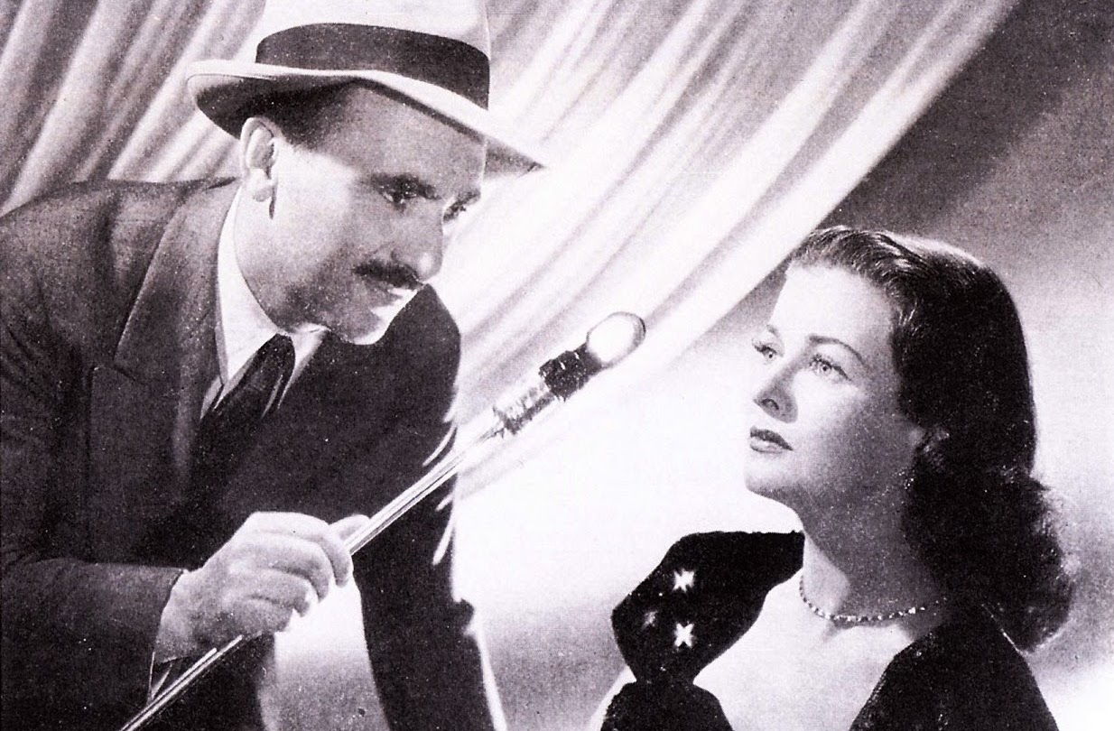
Legendary DP John Alton, ASC tests lighting angles with Joan Bennett
However good-looking the talent may be, they will always look better under certain types of lighting than others. Often you will figure out what suits each actor after a week or so of shooting, but ideally you want to find out before principal photography begins. You can do this during testing, if the cast are available and you have enough time – trying out different key angles, fill levels, backlight and lenses to see what works best for their individual faces. Apart from anything else, this is a great way to establish trust with the cast right from the start, assuring them that they are in safe hands. If testing isn’t possible, watch some of their previous work, looking carefully at how they have been photographed.
9. Mark up your script.
There’s no point in having lots of great ideas in preproduction if you forget them when you’re on set. Everyone has a different system, but you may wish to mark up your script and/or shot list. This could include using coloured highlighters to differentiate day and night scenes at a glance, underlining any references to mood or camera angles in the stage directions, or indicating beats in the development of the story or characters which need to be reflected in how things are lit or shot.
10. Plan your lighting.
Everyone likes to get rolling as soon as possible after call time, and a big factor in achieving this is how quickly you can light. Ideally you will have planned the broad strokes of the lighting in preproduction, and communicated that plan to the gaffer. Budget permitting, the lighting crew can even pre-rig the set so that only tweaking is required when the whole unit arrives. In this case you’ll need to have been very clear and specific about what you want set up and where, drawing diagrams or approving those which the gaffer has drawn up. Often you’ll need to know the rough blocking of the scene before you can plan the lighting, so you should make sure the director indicates their intentions for this during scouts.
Every film is different, but follow the steps above and you’ll be well on your way to an efficient and productive shoot in 2018. Happy new year!
“The Lord of the Rings: The Fellowship of the Ring” – DP: Andrew Lesnie, ACS, ASC
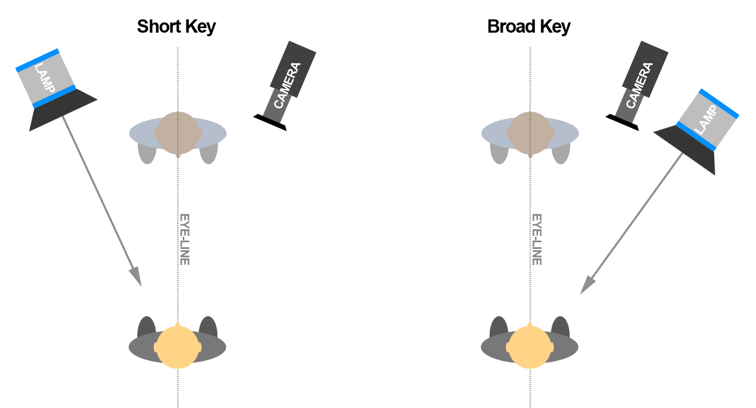
If you’re starting out in your cinematography career, or maybe stepping up from camera operation, lighting can be daunting. How do you know where to put your lights? If you’re working to the Three Point Lighting system, the backlight is self-explanatory, and the fill will often be ambient and directionless, but you may still be left wondering where to put your main light source, your key.
Fortunately there is a very simple rule of thumb, known as short key. In simple terms, a short key light is one which is on the opposite side of the subject’s eye-line to the camera. Let’s delve into what this means and why it’s so common. In fact, once you understand what a short key is you’ll be forever spotting examples of it in film and TV – you’ll be staggered at how often it’s used.
It’s easiest to think of short key from the perspective of the actor. The camera is in front of us and off to one side, because very rarely do actors look down the lens, and the key light is in front of us and off to the other side. It’s called short key because the side of our face that it hits is the side away from camera. The opposite of short key is broad key, where the light is on the same side of us as the camera, thus lighting the “broad” side of our face, the side presented to camera. Note that the light can be either side of the camera, it’s which side of our eye-line it’s on that’s important.
“Arrival” – DP: Bradford Young, ASC
Short key follows the general cinematography principle that light is more interesting when it comes in from the side and behind, rather than from close to camera. It’s preferred by most DPs in most situations because it produces more dimensionality and contrast than broad key. By hitting the side of the face away from camera, a short key leaves shadow on the closer side, creating mood and interest. It brings out the shape of the nose and cheeks. It leaves the ear and side of the head darker, concentrating attention on the face and consequently the performance.
Under the umbrella of short key we can still vary the angle tremendously to affect the mood. If we place the key severely to the side, so none of its illumination reaches the camera side of the actor’s face, and use a very low level of fill, we create a strong, uncompromising look.
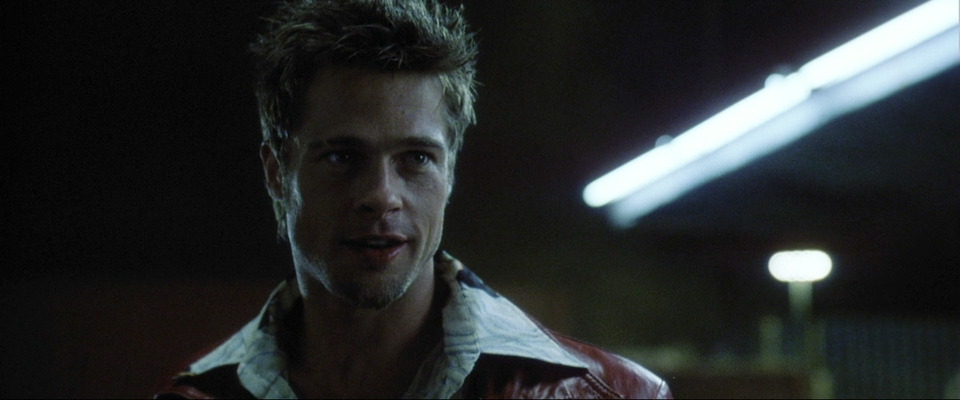
“Logan” – DP: John Mathieson, BSC“Fight Club” – DP: Jeff Cronenweth, ASC
If we place the key closer to front-on, and soften it with diffusion so that it wraps around the camera side of the face, we create a more comfortable, flattering look.
We can also raise the lamp to shade the eye sockets, Godfather style, lower it to create a campfire ghost story look, or place it anywhere in between.
Broad key is less desirable amongst cinematographers, often resorted to only when short key cannot be reconciled with motivating the sources authentically. However, that doesn’t mean that it’s bad or that it can’t be used deliberately and creatively. Here’s just one example of broad key being used extremely effectively.
An example of broad key from “Amélie” – DP: Bruno Delbonnel, AFC, ASC
Short key though is the dominant, ubiquitous style of lighting. It is often the first thing a DP considers when walking onto the set: where can I put the key light in order to hit the short side of the talent? Or conversely, where can I put the camera so that it’s on the opposite side to the light?
If we’re dealing with fixed light sources like windows, or shooting outdoors – we’ll exploit the sun-path or even request that the blocking be altered to ensure a short key. It can go such a long way to making an image cinematic.
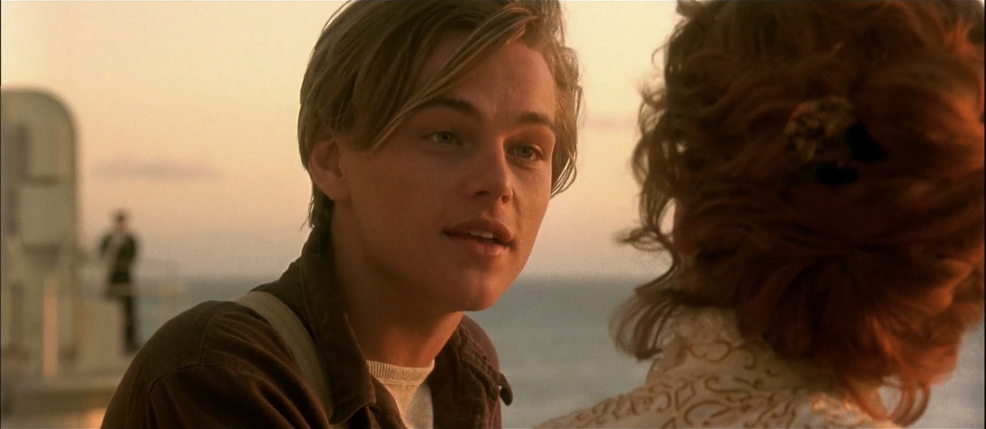
“La La Land” – DP: Linus Sandgren, FSF“Titanic” – DP: Russell Carpenter, ASC
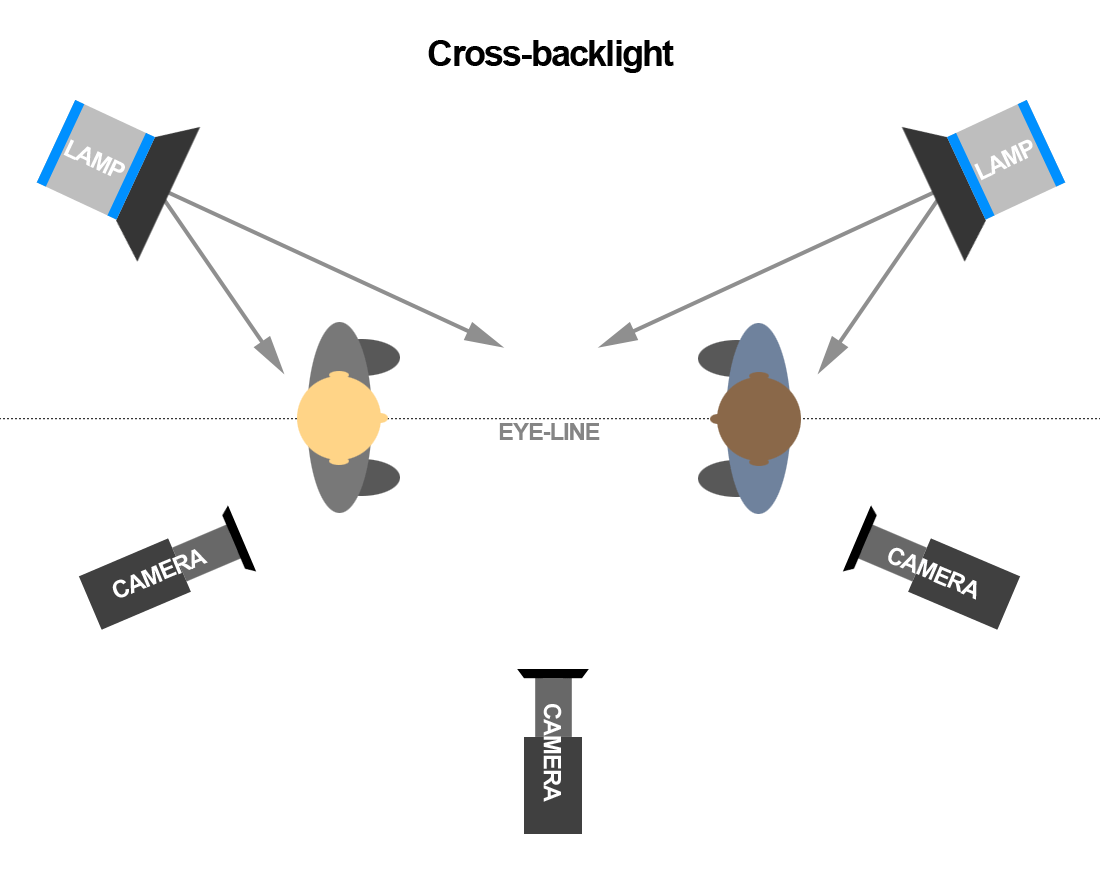
In standard dialogue scenes with two characters facing each other, a technique called cross-backlighting is commonly used to short key both characters and provide backlight too. Check out my post on cross-backlighting for more info.
So next time you watch TV or a movie, look out for short key lighting; I guarantee you’ll see it everywhere.
The frame grabs in this post are from The Cinematographer Index. Check out this very useful resource showcasing great cinematography, and donate a few quid if you can.
This is the third and final part of my report from my time at Camerimage, the Polish film festival focused on cinematography. Read part one here and part two here.
Up.Grade: Human Vision & Colour Pipelines
I thought I would be one of the few people who would be bothered to get up and into town for this technical 10:15am seminar. But to the surprise of both myself and the organisers, the auditorium of the MCK Orzeł was once again packed – though I’d learnt to arrive in plenty of time to grab a ticket.
Up.grade is an international colour grading training programme. Their seminar was divided into two distinct halves: the first was a fascinating explanation of how human beings perceive colour, by Professor Andrew Stockman; the second was a basic overview of colour pipelines.
Prof. Stockman’s presentation – similar to his TED video above – had a lot of interesting nuggets about the way we see. Here are a few:
Our eyes record very little colour information compared with luminance info. You can blur the chrominance channel of an image considerably without seeing much difference; not so with the luminance channel.
Light hitting a rod or cone (sensor cells in our retinae) straightens the twist in the carbon double bond of a molecule. It’s a binary (on/off) response and it’s the same response for any frequency of light. It’s just that red, green and blue cones have different probabilities of absorbing different frequencies.
There are no blue cones in the centre of the fovea (the part of the retina responsible for detailed vision) because blue wavelengths would be out of focus due to the terrible chromatic aberration of our eyes’ lenses.
Data from the rods and cones is compressed in the retina to fit the bandwidth which the optical nerve can handle.
Metamers are colours that look the same but are created differently. For example, light with a wavelength of 575nm is perceived as yellow, but a mixture of 670nm (red) and 540nm (green) is also perceived as yellow, because the red and green cones are triggered in the same way in both scenarios. (Isn’t that weird? It’s like being unable to hear the difference between the note D and a combination of the notes C and E. It just goes to show how unreliable our senses really are.)
Our perception of colour changes according to its surroundings and the apparent colour of the lighting – a phenomenon perfectly demonstrated by the infamous white-gold/blue-black dress.
All in all, very interesting and well worth getting out of bed for!
At the end of the seminar I caught up with fellow DP Laura Howie, and her friend Ben, over coffee and cake. Then I sauntered leisurely to the Opera Nova and navigated the labyrinthine route to the first-floor lecture theatre, where I registered for the imminent Arri seminar.
Arri Seminar: International Support Programme
After picking up my complementary Arri torch, which was inexplicably disguised as a pen, I bumped into Chris Bouchard. Neither of us held high hopes that the Support Programme would be relevant to us, but we thought it was worth getting the lowdown just in case.
Shooting “Kolkata”
The Arri International Support Programme (ISP) is a worldwide scheme to provide emerging filmmakers with sponsored camera/lighting/grip equipment, postproduction services, and in some cases co-production or sales deals as well. Mandy Rahn, the programme’s leader, explained that it supports young people (though there is no strict age limit) making their first, second or third feature in the $500,000-$5,000,000 budget range. They support both drama and documentary, but not short-form projects, which ruled out any hopes I might have had that it could be useful for Ren: The Girl with the Mark.
Having noted these keys details, Chris and I decided to duck out and head elsewhere. While Chris checked out some cameras on the Canon stand, I had a little chat with the reps from American Cinematographer about some possible coverage of The Little Mermaid. We then popped over to the MCK and caught part of a Canon seminar, including a screening of the short documentary Kolkata. Shortly we were treading the familiar path back to the Opera Nova and the first-floor lecture theatre for a Kodak-sponsored session with Ed Lachman, ASC, only to find it had been cancelled for reasons unknown.
Red Seminar: High resolution Image Processing Pipeline
Next on our radar was a Red panel. I wasn’t entirely sure if I could handle another high resolution seminar, but I suggested we return once more to the MCK anyway and relax in the bar with one eye on the live video feed. Unfortunately we got there to find that the monitors had disappeared, so we had to go into the auditorium, where it was standing room only.
“GLOW” – DP: Christian Sprenger
Light Iron colourist Ian Vertovec was talking about his experience grading the Netflix series GLOW, a highly enjoyable comedy-drama set behind the scenes of an eighties female wrestling show. Netflix wanted the series delivered in high dynamic range (HDR) and wide colour gamut (WCG), of a spec so high that no screens are yet capable of displaying it. In fact Vertovec graded in P3 (the colour space used for cinema projection) which was then mapped to Netflix’s higher specs for delivery. The Rec.709 (standard gamut) version was automatically created from the P3 grade by Dolby Vision software which analysed the episodes frame by frame. Netflix streams a 4,000 NIT signal to all viewers, which is then down-converted live (using XML data also generated by the Dolby Vision software) to 100, 650 or 1,000 NITs depending on their display. In theory this should provide a consistent image across all screens.
Vertovec demonstrated his image pipeline for GLOW: multi-layer base grade, halation pass, custom film LUT, blur/sharp pass, grain pass. The aim was to get the look of telecined film. The halation pass involved making a copy of the image, keying out all but the highlights, blurring those highlights and layering them back on top of the original footage. I used to do a similar thing to soften Mini-DV footage back in the day!
An interesting point was made about practicals in HDR. If you have an actor in front of or close to a practical lamp in frame, it’s a delicate balancing act to get them bright enough to look real, yet not so bright that it hurts your eyes to look at the actor with a dazzling lamp next to them. When practicals are further away from your cast they can be brighter because your eye will naturally track around them as in real life.
Next up was Dan Duran from Red, who explained a new LUT that is being rolled out across their cameras. Most of this went in one ear and out the other!
“Breaking Bad”
Afterwards, Chris and I returned to Kung Fusion for another delicious dinner. The final event of the day which I wanted to catch was Breaking Bad‘s pilot episode, screening at Bydgoszcz’s Vue multiplex as part of the festival’s John Toll retrospective. Having binged the entire series relatively recently, I loved seeing the very first episode again – especially on the big screen – with the fore-knowledge of where the characters would end up.
Later Chris introduced me to DP Sebastian Cort, and the three of us decided to try our luck at getting into the Panavision party. We snuck around the back of the venue and into one of the peripheral buildings, only to be immediately collared by a bouncer and sent packing!
This ignoble failure marked the end of my Camerimage experience, more or less. After another drink or two at Cheat we called it a night, and I was on an early flight back to Stansted the next morning. I met some interesting people and learnt a lot from the seminars. There were some complaints that the festival was over-subscribed, and indeed – as I have described – you had to be quick off the mark to get into certain events, but that was pretty much what I had been expecting. I certainly won’t put be off attending again in the future.
To learn more about two of the key issues raised at this year’s Camerimage, check out my Red Shark articles:
This is the second part of my report from my time at Camerimage, the Polish film festival focused on cinematography. Read part one here.
Panavision: The BEauty of 8K Large Format
Bydgoszcz’s town square
It was a chilly but bright morning as I strolled into Bydgoszcz and made straight for the MCK Orzeł, where I planned to spend most of the day. With only a few minutes to go until the scheduled start time, the queue for Panavision’s large format seminar had spilt out onto the street. The tickets ran out before I reached the desk, but there was a live video feed in the cinema’s bar. In many ways this was better than going into the auditorium – sitting in a comfy chair with the bar close at hand, and a table to make notes on.
My article for Red Shark News about the future of large format cinematography has been surprisingly popular, and it contains plenty of detail about this Panavision seminar, so I won’t repeated myself here. I will say that it converted me from a high resolution sceptic to a believer, because the speakers demonstrated that footage acquired in high rez – even when downscaled – retain much of its smoothness, high bit depth and dynamic range. “More resolution evokes the imagination of the brain,” was how colourist Ian Vertovec summed it up.
At the end of the session, Red Shark’s David Shapton and Matt Gregory emerged from the auditorium and joined me for lunch at the bar. We had all found the seminar very interesting, and Matt was quick to get us all tickets to the Panasonic 4K seminar coming up later in the day. The pair then went off to other things, while I headed to the kiosk to get a ticket for the imminent John Toll seminar. But of course I’d left it too late, they were all gone, and so I returned to my comfy chair in the bar to watch via video feed again.
Panavision workshops: A conversation with John Toll, ASC
John Toll, ASC
John Toll, ASC was the recipient of this year’s Lifetime Achievement Award at Camerimage, and this seminar was an epic journey through this career. He explained how he learnt his craft as a camera operator for the late great Conrad Hall, ASC and Jordan Cronenweth, ASC.
The talk then focused on some of Toll’s biggest movies, beginning with the period drama Legends of the Fall starring Brad Pitt and Anthony Hopkins. The movie was largely daylight exterior (something that was to become a theme across Toll’s work) so the cinematographer insisted on twelve weeks of prep, the same as the production designer. This allowed him to be part of selecting locations and choosing orientations for the buildings to get the optimal sun path. Toll said he was lucky that the 1st AD was willing to be flexible with the schedule, observing the mood of the weather each day and shooting scenes that matched that mood.
Gaffer Jim Plannette joined Toll on the stage to discuss the huge night exterior battle sequence. This employed three Musco lights (a Musco being fifteen 6K pars on a 100ft boom arm) which three-quarter-backlit every angle. To get crisp, grain-free blacks, Toll overexposed and printed down.
Braveheart was covered next, with 1st AC Graham Hall joining the panel. Hall had a difficult time with the film’s battle scenes, featuring as they did so much movement, improv and slo-mo. Toll revealed how the immersive style of the action was based on a sixties TV documentary about Culloden that coincidentally both he and director Mel Gibson had seen. A lot of colour timing was required to give consistency to the battles, which were shot over weeks, at all times of day.
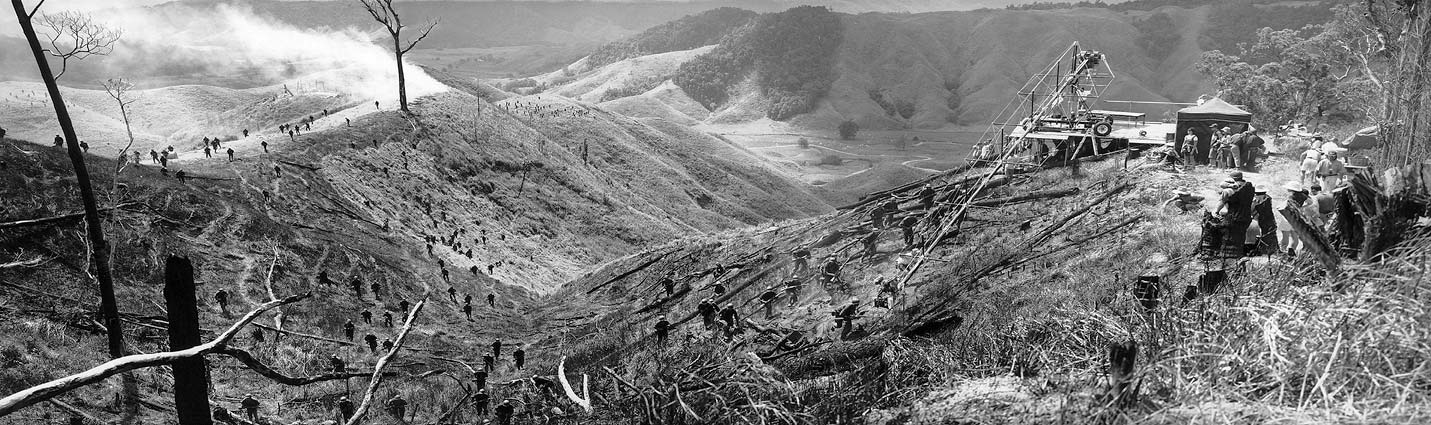
The discussion then turned to Terrence Malick’s The Thin Red Line. The Australian locations featured very difficult, uneven terrain, so Toll used an Akela Crane. The crane’s arm was so long (75ft) that the arc of its movement couldn’t be detected on camera. Its use had to be carefully planned though, because each time it needed to be moved it had to be disassembled and reassembled on a special platform. 80% of the filmwas actually handheld, and Toll operated himself so as to respond to the spontaneity and improv which Malick encourage from his cast.
The Akela Crane in use on “The Thin Red Line”
Toll told a funny story about a shot of shadows moving across long grass which was praised by critics. It was inserted to cover a continuity error, the build-up to the battle having been shot in heavy cloud, while the battle itself was shot in full sun. A happy accident!
Time was running short, so the moderator powered through Almost Famous (where parallels were drawn between the explosive battle scenes of Toll’s earlier movies and the crowd scenes at the rock concerts, punctuated by flashing cameras), Vanilla Sky and Billy Lynn’s Long Halftime Walk. This latter film, directed by Ang Lee, is notable for its acquisition in 120fps 4K stereo. You can read more about it on the British Cinematographer website.
Panasonic Seminar: Varicam Experience
A Panasonic Varicam LT with Fujinon zoom rigged for action on “Arrested Development”
I remained at the MCK and, meeting up with Dave and Matt again, finally got into the auditorium, for the Panasonic seminar. Moderated by British Cinematographer‘s Ronnie Prince, the panel brought together a trio of DPs who shoot Netflix shows on the Varicam: Bobby Shore, CSC (Anne with an E), Pepe Avila del Pino (Ozark) and Patrick Alexander Stewart (Arrested Development).
Both Shore and del Pino admitted that they were most comfortable with the Arri Alexa, but due to Netflix’s strict rules on 4K acquisition (the Alexa tops out at 3.2K) they had to find another camera. They plumped for the Panasonic Varicam, a 4K camera best known for having dual native ISOs: 800, in common with the Alexa, Red and many others, and 5000, two and two-thirds stops faster. Being native, both ISOs have the same dynamic range, the same log curve and in theory are equally clean.
Panasonic, I think, were keen to push ISO 5000 in this seminar, but unfortunately Shore and del Pino shot almost exclusively at 800. Stewart did shoot Arrested Development at 5000, interiors and night scenes at least, but down-rated it to 2500. Otherwise, he said, the sets would have been too dark for the actors to feel like they were in a believable daytime environment. I think that’s a fascinating, unexpected side effect of low light sensitivity! Stewart lit the stages with large Quasar softboxes and paired the Varicam with Fujinon zooms and occasional Xeen primes.
Del Pino chose Zeiss Super Speeds for night scenes and Hawk V anamorphics for day scenes on Ozark. He liked the claustrophobia of cropping the anamorphic images to 2:1, the show’s delivery ratio, while the Super Speeds produced a creaminess he found appealing. He also mentioned that the Varicam’s sensor handled greens very well, which was important for him, given how much of Ozark takes places in woods.
Anne with an E was lensed on vintage Panavision Standard and Super Speeds – “the oldest, craziest lenses we could find,” says Bobby Shore. He liked their low resolving power, their weird flares and how they fell apart when wide open. Part of the show’s signature look are ECUs of the freckled title character, which were captured on a 27mm Primo for a more detailed, tactile image.
Inspired by the work of Robbie Ryan, BSC (Wuthering Heights), Shore kept the lighting naturalistic, mixing tungsten and HMI sources on a set that was treated like a location. He also shot through a Panaflasher, a special lens filter with built-in lighting which reduces contrast and adds a colour tint of your choice, but this effect was dialled out in post. Indeed, Shore raised the issue of DPs’ images being altered after the fact, an issue I explore fully in another Red Shark article.
By the way, I’ve been watching Anne with an E since the festival and I can thoroughly recommend it.
When the seminar was over, I went for dinner with Dave, Matt and Chris Bouchard, at a very nice (but once again cheap) Asian fusion restaurant. Then we met up for drinks with some of the reps from Red, and I got talking to a DP who had shot squid from a submarine for an episode of Blue Planet. After another drink or two with Chris at the Cheat bar, I called it a night.
Tune in next week for the final part of my Camerimage blog.
This week I attended Camerimage for the first time. Centred around the Opera Nova theatre beside the river Brda in Bydgoszcz, Poland, Camerimage is an international film festival celebrating the art of cinematography. It’s a bit like Cannes for DPs, but colder. This is the first part of my account of my three days at the annual hub of motion picture imaging.
The Ryanair flight was dirt cheap but trouble free, and at 9:50am I found myself on the tarmac of Bydgoszcz airport. There I met David Shapton and Matt Gregory, founders of Red Shark News, for the first time. I’ve been contributing articles to Red Shark for a few months so it was nice to finally meet these gentlemen in person.
A taxi (also dirt cheap) dropped me at the Opera Nova – only about three miles from the airport – where I picked up my pass and goodie bag. Bizarrely, said goodies included an Ikea catalogue. How did they know that us DPs love flat-pack furniture so much?
Canon Workshop: Stephen Goldblatt
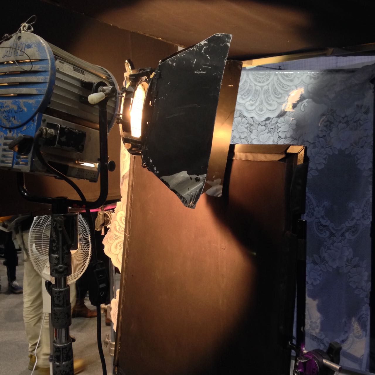
From the Opera Nova I hurried to a college across the river, where the sports hall formed the venue for a Canon workshop run by Stephen Goldblatt, ASC, BSC, the man behind the lens for the likes of Lethal Weapon 2 and Batman Forever. The blurb for this workshop described Goldblatt as “a master of low light shooting”, and it was certainly pitch black when I walked in a few minutes late, and gingerly picked my way around to the far side of the hall to find a seat.
Lighting through lace
On a purpose-built bedroom set, Goldblatt was recreating lighting from the Robert Redford / Jane Fonda romantic drama Our Souls at Night, shot on the Sony F55 and Canon C300 Mark II. To practical lamps on either side of the bed he added egg-crated tungsten soft-boxes to beef up each one. He simulated moonlight through an imagined off-camera window by placing a lace curtain in front of a blue-gelled lamp and blowing it gently with a fan. An additional egg-crated soft-box provided a low level of blue toplight.
As he worked, Goldblatt revealed how he doesn’t miss ceulloid, loving how relatively easy it is now to light night exteriors or moving car scenes. “But just because you don’t need much light,” he cautioned, “it doesn’t mean you don’t want to control it.” Other developments coming down the pipe do not inspire him so much; he feels that high resolutions and HDR are unnecessary, pushed by marketing people rather than creatives.
He placed great emphasis on the importance of the eyes. “A common failing of newer DPs is that they worry more about the set than the eyes,” he said, before explaining how he will often walk beside the handheld camera with a torch, providing eye-light. He also stressed the importance of eye-lines. Although in any one shot it’s not that important how wide or tight the eye-line is, or how high or low, across the two hours of a feature film the decisions have a cumulative effect.
Trying out a Xeen lens in the exhibition hall
Goldblatt no longer uses a light meter. “Trust your eye, develop your eye,” he advised, adding that you must have a strong voice to remain in control of the images through postproduction.
After grabbing lunch, I returned to the Opera Nova to browse the exhibition hall. This closely resembled a mini BSC Expo or Media Production Show, with all the major camera and lens manufacturers displaying their wares, along with several lighting companies. I had a play with some of the cameras, including the actual Alexa 65 used on Rogue One.
Then I met up with Chris Bouchard, one of The Little Mermaid‘s two directors, who had arrived in Poland the previous day. We sauntered over to another venue, the MCK Orzeł, an independent cinema with a nice, chilled, film-buff-friendly atmosphere. The auditorium itself was packed though as we settled in for a seminar on “The Future of Digital Formats”.
Red Seminar: The Future of Digital Formats
Promoting Red’s Monstro sensor, the session was mostly about the benefits of shooting in high resolutions, and giving yourself the maximum flexibility in post. You can read my thoughts on both of those topics in upcoming Red Shark articles.
One of the speakers, Christopher Probst, ASC (DP of Mindhunter and technical editor of American Cinematographer magazine) made some interesting points about ISO. “Traditionally, low ISOs were used for bright scenes like day exteriors, and high ISOs were used for darker scenes like night exteriors,” he explained. “That was based on reducing the grain, getting the cleanest possible image on film.” He advised the opposite for digital capture. “Use a low ISO for nights to get more shadow detail, and a high ISO for days to get more highlight detail [in the sky, for example].”
“Independence Day: Resurgence” – DP: Markus Forderer, BVK
Another interesting nugget came from Markus Förderer, BVK. On Independence Day: Resurgence he switched between spherical, 1.3x anamorphic and 2x anamorphic lenses depending on the situation. For example, flatter lenses were better for wide shots – where anamorphics would distort straight lines – and for VFX work.
Hawk Vantage Seminar: Top cinematographers tell their Hawk stories
I ducked out of the Red session early so that I could pop back to the Opera Nova for the Hawk Vantage seminar, bumping into my Perplexed Music gaffer Sam Meyer on the way. Hawk were launching three new sets of lenses: MiniHawk (T1.7 hybrid anamorphics), Hawk Class-X (T2.2 2x anamorphics) and Hawk65 (T2.2).
A Hawk T1 in the exhibition hall
The MiniHawks in particular seem very exciting. Daniel Pearl, ASC showed us some stunning frame grabs from the upcoming Dennis Quaid vehicle Motivated Seller, shot using these lenses on Alexa Mini. Whilst having key advantages of spherical lenses (speed, small size, low weight, extremely close focus) the MiniHawks have a unique and beautiful cigar-shaped bokeh.
While Pearl had used the latest Hawks, Magdalena Górka, PSC had shot with some old ones, the C series, for Brad Silberling’s drama An Ordinary Man. “I had to frame everything centrally because that’s the only place that was sharp!” she laughed. Also addressing focus fall-off, Andrzej Bartkowiak, ASC (Speed, The Devil’s Advocate) stated, “I like anamorphic because the shallow depth of field allows you to direct the viewer’s eye more.”
Stuart Dryburgh, ASC (The Secret Life of Walter Mitty, Bridget Jones’s Diary) talked about shooting 1.3x anamorphic. He has done this on three-perf 35mm (to achieve a Scope aspect ratio), on an Alexa in 16:9 mode (again for 2.39:1) and on an Alexa in 4:3 mode (to get 1.85:1). He also recommended shooting on Super-16 with 1.3x glass, citing the example of Ed Sheeran’s “Thinking Out Loud” video, which Pearl shot.
Peter Flinckenberg, FCK (Upswing, Concrete Night) noted that, with the shift to digital acquisition, the DP is no longer a magician, “but you can bring back that magic with lighting and glass that has character.”
CW Sonderoptic: Exploring Large format cinematography & Leica lenses
I took my leave, dashing back to the MCK Orzeł for another lens-themed seminar, this time by CWSonderoptic, the makers of Leica. The first half of this panel revolved around a short film shot by Darius Khondji, ASC, AFC (Seven, Delicatessen) on an Alexa 65 with the new Leica Thalias.
The second half was all about Tod Campbell, DP of Stranger Things and Mr. Robot, focusing on the latter show. The second season of Mr. Robot was shot on Leica Summicrons after Campbell found that the Cookes used on season one distorted the many straight lines which became such a key part of the show’s unique look. “I look at season two as kind of the birth of the photography for the show,” he said. With a laugh he added: “Sorry that the lighting looks like shit in season one. I was learning!” (See my spherical lens tests for my own thoughts on Cookes and Leicas.)
One of my favourite shots from “Mr. Robot”
Campbell revealed that season three of Mr. Robot has a different look again, using much more camera movement and “twice as much atmos”. For this season he paired Canon K35 glass with an 8K camera, but due to the Canons’ low resolution he employed Leica Summiluxes for the wide shots.
He also shared some interesting information about his testing process, admitting that he doesn’t really know how other DPs test. He doesn’t use charts, he just makes it up. He always includes a candle, a practical lamp, some kind of highlight in the background, and random foreground objects (as background bokeh can differ from foreground bokeh).
Christopher Doyle Seminar
When the Leica seminar ended I went back to the Opera Nova, where Chris and I had dinner at the nice (and once again cheap – are you detecting a theme?) restaurant. Despite having got up at 4am (3am local time) I wasn’t feeling too tired, so we headed upstairs to the 10pm seminar by Christopher Doyle, HKSC (Hero, Lady in the Water). Many people were nursing beers, including Doyle himself, and the lecture theatre was dimly illuminated by mood lighting. Clearly this session was not going to be like the daytime ones.
“We’re going to fuck things up,” Doyle began, dispelling all doubts. He proceeded to talk disjointedly but entertainingly about his work on The White Girl and what I think was a separate film about a camera obscura. His oratory was liberally sprinkled with great one-liners, a few of which I reproduce here for your edification:
There are only three people in filmmaking: the actor, the audience and the cinematographer in between them.
If actors don’t feel loved, the performance will not come across on camera.
Give the idea the image it deserves.
[Vittorio] Storaro [legendary DP of Apocalypse Now amongst others] can’t tell you how to do it. You have to find it for yourself.
People in space – that’s what cinematography’s about.
The location is very important. It gives the energy, it imposes the style.
The lens doesn’t matter; it’s what it shows that’s important.
You never sleep because you care too much – that’s what filmmaking is.
With Chris Bouchard in front of the Opera Nova
Doyle also picked up on a piece of dialogue from a clip he screened: “What is it?” / “I don’t know yet.” It was a great summation of finding the essence of a shot, he said.
Having had our fill of aphorisms, Chris Bouchard and I slipped out to get a drink. The Cheat, the pop-up bar across the road, was absolutely packed, and my early morning was finally catching up with me, so I called it a night. The highstreet of Bydgoszcz was quiet and chilly as I walked briskly to my hotel, curiously located down a service road behind the city’s football stadium, reflecting on all that I had learnt that day.
Tune in next week for tales from my second day at Camerimage.
 The first colour wheel was drawn by Sir Isaac Newton in 1704, and it’s a precursor of the CIE diagram we met last week. It’s a method of arranging hues so that useful relationships between them – like primaries and secondaries, and the schemes we’ll cover below – can be understood. As we know from last week, colour is in reality a linear spectrum which we humans perceive by deducing it from the amounts of light triggering our red, green and blue cones, but certain quirks of our visual system make a wheel in many ways a more useful arrangement of the colours than a linear spectrum.