A Post-lockdown Trip to the Cinema

This article first appeared on RedShark News last month.

What’s wrong with this picture? Apparently nothing, if you work for the Light.

As I write this, I’ve just got back from my first trip to the cinema in six months. Although they have been allowed to reopen in England since July 4th, the higher operating costs in the pandemic kept many cinemas dark well into August. On Friday the 21st, my local branch of the Light here in Cambridge finally opened its doors, and I went along to experience post-Covid cinema.

Studios have been shifting their release dates throughout the lockdown, with some films giving up on theatrical exhibition altogether, so the Light, like its competitors, has filled its screens with classics for now. I selected Jurassic Park, which I haven’t seen on the big screen since its original release in 1993.

When I arrived, the lobby was dark and almost empty. Like most public spaces, it had sprouted new signage and a one-way system since March, and it took me a couple of attempts to find the right lane. Once inside the main corridor though, little had changed except the odd hand sanitiser dispenser on the wall.

I found my screen and took a seat. As with everything from trains to swimming pools, pre-booking is now strongly recommended, due to the diminished capacity caused by social distancing. When you pick your seat, the website makes you leave two empties between your party and the next. You can even pre-purchase your popcorn and bucket of cola.

I needn’t have booked, however. In a screen of about 100 seats, exactly ten were occupied. It will take the general public a while to cotton on that cinema-going is an option again, even before they decide whether they feel comfortable doing so.

As I sat masked and expectant, my hands sticky from sanitiser that refused to evaporate, I was treated to a rare site: a cinema employee inside the auditorium. He announced that they didn’t have any ads or trailers yet, so they would delay starting the film to give everyone a chance to arrive.

A few minutes later, the man reappeared and asked us all to decamp to the corridor. Apparently they had installed a new sound system, and they needed to test it, which could be very loud. Why they couldn’t have checked the system for eardrum bursting at some point in the last six months is beyond me.

The ten of us duly waited in the corridor. A snatch of the Imperial March from an adjacent screen betokened another classic being wheeled out. A woman with a spray bottle and a cloth, masked like all of her colleagues, worked her way down the corridor, cleaning the door handles. A group next to me (but, I hasten to add, appropriately distant) cracked jokes about the sex appeal of Jeff Goldblum’s Ian Malcom. Another group, evidently missing the trailers, watched one on a phone. (If that doesn’t sum up the existential crisis facing cinema, I don’t know what does.)

At last we were readmitted. The lights dimmed, the sounds of a jungle faded up on the brand new sound system, and the Universal logo appeared. But the trademark globe looked like a deflated football. The film was being projected in the wrong aspect ratio. And not just slightly. It was almost unwatchably stretched, like the flat 1.85:1 images were being shown through a 2:1 anamorphic lens.

By the time the first scene was dissolving away to Bob Peck’s cries of “Shoot her!” the problem hadn’t been corrected, so I stepped out to find a member of staff. The senior person on duty claimed that the problem lay with the file supplied by the distributor, not with the projection. “There’s nothing I can do,” he insisted, while I goggled over my mask in disbelief.

At this point, had I not had this article to write, I would have gone home and watched the film on Netflix, or even on DVD. (There’s that existential crisis again.) But I persevered, trying not to imagine Dean Cundey weeping tears of frustration into his beard.

Fortunately, Jurassic Park is such a great film that it could be appreciated even in the face of such technical incompetence. A larger audience would have been nice, to enjoy the scares and humour with, though since screaming and laughing project dangerous droplets further, perhaps that’s less than ideal these days.

Overall, I must say that I found the experience of going to the cinema less altered than many other aspects of life. I’ve got used to wearing a mask, so much so that I was halfway home before I remembered to take it off, and I normally avoid peak times so the emptiness didn’t feel too unusual.

But with the rise in streaming subscriptions during lockdown, and the understandable caution that many feel about going out, cinemas will need to work much harder to get bums back on flip-up seats. The kind of technical troubles that the Light suffered tonight will only strengthen the case for staying at home, mask-free and pyjama-clad, where you can control both the virus and the aspect ratio.

A week after writing this, I went to a Showcase to see Tenet. The member of staff who took our tickets unequivocally told us that the printed screen number was wrong, and that we should go to another one. We did so. The ads and trailers finally started, fifteen minutes late. We were just wondering why they were trailing such kid-friendly movies when another member of staff came in and told us that Tenet was showing in the original screen after all, and by the way, you’ve missed the first couple of minutes. 

Hopefully it is now clear why I wrote “10 Reasons Why Cinemas Don’t Deserve to Survive the Pandemic”.

A Post-lockdown Trip to the Cinema

Will “The Mandalorian” Revolutionise Filmmaking?

Last week, Greig Fraser, ASC, ACS and Baz Idoine were awarded the Emmy for Outstanding Cinematography for a Single-camera Series (Half-hour) for The Mandalorian. I haven’t yet seen this Star Wars TV series, but I’ve heard and read plenty about it, and to call it a revolution in filmmaking is not hyperbole.

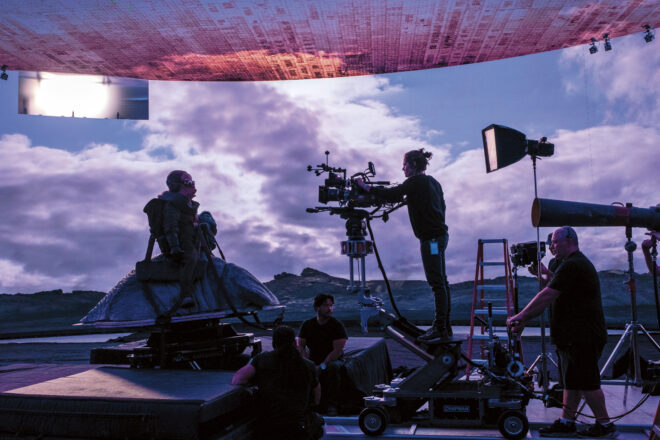
Half of the series was not shot on location or on sets, but on something called a volume: a stage with walls and ceiling made of LED screens, 20ft tall, 75ft across and encompassing 270° of the space. I’ve written before about using large video screens to provide backgrounds in limited aways, outside of train windows for example, and using them as sources of interactive light, but the volume takes things to a whole new level.

In the past, the drawback of the technology has been one of perspective; it’s a flat, two-dimensional screen. Any camera movement revealed this immediately, because of the lack of parallax. So these screens tended to be kept to the deep background, with limited camera movement, or with plenty of real people and objects in the foreground to draw the eye. The footage shown on the screens was pre-filmed or pre-rendered, just video files being played back.

The Mandalorian‘s system, run by multiple computers simultaneously, is much cleverer. Rather than a video clip, everything is rendered in real time from a pre-built 3D environment known as a load, running on software developed for the gaming industry called Unreal Engine. Around the stage are a number of witness cameras which use infra-red to monitor the movements of the cinema camera in the same way that an actor is performance-captured for a film like Avatar. The data is fed into Unreal Engine, which generates the correct shifts in perspective and sends them to the video walls in real time. The result is that the flat screen appears, from the cinema camera’s point of view, to have all the depth and distance required for the scene.

The loads are created by CG arists working to the production designer’s instructions, and textured with photographs taken at real locations around the world. In at least one case, a miniature set was built by the art department and then digitised. The scene is lit with virtual lights by the DP – all this still during preproduction.

The volume’s 270° of screens, plus two supplementary, moveable screens in the 90° gap behind camera, are big enough and bright enough that they provide most or all of the illumination required to film under. The advantages are obvious. “We can create a perfect environment where you have two minutes to sunset frozen in time for an entire ten-hour day,” Idoine explains. “If we need to do a turnaround, we merely rotate the sky and background, and we’re ready to shoot!”

Traditional lighting fixtures are used minimally on the volume, usually for hard light, which the omni-directional pixels of an LED screen can never reproduce. If the DPs require soft sources beyond what is built into the load, the technicians can turn any off-camera part of the video screens into an area of whatever colour and brightness are required –  a virtual white poly-board or black solid, for example.

A key reason for choosing the volume technology was the reflective nature of the eponymous Mandalorian’s armour. Had the series been shot on a green-screen, reflections in his shiny helmet would have been a nightmare for the compositing team. The volume is also much more actor- and filmmaker-friendly; it’s better for everyone when you can capture things in-camera, rather than trying to imagine what they will look like after postproduction. “It gives the control of cinematography back to the cinematographer,” Idoine remarks. VR headsets mean that he and the director can even do a virtual recce.

The Mandalorian shoots on the Arri Alexa LF (large format), giving a shallow depth of field which helps to avoid moiré problems with the video wall. To ensure accurate chromatic reproduction, the wall was calibrated to the Alexa LF’s colour filter array.

Although the whole system was expensive to set up, once up and running it’s easy to imagine how quickly and cheaply the filmmakers can shoot on any given “set”. The volume has limitations, of course. If the cast need to get within a few feet of a wall, for example, or walk through a door, then that set-piece has to be real. If a scene calls for a lot of direct sunlight, then the crew move outside to the studio backlot. But undoubtedly this technology will improve rapidly, so that it won’t be long before we see films and TV episodes shot entirely on volumes. Perhaps one day it could overtake traditional production methods?

For much more detailed information on shooting The Mandalorian, see this American Cinematographer article.

Will “The Mandalorian” Revolutionise Filmmaking?

5 Things Bob Ross Can Teach Us About Cinematography

I’m certainly glad you could join me today. It’s a fantastic day here and I hope it is wherever you’re at. Are you ready to read a fantastic little blog post? Good, then let’s get started.

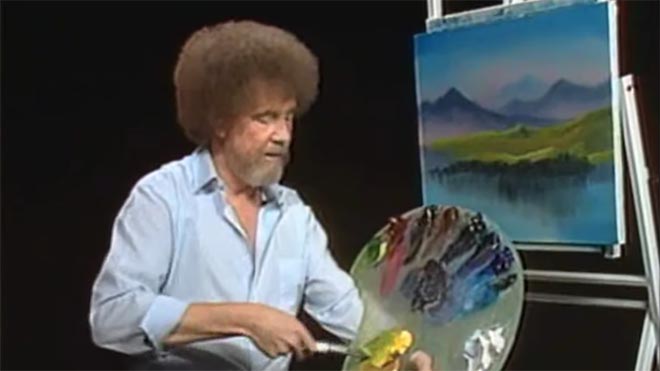
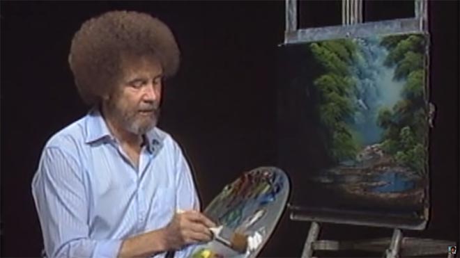
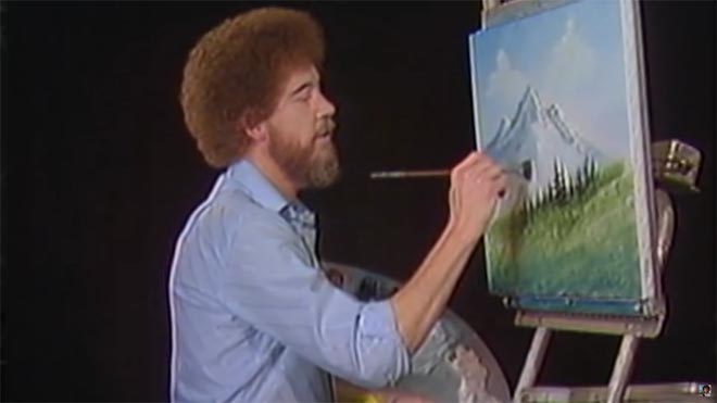
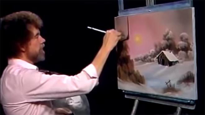
For twelve years, across 400 episodes, Bob Ross entertained all generations of Americans with his public access TV series, The Joy of Painting. Although he floated up to join the happy little clouds in 1995, in recent years YouTube and Twitch have brought his shows to a new audience, of which I am a humble member. Bob’s hypnotic, soft-spoken voice, his unfailingly positive attitude, and the magical effects of his wet-on-wet oil-painting technique make his series calming, comforting and captivating in equal measure.

Having watched every episode at least twice now, I’ve noticed several nuggets of Bob Ross wisdom that apply just as well to cinematography as they do to painting.


1. “The more plains you have in your painting, the more depth it has… and that’s what brings the happy buck.”

Bob always starts with the background of his scene and paints forward: first the sky with its happy little clouds; then often some almighty mountains; then the little footy hills; some trees way in the distance, barely more than scratches on the canvas; then perhaps a lake, its reflections springing forth impossibly from Bob’s brush; the near bank; and some detailed trees and bushes in the foreground, with a little path winding through them.

“Exile Incessant” (dir. James Reynolds)

Just as with landscape painting, depth is tremendously important in cinematography. Creating a three-dimensional world with a monoscopic camera is a big part of a DP’s job, which starts with composition – shooting towards a window, for example, rather than a wall – and continues with lighting. Depth increases production value, which makes for a happy producer and a happy buck for you when you get hired again.


2. “As things get further away from you in a landscape, they get lighter in value.”

Regular Joy of Painting viewers soon notice that the more distant layers of Bob’s paintings use a lot more Titanium White than the closer ones. Bob frequently explains that each layer should be darker and more detailed than the one behind it, “and that’s what creates the illusion of depth”.

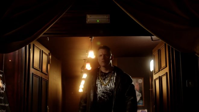
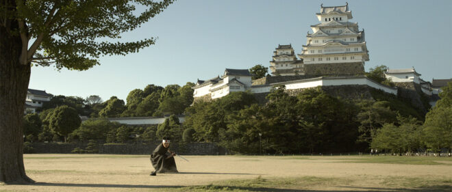
“The Gong Fu Connection” (dir. Ted Duran)

Distant objects seem lighter and less contrasty because of a phenomenon called aerial perspectivebasically atmospheric scattering of light. As a DP, you can simulate this by lighting deeper areas of your frame brightly, and keeping closer areas dark. This might be achieved by setting up a flag to provide negative fill to an object in the foreground, or by placing a battery-powered LED fixture at the end of a dark street. The technique works for night scenes and small interiors, just as well as daytime landscapes, even though aerial perspective would never occur there in real life. The viewer’s brain will subconsciously recognise the depth cue and appreciate the three-dimensionality of the set much more.


3. “Don’t kill the little misty area; that’s your separator.”

After completing each layer, particularly hills and mountains, Bob takes a clean, dry brush and taps gently along the bottom of it. This has a blurring and fading effect, giving the impression that the base of the layer is dissolving into mist. When he paints the next layer, he takes care to leave a little of this misty area showing behind it.

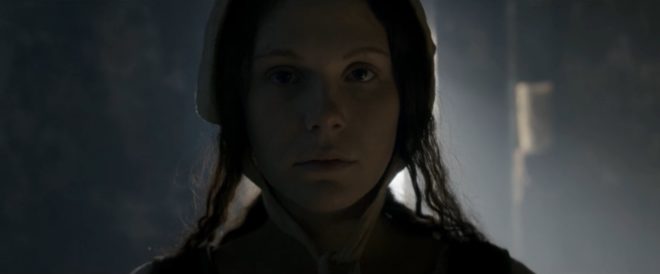
“Heretiks” (dir. Paul Hyett)

We DPs can add atmos (smoke) to a scene to create separation. Because there will be more atmos between the lens and a distant object than between the lens and a close object, it really aids the eye in identifying different plains. That makes the image both clearer and more aesthetically pleasing. Layers can also be separated with backlight, or a differentiation of tones or colours.


4. “You need the dark in order to show the light.”

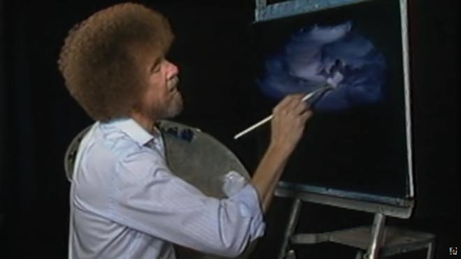
Hinting at the tragedy in his own life, Bob often underlines the importance of playing dark tones against light ones. “It’s like in life. Gotta have a little sadness once in a while so you know when the good times come,” he wisely remarks, as he taps away at the canvas with his fan-brush, painting in the dark rear leaves of a tree. Then he moves onto the lighter foreground leaves, “but don’t kill your dark areas,” he cautions.

“Closer Each Day” promo (dir. Oliver Park)

If there’s one thing that makes a cinematic image, it’s contrast. It can be very easy to over-light a scene, and it’s often a good idea to try turning a fixture or two off to see if the mood is improved. However bright or dark your scene is, where you don’t put light is just as important as where you do. Flagging a little natural light, blacking out a window, or removing the bubble from a practical can often add a nice bit of shape to the image.


5. “Maybe… maybe… maybe… Let’s DROP in an almighty tree.”

As the end of the episode approaches, and the painting seems complete, Bob has a habit of suddenly adding a big ol’ tree down one or both sides of the canvas. Since this covers up background layers that have been carefully constructed earlier in the show, Bob often gets letters complaining that he has spoilt a lovely painting. “Ruined!” is the knowing, light-hearted comment of the modern internet viewer.

“Synced” (dir. Devon Avery)

The function of these trees is to provide a foreground framing element which anchors the side of the image. I discussed this technique in my article on composing a wide shot. A solid, close object along the side or base of the frame makes the image much stronger. It gives a reason for the edge of the frame to be there rather than somewhere else. As DPs, we may not be able to just paint a tree in, but there’s often a fence, a pillar, a window frame, even a supporting artist that we can introduce to the foreground with a little tweaking of the camera position.

The ol’ clock on the wall tells me it’s time to go, so until next time: happy filming, and God bless, my friend.

If you’re keen to learn more about cinematography, don’t forget I have an in-depth course available on Udemy.

5 Things Bob Ross Can Teach Us About Cinematography

The Cinematography of “Chernobyl”

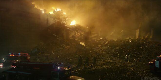
Like many of us, I’ve watched a lot of streaming shows this year. One of the best was Chernobyl, the HBO/Sky Atlantic mini-series about the nuclear power plant disaster of 1986, which I cheekily binged during a free trial of Now TV.

In July, Chernobyl deservedly scooped multiple honours at the Virgin Media British Academy Television (Craft) Awards. In addition to it claiming the Bafta for best mini-series, lead actor Jared Harris, director Johan Renck, director of photography Jakob Ihre, production designers Luke Hull and Claire Levinson-Gendler, costume designer Odile Dicks-Mireaux, editors Simon Smith and Jinx Godfrey, composer Hildur Gudnadóttir, and the sound team all took home the awards in their respective fiction categories.

I use the phrase “took home” figuratively, since no-one had left home in the first place. The craft awards ceremony was a surreal, socially-distanced affair, full of self-filmed, green-screened celebrities. Comedian Rachel Parris impersonated writer/actor Jessica Knappett, and the two mock-argued to present the award for Photography & Lighting: Fiction. Chernobyl’s DP Jakob Ihre, FSF gave his acceptance speech in black tie, despite being filmed on a phone in his living room. In it he thanked his second unit DP Jani-Petteri Passi as well as creator/writer Craig Mazin, one of the few principal players not to receive an award.

Mazin crafted a tense and utterly engrossing story across five hour-long instalments, a story all the more horrifying for its reality. Beginning with the suicide of Harris’ Valery Legasov on the second anniversary of the disaster, the series shifts back to 1986 and straight into the explosion of the No. 4 reactor at the Chernobyl Nuclear Power Plant in the Soviet Ukraine. Legasov, along with Brosi Shcherbina (Stellan Skarsgård) and the fictional, composite character Ulana Khomyuk (Emily Watson) struggle to contain the meltdown while simultaneously investigating its cause. Legions of men are sacrificed to the radiation, wading through coolant water in dark, labyrinthine tunnels to shut off valves, running across what remains of the plant’s rooftop to collect chunks of lethal graphite, and mining in sweltering temperatures beneath the core to install heat exchangers that will prevent another catastrophic explosion.

For Swedish-born NFTS (National Film and Television School) graduate Jakob Ihre, Chernobyl was a first foray into TV. His initial concept for the show’s cinematography was to reflect the machinery of the Soviet Union. He envisaged a heavy camera package representing the apparatus of the state, comprised of an Alexa Studio, with its mechanical shutter, plus anamorphic lenses. “After another two or three months of preproduction,” he told the Arri Channel, “we realised maybe that’s the wrong way to go, and we should actually focus on the characters, on the human beings, the real people who this series is about.”

Sensitivity and respect for the people and their terrible circumstances ultimately became the touchstone for both Ihre and his director. The pair conducted a blind test of ten different lens sets, and both independently selected Cooke Panchros. “We did a U-turn and of course we went for spherical lenses, which in some way are less obtrusive and more subtle,” said Ihre. For the same reason, he chose the Alexa Mini over its big brother. A smaller camera package like this is often selected when filmmakers wish to distract and overwhelm their cast as little as possible, and is believed by many to result in more authentic performances.

When it came to lighting, “We were inspired by the old Soviet murals, where you see the atom, which is often symbolised as a sun with its rays, and you see the workers standing next to that and working hand in hand with the so-called ‘friendly’ atom.” Accordingly, Ihre used light to represent gamma radiation, with characters growing brighter and over-exposed as they approach more dangerous areas.

Ihre thought of the disaster as damaging the fabric of the world, distorting reality. He strove to visualise this through dynamic lighting, with units on dimmers or fitted with remote-controlled shutters. He also allowed the level of atmos (smoke) in a scene to vary – normally a big no-no for continuity. The result is a series in which nothing feels safe or stable.

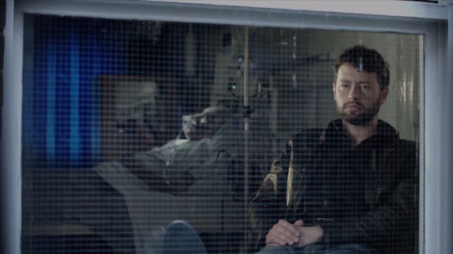
The DP shot through windows and glass partitions wherever possible, to further suggest a distorted world. Working with Hull and Levinson-Gendler, he tested numerous transparent plastics to find the right one for the curtains in the hospital scenes. In our current reality, filled with perspex partitions (and awards ceremonies shot on phones), such imagery of isolation is eerily prescient.

The subject of an invisible, society-changing killer may have become accidentally topical, but the series’ main theme was more deliberately so. “What is the cost of lies?” asks Legasov. “It’s not that we’ll mistake them for the truth. The real danger is that if we hear enough lies, then we no longer recognise the truth at all.” In our post-truth world, the disinformation, denial and delayed responses surrounding the Chernobyl disaster are uncomfortably familiar.

This article first appeared on RedShark News.

The Cinematography of “Chernobyl”