Luna 3: Photographing the Far Side of the Moon without Digital Technology

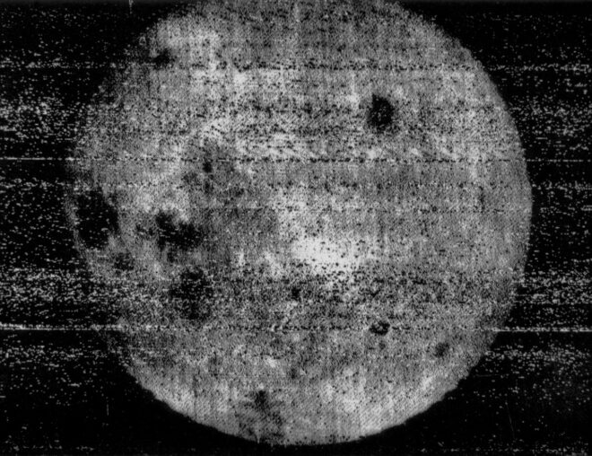
The far side of the moon (frame 29) as shot by Luna 3

It is 1959. Just two years have passed since the launch of the USSR’s Sputnik 1 satellite blew the starting whistle for the Space Race. Sputnik 2, carrying poor Laika the dog, and the American satellite Explorer 1 swiftly followed. Crewed spaceflight is still a couple of years away, but already the eyes of the world’s superpowers have turned to Earth’s nearest neighbour: the moon.

Early attempts at sending probes to the moon were disastrous, with the first three of America’s Pioneer craft crashing back to Earth, while a trio of Soviet attempts exploded on launch. Finally the USSR’s Luna 1 – intended to crash-land on the surface – at least managed a fly-by. Luna 2 reached its target, becoming the first man-made object on the moon in September 1959.

The stage is now set for Luna 3. Its mission: to photograph the far side of the moon.

Luna 3

Our planet and its natural satellite are in a state known as tidal locking, meaning that the moon takes the same length of time to circle the earth as it does to rotate around its own axis. The result is that the same side of the moon always faces us here on Earth. Throughout all of human history, the far side has been hidden to us.

But how do you take a photograph a quarter of a million miles away and return that image to Earth with 1950s technology?

At this point in time, television has been around for twenty years or so. But the images are transient, each frame dancing across the tube of a TV camera at, say, Alexandra Palace, oscillating through the air as VHF waves, zapping down a wire from an aerial, and ultimately driving the deflecting coils of a viewer’s cathode ray tube to paint that image on the phosphorescent screen for a 50th of a second. And then it’s gone forever.

For a probe on the far side of the moon, with 74 million million million tonnes of rock between it and the earthbound receiving station, live transmission is not an option. The image must somehow be captured and stored.

Video tape recorders have been invented by 1959, but the machines are enormous and expensive. At the BBC, most non-live programmes are still recorded by pointing a film camera at a live TV monitor.

And it is film that will make Luna 3’s mission possible. Enemy film in fact, which the USSR recovered, unexposed, from a CIA spy balloon. Resistant to radiation and extremes of temperature, the 35mm isochromatic stock is chosen by Soviet scientists to be loaded into Luna 3’s AFA-Ye1 camera, part of its Yenisey-2 imaging system.

Luna 3 launches on October 4th, 1959 from Baikonur Cosmodrome in what will one day be Kazakhstan. A modified R-7 rocket inserts the probe into a highly elliptical Earth orbit which, after some over-heating and communications issues are resolved, brings it within range of the moon three days later.

The mission has been timed so that the far side of the moon is in sunlight when Luna 3 reaches it. A pioneering three-axis stabilisation system points the craft (and thus the camera, which cannot pan independently) at the side of the moon which no-one has seen before. A photocell detects the bright surface and triggers the Yenisey-2 system. Alternating between 200mm f/5.6 and 500mm f/9.5 lenses, the camera exposes 29 photographs on the ex-CIA film.

The AFA-Ye1 camera

Next that film must be processed, and Luna 3 can’t exactly drop it off at Snappy Snaps. In fact, the Yenisey-2 system contains a fully automated photo lab which develops, fixes and dries the film, all inside a 1.3x1m cylinder tumbling through the vacuum of space at thousands of miles per hour.

Now what? Returning a spacecraft safely to Earth is beyond human ability in 1959, though the following year’s Vostok missions will change all that. Once Luna 3 has swung around the moon and has line of sight to the receiving stations on Earth, the photographic negatives must be converted to radio broadcasts.

To that end, Yenisey-2 incorporates a cathode ray tube which projects a beam of light through the negative, scanning it at a 1,000-line resolution. A photocell on the other side receives the beam, producing a voltage inversely proportional to the density of the negative. This voltage frequency-modulates a radio signal in the same way that fax machines use frequency-modulated audio to send images along phone lines.

Attempts to transmit the photographs begin on October 8th, and after several failures, 17 images are eventually reconstructed by the receiving stations in Crimea and Kamchatka. They are noisy, they are blocky, they are monochromatic, but they show a sight that has been hidden from human eyes since the dawn of time. Featuring many more craters and mountains and many fewer “seas” than the side we’re used to, Luna 3’s pictures prompt a complete rethink of the moon’s history.

Its mission accomplished, the probe spirals in a decaying orbit until it finally burns up in Earth’s atmosphere. In 1961, Yuri Gagarin’s historic flight will capture the public imagination, and unmanned space missions will suddenly seem much less interesting.

But next time you effortlessly WhatsApp a photo to a friend, spare a thought for the remarkable engineering that one day sent never-before-seen photographs across the gulf of space without the aid of digital imaging.

One of the 500mm exposures
Luna 3: Photographing the Far Side of the Moon without Digital Technology

How to Process Black-and-White Film

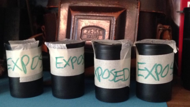
A few weeks ago, I came very close to investing in an Ilford/Paterson Starter Kit so that I could process film at home. I have four exposed rolls of 35mm HP5+ sitting on my shelf, and I thought that developing them at home might be a nice way to kill a bit of lockdown time. However, I still wouldn’t be able to print them, due to the difficulties of creating a darkroom in my flat. And with lockdown now easing, it probably won’t be long until I can get to Holborn Studios and hire their darkroom as usual.

So in this article I’ll talk through the process of developing a roll of black-and-white 35mm, as I would do it in the Holborn darkoom. If you haven’t already, you might want to read my post about how film works first.


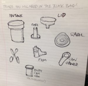
You will need


Loading the developing tank

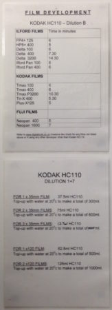
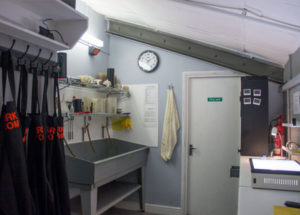
Holborn Studios’ darkroom, run by Bill Ling, displays this handy reminder.

The first step is to transfer the exposed film from its cassette – which is of course light-proof – into the Paterson tank, which is designed to admit the developing chemicals but not light. This transfer must take place in complete darkness, to avoid fogging the film. I’ve always done this using a changing bag, which is a black bag with a double seal and elasticated arm-holes.

Start by putting the following items into the bag: the film cassette, scissors and the various components of the Paterson tank, including the spiral. It’s wise to put in an empty film canister too, in case something goes wrong, and if the tail of your film isn’t sticking out of the cassette then you’ll need a can opener as well.

Seal the bag, put your arms in, and pull all the film out of the cassette. It’s important NOT to remove your arms from the bag now, until the film is safely inside the closed tank, otherwise light can get in through the arm-holes and fog the film.

Use the scissors to cut the end of the film from the cassette, and to trim the tongue (narrower part) off the head of the film.

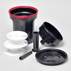
Paterson Universal Developing Tank components, clockwise from the white items: developing reels or spirals, tank, light-proof lid, waterproof cap, and agitator – which I never use. In the centre is the core.

Now we come to the most difficult part, the part which always has me sweating and swearing and regretting all my life choices: loading the film onto the spiral. I have practised this with dead film many times, but when I’m fumbling around in the dark of the changing bag it’s a hundred times harder.

It’s hard to describe loading the spiral verbally, but this blog post by Chris Waller is very clear and even includes pictures. (Chris recommends cutting a slight chamfer onto the leading corners of the film, which I shall certainly try next time, as well as using your thumbs to keep the film flat on its approach to the reel.)

If you’re working with 120 film, the loading process is very slightly different, and this video describes it well.

Once the spiral is loaded, you can thread it onto the core, place the core inside the tank, and then put the lid on. It is now safe to open the bag.


Developing

Developing time info displayed at Holborn Studios

Holborn Studios’ darkroom is stocked with a working solution of Kodak HC-110 developer, but if you don’t have this luxury, or you’re not using the Ilford Simplicity packs, then you’ll need to make up a working solution yourself by diluting the developer according to the manufacturer’s instructions. For HC-110 dilution B, which is what Holborn uses, it’s 1+31, i.e.one part concentrated developer to 31 parts water. The working solution has a limited shelf life, so again consult the manufacturer’s instructions.

Further dilution is required at the point of development, at a ratio of 1+7 in this case, but once more this may vary depending on the chemicals you choose. For one roll of 35mm, you need 37.5ml of the HC-110 dilution B, and 262.5ml of water for a total of 300ml.

The developing time depends on the type of film stock, the speed you rated it at, the type of developer and its dilution, and the temperature of the chemicals. Digital Truth has all the figures you need to find the right development time.

Agitating

I was taught to ensure my water is always at 20°C before mixing it with the developer, to keep the timing calculations a little simpler. At this temperature, a roll of Ilford HP5+ rated at its box speed of ISO 400 needs five minutes to develop in HC-110 dilution B. Ilford Delta, on the other hand, needs a whopping 14.5 minutes to process at its box speed of 3200.

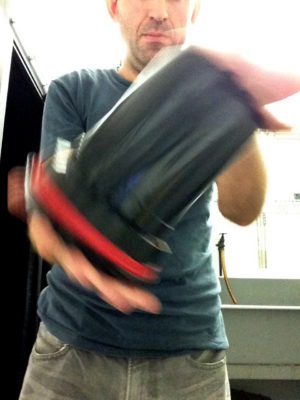
Once your diluted developer is ready, pour it into the Paterson tank and put on the cap. It is now necessary to agitate the chemicals in order to distribute them evenly around the film. My technique is inversion, i.e. turning the tank upside-down and back again. Do this continuously for the first 30 seconds, then for 10 seconds every minute after that.

Inside the tank, your latent image is being transformed into an image proper, wherein every exposed silver halide crystal is now black metallic silver.


Fixing

Once the developing time is up, remove the cap from the tank, and pour away the developer immediately. At this point some people will say you need to use a stop bath to put a firm halt to the developing process, but I was taught simply to rinse the tank out with tap water and then proceed straight to fixing. This method has always worked fine for me.

After rinsing the tank, pour in enough fix solution (again prepared to the manufacturer’s instructions) to fill it completely. Put the cap back on, agitate it for 30 seconds, then leave it for ten minutes.

During this time, the fixer renders the film’s unexposed crystals inactive and water soluble. When the ten minutes is up, pour the fixer back into its container (it’s reuseable) and leave the tank under running water for a further ten minutes. This washes away the unused silver halide crystals, leaving only the exposed black silver corresponding with light areas of the scene, and just the transparent plastic base corresponding with the dark areas.

Squirt a little diluted washing-up liquid into the tank to prevent drying rings, then drain it. You can now open the tank and see your negative for the first time.


Drying

Remove the film from the developing spiral, taking care to only touch the ends and the edges. Squeegee the top part of the film, dry your hands, then squeegee the rest. This removes droplets which can otherwise mark the negative.

Now attach two hooks to the film, a light one at the top to hang it from, and a heavy one at the bottom to stop the film curling as it dries. Holborn Studios is equipped with a heated drying cabinet, but with patience you can hang a film to dry in any dust-free area.

When your film is dry, you can cut it into strips of six frames and insert them into a negative storage sheet.

You can now scan your negatives, or better still print them photo-chemically, as I’ll describe in a future post.

How to Process Black-and-White Film

How Film Works

Over the ten weeks of lockdown to date, I have accumulated four rolls of 35mm film to process. They may have to wait until it is safe for me to visit my usual darkroom in London, unless I decide to invest in the equipment to process film here at home. As this is something I’ve been seriously considering, I thought this would be a good time to remind myself of the science behind it all, by describing how film and the negative process work.


Black and White

The first thing to understand is that the terminology is full of lies. There is no celluloid involved in film – at least not any more – and there never has been any emulsion.

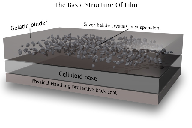
However, the word “film” itself is at least accurate; it is quite literally a strip of plastic backing coated with a film of chemicals, even if that plastic is not celluloid and those chemicals are not an emulsion. Celluloid (cellulose mononitrate) was phased out in the mid-twentieth century due to its rampant inflammability, and a variety of other flexible plastics have been used since.

As for “emulsion”, it is in fact a suspension of silver halide crystals in gelatine. The bigger the crystals, the grainier the film, but the more light-sensitive too. When the crystals are exposed to light, tiny specks of metallic silver are formed. This is known as the latent image. Even if we could somehow view the film at this stage without fogging it completely, we would see no visible image as yet.

For that we need to process the film, by bathing it in a chemical developer. Any sufficiently large specks of silver will react with the developer to turn the entire silver halide crystal into black metallic silver. Thus areas that were exposed to light turn black, while unlit areas remain transparent; we now have a negative image.

Before we can examine the negative, however, we must use a fixer to turn the unexposed silver halide crystals into a light-insensitive, water-soluble compound that we can wash away.

Now we can dry our negative. At this stage it can be scanned for digital manipulation, or printed photo-chemically. This latter process involves shining light through the negative onto a sheet of paper coated with more photographic emulsion, then processing and fixing that paper as with the film. (As the paper’s emulsion is not sensitive to the full spectrum of light, this procedure can be carried out under dim red illumination from a safe-light.) Crystals on the paper turn black when exposed to light – as they are through the transparent portions of the negative, which you will recall correspond to the shadows of the image – while unexposed crystals again remain transparent, allowing the white of the paper to show through. Thus the negative is inverted and a positive image results.


Colour

Things are a little more complicated with colour, as you might expect. I’ve never processed colour film myself, and I currently have no intention of trying!

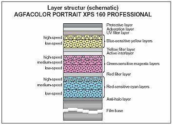
The main difference is that the film itself contains multiple layers of emulsion, each sensitive to different parts of the spectrum, and separated by colour filters. When the film is developed, the by-products of the chemical reaction combine with colour couplers to create colour dyes.

An additional processing step is introduced between the development and the fixing: the bleach step. This converts the silver back to silver halide crystals which are then removed during fixing. The colour dyes remain, and it is these that form the image.

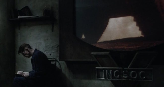
Many cinematographers will have heard of a process call bleach bypass, used on such movies as 1984 and Saving Private Ryan. You can probably guess now that this process means skipping or reducing the bleach step, so as to leave the metallic silver in the negative. We’ve seen that this metallic silver forms the entire image in black-and-white photography, so by leaving it in a colour negative you are effectively combining colour and black-and-white images in the same frame, resulting in low colour saturation and increased contrast.

“1984” (DP: Roger Deakins CBE, ASC, BSC)

Colour printing paper also contains colour couplers and is processed again with a bleach step. Because of its spectral sensitivity, colour papers must be printed and processed in complete darkness or under a very weak amber light.


Coming Up

In future posts I will cover the black-and-white processing and printing process from a much more practical standpoint, guiding you through it, step by step. I will also look at the creative possibilities of the enlargement process, and we’ll discover where the Photoshop “dodge” and “burn” tools had their origins. For those of you who aren’t Luddites, I’ll delve into how digital sensors capture and process images too!

How Film Works

How to Make a Zoetrope for 35mm Contact Prints

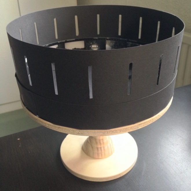
Are you an analogue photographer looking for a different way to present your images? Have you ever thought about shooting a sequence of stills and reanimating them in a zoetrope, an optical device from the Victorian era that pre-figured cinema? That is exactly what I decided to do as a project to occupy myself during the zombie apocalypse Covid-19 lockdown. Contact prints are aesthetically pleasing in themselves, and I wanted to tap into the history of the zoetrope by creating a movie-like continuous filmstrip of sequential images and bringing them to life.

In the first part of my blog about this project, I covered the background and setting up a time-lapse of my cherry tree as content for the device. This weekend I shot the final image of the time-lapse, the last of the blossom having dropped. No-one stole my camera while it sat in my front garden for three weeks, and I was blessed with consistently sunny weather until the very last few days, when I was forced to adjust the exposure time to give me one or two extra stops. I’ll be interested to see how the images have come out, once I can get into the darkroom.

Meanwhile, I’ve been constructing the zoetrope itself, following this excellent article on Reframing Photography. Based on this, I’ve put together my own instructions specifically for making a device that holds 18 frames of contact-printed 35mm film. I chose a frame count of 18 for a few reasons:

  1. The resultant diameter, 220mm, seemed like a comfortable size, similar to a table lamp.
  2. Two image series of 18 frames fit neatly onto a 36 exposure film.
  3. Negatives are commonly cut into strips of six frames for storage and contact-printing, so a number divisible by six makes constructing the image loop a little more convenient.


You Will Need

  • Contact sheet containing 18 sequential 35mm images across three rows
  • A1 sheet of 300gsm card, ideally black
  • PVA glue
  • Ruler (the longer the better)
  • Set square
  • Compass
  • Pencil & eraser
  • Scissors
  • Craft knife or stanley knife
  • Paper clips or clothes pegs for clamping while glue dries
  • Rotating stand like a lazy susan or record player


Making the image loop

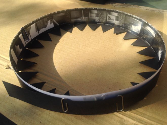
First, cut out the three rows of contact prints, leaving a bit of blank paper at one end of each row for overlap. Now glue them together into one long strip of 18 sequential images. The strip should measure 684mm plus overlap, because a 35mm negative or contact print measures 38mm in width including the border on one side: 38×18=684.

Glue the strip together into a loop with the images on the inside. This loop should have a diameter of 218mm. Note that we must make our zoetrope’s drum to a slightly bigger diameter, or the image loop won’t fit inside it. We’ll use our image loop to check the size of the drum; that’s why we’ve made it first. (If you don’t have your images ready yet, use an old contact sheet – as I did – or any strip of paper or light card of the correct size, 35mmx684mm.)


Making the side wall

Cut a strip of the black card measuring 723x90mm. This will be the side wall of your drum. Wrap this strip around your image loop, as tightly as you can without distorting the circular shape of the image loop. Mark where the card strip overlaps itself to find the circumference of the drum, which will be slightly bigger than the 684mm circumference of the image loop. In my case the drum circumference was 688mm – as illustrated in the diagram above. (You can click on it to enlarge it.)

Now we can measure and cut out the slots, one per image. Reframing Photography recommends a 1/8″ width, and initially I went with this, rounding it to 3mm. As with making a pinhole, a smaller slot means a sharper but darker image, while a bigger slot means a brighter but blurrier one. Once my zoetrope was complete, I felt that there was too much motion blur, so I retrofitted it with 1mm slots.

Let’s stick with 3x35mm (the same height as the images) for our slot size. How far apart should the slots be? They need to be evenly spaced around the circumference, so in my case 688÷18=38.2mm, i.e. a gap of 35.2mm between each slot and then 3mm for the slot itself. If your drum circumference is different to mine, you’ll have to do your own maths to work out the spacing.

(It was impossible to measure 38.2mm accurately, but I made a spreadsheet to give me values for the cumulative slot positions to the nearest millimetre: 38, 76, 115, 153, 191, 229, 268, 306, 344, 382, 420, 459, 497, 535, 573, 612, 650 and 688.)

Mark out your 18 slots, positioning them 15mm from the top of the side wall and 40mm from the bottom, then cut them out carefully using a knife and a ruler.

Now you can glue your side wall into a loop, using paper clips or clothes peg to hold it while the glue dries. I recommend double-checking your image loop fits inside beforehand. (Do not glue your image loop into the drum; this way you can swap it out for another image series whenever you like.)


Making the connector

The connector, as the name suggests, will connect the side wall to the base of the drum. (When I made a prototype, I tried skipping this stage, simply building the connecting teeth into the side wall, but this made it much harder to keep the drum a neat circle.)

Go back to your black card and cut another strip measuring 725x60mm. Score it all the way along the middle (i.e. 30mm from the edge) so that it can be folded in two, long-ways. Now cut triangular teeth into one half of the strip. Each triangle should have a 30mm base along the scored line.

As with the side wall, you should check the circumference of the connector to ensure that it will fit around the side wall and image loop, and adjust it if necessary. My connector’s circumference, as shown on the diagram above, was 690mm.

Glue the strip into a loop, clamping it with clips or pegs while it dries. Again, it doesn’t hurt to double-check that it still fits around the side wall first.


Making the base

Use a compass to draw a circle of 220mm in diameter on your remaining card, and cut it out. (If your connector is signficantly different in circumference to mine, divide that circumference by pi [3.14] to find the diameter that will work for you.)

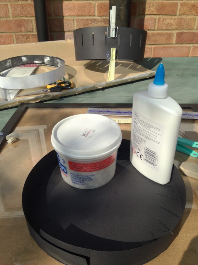
Now you can glue the connector to the base. I suggest starting with a single tooth, putting a bottle of water or something heavy on it to keep it in place while it dries, then do the tooth directly opposite. Once that’s dry, do the ones at 90° and so on. This way you should prevent distortions creeping into the shape of the circle as you go around.

When that’s all dry, apply glue all around the inside of the upright section of the connector. Squish your side wall into a kidney bean shape to fit it inside the connector, then allow it to expand to its usual shape. If you have made it a tight enough fit, it will naturally press against the glue and the connector.


Making it Spin

The critical part of your zoetrope, the drum, is now complete. But to animate the images, you need to make it spin. There are a few ways you can do this:

  • Mount it on an old record player, making a hole in the centre of the base for the centre spindle.
  • Mount it on a rotating cake decoration stand or lazy susan.
  • Make your own custom stand.

I chose the latter, ordering some plywood discs cut to size, an unfinished candlestick and a lazy susan bearing, then assembling and varnishing them before gluing my drum to the top.

How to Make a Zoetrope for 35mm Contact Prints

Shooting a Time-lapse for a Zoetrope

Two years ago I made Stasis, a series of photographs that explored the confluence of time, space and light. Ever since then I’ve been meaning to follow it up with another photography project along similar lines, but haven’t got around to it. Well, with Covid-19 there’s not much excuse for not getting around to things any more.

Example of a zoetrope

So I’ve decided to make a zoetrope – a Victorian optical device which produces animation inside a spinning drum. The user looks through slits in the side of the drum to one of a series of images around the inside. When the drum is set spinning – usually by hand – the images appear to become one single moving picture. The slits passing rapidly through the user’s vision serve the same purpose as a shutter in a film projector, intermittently blanking out the image so that the persistence of vision effect kicks in.

Typically zoetropes contain drawn images, but they have been known to contain photographed images too. Eadward Muybridge, the father of cinema, reanimated some of his groundbreaking image series using zoetropes (though he favoured his proprietary zoopraxiscope) in the late nineteenth century. The device is thus rich with history and a direct antecedent of all movie projectors and the myriad devices capable of displaying moving images today.

This history, its relevance to my profession, and the looping nature of the animation all struck a chord with me. Stasis was to some extent about history repeating, so a zoetrope project seemed like it would sit well alongside it. Here though, history would repeat on a very small scale. Such a time loop, in which nothing can ever progress, feels very relevant under Covid-19 lockdown!

With that in mind, I decided that the first sequence I would shoot for the zoetrope would be a time-lapse of the cherry tree outside my window.  I chose a camera position at the opposite end of the garden, looking back at my window and front door – my lockdown “prison” – through the branches of the tree. (The tree was just about to start blooming.)

The plan is to shoot one exposure every day for at least the next 18 days, maybe more if necessary to capture the full life of the blossom. Ideally I want to record the blossom falling so that my sequence will loop neatly, although the emergence of leaves may interfere with that.

To make the whole thing a little more fun and primitive, I decided to shoot using the pinhole I made a couple of years ago. Since I plan to mount contact prints inside the zoetrope rather than enlargements, that’ll mean I’ve created and exhibited a motion picture without ever once putting the image through a lens.
I’m shooting on Ilford HP5+, a black-and-white stock with a published ISO of 400. My girlfriend bought me five roles for Christmas, which means I can potentially make ten 18-frame zoetrope inserts. I won’t be able to develop or print any of them until the lockdown ends, but that’s okay.

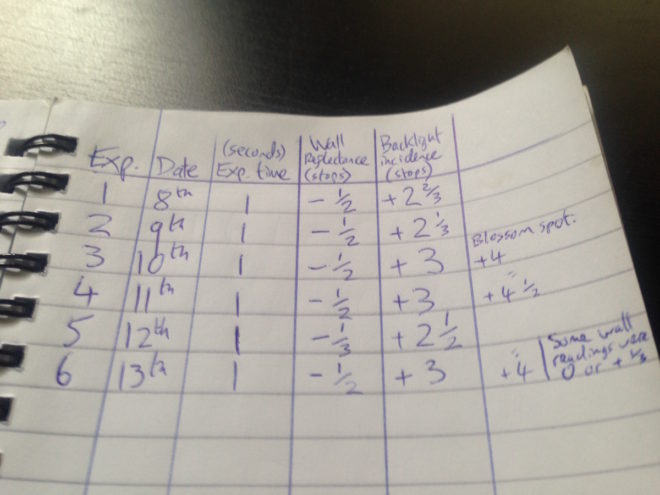
My first image was shot last Wednesday, a sunny day. The Sunny 16 rule tells me that at f/16 on a sunny day, my exposure should be equal to my ISO, i.e. 1/400th of a second for ISO 400. My pinhole has an aperture of f/365, which I calculated when I made it, so it’s about nine stops slower than f/16. Therefore I need to multiply that 1/400th of a second exposure time by two to the power of nine, which is 1.28 – call it one second for simplicity. ( I used my Sekonic incidence/reflectance meter to check the exposure, because it’s always wise to be sure when you haven’t got the fall-back of a digital monitor.)

One second is the longest exposure my Pentax P30t can shoot without switching to Bulb mode and timing it manually. It’s also about the longest exposure that HP5+ can do without the dreaded reciprocity failure kicking in. So all round, one second was a good exposure time to aim for.

The camera is facing roughly south, meaning that the tree is backlit and the wall of the house (which fills the background) is in shadow. This should make the tree stand out nicely. Every day may not be as sunny as today, so the light will inevitably change from frame to frame of the animation. I figured that maintaining a consistent exposure on the background wall would make the changes less jarring than trying to keep the tree’s exposure consistent.

I’ve been taking spot readings every day, and keeping the wall three-and-a-half stops under key, while the blossoms are about one stop over. I may well push the film – i.e. give it extra development time – if I end up with a lot of cloudy days where the blossoms are under key, but so far I’ve managed to catch the sun every time.

All this exposure stuff is great practice for the day when I finally get to shoot real motion picture film, should that day ever come, and it’s pretty useful for digital cinematography too.

Meanwhile, I’ve also made a rough prototype of the zoetrope itself, but more on that in a future post. Watch this space.

Shooting a Time-lapse for a Zoetrope

The Cinematography of “First Man”

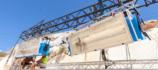
A miniature Saturn V rocket is prepared for filming

If you’re a DP, you’re probably familiar with the “Guess the Format” game. Whenever you see a movie, you find yourself trying to guess what format it was shot on. Film or digital? Camera? Glass? Resolution?

As I sat in the cinema last autumn watching First Man, I was definitely playing the game. First Man tells the true story of Neil Armstrong’s (Ryan Gosling) extraterrestrial career, including his test flights in the hypersonic  X-15, his execution of the first ever docking in space aboard Gemini 8, the tragic deaths of his colleagues in the launchpad fire of Apollo 1, and of course the historic Apollo 11.

The game was given away fairly early on when I noticed frames with dust on, a sure sign of celluloid acquisition. (Though most movies have so much digital clean-up now that a lack of dust doesn’t necessarily mean that film wasn’t involved.) I automatically assumed 35mm, though as the film went on I occasionally wondered if I could possibly be watching Super-16? There was something of the analogue home movie about certain scenes, the way the searing highlights of the sun blasting into the space capsules rolled off and bloomed.

When I got home I tracked down this Studio Daily podcast and my suspicions were confirmed, but we’ll get to that in a minute.


Cinéma Vérité

Let’s start at the beginning. First Man was directed by Damien Chazelle and photographed by Linus Sandgren, FSF, the same team who made La La Land, for which both men won Oscars. What I remember most about the cinematography of that earlier film is the palette of bright but slightly sickly colours, and the choreographed Steadicam moves.

First Man couldn’t be more different, adopting a cinéma vérité approach that often looks like it could be real and previously-unseen Nasa footage. Sandgren used zoom lenses and a documentary approach to achieve this feeling:

When you do a documentary about a person and you’re there in their house with them and they’re sad or they’re talking, maybe you don’t walk in there and stand in the perfect camera position. You can’t really get the perfect angles. That in itself creates some sort of humbleness to the characters; you are a little respectful and leave them a little alone to watch them from a distance or a little bit from behind.

Similarly, scenes in the spacecraft relied heavily on POVs through the small windows of the capsule, which is all that the astronauts or a hypothetical documentary camera operator would have been able to see. This blinkered view, combined with evocative and terrifying sound design – all metallic creaks, clanks and deafening booms, like the world itself is ending – makes the spaceflight sequences incredibly visceral.


Multiple gauges

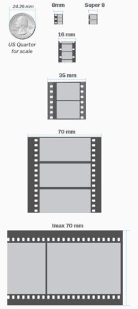
Scale comparison of film formats. Note that Imax is originated on 65mm stock and printed on 70mm to allow room for the soundtrack.

Documentaries in the sixties would have been shot on Super-16, which is part of the reason that Sandgren and Chazelle chose it as one of their acquisition formats. The full breakdown of formats is as follows:

  • Super-16 was employed for intense or emotional material, specifically early sequences relating to the death of Armstrong’s young daughter, and scenes inside the various spacecraft. As well as the creative considerations, the smaller size of Super-16 equipment was presumably advantageous from a practical point of view inside the cramped sets.
  • 35mm was used for most of the non-space scenes. Sandgren differentiated the scenes at Nasa from those at Armstrong’s home by push-processing the former and pull-processing the latter. What this means is that Nasa scenes were underexposed by one stop and overdeveloped, resulting in a detailed, contrasty, grainy look, while the home scenes were overexposed and underdeveloped to produce a cleaner, softer, milkier look. 35mm was also used for wide shots in scenes that were primarily Super-16, to ensure sufficient definition.
  • Imax (horizontally-fed 65mm) was reserved for scenes on the moon.


In-camera effects

In keeping with the vintage aesthetic of celluloid capture, the visual effects were captured in-camera wherever possible. I’ve written in the past about the rise of LED screens as a replacement for green-screen and a source of interactive lighting. I guessed that First Man was using this technology from ECUs which showed the crescent of Earth reflected in Ryan Gosling’s eyes. Such things can be added in post, of course, but First Man‘s VFX have the unmistakeable ring of in-camera authenticity.

Imposing a “no green-screen” rule, Chazelle and his team used a huge LED screen to display the views out of the spacecraft windows. A 180° arc of 60′ diameter and 35′ in height, this screen was bright enough to provide all the interactive lighting that Sandgren required. His only addition was a 5K tungsten par or 18K HMI on a crane arm to represent the direct light of the sun.

The old-school approach extended to building and filming miniatures, of the Saturn V rocket and its launch tower for example. For a sequence of Armstrong in an elevator ascending the tower, the LED screen behind Gosling displayed footage of this miniature.

For external views of the capsules in space, the filmmakers tried to limit themselves to realistic shots which a camera mounted on the bodywork might have been able to capture. This put me in mind of Christopher Nolan’s Interstellar, which used the same technique to sell the verisimilitude of its space vehicles. In an age when any conceivable camera move can be executed, it can be very powerful to stick to simple angles which tap into decades of history – not just from cinema but from documentaries and motorsports coverage too.


Lunar Lighting

For scenes on earth, Landgren walked a line between naturalism and expression, influenced by legendary DPs like Gordon Willis, ASC. My favourite shot is a wide of Armstrong’s street at night, as he and his ill-fated friend Ed White (Jason Clarke) part company after a drinking session. The mundane suburban setting is bathed in blue moonbeams, as if the the moon’s fingers are reaching out to draw the characters in.

Scenes on the lunar surface were captured at night on an outdoor set the size of three football pitches. To achieve absolute authenticity, Sandgren needed a single light source (representing the sun) fixed at 15° above the horizon. Covering an area that size was going to require one hell of a single source, so he went to Luminys, makers of the Softsun.

Softsuns

Softsuns are lamps of frankly ridiculous power. The 50KW model was used, amongst other things, to blast majestic streams of light through the windows of Buckingham Palace on The Crown, but Sandgren turned to the 100KW model. Even that proved insufficient, so he challenged Luminys to build a 200KW model, which they did.

The result is a completely stark and realistic depiction of a place where the sun is the only illumination, with no atmosphere to diffuse or redistribute it, no sky to glow and fill in the shadows. This ties in neatly with a prevailing theme in the film, that of associating black with death, when Armstrong symbolically casts his deceased daughter’s bracelet into an obsidian crater.

First Man may prove unsatisfying for some, with Armstrong’s taciturn and emotionally closed-off nature making his motivations unclear, but cinematically it is a tour de force. Taking a human perspective on extraordinary accomplishments, deftly blending utterly convincing VFX and immersive cinéma vérité photography, First Man recalls the similarly analogue and similarly gripping Dunkirk as well as the documentary-like approach of 1983’s The Right Stuff. The film is currently available on DVD, Blu-ray and VOD, and I highly recommend you check it out.

The Cinematography of “First Man”

The 4:3 Aspect Ratio is Not Dead

This summer I shot Exit Eve, a short film from director Charlie Parham dealing with the exhausting and demeaning life of an au pair. We took the unusual decision to shoot it in 4:3, a ratio all but obsolete, but one which felt right for this particular story. Before I look at some of the ratio’s strengths and challenges, let’s remind ourselves of the history behind it.


History

William Kennedy Dickson

The 4:3 motion picture aspect ratio, a.k.a. 1.33:1, was created about 120 years ago by William Kennedy Dickson. This Thomas Edison employee was developing a forerunner to the movie projector, and decided that an image height of four perforations on 35mm film gave the ideal shape. In 1909 the ratio was declared the official standard for all US films by the Motion Picture Patent Company.

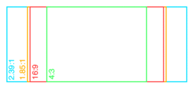
When the talkies arrived two decades later, room needed to be made on the film prints for the optical soundtrack. The Academy of Motion Pictures Arts and Sciences responded by determining a new, very slightly wider ratio of 1.37:1, known fittingly enough as the Academy Ratio. It’s so similar to 4:3 that I’m going to lump them together from hereon in.

When television was invented it naturally adopted the same 4:3 ratio as the big screen. The popularity of TV led to falling cinema attendance in the 1950s, to which the Hollywood studios responded with a range of enticing gimmicks including widescreen aspect ratios. Widescreen stuck, and for the next generation 1.85:1 and 2.39:1 were the ratios of cinema, while the narrower 4:3 was the ratio of TV.

By the time I entered the industry in the late 1990s, 4:3 was much maligned by filmmakers. It seemed boxy and restrictive compared with widescreen, and reminded those of us in the guerrilla world that we didn’t have the budgets and equipment of the Hollywood studios. Meanwhile, the wide compositions of big movies were butchered by pan-and-scan, the practice of cropping during the telecine process to fit the image onto a 4:3 TV without letterboxing. 4:3 was ruining our favourite movies, we felt.

Then, in the 21st century, 16:9 television became the norm, and the 4:3 aspect ratio quietly disappeared, unmourned…. Or did it?


Contemporary Cinema

Although they are firmly in a minority, a number of filmmakers have experimented with 4:3 or Academy Ratio in recent years. Some, like Andrea Arnold and the late Éric Rohmer, rarely shot anything else.

Arnold wanted a combination of intimacy and claustrophobia for her Bafta-winning 2009 drama Fish Tank. She carried the ratio over to her next film, an adaptation of Wuthering Heights, despite the prevalence of big landscapes which would have prompted most directors to choose 2.39:1. The Academy Ratio focuses the viewer’s attention much more on the characters and their inner worlds.

“Fish Tank” – DP: Robbie Ryan, BSC

Mark Kermode has this to say about the 1.37:1 work of Arnold and her DP Robbie Ryan: “What’s wonderful about it is the way [Ryan] uses that squarer format not to make the picture seem compressed but to make it seem taller, to make it seem larger, to make it seem oddly more expansive.”

Meek’s Cutoff (2010), a modern western by Kelly Reichardt, recalls the early Academy classics of the genre. As with Wuthering Heights, characters are placed in the landscape without being dominated by it, while the height of the frame produces bigger skies and an airier feel.

“Meek’s Cutoff” – DP: Chris Blauvelt

Pawel Pawlikowski’s 2013 Oscar-winner Ida deliberately goes against the grain, shooting not only in 4:3 but in black and white as well. It’s the perfect format to convey the timeless, spartan existence of the titular Ida and her fellow nuns. The tall frame allows for copious headroom, inspiring thoughts of Heaven and God, beneath which the mortal characters seem small.

The 2017 animated feature Loving Vincent, meanwhile, adopted 4:3 because it was closer to the shape of Van Gogh’s paintings.

David Lowery, director of last year’s A Ghost Story, wanted to trap his deceased title character in the boxy ratio. “It gave me a good opportunity to really hammer home the circumstances this ghost finds himself trapped in, and to dig into and break down the claustrophobia of his life within these four walls… And it was also a way to tap into some degree of nostalgia, because it feels old-fashioned when you see a movie in a square aspect ratio.”

4:3’s nostalgia factor has allowed it to be used very effectively for flashbacks, such as those in the recent Channel 4/Netflix series The End of the F***ing World. Wes Anderson delineated the three time periods of The Grand Budapest Hotel (2014) with different aspect ratios, using 1.37:1 for scenes set in 1932, the very same year in which that ratio was standardised by the Academy.


“Exit Eve”

Nostalgia, intimacy, claustrophobia, isolation – these are just some of the feelings which cinema’s original aspect ratio can evoke. For Charlie and I on Exit Eve, it was the sense of being trapped which made the ratio really fit our story. 

I’m also a great believer in choosing a ratio that fits the shape of your primary location, and the converted schoolhouse which we were shooting in had very high ceilings. 4:3 allowed us to show the oppressive scale of these rooms, while giving the eponymous Eve little horizontal freedom to move around it. One additional practical consideration was that, when lensing a party scene, the narrower ratio made it easier to fill the frame with supporting artists!

It wasn’t hard to get used to framing in 4:3 again. A lot of Exit Eve was handheld, making for fluid compositions. There were a couple of tripod set-ups where I couldn’t help thinking that the extra width of 1.85:1 would be useful, but for the most part 4:3 worked well. 

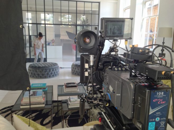
We were shooting on an Alexa Plus with a 16:9 sensor, meaning we were cropping the image at the sides, whereas ideally we would have hired a 4:3 model to use the full width of the sensor and a larger proportion of our lenses’ image circles. This would have allowed us to get slightly wider frames in some of the location’s smaller rooms.

Our sound department had to adapt a little. The boom op was used to being able to get in just above the actors’ heads, but with the generous headroom I was often giving, she had to re-learn her instincts.

Classic 4:3 overs in “Star Trek: The Next Generation”

I had forgotten how well dialogue scenes are suited to 4:3. With wider ratios, over-the-shoulder shots can sometimes be tricky; you can end up with a lot of space between the foreground shoulder and the other actor, and the eye-line ends up way off camera. 4:3 perfectly fits a face, along with that ideal L-shape of the foreground shoulder and side of head, while keeping the eye-line tight to camera.

Not every project is right for 4:3, far from it. But I believe that the ratio has served its sentence in the wilderness for its pan-and-scan crimes against cinema, and should now be returned to the fold as a valid and expressive option for filmmakers.

See also:

The 4:3 Aspect Ratio is Not Dead

Making a Pinhole Attachment for an SLR

Last autumn, after a few years away from it, I got back into 35mm stills photography. I’ve been reading a lot of books about photography: the art of it, the science and the history too. I’ve even taken a darkroom course to learn how to process and print my own black and white photos.

Shooting stills in my spare time gives me more opportunities to develop my eye for composition, my exposure-judging skills and my appreciation of natural light. Beyond that, I’ve discovered interesting parallels between electronic and photochemical imaging which enhance my understanding of both.

For example, I used to think of changing the ISO on a digital camera as analogous to loading a different film stock into a traditional camera. However, I’ve come to realise it’s more like changing the development time – it’s an after-the-fact adjustment to an already-captured (latent) image. There’s more detail on this analogy in my ISO article at Red Shark News.

The importance of rating an entire roll of film at the same exposure index, as it must all be developed for the same length of time, also has resonance in the digital world. Maintaining a consistency of exposure (or the same LUT) throughout a scene or sequence is important in digital filmmaking because it makes the dailies more watchable and reduces the amount of micro-correction which the colourist has to do down the line.

Anyway, this is all a roundabout way of explaining why I decided to make a pinhole attachment for my SLR this week. It’s partly curiosity, partly to increase my understanding of image-making from first principles.

The pinhole camera is the simplest image-making device possible. Because light rays travel in straight lines, when they pass through a very small hole they emerge from the opposite side in exactly the same arrangement, only upside-down, and thus form an image on a flat surface on the other side. Make that flat surface a sheet of film or a digital sensor and you can capture this image.


How to make a pinhole attachment

I used Experimental Filmmaking: Break the Machine by Kathryn Ramey as my guide, but it’s really pretty straightforward.

You will need:

  • an extra body cap for your camera,
  • a drill,
  • a small piece of smooth, non-crumpled black wrap, or kitchen foil painted black,
  • scissors,
  • gaffer tape (of course), and
  • a needle or pin.

Instructions:

  1. Drill a hole in the centre of the body cap. The size of the hole is unimportant.
  2. Use the pin or needle to pierce a hole in the black wrap, at least a couple of centimetres from the edge.
  3. Cut out a rough circle of the black wrap, with the pinhole in the middle. This circle needs to fit on the inside of the body cap, with the pinhole in the centre of the drilled hole.
  4. Use the gaffer tape to fix the black wrap tightly to the inside of the body cap.
  5. Fit the body cap to your camera.

The smaller the pinhole is, the sharper the image will be, but the darker too. The first pinhole I made was about 0.1-0.2mm in diameter, but when I fitted it to my camera and looked through the viewfinder I could hardly make anything out at all. So I made a second one, this time pushing the pin properly through the black wrap, rather than just pricking it with the tip. (Minds out of the gutter, please.) The new hole was about 0.7mm but still produced an incredibly dark image in the viewfinder.


Exposing a pinhole image

If you’re using a digital camera, you can of course judge your exposure off the live-view screen. Things are a little more complicated if, like me, you’re shooting on film.

In theory the TTL (through the lens) light meter should give me just as reliable a reading as it would with a lens. The problem is that, even with the shutter set to 1 second, and ISO 400 Fujifilm Super X-tra loaded, the meter tells me I’m underexposed. Admittedly the weather has been overcast since I made the pinhole yesterday, so I may get a useful reading when the sun decides to come out again.

Failing that, I can use my handheld incident-light meter to determine the exposure…. once I’ve worked out what the f-stop of my pinhole is.

As I described in my article on aperture settings, the definition of an f-stop is: the ratio of the focal length to the aperture diameter. We’re all used to using lenses that have a clearly defined and marked focal length, but what is the focal length in a pinhole system?

The definition of focal length is the distance between the point where the light rays focus (i.e. converge to a point) and the image plane. So the focal length of a pinhole camera is very simply the distance from the pinhole itself to the film or digital sensor. Since my pinhole is more or less level with the top of the lens mount, the focal length is going to be approximately equal to the camera’s flange focal distance (defined as the distance between the lens mount and the image plane). According to Wikipedia, the flange focal distance for a Pentax K-mount camera is 45.46mm.

So the f-stop of my 0.7mm pinhole is f/64, because 45.64 ÷ 0.7 ≈ 64. Conveniently, f/64 is the highest stop my light meter will handle.

The website Mr Pinhole has a calculator to help you figure this sort of stuff out, and it even tells you the optimal pinhole diameter for your focal length. Apparently this is 0.284mm in my case, so my images are likely to be quite soft.

Anyway, when the sun comes out I’ll take some pictures and let you know how I get on!

Making a Pinhole Attachment for an SLR

Creating “Stasis”

Stasis is a personal photography project about time and light. You can view all the images here, and in this post I’ll take you through the technical and creative process of making them.

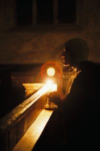
I got into cinematography directly through a love of movies and filmmaking, rather than from a fine art background. To plug this gap, over the past few of years I’ve been trying to give myself an education in art by going to galleries, and reading art and photography books. I’ve previously written about how JMW Turner’s work captured my imagination, but another artist whose work stood out to me was Gerrit (a.k.a. Gerard) Dou. Whereas most of the Dutch 17th century masters painted daylight scenes, Dou often portrayed people lit by only a single candle.

“A Girl Watering Plants” by Gerrit Dou

At around the same time as I discovered Dou, I researched and wrote a blog post about Barry Lyndon‘s groundbreaking candlelit scenes. This got me fascinated by the idea that you can correctly expose an image without once looking at a light meter or digital monitor, because tables exist giving the appropriate stop, shutter and ISO for any given light level… as measured in foot-candles. (One foot-candle is the amount of light received from a standard candle that is one foot away.)

So when I bought a 35mm SLR (a Pentax P30T) last autumn, my first thought was to recreate some of Dou’s scenes. It would be primarily an exercise in exposure discipline, training me to judge light levels and fall-off without recourse to false colours, histograms or any of the other tools available to a modern DP.

I conducted tests with Kate Madison, who had also agreed to furnish period props and costumes from the large collection which she had built up while making Born of Hope and Ren: The Girl with the Mark. Both the tests and the final images were captured on Fujifilm Superia X-tra 400. Ideally I would have tested multiple stocks, but I must confess that the costs of buying and processing several rolls were off-putting. I’d previously shot some basic latitude tests with Superia, so I had some confidence about what it could and couldn’t do. (It can be over-exposed at least five stops and still look good, but more than a stop under and it falls apart.) I therefore confined myself to experimenting with candle-to-subject distances, exposure times and filtration.

The tests showed that the concept was going to work, and also confirmed that I would need to use an 80B filter to cool the “white balance” of the film from its native daylight to tungsten (3400K). (As far as I can tell, tungsten-balanced stills film is no longer on the market.) Candlelight has a colour temperature of about 1800K, so it still reads as orange through an 80B, but without the filter it’s an ugly red.

Meanwhile, the concept had developed beyond simply recreating Gerrit Dou’s scenes. I decided to add a second character, contrasting the historical man lit only by his candle with a modern girl lit only by her phone. Flames have a hypnotic power, tapping into our ancient attraction to light, and today’s smartphones have a similarly powerful draw.

The candlelight was 1600K warmer than the filtered film, so I used an app called Colour Temp to set my iPhone to 5000K, making it 1600K cooler than the film; the phone would therefore look as blue as the candle looked orange. (Unfortunately my phone died quickly and I had trouble recharging it, so some of the last shots were done with Izzi’s non-white-balanced phone.) To match the respective colours of light, we dressed Ivan in earthy browns and Izzi in blues and greys.

Artemis recce image

We shot in St. John’s Church in Duxford, Cambridgeshire, which hasn’t been used as a place of worship since the mid-1800s. Unique markings, paintings and graffiti from the middle ages up to the present give it simultaneously a history and a timelessness, making it a perfect match to the clash of eras represented by my two characters. It resonated with the feelings I’d had when I started learning about art and realised the continuity of techniques and aims from me in my cinematography back through time via all the great artists of the past to the earliest cave paintings.

I knew from the tests that long exposures would be needed. Extrapolating from the exposure table, one foot-candle would require a 1/8th of a second shutter with my f1.4 lens wide open and the Fujifilm’s ISO of 400. The 80B has a filter factor of three, meaning you need three times more light, or, to put it another way, it cuts 1 and 2/3rds of a stop. Accounting for this, and the fact that the candle would often be more than a foot away, or that I’d want to see further into the shadows, the exposures were all at least a second long.

As time had become very much the theme of the project, I decided to make the most of these long exposures by playing with motion blur. Not only does this allow a static image – paradoxically – to show a passage of time, but it recalls 19th century photography, when faces would often blur during the long exposures required by early emulsions. Thus the history of photography itself now played a part in this time-fluid project.

I decided to shoot everything in portrait, to make it as different as possible from my cinematography work. Heavily inspired by all the classical art I’d been discovering, I used eye-level framing, often flat-on and framed architecturally with generous headroom, and a normal lens (an Asahi SMC Pentax-M 50mm/f1.4) to provide a natural field of view.

I ended up using my light meter quite a lot, though not necessarily exposing as it indicated. It was all educated guesswork, based on what the meter said and the tests I’d conducted.

I was tempted more than once to tell a definite story with the images, and had to remind myself that I was not making a movie. In the end I opted for a very vague story which can be interpreted many ways. Which of the two characters is the ghost? Or is it both of them? Are we all just ghosts, as transient as motion blur? Do we unwittingly leave an intangible imprint on the universe, like the trails of light my characters produce, or must we consciously carve our mark upon the world, as Ivan does on the wall?

Models: Izzi Godley & Ivan Moy. Stylist: Kate Madison. Assistant: Ash Maharaj. Location courtesy of the Churches Conservation Trust. Film processing and scanning by Aperture, London.

Creating “Stasis”

5 Facts About the Cinematography of “Dunkirk”

Some have hailed it as a masterpiece, others have complained it left them cold. Personally, seeing it on 70mm, I found Dunkirk a highly immersive and visceral film, cinematic in the truest sense of the word. The huge, sharp images free from any (apparent) CGI tampering, combined with the nerve-jangling gunshots and rumbling engines of the superlative soundtrack, gave me an experience unlike any other I can recall in recent movie-going history. I can imagine that it was less effective projected from a DCP onto a smaller screen, which may account for the underwhelmed reactions of some.

But however you feel about Dunkirk as a film, it’s hard not to admire its technical accomplishments. Here are five unique aspects of its cinematography.


1. It was shot on two huge formats.

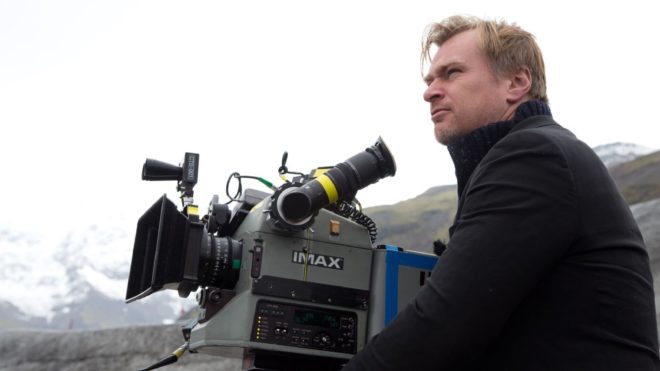
Director Christopher Nolan has long been a champion of large-format celluloid capture, eschewing the digital imaging which has become the dominant medium in recent years. “I think IMAX is the best film format that was ever invented,” says Nolan in a DGA interview. “It’s the gold standard and what any other technology has to match up to, but none have, in my opinion.”

Imax is a process which uses 65mm film (printed on 70mm for exhibition, with the extra space used for the soundtrack) running horizontally through the gate, yielding an image over eight times larger than Academy 35mm. Following some test shots in The Prestige, Nolan captured whole sequences from The Dark KnightThe Dark Knight Rises and Interstellar in Imax.

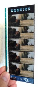
For Dunkirk, Nolan and cinematographer Hoyte van Hoytema, ASC, FSF, NSC were determined to eliminate 35mm altogether, to maintain the highest possible resolution throughout the movie. Imax cameras are noisy, so they shot dialogue scenes on standard 65mm – running vertically through the gate – but Imax footage makes up over 70% of the finished film.


2. The movie was framed with three different aspect ratios in mind.

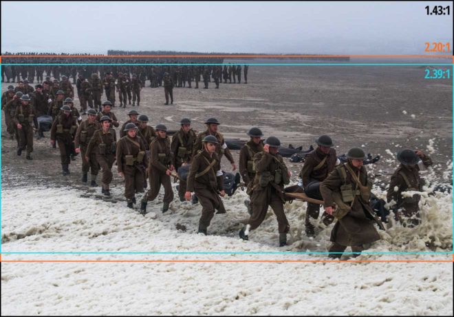
Those who watched Dunkirk in an Imax cinema got to see the native aspect ratio each sequence was captured in, i.e. 2:20:1 for the standard 65mm dialogue scenes but the much taller 1.43:1 for the Imax material, the bulk of the film. Those, like me, who attended a standard 70mm screening, saw it in 2:20:1 throughout. And those hapless individuals who watched it digitally apparently saw the standard Scope ratio of 2.39:1, at least in some cases.

This means that, when composing his shots, van Hoytema had to have two ratios in mind for the dialogue scenes and three for everything else. “Framing was primarily for the 2.40 [a.k.a. 2:39:1], then protecting what was outside of it,” 1st AC Bob Hall explains. This left close-ups, for example, with a large amount of headroom in 1.43:1, but the huge size of Imax screens made such framing desirable anyway.  “Imax is such an immersive experience that it’s not so much the composition that the cinematographer’s done as where your eyes are going on the screen that creates the composition.”


3. Parts of the camera rig were worn as a backpack.

Breaking with the accepted norms of large format cinematography, van Hoytema captured a significant proportion of the movie handheld. The 65mm camera package weighed over 40kg – about three times the weight of a typical Alexa rig – with the Imax camera only a little lighter. To avoid adding the weight of the batteries, video transmitter, Cinetape display and Preston (wireless follow focus) brain, these were placed in a special tethered backpack which was either worn by key grip Ryan Monro or, for water tank work, floated on a small raft.

Unfortunately, Hall quickly found that electromagnetic interference from the Imax camera rendered the Cinetape inoperable, so he ended up relying on his extensive experience to keep the images sharp. “I had to go back to the technology of the 1980s, where I basically guess how far famous people are from me,” he remarks drily in this enlightening podcast from Studio Daily.


4. A periscope lens was used to shoot spitfire cockpit interiors.

“I wanted to tell an intensively subjective version of this story,” says Nolan. To that end he requested over-the-shoulder views out of the windscreens of Spitfires in flight. Furthermore, he wanted to be able to pan and tilt to follow other aircraft passing by. Given the huge size of the Imax camera, there was no room to rotate it within the cockpit. Instead, custom periscope lenses were built which could snake over the pilot’s shoulder, and pan and tilt independently of the camera body, using prisms to maintain the correct image orientation to the film plane.

Other glass used on Dunkirk included an 80mm Imax lens belonging to Nolan himself, and converted stills lenses.

Note that the camera is mounted upside-down, to compensate for the flipped image generated by the prism in the periscope lens.


5. At one point the camera sunk to the bottom of the sea for an hour and a half.

A specific Spitfire POV required was from a damaged plane diving towards the sea and hitting the water. The practical effects department devised a catapult to launch an unmanned mock-up from a ship, the grips built a crash housing for the Imax camera which would be inside, and a plan was devised to recover it before the mock-up sank. But they weren’t quick enough, and the crew watched the plane and the camera disappear beneath the waves and plunge to the bottom of the English Channel, where it sat for 90 minutes until divers retrieved it. Incredibly, once dried out and developed, the film footage was found to be completely undamaged. “The shot was all there, in full colour and clarity,” says van Hoytema in the American Cinematographer article. “This material would have been lost if shot digitally.”


5 Facts About the Cinematography of “Dunkirk”