Undisclosed Project: Experimentation

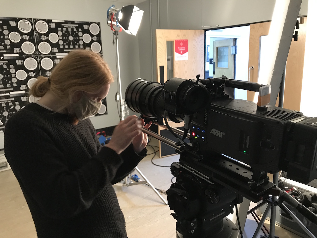
The main event of last week’s prep was a test at Panavision of the Arri Alexa XT, Red Gemini and Sony F55, along with Cooke Panchro, Cooke Varotal, Zeiss Superspeed and Angenieux glass. More on that below, along with footage.

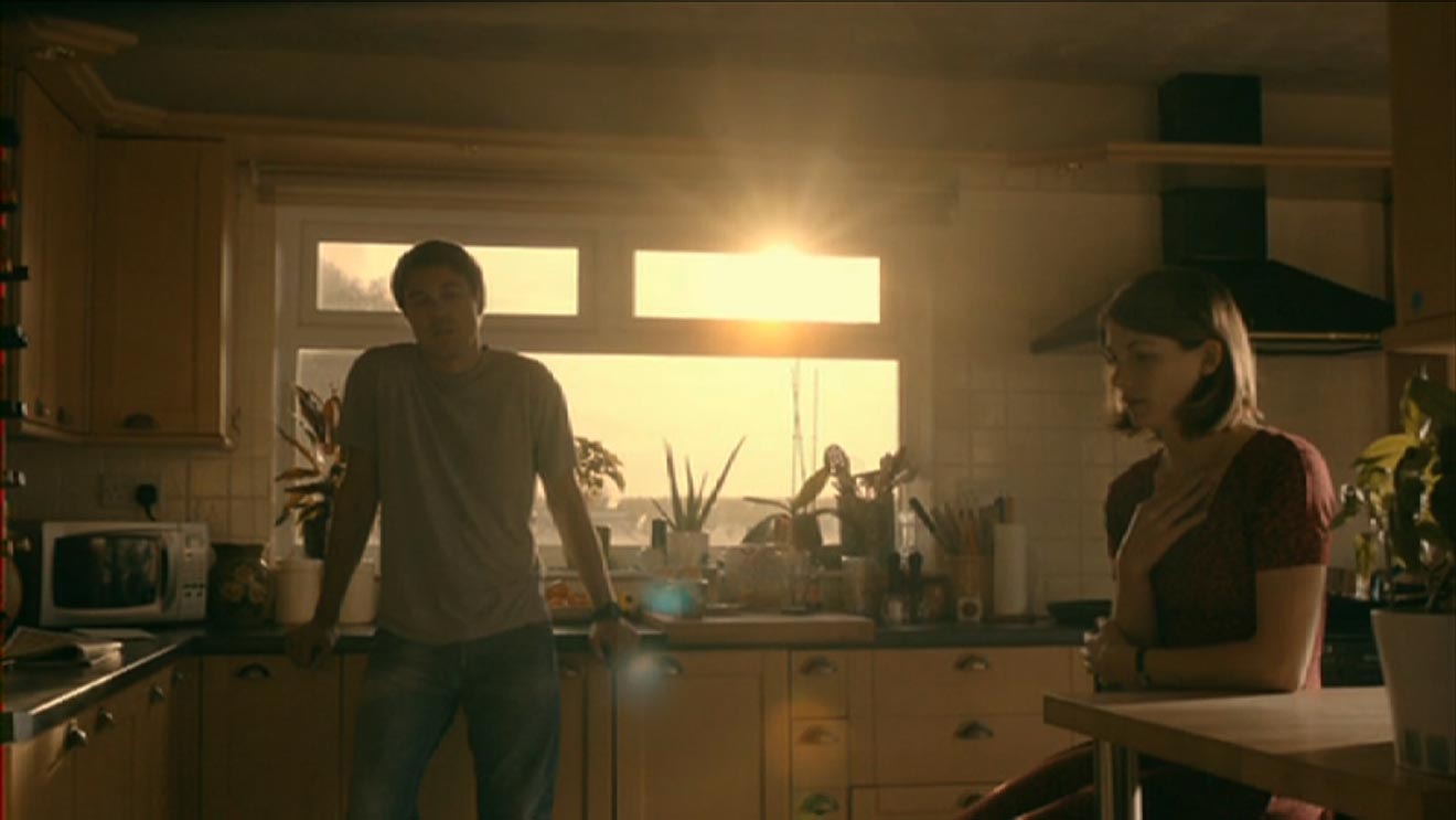
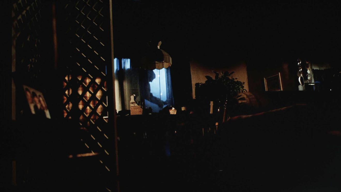
The week started with Zoom meetings with the costume designer, the make-up artist, potential fight choeographers and a theatrical lighting designer. The latter is handling a number of scenes which take place on a stage, which is a new and exciting collaboration for me. I met with her at the location the next day, along with the gaffer and best boy. After discussing the stage scenes and what extra sources we might need – even as some of them were starting to be rigged – I left the lighting designer to it. The rest of us then toured the various rooms of the location, with the best boy making notes and lighting plans on his tablet as the gaffer and I discussed them. They also took measurements and worked out what distro they would need, delivering a lighting kit list to production the next day.

Meanwhile, at the request of the producer, I began a shot list, beginning with two logistically complex scenes. Despite all the recces so far, I’ve not thought about shots as much as you might think, except where they are specified in the script or where they jumped out at me when viewing the location. I expect that much of the shot planning will be done during the rehearsals, using Artemis Pro. That’s much better and easier than sitting at home trying to imagine things, but it’s useful for other departments to be able to see a shot list as early as possible.

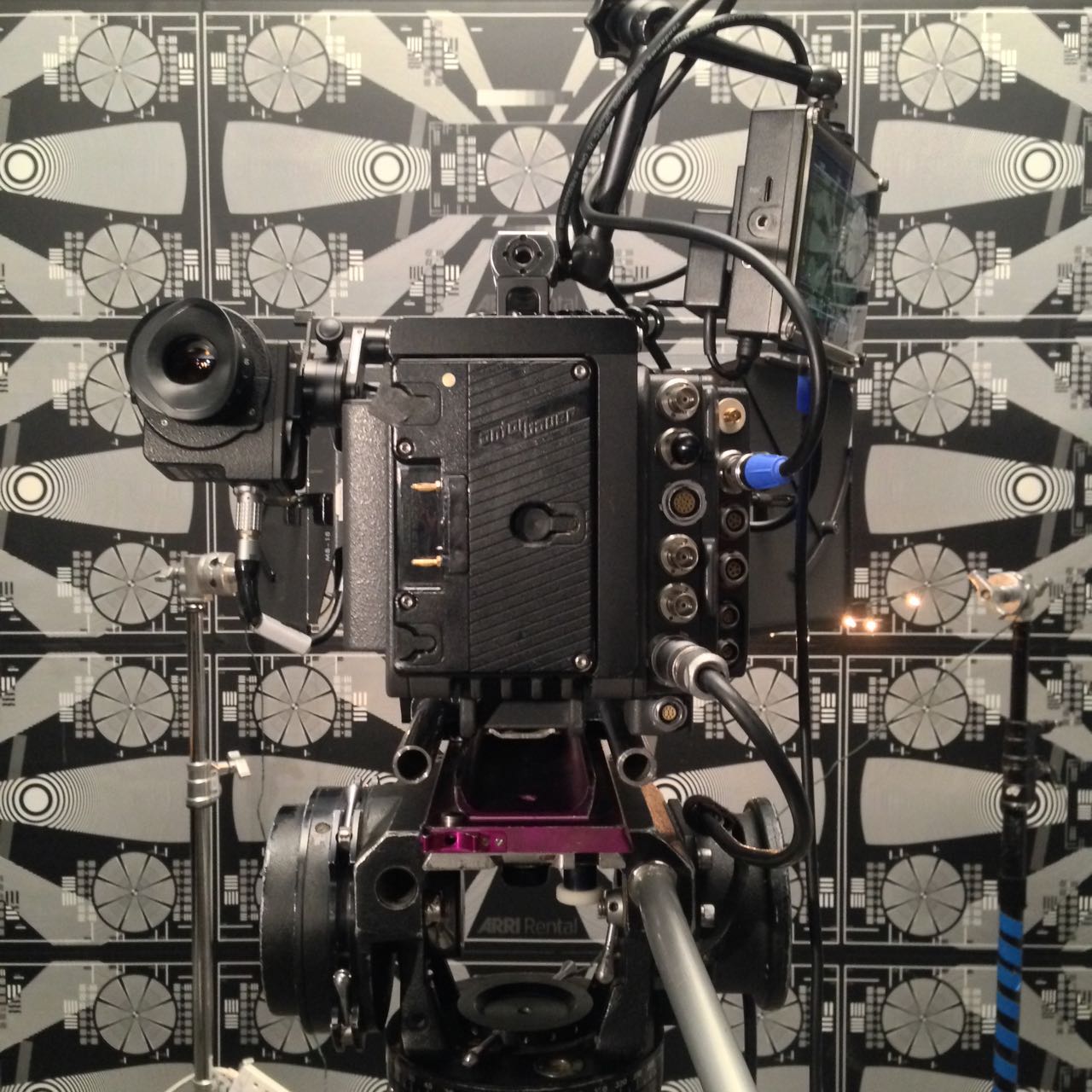
So, the camera tests. I knew all along that I wanted to test multiple cameras and lenses to find the right ones for this project, a practice that is common on features but which, for one reason and another, I’ve never had a proper chance to do before. So I was very excited to spend Wednesday at Panavision, not far from my old stomping ground in Perivale, playing around with expensive equipment.

Specifically we had: an Arri Alexa – a camera I’m very familiar with, and my gut instinct for shooting this project on; a Sony F55 – which I was curious to test because it was used to shoot the beautiful Outlander series; and a Red Gemini – because I haven’t used a Red in years and I wanted to check I wasn’t missing out on something awesome.

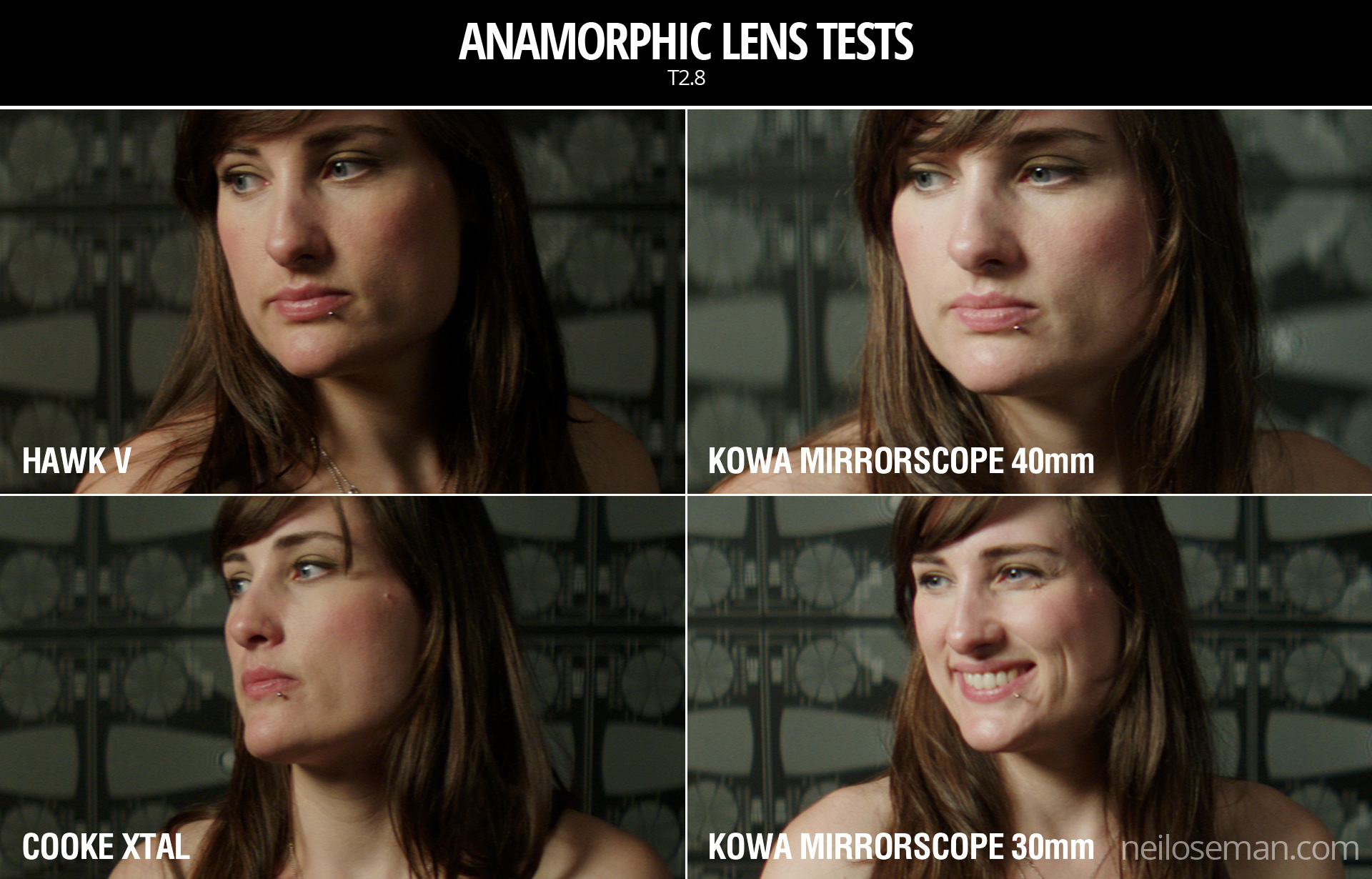
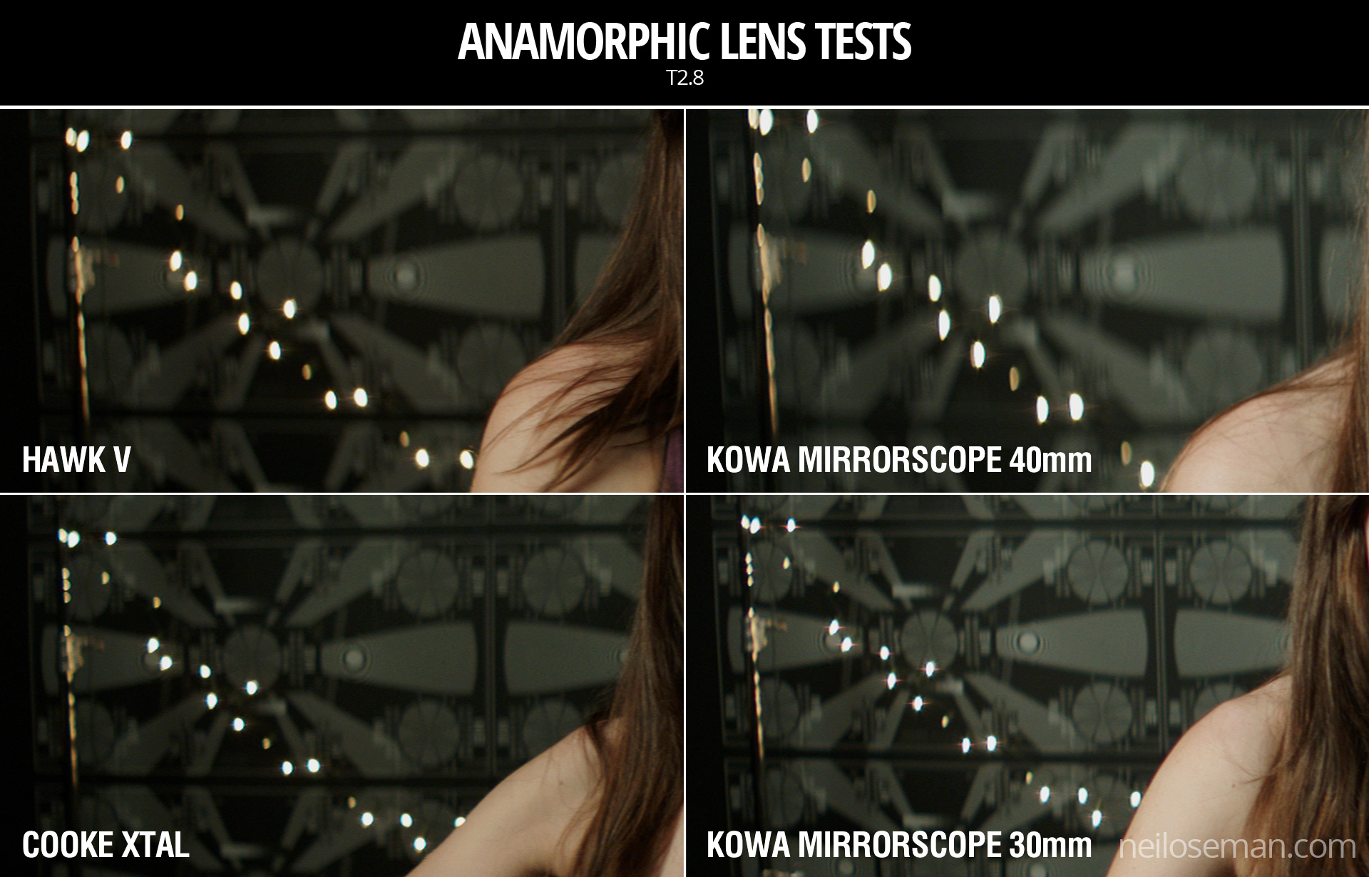
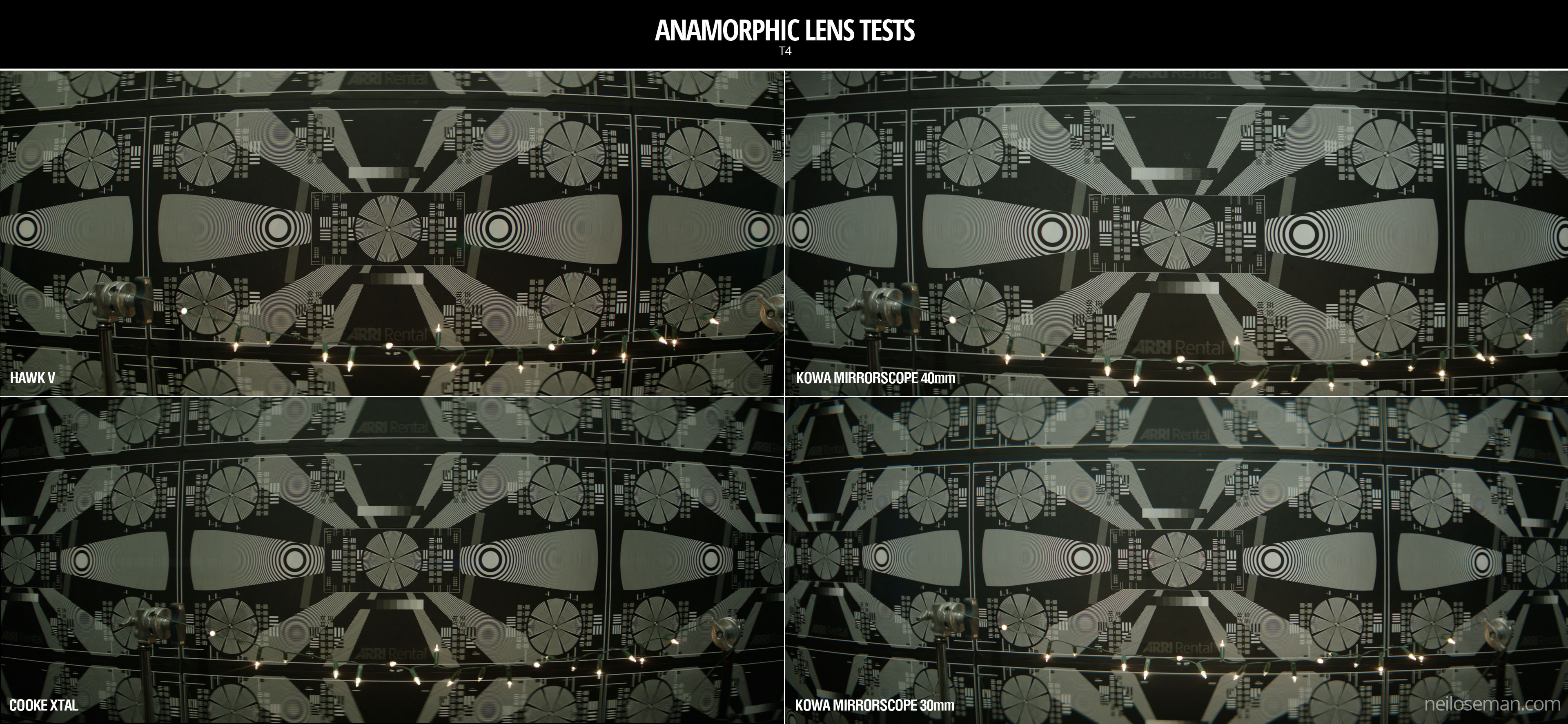
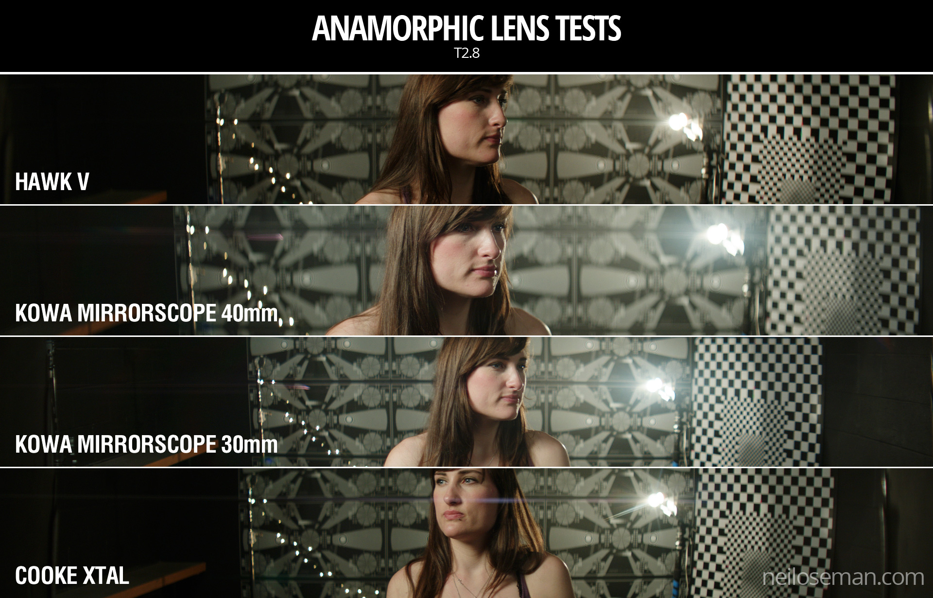
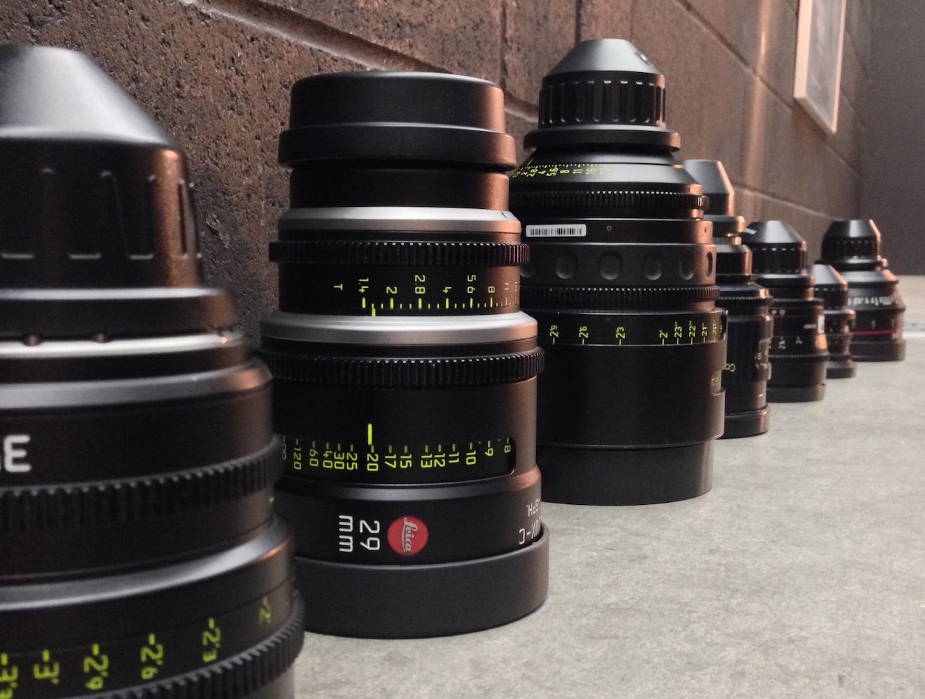
For lenses we had: a set of Cooke Panchros – again a gut instinct (I’ve never used them, but from what I’ve read they seemed to fit); a set of Zeiss Superspeeds – selected after reviewing my 2017 test footage from Arri Rental; a couple of Cooke Varotal zooms, and the equivalents by the ever-reliable Angenieux. Other than the Angenieux we used on the B-camera for The Little Mermaid (which I don’t think we ever zoomed during a take), I’ve not used cinema zooms before, but I want the old-fashioned look for this project.

Here are the edited highlights from the tests…

You’ll notice that the Sony F55 disappears from the video quite early on. This is because, although I quite liked the camera on the day, as soon as I looked at the images side by side I could see that the Sony was significantly softer than the other two.

So it was down to the Alexa vs. the Gemini, and the Cookes vs. the Superspeeds. I spent most of Thursday and all of Friday morning playing with the footage in DaVinci Resolve, trying to decide between these two pairs of very close contenders. I tried various LUTs, did some rough grading (very badly, because I’m not a colourist), tested how far I could brighten the footage before it broke down, and examined flares and bokeh obsessively.

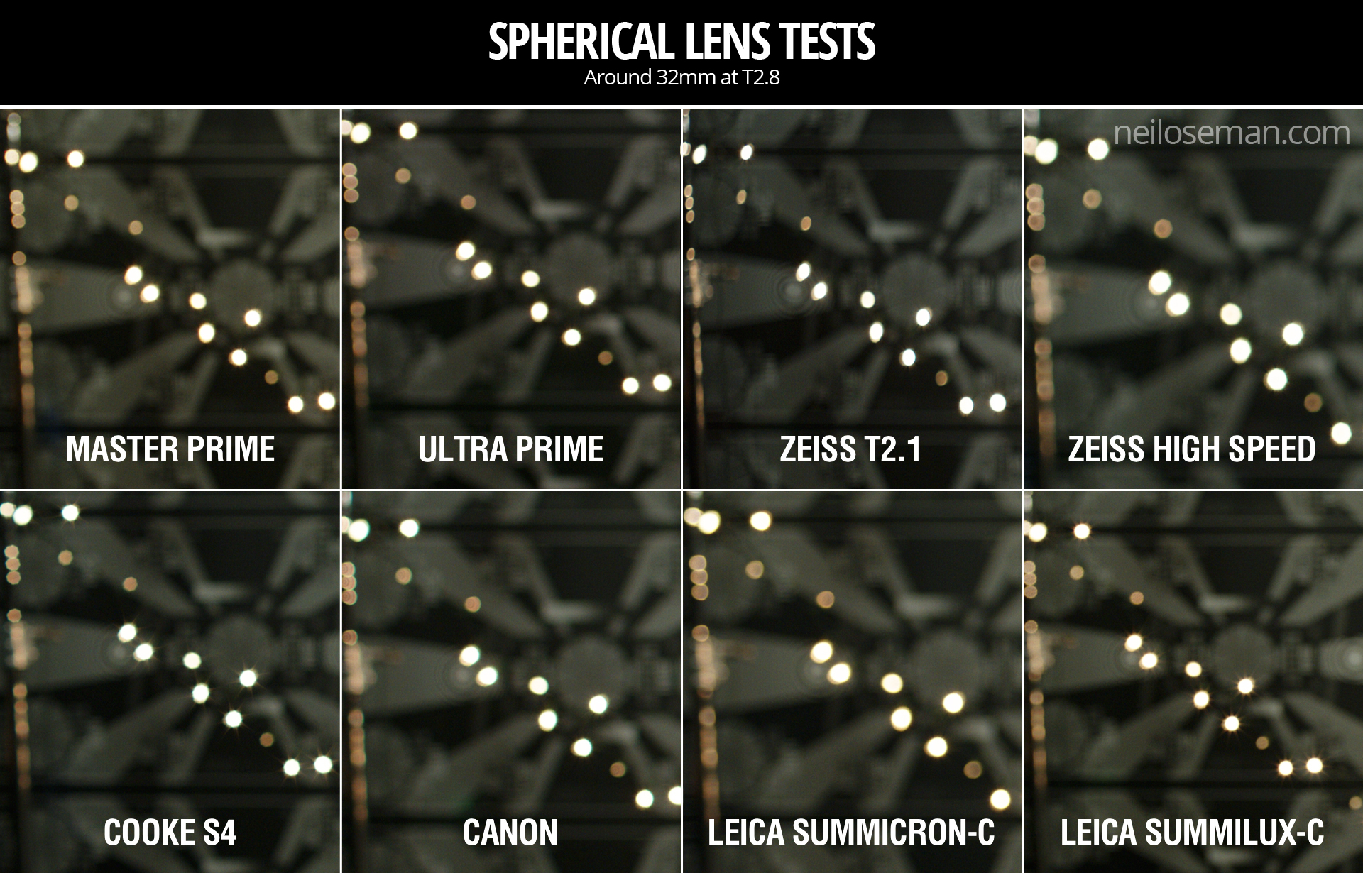
Ultimately I chose the Cooke Panchros because (a) they have a beautiful and very natural-looking flare pattern, (b) the bokeh has a slight glow to it which I like, (c) the bokeh remains a nice shape when stopped down, unlike the Superspeeds’, which goes a bit geometric, (d) they seem sharper than the Superspeeds at the edges of frame when wide open, and (e) more lengths are available.

As for the zoom lenses (not included in the video), the Cooke and the Angenieux were very similar indeed. I chose the former because it focuses a little closer and the bokeh again has that nice glow.

I came very close to picking the Gemini as my camera. I think you’d have to say, objectively, it produces a better image than the Alexa, heretical as that may sound. The colours seem more realistic (although we didn’t shoot a colour chart, which was a major oversight) and it grades extremely well. But…

I’m not making a documentary. I want a cinematic look, and while the Gemini is by no means un-cinematic, the Alexa was clearly engineered by people who loved the look of film and strove to recreate it. When comparing the footage with the Godfather and Fanny and Alexander screen-grabs that are the touchstone of the look I want to create, the Alexa was just a little bit closer. My familiarity and comfort level with the Alexa was a factor too, and the ACs felt the same way.

I’m very glad to have tested the Gemini though, and next time I’m called upon to shoot something great and deliver in 4K (not a requirement on this project) I will know exactly where to turn. A couple of interesting things I learnt about it are: (1) whichever resolution (and concomitant crop factor) you select, you can record a down-scaled 2K ProRes file, and this goes for the Helium too; (2) 4K gives the Super-35 field of view, whereas 5K shows more, resulting in some lenses vignetting at this resolution.

Undisclosed Project: Experimentation

Lighting I Like: “Broadchurch”

The penultimate episode of Lighting I Like goes back to 2013 and the very first episode of the critically-acclaimed ITV crime drama Broadchurch. The scene features the parents of a murdered schoolboy trying to deal with their grief as the sun glares intrusively through the window.

I previously wrote about Broadchurch in an article about headroom, and its third season got a mention in my post about the 2:1 aspect ratio.

The final episode of Lighting I Like will be released, as usual, at 8pm BST next Wednesday, and I’ll be looking at a scene from Star Trek: EnterpriseClick here to see the playlist of all Lighting I Like episodes.

Lighting I Like: “Broadchurch”

Lighting I Like: “Preacher”

Preacher is the subject of this week’s episode of Lighting I Like. I discuss two scenes, from the second episode of the second season, “Mumbai Sky Tower”, which demonstrate the over-the-top, comic-book style of the show.

Both seasons of Preacher can be seen on Amazon Video in the UK.

New episodes of Lighting I Like are released at 8pm BST every Wednesday. Next week I’ll look at two scenes from BroadchurchClick here to see the playlist of all Lighting I Like episodes.

Lighting I Like: “Preacher”

Lighting I Like: “12 Monkeys”

The latest episode of Lighting I Like is out, analysing how the “Splinter Chamber” set is lit in time travel thriller 12 Monkeys. This adaptation of the Terry Gilliam movie can be seen on Netflix in the UK.

I found out lots about the lighting of this scene from this article on the American Society of Cinematographers website. It didn’t mention the source inside the time machine though, but my guess is that it’s a Panibeam 70, as used in the Cine Reflect Lighting System.

New episodes of Lighting I Like are released at 8pm BST every Wednesday. Next week I’ll look at two scenes from PreacherClick here to see the playlist of all Lighting I Like episodes.

Lighting I Like: “12 Monkeys”

Lighting I Like: “The Man in the High Castle”

The second episode in the latest run of Lighting I Like is now out, looking at some of the cinematography in The Man in the High Castle.

Based on the Philip K. Dick novel, The Man in the High Castle is set in an alternate reality where Japan and Nazi Germany won the Second World War. Both seasons of the show are available on Amazon in the UK.

The scenes I focus on use powerful light sources coming in through windows and bouncing off furnishings to softly uplight the talent. For more on this technique, see my article on 5 Ways to Use Hard Light Through a Window.

New episodes of Lighting I Like are released at 8pm BST every Wednesday. Next week I’ll look at a scene from 12 Monkeys the series. Click here to see the playlist of all Lighting I Like episodes.

Lighting I Like: “The Man in the High Castle”

Lighting I Like: “Breaking Bad”

My YouTube series Lighting I Like is back for a second season of six episodes. It’s a very short and simple show, aimed at raising awareness of the art of lighting amongst non-cinematographers, or those at the very start of their cinematography career. Each week I look at the lighting choices made in one or two scenes of a TV/VOD show and how those choices help tell the story.

First up is Breaking Bad, the critically acclaimed series about a high-school chemistry teacher who, after being diagnosed with leukaemia, resorts to manufacturing drugs to ensure his family’s financial future. All five seasons of the show are available on Netflix in the UK.

Breaking Bad is dark and gritty, shot on 35mm film, and features some beautiful cinematography, one example of which I recently covered in my post on modifying window light. You can read an interesting analysis of the show’s photography on Cinevenger.

In the above video I also provide additions and corrections to some episodes of Lighting I Like‘s first season. Click here to see the playlist of all Lighting I Like episodes.

New episodes of Lighting I Like will be released at 8pm BST every Wednesday. Next week I’ll look at a couple of scenes from The Man in the High Castle.

Lighting I Like: “Breaking Bad”

How to do Scenes on a Moving Train

Behind the scenes of “Last Passenger”

The publicity machine is ramping up for Kenneth Branagh’s Murder on the Orient Express remake, and it’s got me thinking about the challenges of a script set largely on a moving train. There are a number of ways of realising such scenes, and today I’m going to look at five movies that demonstrate different techniques. All of these methods are equally applicable to scenes in cars or any other moving vehicle.

1. For Real: “The Darjeeling limited”

Wes Anderson’s 2007 film The Darjeeling Limited sees three brothers embarking on a spiritual railway journey across India. Many of the usual Anderson tropes are present and correct – linear tracking shots, comical headgear, Jason Schwartzman – but surprisingly the moving train wasn’t done with some kind of cutesy stop-motion. Production designer Mark Friedberg explains:

The big creative decision Wes made was that we were going to shoot this movie on a moving train. And all that does is complicate life. It makes it more expensive, it makes the logistics impossible. It made it incredibly difficult to figure out how many crew, what crew, what gear… but what it did do is it made it real.

Kenneth Branagh has stated that at least some of Murder on the Orient Express was shot on a real moving train too:

They painstakingly built a fully functioning period authentic locomotive and carriages from the Orient Express during the golden, glamorous age of travel. It was a train that moved… All of our actors were passengers on the train down the leafy lanes of Surrey, pretending to be the former Yugoslavia.


2. Poor Man’s Process: “The Double”

Director Richard Ayoade

Although best known as The IT Crowd‘s Moss and the new host of the Crystal Maze, Richard Ayoade is also an accomplished director. His last feature was a darkly beautiful adaptation of Dostoyevsky’s classic identity-crisis novella The Double. 

Unlike the other movies on this list, The Double only has short sequences on a train, and that’s a key point. So named because it’s a cheap alternative to rear projection (a.k.a. process photography), Poor Man’s Process is a big cheat. In order to hide the lack of motion, you keep the view outside your vehicle’s windows blank and featureless – typically a night sky, but a black subway tunnel or a grey daytime sky can also work. Then you create the illusion of motion with dynamic lighting, a shaky camera, and grips rocking the carriage on its suspension. Used judiciously, this technique can be very convincing, but you would never get away with it for a whole movie.

Poor Man’s works particularly well in The Double, the black void outside the subway car playing into the oppressive and nightmarish tone of the whole film. In an interview with Pushing Pixels, production designer David Crank explains how the subway carriage set was built out of an old bus. He goes on to describe how the appearance of movement was created:

We put the forks of a forklift under the front of the bus, and shook it… For the effect of moving lights outside the train, it was a combination of some spinning lights on stands, as well as lights on small rolling platforms which tracked back and forth down the outside of the bus.

Part 2 of the Darjeeling Limited featurette above reveals that Poor Man’s Process was also used occasionally on that film, when the train was stuck in a siding due to heavy rail traffic. I used Poor Man’s myself for night-time train sequences in two no-budget features that I made in the early noughties – see the BTS clip below – and I’ve also written a couple of blog posts in the past about my use of the same technique on a promotional video and in a fantasy web series.


3. Green screen: “Source Code”

Duncan “Zowie Bowie” Jones followed up his low-budget masterpiece Moon with Hollywood sci-fi thriller Source Code, a sort of mash-up of Quantum Leap and Groundhog Day with a chilling twist. It takes place predominantly on a Chicago-bound commuter train, in reality a set surrounded by green screen. In the featurette above, Jones mentions that shooting on a real moving train was considered, but ultimately rejected in favour of the flexibility of working on stage:

Because we revisit an event multiple times, it was absolutely integral to making it work, and for the audience not to get bored, that we were able to vary the visuals. And in order to do that we had to be able to build platforms outside of the train and be able to really vary the camera angles.

In the DVD commentary, Jones also notes that the background plates were shot in post from a real train “loaded up with cameras”.

Director Duncan Jones on the set of “Source Code”

Cinematographer Don Burgess, ASC discusses lighting the fake train in a Panavision article:

It’s difficult to make it feel like natural light is coming in and still get the sense of movement on a train… We worked with computer programs where we actually move the light itself, and brighten and dim the lights so it feels as if you are travelling… The lights are never 100% constant.

When I shot The Little Mermaid last year we did some train material against green screen. To make the lighting dynamic, the grips built “branch-a-loris” rigs: windmills of tree branches which they would spin in front of the lamps to create passing shadows.


4. Rear projection: “Last Passenger”

Perhaps the most low-budget film on this list, Last Passenger is a 2013 independent thriller set aboard a runaway train. Director Omid Nooshin and DP Angus Hudson wanted a vintage look, choosing Cooke Xtal anamorphic lenses and a visual effects technique that had long since fallen out of favour: rear projection.

Before the advent of optical – and later digital – compositing, rear projection was commonly used to provide moving backgrounds for scenes in vehicles. The principle is simple: the pre-recorded backgrounds are projected onto a screen like this…

Rear projection in use on “River of no Return” (1954)

Hudson goes into further detail on the technique as used for the Last Passenger:

To capture [the backgrounds] within our limited means, we ended up shooting from a real train using six Canon 5D cameras, rigged in such a way that we got forward, sideways and rear-facing views out of the train at the same time. We captured a huge amount of footage, hours and hours of footage. That allowed us to essentially have 270 degrees of travelling shots, all of which were interlinked.

Because rear projection is an in-camera technique, Nooshin and Hudson were able to have dirt and water droplets on the windows without worrying about creating a compositing nightmare in postproduction. Hudson also notes that the cast loved being able to see the backgrounds and react to them in real time.


5. L.E.D. Panels: “Train to Busan”

Enabling the actors to see the background plates was also a concern for Yeon Sang-ho, director of the hit Korean zombie movie Train to Busan. He felt that green screen would make it “difficult to portray the reality”, so he turned to the latest technology: LED screens. This must have made life easier not just for the cast, but for the cinematographer as well.

You see, when you travel by train in the daytime, most of the light inside the carriage comes from outside. Some of it is toplight from the big, flat sky, and some of it is hard light from the sun – both of these can be faked, as we’ve seen – but a lot of the light is reflected, bouncing off trees, houses, fields and all the other things that are zipping by. This is very difficult to simulate with traditional means, but with big, bright LED screens you get this interactive lighting for free. Because of this, and the lack of postproduction work required, this technique is becoming very popular for car and train scenes throughout the film and TV industry.

This brings us back to Murder on the Orient Express, for which 2,000 LED screens were reportedly employed. In a Digital Spy article, Branagh notes that this simulated motion had an unintended side effect:

It was curious that on the first day we used our gimballed train sets and our LED screens with footage that we’d gone to great trouble to shoot for the various environments – the lowlands and then the Alps, etc… people really did feel quite sick.

I’ll leave you with one final point of interest: some of the above films designed custom camera tracks into their train carriage sets. On Last Passenger, for example, the camera hung from a dolly which straddled the overhead luggage racks, while The Darjeeling Limited had an I-beam track designed into the centre of the ceiling. Non-train movies like Speed have used the same technique to capture dolly shots in the confines of a moving vehicle.

“Last Passenger”s luggage rack dolly
How to do Scenes on a Moving Train

Anamorphic Lens Tests

Anamorphic cinematography, first dabbled with in the 1920s, was popularised by Twentieth Century Fox in the fifties as CinemaScope. Television was growing in popularity and the studios were inventing gimmicks left, right and centre to encourage audiences back into cinemas. Fox’s idea was to immerse viewers in an image far wider than they were used to, but with minimal modifications to existing 4-perf 35mm projectors. They developed a system of anamorphic lenses containing elements which compressed the image horizontally by a factor of two. By placing a corresponding anamorphosing lens onto existing projectors, the image was unsqueezed into an aspect ratio of 2.55:1, or later 2.39:1.

Since those early days of CinemaScope, anamorphic cinematography has become associated with the biggest Hollywood blockbusters. Its optical features – streak flares, oval bokeh and curved horizontal lines – have been seared into our collective consciousness, indelibly associated with high production values.

I’ve not yet been fortunate enough to shoot anamorphic, but I was able to test a few lenses at Arri Rental recently, with the help of Rupert Peddle and Bex Clives. Last week I wrote about the spherical lenses which we tested; our anamorphic tests followed the same methodology.

Again we were shooting on an Alexa XT Plus in log C ProRes 4444 XQ, this time in 4:3 mode, a resolution of 2048×1536. Since all of the lenses had a standard 2:1 anamorphosing ratio, the images unsqueezed to a super-wide 2.66:1 ratio. (This is because the lenses were designed to be used on 35mm film with space left to one side for the optical soundtrack.) You can see the full width of this ratio in the first split-screen image in the video, at 2:08, and in the second image below, but otherwise I have horizontally cropped the footage to the standard 2.39:1 ratio.

We tested the following glass:

Series Length Speed CF* Weight
Hawk V 35mm T2.2 30″ 5.6kg
Cooke Xtal 30mm T2.8 ? 3kg
Kowa Mirrorscope 40mm T2.2 36″ 1.15kg
Kowa Mirrorscope 30mm T2.3 ? ?

* CF = close focus

For consistency with the spherical lenses, we used lengths around 32mm, but in the anamorphic format this is a pretty wide lens, not a mid-range lens. We shot at T2.8, again for consistency, but I hear that many anamorphics don’t perform well wider than T4.

We were only able to test what Arri Rental happened to have on the shelves that day. The biggest and presumably most expensive was the Hawk V-series. Next  in size and weight was the Cooke Xtal – pronounced “crystal” – a 1970s lens based on the much-loved Speed Panchros. The smallest and lightest, was the Kowa Mirrorscope, with a list price of £1,200 per week for a set of four. (Sorry, I couldn’t find any pricing info for the others online.) Note that there isn’t really a 30mm Mirrorscope; to get this length you put a wide angle adapter on the 40mm. As this extra element decreases the optical performance, we tested it with and without, hence the two lengths.

Here’s the video…


Skin tones

Click on the image to see it at full quality.

To my eye, the Hawk has a fairly rich, warm skin tone, while the Cooke – as with the spherical S4 tested last week – seems a little grey and flat. The Kowa is inexplicably brighter than the other two lenses, which makes it hard to compare, but perhaps it’s a little cooler in tone?


Sharpness

Focus is more critical with anamorphic lenses than spherical ones. From a forum posting by Max Jacoby:

Anamorphic lenses have what is known as a “curved field of focus” that works similarly to the curved movie screens in some large Cinerama theatres. This is one reason that one needs to expose these lenses at a deeper stop. If one doesn’t, the curved field will not be covered by depth of field and either the edges or centre of the frame will be soft.

One day I’d like to re-test these lenses at a lower stop, T4 or T5.6, where they will all undoubtedly perform much better. But in this T2.8 test, on Bex’s face in the centre of frame, the Hawk V and the Kowa Mirrorscope 40mm – both almost a full stop from their maximum apertures – are clearly the sharpest of the bunch. The Cooke Xtal, which is wide open, is unsurprisingly softer. The 30mm adapter on the Mirrorscope completely destroys the image, not only making it very soft but also introducing colour aberration.

Now let’s look at the checkerboard at the side of frame and see if we can spot any differences in sharpness there…

It seems to me that the Kowa, both with and without the adapter, has a greater difference in sharpness between the centre and edges of frame than the the Hawk and Cooke. With the latter two lenses, the checkerboard is reasonably sharp, at least on the lefthand side, with some ghosting/blur visible towards the righthand side. The same thing can be observed on the chart in the flare tests at the end of the video.


Breathing & Bokeh

All of these lenses have a noticeable degree of breathe, which I suppose is to be expected from anamorphics. The Hawk V has roughly oval bokeh, the Cooke’s is more circular, while the Mirrorscope has interesting D-shaped bokeh.


Flare

The Hawk V doesn’t flare much at all, which is apparently due to the anamorphic element being in the middle of the lens, rather than at the front. The Kowa has a nice streak and glow around the light source, with a funky purple artefact on the opposite side of frame. But it’s the Cooke Xtal which provides the most classic lens flare, with a horizontal line across most of the frame and a partial star pattern around the source, despite the lens being wide open.

At the end of the video you can see how the flares develop on each lens as the light source moves horizontally across frame.


Distortion

A bulging effect is very obvious on all of these lenses, due to the focal lengths being quite wide for anamorphic. Notice how at 40mm on the Kowa Mirrorscope this curvature of the image is significantly reduced.

It’s hard to compare the levels of distortion because none of the focal lengths are exactly the same, except for the Cooke Xtal and the Kowa Mirrorscope with the 30mm adapter on. The Cooke’s top right and bottom left corners appear to be stretched away from the centre relative to the other two corners. I suppose that strange and funky stuff like this is exactly why you choose vintage glass.

Interestingly, the Cooke’s image appears a little tighter than the Kowa’s, which combined with my inability to find any evidence online of the existence of a 30mm Xtal, leads me to suspect we may have been given a mislabelled 32mm.


Conclusions

When we got to the end of our spherical tests and started putting the anamorphics on, I was shocked by the drop in sharpness. But as noted earlier, this is because anamorphics really need to be used with a smaller aperture than the T2.8 I often shoot at. If I learnt nothing else from this test, I learnt that anamorphic needs more light!

I would love to put the Cooke Xtal’s lovely flares and general vintage look to good use on a period movie one day. The Hawk V would be a good choice if I wanted the anamorphic look with warm, dynamic skin tones. The Kowa system seemed a little cheap and cobbled-together, but could well be a good solution for anamorphic on a budget, as long as I stayed away from the 30mm adapter!

I hope you’ve found these tests useful. Thanks again to 1st AC Rupert Peddle, 2nd AC Bex Clives and Arri Rental UK for making them possible.

Anamorphic Lens Tests

Spherical Lens Tests

The other week I spent a day at Arri Rental in Uxbridge, in the Bafta Room no less, conducting various camera and lens tests. I’ve done a number a productions now where I wanted to test but there wasn’t the time or money, so for a while I’ve been meaning to go into Arri on my own time and do some general tests for my education and edification. An upcoming short provided the catalyst for me to get around to it at last.

Aided by 1st AC Rupert Peddle and 2nd AC Bex Clives, I tested a dozen lenses, some spherical, some anamorphic. Today I will cover the spherical lenses; next time I’ll look at the anamorphics.


Method

We shot on an Alexa XT Plus in log C ProRes 4444 XQ at 3.2K. In the video the image has been downscaled to 1080P and a standard Rec.709 LUT has been added.

I set the Alexa to ISO 800 and lit Bex to a T2.8 using a 650W tungsten fresnel bounced off poly. For fill I caught a little of the spill from the fresnel with a matte silver bounce board on the opposite side of camera. I placed fairy lights in the background to observe the bokeh (out of focus areas) and turned on a 100W globe during each take to see what the flare did.

We shot all the lenses at 2.8 – the stop I most commonly use – and also wide open (compensating with the shutter angle), but the direct 2.8 comparison proved most useful, so that’s mainly what you’ll see in the video. We tested a single length: 35mm or the closest available to it.

What we didn’t do was shoot grey-scale or colour charts, or do any testing of vignettes or distortion. (The day after doing these tests, Shane Hurlbut, ASC published an Inner Circle post about how to tests lenses, so I immediately learnt what my omissions were!)

We tested the following lenses:

Series Length Speed CF* Weight Price
Leica Summilux-C 29mm T1.4 18″ 1.7kg £27K
Arri/Zeiss Master Prime 35mm T1.3 14″ 2.2kg £16K
Cooke S4 32mm T2 6″ 1.85kg £14K
Leica Summicron-C 35mm T2 14″ 1.3kg £13K
Zeiss High Speed
(a.k.a. Superspeed Mk III)
35mm T1.3 14″ 0.79kg £12K
(refurb)
Arri/Zeiss Ultra Prime 32mm T1.9 15″ 1.1kg £10K
Zeiss T2.1 32mm T2.1 24″ 0.45kg £4K
(used)
Canon 35mm T1.5 12″ 1.1kg £3K

* CF = close focus

Here’s the video…


Skin tones

Click the image to see it at best quality.

The Arri/Zeiss Master Prime and the two Leicas seem to have the most vibrant skin tones. To my eye, the Leicas have a slight creaminess that’s very pleasing. The Canon looks just a little cooler and less dynamic. I was surprised to find that the Cooke S4, the lens I’ve used most, appears to have a grey, flat skin tone compared with the Master Prime, Leicas and Canon. I would rank the Ultra Prime and Superspeed next, on a par except that the Ultra Prime has a noticeable magenta cast. My least favourite skin tones are on the Zeiss T2.1, which comparatively makes poor Bex look a little bit ill!

Some of the nuances will be lost in the YouTube and Jpeg compression, but this is a very subjective assessment anyway, so feel free to completely disagree with all of the above. Any of the differences noted above could be corrected by grading, to some extent . But remember that the lens is at the very start of the light’s journey from set to screen, and any wavelengths that don’t get through it are lost forever. It’s like fluorescent lamps with colours missing from the spectrum; you can’t put those back in in post.


Sharpness

I have to say, I’m unable to detect any difference in sharpness between the Master Prime, Cooke S4, Canon and Leicas. The Ultra Prime and Superspeed both look a hair softer, while the T2.1 is very soft.


Breathing

Breathing is the slight zooming effect that you get with some lenses when you pull focus. Looking at 4:44 in the video you can clearly see the differences in breathing between the eight lenses. Because this part of the video is showing a crop of the bottom left corner of the image, the breathing manifests as a shift to the left (zoom in) as the lens is racked closer (goes soft) and a shift to the right (zoom out) as it’s racked deeper (goes sharp).

All the Zeiss lenses except the Master Prime have a significant amount of breath when seen in isolation like this, but not enough to be noticeable to an audience in most real-world situations. The Cooke S4 has a little bit of breathe, and the Canon a hair less. The Master Prime and the Leicas are rock solid.


Bokeh

Small points of light, when thrown out of focus, most clearly demonstrate the bokeh pattern of a lens. The shape of the bokeh is determined by the number of iris blades and the shape of those blades. Generally a circle is preferred, because it’s a natural shape, but for certain stories a more unusual shape might be appropriate. The shape of the iris changes with the T-stop, hence the T2.8 and wide open images above.

Immediately noticeable is the difference in the Cooke S4’s bokeh between wide open (circular) and T2.8 (octagonal). All of the other lenses have round bokeh at T2.8, apart from the Superspeed, which has heptagonal (seven-sided) bokeh.

It’s entirely subjective which bokeh you prefer. The only other thing I’ll point out is that the Canon’s bokeh wide open is very fuzzy, with noticeable colour aberration, though this may be due to the bright highlight rather than the defocusing.


Flare

Flare patterns also vary with aperture. The smaller the aperture, the more of a star effect you will get, as the light interacts with the corners in the iris blades. The Summilux shows this most clearly, with a pronounced star at T2.8 (two stops down from its maximum aperture) and almost none when wide open. The Cooke S4 also has a nice star pattern at T2.8. With the other lenses it’s much more subtle, and the Canon has almost none.


Conclusions

The real revelations in these tests, for me, were the Leicas. The Summilux in particular is a beautiful lens, with rich, dynamic skin tones, nice bokeh, no breathing, plus the bonus of nice star flares. I will definitely be looking to work with this glass in the future, although given the price tag that may be optimistic!

The Summicron also performed incredibly well, matching the more expensive Summilux and Master Prime in every respect except speed. I can see this becoming my new go-to lens.

The Master Prime of course produced a beautiful, sharp, clean image, but it lacks character. It might work nicely for science fiction, a drama requiring a neutral look, or something where filtration was being used to give the image character.

The Canon impressed me too – no mean feat given that it’s the cheapest lens we tested. With nice skin tones and attractive flares, I could see this working well for a romantic movie.

The Zeiss T2.1 did not appeal to me, with poor sharpness and cold, washed-out skin tones, so I would avoid it.

The Superspeed is a decent lens, but in most cases I’d plump for an Ultra Prime instead. Ultra Primes are certainly easier to work with for the 1st AC, and have proven to be a good workhorse lens for drama. (I shot Above the Clouds on them.)

The Cooke S4 has been my go-to glass up to now, and while it will probably remain my first choice for period pieces, due to its gentle focus fall-off, I’m excited to try some of the other glass in this test on other productions.

I’ll say it one last time: this is all subjective. Our visual preferences are what make every director of photography unique.

Tune in next week when I’ll look at the anamorphic lenses: Hawk-V, Cooke Xtal and Kowa Mirrorscope.

Spherical Lens Tests