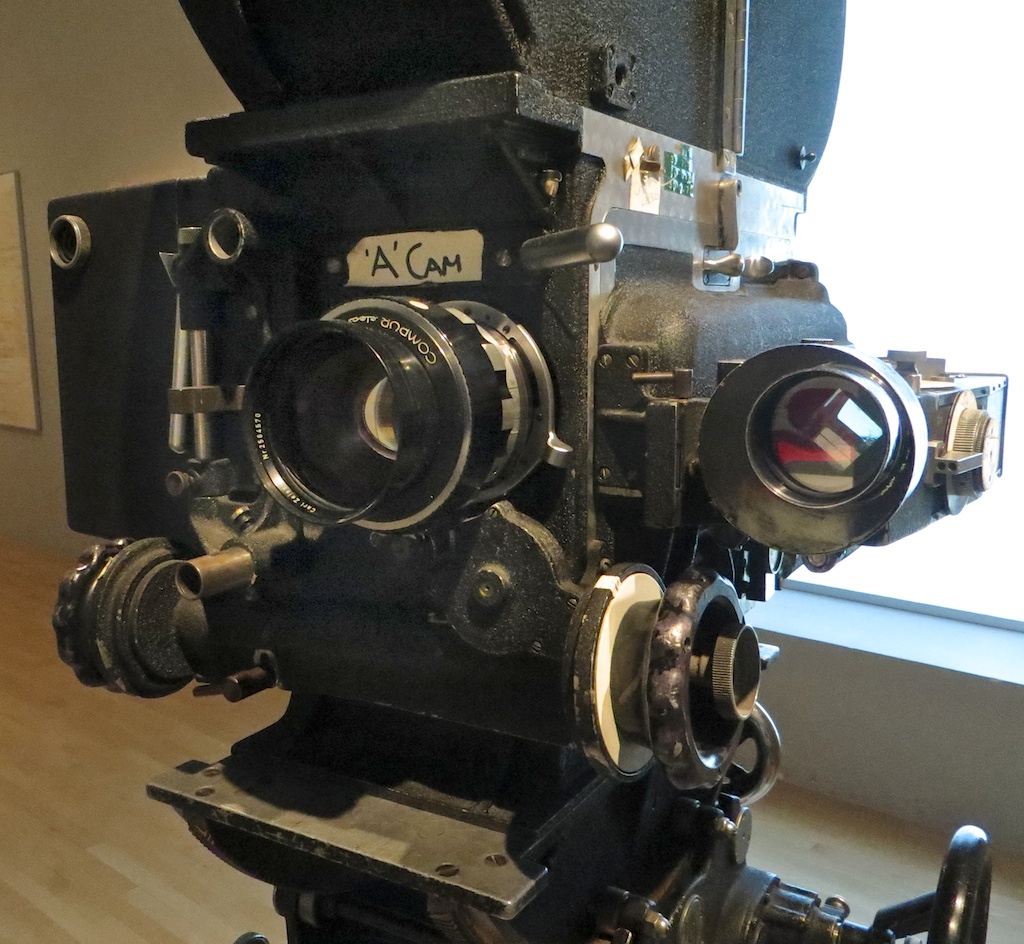
 The other week I spent a day at Arri Rental in Uxbridge, in the Bafta Room no less, conducting various camera and lens tests. I’ve done a number a productions now where I wanted to test but there wasn’t the time or money, so for a while I’ve been meaning to go into Arri on my own time and do some general tests for my education and edification. An upcoming short provided the catalyst for me to get around to it at last.
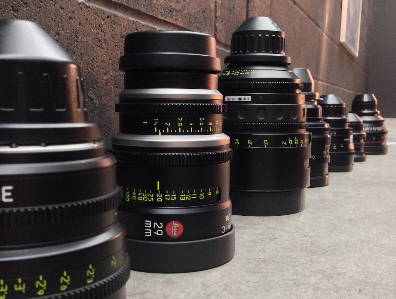
Aided by 1st AC Rupert Peddle and 2nd AC Bex Clives, I tested a dozen lenses, some spherical, some anamorphic. Today I will cover the spherical lenses; next time I’ll look at the anamorphics.
Method

We shot on an Alexa XT Plus in log C ProRes 4444 XQ at 3.2K. In the video the image has been downscaled to 1080P and a standard Rec.709 LUT has been added.
I set the Alexa to ISO 800 and lit Bex to a T2.8 using a 650W tungsten fresnel bounced off poly. For fill I caught a little of the spill from the fresnel with a matte silver bounce board on the opposite side of camera. I placed fairy lights in the background to observe the bokeh (out of focus areas) and turned on a 100W globe during each take to see what the flare did.
We shot all the lenses at 2.8 – the stop I most commonly use – and also wide open (compensating with the shutter angle), but the direct 2.8 comparison proved most useful, so that’s mainly what you’ll see in the video. We tested a single length: 35mm or the closest available to it.
What we didn’t do was shoot grey-scale or colour charts, or do any testing of vignettes or distortion. (The day after doing these tests, Shane Hurlbut, ASC published an Inner Circle post about how to tests lenses, so I immediately learnt what my omissions were!)
We tested the following lenses:
| Series | Length | Speed | CF* | Weight | Price |
| Leica Summilux-C | 29mm | T1.4 | 18″ | 1.7kg | £27K |
| Arri/Zeiss Master Prime | 35mm | T1.3 | 14″ | 2.2kg | £16K |
| Cooke S4 | 32mm | T2 | 6″ | 1.85kg | £14K |
| Leica Summicron-C | 35mm | T2 | 14″ | 1.3kg | £13K |
| Zeiss High Speed (a.k.a. Superspeed Mk III) |
35mm | T1.3 | 14″ | 0.79kg | £12K (refurb) |
| Arri/Zeiss Ultra Prime | 32mm | T1.9 | 15″ | 1.1kg | £10K |
| Zeiss T2.1 | 32mm | T2.1 | 24″ | 0.45kg | £4K (used) |
| Canon | 35mm | T1.5 | 12″ | 1.1kg | £3K |
* CF = close focus
Here’s the video…
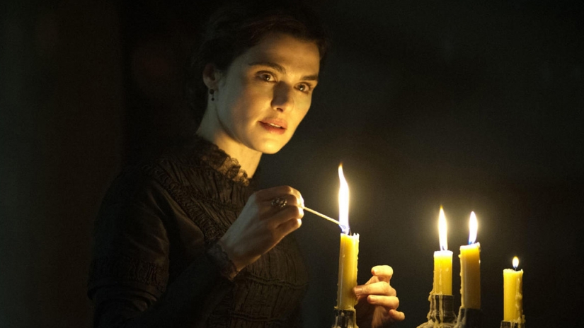
Skin tones

Click the image to see it at best quality.
The Arri/Zeiss Master Prime and the two Leicas seem to have the most vibrant skin tones. To my eye, the Leicas have a slight creaminess that’s very pleasing. The Canon looks just a little cooler and less dynamic. I was surprised to find that the Cooke S4, the lens I’ve used most, appears to have a grey, flat skin tone compared with the Master Prime, Leicas and Canon. I would rank the Ultra Prime and Superspeed next, on a par except that the Ultra Prime has a noticeable magenta cast. My least favourite skin tones are on the Zeiss T2.1, which comparatively makes poor Bex look a little bit ill!
Some of the nuances will be lost in the YouTube and Jpeg compression, but this is a very subjective assessment anyway, so feel free to completely disagree with all of the above. Any of the differences noted above could be corrected by grading, to some extent . But remember that the lens is at the very start of the light’s journey from set to screen, and any wavelengths that don’t get through it are lost forever. It’s like fluorescent lamps with colours missing from the spectrum; you can’t put those back in in post.
Sharpness
I have to say, I’m unable to detect any difference in sharpness between the Master Prime, Cooke S4, Canon and Leicas. The Ultra Prime and Superspeed both look a hair softer, while the T2.1 is very soft.
Breathing
Breathing is the slight zooming effect that you get with some lenses when you pull focus. Looking at 4:44 in the video you can clearly see the differences in breathing between the eight lenses. Because this part of the video is showing a crop of the bottom left corner of the image, the breathing manifests as a shift to the left (zoom in) as the lens is racked closer (goes soft) and a shift to the right (zoom out) as it’s racked deeper (goes sharp).
All the Zeiss lenses except the Master Prime have a significant amount of breath when seen in isolation like this, but not enough to be noticeable to an audience in most real-world situations. The Cooke S4 has a little bit of breathe, and the Canon a hair less. The Master Prime and the Leicas are rock solid.
Bokeh
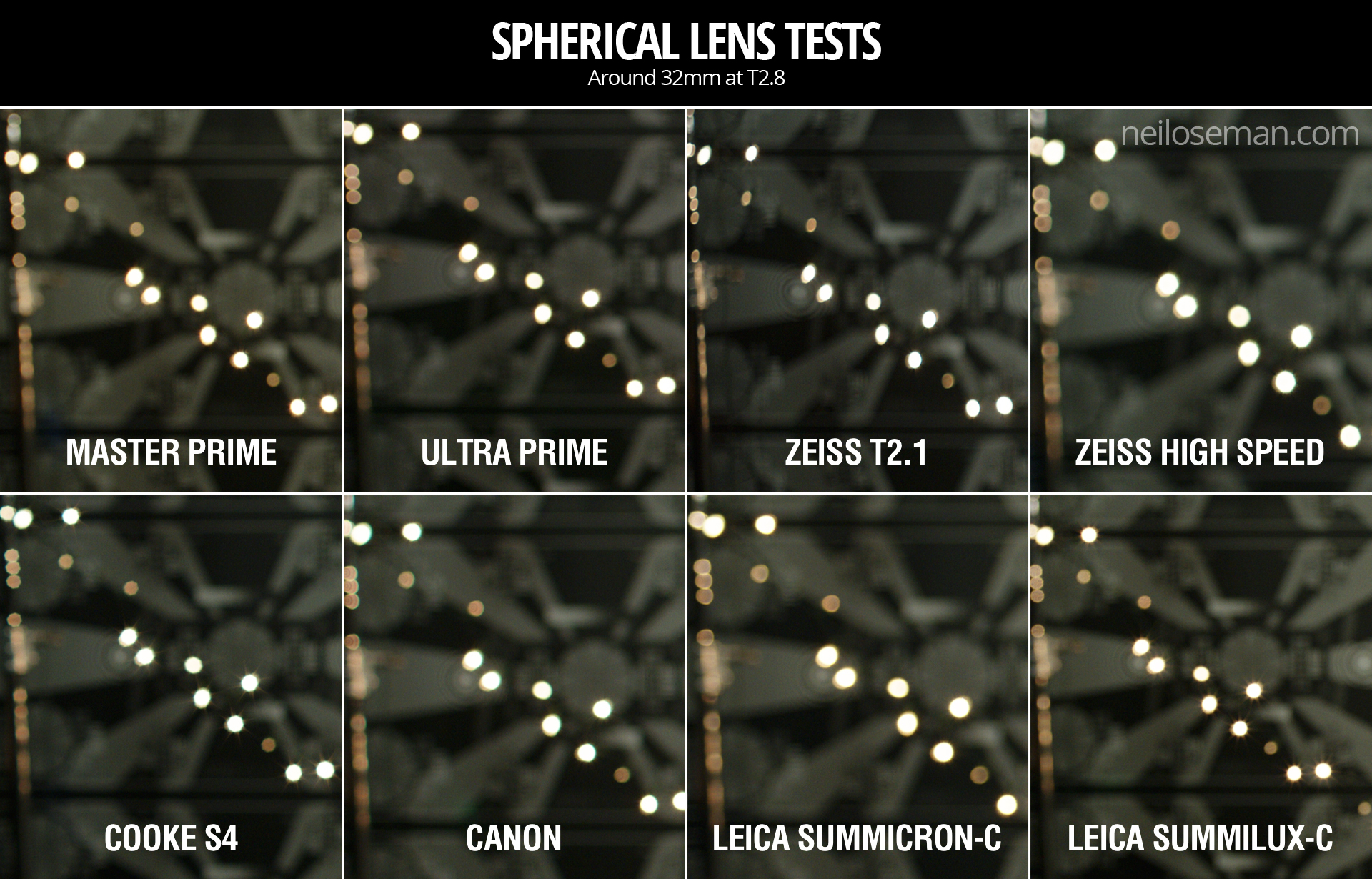

 Small points of light, when thrown out of focus, most clearly demonstrate the bokeh pattern of a lens. The shape of the bokeh is determined by the number of iris blades and the shape of those blades. Generally a circle is preferred, because it’s a natural shape, but for certain stories a more unusual shape might be appropriate. The shape of the iris changes with the T-stop, hence the T2.8 and wide open images above.
Immediately noticeable is the difference in the Cooke S4’s bokeh between wide open (circular) and T2.8 (octagonal). All of the other lenses have round bokeh at T2.8, apart from the Superspeed, which has heptagonal (seven-sided) bokeh.
It’s entirely subjective which bokeh you prefer. The only other thing I’ll point out is that the Canon’s bokeh wide open is very fuzzy, with noticeable colour aberration, though this may be due to the bright highlight rather than the defocusing.
Flare


Flare patterns also vary with aperture. The smaller the aperture, the more of a star effect you will get, as the light interacts with the corners in the iris blades. The Summilux shows this most clearly, with a pronounced star at T2.8 (two stops down from its maximum aperture) and almost none when wide open. The Cooke S4 also has a nice star pattern at T2.8. With the other lenses it’s much more subtle, and the Canon has almost none.
Conclusions
 The real revelations in these tests, for me, were the Leicas. The Summilux in particular is a beautiful lens, with rich, dynamic skin tones, nice bokeh, no breathing, plus the bonus of nice star flares. I will definitely be looking to work with this glass in the future, although given the price tag that may be optimistic!
The Summicron also performed incredibly well, matching the more expensive Summilux and Master Prime in every respect except speed. I can see this becoming my new go-to lens.
The Master Prime of course produced a beautiful, sharp, clean image, but it lacks character. It might work nicely for science fiction, a drama requiring a neutral look, or something where filtration was being used to give the image character.
The Canon impressed me too – no mean feat given that it’s the cheapest lens we tested. With nice skin tones and attractive flares, I could see this working well for a romantic movie.
The Zeiss T2.1 did not appeal to me, with poor sharpness and cold, washed-out skin tones, so I would avoid it.
The Superspeed is a decent lens, but in most cases I’d plump for an Ultra Prime instead. Ultra Primes are certainly easier to work with for the 1st AC, and have proven to be a good workhorse lens for drama. (I shot Above the Clouds on them.)
The Cooke S4 has been my go-to glass up to now, and while it will probably remain my first choice for period pieces, due to its gentle focus fall-off, I’m excited to try some of the other glass in this test on other productions.
I’ll say it one last time: this is all subjective. Our visual preferences are what make every director of photography unique.
Tune in next week when I’ll look at the anamorphic lenses: Hawk-V, Cooke Xtal and Kowa Mirrorscope.


 I won my first DVD player in a trailer competition on a sort of YouTube forerunner site in December 2000. Over the next decade I was entertained and educated by many extras-packed Digital Versatile Discs. Now, of course, physical media is a thing of the past, but many of the anecdotes I heard in DVD commentaries have stuck in my mind. Some have even helped me on set when facing a new situation.

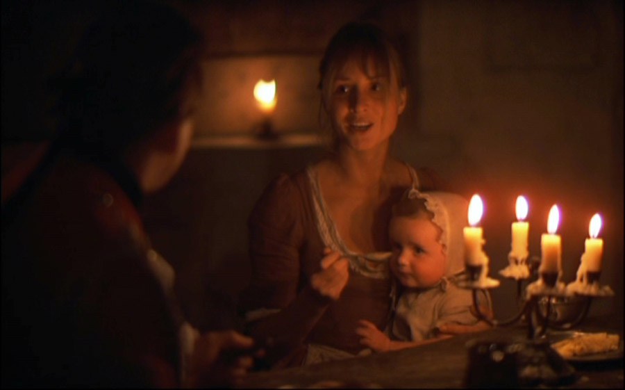
 Although the DVD menu lists it as a director’s commentary, Bryan Singer in fact pairs up with his DP Newton Thomas Sigel for this track. Sigel discusses the importance of building practicals into the sets to enhance realism and flexibility of shooting. He explains how he colour-coded certain scenes so that the audience would more readily understand where they were during the fast-paced action sequences; for example, the corridors of the Alkali Lake bunker were lit with a moss green.


 The departure of director David Fincher from Alien 3 – under a cloud of studio interference and re-edits – is an infamous part of movie lore. Less well known is that the director of photography changed a week into shooting, after original DP Jordan Cronenworth (of Blade Runner fame) fell ill. Alex Thompson stepped in, and his humble, soft-spoken observations are spliced with other crew and cast members to form the commentary track on the Alien Quadrilogy boxset version of this film. Throughout the track he explains how he created the cool, toppy look of the prison’s communal areas, the dark, shadowy environs of the basements, and the hot, hellish feel of the lead-works. There are some interesting remarks about practicals too, such as the deliberate use of mismatched, low-CRI fluorescent tubes to give the canteen a run-down look, and tips for creating convincing firelight flicker.

