A History of Black and White

The contact sheet from my first roll of Ilford Delta 3200

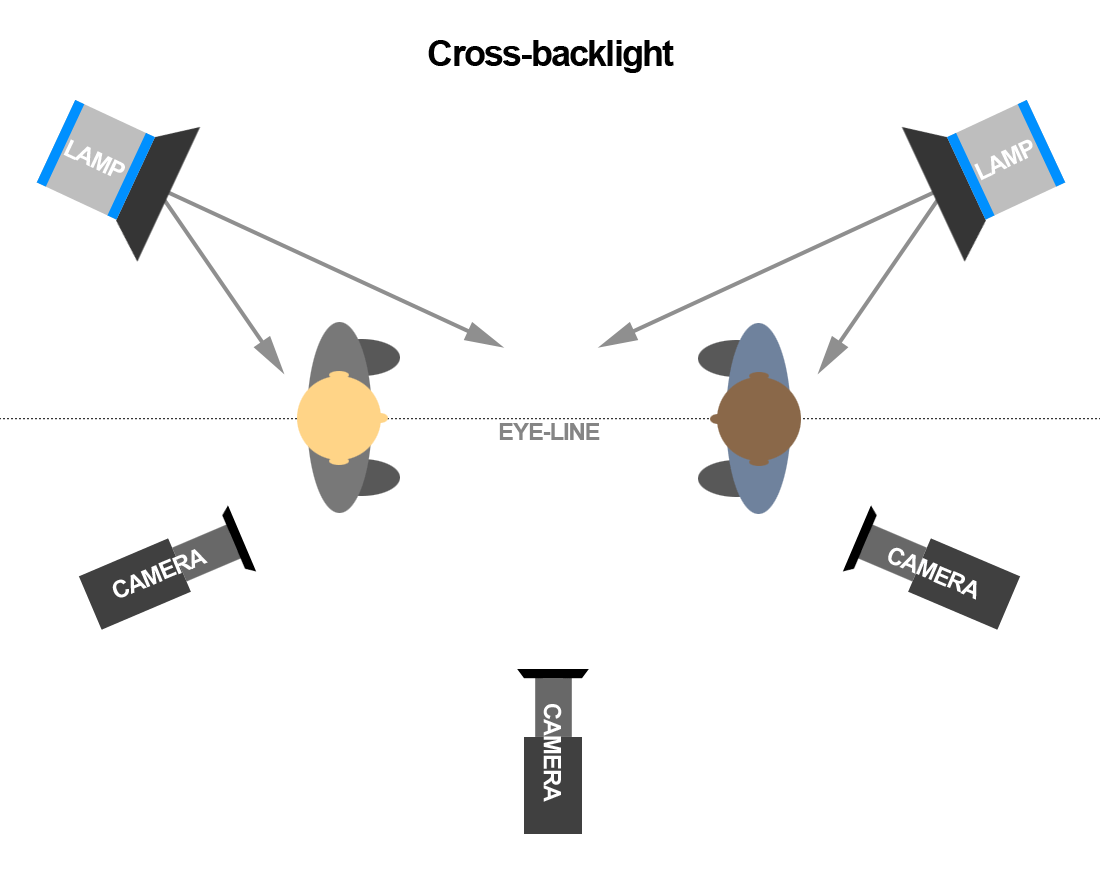
Having lately shot my first roll of black-and-white film in a decade, I thought now would be a good time to delve into the story of monochrome image-making and the various reasons artists have eschewed colour.

I found the recent National Gallery exhibition, Monochrome: Painting in Black and White, a great primer on the history of the unhued image. Beginning with examples from medieval religious art, the exhibition took in grisaille works of the Renaissance before demonstrating the battle between painting and early photography, and finishing with monochrome modern art.

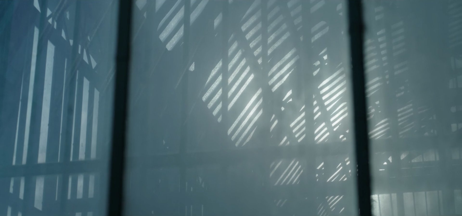
Several of the pictures on display were studies or sketches which were generated in preparation for colour paintings. Ignoring hue allowed the artists to focus on form and composition, and this is still one of black-and-white’s great strengths today: stripping away chroma to heighten other pictorial effects.

“Nativity” by Petrus Christus, c. 1455

What fascinated me most in the exhibition were the medieval religious paintings in the first room. Here, old testament scenes in black-and-white were painted around a larger, colour scene from the new testament; as in the modern TV trope, the flashbacks were in black-and-white. In other pictures, a colour scene was framed by a monochrome rendering of stonework – often incredibly realistic – designed to fool the viewer into thinking they were seeing a painting in an architectural nook.

During cinema’s long transition from black-and-white to colour, filmmakers also used the two modes to define different layers of reality. When colour processes were still in their infancy and very expensive, filmmakers selected particular scenes to pick out in rainbow hues, while the surrounding material remained in black-and-white like the borders of the medieval paintings. By 1939 the borders were shrinking, as The Wizard of Oz portrayed Kansas, the ordinary world, in black-and-white, while rendering Oz – the bulk of the running time – in colour.

Michael Powell, Emeric Pressburger and legendary Technicolor cinematographer Jack Cardiff, OBE, BSC subverted expectations with their 1946 fantasy-romance A Matter of Life and Death, set partly on Earth and partly in heaven. Says Cardiff in his autobiography:

Quite early on I had said casually to Michael Powell, “Of course heaven will be in colour, won’t it?” And Michael replied, “No. Heaven will be in black and white.” He could see I was startled, and grinned: “Because everyone will expect heaven to be in colour, I’m doing it in black-and-white.”

Ironically Cardiff had never shot in black-and-white before, and he ultimately captured the heavenly scenes on three-strip Technicolor, but didn’t have the colour fully developed, resulting in a pearlescent monochrome.

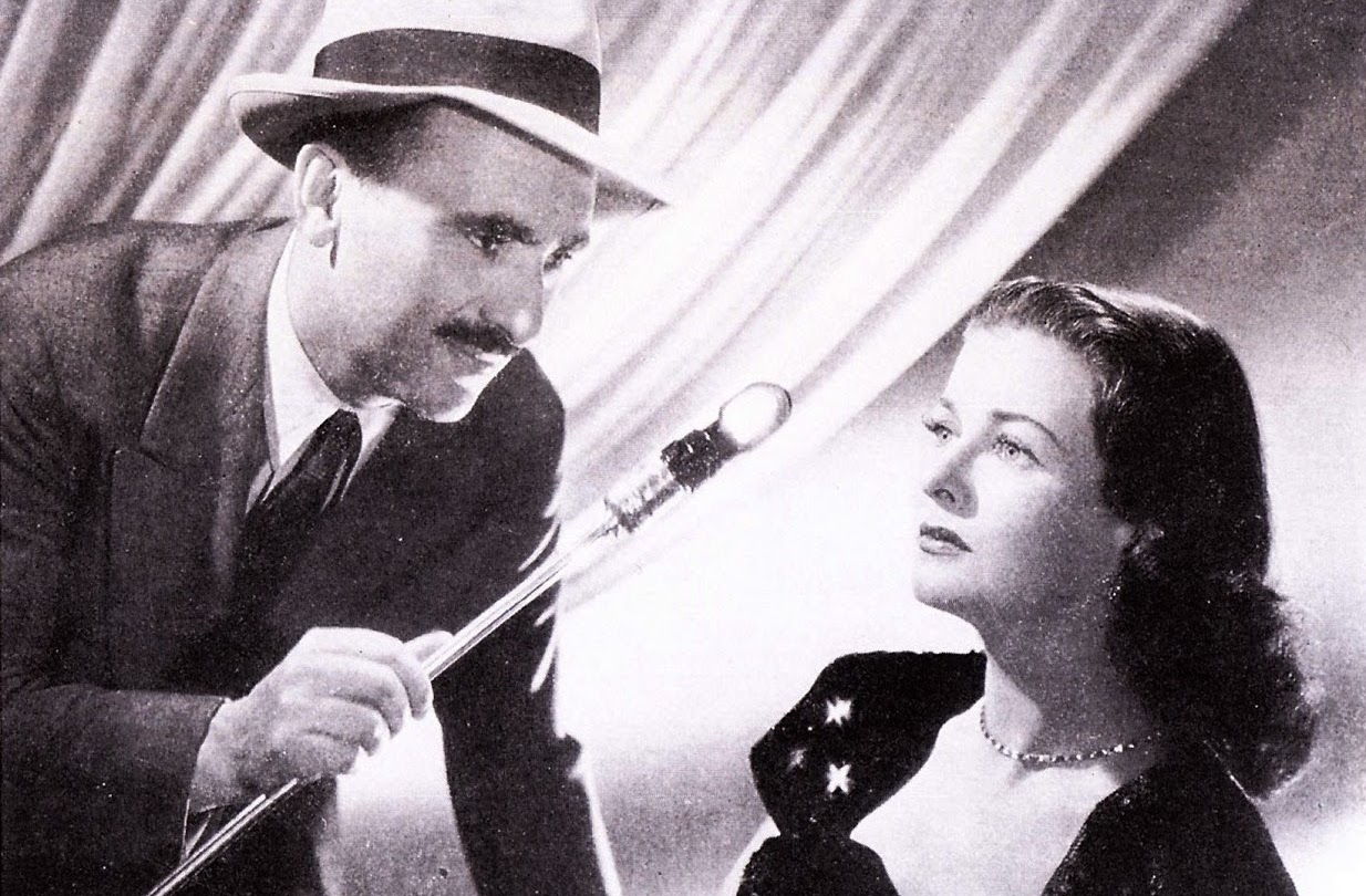
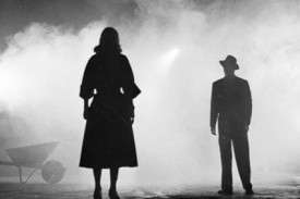
Meanwhile, DPs like John Alton, ASC were pushing greyscale cinematography to its apogee with a genre that would come to be known as film noir. Oppressed Jews like Alton fled the rising Nazism of Europe for the US, bringing German Expressionism with them. The result was a trend of hardboiled thrillers lit with oppressive contrast, harsh shadows, concealing silhouettes and dramatic angles, all of which were heightened by the lack of distracting colour.

A classic bit of Alton's noir lighting from The Big Combo
“The Big Combo” DP: John Alton, ASC

Alton himself had a paradoxical relationship with chroma, famously stating that “black and white are colours”. While he is best known today for his noir, his only Oscar win was for his work on the Technicolor musical An American in Paris, the designers of which hated Alton for the brightly-coloured light he tried to splash over their sets and costumes.

It wasn’t just Alton that was moving to colour. Soon the economics were clear: chromatic cinema was more marketable and no longer prohibitively expensive. The writing was on the wall for black-and-white movies, and by the end of the sixties they were all but gone.

I was brought up in a world of default colour, and the first time I can remember becoming aware of black-and-white was when Schindler’s List was released in 1993. I can clearly recall a friend’s mother refusing to see the film because she felt she wouldn’t be getting her money’s worth if there was no colour. She’s not alone in this view, and that’s why producers are never keen to green-light monochrome movies. Spielberg only got away with it because his name was proven box office gold.

“Schindler’s List” DP: Janusz Kamiński, ASC

A few years later, Jonathan Frakes and his DP Matthew F. Leonetti, ASC wanted to shoot the holodeck sequence of Star Trek: First Contact in black-and-white, but the studio deemed test footage “too experimental”. For the most part, the same attitude prevails today. Despite being marketed as a “visionary” director ever since Pan’s Labyrinth, Guillermo del Toro’s vision of The Shape of Water as a black-and-white film was rejected by financiers. He only got the multi-Oscar-winning fairytale off the ground by reluctantly agreeing to shoot in colour.

Yet there is reason to be hopeful about black-and-white remaining an option for filmmakers. In 2007 MGM denied Frank Darabont the chance to make The Mist in black-and-white, but they permitted a desaturated version on the DVD. Darabont had this to say:

No, it doesn’t look real. Film itself [is a] heightened recreation of reality. To me, black-and-white takes that one step further. It gives you a view of the world that doesn’t really exist in reality and the only place you can see that representation of the world is in a black-and-white movie.

“The Mist” DP: Rohn Schmidt

In 2016, a “black and chrome” version of Mad Max: Fury Road was released on DVD and Blu-Ray, with director George Miller saying:

The best version of “Road Warrior” [“Mad Max 2”]  was what we called a “slash dupe,” a cheap, black-and-white version of the movie for the composer. Something about it seemed more authentic and elemental. So I asked Eric Whipp, the [“Fury Road”] colourist, “Can I see some scenes in black-and-white with quite a bit of contrast?” They looked great. So I said to the guys at Warners, “Can we put a black-and-white version on the DVD?”

One of the James Mangold photos which inspired “Logan Noir”

The following year, Logan director James Mangold’s black-and-white on-set photos proved so popular with the public that he decided to create a monochrome version of the movie. “The western and noir vibes of the film seemed to shine in the form, and there was not a trace of the modern comic hero movie sheen,” he said. Most significantly, the studio approved a limited theatrical release for Logan Noir, presumably seeing the extra dollar-signs of a second release, rather than the reduced dollar-signs of a greyscale picture.

Perhaps the medium of black-and-white imaging has come full circle. During the Renaissance, greyscale images were preparatory sketches, stepping stones to finished products in colour. Today, the work-in-progress slash dupe of Road Warrior and James Mangold’s photographic studies of Logan were also stepping stones to colour products, while at the same time closing the loop by inspiring black-and-white products too.

With the era of budget- and technology-mandated monochrome outside the living memory of many viewers today, I think there is a new willingness to accept black-and-white as an artistic choice. The acclaimed sci-fi anthology series Black Mirror released an episode in greyscale this year, and where Netflix goes, others are bound to follow.

A History of Black and White

Roger Deakins’ Oscar-winning Cinematography of “Blade Runner 2049”

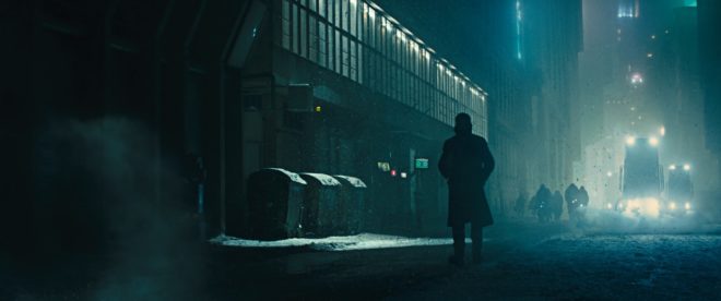
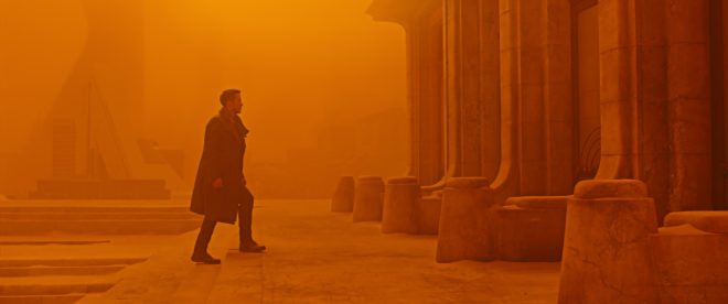
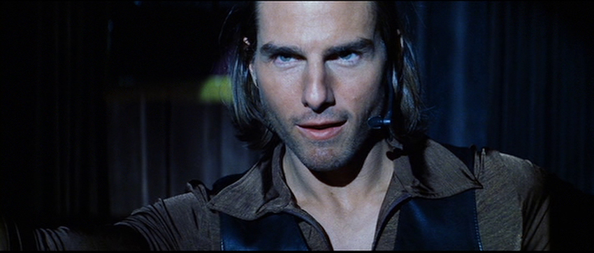
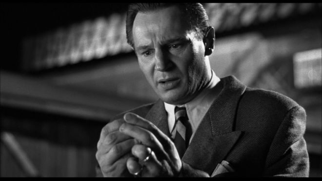
After fourteen nominations, celebrated cinematographer Roger Deakins, CBE, BSC, ASC finally won an Oscar last night, for his work on Denis Villeneuve’s Blade Runner 2049. Villeneuve’s sequel to Ridley Scott’s 1982 sci-fi noir is not a perfect film; its measured, thoughtful pace is not to everyone’s taste, and it has serious issues with women – all of the female characters being highly sexualised, callously slaughtered, or both – but the Best Cinematography Oscar was undoubtedly well deserved. Let’s take a look at the photographic style Deakins employed, and how it plays into the movie’s themes.

Blade Runner 2049 returns to the dystopian metropolis of Ridley Scott’s classic three decades later, introducing us to Ryan Gosling’s K. Like Harrison Ford’s Deckard before him, K is a titular Blade Runner, tasked with locating and “retiring” rogue replicants – artificial, bio-engineered people. He soon makes a discovery which could have huge implications both for himself and the already-strained relationship between humans and replicants. In his quest to uncover the truth, K must track down Deckard for some answers.

Villeneuve’s film meditates on deep questions of identity, creating a world in which you can never be sure who is or isn’t real – or even what truly constitutes being “real”. Deakins reinforces this existential uncertainty by reducing characters and locations to mere forms. Many scenes are shrouded in smog, mist, rain or snow, rendering humans and replicants alike as silhouettes.

K spends his first major scene seated in front of a window, the side-light bouncing off a nearby cabinet the only illumination on his face. Deakins’ greatest strength is his ability to adapt to whatever style each film requires, but if he has a recognisable signature it’s this courage to rely on a single source and let the rest of the frame go black.

Whereas Scott and his DP Jordan Cronenweth portrayed LA mainly at night, ablaze with pinpoints of light, Villeneuve and Deakins introduce it in daylight, but a daylight so dim and smog-ridden that it reveals even less than those night scenes from 1982.

All this is not to say that the film is frustratingly dark, or that audiences will struggle to make out what is going on. Shooting crisply on Arri Alexas with Arri/Zeiss Master Primes, Deakins is a master of ensuring that you see what you need to see.

A number of the film’s sequences are colour-coded, delineating them as separate worlds. The city is mainly fluorescent blues and greens, visually reinforcing the sickly state of society, with the police department – an attempt at justice in an insane world – a neutral white.

The Brutalist headquarters of Jared Leto’s blind entrepreneur Wallace are rendered in gold, as though the corporation attempted a friendly yellow but was corrupted by greed. These scenes also employ rippling reflections from pools of water. Whereas the watery light in the Tyrell HQ of Scott’s Blade Runner was a random last-minute idea by the director, concerned that his scene lacked enough interest and production value, here the light is clearly motivated by architectural water features. Yet it is used symbolically too, and very effectively so, as it underscores one of Blade Runner 2049’s most powerful scenes. At a point in the story where more than one character is calling their memories into question, the ripples playing across the walls are as intangible and illusory as those recollections. “I know what’s real,” Deckard asserts to Wallace, but both the photography and Ford’s performance bely his words.

The most striking use of colour is the sequence in which K first tracks Deckard down, hiding out in a Las Vegas that’s been abandoned since the detonation of a dirty bomb. Inspired by photos of the Australian dust storm of 2009, Deakins bathed this lengthy sequence in soft, orangey-red – almost Martian – light. This permeating warmth, contrasting with the cold artificial light of LA, underlines the personal nature of K’s journey and the theme of birth which is threaded throughout the film.

Deakins has stated in interviews that he made no attempt to emulate Cronenweth’s style of lighting, but nonetheless this sequel feels well-matched to the original in many respects. This has a lot to do with the traditional camerawork, with most scenes covered in beautifully composed static shots, and movement accomplished where necessary with track and dolly.

The visual effects, which bagged the film’s second Oscar, also drew on techniques of the past; the above featurette shows a Canon 1DC tracking through a miniature landscape at 2:29. “Denis and I wanted to do as much as possible in-camera,” Deakins told Variety, “and we insisted when we had the actors, at least, all the foreground and mid-ground would be in-camera.” Giant LED screens were used to get authentic interactive lighting from the advertising holograms on the city streets.

One way in which the lighting of the two Blade Runner movies is undeniably similar is the use of moving light sources to suggest an exciting world continuing off camera. (The infamous lens flares of J.J. Abrahms’ Star Trek served the same purpose, illustrating Blade Runner’s powerful influence on the science fiction genre.) But whereas, in the original film, the roving searchlights pierce the locations sporadically and intrusively, the dynamic lights of Blade Runner 2049 continually remodel the actors’ faces. One moment a character is in mysterious backlight, the next in sinister side-light, and the next in revealing front-light – inviting the audience to reassess who these characters are at every turn.

This obfuscation and transience of identity and motivation permeates the whole film, and is its core visual theme. The 1982 Blade Runner was a deliberate melding of sci-fi and film noir, but to me the sequel does not feel like noir at all. Here there is little hard illumination, no binary division of light and dark. Instead there is insidious soft light, caressing the edge of a face here, throwing a silhouette there, painting everyone on a continuous (and continuously shifting) spectrum between reality and artificiality.

Blade Runner 2049 is a much deeper and more subtle film than its predecessor, and Deakins’ cinematography beautifully reflects this.

Roger Deakins’ Oscar-winning Cinematography of “Blade Runner 2049”

5 Things I Learnt from Editing

I used to do a lot of editing work alongside DPing, and although those days are now behind me, their influence lives on. Every day that I work as a cinematographer, I use some of the knowledge I gained while slaving over a multi-coloured keyboard. Here are some of the most important things I learnt from editing.


1. Performance always wins.

The editor will always use the take with the best performance. What this means for the DP is that there is really no point requesting another take because of a missed focus pull, bumpy dolly move or dodgy pan, because inevitably the performance will not be as spontaneous and engaging as it was when you cocked up the camerawork, so the editor will use the first take.

Of course you need to make the director aware of any significant technical issues, and if they want to do another take, that’s absolutely their prerogative. But the editor will still use the first take. So get it right on the first take, even if that means pushing for another rehearsal.


2. Your darlings will die.

You know all your favourite shots? All the ones you’ve been mentally ear-marking for your showreel? The beautifully-lit wides, the fancy camera moves, that cool scene with the really interesting set? Yeah, half of those won’t make the final cut.

That wide shot is used for a single second before they cut into the meaty mid-shots. The camera move slowed the scene down too much so they chopped it up. That scene with the cool set looked great but didn’t advance the plot.

Two things to learn from this: 1. Do a great job, but don’t be a perfectionist, because you might be wasting everyone’s time on something that is destined for the cutting room floor. 2. If you want that shot for your showreel, grab it from the DIT, otherwise you might never see it again.


3. Bring ’em in, let ’em leave.

I can’t count the number of times, when shooting a close-up, I’ve advised the director to run the whole scene. They just wanted to pick up a few lines, but I convince them to let the talent walk in at the start and walk out at the end. That way the editor has much more flexibility on when to cut, a flexibility which I know that I appreciated when I was the one wrangling the timeline.

Any angle you shoot, push to cover the entire scene from it. In most cases it takes only slightly more time, and it’s easier for the actors because they get to do the whole emotional arc. And the editor will have many more options.


4. Spot the Missing Shot.

The ability to edit in your head is incredibly useful on set. If you can mentally assemble the coverage you’ve just shot, you can quickly identify anything that’s missing. Years of editing trained me to do this, and it’s saved annoying pick-ups several times. Officially this is the script supervisor’s job, but smaller productions may not always have someone in this capacity, and even when they do, another person keeping track can’t hurt.


5. Respect the slate.

On smaller productions, the clapperboard is often treated as an inconvenience. People sometimes chat over it, directors giving last-minute instructions, or actors finishing their showbiz anecdotes before getting into character, rendering the audio announcement unintelligible. On no- or micro-budget productions there might not be a 2nd AC, so the board gets passed to whoever’s handy at the time, who has no idea what the current slate or take number are, and the whole thing becomes a meaningless farce.

Which is fine for everyone except the poor bastard in the edit suite who’s got to figure out which audio clip goes with which video clip. It can add hours of extra work for them. I’ve been there, and it ain’t pretty. So, for the sanity of the (assistant) editor, please respect the slate.

5 Things I Learnt from Editing

If Camera was Sound and Sound was Camera

“Sound has the set,” calls the 1st AD, fishing a roll-up from her pocket and heading for the fire exit.

The production sound mixer strides into the middle of the set and strokes his Hipster beard thoughtfully.

“What are you thinking, boss?” asks the gaffer, scratching at the beer belly under his Yamaha t-shirt.

The mixer points to the skylight. “Let’s have some early morning ambience coming through here – the one with the distant traffic.” With a sweeping gesture he encompasses one side of the kitchen set. “I want it to explode off the floor and reverberate throughout this whole area.”

“Hundred watt woofer?” the gaffer suggests. The mixer nods, and a spark scuttles off to the truck for the required speaker.

“Is that practical?” the mixer wonders aloud. The gaffer follows his gaze to the kettle, nods, and flicks the switch. The mixer pulls a sound meter from the pocket of his leather jacket and holds it up to the boiling appliance. “6dB under.”

“We could hide a little tweeter behind it, bring the level up a bit,” the gaffer suggests. “I’ve got half a dozen different kettle effects on the truck.”

The mixer agrees, and proceeds to point out several other positions around the set, which is soon full of busy sparks running XLR cables, rigging speakers and shaping them with sound blankets. A cacophony grows as each one is fired up.

“Does this look about right?” asks the 1st AS, steadying the Sennheiser as the grips wheel its massive Technoboom to the previously agreed spot. She holds a pair of headphones out to the mixer.

He puts them on, and a reverent hush descends upon the set. He pans the mic left, then right, then up, then down, then left and right again. Finally he takes off the cans, clutching at his SQN baseball cap to stop it coming off too. “We need to go tighter,” he pronounces. He holds up his two hands, forming a circular aperture with his fingers, and cups them around his ear. His face a picture of concentration, he squats down and listens intently through the hole in his hands. He shuffles a little to the left. “This is it. We need to be right here on the 67.”

“Copy that,” the 1st AS replies. Her 2nd drags over a massive flight case and she begins unscrewing the ME66 from the power module.


“OK everyone, standby for a mic rehearsal.”

At last the camera operator – who had been somehow hiding in plain sight – puts down his coffee and heaves an Alexa onto his shoulder, checking the image as the cast go through the motions.

The director presses her headphones against her ears, frowning. She turns to the mixer. “I’m not getting enough sense of where they are,” she says. “Can we go wider?”

A few moments later the 1st AS is sighing as she unscrews the ME67 and remounts the ME66.

“It’s really quiet,” a producer complains, from his canvas chair in front of the amp at sound city. “Can we turn it up a bit?”

“We’ve got to have the mood,” the mixer insists. “What you can’t hear is more exciting than what you can.”

“I’m paying to hear it!” snaps the producer. “And why is there so much hiss? I can barely hear the dialogue over it.”

“It’s atmosphere!” the mixer protests, but he can see he’s not going to win this one. Reluctantly he signals a spark to turn down the white noise generator.


“Cut!” calls the director, smiling in satisfaction at the cast. She turns to the mixer. “How was that for you?”

“That sounded beautiful,” he replies ecstatically.

“OK, moving on,” says the AD, reaching for the clip-list.

“Hang on a minute.”

All eyes turn to the camera op.

“The caterer walked through the back of shot.”

“Did he?” asks the AD, looking around the crew for confirmation.

“I didn’t pick him up,” says the mixer.

The camera op stares at them in disbelief. “He sauntered right across the back of the set. He was there the whole take. It’s completely unusable.”

The AD sighs. “I guess we’d better go again.”

“Can we ask people not to walk through the frame? This lens will pick up literally anyone that walks in front of it.”

The director thinks about this. “Have you got a different lens you can use?”

“Can’t you put Go Pros on them?” asks the AD, gesturing to the cast.

“I’d rather not use Go Pros,” a new voice chimes in. Everyone turns with surprise to see the director of photography blinking in the light. She almost never moves from the shadowy corner where she sits with LiveGrade and a monitor which is rumoured to display mostly rugby matches.

“We can’t afford to lose any more takes because of camera,” says the AD. “What’s wrong with Go Pros anyway?”

“The image just isn’t as good. The dynamic range…”

But the AD cuts her short. “Well, it’s either that or AVR.”

“I just think if we took thirty seconds to find a new position for the Alexa…”

As the producer strides over to stick his oar in, the sound assistants exchange knowing looks: this could go on for a while. The pair lean on the Magliner and check their phones.

“Have you ever worked with a Nagra?” the 2nd AS asks, conversationally. “I still think they sound better than digital.”

If Camera was Sound and Sound was Camera

Front-light

A front-lit shot of mine from “The First Musketeer” (2015, dir. Harriet Sams)

Front-light is a bit of a dirty word in cinematography. DPs will commonly be heard rhapsodising about beautiful backlight or moody sidelight, but rarely does the humble front-light get any love. But there is no right or wrong in cinematography. Just because front-light is less popular, doesn’t mean it can’t make a great shot.

Why do we avoid front-light so often? Because it usually flattens things out, reducing or eliminating any sense of depth in the image, and giving no shape to faces or objects. Sometimes this might be the perfect look: for a character who is shallow, or who feels like their life is dull and uneventful, perhaps; a live-action scene to be intercut with two-dimensional animation; or a stylised flashback like the image above. And sometimes, of course, front-light is unavoidable for logical reasons – if a character is looking out of a window, say. The trouble is, it can make for un-engaging or un-cinematic images, and that’s when you may want to pull some other tricks out of the box.

Here are six ways to bring some interest back into a frontally-lit frame.


1. Cut the light.

A shot of mine from “Crossing Paths” (2015, dir. Ben Bloore)

If you can flag some of the front-light, reducing the area of the frame it’s hitting, and leave the rest to the fill light or to fall into shadow, you’ll get some contrast back into your image.


2. Use a gobo.

Another shot of mine, this one from “Lebensraum” way back in 2007.

If it doesn’t make sense to cut the light, try breaking it up with a gobo. You can make a gobo from almost anything. Commonly on night exteriors I send a spark off to liberate a branch from a nearby tree and rig that in front of the key-light. If I need to create a window-frame effect I’ve been known to clamp a chair or stool to a C-stand to get a suitable pattern of perpendicular lines.


3. Add dynamics.

Front-light is often more interesting if it’s not there all the time. If you can find an excuse to have it flicker or move somehow, you’ll get a lot more mood and shape in your shot. Firelight, TVs, rippling water, panning searchlights or the headlights of a passing car can all safely come from the front and remain dramatic. Create a moving gobo and you’ve got something really interesting. The tree branch example from earlier – if that blows around in the wind then it will add a lot of tension to the visuals. Here’s a firelight example from Ren: The Girl with the Mark

(Check out my Instagram feed for more lighting breakdowns like this.)


4. Darken the background.

“Magnolia” (DP: Robert Elswit, ASC)

You can combat the lack of depth by keeping the background dark, so that the front-lit subject stands out against it. This will happen automatically due to the Inverse-square Law (a post on that is coming soon) if the subject is close to the source, e.g. standing right by a window. Due to the nature of front-light, you probably can’t flag the background without flagging the subject too, so bringing your source closer to the subject or redressing the background may be your only options.


5. Make a virtue of the subject’s shadow.

“The Shadow of Death” by William Holman Hunt, 1873

One reason to avoid front-light is the distracting shadow which the subject will cast on the background. But sometimes this can be a great benefit to the shot, almost becoming another character, or adding subtext as in this painting.


6. Use a strong backlight.

A still of mine from “Stop/Eject”. The red backlight and the kicker from the practical help mitigate the flat front-light.

If there’s nothing you can do to modify the front-light, then pumping up the backlight might well save the day. The most flatly-illuminated shots suddenly become deep and appealing when the subject has a halo of over-exposed light. Indeed, this is what commonly happens with day exteriors: you shoot into the sun to get the nice backlight, and ambient light flatly fills in the faces.

So next time you’re faced with front-light, remember, it’s not the end of the world!

Front-light

#ShotOfTheWeek: 2017 Round-up

At the end of last summer I started a regular #ShotOfTheWeek on my Twitter feed. It’s very simple: each week I post a frame grab (or sometimes a GIF if I can find one) of a great shot from a film or series I’ve been watching. Sometimes these are new productions, just out, and sometimes they’re older pieces which I’m revisiting or viewing for the first time.

For those of you who aren’t among the Twitterati, here is a round-up of last year’s Shots of the Week. On the other hand, if you are a Twitterist, why not post your own inspirational frame grabs, using the hashtag #ShotOfTheWeek?


Powerful Close-ups

Cinema is arguably at its most potent  when showing us the tiny nuances of emotion that only a big close-up can provide.

“Anne with an E” DP: Bobby Shore

This example from the moving Netflix series Anne with an E makes the most of Anne’s freckled face and puts us right in her headspace… literally. Shots like this were captured with a 27mm Primo, as opposed to the vintage Panavision glass used for other coverage. For more on the cinematography of Anne with an E, check out the Varicam section in my report from Camerimage 2017.

“Black Narcissus” DP: Jack Cardiff

I love the shadows in this shot by legendary DP Jack Cardiff; they almost suggest a crucifix or prison bars. Either would be appropriate for this story of a nun sent to a remote Indian palace to establish a school and hospital. The low-angle eye-light adds to the unsettling feel.

“The Crown” DP: Stuart Howell

The key promotional art for The Crown is an edge-lit profile shot of the Queen, evoking the regal image on stamps and coins. Here DP Stuart Howell has paid homage to the artwork, channelling the same connotations of a figurehead carrying a country on her shoulders.

“American Gods” DP: Aaron Morton

What can I say? I’m a sucker for a good profile shot. The hellish colours here are perfect given what the erstwhile Lovejoy has just done. (I won’t give you any spoilers, but let’s just say it doesn’t involve cheeky antiques dealing.)


Symbolism

“The Handmaid’s Tale” DP: Colin Watkinson

This was the shot that inspired me to start #ShotOfTheWeek. The Handmaid’s Tale is set in a Christian fundamentalist society, so evoking classical religious paintings with the angel-wing-like headboard and the muted, brown colour scheme was a clever move.

“The Ipcress File” DP: Otto Heller

This classic spy thriller has a lot of unusual compositions with domineering foreground objects. Here the cross and circle shapes of the light-shade suggest the crosshairs of a gun, while the bulb tastefully obscures the actual bullet wound.

“Mr Robot” DP: Tod Campbell

This one is almost too on-the-nose to be called symbolism. Only a drama as quirky as Mr Robot could get away with this kind of (literal) signposting, but I love how bold it is. The rigid geometric lines and excessive headroom used throughout the series are also in evidence here, reflecting how we’re seeing everything from Elliot’s mentally ill point of view.


Negative Space

“Mission: Impossible – Rogue Nation” DP: Robert Elswit

A forgettable film, but a shot with much to admire. The dark back of the bench creates negative space in the composition, reducing the already-wide Scope frame to a ratio of about 4:1, echoing the short, wide shape of the House of Commons. On the lighting front, negative fill has been employed to render both that bench and the cast very dark, almost silhouettes, imparting a lot of depth to an otherwise flat image.

“Stranger Things” DP: Tim Ives

Again, negative space here creates a geometrical frame within a frame. What I particularly liked was the placement of the bulb above the sheriff’s head, rather than on the right of frame, which would have produced a more balanced but much less interesting shot.

“Better Call Saul” DP: Arthur Albert

Every time Better Call Saul returned to this location I scanned the background of each angle, trying to figure out what on earth could be motivating the bold slash of light on the right of this image. It remains a mystery! The show is full of uncompromisingly dark images with crisp, pure blacks, but perhaps none so overtly noirish as this one.


Intersecting Lines

“Metropolis” DPs: Karl Freund, Günther Rittau & Walter Ruttmann

All credit to Otto Hunte, the production designer on this 1920s sci-fi classic, as every line in this set leads us to the figure of Maria, fittingly for a character who has captured the imaginations of the dystopian underclass. The cinematographers have helped by framing her centrally and making her the brightest part of the image.

“Jardin d’hiver” DP: Darius Khondji

Jardin d’hiver was sponsored by CW Sonderoptic to promote their new large-format Leica Thalia glass (see my Camerimage post for more info). I have to admit that most of the film’s imagery did nothing for me, but this shot of bold, contrasty lines softened by the milkiness of the foreground window has a graphical quality I find very appealing.

“Little Miss Sunshine” DP: Tim Suhrstedt

This is a shot of two halves: the upper half busy, confused and oppressive, the lower half reassuringly simple with its one-point perspective. It was only after filming wrapped on Above the Clouds that I realised just how much this shot and others like it in Little Miss Sunshine had influenced my cinematography of Leon Chambers’ comedy road movie. (Check out the second still on the Above the Clouds page and you’ll see what I mean!)


Iconic Reveals

“The 39 Steps” (1935) DP: Bernard Knowles

Richard Hannay and the audience both discover the cause of Annabella’s distress simultaneously, in a reveal that’s shocking and also funny! The chiaroscuro of the lighting beautifully highlights the bright knife against the deep shadows of the background.

“Terminator 2: Judgment Day” DP: Adam Greenberg

These two gifs are both parts of the same shot, which cranes up from the shockingly unexpected crushing of the skull to reveal the endoskeleton puppet in mid-shot as a perfectly timed explosion goes off in the background. As well as being a remarkable technical achievement, the arts and sciences of cinematography, practical effects and animatronics all working in harmony, it’s a great piece of visual storytelling.


And finally…

“A Ghost Story” DP: Andrew Droz Palermo

A Ghost Story didn’t get a very wide release, and won’t be to everyone’s taste. A lyrical meditation on the nature of time, its slow pace becomes glacial during a grief-filled, ten-minute pie-eating scene containing only one cut. There is plenty of time to consider the composition, and I loved how casually the ghost is placed within the frame, with the top of his head even cut off. (I later discovered he was composited in, to reduce the chances of anything spoiling the ultra-long, ultra-emotional take.) The lines of the cupboards lead our eyes always back to Rooney Mara, the painterly splash of light on the wall (which I believe was natural) throwing her profile into relief. When she starts to cry, it takes a while to spot the tears, but somehow that makes it all the more powerful.

It’s interesting to note that no fewer than four aspect ratios are represented by all these Shots of the Week: from the traditional Academy ratio of 4:3, through the standard 16:9, to the Netflix-favoured 2:1 and of course 2.39:1 Cinemascope. It’s an exciting time to be working in cinematography, when we have so many choices open to us to create the most fitting images for any given story. Here’s to many more inspiring #ShotOfTheWeek images in 2018. Follow me on Twitter to see them first!

#ShotOfTheWeek: 2017 Round-up

A Cinematograper Prepares

One of the things which I believe separates a good director of photography from a bad one is preparation. On a big production you may have weeks of paid, full-time prep, but on a micro-budget movie you may be lucky to have a single meeting before the shoot. In the latter case you’ll have to use your initiative, put in the time for free, and use Skype a lot, but either way the quality of the prep can make or break the production.

Here are ten things a DP should do to set themselves up for success before the camera rolls. This is not intended to be an exhaustive list, rather it’s a run-down of the things which I have found to bear most fruit later on in the production.


1. Get inside the director’s head.

Some directors will come to you with a beautiful set of storyboards, concept art and reference images, but many won’t. Many will simply have an idea in their head of how they want it to look, and it’s your job to find out what that vision is. Often this will happen before full-time prep begins. It will consist of watching movies together, pouring over books of photos, sharing Pinterest boards or Dropboxes full of images, all the while discussing what they do and don’t like. The aim is to get such a clear idea of their vision that when you set up a shot you’ll deliver the mood they’re looking for first time.


2. Work with the art department.

Chatting over a set model helps identify potential lighting or lensing problems before construction begins.

The next person to get in sync with is the production designer. This is an incredibly important and symbiotic relationship; you have the power to completely destroy each others’ work, or to make each other look like geniuses! Two things you should talk about early on with the designer are the colour palette of the film (and any palettes specific to certain locations, plot threads or characters) and the aspect ratio: does the shape of the sets being designed fit the shape of the frame you’re planning to compose? Next you’ll want to discuss each set and the position of windows and practicals within it, to ensure that you’ll be able to get the lighting angles you need. For their part, the designer will want to quiz you on where the key camera positions will be, and the rough lens lengths you’ll be using, so they know where to put in the most detail and the important bits of dressing.


3. Get to know the needs of the other H.o.D.s.

Although the production designer is the most important head of department for a DP to work with, they are by no means the only one. The visual effects supervisor is increasingly a key collaborator; you should discuss the look you’re going for and how that will integrate with the VFX, and whether plates need to be shot at a higher resolution, in RAW, or any other technical requirements. You should familiarise yourself with the costume designs and discuss how those will integrate with the overall look. Similarly the make-up department will want to talk about about lens filtration, coloured lighting and anything else that may affect how their work looks. The line producer is a crucial person to get on the good side of. Sooner or later you’ll have to ask them for something expensive and unexpected, and they’re much more likely to say yes if you have tried to help them earlier on, by reducing your equipment list for example, or by hiring local camera assistants to save on accommodation costs.

Read my article on collaborating with other departments for more on this topic.


4. Check sun paths at locations.

Checking my compass at the stone circleWhen you start to scout the locations, you’ll want to pay careful attention to the direction of the sun. Which windows will it come through as it moves around over the course of the day? Are those trees or buildings likely to shadow that park bench where the characters will be sitting? With a bit of experience – and a compass, if it’s cloudy – you can estimate this, or use apps like Sun Tracker and Helios which are designed for exactly this purpose. For interiors, windows that never get direct sunlight are most convenient, allowing you to light them artificially, and thus constantly, without having to flag the real sun. For exteriors, shooting into the sun is generally most desirable, for the beauty of the backlight and the softness of the reflected fill. Of course, there will always be compromises with the other demands of the production.

See my article on sun paths for more on this.


5. Develop the shot list with the director.

Each director has a different process, but often they will draft a shot list on their own before passing it to you for feedback. There are many things for a DP to consider when going through this list. Do the shots reflect the style and visual grammar you both discussed earlier? (If not, has the director had a change of heart, or have they simply forgotten? Directors have a lot to think about!) Do the shots provide enough coverage for the editor? Are there too many shots to realistically accomplish on schedule? (Very often there are!) What grip equipment will the camera movements require? Are any special lenses or filters required, e.g. a macro lens for an extreme close-up of an eye?


6. Shoot tests.

Testing is a crucial part of the prep for both technical and creative reasons. Usually you will want to test a few different cameras and lens sets, to see which best serve the story. For example, a period film lit with a lot of genuine candlelight may work best on a sensitive camera like the Panasonic Varicam combined with soft fall-off lenses like Cooke S4s, while a sci-fi thriller might be suited to a Red or Alexa and a set of anamorphics for those classic flares. Until you’ve tested them and compared the images side by side though, you can’t be sure, and neither can the director and producers. Often costume and make-up tests will be requested, which may be combined with the camera tests to see how the different sensors render them, or maybe done separately once the camera kit is locked down. These tests are also a great opportunity for the DP to demonstrate for the director the type of lighting you plan to use to, and to make sure you really are on the same page. Ideally a DIT (digital imaging technician) will be available to grade the test footage, developing LUTs (look-up tables) if required, and providing proof of concept for the finished look of the movie.

Check out my tests of Alexa ISO settings, spherical lenses and anamorphic lenses.


7. Discuss the schedule.

Once the 1st AD has drafted the shooting schedule, they will show it to the DP for feedback. When determining how much can be done in a day, the 1st AD is thinking of the script page count, and they may not have seen a shot list at this point. Along with the director, the DP must bring any concerns they have about the schedule to the 1st AD in prep, or forever hold your peace! Is there enough time to get those tricky camera moves you’ve planned? Has the re-light time for the reverse been factored in? Have things been arranged in a logical order for lighting, or will things have to be torn down and put back up again later? Does the schedule permit things to be shot at the best time of day for light? Are the night scenes actually scheduled at night or will the windows have to be blacked out? Are there critical close-ups towards the end of the schedule, when the cast will be tired and no longer look their best?

For more detail on this, check out my article about things to look for in a schedule.


8. Get to know the faces of your cast.

Legendary DP John Alton, ASC tests lighting angles with Joan Bennett

However good-looking the talent may be, they will always look better under certain types of lighting than others. Often you will figure out what suits each actor after a week or so of shooting, but ideally you want to find out before principal photography begins. You can do this during testing, if the cast are available and you have enough time – trying out different key angles, fill levels, backlight and lenses to see what works best for their individual faces. Apart from anything else, this is a great way to establish trust with the cast right from the start, assuring them that they are in safe hands. If testing isn’t possible, watch some of their previous work, looking carefully at how they have been photographed.


9. Mark up your script.

There’s no point in having lots of great ideas in preproduction if you forget them when you’re on set. Everyone has a different system, but you may wish to mark up your script and/or shot list. This could include using coloured highlighters to differentiate day and night scenes at a glance, underlining any references to mood or camera angles in the stage directions, or indicating beats in the development of the story or characters which need to be reflected in how things are lit or shot.


10. Plan your lighting.

Shop lighting planEveryone likes to get rolling as soon as possible after call time, and a big factor in achieving this is how quickly you can light. Ideally you will have planned the broad strokes of the lighting in preproduction, and communicated that plan to the gaffer. Budget permitting, the lighting crew can even pre-rig the set so that only tweaking is required when the whole unit arrives. In this case you’ll need to have been very clear and specific about what you want set up and where, drawing diagrams or approving those which the gaffer has drawn up. Often you’ll need to know the rough blocking of the scene before you can plan the lighting, so you should make sure the director indicates their intentions for this during scouts.


Every film is different, but follow the steps above and you’ll be well on your way to an efficient and productive shoot in 2018. Happy new year!

A Cinematograper Prepares

Introduction to Short Key Lighting

“The Lord of the Rings: The Fellowship of the Ring” – DP: Andrew Lesnie, ACS, ASC

If you’re starting out in your cinematography career, or maybe stepping up from camera operation,  lighting can be daunting. How do you know where to put your lights? If you’re working to the Three Point Lighting system, the backlight is self-explanatory, and the fill will often be ambient and directionless, but you may still be left wondering where to put your main light source, your key.

Fortunately there is a very simple rule of thumb, known as short key. In simple terms, a short key light is one which is on the opposite side of the subject’s eye-line to the camera. Let’s delve into what this means and why it’s so common. In fact, once you understand what a short key is you’ll be forever spotting examples of it in film and TV – you’ll be staggered at how often it’s used.

It’s easiest to think of short key from the perspective of the actor. The camera is in front of us and off to one side, because very rarely do actors look down the lens, and the key light is in front of us and off to the other side. It’s called short key because the side of our face that it hits is the side away from camera. The opposite of short key is broad key, where the light is on the same side of us as the camera, thus lighting the “broad” side of our face, the side presented to camera. Note that the light can be either side of the camera, it’s which side of our eye-line it’s on that’s important.

“Arrival” – DP: Bradford Young, ASC

Short key follows the general cinematography principle that light is more interesting when it comes in from the side and behind, rather than from close to camera. It’s preferred by most DPs in most situations because it produces more dimensionality and contrast than broad key. By hitting the side of the face away from camera, a short key leaves shadow on the closer side, creating mood and interest. It brings out the shape of the nose and cheeks. It leaves the ear and side of the head darker, concentrating attention on the face and consequently the performance.

Under the umbrella of short key we can still vary the angle tremendously to affect the mood. If we place the key severely to the side, so none of its illumination reaches the camera side of the actor’s face, and use a very low level of fill, we create a strong, uncompromising look.

“Logan” – DP: John Mathieson, BSC
“Fight Club” – DP: Jeff Cronenweth, ASC

If we place the key closer to front-on, and soften it with diffusion so that it wraps around the camera side of the face, we create a more comfortable, flattering look.

“Skyfall” – DP: Roger Deakins, ASC, BSC, CBE
“The Pianist” – DP: Pawel Edelman, PSC

We can also raise the lamp to shade the eye sockets, Godfather style, lower it to create a campfire ghost story look, or place it anywhere in between.

Broad key is less desirable amongst cinematographers, often resorted to only when short key cannot be reconciled with motivating the sources authentically. However, that doesn’t mean that it’s bad or that it can’t be used deliberately and creatively. Here’s just one example of broad key being used extremely effectively.

An example of broad key from “Amélie” – DP: Bruno Delbonnel, AFC, ASC

Short key though is the dominant, ubiquitous style of lighting. It is often the first thing a DP considers when walking onto the set: where can I put the key light in order to hit the short side of the talent? Or conversely, where can I put the camera so that it’s on the opposite side to the light?

If we’re dealing with fixed light sources like windows, or shooting outdoors – we’ll exploit the sun-path or even request that the blocking be altered to ensure a short key.  It can go such a long way to making an image cinematic.

“La La Land” – DP: Linus Sandgren, FSF
“Titanic” – DP: Russell Carpenter, ASC

In standard dialogue scenes with two characters facing each other, a technique called cross-backlighting is commonly used to short key both characters and provide backlight too. Check out my post on cross-backlighting for more info.

So next time you watch TV or a movie, look out for short key lighting; I guarantee you’ll see it everywhere.

The frame grabs in this post are from The Cinematographer Index. Check out this very useful resource showcasing great cinematography, and donate a few quid if you can.

Introduction to Short Key Lighting

Camerimage 2017: Wednesday

This is the third and final part of my report from my time at Camerimage, the Polish film festival focused on cinematography. Read part one here and part two here.


Up.Grade: Human Vision & Colour Pipelines

I thought I would be one of the few people who would be bothered to get up and into town for this technical 10:15am seminar. But to the surprise of both myself and the organisers, the auditorium of the MCK Orzeł was once again packed – though I’d learnt to arrive in plenty of time to grab a ticket.

Up.grade is an international colour grading training programme. Their seminar was divided into two distinct halves: the first was a fascinating explanation of how human beings perceive colour, by Professor Andrew Stockman; the second was a basic overview of colour pipelines.

Prof. Stockman’s presentation – similar to his TED video above – had a lot of interesting nuggets about the way we see. Here are a few:

  • Our eyes record very little colour information compared with luminance info. You can blur the chrominance channel of an image considerably without seeing much difference; not so with the luminance channel.
  • Light hitting a rod or cone (sensor cells in our retinae) straightens the twist in the carbon double bond of a molecule. It’s a binary (on/off) response and it’s the same response for any frequency of light. It’s just that red, green and blue cones have different probabilities of absorbing different frequencies.
  • There are no blue cones in the centre of the fovea (the part of the retina responsible for detailed vision) because blue wavelengths would be out of focus due to the terrible chromatic aberration of our eyes’ lenses.
  • Data from the rods and cones is compressed in the retina to fit the bandwidth which the optical nerve can handle.
  • Metamers are colours that look the same but are created differently. For example, light with a wavelength of 575nm is perceived as yellow, but a mixture of 670nm (red) and 540nm (green) is also perceived as yellow, because the red and green cones are triggered in the same way in both scenarios. (Isn’t that weird? It’s like being unable to hear the difference between the note D and a combination of the notes C and E. It just goes to show how unreliable our senses really are.)
  • Our perception of colour changes according to its surroundings and the apparent colour of the lighting – a phenomenon perfectly demonstrated by the infamous white-gold/blue-black dress.

All in all, very interesting and well worth getting out of bed for!

At the end of the seminar I caught up with fellow DP Laura Howie, and her friend Ben, over coffee and cake. Then I sauntered leisurely to the Opera Nova and navigated the labyrinthine route to the first-floor lecture theatre, where I registered for the imminent Arri seminar.


Arri Seminar: International Support Programme

After picking up my complementary Arri torch, which was inexplicably disguised as a pen, I bumped into Chris Bouchard. Neither of us held high hopes that the Support Programme would be relevant to us, but we thought it was worth getting the lowdown just in case.

Shooting “Kolkata”

The Arri International Support Programme (ISP) is a worldwide scheme to provide emerging filmmakers with sponsored camera/lighting/grip equipment, postproduction services, and in some cases co-production or sales deals as well. Mandy Rahn, the programme’s leader, explained that it supports young people (though there is no strict age limit) making their first, second or third feature in the $500,000-$5,000,000 budget range. They support both drama and documentary, but not short-form projects, which ruled out any hopes I might have had that it could be useful for Ren: The Girl with the Mark.

Having noted these keys details, Chris and I decided to duck out and head elsewhere. While Chris checked out some cameras on the Canon stand, I had a little chat with the reps from American Cinematographer about some possible coverage of The Little Mermaid. We then popped over to the MCK and caught part of a Canon seminar, including a screening of the short documentary Kolkata. Shortly we were treading the familiar path back to the Opera Nova and the first-floor lecture theatre for a Kodak-sponsored session with Ed Lachman, ASC, only to find it had been cancelled for reasons unknown.


Red Seminar: High resolution Image Processing Pipeline

Next on our radar was a Red panel. I wasn’t entirely sure if I could handle another high resolution seminar, but I suggested we return once more to the MCK anyway and relax in the bar with one eye on the live video feed. Unfortunately we got there to find that the monitors had disappeared, so we had to go into the auditorium, where it was standing room only.

“GLOW” – DP: Christian Sprenger

Light Iron colourist Ian Vertovec was talking about his experience grading the Netflix series GLOW, a highly enjoyable comedy-drama set behind the scenes of an eighties female wrestling show. Netflix wanted the series delivered in high dynamic range (HDR) and wide colour gamut (WCG), of a spec so high that no screens are yet capable of displaying it. In fact Vertovec graded in P3 (the colour space used for cinema projection) which was then mapped to Netflix’s higher specs for delivery. The Rec.709 (standard gamut) version was automatically created from the P3 grade by Dolby Vision software which analysed the episodes frame by frame. Netflix streams a 4,000 NIT signal to all viewers, which is then down-converted live (using XML data also generated by the Dolby Vision software) to 100, 650 or 1,000 NITs depending on their display. In theory this should provide a consistent image across all screens.

Vertovec demonstrated his image pipeline for GLOW: multi-layer base grade, halation pass, custom film LUT, blur/sharp pass, grain pass. The aim was to get the look of telecined film. The halation pass involved making a copy of the image, keying out all but the highlights, blurring those highlights and layering them back on top of the original footage. I used to do a similar thing to soften Mini-DV footage back in the day!

An interesting point was made about practicals in HDR. If you have an actor in front of or close to a practical lamp in frame, it’s a delicate balancing act to get them bright enough to look real, yet not so bright that it hurts your eyes to look at the actor with a dazzling lamp next to them. When practicals are further away from your cast they can be brighter because your eye will naturally track around them as in real life.

Next up was Dan Duran from Red, who explained a new LUT that is being rolled out across their cameras. Most of this went in one ear and out the other!


“Breaking Bad”

Afterwards, Chris and I returned to Kung Fusion for another delicious dinner. The final event of the day which I wanted to catch was Breaking Bad‘s pilot episode, screening at Bydgoszcz’s Vue multiplex as part of the festival’s John Toll retrospective. Having binged the entire series relatively recently, I loved seeing the very first episode again – especially on the big screen – with the fore-knowledge of where the characters would end up.

Later Chris introduced me to DP Sebastian Cort, and the three of us decided to try our luck at getting into the Panavision party. We snuck around the back of the venue and into one of the peripheral buildings, only to be immediately collared by a bouncer and sent packing!

This ignoble failure marked the end of my Camerimage experience, more or less. After another drink or two at Cheat we called it a night, and I was on an early flight back to Stansted the next morning. I met some interesting people and learnt a lot from the seminars. There were some complaints that the festival was over-subscribed, and indeed – as I have described – you had to be quick off the mark to get into certain events, but that was pretty much what I had been expecting. I certainly won’t put be off attending again in the future.

To learn more about two of the key issues raised at this year’s Camerimage, check out my Red Shark articles:

Camerimage 2017: Wednesday

Camerimage 2017: Tuesday

This is the second part of my report from my time at Camerimage, the Polish film festival focused on cinematography. Read part one here.


Panavision: The BEauty of 8K Large Format

Bydgoszcz’s town square

It was a chilly but bright morning as I strolled into Bydgoszcz and made straight for the MCK Orzeł, where I planned to spend most of the day. With only a few minutes to go until the scheduled start time, the queue for Panavision’s large format seminar had spilt out onto the street. The tickets ran out before I reached the desk, but there was a live video feed in the cinema’s bar. In many ways this was better than going into the auditorium – sitting in a comfy chair with the bar close at hand, and a table to make notes on.

My article for Red Shark News about the future of large format cinematography has been surprisingly popular, and it contains plenty of detail about this Panavision seminar, so I won’t repeated myself here. I will say that it converted me from a high resolution sceptic to a believer, because the speakers demonstrated that footage acquired in high rez – even when downscaled – retain much of its smoothness, high bit depth and dynamic range. “More resolution evokes the imagination of the brain,” was how colourist Ian Vertovec summed it up.

At the end of the session, Red Shark’s David Shapton and Matt Gregory emerged from the auditorium and joined me for lunch at the bar. We had all found the seminar very interesting, and Matt was quick to get us all tickets to the Panasonic 4K seminar coming up later in the day. The pair then went off to other things, while I headed to the kiosk to get a ticket for the imminent John Toll seminar. But of course I’d left it too late, they were all gone, and so I returned to my comfy chair in the bar to watch via video feed again.


Panavision workshops: A conversation with John Toll, ASC

John Toll, ASC

John Toll, ASC was the recipient of this year’s Lifetime Achievement Award at Camerimage, and this seminar was an epic journey through this career. He explained how he learnt his craft as a camera operator for the late great Conrad Hall, ASC and Jordan Cronenweth, ASC.

The talk then focused on some of Toll’s biggest movies, beginning with the period drama Legends of the Fall starring Brad Pitt and Anthony Hopkins. The movie was largely daylight exterior (something that was to become a theme across Toll’s work) so the cinematographer insisted on twelve weeks of prep, the same as the production designer. This allowed him to be part of selecting locations and choosing orientations for the buildings to get the optimal sun path. Toll said he was lucky that the 1st AD was willing to be flexible with the schedule, observing the mood of the weather each day and shooting scenes that matched that mood.

Gaffer Jim Plannette joined Toll on the stage to discuss the huge night exterior battle sequence. This employed three Musco lights (a Musco being fifteen 6K pars on a 100ft boom arm) which three-quarter-backlit every angle. To get crisp, grain-free blacks, Toll overexposed and printed down.

Braveheart was covered next, with 1st AC Graham Hall joining the panel. Hall had a difficult time with the film’s battle scenes, featuring as they did so much movement, improv and slo-mo. Toll revealed how the immersive style of the action was based on a sixties TV documentary about Culloden that coincidentally both he and director Mel Gibson had seen. A lot of colour timing was required to give consistency to the battles, which were shot over weeks, at all times of day.

The discussion then turned to Terrence Malick’s The Thin Red Line. The Australian locations featured very difficult, uneven terrain, so Toll used an Akela Crane. The crane’s arm was so long (75ft) that the arc of its movement couldn’t be detected on camera. Its use had to be carefully planned though, because each time it needed to be moved it had to be disassembled and reassembled on a special platform. 80% of the film was actually handheld, and Toll operated himself so as to respond to the spontaneity and improv which Malick encourage from his cast.

The Akela Crane in use on “The Thin Red Line”

Toll told a funny story about a shot of shadows moving across long grass which was praised by critics. It was inserted to cover a continuity error, the build-up to the battle having been shot in heavy cloud, while the battle itself was shot in full sun. A happy accident!

Time was running short, so the moderator powered through Almost Famous (where parallels were drawn between the explosive battle scenes of Toll’s earlier movies and the crowd scenes at the rock concerts, punctuated by flashing cameras), Vanilla Sky and Billy Lynn’s Long Halftime Walk. This latter film, directed by Ang Lee, is notable for its acquisition in 120fps 4K stereo. You can read more about it on the British Cinematographer website.


Panasonic Seminar: Varicam Experience

A Panasonic Varicam LT with Fujinon zoom rigged for action on “Arrested Development”

I remained at the MCK and, meeting up with Dave and Matt again, finally got into the auditorium, for the Panasonic seminar. Moderated by British Cinematographer‘s Ronnie Prince, the panel brought together a trio of DPs who shoot Netflix shows on the Varicam: Bobby Shore, CSC (Anne with an E), Pepe Avila del Pino (Ozark) and Patrick Alexander Stewart (Arrested Development).

Both Shore and del Pino admitted that they were most comfortable with the Arri Alexa, but due to Netflix’s strict rules on 4K acquisition (the Alexa tops out at 3.2K) they had to find another camera. They plumped for the Panasonic Varicam, a 4K camera best known for having dual native ISOs: 800, in common with the Alexa, Red and many others, and 5000, two and two-thirds stops faster. Being native, both ISOs have the same dynamic range, the same log curve and in theory are equally clean.

Panasonic, I think, were keen to push ISO 5000 in this seminar, but unfortunately Shore and del Pino shot almost exclusively at 800. Stewart did shoot Arrested Development at 5000, interiors and night scenes at least, but down-rated it to 2500. Otherwise, he said, the sets would have been too dark for the actors to feel like they were in a believable daytime environment. I think that’s a fascinating, unexpected side effect of low light sensitivity! Stewart lit the stages with large Quasar softboxes and paired the Varicam with Fujinon zooms and occasional Xeen primes.

Del Pino chose Zeiss Super Speeds for night scenes and Hawk V anamorphics for day scenes on Ozark. He liked the claustrophobia of cropping the anamorphic images to 2:1, the show’s delivery ratio, while the Super Speeds produced a creaminess he found appealing. He also mentioned that the Varicam’s sensor handled greens very well, which was important for him, given how much of Ozark takes places in woods.

Anne with an E was lensed on vintage Panavision Standard and Super Speeds – “the oldest, craziest lenses we could find,” says Bobby Shore. He liked their low resolving power, their weird flares and how they fell apart when wide open. Part of the show’s signature look are ECUs of the freckled title character, which were captured on a 27mm Primo for a more detailed, tactile image.

Inspired by the work of Robbie Ryan, BSC (Wuthering Heights), Shore kept the lighting naturalistic, mixing tungsten and HMI sources on a set that was treated like a location. He also shot through a Panaflasher, a special lens filter with built-in lighting which reduces contrast and adds a colour tint of your choice, but this effect was dialled out in post. Indeed, Shore raised the issue of DPs’ images being altered after the fact, an issue I explore fully in another Red Shark article.

By the way, I’ve been watching Anne with an E since the festival and I can thoroughly recommend it.

When the seminar was over, I went for dinner with Dave, Matt and Chris Bouchard, at a very nice (but once again cheap) Asian fusion restaurant. Then we met up for drinks with some of the reps from Red, and I got talking to a DP who had shot squid from a submarine for an episode of Blue Planet. After another drink or two with Chris at the Cheat bar, I called it a night.

Tune in next week for the final part of my Camerimage blog.

Camerimage 2017: Tuesday