How is Dynamic Range Measured?

The high dynamic range of the ARRI Alexa Mini allowed me to retain all the sky detail in this shot from “Above the Clouds”.

Recently I’ve been pondering which camera to shoot an upcoming project on, so I consulted the ASC’s comparison chart. Amongst the many specs compared is dynamic range, and I noticed that the ARRI Alexa’s was given as 14+ stops, while the Blackmagic URSA’s is 15. Having used both cameras a fair bit, I can tell you that there’s no way in Hell that the Ursa has a higher dynamic range than the Alexa. So what’s going on here?


What is dynamic range?

To put it simply, dynamic range is the level of contrast that an imaging system can handle. To quote Alan Roberts, who we’ll come back to later:

This is normally calculated as the ratio of the exposure which just causes white clipping to the exposure level below which no details can be seen.

A photosite on a digital camera’s sensor outputs a voltage proportional to the amount of light hitting it, but at some point the voltage reaches a maximum, and no matter how much more light you add, it won’t change. At the other end of the scale, a photosite may receive so little light that it outputs no voltage, or at least nothing that’s discernible from the inherent electronic noise in the system. These upper and lower limits of brightness may be narrowed by image processing within the camera, with RAW recording usually retaining the full dynamic range, while linear Rec. 709 severely curtails it.

In photography and cinematography, we measure dynamic range in stops – doublings and halvings of light which I explain fully in this article. One stop is a ratio of 2:1, five stops are 32:1, thirteen stops are almost 10,000:1

It’s worth pausing here to point out the difference between dynamic range and latitude, a term which is sometimes regarded as synonymous, but it’s not. The latitude is a measure of how much the camera can be over- or under-exposed without losing any detail, and is dependent on both the dynamic range of the camera and the dynamic range of the scene. (A low-contrast scene will allow more latitude for incorrect exposure than a high-contrast scene.)


Problems of Measurement

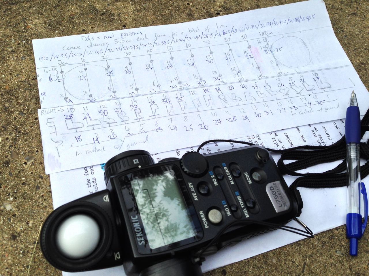
Before digital cinema cameras were developed, video had a dynamic range of about seven stops. You could measure this relatively easily by shooting a greyscale chart and observing the waveform of the recorded image to see where the highlights levelled off and the shadows disappeared into the noise floor. With today’s dynamic ranges into double digits, simple charts are no longer practical, because you can’t manufacture white enough paper or black enough ink.

For his excellent video on dynamic range, Filmmaker IQ’s John Hess built a device fitted with a row of 1W LEDs, using layers of neutral density gel to make each one a stop darker than its neighbour. For the purposes of his demonstration, this works fine, but as Phil Rhodes points out on RedShark News, you start running into the issue of the dynamic range of the lens.

It may seem strange to think that a lens has dynamic range, and in the past when I’ve heard other DPs talk about certain glass being more or less contrasty, I admit that I haven’t thought much about what that means. What it means is flare, and not the good anamorphic streak kind, but the general veiling whereby a strong light shining into the lens will raise the overall brightness of the image as it bounces around the different elements. This lifts the shadows, producing a certain amount of milkiness. Even with high contrast lenses, ones which are less prone to veiling, the brightest light on your test device will cause some glare over the darkest one, when measuring the kind of dynamic range today’s cameras enjoy.


Manufacturer Measurements

Going back to my original query about the Alexa versus the URSA, let’s see exactly what the manufacturers say. ARRI specifically states that its sensor’s dynamic range is over 14 stops “as measured with the ARRI Dynamic Range Test Chart”. So what is this chart and how does it work? The official sales blurb runs thusly:

The ARRI DRTC-1 is a special test chart and analysis software for measurement of dynamic range and sensitivity of digital cameras. Through a unique stray light reduction concept this system is able to accurately measure up to 15.5 stops of dynamic range.

The “stray light reduction” is presumably to reduce the veiling mentioned earlier and provide more accurate results. This could be as simple as covering or turning off the brighter lights when measuring the dimmer ones.

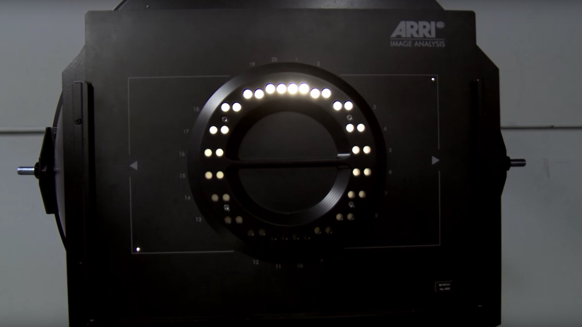
I found a bit more information about the test chart in a 2011 camera shoot-out video, from that momentous time when digital was supplanting film as the cinematic acquisition format of choice. Rather than John Hess’s ND gel technique, the DRTC-1 opts for something else to regulate its light output, as ARRI’s Michael Bravin explains in the video:

There’s a piece of motion picture film behind it that’s checked with a densitometer, and what you do is you set the exposure for your camera, and where you lose detail in the vertical and horizontal lines is your clipping point, and where you lose detail because of noise in the shadow areas is your lowest exposure… and in between you end up finding the number of stops of dynamic range.

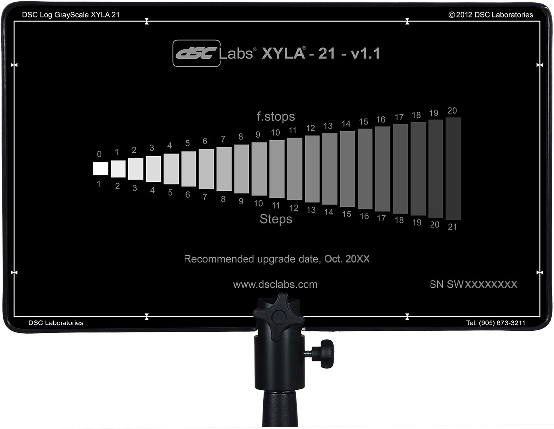
Blackmagic Design do not state how they measure the dynamic range of their cameras, but it may be a DSC Labs Xlya. This illuminated chart boasts a shutter system which “allows users to isolate and evaluate individual steps”, plus a “stepped xylophone shape” to minimise flare problems.

Art Adams, a cinema lens specialist at ARRI, and someone who’s frequently quoted in Blain Brown’s Cinematography: Theory & Practice, told Y.M. Cinema Magazine:

I used to do a lot of consulting with DSC Labs, who make camera test charts, so I own a 20-stop dynamic range chart (DSC Labs Xyla). This is what most manufacturers use to test dynamic range (although not ARRI, because our engineers don’t feel it’s precise enough) and I see what companies claim as usable stops. You can see that they are just barely above the noise floor.


Conclusions

Obviously these ARRI folks I keep quoting may be biased. I wanted to find an independent test that measures both Blackmagics and Alexas with the same conditions and methodology, but I couldn’t find one. There is plenty of anecdotal evidence that Alexas have a bigger dynamic range, in fact that’s widely accepted as fact, but quantifying the difference is harder. The most solid thing I could find is this, from a 2017 article about the Blackmagic Ursa Mini 4.6K (first generation):

The camera was measured at just over 14 stops of dynamic range in RAW 4:1 [and 13 stops in ProRes]. This is a good result, especially considering the price of the camera. To put this into perspective Alan measured the Canon C300 mkII at 15 stops of dynamic range. Both the URSA Mini 4.6 and C300 mkII are bettered by the ARRI Alexa and Amira, but then that comes as no surprise given their reputation and price.

The Alan mentioned is Alan Roberts, something of a legend when it comes to testing cameras. It is interesting to note that he is one of the key players behind the TLCI (Television Lighting Consistency Index), a mooted replacement for CRI (Colour Rendering Index). It’s interesting because this whole dynamic range business is starting to remind me of my investigation into CRI, and is leading me to a similar conclusion, that the numbers which the manufacturers give you are all but useless in real-world cinematography.

Whereas CRI at least has a standardised test, there’s no such thing for dynamic range. Therefore, until there is more transparency from manufacturers about how they measure it, I’d recommend ignoring their published values. As always when choosing a camera, shoot your own tests if at all possible. Even the most reliable numbers can’t tell you whether you’re going to like a camera’s look or not, or whether it’s right for the story you want to tell.

When tests aren’t possible, and I know that’s often the case in low-budget land, at least try to find an independent comparison. I’ll leave you with this video from the Slanted Lens, which compares the URSA Mini Pro G2 with the ARRI Amira (which uses the same Alev III sensor as the Alexa). They don’t measure the dynamic range, but you can at least see the images side by side, and in the end it’s the images that matter, not the numbers.

How is Dynamic Range Measured?

10 Reasons Why Cinemas Don’t Deserve to Survive the Pandemic

I know that as a professional director of photography I should want cinemas to recover and flourish. After all, even if many of the productions I work on don’t get a theatrical release, my livelihood must still be in some indirect way tied to the methods of exhibition, of which cinema is a foundational pillar. But I think we’ve reached the point where the film industry could survive the death of fleapits, and I’m starting to think that wouldn’t be such a bad thing.

Disclaimer: I’m writing this from a place of anger. Last Friday, the day that the cinemas of Cambridge reopened, I went along to the Light for a screening of Jurassic Park. The experience – which I shall detail fully in a future post – reminded me why going to the cinema can often be frustrating or disappointing. Since lockdown we’ve added the risk of deadly infection to the downsides, and before long we’ll have to add huge price hikes, the inevitable consequence of all those empty seats between households. (Controversially, I think that current ticket prices are reasonable.)

Setting Covid-19 to one side for the moment, here are ten long-standing reasons why cinemas deserve to be put out of their misery.


1. No real film any more

My faith in cinema was seriously shaken in the early 2010s when 35mm projection was binned in favour of digital. Some may prefer the crisp quality of electronic images, but for me the magic was in the weave, the dirt, the cigarette burns. The more like real life it looks, the less appeal it holds.


2. Adverts

I’m not sure what’s worse, the adverts themselves, or the people who aim to arrive after the adverts and overshoot, spoiling the first few minutes of the movie by walking in front of the screen as they come in late.


3. No ushers

Yes, I’m old enough to remember ushers in cinemas, just as I’m old enough to remember when supermarket shelf-stackers waited until the shop was closed before infesting the aisles. (Perhaps the unwanted stackers could be seconded to the needy cinema auditoria?) It’s not that I need a waistcoated teenager with a torch to show me to my seat, but I do need them there to discourage the range of antisocial behaviours in the next three points.


4. People eating noisily

I understand that the economics make it unavoidable for cinemas to supplement their income by selling overpriced snacks. But do they have to sell such noisy ones? Is it beyond the wit of humanity to develop quieter packaging? Or for the gluttons to chomp and rustle a little less energetically, especially during the softer scenes?


5. People chatting

One of the Harry Potter films was ruined by a child behind me constantly asking his mum what was happening… and his mum answering in great detail every time. Serves me right for going to a kids’ film, perhaps, but you never know what kind of movie might be spoiled by unwanted additional dialogue. I recall a very unpopular individual who answered his phone during The Last Jedi. And I’m sure we’ve all experienced that most maddening of all cinema phenomena: the people who inexplicably attend purely to hold conversations with each other, often conversations that aren’t even related to the film.

(5a. People snoring – a signficant drawback of Vue’s recliner seats.)


6. People looking at their phones

“The light from your phone can be distracting too,” say the announcements, and they’re not wrong. Basically, the biggest problem with cinemas is people.


7. Arctic air conditioning

Why is cinema air con always turned up so high? No matter how hot it is outside, you always have to take a jacket to keep off the artifical chill in the auditorium.


8. Small screens

Home TV screens have been getting bigger for years, so why are cinema screens going the opposite way? Shouldn’t cinemas be trying to give their customers something they can’t experience at home? There’s nothing more disappointing than shelling out for a ticket and walking into the auditorium to see a screen the size of a postage stamp.


9. Bad projection

The purpose of going to the cinema is to see a movie projected at the highest possible technical quality by competent professionals, but the reality is often far from that. Stretched, cropped, faint or blurry images – I’ve witnessed the whole gamut of crimes against cinematography. The projectionists seem poorly trained, unfairly lumbered with multiple screens, and locked out of making crucial adjustments to the sound and picture. And because there are no ushers, it’s up to you to miss a couple of minutes of the movie by stepping outside to find someone to complain to.


10. Netflix is better

This is the killer. This is what will ultimately bring cinemas down. TV used to be film’s poorer cousin, but these days long-form streaming shows are better written, better photographed and infinitely more engaging than most of what traditional filmmakers seem able to create. Maybe it’s just that I’m middle-aged now, and movies are still being made exclusively for 16-25-year-olds, but it’s rare for a film to excite me the way a series can.

Having said all of that, Christopher Nolan’s Tenet is out on Wednesday. Now that’s something I am looking forward to, if I can just find somewhere showing it on 70mm….

10 Reasons Why Cinemas Don’t Deserve to Survive the Pandemic

10 Clever Camera Tricks in “Aliens”

In 1983, up-and-coming director James Cameron was hired to script a sequel to Ridley Scott’s 1979 hit Alien. He had to pause halfway through to shoot The Terminator, but the subsequent success of that movie, along with the eventually completed Aliens screenplay, so impressed the powers that be at Fox that they greenlit the film with the relatively inexperienced 31-year-old at the helm.

Although the sequel was awarded a budget of $18.5 million – $7.5 million more than Scott’s original – that was still tight given the much more expansive and ambitious nature of Cameron’s script. Consequently, the director and his team had to come up with some clever tricks to put their vision on celluloid.


1. Mirror Image

When contact is lost with the Hadley’s Hope colony on LV-426, Ripley (Sigourney Weaver) is hired as a sort of alien-consultant to a team of crack marines. The hypersleep capsules from which the team emerge on reaching the planet were expensive to build. Production designer Peter Lamont’s solution was to make just half of them, and place a mirror at the end of the set to double them up.


2. Small Screens

Wide shots of Hadley’s Hope were accomplished with fifth-scale miniatures by Robert and Dennis Skotak of 4-Ward Productions. Although impressive, sprawling across two Pinewood stages, the models didn’t always convince. To help, the crew often downgraded the images by showing them on TV monitors, complete with analogue glitching, or by shooting through practical smoke and rain.


3. Big Screens

The filmmakers opted for rear projection to show views out of cockpit windscreens and colony windows. This worked out cheaper than blue-screen composites, and allowed for dirt and condensation on the glass, which would have been impossible to key optically. Rear projection was also employed for the crash of the dropship – the marines’ getaway vehicle – permitting camera dynamics that again were not possible with compositing technology of the time.


4. Back to Front

A highlight of Aliens is the terrifying scene in which Ripley and her young charge Newt (Carrie Henn) are trapped in a room with two facehuggers, deliberately set loose by sinister Company man Carter Burke (Paul Reiser). These nightmarish spider-hands were primarily puppets trailing cables to their operators. To portray them leaping onto a chair and then towards camera, a floppy facehugger was placed in its final position and then tugged to the floor with a fishing wire. The film was reversed to create the illusion of a jump.


5. Upside Down

Like Scott before him, Cameron was careful to obfuscate the man-in-a-suit nature of the alien drones wherever possible. One technique he used was to film the creatures crawling on the floor, with the camera upside-down so that they appeared to be hanging from the ceiling. This is seen when Michael Biehn’s Hicks peeks through the false ceiling to find out how the motion-tracked aliens can be “inside the room”.


6. Flash Frames

All hell (represented by stark red emergency lighting) breaks loose when the aliens drop through the false ceiling. To punch up the visual impact of the movie’s futuristic weapons, strobelights were aimed at the trigger-happy marines. Taking this effect even further, editor Ray Lovejoy spliced individual frames of white leader film into the shots. As a result, the negative cutter remarked that Aliens‘ 12th reel had more cuts than any complete movie he’d ever worked on.


7. Cotton Cloud

With most of the marines slaughtered, Ripley heads to the atmospheric processing plant to rescue Newt from the alien nest. Aided by the android Bishop (Lance Henriksen) they escape just before the plant’s nuclear reactor explodes. The ensuing mushroom cloud is a miniature sculpture made of cotton wool and fibreglass, illuminated by an internal lightbulb!


8. Hole in the floor

Returning to the orbiting Sulaco, Ripley and friends are ambushed by the stowaway queen, who rips Bishop in half. A pre-split, spring-loaded dummy of Henriksen was constructed for that moment, and was followed by the simple trick of concealing the actor’s legs beneath a hole in the floor. As in the first movie, android blood was represented by milk. This gradually soured as the filming progressed, much to Henriksen’s chagrin as the script required him to be coated in the stuff and even to spit it out of his mouth.


9. Big Battle

The alien queen was constructed and operated by Stan Winston Studios as a full-scale puppet. Two puppeteers were concealed inside, while others moved the legs with rods or controlled the crane from which the body hung. The iconic power loader was similar, with a body builder concealed inside and a counter-weighted support rig. This being before the advent of digital wire removal, all the cables and rods had to be obfuscated with smoke and shifting shadows, though they can still be seen on frame grabs like this one. (The queen is one of my Ten Greatest Movie Puppets of All Time.)


10. Little Battle

For wide shots of the final fight, both the queen and the power loader were duplicated as quarter scale puppets. Controlled from beneath the miniature set via rods and cables, the puppets could perform big movements, like falling into the airlock, which would have been very difficult with the full-size props. (When the airlock door opens, the starfield beyond is a black sheet with Christmas lights on it!) The two scales cut seamlessly together and produce a thrilling finale to this classic film.

For more on the visual effects of James Cameron movies, see my rundown of the top five low-tech effects in Hollywood films (featuring Titanic) and a breakdown of the submarine chase in The Abyss.

10 Clever Camera Tricks in “Aliens”

Making a 35mm Zoetrope: The Results

In the early days of lockdown, I blogged about my intentions to build a zoetrope, a Victorian optical device that creates the illusion of a moving image inside a spinning drum. I even provided instructions for building your own, sized like mine to accommodate 18 looping frames of contact-printed 35mm photographs. Well, last week I was finally able to hire my usual darkoom, develop and print the image sequences I had shot over the last five months, and see whether my low-tech motion picture system worked.


Making Mini Movies

Shooting “Sundial”

Before I get to the results, let me say a little about the image sequences themselves and how they were created. Because I was shooting on an SLR, the fastest frame rate I could ever hope to record at was about 1fps, so I was limited to time-lapses or stop motion animation.

Regular readers may recall that the very first sequence I captured was a time-lapse of the cherry tree in my front garden blossoming. I went on to shoot two more time-lapses, shorter-term ones showing sunlight moving across objects during a single day: a circle of rotting apples in a birdbath (which I call Sundial), and a collection of props from my flatmate’s fantasy films (which I call Barrels). I recorded all the time-lapses with the pinhole I made in 2018.

Filming “Social Distance”

The remaining six sequences were all animations, lensed on 28mm, 50mm or 135mm SMC Pentax-Asahi glass. I had no signficant prior experience of this artform, but I certainly had great fun creating some animated responses to the Covid-19 pandemic. My childish raw materials ranged from Blue Peter-esque toilet roll tubes, through Play-Doh to Lego. Orbit features the earth circling a giant Covid-19, and The Sneeze sees a toilet roll person sternutating into their elbow. Happy Birthday shows a pair of rubber glove hands washing themselves, while Avoidance depicts two Lego pedestrians keeping their distance. 360° is a pan of a room in which I am variously sitting, standing and lying as I contemplate lockdown, and finally Social Distance tracks along with a pair of shoes as they walk past coronavirus signage.

The replacement faces for the toilet paper star of “The Sneeze”

By the time I finished shooting all these, I had already learnt a few things about viewing sequences in a zoetrope, by drawing a simple animation of a man walking. Firstly I discovered that the slots in my device – initially 3mm in width – were too large. I therefore retrofitted the drum with 1mm slots, resulting in reduced motion blur but a darker image, much like reducing the shutter angle on a movie camera. I initially made the mistake of putting my eye right up to the drum when viewing the animation, but this destroys the shuttering effect of the slots. Instead the best results seem to be obtained with a viewing distance of about 30cm (1ft).

I could already see where I might have made mistakes with my photographed sequences. The hand-drawn man was bold and simple; it looked best in good light, by a window or outdoors, but it was clear enough to be made out even if the light was a bit poor and there was too much motion blur. Would the same be said of my 35mm sequences?


Postproduction

I contact-printed the nine photographic sequences in the usual way, each one producing three rows of six frames on a single sheet of 8×10″ Ilford MG RC paper. In theory, all that was left was to cut out these rows and glue them together.

In practice, I had managed to screw up a few of the sequences by fogging the start of the film, shooting a frame with bad exposure, or some other act of shameful incompetence. In such cases I had to edit much like filmmakers did before the invention of digital NLEs – by cutting the strips of images, excising the rotten frames and taping them back together. I even printed some of the sequences twice so that I could splice in duplicate frames, where my errors had left a sequence lacking the full 18 images. (This was effectively step-printing, the obsolete optical process by which a shot captured at 24fps could be converted to slow motion by printing each frame twice.)

"Blossom"

Once the sequences were edited, I glued them into loops and could at last view them in the zoetrope. The results were mixed.

Barrels fails because the moving sunlight is too subtle to be discerned through the spinning slots. The same is partly true of Sundial, but the transient glare caused by the sun reflecting off the water at its zenith gives a better sense of motion. Blossom shows movement but I don’t think an uninitiated viewer would know what they were looking at, so small and detailed is the image. Orbit suffers from smallness too, with the earth and Covid-19 unrecognisable. (These last two sequences would have benefitted from colour, undoubtedly.)

The planet Covid-19 (as seen by my phone camera) made from Play-Doh and cloves

I’m very pleased with the animation of Social Distance, though I need to reprint it brighter for it to be truly effective. You can just about make out that there are two people passing each other in Avoidance, but I don’t think it’s at all clear that one is stepping into the road to maintain a safe distance from the other. Happy Birthday is a bit hard to make out too. Similarly, you can tell that 360° is a pan of a room, but that’s about it.

Perhaps the most successful sequence is The Sneeze, with its bold, white toilet roll man against a plain black background.

"Happy Birthday"


Conclusions

Any future zoetrope movies need to be bold, high in contrast and low in detail. I need to take more care to choose colours that read as very different tones when captured in black and white.

Despite the underwhelming results, I had a great time doing this project. It was nice to be doing something hands-on that didn’t involve sitting at a screen, and it’s always good to get more practice at exposing film correctly. I don’t think I’ll ever make an animator though – 18 frames is about the limit of my patience.

My light meter lies beside my animation chart for the walking feet in “Social Distance”.


Making a 35mm Zoetrope: The Results

Beautiful/Realistic/Cheap: The Lighting Triangle

We’re all familiar with the “good/fast/cheap” triangle. You can pick any two, but never all three. When it comes to lighting films, I would posit that there is a slightly different triangle of truth labelled “beautiful/realistic/cheap”. When you’re working to a tight budget, a DP often has to choose between beautiful or realistic lighting, where a better-funded cinematographer can have both.

I first started thinking about this in 2018 when I shot Annabel Lee. Specifically it was when we were shooting a scene from this short period drama – directed by Amy Coop – in a church. Our equipment package was on the larger side for a short, but still far from ideal for lighting up a building of that size. Our biggest instrument was a Nine-light Maxi Brute, which is a grid of 1KW par globes, then we had a couple of 2.5K HMIs and nothing else of any signifcant power.

Director Amy Coop during the church recce for “Annabel Lee”

The master shot for the scene was a side-on dolly move parallel to the central aisle, with three large stained-glass windows visible in the background. My choices were either to put a Maxi Brute or an HMI outside each window, to use only natural light, or to key the scene from somewhere inside the building. The first option was beautiful but not realistic, as I shall explain, the second option would have been realistic but not beautiful (and probably under-exposed) and the third would have been neither.

I went with the hard source outside of each window. I could not diffuse or bounce the light because that would have reduced the intensity to pretty much nothing. (Stained-glass windows don’t transmit a lot of light through them.) For the same reason, the lamps had to be pretty close to the glass.

The result is that, during this dolly shot, each of the three lamps is visible at one time or another. You can’t tell they’re lamps – the blown-out panes of glass disguise them – but the fact that there are three of them rather gives away that they are not the sun! (There is also the issue that contiguous scenes outside the church have overcast light, but that is a discontinuity I have noticed in many other films and series.)

I voiced my concerns to Amy at the time – trying to shirk responsibility, I suppose! Fortunately she found it beautiful enough to let the realism slide.

But I couldn’t help thinking that, with a larger budget and thus larger instruments, I could have had both beauty and realism. If I had had three 18K HMIs, for example, plus the pre-rig time to put them on condors or scaffolding towers, they could all have been high enough and far enough back from the windows that they wouldn’t have been seen. I would still have got the same angle of light and the nice shafts in the smoke, but they would have passed much more convincingly as a single sun source. Hell, if I’d had the budget for a 100KW SoftSun then I really could have done it with one source!

There have been many other examples of the beauty/realism problem throughout my career. One that springs to mind is Above the Clouds, where the 2.5K HMI which I was using as a backlight for a night exterior was in an unrealistic position. The ground behind the action sloped downwards, so the HMI on its wind-up stand threw shafts of light upwards. With the money for a cherry-picker, a far more moon-like high-angle could have been achieved. Without such funds, my only alternative was to sacrifice the beauty of a backlight altogether, which I was not willing to do.

The difference between that example and Annabel Lee is that Clouds director Leon Chambers was unable to accept the unrealistic lighting, and ended up cutting around it. So I think it’s quite important to get on the same page as your director when you’re lighting with limited means.

I remember asking Paul Hyett when we were prepping Heretiks, “How do you feel about shafts of ‘sunlight’ coming into a room from two different directions?” He replied that “two different directions is fine, but not three.” That was a very nice, clear drawing of the line between beauty (or at least stylisation) and realism, which helped me enormously during production.

The beauty/realism/cost triangle is one we all have to navigate. Although it might sometimes give us regrets about what could have been, as long we’re on the same page as our directors we should still get results we can all live with.

Beautiful/Realistic/Cheap: The Lighting Triangle