5 Tips for Working with Practicals

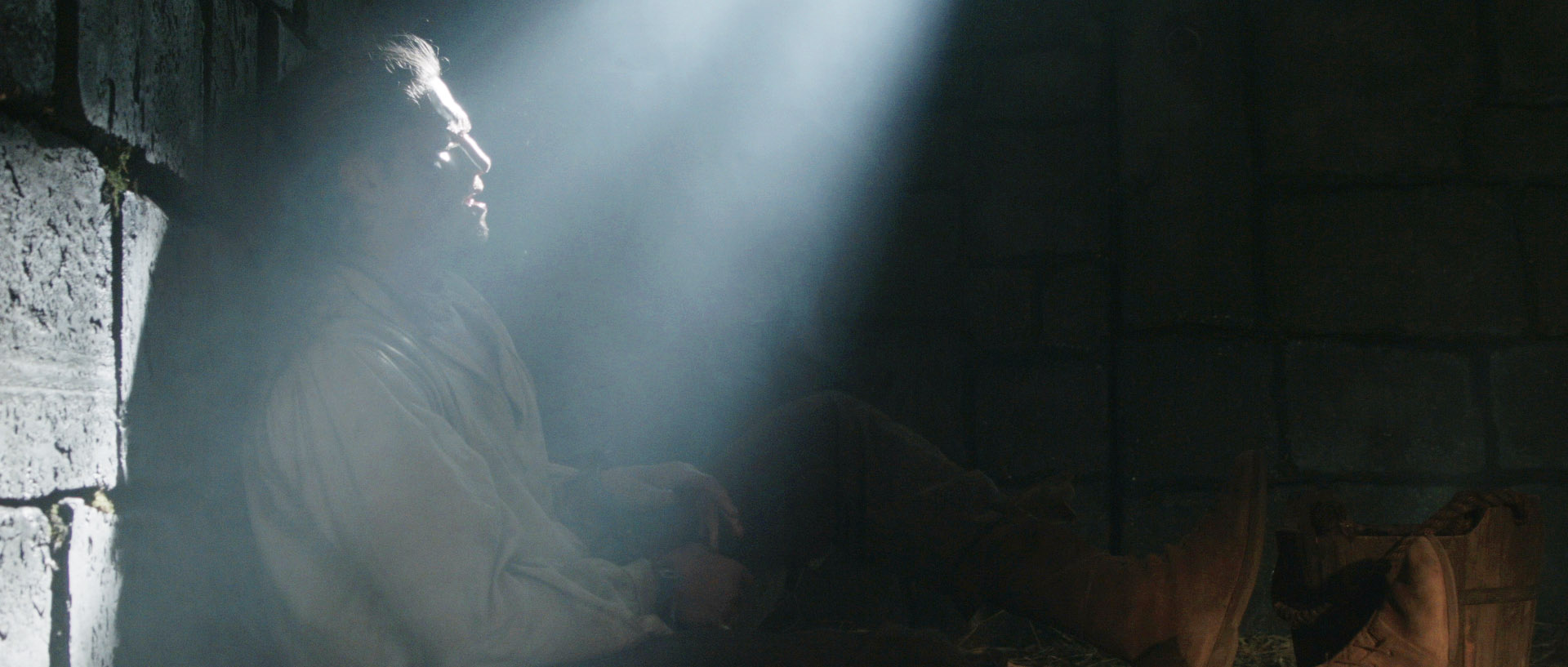
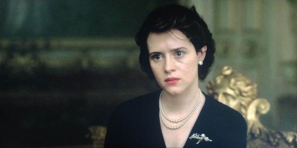
As the sensitivity and dynamic range of cameras has increased, practicals have become a more and more important and popular tool in the cinematographer’s arsenal. A practical is any light source that appears in the frame. It could be a fluorescent strip-light, a table lamp, car headlights, candles, a fireplace, an iPad, fairy lights, street lamps, a torch, a security light… any light that could be realistically found in the place where your scene is set.

Here are five pieces of advice I’ve put together from my own experiences working with practical lights.


1. Liaise continually with the director and art department.

Production Designer Stuart Craig and Cinematographer Slawomir Idziak PSC confer on the set of Harry Potter and the Order of the Phoenix.

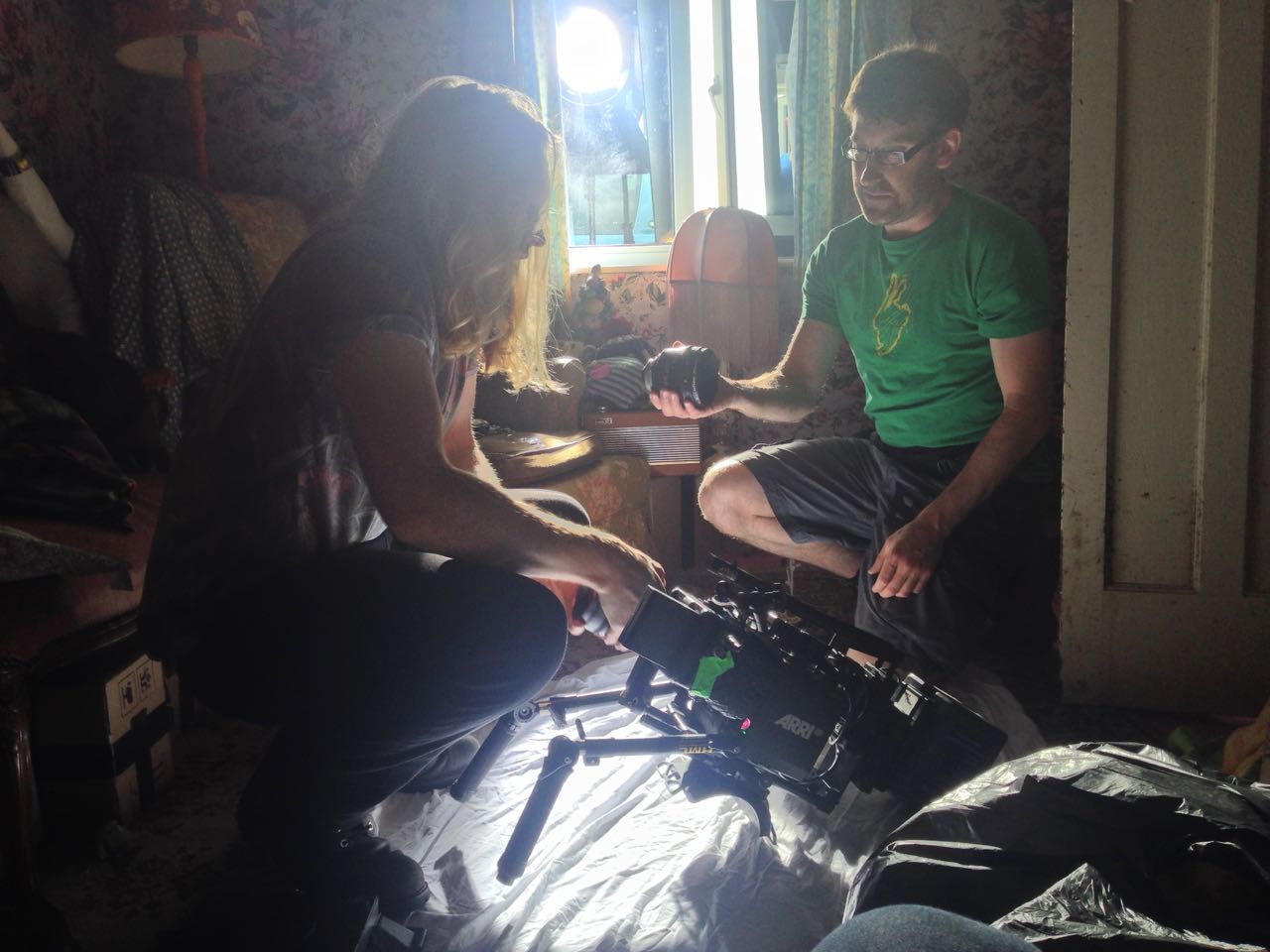
Although the bulb, wiring and power supply are the responsibility of the lighting department, the fixture itself falls under the purview of the art department. A good production designer will be thinking of light sources from the very beginning of their set design process. This is the start of a conversation which will continue throughout preproduction, as you the DP ask for fixtures in certain positions to make the set and actors look good, and the designer either says yes or asks for compromises so as not to ruin the aesthetics or believability (or budget!) of their design. The places a DP wants light sources in order to get the best modelling of the talent are often not the places a real human being would choose to install a light source in their home/office/dungeon etc. Some designers will demand realism and fight you on these decisions; others are open to artistic license. Either way, you must respect the symbiotic relationship between your two departments and do your best to reach a solution that works for both of you.

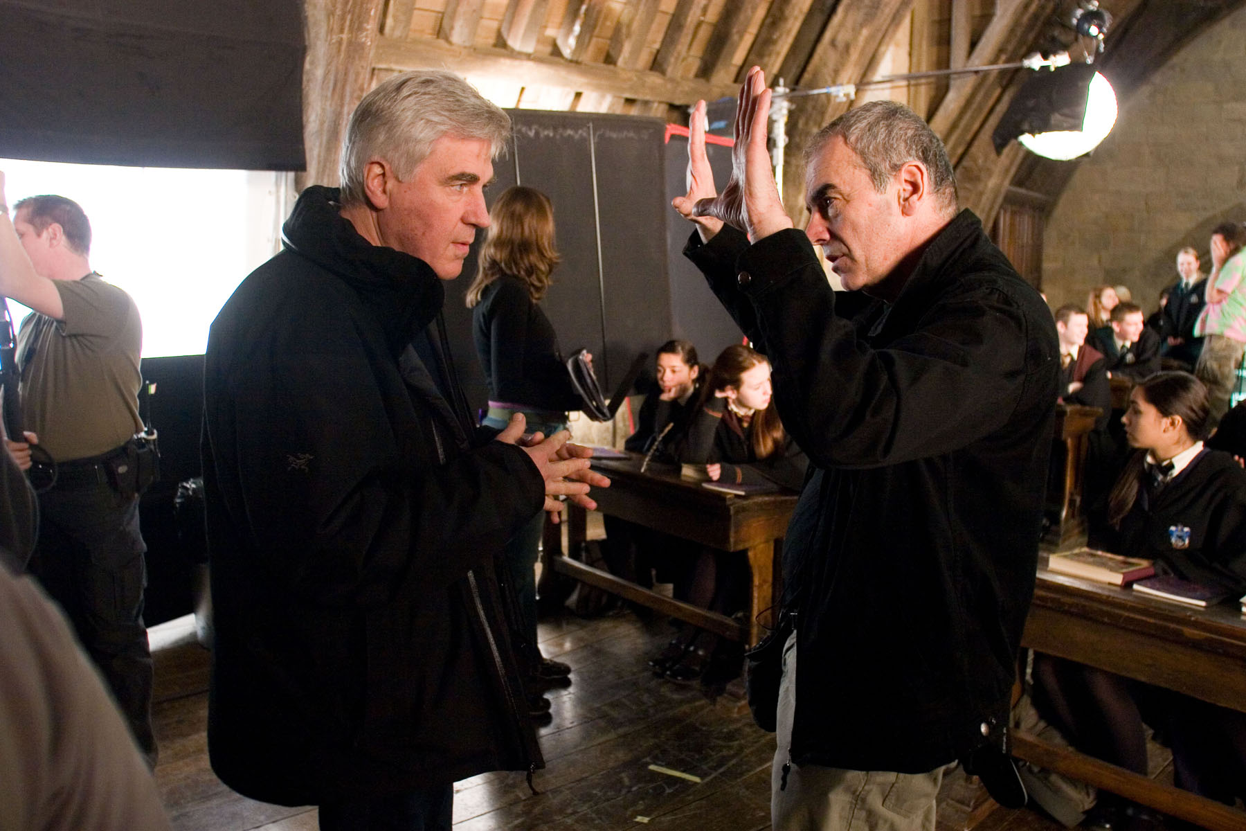
Keeping the director in the loop is also very important. When it comes to lighting, practicals are one of the things most likely to cause disagreement between the director and DP. You may have spent an hour lighting the set to be motivated by the candles all around, only for the director to walk onto set and say that they feel it makes no sense within the story for someone to have lit the candles in this scene. At which point, if you can’t change the director’s mind, you will find yourself hastily relighting the set while the 1st AD shakes their head in despair.


2. Sometimes it’s as simple as turning it on.

A Serious Man (DP: Roger Deakins CBE, ASC, BSC)

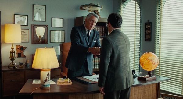
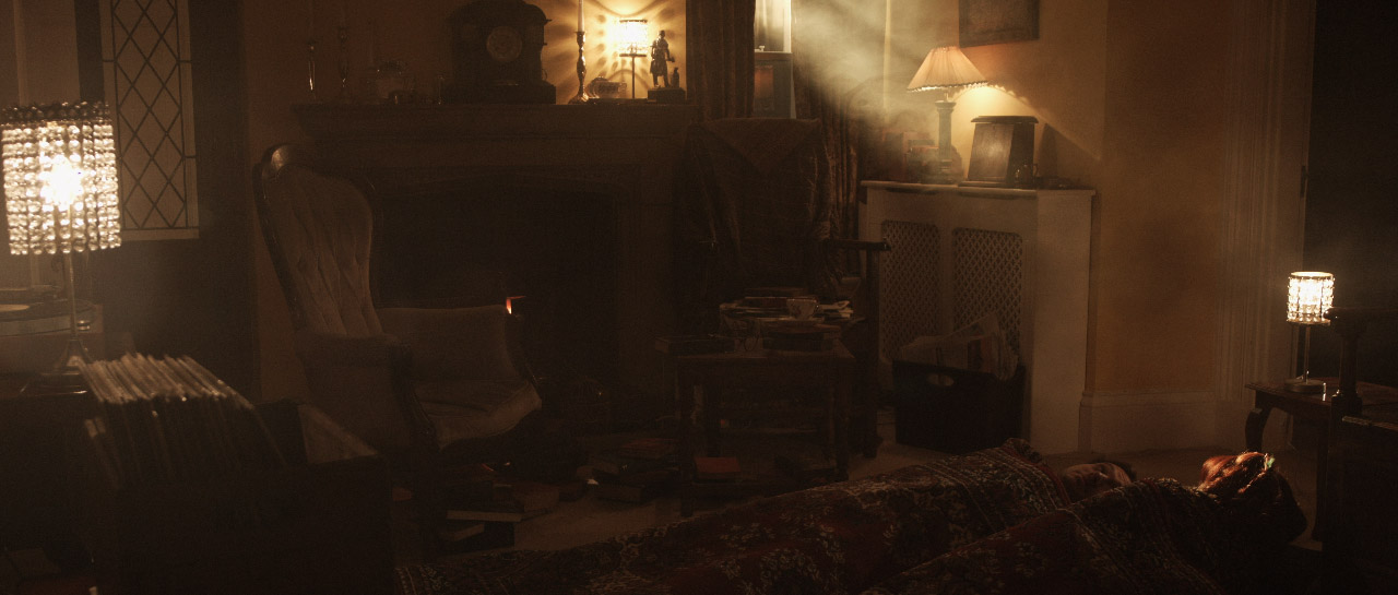
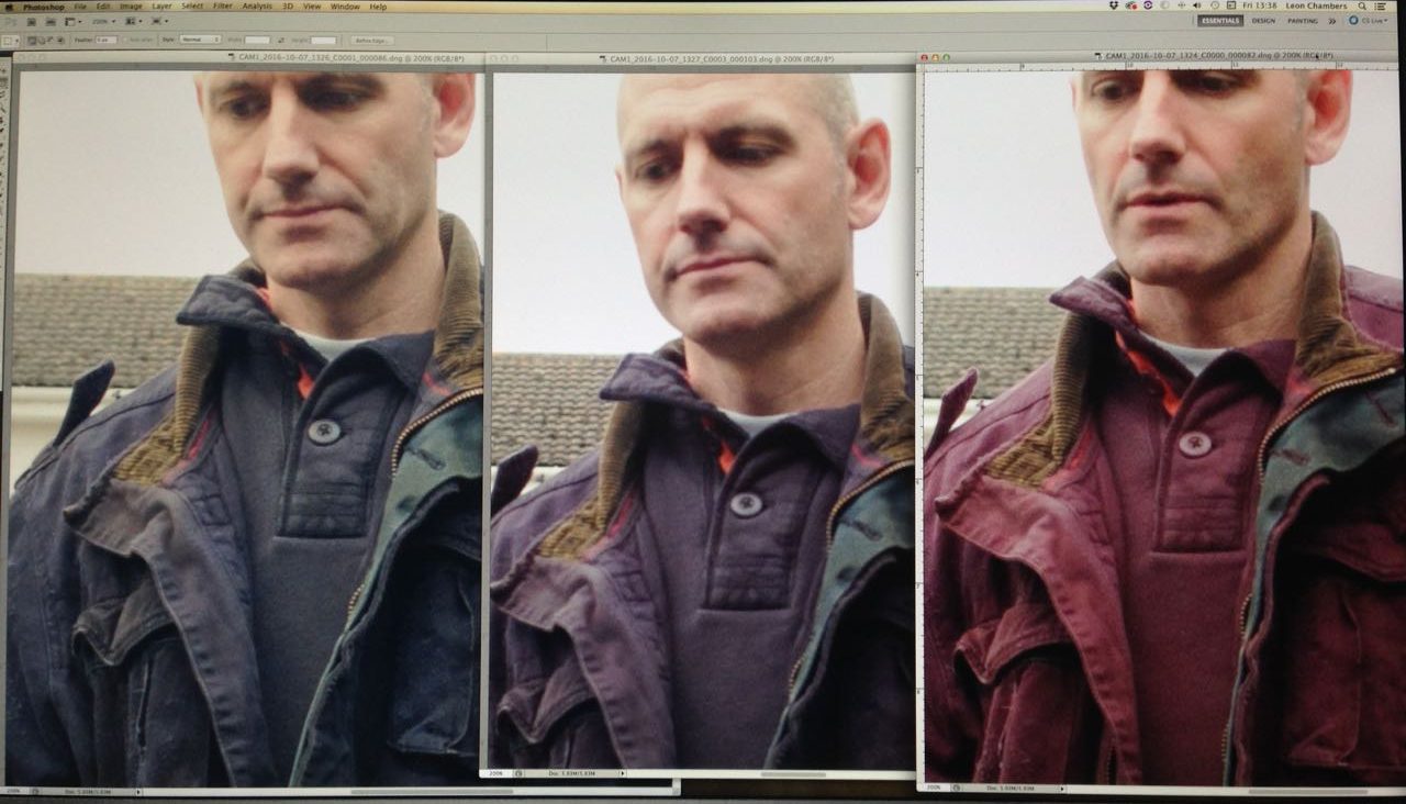
Earlier in my career, whenever I saw a practical, I felt that I had to set up a movie light somewhere out of frame in order to beef up the amount of light apparently coming from that practical. And traditionally, this is indeed the way DPs have worked, because film stocks weren’t sensitive enough to get an acceptable exposure from typical practicals like table lamps. Or it was impossible to find a level for the practical where it was bright enough to expose the talent but dim enough that the lamp itself didn’t read on camera as an ugly, over-exposed white blob.

But today’s digital cameras have a wider dynamic range, making it much easier to expose both the source and the subject acceptably. So ask yourself, do you really need that movie light? Roger Deakins, the world’s most celebrated living cinematographer, says he commonly lights his sets now with predominantly practical sources. Take a look at your scene without any additional lights, and only add extra sources if your practical’s illumination isn’t reaching the distance it needs to.

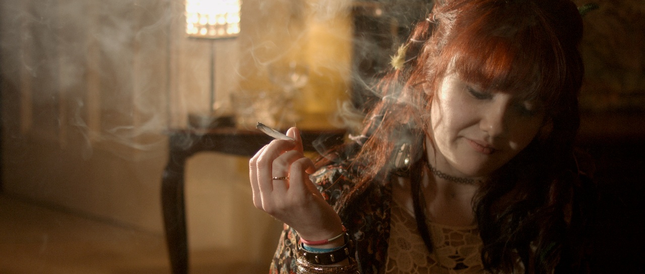
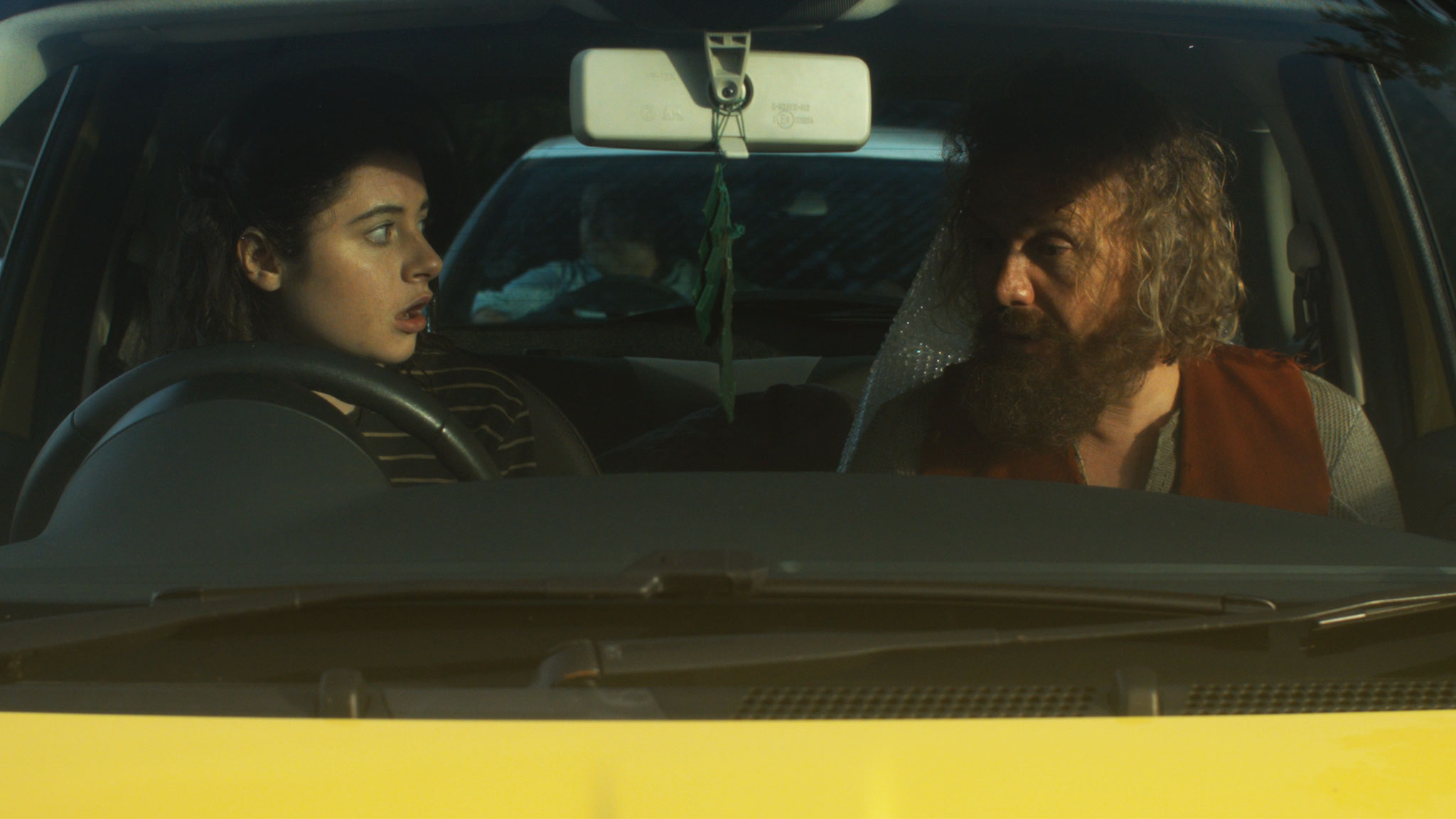
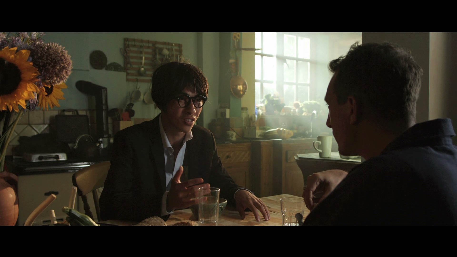
And practicals don’t even need to light the talent. Sometimes you have a scene perfectly well illuminated with other sources, but turning on a practical in the background just adds the icing on the cake. It may not illuminate anything but a small pool immediately around itself, but that little pool of orange light might add colour contrast, production value and interest. I’ve often seen daylight interior scenes on TV or in movies where bright shafts of “sunlight” are blasting in through a window, and no-one would realistically need to turn an artificial light on, but nonetheless several table lamps are glowing away in the background – because it looks great!


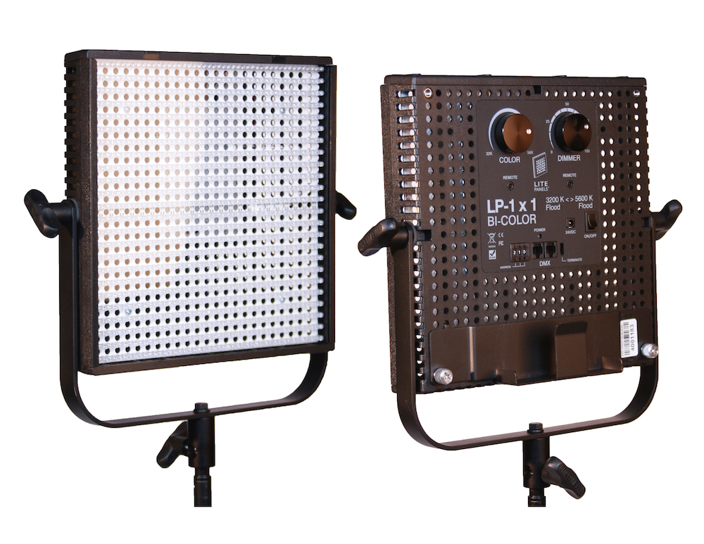
3. Always use dimmers.

As I’ve already said, finding that perfect brightness for your practical can be a delicate balancing act, so always have your crew put practicals on dimmers (a.k.a. “squeezers”) to make it easy to find that right level. Besides, practicals often look best with a warmer colour temperature, and you can get that by dimming them down, if they’re tungsten, adding to the cosy feel.


4. Keep other sources off the practical.

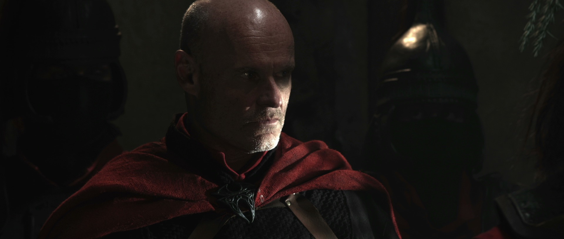
One of the reasons practicals look good is because they create contrast in the frame: a bright patch spreading out into darkness. If other light is falling on the practical, this effect will be washed out and reduced. If the other source is bright, it may even make the practical look like it’s not switched on. (Just like if you take a torch outside in daylight and turn it on, it doesn’t look like it’s on at all because the sun is so overpowering.)

If possible, other sources should be flagged so that they don’t hit the practical. This is something that an experienced gaffer will often have done as a matter of course.


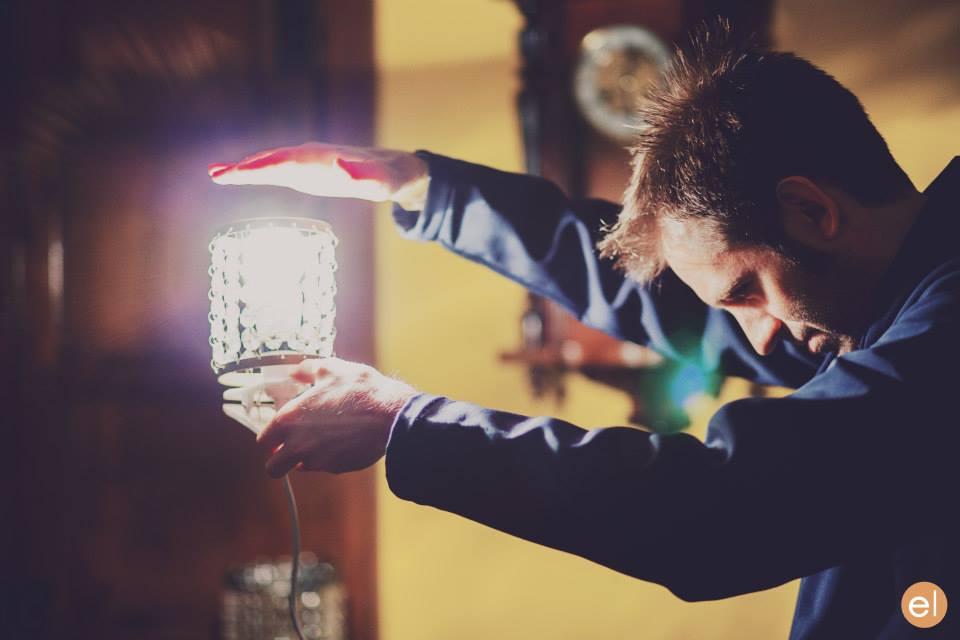
5. Dim the camera side of the practical.

O Brother, Where Art Thou? (DP: Roger Deakins CBE, ASC, BSC)

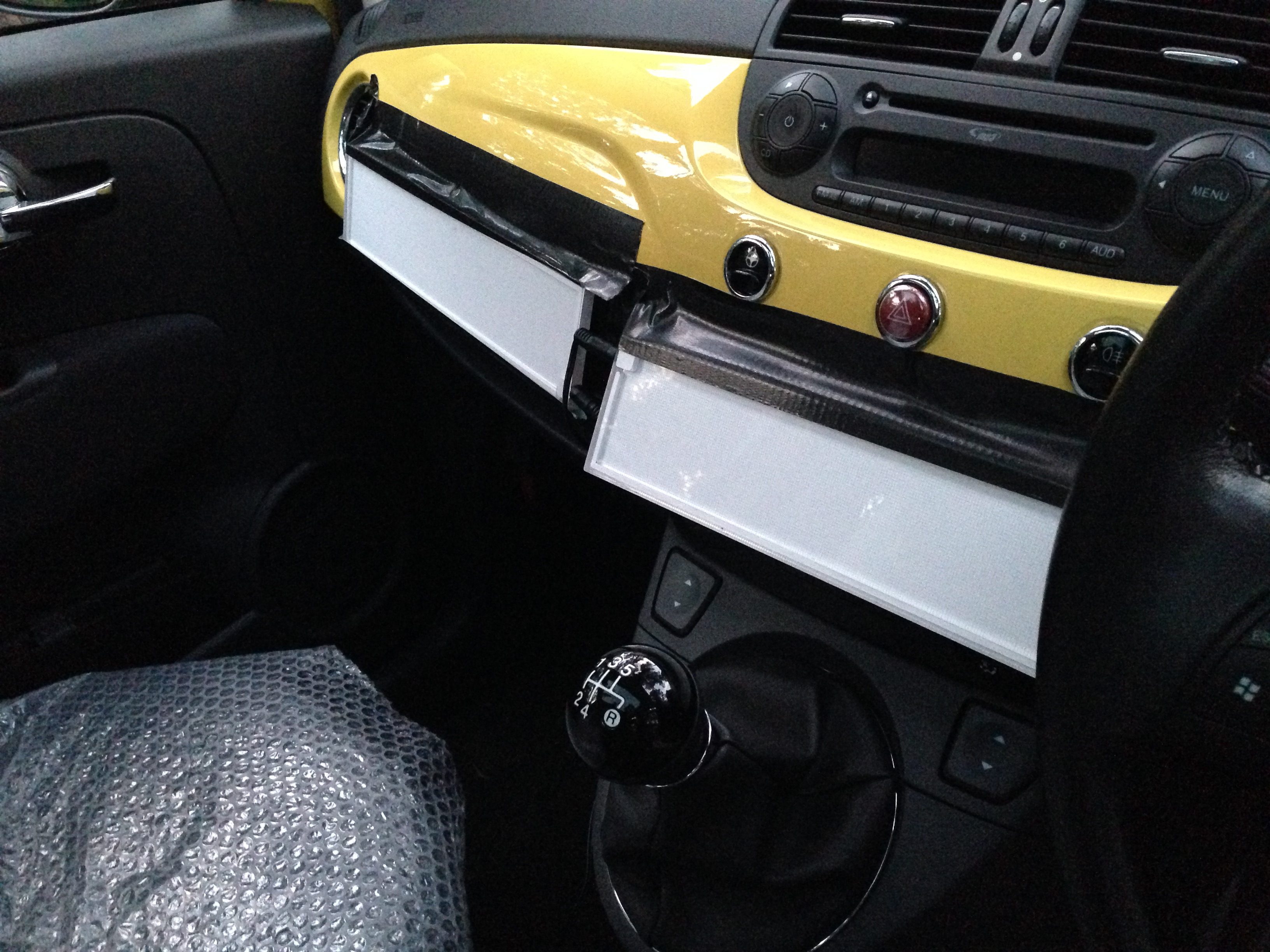
Even with the wide dynamic range of today’s cameras, the flame or bulb of a practical may still look unpleasantly bright on camera. To deal with this, depending on the design of the fixture, you may be able to hide a small piece of ND gel inside it on the camera side. If properly arranged, this will cut the light travelling directly into the camera lens, but not the light shining in other directions and illuminating the talent.

Alternatively, the glass case of a lantern can be sprayed black on the camera side. The paint will not be picked up by the camera because there will still be a lot of light coming through it, but it should cut enough brightness to eliminate lens flare and reduce highlight clipping.


I hope these tips are helpful next time you shoot with practicals. Happy lighting, and merry Christmas!

5 Tips for Working with Practicals

5 Ways to Use Hard Light Through a Window

The first step in lighting a daytime interior scene is almost always to blast a light through the window. Sometimes soft light is the right choice for this, but unless you’re on a big production you simply may not have the huge units and generators necessary to bounce light and still have a reasonable amount of it coming through the window. So in low budget land, hard light is usually the way we have to go.

Now, I used to think that this hard window light had to hit the talent’s faces, otherwise what’s the point? But eventually I learnt that there are many things you can do with this light….


1. Light the talent directly.

This is what I always used to do. The problem is that the light will be very harsh. If there is a good amount of natural light coming in through the window too, that might soften the look enough. If not, slipping a diffusion frame in front of the light will take the edge off the hardness. And it depends which way the talent is facing. If the hard light is backlighting or edging them, the effect might well be beautiful.

prison2
Ren: The Girl with the Mark, S1 E4, director: Kate Madison, DP: Neil Oseman
Hard side light from an Arri M18 outside the window, combined with a 4x4 kino from a 3/4 angle inside the room
The Gong Fu Connection, director: Ted Duran, DP: Neil Oseman


2. Light part of the talent directly.

This is a nice way to get the best of both worlds. You hit their clothes with the hard light, maybe a bit of their chin too; it creates contrast, brings out the texture in the costume, and adds dynamics because as the talent moves, the edge of the hard light will move around on them. To light the parts which the hard source doesn’t hit you can use bounce, or a kinoflo Window Wrap.

ren4-commander-house
Ren: The Girl with the Mark, S1 E4, director: Kate Madison, DP: Neil Oseman
Ren: The Girl with the Mark (Mythica Entertainment, dir. Kate Madison)
Ren: The Girl with the Mark, S1 E2, director: Kate Madison, DP: Neil Oseman


3. Light the floor.

Arrange the light so it hits the floor, creating a skip bounce. Unless the floor’s a very dark colour, the light will bounce back up and light your talent softly from below. While some people are afraid of the “monster” look of lighting from below, it can often produce a very beautiful look. It’s well worth exploring. Alternatively, bounce the hard window light off a wall to create a soft side light.

Manure, director: Michael Polish, DP: M. David Mullen
This photo from the set of Above the Clouds (director: Leon Chambers) shows a white sheet which I laid on the floor to skip-bounce the HMI outside the window. Some of its effects can be seen on Rupert's face (right)!
This photo from the set of Above the Clouds (director: Leon Chambers) shows a white sheet which I laid on the floor to skip-bounce the HMI outside the window.


4. Light the background.

A hot splash of “sunlight” on the background is a common way to add interest to a wide shot. It can show off the production design and the textures in it, or help frame the talent or separate them from the background.

The Crown, S1 E10 "Gloriana", dir.
The Crown, S1 E10 “Gloriana”, director: Philip Martin, DP: Ole Bratt Birkeland
My Utopia, director: Patrick Moreau, DP: Joyce Tsang


5. Light nothing.

Sometimes the most effective way to use a shaft of light through a window is simply as background interest. Volumize the light using smoke, and it creates a nice bit of contrast and production value in the scene. Silhouetting characters in front of the beam can be very effective too. 

33_GuardRoomWide1
Ren: The Girl with the Mark, S1 E4, director: Kate Madison, DP: Neil Oseman
Big Sur, director: Michael Polish, DP: M. David Mullen


Any that I’ve missed? What are your techniques for lighting through windows?

5 Ways to Use Hard Light Through a Window

How “The Crown” Uses Broad Key Lighting to Evoke Tradition

Earlier this year I blogged about a visit to the National Portrait Gallery, studying the lighting in traditional portraits. I noted that, contrary to the current cinematographic trend for short key lighting, almost all of those paintings used broad key. And while watching the high-end Netflix series The Crown this week, I noticed the same thing. Why might this be?

Short key (left) vs. broad key (right). Photos from SLR Lounge

First of all, a reminder: a short key is a key light on the side of the face away from camera, while a broad key hits the side of the face towards camera. Short key is generally preferred amongst cinematographers because it gives better “modelling” – i.e. a better sense of the shape of the face – and focuses the viewer ON the face, rather than the ear and the side of the head. A broad key, meanwhile, presents less shadow to the camera, and arguably shows the hairstyle and the shape of the head better – which may be reasons for the preponderance of broad key in classical portraiture, which were more concerned with overall appearance than with emotion/performance.

An array of broad key paintings at the National Portrait Gallery

But I don’t believe these direct pros and cons were the primary motivation in cinematographer Ole Bratt Birkeland’s decision to use broad key lighting in a crucial scene from The Crown.

The central themes of the series, which dramatises the early life of the Queen, are tradition and duty. Queen Mary often reminds her granddaughter Queen Elizabeth II of the long and noble lineage of the English royal family, a weight of history and responsibility which Elizabeth keenly feels. “The crown must always win,” Mary intones in the trailer.

In episode 4 the young Queen seeks advice, desperate to ensure she does not tarnish the monarchy’s centuries-old reputation. To symbolise this burden, Birkeland evokes the imagery of traditional portraiture – the subjects of which were always high-born individuals, often royals. Consider this frame grab from the scene, beneath an official portrait.

mw58197

img_1647

See how the light models the face the same way in both images? Note also the absence of backlight in the frame grab, another feature common to traditional paintings, which typically relied on a single window light source. Elizabeth’s dark hair blends into parts of the dark background.

Combined with the timeless regal production design, this lighting subtly places the Queen within the frame of an official portrait, trapping her within the overwhelming tradition of the monarchy. Can I say for certain that Birkeland did this deliberately? No, but I’d be very surprised if he hadn’t looked at royal portraits while prepping the show, and I’d be equally surprised if they hadn’t at least influenced him unconsciously.

Either way, this is a first-rate example of the power of cinematography to enhance theme and narrative by guiding the viewer to make subconscious associations. If you haven’t seen The Crown, I can highly recommend it; it’s not just the cinematography that’s top notch.

How “The Crown” Uses Broad Key Lighting to Evoke Tradition

The Cinematography of “Night Owls”

I wrote the bulk of this post over two years ago, when I wrapped photography on Sophie Black’s short drama Night Owls. As usual for no-budget shorts, there followed a long postproduction and then a festival run (it premiered at London Short Film Festival this January) which prevented us releasing any footage online.

But this week a number of great things have happened for the film. Firstly, Night Owls has been released online – you can see it here – and every view counts towards Promofest’s “Short of the Year” competition, so have a watch and help us win! Secondly, the film won an Honourable Mention and Best Actor (Jonny McPherson) at the LA Film Awards. Thirdly, my work on the film won me Best Cinematography at the Festigious International Film Festival.

10476500_250955778426856_3738960460160087990_n
Photo by Elly Lucas

So this is the perfect time to finally publish this look at the decisions and techniques I used in lighting and lensing the film. Night Owls was one of the first projects I shot on my Blackmagic Production Camera, and you can read what I thought of the camera in action in this post from May 2014.

Sophie wanted a soft, warm and cozy look to the short, which is set over a single night, mostly in one room, and tells how a teenage girl and an older man become unlikely friends. At the same time, the dialogue-driven script had moments which hinted at darkness and suffering in the past of both characters. And a cozy look suggests practicals like table lamps, which by their nature cast pools of light and leave other areas in darkness.

On a practical level – if you’ll excuse the pun – I knew that the need to hide lights that would boost the apparent output of the practicals would limit my options in the wide shots, and therefore also in the close-ups which would of course have to match. When shooting a day interior, you can easily stick a huge light outside the window and then shoot pretty much anywhere in the room, crabbing the light to one side or the other if it threatens to come into shot or cast a shadow of the camera. In a night scene with practicals, it’s not so simple.

Dedo rail
Dedo rail

We knew in advance that we could not screw anything into the location’s ceiling, so I was relieved to find that the room had a nice, chunky picture rail all the way around. This soon became a dedo rail, as I used magic arms and k-clamps to rig two of the little spotlights in a classic cross-lighting formation. What I mean by this is that each light was positioned so as to provide backlight on one character and frontlight on the other. This is almost always my starting point when lighting a scene with two characters, and it really came into its own on this project. (See my post on cross-backlighting for more info.)

We had to shoot most of the scenes during the day, so the windows were blacked out. The one that appears on camera was tented around so that we could shine in a blue-gelled redhead, to suggest moonlight, without allowing any daylight in. Another blue-gelled redhead was set in the hall outside the door, creating depth and colour contrast. Our 1.2K HMI was placed in the next room, right at the far end. In front of it we rigged a sort of faux stained glass panel, that had conveniently broken out of another door in the house just the previous week, in order to cast a window-like shadow and give the impression of moonlight coming through a window in the next room.

The reason we rigged so many cool sources was that the first scene in the living room featured only Kent (played by Jonny McPherson), and Sophie had requested that the images only become warmer when Mari (played by Holly Rushbrooke) enters the film. We turned on fewer of the practicals for this first scene, but it was still necessary for their light (represented by the dedos) to be warm in colour to establish that for the later scenes. To counteract this and bring everything back into the blues a bit more, I set up a third dedo, gelled blue, to produce a cool lens flare.

Setting up for the first living room scene. The crossed dedos can be seen in the top left and top right, while the dedo in the foreground is solely to produce lens flare.

Sophie and I had talked about various ways of softening the image. We considered hiring a black promist filter, but after rewatching Christopher Ecclestone’s season of Doctor Who, which appears to be have been entirely shot using a black promist, I decided the look was far too cheesy. In the end we went for a set of Zeiss lenses which had had their anti-flare coating ground off. We felt that lens flares would give some sparkle and magic to the images, as well as giving us the opportunity to soften the contrast in the image when necessary. The flares were usually created by an additional lamp, often a dedo or a battery-powered pag light held by Col, aimed directly at the lens.

When Mari enters, Kent has lit the fire, so Col and I set up our usual cluster of 100W tungsten bulbs covered with an orange gel and rigged to a dimmer board. With hindsight we could have gone much more orange with the gel and much more flickery with the dimmer board action, but since the fire at the location was a wood burning stove with only a very small window, it’s probably good that the source of the light remains ambiguous. For the close-ups, the cluster of four bulbs was rearranged into a straight line, which gave a lovely, soft underlight to the character’s faces.

Scn6_wide_overhead
Night Owls’ signature overhead shot. Sophie had a far more complicated shot planned, but it just wasn’t achievable with equipment we could afford.
Shooting the top-down shot. The redhead in the centre of the image is providing lens flare.
Shooting the top-down shot. The redhead in the centre of the image is providing lens flare. The white blob at the end of the C-stand arm on the left is a 100W bulb surrounded by a string-of-crystals lampshade.

A major scene later on sees the two characters lying top-and-tail on the floor, and was shot from a jib kindly provided by All Doors Lead Somewhere Productions. Overhead shots of people lying down can look very flat, but rather than trying to combat that with cross-lighting, I decided to embrace it and light entirely from above. Sophie and Anya Kordecki, the production designer, had found these great practical lights surrounded by strings of crystals, which cast lovely shadows. Knowing that two of these lights were supposed to be just out of shot on either side of frame, I took some license and rigged them one directly over each character’s face, replacing the 40W bulbs with 100W ones. This created a nice pattern of light and shadow radiating out from the faces. To add further contrast, I spotted two dedos up on the actors as well, one for each, gelled with half CTB, so that the centre of each radial pattern had a cooler, brighter circle of light. I decided to shoot on a white balance of 4,500K so that these centre spots would appear white and the radiating pattern would appear slightly orange.

When the characters sit up later in the scene, the two practical lights were almost perfectly positioned to provide cross-backlight. Again I used the dedos to produce the light that is supposedly coming from the practicals. I cheated Mari’s key light around quite a bit; it should really have lit the camera-right side of her face given where the practical was positioned, but we lost too much of her expression that way when she looked at Kent, not to mention that it didn’t look as aesthetically pleasing.

The film noir shot. A dedo just to the left of the visible practical provides the hot backlight, while Mari's key is a second dedo also off left, but in front of her. A miniscule amount of fill is provided by another practical behind the camera.
The film noir shot. A dedo out the rear left of frame provides the hot backlight, while Mari’s key is a second dedo also off left, but in front of her. A miniscule amount of fill is provided by another practical behind the camera.

I hadn’t been intending to use so much hardlight. I’d actually purchased a sheet of unbleached muslin prior to the shoot with the aim of rigging some kind of book light, and I almost did it for these sitting-up close-ups. But Sophie had asked for Mari’s close-up to have a film noir look, highlighting the smoke from her spliff, besides which the weed was bringing out some home truths for the characters, so it made sense to go with stark lighting. The dedos were perfect for this, with their intense, focused light showing up the smoke brilliantly when shone from behind, and spotlighting the actors when shone in from the side. The dark sides of the characters’ faces were lit by a tiny amount of light that’s genuinely coming from the practicals.

The sun - a 1.2K HMI - bursts through.
The sun – a 1.2K HMI – bursts through.

Near the end of the film, the sun rises, throwing a shaft of light into the room. This was supplied by the 1.2K HMI. With hindsight, cranking up a wind-up stand would have been the best way to create the rising effect, but we didn’t have one, so instead the lamp remained static and Col lowered a sheet of card to give the impression of the sun rising over the horizon. Copious smoke was used so that the beam of “sunlight” would show up on camera.

The 1.2K HMI backlights Mari and the rain, while Kent holds a practical just out of frame for key.

Night Owls is book-ended by doorstep scenes, the first set at night during a rainstorm, the other on a sunny morning. For both scenes I used the HMI as backlight. This was particularly neccesary for the night scene in order for the rain – actually created by a hosepipe – to show up. (For more on faking rain, check out this post.) At night I set my white balance to 3,200K so that the HMI would appear blue, suggesting moonlight, and in the morning I gelled the HMI with Light Straw and shot on a 5,600K white balance. Fill light was provided at night by the electric candelabra Kent was holding, and in the morning by a makeshift bounce card (a square piece of mountboard covered in silver wrapping paper) hidden from camera by Kent’s body, plus a blue-gelled redhead off to the side of the hall. When we turned round to shoot outdoors looking in, it was necessary to diffuse or dim the HMI, and to break up its light (which now looked very flat due to the lamp being so close to the camera) using tree branches.

That’s about it! Though I think I would do some things differently if I was shooting it now (more soft light, definitely), I’m still really proud of the film and the work I did on it. It’s very satisfying that Night Owls is now gaining the recognition it deserves. Don’t forget to check the film out here. And if you want to know more about the lighting set-ups described above, subscribe to my Instagram feed to see some lighting diagrams and behind-the-scenes photos over the next few days.

Images from Night Owls courtesy of Triskelle Pictures, Stella Vision and Team Chameleon. Produced by Sophia Ramcharan and Lauren Parker. Starring Jonny McPherson and Holly Rushbrooke.

The Cinematography of “Night Owls”

5 Tips for Shooting Water

As well as the general principles of cinematography like three-point lighting, short key and so on, there are specific principles that apply to certain situations only. Since these situations don’t always come up, it can take a little longer to develop a mental toolkit to get the best out of them. One such situation is shooting water – scenes by riversides, on beaches, beside swimming pools or in bathrooms. What are the tricks you can use to get the most cinematic look?


1. Use a circular polarising filter

4952a23d13929fe1903f601843a9ef4d
Without (left) and with (right) a polarising filter

A polarising filter cuts out all light waves except those travelling in a certain plane. Since reflections are usually only in a single plane, by rotating a circular polariser filter until you hit the right angle, you should be able to reduce the reflections you’re seeing. This can have an impact on how water appears on camera. On an overcast day, a CP will allow you to reduce the reflections of the grey sky, making the water look clearer and bluer.


2. Get sparkly

All the evidence you need that shooting towards the sun is good.
Shooting towards the sun provides both lovely backlight and sparkles on the river in this shot from Stop/Eject.

Water will always look prettier, particularly large bodies of it, if the sun is sparkling on it. How do you capture this on camera? Use the principle that the angle of incidence equals the angle of reflection, the same principle you use when positioning a bounce board. As with all day exteriors, shooting at the correct time of day is critical. You want the sun to bounce off the surface of the water and into your lens, which means being on the opposite side of the water to the sun, with the camera facing the sun. Use a top flag on your matte box (a.k.a. “top chop” or “eyebrow”) to prevent lens flare if you so wish.

img_1527


3. Get rippling light

Using a paddling pool and a par can to create a rippling light effect on The Little Mermaid. Note the black fabric as per tip 4 below.
Using a paddling pool and a par can to create a rippling light effect for close-ups on The Little Mermaid.  Note the black fabric as per tip 4 below. At the white end of the paddling pool you can see the stool where the talent sat.

The same principle can be applied to capture rippling light effects on walls, faces, etc. This time you want the sun, or artificial light source, to bounce off the surface of the water and hit your subject. You can suggest an off-camera body of water when there is none by carefully positioning a fish tank, paddling pool or similar in relation to the light and your subject.


4. Kill the bottom bounce

img_1529

Beware that not all the light will bounce off the surface of the water. Some will pass through it, bounce off the bottom of the pool and then hit your subject. If the bottom of the pool isn’t a dark colour, this unmoving bounce light will overpower the rippling light coming off the surface. Lay duvetyne or other black fabric on the bottom of the pool so that the only bounce is from the surface.


5. Fake it

A grip standing by to fake rippling watery light on The Little Mermaid
Grip Sawyer Oubre standing by to fake rippling watery light on The Little Mermaid

If you need to create a rippling light effect without using water, you can fake it with a sheet of blue gel on a frame in place of the water surface. Wobble the frame slightly (only slightly, or the sound department will start to yell at you) and the gel will ripple in the frame, creating a similar effect to water. Thanks to my key grip on The Little Mermaid, Jason Batey, for introducing me to this technique.

Another way to simulate watery light is to bounce a lamp off silver paper or fabric which is being rippled by a fan. More on this technique here.

What about shooting UNDER water? Just one tip for that: hire an underwater DP.

5 Tips for Shooting Water

Lighting Micro-sets

From time to time I help out my friend Kate Madison shooting show reels for actors. The fun and the challenge is in creating and lighting little micro-sets to capture angles that look like they might be lifted out of a scene from a much larger production, all with limited equipment.

lawyer-grade-moresat
Here’s an interesting shot from a recent showreel for Dana Hajaj. This was intended to resemble a Good Wife style legal drama, though actually the first reference that the lawyer’s office setting brought to my mind was Ally McBeal. I remember how they often had hot sunlight coming in through their office windows which would hit the talent from the chest down, while softer, indirect daylight would illuminate the faces.

Clearly this technique wasn’t exactly going to work for an MCU, but it did get me thinking about windows as two-in-one sources: a hard source which adds interest and ‘sheen’ to the image but is too harsh to hit faces with, and a soft sources for faces. Often cinematographers will use two different lights through the same window to achieve these two distinct effects. (I sometimes employ what I call a “Window Wrap” to this end.)

Now, the set for this showreel shot was just a red wall and sconce. (We tried a plant in the corner but couldn’t get it to work.) I wanted to suggest what the rest of the set might be, beyond the borders of this MCU, and simulating a window seemed like a natural choice. Furthermore, a window with Venetian blinds would help sell what was really a living room as a place of business. But this was not film noir; I didn’t want stripes of light on Dana’s face. Instead I used them to add interest to the wall.

Kate had a slatted-top stool in the hall which threw convincing “blinds” shadows when clamped to a C-stand in front of an 800W Arrilite. Ideally the shadows would have been sharper, but without a Dedo or a par this was the best I could do.

To get the maximum richness from the practical, I put a topper (black wrap clipped to the stool!) on the 800 to keep it off the sconce, and placed CTO inside the lampshade to warm up the fluorescent bulb.

To key Dana, I fired a 1K Arrilite into a 4’x4′ polyboard which was positioned next to the stool. Tungsten bounced off poly gives a beautiful soft, matt quality of light, and is a great way to key talent.

The backlight comes from a 1’x1′ LED panel set to about 4500K. What is the motivation for this source? North light coming from another window maybe? The great thing about micro-sets is there’s no wide shot so I don’t have to worry about that if I don’t want to! The motivation is that cold backlight looks good on black hair, and that’s that.

img_1344

As we prepared to roll, I wondered if I should increase the contrast more. I could have done this by (a) flagging the poly bounce to prevent it filling in the “blinds” shadows on the wall and (b) bringing in negative fill on the talent’s camera right side to kill the ambience. But I decided that more contrast was not appropriate for this kind of piece.

For another scene for Dana’s reel, we mocked up a remote Arabian campsite on Kate’s patio! Kate used a piece of fabric hung from a post and two light stands to represent the tent.

campsite-grade-moresat

I wanted to give the impression that if we cut to a wide shot – which of course we never do, but if we did – that it would show a vast landscape, perhaps a desert, all backlit by moonlight. On this hypothetical production, I would generate that moonlight with 18Ks on condor cranes, gelled with Steel Blue.

But on this tight shot I was able to achieve the same effect with two far smaller sources, both gelled with Steel Blue. (This is a blue with more green in it than CTB. It’s prettier and has connotations of many 80s and 90s thrillers and action movies that seemed to use copious amounts of this gel.) In the deep background is an LED panel, 3/4 backlighting a couple of blurry apple trees that could maybe play as vegetation around an oasis. Immediately behind the “tent” is a 40″ C-stand, top floor, with a 1K Arrilite on it. So close to the talent, the 1K comes down at a steep enough angle to imply moonlight, or an 18K on a condor, depending on how you want to look at it.

The flames from the fire pit weren’t doing much to light Dana, so I bounced another 1K off a gold reflector on the floor next to the fire. During takes I wiggled the reflector to add dynamics to the light.

To add a final touch of production value, I suggested a foreground practical. Kate found a candle lantern which we hung from a flag arm just in front of camera. Every frame of a Blockbuster movie is packed with details, so things like this help a lot to sell the scale.

img_1308
The 1K “moon” backlight is at top left. The gold reflector for the fire source is in the bottom centre, with the 1K bouncing into it visible two-thirds of the way down the right-hand edge of this image. The camera is just out of the bottom right corner of this frame. Not pictured is the LED background light, way back off left of this frame.

For more on shooting micro-sets, check out my blog from Above the Clouds, a feature that had several of them. Visit actorsatworkproductions.co.uk for showreel info.

Lighting Micro-sets

“Above the Clouds”: October Pick-ups

Day 21 / Friday

My wallet plays a vital part in adjusting the tilt of the camera.

Two and a half months on, and most of the team are back for three days of pick-ups on this comedy road movie. (Read my blog from principal photography here.) Director Leon Chambers showed me some of the rough cut last night, and it’s shaping up to be a really warm, charming film.

Principal was photographed on an Alexa Mini in Pro Res 4444, with Zeiss Ultra Primes and a half Soft FX to take off the digital edge. Since the pick-ups consist largely of scenes in a moving hatchback – the film’s signature Fiat 500 “Yellow Peril” – Leon has invested in a Blackmagic Micro Cinema Camera. Designed for remote applications like drone use, the BMMCC is less than 9cm (3.5″) square, meaning it can capture dashboard angles which no other camera can, except a Go Pro. Unlike a Go Pro, the BMMCC can record Cinema DNG raw files with a claimed 13 stops of dynamic range.

Leon has fitted the camera with a Metabones Speed Booster, converting the BMMCC’s Super 16 sensor to almost a Super 35 equivalent and increasing image brightness by one and two-thirds stops. The Speed Booster also allows us to mount Nikon-fit Zeiss stills lenses – a 50mm Planar, and 25mm and 35mm Distagons – to which I add a half Soft FX filter again. A disadvantage of the Speed Booster is the looseness it introduces between lens and camera; when the focus ring is turned, the whole lens shifts slightly.

Filtration causes the first pick-ups hiccup when we realise that leading man Andy’s blue jacket is reading pink on camera.  This turns out to be an effect of infra-red pollution coming through our .6 and 1.2 ND filters. Yes, whoops, we forgot to order IR NDs. Fortunately we also have a variable ND filter, which doesn’t suffer from IR issues, so we switch to that.

img_1282
Left to right: variable ND, .6 ND, 1.2 ND. As you can see, there is a pronounced magenta shift on the non-variable filters.

Lighting follows a similar pattern to principal, with a little bounce and negative fill outside the car, and Rosco 12″x3″ LitePads on the dashboard for eye light inside. On the move, Rupert and I monitor and pull focus wirelessly from a chase car. Referring to the false colours on an Atomos Ninja, I radio Leon to tweak the variable ND between takes when necessary. I miss the generous dynamic range of the Alexa Mini, which so rarely clipped the sky – and I do not buy the manufacturer claims that the BMMCC has only one stop less, but it still does an amazing job for its size and price.


Day 22 / Saturday

I start the day by reviewing some of yesterday’s footage side-by-side with Alexa Mini material from principal. They are very comparable indeed. The only differences I can detect are a slightly sharper, more “video” look from the BMMCC, and a nasty sort of blooming effect in the stills lenses’ focus roll-off, which reminds me of the cheap Canon f1.8/50mm “Nifty Fifty” I used to own.

A couple of quick shots at Leon’s, then we move to his friend Penny’s house, where a donkey and a horse look on as we set up around the Peril in Penny’s paddock. There are some inserts to do which must cut in with scenes where the car is moving, but since we don’t see any windows in these inserts, the car remains parked. Two people stand, one on either side of the car, each sweeping a 4’x4′ polyboard repeatedly over the windscreen and sunroof. With heavy cloud cover softening the shadows of these boards, the result is an effective illusion that the car is moving.

img_1300

After lunch we have to capture additional angles for the traffic jam scene originally staged on day 14. By an amazing stroke of luck, the sun comes out, shining from almost exactly the same direction (relative to the car) as Colin bounced it in from with Celotex during principal. To begin with we are shooting through the windscreen, with a filter cocktail of half Soft FX, .6 ND and circular polariser. Since Andy is no longer wearing the blue jacket, I decided to risk the .6 ND rather than stacking multiple polarisers (the variable ND consists of two polarising filters). The next shot requires the camera to be rigged outside the driver’s window as the car drives away (pictured right).

Then we set up for night scenes to cut with day 11, which, like the inserts earlier today, we achieve using Poor Man’s Process. Instead of polyboards, Gary sweeps a 1’x1′ LED panel gelled with Urban Sodium over the passenger side of the car to represent streetlights. Rueben walks past the driver’s side with another 1’x1′ panel, representing the headlights of a passing car. I’ve clamped a pair of Dedos to Rupert’s Magliner, and Andrew dollies this side-to-side behind the Peril, representing the headlights of a car behind; these develop and flare very nicely during the scene. For fill, the usual two 12″x3″ LitePads are taped to the dashboard and dimmed to 10%.

For a later stretch of road with no streetlamps or passing cars, I use a low level of static backlight, and a static sidelight with a branch being swept in front of it to suggest moonlight through trees.


Day 23 / Sunday

After a brief scene against a tiny little micro set, we have more scenes to shoot around the parked Peril – and it’s supposed to be parked this time, no movement to fake. Unfortunately it’s raining, which doesn’t work for continuity. Although I’m worried it will block too much light, the crew erect a gazebo over the car to keep the rain off, and in fact it really helps to shape the light. I even add a black drape to increase the effect. Basically, when shooting through the driver’s window, it looks best if most of the light is coming through the windscreen and the passenger’s window, and when we shoot through the windscreen it looks best if most of the light is coming through the side and rear windows; it’s the usual cinematographic principle of not lighting from the front.

img_1304
Shooting through the driver’s window

After another driving scene using car rigs, we move to our final location, a designer bungalow near Seven Oaks. Here we are shooting day-for-dusk, though it’s more like dusk-for-dusk by the time the camera rolls. I set the white balance to 3,200K to add to the dusky feel, increasing it to 4,500K as the daylight gets bluer for real. The extra one and two-thirds stops which the Speed Booster provides are very useful, allowing us to capture all four steadicam shots before the light fades completely.

And with that we are wrapped for the second, but not final, time. Crucial scenes involving a yet-to-be-cast character remain for some future shoot.

Keep up to date with Above the Clouds on the official Facebook page or Instagram account.

“Above the Clouds”: October Pick-ups

Aspect Ratio

Aspect ratio is a large and potentially confusing subject, but the good news is that there are only a few things you need to know to get by 99% of the time. Today I’ll go over those things, and show you where to look if you want to cover that last 1%.

Put simply, aspect ratio is the ratio of an image’s width to its height. For example, a 1.85:1 image is 1.85 times as wide as it is high.

Caption: the three main aspect ratios, plus 4:3 for reference. 4:3 is, more or less, the ratio most movies were shot in until the 1950s and all TV was shot in until the late 1990s.

The diagram above shows four aspect ratios. 4:3 is, more or less, the ratio most movies were shot in until the 1950s and all TV was shot in until the late 1990s, but today it’s virtually obsolete. So let’s look at the other three…

  • 16:9 – This is the standard ratio for TV, DVD (sort of), Blu-ray, YouTube and other video sharing and VOD platforms. It is sometimes written as 1.77:1 or 1.78:1. Almost all digital cameras shoot natively in this ratio. In the TV industry, this ratio was often called widescreen to distinguish it from 4:3.
  • 1.85:1 – One of two standard ratios for digital cinema projection. It is very similar to 16:9, but slightly wider. In practice, 1.85:1 movies may be shot and framed for 16:9, and delivered in 16:9 for TV, DVD and so on, but cropped very slightly at the top and bottom to achieve the 1.85:1 ratio for cinema projection.
  • 2.39:1 – A.k.a. Cinemascope (“Scope” for short) or widescreen (in the film industry), this is the other standard ratio for cinema projection. It is achieved either by cropping a 16:9 frame or by using anamorphic lenses to squeeze the image horizontally. Note that many cameras offer 2.35:1 framing guides rather than 2.39:1, but the difference is negligible, and these two designations are used pretty much interchangeably, as well as 2.40:1. On TV, VOD and so on, 2.39:1 movies are generally letterboxed to fit the ratio onto the 16:9 screen.
A 2.39:1 image letterboxed to 16:9, from The Gong Fu Connection (dir. Ted Duran)
A 2.39:1 image letterboxed to 16:9, from an action-comedy feature I shot called The Gong Fu Connection (dir. Ted Duran)


This graph by Stephen Follows shows how 2.39:1 movies have become more common in recent years, with around 70% of the 100 top grossing Hollywood films produced in this ratio.
This graph by Stephen Follows shows how Scope movies have become more common in the last two decades, with around 70% of the 100 top grossing Hollywood films produced in the 2.35:1 / 2.39:1  ratio. I suspect that a survey of lower grossing films would show a higher proportion of 1.85:1 material.

There is a temptation to choose 2.39:1 because it looks more “cinematic“, but it’s important to think carefully before selecting your aspect ratio. Here are some reasons to consider:

Some advantages of 2.39:1

  • Better for landscapes
  • More composition options with group shots and over-the-shoulder shots in terms of horizontal placement and separation of the two characters
  • Better for wide sets, or sets lacking height

(See also my article on 2:39:1 composition.)

Ren: The Girl with the Mark (2.35:1)
The 2.39:1 aspect ratio helps me to frame out the unfinished roofs of the buildings behind the title character in Ren: The Girl with the Mark (dir. Kate Madison).

Some advantages of 1.85:1 or 16:9

  • Shows more body language in singles
  • Better for shots containing characters of very different heights – e.g. two-shot of an adult and a child
  • Better for tall or narrow sets, and car interiors
The 16:9 aspect ratio allows me to show the nice, oak beam ceiling and the raised stage in this shot from The First Musketeer (dir. Harriet Sams).

Although your project will almost certainly be delivered in one of the three ratios listed above, it is of course possible to frame and mask your footage to any aspect ratio you can imagine. This should always be cleared with the producer though, because sales agents may reject films not presented in a standard ratio.

Some recent films using non-standard ratios are:

  • The Hateful Eight – 2.76:1 – Tarantino’s latest was lensed in Ultra Panavision 70, an obsolete, super-wide 70mm celluloid format. But unless you were lucky enough to catch one of the much-publicised roadshow screenings, or you own the Blu-ray, you probably saw it cropped to 2.39:1.
  • Jurassic World – 2:1 – The filmmakers felt that 1.85:1 was too TV, but 2.39:1 lacked enough height for the dinosaurs, so they used a halfway house. In practice, the movie was delivered to cinemas in 1.85:1 with letterboxing at the top and bottom to achieve the 2:1 ratio. I have a whole post about 2:1 here.
  • Ida – 4:3 – Set in a convent, this film symbolises its nuns’ and novices’ thoughts of God and heaven above by using this tall aspect ratio and framing with lots of head room. I have a whole post about 4:3 here.
aspect_ratios
The Grand Budapest Hotel

A surprising number of films use multiple aspect ratios, which we often don’t even notice on a conscious level. Here are just a few examples:

  • The Grand Budapest Hotel – Wes Anderson differentiated the three time periods featured in the story by giving each a different aspect ratio: 1.375:1 (“Academy” ratio, similar to 4:3) for the 1930s, 2.35:1 for the 1960s and 1.85:1 for the more contemporary bookends.
  • The Dark Knight – Parts of this film, such as the opening bank robbery and aerial city footage, were shot in Imax at 1.44:1, while the rest is in 2.35:1.
  • Scott Pilgrim vs. the World – To recall the comic book format of this film’s source material, the aspect ratio changes on a shot-by-shot basis during the fight scenes.

The aspect ratio of a film is agreed by the director, the DP and sometimes the producer, in preproduction. However, it is very easy for a director, producer, editor or colourist to alter the aspect ratio in postproduction. This is far from ideal, and since it changes the composition of every image in the movie, the DP should always be consulted and should ideally work with the post team to ensure that he or she retains authorship of the frame. After all, his or her name is on the film as director of photography.

Regrettably, this doesn’t always happen. I did a short last year which I agreed with the director and producer we would shoot in 4:3, but to my dismay when I saw the finished film it had been reformatted to 2.39:1, a drastically different ratio. To minimise the chances of this happening to you, make sure in preproduction that your director and producer fully understand the consequences of the selected ratio, and make your best effort to attend the grading so you can at least see if any re-framing has occurred before it’s too late.

If you want to know more about aspect ratio, here are a couple of videos you might find useful. The first is a guide I made a few years ago to shooting on celluloid, and it covers (at timecode 2:00) the aspect ratios native to the various gauges of film.

The second is a comprehensive history of aspect ratios in film and TV from Filmmaker IQ.

Aspect Ratio

24 Things I Learnt from CineFest

img_1220Last week I was fortunate enough to attend the Bristol International Festival of Cinematography: five days of masterclasses and panel discussions with a range of DPs from Oscar-winners like Chris Menges, ASC, BSC and Billy Williams, BSC, OBE to emerging cinematographers like Rina Yang. It was fascinating to watch the likes of Williams lighting the purpose-built set and explaining his decisions as he went. I learnt a huge amount, so I decided to share some of the opinions and nuggets of wisdom I collected.

  • Everyone agrees that the role of the DP is being diminished. Films are more collaborative than they used to be, often with lots of input from the VFX team right from the start.

Getting Work

  • You have to create your own luck. (Rina Yang)
  • Going to LA parties and schmoozing helps. (Roberto Schaefer, AIC, ASC)
  • Each clip on your showreel should make the viewer feel something. (Matt Gray, BSC)

Prep

  • Director Philippa Lowthorpe and Gray, her DP, spent weeks of prep getting on the same page when they worked together – chatting, exchanging photos, films, and so on.
  • Spend as much time as you can with the director in the early stages of prep, because as you get closer to the shoot they will be too busy with other stuff. (Schaefer)
  • Start with ten ideas about how you want to approach the cinematography of the film. If you hang onto five of them throughout the shoot you’re doing well. (Gray)
  • Hire a gaffer who knows more than you do. (Schaefer)

Equipment

  • On Gandhi, co-cinematographer Billy Williams, BSC, OBE was granted only half of the lighting kit he asked for. That was a $22 million movie which won eight Oscars!
  • Schaefer usually carries a 24’x30′ mirror in his kit, in case he needs to get an angle from somewhere where the camera won’t fit.
  • Schaefer doesn’t used OLED monitors to light from, because the blacks are richer than they will ever be seen by an audience on any other device, including in a cinema. He won’t judge the lighting by the EVF either, only a monitor calibrated by the DIT.
  • Focus drop-off is faster on digital than on film. Hence the current popularity of Cooke lenses, which soften the drop-off.
  • Nic Knowland, BSC uses a DSLR as a viewfinder to pick his shots. He also likes to record takes on his Convergent monitor so he can review them quickly for lighting issues.

On Set

  • You have to give the actors freedom, which may mean compromising the cinematography. (Nigel Waters, BSC)
  • Gray would never ask an actor to the find the light. The light needs to find them! As soon as actors are freed from marks, they can truly inhabit the space. [Note: in my experience, some actors absolutely insist on marks. Different strokes for different folks.]
  • On digital, everyone wants to shoot the rehearsal. (Schaefer)
  • Digital encourages more takes, but more takes use up time, drains actors’ energy and creates more work for the editor. Doing fewer takes encourages people to bring their A game to take one. (Williams)
  • Director Philippa Lowthorpe prefers a DP who operates because there is no filter between the ideas you’ve discussed in prep and the operation of the camera.

Lighting

  • Sometimes when you start lighting a set, you don’t where you’re going with it. You build a look, stroke by stroke, and see where it takes you. (Knowland)
  • Williams advocates maintaining the same stop throughout a scene, because your eye gets used to judging that exposure.
  • Knowland relies more on false colours on his monitor than on his light meter.
  • Schaefer often foregoes his traditional light and colour meters for an iPad app called Cine Meter III.
  • Knowland will go to 359º on the shutter if he’s struggling for light.
  • It’s worth checking the grade on a cheap monitor or TV. That’s how most people will watch it. (Schaefer)
24 Things I Learnt from CineFest

Know Your Lights: LED

In this final part of the Know Your Lights series, I’m taking a look at some of the LED fixtures currently available.

In this frame from Ren: The Girl with the Mark, Hunter's face is lit by a small LED reporter light hidden behind the bucket to suggest a reflection off the water.
In this frame from Ren: The Girl with the Mark, Hunter’s face is lit by a small LED reporter light hidden behind the bucket to suggest a reflection off the water.

LEDs (light emitting diodes) generate light through electroluminescence. When a controlled direct current is applied to the electrodes, electrons in the semi-conductor reconfigure, releasing energy as light. LEDs have been around since the early sixties, but for decades they were only capable of emitting a weak red glow, restricting their applications to things like TV standby lights and digital clocks. In recent years the brightness and colour range of LEDs has improved dramatically, making them practical alternatives to traditional light sources.

Compared with those sources – tungsten, HMI and fluorescent –  LEDs are more efficient, lighter, generate less heat, have a longer life, and are less likely to break and less dangerous when they do. They are fully dimmable, without the colour temperature changing, but if you wish, some fixtures allow you to alter the colour temperature with the turn of a knob.

On the down side, LED units are expensive, lack the raw power of large HMI or tungsten fixtures, and can often suffer from poor CRI (colour rendering index – see the overview for more info).

The technology is improving rapidly, and LEDs will only get better over the coming years. For now, many regard them as speciality lights, and they are almost always outnumbered by tungsten, HMI and fluorescent units in a drama lighting package. But some productions have really embraced them, an example being Guardians of the Galaxy, where many of the colourful practicals built into the sets were LEDs. Because they can be squeezed into smaller spaces than any other kind of light, and because you can get around the poor CRI by using coloured lamps, or gelling white ones, LEDs are well suited to creating practical glows from computers, control desks and other technology.

These are just a few of the LED fixtures currently on the market…


Panels

LP-1x1 Bi-color LitePanel
LP-1×1 Bi-color LitePanel

1’x1′ LitePanels are perhaps the most common LED unit. These panels have two dials on the back: one for brightness, and one for colour temperature (3200-5600K). They can be run off mains or a V-lock battery, drawing 40W to output about as much light as a 200W HMI.

LP-1x1 LitePanel, set up in seconds on a lintel in a street location in Japan for the sci-fi thriller Synced.
LP-1×1 LitePanel, set up in seconds on a lintel in a street location in Japan for the sci-fi thriller Synced.

I usually ask for a couple of these panels in my package, and they are great for situations like these:

  • As you are about to roll, you spot an area of the frame that needs a little extra splash of light. It is the work of moments to slap a battery on a LitePanel and fly it into shot.
  • A light needs to be situated in a tight space in the set, or in a spot which a power cable couldn’t reach without appearing in frame, or both. The fact that you can just prop these panels up against the set without worrying about them getting hot and damaging something is huge.
  • When required to shoot a night exterior without a generator, LED panels can really help you out. Even if you do have a genny, the ability to set up a source without running power to it is extremely useful. A short film I shot called Forever Alone is a good example.
  • Wrapped in a diffuser like tough-spun or muslin, they make good fill lights or eye lights for day exterior close-ups.
  • They can make good TV sources, particularly if your set-up time is limited. A spark can twiddle the brightness and colour temp dials during takes to simulate changing images on the TV screen.

There are many manufacturers producing panels in 1’x1′ and other sizes, but LitePanels are the best ones I’ve encountered. However, I’ve yet to come across any LED unit with a good enough CRI to use as a key light.

Under the black bag is an LED panel to keep some consistency to the light on the actors as the car moves.
Under the black bag is an LP-1×1 LitePanel to keep some consistency to the light on the actors as the car moves, in this scene from The Gong Fu Connection.
Arri SkyPanel S60-C, the 60cm colour-tuneable model

A range I haven’t used is the Arri SkyPanels. Designed primarily to be rigged overhead from studio grids, they come in 30, 60 and 120cm lengths. The coolest thing about these units is that you don’t need to gel them; just punch in the Lee or Rosco code of the gel you want to use, and the light instantly changes colour!

Rosco Lite Pads go for a slightly different approach. The LEDs are arranged around the edges of these panels, and bounce off the white backing to produce a soft daylight source. They’re not very bright, and again the CRI is not great, but the range of shapes and sizes they come in mean that you can find one to fit most tricky spaces.

Two 6"x2" Rosco LitePads taped to the dashboard of the picture car in Above the Clouds
Two 3″x12″ Rosco LitePads taped to the dashboard of the picture car in Above the Clouds

I used these a lot on Above the Clouds (check out the blog posts) in many different situations. Two 3″x12″ Lite Pads saw extensive use as fill/eye light, taped to the dashboard of a Fiat 500 in driving scenes. The other standard sizes are  3″x6″, 6″x6″, 6″x12″, 12″x12″ and 3″ circular. The panels themselves are stripped down, so batteries and dimmers can be sited remotely.

Rosco also makes LitePad Vectors, which are more like other brands of LED panel, with on-board dimmers and increased light output, and they can even make custom LitePads.


Arri L7-C LED fresnel

Fresnels

Several companies make small fresnels which at first glance appear to be HMIs, but are in fact LEDs. LitePanels make the Sola 6C and Sola ENG, equivalent to 200 and 100W HMIs respectively. Arri makes the L5, L7 and L10 units, which are each available in three models with differing brightness and colour-tuneability characteristics. The brightest L10 models are comparable with a 2K tungsten fresnel, while drawing a fifth of the power.

There are budget models out there too, such as the NiceFoto CE-1500Ws, which I used a little on Ren: The Girl with the Mark. As with all budget LED and fluorescent lights, the CRI is very poor, but it was useful when we lacked enough traditional fixtures.

Overall, LED fresnels are currently most relevant in scenarios where power is very limited, or portability and lack of heat is particularly important – in a nutshell, electronic news-gathering (ENG).


Ribbons

litegear-vho-pro-120-x2-literibbon-hybrid-2-e1413377188863

One of the most exciting things about LEDs is that because the individual diodes are so small, they don’t necessarily have to be housed in a fixture of any kind. LiteGear, for example, supplies LiteRibbons, which are strips of LEDs “mounted to a white backing material that is flexible, cuttable and adhesive backed”. The possibilities for these ribbons are pretty much endless. Here are some examples:

  • The Enterprise bridge set featured in the last three Star Trek movies has all its control panels lit by LiteRibbons.
  • Mad Max: Fury Road, and many other movies with driving scenes, had strips of LEDs mounted to the ceiling, window frames and pillars of the truck cab to increase the exposure inside.
  • The mini reactor that powers Iron Man’s suit is illuminated by LiteRibbon LEDs.

bh1220_29962_028_resize


Conclusion

Some predict that, as LEDs get brighter, cheaper and higher in CRI, they will eventually replace every other kind of lighting. For now though, they’re just another part of the toolkit in which tungsten and HMIs, and to a lesser extent fluorescents, are the go-to tools.

There is a fifth type of lighting that is emerging too: plasma lighting, but it’s so new and so rare at the moment that I don’t feel equipped to write a post about it yet. But you can read about it over on Shane Hurlbut’s blog.

Another great blog to teach you about the many lights out there is Set Lighting, written by experienced Hollywood gaffer Martijn Veltman. His site was really useful when I was researching this series.

Of course, the most important thing is not what lights you have, but how you use them. There are many, many posts here on neiloseman.com to teach you about that. Check out the Lighting Techniques series for some basics, watch my Lensing Ren video series to see how all four types of lighting are used in practice on a real shoot, or simply search the tag ‘lighting’ for a wealth of material.

Happy lighting!

Know Your Lights: LED