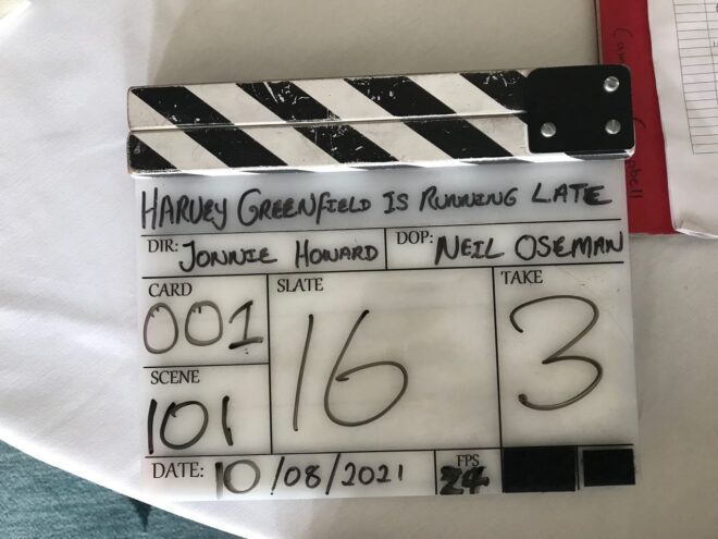
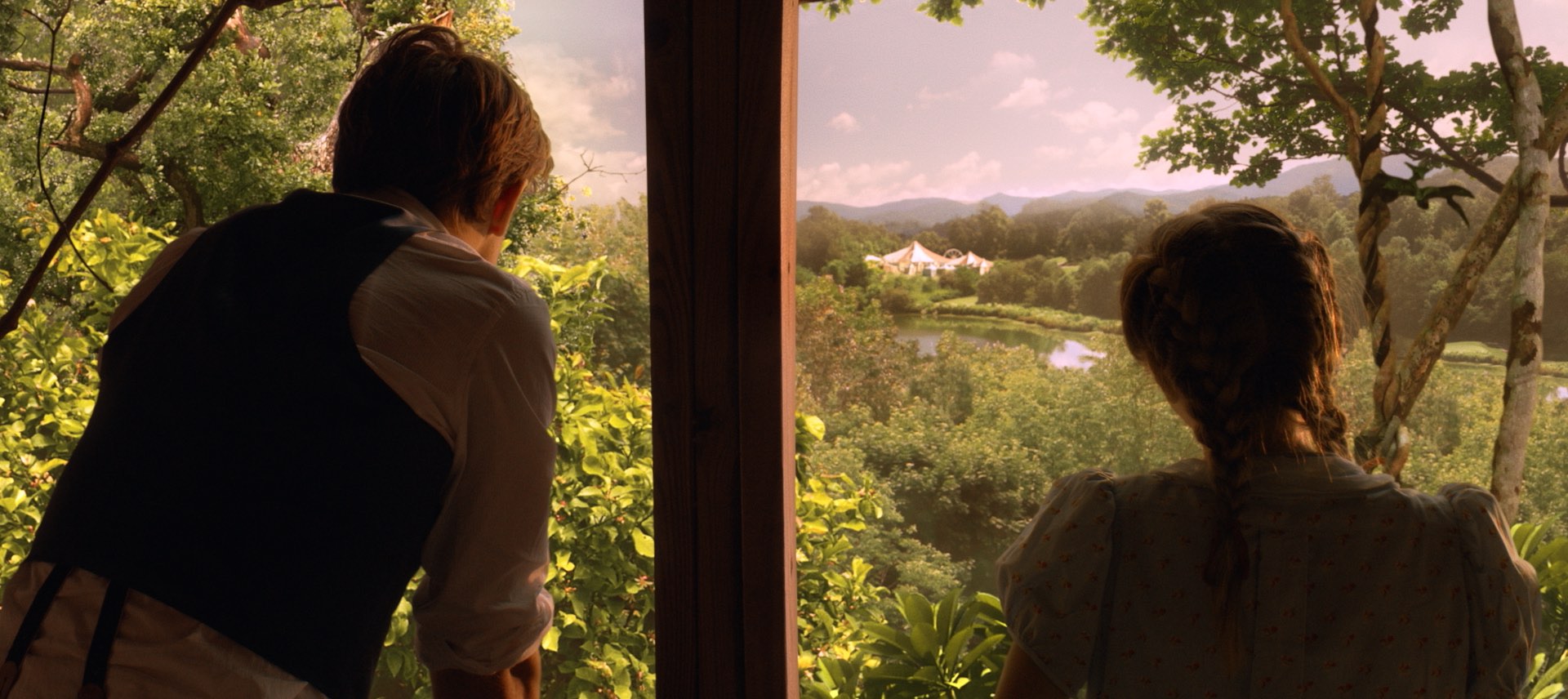
What is a French Over?

Film industry jargon isn’t shy of national references. A Dutch angle is a canted shot. To Spanish a piece of kit is to get rid of it (a corruption of “it’s banished”). To German a light – I think – is to lie the stand horizontal, attach the head, then raise the whole thing vertical. Or maybe that’s Italianing. I forget. But what is a French over?

It’s a type of over-the-shoulder shot. It requires the two characters to be bodily facing in the same direction, like on a bench or in the front seats of a car. If the camera shoots from behind their bodies, it’s a French over. Here are a few examples.

“Norman” (2010, DP: Darren Genet)
A commercial shot by Patrick O’Sullivan
“À bout de souffle” (1960, DP: Raoul Coutard)

A French over feels a little more conspiratorial or voyeuristic than a standard over. It gives the viewer a sense that they’re privy to a confidential conversation.

It works well for bench scenes because benches often have nice vistas in front of them which you can keep in the background of your close-ups, and you don’t have to cross the line to do a wide shot behind the bench showcasing the whole view.

“Mission: Impossible – Rogue Nation” (2015, DP: Robert Elswit, ASC)

It’s far easier to shoot French overs in a car because the operator can simply sit on the back seat rather than trying to jam the camera onto the dashboard.

French overs allow the editor more flexibility too. A typical problem of covering dialogue scenes where characters are facing the same way is that you can often clearly see the foreground character’s mouth, which locks the editor in to maintaining lip-sync every time they cut. In a French over you only see the back of the foreground character’s head so this problem is eliminated.

They’re not to everyone’s taste though. You certainly see less of the actors’ faces than in a standard over, and if the cast are not going to turn to look at each other very often their emotions could easily end up unreadable. If that’s not the effect you want, standard overs would be a better choice.

What is a French Over?

“Die Hard”: A Masterclass in Composition

I hope you have all enjoyed Die Hard as a traditional staple of your Yuletide festivities. Every time I see it I am in awe of, among other things, the composition by DP Jan de Bont, ASC and camera operators Michael Ferris, Michael Scott and M. Todd Henry. Let’s have a look at some of the beautifully framed images and see what some of the hallmarks are.


Low Angles

“From up here it doesn’t look like you’re in charge of jack shit.”

So many low angles in Die Hard, some motivated by the blocking but many simply to make the characters seem larger than life.


No Rule of Thirds

“There are rules for policemen.” / “Yeah. That’s what my captain keeps telling me.”

De Bont uses the full width of the 2.39:1 anamorphic frame to creatively place his subjects, rarely obeying the Rule of Thirds and often squeezing characters right into one side of the frame.


Short-siding

“Now I know what a TV dinner feels like.”

Short-siding means placing a character close to the side of the frame which they’re looking towards, and this happens quite often in the film as well.


Deep Raking Shots

“Welcome to the party, pal.”

The filmmakers love to have a row of characters ranging from near to far. Even in over-the-shoulder shots, de Bont frequently adds an extra element in the background, continuing the depth procession begun by the foreground shoulder and mid-ground actor.


Dutch Angles

“You oughta be on fucking TV with that accent.”

Jan de Bont is from the Netherlands, so every shot… But I’m talking specifically about the canted shots which underscore the deception of the scene where Alan Rickman’s Hans Gruber pretends to be a hostage (with a highly convincing English-German-American accent) and the subsequent shoot-out in the computer room.


There are also a lot of great camera moves in Die Hard, but that’s a post for another Christmas. Happy new year and yippie-ki-yay, motherfuckers!

“Die Hard”: A Masterclass in Composition

“The Little Mermaid”: A Tale of Two Cameras

As The Little Mermaid is leaving Netflix next week, I decided to go back to my production diary from 2016 and see if there were any more extracts that might be of interest. Tying in with my recent post about shooting with two cameras, here are a number of extracts demonstrating how we used our Alexa Plus XR (operated by me) and Alexa Studio XR (operated by Tim Gill). I definitely won’t say that we made the most effective and efficient use of two cameras the whole time, but I certainly learnt a lot about the pros and cons of having a B-cam.


Day 1

We start in a third floor bedroom… After we get the main coverage, we head out to the garden for the next scene, while the B-camera team steps in to pick up a couple of inserts.

As soon as we’re outside, the sun starts to dick around. Those clouds are scudding in and out faster than we can swap ND filters and fly in Ultrabounce to fill the shadows. Eventually we get the three-channel Preston (which only arrived this morning) hooked up so I can pull the iris remotely for our big jib shot. B-camera arrives and picks up alternate angles, and using the two cameras we’re able to wrap out the scenes by lunchtime.

Now we’re inside, on the first floor this time, in a beautiful little circular study. The electrical department have already set up the lamps, so it doesn’t take much tweaking to get us ready to go. Over the course of the afternoon we shoot out our scenes in the study, while B-camera gets various POVs out of windows and establishers of the house exterior. Although the G&E (grip and electric) crew are thinly stretched to support both camera crews, having that second camera is incredibly useful.


Day 2

This morning we’re in a church, shooting a montage scene in which Cam interviews a number of locals. We use two cameras to capture a locked-off wide of the interviewee (which can be jump-cut between characters) and a roaming CU simultaneously. Since Tim’s B-camera is doing the roaming shot, I spend the morning at the monitors, keeping an eye on both feeds…


Day 3

The forecast says cloudy all week, and we dearly want our exteriors at Lorene’s House to be sunny and beautiful. But actually the dark, overcast skies work in our favour when the AD has us spend the morning shooting a “sunset” exterior. Our 12K HMI, gelled with full CTS, has enough power to cut through the dim natural light and give the impression of a gentle sunset. Working with both cameras, we get a great tracking shot, a jib shot and some other coverage. Then we leave the B-camera team behind, under the direction of VFX supervisor Rich (for the above green-screen shot), while we move back inside to block and light other scenes…


Day 8

… We have planned our day to maximise our two cameras. We’ve only been getting about eight set-ups a day, and we knew that with the stunts and effects we have today we would be pushed to even get that many. So we planned six two-camera set-ups and an insert, and we stick closely to this plan. A-camera lives on the crane with the (Angenieux 19.5-94mm Optimo) zoom most of the day, getting the most out of the scale and height of the big top and the action, while B-camera – using the (Cooke S4/i) primes for a change – gets the closer shots. This leaves me free to look at the monitors, which is useful but often boring. (All the material from this day sadly hit the cutting room floor.)


Day 12

Our last day at the circus… For most of the day the B-camera is nearby shooting different stuff. This is great in principle, but in practice we tend to get in each others’ way, our lighting affecting their shots and vice versa.


Day 24

… After lunch we have a big fight scene to shoot, and the pace of work kicks up several gears. I light a small clearing so we can shoot 180 degrees with two cameras simultaneously. Some directions look better than others, but in an action scene no shot will be held for very long, so it’s not necessary to get every angle perfect.

Normally I open the Cooke S4s no wider than 2 and two thirds, as no lens performs at its best when wide open, but my resolve on this is slipping, and it’s really hard to get a decent amount of light through the dense trees at this location, so I go wide open (T2) for this sequence.


Day 25

Our last day on Tybee Island. We start with pick-ups in the woods for various scenes shot over the last few days, then move to the beach, a portion of which we’re cheating as a “river marsh” location. This is a night scene, so we have to go through the slow process of moving the condor (cherry-picker) around from the woods. This involves a police escort to get it across the highway…

Meanwhile B-camera are shooting a shot of a car driving along the road behind the beach. Since the G&E crew are all tied up, at (co-director) Chris Bouchard’s suggestion they use the location work-light and have to fiddle with the white balance to render it a reasonable colour on camera. More and more micro-budget cheats are being employed as the production goes on, and to most of the crew, who are used to big-budget stuff, it’s ridiculous. I don’t mind so much, but I feel bad for the B-camera team.


Day 26

We are back on the stage, in three different sets. I’ve lit them all before, but most of the lamps are gone and some require a new look because the time of day is different. Towards the end of the night we leap-frog from set to set, sending G&E and the B-camera ahead to set up while we’re still shooting. To my surprise it works. The sets are small enough that we have enough G&E crew to split up like that.

Top row: A-cam 1st AC Jonathan Klepfer, A-cam 2nd AC Kane Pearson, me, B-cam 1st AC Geran Daniels; bottom row: B-cam 2nd AC Matt Bradford Dixon, digital loader Alex Dubois, B-cam operator/2nd unit DP Tim Gill

For more extracts from my Little Mermaid diary, visit these links:

The Little Mermaid is currently available on Netflix in the UK – but hurry because it leaves on November 30th – and Showtime in the US.

“The Little Mermaid”: A Tale of Two Cameras

Why You Shouldn’t Shoot the Rehearsal

We’ve all been there. Schedules are tight. Sooner or later the 1st AD, a producer or even the director is going to want to save time by “shooting the rehearsal”. I strongly disagree with this and here’s why.

No matter how great an actor is, they have only a finite amount of performance energy. They can only do so many takes before the results start to go downhill. In my experience, most actors deliver their best performance on take one or two.

So those first takes need to be useable. They need to be in focus. The timing of the camera movement needs to be right. The boom needs to be out of frame. The prop in the drawer that the talent has to take out halfway through the scene needs to be in position, not still in the standby props person’s hand because they didn’t realise we were going that far. The view out of the door that the talent opens at the very end needs to have been dressed and lit. What, you didn’t know they were opening the door because they skipped that in the block-through and you didn’t get a rehearsal? Bummer.

The purpose of a camera rehearsal is to find all these problems without burning the actors’ performance energy. If you roll the camera on the “rehearsal” – and I use quote marks because it isn’t a rehearsal any more – the cast have to deliver a full performance. Maybe a great, spontaneous performance that can’t be repeated. The last thing you want is for a boom shadow to be hovering over their forehead for half the scene.

Things like boom positions and focus pulling especially can only be properly rehearsed with the camera up and the cast moving through their actual positions. And you can talk about a scene all you want, but a moving picture is worth a million words. There’s no substitute for everyone watching the monitor during that rehearsal and seeing exactly what’s required.

Is a camera rehearsal always necessary on every set-up? No, especially if the scene has already been shot from several other angles, or if everyone’s confident that they know how it’s going to unfold, or if the scene demands little emotional commitment from the cast. But it should be the default practice.

Will a camera rehearsal always throw up problems? Of course not. And if it goes perfectly, people will curse that you didn’t roll, and start asking why we bother with camera rehearsals anyway. That’s life.

Why You Shouldn’t Shoot the Rehearsal

“Harvey Greenfield is Running Late”: Week 1

Day 1

The weather was dry and overcast, shedding a pleasantly soft light on the proceedings as the crew of Harvey Greenfield is Running Late set up for our first scene, in front of a small primary school in rural Cambridgeshire.

Then we started shooting and the weather went bananas.

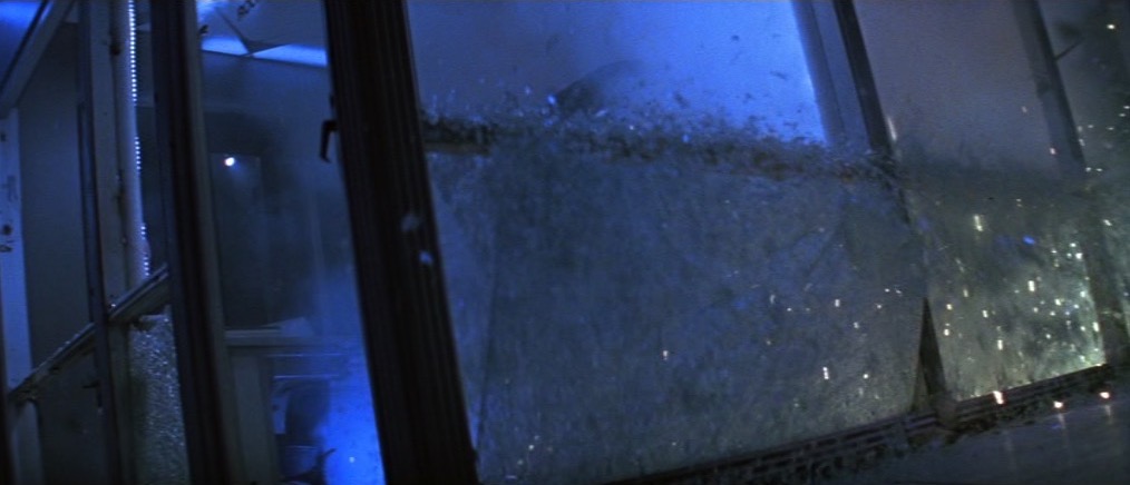
One moment we had bright sunshine, the next we had heavy rain bordering on hail… sometimes in the same take. We had lots of fun and games dodging the showers, maneouvering a 12×12′ silk to soften the sun, keeping reflections and shadows out of shot, waiting for noisy trains to pass, and trying to get through takes without the light changing. But we got there in the end.

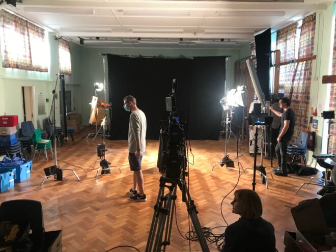
In the afternoon we moved into the school hall, which we were using as a makeshift studio. As well as numerous flashbacks, the film includes several imaginary sequences, including a spoof advert. This we shot against a black backdrop using dual backlights, one on either side, to highlight the talent. I totally stole this look from the Men in Black poster.

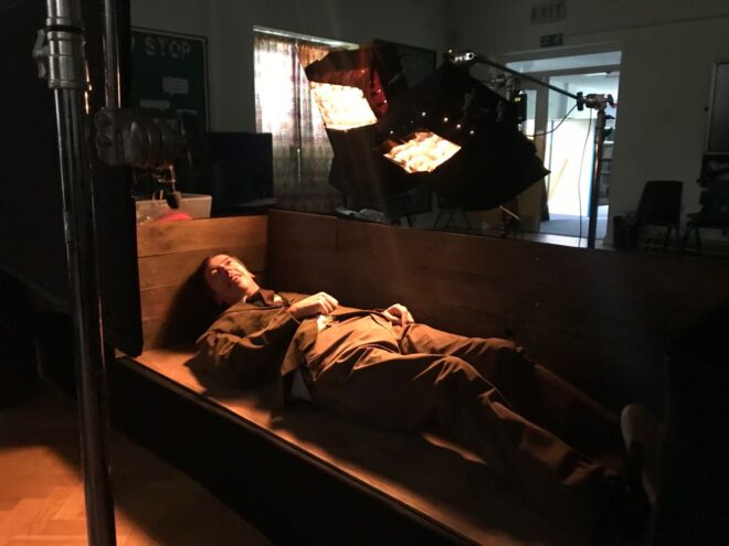
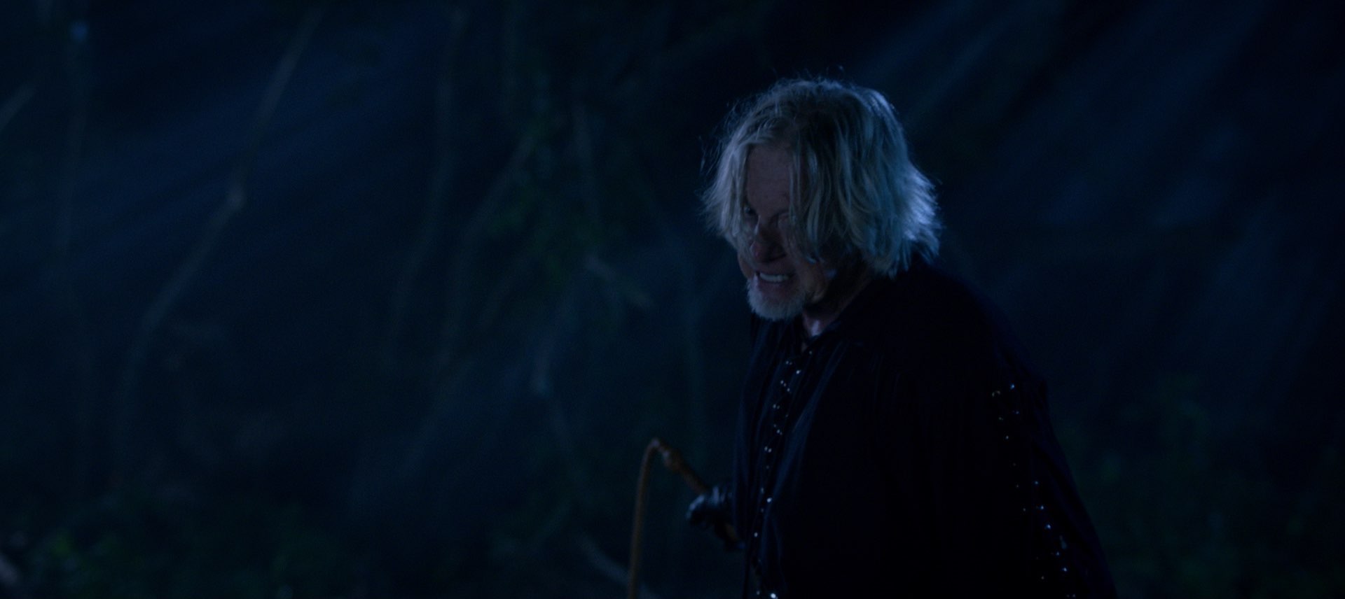
Our last shot of the day was Harvey’s first, and another imaginary scene, this time set in a coffin. To give the appearance of it being underground, the coffin (with no lid and one side missing) was placed on rostra with a black drape hanging below it. To create darkness above it, we simply set a flag in front of camera. Harvey (Paul Richards) lights a match to illuminate himself, which gaffer Stephen Allwright supplemented with two 1×1′ Aladdin Bi-flexes set to tungsten and gelled even more orange.


Day 2

One of the few occasions in my life when I’ve been able to walk to set from home: we started at the University Arms Hotel overlooking Parker’s Piece, one of Cambridge’s many green spaces (and, fact fans, the place where the rules of Association Football were first established).

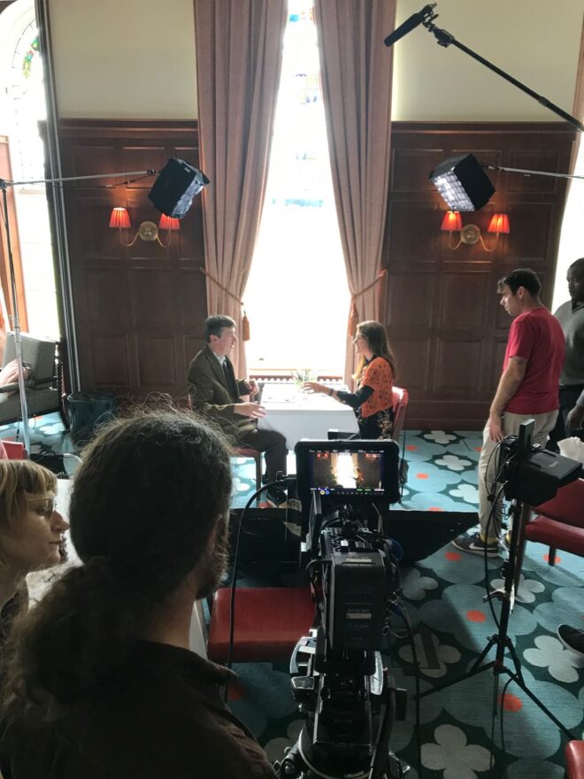
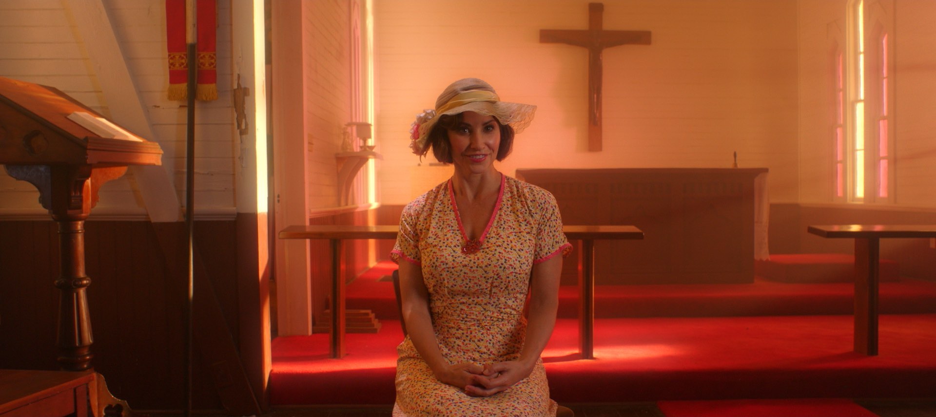
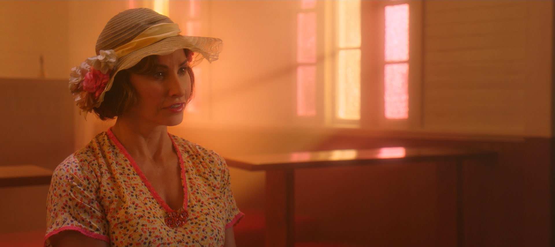
The hotel’s function room was dressed as an upmarket restaurant, where we captured Harvey’s first date with his girlfriend Alice (Liz Todd). We shot towards a window; putting your main light source in the background is always a good move, and it gave us the perfect excuse to do soft cross-backlight on the two characters. The room’s wood panelling and sconces looked great on camera too.

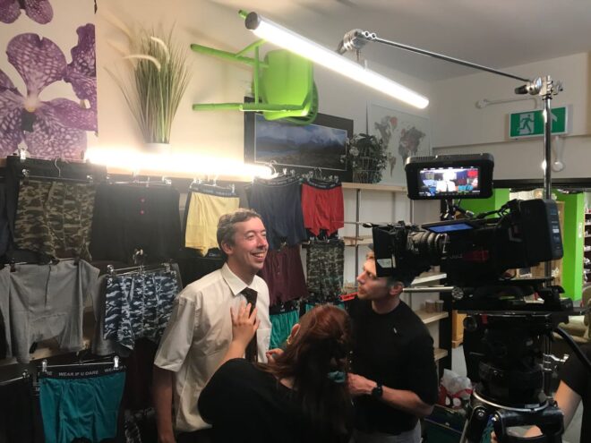
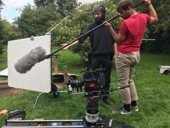
The unit then moved to Emmaus, a large charity shop north of the city, where we filmed a Wall of Pants and some tightly choreographed Sandwich Action. Here we broke out the Astera tubes for the fist time, using them as a toppy, fluorescent-style key-light and backlight.

By now we were getting into the visual rhythm of the film, embracing wide angles (our 18-35mm zoom gets heavy use), central framing (or sometimes short-siding), Wes Anderson-type pans/tilts, and a 14mm lens and/or handheld moves for crazier moments.


Day 3

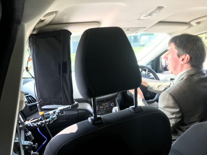
We were based at Paul’s house for day 3, beginning in the street outside for a brief scene in his car. Shooting from the back, we mounted an Aladdin in the passenger seat to key Paul, and blacked out some of the rear windows to create negative fill, much like I did for the driving scenes in Above the Clouds.

The rest of the day was spent in and around Paul’s shed. Or, to be more specific, the middle one of his three sheds. This is Harvey’s “Happy Place” so I stepped up from the Soft FX 0.5 filter I’d been shooting with so far to the Soft FX 1, to diffuse the image a little more. We also used haze for the only time on the film.

Some shots through the shed window gave us the usual reflection challenges. Stephen rigged a 12×12 black solid to help with this, and we draped some bolton over the camera. Inside the shed we used an Aladdin to bring up the level, and once we stopped shooting through the window we fired a tungsten 2K in through there instead. This was gelled with just half CTB so that it would still be warm compared with the daylight, and Stephen swapped the solid for a silk to keep the natural light consistent and eliminate the real direct sun.

I made my first use of the Red Gemini’s low light mode today, switching to ISO 3200 to maintain the depth of field when filming in slow motion. (I have been shooting at T4-5.6 because a sharper, busier background feels more stressful for Harvey.)


Day 4

Back to the primary school. We spent the morning outside shooting flashbacks with some talented child actors from the Pauline Quirke Academy. We got some nice slider shots and comedy pans while dealing with the ever-changing cloud cover.

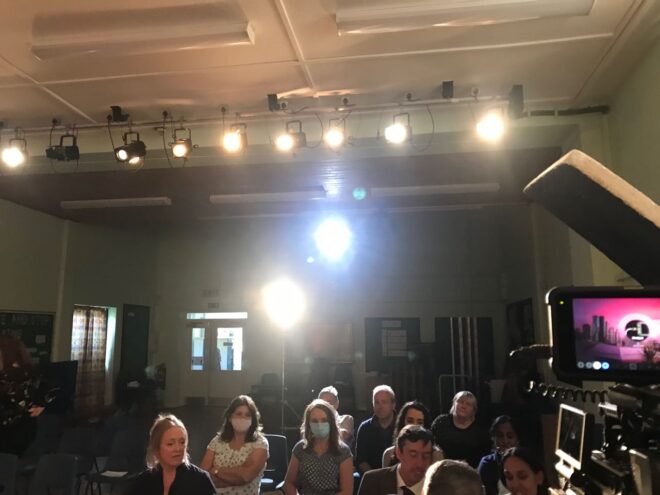
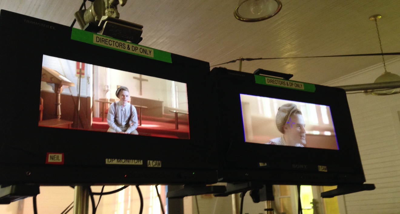
Inside in the afternoon we picked up a dropped scene from day 1, then moved on to one of the film’s biggest challenges: a six-minute dialogue scene travelling through a corridor and around a classroom, to be filmed in a single continuous Steadicam shot. This could easily have been a nightmare, but a number of factors worked in our favour. Firstly, we had rehearsed the scene on location with actors and a phone camera during pre-production. Secondly, we had the brilliant Rupert Peddle operating the Steadicam. Thirdly, it would have been so difficult to keep a boom and its shadows out of shot that mixer Filipe Pinheiro and his team didn’t even try, instead relying on lavaliers and a mic mounted on the camera.

For similar reasons, we didn’t do much lighting either; there were almost no areas of the rooms and their ceilings that didn’t come into shot at some point. In two places Stephen rigged blackout for negative fill. I then chose which of the existing ceiling lights to turn off and which to keep on, to get as much shape into the image as possible. We tried to rig a grid onto one of the ceiling lights to take it off a wall that was getting too hot, but after one take we realised that this was in frame, so instead we stuck a square of ND gel to it. We also rigged two Astera tubes in the corridor, but discovered that one of those came into frame too, so in the end a single Astera tube was the only additive lighting. The existing ceiling lights worked particularly well for a slow push-in to Alice near the end of the shot, providing her with both key and backlight from perfect angles.


Day 5

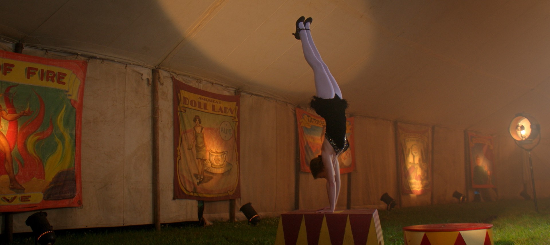
Today we shot a big scene based around a school play. Production designer Amanda Stekly had created a suitably cheesy, sparkly backdrop, and more PQA students dressed up in weird and wonderful costumes to enact snatches of a very random production called Spamlet (making it the second time this year I’ve shot “to be or not to be”, though this time was… er… a little different).

The school had a basic lighting rig already. We refocused and re-gelled some of the lights, keeping it very simple and frontal. Behind the set I put one of my old 800W Arri Lites as a backlight for the kids on stage. To one side, where Alice was standing, we used two Astera tubes, one to key her and one to backlight her. These were both set to a cool, slightly minty colour. My idea of using green for calming characters and moments hasn’t come to fruition quite as I’d planned, because it hasn’t fitted the locations and other design elements, but there’s a little hint of it here.

For the audience, Stephen rigged an Aputure 300D to the ceiling as a backlight, then we bounced the stage lighting back onto them using a silver board. We also used the school’s follow spot, which gave us some nice flares for the stressful moments later in the scene. It was daytime both in reality and in the story, but we closed the (thin) curtains and reduced the ambience outside with floppy flags so that the artificial lighting would have more effect.

We had to move at breakneck speed in the afternoon to get everything in the can before wrap time, but we managed it, finishing our first week on schedule. No mean feat.

“Harvey Greenfield is Running Late”: Week 1

Exposure Part 3: Shutter

In the first two parts of this series we saw how exposure can be controlled using the lens aperture – with side effects including changes to the depth of field – and neutral density (ND) filters. Today we will look at another means of exposure control: shutter angle.


The Physical Shutters of Film Cameras

As with aperture, an understanding of what’s going on under the hood is useful, and that begins with celluloid. Let’s imagine we’re shooting on film at 24fps, the most common frame rate. The film can’t move continuously through the gate (the opening behind the lens where the focused light strikes the film) or we would end up recording just a long vertical streak of light. The film must remain stationary long enough to expose an image, before being moved on by a distance of four perforations (the standard height of a 35mm film frame) so that the next frame can be exposed. Crucially, light must not hit the film while it is being moved, or vertical streaking will occur.

Joram van Hartingsveldt, CC BY-SA 3.0

This is where the shutter comes in. The shutter is a portion of a disc that spins in front of the gate. The standard shutter angle is 180°, meaning that the shutter is a semi-circle. We always describe shutter angles by the portion of the disc which is missing, so a 270° shutter (admitting 1.5x the light of a 180° shutter) is a quarter of a circle, and a 90° shutter (admitting half the light of a 180° shutter) is three-quarters.

The shutter spins continuously at the same speed as the frame rate – so at 24fps the shutter makes 24 revolutions per second. So with a 180° shutter, each 24th of a second is divided into two halves, i.e. 48ths of a second:

  • During one 48th of a second, the missing part of the shutter is over the gate, allowing the light to pass through and the stationary film to be exposed.
  • During the other 48th of a second, the shutter blocks the gate to prevent light hitting the film as it is advanced. The shutter has a mirrored surface so that light from the lens is reflected up the viewfinder, allowing the camera operator to see what they’re shooting.


Intervals vs. Angles

If you come from a stills or ENG background, you may be more used to talking about shutter intervals rather than angles. The two things are related as follows:

Frame rate x (360 ÷ shutter angle) = shutter interval denominator

For example, 24 x (360 ÷ 180) = 48 so a film running at 24fps, shot with a 180° shutter, shows us only a 48th of a second’s worth of light on each frame. This has been the standard frame rate and shutter angle in cinema since the introduction of sound in the late 1920s. The amount of motion blur captured in a 48th of a second is the amount that we as an audience have been trained to expect from motion pictures all our lives.

A greater (larger shutter angle, longer shutter interval) or lesser (smaller shutter angle, shorter shutter interval) amount of motion blur looks unusual to us and thus can be used to creative effect. Saving Private Ryan features one of the best-known examples of a small shutter angle in its D-day landing sequence, where the lack of motion blur creates a crisp, hyper-real effect that draws you into the horror of the battle. The effect has been endlessly copied since then, to the point that it now feels almost mandatory to shoot action scenes with a small shutter angle.

Large shutter angles are less common, but the extra motion blur can imply a drugged, fatigued or dream-like state.

In today’s digital environment, only the Arri Alexa Studio has a physical shutter. In other cameras, the sensor’s photo-sites are allowed to charge with light over a certain period of time – still referred to as the shutter interval, even though no actual shutter is involved. The same principles apply and the same 180° angle of the virtual shutter is standard. The camera will allow you to select a shutter angle/interval from a number of options, and on some models like the Canon C300 there is a menu setting to switch between displaying the shutter setting as an angle or an interval.


When to Change the Shutter Angle

Sometimes it is necessary to change the shutter angle to avoid flickering. Some luminous devices, such as TV screens and monitors, or HMI lighting not set to flicker-free mode, will appear to strobe, pulse or roll on camera. This is due to them turning on and off multiple times per second, in sync with the alternating current of the mains power supply, but not necessarily in sync with the shutter. For example, if you shoot a domestic fluorescent lamp in the UK, where the mains AC cycles at 50Hz, your 1/48th (180° at 24fps) shutter will be out of sync and the lamp will appear to throb or flicker on camera. The solution is to set the shutter to 172.8° (1/50th), which is indeed what most DPs do when shooting features in the UK. Round multiples of the AC frequency like 1/100th will also work.

You may notice that I have barely mentioned exposure so far in this article. This is because, unlike stills photographers, DPs rarely use the shutter as a means of adjusting exposure. An exception is that we may increase the shutter angle when the daylight is fading, to grab an extra shot. By doubling the shutter angle from 172.8° to 345.6° we double the light admitted, i.e. we gain one stop. As long as there isn’t any fast movement, the extra motion blur is likely to go unnoticed by the audience.

One of the hallmarks of amateur cinematography is that sunny scenes have no motion blur, due to the operator (or the camera’s auto mode) decreasing the shutter interval to avoid over-exposure. It is preferable to use ND filters to cut light on bright days, as covered in part two of this series.

For the best results, the 180° (or thereabouts) shutter angle should be retained when shooting slow motion as well. If your camera displays intervals rather than angles, ideally your interval denominator should be double the frame rate. So if you want to shoot at 50fps, set the shutter interval to 1/100th. For 100fps, set the shutter to 1/200th, and so on.

If you do need to change the shutter angle for creative or technical reasons, you will usually want to compensate with the aperture. If you halve the time the shutter is open for, you must double the area of the aperture to maintain the same exposure, and vice versa. For example, if your iris was set to T4 and you change the shutter from 180° to 90° you will need to stop up to T2.8. (Refer back to my article on aperture if you need to refresh your memory about T-stops.)

In the final part of this series we’ll get to grips with ISO.

Learn more about exposure in my online course, Cinematic Lighting. Until this Thursday (19/11/20) you can get it for the special price of £15.99 by using the voucher code INSTA90.

Exposure Part 3: Shutter

Exposure Part 1: Aperture

This is the first in a series of posts where I will look in detail at the four means of controlling the brightness of a digital video image: aperture, neutral density (ND) filters, shutter angle and ISO. It is not uncommon for newer cinematographers to have only a partial understanding of these topics, enough to get by in most situations; that was certainly the case with me for many years. The aim of this series is to give you an understanding of the underlying mechanics which will enable you to make more informed creative decisions.

You can change any one of the four factors, or any combination of them, to reach your desired level of exposure. However, most of them will also affect the image in other ways; for example, aperture affects depth of field. One of the key responsibilities of the director of photography is to use each of the four factors not just to create the ideal exposure, but to make appropriate use of these “side effects” as well.


f-stops and t-stops

The most common way of altering exposure is to adjust the aperture, a.k.a. the iris, sometimes described as changing “the stop”. Just like the pupil in our eyes, the aperture of a photographic lens is a (roughly) circular opening which can be expanded or contracted to permit more or less light through to the sensor.

You will have seen a series of numbers like this printed on the sides of lenses:

1      1.4      2      2.8      4      5.6      8      11      16      22     32

These are ratios – ratios of the lens’ focal length to its iris diameter. So a 50mm lens with a 25mm diameter iris is at f/2. Other lengths of lens would have different iris diameters at f/2 (e.g. 10mm diameter for a 20mm lens) but they would all produce an image of the same brightness. That’s why we use f-stops to talk about iris rather than diameters.

But why not label a lens 1, 2, 3, 4…? Why 1, 1.2, 2, 2.8…? These magic numbers are f-stops. A lens set to f/1.4 will let in twice as much light as (or “one stop more than”) a lens set to f/2, which in turn will let in twice as much as one set to f/2.8, and so on. Conversely, a lens set to f/2.8 will let in half as much light as (or “one stop less than”) a lens set to f/2, and so on. (Note that a number between any of these f-stops, e.g. f/1.8, is properly called an f-number, but not an f-stop.) These doublings or halvings – technically known as a base-2 logarithmic scale – are a fundamental concept in exposure, and mimic our eyes’ response to light.

If you think back to high-school maths and the πr² squared formula for calculating the area of a circle from its radius, the reason for the seemingly random series of numbers will start to become clear. Letting in twice as much light requires twice as much area for those light rays to fall on, and remember that the f-number is the ratio of the focal length to the iris diameter, so you can see how square roots are going to get involved and why f-stops aren’t just plain old round numbers.

If you’re shooting with a cine lens, rather than a stills lens, you’ll see the same series of numbers on the barrel, but here they are T-stops rather than f-stops. T-stops are f-stops adjusted to compensate for the light transmission efficiency. Two different lenses set to, say, f/2 will not necessarily produce equally bright images, because some percentage of light travelling through the elements will always be lost, and that percentage will vary depending on the quality of the glass and the number of elements. A lens with 100% light transmission would have the same f-number and T-number, but in practice the T-number will always be a little bigger than the f-number. For example, Cooke’s 15-40mm zoom is rated at a maximum aperture of T2 or f/1.84.


Fast and slow lenses

When buying or renting a lens, one of the first things you will want to know is its maximum aperture. Lenses are often described as being fast (larger maximum aperture, denoted by a smaller f- or T-number like T1.4) or slow (smaller maximum aperture, denoted by a bigger f- or T-number like T4). These terms come from the fact that the shutter speed would need to be faster or slower to capture the same amount of light… but more on that later in the series.

Faster lenses are generally more expensive, but that expense may well be outweighed by the savings made on lighting equipment. Let’s take a simple example, and imagine an interview lit by a 4-bank Kino Flo and exposed at T2.8. If our lens can open one stop wider (known as stopping up) to T2 then we double the amount of light reaching the sensor. We can therefore halve the level of light – by turning off two of the Kino Flo’s tubes or by renting a cheaper 2-bank unit in the first place. If we can stop up further, to T1.4, then we only need one Kino tube to achieve the same exposure.


Side effects

One of the first things that budding cinematographers learn is that wider apertures make for a smaller depth of field, i.e. the range of distances within which a subject will be in focus is smaller. In simple terms, the background of the image is blurrier when the depth of field is shallower.

It is often tempting to go for the shallowest possible depth of field, because it feels more cinematic and helps conceal shortcomings in the production design, but that is not the right look for every story. A DP will often choose a stop to shoot at based on the depth of field they desire. That choice of stop may affect the entire lighting budget; if you want to shoot at a very slow T14 like Douglas Slocombe did for the Indiana Jones trilogy, you’re going to need several trucks full of lights!

There is another side effect of adjusting the aperture which is less obvious. Lenses are manufactured to perform best in the middle of their iris range. If you open a lens up to its maximum aperture or close it down to its minimum, the image will soften a little. Therefore another advantage of faster lenses is the ability to get further away from their maximum aperture (and poorest image quality) with the same amount of light.

Finally it is worth noting that the appearance of bokeh (out of focus areas) and lens flares also changes with aperture. The Cooke S4 range, for example, renders out-of-focus highlights as circles when wide open, but as octagons when stopped down. With all lenses, the star pattern seen around bright light sources will be stronger when the aperture is smaller. You should shoot tests – like these I conducted in 2017 – if these image artefacts are a critical part of your film’s look.

Next time we’ll look at how we can use ND filters to control exposure without compromising our choice of stop.

Learn how to use exposure practically with my Cinematic Lighting online couse. Enter voucher code INSTA90 for an amazing 90% off.

Exposure Part 1: Aperture

Where to Place Your Horizon

I once had an argument with a director about the composition of a wide shot. I wanted to put the horizon nearer the top of the frame than the bottom, and he felt that this was the wrong way around. In reality there is no right and wrong in composition, only a myriad of possibilities that are all valid and can all make your viewers feel different ways. In this article I will take a metaphorical ramble through these possibilities, and ponder their effects.

You would think that the most natural position for the horizon would be in the vertical centre of the frame. After all, in our day-to-day life, when we look straight ahead, this is where it appears to be.

In practice, a central horizon is not a popular choice. This article by Art Wolfe, for example, argues that it robs the image of dynamism, sending the eye straight to the horizon rather than letting it wander around the frame. The technique is also at odds with the Rule of Thirds, though as I’ve written before, that’s not a rule I place much stock in.

The talented photographer and vlogger Arian Vila, however, describes the merits of a central horizon when composing for a square aspect ratio. And this is an excellent reminder that the horizon does not exist in a vacuum; like anything else, it must be judged in the context of the aspect ratio and the other compositional elements of the frame.

For Leon Chambers’ Above the Clouds (out now on Amazon Prime and other platforms!), I placed the horizon centrally several times:

This was a deliberate echo of the painting “Above the Clouds” which appears in the film and provides the thematic backbone.

A year or two after shooting Clouds, I came across Photograms of the Year: 1949 in a charity shop. Amongst its pages I found another diptych, one created by the book designer rather than the two entirely separate photographers:

These two images, perfectly paired, demonstrate contrasting horizon placement. At Grey Dawn emphasises the sky by placing the horizon low in the frame, creating a sense of space. Meanwhile, Homeward Bound positions its horizon somewhere beyond the trees near the top of frame, drawing attention to the sand and the wheel ruts and indeed to the figures of the caravan itself, rather than to the destination or surroundings.

Horizon placement is closely tied to two other creative choices: headroom, which I dedicated a whole article to, and lens height, i.e. is this a low or a high angle? Even a GCSE media student can tell you that a low angle imbues power while a high angle implies vulnerability, but these are terms most applicable to closer shots. When we think of horizon placement we are probably concerned with big wides, where creating a mood for the scene or setting is more important than visualising a character’s power or lack thereof.

Breaking Bad is an example of a series that predominantly chooses low horizons to show off the big skies of its New Mexico locations. “[Showrunner] Vince [Gilligan] is a student of cinema and knows movies like the back of his hand,” says DP Michael Slovis, ASC. “It was always in his mind that this was a Western in the style of Sergio Leone and the Italian Neo-realists.”

Incidentally, there’s an amazing desert scene in the episode “Crawl Space” where a sunlit close-up cuts to a big wide. The wide holds as clouds roll over the sun. The action continues and the shot still holds, the line between sunlight and shade visible as it rolls away across the desert, until finally a new line slides under the camera and sun breaks over the actors once more. Only then are we permitted to see the scene up close again.

This creative choice, to set the character’s small concerns against the vast immutability of nature, comes from the same place as the choice to put the horizon low in frame.

Returning to Photograms of the Year: 1949, my eyes light upon another pair of contrasting images:

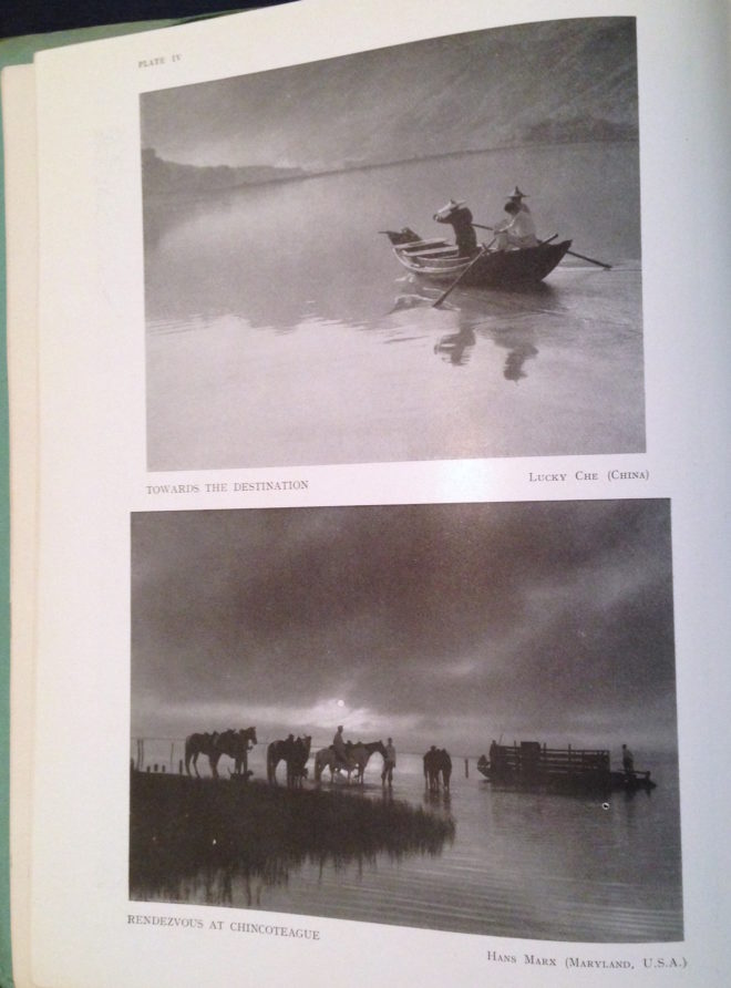
Despite its title, Towards the Destination shows us little of where the sailors are heading, by placing the horizon high in the frame and focusing on the water and the reflections therein. Rendezvous at Chincoteague, by placing its horizon low in the frame, radiates a feeling of isolation that is in contrast to the meeting of the title.

As we consider the figures in these photographs I am forced to concede that the argument I alluded to in the introduction may have been less about the position of the horizon and more about the position of the actor. I think the director felt that it was unnatural for an person to appear in the top half of the frame rather than the bottom half.

I can see his point. The vision of our naked eyes is definitely framed along the bottom by the ground, while the top remains open and unlimited – outdoors, at least. So if a person is standing on the ground, we naturally expect them to appear low down in an image.

But this – like nose room, the Rule of Thirds, the 180° Rule, short-key lighting, so many things in cinematography – is merely a guideline. There are times when it just isn’t helpful, when it can lead to wasted opportunities.

Here is a shot of mine from The Gong Fu Connection (dir. Ted Duran) where the horizon and the cast are placed in the upper half of frame:

Would it really have been better to frame them lower, losing out on the reflections and the foreround rushes, and gaining just empty sky? I think not. This composition was especially important to me, because the film’s titular connection is all about man and the natural world. By showing the water and greenery, we root the characters in it. A composition with more sky might have made them seem dwarfed by nature, lost in it.

This article has been something of a stream of consciousness, but the point I’m trying to make is this: always consider the content and meaning of your shot; reflecting those in your composition is infinitely more important than adhering to any guidelines.

If you enjoyed this, you may be interested in some of my other articles on composition:

Where to Place Your Horizon

The Cinematography of “First Man”

A miniature Saturn V rocket is prepared for filming

If you’re a DP, you’re probably familiar with the “Guess the Format” game. Whenever you see a movie, you find yourself trying to guess what format it was shot on. Film or digital? Camera? Glass? Resolution?

As I sat in the cinema last autumn watching First Man, I was definitely playing the game. First Man tells the true story of Neil Armstrong’s (Ryan Gosling) extraterrestrial career, including his test flights in the hypersonic  X-15, his execution of the first ever docking in space aboard Gemini 8, the tragic deaths of his colleagues in the launchpad fire of Apollo 1, and of course the historic Apollo 11.

The game was given away fairly early on when I noticed frames with dust on, a sure sign of celluloid acquisition. (Though most movies have so much digital clean-up now that a lack of dust doesn’t necessarily mean that film wasn’t involved.) I automatically assumed 35mm, though as the film went on I occasionally wondered if I could possibly be watching Super-16? There was something of the analogue home movie about certain scenes, the way the searing highlights of the sun blasting into the space capsules rolled off and bloomed.

When I got home I tracked down this Studio Daily podcast and my suspicions were confirmed, but we’ll get to that in a minute.


Cinéma Vérité

Let’s start at the beginning. First Man was directed by Damien Chazelle and photographed by Linus Sandgren, FSF, the same team who made La La Land, for which both men won Oscars. What I remember most about the cinematography of that earlier film is the palette of bright but slightly sickly colours, and the choreographed Steadicam moves.

First Man couldn’t be more different, adopting a cinéma vérité approach that often looks like it could be real and previously-unseen Nasa footage. Sandgren used zoom lenses and a documentary approach to achieve this feeling:

When you do a documentary about a person and you’re there in their house with them and they’re sad or they’re talking, maybe you don’t walk in there and stand in the perfect camera position. You can’t really get the perfect angles. That in itself creates some sort of humbleness to the characters; you are a little respectful and leave them a little alone to watch them from a distance or a little bit from behind.

Similarly, scenes in the spacecraft relied heavily on POVs through the small windows of the capsule, which is all that the astronauts or a hypothetical documentary camera operator would have been able to see. This blinkered view, combined with evocative and terrifying sound design – all metallic creaks, clanks and deafening booms, like the world itself is ending – makes the spaceflight sequences incredibly visceral.


Multiple gauges

Scale comparison of film formats. Note that Imax is originated on 65mm stock and printed on 70mm to allow room for the soundtrack.

Documentaries in the sixties would have been shot on Super-16, which is part of the reason that Sandgren and Chazelle chose it as one of their acquisition formats. The full breakdown of formats is as follows:

  • Super-16 was employed for intense or emotional material, specifically early sequences relating to the death of Armstrong’s young daughter, and scenes inside the various spacecraft. As well as the creative considerations, the smaller size of Super-16 equipment was presumably advantageous from a practical point of view inside the cramped sets.
  • 35mm was used for most of the non-space scenes. Sandgren differentiated the scenes at Nasa from those at Armstrong’s home by push-processing the former and pull-processing the latter. What this means is that Nasa scenes were underexposed by one stop and overdeveloped, resulting in a detailed, contrasty, grainy look, while the home scenes were overexposed and underdeveloped to produce a cleaner, softer, milkier look. 35mm was also used for wide shots in scenes that were primarily Super-16, to ensure sufficient definition.
  • Imax (horizontally-fed 65mm) was reserved for scenes on the moon.


In-camera effects

In keeping with the vintage aesthetic of celluloid capture, the visual effects were captured in-camera wherever possible. I’ve written in the past about the rise of LED screens as a replacement for green-screen and a source of interactive lighting. I guessed that First Man was using this technology from ECUs which showed the crescent of Earth reflected in Ryan Gosling’s eyes. Such things can be added in post, of course, but First Man‘s VFX have the unmistakeable ring of in-camera authenticity.

Imposing a “no green-screen” rule, Chazelle and his team used a huge LED screen to display the views out of the spacecraft windows. A 180° arc of 60′ diameter and 35′ in height, this screen was bright enough to provide all the interactive lighting that Sandgren required. His only addition was a 5K tungsten par or 18K HMI on a crane arm to represent the direct light of the sun.

The old-school approach extended to building and filming miniatures, of the Saturn V rocket and its launch tower for example. For a sequence of Armstrong in an elevator ascending the tower, the LED screen behind Gosling displayed footage of this miniature.

For external views of the capsules in space, the filmmakers tried to limit themselves to realistic shots which a camera mounted on the bodywork might have been able to capture. This put me in mind of Christopher Nolan’s Interstellar, which used the same technique to sell the verisimilitude of its space vehicles. In an age when any conceivable camera move can be executed, it can be very powerful to stick to simple angles which tap into decades of history – not just from cinema but from documentaries and motorsports coverage too.


Lunar Lighting

For scenes on earth, Landgren walked a line between naturalism and expression, influenced by legendary DPs like Gordon Willis, ASC. My favourite shot is a wide of Armstrong’s street at night, as he and his ill-fated friend Ed White (Jason Clarke) part company after a drinking session. The mundane suburban setting is bathed in blue moonbeams, as if the the moon’s fingers are reaching out to draw the characters in.

Scenes on the lunar surface were captured at night on an outdoor set the size of three football pitches. To achieve absolute authenticity, Sandgren needed a single light source (representing the sun) fixed at 15° above the horizon. Covering an area that size was going to require one hell of a single source, so he went to Luminys, makers of the Softsun.

Softsuns

Softsuns are lamps of frankly ridiculous power. The 50KW model was used, amongst other things, to blast majestic streams of light through the windows of Buckingham Palace on The Crown, but Sandgren turned to the 100KW model. Even that proved insufficient, so he challenged Luminys to build a 200KW model, which they did.

The result is a completely stark and realistic depiction of a place where the sun is the only illumination, with no atmosphere to diffuse or redistribute it, no sky to glow and fill in the shadows. This ties in neatly with a prevailing theme in the film, that of associating black with death, when Armstrong symbolically casts his deceased daughter’s bracelet into an obsidian crater.

First Man may prove unsatisfying for some, with Armstrong’s taciturn and emotionally closed-off nature making his motivations unclear, but cinematically it is a tour de force. Taking a human perspective on extraordinary accomplishments, deftly blending utterly convincing VFX and immersive cinéma vérité photography, First Man recalls the similarly analogue and similarly gripping Dunkirk as well as the documentary-like approach of 1983’s The Right Stuff. The film is currently available on DVD, Blu-ray and VOD, and I highly recommend you check it out.

The Cinematography of “First Man”

Aspect Ratio and the Marvel Cinematic Universe

I used to be a casual follower of superhero films, until I was inducted into the Marvel Cinematic Universe via a movie marathon. Despite different directors for each instalment, the MCU has a fairly consistent look and feel, so I was a little surprised when we got to The Avengers to note that it differs visually in one significant way from all of its predecessors. Whereas the five previous films (and indeed most of the subsequent ones) were in the 2.39:1 aspect ratio, The Avengers was presented in the taller 1.85:1 ratio.

This initially struck me as counterintuitive. 2.39:1 was introduced in the 1950s to tempt watchers of the new-fangled TV back into the cinemas, and ever since then it has been associated with the biggest, most epic, most cinematic of movies. It seems like the natural choice for a superhero franchise, so it’s no surprise that the MCU adopted this ratio for most of its instalments. But if wider images mean a more epic movie, then surely The Avengers, the climax of Phase One and the coming-together of a whole team of superheroes, should be, if anything, even wider than its 2.39:1 predecessors?

“The Avengers” (2012, DP: Seamus McGarvey, BSC, ASC)

I’m certainly not the first person to be nonplussed by the choice. A quick google later on threw up plenty of forums where fans complained that The Avengers was “not cinematic enough” because of its aspect ratio. Some linked the choice of ratio to director Joss Whedon’s TV background, claiming he was more comfortable with that shape of frame.

The real reason for Whedon’s decision became clear as the action ramped up into the third act. The battle of New York is not a two-dimensional conflict; Thor and Iron Man are flying around, the Hulk climbs up buildings, the Chitauri ships float above the streets, and Stark Tower plays a key part in the action. The extra frame height of 1.85 was essential to tell that story.

“I wanted to feel the space around us, and use wider lenses,” said Whedon. “That’s why I went 1.85 instead of wider. In IMAX, I wanted it to fill your eyeball completely.”

“Ant-Man” (2015, DP: Russell Carpenter, ASC)

Continuing the movie marathon, the MCU does not return to 1.85 until Ant-Man, and director Peyton Reed initially encountered resistance from the studio when he advocated this ratio. “It’s a big conversation because it affects production design. It affects everything. And it felt to me… that shrinking was a vertical act and it was going to serve the movie even more. And I had to make a case for the fact that it was still going to be epic.”

I wonder if the days of wider aspect ratios being perceived as more epic are numbered. IMAX sequences are becoming more and more common in blockbusters, including the Marvel films. Digital IMAX has an aspect ratio of 1.90:1, very similar to the 1.85 which is so often perceived as the small-scale, poor man’s ratio. (To confuse matters, the 1.90 sequences are often cropped to 2.39 for ordinary cinemas and home entertainment release.) An epic feel is very much what the IMAX brand is selling, so the traditional perception is being turned on its head. Both Avengers: Infinity War and the recent Endgame were shot entirely in Imax 1.90:1, and are sure to be the very definition of epic for a while to come.

Things seem to be going the same way over in the DC universe too. On the social media platform Vevo, director Zak Snyder had this to say about Batman v. Superman and Justice League: “I had so much fun shooting the IMAX sections of my movie (BvS) [that I] sort of fell in love with that giant less rectangular aspect ratio and so that’s why I shot JL 1:85”.

Image size may have something to do with this shifting trend. After all, a larger image is surely more epic than a smaller one. In theory, 2.39 should result in the largest image, with curtains or masks at the sides of a cinema screen opening up for these widescreen presentations. In practice though, many smaller multiplex auditoria mask the top and bottom of their screens for 2.39, making for a smaller overall image than 1.85, just like when you watch 2.39 content at home on your TV or monitor (which is 1.78:1). My local multiplex recently converted its largest auditorium to IMAX, which involved no change to the width of the screen, but an increase in height.

Add to this the fact that 2.39 overtook 1.85 as the most common aspect ratio for top-grossing films over a decade ago, and it’s small wonder that filmmakers seeking to make their work stand out from the crowd are turning to taller frames.

“Avengers: Infinity War” (2018, DP: Trent Opaloch)

However the trend of aspect ratios ends up going, it’s important to remember that there’s no wrong or right. I’ve done jobs where directors have told me, “It’s a movie, it’s got to be 2.39,” or, “It’s a series, it’s got to be 1.78,” but there is always a choice. Are your sets tall or wide? Are your lead characters similar or dissimilar in height? Are landscapes or body language most important to this story? It’s factors like these that should really determine the best ratio for your movie, just as Whedon and Reed both realised.

See also:

Aspect Ratio and the Marvel Cinematic Universe