The Normal Lens

Today I’m investigating the so-called normal (a.k.a. standard) lens, finding out exactly what it is, the history behind it, and how it’s relevant to contemporary cinematographers.


The Normal lens in still photography

A normal lens is one whose focal length is equal to the measurement across the diagonal of the recorded image. This gives an angle of view of about 53°, which is roughly equivalent to that of the human eye, at least the angle within which the eye can see detail. If a photo taken with a normal lens is printed and held up in front of the real scene, with the distance from the observer to the print being equal to the diagonal of the print, then objects in the photo will look exactly the same size as the real objects.

Asahi Pentax-M 50mm/f1.4 – a normal lens for 35mm stills

Lenses with a shorter focal length than the normal are known as wide-angle. Lenses with a greater focal length than the normal are considered to be long lenses. (Sometimes you will hear the term telephoto used interchangeably with long lens, but a telephoto lens is technically one which has a focal length greater than its physical length.)

A still 35mm negative is 43.3mm across the diagonal, but this got rounded up quite a bit — by Leica inventor Oskar Barnack — so that 50mm is widely considered to be the normal lens in the photography world. Indeed, some photographers rarely stray from the 50mm. For some this is simply because of its convenience; it is the easiest length of lens to manufacture, and therefore the cheapest and lightest. Because it’s neither too short nor too long, all types of compositions can be achieved with it. Other photographers are more dogmatic, considering a normal lens the only authentic way to capture an image, believing that any other length falsifies or distorts perspective.


The normal lens in cinematography

SMPTE (the Society of Motion Picture and Television Engineers), or indeed SMPE as it was back then, decided almost a century ago that a normal lens for motion pictures should be one with a focal length equal to twice the image diagonal. They reasoned that this would give a natural field of view to a cinema-goer sitting in the middle of the auditorium, halfway between screen and projector (the latter conventionally fitted with a lens twice the length of the camera’s normal lens).

A Super-35 digital cinema sensor – in common with 35mm motion picture film – has a diagonal of about 28mm. According to SMPE, this gives us a normal focal length of 56mm. Acclaimed twentieth century directors like Hitchcock, Robert Bresson and Yasujiro Ozu were proponents of roughly this focal length, 50mm to be more precise, believing it to have the most natural field of view.

Of course, the 1920s SMPE committee, living in a world where films were only screened in cinemas, could never have predicted the myriad devices on which movies are watched today. Right now I’m viewing my computer monitor from a distance about equal to the diagonal of the screen, but to hold my phone at the distance of its diagonal would make it uncomfortably close to my face. Large movie screens are still closer to most of the audience than their diagonal measurement, just as they were in the twenties, but smaller multiplex screens may be further away than their diagonals, and TV screens vary wildly in size and viewing distance.


The new normal

To land in the middle of the various viewing distances common today, I would argue that filmmakers should revert to the photography standard of a normal focal length equal to the diagonal, so 28mm for a Super-35 sensor.

Deleted scene from “Ren: The Girl with the Mark” shot on a vintage 28mm Pentax-M

According to Noam Kroll, “Spielberg, Scorsese, Orson Wells, Malick, and many other A-list directors have cited the 28mm lens as one of their most frequently used and in some cases a favorite [sic]”.

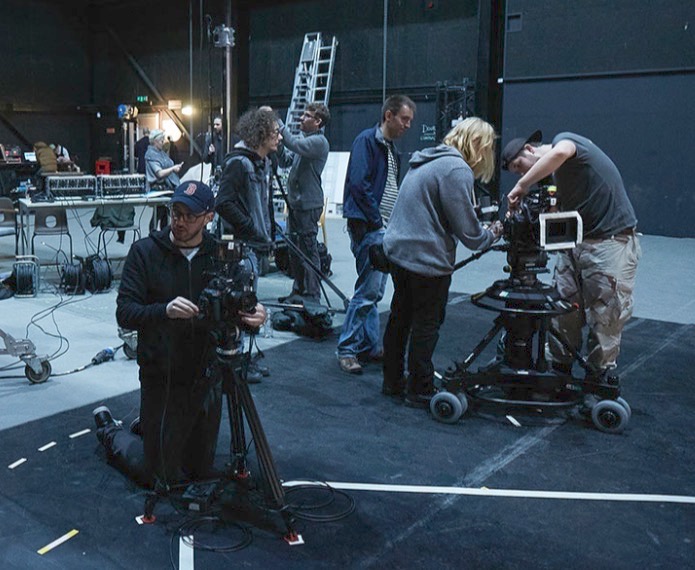
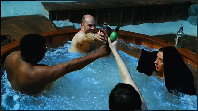
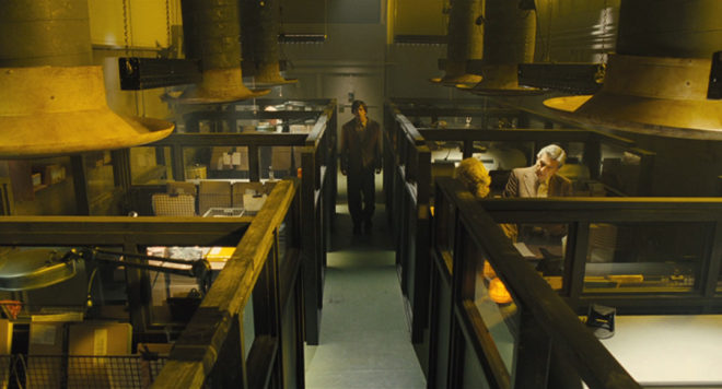
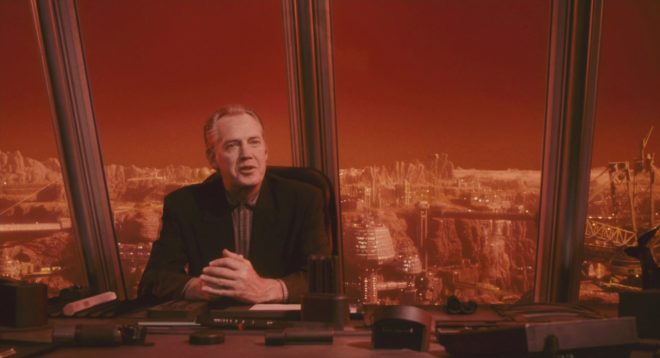
I have certainly found lenses around that length to be the most useful on set.  A 32mm is often my first choice for handheld, Steadicam, or anything approaching a POV. It’s great for wides because it compresses things a little and crops out unnecessary information while still taking plenty of the scene in. It’s also good for mids and medium close-ups, making the viewer feel involved in the conversation.

When I had to commit to a single prime lens to seal up in a splash housing for a critical ocean scene in The Little Mermaid, I quickly chose a 32mm, knowing that I could get wides and tights just by repositioning myself.

A scene from “The Little Mermaid” which I shot on a 32mm Cooke S4

I’ve found a 32mm useful in situations where coverage was limited. Many scenes in Above the Clouds were captured as a simple shot-reverse: both mids, both on the 32mm. This was done partly to save time, partly because most of the sets were cramped, and partly because it was a very effective way to get close to the characters without losing the body language, which was essential for the comedy. We basically combined the virtues of wides and close-ups into a single shot size!

In addition to the normal lens’ own virtues, I believe that it serves as a useful marker post between wide lenses and long lenses. In the same way that an editor should have a reason to cut, in a perfect world a cinematographer should have a reason to deviate from the normal lens. Choose a lens shorter than the normal and you are deliberately choosing to expand the space, to make things grander, to enhance perspective and push planes apart. Select a lens longer than the normal and you’re opting for portraiture, compression, stylisation, maybe even claustrophobia. Thinking about all this consciously and consistently throughout a production can add immeasurably to the impact of the story.

The Normal Lens

How Big a Light do I Need?

Experience goes a long way, but sometimes you need to be more precise about what size of lighting instruments are required for a particular scene. Night exteriors, for example; you don’t want to find out on the day that the HMI you hired as your “moon” backlight isn’t powerful enough to cover the whole of the car park you’re shooting in. How can you prep correctly so that you don’t get egg on your face?

There are two steps: 1. determine the intensity of light you require on the subject, and 2. find a combination of light fixture and fixture-to-subject distance that will provide that intensity.


The Required intensity

The goal here is to arrive at a number of foot-candles (fc). Foot-candles are a unit of light intensity, sometimes more formally called illuminance, and one foot-candle is the illuminance produced by a standard candle one foot away. (Illuminance can also be measured in the SI unit of lux, where 1 fc ≈ 10 lux, but in cinematography foot-candles are more commonly used. It’s important to remember that illuminance is a measure of the light incident to a surface, i.e. the amount of light reaching the subject. It is not to be confused with luminance, which is the amount of light reflected from a surface, or with luminous power, a.k.a. luminous flux, which is the total amount of light emitted from a source.)

Usually you start with a T-stop (or f-stop) that you want to shoot at, based on the depth of field you’d like. You also need to know the ISO and shutter interval (usually 1/48th or 1/50th of a second) you’ll be shooting at. Next you need to convert these facets of exposure into an illuminance value, and there are a few different ways of doing this.

One method is to use a light meter, if you have one, which you enter the ISO and shutter values into. Then you wave it around your office, living room or wherever, pressing the trigger until you happen upon a reading which matches your target f-stop. Then you simply switch your meter into foot-candles mode and read off the number. This method can be a bit of a pain in the neck, especially if – like mine – your meter requires fiddly flipping of dip-switches and additional calculations to get a foot-candles reading out of.

A much simpler method is to consult an exposure table, like the one below, or an exposure calculator, which I’m sure is a thing which must exist, but I’ll be damned if I could find one.

Some cinematographers memorise the fact that 100fc is f/2.8 at ISO 100, and work out other values from that. For example, ISO 400 is four times (two stops) faster than ISO 100, so a quarter of the light is required, i.e. 25fc.

Alternatively, you can use the underlying maths of the above methods. This is unlikely to be necessary in the real world, but for the purposes of this blog it’s instructive to go through the process. The equation is:

where

  • b is the illuminance in fc,
  • f is the f– or T-stop,
  • s is the shutter interval in seconds, and
  • i is the ISO.

Say I’m shooting on an Alexa with a Cooke S4 Mini lens. If I have the lens wide open at T2.8, the camera at its native ISO of 800 and the shutter interval at the UK standard of 1/50th (0.02) of a second…

… so I need about 12fc of light.


The right instrument

In the rare event that you’re actually lighting your set with candles – as covered in my Barry Lyndon and Stasis posts – then an illuminance value in fc is all you need. In every other situation, though, you need to figure out which electric light fixtures are going to give you the illuminance you need.

Manufacturers of professional lighting instruments make this quite easy for you, as they all provide data on the illuminance supplied by their products at various distances. For example, if I visit Mole Richardson’s webpage for their 1K Baby-Baby fresnel, I can click on the Performance Data table to see that this fixture will give me the 12fc (in fact slightly more, 15fc) that I required in my Alexa/Cooke example at a distance of 30ft on full flood.

Other manufacturers provide interactive calculators: on ETC’s site you can drag a virtual Source Four back and forth and watch the illuminance read-out change, while Arri offers a free iOS/Android app with similar functionality.

If you need to calculate an illuminance value for a distance not specified by the manufacturer, you can derive it from distances they do specify, by using the Inverse Square Law. However, as I found in my investigatory post about the law, that could be a whole can of worms.

If illuminance data is not available for your light source, then I’m afraid more maths is involved. For example, the room I’m currently in is lit by a bulb that came in a box marked “1,650 lumens”, which is the luminous power. One lumen is one foot-candle per square foot. To find out the illuminance, i.e. how many square feet those lumens are spread over, we imagine those square feet as the area of a sphere with the lamp at the centre, and where the radius r is the distance from the lamp to the subject. So:

where

  • is again the illuminance in fc,
  • is the luminous power of the souce in lumens, and
  • r is the lamp-to-subject distance in feet.

(I apologise for the mix of Imperial and SI units, but this is the reality in the semi-Americanised world of British film production! Also, please note that this equation is for point sources, rather than beams of light like you get from most professional fixtures. See this article on LED Watcher if you really want to get into the detail of that.)

So if I want to shoot that 12fc scene on my Alexa and Cooke S4 Mini under my 1,650 lumen domestic bulb…

… my subject needs to be 3’4″ from the lamp. I whipped out my light meter to check this, and it gave me the target T2.8 at 3’1″ – pretty close!


Do I have enough light?

If you’re on a tight budget, it may be less a case of, “What T-stop would I like to shoot at, and what fixture does that require?” and more a case of, “Is the fixture which I can afford bright enough?”

Let’s take a real example from Perplexed Music, a short film I lensed last year. We were shooting on an Alexa at ISO 1600, 1/50th sec shutter, and on Arri/Zeiss Ultra Primes, which have a maximum aperture of T1.9. The largest fixture we had was a 2.5K HMI, and I wanted to be sure that we would have enough light for a couple of night exteriors at a house location.

In reality I turned to an exposure table to find the necessary illuminance, but let’s do the maths using the first equation that we met in this post:

Loading up Arri’s photometrics app, I could see that 2.8fc wasn’t going to be a problem at all, with the 2.5K providing 5fc at the app’s maximum distance of 164ft.

That’s enough for today. All that maths may seem bewildering, but most of it is eliminated by apps and other online calculators in most scenarios, and it’s definitely worth going to the trouble of checking you have enough light before you’re on set with everyone ready to roll!

See also: 6 Ways of Judging Exposure

SaveSave

SaveSave

How Big a Light do I Need?

Colour Rendering Index

Many light sources we come across today have a CRI rating. Most of us realise that the higher the number, the better the quality of light, but is it really that simple? What exactly is Colour Rendering Index, how is it measured and can we trust it as cinematographers? Let’s find out.


What is C.R.I.?

CRI was created in 1965 by the CIE – Commission Internationale de l’Eclairage – the same body responsible for the colour-space diagram we met in my post about How Colour Works. The CIE wanted to define a standard method of measuring and rating the colour-rendering properties of light sources, particularly those which don’t emit a full spectrum of light, like fluorescent tubes which were becoming popular in the sixties. The aim was to meet the needs of architects deciding what kind of lighting to install in factories, supermarkets and the like, with little or no thought given to cinematography.

As we saw in How Colour Works, colour is caused by the absorption of certain wavelengths of light by a surface, and the reflection of others. For this to work properly, the light shining on the surface in the first place needs to consist of all the visible wavelengths. The graphs below show that daylight indeed consists of a full spectrum, as does incandescent lighting (e.g. tungsten), although its skew to the red end means that white-balancing is necessary to restore the correct proportions of colours to a photographed image. (See my article on Understanding Colour Temperature.)

Fluorescent and LED sources, however, have huge peaks and troughs in their spectral output, with some wavelengths missing completely. If the wavelengths aren’t there to begin with, they can’t reflect off the subject, so the colour of the subject will look wrong.

Analysing the spectrum of a light source to produce graphs like this required expensive equipment, so the CIE devised a simpler method of determining CRI, based on how the source reflected off a set of eight colour patches. These patches were murky pastel shades taken from the Munsell colour wheel (see my Colour Schemes post for more on colour wheels). In 2004, six more-saturated patches were added.

The maths which is used to arrive at a CRI value goes right over my head, but the testing process boils down to this:

  1. Illuminate a patch with daylight (if the source being tested has a correlated colour temperature of 5,000K or above) or incandescent light (if below 5,000K).
  2. Compare the colour of the patch to a colour-space CIE diagram and note the coordinates of the corresponding colour on the diagram.
  3. Now illuminate the patch with the source being tested.
  4. Compare the new colour of the patch to the CIE diagram and note the coordinates of the corresponding colour.
  5. Calculate the distance between the two sets of coordinates, i.e. the difference in colour under the two light sources.
  6. Repeat with the remaining patches and calculate the average difference.

Here are a few CRI ratings gleaned from around the web:

Source CRI
Sodium streetlight -44
Standard fluorescent 50-75
Standard LED 83
LitePanels 1×1 LED 90
Arri HMI 90+
Kino Flo 95
Tungsten 100 (maximum)


Problems with C.R.I.

There have been many criticisms of the CRI system. One is that the use of mean averaging results in a lamp with mediocre performance across all the patches scoring the same CRI as a lamp that does terrible rendering of one colour but good rendering of all the others.

Demonstrating the non-continuous spectrum of a fluorescent lamp, versus the continuous spectrum of incandescent, using a prism.

Further criticisms relate to the colour patches themselves. The eight standard patches are low in saturation, making them easier to render accurately than bright colours. An unscrupulous manufacturer could design their lamp to render the test colours well without worrying about the rest of the spectrum.

In practice this all means that CRI ratings sometimes don’t correspond to the evidence of your own eyes. For example, I’d wager that an HMI with a quoted CRI in the low nineties is going to render more natural skin-tones than an LED panel with the same rating.

I prefer to assess the quality of a light source by eye rather than relying on any quoted CRI value. Holding my hand up in front of an LED fixture, I can quickly tell whether the skin tones looks right or not. Unfortunately even this system is flawed.

The fundamental issue is the trichromatic nature of our eyes and of cameras: both work out what colour things are based on sensory input of only red, green and blue. As an analogy, imagine a wall with a number of cracks in it. Imagine that you can only inspect it through an opaque barrier with three slits in it. Through those three slits, the wall may look completely unblemished. The cracks are there, but since they’re not aligned with the slits, you’re not aware of them. And the “slits” of the human eye are not in the same place as the slits of a camera’s sensor, i.e. the respective sensitivities of our long, medium and short cones do not quite match the red, green and blue dyes in the Bayer filters of cameras. Under continuous-spectrum lighting (“smooth wall”) this doesn’t matter, but with non-continuous-spectrum sources (“cracked wall”) it can lead to something looking right to the eye but not on camera, or vice-versa.


Conclusion

Given its age and its intended use, it’s not surprising that CRI is a pretty poor indicator of light quality for a modern DP or gaffer. Various alternative systems exist, including GAI (Gamut Area Index) and TLCI (Television Lighting Consistency Index), the latter similar to CRI but introducing a camera into the process rather than relying solely on human observation. The Academy of Motion Picture Arts and Sciences recently invented a system, Spectral Similarity Index (SSI), which involves measuring the source itself with a spectrometer, rather than reflected light. At the time of writing, however, we are still stuck with CRI as the dominant quantitative measure.

So what is the solution? Test, test, test. Take your chosen camera and lens system and shoot some footage with the fixtures in question. For the moment at least, that is the only way to really know what kind of light you’re getting.

SaveSave

SaveSaveSaveSave

SaveSave

SaveSave

SaveSave

SaveSave

SaveSave

SaveSave

SaveSave

SaveSave

Colour Rendering Index

“The Knowledge”: Lighting a Multi-camera Game Show

Metering the key-light. Photo: Laura Radford

Last week I discussed the technical and creative decisions that went into the camerawork of The Knowledge, a fake game show for an art installation conceived by Ian Wolter and directed by Jonnie Howard. This week I’ll break down the choices and challenges involved in lighting the film.

The eighties quiz shows which I looked at during prep were all lit with the dullest, flattest light imaginable. It was only when I moved forward to the nineties shows which Jonnie and I grew up on, like Blockbusters and The Generation Game, that I started to see some creativity in the lighting design: strip-lights and glowing panels in the sets, spotlights and gobos on the backgrounds, and moodier lighting states for quick-fire rounds.

Jonnie and I both wanted The Knowledge‘s lighting to be closer to this nineties look. He was keen to give each team a glowing taxi sign on their desks, which would be the only source of illumination on the contestants at certain moments. Designer Amanda Stekly and I came up with plans for additional practicals – ultimately LED string-lights – that would follow the map-like lines in the set’s back walls.

Once the set design had been finalised, I did my own dodgy pencil sketch and Photoshopped it to create two different lighting previsualisations for Jonnie.

He felt that these were a little too sophisticated, so after some discussion I produced a revised previz…

…and a secondary version showing a lighting state with one team in shadow.

These were approved, so now it was a case of turning those images into reality.

We were shooting on a soundstage, but for budget reasons we opted not to use the lighting grid. I must admit that this worried me for a little while. The key-light needed to come from the front, contrary to normal principles of good cinematography, but very much in keeping with how TV game shows are lit. I was concerned that the light stands and the cameras would get in each others’ way, but my gaffer Ben Millar assured me it could be done, and of course he was right.

Ben ordered several five-section Strato Safe stands (or Fuck-offs as they’re charmingly known). These were so high that, even when placed far enough back to leave room for the cameras, we could get the 45° key angle which we needed in order to avoid seeing the contestants’ shadows on the back walls. (A steep key like this is sometimes known as a butterfly key, for the shape of the shadow which the subject’s nose casts on their upper lip.)  Using the barn doors, and double nets on friction arms in front of the lamp-heads, Ben feathered the key-light to hit as little as possible of the back walls and the fronts of the desks. As well as giving the light some shape, this prevented the practical LEDs from getting washed out.

Note the nets mounted below the key-lights (the tallest ones). Photo: Laura Radford

Once those key-lights were established (a 5K fresnel for each team), we set a 2K backlight for each team as well. These were immediately behind the set, their stands wrapped in duvetyne, and the necks well and truly broken to give a very toppy backlight. A third 2K was placed between the staggered central panels of the set, spilling a streak of light out through the gap from which host Robert Jezek would emerge.

A trio of Source Fours with 15-30mm zoom lenses were used for targeted illumination of certain areas. One was aimed at The Knowledge sign, its cutters adjusted to form a rectangle of light around it. Another was focused on the oval map on the floor, which would come into play during the latter part of the show. The last Source Four was used as a follow-spot on Robert. We had to dim it considerably to keep the exposure in range, which conveniently made him look like he had a fake tan! Ben hooked everything, in fact, up to a dimmer board, so that various lighting cues could be accomplished in camera.

The bulk of the film was recorded in a single day, following a day’s set assembly and a day of pre-rigging. A skeleton crew returned the next day to shoot pick-ups and promos, a couple of which you can see on Vimeo here.

I’ll leave you with some frame grabs from the finished film. Find out more about Ian Wolter’s work at ianwolter.com.

SaveSave

SaveSave

SaveSave

“The Knowledge”: Lighting a Multi-camera Game Show

“The Knowledge”: Shooting a Multi-camera Game Show

Robert Jezek as gameshow host Robert O’Reilly. Photo: Laura Radford

Last week saw the UK premier of The Knowledge, an art installation film, at the FLUX Exhibition hosted by Chelsea College of Arts. Conceived by award-winning, multi-disciplinary artist Ian Wolter, The Knowledge comments on the topical issue of artificial intelligence threatening jobs. It takes the form of a fake game show, pitting a team of traditional London cabbies (schooled in the titular Knowledge) against a team of smart-phoning minicab drivers. Although shot entirely on stage, the film’s central conceit is that the teams are each guiding a driver across London, to see whether technology or human experience will bring its car to the finish line first.

You can see a couple of brief promos on Vimeo here. It’s a unique project, and one that I knew would be an interesting challenge as soon as I heard of it from my friend Amanda Stekly, producer and production designer. This week and next I’ll describe the creative and technical decisions that went into photographing the piece, beginning this week with the camera side of things.

Photo: Laura Radford

I had never shot a multi-camera studio production like this before, so my first move was to sit down with my regular 1st AC and steadicam operator Rupert Peddle, and his friend Jack D’Souza-Toulson. Jack has extensive experience operating as part of a multi-camera team for live TV and events. This conversation answered such basic questions as, could the operators each pull their own focus? (yes) and allowed me to form the beginnings of a plan for crew and kit.

At the monitors with Jonnie. Photo: Laura Howard

Ian and Amanda wanted the film to have a dated look, and referenced such eighties quiz shows as 3-2-1 and Blankety Blank. Director Jonnie Howard and I knew that we had to supply the finished film in HD, which ruled out shooting on vintage analogue video cameras. Interlaced recording was rejected for similar reasons, though if memory serves, I did end up shooting at a shutter angle of 360 degrees to produce a more fluid motion suggestive of interlaced material.

I was very keen that the images should NOT look cinematic. Jonnie was able to supply two Canon C100s – which I’ve always thought have a sharp, “video-ish” look – and L-series glass. I set these to 1600 ISO to give us the biggest possible depth of field. For the remaining two cameras, I chose ENG models, a Canon XF-300 (owned by Rupert) and XF-305. In an ideal world, all four cameras would have been ENG models, to ensure huge depth of field and an overall TV look, but some compromise was necessary for budget reasons, and at least they all used Canon sensors. We hired a rack of four matching 9″ monitors so we could ensure a consistent look on set.

Photo: Laura Radford

One Canon C100, with an L-series zoom, was mounted on a pedestal and outfitted with Rupert’s follow focus system, allowing Jack to pull focus from the panning handle. The other C100 would shoot a locked-off wide, and was the first camera to be set up. A 14mm Samyang lens made the set look huge, and I placed it low down to emphasise the map in the foreground, and to make it easy for the other cameras to shoot over it. Once that frame was set, we taped a large V shape on the floor to indicate the edges of the wide shot. As long as the lights and other cameras stayed out of that area, they would be safe.

Jack operates the pedestal-mounted C100. Photo: Laura Radford

Generally Jack’s pedestal-mounted C100 followed the host, Robert Jezek, or captured the interesting moving shots, while Rupert and the third operator, Jimmy Buchanan, cross-shot the two teams on the XF-100 and XF-105. No filtration was used, except for a four-point star filter on one camera when glitter canons are fired at the end of the game. This cheesiness was inspired by the 3-2-1 clips I watched for research, in which star filters were used for the tacky sequences showing the prizes on offer.

Next week I’ll discuss lighting the show. Meanwhile, find out more about Ian’s work at ianwolter.com.

Photo: Laura Radford

SaveSave

SaveSave

“The Knowledge”: Shooting a Multi-camera Game Show

Colour Schemes

Last week I looked at the science of colour: what it is, how our eyes see it, and how cameras see and process it. Now I’m going to look at colour theory – that is, schemes of mixing colours to produce aesthetically pleasing results.


The Colour wheel

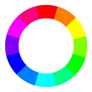
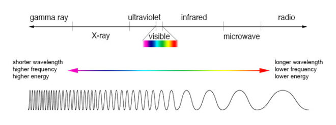
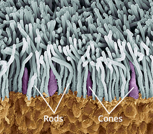
The first colour wheel was drawn by Sir Isaac Newton in 1704, and it’s a precursor of the CIE diagram we met last week. It’s a method of arranging hues so that useful relationships between them – like primaries and secondaries, and the schemes we’ll cover below – can be understood. As we know from last week, colour is in reality a linear spectrum which we humans perceive by deducing it from the amounts of light triggering our red, green and blue cones, but certain quirks of our visual system make a wheel in many ways a more useful arrangement of the colours than a linear spectrum.

One of these quirks is that our long (red) cones, although having peak sensitivity to red light, have a smaller peak in sensitivity at the opposite (violet) end of the spectrum. This may be what causes our perception of colour to “wrap around”.

Another quirk is in the way that colour information is encoded in the retina before being piped along the optic nerve to the brain. Rather than producing red, green and blue signals, the retina compares the levels of red to green, and of blue to yellow (the sum of red and green cones), and sends these colour opponency channels along with a luminance channel to the brain.

You can test these opposites yourself by staring at a solid block of one of the colours for around 30 seconds and then looking at something white. The white will initially take on the opposing colour, so if you stared at red then you will see green.

Hering’s colour wheels

19th century physiologist Ewald Hering was the first to theorise about this colour opponency, and he designed his own colour wheel to match it, having red/green on the vertical axis and blue/yellow on the horizontal.

RGB colour wheel

Today we are more familiar with the RGB colour wheel, which spaces red, green and blue equally around the circle. But both wheels – the first dealing with colour perception in the eye-brain system, and the second dealing with colour representation on an RGB screen – are relevant to cinematography.

On both wheels, colours directly opposite each other are considered to cancel each other out. (In RGB they make white when combined.) These pairs are known as complementary colours.


Complementary

A complementary scheme provides maximum colour contrast, each of the two hues making the other more vibrant. Take “The Snail” by modernist French artist Henri Matisse, which you can currently see at the Tate Modern; Matisse placed complementary colours next to each other to make them all pop.

“The Snail” by Henri Matisse (1953)

In cinematography, a single pair of complementary colours is often used, for example the yellows and blues of Aliens‘ power loader scene:

“Aliens” DP: Adrian Biddle, BSC

Or this scene from Life on Mars which I covered on my YouTube show Lighting I Like:

I frequently use a blue/orange colour scheme, because it’s the natural result of mixing tungsten with cool daylight or “moonlight”.

“The First Musketeer”, DP: Neil Oseman

And then of course there’s the orange-and-teal grading so common in Hollywood:

“Hot Tub Time Machine” DP: Jack N. Green, ASC

Amélie uses a less common complementary pairing of red and green:

“Amélie” DP: Bruno Belbonnel, AFC, ASC


Analogous

An analogous colour scheme uses hues adjacent to each other on the wheel. It lacks the punch and vibrancy of a complementary scheme, instead having a harmonious, unifying effect. In the examples below it seems to enhance the single-mindedness of the characters. Sometimes filmmakers push analogous colours to the extreme of using literally just one hue, at which point it is technically monochrome.

“The Matrix” DP: Bill Pope, ASC
“Terminator 2: Judgment Day” DP: Adam Greenberg, ASC
“The Double” DP: Erik Alexander Wilson
“Total Recall” (1990) DP: Jost Vacano, ASC, BVK


There are other colour schemes, such as triadic, but complementary and analogous colours are by far the most common in cinematography. In a future post I’ll look at the psychological effects of individual colours and how they can be used to enhance the themes and emotions of a film.

SaveSave

Colour Schemes

How Colour Works

Colour is a powerful thing. It can identify a brand, imply eco-friendliness, gender a toy, raise our blood pressure, calm us down. But what exactly is colour? How and why do we see it? And how do cameras record it? Let’s find out.


The Meaning of “Light”

One of the many weird and wonderful phenomena of our universe is the electromagnetic wave, an electric and magnetic oscillation which travels at 186,000 miles per second. Like all waves, EM radiation has the inversely-proportional properties of wavelength and frequency, and we humans have devised different names for it based on these properties.

The electromagnetic spectrum

EM waves with a low frequency and therefore a long wavelength are known as radio waves or, slightly higher in frequency, microwaves; we used them to broadcast information and heat ready-meals. EM waves with a high frequency and a short wavelength are known as x-rays and gamma rays; we use them to see inside people and treat cancer.

In the middle of the electromagnetic spectrum, sandwiched between infrared and ultraviolet, is a range of frequencies between 430 and 750 terahertz (wavelengths 400-700 nanometres). We call these frequencies “light”, and they are the frequencies which the receptors in our eyes can detect.

If your retinae were instead sensitive to electromagnetic radiation of between 88 and 91 megahertz, you would be able to see BBC Radio 2. I’m not talking about magically seeing into Ken Bruce’s studio, but perceiving the FM radio waves which are encoded with his silky-smooth Scottish brogue. Since radio waves can pass through solid objects though, perceiving them would not help you to understand your environment much, whereas light waves are absorbed or reflected by most solid objects, and pass through most non-solid objects, making them perfect for building a picture of the world around you.

Within the range of human vision, we have subdivided and named smaller ranges of frequencies. For example, we describe light of about 590-620nm as “orange”, and below about 450nm as “violet”. This is all colour really is: a small range of wavelengths (or frequencies) of electromagnetic radiation, or a combination of them.


In the eye of the beholder

Scanning electron micrograph of a retina

The inside rear surfaces of your eyeballs are coated with light-sensitive cells called rods and cones, named for their shapes.

The human eye has about five or six million cones. They come in three types: short, medium and long, referring to the wavelengths to which they are sensitive. Short cones have peak sensitivity at about 420nm, medium at 530nm and long at 560nm, roughly what we call blue, green and red respectively. The ratios of the three cone types vary from person to person, but short (blue) ones are always in the minority.

Rods are far more numerous – about 90 million per eye – and around a hundred times more sensitive than cones. (You can think of your eyes as having dual native ISOs like a Panasonic Varicam, with your rods having an ISO six or seven stops faster than your cones.) The trade-off is that they are less temporally and spatially accurate than cones, making it harder to see detail and fast movement with rods. However, rods only really come into play in dark conditions. Because there is just one type of rod, we cannot distinguish colours in low light, and because rods are most sensitive to wavelengths of 500nm, cyan shades appear brightest. That’s why cinematographers have been painting night scenes with everything from steel grey to candy blue light since the advent of colour film.

The spectral sensitivity of short (blue), medium (green) and long (red) cones

The three types of cone are what allow us – in well-lit conditions – to have colour vision. This trichromatic vision is not universal, however. Many animals have tetrachromatic (four channel) vision, and research has discovered some rare humans with it too. On the other hand, some animals, and “colour-blind” humans, are dichromats, having only two types of cone in their retinae. But in most people, perceptions of colour result from combinations of red, green and blue. A combination of red and blue light, for example, appears as magenta. All three of the primaries together make white.

Compared with the hair cells in the cochlea of your ears, which are capable of sensing a continuous spectrum of audio frequencies, trichromacy is quite a crude system, and it can be fooled. If your red and green cones are triggered equally, for example, you have no way of telling whether you are seeing a combination of red and green light, or pure yellow light, which falls between red and green in the spectrum. Both will appear yellow to you, but only one really is. That’s like being unable to hear the difference between, say, the note D and a combination of the notes C and E. (For more info on these colour metamers and how they can cause problems with certain types of lighting, check out Phil Rhode’s excellent article on Red Shark News.)


Artificial eye

A Bayer filter

Mimicking your eyes, video sensors also use a trichromatic system. This is convenient because it means that although a camera and TV can’t record or display yellow, for example, they can produce a mix of red and green which, as we’ve just established, is indistinguishable from yellow to the human eye.

Rather than using three different types of receptor, each sensitive to different frequencies of light, electronic sensors all rely on separating different wavelengths of light before they hit the receptors. The most common method is a colour filter array (CFA) placed immediately over the photosites, and the most common type of CFA is the Bayer filter, patented in 1976 by an Eastman Kodak employee named Dr Bryce Bayer.

The Bayer filter is a colour mosaic which allows only green light through to 50% of the photosites, only red light through to 25%, and only blue to the remaining 25%. The logic is that green is the colour your eyes are most sensitive to overall, and that your vision is much more dependent on luminance than chrominance.

A RAW, non-debayered image

The resulting image must be debayered (or more generally, demosaiced) by an algorithm to produce a viewable image. If you’re recording log or linear then this happens in-camera, whereas if you’re shooting RAW it must be done in post.

This system has implications for resolution. Let’s say your sensor is 2880×1620. You might think that’s the number of pixels, but strictly speaking it isn’t. It’s the number of photosites, and due to the Bayer filter no single one of those photosites has more than a third of the necessary colour information to form a pixel of the final image. Calculating that final image – by debayering the RAW data – reduces the real resolution of the image by 20-33%. That’s why cameras like the Arri Alexa or the Blackmagic Cinema Camera shoot at 2.8K or 2.5K, because once it’s debayered you’re left with an image of 2K (cinema standard) resolution.


colour Compression

Your optic nerve can only transmit about one percent of the information captured by the retina, so a huge amount of data compression is carried out within the eye. Similarly, video data from an electronic sensor is usually compressed, be it within the camera or afterwards. Luminance information is often prioritised over chrominance during compression.

Examples of chroma subsampling ratios

You have probably come across chroma subsampling expressed as, for example, 444 or 422, as in ProRes 4444 (the final 4 being transparency information, only relevant to files generated in postproduction) and ProRes 422. The three digits describe the ratios of colour and luminance information: a file with 444 chroma subsampling has no colour compression; a 422 file retains colour information only in every second pixel; a 420 file, such as those on a DVD or BluRay, contains one pixel of blue info and one of red info (the green being derived from those two and the luminance) to every four pixels of luma.

Whether every pixel, or only a fraction of them, has colour information, the precision of that colour info can vary. This is known as bit depth or colour depth. The more bits allocated to describing the colour of each pixel (or group of pixels), the more precise the colours of the image will be. DSLRs typically record video in 24-bit colour, more commonly described as 8bpc or 8 bits per (colour) channel. Images of this bit depth fall apart pretty quickly when you try to grade them. Professional cinema cameras record 10 or 12 bits per channel, which is much more flexible in postproduction.

CIE diagram showing the gamuts of three video standards. D65 is the standard for white.

The third attribute of recorded colour is gamut, the breadth of the spectrum of colours. You may have seen a CIE (Commission Internationale de l’Eclairage) diagram, which depicts the range of colours perceptible by human vision. Triangles are often superimposed on this diagram to illustrate the gamut (range of colours) that can be described by various colour spaces. The three colour spaces you are most likely to come across are, in ascending order of gamut size: Rec.709, an old standard that is still used by many monitors; P3, used by digital cinema projectors; and Rec.2020. The latter is the standard for ultra-HD, and Netflix are already requiring that some of their shows are delivered in it, even though monitors capable of displaying Rec.2020 do not yet exist. Most cinema cameras today can record images in Rec.709 (known as “video” mode on Blackmagic cameras) or a proprietary wide gamut (“film” mode on a Blackmagic, or “log” on others) which allows more flexibility in the grading suite. Note that the two modes also alter the recording of luminance and dynamic range.

To summarise as simply as possible: chroma subsampling is the proportion of pixels which have colour information, bit depth is the accuracy of that information and gamut is the limits of that info.

That’s all for today. In future posts I will look at how some of the above science leads to colour theory and how cinematographers can make practical use of it.

SaveSave

How Colour Works

6 Ways to Judge Exposure

Exposing the image correctly is one of the most important parts of a cinematographer’s job. Choosing the T-stop can be a complex technical and creative decision, but fortunately there are many ways we can measure light to inform that decision.

First, let’s remind ourselves of the journey light makes: photons are emitted from a source, they strike a surface which absorbs some and reflects others – creating the impressions of colour and shade; then if the reflected light reaches an eye or camera lens it forms an image. We’ll look at the various ways of measuring light in the order the measurements occur along this light path, which is also roughly the order in which these measurements are typically used by a director of photography.


1. Photometrics data

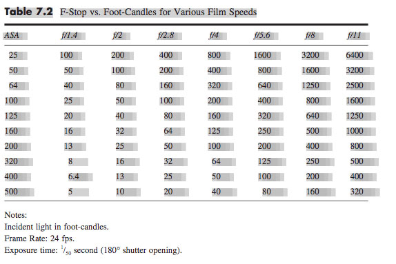
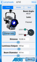
You can use data supplied by the lamp manufacturer to calculate the exposure it will provide, which is very useful in preproduction when deciding what size of lamps you need to hire. There are apps for this, such as the Arri Photometrics App, which allows you to choose one of their fixtures, specify its spot/flood setting and distance from the subject, and then tells you the resulting light level in lux or foot-candles. An exposure table or exposure calculation app will translate that number into a T-stop at any given ISO and shutter interval.


2. Incident meter

Some believe that light meters are unnecessary in today’s digital landscape, but I disagree. Most of the methods listed below require the camera, but the camera may not always be handy – on a location recce, for example. Or during production, it would be inconvenient to interrupt the ACs while they’re rigging the camera onto a crane or Steadicam. This is when having a light meter on your belt becomes very useful.

An incident meter is designed to measure the amount of light reaching the subject. It is recognisable by its white dome, which diffuses and averages the light striking its sensor. Typically it is used to measure the key, fill and backlight levels falling on the talent. Once you have input your ISO and shutter interval, you hold the incident meter next to the actor’s face (or ask them to step aside!) and point it at each source in turn, shading the dome from the other sources with your free hand. You can then decide if you’re happy with the contrast ratios between the sources, and set your lens to the T-stop indicated by the key-light reading, to ensure correct exposure of the subject’s face.


3. Spot meter (a.k.a. reflectance meter)

Now we move along the light path and consider light after it has been reflected off the subject. This is what a spot meter measures. It has a viewfinder with which you target the area you want to read, and it is capable of metering things that would be impractical or impossible to measure with an incident meter. If you had a bright hillside in the background of your shot, you would need to drive over to that hill and climb it to measure the incident light; with a spot meter you would simply stand at the camera position and point it in the right direction. A spot meter can also be used to measure light sources themselves: the sky, a practical lamp, a flame and so on.

But there are disadvantages too. If you spot meter a Caucasian face, you will get a stop that results in underexposure, because a Caucasian face reflects quite a lot of light. Conversely, if you spot meter an African face, you will get a stop that results in overexposure, because an African face reflects relatively little light. For this reason a spot meter is most commonly used to check whether areas of the frame other than the subject – a patch of sunlight in the background, for example – will blow out.

Your smartphone can be turned into a spot meter with a suitable app, such as Cine Meter II, though you will need to configure it using a traditional meter and a grey card. With the addition of a Luxiball attachment for your phone’s camera, it can also become an incident meter.

The remaining three methods of judging exposure which I will cover all use the camera’s sensor itself to measure the light. Therefore they take into account any filters you’re using as well transmission loss within the lens (which can be an issue when shooting on stills glass, where the marked f-stops don’t factor in transmission loss).


4. Monitors and viewfinders

The letter. Photo: Amy Nicholson

In the world of digital image capture, it can be argued that the simplest and best way to judge exposure is to just observe the picture on the monitor. The problem is, not all screens are equal. Cheap monitors can misrepresent the image in all kinds of ways, and even a high-end OLED can deceive you, displaying shadows blacker than any cinema or home entertainment system will ever match. There are only really two scenarios in which you can reliably judge exposure from the image itself: if you’ve owned a camera for a while and you’ve become very familiar with how the images in the viewfinder relate to the finished product; or if the monitor has been properly calibrated by a DIT (Digital Imaging Technician) and the screen is shielded from light.

Most cameras and monitors have built-in tools which graphically represent the luminance of the image in a much more accurate way, and we’ll look at those next. Beware that if you’re monitoring a log or RAW image in Rec.709, these tools will usually take their data from the Rec.709 image.


5. Waveforms and histograms

These are graphs which show the prevalence of different tones within the frame. Histograms are the simplest and most common. In a histogram, the horizontal axis represents luminance and the vertical axis shows the number of pixels which have that luminance. It makes it easy to see at a glance whether you’re capturing the greatest possible amount of detail, making best use of the dynamic range. A “properly” exposed image, with a full range of tones, should show an even distribution across the width of the graph, with nothing hitting the two sides, which would indicate clipped shadows and highlights. A night exterior would have a histogram crowded towards the left (darker) side, whereas a bright, low contrast scene would be crowded on the right.

A waveform plots luminance on the vertical axis, with the horizontal axis matching the horizontal position of those luminance values within the frame. The density of the plotting reveals the prevalence of the values. A waveform that was dense in the bottom left, for example, would indicate a lot of dark tones on the lefthand side of frame. Since the vertical (luminance) axis represents IRE (Institute of Radio Engineers) values, waveforms are ideal when you need to expose to a given IRE, for example when calibrating a system by shooting a grey card. Another common example would be a visual effects supervisor requesting that a green screen be lit to 50 IRE.


6. Zebras and false colours

Almost all cameras have zebras, a setting which superimposes diagonal stripes on parts of the image which are over a certain IRE, or within a certain range of IREs. By digging into the menus you can find and adjust what those IRE levels are. Typically zebras are used to flag up highlights which are clipping (theoretically 100 IRE), or close to clipping.

Exposing an image correctly is not just about controlling highlight clipping however, it’s about balancing the whole range of tones – which brings us to false colours. A false colour overlay looks a little like a weather forecaster’s temperature map, with a code of colours assigned to various luminance values. Clipped highlights are typically red, while bright areas still retaining detail (known as the “knee” or “shoulder”) are yellow. Middle grey is often represented by green, while pink indicates the ideal level for caucasian skin tones (usually around 55 IRE). At the bottom end of the scale, blue represents the “toe” – the darkest area that still has detail – while purple is underexposed. The advantage of zebras and false colours over waveforms and histograms is that the former two show you exactly where the problem areas are in the frame.

I hope this article has given you a useful overview of the tools available for judging exposure. Some DPs have a single tool they rely on at all times, but many will use all of these methods at one time or another to produce an image that balances maximising detail with creative intent. I’ll leave you with a quote from the late, great Douglas Slocombe, BSC who ultimately used none of the above six methods!

I used to use a light meter – I used one for years. Through the years I found that, as schedules got tighter and tighter, I had less and less time to light a set. I found myself not checking the meter until I had finished the set and decided on the proper stop. It would usually say exactly what I thought it should. If it didn’t, I wouldn’t believe it, or I would hold it in such a way as to make it say my stop. After a time I decided this was ridiculous and stopped using it entirely. The “Raiders” pictures were all shot without a meter. I just got used to using my eyes.

6 Ways to Judge Exposure

Book Review: “Motion Studies” by Rebecca Solnit

A modern animation created from photographs from Muybridge’s “Animal Locomotion”, 1887

This is a book that caught my eye following my recent photography project, Stasis. In that project I made some limited explorations of the relationship between time, space and light, so Motion Studies: Time, Space and Eadweard Muybridge, to give it its full title, seemed like it would be on my current wavelength.

Like me a few weeks ago, you might be vaguely aware of Muybridge as the man who first photographed a trotting horse sharply enough to prove that all four of its legs left the ground simultaneously. You may have heard him called “The Father of Cinema”, because he was the first person to shoot a rapid sequence of images of a moving body, and the first person to reanimate those images on a screen.

Born in Kingston-on-Thames in 1830, Muybridge emigrated to San Francisco in the 1850s where, following a stint as a book seller and a near-fatal accident in a runaway carriage, he took up landscape photography. He shot spectacular views of Yosemite National Park and huge panoramas of his adopted city. In 1872 he was commissioned by the railroad tycoon Leland Stanford to photograph his racehorse Occident in motion. This developed into a vast project for Muybridge over the next decade or so, ultimately encompassing over 100,000 photos of humans and other animals in motion.

Muybridge’s set-up for his early motion studies, 1881. The cameras are in the shed on the left.

Much of his early work was accomplished on mammoth wet plates, 2ft wide, that had to be coated with emulsion just before exposure and developed quickly afterwards, necessitating a travelling darkroom tent. To achieve the quick exposures he needed to show the limbs of a   trotting horse without motion blur, he had to develop new chemistry and – with John Isaacs – a new electromagnetic shutter. The results were so different to anything that had been photographed before, that they were initially met with disbelief in some quarters, particularly amongst painters, who were eventually forced to recognise that they had been incorrectly portraying horse’s legs. Artists still use Muybridge’s motion studies today as references for dynamic anatomy.

“Boys Playing Leapfrog”, 1887

To “track” with the animals in motion, Muybridge used a battery of regularly-spaced cameras, each triggered by the feet of the subject pulling on a wire or thread as they passed. Sometimes he would surround a subject with cameras and trigger them all simultaneously, to get multiple angles on the same moment in time. Does that sound familiar? Yes, Muybridge invented Bullet Time over a century before The Matrix.

Muybridge was not the first person to project images in rapid succession to create the illusion of movement, but he was the first person to display photographed (rather than drawn) images in a such a way, to deconstruct motion and reassemble it elsewhere like a Star Trek transporter. In 1888 Muybridge met with Thomas Edison and discussed collaborating on a system to combine motion pictures with wax cylinder audio recordings, but nothing came of this idea which was decades ahead of its time. The same year, French inventor Louis Le Prince shot Roundhay Garden Scene, the oldest known film. A few years later, Edison patented his movie camera, and the Lumière brothers screened their world-changing Workers Leaving the Lumière Factory. The age of cinema had begun.

From “Animal Locomotion”, 1887

Although Muybridge is the centre of Solnit’s book, there is a huge amount of context. The author’s thesis is that Muybridge represents a turning point, a divider between the world he was born into – a world in which people and information could only travel as fast as they or a horse could walk or run, a world where every town kept its own time, where communities were close-knit and relatively isolated – and the world which innovations like his helped to create – the world of speed, of illusions, of instantaneous global communication, where physical distance is no barrier. Solnit draws a direct line from Muybridge’s dissection of time and Stanford’s dissection of space to the global multimedia village we live in today. Because of all this context, the book feels a little slow to get going, but as the story continues and the threads draw together, the value of it becomes clear, elucidating the meaning and significance of Muybridge’s work.

“Muybridge and Athlete”, circa 1887

I can’t claim to have ever been especially interested in history, but I found the book a fascinating lesson on the American West of the late nineteenth century, as well as a thoughtful analysis of the impact photography and cinematography have had on human culture and society. As usual, I’m reviewing this book a little late (it was first published in 2003!), but I heartily recommend checking it out if you’re at all interested in experimental photography or the origins of cinema.

Book Review: “Motion Studies” by Rebecca Solnit

A History of Black and White

The contact sheet from my first roll of Ilford Delta 3200

Having lately shot my first roll of black-and-white film in a decade, I thought now would be a good time to delve into the story of monochrome image-making and the various reasons artists have eschewed colour.

I found the recent National Gallery exhibition, Monochrome: Painting in Black and White, a great primer on the history of the unhued image. Beginning with examples from medieval religious art, the exhibition took in grisaille works of the Renaissance before demonstrating the battle between painting and early photography, and finishing with monochrome modern art.

Several of the pictures on display were studies or sketches which were generated in preparation for colour paintings. Ignoring hue allowed the artists to focus on form and composition, and this is still one of black-and-white’s great strengths today: stripping away chroma to heighten other pictorial effects.

“Nativity” by Petrus Christus, c. 1455

What fascinated me most in the exhibition were the medieval religious paintings in the first room. Here, old testament scenes in black-and-white were painted around a larger, colour scene from the new testament; as in the modern TV trope, the flashbacks were in black-and-white. In other pictures, a colour scene was framed by a monochrome rendering of stonework – often incredibly realistic – designed to fool the viewer into thinking they were seeing a painting in an architectural nook.

During cinema’s long transition from black-and-white to colour, filmmakers also used the two modes to define different layers of reality. When colour processes were still in their infancy and very expensive, filmmakers selected particular scenes to pick out in rainbow hues, while the surrounding material remained in black-and-white like the borders of the medieval paintings. By 1939 the borders were shrinking, as The Wizard of Oz portrayed Kansas, the ordinary world, in black-and-white, while rendering Oz – the bulk of the running time – in colour.

Michael Powell, Emeric Pressburger and legendary Technicolor cinematographer Jack Cardiff, OBE, BSC subverted expectations with their 1946 fantasy-romance A Matter of Life and Death, set partly on Earth and partly in heaven. Says Cardiff in his autobiography:

Quite early on I had said casually to Michael Powell, “Of course heaven will be in colour, won’t it?” And Michael replied, “No. Heaven will be in black and white.” He could see I was startled, and grinned: “Because everyone will expect heaven to be in colour, I’m doing it in black-and-white.”

Ironically Cardiff had never shot in black-and-white before, and he ultimately captured the heavenly scenes on three-strip Technicolor, but didn’t have the colour fully developed, resulting in a pearlescent monochrome.

Meanwhile, DPs like John Alton, ASC were pushing greyscale cinematography to its apogee with a genre that would come to be known as film noir. Oppressed Jews like Alton fled the rising Nazism of Europe for the US, bringing German Expressionism with them. The result was a trend of hardboiled thrillers lit with oppressive contrast, harsh shadows, concealing silhouettes and dramatic angles, all of which were heightened by the lack of distracting colour.

A classic bit of Alton's noir lighting from The Big Combo
“The Big Combo” DP: John Alton, ASC

Alton himself had a paradoxical relationship with chroma, famously stating that “black and white are colours”. While he is best known today for his noir, his only Oscar win was for his work on the Technicolor musical An American in Paris, the designers of which hated Alton for the brightly-coloured light he tried to splash over their sets and costumes.

It wasn’t just Alton that was moving to colour. Soon the economics were clear: chromatic cinema was more marketable and no longer prohibitively expensive. The writing was on the wall for black-and-white movies, and by the end of the sixties they were all but gone.

I was brought up in a world of default colour, and the first time I can remember becoming aware of black-and-white was when Schindler’s List was released in 1993. I can clearly recall a friend’s mother refusing to see the film because she felt she wouldn’t be getting her money’s worth if there was no colour. She’s not alone in this view, and that’s why producers are never keen to green-light monochrome movies. Spielberg only got away with it because his name was proven box office gold.

“Schindler’s List” DP: Janusz Kamiński, ASC

A few years later, Jonathan Frakes and his DP Matthew F. Leonetti, ASC wanted to shoot the holodeck sequence of Star Trek: First Contact in black-and-white, but the studio deemed test footage “too experimental”. For the most part, the same attitude prevails today. Despite being marketed as a “visionary” director ever since Pan’s Labyrinth, Guillermo del Toro’s vision of The Shape of Water as a black-and-white film was rejected by financiers. He only got the multi-Oscar-winning fairytale off the ground by reluctantly agreeing to shoot in colour.

Yet there is reason to be hopeful about black-and-white remaining an option for filmmakers. In 2007 MGM denied Frank Darabont the chance to make The Mist in black-and-white, but they permitted a desaturated version on the DVD. Darabont had this to say:

No, it doesn’t look real. Film itself [is a] heightened recreation of reality. To me, black-and-white takes that one step further. It gives you a view of the world that doesn’t really exist in reality and the only place you can see that representation of the world is in a black-and-white movie.

“The Mist” DP: Rohn Schmidt

In 2016, a “black and chrome” version of Mad Max: Fury Road was released on DVD and Blu-Ray, with director George Miller saying:

The best version of “Road Warrior” [“Mad Max 2”]  was what we called a “slash dupe,” a cheap, black-and-white version of the movie for the composer. Something about it seemed more authentic and elemental. So I asked Eric Whipp, the [“Fury Road”] colourist, “Can I see some scenes in black-and-white with quite a bit of contrast?” They looked great. So I said to the guys at Warners, “Can we put a black-and-white version on the DVD?”

One of the James Mangold photos which inspired “Logan Noir”

The following year, Logan director James Mangold’s black-and-white on-set photos proved so popular with the public that he decided to create a monochrome version of the movie. “The western and noir vibes of the film seemed to shine in the form, and there was not a trace of the modern comic hero movie sheen,” he said. Most significantly, the studio approved a limited theatrical release for Logan Noir, presumably seeing the extra dollar-signs of a second release, rather than the reduced dollar-signs of a greyscale picture.

Perhaps the medium of black-and-white imaging has come full circle. During the Renaissance, greyscale images were preparatory sketches, stepping stones to finished products in colour. Today, the work-in-progress slash dupe of Road Warrior and James Mangold’s photographic studies of Logan were also stepping stones to colour products, while at the same time closing the loop by inspiring black-and-white products too.

With the era of budget- and technology-mandated monochrome outside the living memory of many viewers today, I think there is a new willingness to accept black-and-white as an artistic choice. The acclaimed sci-fi anthology series Black Mirror released an episode in greyscale this year, and where Netflix goes, others are bound to follow.

A History of Black and White