How Does a DP Choose Lenses?

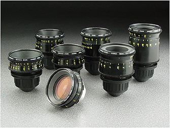
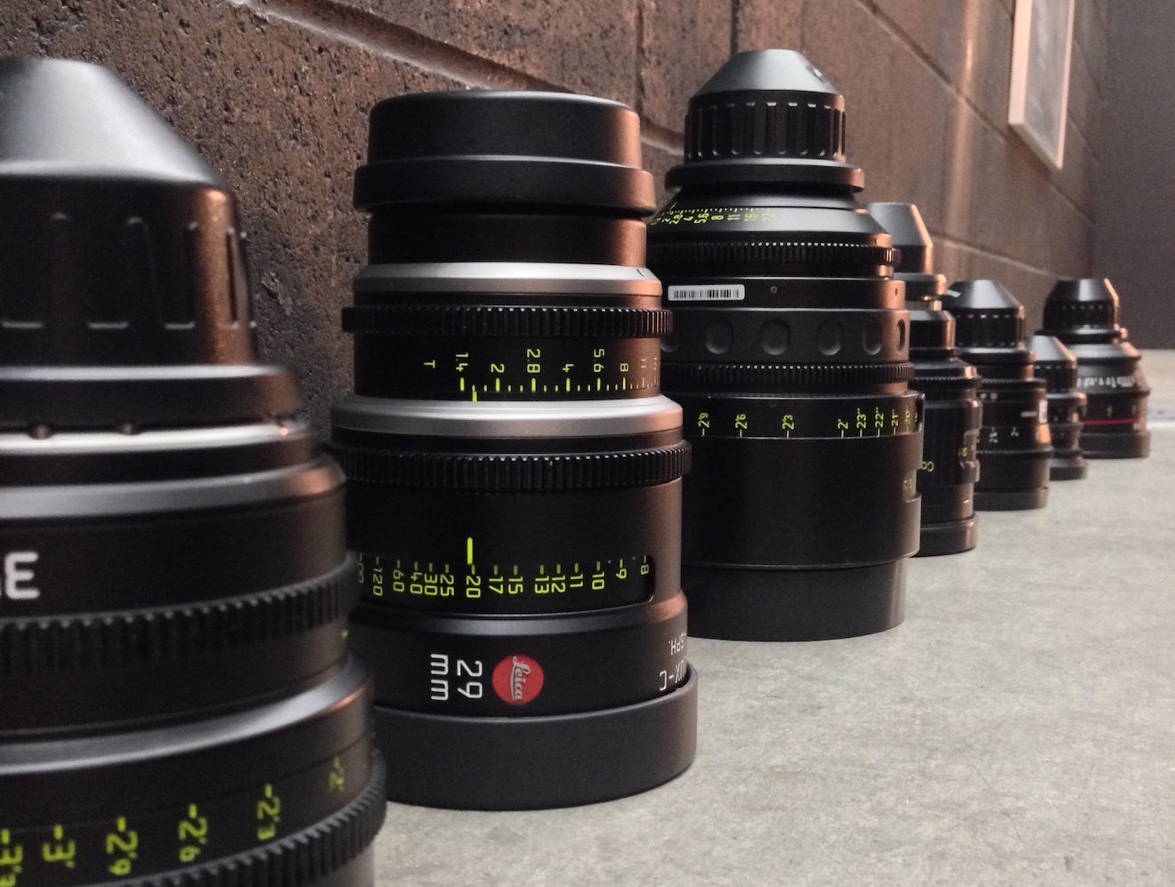
There is a huge range of glass available to filmmakers today – everything from vintage cinema lenses from the 60s to modern stills glass made for DSLRs. How can a DP choose which is right for their production?


Mount

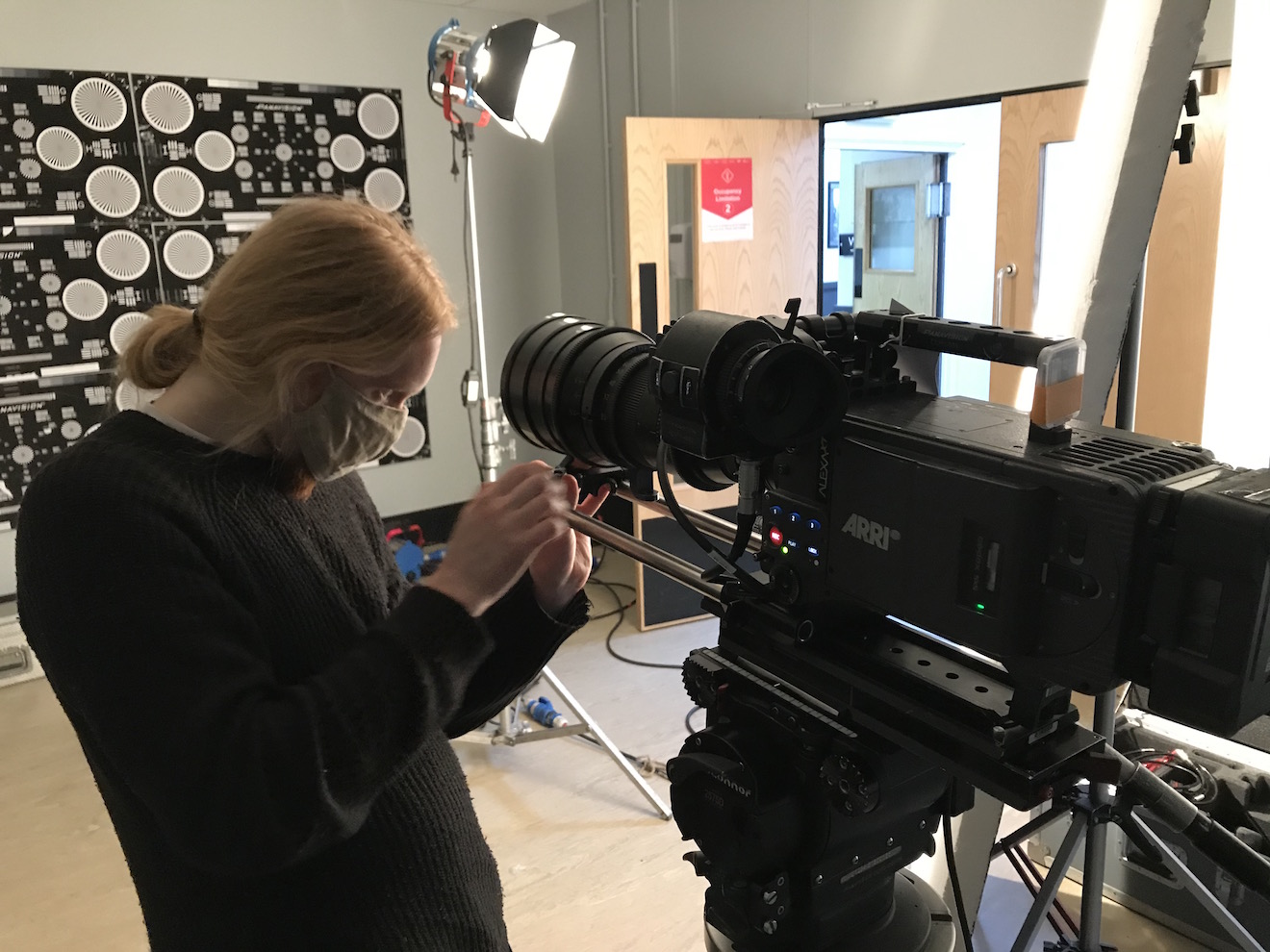
The first thing to take into account is the lens mount on your camera. If it is PL mount you will have access to a huge range of cinema lenses, some of them with decades of movie history. Other mounts such as Canon EF also provide plenty of choice, but mainly glass aimed at stills rather than cinematography. Some lenses can be mount-converted, some cameras can switch mounts, and adapters are available too, but it’s important to know upfront which lenses are going to be ruled out by your camera choice and which aren’t.


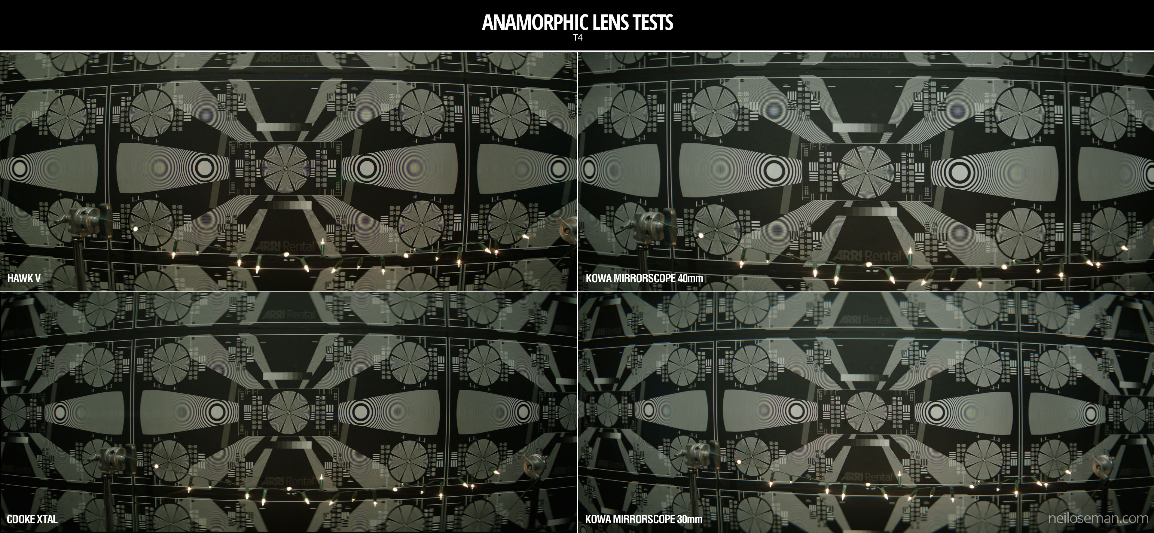
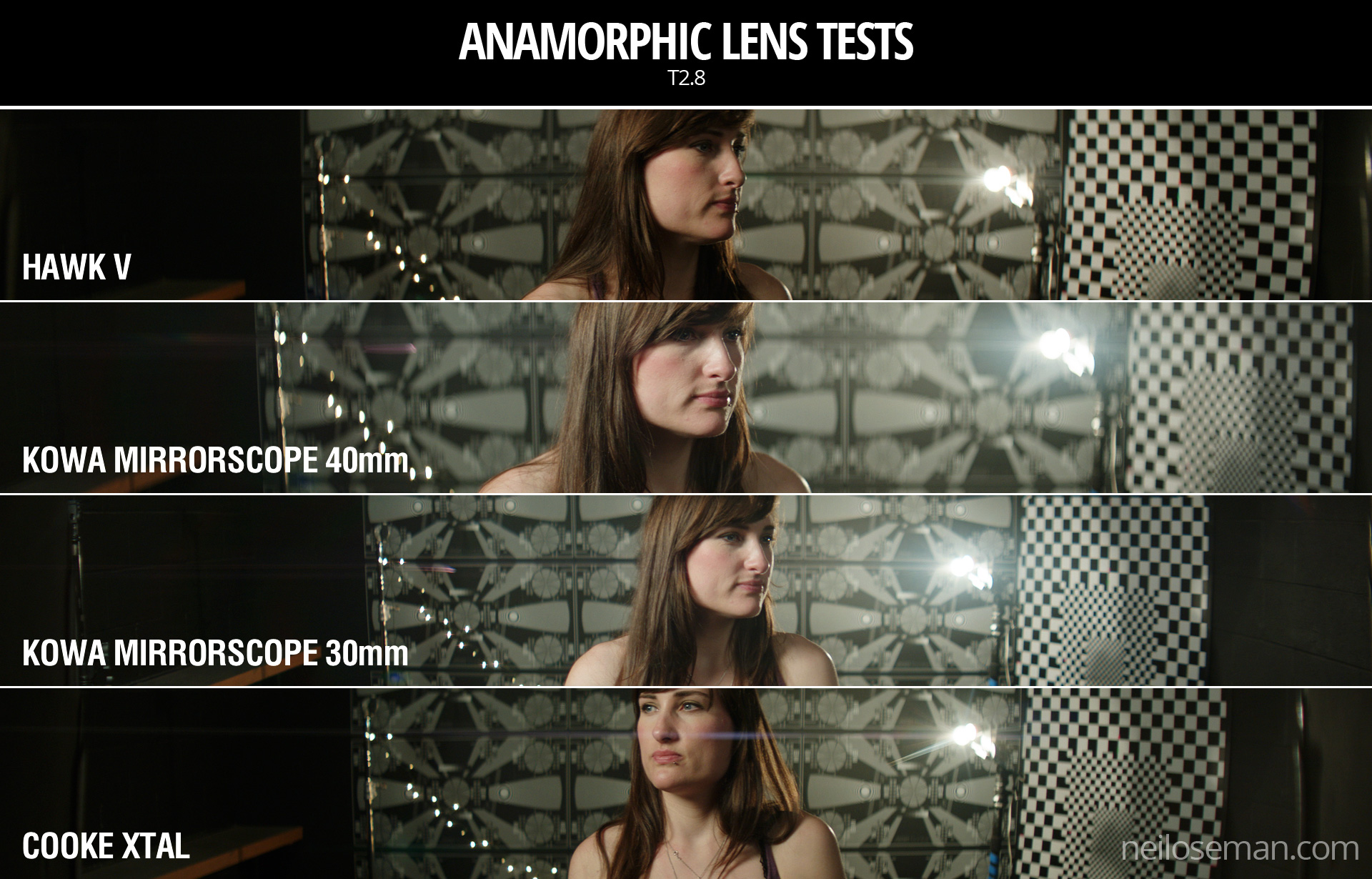
Spherical or Anamorphic

Test of a 30mm Cooke Xtal anamoprhic lens

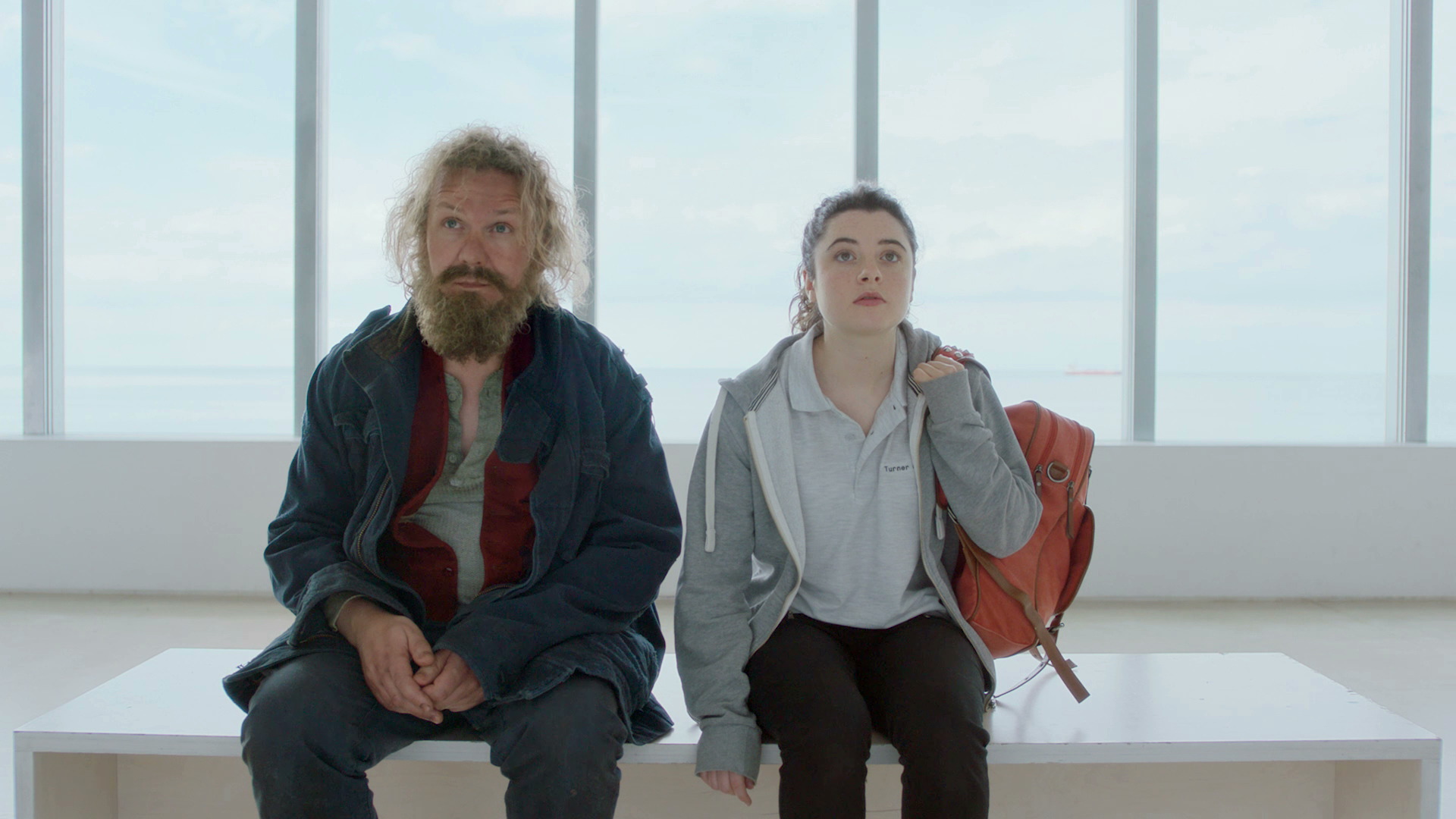
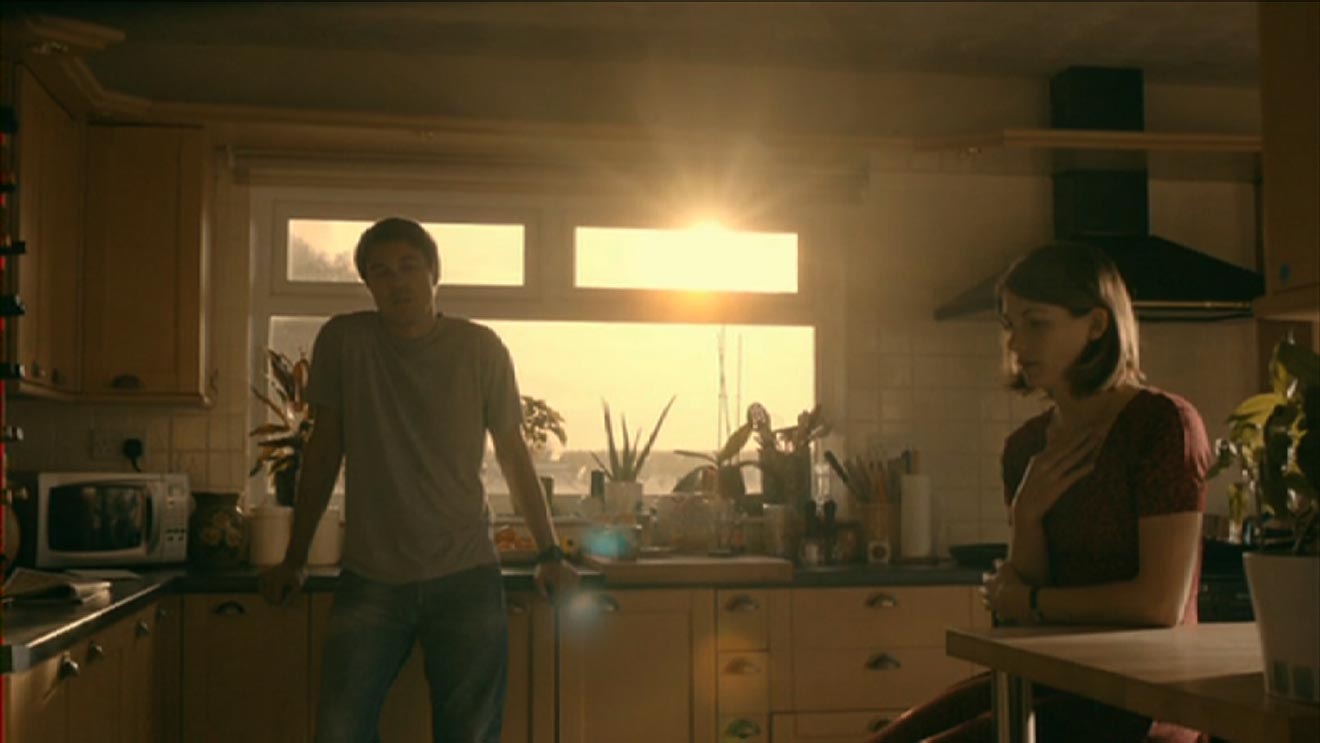
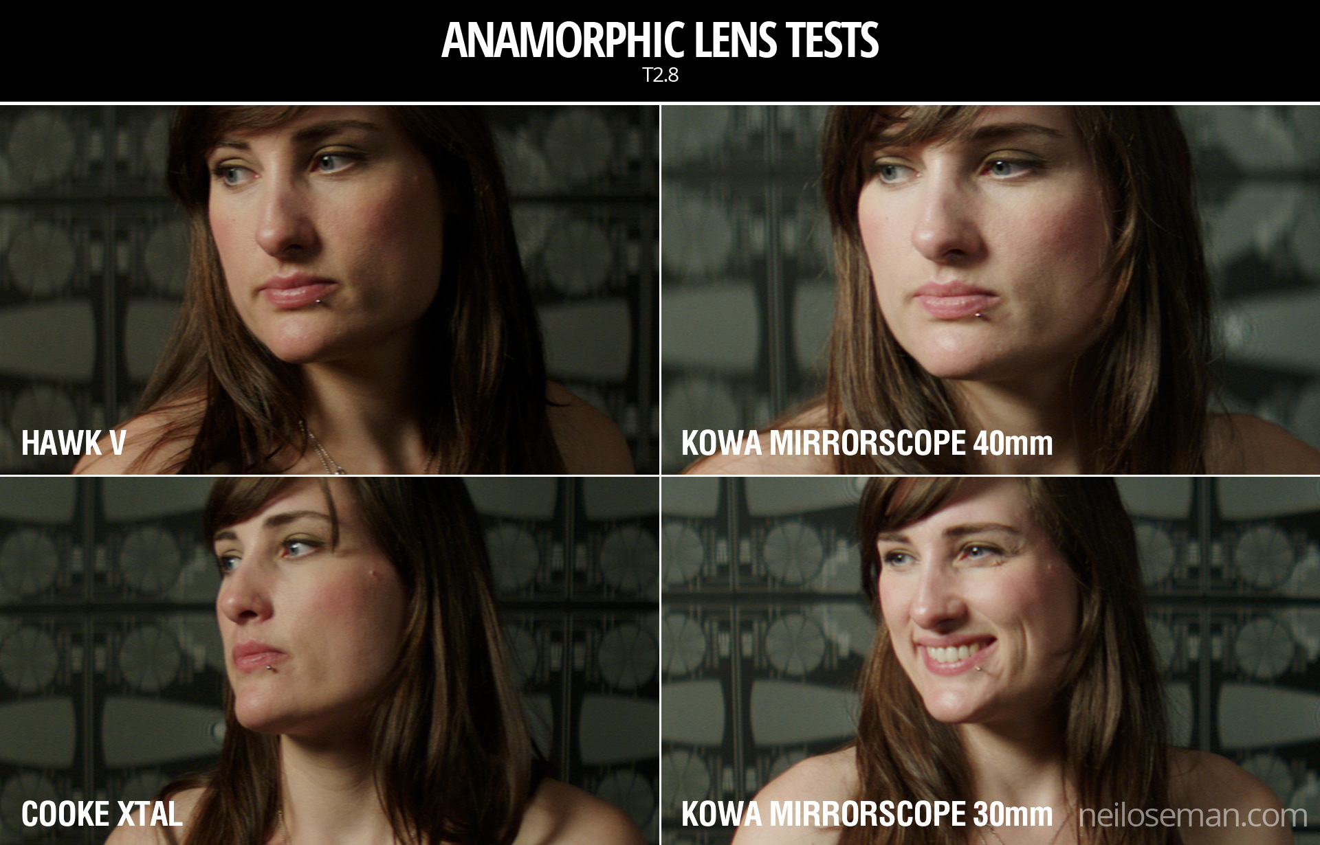
Anamorphic lenses squeeze the image horizontally, to be unsqueezed in post-production. The results are a wider picture, distinctive oval bokeh (out of focus areas) and often lens flares with horizontal streaks in them. This look is very cinematic, but anamorphic lenses tend to be bigger, heavier, more expensive, need more light than and don’t focus as close as their spherical counterparts, so think carefully before you choose them.


Speed

The speed of a lens – i.e. its maximum aperture – is one of its most important characteristics. A fast prime lens might open to T1.4, while a zoom or anamorphic prime might only go to T4. That’s three stops’ difference, equating to eight times more light required by the T4 lens. That can have a big impact on the size and number of lights you need. The ISO you plan to shoot at will also factor into this, of course.

Also consider how deep or shallow a depth of field you want. If you’re after super-blurry backgrounds, only a fast lens will give you those (though shooting on a large-format camera will help). This brings us to…


Bokeh

A quick bokeh test of a Sigma Cine 50-100mm zoom lens using fairy lights

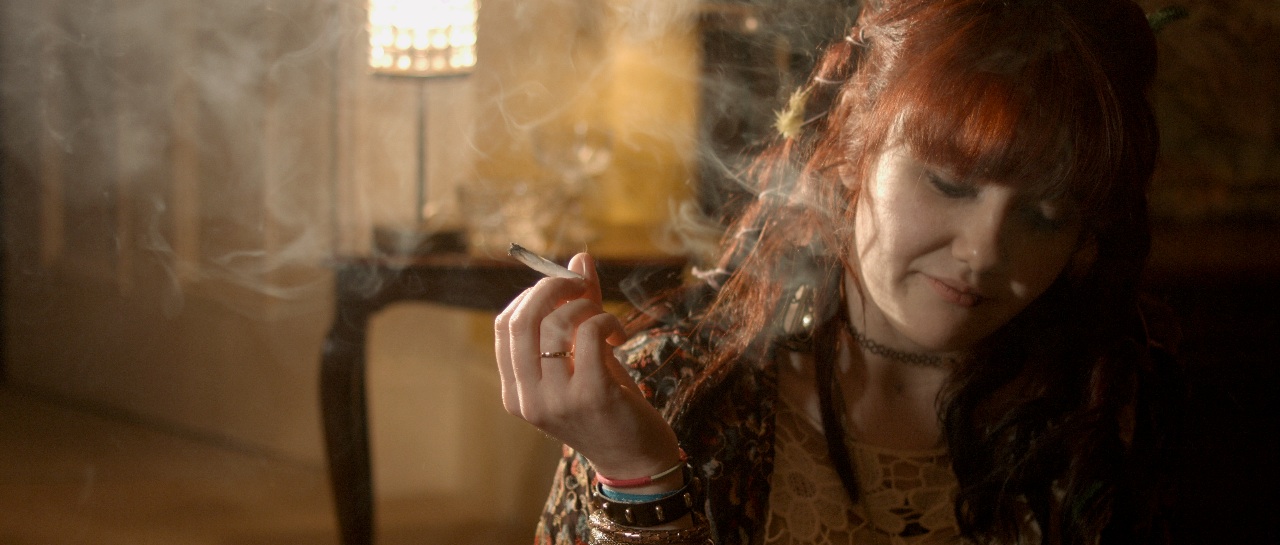
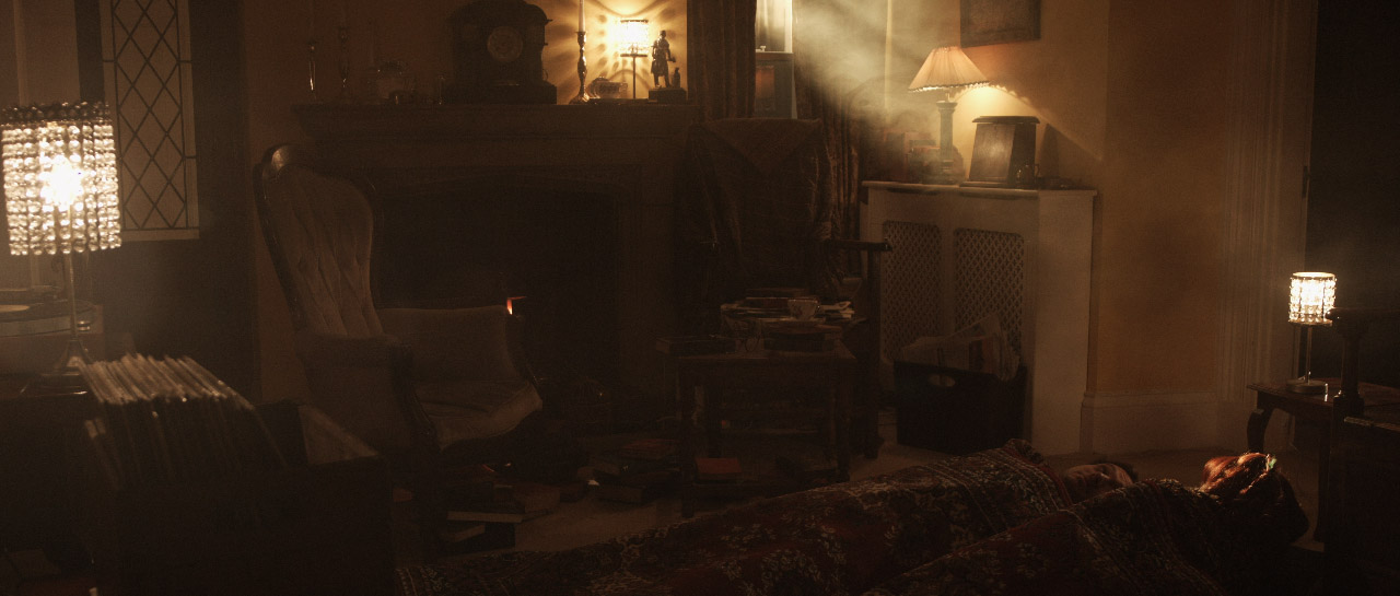
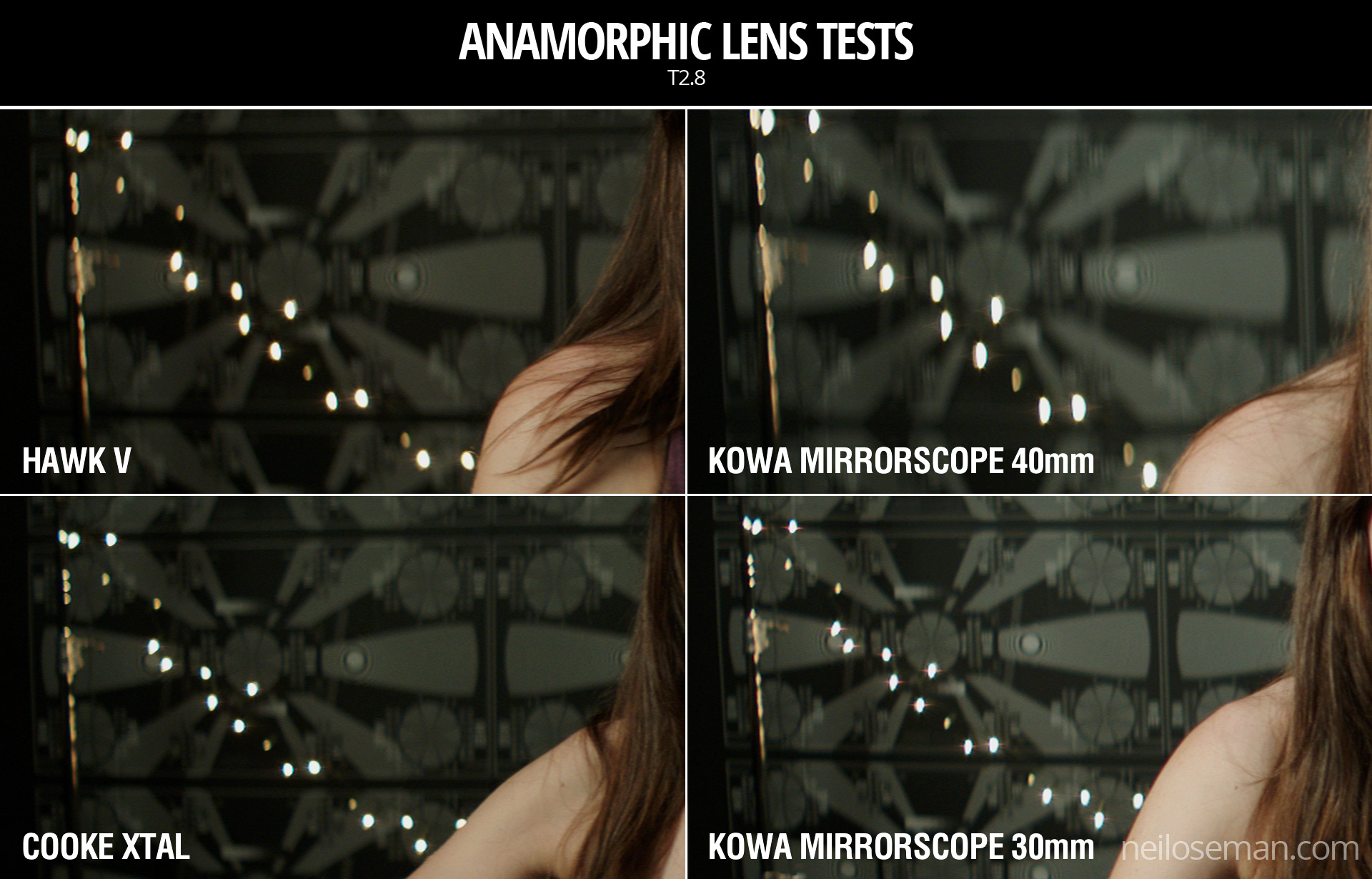
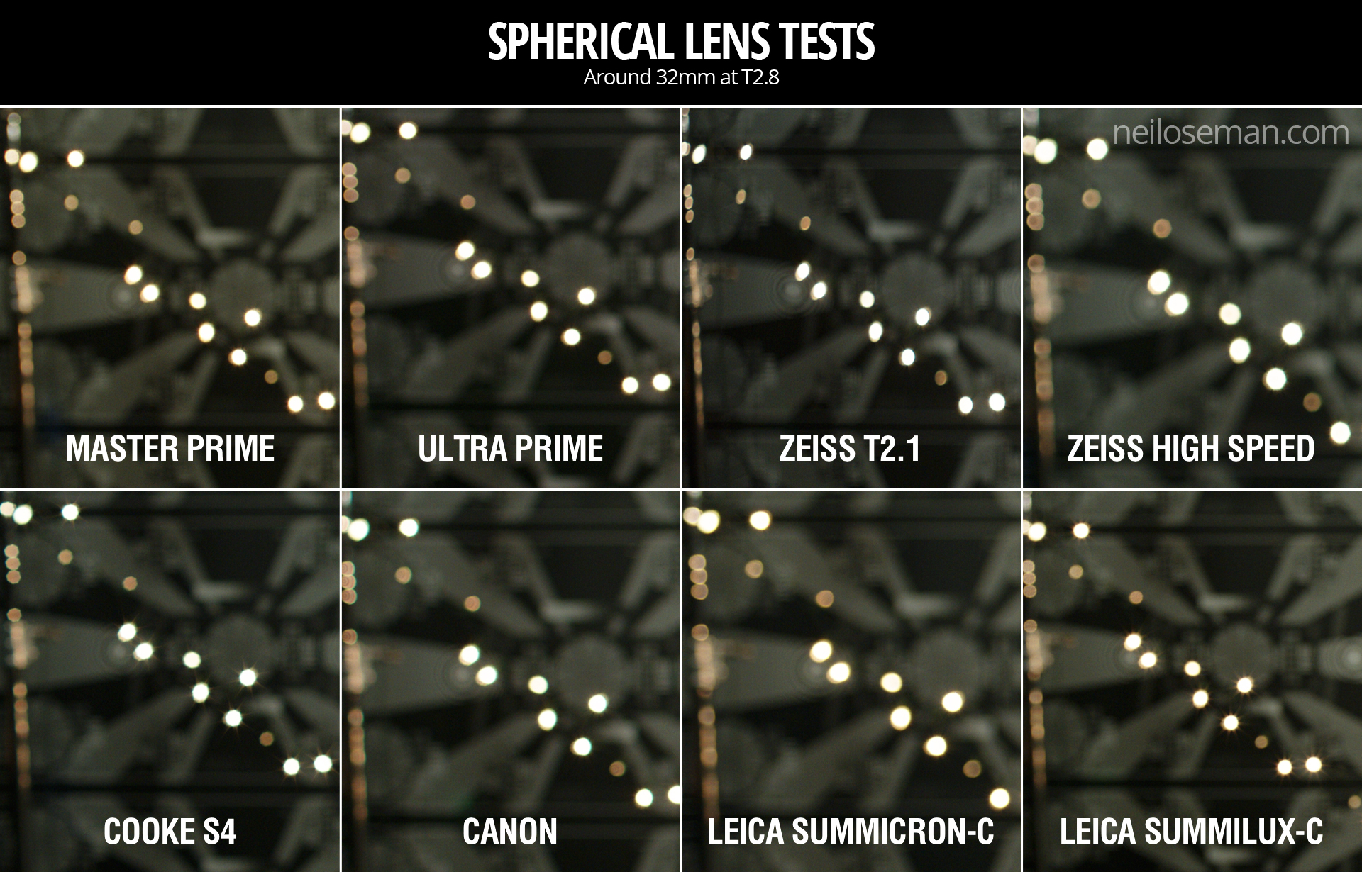
Bokeh is the appearance of out-of-focus areas in your image. It is most noticeable in small highlights such as fairy lights, which generally turn into big circles when they’re out of focus. Just how big and how smoothly circular depends on the lens and the aperture settings. Some lenses will have more geometric bokeh, octagons for example, which is a result of the shape and number of iris blades within. The bokeh may look rounder when the lens is wide open and more geometric when it is stopped down, or vice versa. It will also have a different shape at the edges of frame. What this comes down to is what look you feel is most aesthetically pleasing or appropriate for your story.


Lens Flares

Testing the flare of a Cooke Century 32mm

Another aesthetic choice. How much does the lens flare when light shines straight into it? What about when the light is just out of frame? Is there much veiling flare – an overall milkiness to the image? Do you like the colours and shapes of the flare? Do they feel natural or intrusive, and which is most fitting for the tone of your piece?


Sharpness

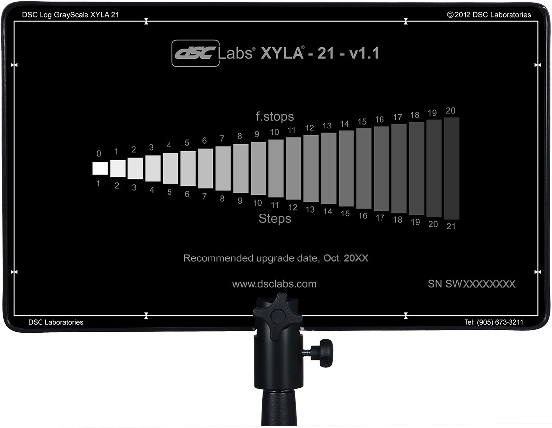
This is an important factor with the resolutions of cameras ever increasing. Any decent lens will be sharp at T5.6, but the more you open the iris the more you might start to see the image softening, especially when it is wide open (or conversely when it is stopped down to its minimum aperture). Check also the edges of frame, which may be less sharp than the centre, especially on a vintage or anamorphic lens. If you plan to do a lot of central framing then soft edges may not matter, or may even help to draw the viewer’s eye to the subject, but if you plan to put your subjects at the extreme sides of the frame then you should be careful what lenses you select.


Breathing

A lens is said to breathe when pulling the focus makes the image zoom in or out slightly. It is most noticeable with zoom lenses, some stills lenses and older glass. If you are racking back and forth between the characters in a deep two-shot, lens breathing can become very distracting.


Other Considerations

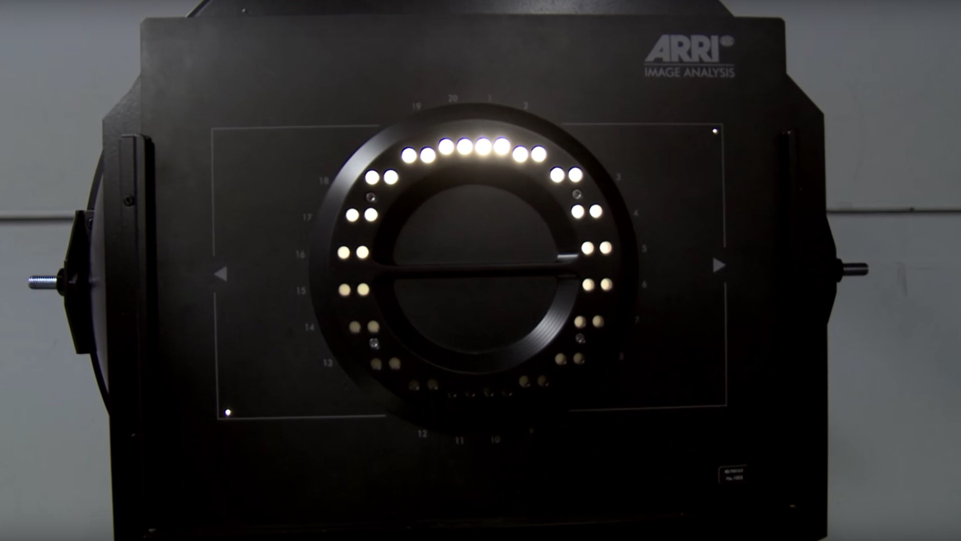
Other things to look out for are diffraction spikes, the star effect that happens around bright light sources, and colour rendition, which can vary slightly from lens to lens. If you expect to be physically close to your subject you should note the minimum focus distance of the lenses, which will be different for each length in the series. Also consider what focal lengths your chosen lens series contains – are there enough different lengths to cover everything you hope to shoot, especially at the shortest and longest ends of the range?

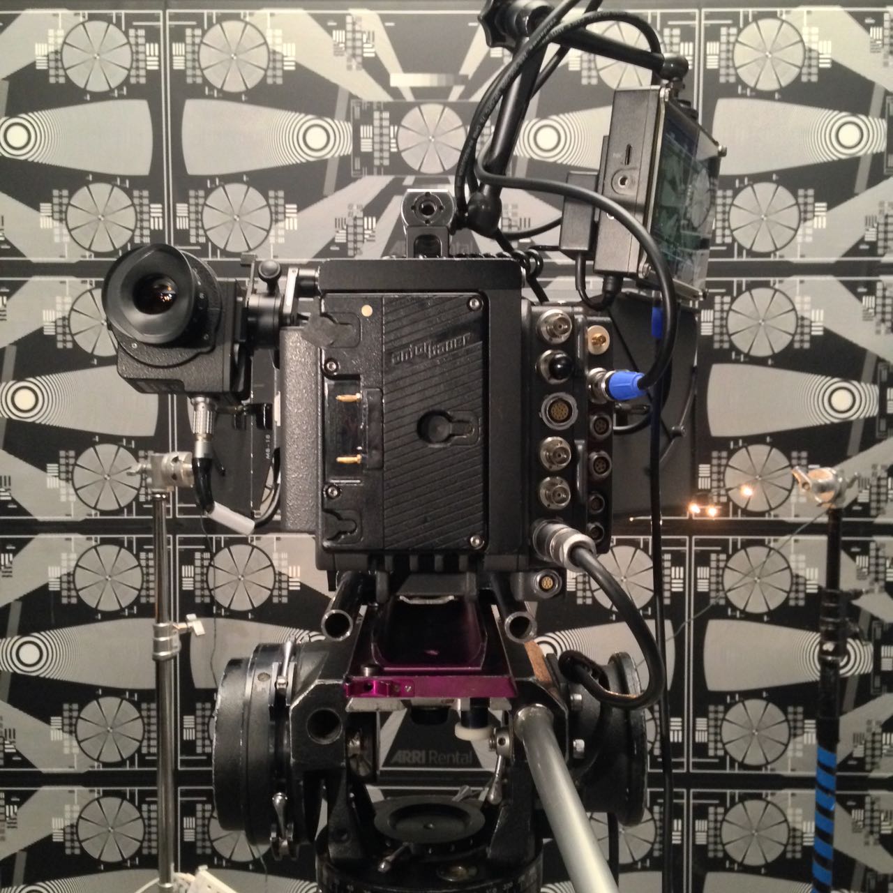
If you’re still not sure where to start, test footage and comparison videos of different lenses can be found online, like this one I made in 2017:

Better still, ask a rental house if you can come in for a day and shoot your own tests.

See also:

How Does a DP Choose Lenses?

6 Things to Beware of with Vintage Lenses

Ever since digital cinematography became the norm, DPs have sought to counter the format’s perfection with characterful vintage lenses. Having just completed a feature film shoot, Hamlet, on Cooke Panchros and a Cooke 10:1 Varotal, I’m over the moon with the beautiful, creamy, organic look they brought to the production. However, I can’t deny that they have some disadvantages over modern glass which you should take into consideration before choosing the vintage approach.


1. Softness

Vintage lenses simply aren’t as sharp as their modern counterparts, particularly at the edges of frame and particularly when the iris is wide open. On Hamlet I deliberately shot with the Panchros wide open to soften the image, rather than adding a diffusion filter like I’ve often done in the past, but that look is not for everyone, and it does make things a little harder for your focus puller. Be sure to test the sharpness and view the results on a large screen before committing.


2. BreathING

Breathe is the phenomenon whereby a lens appears to zoom slightly in or out when the focus is pulled. The Cooke Varotal is especially prone to this. As a result, my focus puller Aristide Russo had to be very gentle with his pulls otherwise the breathing was distracting.


3. Veiling

Many DPs love lens flares, and beautiful, natural flares were one of the reasons I picked the vintage Cooke glass. But look out for veiling flare – a milkiness and lift in the shadows affecting the whole frame. I noticed this a lot when shooting under the practical fluorescents in Hamlet‘s stage set, especially with handheld shots where the veiling would appear and disappear depending on the camera’s angle to the lights. I decided to embrace it and make it part of the film’s look, but if maintaining high contrast at all times is important to you, lenses without modern coatings may not be the right choice.


4. Vignetting

Check for dark patches in the corners of your image. The Varotal I used vignetted at certain parts of the zoom range and not at others, so the dark corners would appear and disappear during a zoom. Although not ideal, it isn’t noticeable most of the time. Besides, I figured that most colourists add vignettes to most shots anyway, so I was simply saving them a little time!


5. Mechanics

Older lenses are, quite naturally, less reliable. Even if they have been rehoused, like our Cooke “Century” Panchros had been in 2000, you may find that the iris and/or focus sticks sometimes. Our 25mm started to play up halfway through our shoot, forcing Aris to use the rosettes to support the matte box, otherwise the motor wasn’t powerful enough to turn the focus ring. This possibility was flagged for me during testing when we had a similar issue with the 50mm. Even if all your lenses seem to be fine during prep, know that a vintage lens could start misbehaving at any time, and your rental house may not have another on the shelf to replace it with.


6. Uniformity

Don’t expect a set of vintage primes to all have the same maximum aperture or the same external configuration. The iris ring might be buried in the matte box, the matte box might not fit on at all, or it may be impossible to engage both iris and focus motors at the same time.


All this sounds quite negative, but the flares, softness, breathing and vignettes can be absolutely beautiful. Be aware of the downsides of using vintage glass, absolutely, but if they suit your story then embrace the flaws and get ready to be blown away by your dailies.

In case you missed them the first time, I’ll leave you with some highlights from my Hamlet lens tests.

6 Things to Beware of with Vintage Lenses

Undisclosed Project: Experimentation

The main event of last week’s prep was a test at Panavision of the Arri Alexa XT, Red Gemini and Sony F55, along with Cooke Panchro, Cooke Varotal, Zeiss Superspeed and Angenieux glass. More on that below, along with footage.

The week started with Zoom meetings with the costume designer, the make-up artist, potential fight choeographers and a theatrical lighting designer. The latter is handling a number of scenes which take place on a stage, which is a new and exciting collaboration for me. I met with her at the location the next day, along with the gaffer and best boy. After discussing the stage scenes and what extra sources we might need – even as some of them were starting to be rigged – I left the lighting designer to it. The rest of us then toured the various rooms of the location, with the best boy making notes and lighting plans on his tablet as the gaffer and I discussed them. They also took measurements and worked out what distro they would need, delivering a lighting kit list to production the next day.

Meanwhile, at the request of the producer, I began a shot list, beginning with two logistically complex scenes. Despite all the recces so far, I’ve not thought about shots as much as you might think, except where they are specified in the script or where they jumped out at me when viewing the location. I expect that much of the shot planning will be done during the rehearsals, using Artemis Pro. That’s much better and easier than sitting at home trying to imagine things, but it’s useful for other departments to be able to see a shot list as early as possible.

So, the camera tests. I knew all along that I wanted to test multiple cameras and lenses to find the right ones for this project, a practice that is common on features but which, for one reason and another, I’ve never had a proper chance to do before. So I was very excited to spend Wednesday at Panavision, not far from my old stomping ground in Perivale, playing around with expensive equipment.

Specifically we had: an Arri Alexa – a camera I’m very familiar with, and my gut instinct for shooting this project on; a Sony F55 – which I was curious to test because it was used to shoot the beautiful Outlander series; and a Red Gemini – because I haven’t used a Red in years and I wanted to check I wasn’t missing out on something awesome.

For lenses we had: a set of Cooke Panchros – again a gut instinct (I’ve never used them, but from what I’ve read they seemed to fit); a set of Zeiss Superspeeds – selected after reviewing my 2017 test footage from Arri Rental; a couple of Cooke Varotal zooms, and the equivalents by the ever-reliable Angenieux. Other than the Angenieux we used on the B-camera for The Little Mermaid (which I don’t think we ever zoomed during a take), I’ve not used cinema zooms before, but I want the old-fashioned look for this project.

Here are the edited highlights from the tests…

You’ll notice that the Sony F55 disappears from the video quite early on. This is because, although I quite liked the camera on the day, as soon as I looked at the images side by side I could see that the Sony was significantly softer than the other two.

So it was down to the Alexa vs. the Gemini, and the Cookes vs. the Superspeeds. I spent most of Thursday and all of Friday morning playing with the footage in DaVinci Resolve, trying to decide between these two pairs of very close contenders. I tried various LUTs, did some rough grading (very badly, because I’m not a colourist), tested how far I could brighten the footage before it broke down, and examined flares and bokeh obsessively.

Ultimately I chose the Cooke Panchros because (a) they have a beautiful and very natural-looking flare pattern, (b) the bokeh has a slight glow to it which I like, (c) the bokeh remains a nice shape when stopped down, unlike the Superspeeds’, which goes a bit geometric, (d) they seem sharper than the Superspeeds at the edges of frame when wide open, and (e) more lengths are available.

As for the zoom lenses (not included in the video), the Cooke and the Angenieux were very similar indeed. I chose the former because it focuses a little closer and the bokeh again has that nice glow.

I came very close to picking the Gemini as my camera. I think you’d have to say, objectively, it produces a better image than the Alexa, heretical as that may sound. The colours seem more realistic (although we didn’t shoot a colour chart, which was a major oversight) and it grades extremely well. But…

I’m not making a documentary. I want a cinematic look, and while the Gemini is by no means un-cinematic, the Alexa was clearly engineered by people who loved the look of film and strove to recreate it. When comparing the footage with the Godfather and Fanny and Alexander screen-grabs that are the touchstone of the look I want to create, the Alexa was just a little bit closer. My familiarity and comfort level with the Alexa was a factor too, and the ACs felt the same way.

I’m very glad to have tested the Gemini though, and next time I’m called upon to shoot something great and deliver in 4K (not a requirement on this project) I will know exactly where to turn. A couple of interesting things I learnt about it are: (1) whichever resolution (and concomitant crop factor) you select, you can record a down-scaled 2K ProRes file, and this goes for the Helium too; (2) 4K gives the Super-35 field of view, whereas 5K shows more, resulting in some lenses vignetting at this resolution.

Undisclosed Project: Experimentation

How is Dynamic Range Measured?

The high dynamic range of the ARRI Alexa Mini allowed me to retain all the sky detail in this shot from “Above the Clouds”.

Recently I’ve been pondering which camera to shoot an upcoming project on, so I consulted the ASC’s comparison chart. Amongst the many specs compared is dynamic range, and I noticed that the ARRI Alexa’s was given as 14+ stops, while the Blackmagic URSA’s is 15. Having used both cameras a fair bit, I can tell you that there’s no way in Hell that the Ursa has a higher dynamic range than the Alexa. So what’s going on here?


What is dynamic range?

To put it simply, dynamic range is the level of contrast that an imaging system can handle. To quote Alan Roberts, who we’ll come back to later:

This is normally calculated as the ratio of the exposure which just causes white clipping to the exposure level below which no details can be seen.

A photosite on a digital camera’s sensor outputs a voltage proportional to the amount of light hitting it, but at some point the voltage reaches a maximum, and no matter how much more light you add, it won’t change. At the other end of the scale, a photosite may receive so little light that it outputs no voltage, or at least nothing that’s discernible from the inherent electronic noise in the system. These upper and lower limits of brightness may be narrowed by image processing within the camera, with RAW recording usually retaining the full dynamic range, while linear Rec. 709 severely curtails it.

In photography and cinematography, we measure dynamic range in stops – doublings and halvings of light which I explain fully in this article. One stop is a ratio of 2:1, five stops are 32:1, thirteen stops are almost 10,000:1

It’s worth pausing here to point out the difference between dynamic range and latitude, a term which is sometimes regarded as synonymous, but it’s not. The latitude is a measure of how much the camera can be over- or under-exposed without losing any detail, and is dependent on both the dynamic range of the camera and the dynamic range of the scene. (A low-contrast scene will allow more latitude for incorrect exposure than a high-contrast scene.)


Problems of Measurement

Before digital cinema cameras were developed, video had a dynamic range of about seven stops. You could measure this relatively easily by shooting a greyscale chart and observing the waveform of the recorded image to see where the highlights levelled off and the shadows disappeared into the noise floor. With today’s dynamic ranges into double digits, simple charts are no longer practical, because you can’t manufacture white enough paper or black enough ink.

For his excellent video on dynamic range, Filmmaker IQ’s John Hess built a device fitted with a row of 1W LEDs, using layers of neutral density gel to make each one a stop darker than its neighbour. For the purposes of his demonstration, this works fine, but as Phil Rhodes points out on RedShark News, you start running into the issue of the dynamic range of the lens.

It may seem strange to think that a lens has dynamic range, and in the past when I’ve heard other DPs talk about certain glass being more or less contrasty, I admit that I haven’t thought much about what that means. What it means is flare, and not the good anamorphic streak kind, but the general veiling whereby a strong light shining into the lens will raise the overall brightness of the image as it bounces around the different elements. This lifts the shadows, producing a certain amount of milkiness. Even with high contrast lenses, ones which are less prone to veiling, the brightest light on your test device will cause some glare over the darkest one, when measuring the kind of dynamic range today’s cameras enjoy.


Manufacturer Measurements

Going back to my original query about the Alexa versus the URSA, let’s see exactly what the manufacturers say. ARRI specifically states that its sensor’s dynamic range is over 14 stops “as measured with the ARRI Dynamic Range Test Chart”. So what is this chart and how does it work? The official sales blurb runs thusly:

The ARRI DRTC-1 is a special test chart and analysis software for measurement of dynamic range and sensitivity of digital cameras. Through a unique stray light reduction concept this system is able to accurately measure up to 15.5 stops of dynamic range.

The “stray light reduction” is presumably to reduce the veiling mentioned earlier and provide more accurate results. This could be as simple as covering or turning off the brighter lights when measuring the dimmer ones.

I found a bit more information about the test chart in a 2011 camera shoot-out video, from that momentous time when digital was supplanting film as the cinematic acquisition format of choice. Rather than John Hess’s ND gel technique, the DRTC-1 opts for something else to regulate its light output, as ARRI’s Michael Bravin explains in the video:

There’s a piece of motion picture film behind it that’s checked with a densitometer, and what you do is you set the exposure for your camera, and where you lose detail in the vertical and horizontal lines is your clipping point, and where you lose detail because of noise in the shadow areas is your lowest exposure… and in between you end up finding the number of stops of dynamic range.

Blackmagic Design do not state how they measure the dynamic range of their cameras, but it may be a DSC Labs Xlya. This illuminated chart boasts a shutter system which “allows users to isolate and evaluate individual steps”, plus a “stepped xylophone shape” to minimise flare problems.

Art Adams, a cinema lens specialist at ARRI, and someone who’s frequently quoted in Blain Brown’s Cinematography: Theory & Practice, told Y.M. Cinema Magazine:

I used to do a lot of consulting with DSC Labs, who make camera test charts, so I own a 20-stop dynamic range chart (DSC Labs Xyla). This is what most manufacturers use to test dynamic range (although not ARRI, because our engineers don’t feel it’s precise enough) and I see what companies claim as usable stops. You can see that they are just barely above the noise floor.


Conclusions

Obviously these ARRI folks I keep quoting may be biased. I wanted to find an independent test that measures both Blackmagics and Alexas with the same conditions and methodology, but I couldn’t find one. There is plenty of anecdotal evidence that Alexas have a bigger dynamic range, in fact that’s widely accepted as fact, but quantifying the difference is harder. The most solid thing I could find is this, from a 2017 article about the Blackmagic Ursa Mini 4.6K (first generation):

The camera was measured at just over 14 stops of dynamic range in RAW 4:1 [and 13 stops in ProRes]. This is a good result, especially considering the price of the camera. To put this into perspective Alan measured the Canon C300 mkII at 15 stops of dynamic range. Both the URSA Mini 4.6 and C300 mkII are bettered by the ARRI Alexa and Amira, but then that comes as no surprise given their reputation and price.

The Alan mentioned is Alan Roberts, something of a legend when it comes to testing cameras. It is interesting to note that he is one of the key players behind the TLCI (Television Lighting Consistency Index), a mooted replacement for CRI (Colour Rendering Index). It’s interesting because this whole dynamic range business is starting to remind me of my investigation into CRI, and is leading me to a similar conclusion, that the numbers which the manufacturers give you are all but useless in real-world cinematography.

Whereas CRI at least has a standardised test, there’s no such thing for dynamic range. Therefore, until there is more transparency from manufacturers about how they measure it, I’d recommend ignoring their published values. As always when choosing a camera, shoot your own tests if at all possible. Even the most reliable numbers can’t tell you whether you’re going to like a camera’s look or not, or whether it’s right for the story you want to tell.

When tests aren’t possible, and I know that’s often the case in low-budget land, at least try to find an independent comparison. I’ll leave you with this video from the Slanted Lens, which compares the URSA Mini Pro G2 with the ARRI Amira (which uses the same Alev III sensor as the Alexa). They don’t measure the dynamic range, but you can at least see the images side by side, and in the end it’s the images that matter, not the numbers.

How is Dynamic Range Measured?

Lighting I Like: “Broadchurch”

The penultimate episode of Lighting I Like goes back to 2013 and the very first episode of the critically-acclaimed ITV crime drama Broadchurch. The scene features the parents of a murdered schoolboy trying to deal with their grief as the sun glares intrusively through the window.

I previously wrote about Broadchurch in an article about headroom, and its third season got a mention in my post about the 2:1 aspect ratio.

The final episode of Lighting I Like will be released, as usual, at 8pm BST next Wednesday, and I’ll be looking at a scene from Star Trek: EnterpriseClick here to see the playlist of all Lighting I Like episodes.

Lighting I Like: “Broadchurch”

Anamorphic Lens Tests

Anamorphic cinematography, first dabbled with in the 1920s, was popularised by Twentieth Century Fox in the fifties as CinemaScope. Television was growing in popularity and the studios were inventing gimmicks left, right and centre to encourage audiences back into cinemas. Fox’s idea was to immerse viewers in an image far wider than they were used to, but with minimal modifications to existing 4-perf 35mm projectors. They developed a system of anamorphic lenses containing elements which compressed the image horizontally by a factor of two. By placing a corresponding anamorphosing lens onto existing projectors, the image was unsqueezed into an aspect ratio of 2.55:1, or later 2.39:1.

Since those early days of CinemaScope, anamorphic cinematography has become associated with the biggest Hollywood blockbusters. Its optical features – streak flares, oval bokeh and curved horizontal lines – have been seared into our collective consciousness, indelibly associated with high production values.

I’ve not yet been fortunate enough to shoot anamorphic, but I was able to test a few lenses at Arri Rental recently, with the help of Rupert Peddle and Bex Clives. Last week I wrote about the spherical lenses which we tested; our anamorphic tests followed the same methodology.

Again we were shooting on an Alexa XT Plus in log C ProRes 4444 XQ, this time in 4:3 mode, a resolution of 2048×1536. Since all of the lenses had a standard 2:1 anamorphosing ratio, the images unsqueezed to a super-wide 2.66:1 ratio. (This is because the lenses were designed to be used on 35mm film with space left to one side for the optical soundtrack.) You can see the full width of this ratio in the first split-screen image in the video, at 2:08, and in the second image below, but otherwise I have horizontally cropped the footage to the standard 2.39:1 ratio.

We tested the following glass:

Series Length Speed CF* Weight
Hawk V 35mm T2.2 30″ 5.6kg
Cooke Xtal 30mm T2.8 ? 3kg
Kowa Mirrorscope 40mm T2.2 36″ 1.15kg
Kowa Mirrorscope 30mm T2.3 ? ?

* CF = close focus

For consistency with the spherical lenses, we used lengths around 32mm, but in the anamorphic format this is a pretty wide lens, not a mid-range lens. We shot at T2.8, again for consistency, but I hear that many anamorphics don’t perform well wider than T4.

We were only able to test what Arri Rental happened to have on the shelves that day. The biggest and presumably most expensive was the Hawk V-series. Next  in size and weight was the Cooke Xtal – pronounced “crystal” – a 1970s lens based on the much-loved Speed Panchros. The smallest and lightest, was the Kowa Mirrorscope, with a list price of £1,200 per week for a set of four. (Sorry, I couldn’t find any pricing info for the others online.) Note that there isn’t really a 30mm Mirrorscope; to get this length you put a wide angle adapter on the 40mm. As this extra element decreases the optical performance, we tested it with and without, hence the two lengths.

Here’s the video…


Skin tones

Click on the image to see it at full quality.

To my eye, the Hawk has a fairly rich, warm skin tone, while the Cooke – as with the spherical S4 tested last week – seems a little grey and flat. The Kowa is inexplicably brighter than the other two lenses, which makes it hard to compare, but perhaps it’s a little cooler in tone?


Sharpness

Focus is more critical with anamorphic lenses than spherical ones. From a forum posting by Max Jacoby:

Anamorphic lenses have what is known as a “curved field of focus” that works similarly to the curved movie screens in some large Cinerama theatres. This is one reason that one needs to expose these lenses at a deeper stop. If one doesn’t, the curved field will not be covered by depth of field and either the edges or centre of the frame will be soft.

One day I’d like to re-test these lenses at a lower stop, T4 or T5.6, where they will all undoubtedly perform much better. But in this T2.8 test, on Bex’s face in the centre of frame, the Hawk V and the Kowa Mirrorscope 40mm – both almost a full stop from their maximum apertures – are clearly the sharpest of the bunch. The Cooke Xtal, which is wide open, is unsurprisingly softer. The 30mm adapter on the Mirrorscope completely destroys the image, not only making it very soft but also introducing colour aberration.

Now let’s look at the checkerboard at the side of frame and see if we can spot any differences in sharpness there…

It seems to me that the Kowa, both with and without the adapter, has a greater difference in sharpness between the centre and edges of frame than the the Hawk and Cooke. With the latter two lenses, the checkerboard is reasonably sharp, at least on the lefthand side, with some ghosting/blur visible towards the righthand side. The same thing can be observed on the chart in the flare tests at the end of the video.


Breathing & Bokeh

All of these lenses have a noticeable degree of breathe, which I suppose is to be expected from anamorphics. The Hawk V has roughly oval bokeh, the Cooke’s is more circular, while the Mirrorscope has interesting D-shaped bokeh.


Flare

The Hawk V doesn’t flare much at all, which is apparently due to the anamorphic element being in the middle of the lens, rather than at the front. The Kowa has a nice streak and glow around the light source, with a funky purple artefact on the opposite side of frame. But it’s the Cooke Xtal which provides the most classic lens flare, with a horizontal line across most of the frame and a partial star pattern around the source, despite the lens being wide open.

At the end of the video you can see how the flares develop on each lens as the light source moves horizontally across frame.


Distortion

A bulging effect is very obvious on all of these lenses, due to the focal lengths being quite wide for anamorphic. Notice how at 40mm on the Kowa Mirrorscope this curvature of the image is significantly reduced.

It’s hard to compare the levels of distortion because none of the focal lengths are exactly the same, except for the Cooke Xtal and the Kowa Mirrorscope with the 30mm adapter on. The Cooke’s top right and bottom left corners appear to be stretched away from the centre relative to the other two corners. I suppose that strange and funky stuff like this is exactly why you choose vintage glass.

Interestingly, the Cooke’s image appears a little tighter than the Kowa’s, which combined with my inability to find any evidence online of the existence of a 30mm Xtal, leads me to suspect we may have been given a mislabelled 32mm.


Conclusions

When we got to the end of our spherical tests and started putting the anamorphics on, I was shocked by the drop in sharpness. But as noted earlier, this is because anamorphics really need to be used with a smaller aperture than the T2.8 I often shoot at. If I learnt nothing else from this test, I learnt that anamorphic needs more light!

I would love to put the Cooke Xtal’s lovely flares and general vintage look to good use on a period movie one day. The Hawk V would be a good choice if I wanted the anamorphic look with warm, dynamic skin tones. The Kowa system seemed a little cheap and cobbled-together, but could well be a good solution for anamorphic on a budget, as long as I stayed away from the 30mm adapter!

I hope you’ve found these tests useful. Thanks again to 1st AC Rupert Peddle, 2nd AC Bex Clives and Arri Rental UK for making them possible.

Anamorphic Lens Tests

Spherical Lens Tests

The other week I spent a day at Arri Rental in Uxbridge, in the Bafta Room no less, conducting various camera and lens tests. I’ve done a number a productions now where I wanted to test but there wasn’t the time or money, so for a while I’ve been meaning to go into Arri on my own time and do some general tests for my education and edification. An upcoming short provided the catalyst for me to get around to it at last.

Aided by 1st AC Rupert Peddle and 2nd AC Bex Clives, I tested a dozen lenses, some spherical, some anamorphic. Today I will cover the spherical lenses; next time I’ll look at the anamorphics.


Method

We shot on an Alexa XT Plus in log C ProRes 4444 XQ at 3.2K. In the video the image has been downscaled to 1080P and a standard Rec.709 LUT has been added.

I set the Alexa to ISO 800 and lit Bex to a T2.8 using a 650W tungsten fresnel bounced off poly. For fill I caught a little of the spill from the fresnel with a matte silver bounce board on the opposite side of camera. I placed fairy lights in the background to observe the bokeh (out of focus areas) and turned on a 100W globe during each take to see what the flare did.

We shot all the lenses at 2.8 – the stop I most commonly use – and also wide open (compensating with the shutter angle), but the direct 2.8 comparison proved most useful, so that’s mainly what you’ll see in the video. We tested a single length: 35mm or the closest available to it.

What we didn’t do was shoot grey-scale or colour charts, or do any testing of vignettes or distortion. (The day after doing these tests, Shane Hurlbut, ASC published an Inner Circle post about how to tests lenses, so I immediately learnt what my omissions were!)

We tested the following lenses:

Series Length Speed CF* Weight Price
Leica Summilux-C 29mm T1.4 18″ 1.7kg £27K
Arri/Zeiss Master Prime 35mm T1.3 14″ 2.2kg £16K
Cooke S4 32mm T2 6″ 1.85kg £14K
Leica Summicron-C 35mm T2 14″ 1.3kg £13K
Zeiss High Speed
(a.k.a. Superspeed Mk III)
35mm T1.3 14″ 0.79kg £12K
(refurb)
Arri/Zeiss Ultra Prime 32mm T1.9 15″ 1.1kg £10K
Zeiss T2.1 32mm T2.1 24″ 0.45kg £4K
(used)
Canon 35mm T1.5 12″ 1.1kg £3K

* CF = close focus

Here’s the video…


Skin tones

Click the image to see it at best quality.

The Arri/Zeiss Master Prime and the two Leicas seem to have the most vibrant skin tones. To my eye, the Leicas have a slight creaminess that’s very pleasing. The Canon looks just a little cooler and less dynamic. I was surprised to find that the Cooke S4, the lens I’ve used most, appears to have a grey, flat skin tone compared with the Master Prime, Leicas and Canon. I would rank the Ultra Prime and Superspeed next, on a par except that the Ultra Prime has a noticeable magenta cast. My least favourite skin tones are on the Zeiss T2.1, which comparatively makes poor Bex look a little bit ill!

Some of the nuances will be lost in the YouTube and Jpeg compression, but this is a very subjective assessment anyway, so feel free to completely disagree with all of the above. Any of the differences noted above could be corrected by grading, to some extent . But remember that the lens is at the very start of the light’s journey from set to screen, and any wavelengths that don’t get through it are lost forever. It’s like fluorescent lamps with colours missing from the spectrum; you can’t put those back in in post.


Sharpness

I have to say, I’m unable to detect any difference in sharpness between the Master Prime, Cooke S4, Canon and Leicas. The Ultra Prime and Superspeed both look a hair softer, while the T2.1 is very soft.


Breathing

Breathing is the slight zooming effect that you get with some lenses when you pull focus. Looking at 4:44 in the video you can clearly see the differences in breathing between the eight lenses. Because this part of the video is showing a crop of the bottom left corner of the image, the breathing manifests as a shift to the left (zoom in) as the lens is racked closer (goes soft) and a shift to the right (zoom out) as it’s racked deeper (goes sharp).

All the Zeiss lenses except the Master Prime have a significant amount of breath when seen in isolation like this, but not enough to be noticeable to an audience in most real-world situations. The Cooke S4 has a little bit of breathe, and the Canon a hair less. The Master Prime and the Leicas are rock solid.


Bokeh

Small points of light, when thrown out of focus, most clearly demonstrate the bokeh pattern of a lens. The shape of the bokeh is determined by the number of iris blades and the shape of those blades. Generally a circle is preferred, because it’s a natural shape, but for certain stories a more unusual shape might be appropriate. The shape of the iris changes with the T-stop, hence the T2.8 and wide open images above.

Immediately noticeable is the difference in the Cooke S4’s bokeh between wide open (circular) and T2.8 (octagonal). All of the other lenses have round bokeh at T2.8, apart from the Superspeed, which has heptagonal (seven-sided) bokeh.

It’s entirely subjective which bokeh you prefer. The only other thing I’ll point out is that the Canon’s bokeh wide open is very fuzzy, with noticeable colour aberration, though this may be due to the bright highlight rather than the defocusing.


Flare

Flare patterns also vary with aperture. The smaller the aperture, the more of a star effect you will get, as the light interacts with the corners in the iris blades. The Summilux shows this most clearly, with a pronounced star at T2.8 (two stops down from its maximum aperture) and almost none when wide open. The Cooke S4 also has a nice star pattern at T2.8. With the other lenses it’s much more subtle, and the Canon has almost none.


Conclusions

The real revelations in these tests, for me, were the Leicas. The Summilux in particular is a beautiful lens, with rich, dynamic skin tones, nice bokeh, no breathing, plus the bonus of nice star flares. I will definitely be looking to work with this glass in the future, although given the price tag that may be optimistic!

The Summicron also performed incredibly well, matching the more expensive Summilux and Master Prime in every respect except speed. I can see this becoming my new go-to lens.

The Master Prime of course produced a beautiful, sharp, clean image, but it lacks character. It might work nicely for science fiction, a drama requiring a neutral look, or something where filtration was being used to give the image character.

The Canon impressed me too – no mean feat given that it’s the cheapest lens we tested. With nice skin tones and attractive flares, I could see this working well for a romantic movie.

The Zeiss T2.1 did not appeal to me, with poor sharpness and cold, washed-out skin tones, so I would avoid it.

The Superspeed is a decent lens, but in most cases I’d plump for an Ultra Prime instead. Ultra Primes are certainly easier to work with for the 1st AC, and have proven to be a good workhorse lens for drama. (I shot Above the Clouds on them.)

The Cooke S4 has been my go-to glass up to now, and while it will probably remain my first choice for period pieces, due to its gentle focus fall-off, I’m excited to try some of the other glass in this test on other productions.

I’ll say it one last time: this is all subjective. Our visual preferences are what make every director of photography unique.

Tune in next week when I’ll look at the anamorphic lenses: Hawk-V, Cooke Xtal and Kowa Mirrorscope.

Spherical Lens Tests

12 Tips for Better Instagram Photos

I joined this social media platform last summer, after hearing DP Ed Moore say in an interview that his Instagram feed helps him get work. I can’t say that’s happened for me yet, but an attractive Instagram feed can’t do any creative freelancer any harm. And for photographers and cinematographers, it’s a great way to practice our skills.

The tips below are primarily aimed at people who are using a phone camera to take their pictures, but many of them will apply to all types of photography.

The particular challenge with Instagram images is that they’re usually viewed on a phone screen; they’re small, so they have to be easy for the brain to decipher. That means reducing clutter, keeping things bold and simple.

Here are twelve tips for putting this philosophy into practice. The examples are all taken from my own feed, and were taken with an iPhone 5, almost always using the HDR (High Dynamic Range) mode to get the best tonal range.


1. choose your background carefully

The biggest challenge I find in taking snaps with my phone is the huge depth of field. This makes it critical to have a suitable, non-distracting background, because it can’t be thrown out of focus. In the pub photo below, I chose to shoot against the blank pillar rather than against the racks of drinks behind the bar, so that the beer and lens mug would stand out clearly. For the Lego photo, I moved the model away from a messy table covered in multi-coloured blocks to use a red-only tray as a background instead.


2. Find Frames within frames

The Instagram filters all have a frame option which can be activated to give your image a white border, or a fake 35mm negative surround, and so on. An improvement on this is to compose your image so that it has a built-in frame. (I discussed frames within frames in a number of my recent posts on composition.)


3. try symmetrical composition

To my eye, the square aspect ratio of Instagram is not wide enough for The Rule of Thirds to be useful in most cases. Instead, I find the most arresting compositions are central, symmetrical ones.


4. Consider Shooting flat on

In cinematography, an impression of depth is usually desirable, but in a little Instagram image I find that two-dimensionality can sometimes work better. Such photos take on a graphical quality, like icons, which I find really interesting. The key thing is that 2D pictures are easier for your brain to interpret when they’re small, or when they’re flashing past as you scroll.


5. Look for shapes

Finding common shapes in a structure or natural environment can be a good way to make your photo catch the eye. In these examples I spotted an ‘S’ shape in the clouds and footpath, and an ‘A’ shape in the architecture.


6. Look for textures

Textures can add interest to your image. Remember the golden rule of avoiding clutter though. Often textures will look best if they’re very bold, like the branches of the tree against the misty sky here, or if they’re very close-up, like this cathedral door.


7. Shoot into the light

Most of you will not be lighting your Instagram pics artificially, so you need to be aware of the existing light falling on your subject. Often the strongest look is achieved by shooting towards the light. In certain situations this can create interesting silhouettes, but often there are enough reflective surfaces around to fill in the shadows so you can get the beauty of the backlight and still see the detail in your subject. You definitely need to be in HDR mode for this.


8. Look for interesting light

It’s also worth looking out for interesting light which may make a dull subject into something worth capturing. Nature provides interesting light every day at sunrise and sunset, so these are good times to keep an eye out for photo ops.


9. Use lens flare for interest

Photographers have been using lens flare to add an extra something to their pictures for decades, and certain science fiction movies have also been known to use (ahem) one or two. To avoid a flare being too overpowering, position your camera so as to hide part of the sun behind a foreground object. To get that anamorphic cinema look, wipe your finger vertically across your camera lens. The natural oils on your skin will cause a flare at 90° to the direction you wiped in. (Best not try this with that rented set of Master Primes though.)


10. Control your palette

Nothing gives an image a sense of unity and professionalism as quickly as a controlled colour palette. You can do this in-camera, like I did below by choosing the purple cushion to photograph the book on, or by adjusting the saturation and colour cast in the Photos app, as I did with the Canary Wharf image. For another example, see the Lego shot under point 3.


11. Wait for the right moment

Any good photographer knows that patience is a virtue. Waiting for pedestrians or vehicles to reach just the right spot in your composition before tapping the shutter can make the difference between a bold, eye-catching photo and a cluttered mess. In the below examples, I waited until the pedestrians (left) and the rowing boat and swans (right) were best placed against the background for contrast and composition before taking the shot.


12. Quality control

One final thing to consider: is the photo you’ve just taken worthy of your Instagram profile, or is it going to drag down the quality of your feed? If it’s not good, maybe you should keep it to yourself.

Check out my Instagram feed to see if you think I’ve broken this rule!

12 Tips for Better Instagram Photos

The Cinematography of “Night Owls”

I wrote the bulk of this post over two years ago, when I wrapped photography on Sophie Black’s short drama Night Owls. As usual for no-budget shorts, there followed a long postproduction and then a festival run (it premiered at London Short Film Festival this January) which prevented us releasing any footage online.

But this week a number of great things have happened for the film. Firstly, Night Owls has been released online – you can see it here – and every view counts towards Promofest’s “Short of the Year” competition, so have a watch and help us win! Secondly, the film won an Honourable Mention and Best Actor (Jonny McPherson) at the LA Film Awards. Thirdly, my work on the film won me Best Cinematography at the Festigious International Film Festival.

10476500_250955778426856_3738960460160087990_n
Photo by Elly Lucas

So this is the perfect time to finally publish this look at the decisions and techniques I used in lighting and lensing the film. Night Owls was one of the first projects I shot on my Blackmagic Production Camera, and you can read what I thought of the camera in action in this post from May 2014.

Sophie wanted a soft, warm and cozy look to the short, which is set over a single night, mostly in one room, and tells how a teenage girl and an older man become unlikely friends. At the same time, the dialogue-driven script had moments which hinted at darkness and suffering in the past of both characters. And a cozy look suggests practicals like table lamps, which by their nature cast pools of light and leave other areas in darkness.

On a practical level – if you’ll excuse the pun – I knew that the need to hide lights that would boost the apparent output of the practicals would limit my options in the wide shots, and therefore also in the close-ups which would of course have to match. When shooting a day interior, you can easily stick a huge light outside the window and then shoot pretty much anywhere in the room, crabbing the light to one side or the other if it threatens to come into shot or cast a shadow of the camera. In a night scene with practicals, it’s not so simple.

Dedo rail
Dedo rail

We knew in advance that we could not screw anything into the location’s ceiling, so I was relieved to find that the room had a nice, chunky picture rail all the way around. This soon became a dedo rail, as I used magic arms and k-clamps to rig two of the little spotlights in a classic cross-lighting formation. What I mean by this is that each light was positioned so as to provide backlight on one character and frontlight on the other. This is almost always my starting point when lighting a scene with two characters, and it really came into its own on this project. (See my post on cross-backlighting for more info.)

We had to shoot most of the scenes during the day, so the windows were blacked out. The one that appears on camera was tented around so that we could shine in a blue-gelled redhead, to suggest moonlight, without allowing any daylight in. Another blue-gelled redhead was set in the hall outside the door, creating depth and colour contrast. Our 1.2K HMI was placed in the next room, right at the far end. In front of it we rigged a sort of faux stained glass panel, that had conveniently broken out of another door in the house just the previous week, in order to cast a window-like shadow and give the impression of moonlight coming through a window in the next room.

The reason we rigged so many cool sources was that the first scene in the living room featured only Kent (played by Jonny McPherson), and Sophie had requested that the images only become warmer when Mari (played by Holly Rushbrooke) enters the film. We turned on fewer of the practicals for this first scene, but it was still necessary for their light (represented by the dedos) to be warm in colour to establish that for the later scenes. To counteract this and bring everything back into the blues a bit more, I set up a third dedo, gelled blue, to produce a cool lens flare.

Setting up for the first living room scene. The crossed dedos can be seen in the top left and top right, while the dedo in the foreground is solely to produce lens flare.

Sophie and I had talked about various ways of softening the image. We considered hiring a black promist filter, but after rewatching Christopher Ecclestone’s season of Doctor Who, which appears to be have been entirely shot using a black promist, I decided the look was far too cheesy. In the end we went for a set of Zeiss lenses which had had their anti-flare coating ground off. We felt that lens flares would give some sparkle and magic to the images, as well as giving us the opportunity to soften the contrast in the image when necessary. The flares were usually created by an additional lamp, often a dedo or a battery-powered pag light held by Col, aimed directly at the lens.

When Mari enters, Kent has lit the fire, so Col and I set up our usual cluster of 100W tungsten bulbs covered with an orange gel and rigged to a dimmer board. With hindsight we could have gone much more orange with the gel and much more flickery with the dimmer board action, but since the fire at the location was a wood burning stove with only a very small window, it’s probably good that the source of the light remains ambiguous. For the close-ups, the cluster of four bulbs was rearranged into a straight line, which gave a lovely, soft underlight to the character’s faces.

Scn6_wide_overhead
Night Owls’ signature overhead shot. Sophie had a far more complicated shot planned, but it just wasn’t achievable with equipment we could afford.
Shooting the top-down shot. The redhead in the centre of the image is providing lens flare.
Shooting the top-down shot. The redhead in the centre of the image is providing lens flare. The white blob at the end of the C-stand arm on the left is a 100W bulb surrounded by a string-of-crystals lampshade.

A major scene later on sees the two characters lying top-and-tail on the floor, and was shot from a jib kindly provided by All Doors Lead Somewhere Productions. Overhead shots of people lying down can look very flat, but rather than trying to combat that with cross-lighting, I decided to embrace it and light entirely from above. Sophie and Anya Kordecki, the production designer, had found these great practical lights surrounded by strings of crystals, which cast lovely shadows. Knowing that two of these lights were supposed to be just out of shot on either side of frame, I took some license and rigged them one directly over each character’s face, replacing the 40W bulbs with 100W ones. This created a nice pattern of light and shadow radiating out from the faces. To add further contrast, I spotted two dedos up on the actors as well, one for each, gelled with half CTB, so that the centre of each radial pattern had a cooler, brighter circle of light. I decided to shoot on a white balance of 4,500K so that these centre spots would appear white and the radiating pattern would appear slightly orange.

When the characters sit up later in the scene, the two practical lights were almost perfectly positioned to provide cross-backlight. Again I used the dedos to produce the light that is supposedly coming from the practicals. I cheated Mari’s key light around quite a bit; it should really have lit the camera-right side of her face given where the practical was positioned, but we lost too much of her expression that way when she looked at Kent, not to mention that it didn’t look as aesthetically pleasing.

The film noir shot. A dedo just to the left of the visible practical provides the hot backlight, while Mari's key is a second dedo also off left, but in front of her. A miniscule amount of fill is provided by another practical behind the camera.
The film noir shot. A dedo out the rear left of frame provides the hot backlight, while Mari’s key is a second dedo also off left, but in front of her. A miniscule amount of fill is provided by another practical behind the camera.

I hadn’t been intending to use so much hardlight. I’d actually purchased a sheet of unbleached muslin prior to the shoot with the aim of rigging some kind of book light, and I almost did it for these sitting-up close-ups. But Sophie had asked for Mari’s close-up to have a film noir look, highlighting the smoke from her spliff, besides which the weed was bringing out some home truths for the characters, so it made sense to go with stark lighting. The dedos were perfect for this, with their intense, focused light showing up the smoke brilliantly when shone from behind, and spotlighting the actors when shone in from the side. The dark sides of the characters’ faces were lit by a tiny amount of light that’s genuinely coming from the practicals.

The sun - a 1.2K HMI - bursts through.
The sun – a 1.2K HMI – bursts through.

Near the end of the film, the sun rises, throwing a shaft of light into the room. This was supplied by the 1.2K HMI. With hindsight, cranking up a wind-up stand would have been the best way to create the rising effect, but we didn’t have one, so instead the lamp remained static and Col lowered a sheet of card to give the impression of the sun rising over the horizon. Copious smoke was used so that the beam of “sunlight” would show up on camera.

The 1.2K HMI backlights Mari and the rain, while Kent holds a practical just out of frame for key.

Night Owls is book-ended by doorstep scenes, the first set at night during a rainstorm, the other on a sunny morning. For both scenes I used the HMI as backlight. This was particularly neccesary for the night scene in order for the rain – actually created by a hosepipe – to show up. (For more on faking rain, check out this post.) At night I set my white balance to 3,200K so that the HMI would appear blue, suggesting moonlight, and in the morning I gelled the HMI with Light Straw and shot on a 5,600K white balance. Fill light was provided at night by the electric candelabra Kent was holding, and in the morning by a makeshift bounce card (a square piece of mountboard covered in silver wrapping paper) hidden from camera by Kent’s body, plus a blue-gelled redhead off to the side of the hall. When we turned round to shoot outdoors looking in, it was necessary to diffuse or dim the HMI, and to break up its light (which now looked very flat due to the lamp being so close to the camera) using tree branches.

That’s about it! Though I think I would do some things differently if I was shooting it now (more soft light, definitely), I’m still really proud of the film and the work I did on it. It’s very satisfying that Night Owls is now gaining the recognition it deserves. Don’t forget to check the film out here. And if you want to know more about the lighting set-ups described above, subscribe to my Instagram feed to see some lighting diagrams and behind-the-scenes photos over the next few days.

Images from Night Owls courtesy of Triskelle Pictures, Stella Vision and Team Chameleon. Produced by Sophia Ramcharan and Lauren Parker. Starring Jonny McPherson and Holly Rushbrooke.

The Cinematography of “Night Owls”