The Cinematography of “First Man”

A miniature Saturn V rocket is prepared for filming

If you’re a DP, you’re probably familiar with the “Guess the Format” game. Whenever you see a movie, you find yourself trying to guess what format it was shot on. Film or digital? Camera? Glass? Resolution?

As I sat in the cinema last autumn watching First Man, I was definitely playing the game. First Man tells the true story of Neil Armstrong’s (Ryan Gosling) extraterrestrial career, including his test flights in the hypersonic  X-15, his execution of the first ever docking in space aboard Gemini 8, the tragic deaths of his colleagues in the launchpad fire of Apollo 1, and of course the historic Apollo 11.

The game was given away fairly early on when I noticed frames with dust on, a sure sign of celluloid acquisition. (Though most movies have so much digital clean-up now that a lack of dust doesn’t necessarily mean that film wasn’t involved.) I automatically assumed 35mm, though as the film went on I occasionally wondered if I could possibly be watching Super-16? There was something of the analogue home movie about certain scenes, the way the searing highlights of the sun blasting into the space capsules rolled off and bloomed.

When I got home I tracked down this Studio Daily podcast and my suspicions were confirmed, but we’ll get to that in a minute.


Cinéma Vérité

Let’s start at the beginning. First Man was directed by Damien Chazelle and photographed by Linus Sandgren, FSF, the same team who made La La Land, for which both men won Oscars. What I remember most about the cinematography of that earlier film is the palette of bright but slightly sickly colours, and the choreographed Steadicam moves.

First Man couldn’t be more different, adopting a cinéma vérité approach that often looks like it could be real and previously-unseen Nasa footage. Sandgren used zoom lenses and a documentary approach to achieve this feeling:

When you do a documentary about a person and you’re there in their house with them and they’re sad or they’re talking, maybe you don’t walk in there and stand in the perfect camera position. You can’t really get the perfect angles. That in itself creates some sort of humbleness to the characters; you are a little respectful and leave them a little alone to watch them from a distance or a little bit from behind.

Similarly, scenes in the spacecraft relied heavily on POVs through the small windows of the capsule, which is all that the astronauts or a hypothetical documentary camera operator would have been able to see. This blinkered view, combined with evocative and terrifying sound design – all metallic creaks, clanks and deafening booms, like the world itself is ending – makes the spaceflight sequences incredibly visceral.


Multiple gauges

Scale comparison of film formats. Note that Imax is originated on 65mm stock and printed on 70mm to allow room for the soundtrack.

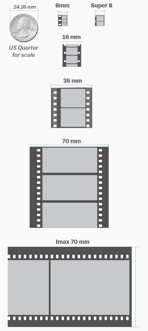
Documentaries in the sixties would have been shot on Super-16, which is part of the reason that Sandgren and Chazelle chose it as one of their acquisition formats. The full breakdown of formats is as follows:

  • Super-16 was employed for intense or emotional material, specifically early sequences relating to the death of Armstrong’s young daughter, and scenes inside the various spacecraft. As well as the creative considerations, the smaller size of Super-16 equipment was presumably advantageous from a practical point of view inside the cramped sets.
  • 35mm was used for most of the non-space scenes. Sandgren differentiated the scenes at Nasa from those at Armstrong’s home by push-processing the former and pull-processing the latter. What this means is that Nasa scenes were underexposed by one stop and overdeveloped, resulting in a detailed, contrasty, grainy look, while the home scenes were overexposed and underdeveloped to produce a cleaner, softer, milkier look. 35mm was also used for wide shots in scenes that were primarily Super-16, to ensure sufficient definition.
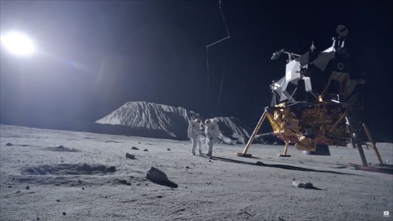
  • Imax (horizontally-fed 65mm) was reserved for scenes on the moon.


In-camera effects

In keeping with the vintage aesthetic of celluloid capture, the visual effects were captured in-camera wherever possible. I’ve written in the past about the rise of LED screens as a replacement for green-screen and a source of interactive lighting. I guessed that First Man was using this technology from ECUs which showed the crescent of Earth reflected in Ryan Gosling’s eyes. Such things can be added in post, of course, but First Man‘s VFX have the unmistakeable ring of in-camera authenticity.

Imposing a “no green-screen” rule, Chazelle and his team used a huge LED screen to display the views out of the spacecraft windows. A 180° arc of 60′ diameter and 35′ in height, this screen was bright enough to provide all the interactive lighting that Sandgren required. His only addition was a 5K tungsten par or 18K HMI on a crane arm to represent the direct light of the sun.

The old-school approach extended to building and filming miniatures, of the Saturn V rocket and its launch tower for example. For a sequence of Armstrong in an elevator ascending the tower, the LED screen behind Gosling displayed footage of this miniature.

For external views of the capsules in space, the filmmakers tried to limit themselves to realistic shots which a camera mounted on the bodywork might have been able to capture. This put me in mind of Christopher Nolan’s Interstellar, which used the same technique to sell the verisimilitude of its space vehicles. In an age when any conceivable camera move can be executed, it can be very powerful to stick to simple angles which tap into decades of history – not just from cinema but from documentaries and motorsports coverage too.


Lunar Lighting

For scenes on earth, Landgren walked a line between naturalism and expression, influenced by legendary DPs like Gordon Willis, ASC. My favourite shot is a wide of Armstrong’s street at night, as he and his ill-fated friend Ed White (Jason Clarke) part company after a drinking session. The mundane suburban setting is bathed in blue moonbeams, as if the the moon’s fingers are reaching out to draw the characters in.

Scenes on the lunar surface were captured at night on an outdoor set the size of three football pitches. To achieve absolute authenticity, Sandgren needed a single light source (representing the sun) fixed at 15° above the horizon. Covering an area that size was going to require one hell of a single source, so he went to Luminys, makers of the Softsun.

Softsuns

Softsuns are lamps of frankly ridiculous power. The 50KW model was used, amongst other things, to blast majestic streams of light through the windows of Buckingham Palace on The Crown, but Sandgren turned to the 100KW model. Even that proved insufficient, so he challenged Luminys to build a 200KW model, which they did.

The result is a completely stark and realistic depiction of a place where the sun is the only illumination, with no atmosphere to diffuse or redistribute it, no sky to glow and fill in the shadows. This ties in neatly with a prevailing theme in the film, that of associating black with death, when Armstrong symbolically casts his deceased daughter’s bracelet into an obsidian crater.

First Man may prove unsatisfying for some, with Armstrong’s taciturn and emotionally closed-off nature making his motivations unclear, but cinematically it is a tour de force. Taking a human perspective on extraordinary accomplishments, deftly blending utterly convincing VFX and immersive cinéma vérité photography, First Man recalls the similarly analogue and similarly gripping Dunkirk as well as the documentary-like approach of 1983’s The Right Stuff. The film is currently available on DVD, Blu-ray and VOD, and I highly recommend you check it out.

The Cinematography of “First Man”

Roger Deakins’ Oscar-winning Cinematography of “Blade Runner 2049”

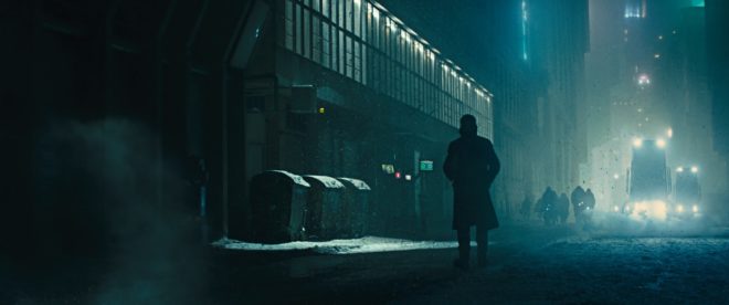
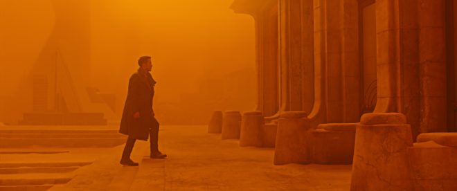
After fourteen nominations, celebrated cinematographer Roger Deakins, CBE, BSC, ASC finally won an Oscar last night, for his work on Denis Villeneuve’s Blade Runner 2049. Villeneuve’s sequel to Ridley Scott’s 1982 sci-fi noir is not a perfect film; its measured, thoughtful pace is not to everyone’s taste, and it has serious issues with women – all of the female characters being highly sexualised, callously slaughtered, or both – but the Best Cinematography Oscar was undoubtedly well deserved. Let’s take a look at the photographic style Deakins employed, and how it plays into the movie’s themes.

Blade Runner 2049 returns to the dystopian metropolis of Ridley Scott’s classic three decades later, introducing us to Ryan Gosling’s K. Like Harrison Ford’s Deckard before him, K is a titular Blade Runner, tasked with locating and “retiring” rogue replicants – artificial, bio-engineered people. He soon makes a discovery which could have huge implications both for himself and the already-strained relationship between humans and replicants. In his quest to uncover the truth, K must track down Deckard for some answers.

Villeneuve’s film meditates on deep questions of identity, creating a world in which you can never be sure who is or isn’t real – or even what truly constitutes being “real”. Deakins reinforces this existential uncertainty by reducing characters and locations to mere forms. Many scenes are shrouded in smog, mist, rain or snow, rendering humans and replicants alike as silhouettes.

K spends his first major scene seated in front of a window, the side-light bouncing off a nearby cabinet the only illumination on his face. Deakins’ greatest strength is his ability to adapt to whatever style each film requires, but if he has a recognisable signature it’s this courage to rely on a single source and let the rest of the frame go black.

Whereas Scott and his DP Jordan Cronenweth portrayed LA mainly at night, ablaze with pinpoints of light, Villeneuve and Deakins introduce it in daylight, but a daylight so dim and smog-ridden that it reveals even less than those night scenes from 1982.

All this is not to say that the film is frustratingly dark, or that audiences will struggle to make out what is going on. Shooting crisply on Arri Alexas with Arri/Zeiss Master Primes, Deakins is a master of ensuring that you see what you need to see.

A number of the film’s sequences are colour-coded, delineating them as separate worlds. The city is mainly fluorescent blues and greens, visually reinforcing the sickly state of society, with the police department – an attempt at justice in an insane world – a neutral white.

The Brutalist headquarters of Jared Leto’s blind entrepreneur Wallace are rendered in gold, as though the corporation attempted a friendly yellow but was corrupted by greed. These scenes also employ rippling reflections from pools of water. Whereas the watery light in the Tyrell HQ of Scott’s Blade Runner was a random last-minute idea by the director, concerned that his scene lacked enough interest and production value, here the light is clearly motivated by architectural water features. Yet it is used symbolically too, and very effectively so, as it underscores one of Blade Runner 2049’s most powerful scenes. At a point in the story where more than one character is calling their memories into question, the ripples playing across the walls are as intangible and illusory as those recollections. “I know what’s real,” Deckard asserts to Wallace, but both the photography and Ford’s performance bely his words.

The most striking use of colour is the sequence in which K first tracks Deckard down, hiding out in a Las Vegas that’s been abandoned since the detonation of a dirty bomb. Inspired by photos of the Australian dust storm of 2009, Deakins bathed this lengthy sequence in soft, orangey-red – almost Martian – light. This permeating warmth, contrasting with the cold artificial light of LA, underlines the personal nature of K’s journey and the theme of birth which is threaded throughout the film.

Deakins has stated in interviews that he made no attempt to emulate Cronenweth’s style of lighting, but nonetheless this sequel feels well-matched to the original in many respects. This has a lot to do with the traditional camerawork, with most scenes covered in beautifully composed static shots, and movement accomplished where necessary with track and dolly.

The visual effects, which bagged the film’s second Oscar, also drew on techniques of the past; the above featurette shows a Canon 1DC tracking through a miniature landscape at 2:29. “Denis and I wanted to do as much as possible in-camera,” Deakins told Variety, “and we insisted when we had the actors, at least, all the foreground and mid-ground would be in-camera.” Giant LED screens were used to get authentic interactive lighting from the advertising holograms on the city streets.

One way in which the lighting of the two Blade Runner movies is undeniably similar is the use of moving light sources to suggest an exciting world continuing off camera. (The infamous lens flares of J.J. Abrahms’ Star Trek served the same purpose, illustrating Blade Runner’s powerful influence on the science fiction genre.) But whereas, in the original film, the roving searchlights pierce the locations sporadically and intrusively, the dynamic lights of Blade Runner 2049 continually remodel the actors’ faces. One moment a character is in mysterious backlight, the next in sinister side-light, and the next in revealing front-light – inviting the audience to reassess who these characters are at every turn.

This obfuscation and transience of identity and motivation permeates the whole film, and is its core visual theme. The 1982 Blade Runner was a deliberate melding of sci-fi and film noir, but to me the sequel does not feel like noir at all. Here there is little hard illumination, no binary division of light and dark. Instead there is insidious soft light, caressing the edge of a face here, throwing a silhouette there, painting everyone on a continuous (and continuously shifting) spectrum between reality and artificiality.

Blade Runner 2049 is a much deeper and more subtle film than its predecessor, and Deakins’ cinematography beautifully reflects this.

Roger Deakins’ Oscar-winning Cinematography of “Blade Runner 2049”

“Kingsman: The Golden Circle” and the Glorification of Sexual Assault

The first Kingsman film made me very angry – in fact I wrote a blog post explaining exactly why it was so misogynous. I was therefore planning to avoid the sequel like the plague, and instead a friend and I set off for the local Vue this afternoon with  a voucher for two free tickets and the intention of seeing A.A. Milne biopic Goodbye Christopher Robin. Unfortunately, on arriving we were told that a broken projector meant that the screening of Goodbye Christopher Robin was cancelled. Neither of us were very enthusiastic about anything else that was showing, but Kingsman: The Golden Circle was starting soonest, so we plumped for that.

Though silly, and providing little screen time to women, the movie was tolerable until it reached the middle with a sequence set at Glastonbury. The scene required our “hero” Eggsy to implant a tracking device on a woman called Clara. For reasons not explained, and extremely difficult to imagine, the tracking device must be implanted in her vagina. That’s tantamount to rape with a foreign object, isn’t it? Or some equally serious and horrifying crime.

Eggsy sets about seducing Clara. She offers to pee on him. He declines, pops to the loo and rings his girlfriend Tilde (yes, somehow that reprehensible anal sex reward at the end of the first movie became a long-term relationship) to warn her that he is about to sleep with another woman because it’s necessary to his mission. Her response boils down to: that’s fine, so long as you marry me afterwards. (What?! It’s 2017 and we’re still portraying women as being fine with cheating men, and wanting nothing more in life than to “snare a man” by getting married?)

At around this point I got up and walked out, shaking with anger and sick to my stomach. I felt dirty, like I had just stood by and watched a gang rape. With the exception of my friend, everyone else in the audience was laughing and (seemingly) enjoying it. It was not an experience I wanted to continue to participate in. I can’t imagine how it made female viewers feel.

I’m told that the next scene featured an uncomfortable sequence in which Eggsy gradually reaches into Clara’s knickers, followed by a CGI zoom into her vagina as the tracking device enters. It sounds like the camera kind of raped her. Ugh.

Now look, I’m not saying that movies shouldn’t have scenes of rape or sexual assault, or whatever strange and abhorrent crime Eggsy commits by placing a foreign object in an unwitting woman’s vagina. Kingsman is loathsome and unacceptable because of two things:

1. Eggsy is the “hero” of the film, the “good guy”, the one who is meant to be loved and idolised. If he was the villain, it would be clear to all viewers that his actions were wrong, but because he is the hero the film implies that his behaviour is not only acceptable, but “heroic” and “good”. Kingsman teaches its teenage audience that the objectification and violation of women is to be admired.

2. Clara is completely unaware of what is being done to her. At least in a rape scene the woman knows she is being violated and can try to fight back. Here the whole thing is played for comedy. Not only is Clara ignorant and completely powerless, but the audience is made complicit in her assault by being encouraged to laugh at her because she doesn’t know what’s going on. It’s like the whole thing is a sick game; indeed there is dialogue between Eggsy and his fellow agent Whiskey in which it is made clear that they are competing to assault Clara. She is humiliated and degraded in every possible way.

Director Matthew Vaughan responded to criticism of the first Kingsman’s misogyny by saying that it was a joke, pushing the sexist tropes of Bond films to the extreme. The backlash should have informed him that this was a bad idea. Instead of taking the hint, he went even further with the sequel. The only possible conclusion is that Vaughan and his fellow filmmakers genuinely hate women. It is simply staggering to think of the number of people involved in the movie who apparently thought this sequence was perfectly okay.

Come to think of it, who else do we know that likes being peed on and grabbing women by the vagina? Perhaps I shouldn’t be so surprised that, in a world whose most powerful man believes he can do what he wants with women’s bodies, movies will express the same ideology. It’s sickening and depressing.

“Kingsman: The Golden Circle” and the Glorification of Sexual Assault

9 Fun Photic Facts from a 70-year-old Book

Shortly before Christmas, while browsing the secondhand books in the corner of an obscure Herefordshire garden centre, I came across a small blue hardback called The Tricks of Light and Colour by Herbert McKay. Published in 1947, the book covered almost every aspect of light you could think of, from the inverse square law to camouflage and optical illusions. What self-respecting bibliophile cinematographer could pass that up?

Here are some quite-interesting things about light which the book describes…


1. SPHERES ARE THE KEY to understandING the inverse square law.

Any cinematographer worth their salt will know that doubling a subject’s distance from a lamp will quarter their brightness; tripling their distance will cut their brightness to a ninth; and so on.  This, of course, is the inverse square law. If you struggle to visualise this law and why it works the way it does, The Tricks of Light and Colour offers a good explanation.

[Think] of light being radiated from… a mere point. Light and heat are radiated in straight lines and in all directions [from this point]. At a distance of one foot from the glowing centre the whole quantity of light and heat is spread out over the surface of a sphere with a radius of one foot. At a distance of two feet from the centre it is spread over the surface of a sphere of radius two feet. Now to find an area we multiply two lengths; in the case of a sphere both lengths are the radius of the sphere. As both lengths are doubled the area is four times as great… We have the same amounts of light and heat spread over a sphere four times as great, and so the illumination and heating effect are reduced to a quarter as great.


2. MIRAGES ARE DUE TO Total internal reflection.

This is one of the things I dimly remember being taught in school, which this book has considerably refreshed me on. When light travels from one transparent substance to another, less dense, transparent substance, it bends towards the surface. This is called refraction, and it’s the reason that, for example, streams look shallower than they really are, when viewed from the bank. If the first substance is very dense, or the light ray is approaching the surface at a glancing angle, the ray might not escape at all, instead bouncing back down. This is called total internal reflection, and it’s the science behind mirages.

The heated sand heats the air above it, and so we get an inversion of the density gradient: low density along the heated surface, higher density in the cooler air above. Light rays are turned down, and then up, so that the scorched and weary traveller sees an image of the sky, and the images looks like a pool of cool water on the face of the desert.


3. Pinhole images pop up in unexpected places.

Most of us have made a pinhole camera at some point in our childhood, creating an upside-down image on a tissue paper screen by admitting light rays through a tiny opening. Make the opening bigger and the image becomes a blur, unless you have a lens to focus the light, as in a “proper” camera or indeed our eyes. But the pinhole imaging effect can occur naturally too. I’ve sometimes lain in bed in the morning, watching images of passing traffic or flapping laundry on a line projected onto my bedroom ceiling through the little gap where the curtains meet at the top. McKay describes another example:

One of the prettiest examples of the effect may be seen under trees when the sun shines brightly. The ground beneath a tree may be dappled with circles of light, some of them quite bright… When we look up through the leaves towards the sun we may see the origin of the circles of light. We can see points of light where the sun shines through small gaps between the leaves. Each of these gaps acts in the same way as a pinhole: it lets through rays from the sun which produce an image of the sun on the ground below.


4. The sun isn’t a point source.

“Shadows are exciting,” McKay enthuses as he opens chapter VI. They certainly are to a cinematographer. And this cinematographer was excited to learn something about the sun and its shadow which is really quite obvious, but I had never considered before.

Look at the shadow of a wall. Near the base, where the shadow begins, the edge of the shadow is straight and sharp… Farther out, the edge of the shadow gets more and more fuzzy… The reason lies of course in the great sun itself. The sun is not a mere point of light, but a globe of considerable angular width.

The accompanying illustration shows how you would see all, part or none of the sun if you stood in a slightly different position relative to the hypothetical wall. The area where none of the sun is visible is of course in full shadow (umbra), and the area where the sun is partially visible is the fuzzy penumbra (the “almost shadow”).


5. Gravity bends LIGHT.

Einstein hypothesised that gravity could bend light rays, and observations during solar eclipses proved him right. Stars near to the eclipsed sun were seen to be slightly out of place, due to the huge gravitational attraction of the sun.

The effect is very small; it is too small to be observed when the rays pass a comparatively small body like the moon. We need a body like the sun, at whose surface gravity is 160 or 170 times as great as at the surface of the moon, to give an observable deviation…. The amount of shift depends on the apparent nearness of a star to the sun, that is, the closeness with which the rays of light from the star graze the sun. The effect of gravity fades out rapidly, according to the inverse square law, so that it is only near the sun that the effects can be observed.


6. Light helped us discover helium.

Sodium street-lamps are not the most pleasant of sources, because hot sodium vapour emits light in only two wave-lengths, rather than a continuous spectrum. Interestingly, cooler sodium vapour absorbs the same two wave-lengths. The same is true of other elements: they  emit certain wave-lengths when very hot, and absorb the same wave-lengths when less hot. This little bit of science led to a major discovery.

The sun is an extremely hot body surrounded by an atmosphere of less highly heated vapours. White light from the sun’s surfaces passes through these heated vapours before it reaches us; many wave-lengths are absorbed by the sun’s atmosphere, and there is a dark line in the spectrum for each wave-length that has been absorbed. The thrilling thing is that these dark lines tell us which elements are present in the sun’s atmosphere. It turned out that the lines in the sun’s spectrum represented elements already known on the earth, except for one small group of lines which were ascribed to a hitherto undetected element. This element was called helium (from helios, the sun).


7. Moonlight is slightly too dim for colours.

Our retinas are populated by two different types of photoreceptors: rods and cones. Rods are much more sensitive than cones, and enable us to see in very dim light once they’ve had some time to adjust. But rods cannot see colours. This is why our vision is almost monochrome in dark conditions, even under the light of a full moon… though only just…

The light of the full moon is just about the threshold, as we say, of colour vision; a little lighter and we should see colours.


8. MAGIC HOUR can be longer than an hour.

We cinematographers often think of magic “hour” as being much shorter than an hour. When prepping for a dusk-for-night scene on The Little Mermaid, I used my light meter to measure the length of shootable twilight. The result was 20 minutes; after that, the light was too dim for our Alexas at 800 ISO and our Cooke S4 glass at T2. But how long after sunset is it until there is literally no light left from the sun, regardless of how sensitive your camera is? McKay has this to say…

Twilight is partly explained as an effect of diffusion. When the sun is below the horizon it still illuminates particles of dust and moisture in the air. Some of the scattered light is thrown down to the earth’s surface… Twilight ends when the sun is 17° or 18° below the horizon. At the equator [for example] the sun sinks vertically at the equinoxes, 15° per hour; so it sinks 17° in 1 hour 8 minutes.


9. Why isn’t Green a primary colour in paint?

And finally, the answer to something that bugged me during my childhood. When I was a small child, daubing crude paintings of stick figures under cheerful suns, I was taught that the primary colours are red, blue and yellow. Later I learnt that the true primary colours, the additive colours of light, are red, blue and green. So why is it that green, a colour that cannot be created by mixing two other colours of light, can be created by mixing blue and yellow paints?

When white light falls on a blue pigment, the pigment absorbs reds and yellows; it reflects blue and also some green. A yellow pigment absorbs blue and violet; it reflects yellow, and also some red and green which are the colours nearest to it in the spectrum. When the two pigments are mixed it may be seen that all the colours are absorbed by one or other of the components except green.


If you’re interested in picking up a copy of The Tricks of Light and Colour yourself, there is one on Amazon at the time of writing, but it will set you back £35. Note that Herbert McKay is not to be confused with Herbert C. McKay, an American author who was writing books about stereoscopic photography at around the same time.

9 Fun Photic Facts from a 70-year-old Book

Book Review: “Cinematography – Theory & Practice” by Blain Brown

Browsing in Waterstones not long ago, I came across the third edition of this hefty tome. Although it is clearly aimed primarily at the student market, a flick through convinced me that amongst the egg-sucking tutorials there was enough detail to make it a worthwhile reference book for grandma’s shelf.

The front cover proclaims the book to be “for cinematographer & directors”. The first five chapters are certainly applicable to directors, covering the visual language of cinematography, the metaphors of lighting and composition that help tell the story, the classifications of the various shot types, shooting to edit, and such core concepts as the line of action. Any director willing to read the remaining thirteen chapters, however, should really learn to delegate the techie stuff and go read something like An Actor Prepares instead.

These thirteen chapters cover in detail the topics of colour, exposure, digital sensors, dynamic range, colour space, image control, lighting, lenses, camera movement, on-set procedures and data management. As a devotee of the art of lighting, I was disappointed that this huge part of the DP’s role gets only two chapters. Perhaps this is because Brown has written a separate book devoted to illumination, though he has also written a book on digital imaging and that doesn’t stop him devoting multiple chapters in Cinematography: Theory & Practice to this subject.

Some of you may wonder why, in this age when you can google any topic of which your knowledge is lacking, you would buy a book. Firstly, finding something in the index of a book which you know you can trust can still be quicker and more effective than wading through search engine results. (I’ve already grabbed my copy off the shelf once to check the sensor size comparison chart.) Secondly, if you read the book cover to cover, amongst all the things you expected to learn, there will be unexpected nuggets of knowledge which a google search might never have led you to.

Perhaps the most interesting chapter for me was the one called “Cameras & Sensors”. It taught me loads about how digital sensors capture images, and how they are processed by the camera. And the chapter on “Linear, Gamma, Log” transformed my previously-hazy understanding of log-C into something much more concrete. The chapter on “Measurement” laid out some interesting pros and cons of waveform monitors, histograms, false colours and light meters, explaining how each has its place in choosing exposure.

Cinematography: Theory & Practice is generally well-written and laid out, but sometimes topics creep up in places that don’t quite make sense. It seems illogical, for example, that the chapter on lenses should come much later on than the one on cameras and sensors. Following the light path would have made much more sense to me. Also the proof-reader seems to have fallen asleep for a while, because there are a couple of chapters in the middle sprinkled with typos and minor errors.

If there is a fourth edition, I would like to see the lighting sections expanded, and some more nitty-gritty about how lenses work (Filmmaker IQ’s video on this topic is hard to beat).

These niggles aside, Brown has produced a very solid reference work. While reading it, I’ve been continually impressed by the depth and breadth of the author’s knowledge  – or perhaps the quality of his research. There is apparently a companion website containing useful videos, but I was unable to get past the splash page (possibly because I’m some kind of bibliophile Luddite).

For any student of cinematography, this book will provide an excellent grounding. As for working DPs, I would challenge any of them to read the book without learning at least something new. Maybe you won’t read it cover to cover, but I’d be surprised if you couldn’t find a few chapters that could helpfully plug some gaps in your knowledge.

Book Review: “Cinematography – Theory & Practice” by Blain Brown

Lighting I Like: “Life on Mars”

This week’s edition of Lighting I Like focuses on a scene from Life on Mars, my all-time favourite TV show. Broadcast on the BBC in 2006 and 2007, this was a police procedural with a twist: John Simm’s protagonist D.I. Sam Tyler had somehow travelled back in time to the 1970s… or was he just in a coma imagining it all? Each week his politically correct noughties policing style would clash with the seventies “bang ’em up first, ask questions later” approach of Philip Glenister’s iconic Gene Hunt.

I must get around to doing a proper post on colour theory one of these days, but in the meantime, there’s a bit about colour contrast in this post. And you can read more about using practicals in this post.

I hope you enjoyed the show. The sixth and final episode goes out at the same time next week: 8pm GMT on Wednesday, and will feature perhaps the most stunning scene yet, from the Starz series Outlander. Subscribe to my YouTube channel to make sure you never miss an episode of Lighting I Like.

Lighting I Like: “Life on Mars”

Lighting I Like: “Harry Potter and the Philosopher’s Stone”

The third episode of my YouTube cinematography series Lighting I Like is out now. This time I discuss a scene from the first instalment in the Harry Potter franchise, directed by Chris Columbus and photographed by John Seale, ACS, ASC.


You can find out more about the forest scene from Wolfman which I mentioned, either in the February 2010 issue of American Cinematographer if you have a subscription, or towards the bottom of this page on Cine Gleaner.

If you’re a fan of John Seale’s work, you may want to read my post “20 Facts About the Cinematography of Mad Max: Fury Road.

To read about how I’ve tackled nighttime forest scenes myself, check out “Poor Man’s Process II” (Ren: The Girl with the Mark) and Above the Clouds: Week Two”.

I hope you enjoyed the show. Episode four goes out at the same time next week: 8pm GMT on Wednesday, and will cover a scene from episode two of the lavish Netflix series The Crown. Subscribe to my YouTube channel to make sure you never miss an episode.

Lighting I Like: “Harry Potter and the Philosopher’s Stone”

Lighting I Like: “Ripper Street”

The second episode of Lighting I Like looks at a scene from the season four premiere of Victorian crime drama Ripper Street, available on Amazon Prime in the UK.

On closer inspection, the “tungsten fill” I mention in the video is more of a soft tungsten toplight – perhaps a Chimera Pancake – rigged to the ceiling in the centre of the room. When Jackson exits at 2:00 you can see him walk under it.

Here’s some further reading if you want to know more about using practicals, and candlelight in particular:

5 Tips for Working With Practicals

Candlelight – how I tackled multiple candlelight scenes in my first period production, The First Musketeer, including a video blog from the set.

I hope you enjoyed the show. Episode three goes out at the same time next week: 8pm GMT on Wednesday, and will cover a scene from the 2001 movie Harry Potter and the Philosopher’s Stone. Subscribe to my YouTube channel to make sure you never miss an episode.

Lighting I Like: “Ripper Street”

“Lighting I Like” Launches

The first episode of my new YouTube series is out. Lighting I Like discusses some of the best and most interesting illumination I’ve seen in film and TV, including how and why I think it’s been done. The first show is about a scene from season two episode four of Daredevil – and beware there is a spoiler.

After recording these shows, and while editing them, I spotted more things about the lighting in the clips. For example, in this Daredevil scene I noticed that there is a backlight tucked just behind the building on the right of frame. This backlight isn’t hitting the actors because a fire escape is shadowing them, but it’s giving that golden glow to the rain and street in the background. It must be gelled with something like Mustard Yellow to match the existing street lamps.

I hope you enjoyed the show. Episode two goes out at the same time next week: 8pm GMT on Wednesday, and will cover a scene from the season four premiere of Ripper Street.

“Lighting I Like” Launches

Book Review: “Green Screen Made Easy”

coverMicro-filmmaker Magazine’s Jeremy Hanke recently got in touch and asked if I would review his book, “Green Screen Made Easy”. I used to make a lot of micro- and no-budget movies packed full of VFX, but I usually avoided green-screen because I could never make it look good. Although those kind of projects are behind me, I agreed to the review because I figured that this book might help others succeed where I’d failed – and also I was interested to find out why I had failed!

What Jeremy and his co-author Michele Terpstra set out to do is to cover the entire process from start to finish: defining chromakeying, buying or building a green screen, lighting and shooting it, sourcing or shooting background plates, choosing keying software, and all aspects of the keying itself.

The book is aimed at no-budget filmmakers, hobbyists or aspiring professionals making self-funded or crowd-funded productions, those digital auteurs who are often their own producers, writers, DPs, editors, colourists and VFX artists. Perhaps you’ve tried green-screening before and been disappointed with the results. Perhaps you’ve always seen it as a bit too “techie” for you. Perhaps the unpaid VFX artist you had lined up for your sci-fi feature just pulled out. Or perhaps you’ve already reached a certain level of competency with keying and now you want to step up a level for your next production. If any of these scenarios ring true with you, I believe you’ll find this book very useful.

“Green Screen Made Easy” is divided into two halves, the first half (by Jeremy) on prepping and executing your green screen shoot, and the second half (by Michele) on the postproduction process. Both authors clearly write from extensive first-hand experience; throughout the text are the kind of tips and work-arounds that only come from long practice. By necessity there is a fair amount of technical content, but everything is lucidly explained and there’s a handy glossary if any of the terms are unfamiliar to you.

camera-techniquesThe section on lighting and shooting green screen material contained few surprises for me as a cinematographer – see my post on green screen for my own tips on this subject – but will be very useful to those newer to the field. The chapters on equipment are very thorough, considering everything from which camera and settings to choose to ensure the best key later on, to buying or building a mobile green screen, or even kitting out your own green screen studio – all with various alternatives to suit any budget.

The postproduction chapters revealed clearly why I struggled with keying in the past. Michele explains how the process is much more than simply pulling a single key, and can involve footage clean-up, garbage matting, a core key and a separate edge key, spill suppression, hold-out matting and light wrapping. The book guides you through all these steps, and outlines the pros and cons of the software and plug-in options for each step.

4picsOnce you’ve read this book, I’d say the only other thing you’ll need before you can start successfully green-screening is to watch some YouTube tutorial videos specific to your software. While the instructions in the book look pretty good (as far as I can tell without attempting to follow them) the medium of text seems a little restrictive in teaching what is inherently a visual process. There are explanatory images throughout “Green Screen Made Easy”, but in the ebook version at least I found it difficult to discern the subtle differences in some of the before-and-after comparisons.

Ultimately what will make you the best “green-screener” is practice, practice, practice, but by reading this book first you’ll give yourself a rock-solid foundation, an appreciation of the entire process from start to finish, and the insider knowledge to avoid a lot of time-sucking pitfalls. And keep it handy, because you’ll be sure to thumb through it and re-read those handy tips throughout your prep, production and post.

“Green Screen Made Easy” is available in paperback and ebook editions from Amazon.

Book Review: “Green Screen Made Easy”