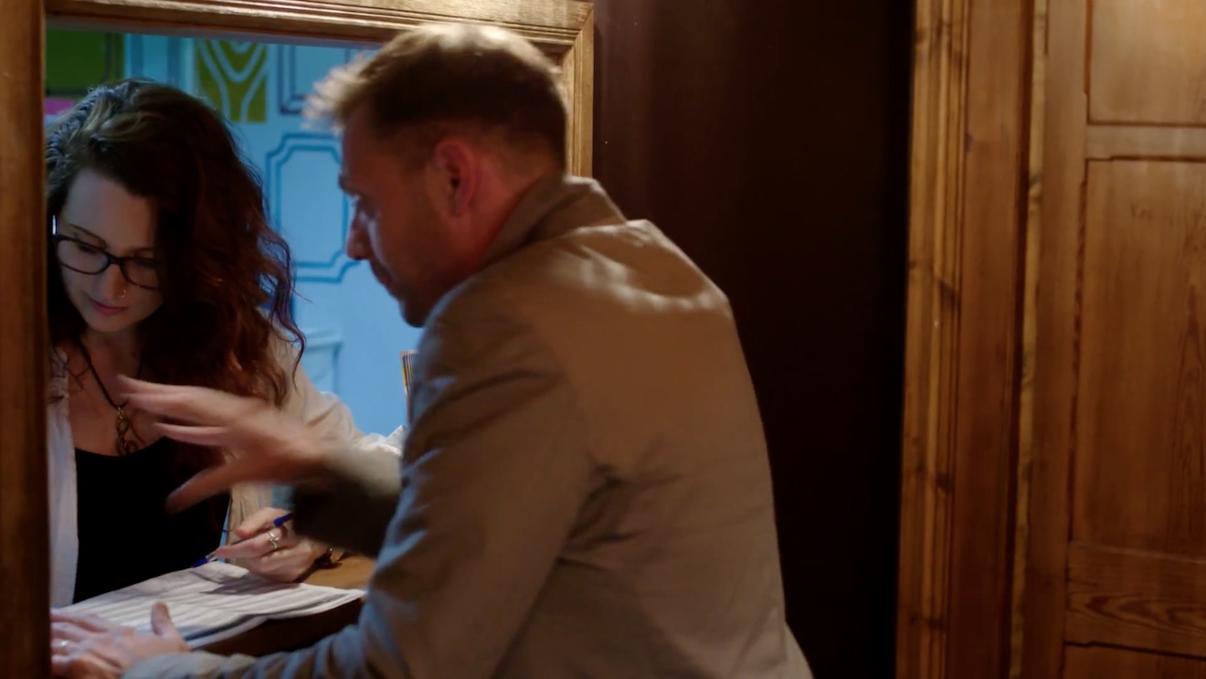
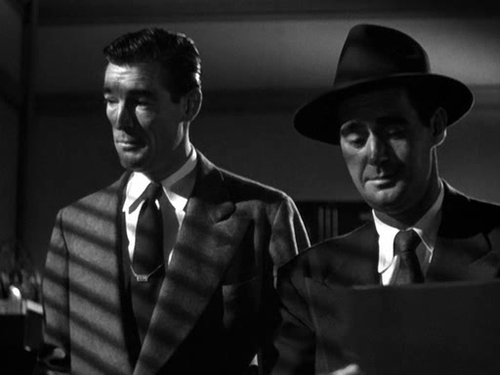
The first Kingsman film made me very angry – in fact I wrote a blog post explaining exactly why it was so misogynous. I was therefore planning to avoid the sequel like the plague, and instead a friend and I set off for the local Vue this afternoon with a voucher for two free tickets and the intention of seeing A.A. Milne biopic Goodbye Christopher Robin. Unfortunately, on arriving we were told that a broken projector meant that the screening of Goodbye Christopher Robin was cancelled. Neither of us were very enthusiastic about anything else that was showing, but Kingsman: The Golden Circle was starting soonest, so we plumped for that.
Though silly, and providing little screen time to women, the movie was tolerable until it reached the middle with a sequence set at Glastonbury. The scene required our “hero” Eggsy to implant a tracking device on a woman called Clara. For reasons not explained, and extremely difficult to imagine, the tracking device must be implanted in her vagina. That’s tantamount to rape with a foreign object, isn’t it? Or some equally serious and horrifying crime.
Eggsy sets about seducing Clara. She offers to pee on him. He declines, pops to the loo and rings his girlfriend Tilde (yes, somehow that reprehensible anal sex reward at the end of the first movie became a long-term relationship) to warn her that he is about to sleep with another woman because it’s necessary to his mission. Her response boils down to: that’s fine, so long as you marry me afterwards. (What?! It’s 2017 and we’re still portraying women as being fine with cheating men, and wanting nothing more in life than to “snare a man” by getting married?)
At around this point I got up and walked out, shaking with anger and sick to my stomach. I felt dirty, like I had just stood by and watched a gang rape. With the exception of my friend, everyone else in the audience was laughing and (seemingly) enjoying it. It was not an experience I wanted to continue to participate in. I can’t imagine how it made female viewers feel.
I’m told that the next scene featured an uncomfortable sequence in which Eggsy gradually reaches into Clara’s knickers, followed by a CGI zoom into her vagina as the tracking device enters. It sounds like the camera kind of raped her. Ugh.
Now look, I’m not saying that movies shouldn’t have scenes of rape or sexual assault, or whatever strange and abhorrent crime Eggsy commits by placing a foreign object in an unwitting woman’s vagina. Kingsman is loathsome and unacceptable because of two things:
1. Eggsy is the “hero” of the film, the “good guy”, the one who is meant to be loved and idolised. If he was the villain, it would be clear to all viewers that his actions were wrong, but because he is the hero the film implies that his behaviour is not only acceptable, but “heroic” and “good”. Kingsman teaches its teenage audience that the objectification and violation of women is to be admired.
2. Clara is completely unaware of what is being done to her. At least in a rape scene the woman knows she is being violated and can try to fight back. Here the whole thing is played for comedy. Not only is Clara ignorant and completely powerless, but the audience is made complicit in her assault by being encouraged to laugh at her because she doesn’t know what’s going on. It’s like the whole thing is a sick game; indeed there is dialogue between Eggsy and his fellow agent Whiskey in which it is made clear that they are competing to assault Clara. She is humiliated and degraded in every possible way.
Director Matthew Vaughan responded to criticism of the first Kingsman’s misogyny by saying that it was a joke, pushing the sexist tropes of Bond films to the extreme. The backlash should have informed him that this was a bad idea. Instead of taking the hint, he went even further with the sequel. The only possible conclusion is that Vaughan and his fellow filmmakers genuinely hate women. It is simply staggering to think of the number of people involved in the movie who apparently thought this sequence was perfectly okay.
Come to think of it, who else do we know that likes being peed on and grabbing women by the vagina? Perhaps I shouldn’t be so surprised that, in a world whose most powerful man believes he can do what he wants with women’s bodies, movies will express the same ideology. It’s sickening and depressing.
The second episode in the latest run of Lighting I Like is now out, looking at some of the cinematography in The Man in the High Castle.
Based on the Philip K. Dick novel, The Man in the High Castle is set in an alternate reality where Japan and Nazi Germany won the Second World War. Both seasons of the show are available on Amazon in the UK.
The scenes I focus on use powerful light sources coming in through windows and bouncing off furnishings to softly uplight the talent. For more on this technique, see my article on 5 Ways to Use Hard Light Through a Window.
My YouTube series Lighting I Like is back for a second season of six episodes. It’s a very short and simple show, aimed at raising awareness of the art of lighting amongst non-cinematographers, or those at the very start of their cinematography career. Each week I look at the lighting choices made in one or two scenes of a TV/VOD show and how those choices help tell the story.
First up is Breaking Bad, the critically acclaimed series about a high-school chemistry teacher who, after being diagnosed with leukaemia, resorts to manufacturing drugs to ensure his family’s financial future. All five seasons of the show are available on Netflix in the UK.
Breaking Bad is dark and gritty, shot on 35mm film, and features some beautiful cinematography, one example of which I recently covered in my post on modifying window light. You can read an interesting analysis of the show’s photography on Cinevenger.
New episodes of Lighting I Like will be released at 8pm BST every Wednesday. Next week I’ll look at a couple of scenes from The Man in the High Castle.
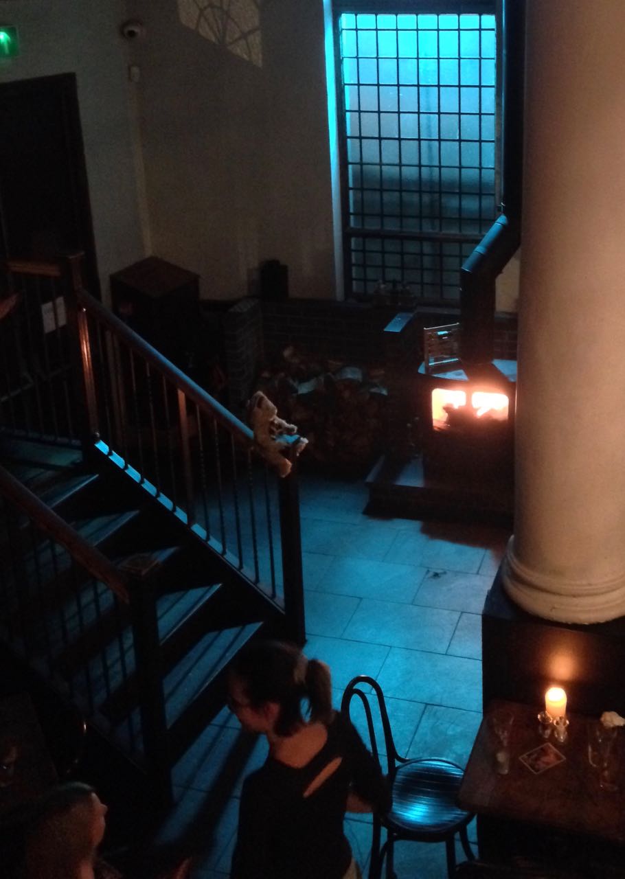
There were no practicals in this corner of the pub, so we placed an 800 open-face outside the window, gelled with Midnight Blue, and a 1×1′ LED panel in the wood-burner, gelled with CTO.
This year I’ve shot a couple of productions on the Sony FS7, a camera I’ve been very impressed by. Its most interesting feature is its high native ISO of 2000, which makes quite an impact on how you go about lighting. The light shed by practicals is often enough to illuminate a scene, or a large part of it, and sometimes you need to take existing practicals away in order to maintain contrast and shape, similar to how you take ambient light away (negative fill) when shooting exteriors.
It’s a strange thing about being a DP that, yes, sometimes you’re required to plan a mammoth lighting set-up using tens of kilowatts of power, but other times it’s just a case of saying, “Take the bulb out of that sconce.” You’re working to exactly the same principles, using your creative eye just as much in both scenarios.
Let’s look at some examples from a promotional film I shot with director Oliver Park for Closer Each Day, an improvised stage soap.
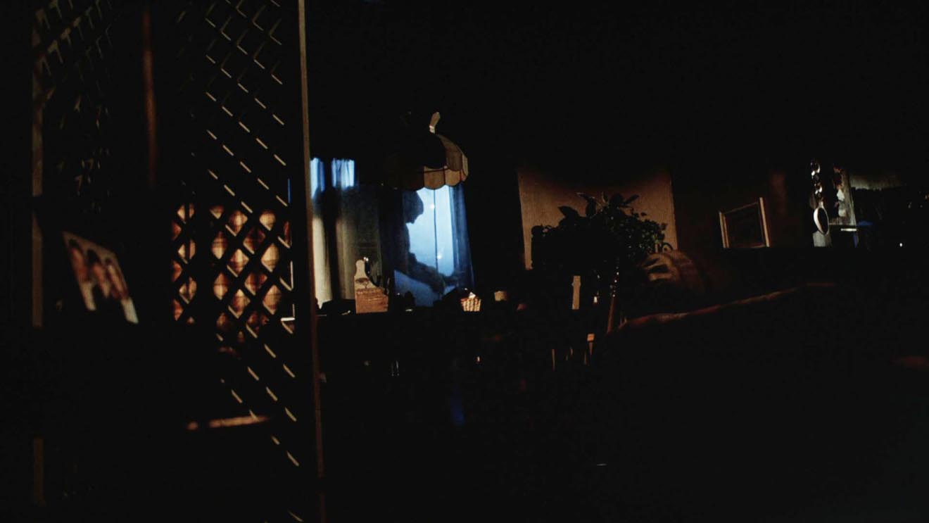
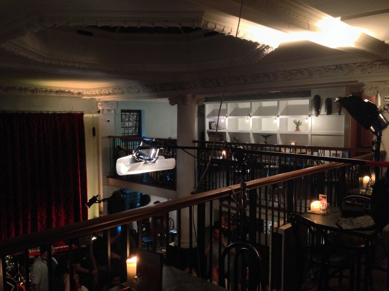
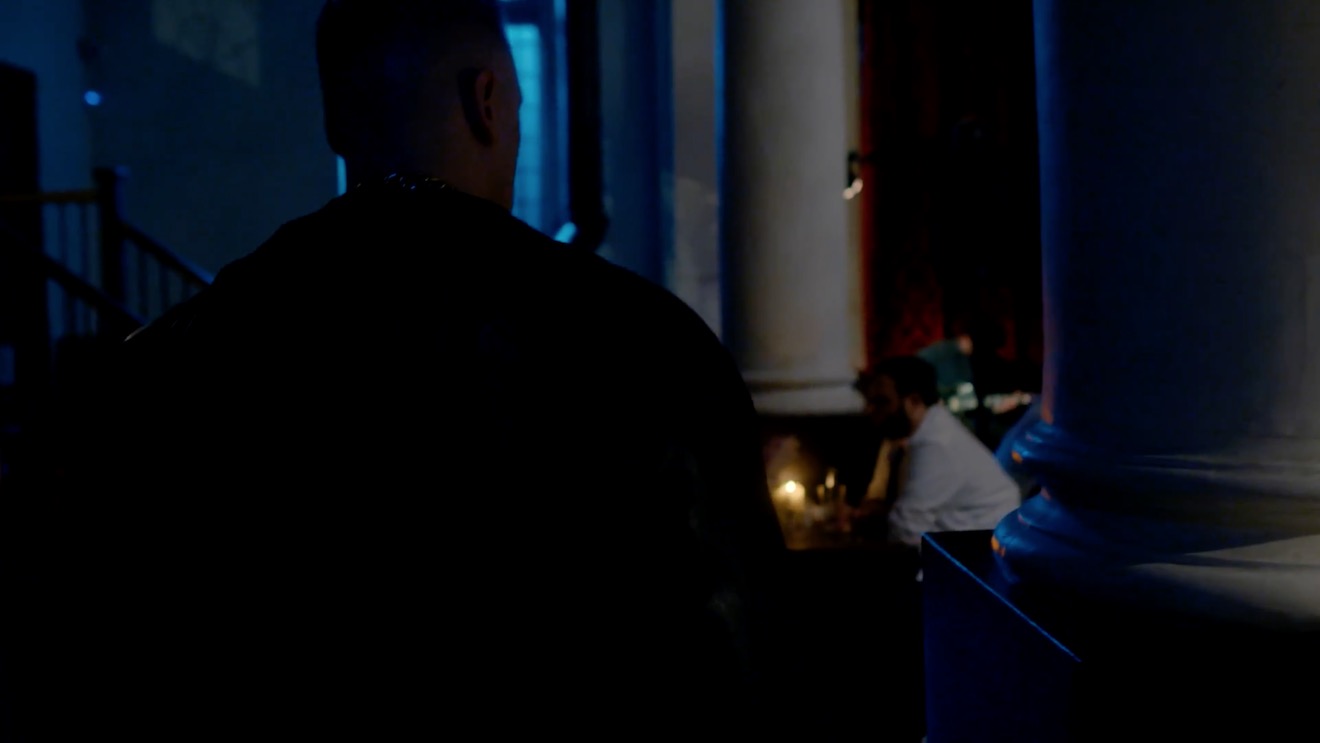
Our location was a pub, which had a large number of existing practicals: mainly wall sconces, but some overheads above the bar and in the corridors too. The film had to be shot in a single night, entirely on Steadicam, with some shots revealing almost the whole room, and to further complicate matters I was a last-minute hire due to another DP having to step down. Keeping the lighting simple, and avoiding putting any “film lights” on the floor where the roving camera might see them, was clearly the way to go.
I identified the darker areas of the room and added a few extra sources: two blue-gelled 800s outside the windows, an orange-gelled 1×1′ LED panel in the wood-burner, an LED reporter light in one key corner, and a small tungsten fresnel toplight onto a key table, firing down from the mezzanine so it would never be in shot. Other than those, and a low level of fill bounced off the ceiling, we relied exclusively on the existing practicals. (They were mainly fluorescent, and ideally we would have reglobed these all with tungsten, but it wasn’t possible.)
This view from the mezzanine shows the diffused 300W fresnel top-lighting the drinking contest table, and the black-wrapped 650 firing into the ceiling for fill.
So, that’s the “positive” lighting. Here are three examples of “negative” lighting in the film…
When Big Dick Johnson (yep, that’s the character’s name) first enters the pub, I put a piece of tape over a little halogen spotlight just above his point of entry. This was partly because it was very bright and I didn’t want him to blow out as he walked under it, but it also made for a much better sense of depth in the overall shot. As I’ve often mentioned on this blog, the best depth in an image is usually achieved by having the foreground dark, the mid-ground at key and the background bright. Killing the halogen spotlight helped create this progression of brightness and therefore depth. It’s also just nice in a shot like this to come out of darkness into the light, enhancing the reveal of the new space to the viewers.
When Billy De Burgh scrambles to buy a ticket at the box office, there are two practicals just above his head. Depending on which way we were shooting, I de-globed one of the fixtures – always the one closest to camera. This ensured that Billy always had backlight, and never had a really hot, toppy front-light shining harshly down on him.
On a side note, the blue light inside the box office was existing – I guess they were using cool white LED bulbs in there – and I really like the way it differentiates the spaces on camera. It puts the bored ticket-seller in a cold, detached world very separate to Billy’s warmer, more urgent world.
This doorway where Big Dick ends the film had sconces on both sides. It’s never very interesting to have an actor evenly lit on both sides of their face, and especially as Dick is such a tough, unpleasant character, I felt that more contrast was required. I chose to remove the globe from the righthand sconce, so that when he turns camera left to look at the sign he turns into the remaining sconce, his key-light. We filled in the other side of his face a tiny touch with a reflector.
I would love to have been able to exercise the same control over the street-lamps in the opening scene of the film – some of them are quite flat and frontal – but unfortunately time, budget and permissions made that impossible. We would have needed huge flags, or a council-approved electrician to switch the lamps off.
That’s all for today. Next time you’re in Bristol, check out Closer Each Day. I didn’t get chance to see it, but I hear it’s brilliant.
Lighting through windows is the cornerstone of a DP’s day interior work. I’ve previously written about the various ways that hard light through a window can be used. Today I’m going to look at some examples of how dressing on the windows – anything from curtains to paint or newspaper – can create interesting lighting looks and help you tell the story.
Please note: there are some minor spoilers in this post, and a quite big one for the season two finale of Mr Robot.
1. PAINTS AND STAINS
Director Michael Bay and DP John Schwartzman, ASC recycled many techniques they had used on commercials when they shot Armaggeddon. One of these was to create coloured light, not by arbitrarily gelling lamps, but by having the art department paint the windows. In an early scene on the oil rig, the windows are yellowed to give a warm feel to a romantic scene between AJ and Grace, contrasting with the cool, monochromatic look of the asteroid later on in the film. “The windows here are like a Filon fibreglass that we then threw some orange asphaltum stain on to give it that warm tone,” Schwartzman explains in the commentary.
2.NEWSPAPER
During the first season of time travel thriller 12 Monkeys, our heroes James Cole and Dr Cassandra Railly base themselves out of a disused shop. It’s a safe place they retreat to when they need to plan or regroup, and a womb-like feeling of warmth and security is created visually by the orange newspaper covering the shop’s front windows.
The season two finale of Mr Robot uses a similar technique to a very different end. Gaps in the paper here allow violent shafts of light to pierce the room, foreshadowing the bullet which is about to pierce Elliot’s body.
3. Blinds
When I lensed the race drama Exile Incessant in 2015, director James Reynolds wanted to visually represent the ideological differences between the older and younger South Africans. I decided to bathe the progressive youngsters in soft, low-contrast light, while throwing hard light and deep shadows onto the more narrow-minded adults, whose world is black and white in more ways than one. For the hospital scene pictured below, I adjusted the venetian blinds – with a 2.5K HMI behind them – to give a contrasty pattern of light and shade on the old man.
Lighting through blinds is of course a famous feature of film noir cinematography, and has found its way into countless movies of all genres over the last several decades.
He Walked by Night (1948, dir. Alfred L. Werker)
4. Diffusing curtains
Placing sheer curtains on a window can solve two problems for filmmakers: disguising an unwanted or non-existent (if on stage) background, and softening the light. This is a widely-used technique; in fact it’s common practice for art departments to consult with DPs about curtains to ensure that the right options are available for the style of lighting that will be employed.
In an episode of my YouTube series Lighting I Like, I discussed a scene from The Crown – Netflix’s dramatisation of Queen Elizabeth II’s reign – in which King George VI is found dead. Unlike many daylight interiors in the series which feature hard shafts of sunlight, the scene in question employed net curtains to create a softer, more subdued light, appropriate to the sombre content.
5. Billowing curtains
The season two Breaking Bad episode “Grilled” sees out-of-their-depth crystal meth cooks Walter White and Jesse Pinkman taken hostage by crazy drug lord Tuco Salamanca. Realising that their only hope of escape lies in killing Tuco, Walter and Jesse plot to poison his burrito. The episode bristles with tension, generated not just through the script and performances, but also by flapping curtains which paint the scene with restless shadows. The scene appears to have been shot on location, so whether the wind was artificial or just a happy accident I don’t know, but either way it adds immeasurably to the atmosphere.
Both Breaking Bad and 12 Monkeys feature in the second season of Lighting I Like – coming soon!
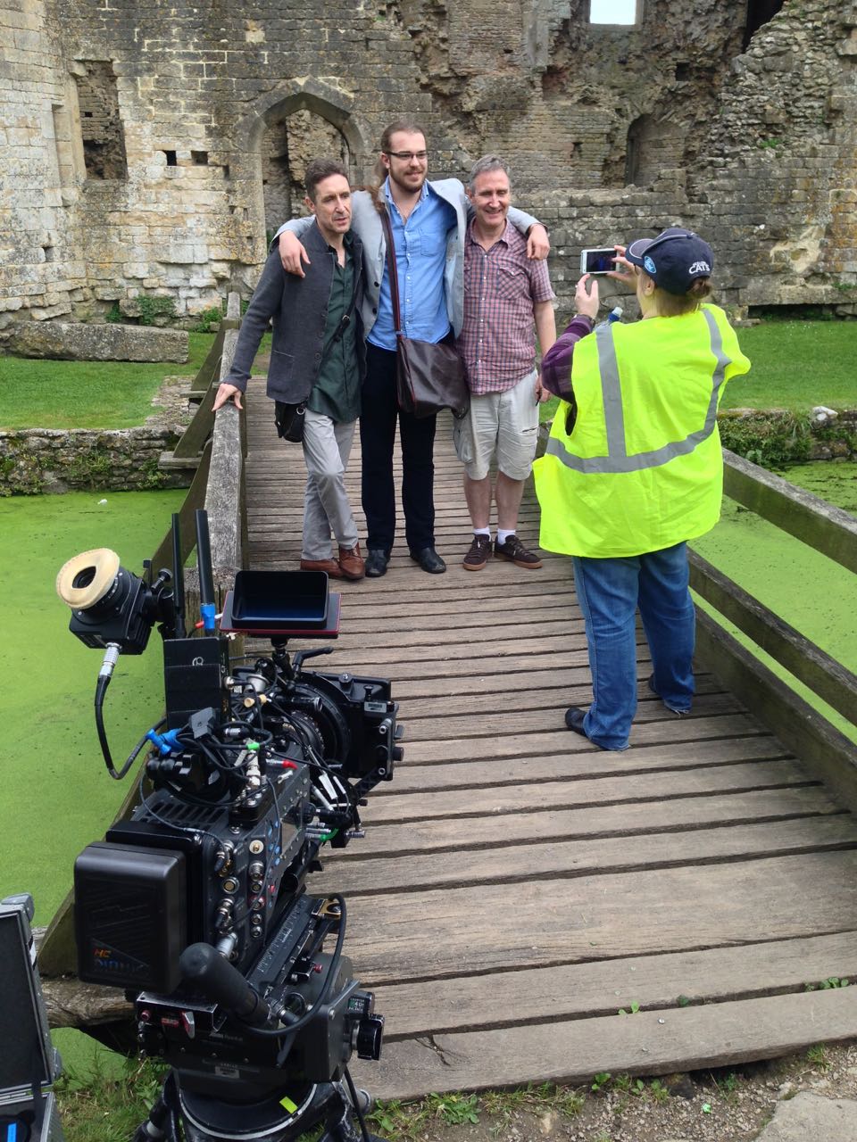
In June I was recommended by a mutual friend to shoot a short drama called Perplexed Music, inspired by the Elizabeth Barrett Browning sonnet of the same name. It’s a passion project from writer-director Mark McGann, with his brother Paul McGann (Doctor Who, Alien 3, Withnail &I) in the lead role of a man grieving for his deceased partner.
Paul and Mark pose with one of the supporting artists between takes.
Mark was keen from the outset to shoot on an Alexa, and I was quick to agree. Arri Rental very kindly gave us an amazing deal on an Alexa Classic and a set of Ultra Primes. As on Above the Clouds, we used a Blackmagic Micro Cinema Camera as a B-cam, capturing two specific angles that were impossible on the Alexa with our limited grip budget.
Throughout July, Mark and I had a very satisfying creative dialogue about the cinematic techniques we would use to tell the story of Paul’s character, The Man, who never speaks. I had been watching a lot of Mr. Robot, and was keen to use unusual compositions as that show does. The visual grammar that we ultimately developed eschewed The Rule of Thirds, either squeezing The Man right into the side of frame – at times when things are too much for him – or placing him dead centre for moments of clarity and acceptance, and for flashbacks to when his partner was alive.
The Blackmagic Micro Cinema Camera is mounted on a combo lighting stand to capture a high angle through a streetlamp.
While testing lenses at Arri Rental a few weeks prior to the shoot, I took the opportunity to shoot some frame-rate tests between 24 and 48fps. Since the film has so little dialogue, I figured there was nothing to stop us using a lot of slow motion if we wanted to. I didn’t want it to look like a music video though. I thought perhaps a very subtle over-cranking, creating languid blinks and slightly heavier movement, would add to the burden of The Man’s grief. Mark agreed as soon as he saw the tests, and we ended up shooting a number of set-ups at 28 and 30fps, plus 40fps for a pivotal sequence.
I also tested various ISO settings on the Alexa (click here for full details, stills and video from this test). Based on these, I decided to use ISO 1600 for the majority of the film, partly for the extra latitude in the highlights, and partly to add grittiness to The Man’s grief-stricken world, in the form of a little picture noise. When we started shooting the flashbacks, on the spur of the moment I decided to switch to ISO 400 for these. A few years back I shot the music video below on a Red Epic and, for reasons I forget, one set-up was done at a lower ISO than the rest. I remember the feeling this gave, when I saw the final edit, of everything suddenly being smooth and hyper-real. I thought that would be a great feeling to give to the flashbacks.
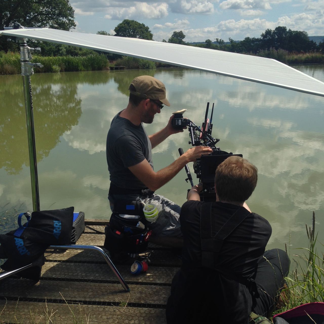
1st AC Rupert Peddle and 2nd AC Ben Davies set up a lakeside close-up under a diffusion frame which will soften the light on Paul.
Much of Perplexed Music was day exterior, but a couple of sequences required lighting. In the opening café scene, I fired HMIs through two windows, but kept their light away from The Man, keying him with a practical to put him in his own little world. Meanwhile, a happy couple he’s watching are bathed in sunlight (sometimes real, sometimes not) warmed up with a quarter CTO, and bouncing beautifully off their table to give them a healthy glow.
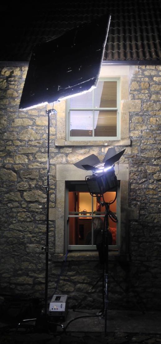
For night interiors at The Man’s home, I was keen to rely on practicals as much as possible. Firstly there wasn’t much space in the little cottage, secondly I didn’t want the hassle of having to shift them around to keep them out of frame when we changed angle, and thirdly it just looks more natural. So aside from a tungsten bounce in a corner of the living room we knew would never be seen, I stuck to practical table lamps and exterior lighting.
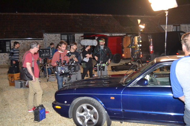
Setting up for a night exterior shot. Photo: Gary Horton
I had planned to use direct HMI sources for moonlight through the windows, but my gaffer Sam suggested going softer so that we wouldn’t have hard shadows inside which would need filling. I saw that he was right, so we used a kino through one window and a 2.5K HMI bounced into poly through another (pictured at left).
Perplexed Music was shot over five days in Frome in Somerset and Rame in Cornwall. The latter provided us with a spectacular cliff-top and the isolated St. Michael’s Chapel on the peak of the headland. Here we employed the services of The Fly Company, who captured two dramatic, sweeping shots on their DJI Inspire 2 drone. We were all extremely impressed by what they were able to achieve, especially as it was done in very windy conditions, in between rain showers.
We completed the final set-ups of the schedule as the winds began gusting up to 60mph, and poor Paul could barely stand upright! I was certainly glad we picked the Alexa to shoot on, because anything lighter would probably have shaken during takes, if not blown over!
Lining up a shot with director Mark McGann. Photo: Gary Horton
I had a fantastic time working with Mark and Paul, and the whole cast and crew. We were sad to part ways at the end of the week, and we all look forward to seeing the finished film soon. And at this point, dear reader, I ask for your help. Currently a Kickstarter campaign is underway for postproduction. It’s well over 50% funded at the time of writing, but every little helps in our quest to reach the finishing line. Rewards for backers include thank you video messages from Paul and Mark, and tickets to a private screening in December. Even if you can’t contribute, please consider sharing the page on social media. Thanks!
The publicity machine is ramping up for Kenneth Branagh’s Murder on the Orient Express remake, and it’s got me thinking about the challenges of a script set largely on a moving train. There are a number of ways of realising such scenes, and today I’m going to look at five movies that demonstrate different techniques. All of these methods are equally applicable to scenes in cars or any other moving vehicle.
1. For Real: “The Darjeeling limited”
https://www.youtube.com/watch?v=S92KktyxGY0
Wes Anderson’s 2007 film The Darjeeling Limited sees three brothers embarking on a spiritual railway journey across India. Many of the usual Anderson tropes are present and correct – linear tracking shots, comical headgear, Jason Schwartzman – but surprisingly the moving train wasn’t done with some kind of cutesy stop-motion. Production designer Mark Friedberg explains:
The big creative decision Wes made was that we were going to shoot this movie on a moving train. And all that does is complicate life. It makes it more expensive, it makes the logistics impossible. It made it incredibly difficult to figure out how many crew, what crew, what gear… but what it did do is it made it real.
Kenneth Branagh has stated that at least some of Murder on the Orient Express was shot on a real moving train too:
They painstakingly built a fully functioning period authentic locomotive and carriages from the Orient Express during the golden, glamorous age of travel. It was a train that moved… All of our actors were passengers on the train down the leafy lanes of Surrey, pretending to be the former Yugoslavia.
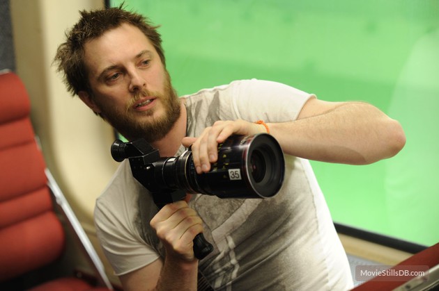
2. Poor Man’s Process: “The Double”
Director Richard Ayoade
Although best known as The IT Crowd‘s Moss and the new host of the Crystal Maze, Richard Ayoade is also an accomplished director. His last feature was a darkly beautiful adaptation of Dostoyevsky’s classic identity-crisis novella The Double.
Unlike the other movies on this list, The Double only has short sequences on a train, and that’s a key point. So named because it’s a cheap alternative to rear projection (a.k.a. process photography), Poor Man’s Process is a big cheat. In order to hide the lack of motion, you keep the view outside your vehicle’s windows blank and featureless – typically a night sky, but a black subway tunnel or a grey daytime sky can also work. Then you create the illusion of motion with dynamic lighting, a shaky camera, and grips rocking the carriage on its suspension. Used judiciously, this technique can be very convincing, but you would never get away with it for a whole movie.
Poor Man’s works particularly well in The Double, the black void outside the subway car playing into the oppressive and nightmarish tone of the whole film. In an interview with Pushing Pixels, production designer David Crank explains how the subway carriage set was built out of an old bus. He goes on to describe how the appearance of movement was created:
We put the forks of a forklift under the front of the bus, and shook it… For the effect of moving lights outside the train, it was a combination of some spinning lights on stands, as well as lights on small rolling platforms which tracked back and forth down the outside of the bus.
Part 2 of the Darjeeling Limited featurette above reveals that Poor Man’s Process was also used occasionally on that film, when the train was stuck in a siding due to heavy rail traffic. I used Poor Man’s myself for night-time train sequences in two no-budget features that I made in the early noughties – see the BTS clip below – and I’ve also written a couple of blog posts in the past about my use of the same technique on a promotional video and in a fantasy web series.
3. Green screen: “Source Code”
https://www.youtube.com/watch?v=ildCiVpLM8s
Duncan “Zowie Bowie” Jones followed up his low-budget masterpiece Moon with Hollywood sci-fi thriller Source Code, a sort of mash-up of Quantum Leap and Groundhog Day with a chilling twist. It takes place predominantly on a Chicago-bound commuter train, in reality a set surrounded by green screen. In the featurette above, Jones mentions that shooting on a real moving train was considered, but ultimately rejected in favour of the flexibility of working on stage:
Because we revisit an event multiple times, it was absolutely integral to making it work, and for the audience not to get bored, that we were able to vary the visuals. And in order to do that we had to be able to build platforms outside of the train and be able to really vary the camera angles.
In the DVD commentary, Jones also notes that the background plates were shot in post from a real train “loaded up with cameras”.
Director Duncan Jones on the set of “Source Code”
Cinematographer Don Burgess, ASC discusses lighting the fake train in a Panavision article:
It’s difficult to make it feel like natural light is coming in and still get the sense of movement on a train… We worked with computer programs where we actually move the light itself, and brighten and dim the lights so it feels as if you are travelling… The lights are never 100% constant.
When I shot The Little Mermaid last year we did some train material against green screen. To make the lighting dynamic, the grips built “branch-a-loris” rigs: windmills of tree branches which they would spin in front of the lamps to create passing shadows.
4. Rear projection: “Last Passenger”
Perhaps the most low-budget film on this list, Last Passenger is a 2013 independent thriller set aboard a runaway train. Director Omid Nooshin and DP Angus Hudson wanted a vintage look, choosing Cooke Xtal anamorphic lenses and a visual effects technique that had long since fallen out of favour: rear projection.
Before the advent of optical – and later digital – compositing, rear projection was commonly used to provide moving backgrounds for scenes in vehicles. The principle is simple: the pre-recorded backgrounds are projected onto a screen like this…
Rear projection in use on “River of no Return” (1954)
Hudson goes into further detail on the technique as used for the Last Passenger:
To capture [the backgrounds] within our limited means, we ended up shooting from a real train using six Canon 5D cameras, rigged in such a way that we got forward, sideways and rear-facing views out of the train at the same time. We captured a huge amount of footage, hours and hours of footage. That allowed us to essentially have 270 degrees of travelling shots, all of which were interlinked.
Because rear projection is an in-camera technique, Nooshin and Hudson were able to have dirt and water droplets on the windows without worrying about creating a compositing nightmare in postproduction. Hudson also notes that the cast loved being able to see the backgrounds and react to them in real time.
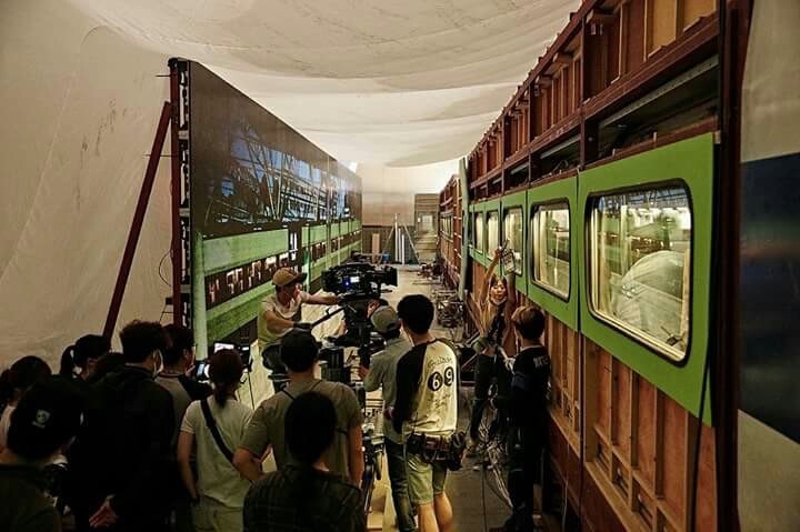
5. L.E.D. Panels: “Train to Busan”
https://www.youtube.com/watch?v=3nKVBSHvxi8
Enabling the actors to see the background plates was also a concern for Yeon Sang-ho, director of the hit Korean zombie movie Train to Busan. He felt that green screen would make it “difficult to portray the reality”, so he turned to the latest technology: LED screens. This must have made life easier not just for the cast, but for the cinematographer as well.
You see, when you travel by train in the daytime, most of the light inside the carriage comes from outside. Some of it is toplight from the big, flat sky, and some of it is hard light from the sun – both of these can be faked, as we’ve seen – but a lot of the light is reflected, bouncing off trees, houses, fields and all the other things that are zipping by. This is very difficult to simulate with traditional means, but with big, bright LED screens you get this interactive lighting for free. Because of this, and the lack of postproduction work required, this technique is becoming very popular for car and train scenes throughout the film and TV industry.
This brings us back to Murder on the Orient Express, for which 2,000 LED screens were reportedly employed. In a Digital Spy article, Branagh notes that this simulated motion had an unintended side effect:
It was curious that on the first day we used our gimballed train sets and our LED screens with footage that we’d gone to great trouble to shoot for the various environments – the lowlands and then the Alps, etc… people really did feel quite sick.
I’ll leave you with one final point of interest: some of the above films designed custom camera tracks into their train carriage sets. On Last Passenger, for example, the camera hung from a dolly which straddled the overhead luggage racks, while The Darjeeling Limited had an I-beam track designed into the centre of the ceiling. Non-train movies like Speed have used the same technique to capture dolly shots in the confines of a moving vehicle.
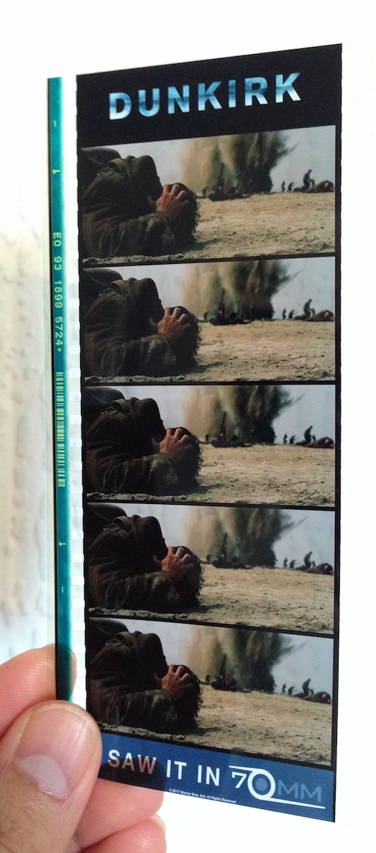
Some have hailed it as a masterpiece, others have complained it left them cold. Personally, seeing it on 70mm, I found Dunkirk a highly immersive and visceral film, cinematic in the truest sense of the word. The huge, sharp images free from any (apparent) CGI tampering, combined with the nerve-jangling gunshots and rumbling engines of the superlative soundtrack, gave me an experience unlike any other I can recall in recent movie-going history. I can imagine that it was less effective projected from a DCP onto a smaller screen, which may account for the underwhelmed reactions of some.
But however you feel about Dunkirk as a film, it’s hard not to admire its technical accomplishments. Here are five unique aspects of its cinematography.
1. It was shot on two huge formats.
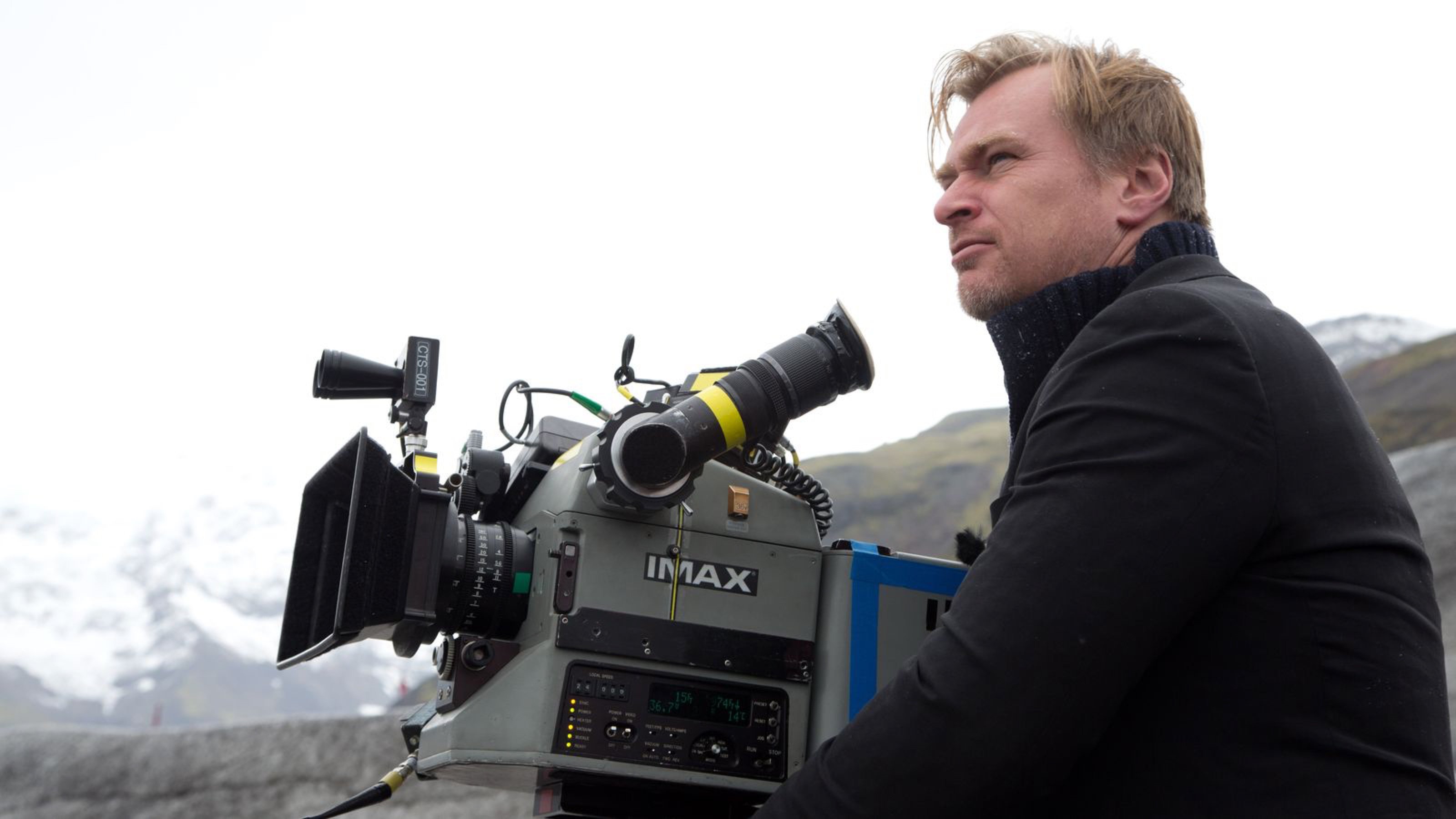
Director Christopher Nolan has long been a champion of large-format celluloid capture, eschewing the digital imaging which has become the dominant medium in recent years. “I think IMAX is the best film format that was ever invented,” says Nolan in a DGA interview. “It’s the gold standard and what any other technology has to match up to, but none have, in my opinion.”
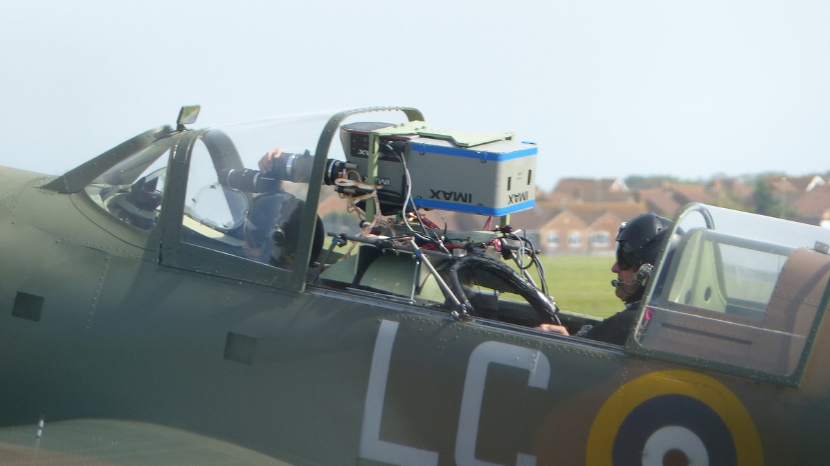
Imax is a process which uses 65mm film (printed on 70mm for exhibition, with the extra space used for the soundtrack) running horizontally through the gate, yielding an image over eight times larger than Academy 35mm. Following some test shots in The Prestige, Nolan captured whole sequences from The Dark Knight, The Dark Knight Rises and Interstellar in Imax.
For Dunkirk, Nolan and cinematographer Hoyte van Hoytema, ASC, FSF, NSC were determined to eliminate 35mm altogether, to maintain the highest possible resolution throughout the movie. Imax cameras are noisy, so they shot dialogue scenes on standard 65mm – running vertically through the gate – but Imax footage makes up over 70% of the finished film.
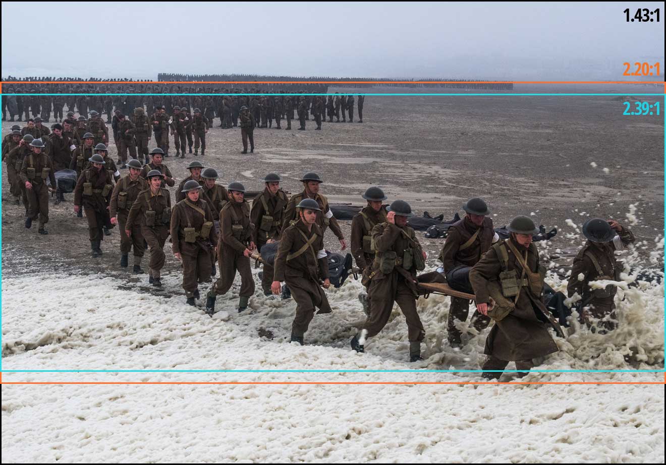
2. The movie was framed with three different aspect ratios in mind.
Those who watched Dunkirk in an Imax cinema got to see the native aspect ratio each sequence was captured in, i.e. 2:20:1 for the standard 65mm dialogue scenes but the much taller 1.43:1 for the Imax material, the bulk of the film. Those, like me, who attended a standard 70mm screening, saw it in 2:20:1 throughout. And those hapless individuals who watched it digitally apparently saw the standard Scope ratio of 2.39:1, at least in some cases.
This means that, when composing his shots, van Hoytema had to have two ratios in mind for the dialogue scenes and three for everything else. “Framing was primarily for the 2.40 [a.k.a. 2:39:1], then protecting what was outside of it,” 1st AC Bob Hall explains. This left close-ups, for example, with a large amount of headroom in 1.43:1, but the huge size of Imax screens made such framing desirable anyway. “Imax is such an immersive experience that it’s not so much the composition that the cinematographer’s done as where your eyes are going on the screen that creates the composition.”
3. Parts of the camera rig were worn as a backpack.
Breaking with the accepted norms of large format cinematography, van Hoytema captured a significant proportion of the movie handheld. The 65mm camera package weighed over 40kg – about three times the weight of a typical Alexa rig – with the Imax camera only a little lighter. To avoid adding the weight of the batteries, video transmitter, Cinetape display and Preston (wireless follow focus) brain, these were placed in a special tethered backpack which was either worn by key grip Ryan Monro or, for water tank work, floated on a small raft.
Unfortunately, Hall quickly found that electromagnetic interference from the Imax camera rendered the Cinetape inoperable, so he ended up relying on his extensive experience to keep the images sharp. “I had to go back to the technology of the 1980s, where I basically guess how far famous people are from me,” he remarks drily in this enlightening podcast from Studio Daily.
4. A periscope lens was used to shoot spitfire cockpit interiors.
“I wanted to tell an intensively subjective version of this story,” says Nolan. To that end he requested over-the-shoulder views out of the windscreens of Spitfires in flight. Furthermore, he wanted to be able to pan and tilt to follow other aircraft passing by. Given the huge size of the Imax camera, there was no room to rotate it within the cockpit. Instead, custom periscope lenses were built which could snake over the pilot’s shoulder, and pan and tilt independently of the camera body, using prisms to maintain the correct image orientation to the film plane.
Other glass used on Dunkirk included an 80mm Imax lens belonging to Nolan himself, and converted stills lenses.
Note that the camera is mounted upside-down, to compensate for the flipped image generated by the prism in the periscope lens.
5. At one point the camera sunk to the bottom of the sea for an hour and a half.
A specific Spitfire POV required was from a damaged plane diving towards the sea and hitting the water. The practical effects department devised a catapult to launch an unmanned mock-up from a ship, the grips built a crash housing for the Imax camera which would be inside, and a plan was devised to recover it before the mock-up sank. But they weren’t quick enough, and the crew watched the plane and the camera disappear beneath the waves and plunge to the bottom of the English Channel, where it sat for 90 minutes until divers retrieved it. Incredibly, once dried out and developed, the film footage was found to be completely undamaged. “The shot was all there, in full colour and clarity,” says van Hoytema in the American Cinematographer article. “This material would have been lost if shot digitally.”
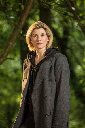
Reaction to Jodie Whittaker’s casting as the new Doctor pretty much broke the internet last month. While the majority appear to be in favour, a significant minority reacted with hostility.
At first glance, the haters did seem to have a reasonable point. The Doctor is a man, has always been a man, so it’s weird to regenerate them into a woman. After all, there are constants across every regeneration, different as it may be to its predecessors. For example, the Doctor always has a British accent. If the Doctor ever gained an American twang, there would be outrage; the Doctors’ Britishness is a fixed point of their ever-changing character. Is it so unreasonable for their gender to be another fixed point, something to anchor their character and reassure viewers that despite the new actor, this is still the Doctor you know and love?
But as soon as you start to think about it, this argument collapses completely. After all, Doctor Who‘s 54-year history is littered with contradictions and continuity errors. The majority of the episodes produced under Steven Moffatt were full of plot-holes, so to suggest that there is anything fixed, immutable and logical about the show is utterly ridiculous. It’s pure fantasy. Fantasy – that’s a key word that I’ll return to later.
Let’s consider some of the most common negative reactions that appeared online…
1. “It’s Not Doctor Who any more.”
People said that in 1966 when the Doctor first regenerated. They said it when he was exiled to Earth in the 70s. They said it when it got campy in the 80s. They said it when the American TV movie was made in 1996. They said it when Russell T. Davies resurrected the show in 2005. They said it when Tennant left in 2010. And now they’re saying it again.
Change, evolution, moving with the times – these are the reasons that Doctor Who is the longest-running sci-fi show on the planet. The world has changed enormously since William Hartnell first flickered onto the screen with his magic blue (grey) box. It’s the show’s ability to develop in step with the real world that makes it a continued success. These changes are visible in the ever-improving VFX, the topical themes of the stories, the shifts in tone under new showrunners, and crucially through Who‘s groundbreaking concept of regeneration.
Doctor Who is change.
2. “We have lost an important male role model.”
I saw a post from a man who was angry and upset to lose what he saw as a crucial role model in his life. His argument was that male heroes are usually more physical and violent, whereas the Doctor’s more intelligent approach made him great for encouraging men into STEM (Science, Technology, Engineering, Maths) careers. Peter Davison, the fifth Doctor, expressed a similar concern.
But it is women who are under-represented in STEM industries, not men. And if you’re looking for other intelligent male role models, how about super-brainy Sherlock? Or engineering genius Tony “Iron Man” Stark? Or most of the Star Trek captains and science officers? Even if you reject every other film and TV show’s male heroes as not intellectual enough, you still have the other twelve Doctors. Can’t we let 50% of the population have one female Doctor in there to look up to?
3. “It’s a cynical move.”
It’s no secret that Doctor Who‘s ratings have been steadily declining in recent years, so some people have come to the conclusion that incoming showrunner Chris Chibnall cast a woman purely to generate controversy and draw attention to the show.
Undoubtedly Chibnall would have seen the press and social media interest as a bonus to casting a woman, but it can’t have been the sole or primary motivator. Chibnall is first and foremost a writer, and no writer would ever cast a lead actor to bring their character to life if they didn’t believe absolutely that that actor was right for the part. The first woman in the role is bound to attract a greater degree of scrutiny and criticism than another man when her episodes start screening, so if the show is to have a hope of impressing the critics then the Doctor has to be an excellent actor with an impeccable track record. And Whittaker is definitely that.
This move is far from cynical. It’s bold, refreshing and relevant, and for this fan at least it gives me more excitement about the next season than I have felt for some time.
4. “It’s political correctness gone mad.”
Political correctness has become a dirty phrase, but all it really means is being careful not to offend oppressed or minority groups unnecessarily. So to say that Whittaker’s casting is political correctness gone mad is to suggest that it’s placating people who have no valid complaint of oppression or under-representation.
Let me say it again: twelve of the thirteen Doctors are men. (Thirteen of fourteen if you count the War Doctor.) Only one is a woman. That’s less than 10%, compared with 50% of the population being female. That is the very definition of under-representation. And let’s not forget that Whittaker’s casting was announced after the men’s Wimbledon final, not the women’s, because we still live in a world where women, and all the things women do, are considered less important than their male counterparts.
Casting a female Doctor is not “political correctness gone mad”. It’s taking a small step towards correcting a huge imbalance.
5. “I won’t be watching any more.”
I suspect the men who wrote comments like this did not stop to consider the more limited choices their mothers, daughters and sisters have in this matter. If women threw their toys out of the pram every time a TV show or film came along with a male lead, they wouldn’t get much else done. Women have got used to watching stories led by the other gender; we men must learn to do the same.
To the people who still say, “but the Doctor is a man,” and suggest that casting female leads in new shows would be better than swapping the gender of an established character, you may be right. And when 50% of all big franchises have female leads there will be no need to do this kind of thing, but until then, it’s necessary. Until then, us men whining that we’ve lost something in this situation is like a millionaire crying because they dropped a penny down the drain.
Finally, let’s return to that keyword, fantasy. Because I think the most significant things about Whittaker’s casting are the kids in the playgrounds who will grow up with choice. The girls won’t always have to play the kidnapped princesses, or the love interests, or the companions, while the boys get the roles with agency; they can play Rey, or Wonder Woman, or the Doctor. That can only be beneficial to the future of our society.
Anamorphic cinematography, first dabbled with in the 1920s, was popularised by Twentieth Century Fox in the fifties as CinemaScope. Television was growing in popularity and the studios were inventing gimmicks left, right and centre to encourage audiences back into cinemas. Fox’s idea was to immerse viewers in an image far wider than they were used to, but with minimal modifications to existing 4-perf 35mm projectors. They developed a system of anamorphic lenses containing elements which compressed the image horizontally by a factor of two. By placing a corresponding anamorphosing lens onto existing projectors, the image was unsqueezed into an aspect ratio of 2.55:1, or later 2.39:1.
Since those early days of CinemaScope, anamorphic cinematography has become associated with the biggest Hollywood blockbusters. Its optical features – streak flares, oval bokeh and curved horizontal lines – have been seared into our collective consciousness, indelibly associated with high production values.
Again we were shooting on an Alexa XT Plus in log C ProRes 4444 XQ, this time in 4:3 mode, a resolution of 2048×1536. Since all of the lenses had a standard 2:1 anamorphosing ratio, the images unsqueezed to a super-wide 2.66:1 ratio. (This is because the lenses were designed to be used on 35mm film with space left to one side for the optical soundtrack.) You can see the full width of this ratio in the first split-screen image in the video, at 2:08, and in the second image below, but otherwise I have horizontally cropped the footage to the standard 2.39:1 ratio.
We tested the following glass:
Series
Length
Speed
CF*
Weight
Hawk V
35mm
T2.2
30″
5.6kg
Cooke Xtal
30mm
T2.8
?
3kg
Kowa Mirrorscope
40mm
T2.2
36″
1.15kg
Kowa Mirrorscope
30mm
T2.3
?
?
* CF = close focus
For consistency with the spherical lenses, we used lengths around 32mm, but in the anamorphic format this is a pretty wide lens, not a mid-range lens. We shot at T2.8, again for consistency, but I hear that many anamorphics don’t perform well wider than T4.
We were only able to test what Arri Rental happened to have on the shelves that day. The biggest and presumably most expensive was the Hawk V-series. Next in size and weight was the Cooke Xtal – pronounced “crystal” – a 1970s lens based on the much-loved Speed Panchros. The smallest and lightest, was the Kowa Mirrorscope, with a list price of £1,200 per week for a set of four. (Sorry, I couldn’t find any pricing info for the others online.) Note that there isn’t really a 30mm Mirrorscope; to get this length you put a wide angle adapter on the 40mm. As this extra element decreases the optical performance, we tested it with and without, hence the two lengths.
Here’s the video…
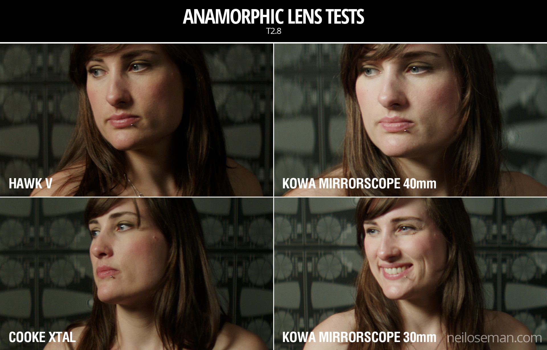
Skin tones
Click on the image to see it at full quality.
To my eye, the Hawk has a fairly rich, warm skin tone, while the Cooke – as with the spherical S4 tested last week – seems a little grey and flat. The Kowa is inexplicably brighter than the other two lenses, which makes it hard to compare, but perhaps it’s a little cooler in tone?
Anamorphic lenses have what is known as a “curved field of focus” that works similarly to the curved movie screens in some large Cinerama theatres. This is one reason that one needs to expose these lenses at a deeper stop. If one doesn’t, the curved field will not be covered by depth of field and either the edges or centre of the frame will be soft.
One day I’d like to re-test these lenses at a lower stop, T4 or T5.6, where they will all undoubtedly perform much better. But in this T2.8 test, on Bex’s face in the centre of frame, the Hawk V and the Kowa Mirrorscope 40mm – both almost a full stop from their maximum apertures – are clearly the sharpest of the bunch. The Cooke Xtal, which is wide open, is unsurprisingly softer. The 30mm adapter on the Mirrorscope completely destroys the image, not only making it very soft but also introducing colour aberration.
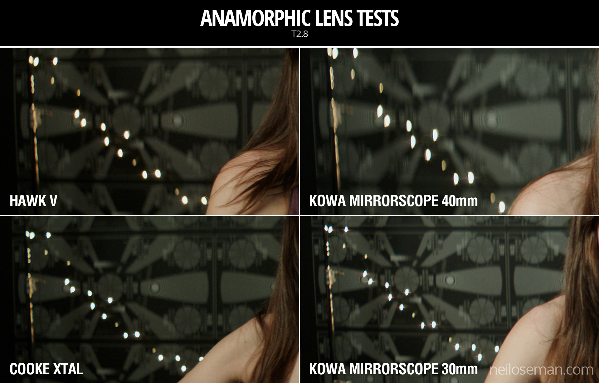
Now let’s look at the checkerboard at the side of frame and see if we can spot any differences in sharpness there…
It seems to me that the Kowa, both with and without the adapter, has a greater difference in sharpness between the centre and edges of frame than the the Hawk and Cooke. With the latter two lenses, the checkerboard is reasonably sharp, at least on the lefthand side, with some ghosting/blur visible towards the righthand side. The same thing can be observed on the chart in the flare tests at the end of the video.
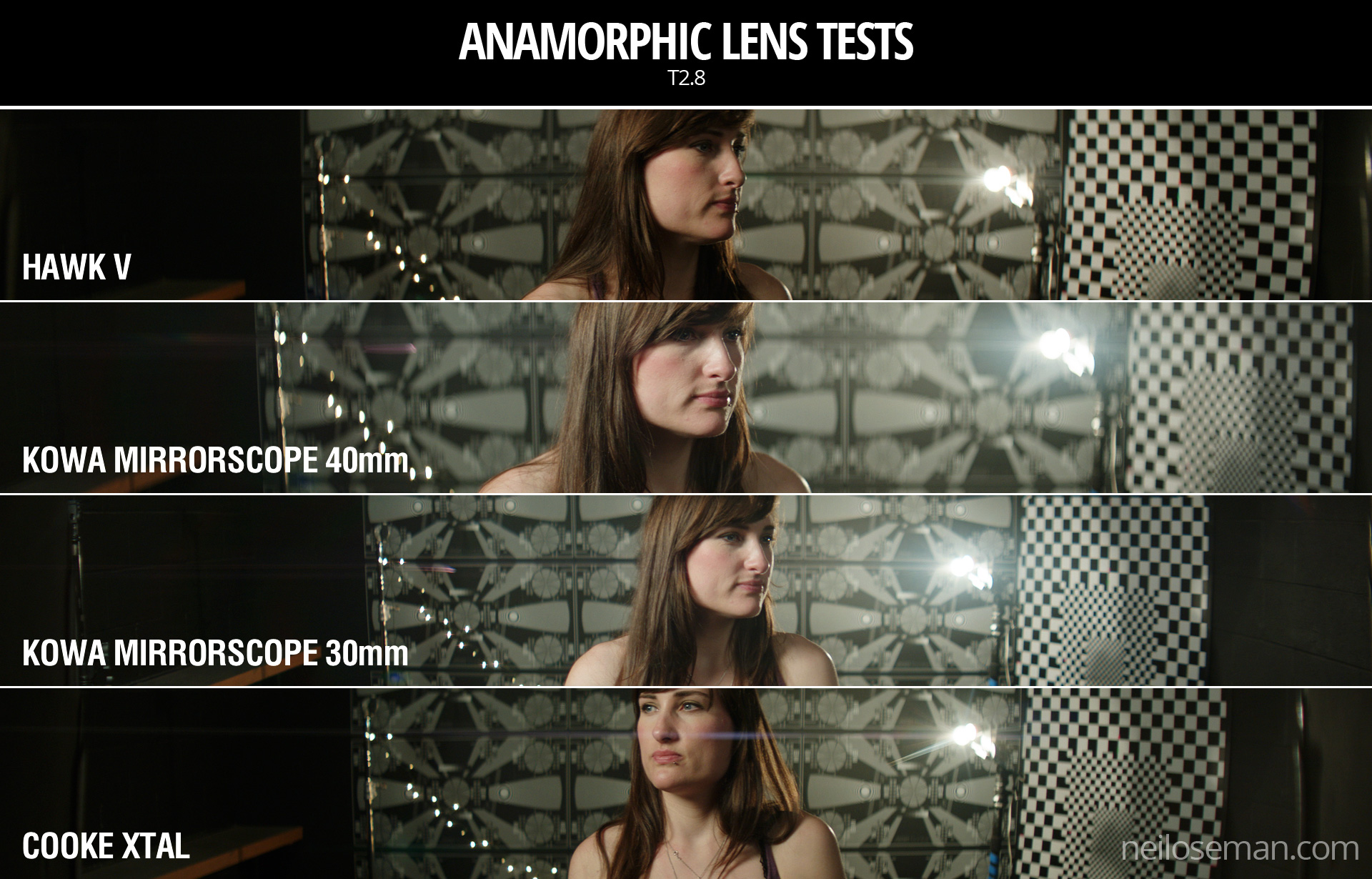
Breathing & Bokeh
All of these lenses have a noticeable degree of breathe, which I suppose is to be expected from anamorphics. The Hawk V has roughly oval bokeh, the Cooke’s is more circular, while the Mirrorscope has interesting D-shaped bokeh.
Flare
The Hawk V doesn’t flare much at all, which is apparently due to the anamorphic element being in the middle of the lens, rather than at the front. The Kowa has a nice streak and glow around the light source, with a funky purple artefact on the opposite side of frame. But it’s the Cooke Xtal which provides the most classic lens flare, with a horizontal line across most of the frame and a partial star pattern around the source, despite the lens being wide open.
At the end of the video you can see how the flares develop on each lens as the light source moves horizontally across frame.
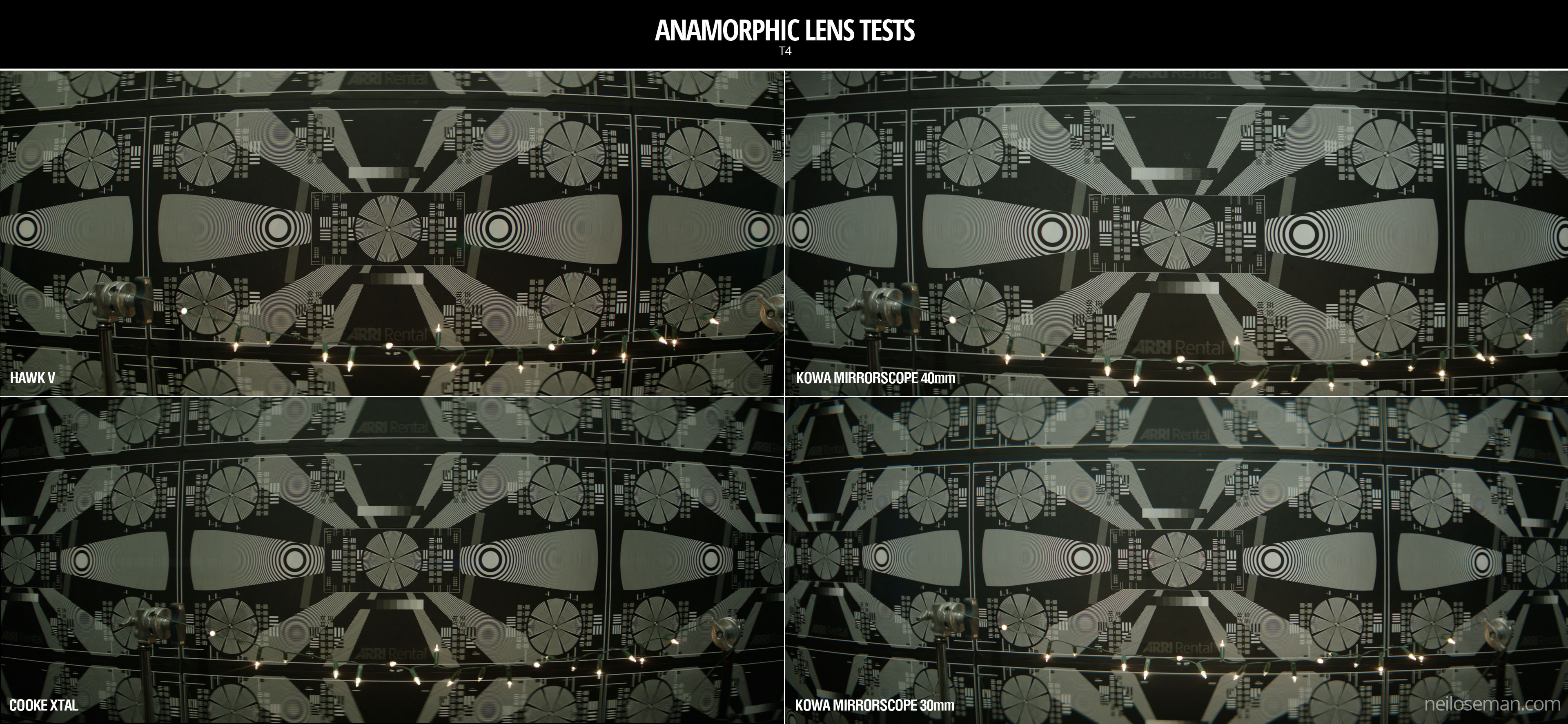
Distortion
A bulging effect is very obvious on all of these lenses, due to the focal lengths being quite wide for anamorphic. Notice how at 40mm on the Kowa Mirrorscope this curvature of the image is significantly reduced.
It’s hard to compare the levels of distortion because none of the focal lengths are exactly the same, except for the Cooke Xtal and the Kowa Mirrorscope with the 30mm adapter on. The Cooke’s top right and bottom left corners appear to be stretched away from the centre relative to the other two corners. I suppose that strange and funky stuff like this is exactly why you choose vintage glass.
Interestingly, the Cooke’s image appears a little tighter than the Kowa’s, which combined with my inability to find any evidence online of the existence of a 30mm Xtal, leads me to suspect we may have been given a mislabelled 32mm.
Conclusions
When we got to the end of our spherical tests and started putting the anamorphics on, I was shocked by the drop in sharpness. But as noted earlier, this is because anamorphics really need to be used with a smaller aperture than the T2.8 I often shoot at. If I learnt nothing else from this test, I learnt that anamorphic needs more light!
I would love to put the Cooke Xtal’s lovely flares and general vintage look to good use on a period movie one day. The Hawk V would be a good choice if I wanted the anamorphic look with warm, dynamic skin tones. The Kowa system seemed a little cheap and cobbled-together, but could well be a good solution for anamorphic on a budget, as long as I stayed away from the 30mm adapter!
 The first Kingsman film made me very angry – in fact I wrote a blog post explaining exactly why it was so misogynous. I was therefore planning to avoid the sequel like the plague, and instead a friend and I set off for the local Vue this afternoon with a voucher for two free tickets and the intention of seeing A.A. Milne biopic Goodbye Christopher Robin. Unfortunately, on arriving we were told that a broken projector meant that the screening of Goodbye Christopher Robin was cancelled. Neither of us were very enthusiastic about anything else that was showing, but Kingsman: The Golden Circle was starting soonest, so we plumped for that.
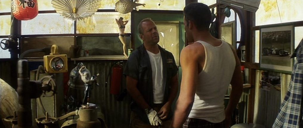


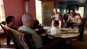 The season two Breaking Bad episode “Grilled” sees out-of-their-depth crystal meth cooks Walter White and Jesse Pinkman taken hostage by crazy drug lord Tuco Salamanca. Realising that their only hope of escape lies in killing Tuco, Walter and Jesse plot to poison his burrito. The episode bristles with tension, generated not just through the script and performances, but also by flapping curtains which paint the scene with restless shadows. The scene appears to have been shot on location, so whether the wind was artificial or just a happy accident I don’t know, but either way it adds immeasurably to the atmosphere.