5 Lighting Tips from Classic Art

A few weeks ago I discussed compositional techniques which we can learn from the work of JMW Turner. This time I’m looking at the use of light, and I’m broadening the scope to cover a few other classical artists whose works have caught my eye at galleries lately.

Without artificial illumination, these old masters had to make the most of the light God gave them. Here are five examples of their techniques which we can trace directly forward to cinematographic techniques of today.


Cross-light
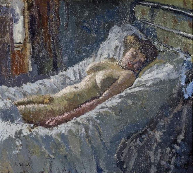
“Mornington Crescent Nude” (circa 1907) – Walter Richard Sickert

Decades before DPs started encouraging directors to shoot interior scenes towards windows to achieve the most interesting modelling, Sickert had the same idea. See how the light from the window in the background throws the model’s body into relief, giving it form and dimension? Cross-light is commonly used today in commercials for sport and fitness products, to emphasise muscle tone.

See also: Lighting Techniques #6: Cross-light


Background strokes

“Tancred’s Servant Presenting the Heart of Guiscard in a Golden Cup to Guismond” (circa 1675) – Adriaen van der Werff

What caught my eye about this painting was the slash of light on the background wall in the top left corner. It may seem trivial, but a little stroke of background light like this can really elevate the quality of a shot. Here it anchors the corner of the composition and gives us a hint of the room’s decor, adding interest to what would otherwise be a black void behind Guismond.

While lighting the subject of the shot is clearly a DP’s priority, it’s important to find time to paint in the surroundings even if they’re in the deep background or extreme foreground.

“Drive” (DP: Newton Thomas Sigel)

See also: 5 Ways to Use Hard Light Through a Window


Haze

“Chloe Idille” (1811) – Salomon Gessner & Carl Wilhelm Kolbe

This monochrome etching has a tremendous feeling of depth, and it is achieved purely through contrast. The further away an object is, the more air there is between that object and your eye. Since air isn’t 100% transparent, that distant object appears lighter and lower-contrast than closer objects. Gessner and Kolbe capture this effect beautifully here.

Many cinematographers today use hazers to create or enhance this atmospheric effect, even for interiors. In the days of miniature effects, smoke was often used to create atmospheric haze and increase the feeling of scale. On Blade Runner, for example, Douglas Trumbull’s VFX crew sealed the motion control stage and used infra-red sensors linked to hazers to automatically keep the smoke level constant during the long-exposure passes over the futuristic cityscape.

“Blade Runner” (DP: Jordan Cronenweth)

See also: Depth Cues in Cinematography


Golden hour

“Abingdon” (1806) – Joseph Mallord William Turner

Painters figured out centuries ago that the most beautiful light is found at the beginning and end of the day. It’s partly due to the cross-light effect (see above) of the lower sun, and partly due to the beautiful orange colour caused by the greater amount of atmosphere the sun’s rays must pass through. To shoot the perfect sunset, you’ll need patience, and a sun-tracker app or at least a compass. Ensure the schedule permits you to try again another day if clouds spoil the view.

“Raiders of the Lost Ark” (DP: Douglas Slocombe)

See also: Sun Paths


Wet-Downs

“The Boulevard Montmartre” (1897) – Camille Pissarro

This is the only night image in a series of impressionist oil paintings which Pissarro executed from a hotel window overlooking the Boulevard Montmartre. What makes it particularly beautiful is the wet street, turning what might otherwise have been a dull grey central swathe of the image into an arena of alternately shadowy and glittering reflections.

Cinematographers shooting night exteriors on streets will often have the tarmac hosed down for four reasons: (1) as already noted, the beauty of the reflections; (2) the deeper blacks and increased contrast; (3) the extra exposure gained by the light sources bouncing off the water; and (4) avoidance of continuity problems if it rains.

A scene from “Terminator 2” (DP: Adam Greenberg) on a street that’s been wetted down

See also: 7 Considerations for Night Shooting

5 Lighting Tips from Classic Art

12 Tips for Better Instagram Photos

I joined this social media platform last summer, after hearing DP Ed Moore say in an interview that his Instagram feed helps him get work. I can’t say that’s happened for me yet, but an attractive Instagram feed can’t do any creative freelancer any harm. And for photographers and cinematographers, it’s a great way to practice our skills.

The tips below are primarily aimed at people who are using a phone camera to take their pictures, but many of them will apply to all types of photography.

The particular challenge with Instagram images is that they’re usually viewed on a phone screen; they’re small, so they have to be easy for the brain to decipher. That means reducing clutter, keeping things bold and simple.

Here are twelve tips for putting this philosophy into practice. The examples are all taken from my own feed, and were taken with an iPhone 5, almost always using the HDR (High Dynamic Range) mode to get the best tonal range.


1. choose your background carefully

The biggest challenge I find in taking snaps with my phone is the huge depth of field. This makes it critical to have a suitable, non-distracting background, because it can’t be thrown out of focus. In the pub photo below, I chose to shoot against the blank pillar rather than against the racks of drinks behind the bar, so that the beer and lens mug would stand out clearly. For the Lego photo, I moved the model away from a messy table covered in multi-coloured blocks to use a red-only tray as a background instead.


2. Find Frames within frames

The Instagram filters all have a frame option which can be activated to give your image a white border, or a fake 35mm negative surround, and so on. An improvement on this is to compose your image so that it has a built-in frame. (I discussed frames within frames in a number of my recent posts on composition.)


3. try symmetrical composition

To my eye, the square aspect ratio of Instagram is not wide enough for The Rule of Thirds to be useful in most cases. Instead, I find the most arresting compositions are central, symmetrical ones.


4. Consider Shooting flat on

In cinematography, an impression of depth is usually desirable, but in a little Instagram image I find that two-dimensionality can sometimes work better. Such photos take on a graphical quality, like icons, which I find really interesting. The key thing is that 2D pictures are easier for your brain to interpret when they’re small, or when they’re flashing past as you scroll.


5. Look for shapes

Finding common shapes in a structure or natural environment can be a good way to make your photo catch the eye. In these examples I spotted an ‘S’ shape in the clouds and footpath, and an ‘A’ shape in the architecture.


6. Look for textures

Textures can add interest to your image. Remember the golden rule of avoiding clutter though. Often textures will look best if they’re very bold, like the branches of the tree against the misty sky here, or if they’re very close-up, like this cathedral door.


7. Shoot into the light

Most of you will not be lighting your Instagram pics artificially, so you need to be aware of the existing light falling on your subject. Often the strongest look is achieved by shooting towards the light. In certain situations this can create interesting silhouettes, but often there are enough reflective surfaces around to fill in the shadows so you can get the beauty of the backlight and still see the detail in your subject. You definitely need to be in HDR mode for this.


8. Look for interesting light

It’s also worth looking out for interesting light which may make a dull subject into something worth capturing. Nature provides interesting light every day at sunrise and sunset, so these are good times to keep an eye out for photo ops.


9. Use lens flare for interest

Photographers have been using lens flare to add an extra something to their pictures for decades, and certain science fiction movies have also been known to use (ahem) one or two. To avoid a flare being too overpowering, position your camera so as to hide part of the sun behind a foreground object. To get that anamorphic cinema look, wipe your finger vertically across your camera lens. The natural oils on your skin will cause a flare at 90° to the direction you wiped in. (Best not try this with that rented set of Master Primes though.)


10. Control your palette

Nothing gives an image a sense of unity and professionalism as quickly as a controlled colour palette. You can do this in-camera, like I did below by choosing the purple cushion to photograph the book on, or by adjusting the saturation and colour cast in the Photos app, as I did with the Canary Wharf image. For another example, see the Lego shot under point 3.


11. Wait for the right moment

Any good photographer knows that patience is a virtue. Waiting for pedestrians or vehicles to reach just the right spot in your composition before tapping the shutter can make the difference between a bold, eye-catching photo and a cluttered mess. In the below examples, I waited until the pedestrians (left) and the rowing boat and swans (right) were best placed against the background for contrast and composition before taking the shot.


12. Quality control

One final thing to consider: is the photo you’ve just taken worthy of your Instagram profile, or is it going to drag down the quality of your feed? If it’s not good, maybe you should keep it to yourself.

Check out my Instagram feed to see if you think I’ve broken this rule!

12 Tips for Better Instagram Photos

Composing a Shot-Reverse

Ah, the shot-reverse, that staple of film and television, that standard for dialogue scenes everywhere. Sooner or later, two characters are going to stand three feet apart, facing each other, and have a chat. (You know, like real people do all the time.) And the required coverage will be a wide or two-shot, followed by a pair of singles known as a shot-reverse.

The singles can be dirty (including the other character’s shoulder or back of head in the frame) or clean (not showing the other character). Except for tight close-ups, dirty singles – often called over-the-shoulder shots for obvious reasons – are most common, and it’s these that I’ll focus on in this post.


The Unwritten rules. Which I shall now write.

Conventional wisdom on shot-reverses says that the two shots should

  • be the same size,
  • use the same lens,
  • match the height of the respective eye-lines,
  • allow “looking space”, and
  • frame the two characters on opposite sides of the screen.

Here is a shot-reverse from Hugo (DP: Robert Richardson) which obeys all of these rules…

And here is a shot-reverse from Alien (DP: Derek Vanlint) which obeys none of them…

Ultimately, like all framing decisions, it’s subjective. Directors often have strong ideas about what they do and don’t like in shot-reverses. And no two DPs will agree exactly on the subject. And of course the actors will move around at least slightly during the scene, messing with any strict composition you’ve established.


Using the width of the frame

Traditional television, driven as it was by dialogue scenes usually covered in over-the-shoulder shots, was perfectly suited to the old 4:3 ratio. The subject and foreground characters neatly filled the frame.

But with today’s wider aspect ratios – particularly 2.39:1- we have a choice to make about how to use the extra horizontal space. If we want to place the characters on either side of the frame, we have to shift the camera out, away from the eyeline…

This has the disadvantage of showing some of the foreground character’s face, and starting to look a little like a two-shot. But it may be very effective symbolically if the characters have a strained or distant relationship in the story.

If you don’t like all that space between the characters, you can return the camera closer to the eyeline, keeping the subject on the “correct” side of frame, the side that gives them the most looking space

However, the foreground character cuts off the looking space, and the composition can end up looking unbalanced. It may feel like the subject is trapped, squashed into the side of frame by the foreground character. But again, this may be the effect you want to create.

You can frame the characters more centrally, or you can go to the other extreme, placing the foreground character enclosing the side of frame, cradling the rest of the composition…

This creates a nice sense of depth, making the screen resemble a window. The foreground character on the edge of frame continues the perspective of the physical frame itself (be it the plastic surround of a TV set, the curtains of a cinema or whatever) into the frame.

(I can’t understand why the cinema’s empty. This looks like an awesome movie.)

Here’s a similar composition from Die Hard (DP: Jan de Bont), where the perspective is continued even further into the image, to a statue in the deep background…


Oscar-winning shot-reverses

Looking through Evan Richards’ Cinematography Index at recent movies to bag the Best Cinematography Oscar, I saw a wide variety of styles in the shot-reverses. Here are just a few that stood out to me as interesting.

Here’s an example from The Revenant (DP: Emmanuel Lubezki) which uses the foreground character as a framing element on the right…

This next example from Inception (DP: Wally Pfister) has great perspective, helped by the line of the table, and the wineglass on the left which almost feels like a vanishing point for the eye-line…

This clean shot-reverse from Sicario (DP: Roger Deakins) is interesting because the camera height is not on the eye-line….

The men at the table are shot from just below their head height, giving them more power and permitting the inclusion of the great perspective lines of ceiling lights in the background. The characters are framed quite centrally, which is also true of this final example, from Memoirs of a Geisha (DP: Dion Beebe)…

In the first shot, the distant window on frame right anchors and balances the composition, while the lantern on frame left serves the same function in the second shot.


And now the conclusion

If there’s one single piece of advice to take from this somewhat disjointed post, it’s that it’s more important to frame a shot-reverse in a way that feels right aesthetically, for the characters, and for the story, than to follow any rules, because…

See also: Composing a Wide Shot and 2.39:1 Composition

Composing a Shot-Reverse

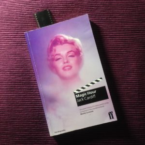
Book Review: “Magic Hour” by Jack Cardiff

If Roger Deakins is the greatest living cinematographer, Jack Cardiff must be the greatest one no longer with us. He is perhaps best known for his triptych of Technicolor collaborations with Powell & Pressburger – A Matter of Life and Death, Black Narcissus (which won Cardiff an Oscar and a Golden Globe) and The Red Shoes. But his career spanned a huge swathe of cinematic history, beginning in the days of the silent film and concluding in the age of action blockbusters like Rambo: First Blood Part II. Along the way he photographed many of the twentieth century’s most iconic movie stars: Humphrey Bogart, Sophia Loren, Errol Flynn, Marilyn Monroe, Laurence Olivier, Audrey Hepburn and Kirk Douglas, to name but a few.

Magic Hour is Cardiff’s autobiography, first published in 1996. (Yes, I’m reviewing this book 21 years late. Sorry.) From the beginning, his life was remarkable. His parents were travelling music hall performers, and he never stayed at the same school for long. But what he might have lacked in conventional education he more than made up for with a voracious appetite for literature and fine art.

One day, gazing at a roomful of paintings, I realized something starkly obvious that I’d never noticed before. Light! Now I gave all my attention to the way painters used light and also began the habit of analysing the light all around me: in rooms, buses, trains – everywhere. How light plays subtle tricks, bouncing off walls, how its various reflections and changed light sources can reveal much insight into the character of a face.

After a few movie appearances as a child actor, Cardiff found work as a camera assistant at Elstree, eventually rising to the rank of camera operator. One day, he and his fellow operators were interviewed to see who would go to America to learn all about the new Technicolor process. Cardiff cut short the technical questions and held forth on the great painters who inspired him. He was selected.

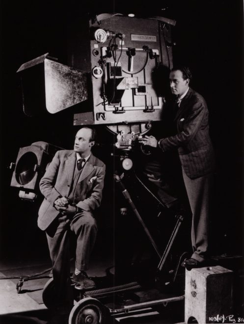
Cardiff (left) and his operator Geoffrey Unsworth with the comically huge Technicolor camera

The Technicolor camera was enormous and required precision maintenance, but Cardiff was to get stunning results from it.

Over the next quarter of a century, until the advent of single-film Eastmancolor, which tolled the death knell of the three-strip camera, I used this superb Rolls-Royce of a beauty all over the world in all kinds of dangerous situations: in steel foundries (inches away from molten ingots), in battleships in wartime seas, on top of erupting volcanoes, in burning deserts and steaming jungles, and diving on to the Colosseum in Rome in an old Italian bomber.

The above passage neatly sums up the kind of adventures Cardiff chronicles in Magic Hour. Anyone who’s ever worked on a film set will have a few ridiculous anecdotes to tell, and this man had a lifetime’s worth. For example, during World War II, Cardiff was tapped to lens a propaganda drama called Western Approaches. One scene required the sinking of a submarine, which was achieved without VFX of any kind, with the vessel doing a controlled dive to end up just short of total submersion. “My Technicolor camera was tied on to the extreme tip of the stern,” wrote Cardiff, “and I was operating it!”

Frame of Cardiff’s Oscar-winning work from “Black Narcissus” (1947, dir. Michael Powell & Emeric Pressburger)

After the war he came to the attention of director/producer team Michael Powell and Emeric Pressburger, leading to that famous triptych noted in my introduction, before going on to work with many other renowned filmmakers. His collaboration with Hitchcock, Under Capricorn, featured a memorable scene in which the four-foot-high Technicolor camera was required to track along the length of a dining table. This being impossible, the table was rigged to split apart as the camera advanced.

Now the camera moved forward, seemingly on an inevitable collision course, but at the last moment, each of the guests fell back on to a mattress clutching his section of the table with all the props stuck on it!

Magic Hour is beautifully and sincerely written, making you wish you could share a pint with the great man and hear even more of his beguiling tales of cinematic capers. Throughout the book, he provides unique insights into the off-screen lives of the Hollywood icons he worked alongside: his friendship with the “childlike, frightened Marilyn”; his unconsummated romance with Sophia Loren; his chat with Errol Flynn about the latter’s womanising, and many others.

Cardiff and Monroe on the set of “The Prince and the Showgirl” (1957)

We are also treated to fascinating glimpses into Cardiff’s creativity as a cinematographer. For example, when faced with an exterior close-up whose grey, cloudy background would not match earlier sunny wide shots, Cardiff shone an ungelled tungsten lamp on the talent and instructed the lab to correct for his skin tone. The lab duly added blue to the print, restoring the talent’s skin tone to normal and tinting the grey sky a perfect blue! Can you imagine performing such a risky experiment and not knowing until the following day whether it had succeeded or not? We digital DPs are truly spoilt.

Another example of Cardiff’s ingenuity was on 1956’s War and Peace, where he had to create a sunrise effect on a glass matte painting.

I placed a small lamp close beside my camera which was brightly reflected in the sheet of glass. [This had] pink and orange filters on it. Although a tiny lamp, its reflection in the glass looked exactly like a dawn sun on the horizon.

In the late fifities, Cardiff moved into directing, and the great critical and commercial success of his 1960 film Sons and Loverforms the denouement of Magic Hour. He later returned to DPing with such mainstream movies as Death on the Nile and Conan the Destroyer, a period of his life which Cardiff gives only a passing mention in the closing chapter. Perhaps he was less proud of the modern box office fodder than his earlier, arguably more artistic, work?

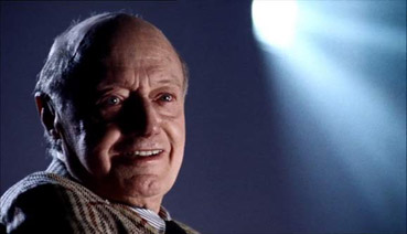
Cardiff in a shot from “Cameraman: The Life and Work of Jack Cardiff” (2010, dir. Craig McCall)

Cardiff died in 2009, the year before the release of the documentary feature Cameraman: The Life and Word of Jack Cardiff. Whether you choose to learn about Cardiff’s contributions to cinema from that excellent film or from the equally absorbing Magic Hour, learn you should. The word “legendary” is over-used, but Cardiff is more deserving of the adjective than most.

Book Review: “Magic Hour” by Jack Cardiff

Composing a Wide Shot

I have wanted to write a blog post about composition for ages, but I’ve procrastinated. Framing is such an instinctive and subjective thing; could I ever articulate how to do it? I’m still not sure, but at last I’m taking a deep breath and giving it a go. To help me, I’m using frame grabs from Best Cinematography Oscar-winning films of the last ten years or so, taken from the brilliant and handy website Cinematographer’s Index. Check it out and donate a few bucks if you can.


the rule of thirds

The Rule of Thirds is well known to most filmmakers. It suggests that you imagine the frame divided vertically and horizontally into thirds, then place the subject on one of the intersections of these lines.

However, composing images using The Rule of Thirds is like riding a bike using stabilisers. It’s something that you use before you’ve developed your own eye for composition.

Here are just a few examples of cinematography which completely ignore the rule, yet won Oscars. Guillermo Navarro puts his subject bang in the centre, in this scene from Pan’s Labyrinth

While Dion Beebe goes for an extreme off-set in Memoirs of a Geisha

In this scene from Life of Pi, Claudio Miranda places the two least important elements in the frame – the lifeboat and the sun – roughly on the thirds, but puts Pi himself right in the centre, and the distant ship off to the right…


ENclosing one SIDE

So, if we’re not using The Rule of Thirds, where do we start? I like to start with the edges of the frame, rather than some arbitrary points within in. I look for something to give me a reason to put the edge of the frame in a particular place.

As I touched on in my previous post, about Turner, it’s aesthetically pleasing to create a frame within a frame, but unless you’re shooting through a window you can’t always enclose the image on all four sides. Often the ground/horizon gives you a free framing along the bottom edge. So if you can frame just one more side, you’ve got an L-shaped frame (though the ‘L’ may be backwards) and you’re doing pretty well.

This is probably the most common compositional technique you’ll see in wide shots: a tree, wall or other vertical element enclosing the frame on one side. Pan’s Labyrinth again…

Here’s one from The Revenant (DP: Emmanuel Lubezki)…

It’s great when these enclosing elements are in the foreground, because they also serve to add depth to the image. But they can be in the background too, like the righthand skyscraper in this frame from Slumdog Millionaire (DP: Anthony Dod Mantle)…

Or in this one from Pan’s Labyrinth, where the mill wheel defines the height of the image as well as framing it on the left…

Sometimes, with flatter compositions, you can find an element on the same plane as the subject with which to frame the shot on one side, like the streetlamp on the left of this shot from Life of Pi. Note that the edge of the pond also provides strong framing along the bottom of the image…


ENCLOSING TWO SIDES

Placing enclosing elements on both sides of the frame, as well as being even more aesthetically pleasing than enclosing a single side, can suggest a situation from which the characters cannot escape. Consider these frames from, respectively, Inception (DP: Wally Pfister) and Road to Perdition (DP: Conrad Hall)…


Other frames within frames

In this shot from Hugo (DP: Robert Richardson), the architecture frames the image along the top and righthand side, while leaving it open in the bottom left, the direction towards which the subject is moving…

This shot from Life of Pi contains an interesting choice. The obvious – and far more dominant place – to put the subject would have been leaning against the foreground pillar on the right. Instead, Miranda makes the audience search for him in the frame…

Here, in Road to Perdition, the foreground character, the desk, the phone and the doorway all cradle and enclose the subject…


Pinning a corner

Sometimes it is impossible to enclose the image on any of its sides. In these cases I will at least try to pin a corner – to find an element that I can place just within a corner of the frame to anchor the composition. This frame from Hugo uses the lamp in the top right for this purpose…

Mantle uses the foreground tyre here in Slumdog Millionaire…

Navarro uses a chair in the bottom left of this Pan’s Labyrinth shot. Notice how the subject is placed on the imaginary line connecting the chair to the circular window in the background, which balances it out…

In this scene from Road to Perdition, Hall pins the top lefthand corner with the light fixture, then balances it beautifully with the shadows in the bottom right…

Indeed, the corner-pinning technique seems most effective when the diagonally opposite corner is opposite in other ways too – dark vs. light, close vs. far, warm vs. cold, etc.


Vanishing points

Vanishing points are a concept familiar to artists and technical drafters. You extend the image’s straight lines in perspective to the point where they vanish into the distance. Placing the subject of your image on a vanishing point will lead the viewer’s eyes right to them. Check out these examples from, respectively, Memoirs of a Geisha and Road to Perdition…

This shot from Slumdog Millionaire is a little more subtle, but follow the lines of the table and chair and you’ll end up right at the children…

And just to prove that rules are meant to be broken, here’s a Slumdog shot where the subjects are nowhere the vanishing point…


LEADING LINES

It’s not just vanishing points that provide satisfying spots to place your subject. Leading lines of any kind can draw the eye. In this shot from Inception, the vanishing point (the tip of the plane’s nose) would be somewhere in the extreme top-left corner of frame. Di Caprio isn’t on that vanishing point, but the rows of seats still lead our eyes to him…

In this shot from Sicario, Roger Deakins places both subjects over the corners of the house, where the buildings’ lines lead us to…

In The Revenant, this frame places the subjects at the point of the V formed by the sloping mounds…


Symmetry

I’ve touched on the concept of balance throughout this post, and I’ll probably need to write a whole other post to really get into it, but for now, here are some beautiful examples of the simplest way of giving a composition balance: symmetry…


So those are a few basic ways of approaching the composition of a wide shot. More composition posts to come, but meanwhile, you might like to check out my existing post on 2.39:1 composition.

Composing a Wide Shot

5 Principles of Cinematography We Can Learn from Turner

Yesterday I took a trip to The Tate Britain to see what I could learn about light and composition from the world of traditional art. My background is more technical than fine art, so this world is quite new to me. Within quarter of an hour of arriving, I had fallen in love with the work of JMW Turner. The way this man captured the natural moods of light and weather is breathtaking.

Here are five of Turner’s techniques for creating beautiful images which we can apply to cinematography.


1. Negative space

One of the most powerful things you can do with an area of the frame is to let it go black. A great example is Bill Pope’s work on The Matrix. But 200 years before that, Turner was embracing the darkness, emphasising those areas in the light, and allowing the viewer’s imagination to fill in the gaps.

“Jason” (1802) – That dragon is lurking in the shadows like a dodgy monster costume in a B-movie.
“Sketch of a Bank, with Gipsies” (1809) – The titular gypsies are barely visible in the black shadows, betrayed only by the smoke from their fire.


2. Layering

Any artist creating a 2D image strives to give the impression of depth and dimensionality. There are a number of techniques that can be used to achieve this, but one which Turner uses repeatedly is layering. See how the paintings below delineate foreground (light), midground (dark) and background (light again). The midgrounds sink into shadow, becoming negative space, reinforcing the link and relationship between the foregrounds and backgrounds. At the same time, the foreground figures stand out clearly and eye-catchingly against the shade behind them.

“The Tenth Plague of Egypt” (1802)
“The Goddess of Discord Choosing the Apple of Contention in the Garden of the Hesperides” (1806) – This painting contains five layers: light-dark-light-dark-light, highlighting the two groups of people and the monster in the distance.


3. Framing

Although most images we see are framed, be it by a gilt picture frame or by the black edges of a phone screen, there is something aesthetically pleasing about adding a second frame within the image itself. An extreme example would be shooting through a window, framing the image on all four sides, but more commonly we frame two or three sides of the image. Turner frequently does this using trees, buildings and shadowy ground.

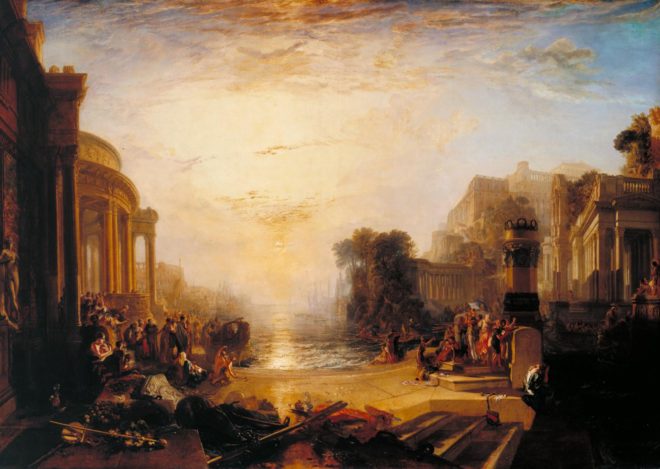
“The Decline of the Carthaginian Empire” (1817) – A backwards-‘J’-shaped frame is created by the dark foreground: the wall on the left, the shadowed floor across the bottom, and the dark space in the lower right. To balance the shorter part of the ‘J’ on the righthand side, the sun and its reflection (the focal point of the image) are placed left of centre.
“England: Richmond Hill, on the Prince Regent’s Birthday” (1819) – The dark ground and dark tree to the right create a backwards-L-shaped frame which appears to cradle the rest of the image like a waiter cradling plates in the crook of his elbow.


4. Dynamic Composition

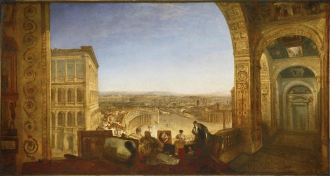
The composition of the two paintings below fascinates me. Both seem to be two images in one: a deep view of a settlement on the left, and a tapering tunnel perspective on the right. As I studied them, I found my eyes “panning” from one side to the other. As cinematographers, we can use actual camera movement to create a dynamic shot, but we should not forget Turner’s lesson here, that there can also be dynamism in static frames.

“Rome, from the Vatican. Raffaelle, Accompanied by La Fornarina, Preparing his Pictures for the Decoration of the Loggia” (1820)
“Palestrina – Composition” (1828)


5. Colour Contrast

Apart from stunningly demonstrating Turner’s power to create mood and atmosphere (a core skill for any DP), the two paintings below are great examples of warm/cool colour contrast. The yellows, oranges and reds of fire and sunset are juxtaposed with the blues of the sky. The result is pictures that really “pop”, arresting the viewer’s attention. A modern cinematographer can readily achieve a similar effect by playing natural daylight, and daylight sources like HMIs and Kinos, against practicals and other tungsten sources.

“Peace – Burial at Sea” (1842) – Contrast in both hue and luminance make this a powerfully evocative painting.
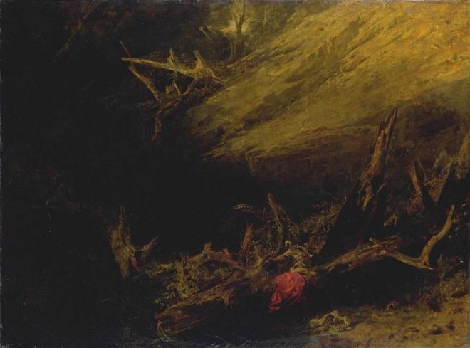
“War. The Exile and the Rock Limpet” (1842) – Note how Napoleon’s blue uniform causes him to stand out against the oranges of the sky, whilst the unimportant, red-garbed soldier behind him is allowed to blend into the background.

 
See also: my trip to the National Portrait Gallery.

5 Principles of Cinematography We Can Learn from Turner

9 Fun Photic Facts from a 70-year-old Book

Shortly before Christmas, while browsing the secondhand books in the corner of an obscure Herefordshire garden centre, I came across a small blue hardback called The Tricks of Light and Colour by Herbert McKay. Published in 1947, the book covered almost every aspect of light you could think of, from the inverse square law to camouflage and optical illusions. What self-respecting bibliophile cinematographer could pass that up?

Here are some quite-interesting things about light which the book describes…


1. SPHERES ARE THE KEY to understandING the inverse square law.

Any cinematographer worth their salt will know that doubling a subject’s distance from a lamp will quarter their brightness; tripling their distance will cut their brightness to a ninth; and so on.  This, of course, is the inverse square law. If you struggle to visualise this law and why it works the way it does, The Tricks of Light and Colour offers a good explanation.

[Think] of light being radiated from… a mere point. Light and heat are radiated in straight lines and in all directions [from this point]. At a distance of one foot from the glowing centre the whole quantity of light and heat is spread out over the surface of a sphere with a radius of one foot. At a distance of two feet from the centre it is spread over the surface of a sphere of radius two feet. Now to find an area we multiply two lengths; in the case of a sphere both lengths are the radius of the sphere. As both lengths are doubled the area is four times as great… We have the same amounts of light and heat spread over a sphere four times as great, and so the illumination and heating effect are reduced to a quarter as great.


2. MIRAGES ARE DUE TO Total internal reflection.

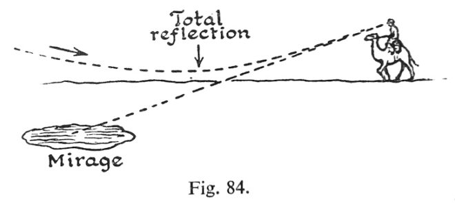
This is one of the things I dimly remember being taught in school, which this book has considerably refreshed me on. When light travels from one transparent substance to another, less dense, transparent substance, it bends towards the surface. This is called refraction, and it’s the reason that, for example, streams look shallower than they really are, when viewed from the bank. If the first substance is very dense, or the light ray is approaching the surface at a glancing angle, the ray might not escape at all, instead bouncing back down. This is called total internal reflection, and it’s the science behind mirages.

The heated sand heats the air above it, and so we get an inversion of the density gradient: low density along the heated surface, higher density in the cooler air above. Light rays are turned down, and then up, so that the scorched and weary traveller sees an image of the sky, and the images looks like a pool of cool water on the face of the desert.


3. Pinhole images pop up in unexpected places.

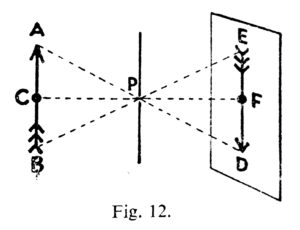
Most of us have made a pinhole camera at some point in our childhood, creating an upside-down image on a tissue paper screen by admitting light rays through a tiny opening. Make the opening bigger and the image becomes a blur, unless you have a lens to focus the light, as in a “proper” camera or indeed our eyes. But the pinhole imaging effect can occur naturally too. I’ve sometimes lain in bed in the morning, watching images of passing traffic or flapping laundry on a line projected onto my bedroom ceiling through the little gap where the curtains meet at the top. McKay describes another example:

One of the prettiest examples of the effect may be seen under trees when the sun shines brightly. The ground beneath a tree may be dappled with circles of light, some of them quite bright… When we look up through the leaves towards the sun we may see the origin of the circles of light. We can see points of light where the sun shines through small gaps between the leaves. Each of these gaps acts in the same way as a pinhole: it lets through rays from the sun which produce an image of the sun on the ground below.


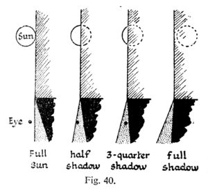
4. The sun isn’t a point source.

“Shadows are exciting,” McKay enthuses as he opens chapter VI. They certainly are to a cinematographer. And this cinematographer was excited to learn something about the sun and its shadow which is really quite obvious, but I had never considered before.

Look at the shadow of a wall. Near the base, where the shadow begins, the edge of the shadow is straight and sharp… Farther out, the edge of the shadow gets more and more fuzzy… The reason lies of course in the great sun itself. The sun is not a mere point of light, but a globe of considerable angular width.

The accompanying illustration shows how you would see all, part or none of the sun if you stood in a slightly different position relative to the hypothetical wall. The area where none of the sun is visible is of course in full shadow (umbra), and the area where the sun is partially visible is the fuzzy penumbra (the “almost shadow”).


5. Gravity bends LIGHT.

Einstein hypothesised that gravity could bend light rays, and observations during solar eclipses proved him right. Stars near to the eclipsed sun were seen to be slightly out of place, due to the huge gravitational attraction of the sun.

The effect is very small; it is too small to be observed when the rays pass a comparatively small body like the moon. We need a body like the sun, at whose surface gravity is 160 or 170 times as great as at the surface of the moon, to give an observable deviation…. The amount of shift depends on the apparent nearness of a star to the sun, that is, the closeness with which the rays of light from the star graze the sun. The effect of gravity fades out rapidly, according to the inverse square law, so that it is only near the sun that the effects can be observed.


6. Light helped us discover helium.

Sodium street-lamps are not the most pleasant of sources, because hot sodium vapour emits light in only two wave-lengths, rather than a continuous spectrum. Interestingly, cooler sodium vapour absorbs the same two wave-lengths. The same is true of other elements: they  emit certain wave-lengths when very hot, and absorb the same wave-lengths when less hot. This little bit of science led to a major discovery.

The sun is an extremely hot body surrounded by an atmosphere of less highly heated vapours. White light from the sun’s surfaces passes through these heated vapours before it reaches us; many wave-lengths are absorbed by the sun’s atmosphere, and there is a dark line in the spectrum for each wave-length that has been absorbed. The thrilling thing is that these dark lines tell us which elements are present in the sun’s atmosphere. It turned out that the lines in the sun’s spectrum represented elements already known on the earth, except for one small group of lines which were ascribed to a hitherto undetected element. This element was called helium (from helios, the sun).


7. Moonlight is slightly too dim for colours.

Our retinas are populated by two different types of photoreceptors: rods and cones. Rods are much more sensitive than cones, and enable us to see in very dim light once they’ve had some time to adjust. But rods cannot see colours. This is why our vision is almost monochrome in dark conditions, even under the light of a full moon… though only just…

The light of the full moon is just about the threshold, as we say, of colour vision; a little lighter and we should see colours.


8. MAGIC HOUR can be longer than an hour.

We cinematographers often think of magic “hour” as being much shorter than an hour. When prepping for a dusk-for-night scene on The Little Mermaid, I used my light meter to measure the length of shootable twilight. The result was 20 minutes; after that, the light was too dim for our Alexas at 800 ISO and our Cooke S4 glass at T2. But how long after sunset is it until there is literally no light left from the sun, regardless of how sensitive your camera is? McKay has this to say…

Twilight is partly explained as an effect of diffusion. When the sun is below the horizon it still illuminates particles of dust and moisture in the air. Some of the scattered light is thrown down to the earth’s surface… Twilight ends when the sun is 17° or 18° below the horizon. At the equator [for example] the sun sinks vertically at the equinoxes, 15° per hour; so it sinks 17° in 1 hour 8 minutes.


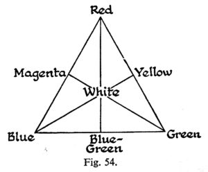
9. Why isn’t Green a primary colour in paint?

And finally, the answer to something that bugged me during my childhood. When I was a small child, daubing crude paintings of stick figures under cheerful suns, I was taught that the primary colours are red, blue and yellow. Later I learnt that the true primary colours, the additive colours of light, are red, blue and green. So why is it that green, a colour that cannot be created by mixing two other colours of light, can be created by mixing blue and yellow paints?

When white light falls on a blue pigment, the pigment absorbs reds and yellows; it reflects blue and also some green. A yellow pigment absorbs blue and violet; it reflects yellow, and also some red and green which are the colours nearest to it in the spectrum. When the two pigments are mixed it may be seen that all the colours are absorbed by one or other of the components except green.


If you’re interested in picking up a copy of The Tricks of Light and Colour yourself, there is one on Amazon at the time of writing, but it will set you back £35. Note that Herbert McKay is not to be confused with Herbert C. McKay, an American author who was writing books about stereoscopic photography at around the same time.

9 Fun Photic Facts from a 70-year-old Book

7 Female DPs You Didn’t Know You’ve Been Watching

We’ve all heard the shocking statistics about the tiny proportion of DPs who are women. So when you watch film and TV, sadly, you might assume that you’re always watching the cinematography of a man. Today’s post encourages you to think again.

To mark International Women’s Day, I’m highlighting the work of seven female DPs who are lensing mainstream productions, and whose cinematography you’ve probably seen. All of these women are great role models for aspiring DPs.


Sharon Calahan, ASC


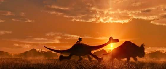
Raised in the USA’s Pacific Northwest, Calahan studied advertising art, illustration, and graphic design. Her first job was at a TV station, where she worked as an art director but also got involved in lighting sets. She joined Pixar just as the company was starting out, becoming the lighting supervisor on Toy Story, before graduating to director of photography for A Bug’s Life, Toy Story 2 and Finding Nemo. In 2014, Calahan became the first DP working purely in CGI to be admitted into the American Society of Cinematographers. By this time, her extensive experience of studying and mimicking natural light had led her to take up landscape painting, and for Pixar’s next release, The Good Dinosaur, director Peter Sohn used Calahan’s landscapes as the visual template for the entire look.
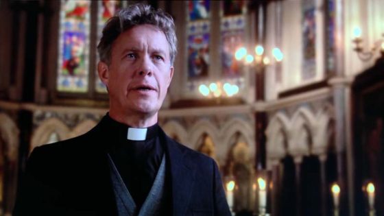
 

Anna Foerster, ASC


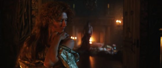
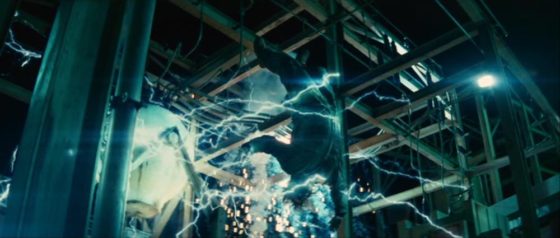
A German cinematographer and director, Foerster is perhaps best known for her collaborations with her fellow countryman Roland Emmerich. After working as an FX unit DP for him on Independence Day and Godzilla (1998), then second unit DP and director on Tomorrow and 10,000 BC, she graduated to first unit DP on Anonymous and White House Down. Anonymous is an independent historical thriller suggesting Shakespeare’s plays were actually written by Lord Oxford, while White House Down is of course an all-out action thriller. On the latter, Foerster came up with a number of clever tricks to hide the lighting units from the wide lenses she favoured. She also worked hard to sell the sound-stages that most of the movie was shot on as real day-lit interior and exterior locations. Foerster’s directing credits include Underworld: Blood Wars, and episodes of Outlander and Criminal Minds.


Sue Gibson, BSC

Derbyshire-born Gibson developed an interest in photography at the age of fourteen. She studied at Newport College of Art, then at the National Film and Television School (NFTS), graduating in 1981. After starting out in commercials, she shot her first feature, Hear My Song, in 1989, which won The Evening Standard Award for Technical Achievement. Her other feature credits include Mrs Dalloway and – in a very different genre – second unit on Alien vs. Predator. She worked extensively in British TV, particularly murder mystery, lensing episodes of Poirot, Marple, LewisSpooks and The Forsyte Saga. In 1992 Gibson became the first female member of the British Society of Cinematographers, and later served as its president between 2008-2010. She passed away last summer, and was posthumously awarded The Philips Vari-Lite Award for Drama at The Knight of Illuminations Awards for two of her Death in Paradise episodes, her final work.
 

Ellen Kuras, ASC

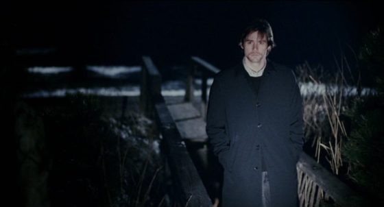
Born in New Jersey, Kuras studied photography and 8mm filmmaking after university, with a view to becoming a documentary filmmaker. After lensing the award-winning short doc Samsara: Death and Rebirth in Cambodia, her career diversified to eventually include such big-budget features as Blow and Analyze That. Kuras has also collaborated twice with French director Michel Gondry. In Eternal Sunshine of the Spotless Mind, she used her documentary background to put the realism into Gondry’s magical realism, with handheld cameras and naturalistic lighting. But she brought the magic too; for example, using a camera-mounted spotlight for a tunnel vision effect during the sequence in which Jim Carey and Kate Winslet try to hide within Carey’s memory. Although more classically composed, 2008’s Be Kind Rewind was similarly creative, featuring low-fi VHS recreations of big movies, and a memorable montage captured in a single developing shot. Kuras’ many awards include an unprecedented hat-trick of Best Dramatic Cinematography gongs at Sundance, and an Oscar nomination for The Betrayal – Nerakhoon, a documentary feature she directed.


Suzie Lavelle, ISC

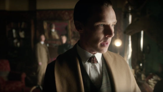
Lavelle is an Irish DP who studied at NFTS before entering the TV industry as an AC. Her sumptuous, colourful and contrasty lighting has featured in some of the BBC’s most high-profile TV dramas. “The Abominable Bride”, her Sherlock outing, was nominated for a Primetime Emmy in 2016. “Cold War”, her contribution to Doctor Who‘s 2013 season, is one of the best-looking and most atmospheric episodes the venerable series has ever produced.  And, along with James Mather, she swept away the dull photography of Ripper Street‘s first two seasons and established the much moodier style for season three that would continue for the rest of the show’s run. Lavelle’s other TV credits include VikingsThe Living and the Dead, Endeavour and Jekyll & Hyde, and she photographed the award-winning features One Hundred Mornings and The Other Side of Sleep.


Urszula Pontikos, BSC

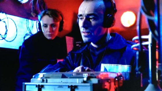
Hailing from Gdynia in Poland, Pontikos has photographed a number of indie features, including Weekend, Second Coming and Lilting. The latter won her the Cinematography Award for World Cinema (Dramatic) at Sundance 2014, but she’s also shot some of the most interesting British TV shows of recent years. Despite a self-confessed nervousness about the scale of the show’s night exteriors, Pontikos delivered confident, slick and atmospheric cinematography for BBC 1’s Cold War spy thriller The Game in 2014. The following year she photographed the first two episodes of Humans, setting the style for this hugely popular C4 sci-fi drama. She employed unusual eye-lights, symmetrical composition and linear camera moves for scenes featuring the robotic “synths”. Her other TV credits include the crime dramas Glue for E4 and Marcella for ITV.


Mandy Walker, ACS, ASC

Born and raised in Melbourne, Walker got her first industry contacts from a short film course she took after graduation. Persistently calling these contacts yielded some unpaid work and her first feature at the age of just 25. More Aussie features followed, until a Chanel Nº 5 commercial with Baz Luhrmann and Nicole Kidman propelled Walker into the big-time with an epic drama, entitled – of course – Australia. Since then, Walker has lensed the likes of Natalie Portman (Jane Got a Gun) and Robert Redford (Truth). Her latest release is Hidden Figures, an inspiring and important drama about African-American women who worked on Nasa’s space programme. Walker used subtle techniques to enhance the themes of racism and sexism, like placing the camera below the heroine’s eye-lines so that they were always looking up at the white men. Hidden Figures is in cinemas across the UK right now, and I highly recommend it.


That’s all for now, but some other great DPs to check out are Charlotte Bruus Christensen (The Girl on the Train), Uta Briesewitz, ASC (The Wire) and Cynthia Pusheck, ASC (Magnolia).

7 Female DPs You Didn’t Know You’ve Been Watching

“Above the Clouds”: February 2017 Pick-ups

Last weekend saw many of the crew of Above the Clouds reunite to shoot the remaining scenes of this comedy road movie. Principal photography was captured on an Alexa Mini during summer 2016 on location in Kent, on the Isle of Skye, and at Longcross Studio in Buckinghamshire, with additional location shooting on a Blackmagic Micro Cinema Camera in October.

The outstanding scenes were to be photographed on stage, at Halliford Studio in Shepperton, this time on an Arri Amira. The Amira uses the same sensor as the Alexas, allowing us to match the look from principal photography in the most cost-effective way. With the addition of a Premium license, the camera is capable of the same ProRes 4444 recording codec as the Alexas too. As per last summer, our glass was a set of Arri/Zeiss Ultra Primes, with a half Soft FX filter to take the digital edge off.

Director Leon Chambers designed and built the set himself, sending me photos of a scale model well in advance. He was also specific about certain lighting cues and states that were required across the two sets and six scenes we would be recording to complete the movie. Based on this information, I concocted a lighting plan, which I communicated to Halliford’s in-house gaffer Micky Reeves by Photoshopping stock images of lamps onto Leon’s set model photos.

Last Saturday was devoted to pre-lighting the sets, mainly the kitchen, while construction work continued on the second set.


Day 24 / Sunday

We begin with a morning scene. A 5K fresnel serves as a low sun, streaking across the back wall of the set (see my post about lighting through windows). Even with this direct light four stops over, the natural bounce off the set isn’t enough to bring actor Philip Jackson – with his back to the window – up to key. Micky rigs a Dedo firing into a soft silver bounce just out of frame to solve the problem.

Also coming through the window are two 4×4 kinos, rigged on goalposts above the window. Their daylight tubes reflect off the blinds, serendipitously creating the illusion of a blue sky “outdoors”, where in fact there is only a wall and a white backdrop.

Philip exits into the hallway and disappears from view, supposedly to go out through the front door. No door exists. Instead there is a flag which spark Amir Moulfi rotates in front of a 2K, creating a momentary oblong of light in which Philip’s shadow appears.

The next scene follows on from an exterior captured last October at dusk, when the natural light was soft, flat and cool in colour, cheated even cooler with the white balance. This failing daylight is to be the only source of illumination now in the kitchen set, until Philip enters and turns on the lights. This is the main reason that the daylight 4×4 kinos outside the window were rigged. A third kino from the direction of the front door is added, plus a small LED reporter light to pick an important prop out of the shadows.

Lead actress Naomi Morris enters, silhouetted against the windows. Then Philip enters and hits the lights. Simultaneously, Amir flips a breaker on a lunchbox, activating a hanging practical fixture above the breakfast bar and the 5K which that practical motivates.

Generally I don’t like toplight. It throws the eyes – those windows to the soul… or windows to the performance – into shadow. But with the hanging practical in shot, whatever I was going to use to beef it up had to be somewhat toppy or it wouldn’t make sense. I considered space-lights and Jem balls, but in consultation with Micky I ultimately picked a 5K with a chimera, coming in at a 45 degree back/toplight angle. As you can see from the photos, this looks almost comically large. But large and close means soft, which is what I want. It had to be soft enough to wrap both actors when they faced each other across the bar.


But why such a large lamp? Why not use a 2K, like Micky suggested yesterday? Bitter experience has always taught me to go with a bigger unit than you think you need, particularly if you’re softening it, and particularly if it’s going to take a while to rig. (The 5K was hung from another goalposts set-up.) We ended up dimming the 5K to 50% and scrimming it down a stop and a half. But having too much light like that is easy to deal with. If we had put up a 2K and it wasn’t bright enough, we would have to have taken the whole thing down and re-rigged with a 5K. And even if the 2K had seemed sufficient to begin with, blocking can often take actors into unexpected, dark corners of the set. Being able to turn up a dimmer a couple of notches to handle that kind of situation is very useful.

Besides the 5K, there are a few other sources playing: some 300W hairlights, a pup bouncing off the side of a cupboard to bring up the area around the cooker, a China ball in the hallway, and Leon’s Rosco LitePads serving as practical under-cabinet down-lighters.


Day 25 / Monday

I probably shouldn’t say what today’s set is, because it’s a little bit of a spoiler. There are some lighting similarities to the kitchen: again we have a character flicking a light switch, bringing on two hanging overhead practicals and a 2K with a chimera to beef them up.

A practical lamp on a desk was supposed to be turned on during the scene as well, but we all forget until it’s too late. It would have bounced off the desk and given Philip a little eye-light, and at first I regret losing this. But soon I realise that it is more appropriate for the scene not to have that level of refinement, for the lighting to be a little raw. The toppy, “broken key” angle of the chimera’s light works well for this tone too.

We wrap just before noon, releasing Naomi to high-tail it to Oxford to appear on stage in a musical this evening. Eventually there will be second-unit-style GVs and establishing shots to do, but there will only be three or four of us for that. For the cast and most of the crew, today brings Above the Clouds to an end, eight months after the camera first rolled.

See all my Above the Clouds posts here, or visit the official website.

“Above the Clouds”: February 2017 Pick-ups

Book Review: “Cinematography – Theory & Practice” by Blain Brown

Browsing in Waterstones not long ago, I came across the third edition of this hefty tome. Although it is clearly aimed primarily at the student market, a flick through convinced me that amongst the egg-sucking tutorials there was enough detail to make it a worthwhile reference book for grandma’s shelf.

The front cover proclaims the book to be “for cinematographer & directors”. The first five chapters are certainly applicable to directors, covering the visual language of cinematography, the metaphors of lighting and composition that help tell the story, the classifications of the various shot types, shooting to edit, and such core concepts as the line of action. Any director willing to read the remaining thirteen chapters, however, should really learn to delegate the techie stuff and go read something like An Actor Prepares instead.

These thirteen chapters cover in detail the topics of colour, exposure, digital sensors, dynamic range, colour space, image control, lighting, lenses, camera movement, on-set procedures and data management. As a devotee of the art of lighting, I was disappointed that this huge part of the DP’s role gets only two chapters. Perhaps this is because Brown has written a separate book devoted to illumination, though he has also written a book on digital imaging and that doesn’t stop him devoting multiple chapters in Cinematography: Theory & Practice to this subject.

Some of you may wonder why, in this age when you can google any topic of which your knowledge is lacking, you would buy a book. Firstly, finding something in the index of a book which you know you can trust can still be quicker and more effective than wading through search engine results. (I’ve already grabbed my copy off the shelf once to check the sensor size comparison chart.) Secondly, if you read the book cover to cover, amongst all the things you expected to learn, there will be unexpected nuggets of knowledge which a google search might never have led you to.

Perhaps the most interesting chapter for me was the one called “Cameras & Sensors”. It taught me loads about how digital sensors capture images, and how they are processed by the camera. And the chapter on “Linear, Gamma, Log” transformed my previously-hazy understanding of log-C into something much more concrete. The chapter on “Measurement” laid out some interesting pros and cons of waveform monitors, histograms, false colours and light meters, explaining how each has its place in choosing exposure.

Cinematography: Theory & Practice is generally well-written and laid out, but sometimes topics creep up in places that don’t quite make sense. It seems illogical, for example, that the chapter on lenses should come much later on than the one on cameras and sensors. Following the light path would have made much more sense to me. Also the proof-reader seems to have fallen asleep for a while, because there are a couple of chapters in the middle sprinkled with typos and minor errors.

If there is a fourth edition, I would like to see the lighting sections expanded, and some more nitty-gritty about how lenses work (Filmmaker IQ’s video on this topic is hard to beat).

These niggles aside, Brown has produced a very solid reference work. While reading it, I’ve been continually impressed by the depth and breadth of the author’s knowledge  – or perhaps the quality of his research. There is apparently a companion website containing useful videos, but I was unable to get past the splash page (possibly because I’m some kind of bibliophile Luddite).

For any student of cinematography, this book will provide an excellent grounding. As for working DPs, I would challenge any of them to read the book without learning at least something new. Maybe you won’t read it cover to cover, but I’d be surprised if you couldn’t find a few chapters that could helpfully plug some gaps in your knowledge.

Book Review: “Cinematography – Theory & Practice” by Blain Brown