Book Review: “Motion Studies” by Rebecca Solnit

A modern animation created from photographs from Muybridge’s “Animal Locomotion”, 1887

This is a book that caught my eye following my recent photography project, Stasis. In that project I made some limited explorations of the relationship between time, space and light, so Motion Studies: Time, Space and Eadweard Muybridge, to give it its full title, seemed like it would be on my current wavelength.

Like me a few weeks ago, you might be vaguely aware of Muybridge as the man who first photographed a trotting horse sharply enough to prove that all four of its legs left the ground simultaneously. You may have heard him called “The Father of Cinema”, because he was the first person to shoot a rapid sequence of images of a moving body, and the first person to reanimate those images on a screen.

Born in Kingston-on-Thames in 1830, Muybridge emigrated to San Francisco in the 1850s where, following a stint as a book seller and a near-fatal accident in a runaway carriage, he took up landscape photography. He shot spectacular views of Yosemite National Park and huge panoramas of his adopted city. In 1872 he was commissioned by the railroad tycoon Leland Stanford to photograph his racehorse Occident in motion. This developed into a vast project for Muybridge over the next decade or so, ultimately encompassing over 100,000 photos of humans and other animals in motion.
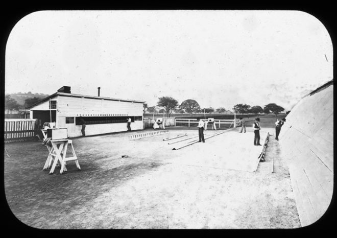
Muybridge’s set-up for his early motion studies, 1881. The cameras are in the shed on the left.

Much of his early work was accomplished on mammoth wet plates, 2ft wide, that had to be coated with emulsion just before exposure and developed quickly afterwards, necessitating a travelling darkroom tent. To achieve the quick exposures he needed to show the limbs of a   trotting horse without motion blur, he had to develop new chemistry and – with John Isaacs – a new electromagnetic shutter. The results were so different to anything that had been photographed before, that they were initially met with disbelief in some quarters, particularly amongst painters, who were eventually forced to recognise that they had been incorrectly portraying horse’s legs. Artists still use Muybridge’s motion studies today as references for dynamic anatomy.

“Boys Playing Leapfrog”, 1887

To “track” with the animals in motion, Muybridge used a battery of regularly-spaced cameras, each triggered by the feet of the subject pulling on a wire or thread as they passed. Sometimes he would surround a subject with cameras and trigger them all simultaneously, to get multiple angles on the same moment in time. Does that sound familiar? Yes, Muybridge invented Bullet Time over a century before The Matrix.

Muybridge was not the first person to project images in rapid succession to create the illusion of movement, but he was the first person to display photographed (rather than drawn) images in a such a way, to deconstruct motion and reassemble it elsewhere like a Star Trek transporter. In 1888 Muybridge met with Thomas Edison and discussed collaborating on a system to combine motion pictures with wax cylinder audio recordings, but nothing came of this idea which was decades ahead of its time. The same year, French inventor Louis Le Prince shot Roundhay Garden Scene, the oldest known film. A few years later, Edison patented his movie camera, and the Lumière brothers screened their world-changing Workers Leaving the Lumière Factory. The age of cinema had begun.

From “Animal Locomotion”, 1887

Although Muybridge is the centre of Solnit’s book, there is a huge amount of context. The author’s thesis is that Muybridge represents a turning point, a divider between the world he was born into – a world in which people and information could only travel as fast as they or a horse could walk or run, a world where every town kept its own time, where communities were close-knit and relatively isolated – and the world which innovations like his helped to create – the world of speed, of illusions, of instantaneous global communication, where physical distance is no barrier. Solnit draws a direct line from Muybridge’s dissection of time and Stanford’s dissection of space to the global multimedia village we live in today. Because of all this context, the book feels a little slow to get going, but as the story continues and the threads draw together, the value of it becomes clear, elucidating the meaning and significance of Muybridge’s work.
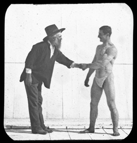
“Muybridge and Athlete”, circa 1887

I can’t claim to have ever been especially interested in history, but I found the book a fascinating lesson on the American West of the late nineteenth century, as well as a thoughtful analysis of the impact photography and cinematography have had on human culture and society. As usual, I’m reviewing this book a little late (it was first published in 2003!), but I heartily recommend checking it out if you’re at all interested in experimental photography or the origins of cinema.

Book Review: “Motion Studies” by Rebecca Solnit

Roger Deakins’ Oscar-winning Cinematography of “Blade Runner 2049”

After fourteen nominations, celebrated cinematographer Roger Deakins, CBE, BSC, ASC finally won an Oscar last night, for his work on Denis Villeneuve’s Blade Runner 2049. Villeneuve’s sequel to Ridley Scott’s 1982 sci-fi noir is not a perfect film; its measured, thoughtful pace is not to everyone’s taste, and it has serious issues with women – all of the female characters being highly sexualised, callously slaughtered, or both – but the Best Cinematography Oscar was undoubtedly well deserved. Let’s take a look at the photographic style Deakins employed, and how it plays into the movie’s themes.
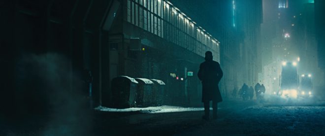
Blade Runner 2049 returns to the dystopian metropolis of Ridley Scott’s classic three decades later, introducing us to Ryan Gosling’s K. Like Harrison Ford’s Deckard before him, K is a titular Blade Runner, tasked with locating and “retiring” rogue replicants – artificial, bio-engineered people. He soon makes a discovery which could have huge implications both for himself and the already-strained relationship between humans and replicants. In his quest to uncover the truth, K must track down Deckard for some answers.

Villeneuve’s film meditates on deep questions of identity, creating a world in which you can never be sure who is or isn’t real – or even what truly constitutes being “real”. Deakins reinforces this existential uncertainty by reducing characters and locations to mere forms. Many scenes are shrouded in smog, mist, rain or snow, rendering humans and replicants alike as silhouettes.

K spends his first major scene seated in front of a window, the side-light bouncing off a nearby cabinet the only illumination on his face. Deakins’ greatest strength is his ability to adapt to whatever style each film requires, but if he has a recognisable signature it’s this courage to rely on a single source and let the rest of the frame go black.

Whereas Scott and his DP Jordan Cronenweth portrayed LA mainly at night, ablaze with pinpoints of light, Villeneuve and Deakins introduce it in daylight, but a daylight so dim and smog-ridden that it reveals even less than those night scenes from 1982.

All this is not to say that the film is frustratingly dark, or that audiences will struggle to make out what is going on. Shooting crisply on Arri Alexas with Arri/Zeiss Master Primes, Deakins is a master of ensuring that you see what you need to see.

A number of the film’s sequences are colour-coded, delineating them as separate worlds. The city is mainly fluorescent blues and greens, visually reinforcing the sickly state of society, with the police department – an attempt at justice in an insane world – a neutral white.

The Brutalist headquarters of Jared Leto’s blind entrepreneur Wallace are rendered in gold, as though the corporation attempted a friendly yellow but was corrupted by greed. These scenes also employ rippling reflections from pools of water. Whereas the watery light in the Tyrell HQ of Scott’s Blade Runner was a random last-minute idea by the director, concerned that his scene lacked enough interest and production value, here the light is clearly motivated by architectural water features. Yet it is used symbolically too, and very effectively so, as it underscores one of Blade Runner 2049’s most powerful scenes. At a point in the story where more than one character is calling their memories into question, the ripples playing across the walls are as intangible and illusory as those recollections. “I know what’s real,” Deckard asserts to Wallace, but both the photography and Ford’s performance bely his words.

The most striking use of colour is the sequence in which K first tracks Deckard down, hiding out in a Las Vegas that’s been abandoned since the detonation of a dirty bomb. Inspired by photos of the Australian dust storm of 2009, Deakins bathed this lengthy sequence in soft, orangey-red – almost Martian – light. This permeating warmth, contrasting with the cold artificial light of LA, underlines the personal nature of K’s journey and the theme of birth which is threaded throughout the film.

Deakins has stated in interviews that he made no attempt to emulate Cronenweth’s style of lighting, but nonetheless this sequel feels well-matched to the original in many respects. This has a lot to do with the traditional camerawork, with most scenes covered in beautifully composed static shots, and movement accomplished where necessary with track and dolly.

The visual effects, which bagged the film’s second Oscar, also drew on techniques of the past; the above featurette shows a Canon 1DC tracking through a miniature landscape at 2:29. “Denis and I wanted to do as much as possible in-camera,” Deakins told Variety, “and we insisted when we had the actors, at least, all the foreground and mid-ground would be in-camera.” Giant LED screens were used to get authentic interactive lighting from the advertising holograms on the city streets.

One way in which the lighting of the two Blade Runner movies is undeniably similar is the use of moving light sources to suggest an exciting world continuing off camera. (The infamous lens flares of J.J. Abrahms’ Star Trek served the same purpose, illustrating Blade Runner’s powerful influence on the science fiction genre.) But whereas, in the original film, the roving searchlights pierce the locations sporadically and intrusively, the dynamic lights of Blade Runner 2049 continually remodel the actors’ faces. One moment a character is in mysterious backlight, the next in sinister side-light, and the next in revealing front-light – inviting the audience to reassess who these characters are at every turn.

This obfuscation and transience of identity and motivation permeates the whole film, and is its core visual theme. The 1982 Blade Runner was a deliberate melding of sci-fi and film noir, but to me the sequel does not feel like noir at all. Here there is little hard illumination, no binary division of light and dark. Instead there is insidious soft light, caressing the edge of a face here, throwing a silhouette there, painting everyone on a continuous (and continuously shifting) spectrum between reality and artificiality.

Blade Runner 2049 is a much deeper and more subtle film than its predecessor, and Deakins’ cinematography beautifully reflects this.

Roger Deakins’ Oscar-winning Cinematography of “Blade Runner 2049”

My 5 Favourite Cinematographer Commentaries

I won my first DVD player in a trailer competition on a sort of YouTube forerunner site in December 2000. Over the next decade I was entertained and educated by many extras-packed Digital Versatile Discs. Now, of course, physical media is a thing of the past, but many of the anecdotes I heard in DVD commentaries have stuck in my mind. Some have even helped me on set when facing a new situation.

So, if you’ve got these discs on your shelf and never given the commentary a listen, or if you’re passing a CEX or Cash Convertor with a shiny new pound coin burning a hole in your pocket, you could do worse than seek out these classic chat tracks.


5. Moulin Rouge

DP Don McAlpine is actually quite quiet on this track, leaving director Baz Luhrmann and production designer Catherine Martin to do much of the work. This latter pair explain how sets, miniatures and CGI were blended to create the world of Moulin Rouge. At one point Luhrmann notes that he resisted the temptation to digitally stabilise the crane shots in the Elephant Love Medley, preferring to recall the look of classic 20th century musicals which did not have access to such postproduction trickery. A few nuggets we get from McAlpine include his use of blue light on Satine (Nicole Kidman) to make the most of her pale skin, the anachronistic use of follow spots for the stage shows, and how he was briefed by Luhrmann in one scene to light Jim Broadbent like the devil – which he did with flickering orange firelight from a low angle.

Highlight: Performing in what proves to be her final show, Satine wears a diamond necklace which reflects dazzling light onto Richard Roxburgh’s lustful duke. McAlpine reveals that he created the shimmering reflections by shaking some canvas with pieces of broken mirror on it.


4. X-Men 2

Although the DVD menu lists it as a director’s commentary, Bryan Singer in fact pairs up with his DP Newton Thomas Sigel for this track. Sigel discusses the importance of building practicals into the sets to enhance realism and flexibility of shooting. He explains how he colour-coded certain scenes so that the audience would more readily understand where they were during the fast-paced action sequences; for example, the corridors of the Alkali Lake bunker were lit with a moss green.

Highlight: The brutal claw-fight between Wolverine and Lady Deathstrike features dynamic and unusual camerawork. Sigel and Singer reveal that they used a cable rig to swoop the camera towards the duelling mutants, knowing that the camera would bounce back when it reached the end of its cable, but embracing this for the extra energy it added to the sequence.


3. Garden State

DP Lawrence Sher shares (no pun intended) a commentary track with director Zach Braff and production designer Judy Becker. The trio give an insight into the way that the moods and emotions of the film were enhanced by the colours, design, framing and camera movement. Braff and Sher chose a static look with strong compositions, punctuated by occasional Technocrane moves and at least one quasi-crane move that was actually captured on a Steadicam. Various happy (and unhappy) accidents helped shape the look too, like the constant rain throughout the exterior shoots, the mist and flaring practicals in the pool party scene, and the square of light on the airport wall behind Braff and Natalie Portman in the final shot.

Highlight: Sher explains the use of different film stocks to delineate threads of the story. Scenes with Large’s father (Ian Holm) were rendered cold and clinical by shooting on a sharper, harder Kodak film, while Portman’s sequences were imbued with organic warmth by Fuji stock. The feel was further enhanced by lighting and the colour choices in the respective sets.


2. Alien 3

The departure of director David Fincher from Alien 3 – under a cloud of studio interference and re-edits – is an infamous part of movie lore. Less well known is that the director of photography changed a week into shooting, after original DP Jordan Cronenworth (of Blade Runner fame) fell ill. Alex Thompson stepped in, and his humble, soft-spoken observations are spliced with other crew and cast members to form the commentary track on the Alien Quadrilogy boxset version of this film. Throughout the track he explains how he created the cool, toppy look of the prison’s communal areas, the dark, shadowy environs of the basements, and the hot, hellish feel of the lead-works. There are some interesting remarks about practicals too, such as the deliberate use of mismatched, low-CRI fluorescent tubes to give the canteen a run-down look, and tips for creating convincing firelight flicker.

Highlight: To create the illusion of glowing molten metal in the colony’s lead-works set, Thompson placed a veritable arsenal of lamps – almost 1,000 amps’ worth – underneath sheets of trace. Despite their brilliance, the individual units were still visible on camera, rather than a continuous white glow. According to Thompson, it was Fincher who came to the rescue, wiping grease from the side of his nose onto the lens to diffuse the offending lamps. I hope he let the AC put an optical flat on first!


1. Armageddon

Whatever you think of this slice of outer-space Bayhem, there’s no denying that DP John Schwartzman’s commentary on the Criterion Collection edition (spliced in with two of the film’s scientific advisors) is a fascinating insight into photographing the biggest of big-budget blockbusters. Schwartzman reveals that seven miles of cable were laid by his electrical department in preparation for extreme wide shots of the Armadillo vehicle travelling across the asteroid – in reality the South Dakota Badlands at night. Elsewhere he discusses lighting through coloured windows, shooting under UV lights (pictured above), dealing with spacesuit helmet reflections, and how Spielberg’s lens-meister Janusz Kaminski stepped in to shoot pick-ups of meteorites wiping out Shanghai.

Highlight: Schwartzman and his team photographed two real shuttle launches for the movie. Nasa decreed that the 35mm cameras had to sit in position on the launchpad, threaded with film and ready to go, for two days before take-off. The camera dept undertook extensive testing to making this possible, dealing with such problems as the condensation that would form as the temperature changed over the 48 hours. When they returned to the cameras after the launch and examined the one which had been the closest to the shuttle’s rocket motors, they discovered that the lens was in pieces, the vibrations having undone every single screw!

My 5 Favourite Cinematographer Commentaries

Book Review: “Magic Hour” by Jack Cardiff

If Roger Deakins is the greatest living cinematographer, Jack Cardiff must be the greatest one no longer with us. He is perhaps best known for his triptych of Technicolor collaborations with Powell & Pressburger – A Matter of Life and Death, Black Narcissus (which won Cardiff an Oscar and a Golden Globe) and The Red Shoes. But his career spanned a huge swathe of cinematic history, beginning in the days of the silent film and concluding in the age of action blockbusters like Rambo: First Blood Part II. Along the way he photographed many of the twentieth century’s most iconic movie stars: Humphrey Bogart, Sophia Loren, Errol Flynn, Marilyn Monroe, Laurence Olivier, Audrey Hepburn and Kirk Douglas, to name but a few.

Magic Hour is Cardiff’s autobiography, first published in 1996. (Yes, I’m reviewing this book 21 years late. Sorry.) From the beginning, his life was remarkable. His parents were travelling music hall performers, and he never stayed at the same school for long. But what he might have lacked in conventional education he more than made up for with a voracious appetite for literature and fine art.

One day, gazing at a roomful of paintings, I realized something starkly obvious that I’d never noticed before. Light! Now I gave all my attention to the way painters used light and also began the habit of analysing the light all around me: in rooms, buses, trains – everywhere. How light plays subtle tricks, bouncing off walls, how its various reflections and changed light sources can reveal much insight into the character of a face.

After a few movie appearances as a child actor, Cardiff found work as a camera assistant at Elstree, eventually rising to the rank of camera operator. One day, he and his fellow operators were interviewed to see who would go to America to learn all about the new Technicolor process. Cardiff cut short the technical questions and held forth on the great painters who inspired him. He was selected.

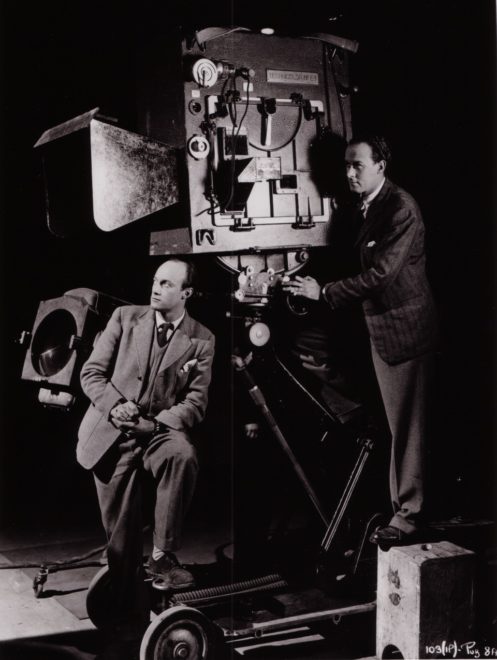
Cardiff (left) and his operator Geoffrey Unsworth with the comically huge Technicolor camera

The Technicolor camera was enormous and required precision maintenance, but Cardiff was to get stunning results from it.

Over the next quarter of a century, until the advent of single-film Eastmancolor, which tolled the death knell of the three-strip camera, I used this superb Rolls-Royce of a beauty all over the world in all kinds of dangerous situations: in steel foundries (inches away from molten ingots), in battleships in wartime seas, on top of erupting volcanoes, in burning deserts and steaming jungles, and diving on to the Colosseum in Rome in an old Italian bomber.

The above passage neatly sums up the kind of adventures Cardiff chronicles in Magic Hour. Anyone who’s ever worked on a film set will have a few ridiculous anecdotes to tell, and this man had a lifetime’s worth. For example, during World War II, Cardiff was tapped to lens a propaganda drama called Western Approaches. One scene required the sinking of a submarine, which was achieved without VFX of any kind, with the vessel doing a controlled dive to end up just short of total submersion. “My Technicolor camera was tied on to the extreme tip of the stern,” wrote Cardiff, “and I was operating it!”

Frame of Cardiff’s Oscar-winning work from “Black Narcissus” (1947, dir. Michael Powell & Emeric Pressburger)

After the war he came to the attention of director/producer team Michael Powell and Emeric Pressburger, leading to that famous triptych noted in my introduction, before going on to work with many other renowned filmmakers. His collaboration with Hitchcock, Under Capricorn, featured a memorable scene in which the four-foot-high Technicolor camera was required to track along the length of a dining table. This being impossible, the table was rigged to split apart as the camera advanced.

Now the camera moved forward, seemingly on an inevitable collision course, but at the last moment, each of the guests fell back on to a mattress clutching his section of the table with all the props stuck on it!

Magic Hour is beautifully and sincerely written, making you wish you could share a pint with the great man and hear even more of his beguiling tales of cinematic capers. Throughout the book, he provides unique insights into the off-screen lives of the Hollywood icons he worked alongside: his friendship with the “childlike, frightened Marilyn”; his unconsummated romance with Sophia Loren; his chat with Errol Flynn about the latter’s womanising, and many others.

Cardiff and Monroe on the set of “The Prince and the Showgirl” (1957)

We are also treated to fascinating glimpses into Cardiff’s creativity as a cinematographer. For example, when faced with an exterior close-up whose grey, cloudy background would not match earlier sunny wide shots, Cardiff shone an ungelled tungsten lamp on the talent and instructed the lab to correct for his skin tone. The lab duly added blue to the print, restoring the talent’s skin tone to normal and tinting the grey sky a perfect blue! Can you imagine performing such a risky experiment and not knowing until the following day whether it had succeeded or not? We digital DPs are truly spoilt.

Another example of Cardiff’s ingenuity was on 1956’s War and Peace, where he had to create a sunrise effect on a glass matte painting.

I placed a small lamp close beside my camera which was brightly reflected in the sheet of glass. [This had] pink and orange filters on it. Although a tiny lamp, its reflection in the glass looked exactly like a dawn sun on the horizon.

In the late fifities, Cardiff moved into directing, and the great critical and commercial success of his 1960 film Sons and Loverforms the denouement of Magic Hour. He later returned to DPing with such mainstream movies as Death on the Nile and Conan the Destroyer, a period of his life which Cardiff gives only a passing mention in the closing chapter. Perhaps he was less proud of the modern box office fodder than his earlier, arguably more artistic, work?

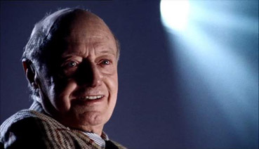
Cardiff in a shot from “Cameraman: The Life and Work of Jack Cardiff” (2010, dir. Craig McCall)

Cardiff died in 2009, the year before the release of the documentary feature Cameraman: The Life and Word of Jack Cardiff. Whether you choose to learn about Cardiff’s contributions to cinema from that excellent film or from the equally absorbing Magic Hour, learn you should. The word “legendary” is over-used, but Cardiff is more deserving of the adjective than most.

Book Review: “Magic Hour” by Jack Cardiff

9 Fun Photic Facts from a 70-year-old Book

Shortly before Christmas, while browsing the secondhand books in the corner of an obscure Herefordshire garden centre, I came across a small blue hardback called The Tricks of Light and Colour by Herbert McKay. Published in 1947, the book covered almost every aspect of light you could think of, from the inverse square law to camouflage and optical illusions. What self-respecting bibliophile cinematographer could pass that up?

Here are some quite-interesting things about light which the book describes…


1. SPHERES ARE THE KEY to understandING the inverse square law.

Any cinematographer worth their salt will know that doubling a subject’s distance from a lamp will quarter their brightness; tripling their distance will cut their brightness to a ninth; and so on.  This, of course, is the inverse square law. If you struggle to visualise this law and why it works the way it does, The Tricks of Light and Colour offers a good explanation.

[Think] of light being radiated from… a mere point. Light and heat are radiated in straight lines and in all directions [from this point]. At a distance of one foot from the glowing centre the whole quantity of light and heat is spread out over the surface of a sphere with a radius of one foot. At a distance of two feet from the centre it is spread over the surface of a sphere of radius two feet. Now to find an area we multiply two lengths; in the case of a sphere both lengths are the radius of the sphere. As both lengths are doubled the area is four times as great… We have the same amounts of light and heat spread over a sphere four times as great, and so the illumination and heating effect are reduced to a quarter as great.


2. MIRAGES ARE DUE TO Total internal reflection.

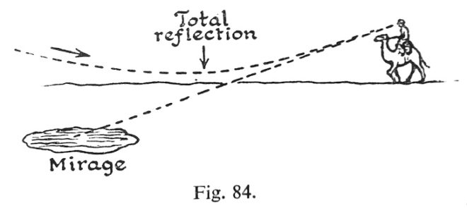
This is one of the things I dimly remember being taught in school, which this book has considerably refreshed me on. When light travels from one transparent substance to another, less dense, transparent substance, it bends towards the surface. This is called refraction, and it’s the reason that, for example, streams look shallower than they really are, when viewed from the bank. If the first substance is very dense, or the light ray is approaching the surface at a glancing angle, the ray might not escape at all, instead bouncing back down. This is called total internal reflection, and it’s the science behind mirages.

The heated sand heats the air above it, and so we get an inversion of the density gradient: low density along the heated surface, higher density in the cooler air above. Light rays are turned down, and then up, so that the scorched and weary traveller sees an image of the sky, and the images looks like a pool of cool water on the face of the desert.


3. Pinhole images pop up in unexpected places.

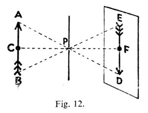
Most of us have made a pinhole camera at some point in our childhood, creating an upside-down image on a tissue paper screen by admitting light rays through a tiny opening. Make the opening bigger and the image becomes a blur, unless you have a lens to focus the light, as in a “proper” camera or indeed our eyes. But the pinhole imaging effect can occur naturally too. I’ve sometimes lain in bed in the morning, watching images of passing traffic or flapping laundry on a line projected onto my bedroom ceiling through the little gap where the curtains meet at the top. McKay describes another example:

One of the prettiest examples of the effect may be seen under trees when the sun shines brightly. The ground beneath a tree may be dappled with circles of light, some of them quite bright… When we look up through the leaves towards the sun we may see the origin of the circles of light. We can see points of light where the sun shines through small gaps between the leaves. Each of these gaps acts in the same way as a pinhole: it lets through rays from the sun which produce an image of the sun on the ground below.


4. The sun isn’t a point source.

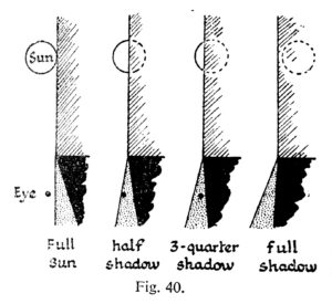
“Shadows are exciting,” McKay enthuses as he opens chapter VI. They certainly are to a cinematographer. And this cinematographer was excited to learn something about the sun and its shadow which is really quite obvious, but I had never considered before.

Look at the shadow of a wall. Near the base, where the shadow begins, the edge of the shadow is straight and sharp… Farther out, the edge of the shadow gets more and more fuzzy… The reason lies of course in the great sun itself. The sun is not a mere point of light, but a globe of considerable angular width.

The accompanying illustration shows how you would see all, part or none of the sun if you stood in a slightly different position relative to the hypothetical wall. The area where none of the sun is visible is of course in full shadow (umbra), and the area where the sun is partially visible is the fuzzy penumbra (the “almost shadow”).


5. Gravity bends LIGHT.

Einstein hypothesised that gravity could bend light rays, and observations during solar eclipses proved him right. Stars near to the eclipsed sun were seen to be slightly out of place, due to the huge gravitational attraction of the sun.

The effect is very small; it is too small to be observed when the rays pass a comparatively small body like the moon. We need a body like the sun, at whose surface gravity is 160 or 170 times as great as at the surface of the moon, to give an observable deviation…. The amount of shift depends on the apparent nearness of a star to the sun, that is, the closeness with which the rays of light from the star graze the sun. The effect of gravity fades out rapidly, according to the inverse square law, so that it is only near the sun that the effects can be observed.


6. Light helped us discover helium.

Sodium street-lamps are not the most pleasant of sources, because hot sodium vapour emits light in only two wave-lengths, rather than a continuous spectrum. Interestingly, cooler sodium vapour absorbs the same two wave-lengths. The same is true of other elements: they  emit certain wave-lengths when very hot, and absorb the same wave-lengths when less hot. This little bit of science led to a major discovery.

The sun is an extremely hot body surrounded by an atmosphere of less highly heated vapours. White light from the sun’s surfaces passes through these heated vapours before it reaches us; many wave-lengths are absorbed by the sun’s atmosphere, and there is a dark line in the spectrum for each wave-length that has been absorbed. The thrilling thing is that these dark lines tell us which elements are present in the sun’s atmosphere. It turned out that the lines in the sun’s spectrum represented elements already known on the earth, except for one small group of lines which were ascribed to a hitherto undetected element. This element was called helium (from helios, the sun).


7. Moonlight is slightly too dim for colours.

Our retinas are populated by two different types of photoreceptors: rods and cones. Rods are much more sensitive than cones, and enable us to see in very dim light once they’ve had some time to adjust. But rods cannot see colours. This is why our vision is almost monochrome in dark conditions, even under the light of a full moon… though only just…

The light of the full moon is just about the threshold, as we say, of colour vision; a little lighter and we should see colours.


8. MAGIC HOUR can be longer than an hour.

We cinematographers often think of magic “hour” as being much shorter than an hour. When prepping for a dusk-for-night scene on The Little Mermaid, I used my light meter to measure the length of shootable twilight. The result was 20 minutes; after that, the light was too dim for our Alexas at 800 ISO and our Cooke S4 glass at T2. But how long after sunset is it until there is literally no light left from the sun, regardless of how sensitive your camera is? McKay has this to say…

Twilight is partly explained as an effect of diffusion. When the sun is below the horizon it still illuminates particles of dust and moisture in the air. Some of the scattered light is thrown down to the earth’s surface… Twilight ends when the sun is 17° or 18° below the horizon. At the equator [for example] the sun sinks vertically at the equinoxes, 15° per hour; so it sinks 17° in 1 hour 8 minutes.


9. Why isn’t Green a primary colour in paint?

And finally, the answer to something that bugged me during my childhood. When I was a small child, daubing crude paintings of stick figures under cheerful suns, I was taught that the primary colours are red, blue and yellow. Later I learnt that the true primary colours, the additive colours of light, are red, blue and green. So why is it that green, a colour that cannot be created by mixing two other colours of light, can be created by mixing blue and yellow paints?

When white light falls on a blue pigment, the pigment absorbs reds and yellows; it reflects blue and also some green. A yellow pigment absorbs blue and violet; it reflects yellow, and also some red and green which are the colours nearest to it in the spectrum. When the two pigments are mixed it may be seen that all the colours are absorbed by one or other of the components except green.


If you’re interested in picking up a copy of The Tricks of Light and Colour yourself, there is one on Amazon at the time of writing, but it will set you back £35. Note that Herbert McKay is not to be confused with Herbert C. McKay, an American author who was writing books about stereoscopic photography at around the same time.

9 Fun Photic Facts from a 70-year-old Book

Book Review: “Cinematography – Theory & Practice” by Blain Brown

Browsing in Waterstones not long ago, I came across the third edition of this hefty tome. Although it is clearly aimed primarily at the student market, a flick through convinced me that amongst the egg-sucking tutorials there was enough detail to make it a worthwhile reference book for grandma’s shelf.

The front cover proclaims the book to be “for cinematographer & directors”. The first five chapters are certainly applicable to directors, covering the visual language of cinematography, the metaphors of lighting and composition that help tell the story, the classifications of the various shot types, shooting to edit, and such core concepts as the line of action. Any director willing to read the remaining thirteen chapters, however, should really learn to delegate the techie stuff and go read something like An Actor Prepares instead.

These thirteen chapters cover in detail the topics of colour, exposure, digital sensors, dynamic range, colour space, image control, lighting, lenses, camera movement, on-set procedures and data management. As a devotee of the art of lighting, I was disappointed that this huge part of the DP’s role gets only two chapters. Perhaps this is because Brown has written a separate book devoted to illumination, though he has also written a book on digital imaging and that doesn’t stop him devoting multiple chapters in Cinematography: Theory & Practice to this subject.

Some of you may wonder why, in this age when you can google any topic of which your knowledge is lacking, you would buy a book. Firstly, finding something in the index of a book which you know you can trust can still be quicker and more effective than wading through search engine results. (I’ve already grabbed my copy off the shelf once to check the sensor size comparison chart.) Secondly, if you read the book cover to cover, amongst all the things you expected to learn, there will be unexpected nuggets of knowledge which a google search might never have led you to.

Perhaps the most interesting chapter for me was the one called “Cameras & Sensors”. It taught me loads about how digital sensors capture images, and how they are processed by the camera. And the chapter on “Linear, Gamma, Log” transformed my previously-hazy understanding of log-C into something much more concrete. The chapter on “Measurement” laid out some interesting pros and cons of waveform monitors, histograms, false colours and light meters, explaining how each has its place in choosing exposure.

Cinematography: Theory & Practice is generally well-written and laid out, but sometimes topics creep up in places that don’t quite make sense. It seems illogical, for example, that the chapter on lenses should come much later on than the one on cameras and sensors. Following the light path would have made much more sense to me. Also the proof-reader seems to have fallen asleep for a while, because there are a couple of chapters in the middle sprinkled with typos and minor errors.

If there is a fourth edition, I would like to see the lighting sections expanded, and some more nitty-gritty about how lenses work (Filmmaker IQ’s video on this topic is hard to beat).

These niggles aside, Brown has produced a very solid reference work. While reading it, I’ve been continually impressed by the depth and breadth of the author’s knowledge  – or perhaps the quality of his research. There is apparently a companion website containing useful videos, but I was unable to get past the splash page (possibly because I’m some kind of bibliophile Luddite).

For any student of cinematography, this book will provide an excellent grounding. As for working DPs, I would challenge any of them to read the book without learning at least something new. Maybe you won’t read it cover to cover, but I’d be surprised if you couldn’t find a few chapters that could helpfully plug some gaps in your knowledge.

Book Review: “Cinematography – Theory & Practice” by Blain Brown

Book Review: “Green Screen Made Easy”

coverMicro-filmmaker Magazine’s Jeremy Hanke recently got in touch and asked if I would review his book, “Green Screen Made Easy”. I used to make a lot of micro- and no-budget movies packed full of VFX, but I usually avoided green-screen because I could never make it look good. Although those kind of projects are behind me, I agreed to the review because I figured that this book might help others succeed where I’d failed – and also I was interested to find out why I had failed!

What Jeremy and his co-author Michele Terpstra set out to do is to cover the entire process from start to finish: defining chromakeying, buying or building a green screen, lighting and shooting it, sourcing or shooting background plates, choosing keying software, and all aspects of the keying itself.

The book is aimed at no-budget filmmakers, hobbyists or aspiring professionals making self-funded or crowd-funded productions, those digital auteurs who are often their own producers, writers, DPs, editors, colourists and VFX artists. Perhaps you’ve tried green-screening before and been disappointed with the results. Perhaps you’ve always seen it as a bit too “techie” for you. Perhaps the unpaid VFX artist you had lined up for your sci-fi feature just pulled out. Or perhaps you’ve already reached a certain level of competency with keying and now you want to step up a level for your next production. If any of these scenarios ring true with you, I believe you’ll find this book very useful.

“Green Screen Made Easy” is divided into two halves, the first half (by Jeremy) on prepping and executing your green screen shoot, and the second half (by Michele) on the postproduction process. Both authors clearly write from extensive first-hand experience; throughout the text are the kind of tips and work-arounds that only come from long practice. By necessity there is a fair amount of technical content, but everything is lucidly explained and there’s a handy glossary if any of the terms are unfamiliar to you.

camera-techniquesThe section on lighting and shooting green screen material contained few surprises for me as a cinematographer – see my post on green screen for my own tips on this subject – but will be very useful to those newer to the field. The chapters on equipment are very thorough, considering everything from which camera and settings to choose to ensure the best key later on, to buying or building a mobile green screen, or even kitting out your own green screen studio – all with various alternatives to suit any budget.

The postproduction chapters revealed clearly why I struggled with keying in the past. Michele explains how the process is much more than simply pulling a single key, and can involve footage clean-up, garbage matting, a core key and a separate edge key, spill suppression, hold-out matting and light wrapping. The book guides you through all these steps, and outlines the pros and cons of the software and plug-in options for each step.

4picsOnce you’ve read this book, I’d say the only other thing you’ll need before you can start successfully green-screening is to watch some YouTube tutorial videos specific to your software. While the instructions in the book look pretty good (as far as I can tell without attempting to follow them) the medium of text seems a little restrictive in teaching what is inherently a visual process. There are explanatory images throughout “Green Screen Made Easy”, but in the ebook version at least I found it difficult to discern the subtle differences in some of the before-and-after comparisons.

Ultimately what will make you the best “green-screener” is practice, practice, practice, but by reading this book first you’ll give yourself a rock-solid foundation, an appreciation of the entire process from start to finish, and the insider knowledge to avoid a lot of time-sucking pitfalls. And keep it handy, because you’ll be sure to thumb through it and re-read those handy tips throughout your prep, production and post.

“Green Screen Made Easy” is available in paperback and ebook editions from Amazon.

Book Review: “Green Screen Made Easy”

Star Wars Episode VII: The Feminism Awakens (Spoilers)

Star-Wars-7-Character-Guide-Finn-Rey

J.J. Abrams, though one of my favourite directors, has something of a chequered past when it comes to representing women on screen. Although noted for female leads in some of his projects (the TV shows Felicity, Alias and Fringe), he’s not averse to showing them in their underwear to grab ratings or boost ticket sales. The season four premier of Alias springs to mind – a scene with Jennifer Garner in lingerie was brought to the start of the episode as a flash-forward in a cynical effort to hook audiences – as does the gratuitous shot of Alice Eve in her underwear in Star Trek Into Darkness, which rightly caused an internet furore.

So I waited with mixed feelings to see where Star Wars Episode VII: The Force Awakens would fall on the misogyny/feminism spectrum. BEWARE: SPOILERS AHEAD.

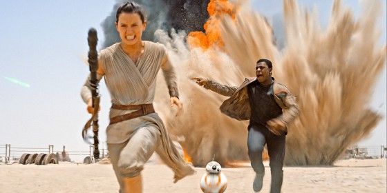
The film presents two new central characters, vying for the position of protagonist: John Boyega’s Finn and Daisy Ridley’s Rey. For the first few reels, the script seems to be trying too hard to be feminist: Rey is constantly rebuffing Finn’s patronising attempts to protect her. This reeks suspiciously of the “post-sexism” portrayal of female characters, whereby they serve the same old plot function of damsel in distress, but are made “strong” by perfunctory attempts to assert their authority and complaints about how reckless and useless the men are – even though the patriarchal script still has those same men save the day.

screen shot 2015-10-19 at 10.31.30 pmThis theory seems to be confirmed as Rey is knocked unconscious and carried off to the villain’s lair, leaving us to assume her plot function is indeed just to be rescued by Finn. Aboard the Death Star, or whatever they’re calling it, villain Kylo Ren creepily remarks that he can take whatever he wants from her. He proceeds to mind-rape her with the Force – a much darker interrogation than Vader’s implied use of the floating spiky ball thing on Leia in episode IV. But the film toys with our expectations as Rey turns this invasion back on Ren, and subsequently escapes her cell through her own agency.

Things get patriarchal again when a climactic light sabre battle sees Rey knocked unconscious as Finn fights the villain. But suddenly J.J. turns the tables. Rey recovers, Finn is knocked unconscious, and Rey triumphantly defeats the antagonist with a bad-ass combination of physical and mental prowess. At least, she defeats him as much as the antagonist can ever be defeated in the first part of a trilogy. Presumably in Episode IX she’ll send him spiralling fatally into the depths of a bottomless shaft, since the whole plot is just a re-run of the original films.

2326134Despite its female protagonist, Episode VII’s feminism is far from perfect. In common with other female leads in contemporary cinema, Rey is surrounded by a sea of male characters, as if the filmmakers have to compensate the audience for the lack of one big leading penis with a plethora of supporting penises. The movie only passes the Bechdel Test by the skin of its teeth, as far as I can recall – Rey’s conversation with Maz Kanata being at least partly about Luke, and dialogue between Rey and Leia not occurring until the film’s closing minutes.

Frequently throughout the running time, Rey is referred to simply as “the girl”. This is a recurring and worrying theme in genre movies: “Give me the girl”, “Let the girl go and I’ll give you the MacGuffin”, etc, etc. Apparently women are so insignificant and interchangeable that they need no names. Let’s hope that J.J. and co-writers Lawrence Kasdan and Michael Arndt were deliberately pastiching this as part of their subversion of gender roles.

Either way, Star Wars Episode VII: The Force Awakens is refreshingly feminist and presents a great female role model. Hopefully there will be just as many little girls wanting light sabre toys as little boys (though I find the lack of Rey action figures disturbing). I doubt we’ll ever see a female Bond  – sleeping with hunky men then not caring when they get killed – but we’re moving closer to a female Doctor Who – two major Timelord characters having recently regenerated into women – and having a woman at the centre of the Star Wars universe is a definite step in the right direction for the world media’s representation of the gender.

tfa_poster_wide_header-1536x864-959818851016

Star Wars Episode VII: The Feminism Awakens (Spoilers)

My Two Cents on the Bafta Best Picture Nominations

Looking at this year’s Bafta Best Picture nominations, I realised there was only one that I hadn’t seen, so I headed off to the cinema to complete the set. For what they’re worth, here are my thoughts on the five nominated films.

_TFJ0226.NEFTHE IMITATION GAME is the story of Alan Turing, the man who helped shorten World War II by breaking the Nazis’ Enigma code, but was driven to suicide after being convicted of indecency for homosexual acts. The film takes numerous liberties with the truth – creating conflict where none existed, and ignoring other people who contributed to the code-breaking success – but such liberties are often necessary in adapting reality to the needs of cinema.

As played by the ever-brilliant Benedict Cumberbatch, Turing is arrogant and socially inept to the extreme, like a wartime Sheldon Cooper. Keira Knightley turns in a solid performance as Turing’s friend and confidant, as do Mark Strong and the rest of the supporting cast. With great design and beautiful 35mm cinematography, the film is a treat for the eyes.

Of all the nominated films, this is the one that got me most, emotionally. I rooted for Turing and his much-doubted Bombe machine to work, and when it does the film really soars. Then begins the plunge to the opposite end of the emotional scale. It is truly tragic what this country did to Turing, and I felt the shame of that keenly as the film drew to a close.

video-undefined-24475D3100000578-421_636x358THE THEORY OF EVERYTHING is similar in many ways, the story of another brilliant Englishman whose life is marred by tragedy. Eddie Redmayne is Stephen Hawking, the theoretical physicist who defied time in more ways than one. Diagnosed with motor neurone disease in the sixties and given two years to live, Hawking went on to model the origins of the universe.

The film is based on the autobiography of Hawking’s wife Jane, played by the very talented Felicity Jones. But inevitably it’s Redmayne who provides the tour de force performance, reportedly exhausting himself on every take as he maintained Hawking’s contorted postures.

Director James Marsh peppers the film with galactic spirals, from the simple joy of the Hawking kids playing around a circular fountain, to the profound mundanity of UHT milk swirling in a British Rail coffee. Like The Imitation Game, The Theory of Everything looks great, though its digital crispness can’t quite match the beauty of the former film’s 35mm images.

While both of these films are extremely well made and engaging, neither demonstrates a particularly unique cinematic voice, which would seem to be necessary to justify the winning of a Best Picture Bafta.

1398885003815THE GRAND BUDAPEST HOTEL, on the other hand, is stamped with the unmistakable style of auteur Wes Anderson. Formal compositions, deliberate lateral tracks, stop motion FX, intertitles, neo-fetish costumes and quirky characters all abound in this tale of hotel concierge Gustave H. (Ralph Fiennes) and his young apprentice Zero (Tony Revolori).

Book-ended by scenes in the present day (shot in 1.85:1), the film quickly moves to 1968, which depicts the titular hotel in decay, the 2.39:1 frame literally revealing the fraying edges as they bow under the distortion of Anderson’s super-wide lenses. Conversely, the main narrative, set during the hotel’s heyday of 1932, is seen only through the blinkered eye of a 4:3 frame, all flawless straight lines, as slick as Gustave.

As in all of Anderson’s best work, every situation comes across as hilariously ridiculous, and every character is memorable. Fiennes is delightfully arrogant and self-involved, Revolori is charmingly earnest, and the supporting cast are clearly having the time of their lives. The ski/sledge chase is a particular highlight, the stop motion wide shots looking joyously like something out of a seventies kids’ TV show. (I had the pleasure of working with lead animator Andy Biddle many years ago on Soul Searcher.)

But while The Grand Budapest Hotel is the quirkiest of the nominations, this quirkiness has been well practiced by Anderson throughout his career. He’s not pushing himself, and so this film does not, to my mind, merit a Best Picture win.

The last two nominations, however, both push the artform of cinema by challenging the conventions of how films are made.

boyhood_hires_3BOYHOOD, directed by Richard Linklater, was filmed in annual stages over twelve years, in order to capture the genuine ageing of its young protagonist (Ellar Coltrane). I don’t know about you, but I’m often distracted from the storyline of a movie by unconvincing ageing make-up or the substitution of what is clearly a different actor to play a character at a different age, so it was great to see a movie that finally showed real ageing.

The film stays close to reality in other aspects, too. None of the cast look like (or are, for the most part) movie stars. It’s unusual to see a spotty face or an overweight leading lady in a Hollywood movie, but Linklater does not shy away from these things. The performances are all naturalistic, even when the kids are very young; Samantha’s teasing of her younger brother will be recognisable to anyone who’s not an only child, and provides an early highlight in the film. The look of Boyhood is equally raw; its 35mm images are dirty, and you can feel the stock being pushed in the night scenes.

Unfortunately, Linklater also chose to be true to life in the narrative: there isn’t one. A burst of story a third of the way through sees the family suffer as mum (Patricia Arquette) marries a violent alcoholic, but otherwise it is, like life, a series of unconnected events. Characters show up and disappear without explanation, like the friends we lose touch with. Towards the end, Mom monologues about the futility of life, and that’s the theme I took away from this unique, accomplished but unsatisfying movie.

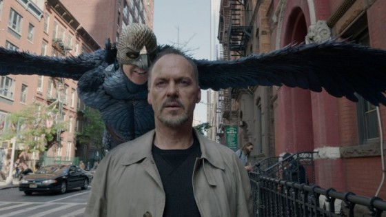
birdman_aFinally we have BIRDMAN, in which Michael Keaton gets near the knuckle as Riggan Thomas, a has-been actor most famous for playing a Batman-esque superhero. Riggan is now trying to reinvent himself as a serious thesp by writing, directing and starring in a Broadway play.

Apart from a brief montage near the end, Birdman echoes its theatrical setting by appearing to consist of one continuous shot. Although this isn’t unprecedented in movies, nowhere has it been done as effectively. The technical and logistical challenges of shooting a movie like this – with grips dancing around behind the camera and technicians dimming lamps up and down to maintain shape in the lighting – God knows how the boom op got in there – would overwhelm most directors, but not Alejandro G. Iñárritu.

DP Emmanuel Lubezki’s roving camera puts you right inside the action. His wide lenses, pushing incredibly close to the actors’ faces, provide a level of intimacy unparalleled in my experience of cinema. That the performances not only stand up to this minute scrutiny, but positively shine, and that the pace never flags despite the impossibility of trimming scenes in post, is evidence of a tremendous talent and skill from director and cast alike. Both Keaton and Emma Stone, as his daughter, turn in career-high performances, extending their range beyond what we have previously seen from them.

But most importantly, Birdman tells a great story with strong and interesting characters. It’s essentially a portrait of a man’s mental breakdown, and it uses the simplest techniques – arresting performances, honestly photographed – and the most complex ones – elaborate hallucination VFX within a single-shot framework – to paint this portrait.

So, because it tells a strong story, and because it does that through the highly effective use of a challenging and near-unique production methodology, BIRDMAN would be my choice to win this year’s Bafta for Best Picture.

birdman_still_3

My Two Cents on the Bafta Best Picture Nominations

Five Great ‘Making Of’ Books

I love a good ‘making of’ book. Even if the film it’s about is rubbish, you can usually learn something, so long as it’s not one of those cheap cash-in books that relies mostly on reproducing the script and the press kit. DVD extras can be great, but an in-depth book can be so much more immersive; you almost feel like you’re part of the crew by the time you get to the end.

Here, in my opinion, are five of the best ‘making of’ books. If you’re looking for a Christmas present for the filmmaker in your life, you could do worse than tracking down one of these tomes.

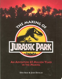
cover_fontThe Making of Jurassic Park

Don Shay & Jody Duncan

I can still picture the shop I bought this in when I was thirteen years old. Spielberg’s paleo-blockbuster was one of the major cinema events of my childhood, and along with this book it planted the idea firmly in young Neil’s mind that filmmaking might be a pretty cool thing to do when he grew up. Shay and Duncan, the writers behind the awesome Cinefex magazine, note in the acknowledgments that their publisher wanted “a book of substance and quality on the making of Jurassic Park”. The pair delivered in spades, detailing every step of the journey that started with a best-selling novel, saw Stan Winston and his studio build the most sophisticated and convincing animatronics ever seen on film, took Spielberg and his crew onto a storm-lashed Hawaiian island, and ruined Phil Tippett’s career with ground-breaking computer-generated dinosaurs. But perhaps what inspired me most as a teenager were the 40 pages of storyboards reproduced at the end of the book, a showcase to Spielberg’s visual storytelling genius. I loved this book so much that I mimicked its style when GCSE Media Studies required me to write a journal about the making of my coursework film.

The_Making_of_Star_Trek_Deep_Space_Nine_coverThe Making of Star Trek: Deep Space Nine

Judith & Garfield Reeves-Stevens

By the time I found this in my local library in the late nineties, I was already well set on the path to filmmaking, but I still knew little about how big films and TV shows were made, except what I’d read in The Making of Jurassic Park. The Making of ST: DS9 was a detailed and informative guide to the process of making a high-end US TV series. Having recently tracked it down and re-read it, I found it just as interesting the second time around. While the business side of network TV has probably changed, and the days of off-lining on 3/4″ tape are long gone, much of the content is still relevant, and is backed up by extracts from call sheets, treatments and production memos. Kudos must go to the writers for covering oft-neglected subjects like the art and importance of editing, the role of stand-ins, and the financial reasons behind key creative decisions.

CE3K200Close Encounters of the Third Kind: The Making of Spielberg’s Classic Film

Ray Morton

This is the only book on this list which is unofficial, and while that means it lacks for pretty photos, it also means it doesn’t pull its punches when discussing the struggles and conflicts of the production. Engaging and well-researched, Morton’s book traces the origins of the UFO craze and Spielberg’s fascination with it, along with the steps in the young director’s career that brought him to the point where he could make this seminal sci-fi movie. Like many great films, Close Encounters’ production was a troubled one, with a budget that spiralled out of control as studio bosses – convinced they’d backed a dud – fretted and fumed. Two converted aircraft hangars in sweltering Mobile, Alabama, seemed like financial black holes as cinematographer Vilmos Zsigmond poured megawatts of light into them and the practical effects crew flew in a full-size mothership underbelly. Morton documents all the creativity and uncertainty in workmanlike fashion, and also uncovers the stories behind the re-releases and special editions.

51qMqBgrATL._SY344_BO1,204,203,200_Titanic and the Making of James Cameron

Paula Parisi

Not to be confused with the glossier and less substantial James Cameron’s Titanic by Ed W. Marsh, this 230-pager is an intimate account of Cameron’s journey from the depths of the Atlantic ocean to the excesses of the Mexican coastline set as he strove to tell a story that had gripped his imagination. Those intent on hating Cameron will dislike this book, which endeavours to counter the bad press he frequently gets by drilling to the core of the passion and determination which drives him. With a budget that climbed so high it required two major Hollywood studios to finance, Titanic was the biggest undertaking in motion picture history at the time, requiring a full-scale replica of the titular ship, hundreds of extras, hydraulic sinking effects, cutting-edge motion capture and 163 days of photography. Whatever you think of the film, it’s hard not to be sucked in by the drama of this book, as Cameron battles against everything from nature to studio executives to complete what looks set to be a financial disaster, only to have it shatter box office records and scoop eleven Oscars.

Making_of_TESB_coverThe Making of Star Wars / The Empire Strikes Back / Return of the Jedi

J. W. Rinzler

It’s not surprising that the most loved films in the history of cinema have some of the most comprehensive and beautiful ‘making of’ books ever published. It’s only surprising that it took 30 years for them to be written. Drawing on Lucasfilm’s extensive archive of interviews, Rinzler takes us almost day-by-day through the development, production and postproduction of the movies that would define cinema for a generation. Arguably echoing the films themselves, the third book is the weakest, as by then Lucasfilm had financial stability, and making the movies was no longer a huge risk. I was shocked by how difficult Lucas found it to fund Empire; although phenomenally successful, Star Wars had yet to make him much money and everyone thought the sequel would be a pale shadow of the original. All three books are beautifully illustrated with photographs both rare and familiar, concept art and storyboards. There are also extracts and summaries of early versions of the scripts, and the Empire book even includes an extensive transcript of on-set conversations from the day Solo’s descent into the freezing chamber was filmed. Essential reading for filmmakers everywhere.

I’m sure there are some classics I’ve missed from this list. By all accounts, The Battle of Brazil: Terry Gilliam vs. Universal, Future Noir: The Making of Blade Runner and The Making of Ghostbusters are all excellent, but sadly I’ve so far been unable to get my hands on them. What are your favourite ‘making of’ books?

Five Great ‘Making Of’ Books