“The Little Mermaid”: Pools of Light

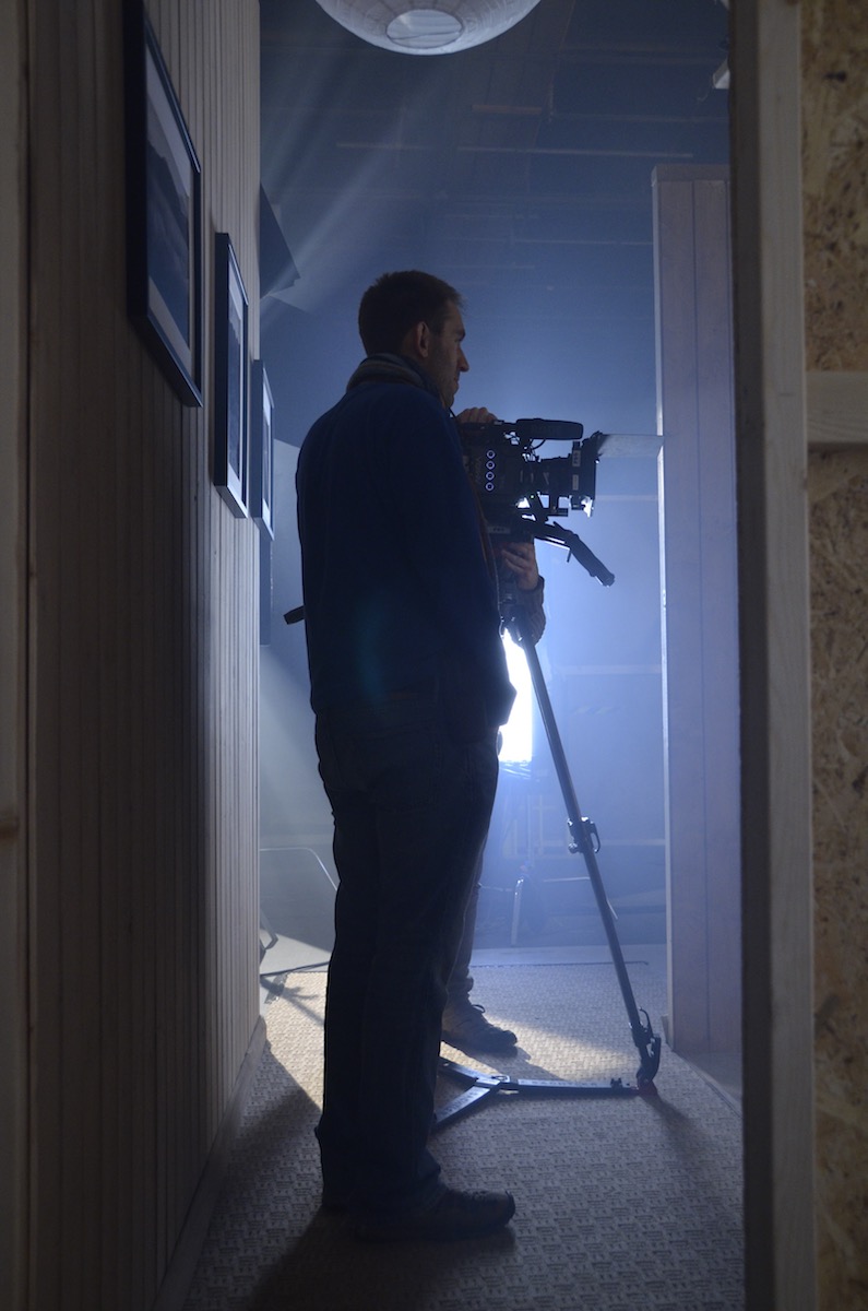
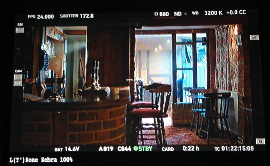
Although The Little Mermaid takes place mostly on dry land, there were some key scenes involving tanks and pools. These include the moment which introduces the audience to the mermaid herself, played by Poppy Drayton. Here are some extracts from my diary covering the challenges of creating a magical, fairytale look while filming in and around water.


Day 10

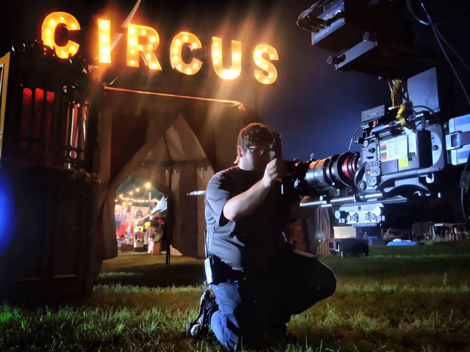
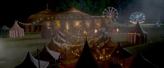
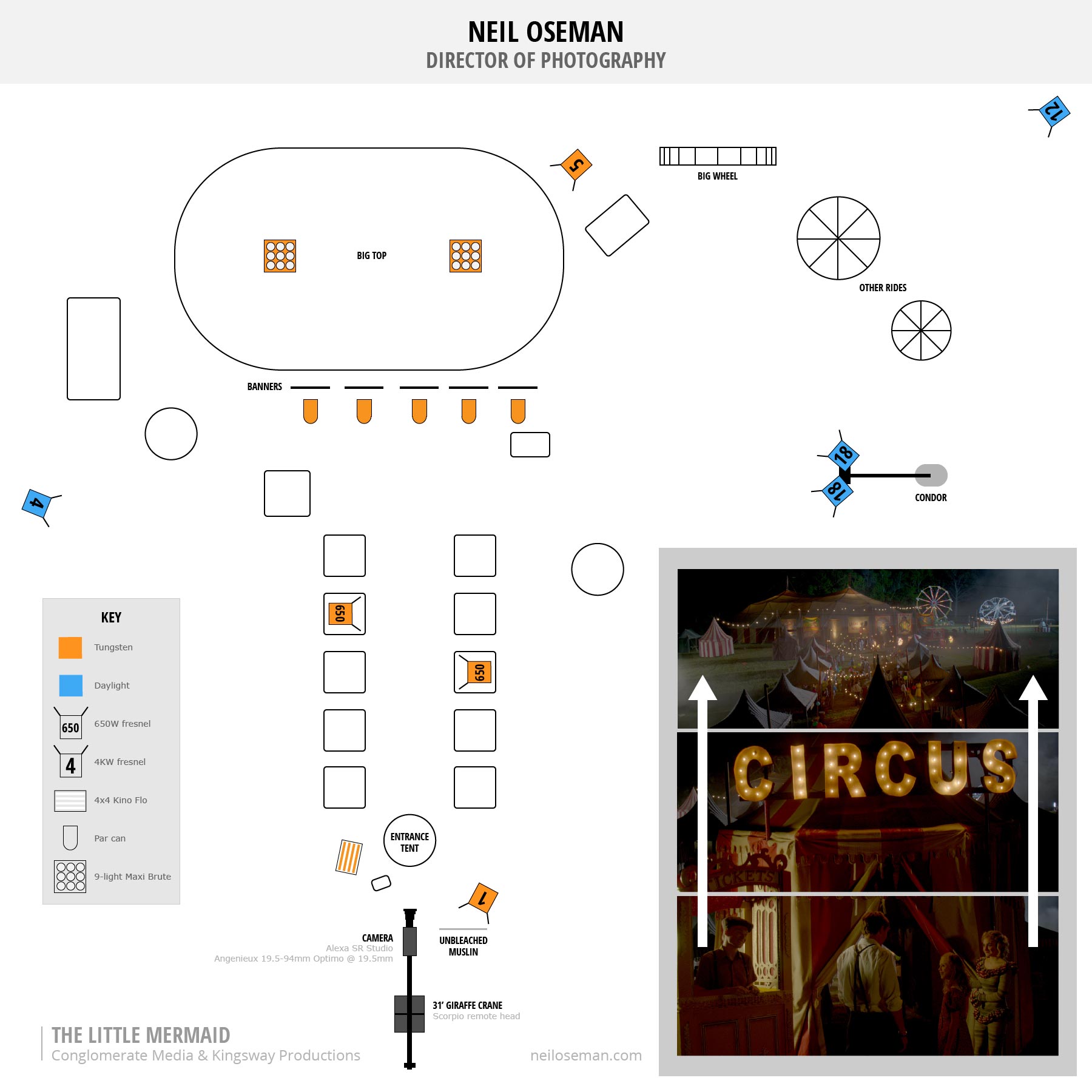
Today we’re inside the big top all day – actually all NIGHT. We can’t shoot during the day because too much daylight bleeds through the canvas of the tent.

We are setting up when a storm hits. The tent starts to blow about in a slightly alarming fashion, rain lashes down outside (and inside, because the tent isn’t very waterproof) and lightning flashes. We are ordered out of the tent, and I run into a waiting mini-van with Joe from art and some of the camera crew. We sit watching the rain and telling stories for half an hour before we can press on.

Setting up with a stand-in next to the mermaid tank (centre, behind the monitors). In the top right you can see the 575W HMI backlight for the tank, and below that, grip Sawyer Oubre stands ready to fake watery rippling light with a par can and a blue gel frame.

Around the wall of the tent the art department have hung canvas posters; at the suggestion of gaffer Mike Horton, we uplight these with par cans and par 38s. The design of these fixtures hasn’t changed since the 30s, so we can get away with seeing them in shot. The art dept have sourced four period spotlights which we use as background interest (they’re not powerful enough to really illuminate anything), as well as string-lights.

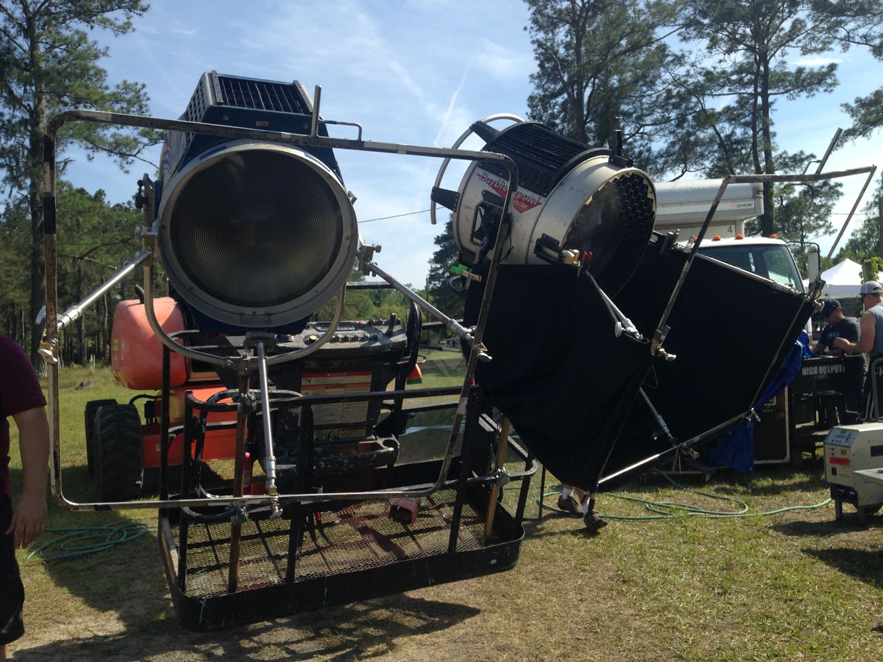
Ambience comes from a Maxi Brute, with just a couple of bubbles on, firing into the tent roof. After seeing a video test of various diffusers during preproduction, I asked for Moroccan Frost to be added to our consumables list, and we use it for the first time on this Maxi Brute. It gives a lovely muted orangey-pink look to the scene.

Steadicam operator Chris Lymberis. Photo: Kane Pearson

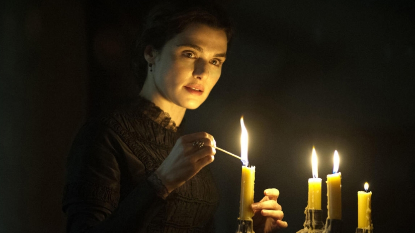
We’re shooting our mermaid for the very first time, in a tank in the circus ring. The initial plan is to fire a Source Four straight down into the water to create genuine watery rippling light, while bouncing a par can off a wobbling frame of blue gel to beef up the effect. In the end the Source Four isn’t really cutting it, so instead we rig a 575W HMI, gelled with Steel Blue, to a menace arm and fire it into the tank as toppy backlight. This Steel Blue gelled daylight source, blued up slightly further by the water itself, contrasts beautifully with the Moroccan Frost tungsten ambience which the Maxi Brutes are giving us.

In her mermaid tail and costume, Poppy Drayton looks stunning in the tank. We shoot steadicam angles and some slo-mo to get the most out of the set-up.


Day 15

The rocky pool set with two of the side-lighting Kino Flos and the 1.2K HMI backlight (centre) in place

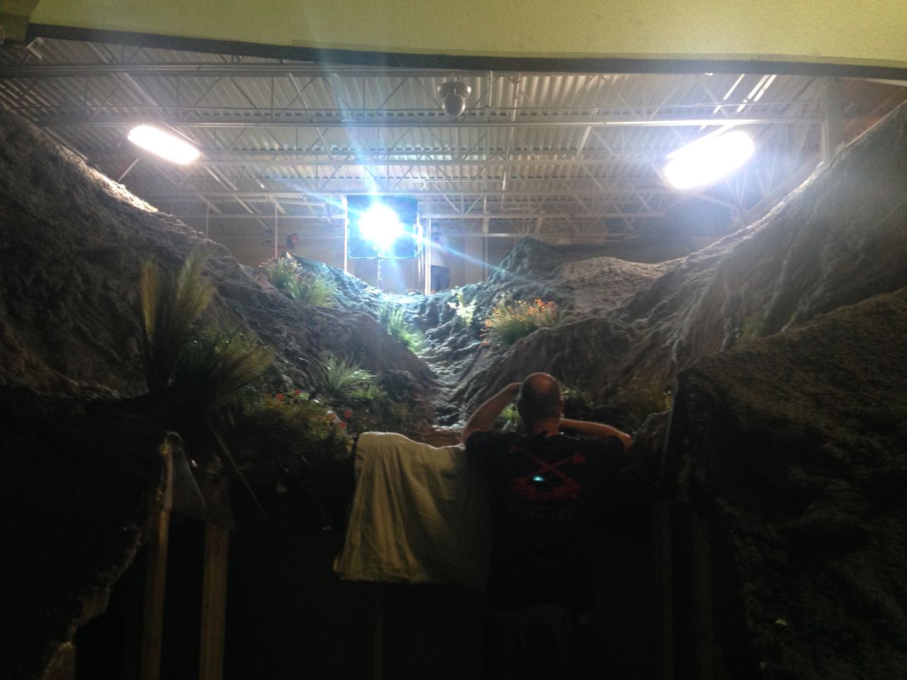
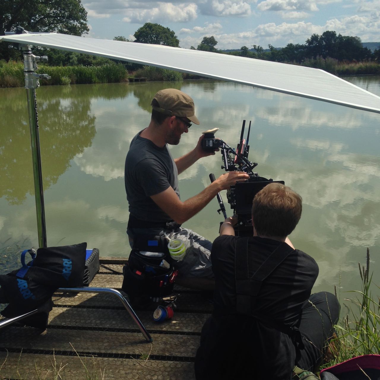
Back on stage, and we’re shooting the rocky pool. This set was built before I even arrived in Savannah, so I’ve been waiting a long time to shoot it. It’s built almost right up to the ceiling of the studio (a former supermarket) so it’s challenging to light. The grips build four menace arms and poke two 4×4 Kinos and two 575W HMIs over the sides to cross-light the set and bring out all the texture in it. Where the set ends they put up a 20×20′ greenscreen, which we light with two Kino Flo Image 80s fitted with special chroma green tubes.

After a wide (which didn’t make the final cut), the next set-up is a 2-shot of our leads in the pool itself. We consider arming the camera out over the pool using a jib, but ultimately decide that it’s better for me to join the cast in the pool, with the camera on my shoulder in a splash bag. 2nd AC Kane Pearson joins the pool party as well, and ends up hand-bashing a monitor for me since the splash bag’s designed for a Panaflex film camera and the viewfinder doesn’t line up. I’m reminded of my frustrating splash bag experience on See Saw back in 2007, but this time at least within a few minutes I’ve found a comfortable and effective way to operate the camera, under-slinging it and allowing it to partially float so I don’t have to support the whole weight.

For this shot we’ve added our par-can-bounced-off-a-wobbling-blue-gel gag for watery light ripples, and combined with the real light ripples and the reflections of a 1.2K HMI backlight, the image looks beautiful.


Day 19

After lunch we shoot the singles for the rocky pool scene. The pool itself has been removed, and the actors sit on stools in a paddling pool, with the set behind them. The paddling pool serves two functions: it catches the water that make-up pours over the actors to make them look wet, and it reflects rippling light onto their faces. This light originates from a par can. At first it flattens out the look, then we figure out that we need to lay black fabric on the bottom of the pool. This stops the par can’s light bouncing directly, while retaining the rippling highlights off the water’s surface. (Check out my article on shooting water for more tips like this.)

The low-tech solution for the pool pick-ups

In the final edit this was all intercut with some beautiful footage by underwater DP Jordan Klein, shot both at a local diving pool in Savannah and at Weeki Wachee Springs State Park in Florida. The main unit shot another scene in the actual ocean, but I’ll cover that later in this series. In the meantime, next week I’ll reveal some of the tricks and techniques used in shooting The Little Mermaid‘s many sequences in moving vehicles.

“The Little Mermaid”: Pools of Light

“The Little Mermaid”: Circus Cinematography

‘B’ cam 2nd AC Matt Dixon preps the camera on the crane’s Scorpio remote head. Photo: Tim Gill

The biggest set on The Little Mermaid was the circus, an area the size of a football pitch which was transformed into a period spectacle. The big top and many other pieces were driven across the country from LA, and during our first week of principal photography the art department were hard at work setting it all up and dressing it.

Today’s post is about how I lit the night exterior scenes on this huge set. To that end I’m going to focus on the two biggest shots in the sequence: a tracking shot outside the big top, and the crane-up which first reveals the circus to the audience. Below, as well as my diary entries from the shoot, you’ll find a little behind-the-scenes video I grabbed on my phone for the tracking shot, and a lighting plan for the crane shot.


Day 7

The two 18K HMI fresnels rigged on the condor

A couple of daylight pick-ups today, then we start setting up for a big night scene. The camera will dolly with Cam and Elle from the exit of the big top, past candy floss and ‘healing water’ stalls where bits of dialogue will happen, and finally reveal a ferris wheel in the distance. We block while the sun’s still up, and paint in the light as night sets in. We are trying to light most of it in a way that will also work for our big crane shot reveal of the circus later in the week, because repositioning large HMIs – especially the two 18Ks we’re flying on a condor (cherry-picker) – is very time-consuming. Inevitably it doesn’t quite work out that way, and one of the 18Ks has to die for now at least.

The ferris wheel is backlit by a 12K, with a little front-light from a 5K tungsten fresnel. Cross-light on the talent comes from the working 18K and a 6K on the opposite side of frame. Nine-light Maxi Brutes illuminate the tent from inside, some of that light spilling out onto the talent, while par cans uplight a row of banners outside. A 1K baby provides edge-light to the talent in their final position. A 300W fresnel inside the healing water wagon spills out, and a bare 40W globe inside the umbrella of the candy floss stall gives us a little glow there.

The final lamp to go up is another 300W fresnel, because the directors are concerned that the ’sold out’ sign on the healing water wagon isn’t clear enough. We end up firing it in from the front because there’s no time for anything else, but as always with front-light, I deeply regret it. Ideally we would have armed it out from the roof of the wagon to rake down the side of it.

Once the supporting artists are choreographed, the shot looks great.

A post shared by Neil Oseman (@neiloseman) on


Day 9

A Nine-light Maxi Brute inside the big top

We start with a big crane shot revealing the whole circus at night. For this shot we have the following lamps burning: 2 x 18Ks (on a condor), 1 x 12K, 1 x 4K – all those are providing moonlight or starlight, with varying degrees of blue gel on them; 2 x Nine-light Maxi Brutes making the big top glow from inside; a 5K spilling some orange glow on the background; 2 or 3 smaller tungsten units spilling out light from inside the smaller tents; and lighting the foreground, a 4×4 Kino and a 1K baby bounced off unbleached muslin. There are also numerous practicals on, including the lights on the ferris wheel, the illuminated ‘circus’ sign, several par can up-lighters, and about 7KW of fairy lights. Totalling over 80KW, it is easily the biggest lighting set-up of my career. Although the grip and electrical crew is relatively small given the scale of the set-up, they handle it with aplomb.

We have rebuilt our Giraffe crane to its maximum 31ft configuration, so we can swoop up over the entrance tent, past the ’circus’ sign, and reveal the twinkling string-lights of the midway leading to the big top, and the rides beyond.

Here’s a retrospective lighting plan for this crane shot (not to scale); click to enlarge it. Note that additional tents were added in postproduction, as you can see in the trailer.

Ideally we would have had two condors, with an 18K on each, and put one of them way back behind the trees, to maintain a consistent direction of moonlight, but budget and the practicalities of the location made this impossible.

The ‘A’ camera on the dolly, with the two 18Ks on the condor in the background

One thing that was a little different to my original plan was the hard 4K edging the roofs of the midway tents on the lefthand side. This was meant to be a pair of 6Ks firing through a diffusion frame, to get a much softer, less “sourcey” look than the hard “moonlight” from the 18Ks. But unfortunately both our 6Ks were malfunctioning.

Another change was the lighting of the midway itself. We had a tungsten helium balloon on the truck, which I had planned to float above the midway to provide warm ambience. As it turned out, the practical string lights, although only 40W each, were so numerous that they provided ample illumination in the centre of the frame.

Later on in production, I was chatting to one of the ADs about this scene and he expressed surprise at how well I had handled it, given that it was so much bigger than any lighting set-up I’d previously done. Honestly it never fazed me. Lighting is entirely scaleable; the principles are identical, whether your set is a small bathroom or a football pitch. I’d done so much night exterior in my career, I’d just never had the big toys I wanted before. I’ll let you in on a secret though: the only reason I knew to ask for 18Ks and a condor was from reading American Cinematographer!

In my next post I’ll discuss shooting some of Poppy Drayton’s key scenes as the eponymous mermaid, including her introduction inside the big top. Don’t forget that The Little Mermaid is currently showing in movie theatres across the US and on Amazon in the UK.

“The Little Mermaid”: Circus Cinematography

Grading “Above the Clouds”

Recently work began on colour grading Above the Clouds, a comedy road movie I shot for director Leon Chambers. I’ve covered every day of shooting here on my blog, but the story wouldn’t be complete without an account of this crucial stage of postproduction.

I must confess I didn’t give much thought to the grade during the shoot, monitoring in Rec.709 and not envisaging any particular “look”. So when Leon asked if I had any thoughts or references to pass on to colourist Duncan Russell, I had to put my thinking cap on. I came up with a few different ideas and met with Leon to discuss them. The one that clicked with his own thoughts was a super-saturated vintage postcard (above). He also liked how, in a frame grab I’d been playing about with, I had warmed up the yellow of the car – an important character in the movie!

Leon was keen to position Above the Clouds‘ visual tone somewhere between the grim reality  of a typical British drama and the high-key gloss of Hollywood comedies. Finding exactly the right spot on that wide spectrum was the challenge!

“Real but beautiful” was Duncan’s mantra when Leon and I sat down with him last week for a session in Freefolk’s Baselight One suite. He pointed to the John Lewis “Tiny Dancer” ad as a good touchstone for this approach.

We spent the day looking at the film’s key sequences. There was a shot of Charlie, Oz and the Yellow Peril (the car) outside the garage from week one which Duncan used to establish a look for the three characters. It’s commonplace nowadays to track faces and apply individual grades to them, making it possible to fine-tune skin-tones with digital precision. I’m pleased that Duncan embraced the existing contrast between Charlie’s pale, freckled innocence and Oz’s dirty, craggy world-weariness.

Above the Clouds was mainly shot on an Alexa Mini, in Log C ProRes 4444, so there was plenty of detail captured beyond the Rec.709 image that I was (mostly) monitoring. A simple example of this coming in useful is the torchlight charity shop scene, shot at the end of week two. At one point Leo reaches for something on a shelf and his arm moves right in front of his torch. Power-windowing Leo’s arm, Duncan was able to bring back the highlight detail, because it had all been captured in the Log C.

But just because all the detail is there, it doesn’t mean you can always use it. Take the gallery scenes, also shot in week two, at the Turner Contemporary in Margate. The location has large sea-view windows and white walls. Many of the key shots featured Oz and Charlie with their backs towards the windows. This is a classic contrasty situation, but I knew from checking the false colours in log mode that all the detail was being captured.

Duncan initially tried to retain all the exterior detail in the grade, by separating the highlights from the mid-tones and treating them differently. He succeeded, but it didn’t look real. It looked like Oz and Charlie were green-screened over a separate background. Our subconscious minds know that a daylight exterior cannot be only slightly brighter than an interior, so it appeared artificial. It was necessary to back off on the sky detail to keep it feeling real. (Had we been grading in HDR [High Dynamic Range], which may one day be the norm, we could theoretically have retained all the detail while still keeping it realistic. However, if what I’ve heard of HDR is correct, it may have been unpleasant for audiences to look at Charlie and Oz against the bright light of the window beyond.)

There were other technical challenges to deal with in the film as well. One was the infra-red problem we encountered with our ND filters during last autumn’s pick-ups, which meant that Duncan had to key out Oz’s apparently pink jacket and restore it to blue. Another was the mix of formats employed for the various pick-ups: in addition to the Alexa Mini, there was footage from an Arri Amira, a Blackmagic Micro Cinema Camera (BMMCC) and even a Canon 5D Mk III. Although the latter had an intentionally different look, the other three had to match as closely as possible.

A twilight scene set in a rural village contains perhaps the most disparate elements. Many shots were done day-for-dusk on the Alexa Mini in Scotland, at the end of week four. Additional angles were captured on the BMMCC in Kent a few months later, both day-for-dusk and dusk-for-dusk. This outdoor material continues directly into indoor scenes, shot on a set this February on the Amira. Having said all that, they didn’t match too badly at all, but some juggling was required to find a level of darkness that worked for the whole sequence while retaining consistency.

In other sequences, like the ones in Margate near the start of the film, a big continuity issue is the clouds. Given the film’s title, I always tried to frame in plenty of sky and retain detail in it, using graduated ND filters where necessary. Duncan was able to bring out, suppress or manipulate detail as needed, to maintain continuity with adjacent shots.

Consistency is important in a big-picture sense too. One of the last scenes we looked at was the interior of Leo’s house, from weeks two and three, for which Duncan hit upon a nice, painterly grade with a bit of mystery to it. The question is, does that jar with the rest of the movie, which is fairly light overall, and does it give the audience the right clues about the tone of the scene which will unfold? We may not know the answers until we watch the whole film through.

Duncan has plenty more work to do on Above the Clouds, but I’m confident it’s in very good hands. I will probably attend another session when it’s close to completion, so watch this space for that.

See all my Above the Clouds posts here, or visit the official website.

Grading “Above the Clouds”

The Cinematography of “Perplexed Music”

In June I was recommended by a mutual friend to shoot a short drama called Perplexed Music, inspired by the Elizabeth Barrett Browning sonnet of the same name. It’s a passion project from writer-director Mark McGann, with his brother Paul McGann (Doctor Who, Alien 3, Withnail & I) in the lead role of a man grieving for his deceased partner.

Paul and Mark pose with one of the supporting artists between takes.

Mark was keen from the outset to shoot on an Alexa, and I was quick to agree. Arri Rental very kindly gave us an amazing deal on an Alexa Classic and a set of Ultra Primes. As on Above the Clouds, we used a Blackmagic Micro Cinema Camera as a B-cam, capturing two specific angles that were impossible on the Alexa with our limited grip budget.

Throughout July, Mark and I had a very satisfying creative dialogue about the cinematic techniques we would use to tell the story of Paul’s character, The Man, who never speaks. I had been watching a lot of Mr. Robot, and was keen to use unusual compositions as that show does. The visual grammar that we ultimately developed eschewed The Rule of Thirds, either squeezing The Man right into the side of frame – at times when things are too much for him – or placing him dead centre for moments of clarity and acceptance, and for flashbacks to when his partner was alive.

The Blackmagic Micro Cinema Camera is mounted on a combo lighting stand to capture a high angle through a streetlamp.

While testing lenses at Arri Rental a few weeks prior to the shoot, I took the opportunity to shoot some frame-rate tests between 24 and 48fps. Since the film has so little dialogue, I figured there was nothing to stop us using a lot of slow motion if we wanted to. I didn’t want it to look like a music video though. I thought perhaps a very subtle over-cranking, creating languid blinks and slightly heavier movement, would add to the burden of The Man’s grief. Mark agreed as soon as he saw the tests, and we ended up shooting a number of set-ups at 28 and 30fps, plus 40fps for a pivotal sequence.

I also tested various ISO settings on the Alexa (click here for full details, stills and video from this test). Based on these, I decided to use ISO 1600 for the majority of the film, partly for the extra latitude in the highlights, and partly to add grittiness to The Man’s grief-stricken world, in the form of a little picture noise. When we started shooting the flashbacks, on the spur of the moment I decided to switch to ISO 400 for these. A few years back I shot the music video below on a Red Epic and, for reasons I forget, one set-up was done at a lower ISO than the rest. I remember the feeling this gave, when I saw the final edit, of everything suddenly being smooth and hyper-real. I thought that would be a great feeling to give to the flashbacks.

1st AC Rupert Peddle and 2nd AC Ben Davies set up a lakeside close-up under a diffusion frame which will soften the light on Paul.

Much of Perplexed Music was day exterior, but a couple of sequences required lighting. In the opening café scene, I fired HMIs through two windows, but kept their light away from The Man, keying him with a practical to put him in his own little world. Meanwhile, a happy couple he’s watching are bathed in sunlight (sometimes real, sometimes not) warmed up with a quarter CTO, and bouncing beautifully off their table to give them a healthy glow.

For night interiors at The Man’s home, I was keen to rely on practicals as much as possible. Firstly there wasn’t much space in the little cottage, secondly I didn’t want the hassle of having to shift them around to keep them out of frame when we changed angle, and thirdly it just looks more natural. So aside from a tungsten bounce in a corner of the living room we knew would never be seen, I stuck to practical table lamps and exterior lighting.

Setting up for a night exterior shot. Photo: Gary Horton

I had planned to use direct HMI sources for moonlight through the windows, but my gaffer Sam suggested going softer so that we wouldn’t have hard shadows inside which would need filling. I saw that he was right, so we used a kino through one window and a 2.5K HMI bounced into poly through another (pictured at left).

Perplexed Music was shot over five days in Frome in Somerset and Rame in Cornwall. The latter provided us with a spectacular cliff-top and the isolated St. Michael’s Chapel on the peak of the headland. Here we employed the services of The Fly Company, who captured two dramatic, sweeping shots on their DJI Inspire 2 drone. We were all extremely impressed by what they were able to achieve, especially as it was done in very windy conditions, in between rain showers.

We completed the final set-ups of the schedule as the winds began gusting up to 60mph, and poor Paul could barely stand upright! I was certainly glad we picked the Alexa to shoot on, because anything lighter would probably have shaken during takes, if not blown over!

Lining up a shot with director Mark McGann. Photo: Gary Horton

I had a fantastic time working with Mark and Paul, and the whole cast and crew. We were sad to part ways at the end of the week, and we all look forward to seeing the finished film soon. And at this point, dear reader, I ask for your help. Currently a Kickstarter campaign is underway for postproduction. It’s well over 50% funded at the time of writing, but every little helps in our quest to reach the finishing line. Rewards for backers include thank you video messages from Paul and Mark, and tickets to a private screening in December. Even if you can’t contribute, please consider sharing the page on social media. Thanks!

https://www.kickstarter.com/projects/perplexedmusic/perplexed-music-post-production

The Cinematography of “Perplexed Music”

Anamorphic Lens Tests

Anamorphic cinematography, first dabbled with in the 1920s, was popularised by Twentieth Century Fox in the fifties as CinemaScope. Television was growing in popularity and the studios were inventing gimmicks left, right and centre to encourage audiences back into cinemas. Fox’s idea was to immerse viewers in an image far wider than they were used to, but with minimal modifications to existing 4-perf 35mm projectors. They developed a system of anamorphic lenses containing elements which compressed the image horizontally by a factor of two. By placing a corresponding anamorphosing lens onto existing projectors, the image was unsqueezed into an aspect ratio of 2.55:1, or later 2.39:1.

Since those early days of CinemaScope, anamorphic cinematography has become associated with the biggest Hollywood blockbusters. Its optical features – streak flares, oval bokeh and curved horizontal lines – have been seared into our collective consciousness, indelibly associated with high production values.

I’ve not yet been fortunate enough to shoot anamorphic, but I was able to test a few lenses at Arri Rental recently, with the help of Rupert Peddle and Bex Clives. Last week I wrote about the spherical lenses which we tested; our anamorphic tests followed the same methodology.

Again we were shooting on an Alexa XT Plus in log C ProRes 4444 XQ, this time in 4:3 mode, a resolution of 2048×1536. Since all of the lenses had a standard 2:1 anamorphosing ratio, the images unsqueezed to a super-wide 2.66:1 ratio. (This is because the lenses were designed to be used on 35mm film with space left to one side for the optical soundtrack.) You can see the full width of this ratio in the first split-screen image in the video, at 2:08, and in the second image below, but otherwise I have horizontally cropped the footage to the standard 2.39:1 ratio.

We tested the following glass:

Series Length Speed CF* Weight
Hawk V 35mm T2.2 30″ 5.6kg
Cooke Xtal 30mm T2.8 ? 3kg
Kowa Mirrorscope 40mm T2.2 36″ 1.15kg
Kowa Mirrorscope 30mm T2.3 ? ?

* CF = close focus

For consistency with the spherical lenses, we used lengths around 32mm, but in the anamorphic format this is a pretty wide lens, not a mid-range lens. We shot at T2.8, again for consistency, but I hear that many anamorphics don’t perform well wider than T4.

We were only able to test what Arri Rental happened to have on the shelves that day. The biggest and presumably most expensive was the Hawk V-series. Next  in size and weight was the Cooke Xtal – pronounced “crystal” – a 1970s lens based on the much-loved Speed Panchros. The smallest and lightest, was the Kowa Mirrorscope, with a list price of £1,200 per week for a set of four. (Sorry, I couldn’t find any pricing info for the others online.) Note that there isn’t really a 30mm Mirrorscope; to get this length you put a wide angle adapter on the 40mm. As this extra element decreases the optical performance, we tested it with and without, hence the two lengths.

Here’s the video…


Skin tones

Click on the image to see it at full quality.

To my eye, the Hawk has a fairly rich, warm skin tone, while the Cooke – as with the spherical S4 tested last week – seems a little grey and flat. The Kowa is inexplicably brighter than the other two lenses, which makes it hard to compare, but perhaps it’s a little cooler in tone?


Sharpness

Focus is more critical with anamorphic lenses than spherical ones. From a forum posting by Max Jacoby:

Anamorphic lenses have what is known as a “curved field of focus” that works similarly to the curved movie screens in some large Cinerama theatres. This is one reason that one needs to expose these lenses at a deeper stop. If one doesn’t, the curved field will not be covered by depth of field and either the edges or centre of the frame will be soft.

One day I’d like to re-test these lenses at a lower stop, T4 or T5.6, where they will all undoubtedly perform much better. But in this T2.8 test, on Bex’s face in the centre of frame, the Hawk V and the Kowa Mirrorscope 40mm – both almost a full stop from their maximum apertures – are clearly the sharpest of the bunch. The Cooke Xtal, which is wide open, is unsurprisingly softer. The 30mm adapter on the Mirrorscope completely destroys the image, not only making it very soft but also introducing colour aberration.

Now let’s look at the checkerboard at the side of frame and see if we can spot any differences in sharpness there…

It seems to me that the Kowa, both with and without the adapter, has a greater difference in sharpness between the centre and edges of frame than the the Hawk and Cooke. With the latter two lenses, the checkerboard is reasonably sharp, at least on the lefthand side, with some ghosting/blur visible towards the righthand side. The same thing can be observed on the chart in the flare tests at the end of the video.


Breathing & Bokeh

All of these lenses have a noticeable degree of breathe, which I suppose is to be expected from anamorphics. The Hawk V has roughly oval bokeh, the Cooke’s is more circular, while the Mirrorscope has interesting D-shaped bokeh.


Flare

The Hawk V doesn’t flare much at all, which is apparently due to the anamorphic element being in the middle of the lens, rather than at the front. The Kowa has a nice streak and glow around the light source, with a funky purple artefact on the opposite side of frame. But it’s the Cooke Xtal which provides the most classic lens flare, with a horizontal line across most of the frame and a partial star pattern around the source, despite the lens being wide open.

At the end of the video you can see how the flares develop on each lens as the light source moves horizontally across frame.


Distortion

A bulging effect is very obvious on all of these lenses, due to the focal lengths being quite wide for anamorphic. Notice how at 40mm on the Kowa Mirrorscope this curvature of the image is significantly reduced.

It’s hard to compare the levels of distortion because none of the focal lengths are exactly the same, except for the Cooke Xtal and the Kowa Mirrorscope with the 30mm adapter on. The Cooke’s top right and bottom left corners appear to be stretched away from the centre relative to the other two corners. I suppose that strange and funky stuff like this is exactly why you choose vintage glass.

Interestingly, the Cooke’s image appears a little tighter than the Kowa’s, which combined with my inability to find any evidence online of the existence of a 30mm Xtal, leads me to suspect we may have been given a mislabelled 32mm.


Conclusions

When we got to the end of our spherical tests and started putting the anamorphics on, I was shocked by the drop in sharpness. But as noted earlier, this is because anamorphics really need to be used with a smaller aperture than the T2.8 I often shoot at. If I learnt nothing else from this test, I learnt that anamorphic needs more light!

I would love to put the Cooke Xtal’s lovely flares and general vintage look to good use on a period movie one day. The Hawk V would be a good choice if I wanted the anamorphic look with warm, dynamic skin tones. The Kowa system seemed a little cheap and cobbled-together, but could well be a good solution for anamorphic on a budget, as long as I stayed away from the 30mm adapter!

I hope you’ve found these tests useful. Thanks again to 1st AC Rupert Peddle, 2nd AC Bex Clives and Arri Rental UK for making them possible.

Anamorphic Lens Tests

Spherical Lens Tests

The other week I spent a day at Arri Rental in Uxbridge, in the Bafta Room no less, conducting various camera and lens tests. I’ve done a number a productions now where I wanted to test but there wasn’t the time or money, so for a while I’ve been meaning to go into Arri on my own time and do some general tests for my education and edification. An upcoming short provided the catalyst for me to get around to it at last.

Aided by 1st AC Rupert Peddle and 2nd AC Bex Clives, I tested a dozen lenses, some spherical, some anamorphic. Today I will cover the spherical lenses; next time I’ll look at the anamorphics.


Method

We shot on an Alexa XT Plus in log C ProRes 4444 XQ at 3.2K. In the video the image has been downscaled to 1080P and a standard Rec.709 LUT has been added.

I set the Alexa to ISO 800 and lit Bex to a T2.8 using a 650W tungsten fresnel bounced off poly. For fill I caught a little of the spill from the fresnel with a matte silver bounce board on the opposite side of camera. I placed fairy lights in the background to observe the bokeh (out of focus areas) and turned on a 100W globe during each take to see what the flare did.

We shot all the lenses at 2.8 – the stop I most commonly use – and also wide open (compensating with the shutter angle), but the direct 2.8 comparison proved most useful, so that’s mainly what you’ll see in the video. We tested a single length: 35mm or the closest available to it.

What we didn’t do was shoot grey-scale or colour charts, or do any testing of vignettes or distortion. (The day after doing these tests, Shane Hurlbut, ASC published an Inner Circle post about how to tests lenses, so I immediately learnt what my omissions were!)

We tested the following lenses:

Series Length Speed CF* Weight Price
Leica Summilux-C 29mm T1.4 18″ 1.7kg £27K
Arri/Zeiss Master Prime 35mm T1.3 14″ 2.2kg £16K
Cooke S4 32mm T2 6″ 1.85kg £14K
Leica Summicron-C 35mm T2 14″ 1.3kg £13K
Zeiss High Speed
(a.k.a. Superspeed Mk III)
35mm T1.3 14″ 0.79kg £12K
(refurb)
Arri/Zeiss Ultra Prime 32mm T1.9 15″ 1.1kg £10K
Zeiss T2.1 32mm T2.1 24″ 0.45kg £4K
(used)
Canon 35mm T1.5 12″ 1.1kg £3K

* CF = close focus

Here’s the video…


Skin tones

Click the image to see it at best quality.

The Arri/Zeiss Master Prime and the two Leicas seem to have the most vibrant skin tones. To my eye, the Leicas have a slight creaminess that’s very pleasing. The Canon looks just a little cooler and less dynamic. I was surprised to find that the Cooke S4, the lens I’ve used most, appears to have a grey, flat skin tone compared with the Master Prime, Leicas and Canon. I would rank the Ultra Prime and Superspeed next, on a par except that the Ultra Prime has a noticeable magenta cast. My least favourite skin tones are on the Zeiss T2.1, which comparatively makes poor Bex look a little bit ill!

Some of the nuances will be lost in the YouTube and Jpeg compression, but this is a very subjective assessment anyway, so feel free to completely disagree with all of the above. Any of the differences noted above could be corrected by grading, to some extent . But remember that the lens is at the very start of the light’s journey from set to screen, and any wavelengths that don’t get through it are lost forever. It’s like fluorescent lamps with colours missing from the spectrum; you can’t put those back in in post.


Sharpness

I have to say, I’m unable to detect any difference in sharpness between the Master Prime, Cooke S4, Canon and Leicas. The Ultra Prime and Superspeed both look a hair softer, while the T2.1 is very soft.


Breathing

Breathing is the slight zooming effect that you get with some lenses when you pull focus. Looking at 4:44 in the video you can clearly see the differences in breathing between the eight lenses. Because this part of the video is showing a crop of the bottom left corner of the image, the breathing manifests as a shift to the left (zoom in) as the lens is racked closer (goes soft) and a shift to the right (zoom out) as it’s racked deeper (goes sharp).

All the Zeiss lenses except the Master Prime have a significant amount of breath when seen in isolation like this, but not enough to be noticeable to an audience in most real-world situations. The Cooke S4 has a little bit of breathe, and the Canon a hair less. The Master Prime and the Leicas are rock solid.


Bokeh

Small points of light, when thrown out of focus, most clearly demonstrate the bokeh pattern of a lens. The shape of the bokeh is determined by the number of iris blades and the shape of those blades. Generally a circle is preferred, because it’s a natural shape, but for certain stories a more unusual shape might be appropriate. The shape of the iris changes with the T-stop, hence the T2.8 and wide open images above.

Immediately noticeable is the difference in the Cooke S4’s bokeh between wide open (circular) and T2.8 (octagonal). All of the other lenses have round bokeh at T2.8, apart from the Superspeed, which has heptagonal (seven-sided) bokeh.

It’s entirely subjective which bokeh you prefer. The only other thing I’ll point out is that the Canon’s bokeh wide open is very fuzzy, with noticeable colour aberration, though this may be due to the bright highlight rather than the defocusing.


Flare

Flare patterns also vary with aperture. The smaller the aperture, the more of a star effect you will get, as the light interacts with the corners in the iris blades. The Summilux shows this most clearly, with a pronounced star at T2.8 (two stops down from its maximum aperture) and almost none when wide open. The Cooke S4 also has a nice star pattern at T2.8. With the other lenses it’s much more subtle, and the Canon has almost none.


Conclusions

The real revelations in these tests, for me, were the Leicas. The Summilux in particular is a beautiful lens, with rich, dynamic skin tones, nice bokeh, no breathing, plus the bonus of nice star flares. I will definitely be looking to work with this glass in the future, although given the price tag that may be optimistic!

The Summicron also performed incredibly well, matching the more expensive Summilux and Master Prime in every respect except speed. I can see this becoming my new go-to lens.

The Master Prime of course produced a beautiful, sharp, clean image, but it lacks character. It might work nicely for science fiction, a drama requiring a neutral look, or something where filtration was being used to give the image character.

The Canon impressed me too – no mean feat given that it’s the cheapest lens we tested. With nice skin tones and attractive flares, I could see this working well for a romantic movie.

The Zeiss T2.1 did not appeal to me, with poor sharpness and cold, washed-out skin tones, so I would avoid it.

The Superspeed is a decent lens, but in most cases I’d plump for an Ultra Prime instead. Ultra Primes are certainly easier to work with for the 1st AC, and have proven to be a good workhorse lens for drama. (I shot Above the Clouds on them.)

The Cooke S4 has been my go-to glass up to now, and while it will probably remain my first choice for period pieces, due to its gentle focus fall-off, I’m excited to try some of the other glass in this test on other productions.

I’ll say it one last time: this is all subjective. Our visual preferences are what make every director of photography unique.

Tune in next week when I’ll look at the anamorphic lenses: Hawk-V, Cooke Xtal and Kowa Mirrorscope.

Spherical Lens Tests

Alexa ProRes ISO Tests

My Cousin Rachel

I’ve shot three features on Arri Alexas, but I’ve never moved the ISO away from its native setting of 800 for fear of noise and general image degradation. Recently I read an article about the cinematography of My Cousin Rachel, in which DP Mike Eley mentioned shooting the night scenes at ISO 1600. I deliberately set off for the cinema in order to analyse the image quality of this ISO on the big screen. Undoubtedly I’ve unwittingly seen many things that were shot on an Alexa at ISO 1600 over the past few years, but this was the first time I’d given it any real thought.

To my eye, My Cousin Rachel looked great. So when I was at Arri Rental the other week testing some lenses, I decided to shoot a quick ISO test to see exactly what would happen when I moved away from the native 800.

But before we get to the test footage, for those of you unsure exactly what ISO is, here’s an introduction. The more experienced amongst you may wish to skip down to the video and analysis.


What is ISO?

A revised and updated version of this section is available.

ISO is a measure of a camera’s light sensitivity; the higher the ISO, the less light it requires to expose an image.

The acronym actually stands for International Organization for Standardization [sic], the body which in 1974 combined the old ASA (American Standards Association) units of film speed with the German DIN standard. That’s why you’ll often hear the terms ISO and ASA used interchangeably. On some cameras, like the Alexa, you’ll see it called EI (Exposure Index) in the menus.

A common ISO to shoot at today is 800. One way of defining ISO 800 is that it’s the sensitivity required to correctly expose a key-light of 3 foot-candles with a lens of T-stop 1.4 and a 180° shutter at 24fps, as we saw in my Barry Lyndon blog.

If we double the ISO we double the effective sensitivity of the camera, or halve the amount of light it requires. So at ISO 1600 we would only need 1.5 foot-candles of light (all the other settings being the same), and at ISO 3200 we would need just 0.75 foot-candles. Conversely, at ISO 400 we would need 6 foot-candles, or 12 at ISO 200. Check out this exposure chart if it’s still unclear.

ISO is one of the three corners of the Exposure Triangle, well-known to stills photographers the world over. You can read my posts on the other two corners: Understanding Shutter Angles and F-stops, T-stops and Optical Density.

Just as altering the shutter angle (exposure time) has the side effect of changing the amount of motion blur, and altering the aperture affects the depth of field, so ISO has its own side effect: noise. Increase the ISO and you increase the electronic noise in the picture.

This is because turning the ISO up causes the camera to electronically boost the signals it’s receiving from the sensor. It’s exactly the same as turning up the volume on an amplifier; you hear more hiss because the noise floor is being boosted along with the signal itself.

I remember the days of Mini-DV cameras, which instead of ISO had gain; my Canon XL1 had gain settings of -3dB, +6dB and +12dB. It was the exact same thing, just with a different name. What the XL1 called 0dB of gain was what today we call the native ISO. It’s the ISO at which the camera is designed to give the best images.


ISO and Dynamic Range

The Alexa has a dynamic range of 14 stops. That means it can simultaneously record detail in an area of brightness x and an area of brightness times 2 to the power 14. At its native ISO of 800, those 14 stops of dynamic range are equally distributed above and below “correct” exposure (known as middle grey), so you can overexpose by up to 7 stops, and underexpose by up to 7 stops, without losing detail.

If you increase the ISO, those limits of under- and overexposure still apply, but they’re effectively shifted around middle grey, as the graphic to the left illustrates. (The Pro Video Coalition post this graphic comes from is a great read if you want more detail.) You will see the effects of this shifting of dynamic range very clearly in the test video and images below.

In principle, shooting at ISO 1600 is the same as shooting at ISO 800, underexposing by a stop (giving you more highlight detail) and then bringing it back up a stop in post. The boosting of the signal in that case would come right at the end of the image path instead of near the beginning, so the results would never be identical, but they’d be close. If you were on a bigger project with a DIT, you could create a LUT to bring the exposure up a stop which again would achieve much the same thing.

All of the above assumes you’re shooting log ProRes. If you’re shooting Raw then everything is simply recorded at the native ISO and any other ISO you select is merely metadata. But again, assuming you exposed for that other ISO (in terms of iris, shutter and ND filters), you will effectively get that same dynamic range shift, just further along the pipeline.

If this all got a bit too technical for you, don’t worry. Just remember:

Doubling the ISO

  • increases overall exposure by one stop,
  • gives you one more stop of detail in the highlights,
  • gives you one less stop of detail in the shadows, and
  • increases picture noise.

Halving the ISO

  • decreases overall exposure by one stop,
  • gives you one less stop of detail in the highlights,
  • gives you one more stop of detail in the shadows, and
  • decreases picture noise.


The Test

I lit the subject, Rupert “Are You Ready?” Peddle, with a 650W tungsten fresnel bounced off poly, and placed a 40W candle globe and some LED fairy lights in the background to show highlight clipping. We shot the tests in ProRes 4444 XQ on an Alexa XT Plus with a 32mm Cooke S4, altering the shutter angle to compensate for the changing ISOs. At ISO 400 the shutter angle was maxed out, so we opened the lens a stop for ISO 200.

We tested five settings, the ones corresponding to a series of stops (i.e. doublings or halvings of sensitivity): 200, 400, 800, 1600 and 3200. I have presented the tests in the video both as recorded in the original log C, and with a standard Rec.709 LUT.

You’ll need to watch the video at full-screen at 1080P to have any chance of seeing the differences, and even then you might see the compression artefacts caused by the noise more than the noise itself. Check out the stills below for a clearer picture of what’s going on. (Click on them for full resolution.)


Analysis

To me, the most important thing with every test is how skin tones are rendered. Looking at the original ProRes of these comparisons I think I see a little more life and vibrance in the skin tones at lower ISOs, but it’s extremely subtle. More noticeable is a magenta shift at the lower ISOs versus a green shift at higher ones. The contrast also increases with the ISO, as you can see most clearly in the log images.

At the lower ISOs you are not really aware of any noise in the picture. It’s only at ISO 1600 that it becomes noticeable, but I have to say that I really liked this level of noise; it gives the image a texture reminiscent of film grain. At ISO 3200 the noise is quite significant, and would probably be unacceptable to many people.

The really interesting thing for me was the shifting of the dynamic range. In the above comparison image, look at the globe in log – see how it starts off as one big white blob at ISO 200 and becomes more detailed as the ISO rises? Now look at the dark wall around the globe, both here and in the previous image – see how it subtly and smoothly graduates into darkness at the lower ISOs, but becomes a grainy mess at the higher ones?

I can see an immediate benefit to shooting at ISO 1600 in scenes lit predominantly with practicals. Such scenes tend to have a low overall level of illumination, while the practicals themselves often blow out on camera. Going to ISO 1600 would give me extra exposure and extra detail in the practicals. I would be sacrificing shadow detail, so I would have to be a little more careful not to underexpose any faces or other important elements of the frame, but I can deal with that. In fact, I often find myself determining my exposure in these types of scenes by how blown out the practicals are, wishing I could open up a little more to see the faces better but not wanting to turn the lamps into big white blobs. Increasing the ISO would be the perfect solution, so I’m very glad I did this test to alleviate my ungrounded fears.

What about scenarios in which a lower-than-native ISO would be useful? Perhaps a scene outside a building with an open door, where the dark interior is visible in the background and more detail is required in it. Or maybe one of those night scenes which in reality would be pitch black but for movie purposes have a low level of ambient light with no highlights.

I hope you’ve found this test as useful and interesting as I have. Watch this space or subscribe to my YouTube Channel for the lens test.

Thanks to Rupert Peddle, awesome steadicam op and focus puller – check out his site at pedhead.net – for appearing in front of the lens. Thanks also to Bex Clives, who was busy wrangling data from the lens tests while we were shooting these ISO tests, and of course Arri Rental UK.

Alexa ProRes ISO Tests

“Above the Clouds”: February 2017 Pick-ups

Last weekend saw many of the crew of Above the Clouds reunite to shoot the remaining scenes of this comedy road movie. Principal photography was captured on an Alexa Mini during summer 2016 on location in Kent, on the Isle of Skye, and at Longcross Studio in Buckinghamshire, with additional location shooting on a Blackmagic Micro Cinema Camera in October.

The outstanding scenes were to be photographed on stage, at Halliford Studio in Shepperton, this time on an Arri Amira. The Amira uses the same sensor as the Alexas, allowing us to match the look from principal photography in the most cost-effective way. With the addition of a Premium license, the camera is capable of the same ProRes 4444 recording codec as the Alexas too. As per last summer, our glass was a set of Arri/Zeiss Ultra Primes, with a half Soft FX filter to take the digital edge off.

Director Leon Chambers designed and built the set himself, sending me photos of a scale model well in advance. He was also specific about certain lighting cues and states that were required across the two sets and six scenes we would be recording to complete the movie. Based on this information, I concocted a lighting plan, which I communicated to Halliford’s in-house gaffer Micky Reeves by Photoshopping stock images of lamps onto Leon’s set model photos.

Last Saturday was devoted to pre-lighting the sets, mainly the kitchen, while construction work continued on the second set.


Day 24 / Sunday

We begin with a morning scene. A 5K fresnel serves as a low sun, streaking across the back wall of the set (see my post about lighting through windows). Even with this direct light four stops over, the natural bounce off the set isn’t enough to bring actor Philip Jackson – with his back to the window – up to key. Micky rigs a Dedo firing into a soft silver bounce just out of frame to solve the problem.

Also coming through the window are two 4×4 kinos, rigged on goalposts above the window. Their daylight tubes reflect off the blinds, serendipitously creating the illusion of a blue sky “outdoors”, where in fact there is only a wall and a white backdrop.

Philip exits into the hallway and disappears from view, supposedly to go out through the front door. No door exists. Instead there is a flag which spark Amir Moulfi rotates in front of a 2K, creating a momentary oblong of light in which Philip’s shadow appears.

The next scene follows on from an exterior captured last October at dusk, when the natural light was soft, flat and cool in colour, cheated even cooler with the white balance. This failing daylight is to be the only source of illumination now in the kitchen set, until Philip enters and turns on the lights. This is the main reason that the daylight 4×4 kinos outside the window were rigged. A third kino from the direction of the front door is added, plus a small LED reporter light to pick an important prop out of the shadows.

Lead actress Naomi Morris enters, silhouetted against the windows. Then Philip enters and hits the lights. Simultaneously, Amir flips a breaker on a lunchbox, activating a hanging practical fixture above the breakfast bar and the 5K which that practical motivates.

Generally I don’t like toplight. It throws the eyes – those windows to the soul… or windows to the performance – into shadow. But with the hanging practical in shot, whatever I was going to use to beef it up had to be somewhat toppy or it wouldn’t make sense. I considered space-lights and Jem balls, but in consultation with Micky I ultimately picked a 5K with a chimera, coming in at a 45 degree back/toplight angle. As you can see from the photos, this looks almost comically large. But large and close means soft, which is what I want. It had to be soft enough to wrap both actors when they faced each other across the bar.


But why such a large lamp? Why not use a 2K, like Micky suggested yesterday? Bitter experience has always taught me to go with a bigger unit than you think you need, particularly if you’re softening it, and particularly if it’s going to take a while to rig. (The 5K was hung from another goalposts set-up.) We ended up dimming the 5K to 50% and scrimming it down a stop and a half. But having too much light like that is easy to deal with. If we had put up a 2K and it wasn’t bright enough, we would have to have taken the whole thing down and re-rigged with a 5K. And even if the 2K had seemed sufficient to begin with, blocking can often take actors into unexpected, dark corners of the set. Being able to turn up a dimmer a couple of notches to handle that kind of situation is very useful.

Besides the 5K, there are a few other sources playing: some 300W hairlights, a pup bouncing off the side of a cupboard to bring up the area around the cooker, a China ball in the hallway, and Leon’s Rosco LitePads serving as practical under-cabinet down-lighters.


Day 25 / Monday

I probably shouldn’t say what today’s set is, because it’s a little bit of a spoiler. There are some lighting similarities to the kitchen: again we have a character flicking a light switch, bringing on two hanging overhead practicals and a 2K with a chimera to beef them up.

A practical lamp on a desk was supposed to be turned on during the scene as well, but we all forget until it’s too late. It would have bounced off the desk and given Philip a little eye-light, and at first I regret losing this. But soon I realise that it is more appropriate for the scene not to have that level of refinement, for the lighting to be a little raw. The toppy, “broken key” angle of the chimera’s light works well for this tone too.

We wrap just before noon, releasing Naomi to high-tail it to Oxford to appear on stage in a musical this evening. Eventually there will be second-unit-style GVs and establishing shots to do, but there will only be three or four of us for that. For the cast and most of the crew, today brings Above the Clouds to an end, eight months after the camera first rolled.

See all my Above the Clouds posts here, or visit the official website.

“Above the Clouds”: February 2017 Pick-ups

“Above the Clouds”: Week 4

IMG_0725Day 18 / Tuesday

Yesterday some of the crew started the long drive up to Skye, but for a lucky few – me, MUA Helen and actors Naomi and Andy – our journey starts today with a flight from Luton to Inverness. From there it’s a two-and-a-half-hour drive across the Highlands to the Kyle of Kochalsh, where Gary is waiting for us with his motorhome and the crafty table all set up. Soon afterwards the vans arrive, and the Yellow Peril. From 4pm we are shooting on a little ferry, big enough to hold three or four cars, as it pootles back and forth, back and forth between Skye and the mainland. It is, I think, the most stunning location I have ever shot in. The mountains tower over us from either side of the water, which sparkles in the sun. Although the light turns cloudy pretty quickly, the scene looks epic. All I do is add the usual dashboard LEDs in the picture car, and some sky bounce from Celotex, and darken the skies a little with an ND grad.

IMG_0713

Day 19 / Wednesday

For some reason there’s no water at the cottage where many of us are staying, so it’s a slightly whiffy cast and crew that rocks up in another stunning location this morning. In common with the whole shoot to date, the weather – and therefore the light – is very changeable. We have to roll between the squalls that drift across the valley. An interesting continuity issue arises with the mountains in the background of shot: the light on them keeps changing as clouds move across them. The weather here really is something else; this morning we saw a rainbow so close and so low to the ground that it felt like we could have walked over and touched it.

IMG_0751In the afternoon we’re at yet another stunning location, a bench overlooking a bay. For once the light is fairly constant and sunny, which gives us lovely sparkles in the sea. Again I frame the master like the painting in the Turner, with the horizon bang on the vertical centre of frame: clouds above, landscape and characters below. When we flip around to shoot the singles, the light is hard on the actors’ faces, but frontal, which at least is the most flattering kind of hard light. And it fits well with the dialogue, which references it being sunny, so it wouldn’t make sense to put a diffusion frame up. All I do is have runner Jacob stand just out of frame with some poly, which lifts the shadows a little and makes sure we see into Naomi’s eyes when she looks away from the sun.


Day 20 / Thursday

IMG_0768Various small driving scenes to start with. Rupert and Max reconfigure the camera as per our test of week 2, and I climb into the Yellow Peril’s modest rear seat to capture the action. I black out the rear window to get a classic dark-to-light depth effect: underexposed backs of seats in the foreground, the actors (including Naomi’s reflection in the rear view mirror) correctly exposed in the midground, and the view through the windscreen slightly overexposed in the background.

We also shoot exterior up-and-pass shots of the car amidst the spectacular scenery, before crossing the Skye Bridge to record a scene in a mainland village. Here we’re shooting dusk-for-night, so I set the white balance to 3,200K and heavily grad the sky. For shots inside the car, I plaster multiple Litepads over the windscreen, gelled with half CTO. The intention was for these to represent the car’s courtesy light, but with a fair amount of daylight coming into the vehicle the effect is more subtle, serving only to warm up what would otherwise be very cold skin-tones at 3,200K.

IMG_0775On the final set-up, appropriately enough, a car with clouds painted on it happens to drive by. And with that, principal photography is wrapped. There is a fifth week to do at some point, perhaps September, when a certain critical role has been cast, but for now the shoot is over. Andy, Naomi, Helen and I will meander back to Inverness tomorrow, while the rest of the crew drive south. I’ve had a great time, and I look forward to seeing a rough cut and shooting the remaining scenes later in the year.

Keep up to date with Above the Clouds on the official Facebook page or Instagram account.

“Above the Clouds”: Week 4

“Above the Clouds”: Week 3

IMG_0572Day 12 / Sunday

A split day, starting with two scenes at two different petrol stations (one of them open!). It’s a sunny day and when the cast stand next to the Yellow Peril (the picture car) they are bathed in yellow bounce. We build on this by bouncing more light with the gold side of a Lasolite.

IMG_0590Next we have some interiors in a soup kitchen, which will intercut and contrast with the dining room scenes from day one. Whereas the dining room had perfect three point lighting with a Rembrandt key, I want the soup kitchen to look much less pleasant, so I use toplight, broken keys and cross-light to bring out the texture of the peeling walls.

Our last scene is a night exterior. A sodium vapour security light which we can’t turn off is already backlighting the set. Rather than fighting it, we beef it up using the 1.2K gelled with Urban Sodium. This forms half of a cross-backlighting set-up, paired with a 1×1 LED panel gelled with Quarter Plus Green. Another 1×1 gelled with Mustard Yellow provides a pool of light in the background, while the 4×4 Kino gelled wth full CTB supplies a tiny bit of ‘moonlight’ fill. I’ve never lit a scene with so many different colours, but it feels realistic because there are so many different kinds of streetlamps and security lights in our towns and cities these days.


Day 13 / Monday

IMG_0595In the pub all day. The scenes are meant to have an evening feel, so we black out the windows with thin weed-blocking material which lets a little light through, and close the curtains. On a tungsten white balance we get just a little blue glow coming through the curtains. The window in the door has no curtains, so we gel it with .9 ND and it looks convincingly dusky outside.

Fairly standard stuff today, lighting wise. Cross-backlighting for bar scenes, a bit of blue glow in the deep background from a kino to give depth and show up the smoke.

We echo the Turner scenes with a symmetrical shot of Andy and Naomi seated in front of the fireplace. For a soft, pleasing key we bounce fire both the Dedos into a poly board. A double CTO-gelled LED panel on the floor enhances the backlight from the fire, and the pub’s practicals do the rest.

One of the last close-ups we do has an alcove in the background. It bothers me that the brickwork in there is the same shade and tone as the foreground brickwork – we’re losing the dimensionality – so I have Colin run in with a bit of half CTB to cool down the sconce slightly and separate the alcove.


Day 14 / Tuesday

IMG_0612

IMG_0613More micro sets in Leon’s living room. One of them is a tiny under-the-stairs bathroom, which we light with a single bare bulb hanging down into the shots. Again the Alexa’s dynamic range allows me to hold all the highlights and shadows, even when Andy is inches from the bulb, and it looks completely authentic on camera.

For the first time I try gelling the Rosco Litepads to match the tungsten Dedos. It doesn’t work; the Litepads are noticeably greener. If I try that again I’ll need to spend some time to find the correct cocktail of minus green and CTO gels.


IMG_0633Day 15 / Wednesday

After one final micro set in Leon’s living room we move upstairs for some crucial scenes in the master bedroom. I light it with a 2.5K HMI coming in through the window, that being really the only option. I shape this with gels, diffusion and black-out on the window or the lamp-head itself. For example, when we do Naomi’s close-ups I stick two or three layers of opal to the middle section of the window. That way we keep the nice hot streaks on the background wall, but Naomi has a much softer light on her.

The only other sources are the two 6×2″ Litepads hidden in the wardrobe behind a key prop, dimmed right down so they just silhouette the prop very, very slightly. For the final bedroom scene I go purely with available light, since the sun is now shining in at a nice angle, hitting the bed and bouncing back up into Naomi’s face.

It’s our last day in Kent, and many of the crew will be returning home tonight and commuting for the rest of the week, so it feels like the end of an era. Nevertheless, we remain detached and professional. No-one kidnaps Naomi’s stuffed dog Rupert and messages a picture of him tied up and gagged with gaffer tape, and definitely no-one retaliates by kidnapping Colin’s dashboard Spider-pig.


Day 16 / Thursday

IMG_0642

We are at Longcross Studio & Test Track, an ex-MOD facility in Berkshire. We stage a traffic jam on a road originally built for tank trials. The 85mm lens gets more use than it has the whole shoot so far. The compression of perspective works perfectly for the scene, enhancing the feeling that the characters are hemmed in both physically and psychologically.

Most of the action takes place inside the car and is shot raking across the characters from a side window. To get the best shape to the natural light, we black out the sunroof and place negative fill on the window closest to camera, then bounce in extra light through the windscreen.

The rota polar sees extensive use again, although sometimes it reveals weird circular patterns in the car’s window glass.


IMG_0650Day 17 / Friday

Our second day at Longcross, and this time we’re using the main loop of track. It’s non-exclusive, so occasionally a prototype sports car zooms past us, or a stills photographer hanging out of the boot of an SUV.

Day-playing grip Darren has brought his universal mount which we use as a hostess tray, shooting in through the passenger or driver’s windows. (Leon is not a fan of bonnet-mounted shots.) The rig prevents us from closing the window, which necessitates minor rewrites, but the shots look great and allow us to cover large swathes of dialogue relatively quickly.

The picture car is towed on an A-frame by Andrew’s Landrover. Riding in the Landrover are Leon, Rupert and me, each with a monitor. Leon’s shows a clean picture, Rupert’s of course has focus assist, and I switch mine between clean and false colours so that I can monitor the exposure as we go around the track. Leon connects his mixer to the Landrover’s stereo so that we can all hear the dialogue. Communication back to the picture car is achieved via radio with Max, hiding on the back seat, popping out to slate and even reading in lines for a phone conversation.

IMG_0658Col rigs the two 6×2″ Litepads to the dashboard. They mitigate the sunroof’s toplight by filling in the shadows very slightly, but more importantly they put a sparkle in the actors’ eyes, which always helps the performances come across on camera. I take a light reading inside the Yellow Peril before each lap, but due to the number of trees around the track, light levels during the takes are about two stops below what I get in the car park when we’re prepping. Fortunately the cloud cover is fairly consistent today so there aren’t hot patches of sun to contend with.

Today wraps the English portion of principal photography for Above the Clouds, and we sadly say goodbye to Colin, Zoë, Alice and Andrew. It’s been a really fun team to work with, and it will be strange next week without them.

“Above the Clouds”: Week 3