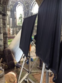
The 4×4 flags and matt silver bounce board used to shape the “Heretiks” shot later in the article.
If you’ve ever learnt anything about lighting, you’ll have heard of the Three Point System: key, backlight and fill. That last one is a soft light which raises the shadows and reduces contrast in the image.
As you might expect, negative fill is the exact opposite. It brings the shadows down, increasing contrast. It’s a big part of cinematography today because the dynamic range of digital cameras is so wide and their light sensitivity is so high that taking away light has become just as important as adding it.
Negative fill – neg fill or just neg for short – can be accomplished with anything black, most commonly a polystyrene board (American name: bead-board), blackout material (usually bolton in the UK or duvetyne in the US) or a flag. 5-in-1 reflectors have a black side that can be used for neg fill too. The term solids or black solids can be applied to any of these tools, indicating that they are completely opaque, as opposed to nets.
When DPs talk about neg fill you often hear the word “shape” come up in their reasoning. Neg fill is typically applied to the camera side (broad side) of the talent, allowing their other side (short side) to remain bright. This has the effect of making the face – or any other object – look more three-dimensional. Hence “shape”. (This is all part of the theory of short key lighting, which I’ve covered in detail before.)
Below is an example from my online course, Cinematic Lighting. In these before and after shots, I use the black side of a 5-in-1 reflector (though you see silver facing camera) to neg-fill Ivan’s short side, adding mood and contrast.
We made it more permanent by replacing the reflector with a 4×4′ floppy flag on a C-stand.
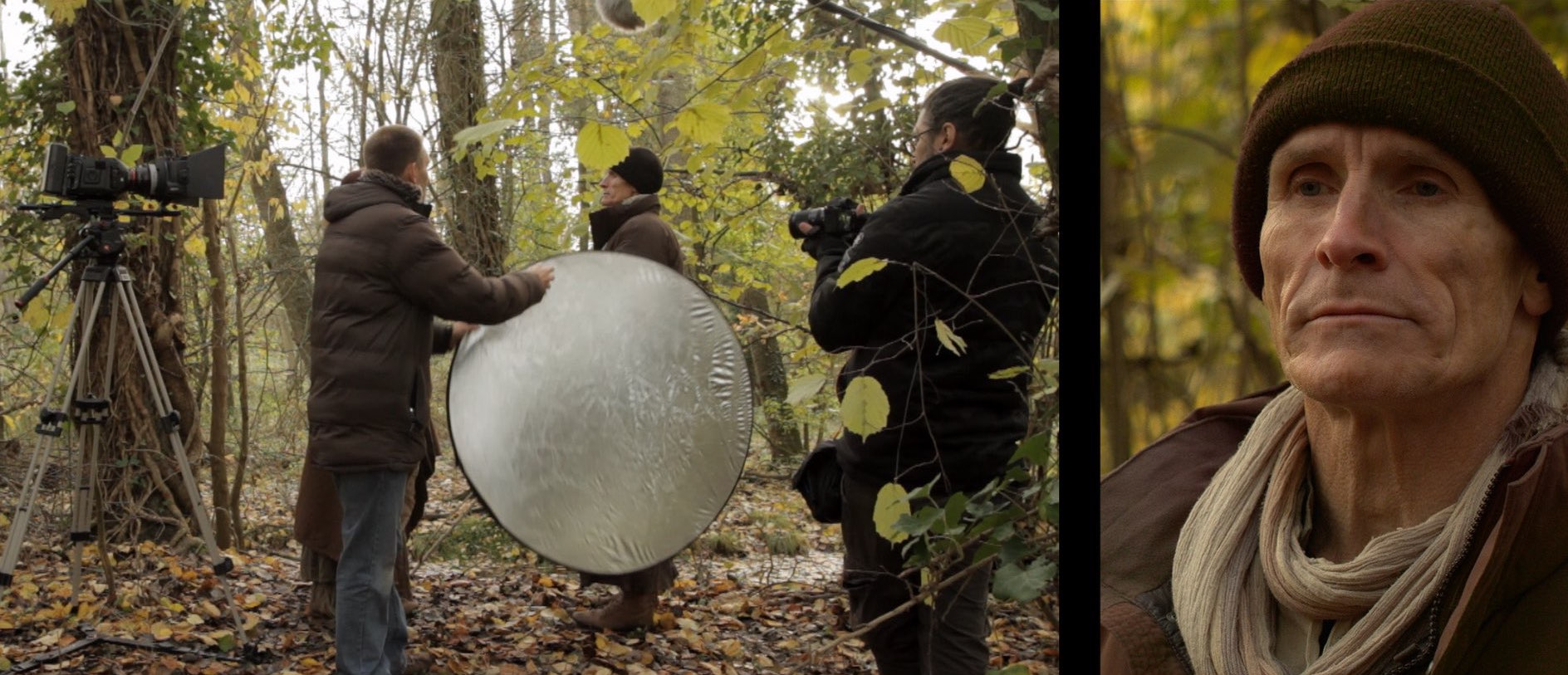
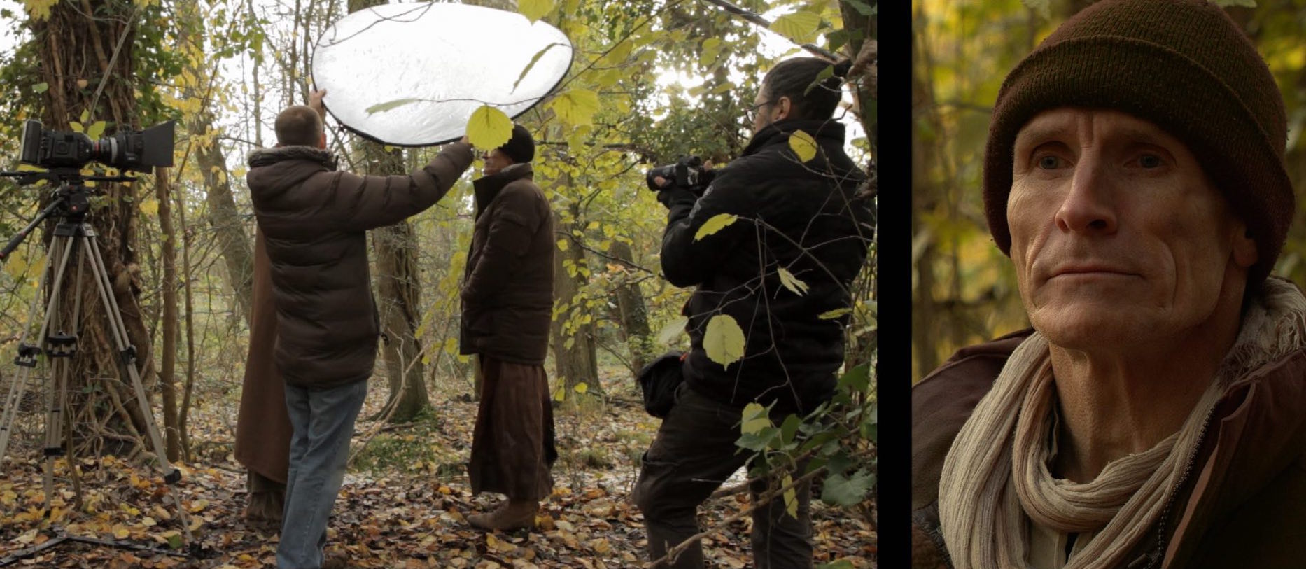
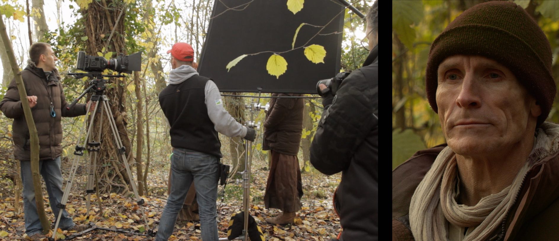
Here’s an example from Heretikswhere I chose to put a glint of light back into the darkness created by the neg fill, by using a matt silver reflector to create a rim-light. (There are many more diagrams like this on my Instagram feed.)
Neg fill is most commonly used outdoors, but it can be desirable indoors too, for example when white walls are bouncing light around everywhere. For the shot below from Exit Eve, I had the white wall behind camera covered with bolton so that the light would all be coming from behind the talent. (See my article on lighting from the back.)
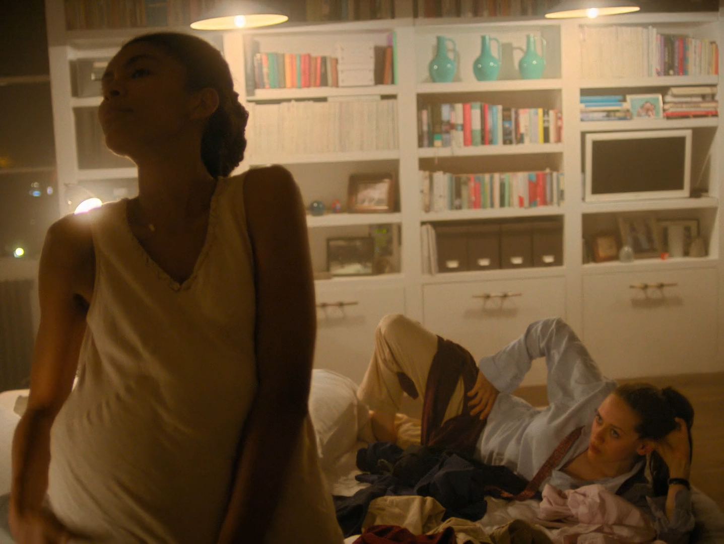
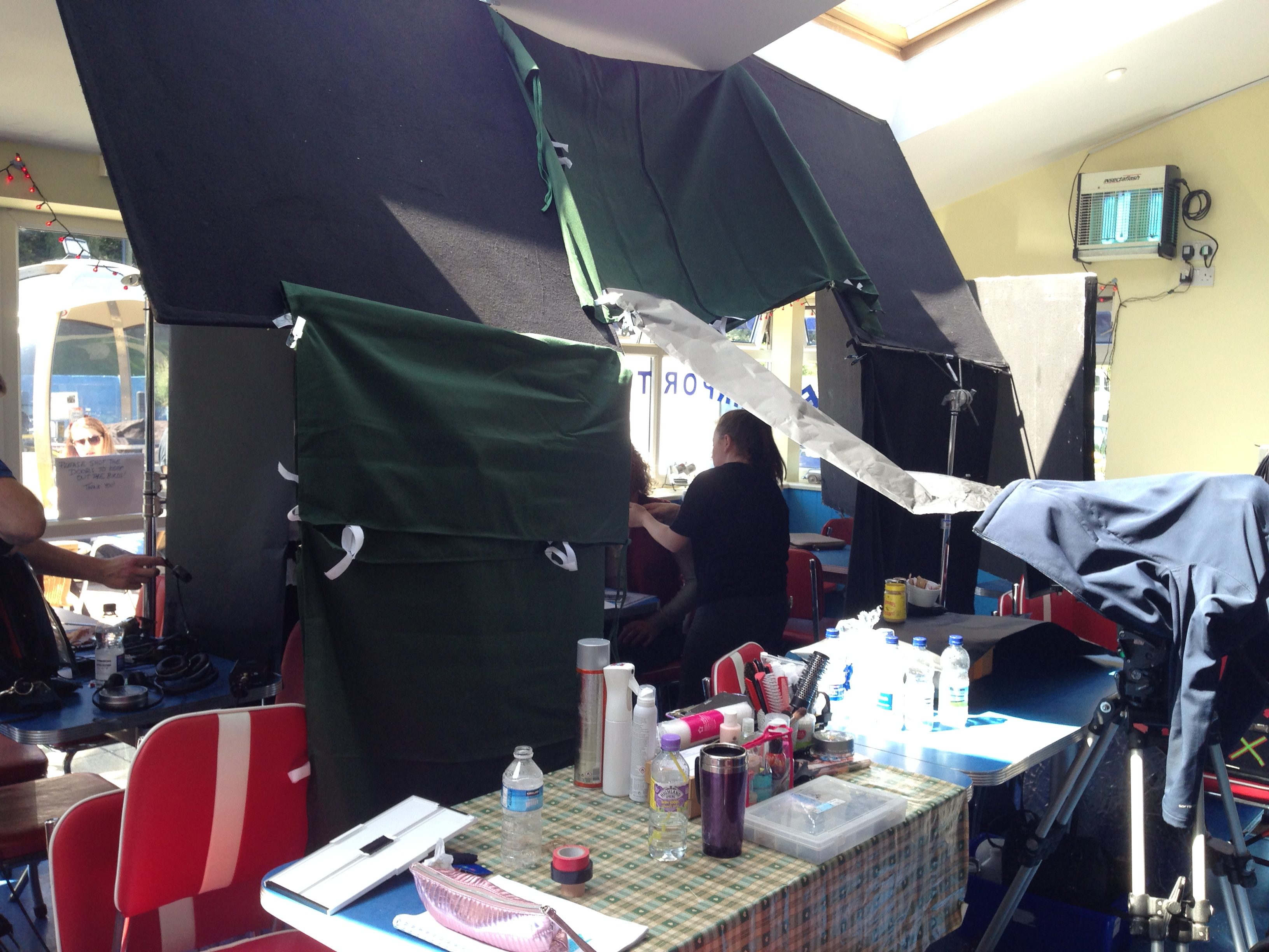
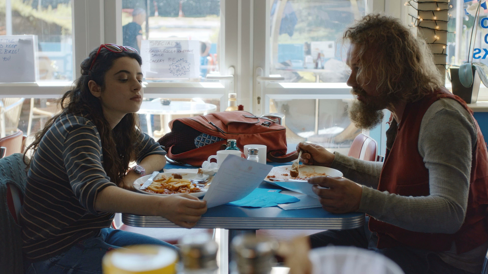
In the café scene from Above the Clouds we shot towards the windows, but there was still too much ambience (mainly from skylights in the roof) on the camera sides of the actors for my taste. We only had a limited supply of flags, so we pressed the sides of the Easy-Up tent into service too!
I’ll leave you with this extreme example of negative fill from Instagram.
I’m certainly glad you could join me today. It’s a fantastic day here and I hope it is wherever you’re at. Are you ready to read a fantastic little blog post? Good, then let’s get started.
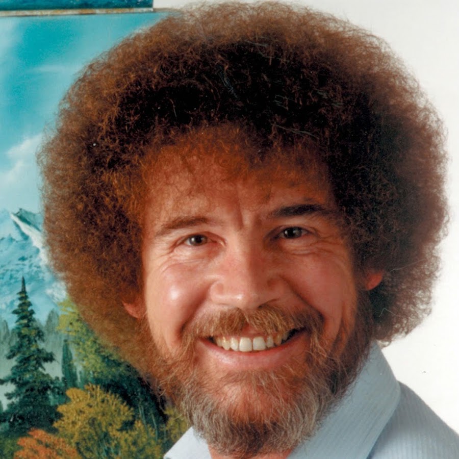
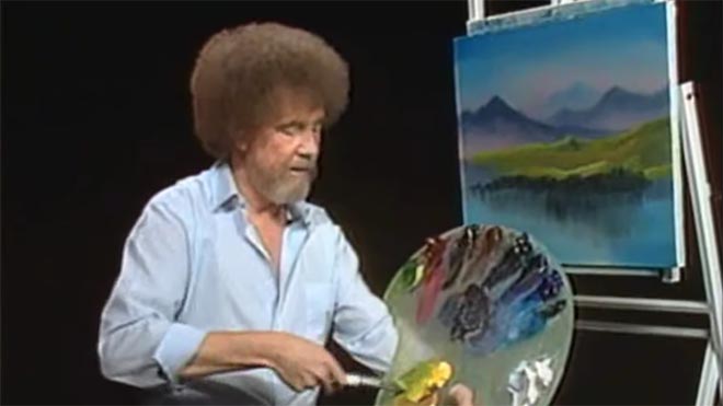
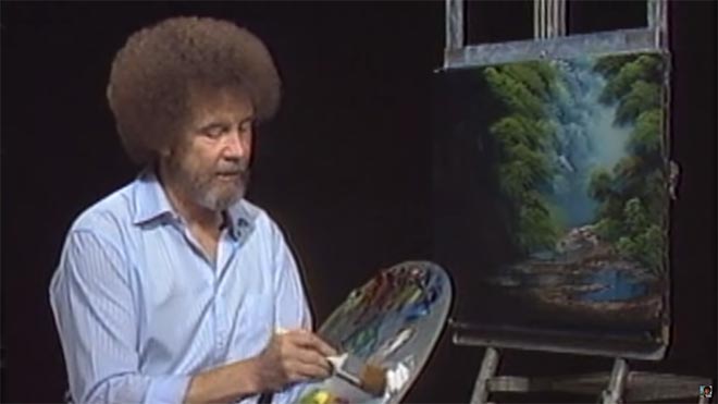
For twelve years, across 400 episodes, Bob Ross entertained all generations of Americans with his public access TV series, The Joy of Painting. Although he floated up to join the happy little clouds in 1995, in recent years YouTube and Twitch have brought his shows to a new audience, of which I am a humble member. Bob’s hypnotic, soft-spoken voice, his unfailingly positive attitude, and the magical effects of his wet-on-wet oil-painting technique make his series calming, comforting and captivating in equal measure.
Having watched every episode at least twice now, I’ve noticed several nuggets of Bob Ross wisdom that apply just as well to cinematography as they do to painting.
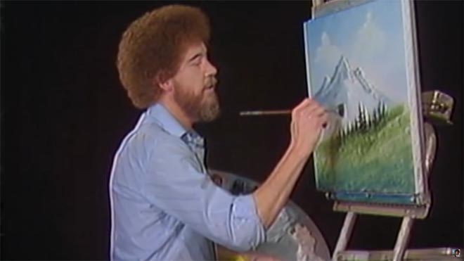
1. “The more plains you have in your painting, the more depth it has… and that’s what brings the happy buck.”
Bob always starts with the background of his scene and paints forward: first the sky with its happy little clouds; then often some almighty mountains; then the little footy hills; some trees way in the distance, barely more than scratches on the canvas; then perhaps a lake, its reflections springing forth impossibly from Bob’s brush; the near bank; and some detailed trees and bushes in the foreground, with a little path winding through them.
“Exile Incessant” (dir. James Reynolds)
Just as with landscape painting, depth is tremendously important in cinematography. Creating a three-dimensional world with a monoscopic camera is a big part of a DP’s job, which starts with composition – shooting towards a window, for example, rather than a wall – and continues with lighting. Depth increases production value, which makes for a happy producer and a happy buck for you when you get hired again.
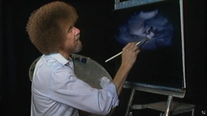
2. “As things get further away from you in a landscape, they get lighter in value.”
Regular Joy of Painting viewers soon notice that the more distant layers of Bob’s paintings use a lot more Titanium White than the closer ones. Bob frequently explains that each layer should be darker and more detailed than the one behind it, “and that’s what creates the illusion of depth”.
“The Gong Fu Connection” (dir. Ted Duran)
Distant objects seem lighter and less contrasty because of a phenomenon called aerial perspective, basically atmospheric scattering of light. As a DP, you can simulate this by lighting deeper areas of your frame brightly, and keeping closer areas dark. This might be achieved by setting up a flag to provide negative fill to an object in the foreground, or by placing a battery-powered LED fixture at the end of a dark street. The technique works for night scenes and small interiors, just as well as daytime landscapes, even though aerial perspective would never occur there in real life. The viewer’s brain will subconsciously recognise the depth cue and appreciate the three-dimensionality of the set much more.
3. “Don’t kill the little misty area; that’s your separator.”
After completing each layer, particularly hills and mountains, Bob takes a clean, dry brush and taps gently along the bottom of it. This has a blurring and fading effect, giving the impression that the base of the layer is dissolving into mist. When he paints the next layer, he takes care to leave a little of this misty area showing behind it.
“Heretiks” (dir. Paul Hyett)
We DPs can add atmos (smoke) to a scene to create separation. Because there will be more atmos between the lens and a distant object than between the lens and a close object, it really aids the eye in identifying different plains. That makes the image both clearer and more aesthetically pleasing. Layers can also be separated with backlight, or a differentiation of tones or colours.
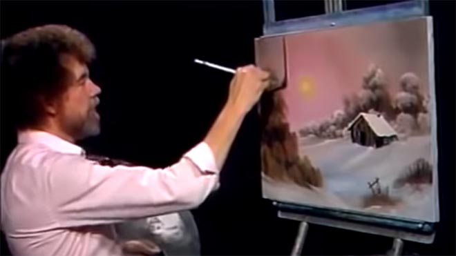
4. “You need the dark in order to show the light.”
Hinting at the tragedy in his own life, Bob often underlines the importance of playing dark tones against light ones. “It’s like in life. Gotta have a little sadness once in a while so you know when the good times come,” he wisely remarks, as he taps away at the canvas with his fan-brush, painting in the dark rear leaves of a tree. Then he moves onto the lighter foreground leaves, “but don’t kill your dark areas,” he cautions.
“Closer Each Day” promo (dir. Oliver Park)
If there’s one thing that makes a cinematic image, it’s contrast. It can be very easy to over-light a scene, and it’s often a good idea to try turning a fixture or two off to see if the mood is improved. However bright or dark your scene is, where you don’t put light is just as important as where you do. Flagging a little natural light, blacking out a window, or removing the bubble from a practical can often add a nice bit of shape to the image.
5. “Maybe… maybe… maybe… Let’s DROP in an almighty tree.”
As the end of the episode approaches, and the painting seems complete, Bob has a habit of suddenly adding a big ol’ tree down one or both sides of the canvas. Since this covers up background layers that have been carefully constructed earlier in the show, Bob often gets letters complaining that he has spoilt a lovely painting. “Ruined!” is the knowing, light-hearted comment of the modern internet viewer.
“Synced” (dir. Devon Avery)
The function of these trees is to provide a foreground framing element which anchors the side of the image. I discussed this technique in my article on composing a wide shot. A solid, close object along the side or base of the frame makes the image much stronger. It gives a reason for the edge of the frame to be there rather than somewhere else. As DPs, we may not be able to just paint a tree in, but there’s often a fence, a pillar, a window frame, even a supporting artist that we can introduce to the foreground with a little tweaking of the camera position.
The ol’ clock on the wall tells me it’s time to go, so until next time: happy filming, and God bless, my friend.
White walls are the bane of a DP’s existence. They bounce light around everywhere, killing the mood, and they look cheap and boring in the background of your shot. Nonetheless, with so many contemporary buildings decorated this way, it’s a challenge we all have to face. Today I’m going to look back on two short films I’ve photographed, and explain the different approaches I took to get the white-walled locations looking nice.
Finding Hope is a moving drama about a couple grieving for the baby they have lost. It was shot largely at the home of the producer, Jean Maye, on a Sony FS7 with Sigma and Pentax stills glass.
Exit Eve is a non-linear narrative about the dehumanisation of an au pair by her wealthy employers. With a fairly respectable budget for a short, this production shot in a luxurious Battersea townhouse on an Arri Alexa Classic with Ultra Primes.
“Crown”-inspired colour contrast
Cheap 300W dimmers like these are great for practicals.
It was January 2017 when we made Finding Hope, and I’d recently been watching a lot of The Crown. I liked how that series punctuated its daylight interior frames with pools of orange light from practicals. We couldn’t afford much of a lighting package, and I thought that pairing existing pracs with dimmers and tungsten bulbs would be a cheap and easy way to break up the white walls and bring some warmth – perhaps a visual representation of the titular hope – into the heavy story.
I shot all the daylight interiors at 5600K to get that warmth out of the pracs. Meanwhile I shaped the natural light as far as possible with the existing curtains, and beefed it up with a 1.2K HMI where I could. I used no haze or lens diffusion on the film because I felt it needed the unforgiving edges.
For close-ups, I often cheated the pracs a little closer and tweaked the angle, but I chose not to supplement them with movie lamps. The FS7’s native ISO of 2500 helped a lot, especially in a nighttime scene where the grieving parents finally let each other in. Director Krysten Resnick had decided that there would be tea-lights on the kitchen counter, and I asked art director Justine Arbuthnot to increase the number as much as she dared. They became the key-light, and again I tweaked them around for the close-ups.
My favourite scene in Finding Hope is another nighttime one, in which Crystal Leaity sits at a piano while Kevin Leslie watches from the doorway. I continued the theme of warm practicals, bouncing a bare 100W globe off the wall as Crystal’s key, and shaping the existing hall light with some black wrap, but I alternated that with layers of contrasting blue light: the HMI’s “moonlight” coming in through the window, and the flicker of a TV in the deep background. This latter was a blue-gelled 800W tungsten lamp bounced off a wobbling reflector.
When I saw the finished film, I was very pleased that the colourist had leant into the warm/cool contrast throughout the piece, even teasing it out of the daylight exteriors.
Trapped in a stark white townhouse
I took a different approach to colour in Exit Eve. Director Charlie Parham already knew that he wanted strong red lighting in party scenes, and I felt that this would be most effective if I kept colour out of the lighting elsewhere. As the film approaches its climax, I did start to bring in the orange of outside streetlamps, and glimpses of the party’s red, but otherwise I kept the light stark and white.
Converted from a Victorian schoolhouse, the location had high ceilings, huge windows and multiple floors, so I knew that I would mostly have to live with whatever natural light did or didn’t shine in. We were shooting during the heatwave of 2018, with many long handheld takes following lead actor Thalissa Teixeria from room to room and floor to floor, so even the Alexa’s dynamic range struggled to cope with the variations in light level.
For a night scene in the top floor bedroom, I found that the existing practicals were perfectly placed to provide shape and backlight. I white-balanced to 3600K to keep most of the colour out of them, and rigged black solids behind the camera to prevent the white walls from filling in the shadows.
(Incidentally, the night portions of this sequence were shot as one continuous take, despite comprising two different scenes set months apart. The actors did a quick-change and the bed was redressed by the art department while it was out frame, but sadly this tour de force was chopped up in the final cut.)
I had most control over the lighting when it came to the denouement in the ground floor living area. Here I was inspired by the work of Bradford Young, ASC to backlight the closed blinds (with tungsten units gelled to represent streetlights) and allow the actors inside to go a bit dim and murky. For a key moment we put a red gel on one of the existing spotlights in the living room and let the cast step into it.
So there we have it, two different approaches to lighting in a while-walled location: creating colour contrast with dimmed practicals, or embracing the starkness and saving the colour for dramatic moments. How will you tackle your next magnolia-hued background?
For another example of how I’ve tackled white-walled locations, see my Forever Alone blog.
Earlier this year I undertook a personal photography project called Stasis. I deliberately set out to do something different to my cinematography work, shooting in portrait, taking the paintings of Dutch seventeenth century masters as my inspiration, and eschewing traditional lighting fixtures in favour of practical sources. I was therefore a little disappointed when I began showing the images to people and they described them as “cinematic”.
An image from “Stasis”
This experience made me wonder just what people mean by that word, “cinematic”. It’s a term I’ve heard – and used myself – many times during my career. We all seem to have some vague idea of what it means, but few of us are able to define it.
Dictionaries are not much help either, with the Oxford English Dictionary defining it simply as “relating to the cinema” or “having qualities characteristic of films”. But what exactly are those qualities?
Shallow depth of field is certainly a quality that has been widely described as cinematic. Until the late noughties, shallow focus was the preserve of “proper” movies. The size of a 35mm frame (or of the digital cinema sensors which were then emerging) meant that backgrounds could be thrown way out of focus while the subject remained crisp and sharp. The formats which lower-budget productions had thereto been shot on – 2/3” CCDs and Super-16 film – could not achieve such an effect.
Then the DSLR revolution happened, putting sensors as big as – or bigger than – those of Hollywood movies into the hands of anyone with a few hundred pounds to spare. Suddenly everyone could get that “cinematic” depth of field.
My first time utilising the shallow depth of field of a DSLR, on a never-completed feature back in 2011.
Before long, of course, ultra-shallow depth of field became more indicative of a low-budget production trying desperately to look bigger than of something truly cinematic. Gradually young cinematographers started to realise that their idols chose depth of field for storytelling reasons, rather than simply using it because they could. Douglas Slocombe, OBE, BSC, ASC, cinematographer of the original Indiana Jones trilogy, was renowned for his deep depth of field, typically shooting at around T5.6, while Janusz Kaminski, ASC, when shooting Kingdom of the Crystal Skull, stopped down as far as T11.
There was also a time when progressive scan – the recording of discrete frames rather than alternately odd and even horizontal lines to make an interlaced image – was considered cinematic. Now it is standard in most types of production, although deviations from the norm of 24 or 25 frames per second, such as the high frame rate of The Hobbit, still make audiences think of reality TV or news, rejecting it as “uncinematic”.
Other distinctions in shooting style between TV/low-budget film and big-budget film have slipped away too. The grip equipment that enables “cinematic” camera movement – cranes, Steadicams and other stabilisers – is accessible now in some form to most productions. Meanwhile the multi-camera shooting which was once the preserve of TV, looked down upon by filmmakers, has spread into movie production.
A direct comparison may help us drill to the core of what is “cinematic”. Star Trek: Generations, the seventh instalment in the sci-fi film franchise, went into production in spring 1994, immediately after the final TV season of Star Trek: The Next Generation wrapped. The movie shot on the same sets, with the same cast and even the same acquisition format (35mm film) as the TV series. It was directed by David Carson, who had helmed several episodes of the TV series, and whose CV contained no features at that point.
Yet despite all these constants, Star Trek: Generations is more cinematic than the TV series which spawned it. The difference lies with the cinematographer, John A. Alonzo, ASC, one of the few major crew members who had not worked on the TV show, and whose experience was predominantly in features. I suspect he was hired specifically to ensure that Generations looked like a movie, not like TV.
The main thing that stands out to me when comparing the film and the series is the level of contrast in the images. The movie is clearly darker and moodier than the TV show. In fact I can remember my schoolfriend Chris remarking on this at the time – something along the lines of, “Now it’s a movie, they’re in space but they can only afford one 40W bulb to light the ship.”
The bridge of the Enterprise D as seen on TV (top) and in the “Generations” movie (bottom).
It was a distinction borne of technical limitations. Cathode ray tube TVs could only handle a dynamic range of a few stops, requiring lighting with low contrast ratios, while a projected 35mm print could reproduce much more subtlety.
Today, film and TV is shot on the same equipment, and both are viewed on a range of devices which are all good at dealing with contrast (at least compared with CRTs). The result is that, with contrast as with depth of field, camera movement and progressive scan, the distinction between the cinematic and the uncinematic has reduced.
The cinematography of “Better Call Saul” owes much to film noir.
In fact, I’d argue that it’s flipped around. To my eye, many of today’s TV series – and admittedly I’m thinking of high-end ones like The Crown, Better Call Saul or The Man in the High Castle, not Eastenders – look more cinematic than modern movies.
As my friend Chris had realised, the flat, high-key look of Star Trek: The Next Generation was actually far more realistic than that of its cinema counterpart. And now movies seem to have moved towards realism in the lighting, which is less showy and not so much moody for the sake of being moody, while TV has become more daring and stylised.
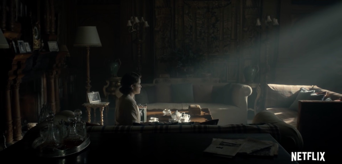
A typically moody and contrasty shot from “The Crown”
The Crown, for examples, blasts a 50KW Soft Sun through the window in almost every scene, bathing the monarchy in divine light to match its supposed divine right, while Better Call Saul paints huge swathes of rich, impenetrable black across the screen to represent the rotten soul of its antihero.
Film lighting today seems to strive for naturalism in the most part. Top DPs like recent Oscar-winner Roger Deakins, CBE, ASC, BSC, talk about relying heavily on practicals and using fewer movie fixtures, and fellow nominee Rachel Morrison, ASC, despite using a lot of movie fixtures, goes to great lengths to make the result look unlit. Could it be that film DPs feel they can be more subtle in the controlled darkness of a cinema, while TV DPs choose extremes to make their vision clear no matter what device it’s viewed on or how much ambient light contaminates it?
“Mudbound”, shot by Rachel Morrison, ASC
Whatever the reason, contrast does seem to be the key to a cinematic look. Even though that look may no longer be exclusive to movies released in cinemas, the perception of high contrast being linked to production value persists. The high contrast of the practically-lit scenes in my Stasis project is – as best I can tell – what makes people describe it as cinematic.
What does all of this mean for a filmmaker? Simply pumping up the contrast in the grade is not the answer. Contrast should be built into the lighting, and used to reveal and enhance form and depth. The importance of good production design, or at least good locations, should not be overlooked; shooting in a friend’s white-walled flat will kill your contrast and your cinematic look stone dead.
A shot of mine from “Forever Alone”, a short film where I was struggling to get a cinematic look out of the white-walled location.
Above all, remember that story – and telling that story in the most visually appropriate way – is the essence of cinema. In the end, that is what makes a film truly cinematic.
Stanley Kubrick’s 1975 period epic Barry Lyndon, although indifferently received upon its original release, is considered a masterpiece by many today. This is largely due to its painterly photography with strong, precisely composed frames that leave the viewer feeling more like they’ve wandered through an art gallery than watched a movie. Today I’m going to look at eight methods that Kubrick and his team used to create this feel. It’s an excellent example of how a director with a strong vision can use the many aspects of filmmaking to realise that vision.
1. Storytelling
The American Cinematographer article on Barry Lyndon notes that “Kubrick has taken a basically talky novel and magically transformed it into an intensely visual film.” You have only to look at a series of frame-grabs from the movie to see just how much of the story is contained in the images. Just like a painter, Kubrick reveals a wealth of narrative within a single frame. The shot above, for example, while recalling the landscapes of artists like Constable in its background and composition, also clearly tells the story of a courtship threatened by a third party with violent designs.
2. Design
Kubrick was keen for Lyndon to feature the type of rich fabrics which are often seen in 18th century art. He referred costume designer Milena Canonero to various painters of the period. “Stanley wanted beautiful materials,” she recalls in the documentary Stanley Kubrick: A Life in Pictures, “because as he quite rightly said, that’s why in those paintings they gave that wonderful light.”
3. Aspect ratio
There was much confusion and controversy surrounding Kubrick’s intended ratio for Lyndon. The negative was apparently hard-masked to 1.6:1, with the result that VHS and DVDs used this ratio, while the images were vertically cropped to 1.78:1 for the later Blu-ray release. However, the discovery in 2011 of a letter from Kubrick to cinema projectionists finally proved that 1.66:1 was the ratio he wanted audiences to see the film in.
1.66:1 was a standard ratio in parts of Europe, but unusual in the UK and USA. It’s not far off the golden ratio (1.6180:1) – a mathematically significant ratio which some artists believe to be aesthetically pleasing. There is evidence that Kubrick was not a fan of wide aspect ratios in general, perhaps because of his background as a photographer, but it can be no coincidence that Lyndon distances itself from the cinematic ratios of 1.85 and 2.39, and instead takes a shape closer to that of a typical painting.
(Most of the images in this post come from Evan Richards’ Cinematographers Index, and he in turn grabbed them from the 1.78:1 Blu-ray. The image above is in 1.66:1 but shows the 1.78:1 crop-lines.)
4. Composition
“The actual compositions of our setups were very authentic to the drawings of the period,” says DP John Alcott, BSC in his interview with American Cinematographer. Perhaps the film’s most obvious compositional nod to classical art is the large amount of headroom seen in the wide shots. As this article by Art Adams explains, the concept of placing the subject’s head at the top of the frame is fairly new in the history of image creation. Plenty of traditional art includes lots of headroom, and Lyndon does the same.
5. Camera movement
There is little camera movement in Barry Lyndon, but there are 36 zoom shots. Unlike a physical dolly move, in which the parallax effect causes different planes of the image to shrink or enlarge at differing rates, a zoom merely magnifies or reduces the whole image as a single element. This of course only serves to enhance the impression of a two-dimensional piece of art. In fact, the zooms resemble nothing so much as the rostrum camera moves a documentary filmmaker might make across a painting – what today we’d call a Ken Burns effect.
It’s interesting to note that, although Barry Lyndon is famous for its fast lenses – the f/0.7 Zeiss Planar primes – the movie also used a very slow lens, a custom-built T9 24-480mm zoom. From various accounts, other zooms used seem to include a Cooke T3.1 20-100mm and possibly a 25-250mm of some description. Of course, none of the zoom lenses were anywhere near fast enough for the candlelit scenes, so in those instances the filmmakers were forced to use a Planar and pull back physically on a dolly.
6. Lighting
“In preparation for Barry Lyndon we studied the lighting effects achieved in the paintings of the Dutch masters,” Alcott says. “In most instances we were trying to create the feeling of natural light within the houses, mostly stately homes, that we used as shooting locations.” The DP closely observed how natural light would come in through the windows and emulate that using diffused mini-brutes outside. This made it possible to shoot long days during the British winter when natural light was in short supply. Last week I covered in detail the technical innovations which allowed Alcott and Kubrick to shoot night scenes with just genuine candlelight, as 18th century painters would have seen and depicted them.
7. Contrast
Film stock in the seventies was quite contrasty, so Alcott employed a few methods to adjust his images to a tonal range more in keeping with 18th century paintings. He used a Tiffen No. 3 Low Contrast Filter at all times, with an additional brown net for the wedding scene “where I wanted to control the highlights on the faces a bit more,” he explains. He also used graduated ND filters (as in the above frame) both outdoors and indoors, if one side of the room was too bright. Most interestingly, he even went so far as to cover white fireplaces and doorways with fine black nets – not on the lens but on the objects themselves.
8. Blocking
The blocking in Barry Lyndon is often static. While this is certainly a creative decision by Kubrick, again recalling painted canvases and their frozen figures, it was also technically necessary in the candlelit scenes. Whenever the f/0.7 lenses were in use, the cast were apparently instructed to move as little as possible, to prevent them going out of focus. As one YouTube commenter points out, the stillness imposed by these lenses mirrors the stillness required of a painter’s model.