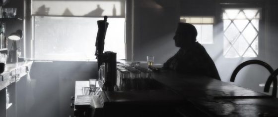
5 Steps to Lighting a Forest at Night

EXT. FOREST - NIGHT

A simple enough slug line, and fairly common, but amongst the most challenging for a cinematographer. In this article I’ll break down into five manageable steps my process of lighting woodlands at night.


1. Set up the moon.
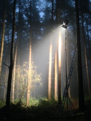
Forests typically have no artificial illumination, except perhaps practical torches carried by the cast. This means that the DP will primarily be simulating moonlight.

Your “moon” should usually be the largest HMI that your production can afford, as high up and far away as you can get it. (If your production can’t afford an HMI, I would advise against attempting night exteriors in a forest.) Ideally this would be a 12K or 18K on a cherry-picker, but in low-budget land you’re more likely to be dealing with a 2.5K on a triple wind-up stand.

Why is height important? Firstly, it’s more realistic. Real moonlight rarely comes from 15ft off the ground! Secondly, it’s hard to keep the lamp out of shot when you’re shooting towards it. A stand might seem quite tall when you’re right next to it, but as soon as you put it far away, it comes into shot quite easily. If you can use the terrain to give your HMI extra height, or acquire scaffolding or some other means of safely raising your light up, you’ll save yourself a lot of headaches.
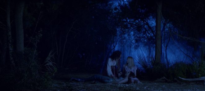
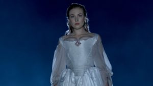
In this shot from “The Little Mermaid” (dir. Blake Harris), a 12K HMI on a cherry-picker creates the shafts of moonlight, while another HMI through diffusion provides the frontlight. (This frontlight was orange to represent sunrise, but the scene was altered in the grade to be pure night.)

The size of the HMI is of course going to determine how large an area you can light to a sufficient exposure to record a noise-free image. Using a good low-light camera is going to help you out here. I shot a couple of recent forest night scenes on a Blackmagic Pocket Cinema Camera, which has dual native ISOs, the higher being 3200. Combined with a Speedbooster, this camera required only 1 or 2 foot-candles of illuminance, meaning that our 2.5K HMI could be a good 150 feet away from the action. (See also: “How Big a Light do I Need?”)


2. Plan for the reverse.

A fake moon looks great as a backlight, but what happens when it comes time to shoot the reverse? Often the schedule is too tight to move the HMI all the way around to the other side, particularly if it’s rigged up high, so you may need to embrace it as frontlight.

Frontlight is generally flat and undesirable, but it can be interesting when it’s broken up with shadows, and that’s exactly what the trees of a forest will do. Sometimes the pattern of light and dark is so strong and camouflaging that it can be hard to pick out your subject until they move. One day I intend to try this effect in a horror film as a way of concealing a monster.

One thing to look out for with frontlight is unwanted shadows, i.e. those of the camera and boom. Again, the higher up your HMI is, the less of an issue this will be.

If you can afford it, a second HMI set up in the opposite direction is an ideal way to maintain backlight; just pan one off and strike up the other. I’ve known directors to complain that this breaks continuity, but arguably it does the opposite. Frontlight and backlight look very different, especially when smoke is involved (and I’ll come to that in a minute). Isn’t it smoother to intercut two backlit shots than a backlit one and frontlit one? Ultimately it’s a matter of opinion.

An example of cheated moonlight directions in “His Dark Materials” – DP: David Luther


3. Consider Ground lights.

One thing I’ve been experimenting with lately is ground lights. For this you need a forest that has at least a little undulation in its terrain. You set up lights directly on the ground, pointed towards camera but hidden from it behind mounds or ridges in the deep background.
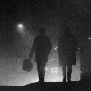
Detail from one of my 35mm stills: pedestrians backlit by car headlights in mist. Shot on Ilford Delta 3200

I once tried this with an HMI and it just looked weird, like there was a rave going on in the next field, but with soft lights it is much more effective. Try fluorescent tubes, long LED panels or even rows of festoon lights. When smoke catches them they create a beautiful glow in the background. Use a warm colour to suggest urban lighting in the distance, or leave it cold and it will pass unquestioned as ambience.

Put your cast in front of this ground glow and you will get some lovely silhouettes. Very effective silhouettes can also be captured in front of smoky shafts of hard light from your “moon”.


4. Fill in the faces.

All of the above looks great, but sooner or later the director is going to want to see the actors’ faces. Such is the cross a DP must bear.

On one recent project I relied on practical torches – sometimes bounced back to the cast with silver reflectors – or a soft LED ball on a boom pole, following the cast around.

Big-budget movies often rig some kind of soft toplight over the entire area they’re shooting in, but this requires a lot of prep time and money, and I expect it’s quite vulnerable to wind.

A recipe that I use a lot for all kinds of night exteriors is a hard backlight and a soft sidelight, both from the same side of camera. You don’t question where the sidelight is coming from when it’s from the same general direction as the “moon” backlight. In a forest you just have to be careful not to end up with very hot, bright trees near the sidelight, so have flags and nets at the ready.
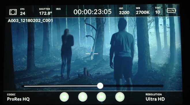
This shot (from a film not yet released, hence the blurring) is backlit by a 2.5K HMI and side-lit by a 1×1 Aladdin LED with a softbox, both from camera right.


5. Don’t forget the Smoke.

Finally, as I’ve already hinted, smoke is very important for a cinematic forest scene. The best options are a gas-powered smoke gun called an Artem or a “Tube of Death”. This latter is a plastic tube connected to a fan and an electric smoke machine. The fan forces smoke into the tube and out of little holes along its length, creating an even spread of smoke.
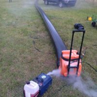
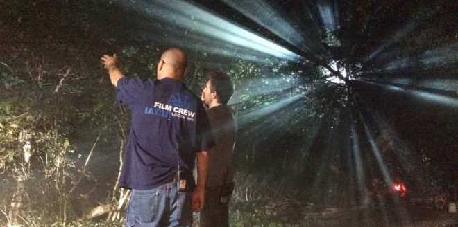
A Tube of Death in action on the set of “The Little Mermaid”

All smoke is highly suspectible to changes in the wind. An Artem is easier to pick up and move around when the wind changes, and it doesn’t require a power supply, but you will lose time waiting for it to heat up and for the smoke and gas canisters to be changed. Whichever one you pick though, the smoke will add a tremendous amount of depth and texture to the image.

Overall, nighttime forest work scenes may be challenging, but they offer some of the greatest opportunities for moody and creative lighting. Just don’t forget your thermals and your waterproofs!
5 Steps to Lighting a Forest at Night

6 Tips for Making DIY Lighting Look Pro

Good lighting can boost the production values of a film tremendously, making the difference between an amateur and a professional-looking piece. For filmmakers early in their careers, however, the equipment typically used to achieve these results can be prohibitively expensive. Far from the Hollywood productions attended by trucks full of lights, a micro-budget film may be unable to rent even a single HMI. Do not despair though, as there are ways to light scenes well without breaking the bank. Here are my top six tips for lighting on the cheap.


1. Make the most of natural light

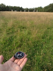
Checking my compass at the stone circle
Guesstimating the sun path on location

The hardest shots to light without the proper equipment are wide shots. Where a fully-budgeted production would rig Maxi Brutes on cherry-pickers, or pound HMIs through windows, a filmmaker of limited means simply won’t have access to the raw power of such fixtures. Instead, plan your day carefully to capture the wide shots at the time when natural light gives you the most assistance. For a day interior, this means shooting when the sun is on the correct side of the building.

See also: “Sun Paths”


2. Keep L.E.D.s to the background

£2 LED camping light

There are a plethora of LED fixtures on the market, designed for all kinds of applications, some of them very reasonably priced. It might be tempting to purchase some of these to provide your primary illumination, but I advise against it. Cheap LED units (and fluorescents) have a terrible Colour Rendering Index (CRI), making for unnatural and unappealing skintones. Such units are therefore best restricted to backgrounds, accent lighting and “specials”. For example, I purchased a little LED camping light from a charity shop for about £2, and I often use it to create the blue glow from computer screens or hang it from the ceiling to produce a hint of hair-light.

See also my article on LEDs from my “Know Your Lights” series.


3. Key with tungsten or halogen

Worklight
Halogen floodlight

By far the best solution for a high output, high CRI, low cost key is a halogen floodlight; 500W models are available for as little as £5. Their chief disadvantage is the lack of barn doors, making the light hard to control, though if you can stretch to a roll of black wrap you can fashion a kind of snoot. Alternatively, consider investing in a secondhand tungsten movie fixture. With many people switching to LEDs, there are plenty of old tungsten units out there. Try to get a reputable brand like Arri or Ianiro, as some of the unbranded units available on Ebay are poorly wired and can be unsafe.

See also: “DIY Interview Lighting for the ‘Ren’ EPK”


4. Control the light

Lace curtains used to break up light in a Camerimage workshop last year

Flooding a halogen light onto a scene is never going to look good, but then the same is often true of dedicated movie fixtures. Instead it’s more how you modify the light that creates the nuanced, professional look. Improvise flags from pieces of cardboard to stop the light spilling into unwanted places – but be VERY careful how close you put them to a tungsten or halogen source, as these get extremely hot. For example, when shooting indoors, flag light off the background wall (especially if it’s white or cream) to help your subject stand out.

See also “Lighting Micro-sets” for an example of this.


5. Soften the light

Almost all cinematographers today prefer the subtlety of soft light to the harshness of hard light. You can achieve this by bouncing your fixture off a wall or ceiling, or a sheet of polystyrene or card. Or you could hang a white bedsheet or a shower curtain in front of the light as diffusion, but again be sure to leave a safe distance between them. Professional collapsible reflectors are available very cheaply online, and can be used in multiple ways to diffuse or reflect light.

Hot tub cover = bounce board
Hot tub cover = bounce board. Towel = flag

See also: “How to Soften Harsh Sunlight with Tinfoil and a Bedsheet”; and to read more about the pictured example: “Always Know Where Your Towel Is”


6. Make use of practicals

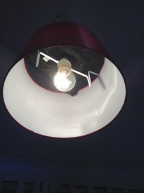
Black-wrapped ceiling light

Finally, don’t be afraid to use existing practical lighting in your scene. Turning on the main overhead light usually kills the mood, but sometimes it can be useful. You can generate more contrast and shape by covering up the top of the lampshade, thus preventing ceiling bounce, or conversely use the ceiling bounce to give some ambient top-light and cover the bottom of the lampshade to prevent a harsh hotspot underneath it. Table lamps and under-cupboard kitchen lights can add a lot of interest and production value to your backgrounds. If possible, swap out LED or fluorescent bulbs for conventional tungsten ones for a more attractive colour and to eliminate potential flickering on camera.

See also: “5 Tips for Working with Practicals”, and for an example of the above techniques, my blog from day two of the Forever Alone shoot.

6 Tips for Making DIY Lighting Look Pro

Colour Schemes

Last week I looked at the science of colour: what it is, how our eyes see it, and how cameras see and process it. Now I’m going to look at colour theory – that is, schemes of mixing colours to produce aesthetically pleasing results.


The Colour wheel

The first colour wheel was drawn by Sir Isaac Newton in 1704, and it’s a precursor of the CIE diagram we met last week. It’s a method of arranging hues so that useful relationships between them – like primaries and secondaries, and the schemes we’ll cover below – can be understood. As we know from last week, colour is in reality a linear spectrum which we humans perceive by deducing it from the amounts of light triggering our red, green and blue cones, but certain quirks of our visual system make a wheel in many ways a more useful arrangement of the colours than a linear spectrum.

One of these quirks is that our long (red) cones, although having peak sensitivity to red light, have a smaller peak in sensitivity at the opposite (violet) end of the spectrum. This may be what causes our perception of colour to “wrap around”.
Another quirk is in the way that colour information is encoded in the retina before being piped along the optic nerve to the brain. Rather than producing red, green and blue signals, the retina compares the levels of red to green, and of blue to yellow (the sum of red and green cones), and sends these colour opponency channels along with a luminance channel to the brain.

You can test these opposites yourself by staring at a solid block of one of the colours for around 30 seconds and then looking at something white. The white will initially take on the opposing colour, so if you stared at red then you will see green.

Hering’s colour wheels

19th century physiologist Ewald Hering was the first to theorise about this colour opponency, and he designed his own colour wheel to match it, having red/green on the vertical axis and blue/yellow on the horizontal.

RGB colour wheel

Today we are more familiar with the RGB colour wheel, which spaces red, green and blue equally around the circle. But both wheels – the first dealing with colour perception in the eye-brain system, and the second dealing with colour representation on an RGB screen – are relevant to cinematography.

On both wheels, colours directly opposite each other are considered to cancel each other out. (In RGB they make white when combined.) These pairs are known as complementary colours.


Complementary

A complementary scheme provides maximum colour contrast, each of the two hues making the other more vibrant. Take “The Snail” by modernist French artist Henri Matisse, which you can currently see at the Tate Modern; Matisse placed complementary colours next to each other to make them all pop.

“The Snail” by Henri Matisse (1953)

In cinematography, a single pair of complementary colours is often used, for example the yellows and blues of Aliens‘ power loader scene:

“Aliens” DP: Adrian Biddle, BSC

Or this scene from Life on Mars which I covered on my YouTube show Lighting I Like:

I frequently use a blue/orange colour scheme, because it’s the natural result of mixing tungsten with cool daylight or “moonlight”.

“The First Musketeer”, DP: Neil Oseman

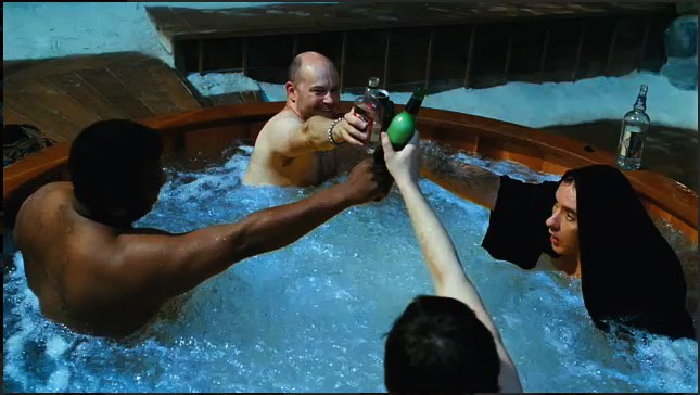
And then of course there’s the orange-and-teal grading so common in Hollywood:

“Hot Tub Time Machine” DP: Jack N. Green, ASC

Amélie uses a less common complementary pairing of red and green:

“Amélie” DP: Bruno Belbonnel, AFC, ASC


Analogous

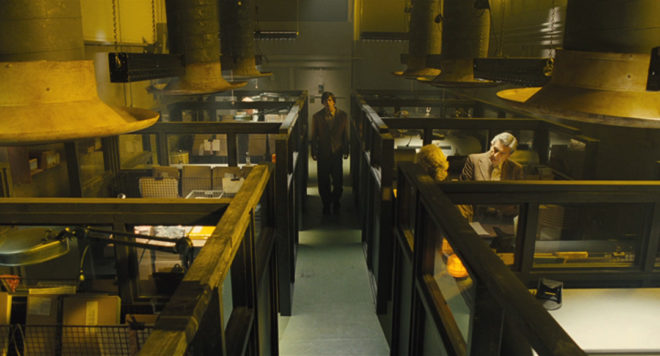
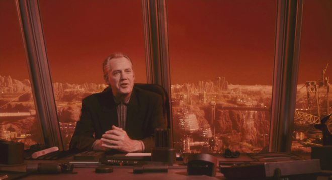
An analogous colour scheme uses hues adjacent to each other on the wheel. It lacks the punch and vibrancy of a complementary scheme, instead having a harmonious, unifying effect. In the examples below it seems to enhance the single-mindedness of the characters. Sometimes filmmakers push analogous colours to the extreme of using literally just one hue, at which point it is technically monochrome.

“The Matrix” DP: Bill Pope, ASC
“Terminator 2: Judgment Day” DP: Adam Greenberg, ASC
“The Double” DP: Erik Alexander Wilson
“Total Recall” (1990) DP: Jost Vacano, ASC, BVK


There are other colour schemes, such as triadic, but complementary and analogous colours are by far the most common in cinematography. In a future post I’ll look at the psychological effects of individual colours and how they can be used to enhance the themes and emotions of a film.

SaveSave

Colour Schemes

Front-light

A front-lit shot of mine from “The First Musketeer” (2015, dir. Harriet Sams)

Front-light is a bit of a dirty word in cinematography. DPs will commonly be heard rhapsodising about beautiful backlight or moody sidelight, but rarely does the humble front-light get any love. But there is no right or wrong in cinematography. Just because front-light is less popular, doesn’t mean it can’t make a great shot.

Why do we avoid front-light so often? Because it usually flattens things out, reducing or eliminating any sense of depth in the image, and giving no shape to faces or objects. Sometimes this might be the perfect look: for a character who is shallow, or who feels like their life is dull and uneventful, perhaps; a live-action scene to be intercut with two-dimensional animation; or a stylised flashback like the image above. And sometimes, of course, front-light is unavoidable for logical reasons – if a character is looking out of a window, say. The trouble is, it can make for un-engaging or un-cinematic images, and that’s when you may want to pull some other tricks out of the box.

Here are six ways to bring some interest back into a frontally-lit frame.


1. Cut the light.

A shot of mine from “Crossing Paths” (2015, dir. Ben Bloore)

If you can flag some of the front-light, reducing the area of the frame it’s hitting, and leave the rest to the fill light or to fall into shadow, you’ll get some contrast back into your image.


2. Use a gobo.

Another shot of mine, this one from “Lebensraum” way back in 2007.

If it doesn’t make sense to cut the light, try breaking it up with a gobo. You can make a gobo from almost anything. Commonly on night exteriors I send a spark off to liberate a branch from a nearby tree and rig that in front of the key-light. If I need to create a window-frame effect I’ve been known to clamp a chair or stool to a C-stand to get a suitable pattern of perpendicular lines.


3. Add dynamics.

Front-light is often more interesting if it’s not there all the time. If you can find an excuse to have it flicker or move somehow, you’ll get a lot more mood and shape in your shot. Firelight, TVs, rippling water, panning searchlights or the headlights of a passing car can all safely come from the front and remain dramatic. Create a moving gobo and you’ve got something really interesting. The tree branch example from earlier – if that blows around in the wind then it will add a lot of tension to the visuals. Here’s a firelight example from Ren: The Girl with the Mark

(Check out my Instagram feed for more lighting breakdowns like this.)


4. Darken the background.

“Magnolia” (DP: Robert Elswit, ASC)

You can combat the lack of depth by keeping the background dark, so that the front-lit subject stands out against it. This will happen automatically due to the Inverse-square Law (a post on that is coming soon) if the subject is close to the source, e.g. standing right by a window. Due to the nature of front-light, you probably can’t flag the background without flagging the subject too, so bringing your source closer to the subject or redressing the background may be your only options.


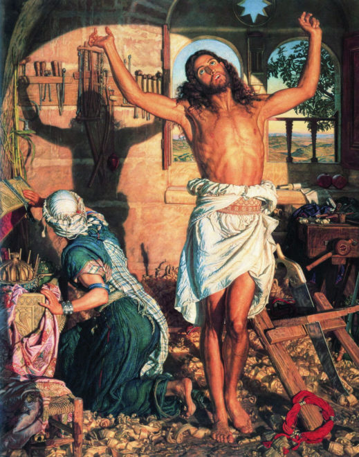
5. Make a virtue of the subject’s shadow.

“The Shadow of Death” by William Holman Hunt, 1873

One reason to avoid front-light is the distracting shadow which the subject will cast on the background. But sometimes this can be a great benefit to the shot, almost becoming another character, or adding subtext as in this painting.


6. Use a strong backlight.

A still of mine from “Stop/Eject”. The red backlight and the kicker from the practical help mitigate the flat front-light.

If there’s nothing you can do to modify the front-light, then pumping up the backlight might well save the day. The most flatly-illuminated shots suddenly become deep and appealing when the subject has a halo of over-exposed light. Indeed, this is what commonly happens with day exteriors: you shoot into the sun to get the nice backlight, and ambient light flatly fills in the faces.

So next time you’re faced with front-light, remember, it’s not the end of the world!

Front-light

Introduction to Short Key Lighting

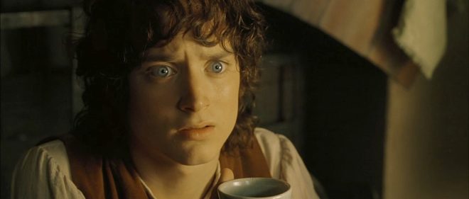
“The Lord of the Rings: The Fellowship of the Ring” – DP: Andrew Lesnie, ACS, ASC

If you’re starting out in your cinematography career, or maybe stepping up from camera operation,  lighting can be daunting. How do you know where to put your lights? If you’re working to the Three Point Lighting system, the backlight is self-explanatory, and the fill will often be ambient and directionless, but you may still be left wondering where to put your main light source, your key.

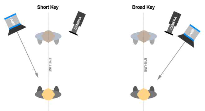
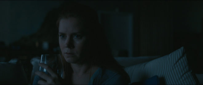
Fortunately there is a very simple rule of thumb, known as short key. In simple terms, a short key light is one which is on the opposite side of the subject’s eye-line to the camera. Let’s delve into what this means and why it’s so common. In fact, once you understand what a short key is you’ll be forever spotting examples of it in film and TV – you’ll be staggered at how often it’s used.

It’s easiest to think of short key from the perspective of the actor. The camera is in front of us and off to one side, because very rarely do actors look down the lens, and the key light is in front of us and off to the other side. It’s called short key because the side of our face that it hits is the side away from camera. The opposite of short key is broad key, where the light is on the same side of us as the camera, thus lighting the “broad” side of our face, the side presented to camera. Note that the light can be either side of the camera, it’s which side of our eye-line it’s on that’s important.

“Arrival” – DP: Bradford Young, ASC

Short key follows the general cinematography principle that light is more interesting when it comes in from the side and behind, rather than from close to camera. It’s preferred by most DPs in most situations because it produces more dimensionality and contrast than broad key. By hitting the side of the face away from camera, a short key leaves shadow on the closer side, creating mood and interest. It brings out the shape of the nose and cheeks. It leaves the ear and side of the head darker, concentrating attention on the face and consequently the performance.

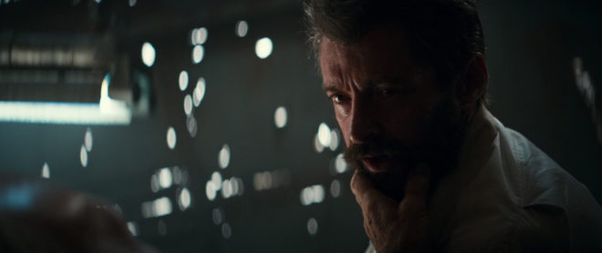
Under the umbrella of short key we can still vary the angle tremendously to affect the mood. If we place the key severely to the side, so none of its illumination reaches the camera side of the actor’s face, and use a very low level of fill, we create a strong, uncompromising look.

“Logan” – DP: John Mathieson, BSC
“Fight Club” – DP: Jeff Cronenweth, ASC

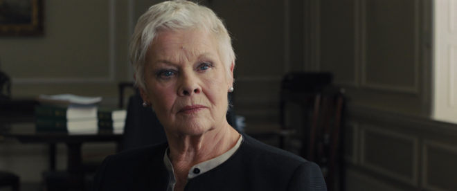
If we place the key closer to front-on, and soften it with diffusion so that it wraps around the camera side of the face, we create a more comfortable, flattering look.

“Skyfall” – DP: Roger Deakins, ASC, BSC, CBE
“The Pianist” – DP: Pawel Edelman, PSC

We can also raise the lamp to shade the eye sockets, Godfather style, lower it to create a campfire ghost story look, or place it anywhere in between.

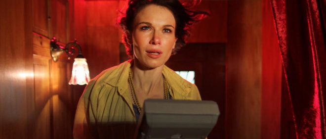
Broad key is less desirable amongst cinematographers, often resorted to only when short key cannot be reconciled with motivating the sources authentically. However, that doesn’t mean that it’s bad or that it can’t be used deliberately and creatively. Here’s just one example of broad key being used extremely effectively.

An example of broad key from “Amélie” – DP: Bruno Delbonnel, AFC, ASC

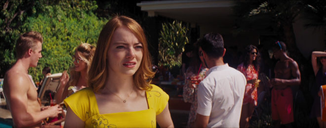
Short key though is the dominant, ubiquitous style of lighting. It is often the first thing a DP considers when walking onto the set: where can I put the key light in order to hit the short side of the talent? Or conversely, where can I put the camera so that it’s on the opposite side to the light?

If we’re dealing with fixed light sources like windows, or shooting outdoors – we’ll exploit the sun-path or even request that the blocking be altered to ensure a short key.  It can go such a long way to making an image cinematic.

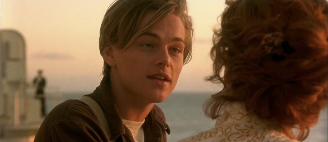
“La La Land” – DP: Linus Sandgren, FSF
“Titanic” – DP: Russell Carpenter, ASC

In standard dialogue scenes with two characters facing each other, a technique called cross-backlighting is commonly used to short key both characters and provide backlight too. Check out my post on cross-backlighting for more info.

So next time you watch TV or a movie, look out for short key lighting; I guarantee you’ll see it everywhere.

The frame grabs in this post are from The Cinematographer Index. Check out this very useful resource showcasing great cinematography, and donate a few quid if you can.

Introduction to Short Key Lighting

The Art of Single Source Lighting

Can a scene be lit with just one lamp? It certainly can, and in fact some of cinema’s most stunning and iconic images have been achieved this way. A single source image can be realistic or stylised, flattering or scary, but is almost always arresting. Even if you decide the look of a single source is too extreme, and add more lamps, building the lighting around that one key source can still be a very useful approach.

Let’s consider some of the ways in which a single source can be used.


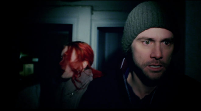
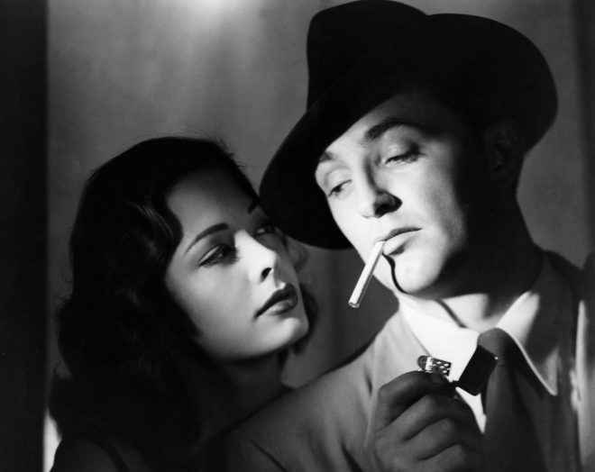
Front Light

Front light is not very common in cinematography because – and this will be especially true without any other sources – it produces a flat image. Often we think of front light as being devoid of depth, though in fact it does reveal depth because things closer to the camera (and therefore also closer to the light) are brighter, while distant backgrounds are darker. An example is the sequence from Eternal Sunshine of the Spotless Mind in which the frontal spotlight and the resultant dark surroundings represent the protagonist’s memories being erased.

“Eternal Sunshine of the Spotless Mind” – DP: Ellen Kuras ASC
“Out of the Past” – DP: Nicholas Musuraca ASC. This one’s a bit of a cheat because there appears to be a second light on the background.

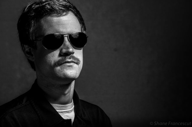
More common is three-quarter front light, which gives some modelling on the face, and is consequently seen a lot in portraiture, both modern and classical.

Photo by Shane Francescut, www.theweeklyminute.wordpress.com
“Portrait of Doge Leornardo Loredan” – Giovanni Bellini (1501)


Side Light

Light from the side can be the most informative, revealing shape, texture and detail. As a single source, it produces incredible chiaroscuro – contrast between light and shade. This shot from the The Godfather is a great example.

“The Godfather” – DP: Gordon Willis ASC

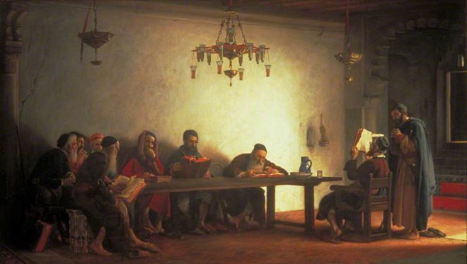
Here is a more complex example from classical art. I saw this painting at the Guildhall recently and it inspired me to write this post. I love the way that the soft light comes in through an unseen doorway to the right, illuminating the wall and modelling each of the people differently according to the angle it reaches them at.

“The Reading of the Bible by the Rabbis” – Jean Jules Antoine Lecomte du Noüy (1882)


Toplight

Perhaps the most famous use of toplight is in The Godfather‘s opening scene, where the characters’ eye sockets are rendered black and hollow by the steep angle of the single source.

“The Godfather” – DP: Gordon Willis ASC

A ceiling lamp hanging over a table is one of the most frequently seen examples of single source top-lighting.

“Mud” – DP: Adam Stone

Often the table or things on it – papers, white tablecloths – will reflect back some of the toplight, filling in the shadows. Film Riot investigates the many variations of this set-up in their episode on single source lighting.


Backlight

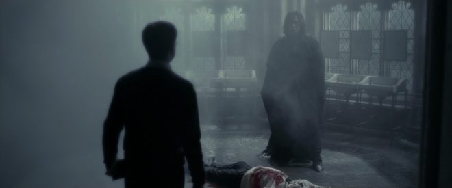
There are many examples of scenes lit only from the back. It’s a beautiful look, creating mood and mystery, revealing form without details, reducing people to simulacra. The optional addition of smoke helps the light to wrap a little and lift the shadows.

“Blade Runner” – DP: Jordan Cronenweth ASC
“Harry Potter and the Half-blood Prince” – DP: Bruno Delbonnel AFC, ASC
“The Man from London” – DP: Fred Kelemen
“The Assassination of Jesse James by the Coward Robert Ford” – DP: Roger Deakins CBE, ASC, BSC
“The Social Network” – DP: Jeff Cronenweth ASC

It’s not uncommon for a DP to begin lighting by setting a backlight to give form and depth to the scene, then seeing if and where other sources are necessary, to illuminate faces and other important details.


OMNIDIRECTIONAL

Most film fixtures shed their illumination in broadly one direction, but of course most light sources in day-to-day life aren’t that discriminating, throwing rays all around them. In the form of practicals, such omnidirectional lights can create very interesting images, particularly when they are handheld.

“O Brother, Where Art Thou?” – DP: Roger Deakins CBE, ASC, BSC

When people are grouped around an omnidirectional source, each one is modelled differently. Characters in the foreground, between the lamp and the camera, become silhouettes, while those to the sides are rendered in chiaroscuro, and those in the background are lit frontally. This creates a wonderful feeling of dark-to-light/near-to-far depth and dimensionality. 17th century Dutch masters like Gerrit Dou and Gerard van Honthorst painted such effects beautifully.

“The Match-maker” – Gerard van Honthorst (1625)
“The Denial of St Peter” – Gerard van Honthorst (circa 1618-1620)

Having recently re-equipped myself with a 35mm SLR, I’m planning a photography project inspired by some of these candlelit scenes. Watch this space!

The Art of Single Source Lighting

Lighting with LED Screens

Gravity’s LED light box

LED lighting has found its way onto most sets now, but there is another off-shoot of LED technology which I see cropping up more and more in American Cinematographer articles. Sometimes it’s lighting, sometimes it’s a special effect, and often it’s both. I’m talking about LED screens: huge LED panels that, rather than emitting solid, constant light, display a moving image like a giant monitor.

I touched on LED Screens in my article about shooting on moving trains, and moving backgrounds do seem to be one of the most common uses for these screens. House of Cards has been in the news this week for all the wrong reasons, but it remains a useful example here. Production designer Steve Arnold describes the use of LED screens for car scenes in the political drama:

We had a camera crew go to Washington, D.C. to drive around and shoot plates for what you see outside when you’re driving. And that is fed into the LED screens above the car. So as the scene is progressing, the LED screens are synched up to emit interactive light to match the light conditions you see in the scenery you’re driving past (that will be added in post). All the reflections on the car windows, the window frames and door jambs is being shot while we’re shooting the actors in the car. Then in post the green screens are replaced with the synced up driving plates, and it works really well. It gives you the sense of light passing over the actors’ faces, matching the lighting that is in the image of the plate.

The green-screen stage used for a car scenes on House of Cards, complete with LED screens for interactive lighting.

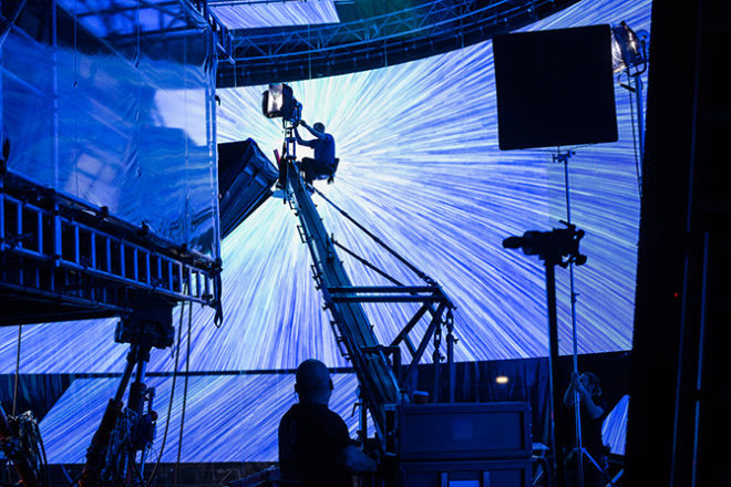
This appears to be the go-to method for shooting car scenes now, and more exotic forms of transport are using the technique as well. Rogue One employed “a massive array of WinVision Air 9mm LED panels” to create “an interactive hyperspace lighting effect” (American Cinematographer, February 2017).

The hyperspace VFX is displayed on a huge LED screen on the set of Rogue One.

Production designer Doug Chiang comments on the use of LED screens in the Death Star command centre:

We wanted to see things on the viewscreen where traditionally it would have been a giant bluescreen; we wanted the interactive reflective quality of what you would actually see. Even though we ultimately had to replace some of those images with higher-fidelity images in postproduction, they were enough to give a sense that the quality of light on the actors and the reflections on the set looked and felt very real.

One of the first major uses of LED screens for lighting was in the seminal stranded-in-space thriller Gravity. Concerned about blending the actors convincingly with the CGI backgrounds, DP Emmanuel Lubezki, ASC, AMC came up with a solution that was, at the time, cutting-edge: “I had the idea to build a set out of LED panels and to light the actors’ faces inside it with the previs animation.” (AC, November 2013)

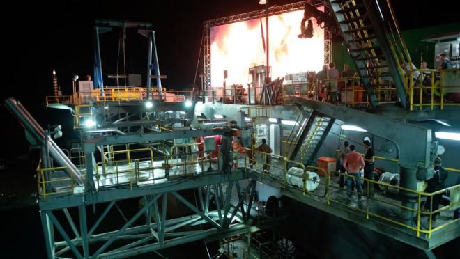
Gravity also featured a scene in which Sandra Bullock’s character puts out a fire, and here once again LED panels provided interactive light. This is a technique that has since been used on several other films to simulate off-camera fires, including Christopher Nolan’s Dunkirk, and the true story of the BP oil rig disaster, Deepwater Horizon.

An LED screen in use on Dunkirk

Traditionally, fire has been simulated with tungsten sources, often Maxibrutes, but on Deepwater Horizon these were relegated to background action, while foregrounds were keyed by a huge 42’x24′ video wall made up of 252 LED panels.  DP Enrqiue Chediak, ASC had this to say (in AC, October 2016):

Fire caused by burning oil is very red and has deep blacks. You cannot get that with the substance that the special effects crews use – all those propane fires are yellow. Oil fire has a very specific quality, and I wanted to reach that. It was important to feel the sense of hell.

By playing back footage of real oil fires on the video wall, Chediak was able to get the realistic colour of lighting he wanted, while retaining authentic dynamics.

The giant LED wall on Deepwater Horizon

This technique isn’t necessarily confined to big-budget productions. In theory you could create interactive lighting with an iPad. For example, a tight shot of an actor supposedly warming themselves by a fireplace; if you could get the iPad close enough, playing a video of flames, I imagine the result would be quite convincing. Has anyone out there tried something like this? Let me know if you have!

I’ll leave you with a music video I shot a few years back (more info here), featuring custom-built LED panels in the background.

Lighting with LED Screens

5 Lighting Modifiers You Can Put on Windows

Lighting through windows is the cornerstone of a DP’s day interior work. I’ve previously written about the various ways that hard light through a window can be used. Today I’m going to look at some examples of how dressing on the windows – anything from curtains to paint or newspaper – can create interesting lighting looks and help you tell the story.

Please note: there are some minor spoilers in this post, and a quite big one for the season two finale of Mr Robot.


1. PAINTS AND STAINS

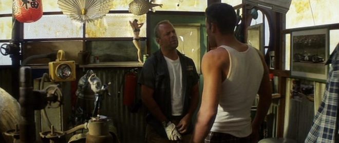
Director Michael Bay and DP John Schwartzman, ASC recycled many techniques they had used on commercials when they shot Armaggeddon. One of these was to create coloured light, not by arbitrarily gelling lamps, but by having the art department paint the windows. In an early scene on the oil rig, the windows are yellowed to give a warm feel to a romantic scene between AJ and Grace, contrasting with the cool, monochromatic look of the asteroid later on in the film. “The windows here are like a Filon fibreglass that we then threw some orange asphaltum stain on to give it that warm tone,” Schwartzman explains in the commentary.


2.NEWSPAPER

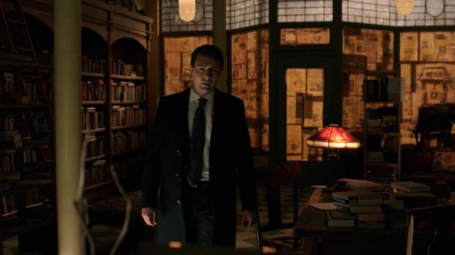
During the first season of time travel thriller 12 Monkeys, our heroes James Cole and Dr Cassandra Railly base themselves out of a disused shop. It’s a safe place they retreat to when they need to plan or regroup, and a womb-like feeling of warmth and security is created visually by the orange newspaper covering the shop’s front windows.

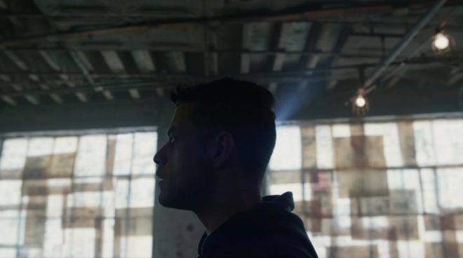
The season two finale of Mr Robot uses a similar technique to a very different end. Gaps in the paper here allow violent shafts of light to pierce the room, foreshadowing the bullet which is about to pierce Elliot’s body.


3. Blinds

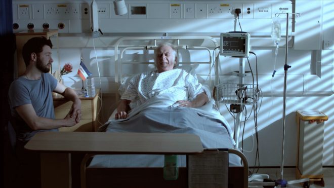
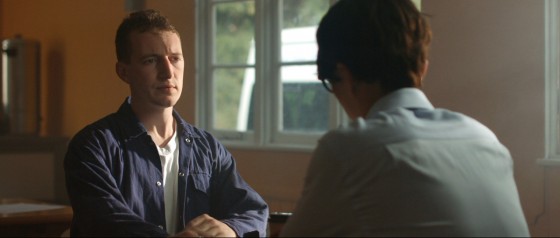
When I lensed the race drama Exile Incessant in 2015, director James Reynolds wanted to visually represent the ideological differences between the older and younger South Africans. I decided to bathe the progressive youngsters in soft, low-contrast light, while throwing hard light and deep shadows onto the more narrow-minded adults, whose world is black and white in more ways than one. For the hospital scene pictured below, I adjusted the venetian blinds – with a 2.5K HMI behind them – to give a contrasty pattern of light and shade on the old man.

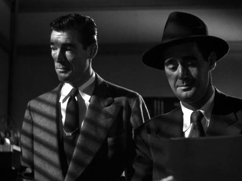
Lighting through blinds is of course a famous feature of film noir cinematography, and has found its way into countless movies of all genres over the last several decades.

He Walked by Night (1948, dir. Alfred L. Werker)


4. Diffusing curtains

Placing sheer curtains on a window can solve two problems for filmmakers: disguising an unwanted or non-existent (if on stage) background, and softening the light. This is a widely-used technique; in fact it’s common practice for art departments to consult with DPs about curtains to ensure that the right options are available for the style of lighting that will be employed.

In an episode of my YouTube series Lighting I Like, I discussed a scene from The Crown – Netflix’s dramatisation of Queen Elizabeth II’s reign – in which King George VI is found dead. Unlike many daylight interiors in the series which feature hard shafts of sunlight, the scene in question employed net curtains to create a softer, more subdued light, appropriate to the sombre content.


5. Billowing curtains

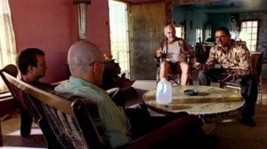
The season two Breaking Bad episode “Grilled” sees out-of-their-depth crystal meth cooks Walter White and Jesse Pinkman taken hostage by crazy drug lord Tuco Salamanca. Realising that their only hope of escape lies in killing Tuco, Walter and Jesse plot to poison his burrito. The episode bristles with tension, generated not just through the script and performances, but also by flapping curtains which paint the scene with restless shadows. The scene appears to have been shot on location, so whether the wind was artificial or just a happy accident I don’t know, but either way it adds immeasurably to the atmosphere.

Both Breaking Bad and 12 Monkeys feature in the second season of Lighting I Like – coming soon!

5 Lighting Modifiers You Can Put on Windows

5 Tips for Working with Practicals

As the sensitivity and dynamic range of cameras has increased, practicals have become a more and more important and popular tool in the cinematographer’s arsenal. A practical is any light source that appears in the frame. It could be a fluorescent strip-light, a table lamp, car headlights, candles, a fireplace, an iPad, fairy lights, street lamps, a torch, a security light… any light that could be realistically found in the place where your scene is set.

Here are five pieces of advice I’ve put together from my own experiences working with practical lights.


1. Liaise continually with the director and art department.

Production Designer Stuart Craig and Cinematographer Slawomir Idziak PSC confer on the set of Harry Potter and the Order of the Phoenix.

Although the bulb, wiring and power supply are the responsibility of the lighting department, the fixture itself falls under the purview of the art department. A good production designer will be thinking of light sources from the very beginning of their set design process. This is the start of a conversation which will continue throughout preproduction, as you the DP ask for fixtures in certain positions to make the set and actors look good, and the designer either says yes or asks for compromises so as not to ruin the aesthetics or believability (or budget!) of their design. The places a DP wants light sources in order to get the best modelling of the talent are often not the places a real human being would choose to install a light source in their home/office/dungeon etc. Some designers will demand realism and fight you on these decisions; others are open to artistic license. Either way, you must respect the symbiotic relationship between your two departments and do your best to reach a solution that works for both of you.

Keeping the director in the loop is also very important. When it comes to lighting, practicals are one of the things most likely to cause disagreement between the director and DP. You may have spent an hour lighting the set to be motivated by the candles all around, only for the director to walk onto set and say that they feel it makes no sense within the story for someone to have lit the candles in this scene. At which point, if you can’t change the director’s mind, you will find yourself hastily relighting the set while the 1st AD shakes their head in despair.


2. Sometimes it’s as simple as turning it on.

A Serious Man (DP: Roger Deakins CBE, ASC, BSC)

Earlier in my career, whenever I saw a practical, I felt that I had to set up a movie light somewhere out of frame in order to beef up the amount of light apparently coming from that practical. And traditionally, this is indeed the way DPs have worked, because film stocks weren’t sensitive enough to get an acceptable exposure from typical practicals like table lamps. Or it was impossible to find a level for the practical where it was bright enough to expose the talent but dim enough that the lamp itself didn’t read on camera as an ugly, over-exposed white blob.

But today’s digital cameras have a wider dynamic range, making it much easier to expose both the source and the subject acceptably. So ask yourself, do you really need that movie light? Roger Deakins, the world’s most celebrated living cinematographer, says he commonly lights his sets now with predominantly practical sources. Take a look at your scene without any additional lights, and only add extra sources if your practical’s illumination isn’t reaching the distance it needs to.

And practicals don’t even need to light the talent. Sometimes you have a scene perfectly well illuminated with other sources, but turning on a practical in the background just adds the icing on the cake. It may not illuminate anything but a small pool immediately around itself, but that little pool of orange light might add colour contrast, production value and interest. I’ve often seen daylight interior scenes on TV or in movies where bright shafts of “sunlight” are blasting in through a window, and no-one would realistically need to turn an artificial light on, but nonetheless several table lamps are glowing away in the background – because it looks great!


3. Always use dimmers.

As I’ve already said, finding that perfect brightness for your practical can be a delicate balancing act, so always have your crew put practicals on dimmers (a.k.a. “squeezers”) to make it easy to find that right level. Besides, practicals often look best with a warmer colour temperature, and you can get that by dimming them down, if they’re tungsten, adding to the cosy feel.


4. Keep other sources off the practical.

One of the reasons practicals look good is because they create contrast in the frame: a bright patch spreading out into darkness. If other light is falling on the practical, this effect will be washed out and reduced. If the other source is bright, it may even make the practical look like it’s not switched on. (Just like if you take a torch outside in daylight and turn it on, it doesn’t look like it’s on at all because the sun is so overpowering.)

If possible, other sources should be flagged so that they don’t hit the practical. This is something that an experienced gaffer will often have done as a matter of course.


5. Dim the camera side of the practical.

O Brother, Where Art Thou? (DP: Roger Deakins CBE, ASC, BSC)

Even with the wide dynamic range of today’s cameras, the flame or bulb of a practical may still look unpleasantly bright on camera. To deal with this, depending on the design of the fixture, you may be able to hide a small piece of ND gel inside it on the camera side. If properly arranged, this will cut the light travelling directly into the camera lens, but not the light shining in other directions and illuminating the talent.

Alternatively, the glass case of a lantern can be sprayed black on the camera side. The paint will not be picked up by the camera because there will still be a lot of light coming through it, but it should cut enough brightness to eliminate lens flare and reduce highlight clipping.


I hope these tips are helpful next time you shoot with practicals. Happy lighting, and merry Christmas!

5 Tips for Working with Practicals

5 Ways to Use Hard Light Through a Window

The first step in lighting a daytime interior scene is almost always to blast a light through the window. Sometimes soft light is the right choice for this, but unless you’re on a big production you simply may not have the huge units and generators necessary to bounce light and still have a reasonable amount of it coming through the window. So in low budget land, hard light is usually the way we have to go.

Now, I used to think that this hard window light had to hit the talent’s faces, otherwise what’s the point? But eventually I learnt that there are many things you can do with this light….


1. Light the talent directly.

This is what I always used to do. The problem is that the light will be very harsh. If there is a good amount of natural light coming in through the window too, that might soften the look enough. If not, slipping a diffusion frame in front of the light will take the edge off the hardness. And it depends which way the talent is facing. If the hard light is backlighting or edging them, the effect might well be beautiful.

prison2
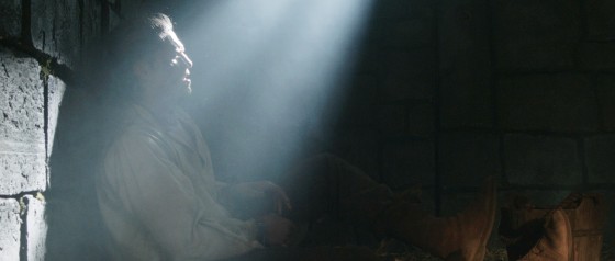
Ren: The Girl with the Mark, S1 E4, director: Kate Madison, DP: Neil Oseman
Hard side light from an Arri M18 outside the window, combined with a 4x4 kino from a 3/4 angle inside the room
The Gong Fu Connection, director: Ted Duran, DP: Neil Oseman


2. Light part of the talent directly.

This is a nice way to get the best of both worlds. You hit their clothes with the hard light, maybe a bit of their chin too; it creates contrast, brings out the texture in the costume, and adds dynamics because as the talent moves, the edge of the hard light will move around on them. To light the parts which the hard source doesn’t hit you can use bounce, or a kinoflo Window Wrap.

ren4-commander-house
Ren: The Girl with the Mark, S1 E4, director: Kate Madison, DP: Neil Oseman
Ren: The Girl with the Mark (Mythica Entertainment, dir. Kate Madison)
Ren: The Girl with the Mark, S1 E2, director: Kate Madison, DP: Neil Oseman


3. Light the floor.

Arrange the light so it hits the floor, creating a skip bounce. Unless the floor’s a very dark colour, the light will bounce back up and light your talent softly from below. While some people are afraid of the “monster” look of lighting from below, it can often produce a very beautiful look. It’s well worth exploring. Alternatively, bounce the hard window light off a wall to create a soft side light.

Manure, director: Michael Polish, DP: M. David Mullen
This photo from the set of Above the Clouds (director: Leon Chambers) shows a white sheet which I laid on the floor to skip-bounce the HMI outside the window. Some of its effects can be seen on Rupert's face (right)!
This photo from the set of Above the Clouds (director: Leon Chambers) shows a white sheet which I laid on the floor to skip-bounce the HMI outside the window.


4. Light the background.

A hot splash of “sunlight” on the background is a common way to add interest to a wide shot. It can show off the production design and the textures in it, or help frame the talent or separate them from the background.

The Crown, S1 E10 "Gloriana", dir.
The Crown, S1 E10 “Gloriana”, director: Philip Martin, DP: Ole Bratt Birkeland
My Utopia, director: Patrick Moreau, DP: Joyce Tsang


5. Light nothing.

Sometimes the most effective way to use a shaft of light through a window is simply as background interest. Volumize the light using smoke, and it creates a nice bit of contrast and production value in the scene. Silhouetting characters in front of the beam can be very effective too. 

33_GuardRoomWide1
Ren: The Girl with the Mark, S1 E4, director: Kate Madison, DP: Neil Oseman
Big Sur, director: Michael Polish, DP: M. David Mullen


Any that I’ve missed? What are your techniques for lighting through windows?

5 Ways to Use Hard Light Through a Window