8 Ways “Barry Lyndon” Emulates Paintings

Stanley Kubrick’s 1975 period epic Barry Lyndon, although indifferently received upon its original release, is considered a masterpiece by many today. This is largely due to its painterly photography with strong, precisely composed frames that leave the viewer feeling more like they’ve wandered through an art gallery than watched a movie. Today I’m going to look at eight methods that Kubrick and his team used to create this feel. It’s an excellent example of how a director with a strong vision can use the many aspects of filmmaking to realise that vision.


1. Storytelling

The American Cinematographer article on Barry Lyndon notes that “Kubrick has taken a basically talky novel and magically transformed it into an intensely visual film.” You have only to look at a series of frame-grabs from the movie to see just how much of the story is contained in the images. Just like a painter, Kubrick reveals a wealth of narrative within a single frame. The shot above, for example, while recalling the landscapes of artists like Constable in its background and composition, also clearly tells the story of a courtship threatened by a third party with violent designs.


2. Design

Kubrick was keen for Lyndon to feature the type of rich fabrics which are often seen in 18th century art. He referred costume designer Milena Canonero to various painters of the period. “Stanley wanted beautiful materials,” she recalls in the documentary Stanley Kubrick: A Life in Pictures, “because as he quite rightly said, that’s why in those paintings they gave that wonderful light.”


3. Aspect ratio

There was much confusion and controversy surrounding Kubrick’s intended ratio for Lyndon. The negative was apparently hard-masked to 1.6:1, with the result that VHS and DVDs used this ratio, while the images were vertically cropped to 1.78:1 for the later Blu-ray release. However, the discovery in 2011 of a letter from Kubrick to cinema projectionists finally proved that 1.66:1 was the ratio he wanted audiences to see the film in.

1.66:1 was a standard ratio in parts of Europe, but unusual in the UK and USA. It’s not far off the golden ratio (1.6180:1) – a mathematically significant ratio which some artists believe to be aesthetically pleasing. There is evidence that Kubrick was not a fan of wide aspect ratios in general, perhaps because of his background as a photographer, but it can be no coincidence that Lyndon distances itself from the cinematic ratios of 1.85 and 2.39, and instead takes a shape closer to that of a typical painting.

(Most of the images in this post come from Evan Richards’ Cinematographers Index, and he in turn grabbed them from the 1.78:1 Blu-ray. The image above is in 1.66:1 but shows the 1.78:1 crop-lines.)


4. Composition

“The actual compositions of our setups were very authentic to the drawings of the period,” says DP John Alcott, BSC in his interview with American Cinematographer. Perhaps the film’s most obvious compositional nod to classical art is the large amount of headroom seen in the wide shots. As this article by Art Adams explains, the concept of placing the subject’s head at the top of the frame is fairly new in the history of image creation. Plenty of traditional art includes lots of headroom, and Lyndon does the same.


5. Camera movement

There is little camera movement in Barry Lyndon, but there are 36 zoom shots. Unlike a physical dolly move, in which the parallax effect causes different planes of the image to shrink or enlarge at differing rates, a zoom merely magnifies or reduces the whole image as a single element. This of course only serves to enhance the impression of a two-dimensional piece of art. In fact, the zooms resemble nothing so much as the rostrum camera moves a documentary filmmaker might make across a painting – what today we’d call a Ken Burns effect.

It’s interesting to note that, although Barry Lyndon is famous for its fast lenses – the f/0.7 Zeiss Planar primes – the movie also used a very slow lens, a custom-built T9 24-480mm zoom. From various accounts, other zooms used seem to include a Cooke T3.1 20-100mm and possibly a 25-250mm of some description. Of course, none of the zoom lenses were anywhere near fast enough for the candlelit scenes, so in those instances the filmmakers were forced to use a Planar and pull back physically on a dolly.


6. Lighting

“In preparation for Barry Lyndon we studied the lighting effects achieved in the paintings of the Dutch masters,” Alcott says. “In most instances we were trying to create the feeling of natural light within the houses, mostly stately homes, that we used as shooting locations.”  The DP closely observed how natural light would come in through the windows and emulate that using diffused mini-brutes outside. This made it possible to shoot long days during the British winter when natural light was in short supply. Last week I covered in detail the technical innovations which allowed Alcott and Kubrick to shoot night scenes with just genuine candlelight, as 18th century painters would have seen and depicted them.


7. Contrast

Film stock in the seventies was quite contrasty, so Alcott employed a few methods to adjust his images to a tonal range more in keeping with 18th century paintings. He used a Tiffen No. 3 Low Contrast Filter at all times, with an additional brown net for the wedding scene “where I wanted to control the highlights on the faces a bit more,” he explains. He also used graduated ND filters (as in the above frame) both outdoors and indoors, if one side of the room was too bright. Most interestingly, he even went so far as to cover white fireplaces and doorways with fine black nets – not on the lens but on the objects themselves.


8. Blocking

The blocking in Barry Lyndon is often static. While this is certainly a creative decision by Kubrick, again recalling painted canvases and their frozen figures, it was also technically necessary in the candlelit scenes. Whenever the f/0.7 lenses were in use, the cast were apparently instructed to move as little as possible, to prevent them going out of focus. As one YouTube commenter points out, the stillness imposed by these lenses mirrors the stillness required of a painter’s model.

8 Ways “Barry Lyndon” Emulates Paintings

“Barry Lyndon”: The Full Story of the Famous f/0.7 Lenses

After seeing Barry Lyndon (1975) on the big screen this week, I felt compelled to write a blog post about its cinematography. But what aspect of the cinematography? The painterly look? The many zooms? The use of natural light?

What I knew for certain is that I should definitely not write about the entirely candlelit scenes lensed on f/0.7 Nasa glass, because everyone knows that story. However, reading the vintage American Cinematographer article and some other material, I found the details surrounding this groundbreaking use of high-speed lenses so interesting that I decided to do it anyway.


The Vision

Barry Lyndon is the 18th century tale of a low-born Irishman who strives – through various misadventures, and ups and downs of fortune – to become a gentleman. The key visual influence of director Stanley Kubrick and DP John Alcott, BSC were the great painters of the story’s era, such as Vermeer.

Next week’s post will look at this painterly influence in Barry Lyndon more closely, but for now the important thing is the use of candlelight on those classical canvases, and Kubrick’s desire to replicate that look. According to lens expert Ed DiGuilio, who was tasked with adapting the f/0.7 glass for Lyndon, Kubrick “wanted to preserve the natural patina and feeling of these old castles at night as they actually were”.

Typically in movies, a candle in frame may motivate the lighting, but most of the illumination on the actors actually comes from an orange-gelled lamp just out of frame. Kubrick wasn’t interested in shooting Lyndon that way. He wanted all the light in those night interior scenes to genuinely come from the candles themselves.


The Problem

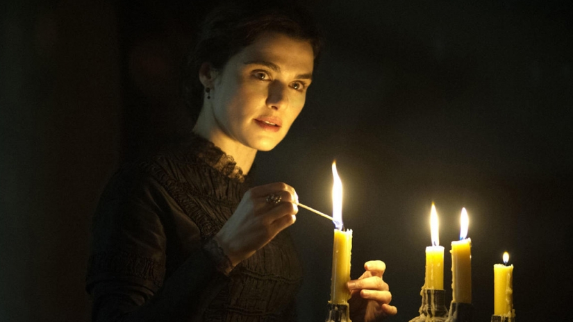
How much light does a candle shed? Conveniently, there is a unit of illumination called the foot-candle. One foot-candle is the amount of light received from a standard candle one foot away. Without going into the detail of what a “standard” candle is, it is enough for our purposes to say that the scene below has a key light of about three foot-candles…

… because there are three candles, about a foot away from the actor’s face. (The level of your key light, and consequently where you set your aperture, is almost always measured at your subject’s face, as that is usually the focus of the shot and the most important thing to get correctly exposed. This is why we DPs are always waving light meters in actors’ faces.)

If we look at an exposure table, such as this one, we can see that a three foot-candle key can be correctly exposed with an aperture of T1.4 and an EI (exposure index) of 800. Today that would be no problem, with many digital cameras having a native EI of 800, and the availability of fast lenses like Zeiss Master Primes and Super Speeds.

In the mid-seventies however, long before the advent of digital cameras, things were not so simple. Kubrick and Alcott had little choice but to shoot on Eastman Kodak 100T 5254. Those first three digits denote the film stock’s exposure index: 100. Alcott pushed the stock (brought the brightness up during processing) one stop, re-rating it to an EI of 200. But it still needed four times more light, or two stops more light than our modern-day Alexa or Red. (Check out my post on f-stops and T-stops if you’re getting lost.)

If we’re losing two stops on the EI, we need to gain two stops on the aperture to compensate. And two stops up from T1.4 is T0.7. You may notice that T0.7 isn’t on that table I linked to. This is because a lens with such a large relative aperture pretty much doesn’t exist.

Pretty much…


The Solution

Kubrick obsessively researched the problem. He eventually discovered that Nasa had commissioned Carl Zeiss to build ten Planar 50mm f/0.7 stills lenses in the sixties, which were used to take photos of the dark side of the moon. (I was unable to find out the T-stop of these lenses, but I’ll assume it was close enough to T0.7 for it to make little difference to my calculations above.) The developments leading to these lenses stretched back through Nazi military applications during WW2 all the way to the late Victorian era, when the double-Gauss cell at the core of the lenses was first invented.

Anyway, Kubrick promptly bought three of the Zeiss Planars. He liked to own equipment himself, rather than hire it in, and to this end he had also purchased at least one Mitchell BNC camera. As befits Kubrick’s perfectionism, these were perhaps the world’s most precisely engineered cameras, previously used for special effects work.

This is where Ed DiGuilio comes in: “[Kubrick] called one day to ask me if I thought I could fit a Zeiss lens he had procured… to his BNC.” It wasn’t simply a case of the f/0.7 glass having the wrong mount. The rear element was so large and needed to be so close to the film plane that DiGuilio had to extensively modify the camera, literally cutting parts out of it.

Ed DiGuilio (left), President of Cinema Products Corporation, working on adapting a zoom lens for Kubrick’s Mitchell BNC

Once this was done, extensive testing ensued. The focus scale (distances marked on the barrel) had to be calibrated from scratch, and indeed the focus ring was re-engineered to allow the precision focusing that the lens’ tiny depth of field would require. Whereas the focus ring on a stills lens will turn about 90° to go from infinity to close focus, and the ring on a cine lens might turn 270°, the rings on these unique Planars now turned a whopping 720° – two whole revolutions!

50mm is a very useful lens length for close-ups, but Kubrick understandably wanted a wider option as well. Accordingly, DiGuilio located an adapter designed to adjust the throw of cinema projector lenses. Mounted onto one of the 50s, it gave an effective focal length of 36.5mm with only very minor light loss. A 24mm version was also tested, but Kubrick disliked the amount of distortion in its images, and rejected it.


The Execution

The colour brown and the trousers of Doug Milsone, Barry Lyndon‘s focus puller, cannot have been strangers to each other. Imagine trying to hold focus on this dolly-back at f/0.7!

By my calculations (which were difficult, because most depth of field tables/calculators don’t go to f/0.7!) an MCU on Kubrick’s 50mm Planar with the subject at 2.5m (8.2ft) and the iris wide open would have had a depth of field of about 43mm (1.7″). To get this same depth of field at f2.8, a popular working stop for cinematographers today, the subject would have to be just 1m (3.3ft) from the sensor plane, which would be a biggish close-up. And remember that focus monitors, peaking and Cine Tape did not exist in the seventies.

To give Milsone a fighting chance, a unique system of focus assist was developed. While the main camera shot an actor from the front, a CCTV camera captured them in profile. This profile image was piped to a monitor, over which a grid was placed. This grid was marked off with distances so that Milsone could see how much the actor had moved by, far more accurately than judging it by eye from beside the lens.

Another problem thrown up by the low-light cinematography was with the viewfinder. Interestingly, the Mitchell BNC was a non-reflex camera, meaning that it didn’t have a mirror on the shutter, reflecting the image to the viewfinder when the shutter was closed. Instead, the camera body racked over to one side to allow the viewfinder to get an image during line-ups and rehearsals, and when it was actually rolling the operator got their images from a side viewfinder with its own lens – just like in a disposable 35mm stills camera. The original prism-based viewfinder on Kubrick’s Mitchell BNC suffered from far too much light loss for a candlelit image to be visible through it, so it was replaced with a mirror-based viewfinder adapted from a Technicolor camera.

The shots resulting from all of these technical challenges are quite soft to the modern eye, but I think that only adds to their beauty. Barry Lyndon captured the exquisite fragility of candelight, and 42 years on the images are still unique and captivating.

“Barry Lyndon”: The Full Story of the Famous f/0.7 Lenses

9 Uses for Central Framing

A couple of weeks ago I wrote a post on lead room, the amount of horizontal space the subject is given in front of them in the frame. Commonly the subject is placed to one side or the other, but there can be times when sitting that actor bang in the middle of the screen is most appropriate and effective. Here are some reasons you might want to do it.


1. To show immersion in the environment

When you surround a character with equal amounts of the background on both sides, you embed them into that background, creating a strong connection between them and their environment. This can be seen to great effect in the above frames from Road to Perdition and Butch Cassidy and the Sundance Kid (DP: Conrad Hall, ASC) and The Revenant (DP: Emmanuel Lubezki, ASC, AMC).


2. To create power

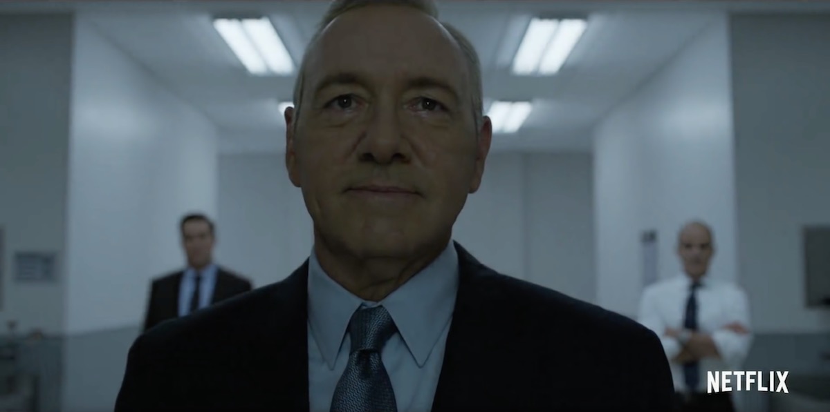
Central framing can give a subject tremendous power and dominance, particularly in combination with a low angle, as seen in the above examples from House of Cards (DP: David M. Dunlap) and Django Unchained (DP: Robert Richardson, ASC).


3. To suggest formality or rigidity

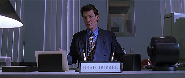
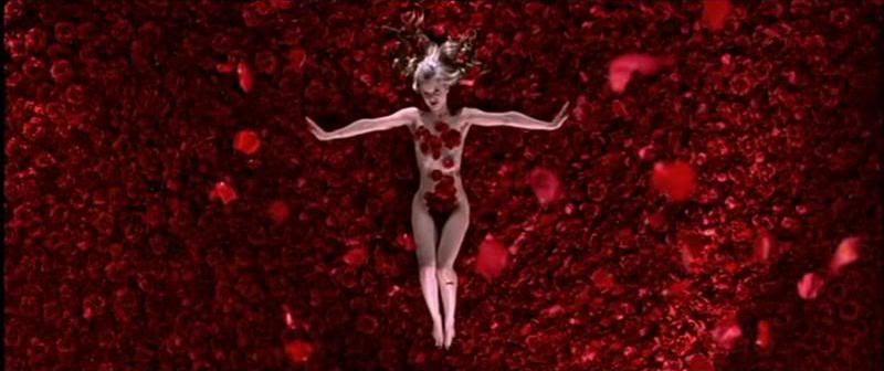
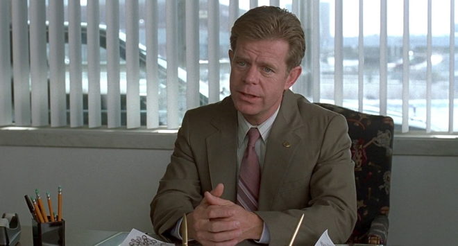
These scenes from American Beauty (DP: Conrad Hall, ASC) use central framing to emphasise the formality of Lester’s performance review, and the stilted, suffocating nature of his home life.


4. To create order

Kubrick used central framing with strong single-point perspective to create worlds of perfect order… so perfect that they would have to come crashing down sooner or later. The above examples are from Full Metal Jacket (DP: Douglas Milsome, BSC, ASC) and 2001: A Space Odyssey (DP: Geoffrey Unsworth, OBE, BSC).

This shot from The Matrix (DP: Bill Pope, ASC) also uses central framing to symbolise order, the calculatingly perfect order of the machines.


5. To suggest duality

When you shoot a shot-reverse with both parties centred, the two characters appear to replace each other on screen every time you cut. This can suggest a strong connection between the characters, or a strong conflict as they battle for the same piece of screen. Donnie Darko (DP: Steven B. Poster, ASC, ICG) uses this technique to set up the antagonism of the rabbit, while also suggesting he’s a part of Donnie, a figment of his imagination.


6. For humour

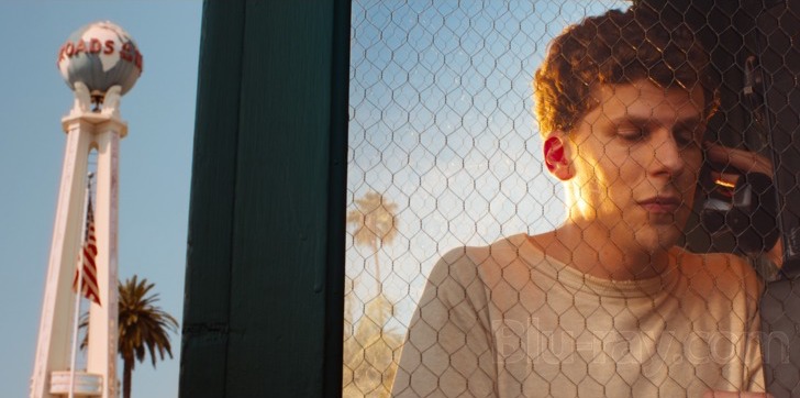
Centre framing is of course a huge part of Wes Anderson’s style, as in The Life Aquatic with Steve Zissou and The Grand Budapest Hotel (DP: Robert Yeoman, ASC). But I don’t think it’s stylisation for stylisation’s sake; his movies all have the feeling of tall tales told by ageing relatives with the aid of a scrapbook full of dorky, posed photos. The symmetry helps create the dorkiness, and from thence – as Lee & Herring used to say – the humour arises. The same is true of this classic scene from Garden State (DP: Lawrence Sher, ASC).


7. For faster cutting

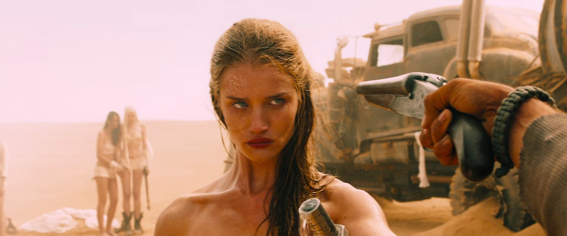
Mad Max: Fury Road (DP: John Seale, ACS, ASC) was framed centrally in service of the editing. Director George Hill realised that if he put everyone in the same place in frame, the audience wouldn’t need to search the screen for the subject after every cut, allowing him to edit faster without making the action incomprehensible. See this post for more on the cinematography of Fury Road.


8. For impact

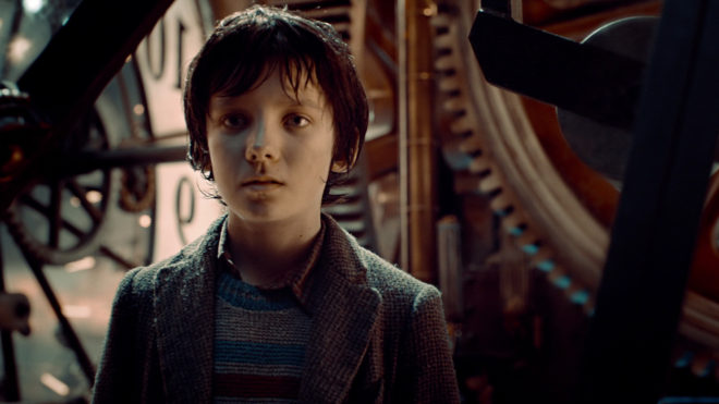
When used judiciously, central framing can have a big impact, giving a character their moment in the spotlight, putting them centre stage. It can underline a key character or story beat. The examples above are from Hugo (DP: Robert Richardson, ASC), Rogue One (DP: Greig Fraser, ACS, ASC) and American Beauty again.


9. To Break the fourth wall

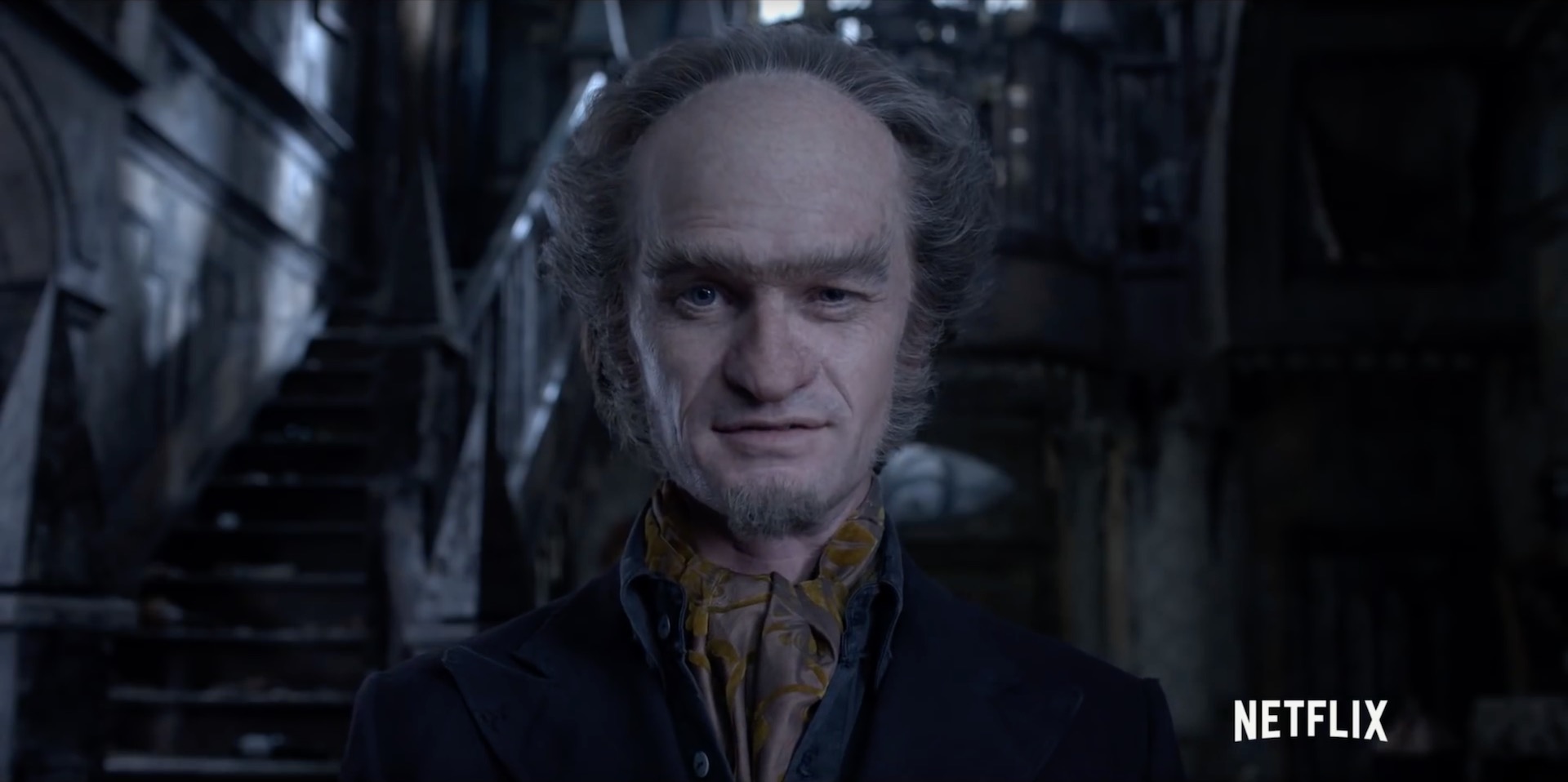
And finally, if your subject is looking into the lens, addressing the audience, then central framing is the natural composition. It’s not the only composition though; often the subject will be framed to one side so we can see the action continuing in the background even as it is narrated to us. But if the shot is just about the narrator, often central framing will be the most effective, as in the above shots from Amélie (DP: Bruno Delbonnel, AFC, ASC) and A Series of Unfortunate Events (DP: Bernard Couture).

9 Uses for Central Framing

The 2:1 Aspect Ratio

Last autumn I wrote a post about aspect ratio, covering the three main ratios in use today: 16:9, 1.85:1 and 2.39:1. The post briefly mentioned a few non-standard ratios, including 2:1. Since then, I’ve noticed this ratio popping up all over the place. Could it be on its way to becoming a standard?

Today I’ll give you a little background on this ratio, followed by a gallery of frame grabs from 2:1 productions. The aim is simply to raise awareness of this new(ish) tool in the aspect ratio toolkit. As ever, it’s up to the director and DP to decide whether their particular project is right for this, or any other, ratio. However, I would caution low-budget filmmakers against picking what is still not a common ratio without considering that smaller distribution companies may crop your work to a more standard ratio either because of convenience or negligence.

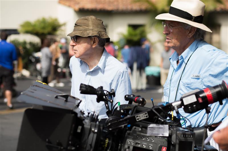
Woody Allen and Vittorio Storaro shooting Café Society

Vittorio Storaro, ASC, AIC – the highly-regarded cinematographer of Last Tango in Paris and Apocalypse Now amongst many others – began championing the 2:1 ratio around the turn of the millennium. It was one of the most complicated times in the history of aspect ratios. The horror of pan-and-scan (butchering a movie to fit its 1.85:1 or 2.39:1 ratio into 4:3 without bars) was starting to recede with the introduction of DVD, which was in fact still 4:3 but could contain squeezed 16:9 content. Widescreen television sets were starting to build in popularity, but some programmes and films were being broadcast in the middle-ground ratio of 14:9 so as not to offend the majority of viewers who still had 4:3 sets. And Storaro recognised that HD would soon supplant celluloid as the primary capture and exhibition method for cinema, likely bringing with it fresh aspect ratio nightmares.

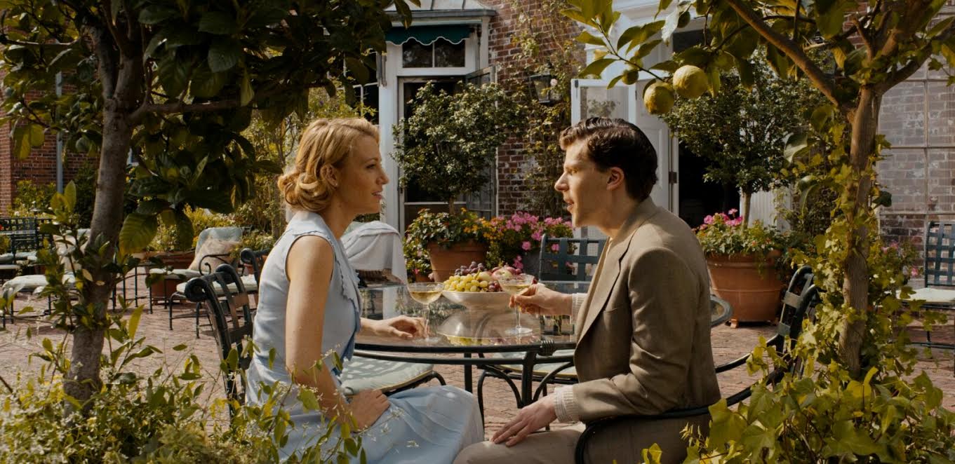
Storaro proposed “Univisium”, a 2:1 aspect ratio that fell between the two cinema standards of 1.85:1 and 2.39:1. It was a compromise, designed to make everyone’s life easier, to produce images that would need only minor letterboxing no matter where or how they were screened. However, the industry did not share his vision, and until recently 2:1 productions were relatively rare, most of them lensed by Storaro himself, such as Frank Herbert’s Dune, Exorcist: The Beginning and Storaro’s first digital picture, Café Society.

John Schwartzman shooting Jurassic World

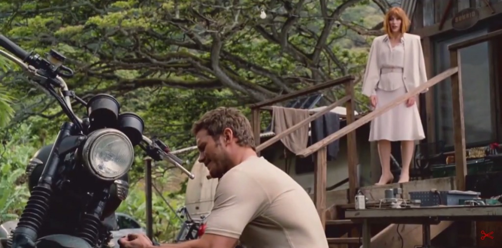
Perhaps the biggest 2:1 movie to date is Jurassic World. DP John Schwartzman, ASC wanted to shoot anamorphic 2.39:1, while Steven Spielberg, exec producing, advocated 1.85:1 (like his original Jurassic Park) to provide more height for the dinosaurs. 2:1 was arrived at, again, as a compromise.

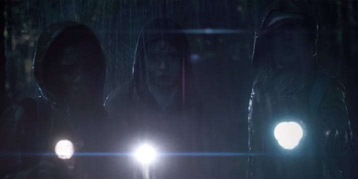
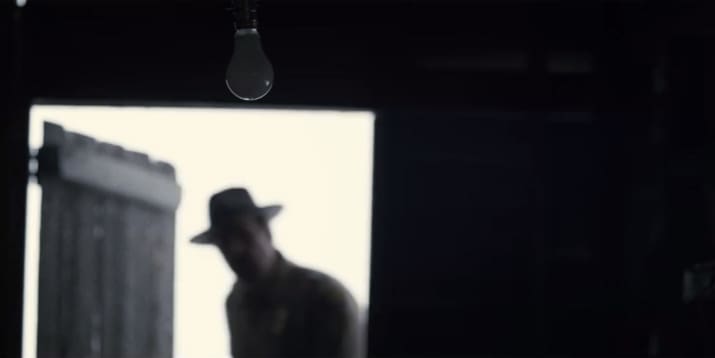
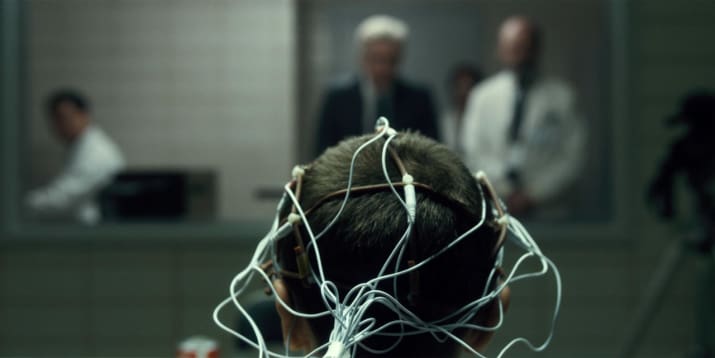
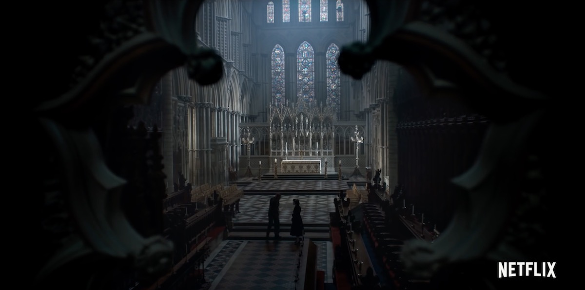
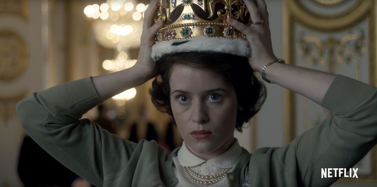
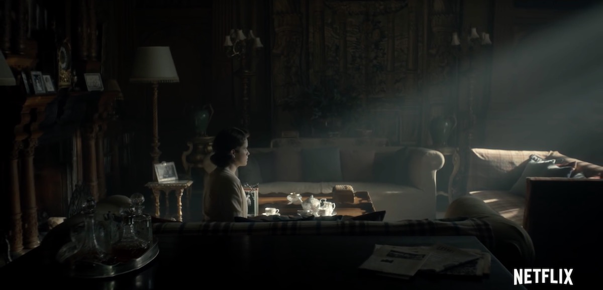
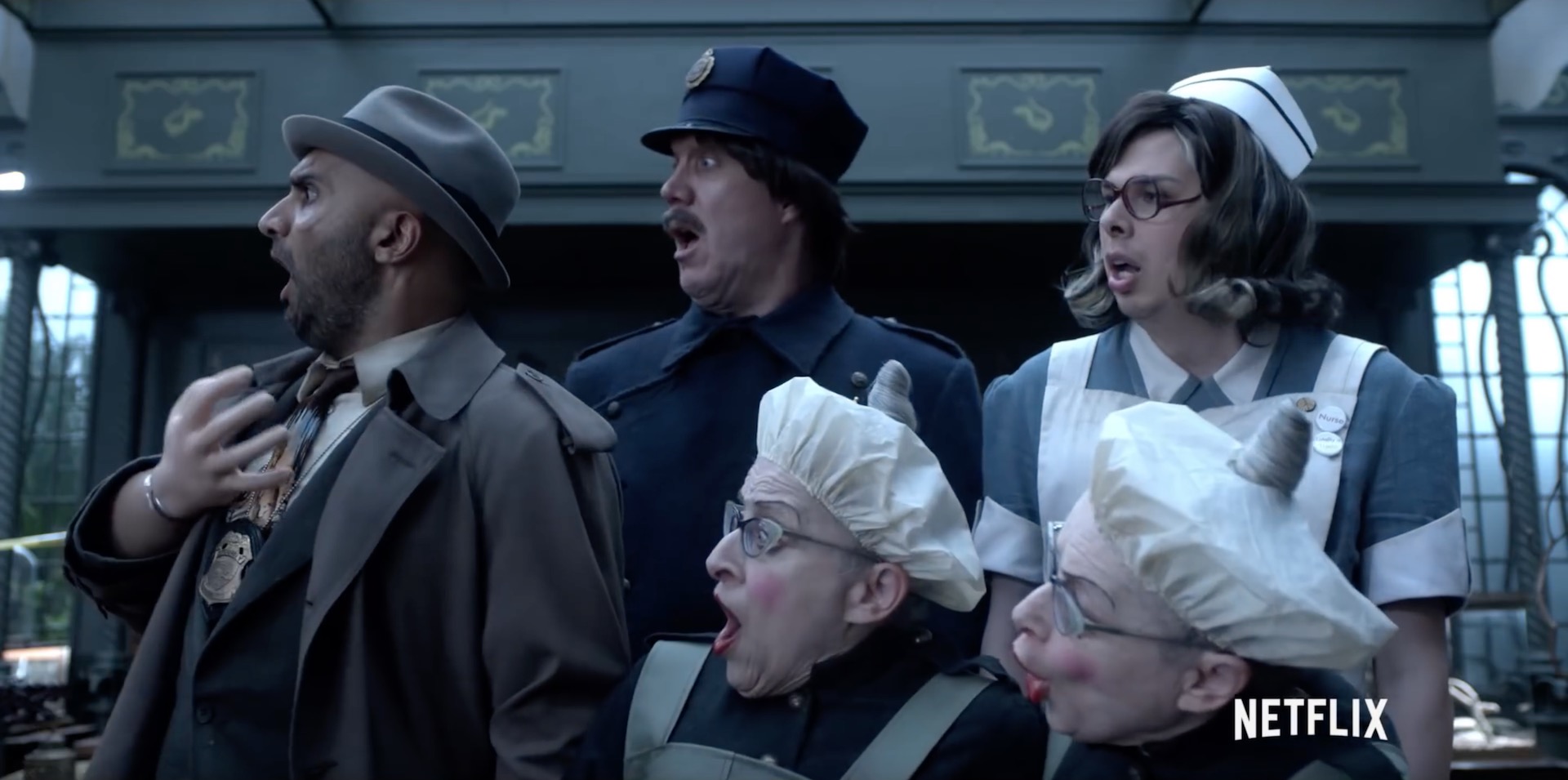
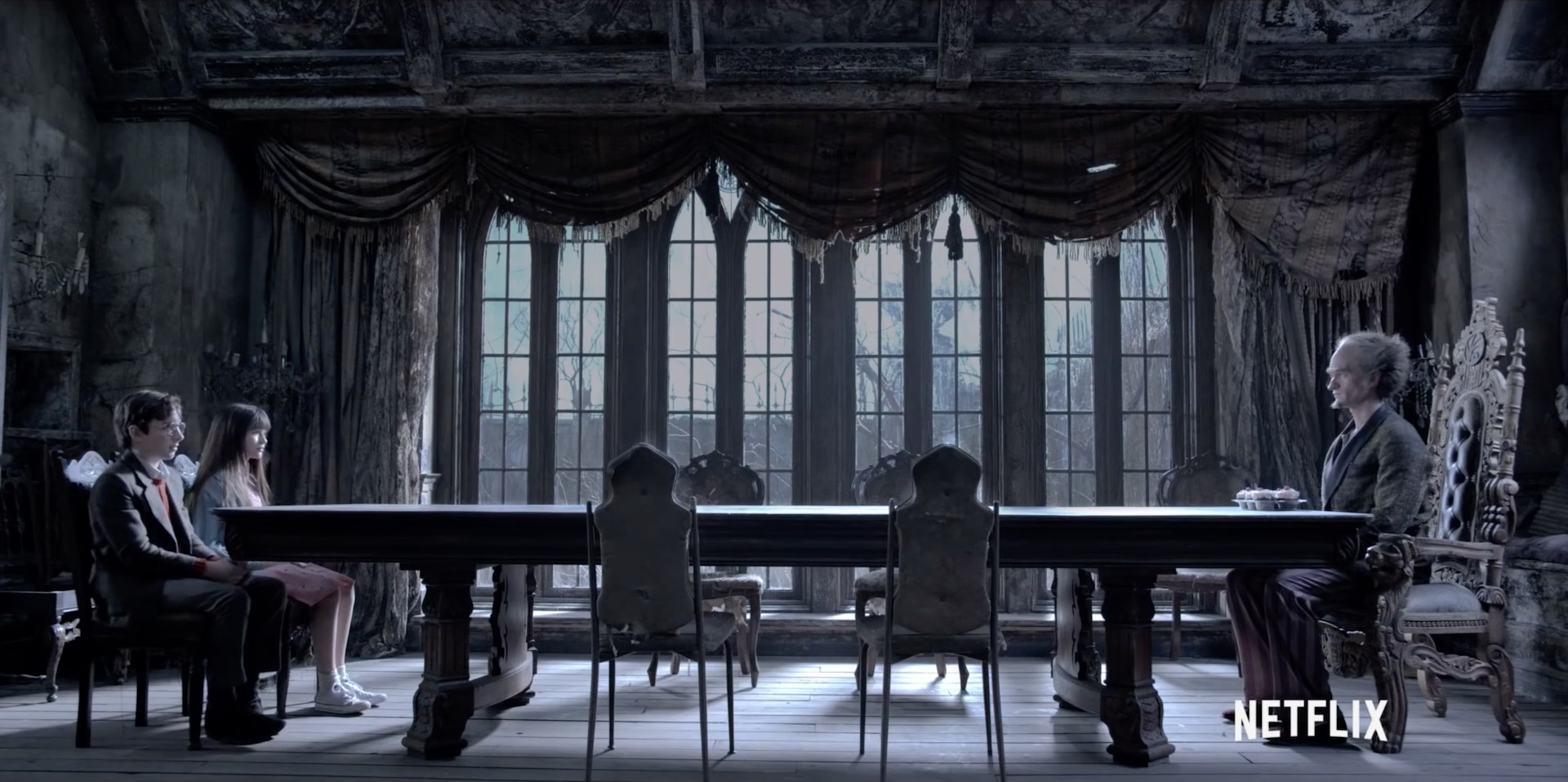
And compromise is likely what has driven the recent explosion in 2:1 material – not in the cinema, but online. Recent shows produced in this ratio include The Crown, A Series of Unfortunate Events, Stranger Things and House of Cards on Netflix, and Transparent on Amazon. I expect the producers of these series were looking to give their audience a more cinematic experience without putting off those who dislike big black bars on their screen, not unlike the reasoning behind the 14:9 broadcasts in the noughties.

2:1 may be a ratio born out of compromise, but then so was 16:9 (invented by SMPTE in the early eighties as a halfway house between 2.35:1 and  4:3). It certainly doesn’t mean that shooting in 2:1 isn’t a valid creative choice. Perhaps its most interesting attribute is its lack of baggage; 16:9 is sometimes seen as “the TV ratio” and 2.39:1 as “the big movie ratio”, but 2:1 has no such associations. One day perhaps it may be thought of as “the streaming ratio”, but for now it is simply something other.

Anyway, enough of the history and theory. Here are some examples of the cinematography that can be achieved in 2:1.


Cafe Society

DP: Vittorio Storaro, ASC, AIC


Jurassic World

DP: John Schwartzman, ASC


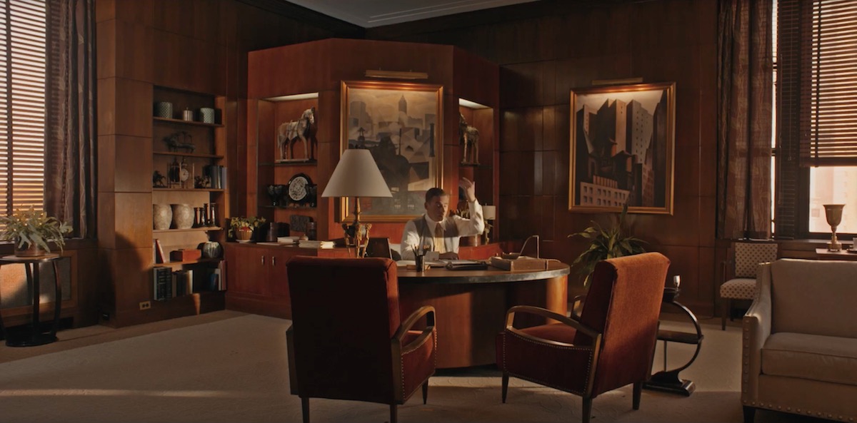
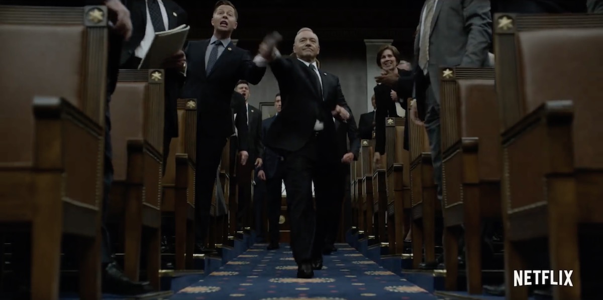
House of Cards

Season 5 DP: David M. Dunlap


Stranger Things

Season 1 DP: Tim Ives


The Crown

Season 1 DPs: Adriano Goldman, ASC, ABC & Ole Bratt Birkeland


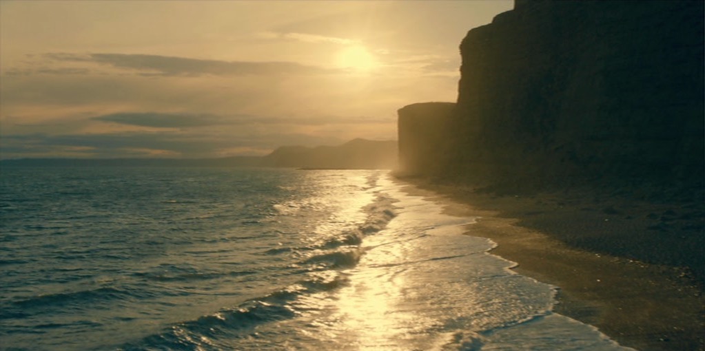
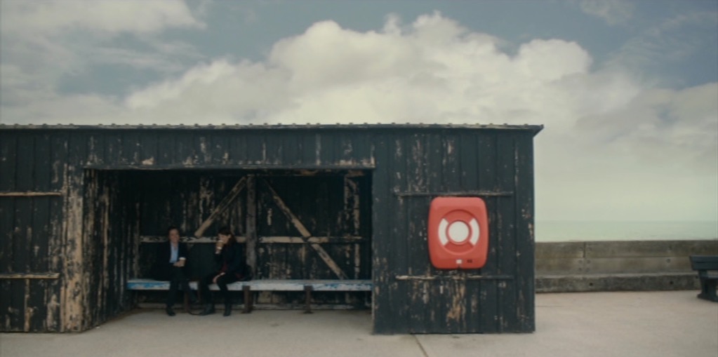
Broadchurch

Season 3 DP: Carlos Catalan


A Series of Unfortunate Events

Season 1 DP: Bernard Couture

The 2:1 Aspect Ratio

Lead Room, Nose Room or Looking Space

Like headroom, last week’s topic, lead room is one of the first concepts we are introduced to when we begin learning camera operation. And like headroom, it’s a rule that’s made to be broken. If a character is looking screen-left, certainly it’s most common to place them on the right of frame – giving them lead room (a.k.a. nose room or looking space) on the left, but that is not the only option. In certain situations it’s more appropriate, or simply more aesthetically pleasing, to place them on the left, or in the centre. And although The Rule of Thirds suggests how far to the left or right they will commonly be placed (a third, or two-thirds of the way across the frame) it is, again, far from the only option.

Below I’ve compiled a spectrum of lead room: a series of examples showing the whole range of horizontal positions within a frame where a subject could be placed. (Note: I’ve flopped some of the images to maintain the screen direction.) All of these examples are from 1.78:1 or 1.85:1 productions, but of course with the 2.39:1 Cinemascope format there is an even greater range of options. On the righthand side, to aid comparison, I’ve placed different crops of the same photo (by Richard Unger).

No composition is fixed in motion picture production. Actors move around, miss their marks; it’s difficult for a DP to be precise about where the subject appears in the shot, so reading a particular intention into an individual frame is dangerous. But if, within a film, there is a trend of characters, or a specific character, being placed in one particular part of the frame, then it’s fair to assume that the filmmakers were deliberately trying to create a particular effect.

With that in mind, the thoughts below are not intended to analyse why that specific shot in that specific production was composed the way it was, but rather to consider in general terms what meanings and emotions that kind of composition might convey.


“Carol” (DP: Edward Lachman)

This is the maximum lead room you can give an actor in 1.85:1 without cutting off part of their head (which you may want to do in certain extreme circumstances, but that’s a subject for another post). This is someone backed into a corner, isolated. They have full cognisance of their situation – they can see it all in front of them. What you choose to place on the other side of frame is very important with an extreme composition like this. Negative space, as in the above example, creates an unbalanced frame, suggesting someone in a precarious situation, whereas another person or object would appear to dominate the subject.


“Atonement” (DP: Seamus McGarvey)

This is widely considered to be the ideal framing, with the subject placed according to The Rule of Thirds. Assuming that Keira is looking at another actor here, and that that actor’s single is framed with him in the left half of frame, the brain can comfortably merge the two shots into one, creating – subconsciously – a split-screen like a phone conversation in an old sitcom. The shot-reverse will be pleasingly balanced, and no tension will be created – at least not by the lead room.


“Fargo” (DP: Roger Deakins)

On more than one occasion I’ve tried to frame a shot like this, only to be told by the director that the subject is “too close to the centre”, it’s “wrong” and the subject must be placed on a third. What I should have done is shown them this frame, said, “If it’s good enough for Roger Deakins….” and then coughed in a way that sounded suspiciously like “thirteen Oscar nominations”. What’s interesting about this composition is the visual tension it creates when edited with the reverse. If the other actor is similarly close to the centre, their images start to overlap, almost like they’re duking it out, and if the other actor is placed further from the centre, they will seem trapped by their interlocutor. Or maybe composing the shot this way sometimes just allows for the best range of movement from the actor and the most pleasing frame.


“Lost in Translation” (DP: Lance Acord)

Placing someone in the centre of frame can be very powerful. It suggests someone in control, balanced, dominant. Now of course, that is not at all an accurate description of Bill Murray’s character in Lost in Translation. But notice that big, bright practical light so close to his head; it completely unbalances the composition. This just goes to show that the subject’s   position relative to background elements can be of equal or greater importance to their position within the frame. I aim to do a whole post about centre-framing in the near future.


“Hugo” (DP: Robert Richardson)

Although short-sided, the boy still has some lead room, in fact an amount of lead room that would be perfectly normal in a 4:3 composition. Personally, I would be comfortable with this composition for purely aesthetic reasons, but it could also be used to create some visual tension, suggesting things unknown behind the subject, waiting to creep up on them figuratively or literally. It could also suggest the character is weak, particularly if intercut with another character who is more traditionally framed.


“Les Miserables” (DP: Danny Cohen)

Now we are into territory that many will find uncomfortable. A character short-sided like this may seem unbalanced, lost, trapped, wrong-footed or isolated. Or they might simply be deep in thought;  you can easily imagine another character entering in the background of the above frame, breaking Crowe’s reverie, restoring the compositional balance and turning it into a deep two-shot.


“Mr. Robot” (DP: Tod Campbell)

Imagine someone walking into a room and standing right up against the wall, facing it. You would think them strange, disturbed. You might wonder if they were looking at something imaginary. This is the effect created by extreme short-siding. It also serves to make the subject look completely alone, even though they might be speaking to someone just inches in front of them. Mr. Robot is the only place I’ve ever seen composition this unusual, though I’m sure there are other examples out there.


Next time you watch a film or a TV show, pay attention to the lead room. You may be surprised to find that non-standard compositions are employed more often than you thought.

Thanks again to evanrichards.com, where I found most of the frame grabs.

Lead Room, Nose Room or Looking Space

Headroom

One of the first things that amateur photographers and cinematographers are taught is  “correct” headroom. Don’t put people’s heads in the middle of the frame, we’re told, but at the top. Rules are made to be broken though, and here are three examples of beautiful cinematography which do just that.


Broadchurch

“A town wrapped in secrets” is the tag-line of this critically-acclaimed ITV detective serial. In classic murder mystery fashion, every character is hiding something, causing suspicion to rest on each of them for a little while until the the person hiding the right secret is found.

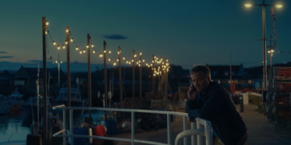
David Tennant’s DI Alec Hardy complains of the small coastal town’s “endless sky”, an observation which could equally apply to the cinematography, framing the action as it often does with expansive headroom. While this may be partly an attempt to emphasise the isolation of the titular town, where people are small in the face of nature, its primary effect is to evoke the secrecy so integral to the storyline. Just as the police – and viewers – are figuratively misdirected by the suspects’ lies, so the camera is literally misdirected. The message from Matt Gray, BSC’s cinematography is: look at the beautiful sky and the paintings high up on the wall, because if you look too hard at what’s in front of you, you’ll see that the surface perfection of the bucket-and-spade idyll is built on foundations of sand.


Utopia

This stylish, stunningly-photographed thriller ran for two seasons on Channel 4 in 2013 and 2014. It featured a group of disparate characters following clues in a cult graphic novel to uncover a chilling conspiracy. It was the first TV show I’d ever seen in 2.39:1, it had a garish, digitally-manipulated palette, and its composition broke all the rules.

Amongst Utopia‘s visual hallmarks was the use of plentiful headroom. Characters were frequently crushed into the lower half of the frame, a symbol of the powerful conspiracy looming over them. The overall look crafted by director Marc Munden and DP Ole Bratt Birkeland placed the viewer completely outside of the comfort zone of TV’s visual conventions, into a world where you couldn’t trust or rely on anything. (The Amazon series Mr. Robot uses similar techniques for similar reasons.)

Both seasons of Utopia can be viewed free at channel4.com


IDA

The makers of the Oscar-winning Polish indie feature Ida also chose an unusual aspect ratio; 4:3 had not been commonly used in features for decades. It was director Pawel Pawlikowski who wanted to try framing his subjects low down within the boxy ratio, leaving lots of headroom.

DP Lukasz Zal, PSC embraced the idea. “We saw that [the odd framing] created the feeling of loss, isolation and that it wasn’t just a strange mannerism but it conveyed so much more,” he told The LA Times.

Many interpretations have been placed on the meaning of the extra headroom in this tale of a young novitiate nun who comes to question her lifestyle. Most commonly it is seen as implying heaven above and therefore the nuns’ thoughts of the divine. To me it also conveys a sense of helplessness, of free will being overcome by larger forces above and around Ida.
Read this post on the ASC website for more on the cinematography of Ida.

If you want to delve deeper into the topic of headroom, I highly recommend this article by Art Adams: A Short History of Headroom, and How to Use It.

I’ll leave you with Pawel Pawlikowski’s thoughts on the ambiguity of his framing in Ida

Some audiences have said the sky was crushing them. When you do something that’s formally strong, it elicits all kinds of responses. When you make these decisions, they’re kind of intuitive. You don’t intellectualize what it means; it feels right.

Headroom

My 5 Favourite Cinematographer Commentaries

I won my first DVD player in a trailer competition on a sort of YouTube forerunner site in December 2000. Over the next decade I was entertained and educated by many extras-packed Digital Versatile Discs. Now, of course, physical media is a thing of the past, but many of the anecdotes I heard in DVD commentaries have stuck in my mind. Some have even helped me on set when facing a new situation.

So, if you’ve got these discs on your shelf and never given the commentary a listen, or if you’re passing a CEX or Cash Convertor with a shiny new pound coin burning a hole in your pocket, you could do worse than seek out these classic chat tracks.


5. Moulin Rouge

DP Don McAlpine is actually quite quiet on this track, leaving director Baz Luhrmann and production designer Catherine Martin to do much of the work. This latter pair explain how sets, miniatures and CGI were blended to create the world of Moulin Rouge. At one point Luhrmann notes that he resisted the temptation to digitally stabilise the crane shots in the Elephant Love Medley, preferring to recall the look of classic 20th century musicals which did not have access to such postproduction trickery. A few nuggets we get from McAlpine include his use of blue light on Satine (Nicole Kidman) to make the most of her pale skin, the anachronistic use of follow spots for the stage shows, and how he was briefed by Luhrmann in one scene to light Jim Broadbent like the devil – which he did with flickering orange firelight from a low angle.

Highlight: Performing in what proves to be her final show, Satine wears a diamond necklace which reflects dazzling light onto Richard Roxburgh’s lustful duke. McAlpine reveals that he created the shimmering reflections by shaking some canvas with pieces of broken mirror on it.


4. X-Men 2

Although the DVD menu lists it as a director’s commentary, Bryan Singer in fact pairs up with his DP Newton Thomas Sigel for this track. Sigel discusses the importance of building practicals into the sets to enhance realism and flexibility of shooting. He explains how he colour-coded certain scenes so that the audience would more readily understand where they were during the fast-paced action sequences; for example, the corridors of the Alkali Lake bunker were lit with a moss green.

Highlight: The brutal claw-fight between Wolverine and Lady Deathstrike features dynamic and unusual camerawork. Sigel and Singer reveal that they used a cable rig to swoop the camera towards the duelling mutants, knowing that the camera would bounce back when it reached the end of its cable, but embracing this for the extra energy it added to the sequence.


3. Garden State

DP Lawrence Sher shares (no pun intended) a commentary track with director Zach Braff and production designer Judy Becker. The trio give an insight into the way that the moods and emotions of the film were enhanced by the colours, design, framing and camera movement. Braff and Sher chose a static look with strong compositions, punctuated by occasional Technocrane moves and at least one quasi-crane move that was actually captured on a Steadicam. Various happy (and unhappy) accidents helped shape the look too, like the constant rain throughout the exterior shoots, the mist and flaring practicals in the pool party scene, and the square of light on the airport wall behind Braff and Natalie Portman in the final shot.

Highlight: Sher explains the use of different film stocks to delineate threads of the story. Scenes with Large’s father (Ian Holm) were rendered cold and clinical by shooting on a sharper, harder Kodak film, while Portman’s sequences were imbued with organic warmth by Fuji stock. The feel was further enhanced by lighting and the colour choices in the respective sets.


2. Alien 3

The departure of director David Fincher from Alien 3 – under a cloud of studio interference and re-edits – is an infamous part of movie lore. Less well known is that the director of photography changed a week into shooting, after original DP Jordan Cronenworth (of Blade Runner fame) fell ill. Alex Thompson stepped in, and his humble, soft-spoken observations are spliced with other crew and cast members to form the commentary track on the Alien Quadrilogy boxset version of this film. Throughout the track he explains how he created the cool, toppy look of the prison’s communal areas, the dark, shadowy environs of the basements, and the hot, hellish feel of the lead-works. There are some interesting remarks about practicals too, such as the deliberate use of mismatched, low-CRI fluorescent tubes to give the canteen a run-down look, and tips for creating convincing firelight flicker.

Highlight: To create the illusion of glowing molten metal in the colony’s lead-works set, Thompson placed a veritable arsenal of lamps – almost 1,000 amps’ worth – underneath sheets of trace. Despite their brilliance, the individual units were still visible on camera, rather than a continuous white glow. According to Thompson, it was Fincher who came to the rescue, wiping grease from the side of his nose onto the lens to diffuse the offending lamps. I hope he let the AC put an optical flat on first!


1. Armageddon

Whatever you think of this slice of outer-space Bayhem, there’s no denying that DP John Schwartzman’s commentary on the Criterion Collection edition (spliced in with two of the film’s scientific advisors) is a fascinating insight into photographing the biggest of big-budget blockbusters. Schwartzman reveals that seven miles of cable were laid by his electrical department in preparation for extreme wide shots of the Armadillo vehicle travelling across the asteroid – in reality the South Dakota Badlands at night. Elsewhere he discusses lighting through coloured windows, shooting under UV lights (pictured above), dealing with spacesuit helmet reflections, and how Spielberg’s lens-meister Janusz Kaminski stepped in to shoot pick-ups of meteorites wiping out Shanghai.

Highlight: Schwartzman and his team photographed two real shuttle launches for the movie. Nasa decreed that the 35mm cameras had to sit in position on the launchpad, threaded with film and ready to go, for two days before take-off. The camera dept undertook extensive testing to making this possible, dealing with such problems as the condensation that would form as the temperature changed over the 48 hours. When they returned to the cameras after the launch and examined the one which had been the closest to the shuttle’s rocket motors, they discovered that the lens was in pieces, the vibrations having undone every single screw!

My 5 Favourite Cinematographer Commentaries

5 Lighting Tips from Classic Art

A few weeks ago I discussed compositional techniques which we can learn from the work of JMW Turner. This time I’m looking at the use of light, and I’m broadening the scope to cover a few other classical artists whose works have caught my eye at galleries lately.

Without artificial illumination, these old masters had to make the most of the light God gave them. Here are five examples of their techniques which we can trace directly forward to cinematographic techniques of today.


Cross-light

“Mornington Crescent Nude” (circa 1907) – Walter Richard Sickert

Decades before DPs started encouraging directors to shoot interior scenes towards windows to achieve the most interesting modelling, Sickert had the same idea. See how the light from the window in the background throws the model’s body into relief, giving it form and dimension? Cross-light is commonly used today in commercials for sport and fitness products, to emphasise muscle tone.

See also: Lighting Techniques #6: Cross-light


Background strokes

“Tancred’s Servant Presenting the Heart of Guiscard in a Golden Cup to Guismond” (circa 1675) – Adriaen van der Werff

What caught my eye about this painting was the slash of light on the background wall in the top left corner. It may seem trivial, but a little stroke of background light like this can really elevate the quality of a shot. Here it anchors the corner of the composition and gives us a hint of the room’s decor, adding interest to what would otherwise be a black void behind Guismond.

While lighting the subject of the shot is clearly a DP’s priority, it’s important to find time to paint in the surroundings even if they’re in the deep background or extreme foreground.

“Drive” (DP: Newton Thomas Sigel)

See also: 5 Ways to Use Hard Light Through a Window


Haze

“Chloe Idille” (1811) – Salomon Gessner & Carl Wilhelm Kolbe

This monochrome etching has a tremendous feeling of depth, and it is achieved purely through contrast. The further away an object is, the more air there is between that object and your eye. Since air isn’t 100% transparent, that distant object appears lighter and lower-contrast than closer objects. Gessner and Kolbe capture this effect beautifully here.

Many cinematographers today use hazers to create or enhance this atmospheric effect, even for interiors. In the days of miniature effects, smoke was often used to create atmospheric haze and increase the feeling of scale. On Blade Runner, for example, Douglas Trumbull’s VFX crew sealed the motion control stage and used infra-red sensors linked to hazers to automatically keep the smoke level constant during the long-exposure passes over the futuristic cityscape.

“Blade Runner” (DP: Jordan Cronenweth)

See also: Depth Cues in Cinematography


Golden hour

“Abingdon” (1806) – Joseph Mallord William Turner

Painters figured out centuries ago that the most beautiful light is found at the beginning and end of the day. It’s partly due to the cross-light effect (see above) of the lower sun, and partly due to the beautiful orange colour caused by the greater amount of atmosphere the sun’s rays must pass through. To shoot the perfect sunset, you’ll need patience, and a sun-tracker app or at least a compass. Ensure the schedule permits you to try again another day if clouds spoil the view.

“Raiders of the Lost Ark” (DP: Douglas Slocombe)

See also: Sun Paths


Wet-Downs

“The Boulevard Montmartre” (1897) – Camille Pissarro

This is the only night image in a series of impressionist oil paintings which Pissarro executed from a hotel window overlooking the Boulevard Montmartre. What makes it particularly beautiful is the wet street, turning what might otherwise have been a dull grey central swathe of the image into an arena of alternately shadowy and glittering reflections.

Cinematographers shooting night exteriors on streets will often have the tarmac hosed down for four reasons: (1) as already noted, the beauty of the reflections; (2) the deeper blacks and increased contrast; (3) the extra exposure gained by the light sources bouncing off the water; and (4) avoidance of continuity problems if it rains.

A scene from “Terminator 2” (DP: Adam Greenberg) on a street that’s been wetted down

See also: 7 Considerations for Night Shooting

5 Lighting Tips from Classic Art

12 Tips for Better Instagram Photos

I joined this social media platform last summer, after hearing DP Ed Moore say in an interview that his Instagram feed helps him get work. I can’t say that’s happened for me yet, but an attractive Instagram feed can’t do any creative freelancer any harm. And for photographers and cinematographers, it’s a great way to practice our skills.

The tips below are primarily aimed at people who are using a phone camera to take their pictures, but many of them will apply to all types of photography.

The particular challenge with Instagram images is that they’re usually viewed on a phone screen; they’re small, so they have to be easy for the brain to decipher. That means reducing clutter, keeping things bold and simple.

Here are twelve tips for putting this philosophy into practice. The examples are all taken from my own feed, and were taken with an iPhone 5, almost always using the HDR (High Dynamic Range) mode to get the best tonal range.


1. choose your background carefully

The biggest challenge I find in taking snaps with my phone is the huge depth of field. This makes it critical to have a suitable, non-distracting background, because it can’t be thrown out of focus. In the pub photo below, I chose to shoot against the blank pillar rather than against the racks of drinks behind the bar, so that the beer and lens mug would stand out clearly. For the Lego photo, I moved the model away from a messy table covered in multi-coloured blocks to use a red-only tray as a background instead.


2. Find Frames within frames

The Instagram filters all have a frame option which can be activated to give your image a white border, or a fake 35mm negative surround, and so on. An improvement on this is to compose your image so that it has a built-in frame. (I discussed frames within frames in a number of my recent posts on composition.)


3. try symmetrical composition

To my eye, the square aspect ratio of Instagram is not wide enough for The Rule of Thirds to be useful in most cases. Instead, I find the most arresting compositions are central, symmetrical ones.


4. Consider Shooting flat on

In cinematography, an impression of depth is usually desirable, but in a little Instagram image I find that two-dimensionality can sometimes work better. Such photos take on a graphical quality, like icons, which I find really interesting. The key thing is that 2D pictures are easier for your brain to interpret when they’re small, or when they’re flashing past as you scroll.


5. Look for shapes

Finding common shapes in a structure or natural environment can be a good way to make your photo catch the eye. In these examples I spotted an ‘S’ shape in the clouds and footpath, and an ‘A’ shape in the architecture.


6. Look for textures

Textures can add interest to your image. Remember the golden rule of avoiding clutter though. Often textures will look best if they’re very bold, like the branches of the tree against the misty sky here, or if they’re very close-up, like this cathedral door.


7. Shoot into the light

Most of you will not be lighting your Instagram pics artificially, so you need to be aware of the existing light falling on your subject. Often the strongest look is achieved by shooting towards the light. In certain situations this can create interesting silhouettes, but often there are enough reflective surfaces around to fill in the shadows so you can get the beauty of the backlight and still see the detail in your subject. You definitely need to be in HDR mode for this.


8. Look for interesting light

It’s also worth looking out for interesting light which may make a dull subject into something worth capturing. Nature provides interesting light every day at sunrise and sunset, so these are good times to keep an eye out for photo ops.


9. Use lens flare for interest

Photographers have been using lens flare to add an extra something to their pictures for decades, and certain science fiction movies have also been known to use (ahem) one or two. To avoid a flare being too overpowering, position your camera so as to hide part of the sun behind a foreground object. To get that anamorphic cinema look, wipe your finger vertically across your camera lens. The natural oils on your skin will cause a flare at 90° to the direction you wiped in. (Best not try this with that rented set of Master Primes though.)


10. Control your palette

Nothing gives an image a sense of unity and professionalism as quickly as a controlled colour palette. You can do this in-camera, like I did below by choosing the purple cushion to photograph the book on, or by adjusting the saturation and colour cast in the Photos app, as I did with the Canary Wharf image. For another example, see the Lego shot under point 3.


11. Wait for the right moment

Any good photographer knows that patience is a virtue. Waiting for pedestrians or vehicles to reach just the right spot in your composition before tapping the shutter can make the difference between a bold, eye-catching photo and a cluttered mess. In the below examples, I waited until the pedestrians (left) and the rowing boat and swans (right) were best placed against the background for contrast and composition before taking the shot.


12. Quality control

One final thing to consider: is the photo you’ve just taken worthy of your Instagram profile, or is it going to drag down the quality of your feed? If it’s not good, maybe you should keep it to yourself.

Check out my Instagram feed to see if you think I’ve broken this rule!

12 Tips for Better Instagram Photos

Composing a Shot-Reverse

Ah, the shot-reverse, that staple of film and television, that standard for dialogue scenes everywhere. Sooner or later, two characters are going to stand three feet apart, facing each other, and have a chat. (You know, like real people do all the time.) And the required coverage will be a wide or two-shot, followed by a pair of singles known as a shot-reverse.

The singles can be dirty (including the other character’s shoulder or back of head in the frame) or clean (not showing the other character). Except for tight close-ups, dirty singles – often called over-the-shoulder shots for obvious reasons – are most common, and it’s these that I’ll focus on in this post.


The Unwritten rules. Which I shall now write.

Conventional wisdom on shot-reverses says that the two shots should

  • be the same size,
  • use the same lens,
  • match the height of the respective eye-lines,
  • allow “looking space”, and
  • frame the two characters on opposite sides of the screen.

Here is a shot-reverse from Hugo (DP: Robert Richardson) which obeys all of these rules…

And here is a shot-reverse from Alien (DP: Derek Vanlint) which obeys none of them…

Ultimately, like all framing decisions, it’s subjective. Directors often have strong ideas about what they do and don’t like in shot-reverses. And no two DPs will agree exactly on the subject. And of course the actors will move around at least slightly during the scene, messing with any strict composition you’ve established.


Using the width of the frame

Traditional television, driven as it was by dialogue scenes usually covered in over-the-shoulder shots, was perfectly suited to the old 4:3 ratio. The subject and foreground characters neatly filled the frame.

But with today’s wider aspect ratios – particularly 2.39:1- we have a choice to make about how to use the extra horizontal space. If we want to place the characters on either side of the frame, we have to shift the camera out, away from the eyeline…

This has the disadvantage of showing some of the foreground character’s face, and starting to look a little like a two-shot. But it may be very effective symbolically if the characters have a strained or distant relationship in the story.

If you don’t like all that space between the characters, you can return the camera closer to the eyeline, keeping the subject on the “correct” side of frame, the side that gives them the most looking space

However, the foreground character cuts off the looking space, and the composition can end up looking unbalanced. It may feel like the subject is trapped, squashed into the side of frame by the foreground character. But again, this may be the effect you want to create.

You can frame the characters more centrally, or you can go to the other extreme, placing the foreground character enclosing the side of frame, cradling the rest of the composition…

This creates a nice sense of depth, making the screen resemble a window. The foreground character on the edge of frame continues the perspective of the physical frame itself (be it the plastic surround of a TV set, the curtains of a cinema or whatever) into the frame.

(I can’t understand why the cinema’s empty. This looks like an awesome movie.)

Here’s a similar composition from Die Hard (DP: Jan de Bont), where the perspective is continued even further into the image, to a statue in the deep background…


Oscar-winning shot-reverses

Looking through Evan Richards’ Cinematography Index at recent movies to bag the Best Cinematography Oscar, I saw a wide variety of styles in the shot-reverses. Here are just a few that stood out to me as interesting.

Here’s an example from The Revenant (DP: Emmanuel Lubezki) which uses the foreground character as a framing element on the right…

This next example from Inception (DP: Wally Pfister) has great perspective, helped by the line of the table, and the wineglass on the left which almost feels like a vanishing point for the eye-line…

This clean shot-reverse from Sicario (DP: Roger Deakins) is interesting because the camera height is not on the eye-line….

The men at the table are shot from just below their head height, giving them more power and permitting the inclusion of the great perspective lines of ceiling lights in the background. The characters are framed quite centrally, which is also true of this final example, from Memoirs of a Geisha (DP: Dion Beebe)…

In the first shot, the distant window on frame right anchors and balances the composition, while the lantern on frame left serves the same function in the second shot.


And now the conclusion

If there’s one single piece of advice to take from this somewhat disjointed post, it’s that it’s more important to frame a shot-reverse in a way that feels right aesthetically, for the characters, and for the story, than to follow any rules, because…

See also: Composing a Wide Shot and 2.39:1 Composition

Composing a Shot-Reverse