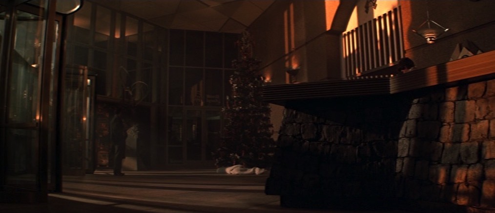
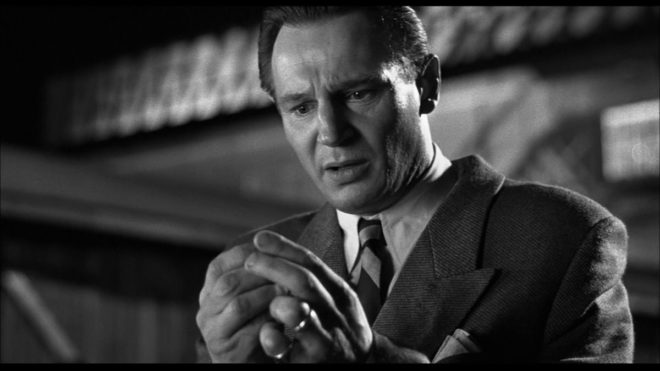
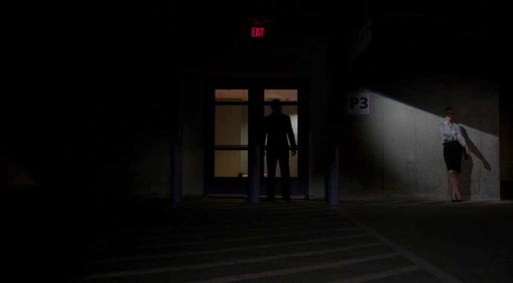
I hope you have all enjoyed Die Hard as a traditional staple of your Yuletide festivities. Every time I see it I am in awe of, among other things, the composition by DP Jan de Bont, ASC and camera operators Michael Ferris, Michael Scott and M. Todd Henry. Let’s have a look at some of the beautifully framed images and see what some of the hallmarks are.
Low Angles
“From up here it doesn’t look like you’re in charge of jack shit.”
So many low angles in Die Hard, some motivated by the blocking but many simply to make the characters seem larger than life.
No Rule of Thirds
“There are rules for policemen.” / “Yeah. That’s what my captain keeps telling me.”
De Bont uses the full width of the 2.39:1anamorphic frame to creatively place his subjects, rarely obeying the Rule of Thirds and often squeezing characters right into one side of the frame.
Short-siding
“Now I know what a TV dinner feels like.”
Short-siding means placing a character close to the side of the frame which they’re looking towards, and this happens quite often in the film as well.
Deep Raking Shots
“Welcome to the party, pal.”
The filmmakers love to have a row of characters ranging from near to far. Even in over-the-shoulder shots, de Bont frequently adds an extra element in the background, continuing the depth procession begun by the foreground shoulder and mid-ground actor.
Dutch Angles
“You oughta be on fucking TV with that accent.”
Jan de Bont is from the Netherlands, so every shot… But I’m talking specifically about the canted shots which underscore the deception of the scene where Alan Rickman’s Hans Gruber pretends to be a hostage (with a highly convincing English-German-American accent) and the subsequent shoot-out in the computer room.
There are also a lot of great camera moves in Die Hard, but that’s a post for another Christmas. Happy new year and yippie-ki-yay, motherfuckers!
The following article originally appeared on RedShark News in 2018.
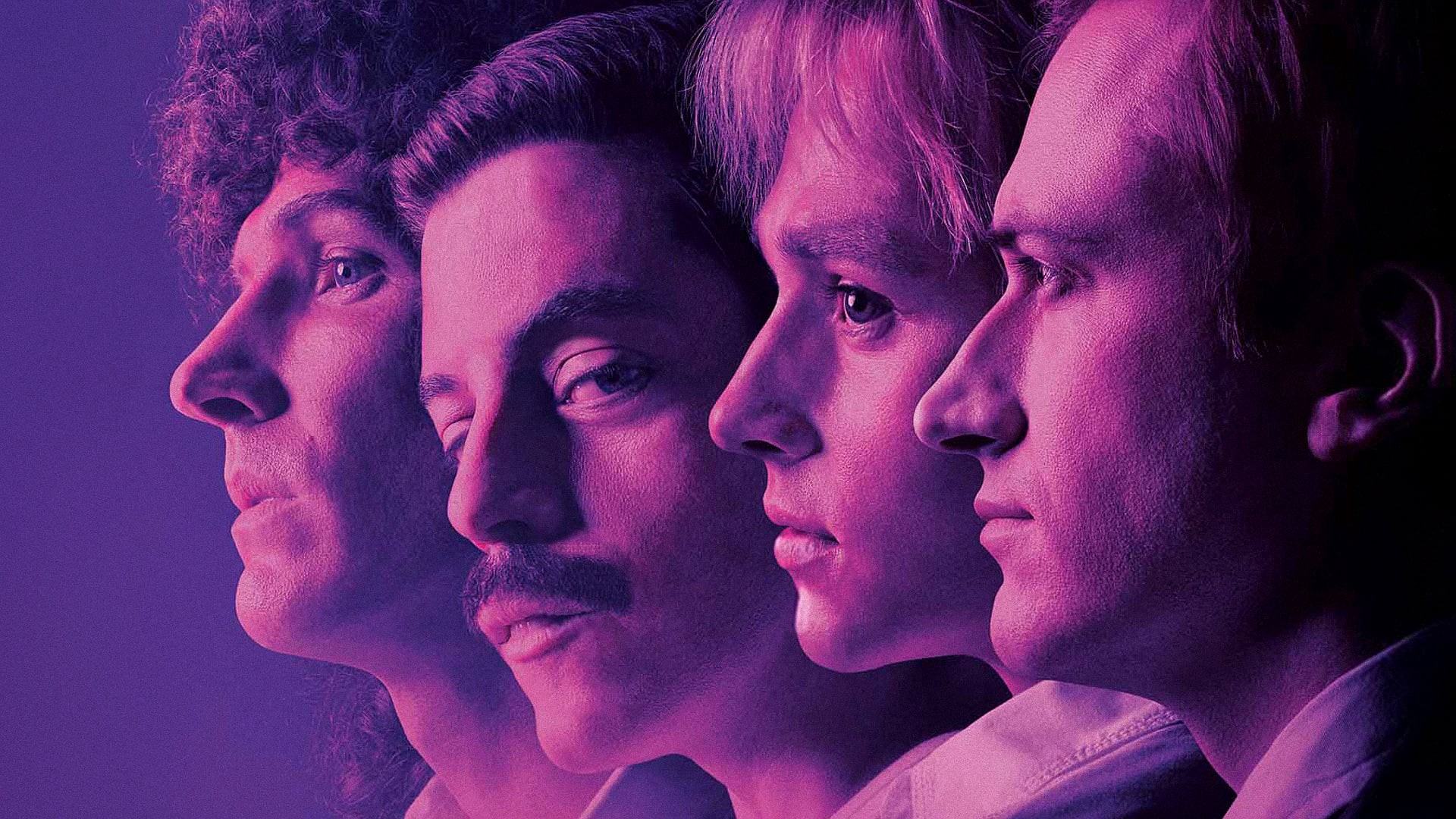
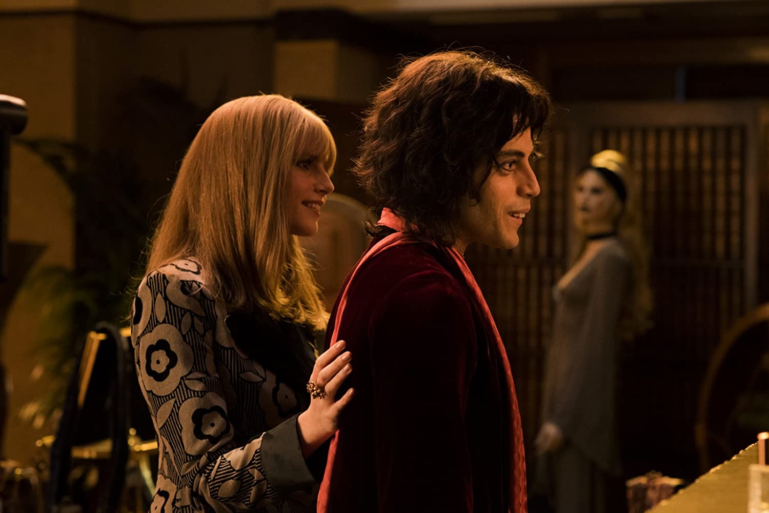
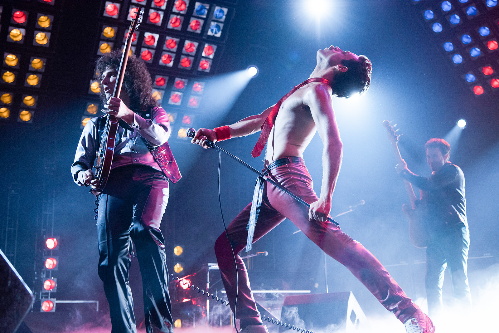
Directed by Bryan Singer, of X-Men and The Usual Suspects fame, Bohemian Rhapsody charts the story of Queen from their formation in 1970 to their triumphant Live Aid set in 1985, with plenty of their classic rock hits along the way. Rami Malek (from Amazon’s Mr. Robot) turns in an Oscar-winning performance as larger-than-life frontman Freddie Mercury.
In his tenth collaboration with Singer was director of photography Newton Thomas Sigel, ASC. I spoke to Sigel about how he approached evoking an era, recreating the concerts, and lensing a legend.
“Every day was this wonderful trip back in time,” enthuses Sigel, who saw the movie as a chance to relive his own youth. “I love shooting music. There is this wonderful transition from the end of the counter-culture, through glam-rock into the hedonism of the eighties.”
Shooting digitally, Sigel employed both the Alexa SXT and Alexa 65. “I decided the movie needed to have a visual arc that best represented the band’s transition from idealists to rock stars, and all the issues that creates. To that effect, I did the first act with old Cooke Speed Panchro lenses on the Alexa SXT. As Queen is discovered, and begins to be known on the international stage, we transition to the Alexa 65.” Sigel later fine-tuned this arc during grading.
The cinematographer paired the large-format Alexa 65 with Prime DNA and Prime 65-S glass, testing all the lenses to find the ones with the most gentle fall-off in focus. “Each lens had its own personality, and was never really ‘perfect’. Our 28mm had a particularly crazy quality that, when used sparingly, had great effect.”
One thing that struck me immediately about the cinematography is the distinctly un-British, warm and glowing look, with lots of sun streaming through windows. This was all part of Sigel’s plan, which develops as the film progresses. “What begins as warm and golden, with its own special LUT, grows ever sharper and cooler, even desaturated,” he explains. “The beginning is all handheld and grainy, the rest much cleaner, with the camera on Steadicam and crane.”
Sigel took a down-to-earth approach to photographing Malek’s Mercury. “I always wanted Freddie to feel very real,” he states. “It is important that you sense his vulnerability at the same time as he is projecting the bravado of the consummate showman. Like so many great performers, Freddie exuded confidence and brashness on stage, and yet, had a terribly shy insecurity in ‘real’ life.”
The highlights of Bohemian Rhapsody are undoubtedly the concert scenes. To tackle these, Sigel began by watching every single piece of Queen footage he could lay his hands on, noting the development of the stage lighting over the years. “I wanted to be as faithful to that as I could, while still having it service our story,” he says. That meant eschewing the easily-coloured RGB LED fixtures so common in movies and concerts today, and going back to the traditional method of laboriously changing gels on tungsten units. “We stuck to period lights,” Sigel confirms, “predominantly par cans and follow spots.”
The sheer number of concert scenes was a challenge for the filmmakers, who at one point had to shoot four gigs in just two days. “We had so many concerts to shoot and so little time, I needed to develop a system to quickly change from one venue to the next,” Sigel recalls. “Because Queen’s lighting was based on large racks of par cans, we were able to construct a very modular system that would allow us to raise or lower different sections very quickly. By pre-programming lighting sequences, we could also create sequence patterns with different configurations of light pods to make it look like a different venue.”
The types of units change as the story progresses through the band’s career. “By the late 70s, Queen was among the first bands to adopt the Vari-Lite, which was championed by the band Genesis,” Sigel explains. “That opened up many more possibilities in the theatrical lighting, which also reflected the band’s ascendancy to the upper echelons of the rock world.”
Sigel notes that he embraced all opportunities to capture lens flares from the concert lighting. “There is a great moment during Live Aid where Freddie makes this sweeping gesture through a circular flare, and it almost seems as if he is drawing on the lens.”
The historic Live Aid concert forms the jubilant climax of the film. Queen’s entire 20-minute set was recreated over seven days of shooting. “We photographed it in every type of weather Great Britain has ever seen: rain, sun, overcast, front-light, backlight – you name it. We couldn’t afford to silk the area as I would have liked,” Sigel adds, referring to large sheets of diffusion hung from cranes to maintain a soft, consistent daylight. “So it was a constant battle and the DI [digital intermediate] certainly helped.”
Filming for Bohemian Rhapsody began in autumn 2017, but by December trouble was brewing. Twentieth Century Fox halted production for a while, with the Hollywood Reporter citing the “unexpected unavailability of director Bryan Singer” as the reason. Dexter Fletcher, who had been attached to direct the nascent film back in 2013, ultimately replaced Singer for the last leg of photography.
“A change like that is never ideal,” admits Sigel, “but Dexter was very impressed with what we had done so far. With only a couple weeks to go, he was happy to carry on in the direction we had begun. Obviously he brought some of his own personal touches, but what I noticed the most was the ease he had in communicating with the actors.”
Reflecting on his long history of collaboration with Singer, Sigel is very positive. “When you have done that many movies together, there is a shorthand that develops and makes much of the work easier because you know your parameters from the beginning. Bohemian Rhapsodywas truly the ‘labour of love’ cliché for so many people involved; it was quite remarkable.”
Asked to sum up the appeal of Bohemian Rhapsody, the cinematographer declares, “The film has everything – a deep emotional core at the centre of what is otherwise an exuberant celebration of Queen’s music. I also think Freddie’s story of an immigrant outsider just trying to fit in has a resonance today that is very profound.”
After many delays, No Time to Die hit UK cinemas a month ago, and has already made half a billion dollars around the world. The 25th James Bond movie was shot on celluloid, making it part of a small group of productions that choose to keep using the traditional medium despite digital becoming the dominant acquisition format in 2013.
Skyfall made headlines the year before that when it became the first Bond film to shoot digitally, captured on the Arri Alexa by the legendary Roger Deakins. But when director Sam Mendes returned to helm the next instalment, 2015’s Spectre, he opted to shoot on 35mm.
“With the Alexa, I missed the routine of film and the dailies,” Mendes told American Cinematographer. “Watching dailies on the big screen for the first time is kind of like Christmas. Film is difficult, it’s imprecise, but that’s also the glory of it. It had romance, a slight nostalgia… and that’s not inappropriate when dealing with a classic Bond movie.”
Early rumours suggested that Bond’s next outing, No Time to Die, would return to digital capture, but film won out again. Variety reported last year: “[Director Cary Joji] Fukunaga and cinematographer Linus Sandgren pushed to have No Time to Die shot on film instead of digital, believing it enhanced the look of the picture.”
Charlotte Bruus Christensen believed the same when she photographed the horror film A Quiet Place on 35mm. “Film captures the natural warmth, colour and beauty of the daylight,” she told British Cinematographer, “but it’s also wonderful in the dark, the way it renders the light on a face from a candle, before falling off into deep detailed blacks. It is quite simply beautiful and uniquely atmospheric.”
The Bond filmmakers went one step further, making No Time to Die the franchise’s first instalment to utilise IMAX 65mm (reportedly for action sequences only). In this respect they follow in the footsteps of film’s most passionate advocate, Christopher Nolan, who mixed 35mm and IMAX for The Dark Knight, The Dark Knight Rises and Interstellar.
“I think IMAX is the best film format that was ever invented,” said the celebrated director in a DGA interview. “It’s the gold standard and what any other technology has to match up to, but none have, in my opinion.” For his most recent films, Dunkirk and Tenet, Nolan eschewed 35mm altogether, mixing IMAX with standard 65mm.
Nolan’s brother Jonathan brought the same passion for celluloid to his TV series Westworld. “Jonathan told me that he had already made up his mind about film,” said pilot DP Paul Cameron in an Indiewire interview. “We wanted the western town to feel classy and elegant… There’s something tactile and formidable [about film] that’s very real.”
Cameron and another of the show’s DPs, John Grillo, both felt that film worked perfectly for the timeless, minimalist look of the desert, but when the story moved to a futuristic city for its third season Grillo expected a corresponding switch in formats. “I thought we might go digital, shooting in 4K or 6K. But it never got past my own head. Jonathan would never go for it. So we stuck with film. We’re still telling the same story, we’re just in a different place.”
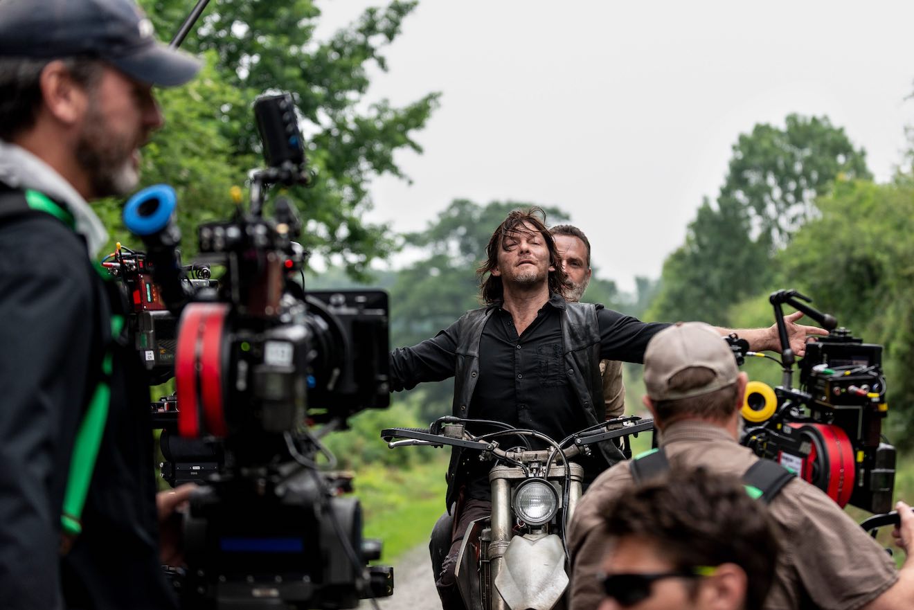
One series that did recently transition from film to digital is The Walking Dead. For nine and a half seasons the zombie thriller was shot on Super 16, a decision first made for the 2010 pilot after also testing a Red, a Panavision Genesis and 35mm. “When the images came back, everyone realised that Super 16 was the format that made everything look right,” reported DP David Boyd. “With the smaller gauge and the grain, suddenly the images seemed to derive from the graphic novel itself. Every image is a step removed from reality and a step deeper into cinema.”
“You really are in there with the characters,” added producer Gale Anne Hurd during a Producers Guild of America panel. “The grain itself, it somehow makes it feel much more personal.” Creator Frank Darabont also noted that the lightweight cameras can be squeezed guerilla-style into small spaces for a more intimate feel.
The team were forced to switch to digital capture during season ten when the COVID-19 pandemic struck. “The decision came about because there are fewer ‘touch points’ with digital than 16mm,” showrunner Angela Kang explained to the press. “We don’t have to swap out film every few minutes, for example.”
The pandemic also hit No Time to Die, pushing its release date back by 18 months and triggering the closure of the Cineworld chain, putting 45,000 jobs in jeopardy. But its reception so far has proved that there’s life yet in both celluloid capture and cinema as a whole.
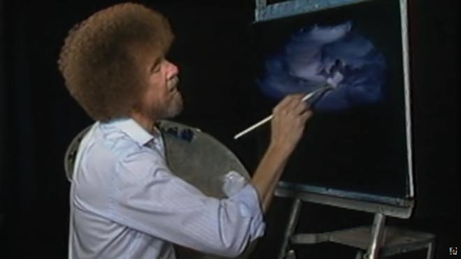
I’m certainly glad you could join me today. It’s a fantastic day here and I hope it is wherever you’re at. Are you ready to read a fantastic little blog post? Good, then let’s get started.
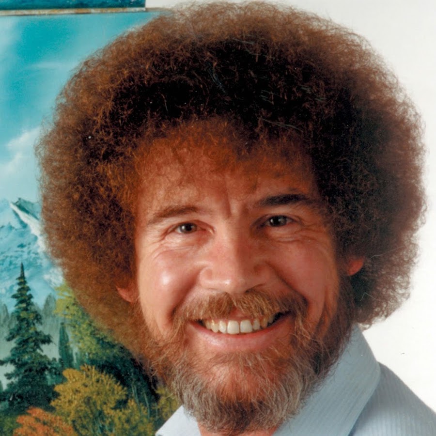
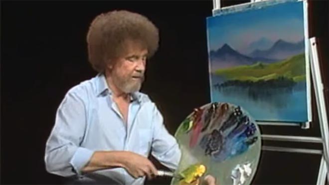
For twelve years, across 400 episodes, Bob Ross entertained all generations of Americans with his public access TV series, The Joy of Painting. Although he floated up to join the happy little clouds in 1995, in recent years YouTube and Twitch have brought his shows to a new audience, of which I am a humble member. Bob’s hypnotic, soft-spoken voice, his unfailingly positive attitude, and the magical effects of his wet-on-wet oil-painting technique make his series calming, comforting and captivating in equal measure.
Having watched every episode at least twice now, I’ve noticed several nuggets of Bob Ross wisdom that apply just as well to cinematography as they do to painting.
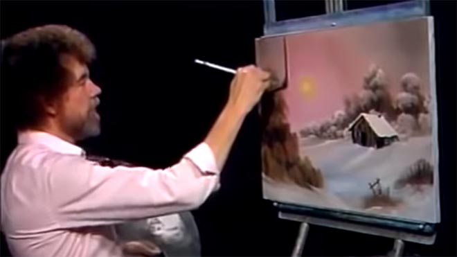
1. “The more plains you have in your painting, the more depth it has… and that’s what brings the happy buck.”
Bob always starts with the background of his scene and paints forward: first the sky with its happy little clouds; then often some almighty mountains; then the little footy hills; some trees way in the distance, barely more than scratches on the canvas; then perhaps a lake, its reflections springing forth impossibly from Bob’s brush; the near bank; and some detailed trees and bushes in the foreground, with a little path winding through them.
“Exile Incessant” (dir. James Reynolds)
Just as with landscape painting, depth is tremendously important in cinematography. Creating a three-dimensional world with a monoscopic camera is a big part of a DP’s job, which starts with composition – shooting towards a window, for example, rather than a wall – and continues with lighting. Depth increases production value, which makes for a happy producer and a happy buck for you when you get hired again.
2. “As things get further away from you in a landscape, they get lighter in value.”
Regular Joy of Painting viewers soon notice that the more distant layers of Bob’s paintings use a lot more Titanium White than the closer ones. Bob frequently explains that each layer should be darker and more detailed than the one behind it, “and that’s what creates the illusion of depth”.
“The Gong Fu Connection” (dir. Ted Duran)
Distant objects seem lighter and less contrasty because of a phenomenon called aerial perspective, basically atmospheric scattering of light. As a DP, you can simulate this by lighting deeper areas of your frame brightly, and keeping closer areas dark. This might be achieved by setting up a flag to provide negative fill to an object in the foreground, or by placing a battery-powered LED fixture at the end of a dark street. The technique works for night scenes and small interiors, just as well as daytime landscapes, even though aerial perspective would never occur there in real life. The viewer’s brain will subconsciously recognise the depth cue and appreciate the three-dimensionality of the set much more.
3. “Don’t kill the little misty area; that’s your separator.”
After completing each layer, particularly hills and mountains, Bob takes a clean, dry brush and taps gently along the bottom of it. This has a blurring and fading effect, giving the impression that the base of the layer is dissolving into mist. When he paints the next layer, he takes care to leave a little of this misty area showing behind it.
“Heretiks” (dir. Paul Hyett)
We DPs can add atmos (smoke) to a scene to create separation. Because there will be more atmos between the lens and a distant object than between the lens and a close object, it really aids the eye in identifying different plains. That makes the image both clearer and more aesthetically pleasing. Layers can also be separated with backlight, or a differentiation of tones or colours.
4. “You need the dark in order to show the light.”
Hinting at the tragedy in his own life, Bob often underlines the importance of playing dark tones against light ones. “It’s like in life. Gotta have a little sadness once in a while so you know when the good times come,” he wisely remarks, as he taps away at the canvas with his fan-brush, painting in the dark rear leaves of a tree. Then he moves onto the lighter foreground leaves, “but don’t kill your dark areas,” he cautions.
“Closer Each Day” promo (dir. Oliver Park)
If there’s one thing that makes a cinematic image, it’s contrast. It can be very easy to over-light a scene, and it’s often a good idea to try turning a fixture or two off to see if the mood is improved. However bright or dark your scene is, where you don’t put light is just as important as where you do. Flagging a little natural light, blacking out a window, or removing the bubble from a practical can often add a nice bit of shape to the image.
5. “Maybe… maybe… maybe… Let’s DROP in an almighty tree.”
As the end of the episode approaches, and the painting seems complete, Bob has a habit of suddenly adding a big ol’ tree down one or both sides of the canvas. Since this covers up background layers that have been carefully constructed earlier in the show, Bob often gets letters complaining that he has spoilt a lovely painting. “Ruined!” is the knowing, light-hearted comment of the modern internet viewer.
“Synced” (dir. Devon Avery)
The function of these trees is to provide a foreground framing element which anchors the side of the image. I discussed this technique in my article on composing a wide shot. A solid, close object along the side or base of the frame makes the image much stronger. It gives a reason for the edge of the frame to be there rather than somewhere else. As DPs, we may not be able to just paint a tree in, but there’s often a fence, a pillar, a window frame, even a supporting artist that we can introduce to the foreground with a little tweaking of the camera position.
The ol’ clock on the wall tells me it’s time to go, so until next time: happy filming, and God bless, my friend.
Like many of us, I’ve watched a lot of streaming shows this year. One of the best was Chernobyl, the HBO/Sky Atlantic mini-series about the nuclear power plant disaster of 1986, which I cheekily binged during a free trial of Now TV.
In July, Chernobyl deservedly scooped multiple honours at the Virgin Media British Academy Television (Craft) Awards. In addition to it claiming the Bafta for best mini-series, lead actor Jared Harris, director Johan Renck, director of photography Jakob Ihre, production designers Luke Hull and Claire Levinson-Gendler, costume designer Odile Dicks-Mireaux, editors Simon Smith and Jinx Godfrey, composer Hildur Gudnadóttir, and the sound team all took home the awards in their respective fiction categories.
I use the phrase “took home” figuratively, since no-one had left home in the first place. The craft awards ceremony was a surreal, socially-distanced affair, full of self-filmed, green-screened celebrities. Comedian Rachel Parris impersonated writer/actor Jessica Knappett, and the two mock-argued to present the award for Photography & Lighting: Fiction. Chernobyl’s DP Jakob Ihre, FSF gave his acceptance speech in black tie, despite being filmed on a phone in his living room. In it he thanked his second unit DP Jani-Petteri Passi as well as creator/writer Craig Mazin, one of the few principal players not to receive an award.
Mazin crafted a tense and utterly engrossing story across five hour-long instalments, a story all the more horrifying for its reality. Beginning with the suicide of Harris’ Valery Legasov on the second anniversary of the disaster, the series shifts back to 1986 and straight into the explosion of the No. 4 reactor at the Chernobyl Nuclear Power Plant in the Soviet Ukraine. Legasov, along with Brosi Shcherbina (Stellan Skarsgård) and the fictional, composite character Ulana Khomyuk (Emily Watson) struggle to contain the meltdown while simultaneously investigating its cause. Legions of men are sacrificed to the radiation, wading through coolant water in dark, labyrinthine tunnels to shut off valves, running across what remains of the plant’s rooftop to collect chunks of lethal graphite, and mining in sweltering temperatures beneath the core to install heat exchangers that will prevent another catastrophic explosion.
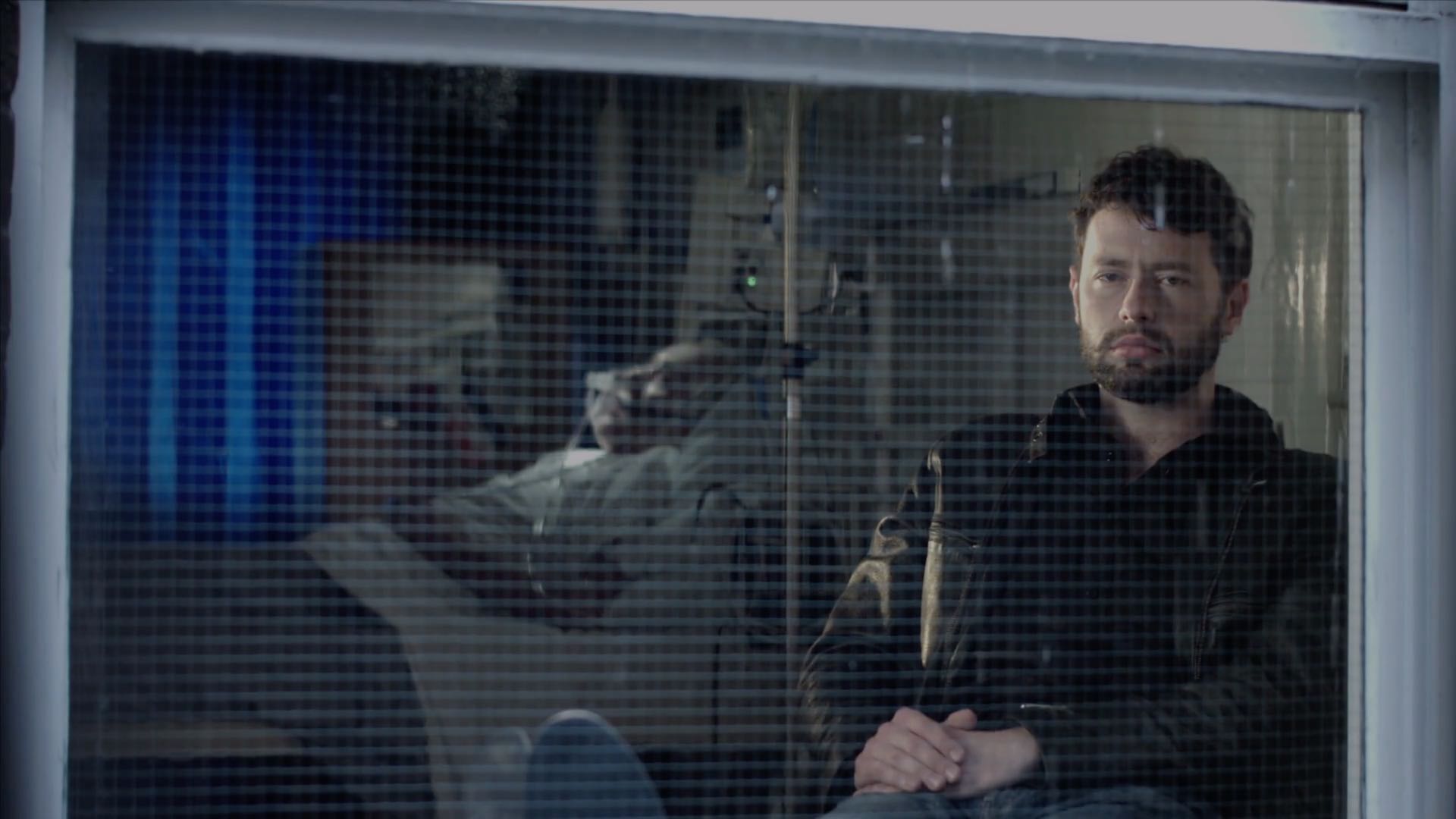
For Swedish-born NFTS (National Film and Television School) graduate Jakob Ihre, Chernobyl was a first foray into TV. His initial concept for the show’s cinematography was to reflect the machinery of the Soviet Union. He envisaged a heavy camera package representing the apparatus of the state, comprised of an Alexa Studio, with its mechanical shutter, plus anamorphic lenses. “After another two or three months of preproduction,” he told the Arri Channel, “we realised maybe that’s the wrong way to go, and we should actually focus on the characters, on the human beings, the real people who this series is about.”
Sensitivity and respect for the people and their terrible circumstances ultimately became the touchstone for both Ihre and his director. The pair conducted a blind test of ten different lens sets, and both independently selected Cooke Panchros. “We did a U-turn and of course we went for spherical lenses, which in some way are less obtrusive and more subtle,” said Ihre. For the same reason, he chose the Alexa Mini over its big brother. A smaller camera package like this is often selected when filmmakers wish to distract and overwhelm their cast as little as possible, and is believed by many to result in more authentic performances.
When it came to lighting, “We were inspired by the old Soviet murals, where you see the atom, which is often symbolised as a sun with its rays, and you see the workers standing next to that and working hand in hand with the so-called ‘friendly’ atom.” Accordingly, Ihre used light to represent gamma radiation, with characters growing brighter and over-exposed as they approach more dangerous areas.
Ihre thought of the disaster as damaging the fabric of the world, distorting reality. He strove to visualise this through dynamic lighting, with units on dimmers or fitted with remote-controlled shutters. He also allowed the level of atmos (smoke) in a scene to vary – normally a big no-no for continuity. The result is a series in which nothing feels safe or stable.
The DP shot through windows and glass partitions wherever possible, to further suggest a distorted world. Working with Hull and Levinson-Gendler, he tested numerous transparent plastics to find the right one for the curtains in the hospital scenes. In our current reality, filled with perspex partitions (and awards ceremonies shot on phones), such imagery of isolation is eerily prescient.
The subject of an invisible, society-changing killer may have become accidentally topical, but the series’ main theme was more deliberately so. “What is the cost of lies?” asks Legasov. “It’s not that we’ll mistake them for the truth. The real danger is that if we hear enough lies, then we no longer recognise the truth at all.” In our post-truth world, the disinformation, denial and delayed responses surrounding the Chernobyl disaster are uncomfortably familiar.
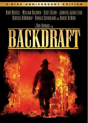
Lately, having run out of interesting series, I’ve found myself watching a lot of nineties blockbusters: Outbreak, Twister, Dante’s Peak, Backdraft, Daylight. Whilst eighties movies were the background to my childhood, and will always have a place in my heart, it was the cinema of the nineties that I was immersed in as I began my own amateur filmmaking. So, looking back on those movies now, while certain clichés stand out like sore thumbs, they still feel to me like solid examples of how to make a summer crowd-pleaser.
Let’s get those clichés out of the way first. The lead character always has a failed marriage. There’s usually an opening scene in which they witness the death of a spouse or close relative, before the legend “X years later” fades up. The dog will be saved, but the crotchety elderly character will die nobly. Buildings instantly explode towards camera when touched by lava, hurricanes, floods or fires. A stubborn senior authority figure will refuse to listen to the disgraced lead character who will ultimately be proven correct, to no-one’s surprise.
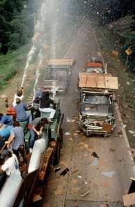
Practical effects in action on “Twister”
There’s an intensity to nineties action scenes, born of the largely practical approach to creating them. The decade was punctuated by historic advances in digital effects: the liquid metal T-1000 in Terminator 2 (1991), digital dinosaurs in Jurassic Park(1993), motion-captured passengers aboard the miniature Titanic (1997), Bullet Time in The Matrix (1999). Yet these techniques remained expensive and time-consuming, and could not match traditional methods of creating explosions, floods, fire or debris. The result was that the characters in jeopardy were generally surrounded by real set-pieces and practical effects, a far more nerve-wracking experience for the viewer than today, when we can tell that our heroes are merely imagining their peril on a green-screen stage.
One thing I was looking out for during these movie meanders down memory lane was lens selection. A few weeks back, a director friend had asked me to suggest examples of films that preferred long lenses. He had mentioned that such lenses were more in vogue in the nineties, which I’d never thought about before.
As soon as I started to consider it, I realised how right my friend was. And how much that long-lens look had influenced me. When I started out making films, I was working with the tiny sensors of Mini-DV cameras. I would often try to make my shots look more cinematic by shooting on the long end of the zoom. This was partly to reduce the depth of field, but also because I instinctively felt that the compressed perspective was more in keeping with what I saw at the cinema.
I remember being surprised by something that James Cameron said in his commentary on the Aliens DVD:
I went to school on Ridley [Scott]’s style of photography, which was actually quite a bit different from mine, because he used a lot of long lenses, much more so than I was used to working with.
I had assumed that Cameron used long lenses too, because I felt his films looked incredibly cinematic, and because I was so sure that cinematic meant telephoto. I’ve discussed in the past what I think people tend to mean by the term “cinematic”, and there’s hardly a definitive answer, but I’m now sure that lens length has little to do with it.
“Above the Clouds” (dir. Leon Chambers)
And yet… are those nineties films influencing me still? I have to confess, I struggle with short lenses to this day. I find it hard to make wide-angle shots look as good. On Above the Clouds, to take just one example, I frequently found that I preferred the wide shots on a 32mm than a 24mm. Director Leon Chambers agreed; perhaps those same films influenced him?
A deleted scene from Ren: The Girl with the Mark ends with some great close-ups shot on my old Sigma 105mm still lens, complete with the slight wobble of wind buffeting the camera, which to my mind only adds to the cinematic look! On a more recent project, War of the Worlds: The Attack, I definitely got a kick from scenes where we shot the heroes walking towards us down the middle of the street on a 135mm.
Apart from the nice bokeh, what does a long lens do for an image? I’ve already mentioned that it compresses perspective, and because this is such a different look to human vision, it arguably provides a pleasing unreality. You could describe it as doing for the image spatially what the flicker of 24fps (versus high frame rates) does for it temporally. Perhaps I shy away from short lenses because they look too much like real life, they’re too unforgiving, like many people find 48fps to be.
The compression applies to people’s faces too. Dustin Hoffman is not known for his small nose, yet it appears positively petite in the close-up below from Outbreak. While this look flatters many actors, others benefit from the rounding of their features caused by a shorter lens.
Perhaps the chief reason to be cautious of long lenses is that they necessitate placing the camera further from the action, and the viewer will sense this, if only on a subconscious level. A long lens, if misused, can rob a scene of intimacy, and if overused could even cause the viewer to disengage with the characters and story.
I’ll leave you with some examples of long-lens shots from the nineties classics I mentioned at the start of this post. Make no mistake, these films employed shorter lenses too, but it certainly looks to me like they used longer lenses on average than contemporary movies.
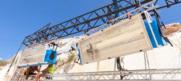
A miniature Saturn V rocket is prepared for filming
If you’re a DP, you’re probably familiar with the “Guess the Format” game. Whenever you see a movie, you find yourself trying to guess what format it was shot on. Film or digital? Camera? Glass? Resolution?
As I sat in the cinema last autumn watching First Man, I was definitely playing the game. First Man tells the true story of Neil Armstrong’s (Ryan Gosling) extraterrestrial career, including his test flights in the hypersonic X-15, his execution of the first ever docking in space aboard Gemini 8, the tragic deaths of his colleagues in the launchpad fire of Apollo 1, and of course the historic Apollo 11.
The game was given away fairly early on when I noticed frames with dust on, a sure sign of celluloid acquisition. (Though most movies have so much digital clean-up now that a lack of dust doesn’t necessarily mean that film wasn’t involved.) I automatically assumed 35mm, though as the film went on I occasionally wondered if I could possibly be watching Super-16? There was something of the analogue home movie about certain scenes, the way the searing highlights of the sun blasting into the space capsules rolled off and bloomed.
When I got home I tracked down this Studio Daily podcast and my suspicions were confirmed, but we’ll get to that in a minute.
Cinéma Vérité
Let’s start at the beginning. First Man was directed by Damien Chazelle and photographed by Linus Sandgren, FSF, the same team who made La La Land, for which both men won Oscars. What I remember most about the cinematography of that earlier film is the palette of bright but slightly sickly colours, and the choreographed Steadicam moves.
First Man couldn’t be more different, adopting a cinéma vérité approach that often looks like it could be real and previously-unseen Nasa footage. Sandgren used zoom lenses and a documentary approach to achieve this feeling:
When you do a documentary about a person and you’re there in their house with them and they’re sad or they’re talking, maybe you don’t walk in there and stand in the perfect camera position. You can’t really get the perfect angles. That in itself creates some sort of humbleness to the characters; you are a little respectful and leave them a little alone to watch them from a distance or a little bit from behind.
Similarly, scenes in the spacecraft relied heavily on POVs through the small windows of the capsule, which is all that the astronauts or a hypothetical documentary camera operator would have been able to see. This blinkered view, combined with evocative and terrifying sound design – all metallic creaks, clanks and deafening booms, like the world itself is ending – makes the spaceflight sequences incredibly visceral.
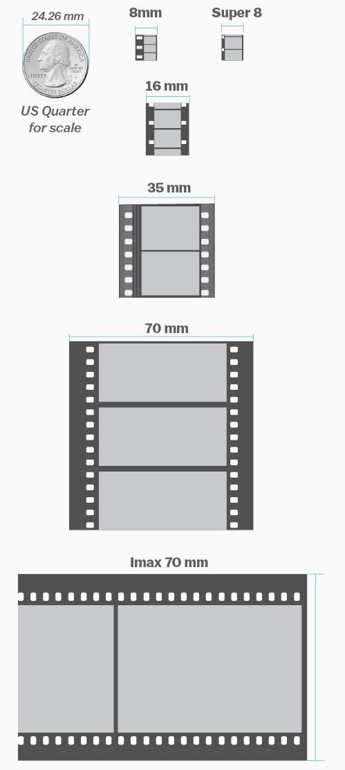
Multiple gauges
Scale comparison of film formats. Note that Imax is originated on 65mm stock and printed on 70mm to allow room for the soundtrack.
Documentaries in the sixties would have been shot on Super-16, which is part of the reason that Sandgren and Chazelle chose it as one of their acquisition formats. The full breakdown of formats is as follows:
Super-16 was employed for intense or emotional material, specifically early sequences relating to the death of Armstrong’s young daughter, and scenes inside the various spacecraft. As well as the creative considerations, the smaller size of Super-16 equipment was presumably advantageous from a practical point of view inside the cramped sets.
35mm was used for most of the non-space scenes. Sandgren differentiated the scenes at Nasa from those at Armstrong’s home by push-processing the former and pull-processing the latter. What this means is that Nasa scenes were underexposed by one stop and overdeveloped, resulting in a detailed, contrasty, grainy look, while the home scenes were overexposed and underdeveloped to produce a cleaner, softer, milkier look. 35mm was also used for wide shots in scenes that were primarily Super-16, to ensure sufficient definition.
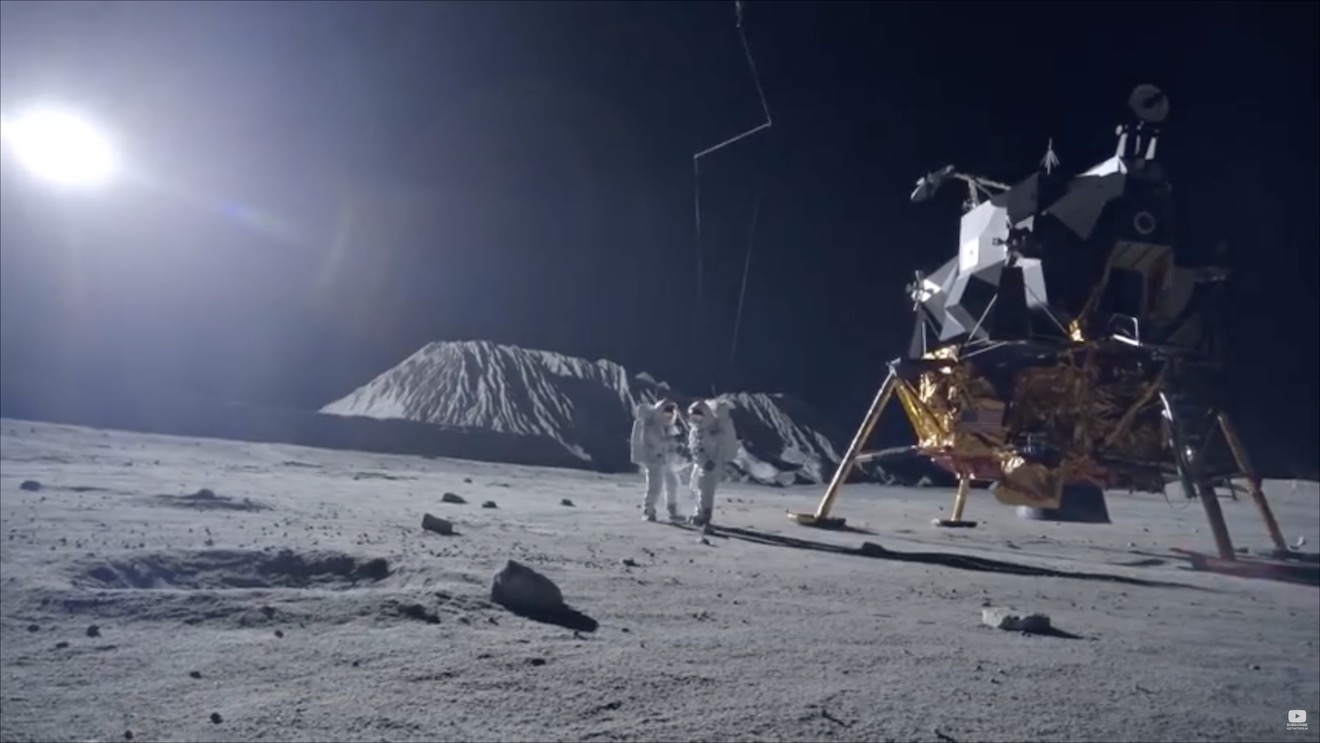
Imax (horizontally-fed 65mm) was reserved for scenes on the moon.
In-camera effects
In keeping with the vintage aesthetic of celluloid capture, the visual effects were captured in-camera wherever possible. I’ve written in the past about the rise of LED screens as a replacement for green-screen and a source of interactive lighting. I guessed that First Man was using this technology from ECUs which showed the crescent of Earth reflected in Ryan Gosling’s eyes. Such things can be added in post, of course, but First Man‘s VFX have the unmistakeable ring of in-camera authenticity.
Imposing a “no green-screen” rule, Chazelle and his team used a huge LED screen to display the views out of the spacecraft windows. A 180° arc of 60′ diameter and 35′ in height, this screen was bright enough to provide all the interactive lighting that Sandgren required. His only addition was a 5K tungsten par or 18K HMI on a crane arm to represent the direct light of the sun.
The old-school approach extended to building and filming miniatures, of the Saturn V rocket and its launch tower for example. For a sequence of Armstrong in an elevator ascending the tower, the LED screen behind Gosling displayed footage of this miniature.
For external views of the capsules in space, the filmmakers tried to limit themselves to realistic shots which a camera mounted on the bodywork might have been able to capture. This put me in mind of Christopher Nolan’s Interstellar, which used the same technique to sell the verisimilitude of its space vehicles. In an age when any conceivable camera move can be executed, it can be very powerful to stick to simple angles which tap into decades of history – not just from cinema but from documentaries and motorsports coverage too.
Lunar Lighting
For scenes on earth, Landgren walked a line between naturalism and expression, influenced by legendary DPs like Gordon Willis, ASC. My favourite shot is a wide of Armstrong’s street at night, as he and his ill-fated friend Ed White (Jason Clarke) part company after a drinking session. The mundane suburban setting is bathed in blue moonbeams, as if the the moon’s fingers are reaching out to draw the characters in.
Scenes on the lunar surface were captured at night on an outdoor set the size of three football pitches. To achieve absolute authenticity, Sandgren needed a single light source (representing the sun) fixed at 15° above the horizon. Covering an area that size was going to require one hell of a single source, so he went to Luminys, makers of the Softsun.
Softsuns
Softsuns are lamps of frankly ridiculous power. The 50KW model was used, amongst other things, to blast majestic streams of light through the windows of Buckingham Palace on The Crown, but Sandgren turned to the 100KW model. Even that proved insufficient, so he challenged Luminys to build a 200KW model, which they did.
The result is a completely stark and realistic depiction of a place where the sun is the only illumination, with no atmosphere to diffuse or redistribute it, no sky to glow and fill in the shadows. This ties in neatly with a prevailing theme in the film, that of associating black with death, when Armstrong symbolically casts his deceased daughter’s bracelet into an obsidian crater.
First Man may prove unsatisfying for some, with Armstrong’s taciturn and emotionally closed-off nature making his motivations unclear, but cinematically it is a tour de force. Taking a human perspective on extraordinary accomplishments, deftly blending utterly convincing VFX and immersive cinéma vérité photography, First Man recalls the similarly analogue and similarly gripping Dunkirk as well as the documentary-like approach of 1983’s The Right Stuff. The film is currently available on DVD, Blu-ray and VOD, and I highly recommend you check it out.
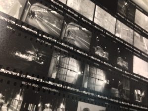
The contact sheet from my first roll of Ilford Delta 3200
Having lately shot my first roll of black-and-white film in a decade, I thought now would be a good time to delve into the story of monochrome image-making and the various reasons artists have eschewed colour.
I found the recent National Gallery exhibition, Monochrome: Painting in Black and White, a great primer on the history of the unhued image. Beginning with examples from medieval religious art, the exhibition took in grisaille works of the Renaissance before demonstrating the battle between painting and early photography, and finishing with monochrome modern art.
Several of the pictures on display were studies or sketches which were generated in preparation for colour paintings. Ignoring hue allowed the artists to focus on form and composition, and this is still one of black-and-white’s great strengths today: stripping away chroma to heighten other pictorial effects.
“Nativity” by Petrus Christus, c. 1455
What fascinated me most in the exhibition were the medieval religious paintings in the first room. Here, old testament scenes in black-and-white were painted around a larger, colour scene from the new testament; as in the modern TV trope, the flashbacks were in black-and-white. In other pictures, a colour scene was framed by a monochrome rendering of stonework – often incredibly realistic – designed to fool the viewer into thinking they were seeing a painting in an architectural nook.
During cinema’s long transition from black-and-white to colour, filmmakers also used the two modes to define different layers of reality. When colour processes were still in their infancy and very expensive, filmmakers selected particular scenes to pick out in rainbow hues, while the surrounding material remained in black-and-white like the borders of the medieval paintings. By 1939 the borders were shrinking, as The Wizard of Oz portrayed Kansas, the ordinary world, in black-and-white, while rendering Oz – the bulk of the running time – in colour.
Michael Powell, Emeric Pressburger and legendary Technicolor cinematographer Jack Cardiff, OBE, BSC subverted expectations with their 1946 fantasy-romance A Matter of Life and Death, set partly on Earth and partly in heaven. Says Cardiff in his autobiography:
Quite early on I had said casually to Michael Powell, “Of course heaven will be in colour, won’t it?” And Michael replied, “No. Heaven will be in black and white.” He could see I was startled, and grinned: “Because everyone will expect heaven to be in colour, I’m doing it in black-and-white.”
Ironically Cardiff had never shot in black-and-white before, and he ultimately captured the heavenly scenes on three-strip Technicolor, but didn’t have the colour fully developed, resulting in a pearlescent monochrome.
Meanwhile, DPs like John Alton, ASC were pushing greyscale cinematography to its apogee with a genre that would come to be known as film noir. Oppressed Jews like Alton fled the rising Nazism of Europe for the US, bringing German Expressionism with them. The result was a trend of hardboiled thrillers lit with oppressive contrast, harsh shadows, concealing silhouettes and dramatic angles, all of which were heightened by the lack of distracting colour.
“The Big Combo” DP: John Alton, ASC
Alton himself had a paradoxical relationship with chroma, famously stating that “black and white are colours”. While he is best known today for his noir, his only Oscar win was for his work on the Technicolor musical An American in Paris, the designers of which hated Alton for the brightly-coloured light he tried to splash over their sets and costumes.
It wasn’t just Alton that was moving to colour. Soon the economics were clear: chromatic cinema was more marketable and no longer prohibitively expensive. The writing was on the wall for black-and-white movies, and by the end of the sixties they were all but gone.
I was brought up in a world of default colour, and the first time I can remember becoming aware of black-and-white was when Schindler’s List was released in 1993. I can clearly recall a friend’s mother refusing to see the film because she felt she wouldn’t be getting her money’s worth if there was no colour. She’s not alone in this view, and that’s why producers are never keen to green-light monochrome movies. Spielberg only got away with it because his name was proven box office gold.
“Schindler’s List” DP: Janusz Kamiński, ASC
A few years later, Jonathan Frakes and his DP Matthew F. Leonetti, ASC wanted to shoot the holodeck sequence of Star Trek: First Contact in black-and-white, but the studio deemed test footage “too experimental”. For the most part, the same attitude prevails today. Despite being marketed as a “visionary” director ever since Pan’s Labyrinth, Guillermo del Toro’s vision of The Shape of Water as a black-and-white film was rejected by financiers. He only got the multi-Oscar-winning fairytale off the ground by reluctantly agreeing to shoot in colour.
Yet there is reason to be hopeful about black-and-white remaining an option for filmmakers. In 2007 MGM denied Frank Darabont the chance to make The Mist in black-and-white, but they permitted a desaturated version on the DVD. Darabont had this to say:
No, it doesn’t look real. Film itself [is a] heightened recreation of reality. To me, black-and-white takes that one step further. It gives you a view of the world that doesn’t really exist in reality and the only place you can see that representation of the world is in a black-and-white movie.
“The Mist” DP: Rohn Schmidt
In 2016, a “black and chrome” version of Mad Max: Fury Road was released on DVD and Blu-Ray, with director George Miller saying:
The best version of “Road Warrior” [“Mad Max 2”] was what we called a “slash dupe,” a cheap, black-and-white version of the movie for the composer. Something about it seemed more authentic and elemental. So I asked Eric Whipp, the [“Fury Road”] colourist, “Can I see some scenes in black-and-white with quite a bit of contrast?” They looked great. So I said to the guys at Warners, “Can we put a black-and-white version on the DVD?”
One of the James Mangold photos which inspired “Logan Noir”
The following year, Logan director James Mangold’s black-and-white on-set photos proved so popular with the public that he decided to create a monochrome version of the movie. “The western and noir vibes of the film seemed to shine in the form, and there was not a trace of the modern comic hero movie sheen,” he said. Most significantly, the studio approved a limited theatrical release for Logan Noir, presumably seeing the extra dollar-signs of a second release, rather than the reduced dollar-signs of a greyscale picture.
Perhaps the medium of black-and-white imaging has come full circle. During the Renaissance, greyscale images were preparatory sketches, stepping stones to finished products in colour. Today, the work-in-progress slash dupe of Road Warrior and James Mangold’s photographic studies of Logan were also stepping stones to colour products, while at the same time closing the loop by inspiring black-and-white products too.
With the era of budget- and technology-mandated monochrome outside the living memory of many viewers today, I think there is a new willingness to accept black-and-white as an artistic choice. The acclaimed sci-fi anthology series Black Mirror released an episode in greyscale this year, and where Netflix goes, others are bound to follow.
At the end of last summer I started a regular #ShotOfTheWeek on my Twitter feed. It’s very simple: each week I post a frame grab (or sometimes a GIF if I can find one) of a great shot from a film or series I’ve been watching. Sometimes these are new productions, just out, and sometimes they’re older pieces which I’m revisiting or viewing for the first time.
For those of you who aren’t among the Twitterati, here is a round-up of last year’s Shots of the Week. On the other hand, if you are a Twitterist, why not post your own inspirational frame grabs, using the hashtag #ShotOfTheWeek?
Powerful Close-ups
Cinema is arguably at its most potent when showing us the tiny nuances of emotion that only a big close-up can provide.
“Anne with an E” DP: Bobby Shore
This example from the moving Netflix series Anne with an E makes the most of Anne’s freckled face and puts us right in her headspace… literally. Shots like this were captured with a 27mm Primo, as opposed to the vintage Panavision glass used for other coverage. For more on the cinematography of Anne with an E, check out the Varicam section in my report from Camerimage 2017.
“Black Narcissus” DP: Jack Cardiff
I love the shadows in this shot by legendary DP Jack Cardiff; they almost suggest a crucifix or prison bars. Either would be appropriate for this story of a nun sent to a remote Indian palace to establish a school and hospital. The low-angle eye-light adds to the unsettling feel.
“The Crown” DP: Stuart Howell
The key promotional art for The Crown is an edge-lit profile shot of the Queen, evoking the regal image on stamps and coins. Here DP Stuart Howell has paid homage to the artwork, channelling the same connotations of a figurehead carrying a country on her shoulders.
“American Gods” DP: Aaron Morton
What can I say? I’m a sucker for a good profile shot. The hellish colours here are perfect given what the erstwhile Lovejoy has just done. (I won’t give you any spoilers, but let’s just say it doesn’t involve cheeky antiques dealing.)
Symbolism
“The Handmaid’s Tale” DP: Colin Watkinson
This was the shot that inspired me to start #ShotOfTheWeek. The Handmaid’s Tale is set in a Christian fundamentalist society, so evoking classical religious paintings with the angel-wing-like headboard and the muted, brown colour scheme was a clever move.
“The Ipcress File” DP: Otto Heller
This classic spy thriller has a lot of unusual compositions with domineering foreground objects. Here the cross and circle shapes of the light-shade suggest the crosshairs of a gun, while the bulb tastefully obscures the actual bullet wound.
“Mr Robot” DP: Tod Campbell
This one is almost too on-the-nose to be called symbolism. Only a drama as quirky as Mr Robot could get away with this kind of (literal) signposting, but I love how bold it is. The rigid geometric lines and excessive headroom used throughout the series are also in evidence here, reflecting how we’re seeing everything from Elliot’s mentally ill point of view.
Negative Space
“Mission: Impossible – Rogue Nation” DP: Robert Elswit
A forgettable film, but a shot with much to admire. The dark back of the bench creates negative space in the composition, reducing the already-wide Scope frame to a ratio of about 4:1, echoing the short, wide shape of the House of Commons. On the lighting front, negative fill has been employed to render both that bench and the cast very dark, almost silhouettes, imparting a lot of depth to an otherwise flat image.
“Stranger Things” DP: Tim Ives
Again, negative space here creates a geometrical frame within a frame. What I particularly liked was the placement of the bulb above the sheriff’s head, rather than on the right of frame, which would have produced a more balanced but much less interesting shot.
“Better Call Saul” DP: Arthur Albert
Every time Better Call Saul returned to this location I scanned the background of each angle, trying to figure out what on earth could be motivating the bold slash of light on the right of this image. It remains a mystery! The show is full of uncompromisingly dark images with crisp, pure blacks, but perhaps none so overtly noirish as this one.
Intersecting Lines
“Metropolis” DPs: Karl Freund, Günther Rittau & Walter Ruttmann
All credit to Otto Hunte, the production designer on this 1920s sci-fi classic, as every line in this set leads us to the figure of Maria, fittingly for a character who has captured the imaginations of the dystopian underclass. The cinematographers have helped by framing her centrally and making her the brightest part of the image.
“Jardin d’hiver” DP: Darius Khondji
Jardin d’hiver was sponsored by CW Sonderoptic to promote their new large-format Leica Thalia glass (see my Camerimage post for more info). I have to admit that most of the film’s imagery did nothing for me, but this shot of bold, contrasty lines softened by the milkiness of the foreground window has a graphical quality I find very appealing.
“Little Miss Sunshine” DP: Tim Suhrstedt
This is a shot of two halves: the upper half busy, confused and oppressive, the lower half reassuringly simple with its one-point perspective. It was only after filming wrapped on Above the Clouds that I realised just how much this shot and others like it in Little Miss Sunshine had influenced my cinematography of Leon Chambers’ comedy road movie. (Check out the second still on the Above the Clouds page and you’ll see what I mean!)
Iconic Reveals
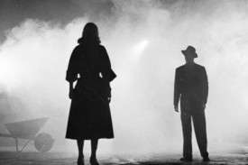
“The 39 Steps” (1935) DP: Bernard Knowles
Richard Hannay and the audience both discover the cause of Annabella’s distress simultaneously, in a reveal that’s shocking and also funny! The chiaroscuro of the lighting beautifully highlights the bright knife against the deep shadows of the background.
“Terminator 2: Judgment Day” DP: Adam Greenberg
These two gifs are both parts of the same shot, which cranes up from the shockingly unexpected crushing of the skull to reveal the endoskeleton puppet in mid-shot as a perfectly timed explosion goes off in the background. As well as being a remarkable technical achievement, the arts and sciences of cinematography, practical effects and animatronics all working in harmony, it’s a great piece of visual storytelling.
And finally…
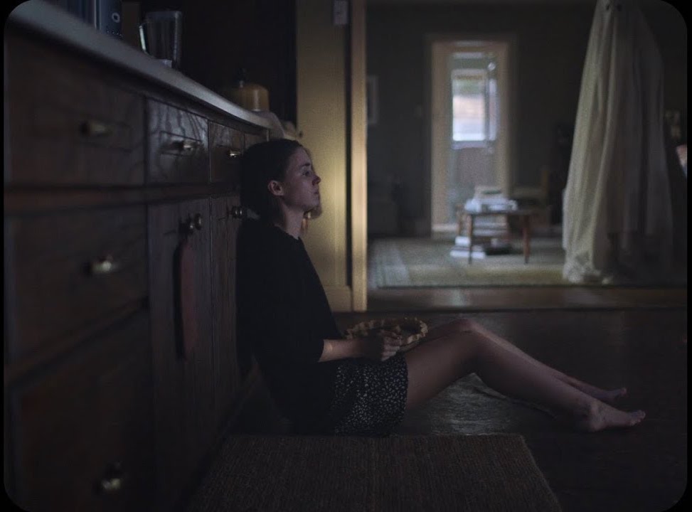
“A Ghost Story” DP: Andrew Droz Palermo
A Ghost Story didn’t get a very wide release, and won’t be to everyone’s taste. A lyrical meditation on the nature of time, its slow pace becomes glacial during a grief-filled, ten-minute pie-eating scene containing only one cut. There is plenty of time to consider the composition, and I loved how casually the ghost is placed within the frame, with the top of his head even cut off. (I later discovered he was composited in, to reduce the chances of anything spoiling the ultra-long, ultra-emotional take.) The lines of the cupboards lead our eyes always back to Rooney Mara, the painterly splash of light on the wall (which I believe was natural) throwing her profile into relief. When she starts to cry, it takes a while to spot the tears, but somehow that makes it all the more powerful.
It’s interesting to note that no fewer than four aspect ratios are represented by all these Shots of the Week: from the traditional Academy ratio of 4:3, through the standard 16:9, to the Netflix-favoured 2:1 and of course 2.39:1 Cinemascope. It’s an exciting time to be working in cinematography, when we have so many choices open to us to create the most fitting images for any given story. Here’s to many more inspiring #ShotOfTheWeek images in 2018. Follow me on Twitter to see them first!
This is the third and final part of my report from my time at Camerimage, the Polish film festival focused on cinematography. Read part one here and part two here.
Up.Grade: Human Vision & Colour Pipelines
I thought I would be one of the few people who would be bothered to get up and into town for this technical 10:15am seminar. But to the surprise of both myself and the organisers, the auditorium of the MCK Orzeł was once again packed – though I’d learnt to arrive in plenty of time to grab a ticket.
Up.grade is an international colour grading training programme. Their seminar was divided into two distinct halves: the first was a fascinating explanation of how human beings perceive colour, by Professor Andrew Stockman; the second was a basic overview of colour pipelines.
Prof. Stockman’s presentation – similar to his TED video above – had a lot of interesting nuggets about the way we see. Here are a few:
Our eyes record very little colour information compared with luminance info. You can blur the chrominance channel of an image considerably without seeing much difference; not so with the luminance channel.
Light hitting a rod or cone (sensor cells in our retinae) straightens the twist in the carbon double bond of a molecule. It’s a binary (on/off) response and it’s the same response for any frequency of light. It’s just that red, green and blue cones have different probabilities of absorbing different frequencies.
There are no blue cones in the centre of the fovea (the part of the retina responsible for detailed vision) because blue wavelengths would be out of focus due to the terrible chromatic aberration of our eyes’ lenses.
Data from the rods and cones is compressed in the retina to fit the bandwidth which the optical nerve can handle.
Metamers are colours that look the same but are created differently. For example, light with a wavelength of 575nm is perceived as yellow, but a mixture of 670nm (red) and 540nm (green) is also perceived as yellow, because the red and green cones are triggered in the same way in both scenarios. (Isn’t that weird? It’s like being unable to hear the difference between the note D and a combination of the notes C and E. It just goes to show how unreliable our senses really are.)
Our perception of colour changes according to its surroundings and the apparent colour of the lighting – a phenomenon perfectly demonstrated by the infamous white-gold/blue-black dress.
All in all, very interesting and well worth getting out of bed for!
At the end of the seminar I caught up with fellow DP Laura Howie, and her friend Ben, over coffee and cake. Then I sauntered leisurely to the Opera Nova and navigated the labyrinthine route to the first-floor lecture theatre, where I registered for the imminent Arri seminar.
Arri Seminar: International Support Programme
After picking up my complementary Arri torch, which was inexplicably disguised as a pen, I bumped into Chris Bouchard. Neither of us held high hopes that the Support Programme would be relevant to us, but we thought it was worth getting the lowdown just in case.
Shooting “Kolkata”
The Arri International Support Programme (ISP) is a worldwide scheme to provide emerging filmmakers with sponsored camera/lighting/grip equipment, postproduction services, and in some cases co-production or sales deals as well. Mandy Rahn, the programme’s leader, explained that it supports young people (though there is no strict age limit) making their first, second or third feature in the $500,000-$5,000,000 budget range. They support both drama and documentary, but not short-form projects, which ruled out any hopes I might have had that it could be useful for Ren: The Girl with the Mark.
Having noted these keys details, Chris and I decided to duck out and head elsewhere. While Chris checked out some cameras on the Canon stand, I had a little chat with the reps from American Cinematographer about some possible coverage of The Little Mermaid. We then popped over to the MCK and caught part of a Canon seminar, including a screening of the short documentary Kolkata. Shortly we were treading the familiar path back to the Opera Nova and the first-floor lecture theatre for a Kodak-sponsored session with Ed Lachman, ASC, only to find it had been cancelled for reasons unknown.
Red Seminar: High resolution Image Processing Pipeline
Next on our radar was a Red panel. I wasn’t entirely sure if I could handle another high resolution seminar, but I suggested we return once more to the MCK anyway and relax in the bar with one eye on the live video feed. Unfortunately we got there to find that the monitors had disappeared, so we had to go into the auditorium, where it was standing room only.
“GLOW” – DP: Christian Sprenger
Light Iron colourist Ian Vertovec was talking about his experience grading the Netflix series GLOW, a highly enjoyable comedy-drama set behind the scenes of an eighties female wrestling show. Netflix wanted the series delivered in high dynamic range (HDR) and wide colour gamut (WCG), of a spec so high that no screens are yet capable of displaying it. In fact Vertovec graded in P3 (the colour space used for cinema projection) which was then mapped to Netflix’s higher specs for delivery. The Rec.709 (standard gamut) version was automatically created from the P3 grade by Dolby Vision software which analysed the episodes frame by frame. Netflix streams a 4,000 NIT signal to all viewers, which is then down-converted live (using XML data also generated by the Dolby Vision software) to 100, 650 or 1,000 NITs depending on their display. In theory this should provide a consistent image across all screens.
Vertovec demonstrated his image pipeline for GLOW: multi-layer base grade, halation pass, custom film LUT, blur/sharp pass, grain pass. The aim was to get the look of telecined film. The halation pass involved making a copy of the image, keying out all but the highlights, blurring those highlights and layering them back on top of the original footage. I used to do a similar thing to soften Mini-DV footage back in the day!
An interesting point was made about practicals in HDR. If you have an actor in front of or close to a practical lamp in frame, it’s a delicate balancing act to get them bright enough to look real, yet not so bright that it hurts your eyes to look at the actor with a dazzling lamp next to them. When practicals are further away from your cast they can be brighter because your eye will naturally track around them as in real life.
Next up was Dan Duran from Red, who explained a new LUT that is being rolled out across their cameras. Most of this went in one ear and out the other!
“Breaking Bad”
Afterwards, Chris and I returned to Kung Fusion for another delicious dinner. The final event of the day which I wanted to catch was Breaking Bad‘s pilot episode, screening at Bydgoszcz’s Vue multiplex as part of the festival’s John Toll retrospective. Having binged the entire series relatively recently, I loved seeing the very first episode again – especially on the big screen – with the fore-knowledge of where the characters would end up.
Later Chris introduced me to DP Sebastian Cort, and the three of us decided to try our luck at getting into the Panavision party. We snuck around the back of the venue and into one of the peripheral buildings, only to be immediately collared by a bouncer and sent packing!
This ignoble failure marked the end of my Camerimage experience, more or less. After another drink or two at Cheat we called it a night, and I was on an early flight back to Stansted the next morning. I met some interesting people and learnt a lot from the seminars. There were some complaints that the festival was over-subscribed, and indeed – as I have described – you had to be quick off the mark to get into certain events, but that was pretty much what I had been expecting. I certainly won’t put be off attending again in the future.
To learn more about two of the key issues raised at this year’s Camerimage, check out my Red Shark articles: