Camerimage 2017: Tuesday

This is the second part of my report from my time at Camerimage, the Polish film festival focused on cinematography. Read part one here.


Panavision: The BEauty of 8K Large Format
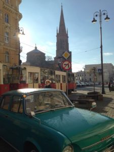
Bydgoszcz’s town square

It was a chilly but bright morning as I strolled into Bydgoszcz and made straight for the MCK Orzeł, where I planned to spend most of the day. With only a few minutes to go until the scheduled start time, the queue for Panavision’s large format seminar had spilt out onto the street. The tickets ran out before I reached the desk, but there was a live video feed in the cinema’s bar. In many ways this was better than going into the auditorium – sitting in a comfy chair with the bar close at hand, and a table to make notes on.

My article for Red Shark News about the future of large format cinematography has been surprisingly popular, and it contains plenty of detail about this Panavision seminar, so I won’t repeated myself here. I will say that it converted me from a high resolution sceptic to a believer, because the speakers demonstrated that footage acquired in high rez – even when downscaled – retain much of its smoothness, high bit depth and dynamic range. “More resolution evokes the imagination of the brain,” was how colourist Ian Vertovec summed it up.

At the end of the session, Red Shark’s David Shapton and Matt Gregory emerged from the auditorium and joined me for lunch at the bar. We had all found the seminar very interesting, and Matt was quick to get us all tickets to the Panasonic 4K seminar coming up later in the day. The pair then went off to other things, while I headed to the kiosk to get a ticket for the imminent John Toll seminar. But of course I’d left it too late, they were all gone, and so I returned to my comfy chair in the bar to watch via video feed again.


Panavision workshops: A conversation with John Toll, ASC
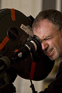
John Toll, ASC

John Toll, ASC was the recipient of this year’s Lifetime Achievement Award at Camerimage, and this seminar was an epic journey through this career. He explained how he learnt his craft as a camera operator for the late great Conrad Hall, ASC and Jordan Cronenweth, ASC.

The talk then focused on some of Toll’s biggest movies, beginning with the period drama Legends of the Fall starring Brad Pitt and Anthony Hopkins. The movie was largely daylight exterior (something that was to become a theme across Toll’s work) so the cinematographer insisted on twelve weeks of prep, the same as the production designer. This allowed him to be part of selecting locations and choosing orientations for the buildings to get the optimal sun path. Toll said he was lucky that the 1st AD was willing to be flexible with the schedule, observing the mood of the weather each day and shooting scenes that matched that mood.

Gaffer Jim Plannette joined Toll on the stage to discuss the huge night exterior battle sequence. This employed three Musco lights (a Musco being fifteen 6K pars on a 100ft boom arm) which three-quarter-backlit every angle. To get crisp, grain-free blacks, Toll overexposed and printed down.

Braveheart was covered next, with 1st AC Graham Hall joining the panel. Hall had a difficult time with the film’s battle scenes, featuring as they did so much movement, improv and slo-mo. Toll revealed how the immersive style of the action was based on a sixties TV documentary about Culloden that coincidentally both he and director Mel Gibson had seen. A lot of colour timing was required to give consistency to the battles, which were shot over weeks, at all times of day.

The discussion then turned to Terrence Malick’s The Thin Red Line. The Australian locations featured very difficult, uneven terrain, so Toll used an Akela Crane. The crane’s arm was so long (75ft) that the arc of its movement couldn’t be detected on camera. Its use had to be carefully planned though, because each time it needed to be moved it had to be disassembled and reassembled on a special platform. 80% of the film was actually handheld, and Toll operated himself so as to respond to the spontaneity and improv which Malick encourage from his cast.

The Akela Crane in use on “The Thin Red Line”

Toll told a funny story about a shot of shadows moving across long grass which was praised by critics. It was inserted to cover a continuity error, the build-up to the battle having been shot in heavy cloud, while the battle itself was shot in full sun. A happy accident!

Time was running short, so the moderator powered through Almost Famous (where parallels were drawn between the explosive battle scenes of Toll’s earlier movies and the crowd scenes at the rock concerts, punctuated by flashing cameras), Vanilla Sky and Billy Lynn’s Long Halftime Walk. This latter film, directed by Ang Lee, is notable for its acquisition in 120fps 4K stereo. You can read more about it on the British Cinematographer website.


Panasonic Seminar: Varicam Experience
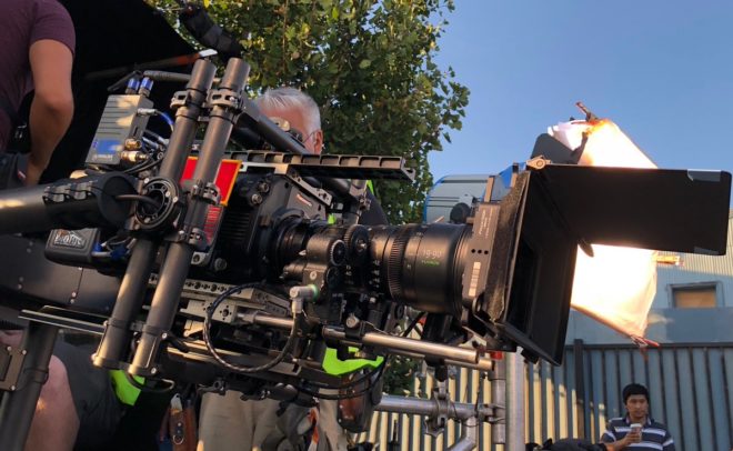
A Panasonic Varicam LT with Fujinon zoom rigged for action on “Arrested Development”

I remained at the MCK and, meeting up with Dave and Matt again, finally got into the auditorium, for the Panasonic seminar. Moderated by British Cinematographer‘s Ronnie Prince, the panel brought together a trio of DPs who shoot Netflix shows on the Varicam: Bobby Shore, CSC (Anne with an E), Pepe Avila del Pino (Ozark) and Patrick Alexander Stewart (Arrested Development).

Both Shore and del Pino admitted that they were most comfortable with the Arri Alexa, but due to Netflix’s strict rules on 4K acquisition (the Alexa tops out at 3.2K) they had to find another camera. They plumped for the Panasonic Varicam, a 4K camera best known for having dual native ISOs: 800, in common with the Alexa, Red and many others, and 5000, two and two-thirds stops faster. Being native, both ISOs have the same dynamic range, the same log curve and in theory are equally clean.

Panasonic, I think, were keen to push ISO 5000 in this seminar, but unfortunately Shore and del Pino shot almost exclusively at 800. Stewart did shoot Arrested Development at 5000, interiors and night scenes at least, but down-rated it to 2500. Otherwise, he said, the sets would have been too dark for the actors to feel like they were in a believable daytime environment. I think that’s a fascinating, unexpected side effect of low light sensitivity! Stewart lit the stages with large Quasar softboxes and paired the Varicam with Fujinon zooms and occasional Xeen primes.

Del Pino chose Zeiss Super Speeds for night scenes and Hawk V anamorphics for day scenes on Ozark. He liked the claustrophobia of cropping the anamorphic images to 2:1, the show’s delivery ratio, while the Super Speeds produced a creaminess he found appealing. He also mentioned that the Varicam’s sensor handled greens very well, which was important for him, given how much of Ozark takes places in woods.

Anne with an E was lensed on vintage Panavision Standard and Super Speeds – “the oldest, craziest lenses we could find,” says Bobby Shore. He liked their low resolving power, their weird flares and how they fell apart when wide open. Part of the show’s signature look are ECUs of the freckled title character, which were captured on a 27mm Primo for a more detailed, tactile image.

Inspired by the work of Robbie Ryan, BSC (Wuthering Heights), Shore kept the lighting naturalistic, mixing tungsten and HMI sources on a set that was treated like a location. He also shot through a Panaflasher, a special lens filter with built-in lighting which reduces contrast and adds a colour tint of your choice, but this effect was dialled out in post. Indeed, Shore raised the issue of DPs’ images being altered after the fact, an issue I explore fully in another Red Shark article.

By the way, I’ve been watching Anne with an E since the festival and I can thoroughly recommend it.

When the seminar was over, I went for dinner with Dave, Matt and Chris Bouchard, at a very nice (but once again cheap) Asian fusion restaurant. Then we met up for drinks with some of the reps from Red, and I got talking to a DP who had shot squid from a submarine for an episode of Blue Planet. After another drink or two with Chris at the Cheat bar, I called it a night.

Tune in next week for the final part of my Camerimage blog.
Camerimage 2017: Tuesday

Camerimage 2017: Monday

This week I attended Camerimage for the first time. Centred around the Opera Nova theatre beside the river Brda in Bydgoszcz, Poland, Camerimage is an international film festival celebrating the art of cinematography. It’s a bit like Cannes for DPs, but colder. This is the first part of my account of my three days at the annual hub of motion picture imaging.

The Ryanair flight was dirt cheap but trouble free, and at 9:50am I found myself on the tarmac of Bydgoszcz airport. There I met David Shapton and Matt Gregory, founders of Red Shark News, for the first time. I’ve been contributing articles to Red Shark for a few months so it was nice to finally meet these gentlemen in person.

A taxi (also dirt cheap) dropped me at the Opera Nova – only about three miles from the airport – where I picked up my pass and goodie bag. Bizarrely, said goodies included an Ikea catalogue. How did they know that us DPs love flat-pack furniture so much?


Canon Workshop: Stephen Goldblatt

From the Opera Nova I hurried to a college across the river, where the sports hall formed the venue for a Canon workshop run by Stephen Goldblatt, ASC, BSC, the man behind the lens for the likes of Lethal Weapon 2 and Batman Forever. The blurb for this workshop described Goldblatt as “a master of low light shooting”, and it was certainly pitch black when I walked in a few minutes late, and gingerly picked my way around to the far side of the hall to find a seat.

Lighting through lace

On a purpose-built bedroom set, Goldblatt was recreating lighting from the Robert Redford / Jane Fonda romantic drama Our Souls at Night, shot on the Sony F55 and Canon C300 Mark II. To practical lamps on either side of the bed he added egg-crated tungsten soft-boxes to beef up each one. He simulated moonlight through an imagined off-camera window by placing a lace curtain in front of a blue-gelled lamp and blowing it gently with a fan. An additional egg-crated soft-box provided a low level of blue toplight.

As he worked, Goldblatt revealed how he doesn’t miss ceulloid, loving how relatively easy it is now to light night exteriors or moving car scenes. “But just because you don’t need much light,” he cautioned, “it doesn’t mean you don’t want to control it.” Other developments coming down the pipe do not inspire him so much; he feels that high resolutions and HDR are unnecessary, pushed by marketing people rather than creatives.

He placed great emphasis on the importance of the eyes. “A common failing of newer DPs is that they worry more about the set than the eyes,” he said, before explaining how he will often walk beside the handheld camera with a torch, providing eye-light. He also stressed the importance of eye-lines. Although in any one shot it’s not that important how wide or tight the eye-line is, or how high or low, across the two hours of a feature film the decisions have a cumulative effect.

Trying out a Xeen lens in the exhibition hall

Goldblatt no longer uses a light meter. “Trust your eye, develop your eye,” he advised, adding that you must have a strong voice to remain in control of the images through postproduction.

After grabbing lunch, I returned to the Opera Nova to browse the exhibition hall. This closely resembled a mini BSC Expo or Media Production Show, with all the major camera and lens manufacturers displaying their wares, along with several lighting companies. I had a play with some of the cameras, including the actual Alexa 65 used on Rogue One.

Then I met up with Chris Bouchard, one of The Little Mermaid‘s two directors, who had arrived in Poland the previous day. We sauntered over to another venue, the MCK Orzeł, an independent cinema with a nice, chilled, film-buff-friendly atmosphere. The auditorium itself was packed though as we settled in for a seminar on “The Future of Digital Formats”.


Red Seminar: The Future of Digital Formats

Promoting Red’s Monstro sensor, the session was mostly about the benefits of shooting in high resolutions, and giving yourself the maximum flexibility in post. You can read my thoughts on both of those topics in upcoming Red Shark articles.

One of the speakers, Christopher Probst, ASC (DP of Mindhunter and technical editor of American Cinematographer magazine) made some interesting points about ISO. “Traditionally, low ISOs were used for bright scenes like day exteriors, and high ISOs were used for darker scenes like night exteriors,” he explained. “That was based on reducing the grain, getting the cleanest possible image on film.” He advised the opposite for digital capture. “Use a low ISO for nights to get more shadow detail, and a high ISO for days to get more highlight detail [in the sky, for example].”

“Independence Day: Resurgence” – DP: Markus Forderer, BVK

Another interesting nugget came from Markus Förderer, BVK. On Independence Day: Resurgence he switched between spherical, 1.3x anamorphic and 2x anamorphic lenses depending on the situation. For example, flatter lenses were better for wide shots – where anamorphics would distort straight lines – and for VFX work.


Hawk Vantage Seminar: Top cinematographers tell their Hawk stories

I ducked out of the Red session early so that I could pop back to the Opera Nova for the Hawk Vantage seminar, bumping into my Perplexed Music gaffer Sam Meyer on the way. Hawk were launching three new sets of lenses: MiniHawk (T1.7 hybrid anamorphics), Hawk Class-X (T2.2 2x anamorphics) and Hawk65 (T2.2).

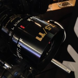
A Hawk T1 in the exhibition hall

The MiniHawks in particular seem very exciting. Daniel Pearl, ASC showed us some stunning frame grabs from the upcoming Dennis Quaid vehicle Motivated Seller, shot using these lenses on Alexa Mini. Whilst having key advantages of spherical lenses (speed, small size, low weight, extremely close focus) the MiniHawks have a unique and beautiful cigar-shaped bokeh.

While Pearl had used the latest Hawks, Magdalena Górka, PSC had shot with some old ones, the C series, for Brad Silberling’s drama An Ordinary Man. “I had to frame everything centrally because that’s the only place that was sharp!” she laughed. Also addressing focus fall-off, Andrzej Bartkowiak, ASC (Speed, The Devil’s Advocate) stated, “I like anamorphic because the shallow depth of field allows you to direct the viewer’s eye more.”

Stuart Dryburgh, ASC (The Secret Life of Walter Mitty, Bridget Jones’s Diary) talked about shooting 1.3x anamorphic. He has done this on three-perf 35mm (to achieve a Scope aspect ratio), on an Alexa in 16:9 mode (again for 2.39:1) and on an Alexa in 4:3 mode (to get 1.85:1). He also recommended shooting on Super-16 with 1.3x glass, citing the example of Ed Sheeran’s “Thinking Out Loud” video, which Pearl shot.

Peter Flinckenberg, FCK (Upswing, Concrete Night) noted that, with the shift to digital acquisition, the DP is no longer a magician, “but you can bring back that magic with lighting and glass that has character.”


CW Sonderoptic: Exploring Large format cinematography & Leica lenses

I took my leave, dashing back to the MCK Orzeł for another lens-themed seminar, this time by CWSonderoptic, the makers of Leica. The first half of this panel revolved around a short film shot by Darius Khondji, ASC, AFC (Seven, Delicatessen) on an Alexa 65 with the new Leica Thalias.

The second half was all about Tod Campbell, DP of Stranger Things and Mr. Robot, focusing on the latter show. The second season of Mr. Robot was shot on Leica Summicrons after Campbell found that the Cookes used on season one distorted the many straight lines which became such a key part of the show’s unique look. “I look at season two as kind of the birth of the photography for the show,” he said. With a laugh he added: “Sorry that the lighting looks like shit in season one. I was learning!” (See my spherical lens tests for my own thoughts on Cookes and Leicas.)

One of my favourite shots from “Mr. Robot”

Campbell revealed that season three of Mr. Robot has a different look again, using much more camera movement and “twice as much atmos”. For this season he paired Canon K35 glass with an 8K camera, but due to the Canons’ low resolution he employed Leica Summiluxes for the wide shots.

He also shared some interesting information about his testing process, admitting that he doesn’t really know how other DPs test. He doesn’t use charts, he just makes it up. He always includes a candle, a practical lamp, some kind of highlight in the background, and random foreground objects (as background bokeh can differ from foreground bokeh).


Christopher Doyle Seminar

When the Leica seminar ended I went back to the Opera Nova, where Chris and I had dinner at the nice (and once again cheap – are you detecting a theme?) restaurant. Despite having got up at 4am (3am local time) I wasn’t feeling too tired, so we headed upstairs to the 10pm seminar by Christopher Doyle, HKSC (Hero, Lady in the Water). Many people were nursing beers, including Doyle himself, and the lecture theatre was dimly illuminated by mood lighting. Clearly this session was not going to be like the daytime ones.

“We’re going to fuck things up,” Doyle began, dispelling all doubts. He proceeded to talk disjointedly but entertainingly about his work on The White Girl and what I think was a separate film about a camera obscura. His oratory was liberally sprinkled with great one-liners, a few of which I reproduce here for your edification:

  • There are only three people in filmmaking: the actor, the audience and the cinematographer in between them.
  • If actors don’t feel loved, the performance will not come across on camera.
  • Give the idea the image it deserves.
  • [Vittorio] Storaro [legendary DP of Apocalypse Now amongst others] can’t tell you how to do it. You have to find it for yourself.
  • People in space – that’s what cinematography’s about.
  • The location is very important. It gives the energy, it imposes the style.
  • The lens doesn’t matter; it’s what it shows that’s important.
  • You never sleep because you care too much – that’s what filmmaking is.
With Chris Bouchard in front of the Opera Nova

Doyle also picked up on a piece of dialogue from a clip he screened: “What is it?” / “I don’t know yet.” It was a great summation of finding the essence of a shot, he said.

Having had our fill of aphorisms, Chris Bouchard and I slipped out to get a drink. The Cheat, the pop-up bar across the road, was absolutely packed, and my early morning was finally catching up with me, so I called it a night. The highstreet of Bydgoszcz was quiet and chilly as I walked briskly to my hotel, curiously located down a service road behind the city’s football stadium, reflecting on all that I had learnt that day.

Tune in next week for tales from my second day at Camerimage.

Camerimage 2017: Monday

5 Facts About the Cinematography of “Dunkirk”

Some have hailed it as a masterpiece, others have complained it left them cold. Personally, seeing it on 70mm, I found Dunkirk a highly immersive and visceral film, cinematic in the truest sense of the word. The huge, sharp images free from any (apparent) CGI tampering, combined with the nerve-jangling gunshots and rumbling engines of the superlative soundtrack, gave me an experience unlike any other I can recall in recent movie-going history. I can imagine that it was less effective projected from a DCP onto a smaller screen, which may account for the underwhelmed reactions of some.

But however you feel about Dunkirk as a film, it’s hard not to admire its technical accomplishments. Here are five unique aspects of its cinematography.


1. It was shot on two huge formats.

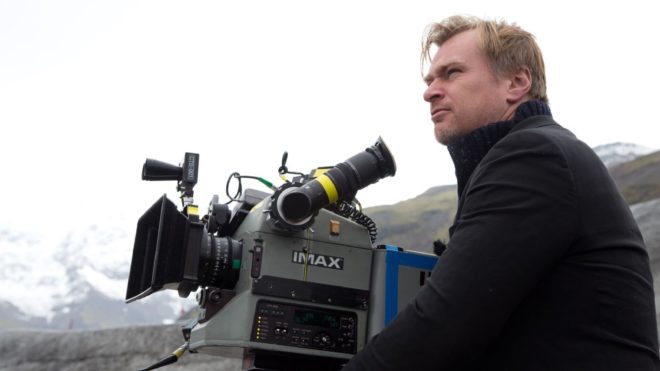
Director Christopher Nolan has long been a champion of large-format celluloid capture, eschewing the digital imaging which has become the dominant medium in recent years. “I think IMAX is the best film format that was ever invented,” says Nolan in a DGA interview. “It’s the gold standard and what any other technology has to match up to, but none have, in my opinion.”

Imax is a process which uses 65mm film (printed on 70mm for exhibition, with the extra space used for the soundtrack) running horizontally through the gate, yielding an image over eight times larger than Academy 35mm. Following some test shots in The Prestige, Nolan captured whole sequences from The Dark KnightThe Dark Knight Rises and Interstellar in Imax.

For Dunkirk, Nolan and cinematographer Hoyte van Hoytema, ASC, FSF, NSC were determined to eliminate 35mm altogether, to maintain the highest possible resolution throughout the movie. Imax cameras are noisy, so they shot dialogue scenes on standard 65mm – running vertically through the gate – but Imax footage makes up over 70% of the finished film.


2. The movie was framed with three different aspect ratios in mind.

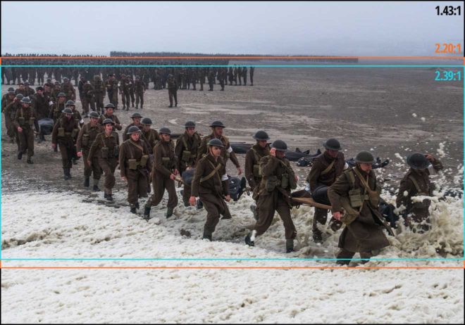
Those who watched Dunkirk in an Imax cinema got to see the native aspect ratio each sequence was captured in, i.e. 2:20:1 for the standard 65mm dialogue scenes but the much taller 1.43:1 for the Imax material, the bulk of the film. Those, like me, who attended a standard 70mm screening, saw it in 2:20:1 throughout. And those hapless individuals who watched it digitally apparently saw the standard Scope ratio of 2.39:1, at least in some cases.

This means that, when composing his shots, van Hoytema had to have two ratios in mind for the dialogue scenes and three for everything else. “Framing was primarily for the 2.40 [a.k.a. 2:39:1], then protecting what was outside of it,” 1st AC Bob Hall explains. This left close-ups, for example, with a large amount of headroom in 1.43:1, but the huge size of Imax screens made such framing desirable anyway.  “Imax is such an immersive experience that it’s not so much the composition that the cinematographer’s done as where your eyes are going on the screen that creates the composition.”


3. Parts of the camera rig were worn as a backpack.

Breaking with the accepted norms of large format cinematography, van Hoytema captured a significant proportion of the movie handheld. The 65mm camera package weighed over 40kg – about three times the weight of a typical Alexa rig – with the Imax camera only a little lighter. To avoid adding the weight of the batteries, video transmitter, Cinetape display and Preston (wireless follow focus) brain, these were placed in a special tethered backpack which was either worn by key grip Ryan Monro or, for water tank work, floated on a small raft.

Unfortunately, Hall quickly found that electromagnetic interference from the Imax camera rendered the Cinetape inoperable, so he ended up relying on his extensive experience to keep the images sharp. “I had to go back to the technology of the 1980s, where I basically guess how far famous people are from me,” he remarks drily in this enlightening podcast from Studio Daily.


4. A periscope lens was used to shoot spitfire cockpit interiors.

“I wanted to tell an intensively subjective version of this story,” says Nolan. To that end he requested over-the-shoulder views out of the windscreens of Spitfires in flight. Furthermore, he wanted to be able to pan and tilt to follow other aircraft passing by. Given the huge size of the Imax camera, there was no room to rotate it within the cockpit. Instead, custom periscope lenses were built which could snake over the pilot’s shoulder, and pan and tilt independently of the camera body, using prisms to maintain the correct image orientation to the film plane.

Other glass used on Dunkirk included an 80mm Imax lens belonging to Nolan himself, and converted stills lenses.

Note that the camera is mounted upside-down, to compensate for the flipped image generated by the prism in the periscope lens.


5. At one point the camera sunk to the bottom of the sea for an hour and a half.

A specific Spitfire POV required was from a damaged plane diving towards the sea and hitting the water. The practical effects department devised a catapult to launch an unmanned mock-up from a ship, the grips built a crash housing for the Imax camera which would be inside, and a plan was devised to recover it before the mock-up sank. But they weren’t quick enough, and the crew watched the plane and the camera disappear beneath the waves and plunge to the bottom of the English Channel, where it sat for 90 minutes until divers retrieved it. Incredibly, once dried out and developed, the film footage was found to be completely undamaged. “The shot was all there, in full colour and clarity,” says van Hoytema in the American Cinematographer article. “This material would have been lost if shot digitally.”


5 Facts About the Cinematography of “Dunkirk”

8 Ways “Barry Lyndon” Emulates Paintings

Stanley Kubrick’s 1975 period epic Barry Lyndon, although indifferently received upon its original release, is considered a masterpiece by many today. This is largely due to its painterly photography with strong, precisely composed frames that leave the viewer feeling more like they’ve wandered through an art gallery than watched a movie. Today I’m going to look at eight methods that Kubrick and his team used to create this feel. It’s an excellent example of how a director with a strong vision can use the many aspects of filmmaking to realise that vision.


1. Storytelling

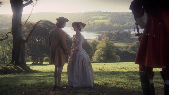
The American Cinematographer article on Barry Lyndon notes that “Kubrick has taken a basically talky novel and magically transformed it into an intensely visual film.” You have only to look at a series of frame-grabs from the movie to see just how much of the story is contained in the images. Just like a painter, Kubrick reveals a wealth of narrative within a single frame. The shot above, for example, while recalling the landscapes of artists like Constable in its background and composition, also clearly tells the story of a courtship threatened by a third party with violent designs.


2. Design

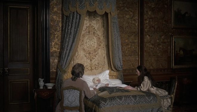
Kubrick was keen for Lyndon to feature the type of rich fabrics which are often seen in 18th century art. He referred costume designer Milena Canonero to various painters of the period. “Stanley wanted beautiful materials,” she recalls in the documentary Stanley Kubrick: A Life in Pictures, “because as he quite rightly said, that’s why in those paintings they gave that wonderful light.”


3. Aspect ratio

There was much confusion and controversy surrounding Kubrick’s intended ratio for Lyndon. The negative was apparently hard-masked to 1.6:1, with the result that VHS and DVDs used this ratio, while the images were vertically cropped to 1.78:1 for the later Blu-ray release. However, the discovery in 2011 of a letter from Kubrick to cinema projectionists finally proved that 1.66:1 was the ratio he wanted audiences to see the film in.

1.66:1 was a standard ratio in parts of Europe, but unusual in the UK and USA. It’s not far off the golden ratio (1.6180:1) – a mathematically significant ratio which some artists believe to be aesthetically pleasing. There is evidence that Kubrick was not a fan of wide aspect ratios in general, perhaps because of his background as a photographer, but it can be no coincidence that Lyndon distances itself from the cinematic ratios of 1.85 and 2.39, and instead takes a shape closer to that of a typical painting.

(Most of the images in this post come from Evan Richards’ Cinematographers Index, and he in turn grabbed them from the 1.78:1 Blu-ray. The image above is in 1.66:1 but shows the 1.78:1 crop-lines.)


4. Composition

“The actual compositions of our setups were very authentic to the drawings of the period,” says DP John Alcott, BSC in his interview with American Cinematographer. Perhaps the film’s most obvious compositional nod to classical art is the large amount of headroom seen in the wide shots. As this article by Art Adams explains, the concept of placing the subject’s head at the top of the frame is fairly new in the history of image creation. Plenty of traditional art includes lots of headroom, and Lyndon does the same.


5. Camera movement

There is little camera movement in Barry Lyndon, but there are 36 zoom shots. Unlike a physical dolly move, in which the parallax effect causes different planes of the image to shrink or enlarge at differing rates, a zoom merely magnifies or reduces the whole image as a single element. This of course only serves to enhance the impression of a two-dimensional piece of art. In fact, the zooms resemble nothing so much as the rostrum camera moves a documentary filmmaker might make across a painting – what today we’d call a Ken Burns effect.

It’s interesting to note that, although Barry Lyndon is famous for its fast lenses – the f/0.7 Zeiss Planar primes – the movie also used a very slow lens, a custom-built T9 24-480mm zoom. From various accounts, other zooms used seem to include a Cooke T3.1 20-100mm and possibly a 25-250mm of some description. Of course, none of the zoom lenses were anywhere near fast enough for the candlelit scenes, so in those instances the filmmakers were forced to use a Planar and pull back physically on a dolly.


6. Lighting

“In preparation for Barry Lyndon we studied the lighting effects achieved in the paintings of the Dutch masters,” Alcott says. “In most instances we were trying to create the feeling of natural light within the houses, mostly stately homes, that we used as shooting locations.”  The DP closely observed how natural light would come in through the windows and emulate that using diffused mini-brutes outside. This made it possible to shoot long days during the British winter when natural light was in short supply. Last week I covered in detail the technical innovations which allowed Alcott and Kubrick to shoot night scenes with just genuine candlelight, as 18th century painters would have seen and depicted them.


7. Contrast

Film stock in the seventies was quite contrasty, so Alcott employed a few methods to adjust his images to a tonal range more in keeping with 18th century paintings. He used a Tiffen No. 3 Low Contrast Filter at all times, with an additional brown net for the wedding scene “where I wanted to control the highlights on the faces a bit more,” he explains. He also used graduated ND filters (as in the above frame) both outdoors and indoors, if one side of the room was too bright. Most interestingly, he even went so far as to cover white fireplaces and doorways with fine black nets – not on the lens but on the objects themselves.


8. Blocking

The blocking in Barry Lyndon is often static. While this is certainly a creative decision by Kubrick, again recalling painted canvases and their frozen figures, it was also technically necessary in the candlelit scenes. Whenever the f/0.7 lenses were in use, the cast were apparently instructed to move as little as possible, to prevent them going out of focus. As one YouTube commenter points out, the stillness imposed by these lenses mirrors the stillness required of a painter’s model.

8 Ways “Barry Lyndon” Emulates Paintings

“Barry Lyndon”: The Full Story of the Famous f/0.7 Lenses

After seeing Barry Lyndon (1975) on the big screen this week, I felt compelled to write a blog post about its cinematography. But what aspect of the cinematography? The painterly look? The many zooms? The use of natural light?

What I knew for certain is that I should definitely not write about the entirely candlelit scenes lensed on f/0.7 Nasa glass, because everyone knows that story. However, reading the vintage American Cinematographer article and some other material, I found the details surrounding this groundbreaking use of high-speed lenses so interesting that I decided to do it anyway.


The Vision

Barry Lyndon is the 18th century tale of a low-born Irishman who strives – through various misadventures, and ups and downs of fortune – to become a gentleman. The key visual influence of director Stanley Kubrick and DP John Alcott, BSC were the great painters of the story’s era, such as Vermeer.

Next week’s post will look at this painterly influence in Barry Lyndon more closely, but for now the important thing is the use of candlelight on those classical canvases, and Kubrick’s desire to replicate that look. According to lens expert Ed DiGuilio, who was tasked with adapting the f/0.7 glass for Lyndon, Kubrick “wanted to preserve the natural patina and feeling of these old castles at night as they actually were”.

Typically in movies, a candle in frame may motivate the lighting, but most of the illumination on the actors actually comes from an orange-gelled lamp just out of frame. Kubrick wasn’t interested in shooting Lyndon that way. He wanted all the light in those night interior scenes to genuinely come from the candles themselves.


The Problem

How much light does a candle shed? Conveniently, there is a unit of illumination called the foot-candle. One foot-candle is the amount of light received from a standard candle one foot away. Without going into the detail of what a “standard” candle is, it is enough for our purposes to say that the scene below has a key light of about three foot-candles…

… because there are three candles, about a foot away from the actor’s face. (The level of your key light, and consequently where you set your aperture, is almost always measured at your subject’s face, as that is usually the focus of the shot and the most important thing to get correctly exposed. This is why we DPs are always waving light meters in actors’ faces.)

If we look at an exposure table, such as this one, we can see that a three foot-candle key can be correctly exposed with an aperture of T1.4 and an EI (exposure index) of 800. Today that would be no problem, with many digital cameras having a native EI of 800, and the availability of fast lenses like Zeiss Master Primes and Super Speeds.

In the mid-seventies however, long before the advent of digital cameras, things were not so simple. Kubrick and Alcott had little choice but to shoot on Eastman Kodak 100T 5254. Those first three digits denote the film stock’s exposure index: 100. Alcott pushed the stock (brought the brightness up during processing) one stop, re-rating it to an EI of 200. But it still needed four times more light, or two stops more light than our modern-day Alexa or Red. (Check out my post on f-stops and T-stops if you’re getting lost.)

If we’re losing two stops on the EI, we need to gain two stops on the aperture to compensate. And two stops up from T1.4 is T0.7. You may notice that T0.7 isn’t on that table I linked to. This is because a lens with such a large relative aperture pretty much doesn’t exist.

Pretty much…


The Solution

Kubrick obsessively researched the problem. He eventually discovered that Nasa had commissioned Carl Zeiss to build ten Planar 50mm f/0.7 stills lenses in the sixties, which were used to take photos of the dark side of the moon. (I was unable to find out the T-stop of these lenses, but I’ll assume it was close enough to T0.7 for it to make little difference to my calculations above.) The developments leading to these lenses stretched back through Nazi military applications during WW2 all the way to the late Victorian era, when the double-Gauss cell at the core of the lenses was first invented.

Anyway, Kubrick promptly bought three of the Zeiss Planars. He liked to own equipment himself, rather than hire it in, and to this end he had also purchased at least one Mitchell BNC camera. As befits Kubrick’s perfectionism, these were perhaps the world’s most precisely engineered cameras, previously used for special effects work.

This is where Ed DiGuilio comes in: “[Kubrick] called one day to ask me if I thought I could fit a Zeiss lens he had procured… to his BNC.” It wasn’t simply a case of the f/0.7 glass having the wrong mount. The rear element was so large and needed to be so close to the film plane that DiGuilio had to extensively modify the camera, literally cutting parts out of it.

Ed DiGuilio (left), President of Cinema Products Corporation, working on adapting a zoom lens for Kubrick’s Mitchell BNC

Once this was done, extensive testing ensued. The focus scale (distances marked on the barrel) had to be calibrated from scratch, and indeed the focus ring was re-engineered to allow the precision focusing that the lens’ tiny depth of field would require. Whereas the focus ring on a stills lens will turn about 90° to go from infinity to close focus, and the ring on a cine lens might turn 270°, the rings on these unique Planars now turned a whopping 720° – two whole revolutions!

50mm is a very useful lens length for close-ups, but Kubrick understandably wanted a wider option as well. Accordingly, DiGuilio located an adapter designed to adjust the throw of cinema projector lenses. Mounted onto one of the 50s, it gave an effective focal length of 36.5mm with only very minor light loss. A 24mm version was also tested, but Kubrick disliked the amount of distortion in its images, and rejected it.


The Execution

The colour brown and the trousers of Doug Milsone, Barry Lyndon‘s focus puller, cannot have been strangers to each other. Imagine trying to hold focus on this dolly-back at f/0.7!

By my calculations (which were difficult, because most depth of field tables/calculators don’t go to f/0.7!) an MCU on Kubrick’s 50mm Planar with the subject at 2.5m (8.2ft) and the iris wide open would have had a depth of field of about 43mm (1.7″). To get this same depth of field at f2.8, a popular working stop for cinematographers today, the subject would have to be just 1m (3.3ft) from the sensor plane, which would be a biggish close-up. And remember that focus monitors, peaking and Cine Tape did not exist in the seventies.

To give Milsone a fighting chance, a unique system of focus assist was developed. While the main camera shot an actor from the front, a CCTV camera captured them in profile. This profile image was piped to a monitor, over which a grid was placed. This grid was marked off with distances so that Milsone could see how much the actor had moved by, far more accurately than judging it by eye from beside the lens.

Another problem thrown up by the low-light cinematography was with the viewfinder. Interestingly, the Mitchell BNC was a non-reflex camera, meaning that it didn’t have a mirror on the shutter, reflecting the image to the viewfinder when the shutter was closed. Instead, the camera body racked over to one side to allow the viewfinder to get an image during line-ups and rehearsals, and when it was actually rolling the operator got their images from a side viewfinder with its own lens – just like in a disposable 35mm stills camera. The original prism-based viewfinder on Kubrick’s Mitchell BNC suffered from far too much light loss for a candlelit image to be visible through it, so it was replaced with a mirror-based viewfinder adapted from a Technicolor camera.

The shots resulting from all of these technical challenges are quite soft to the modern eye, but I think that only adds to their beauty. Barry Lyndon captured the exquisite fragility of candelight, and 42 years on the images are still unique and captivating.

“Barry Lyndon”: The Full Story of the Famous f/0.7 Lenses

5 Lighting Tips from Classic Art

A few weeks ago I discussed compositional techniques which we can learn from the work of JMW Turner. This time I’m looking at the use of light, and I’m broadening the scope to cover a few other classical artists whose works have caught my eye at galleries lately.

Without artificial illumination, these old masters had to make the most of the light God gave them. Here are five examples of their techniques which we can trace directly forward to cinematographic techniques of today.


Cross-light

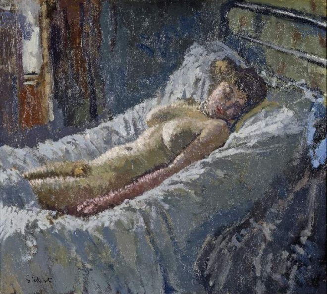
“Mornington Crescent Nude” (circa 1907) – Walter Richard Sickert

Decades before DPs started encouraging directors to shoot interior scenes towards windows to achieve the most interesting modelling, Sickert had the same idea. See how the light from the window in the background throws the model’s body into relief, giving it form and dimension? Cross-light is commonly used today in commercials for sport and fitness products, to emphasise muscle tone.

See also: Lighting Techniques #6: Cross-light


Background strokes

“Tancred’s Servant Presenting the Heart of Guiscard in a Golden Cup to Guismond” (circa 1675) – Adriaen van der Werff

What caught my eye about this painting was the slash of light on the background wall in the top left corner. It may seem trivial, but a little stroke of background light like this can really elevate the quality of a shot. Here it anchors the corner of the composition and gives us a hint of the room’s decor, adding interest to what would otherwise be a black void behind Guismond.

While lighting the subject of the shot is clearly a DP’s priority, it’s important to find time to paint in the surroundings even if they’re in the deep background or extreme foreground.

“Drive” (DP: Newton Thomas Sigel)

See also: 5 Ways to Use Hard Light Through a Window


Haze

“Chloe Idille” (1811) – Salomon Gessner & Carl Wilhelm Kolbe

This monochrome etching has a tremendous feeling of depth, and it is achieved purely through contrast. The further away an object is, the more air there is between that object and your eye. Since air isn’t 100% transparent, that distant object appears lighter and lower-contrast than closer objects. Gessner and Kolbe capture this effect beautifully here.

Many cinematographers today use hazers to create or enhance this atmospheric effect, even for interiors. In the days of miniature effects, smoke was often used to create atmospheric haze and increase the feeling of scale. On Blade Runner, for example, Douglas Trumbull’s VFX crew sealed the motion control stage and used infra-red sensors linked to hazers to automatically keep the smoke level constant during the long-exposure passes over the futuristic cityscape.

“Blade Runner” (DP: Jordan Cronenweth)

See also: Depth Cues in Cinematography


Golden hour

“Abingdon” (1806) – Joseph Mallord William Turner

Painters figured out centuries ago that the most beautiful light is found at the beginning and end of the day. It’s partly due to the cross-light effect (see above) of the lower sun, and partly due to the beautiful orange colour caused by the greater amount of atmosphere the sun’s rays must pass through. To shoot the perfect sunset, you’ll need patience, and a sun-tracker app or at least a compass. Ensure the schedule permits you to try again another day if clouds spoil the view.

“Raiders of the Lost Ark” (DP: Douglas Slocombe)

See also: Sun Paths


Wet-Downs

“The Boulevard Montmartre” (1897) – Camille Pissarro

This is the only night image in a series of impressionist oil paintings which Pissarro executed from a hotel window overlooking the Boulevard Montmartre. What makes it particularly beautiful is the wet street, turning what might otherwise have been a dull grey central swathe of the image into an arena of alternately shadowy and glittering reflections.

Cinematographers shooting night exteriors on streets will often have the tarmac hosed down for four reasons: (1) as already noted, the beauty of the reflections; (2) the deeper blacks and increased contrast; (3) the extra exposure gained by the light sources bouncing off the water; and (4) avoidance of continuity problems if it rains.

A scene from “Terminator 2” (DP: Adam Greenberg) on a street that’s been wetted down

See also: 7 Considerations for Night Shooting

5 Lighting Tips from Classic Art

Composing a Wide Shot

I have wanted to write a blog post about composition for ages, but I’ve procrastinated. Framing is such an instinctive and subjective thing; could I ever articulate how to do it? I’m still not sure, but at last I’m taking a deep breath and giving it a go. To help me, I’m using frame grabs from Best Cinematography Oscar-winning films of the last ten years or so, taken from the brilliant and handy website Cinematographer’s Index. Check it out and donate a few bucks if you can.


the rule of thirds

The Rule of Thirds is well known to most filmmakers. It suggests that you imagine the frame divided vertically and horizontally into thirds, then place the subject on one of the intersections of these lines.

However, composing images using The Rule of Thirds is like riding a bike using stabilisers. It’s something that you use before you’ve developed your own eye for composition.

Here are just a few examples of cinematography which completely ignore the rule, yet won Oscars. Guillermo Navarro puts his subject bang in the centre, in this scene from Pan’s Labyrinth

While Dion Beebe goes for an extreme off-set in Memoirs of a Geisha

In this scene from Life of Pi, Claudio Miranda places the two least important elements in the frame – the lifeboat and the sun – roughly on the thirds, but puts Pi himself right in the centre, and the distant ship off to the right…


ENclosing one SIDE

So, if we’re not using The Rule of Thirds, where do we start? I like to start with the edges of the frame, rather than some arbitrary points within in. I look for something to give me a reason to put the edge of the frame in a particular place.

As I touched on in my previous post, about Turner, it’s aesthetically pleasing to create a frame within a frame, but unless you’re shooting through a window you can’t always enclose the image on all four sides. Often the ground/horizon gives you a free framing along the bottom edge. So if you can frame just one more side, you’ve got an L-shaped frame (though the ‘L’ may be backwards) and you’re doing pretty well.

This is probably the most common compositional technique you’ll see in wide shots: a tree, wall or other vertical element enclosing the frame on one side. Pan’s Labyrinth again…

Here’s one from The Revenant (DP: Emmanuel Lubezki)…

It’s great when these enclosing elements are in the foreground, because they also serve to add depth to the image. But they can be in the background too, like the righthand skyscraper in this frame from Slumdog Millionaire (DP: Anthony Dod Mantle)…

Or in this one from Pan’s Labyrinth, where the mill wheel defines the height of the image as well as framing it on the left…

Sometimes, with flatter compositions, you can find an element on the same plane as the subject with which to frame the shot on one side, like the streetlamp on the left of this shot from Life of Pi. Note that the edge of the pond also provides strong framing along the bottom of the image…


ENCLOSING TWO SIDES

Placing enclosing elements on both sides of the frame, as well as being even more aesthetically pleasing than enclosing a single side, can suggest a situation from which the characters cannot escape. Consider these frames from, respectively, Inception (DP: Wally Pfister) and Road to Perdition (DP: Conrad Hall)…


Other frames within frames

In this shot from Hugo (DP: Robert Richardson), the architecture frames the image along the top and righthand side, while leaving it open in the bottom left, the direction towards which the subject is moving…

This shot from Life of Pi contains an interesting choice. The obvious – and far more dominant place – to put the subject would have been leaning against the foreground pillar on the right. Instead, Miranda makes the audience search for him in the frame…

Here, in Road to Perdition, the foreground character, the desk, the phone and the doorway all cradle and enclose the subject…


Pinning a corner

Sometimes it is impossible to enclose the image on any of its sides. In these cases I will at least try to pin a corner – to find an element that I can place just within a corner of the frame to anchor the composition. This frame from Hugo uses the lamp in the top right for this purpose…

Mantle uses the foreground tyre here in Slumdog Millionaire…

Navarro uses a chair in the bottom left of this Pan’s Labyrinth shot. Notice how the subject is placed on the imaginary line connecting the chair to the circular window in the background, which balances it out…

In this scene from Road to Perdition, Hall pins the top lefthand corner with the light fixture, then balances it beautifully with the shadows in the bottom right…

Indeed, the corner-pinning technique seems most effective when the diagonally opposite corner is opposite in other ways too – dark vs. light, close vs. far, warm vs. cold, etc.


Vanishing points

Vanishing points are a concept familiar to artists and technical drafters. You extend the image’s straight lines in perspective to the point where they vanish into the distance. Placing the subject of your image on a vanishing point will lead the viewer’s eyes right to them. Check out these examples from, respectively, Memoirs of a Geisha and Road to Perdition…

This shot from Slumdog Millionaire is a little more subtle, but follow the lines of the table and chair and you’ll end up right at the children…

And just to prove that rules are meant to be broken, here’s a Slumdog shot where the subjects are nowhere the vanishing point…


LEADING LINES

It’s not just vanishing points that provide satisfying spots to place your subject. Leading lines of any kind can draw the eye. In this shot from Inception, the vanishing point (the tip of the plane’s nose) would be somewhere in the extreme top-left corner of frame. Di Caprio isn’t on that vanishing point, but the rows of seats still lead our eyes to him…

In this shot from Sicario, Roger Deakins places both subjects over the corners of the house, where the buildings’ lines lead us to…

In The Revenant, this frame places the subjects at the point of the V formed by the sloping mounds…


Symmetry

I’ve touched on the concept of balance throughout this post, and I’ll probably need to write a whole other post to really get into it, but for now, here are some beautiful examples of the simplest way of giving a composition balance: symmetry…


So those are a few basic ways of approaching the composition of a wide shot. More composition posts to come, but meanwhile, you might like to check out my existing post on 2.39:1 composition.

Composing a Wide Shot

5 Principles of Cinematography We Can Learn from Turner

Yesterday I took a trip to The Tate Britain to see what I could learn about light and composition from the world of traditional art. My background is more technical than fine art, so this world is quite new to me. Within quarter of an hour of arriving, I had fallen in love with the work of JMW Turner. The way this man captured the natural moods of light and weather is breathtaking.

Here are five of Turner’s techniques for creating beautiful images which we can apply to cinematography.


1. Negative space

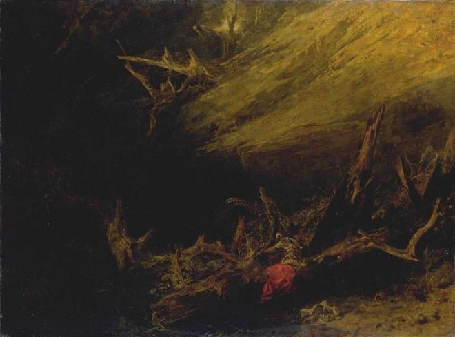
One of the most powerful things you can do with an area of the frame is to let it go black. A great example is Bill Pope’s work on The Matrix. But 200 years before that, Turner was embracing the darkness, emphasising those areas in the light, and allowing the viewer’s imagination to fill in the gaps.

“Jason” (1802) – That dragon is lurking in the shadows like a dodgy monster costume in a B-movie.
“Sketch of a Bank, with Gipsies” (1809) – The titular gypsies are barely visible in the black shadows, betrayed only by the smoke from their fire.


2. Layering

Any artist creating a 2D image strives to give the impression of depth and dimensionality. There are a number of techniques that can be used to achieve this, but one which Turner uses repeatedly is layering. See how the paintings below delineate foreground (light), midground (dark) and background (light again). The midgrounds sink into shadow, becoming negative space, reinforcing the link and relationship between the foregrounds and backgrounds. At the same time, the foreground figures stand out clearly and eye-catchingly against the shade behind them.

“The Tenth Plague of Egypt” (1802)
“The Goddess of Discord Choosing the Apple of Contention in the Garden of the Hesperides” (1806) – This painting contains five layers: light-dark-light-dark-light, highlighting the two groups of people and the monster in the distance.


3. Framing

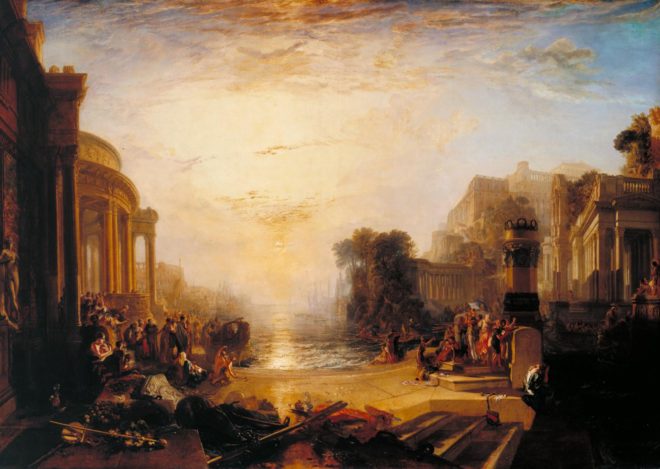
Although most images we see are framed, be it by a gilt picture frame or by the black edges of a phone screen, there is something aesthetically pleasing about adding a second frame within the image itself. An extreme example would be shooting through a window, framing the image on all four sides, but more commonly we frame two or three sides of the image. Turner frequently does this using trees, buildings and shadowy ground.

“The Decline of the Carthaginian Empire” (1817) – A backwards-‘J’-shaped frame is created by the dark foreground: the wall on the left, the shadowed floor across the bottom, and the dark space in the lower right. To balance the shorter part of the ‘J’ on the righthand side, the sun and its reflection (the focal point of the image) are placed left of centre.
“England: Richmond Hill, on the Prince Regent’s Birthday” (1819) – The dark ground and dark tree to the right create a backwards-L-shaped frame which appears to cradle the rest of the image like a waiter cradling plates in the crook of his elbow.


4. Dynamic Composition

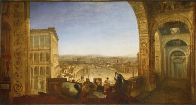
The composition of the two paintings below fascinates me. Both seem to be two images in one: a deep view of a settlement on the left, and a tapering tunnel perspective on the right. As I studied them, I found my eyes “panning” from one side to the other. As cinematographers, we can use actual camera movement to create a dynamic shot, but we should not forget Turner’s lesson here, that there can also be dynamism in static frames.

“Rome, from the Vatican. Raffaelle, Accompanied by La Fornarina, Preparing his Pictures for the Decoration of the Loggia” (1820)
“Palestrina – Composition” (1828)


5. Colour Contrast

Apart from stunningly demonstrating Turner’s power to create mood and atmosphere (a core skill for any DP), the two paintings below are great examples of warm/cool colour contrast. The yellows, oranges and reds of fire and sunset are juxtaposed with the blues of the sky. The result is pictures that really “pop”, arresting the viewer’s attention. A modern cinematographer can readily achieve a similar effect by playing natural daylight, and daylight sources like HMIs and Kinos, against practicals and other tungsten sources.

“Peace – Burial at Sea” (1842) – Contrast in both hue and luminance make this a powerfully evocative painting.
“War. The Exile and the Rock Limpet” (1842) – Note how Napoleon’s blue uniform causes him to stand out against the oranges of the sky, whilst the unimportant, red-garbed soldier behind him is allowed to blend into the background.

 
See also: my trip to the National Portrait Gallery.

5 Principles of Cinematography We Can Learn from Turner

How “The Crown” Uses Broad Key Lighting to Evoke Tradition

Earlier this year I blogged about a visit to the National Portrait Gallery, studying the lighting in traditional portraits. I noted that, contrary to the current cinematographic trend for short key lighting, almost all of those paintings used broad key. And while watching the high-end Netflix series The Crown this week, I noticed the same thing. Why might this be?

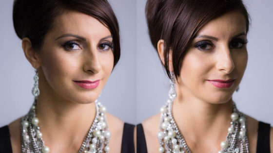
Short key (left) vs. broad key (right). Photos from SLR Lounge

First of all, a reminder: a short key is a key light on the side of the face away from camera, while a broad key hits the side of the face towards camera. Short key is generally preferred amongst cinematographers because it gives better “modelling” – i.e. a better sense of the shape of the face – and focuses the viewer ON the face, rather than the ear and the side of the head. A broad key, meanwhile, presents less shadow to the camera, and arguably shows the hairstyle and the shape of the head better – which may be reasons for the preponderance of broad key in classical portraiture, which were more concerned with overall appearance than with emotion/performance.

An array of broad key paintings at the National Portrait Gallery

But I don’t believe these direct pros and cons were the primary motivation in cinematographer Ole Bratt Birkeland’s decision to use broad key lighting in a crucial scene from The Crown.

The central themes of the series, which dramatises the early life of the Queen, are tradition and duty. Queen Mary often reminds her granddaughter Queen Elizabeth II of the long and noble lineage of the English royal family, a weight of history and responsibility which Elizabeth keenly feels. “The crown must always win,” Mary intones in the trailer.

In episode 4 the young Queen seeks advice, desperate to ensure she does not tarnish the monarchy’s centuries-old reputation. To symbolise this burden, Birkeland evokes the imagery of traditional portraiture – the subjects of which were always high-born individuals, often royals. Consider this frame grab from the scene, beneath an official portrait.

mw58197

img_1647

See how the light models the face the same way in both images? Note also the absence of backlight in the frame grab, another feature common to traditional paintings, which typically relied on a single window light source. Elizabeth’s dark hair blends into parts of the dark background.

Combined with the timeless regal production design, this lighting subtly places the Queen within the frame of an official portrait, trapping her within the overwhelming tradition of the monarchy. Can I say for certain that Birkeland did this deliberately? No, but I’d be very surprised if he hadn’t looked at royal portraits while prepping the show, and I’d be equally surprised if they hadn’t at least influenced him unconsciously.

Either way, this is a first-rate example of the power of cinematography to enhance theme and narrative by guiding the viewer to make subconscious associations. If you haven’t seen The Crown, I can highly recommend it; it’s not just the cinematography that’s top notch.

How “The Crown” Uses Broad Key Lighting to Evoke Tradition

24 Things I Learnt from CineFest

img_1220Last week I was fortunate enough to attend the Bristol International Festival of Cinematography: five days of masterclasses and panel discussions with a range of DPs from Oscar-winners like Chris Menges, ASC, BSC and Billy Williams, BSC, OBE to emerging cinematographers like Rina Yang. It was fascinating to watch the likes of Williams lighting the purpose-built set and explaining his decisions as he went. I learnt a huge amount, so I decided to share some of the opinions and nuggets of wisdom I collected.

  • Everyone agrees that the role of the DP is being diminished. Films are more collaborative than they used to be, often with lots of input from the VFX team right from the start.

Getting Work

  • You have to create your own luck. (Rina Yang)
  • Going to LA parties and schmoozing helps. (Roberto Schaefer, AIC, ASC)
  • Each clip on your showreel should make the viewer feel something. (Matt Gray, BSC)

Prep

  • Director Philippa Lowthorpe and Gray, her DP, spent weeks of prep getting on the same page when they worked together – chatting, exchanging photos, films, and so on.
  • Spend as much time as you can with the director in the early stages of prep, because as you get closer to the shoot they will be too busy with other stuff. (Schaefer)
  • Start with ten ideas about how you want to approach the cinematography of the film. If you hang onto five of them throughout the shoot you’re doing well. (Gray)
  • Hire a gaffer who knows more than you do. (Schaefer)

Equipment

  • On Gandhi, co-cinematographer Billy Williams, BSC, OBE was granted only half of the lighting kit he asked for. That was a $22 million movie which won eight Oscars!
  • Schaefer usually carries a 24’x30′ mirror in his kit, in case he needs to get an angle from somewhere where the camera won’t fit.
  • Schaefer doesn’t used OLED monitors to light from, because the blacks are richer than they will ever be seen by an audience on any other device, including in a cinema. He won’t judge the lighting by the EVF either, only a monitor calibrated by the DIT.
  • Focus drop-off is faster on digital than on film. Hence the current popularity of Cooke lenses, which soften the drop-off.
  • Nic Knowland, BSC uses a DSLR as a viewfinder to pick his shots. He also likes to record takes on his Convergent monitor so he can review them quickly for lighting issues.

On Set

  • You have to give the actors freedom, which may mean compromising the cinematography. (Nigel Waters, BSC)
  • Gray would never ask an actor to the find the light. The light needs to find them! As soon as actors are freed from marks, they can truly inhabit the space. [Note: in my experience, some actors absolutely insist on marks. Different strokes for different folks.]
  • On digital, everyone wants to shoot the rehearsal. (Schaefer)
  • Digital encourages more takes, but more takes use up time, drains actors’ energy and creates more work for the editor. Doing fewer takes encourages people to bring their A game to take one. (Williams)
  • Director Philippa Lowthorpe prefers a DP who operates because there is no filter between the ideas you’ve discussed in prep and the operation of the camera.

Lighting

  • Sometimes when you start lighting a set, you don’t where you’re going with it. You build a look, stroke by stroke, and see where it takes you. (Knowland)
  • Williams advocates maintaining the same stop throughout a scene, because your eye gets used to judging that exposure.
  • Knowland relies more on false colours on his monitor than on his light meter.
  • Schaefer often foregoes his traditional light and colour meters for an iPad app called Cine Meter III.
  • Knowland will go to 359º on the shutter if he’s struggling for light.
  • It’s worth checking the grade on a cheap monitor or TV. That’s how most people will watch it. (Schaefer)
24 Things I Learnt from CineFest