There were no practicals in this corner of the pub, so we placed an 800 open-face outside the window, gelled with Midnight Blue, and a 1×1′ LED panel in the wood-burner, gelled with CTO.
This year I’ve shot a couple of productions on the Sony FS7, a camera I’ve been very impressed by. Its most interesting feature is its high native ISO of 2000, which makes quite an impact on how you go about lighting. The light shed by practicals is often enough to illuminate a scene, or a large part of it, and sometimes you need to take existing practicals away in order to maintain contrast and shape, similar to how you take ambient light away (negative fill) when shooting exteriors.
It’s a strange thing about being a DP that, yes, sometimes you’re required to plan a mammoth lighting set-up using tens of kilowatts of power, but other times it’s just a case of saying, “Take the bulb out of that sconce.” You’re working to exactly the same principles, using your creative eye just as much in both scenarios.
Let’s look at some examples from a promotional film I shot with director Oliver Park for Closer Each Day, an improvised stage soap.
Our location was a pub, which had a large number of existing practicals: mainly wall sconces, but some overheads above the bar and in the corridors too. The film had to be shot in a single night, entirely on Steadicam, with some shots revealing almost the whole room, and to further complicate matters I was a last-minute hire due to another DP having to step down. Keeping the lighting simple, and avoiding putting any “film lights” on the floor where the roving camera might see them, was clearly the way to go.
I identified the darker areas of the room and added a few extra sources: two blue-gelled 800s outside the windows, an orange-gelled 1×1′ LED panel in the wood-burner, an LED reporter light in one key corner, and a small tungsten fresnel toplight onto a key table, firing down from the mezzanine so it would never be in shot. Other than those, and a low level of fill bounced off the ceiling, we relied exclusively on the existing practicals. (They were mainly fluorescent, and ideally we would have reglobed these all with tungsten, but it wasn’t possible.)
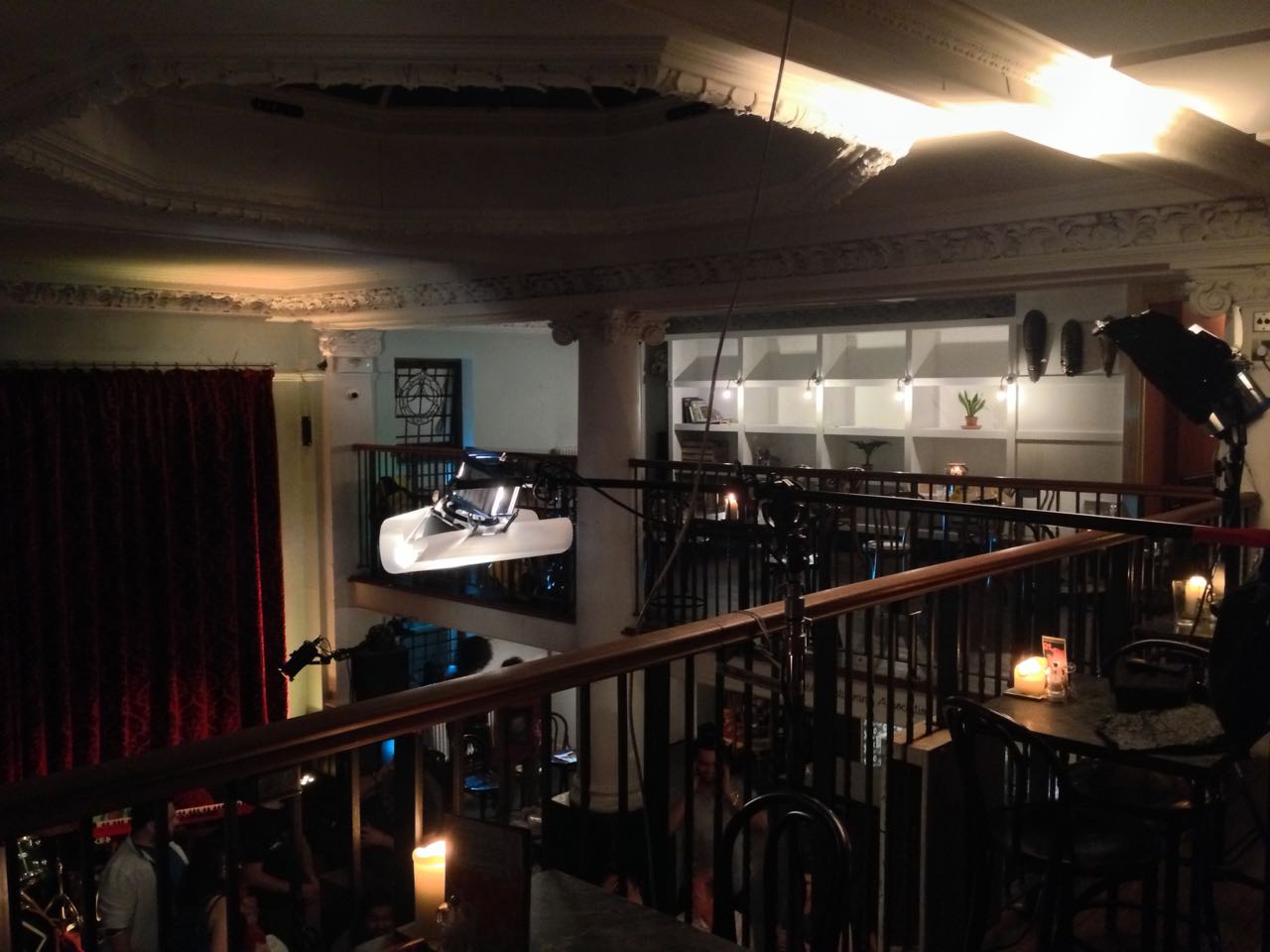
This view from the mezzanine shows the diffused 300W fresnel top-lighting the drinking contest table, and the black-wrapped 650 firing into the ceiling for fill.
So, that’s the “positive” lighting. Here are three examples of “negative” lighting in the film…
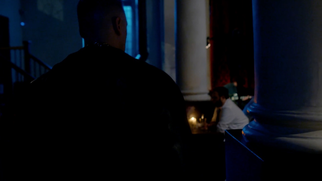
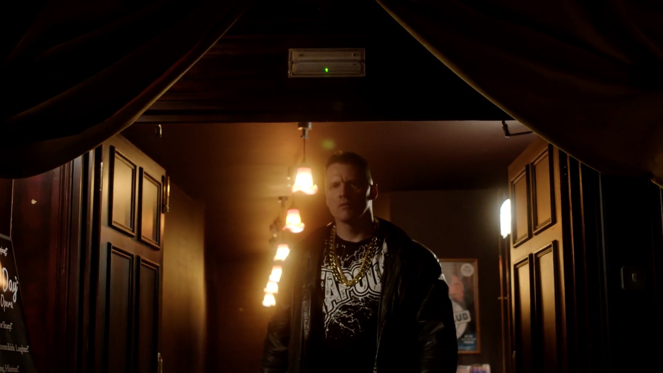
When Big Dick Johnson (yep, that’s the character’s name) first enters the pub, I put a piece of tape over a little halogen spotlight just above his point of entry. This was partly because it was very bright and I didn’t want him to blow out as he walked under it, but it also made for a much better sense of depth in the overall shot. As I’ve often mentioned on this blog, the best depth in an image is usually achieved by having the foreground dark, the mid-ground at key and the background bright. Killing the halogen spotlight helped create this progression of brightness and therefore depth. It’s also just nice in a shot like this to come out of darkness into the light, enhancing the reveal of the new space to the viewers.
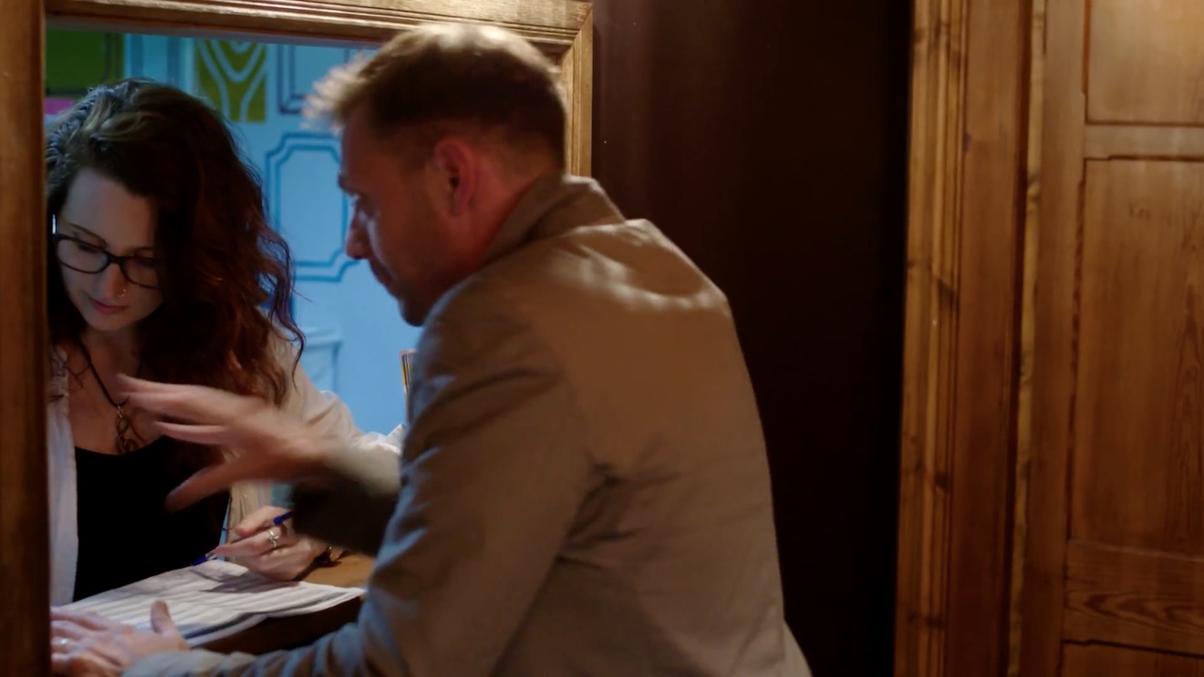
When Billy De Burgh scrambles to buy a ticket at the box office, there are two practicals just above his head. Depending on which way we were shooting, I de-globed one of the fixtures – always the one closest to camera. This ensured that Billy always had backlight, and never had a really hot, toppy front-light shining harshly down on him.
On a side note, the blue light inside the box office was existing – I guess they were using cool white LED bulbs in there – and I really like the way it differentiates the spaces on camera. It puts the bored ticket-seller in a cold, detached world very separate to Billy’s warmer, more urgent world.
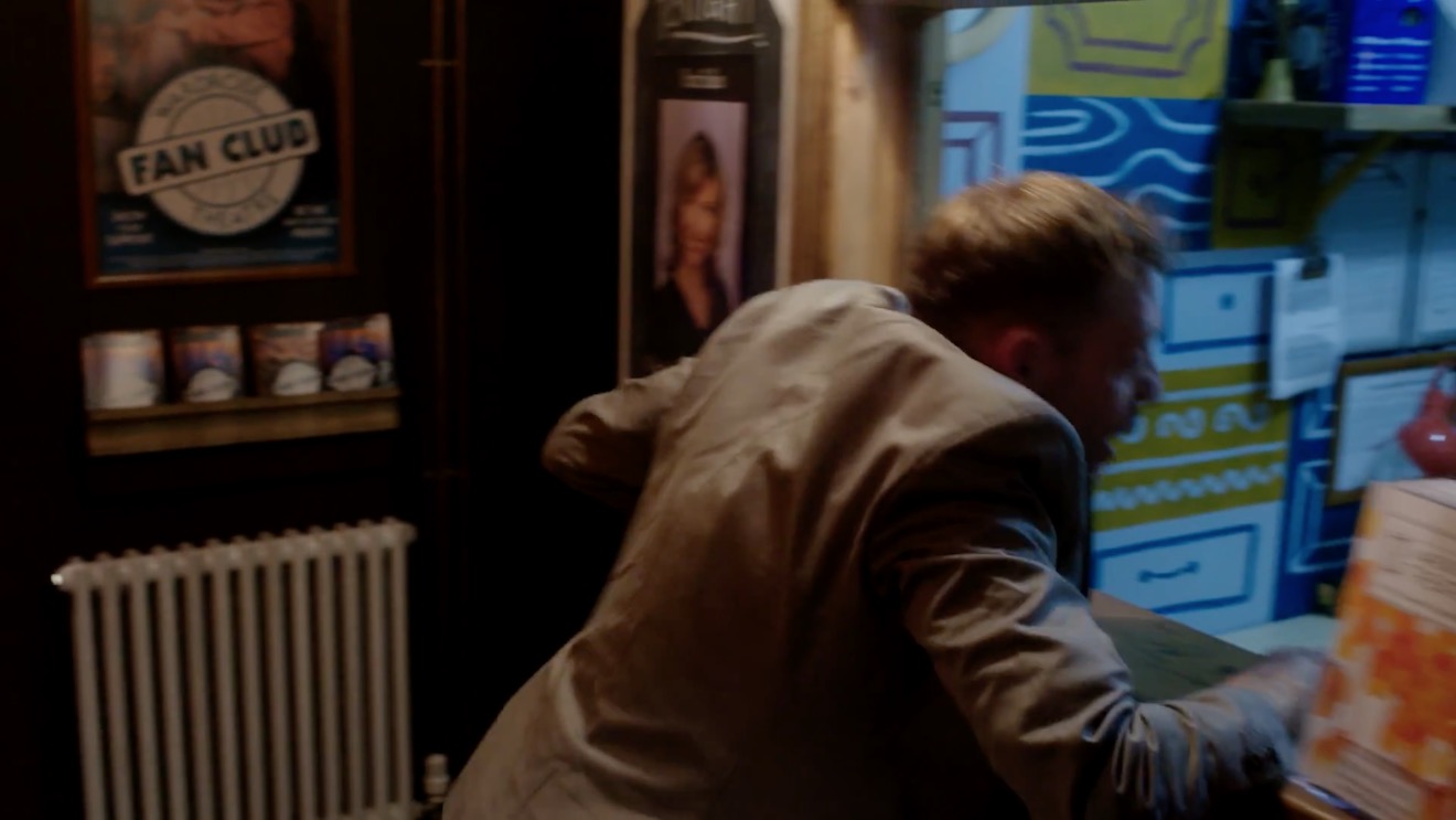
This doorway where Big Dick ends the film had sconces on both sides. It’s never very interesting to have an actor evenly lit on both sides of their face, and especially as Dick is such a tough, unpleasant character, I felt that more contrast was required. I chose to remove the globe from the righthand sconce, so that when he turns camera left to look at the sign he turns into the remaining sconce, his key-light. We filled in the other side of his face a tiny touch with a reflector.
I would love to have been able to exercise the same control over the street-lamps in the opening scene of the film – some of them are quite flat and frontal – but unfortunately time, budget and permissions made that impossible. We would have needed huge flags, or a council-approved electrician to switch the lamps off.
That’s all for today. Next time you’re in Bristol, check out Closer Each Day. I didn’t get chance to see it, but I hear it’s brilliant.
Lighting through windows is the cornerstone of a DP’s day interior work. I’ve previously written about the various ways that hard light through a window can be used. Today I’m going to look at some examples of how dressing on the windows – anything from curtains to paint or newspaper – can create interesting lighting looks and help you tell the story.
Please note: there are some minor spoilers in this post, and a quite big one for the season two finale of Mr Robot.
1. PAINTS AND STAINS
Director Michael Bay and DP John Schwartzman, ASC recycled many techniques they had used on commercials when they shot Armaggeddon. One of these was to create coloured light, not by arbitrarily gelling lamps, but by having the art department paint the windows. In an early scene on the oil rig, the windows are yellowed to give a warm feel to a romantic scene between AJ and Grace, contrasting with the cool, monochromatic look of the asteroid later on in the film. “The windows here are like a Filon fibreglass that we then threw some orange asphaltum stain on to give it that warm tone,” Schwartzman explains in the commentary.
2.NEWSPAPER
During the first season of time travel thriller 12 Monkeys, our heroes James Cole and Dr Cassandra Railly base themselves out of a disused shop. It’s a safe place they retreat to when they need to plan or regroup, and a womb-like feeling of warmth and security is created visually by the orange newspaper covering the shop’s front windows.
The season two finale of Mr Robot uses a similar technique to a very different end. Gaps in the paper here allow violent shafts of light to pierce the room, foreshadowing the bullet which is about to pierce Elliot’s body.
3. Blinds
When I lensed the race drama Exile Incessant in 2015, director James Reynolds wanted to visually represent the ideological differences between the older and younger South Africans. I decided to bathe the progressive youngsters in soft, low-contrast light, while throwing hard light and deep shadows onto the more narrow-minded adults, whose world is black and white in more ways than one. For the hospital scene pictured below, I adjusted the venetian blinds – with a 2.5K HMI behind them – to give a contrasty pattern of light and shade on the old man.
Lighting through blinds is of course a famous feature of film noir cinematography, and has found its way into countless movies of all genres over the last several decades.
He Walked by Night (1948, dir. Alfred L. Werker)
4. Diffusing curtains
Placing sheer curtains on a window can solve two problems for filmmakers: disguising an unwanted or non-existent (if on stage) background, and softening the light. This is a widely-used technique; in fact it’s common practice for art departments to consult with DPs about curtains to ensure that the right options are available for the style of lighting that will be employed.
In an episode of my YouTube series Lighting I Like, I discussed a scene from The Crown – Netflix’s dramatisation of Queen Elizabeth II’s reign – in which King George VI is found dead. Unlike many daylight interiors in the series which feature hard shafts of sunlight, the scene in question employed net curtains to create a softer, more subdued light, appropriate to the sombre content.
5. Billowing curtains
The season two Breaking Bad episode “Grilled” sees out-of-their-depth crystal meth cooks Walter White and Jesse Pinkman taken hostage by crazy drug lord Tuco Salamanca. Realising that their only hope of escape lies in killing Tuco, Walter and Jesse plot to poison his burrito. The episode bristles with tension, generated not just through the script and performances, but also by flapping curtains which paint the scene with restless shadows. The scene appears to have been shot on location, so whether the wind was artificial or just a happy accident I don’t know, but either way it adds immeasurably to the atmosphere.
Both Breaking Bad and 12 Monkeys feature in the second season of Lighting I Like – coming soon!
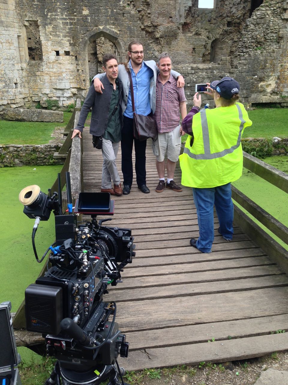
In June I was recommended by a mutual friend to shoot a short drama called Perplexed Music, inspired by the Elizabeth Barrett Browning sonnet of the same name. It’s a passion project from writer-director Mark McGann, with his brother Paul McGann (Doctor Who, Alien 3, Withnail &I) in the lead role of a man grieving for his deceased partner.
Paul and Mark pose with one of the supporting artists between takes.
Mark was keen from the outset to shoot on an Alexa, and I was quick to agree. Arri Rental very kindly gave us an amazing deal on an Alexa Classic and a set of Ultra Primes. As on Above the Clouds, we used a Blackmagic Micro Cinema Camera as a B-cam, capturing two specific angles that were impossible on the Alexa with our limited grip budget.
Throughout July, Mark and I had a very satisfying creative dialogue about the cinematic techniques we would use to tell the story of Paul’s character, The Man, who never speaks. I had been watching a lot of Mr. Robot, and was keen to use unusual compositions as that show does. The visual grammar that we ultimately developed eschewed The Rule of Thirds, either squeezing The Man right into the side of frame – at times when things are too much for him – or placing him dead centre for moments of clarity and acceptance, and for flashbacks to when his partner was alive.
The Blackmagic Micro Cinema Camera is mounted on a combo lighting stand to capture a high angle through a streetlamp.
While testing lenses at Arri Rental a few weeks prior to the shoot, I took the opportunity to shoot some frame-rate tests between 24 and 48fps. Since the film has so little dialogue, I figured there was nothing to stop us using a lot of slow motion if we wanted to. I didn’t want it to look like a music video though. I thought perhaps a very subtle over-cranking, creating languid blinks and slightly heavier movement, would add to the burden of The Man’s grief. Mark agreed as soon as he saw the tests, and we ended up shooting a number of set-ups at 28 and 30fps, plus 40fps for a pivotal sequence.
I also tested various ISO settings on the Alexa (click here for full details, stills and video from this test). Based on these, I decided to use ISO 1600 for the majority of the film, partly for the extra latitude in the highlights, and partly to add grittiness to The Man’s grief-stricken world, in the form of a little picture noise. When we started shooting the flashbacks, on the spur of the moment I decided to switch to ISO 400 for these. A few years back I shot the music video below on a Red Epic and, for reasons I forget, one set-up was done at a lower ISO than the rest. I remember the feeling this gave, when I saw the final edit, of everything suddenly being smooth and hyper-real. I thought that would be a great feeling to give to the flashbacks.
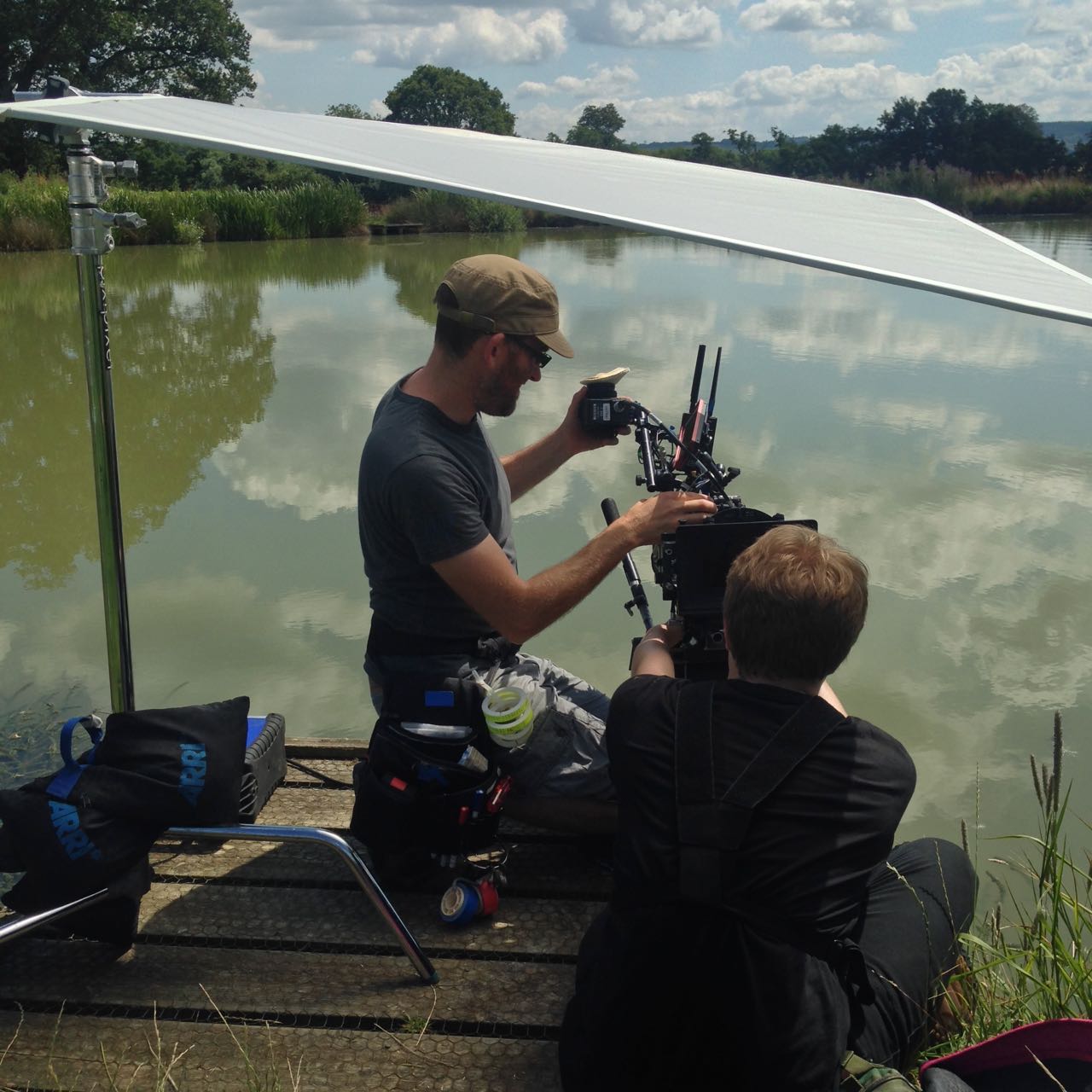
1st AC Rupert Peddle and 2nd AC Ben Davies set up a lakeside close-up under a diffusion frame which will soften the light on Paul.
Much of Perplexed Music was day exterior, but a couple of sequences required lighting. In the opening café scene, I fired HMIs through two windows, but kept their light away from The Man, keying him with a practical to put him in his own little world. Meanwhile, a happy couple he’s watching are bathed in sunlight (sometimes real, sometimes not) warmed up with a quarter CTO, and bouncing beautifully off their table to give them a healthy glow.
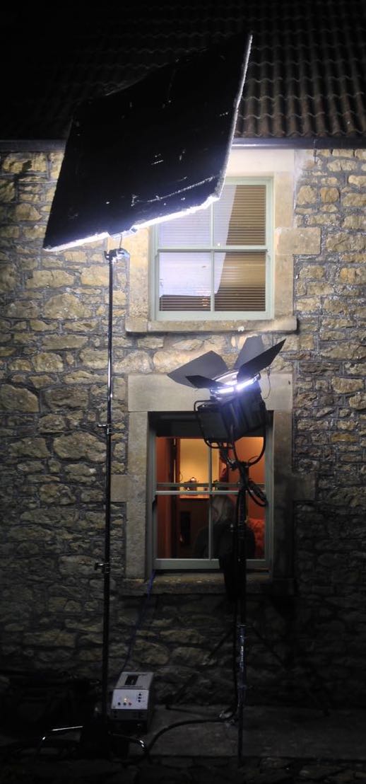
For night interiors at The Man’s home, I was keen to rely on practicals as much as possible. Firstly there wasn’t much space in the little cottage, secondly I didn’t want the hassle of having to shift them around to keep them out of frame when we changed angle, and thirdly it just looks more natural. So aside from a tungsten bounce in a corner of the living room we knew would never be seen, I stuck to practical table lamps and exterior lighting.
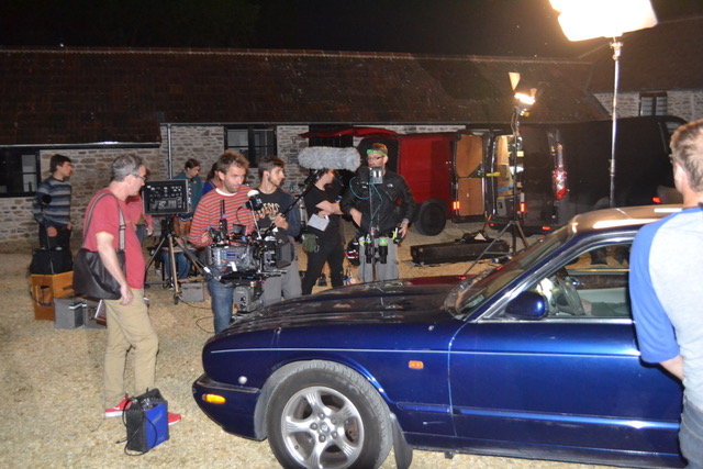
Setting up for a night exterior shot. Photo: Gary Horton
I had planned to use direct HMI sources for moonlight through the windows, but my gaffer Sam suggested going softer so that we wouldn’t have hard shadows inside which would need filling. I saw that he was right, so we used a kino through one window and a 2.5K HMI bounced into poly through another (pictured at left).
Perplexed Music was shot over five days in Frome in Somerset and Rame in Cornwall. The latter provided us with a spectacular cliff-top and the isolated St. Michael’s Chapel on the peak of the headland. Here we employed the services of The Fly Company, who captured two dramatic, sweeping shots on their DJI Inspire 2 drone. We were all extremely impressed by what they were able to achieve, especially as it was done in very windy conditions, in between rain showers.
We completed the final set-ups of the schedule as the winds began gusting up to 60mph, and poor Paul could barely stand upright! I was certainly glad we picked the Alexa to shoot on, because anything lighter would probably have shaken during takes, if not blown over!
Lining up a shot with director Mark McGann. Photo: Gary Horton
I had a fantastic time working with Mark and Paul, and the whole cast and crew. We were sad to part ways at the end of the week, and we all look forward to seeing the finished film soon. And at this point, dear reader, I ask for your help. Currently a Kickstarter campaign is underway for postproduction. It’s well over 50% funded at the time of writing, but every little helps in our quest to reach the finishing line. Rewards for backers include thank you video messages from Paul and Mark, and tickets to a private screening in December. Even if you can’t contribute, please consider sharing the page on social media. Thanks!
The publicity machine is ramping up for Kenneth Branagh’s Murder on the Orient Express remake, and it’s got me thinking about the challenges of a script set largely on a moving train. There are a number of ways of realising such scenes, and today I’m going to look at five movies that demonstrate different techniques. All of these methods are equally applicable to scenes in cars or any other moving vehicle.
1. For Real: “The Darjeeling limited”
https://www.youtube.com/watch?v=S92KktyxGY0
Wes Anderson’s 2007 film The Darjeeling Limited sees three brothers embarking on a spiritual railway journey across India. Many of the usual Anderson tropes are present and correct – linear tracking shots, comical headgear, Jason Schwartzman – but surprisingly the moving train wasn’t done with some kind of cutesy stop-motion. Production designer Mark Friedberg explains:
The big creative decision Wes made was that we were going to shoot this movie on a moving train. And all that does is complicate life. It makes it more expensive, it makes the logistics impossible. It made it incredibly difficult to figure out how many crew, what crew, what gear… but what it did do is it made it real.
Kenneth Branagh has stated that at least some of Murder on the Orient Express was shot on a real moving train too:
They painstakingly built a fully functioning period authentic locomotive and carriages from the Orient Express during the golden, glamorous age of travel. It was a train that moved… All of our actors were passengers on the train down the leafy lanes of Surrey, pretending to be the former Yugoslavia.
2. Poor Man’s Process: “The Double”
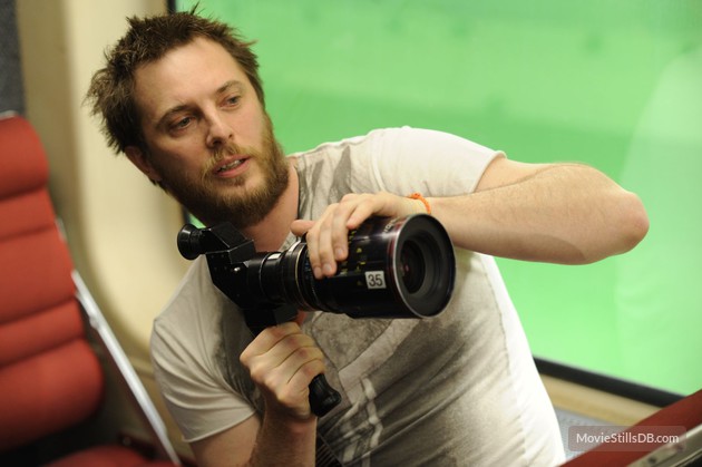
Director Richard Ayoade
Although best known as The IT Crowd‘s Moss and the new host of the Crystal Maze, Richard Ayoade is also an accomplished director. His last feature was a darkly beautiful adaptation of Dostoyevsky’s classic identity-crisis novella The Double.
Unlike the other movies on this list, The Double only has short sequences on a train, and that’s a key point. So named because it’s a cheap alternative to rear projection (a.k.a. process photography), Poor Man’s Process is a big cheat. In order to hide the lack of motion, you keep the view outside your vehicle’s windows blank and featureless – typically a night sky, but a black subway tunnel or a grey daytime sky can also work. Then you create the illusion of motion with dynamic lighting, a shaky camera, and grips rocking the carriage on its suspension. Used judiciously, this technique can be very convincing, but you would never get away with it for a whole movie.
Poor Man’s works particularly well in The Double, the black void outside the subway car playing into the oppressive and nightmarish tone of the whole film. In an interview with Pushing Pixels, production designer David Crank explains how the subway carriage set was built out of an old bus. He goes on to describe how the appearance of movement was created:
We put the forks of a forklift under the front of the bus, and shook it… For the effect of moving lights outside the train, it was a combination of some spinning lights on stands, as well as lights on small rolling platforms which tracked back and forth down the outside of the bus.
Part 2 of the Darjeeling Limited featurette above reveals that Poor Man’s Process was also used occasionally on that film, when the train was stuck in a siding due to heavy rail traffic. I used Poor Man’s myself for night-time train sequences in two no-budget features that I made in the early noughties – see the BTS clip below – and I’ve also written a couple of blog posts in the past about my use of the same technique on a promotional video and in a fantasy web series.
3. Green screen: “Source Code”
https://www.youtube.com/watch?v=ildCiVpLM8s
Duncan “Zowie Bowie” Jones followed up his low-budget masterpiece Moon with Hollywood sci-fi thriller Source Code, a sort of mash-up of Quantum Leap and Groundhog Day with a chilling twist. It takes place predominantly on a Chicago-bound commuter train, in reality a set surrounded by green screen. In the featurette above, Jones mentions that shooting on a real moving train was considered, but ultimately rejected in favour of the flexibility of working on stage:
Because we revisit an event multiple times, it was absolutely integral to making it work, and for the audience not to get bored, that we were able to vary the visuals. And in order to do that we had to be able to build platforms outside of the train and be able to really vary the camera angles.
In the DVD commentary, Jones also notes that the background plates were shot in post from a real train “loaded up with cameras”.
Director Duncan Jones on the set of “Source Code”
Cinematographer Don Burgess, ASC discusses lighting the fake train in a Panavision article:
It’s difficult to make it feel like natural light is coming in and still get the sense of movement on a train… We worked with computer programs where we actually move the light itself, and brighten and dim the lights so it feels as if you are travelling… The lights are never 100% constant.
When I shot The Little Mermaid last year we did some train material against green screen. To make the lighting dynamic, the grips built “branch-a-loris” rigs: windmills of tree branches which they would spin in front of the lamps to create passing shadows.
4. Rear projection: “Last Passenger”
Perhaps the most low-budget film on this list, Last Passenger is a 2013 independent thriller set aboard a runaway train. Director Omid Nooshin and DP Angus Hudson wanted a vintage look, choosing Cooke Xtal anamorphic lenses and a visual effects technique that had long since fallen out of favour: rear projection.
Before the advent of optical – and later digital – compositing, rear projection was commonly used to provide moving backgrounds for scenes in vehicles. The principle is simple: the pre-recorded backgrounds are projected onto a screen like this…
Rear projection in use on “River of no Return” (1954)
Hudson goes into further detail on the technique as used for the Last Passenger:
To capture [the backgrounds] within our limited means, we ended up shooting from a real train using six Canon 5D cameras, rigged in such a way that we got forward, sideways and rear-facing views out of the train at the same time. We captured a huge amount of footage, hours and hours of footage. That allowed us to essentially have 270 degrees of travelling shots, all of which were interlinked.
Because rear projection is an in-camera technique, Nooshin and Hudson were able to have dirt and water droplets on the windows without worrying about creating a compositing nightmare in postproduction. Hudson also notes that the cast loved being able to see the backgrounds and react to them in real time.
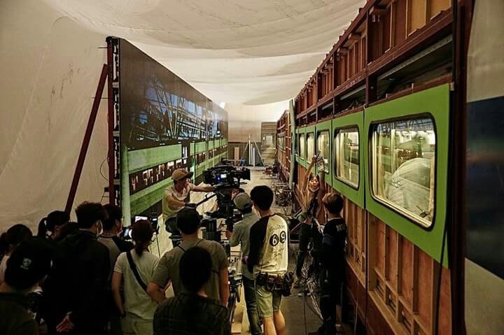
5. L.E.D. Panels: “Train to Busan”
https://www.youtube.com/watch?v=3nKVBSHvxi8
Enabling the actors to see the background plates was also a concern for Yeon Sang-ho, director of the hit Korean zombie movie Train to Busan. He felt that green screen would make it “difficult to portray the reality”, so he turned to the latest technology: LED screens. This must have made life easier not just for the cast, but for the cinematographer as well.
You see, when you travel by train in the daytime, most of the light inside the carriage comes from outside. Some of it is toplight from the big, flat sky, and some of it is hard light from the sun – both of these can be faked, as we’ve seen – but a lot of the light is reflected, bouncing off trees, houses, fields and all the other things that are zipping by. This is very difficult to simulate with traditional means, but with big, bright LED screens you get this interactive lighting for free. Because of this, and the lack of postproduction work required, this technique is becoming very popular for car and train scenes throughout the film and TV industry.
This brings us back to Murder on the Orient Express, for which 2,000 LED screens were reportedly employed. In a Digital Spy article, Branagh notes that this simulated motion had an unintended side effect:
It was curious that on the first day we used our gimballed train sets and our LED screens with footage that we’d gone to great trouble to shoot for the various environments – the lowlands and then the Alps, etc… people really did feel quite sick.
I’ll leave you with one final point of interest: some of the above films designed custom camera tracks into their train carriage sets. On Last Passenger, for example, the camera hung from a dolly which straddled the overhead luggage racks, while The Darjeeling Limited had an I-beam track designed into the centre of the ceiling. Non-train movies like Speed have used the same technique to capture dolly shots in the confines of a moving vehicle.
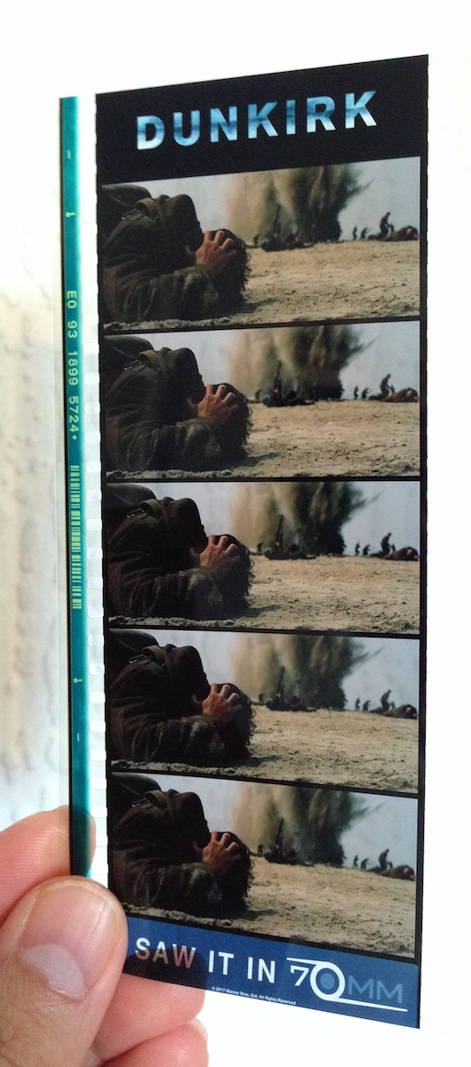
Some have hailed it as a masterpiece, others have complained it left them cold. Personally, seeing it on 70mm, I found Dunkirk a highly immersive and visceral film, cinematic in the truest sense of the word. The huge, sharp images free from any (apparent) CGI tampering, combined with the nerve-jangling gunshots and rumbling engines of the superlative soundtrack, gave me an experience unlike any other I can recall in recent movie-going history. I can imagine that it was less effective projected from a DCP onto a smaller screen, which may account for the underwhelmed reactions of some.
But however you feel about Dunkirk as a film, it’s hard not to admire its technical accomplishments. Here are five unique aspects of its cinematography.
1. It was shot on two huge formats.
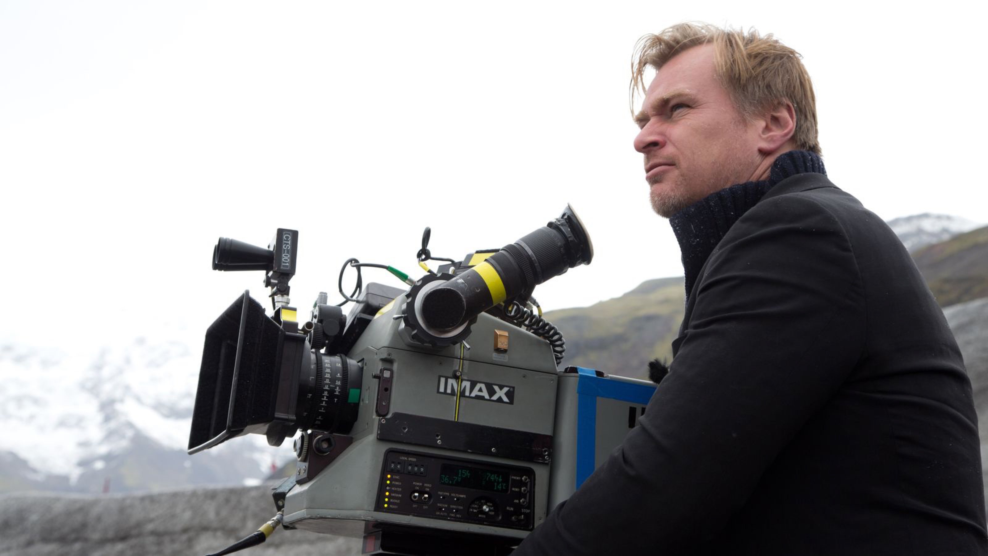
Director Christopher Nolan has long been a champion of large-format celluloid capture, eschewing the digital imaging which has become the dominant medium in recent years. “I think IMAX is the best film format that was ever invented,” says Nolan in a DGA interview. “It’s the gold standard and what any other technology has to match up to, but none have, in my opinion.”
Imax is a process which uses 65mm film (printed on 70mm for exhibition, with the extra space used for the soundtrack) running horizontally through the gate, yielding an image over eight times larger than Academy 35mm. Following some test shots in The Prestige, Nolan captured whole sequences from The Dark Knight, The Dark Knight Rises and Interstellar in Imax.
For Dunkirk, Nolan and cinematographer Hoyte van Hoytema, ASC, FSF, NSC were determined to eliminate 35mm altogether, to maintain the highest possible resolution throughout the movie. Imax cameras are noisy, so they shot dialogue scenes on standard 65mm – running vertically through the gate – but Imax footage makes up over 70% of the finished film.
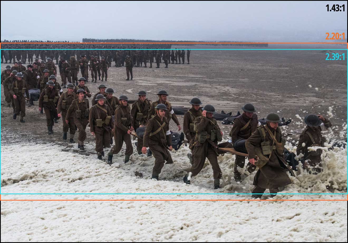
2. The movie was framed with three different aspect ratios in mind.
Those who watched Dunkirk in an Imax cinema got to see the native aspect ratio each sequence was captured in, i.e. 2:20:1 for the standard 65mm dialogue scenes but the much taller 1.43:1 for the Imax material, the bulk of the film. Those, like me, who attended a standard 70mm screening, saw it in 2:20:1 throughout. And those hapless individuals who watched it digitally apparently saw the standard Scope ratio of 2.39:1, at least in some cases.
This means that, when composing his shots, van Hoytema had to have two ratios in mind for the dialogue scenes and three for everything else. “Framing was primarily for the 2.40 [a.k.a. 2:39:1], then protecting what was outside of it,” 1st AC Bob Hall explains. This left close-ups, for example, with a large amount of headroom in 1.43:1, but the huge size of Imax screens made such framing desirable anyway. “Imax is such an immersive experience that it’s not so much the composition that the cinematographer’s done as where your eyes are going on the screen that creates the composition.”
3. Parts of the camera rig were worn as a backpack.
Breaking with the accepted norms of large format cinematography, van Hoytema captured a significant proportion of the movie handheld. The 65mm camera package weighed over 40kg – about three times the weight of a typical Alexa rig – with the Imax camera only a little lighter. To avoid adding the weight of the batteries, video transmitter, Cinetape display and Preston (wireless follow focus) brain, these were placed in a special tethered backpack which was either worn by key grip Ryan Monro or, for water tank work, floated on a small raft.
Unfortunately, Hall quickly found that electromagnetic interference from the Imax camera rendered the Cinetape inoperable, so he ended up relying on his extensive experience to keep the images sharp. “I had to go back to the technology of the 1980s, where I basically guess how far famous people are from me,” he remarks drily in this enlightening podcast from Studio Daily.
4. A periscope lens was used to shoot spitfire cockpit interiors.
“I wanted to tell an intensively subjective version of this story,” says Nolan. To that end he requested over-the-shoulder views out of the windscreens of Spitfires in flight. Furthermore, he wanted to be able to pan and tilt to follow other aircraft passing by. Given the huge size of the Imax camera, there was no room to rotate it within the cockpit. Instead, custom periscope lenses were built which could snake over the pilot’s shoulder, and pan and tilt independently of the camera body, using prisms to maintain the correct image orientation to the film plane.
Other glass used on Dunkirk included an 80mm Imax lens belonging to Nolan himself, and converted stills lenses.
Note that the camera is mounted upside-down, to compensate for the flipped image generated by the prism in the periscope lens.
5. At one point the camera sunk to the bottom of the sea for an hour and a half.
A specific Spitfire POV required was from a damaged plane diving towards the sea and hitting the water. The practical effects department devised a catapult to launch an unmanned mock-up from a ship, the grips built a crash housing for the Imax camera which would be inside, and a plan was devised to recover it before the mock-up sank. But they weren’t quick enough, and the crew watched the plane and the camera disappear beneath the waves and plunge to the bottom of the English Channel, where it sat for 90 minutes until divers retrieved it. Incredibly, once dried out and developed, the film footage was found to be completely undamaged. “The shot was all there, in full colour and clarity,” says van Hoytema in the American Cinematographer article. “This material would have been lost if shot digitally.”
Anamorphic cinematography, first dabbled with in the 1920s, was popularised by Twentieth Century Fox in the fifties as CinemaScope. Television was growing in popularity and the studios were inventing gimmicks left, right and centre to encourage audiences back into cinemas. Fox’s idea was to immerse viewers in an image far wider than they were used to, but with minimal modifications to existing 4-perf 35mm projectors. They developed a system of anamorphic lenses containing elements which compressed the image horizontally by a factor of two. By placing a corresponding anamorphosing lens onto existing projectors, the image was unsqueezed into an aspect ratio of 2.55:1, or later 2.39:1.
Since those early days of CinemaScope, anamorphic cinematography has become associated with the biggest Hollywood blockbusters. Its optical features – streak flares, oval bokeh and curved horizontal lines – have been seared into our collective consciousness, indelibly associated with high production values.
Again we were shooting on an Alexa XT Plus in log C ProRes 4444 XQ, this time in 4:3 mode, a resolution of 2048×1536. Since all of the lenses had a standard 2:1 anamorphosing ratio, the images unsqueezed to a super-wide 2.66:1 ratio. (This is because the lenses were designed to be used on 35mm film with space left to one side for the optical soundtrack.) You can see the full width of this ratio in the first split-screen image in the video, at 2:08, and in the second image below, but otherwise I have horizontally cropped the footage to the standard 2.39:1 ratio.
We tested the following glass:
Series
Length
Speed
CF*
Weight
Hawk V
35mm
T2.2
30″
5.6kg
Cooke Xtal
30mm
T2.8
?
3kg
Kowa Mirrorscope
40mm
T2.2
36″
1.15kg
Kowa Mirrorscope
30mm
T2.3
?
?
* CF = close focus
For consistency with the spherical lenses, we used lengths around 32mm, but in the anamorphic format this is a pretty wide lens, not a mid-range lens. We shot at T2.8, again for consistency, but I hear that many anamorphics don’t perform well wider than T4.
We were only able to test what Arri Rental happened to have on the shelves that day. The biggest and presumably most expensive was the Hawk V-series. Next in size and weight was the Cooke Xtal – pronounced “crystal” – a 1970s lens based on the much-loved Speed Panchros. The smallest and lightest, was the Kowa Mirrorscope, with a list price of £1,200 per week for a set of four. (Sorry, I couldn’t find any pricing info for the others online.) Note that there isn’t really a 30mm Mirrorscope; to get this length you put a wide angle adapter on the 40mm. As this extra element decreases the optical performance, we tested it with and without, hence the two lengths.
Here’s the video…
Skin tones
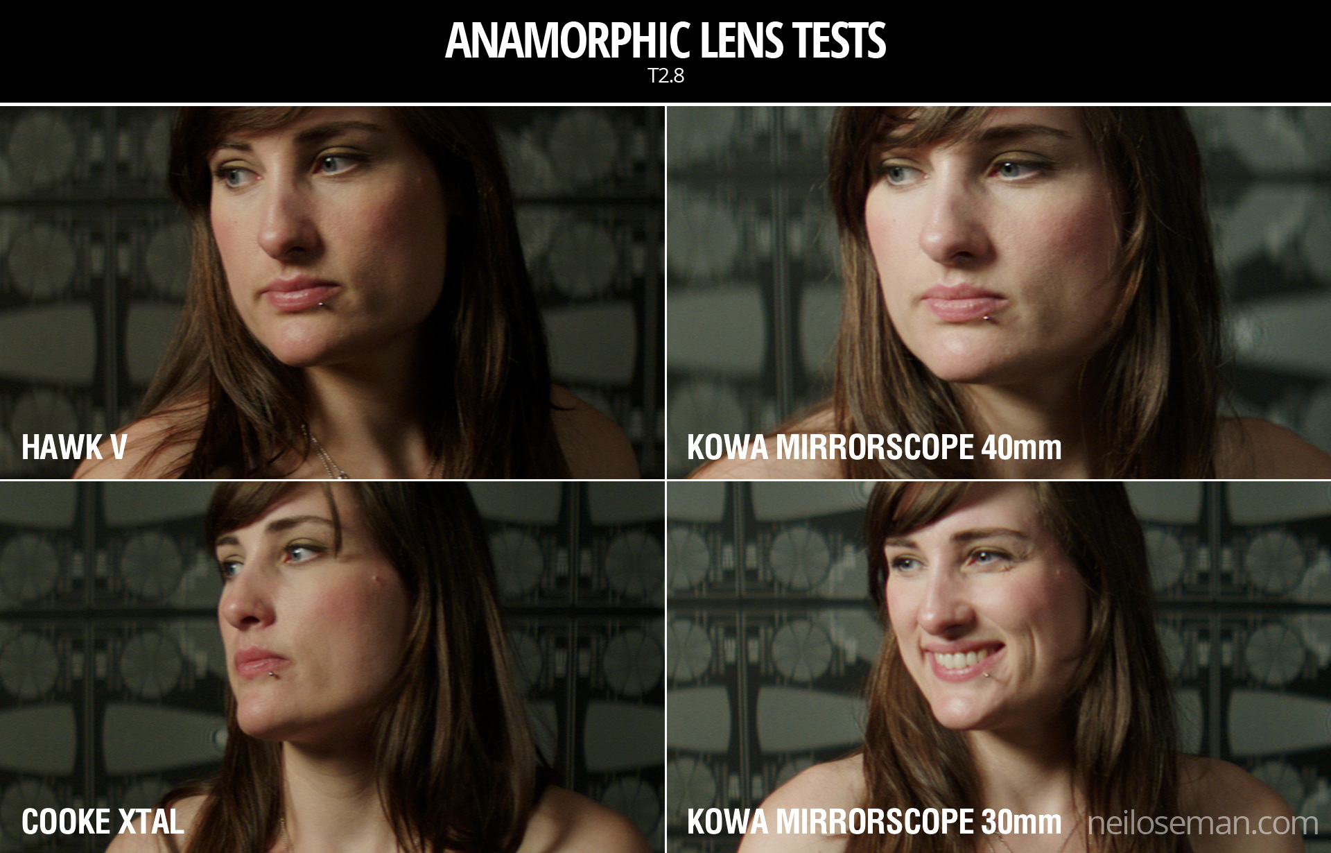
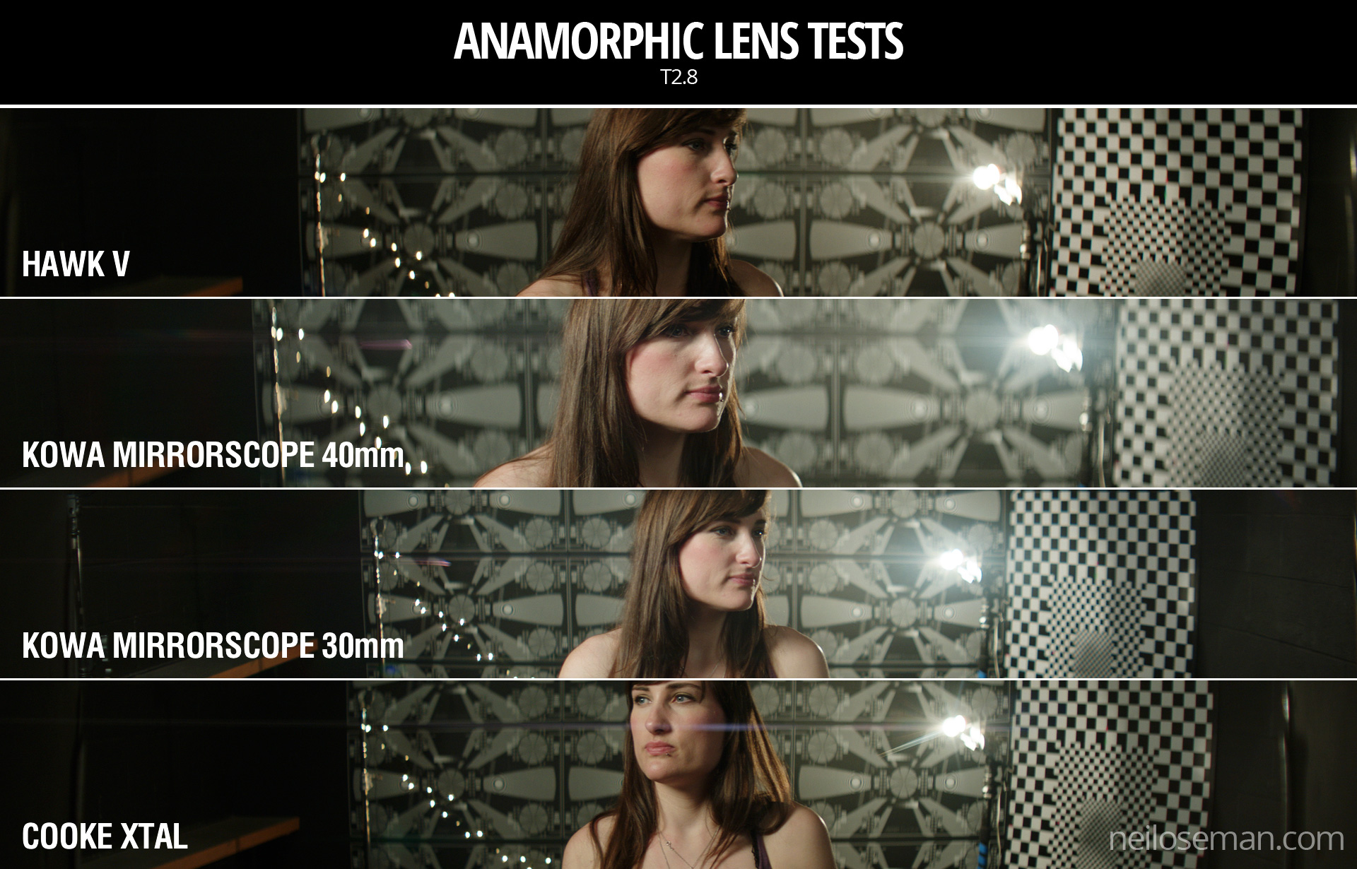
Click on the image to see it at full quality.
To my eye, the Hawk has a fairly rich, warm skin tone, while the Cooke – as with the spherical S4 tested last week – seems a little grey and flat. The Kowa is inexplicably brighter than the other two lenses, which makes it hard to compare, but perhaps it’s a little cooler in tone?
Anamorphic lenses have what is known as a “curved field of focus” that works similarly to the curved movie screens in some large Cinerama theatres. This is one reason that one needs to expose these lenses at a deeper stop. If one doesn’t, the curved field will not be covered by depth of field and either the edges or centre of the frame will be soft.
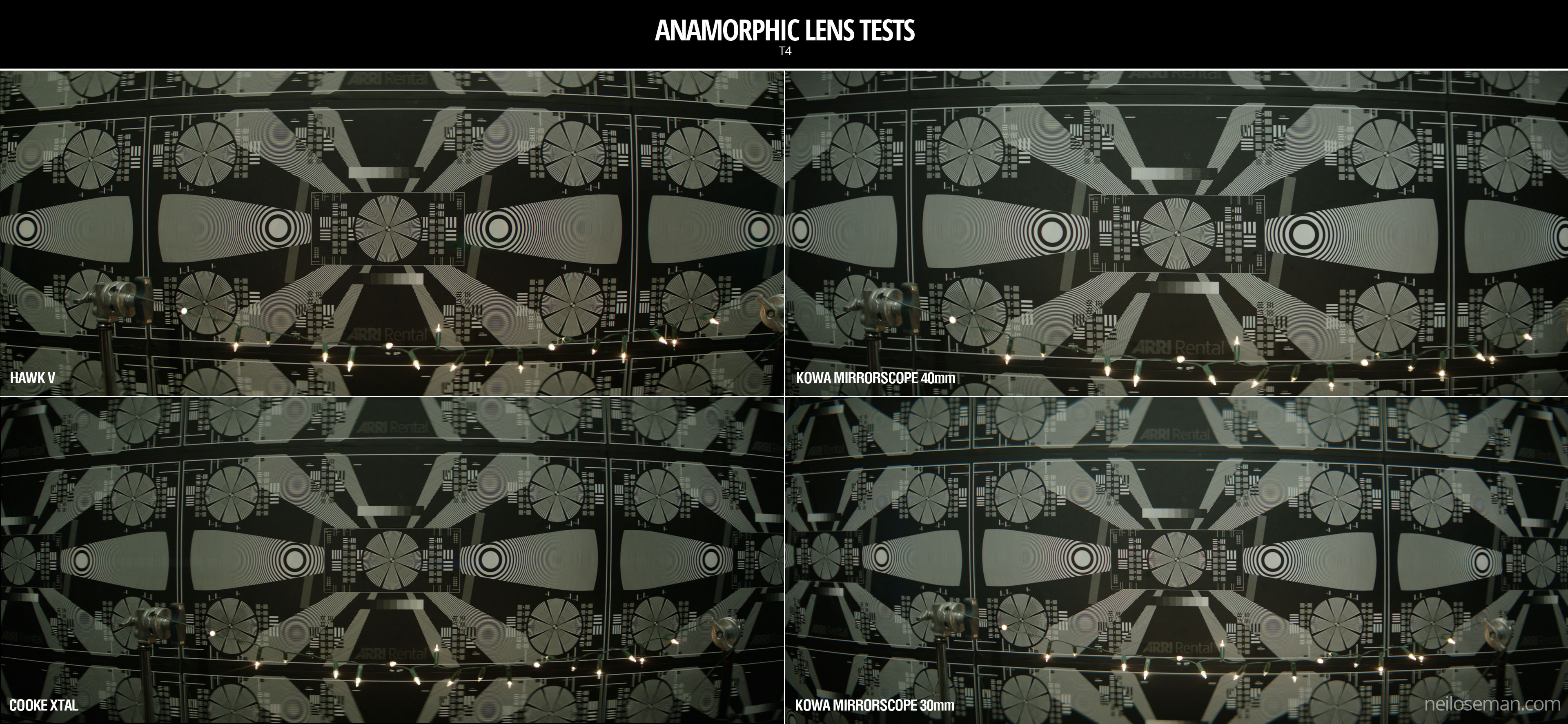
One day I’d like to re-test these lenses at a lower stop, T4 or T5.6, where they will all undoubtedly perform much better. But in this T2.8 test, on Bex’s face in the centre of frame, the Hawk V and the Kowa Mirrorscope 40mm – both almost a full stop from their maximum apertures – are clearly the sharpest of the bunch. The Cooke Xtal, which is wide open, is unsurprisingly softer. The 30mm adapter on the Mirrorscope completely destroys the image, not only making it very soft but also introducing colour aberration.
Now let’s look at the checkerboard at the side of frame and see if we can spot any differences in sharpness there…
It seems to me that the Kowa, both with and without the adapter, has a greater difference in sharpness between the centre and edges of frame than the the Hawk and Cooke. With the latter two lenses, the checkerboard is reasonably sharp, at least on the lefthand side, with some ghosting/blur visible towards the righthand side. The same thing can be observed on the chart in the flare tests at the end of the video.
Breathing & Bokeh
All of these lenses have a noticeable degree of breathe, which I suppose is to be expected from anamorphics. The Hawk V has roughly oval bokeh, the Cooke’s is more circular, while the Mirrorscope has interesting D-shaped bokeh.
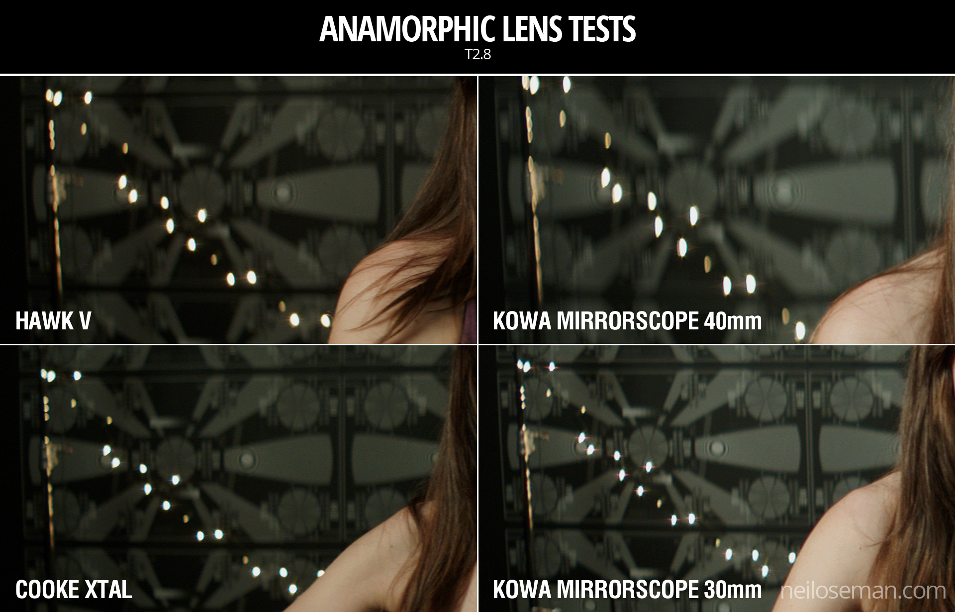
Flare
The Hawk V doesn’t flare much at all, which is apparently due to the anamorphic element being in the middle of the lens, rather than at the front. The Kowa has a nice streak and glow around the light source, with a funky purple artefact on the opposite side of frame. But it’s the Cooke Xtal which provides the most classic lens flare, with a horizontal line across most of the frame and a partial star pattern around the source, despite the lens being wide open.
At the end of the video you can see how the flares develop on each lens as the light source moves horizontally across frame.
Distortion
A bulging effect is very obvious on all of these lenses, due to the focal lengths being quite wide for anamorphic. Notice how at 40mm on the Kowa Mirrorscope this curvature of the image is significantly reduced.
It’s hard to compare the levels of distortion because none of the focal lengths are exactly the same, except for the Cooke Xtal and the Kowa Mirrorscope with the 30mm adapter on. The Cooke’s top right and bottom left corners appear to be stretched away from the centre relative to the other two corners. I suppose that strange and funky stuff like this is exactly why you choose vintage glass.
Interestingly, the Cooke’s image appears a little tighter than the Kowa’s, which combined with my inability to find any evidence online of the existence of a 30mm Xtal, leads me to suspect we may have been given a mislabelled 32mm.
Conclusions
When we got to the end of our spherical tests and started putting the anamorphics on, I was shocked by the drop in sharpness. But as noted earlier, this is because anamorphics really need to be used with a smaller aperture than the T2.8 I often shoot at. If I learnt nothing else from this test, I learnt that anamorphic needs more light!
I would love to put the Cooke Xtal’s lovely flares and general vintage look to good use on a period movie one day. The Hawk V would be a good choice if I wanted the anamorphic look with warm, dynamic skin tones. The Kowa system seemed a little cheap and cobbled-together, but could well be a good solution for anamorphic on a budget, as long as I stayed away from the 30mm adapter!
The other week I spent a day at Arri Rental in Uxbridge, in the Bafta Room no less, conducting various camera and lens tests. I’ve done a number a productions now where I wanted to test but there wasn’t the time or money, so for a while I’ve been meaning to go into Arri on my own time and do some general tests for my education and edification. An upcoming short provided the catalyst for me to get around to it at last.
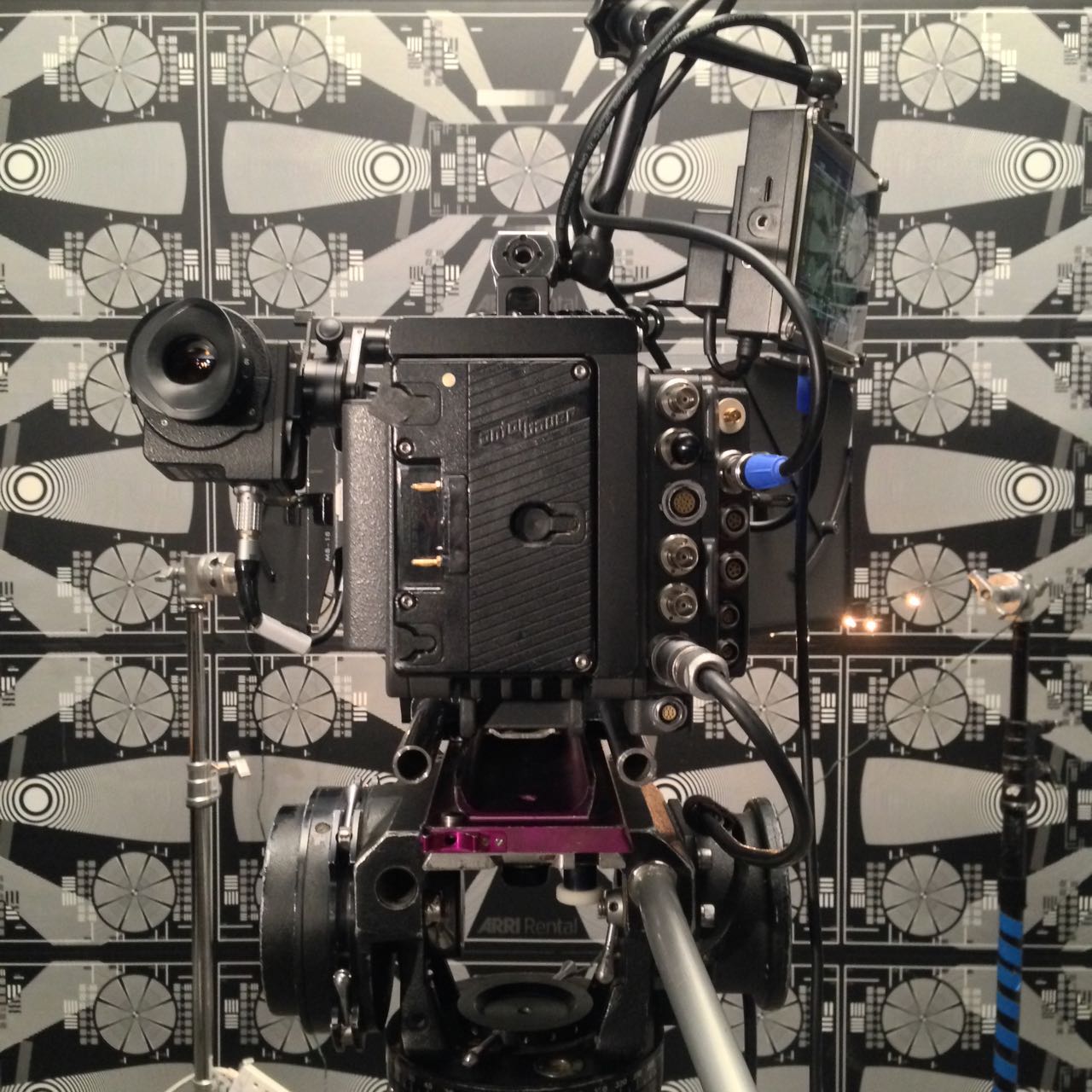
Aided by 1st AC Rupert Peddle and 2nd AC Bex Clives, I tested a dozen lenses, some spherical, some anamorphic. Today I will cover the spherical lenses; next time I’ll look at the anamorphics.
Method
We shot on an Alexa XT Plus in log C ProRes 4444 XQ at 3.2K. In the video the image has been downscaled to 1080P and a standard Rec.709 LUT has been added.
I set the Alexa to ISO 800 and lit Bex to a T2.8 using a 650W tungsten fresnel bounced off poly. For fill I caught a little of the spill from the fresnel with a matte silver bounce board on the opposite side of camera. I placed fairy lights in the background to observe the bokeh (out of focus areas) and turned on a 100W globe during each take to see what the flare did.
We shot all the lenses at 2.8 – the stop I most commonly use – and also wide open (compensating with the shutter angle), but the direct 2.8 comparison proved most useful, so that’s mainly what you’ll see in the video. We tested a single length: 35mm or the closest available to it.
What we didn’t do was shoot grey-scale or colour charts, or do any testing of vignettes or distortion. (The day after doing these tests, Shane Hurlbut, ASC published an Inner Circle post about how to tests lenses, so I immediately learnt what my omissions were!)
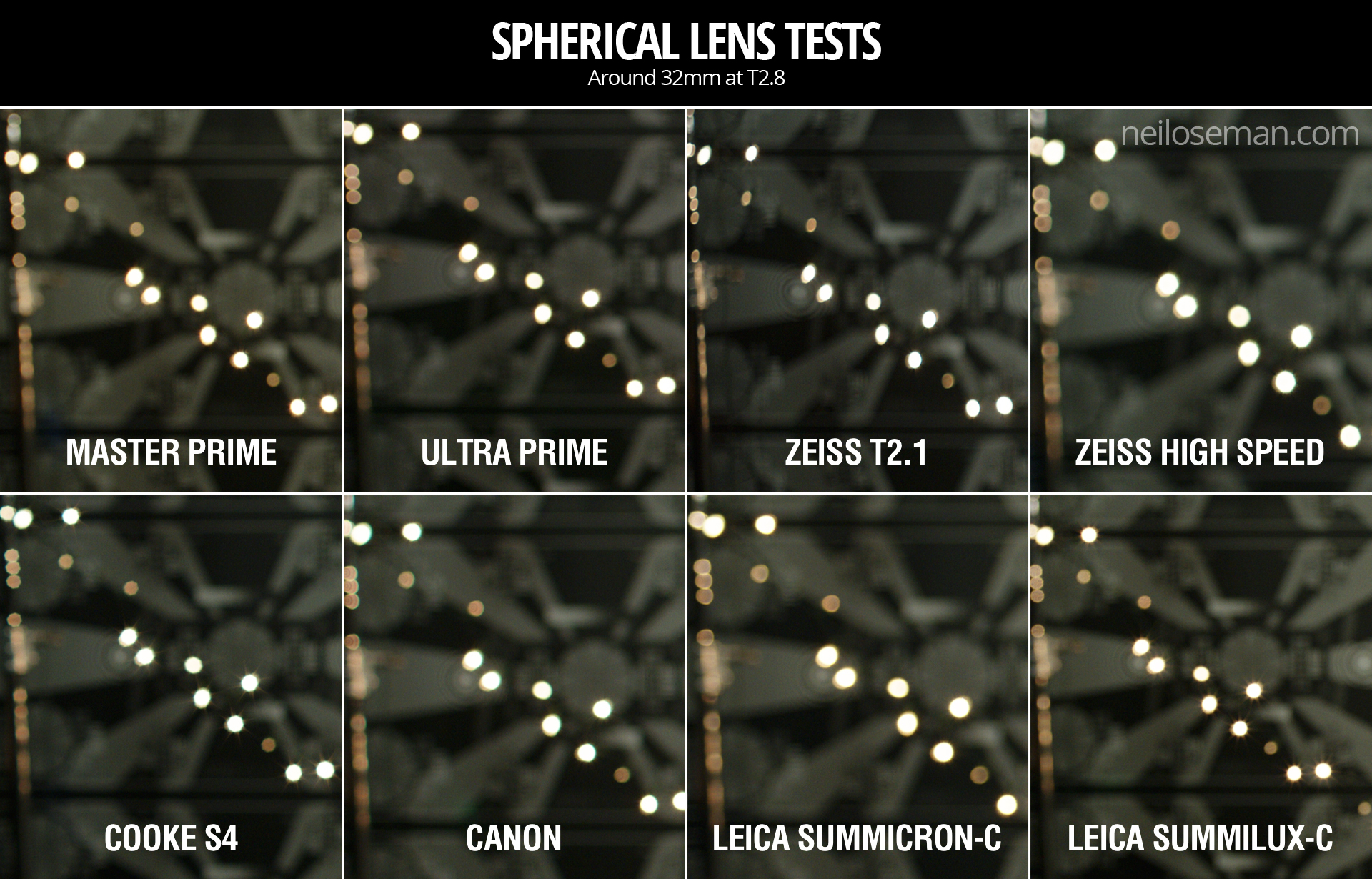
We tested the following lenses:
Series
Length
Speed
CF*
Weight
Price
Leica Summilux-C
29mm
T1.4
18″
1.7kg
£27K
Arri/Zeiss Master Prime
35mm
T1.3
14″
2.2kg
£16K
Cooke S4
32mm
T2
6″
1.85kg
£14K
Leica Summicron-C
35mm
T2
14″
1.3kg
£13K
Zeiss High Speed
(a.k.a. Superspeed Mk III)
35mm
T1.3
14″
0.79kg
£12K
(refurb)
Arri/Zeiss Ultra Prime
32mm
T1.9
15″
1.1kg
£10K
Zeiss T2.1
32mm
T2.1
24″
0.45kg
£4K
(used)
Canon
35mm
T1.5
12″
1.1kg
£3K
* CF = close focus
Here’s the video…
Skin tones
Click the image to see it at best quality.
The Arri/Zeiss Master Prime and the two Leicas seem to have the most vibrant skin tones. To my eye, the Leicas have a slight creaminess that’s very pleasing. The Canon looks just a little cooler and less dynamic. I was surprised to find that the Cooke S4, the lens I’ve used most, appears to have a grey, flat skin tone compared with the Master Prime, Leicas and Canon. I would rank the Ultra Prime and Superspeed next, on a par except that the Ultra Prime has a noticeable magenta cast. My least favourite skin tones are on the Zeiss T2.1, which comparatively makes poor Bex look a little bit ill!
Some of the nuances will be lost in the YouTube and Jpeg compression, but this is a very subjective assessment anyway, so feel free to completely disagree with all of the above. Any of the differences noted above could be corrected by grading, to some extent . But remember that the lens is at the very start of the light’s journey from set to screen, and any wavelengths that don’t get through it are lost forever. It’s like fluorescent lamps with colours missing from the spectrum; you can’t put those back in in post.
Sharpness
I have to say, I’m unable to detect any difference in sharpness between the Master Prime, Cooke S4, Canon and Leicas. The Ultra Prime and Superspeed both look a hair softer, while the T2.1 is very soft.
Breathing
Breathing is the slight zooming effect that you get with some lenses when you pull focus. Looking at 4:44 in the video you can clearly see the differences in breathing between the eight lenses. Because this part of the video is showing a crop of the bottom left corner of the image, the breathing manifests as a shift to the left (zoom in) as the lens is racked closer (goes soft) and a shift to the right (zoom out) as it’s racked deeper (goes sharp).
All the Zeiss lenses except the Master Prime have a significant amount of breath when seen in isolation like this, but not enough to be noticeable to an audience in most real-world situations. The Cooke S4 has a little bit of breathe, and the Canon a hair less. The Master Prime and the Leicas are rock solid.
Bokeh
Small points of light, when thrown out of focus, most clearly demonstrate the bokeh pattern of a lens. The shape of the bokeh is determined by the number of iris blades and the shape of those blades. Generally a circle is preferred, because it’s a natural shape, but for certain stories a more unusual shape might be appropriate. The shape of the iris changes with the T-stop, hence the T2.8 and wide open images above.
Immediately noticeable is the difference in the Cooke S4’s bokeh between wide open (circular) and T2.8 (octagonal). All of the other lenses have round bokeh at T2.8, apart from the Superspeed, which has heptagonal (seven-sided) bokeh.
It’s entirely subjective which bokeh you prefer. The only other thing I’ll point out is that the Canon’s bokeh wide open is very fuzzy, with noticeable colour aberration, though this may be due to the bright highlight rather than the defocusing.
Flare
Flare patterns also vary with aperture. The smaller the aperture, the more of a star effect you will get, as the light interacts with the corners in the iris blades. The Summilux shows this most clearly, with a pronounced star at T2.8 (two stops down from its maximum aperture) and almost none when wide open. The Cooke S4 also has a nice star pattern at T2.8. With the other lenses it’s much more subtle, and the Canon has almost none.
Conclusions
The real revelations in these tests, for me, were the Leicas. The Summilux in particular is a beautiful lens, with rich, dynamic skin tones, nice bokeh, no breathing, plus the bonus of nice star flares. I will definitely be looking to work with this glass in the future, although given the price tag that may be optimistic!
The Summicron also performed incredibly well, matching the more expensive Summilux and Master Prime in every respect except speed. I can see this becoming my new go-to lens.
The Master Prime of course produced a beautiful, sharp, clean image, but it lacks character. It might work nicely for science fiction, a drama requiring a neutral look, or something where filtration was being used to give the image character.
The Canon impressed me too – no mean feat given that it’s the cheapest lens we tested. With nice skin tones and attractive flares, I could see this working well for a romantic movie.
The Zeiss T2.1 did not appeal to me, with poor sharpness and cold, washed-out skin tones, so I would avoid it.
The Superspeed is a decent lens, but in most cases I’d plump for an Ultra Prime instead. Ultra Primes are certainly easier to work with for the 1st AC, and have proven to be a good workhorse lens for drama. (I shot Above the Clouds on them.)
The Cooke S4 has been my go-to glass up to now, and while it will probably remain my first choice for period pieces, due to its gentle focus fall-off, I’m excited to try some of the other glass in this test on other productions.
I’ll say it one last time: this is all subjective. Our visual preferences are what make every director of photography unique.
Tune in next week when I’ll look at the anamorphic lenses: Hawk-V, Cooke Xtal and Kowa Mirrorscope.
I’ve shot three features on Arri Alexas, but I’ve never moved the ISO away from its native setting of 800 for fear of noise and general image degradation. Recently I read an article about the cinematography of My Cousin Rachel, in which DP Mike Eley mentioned shooting the night scenes at ISO 1600. I deliberately set off for the cinema in order to analyse the image quality of this ISO on the big screen. Undoubtedly I’ve unwittingly seen many things that were shot on an Alexa at ISO 1600 over the past few years, but this was the first time I’d given it any real thought.
To my eye, My Cousin Rachel looked great. So when I was at Arri Rental the other week testing some lenses, I decided to shoot a quick ISO test to see exactly what would happen when I moved away from the native 800.
But before we get to the test footage, for those of you unsure exactly what ISO is, here’s an introduction. The more experienced amongst you may wish to skip down to the video and analysis.
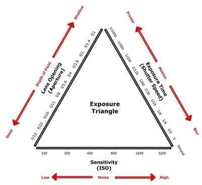
ISO is a measure of a camera’s light sensitivity; the higher the ISO, the less light it requires to expose an image.
The acronym actually stands for International Organization for Standardization [sic], the body which in 1974 combined the old ASA (American Standards Association) units of film speed with the German DIN standard. That’s why you’ll often hear the terms ISO and ASA used interchangeably. On some cameras, like the Alexa, you’ll see it called EI (Exposure Index) in the menus.
A common ISO to shoot at today is 800. One way of defining ISO 800 is that it’s the sensitivity required to correctly expose a key-light of 3 foot-candles with a lens of T-stop 1.4 and a 180° shutter at 24fps, as we saw in my Barry Lyndon blog.
If we double the ISO we double the effective sensitivity of the camera, or halve the amount of light it requires. So at ISO 1600 we would only need 1.5 foot-candles of light (all the other settings being the same), and at ISO 3200 we would need just 0.75 foot-candles. Conversely, at ISO 400 we would need 6 foot-candles, or 12 at ISO 200. Check out this exposure chart if it’s still unclear.
Just as altering the shutter angle (exposure time) has the side effect of changing the amount of motion blur, and altering the aperture affects the depth of field, so ISO has its own side effect: noise. Increase the ISO and you increase the electronic noise in the picture.
This is because turning the ISO up causes the camera to electronically boost the signals it’s receiving from the sensor. It’s exactly the same as turning up the volume on an amplifier; you hear more hiss because the noise floor is being boosted along with the signal itself.
I remember the days of Mini-DV cameras, which instead of ISO had gain; my Canon XL1 had gain settings of -3dB, +6dB and +12dB. It was the exact same thing, just with a different name. What the XL1 called 0dB of gain was what today we call the native ISO. It’s the ISO at which the camera is designed to give the best images.
ISO and Dynamic Range
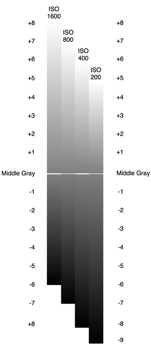
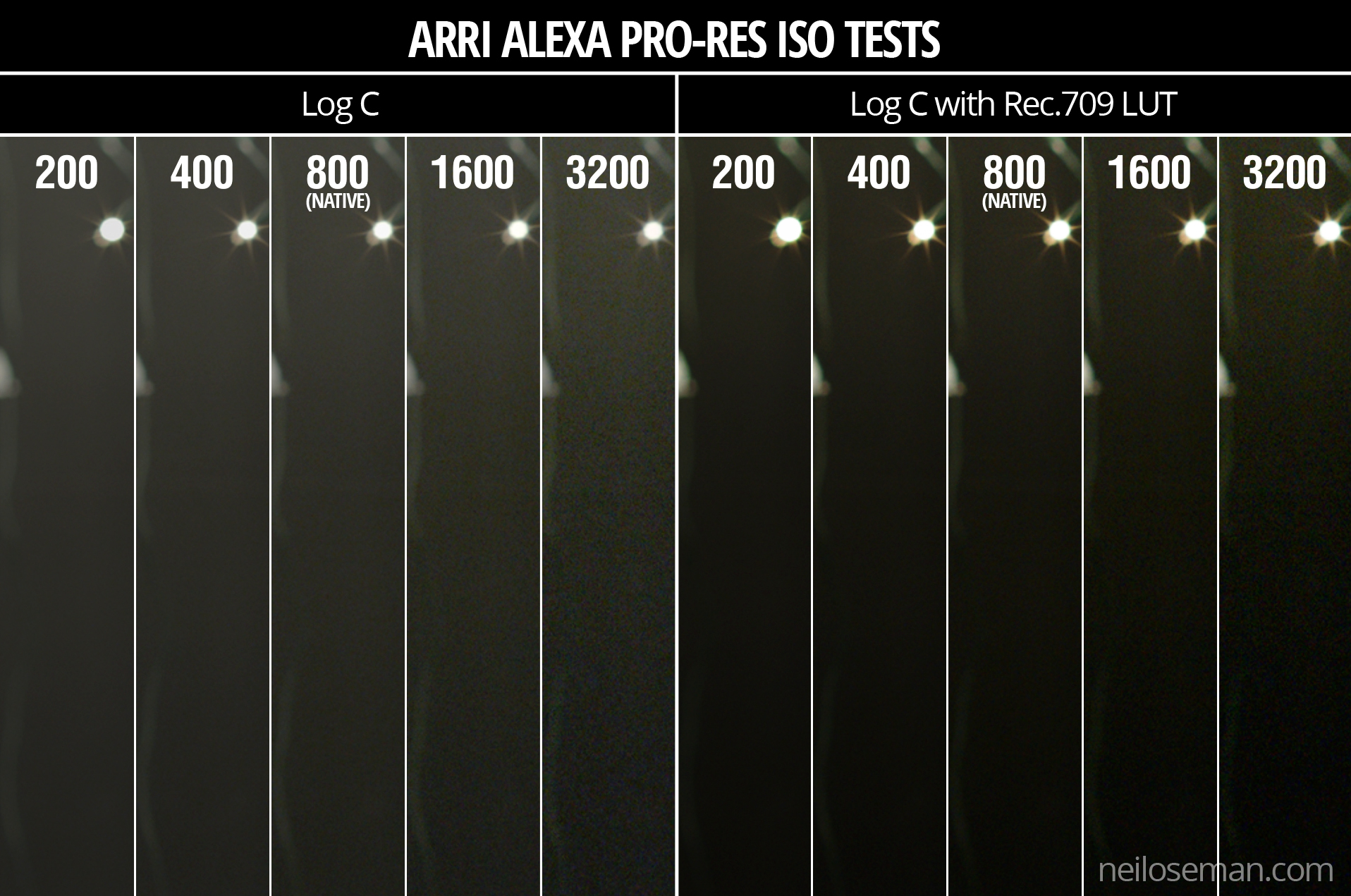
The Alexa has a dynamic range of 14 stops. That means it can simultaneously record detail in an area of brightness x and an area of brightness x times 2 to the power 14. At its native ISO of 800, those 14 stops of dynamic range are equally distributed above and below “correct” exposure (known as middle grey), so you can overexpose by up to 7 stops, and underexpose by up to 7 stops, without losing detail.
If you increase the ISO, those limits of under- and overexposure still apply, but they’re effectively shifted around middle grey, as the graphic to the left illustrates. (The Pro Video Coalition post this graphic comes from is a great read if you want more detail.) You will see the effects of this shifting of dynamic range very clearly in the test video and images below.
In principle, shooting at ISO 1600 is the same as shooting at ISO 800, underexposing by a stop (giving you more highlight detail) and then bringing it back up a stop in post. The boosting of the signal in that case would come right at the end of the image path instead of near the beginning, so the results would never be identical, but they’d be close. If you were on a bigger project with a DIT, you could create a LUT to bring the exposure up a stop which again would achieve much the same thing.
All of the above assumes you’re shooting log ProRes. If you’re shooting Raw then everything is simply recorded at the native ISO and any other ISO you select is merely metadata. But again, assuming you exposed for that other ISO (in terms of iris, shutter and ND filters), you will effectively get that same dynamic range shift, just further along the pipeline.
If this all got a bit too technical for you, don’t worry. Just remember:
Doubling the ISO
increases overall exposure by one stop,
gives you one more stop of detail in the highlights,
gives you one less stop of detail in the shadows, and
increases picture noise.
Halving the ISO
decreases overall exposure by one stop,
gives you one less stop of detail in the highlights,
gives you one more stop of detail in the shadows, and
decreases picture noise.
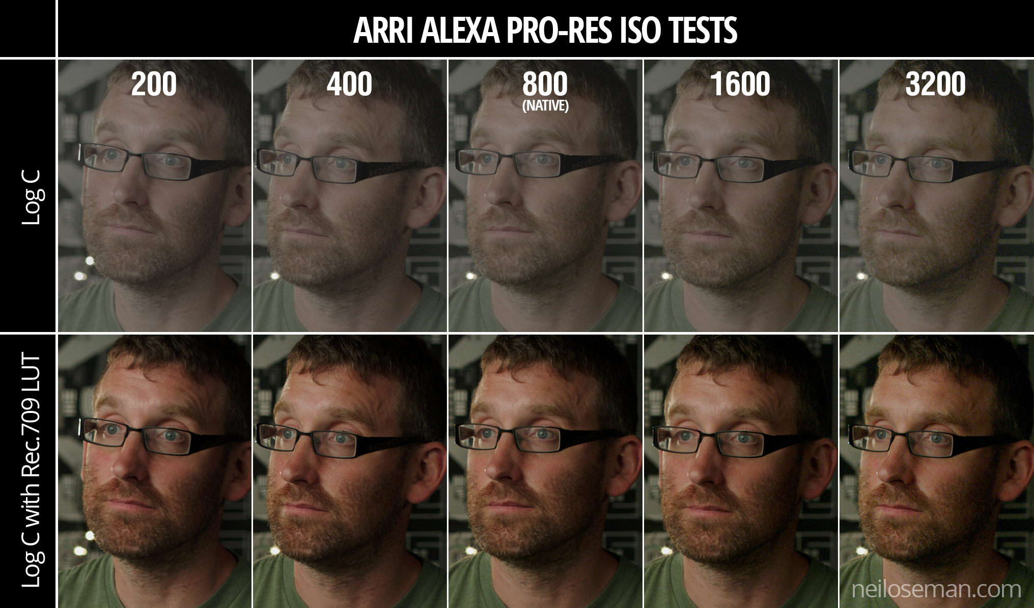
The Test
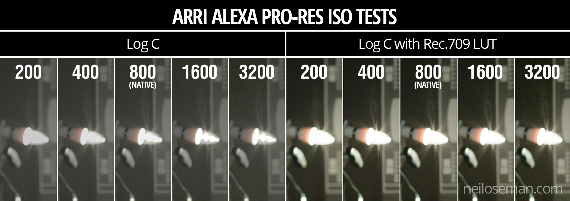
I lit the subject, Rupert “Are You Ready?” Peddle, with a 650W tungsten fresnel bounced off poly, and placed a 40W candle globe and some LED fairy lights in the background to show highlight clipping. We shot the tests in ProRes 4444 XQ on an Alexa XT Plus with a 32mm Cooke S4, altering the shutter angle to compensate for the changing ISOs. At ISO 400 the shutter angle was maxed out, so we opened the lens a stop for ISO 200.
We tested five settings, the ones corresponding to a series of stops (i.e. doublings or halvings of sensitivity): 200, 400, 800, 1600 and 3200. I have presented the tests in the video both as recorded in the original log C, and with a standard Rec.709 LUT.
You’ll need to watch the video at full-screen at 1080P to have any chance of seeing the differences, and even then you might see the compression artefacts caused by the noise more than the noise itself. Check out the stills below for a clearer picture of what’s going on. (Click on them for full resolution.)
Analysis
To me, the most important thing with every test is how skin tones are rendered. Looking at the original ProRes of these comparisons I think I see a little more life and vibrance in the skin tones at lower ISOs, but it’s extremely subtle. More noticeable is a magenta shift at the lower ISOs versus a green shift at higher ones. The contrast also increases with the ISO, as you can see most clearly in the log images.
At the lower ISOs you are not really aware of any noise in the picture. It’s only at ISO 1600 that it becomes noticeable, but I have to say that I really liked this level of noise; it gives the image a texture reminiscent of film grain. At ISO 3200 the noise is quite significant, and would probably be unacceptable to many people.
The really interesting thing for me was the shifting of the dynamic range. In the above comparison image, look at the globe in log – see how it starts off as one big white blob at ISO 200 and becomes more detailed as the ISO rises? Now look at the dark wall around the globe, both here and in the previous image – see how it subtly and smoothly graduates into darkness at the lower ISOs, but becomes a grainy mess at the higher ones?
I can see an immediate benefit to shooting at ISO 1600 in scenes lit predominantly with practicals. Such scenes tend to have a low overall level of illumination, while the practicals themselves often blow out on camera. Going to ISO 1600 would give me extra exposure and extra detail in the practicals. I would be sacrificing shadow detail, so I would have to be a little more careful not to underexpose any faces or other important elements of the frame, but I can deal with that. In fact, I often find myself determining my exposure in these types of scenes by how blown out the practicals are, wishing I could open up a little more to see the faces better but not wanting to turn the lamps into big white blobs. Increasing the ISO would be the perfect solution, so I’m very glad I did this test to alleviate my ungrounded fears.
What about scenarios in which a lower-than-native ISO would be useful? Perhaps a scene outside a building with an open door, where the dark interior is visible in the background and more detail is required in it. Or maybe one of those night scenes which in reality would be pitch black but for movie purposes have a low level of ambient light with no highlights.
I hope you’ve found this test as useful and interesting as I have. Watch this space or subscribe to my YouTube Channel for the lens test.
Thanks to Rupert Peddle, awesome steadicam op and focus puller – check out his site at pedhead.net – for appearing in front of the lens. Thanks also to Bex Clives, who was busy wrangling data from the lens tests while we were shooting these ISO tests, and of course Arri Rental UK.
This time last year, principal photography had just wrapped on Above the Clouds, a comedy road movie directed by Leon Chambers. We always knew that there would be additional photography, and several days of this have been scattered over the past year.
In May I spent a few odd days with Leon and the Yellow Peril, primarily capturing car-to-car tracking shots. Leon had already shot some of these without me up in Cumbria, so he had the technique down. He attached his Blackmagic Micro Cinema Camera to his roof rack with clamps and suction cups – three points of contact in all, to eliminate vibrations.
The focus was left fixed at the approximate distance the cars would be apart, and I could reach out of the passenger window and tweak it, along with the variable ND filter, if necessary. Recording was triggered from the custom remote which Leon had made for the camera last year when we used it for the autumn pick-ups. I monitored on a 5″ Blackmagic Video Assist which – thanks to a firmware update – now has a false colour display, which was very useful for keeping an eye on the exposure.
We had no means of panning or tilting the camera during takes, so we would frame the car centrally, allowing the maximum space to each side for when we went around the bends. This had the nice effect of making the Peril look small in the landscape, surrounded by it on all sides.
And speaking of the Peril looking small, it had shrunk considerably when I next saw it. But so had the landscape.
To keep the audience informed of the characters’ progress across Great Britain, Leon planned to cut to a map at a few strategic moments. At some point the original plan of shooting an Ordnance Survey map on a wall turned into something much more elaborate, a work of art featuring found objects, such as the lead character Charlie might have made herself.
Leon knew he wanted to use his jib to drift the camera over the map. But what camera? We both agreed that these shots needed to have a noticeably different look to the rest of the movie. Both Super-8 and Super-16 were discussed, but ultimately neither were viable. Then I suggested shooting on a full-frame DSLR to get a tiny depth of field. I imagined the camera having fixed focus as it skimmed over the map, with features coming in and out of focus as they passed through the field. We didn’t end up doing that, but Leon did like the DSLR idea.
Asahi Pentax-M 50mm/f1.4
So the decision was made to shoot on a Canon 5D Mk III belonging to focus puller Max Quinton. We ended up shooting everything on a single lens, my Asahi Pentax-M 50mm/f1.4. This is a vintage K-mount stills lens which is beautifully sharp, and we mounted it with a passive EF adapter. 50mm on full-frame is equivalent to 35mm on Super 35, very close to the 32mm which was our most used lens length during principal photography.
I added a half Soft FX filter as I usually do. I had briefly considered omitting it, to further differentiate the map shots from the rest of the film, but undiffused shots in a mostly diffused movie draw attention to the filtration and can be quite jarring.
I offered Leon two options for the lighting. One was to simulate the natural light you would see if shooting the British Isles from a high altitude, i.e. a hard sun source and ambient toplight. The other, which he went for, was to carry on the suggestion of Charlie making the map herself, and make it look like she had lit it herself too, with an eclectic mix of practicals around the edge. A couple of tungsten Chinese lanterns were hung overhead as well for soft fill. To help the camera’s limited dynamic range, I put tough-spun diffuser inside some of the practicals’ shades, on the camera side.
The Blackmagic 5″ Video Assist can be seen here mounted on the back of the camera.
There were a couple of “night” scenes on the shot list. For these we turned off the Chinese lanterns and turned on a desk-lamp practical with a blue-ish LED bulb to suggest moonlight. We also used a string of LED fairy lights to represent a road with streetlights.
For the smallest possible depth of field, everything was shot at f1.4. Even at ISO 320, in the daylight scenes it was necessary to add a 0.45 ND filter to bring the exposure down to f1.4. We shot on a neutral picture profile, piping the images via HDMI to the Blackmagic Video Assist, where they were recorded in ProRes 422 HQ.
After a few years shooting on Blackmagics, FS7s and Alexas, the 5D’s colour saturation and contrast seemed very pronounced to me, but that really suited the toy-like nature of the map. And the tiny depth of field made everything look even smaller and cuter than it already was.
So, that’s a wrap on Above the Clouds finally and forever. Apparently.
Stanley Kubrick’s 1975 period epic Barry Lyndon, although indifferently received upon its original release, is considered a masterpiece by many today. This is largely due to its painterly photography with strong, precisely composed frames that leave the viewer feeling more like they’ve wandered through an art gallery than watched a movie. Today I’m going to look at eight methods that Kubrick and his team used to create this feel. It’s an excellent example of how a director with a strong vision can use the many aspects of filmmaking to realise that vision.
1. Storytelling
The American Cinematographer article on Barry Lyndon notes that “Kubrick has taken a basically talky novel and magically transformed it into an intensely visual film.” You have only to look at a series of frame-grabs from the movie to see just how much of the story is contained in the images. Just like a painter, Kubrick reveals a wealth of narrative within a single frame. The shot above, for example, while recalling the landscapes of artists like Constable in its background and composition, also clearly tells the story of a courtship threatened by a third party with violent designs.
2. Design
Kubrick was keen for Lyndon to feature the type of rich fabrics which are often seen in 18th century art. He referred costume designer Milena Canonero to various painters of the period. “Stanley wanted beautiful materials,” she recalls in the documentary Stanley Kubrick: A Life in Pictures, “because as he quite rightly said, that’s why in those paintings they gave that wonderful light.”
3. Aspect ratio
There was much confusion and controversy surrounding Kubrick’s intended ratio for Lyndon. The negative was apparently hard-masked to 1.6:1, with the result that VHS and DVDs used this ratio, while the images were vertically cropped to 1.78:1 for the later Blu-ray release. However, the discovery in 2011 of a letter from Kubrick to cinema projectionists finally proved that 1.66:1 was the ratio he wanted audiences to see the film in.
1.66:1 was a standard ratio in parts of Europe, but unusual in the UK and USA. It’s not far off the golden ratio (1.6180:1) – a mathematically significant ratio which some artists believe to be aesthetically pleasing. There is evidence that Kubrick was not a fan of wide aspect ratios in general, perhaps because of his background as a photographer, but it can be no coincidence that Lyndon distances itself from the cinematic ratios of 1.85 and 2.39, and instead takes a shape closer to that of a typical painting.
(Most of the images in this post come from Evan Richards’ Cinematographers Index, and he in turn grabbed them from the 1.78:1 Blu-ray. The image above is in 1.66:1 but shows the 1.78:1 crop-lines.)
4. Composition
“The actual compositions of our setups were very authentic to the drawings of the period,” says DP John Alcott, BSC in his interview with American Cinematographer. Perhaps the film’s most obvious compositional nod to classical art is the large amount of headroom seen in the wide shots. As this article by Art Adams explains, the concept of placing the subject’s head at the top of the frame is fairly new in the history of image creation. Plenty of traditional art includes lots of headroom, and Lyndon does the same.
5. Camera movement
There is little camera movement in Barry Lyndon, but there are 36 zoom shots. Unlike a physical dolly move, in which the parallax effect causes different planes of the image to shrink or enlarge at differing rates, a zoom merely magnifies or reduces the whole image as a single element. This of course only serves to enhance the impression of a two-dimensional piece of art. In fact, the zooms resemble nothing so much as the rostrum camera moves a documentary filmmaker might make across a painting – what today we’d call a Ken Burns effect.
It’s interesting to note that, although Barry Lyndon is famous for its fast lenses – the f/0.7 Zeiss Planar primes – the movie also used a very slow lens, a custom-built T9 24-480mm zoom. From various accounts, other zooms used seem to include a Cooke T3.1 20-100mm and possibly a 25-250mm of some description. Of course, none of the zoom lenses were anywhere near fast enough for the candlelit scenes, so in those instances the filmmakers were forced to use a Planar and pull back physically on a dolly.
6. Lighting
“In preparation for Barry Lyndon we studied the lighting effects achieved in the paintings of the Dutch masters,” Alcott says. “In most instances we were trying to create the feeling of natural light within the houses, mostly stately homes, that we used as shooting locations.” The DP closely observed how natural light would come in through the windows and emulate that using diffused mini-brutes outside. This made it possible to shoot long days during the British winter when natural light was in short supply. Last week I covered in detail the technical innovations which allowed Alcott and Kubrick to shoot night scenes with just genuine candlelight, as 18th century painters would have seen and depicted them.
7. Contrast
Film stock in the seventies was quite contrasty, so Alcott employed a few methods to adjust his images to a tonal range more in keeping with 18th century paintings. He used a Tiffen No. 3 Low Contrast Filter at all times, with an additional brown net for the wedding scene “where I wanted to control the highlights on the faces a bit more,” he explains. He also used graduated ND filters (as in the above frame) both outdoors and indoors, if one side of the room was too bright. Most interestingly, he even went so far as to cover white fireplaces and doorways with fine black nets – not on the lens but on the objects themselves.
8. Blocking
The blocking in Barry Lyndon is often static. While this is certainly a creative decision by Kubrick, again recalling painted canvases and their frozen figures, it was also technically necessary in the candlelit scenes. Whenever the f/0.7 lenses were in use, the cast were apparently instructed to move as little as possible, to prevent them going out of focus. As one YouTube commenter points out, the stillness imposed by these lenses mirrors the stillness required of a painter’s model.


 The season two Breaking Bad episode “Grilled” sees out-of-their-depth crystal meth cooks Walter White and Jesse Pinkman taken hostage by crazy drug lord Tuco Salamanca. Realising that their only hope of escape lies in killing Tuco, Walter and Jesse plot to poison his burrito. The episode bristles with tension, generated not just through the script and performances, but also by flapping curtains which paint the scene with restless shadows. The scene appears to have been shot on location, so whether the wind was artificial or just a happy accident I don’t know, but either way it adds immeasurably to the atmosphere.