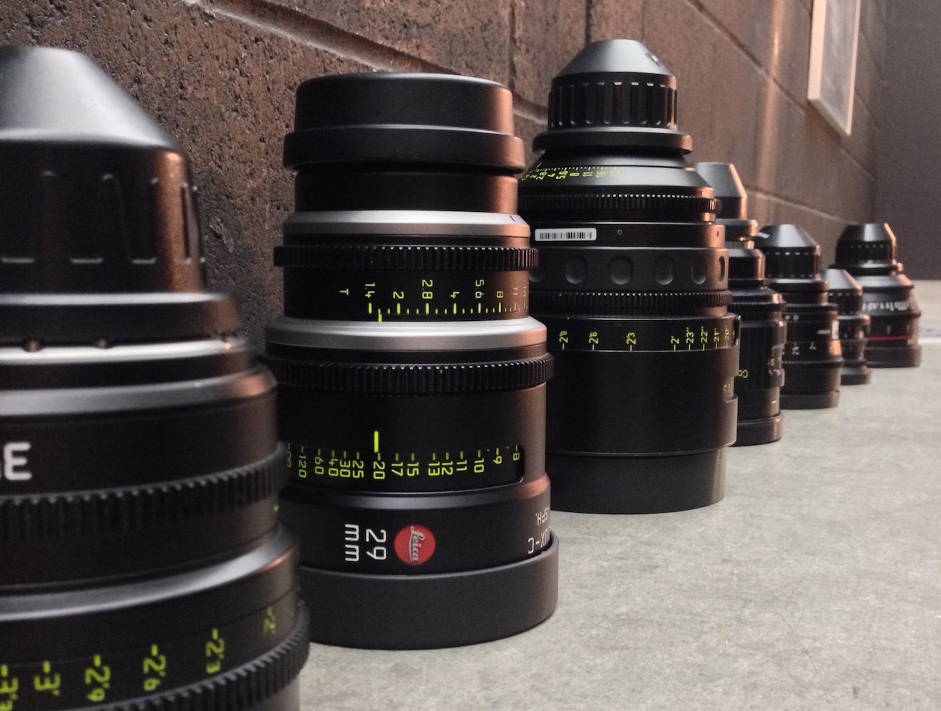
I’ve been thinking lately that I should learn more about what goes on inside a lens, so I looked around online and found this great series of YouTube videos. Warning: there’s a fair amount of maths!
Science of Cinematography
The Colour of Moonlight
What colour is moonlight? In cinema, the answer is often blue, but what is the reality? Where does the idea of blue moonlight come from? And how has the colour of cinematic moonlight evolved over the decades?
The science bit
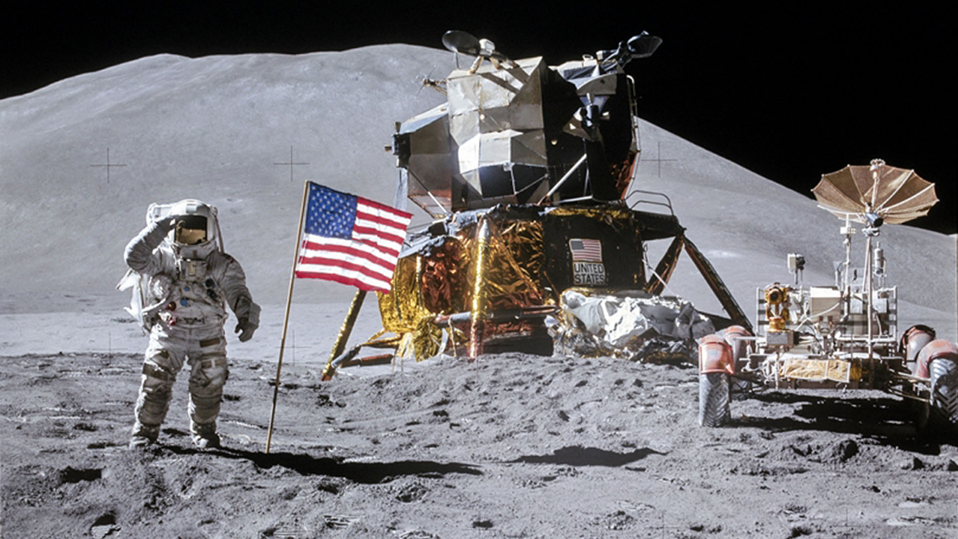
According to universetoday.com the lunar surface “is mostly oxygen, silicon, magnesium, iron, calcium and aluminium”. These elements give the moon its colour: grey, as seen best in photographs from the Apollo missions and images taken from space.
When viewed from Earth, Rayleigh scattering by the atmosphere removes the bluer wavelengths of light. This is most noticeable when the moon is low in the sky, when the large amount of atmosphere that the light has to travel through turns the lunar disc quite red, just as with the sun, while at its zenith the moon merely looks yellow.
Yellow is literally the opposite (or complement) of blue, so where on (or off) Earth did this idea of blue cinematic moonlight come from?
One explanation is that, in low light, our vision comes from our rods, the most numerous type of receptor in the human retina (see my article “How Colour Works” for more on this). These cells are more sensitive to blue than any other colour. This doesn’t actually mean that things look blue in moonlight exactly, just that objects which reflect blue light are more visible than those that don’t.
 In reality everything looks monochromatic under moonlight because there is only one type of rod, unlike the three types of cones (red, green and blue) which permit colour vision in brighter situations. I would personally describe moonlight as a fragile, silvery grey.
Blue moonlight on screen dates back to the early days of cinema, before colour cinematography was possible, but when enterprising producers were colour-tinting black-and-white films to get more bums on seats. The Complete Guide to Colour by Tom Fraser has this to say:
As an interesting example of the objectivity of colour, Western films were tinted blue to indicate nighttime, since our eyes detect mostly blue wavelengths in low light, but orange served the same function in films about the Far East, presumably in reference to the warm evening light there.
It’s entirely possible that that choice to tint night scenes blue has as much to do with our perception of blue as a cold colour as it does with the functioning of our rods. This perception in turn may come from the way our skin turns bluer when cold, due to reduced blood flow, and redder when hot. (We saw in my recent article on white balance that, when dealing with incandescence at least, bluer actually means hotter.)
Whatever the reason, by the time it became possible to shoot in colour, blue had lodged in the minds of filmmakers and moviegoers as a shorthand for night.
Examples
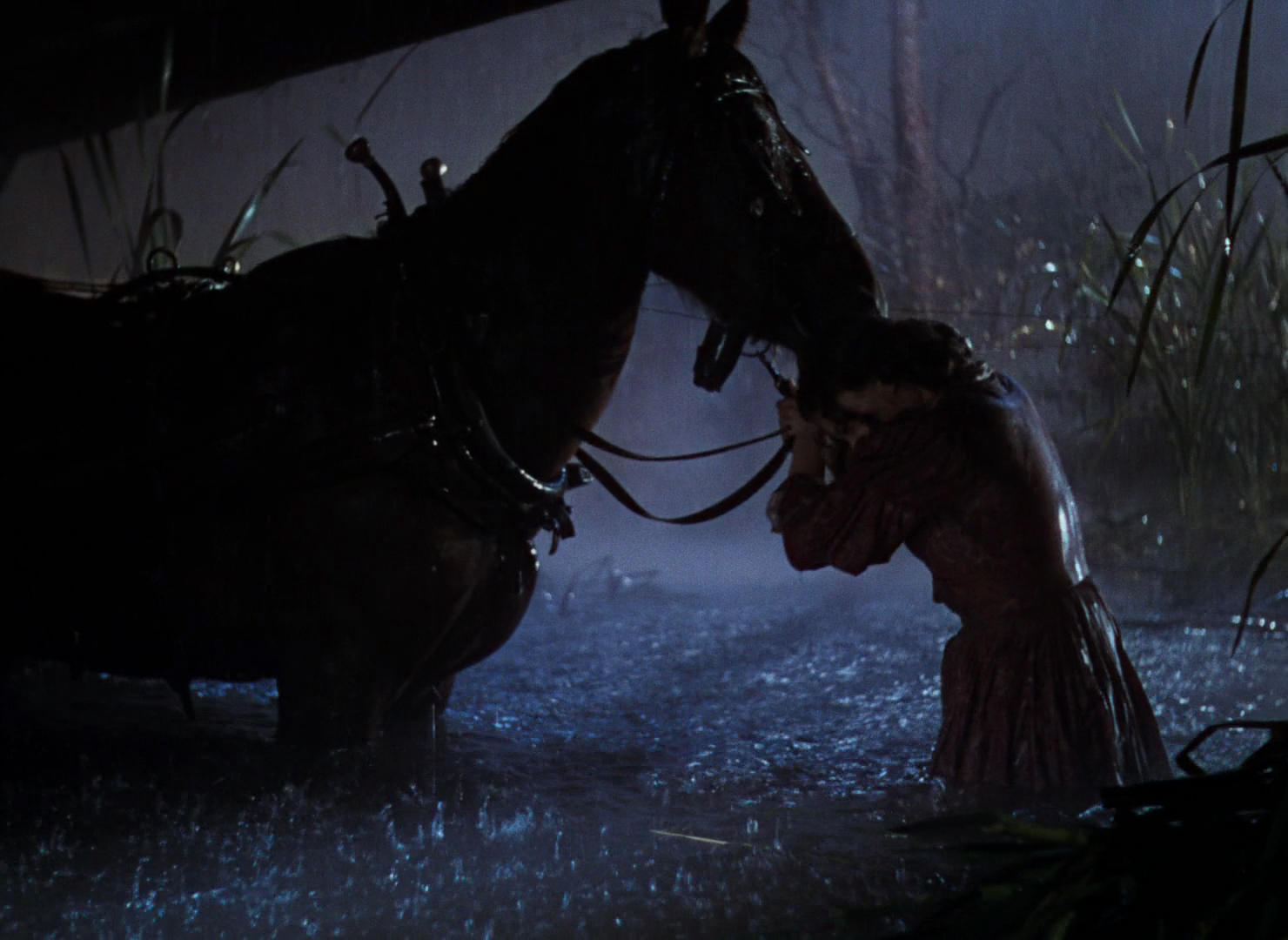
Early colour films often staged their night scenes during the day; DPs underexposed and fitted blue filters in their matte boxes to create the illusion. It is hard to say whether the blue filters were an honest effort to make the sunlight look like moonlight or simply a way of winking to the audience: “Remember those black-and-white films where blue tinting meant you were watching a night scene? Well, this is the same thing.”


Day-for-night fell out of fashion probably for a number of reasons: 1. audiences grew more savvy and demanded more realism; 2. lighting technology for large night exteriors improved; 3. day-for-night scenes looked extremely unconvincing when brightened up for TV broadcast. Nonetheless, it remains the only practical way to show an expansive seascape or landscape, such as the desert in Mad Max: Fury Road.

One of the big technological changes for night shooting was the availability of HMI lighting, developed by Osram in the late 1960s. With these efficient, daylight-balanced fixtures large areas could be lit with less power, and it was easy to render the light blue without gels by photographing on tungsten film stock.
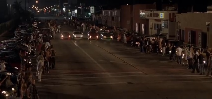
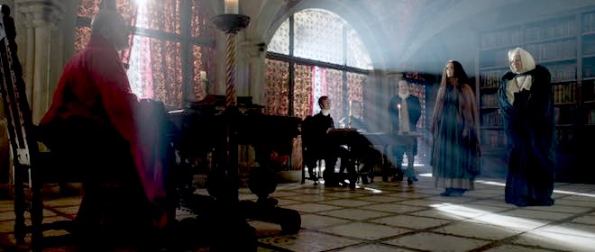
Cinematic moonlight reached a peak of blueness in the late 1980s and early ’90s, in keeping with the general fashion for saturated neon colours at that time. Filmmakers like Tony Scott, James Cameron and Jan de Bont went heavy on the candy-blue night scenes.


By the start of the 21st century bright blue moonlight was starting to feel a bit cheesy, and DPs were experimenting with other looks.

Speaking of the above ferry scene in War of the Worlds, Janusz Kaminski, ASC said:
I didn’t use blue for that night lighting. I wanted the night to feel more neutral. The ferryboat was practically illuminated with warm light and I didn’t want to create a big contrast between that light and a blue night look.
The invention of the digital intermediate (DI) process, and later the all-digital cinematography workflow, greatly expanded the possibilities for moonlight. It can now be desaturated to produce something much closer to the silvery grey of reality. Conversely, it can be pushed towards cyan or even green in order to fit an orange-and-teal scheme of colour contrast.
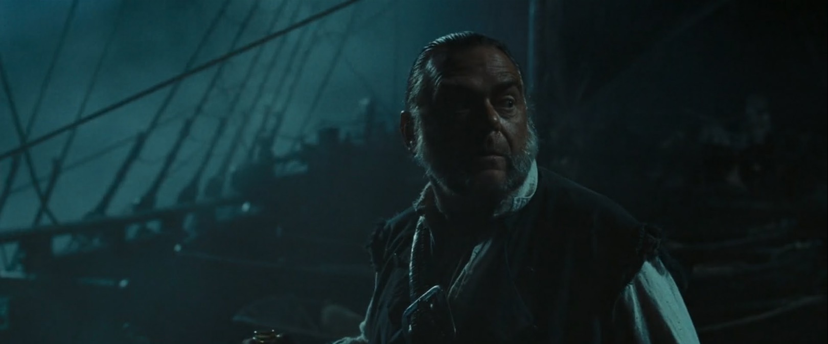
Darius Wolksi, ASC made this remark to American Cinematographer in 2007 about HMI moonlight on the Pirates of the Caribbean movies:
The colour temperature difference between the HMIs and the firelight is huge. If this were printed without a DI, the night would be candy blue and the faces would be red. [With a digital intermediate] I can take the blue out and turn it into more of a grey-green, and I can take the red out of the firelight and make it more yellow.
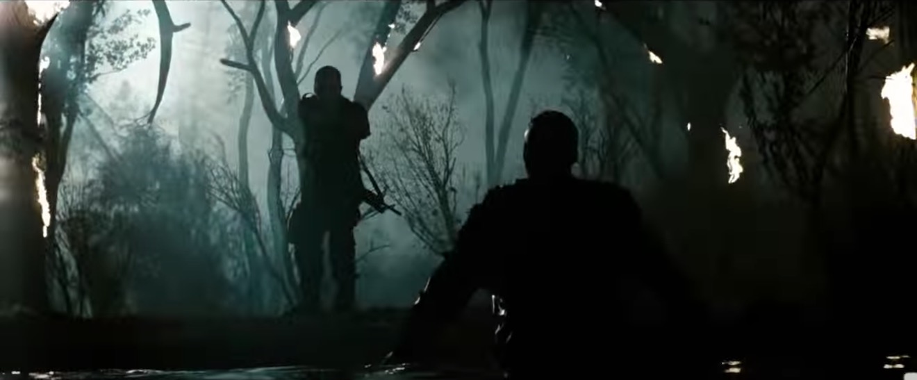

My favourite recent approach to moonlight was in the Amazon sci-fi series Tales from the Loop. Jeff Cronenweth, ASC decided to shoot all the show’s night scenes at blue hour, a decision motivated by the long dusks (up to 75 minutes) in Winnipeg, where the production was based, and the legal limits on how late the child actors could work.
The results are beautiful. Blue moonlight may be a cinematic myth, but Tales from the Loop is one of the few places where you can see real, naturally blue light in a night scene.
If you would like to learn how to light and shoot night scenes, why not take my online course, Cinematic Lighting? 2,300 students have enrolled to date, awarding it an average of 4.5 stars out of 5. Visit Udemy to sign up now.
The Art and Science of White Balance
Colour temperature starts with something mysterious called a “black body”, a theoretical object which absorbs all frequencies of electromagnetic radiation and emits it according to Planck’s Law. Put simply, Planck’s Law states that as the temperature of such a body increases, the light which it emits moves toward the blue end of the spectrum. (Remember from chemistry lessons how the tip of the blue flame was the hottest part of the Bunsen Burner?)
Colour temperature is measured in kelvins, a scale of temperature that begins at absolute zero (-273°C), the coldest temperature physically possible in the universe. To convert centigrade to kelvin, simply add 273.
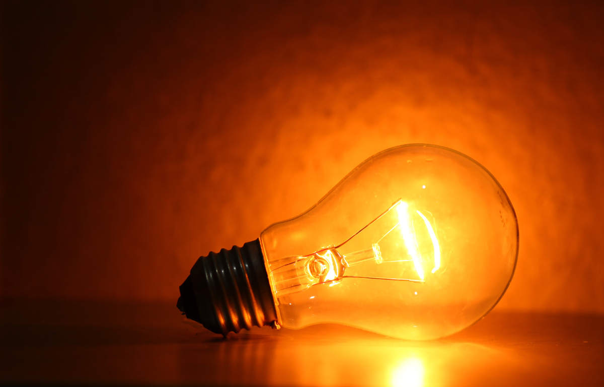 The surface of the sun has a temperature of 5,778K (5,505°C), so it emits a relatively blue light. The filament of a tungsten studio lamp reaches roughly 3,200K (2,927°C), providing more of an orange light. Connect that fixture to a dimmer and bring it down to 50% intensity and you might get a colour temperature of 2,950K, even more orange.
Incandescent lamps and the sun’s surface follow Planck’s Law fairly closely, but not all light sources rely on thermal radiation, and so their colour output is not dependent on temperature alone. This leads us to the concept of “correlated colour temperature”.
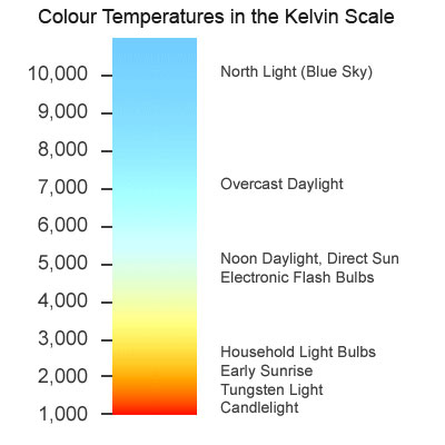 The correlated colour temperature of a source is the temperature which a black body would have to be at in order to emit the same colour of light as that source. For example, the earth’s atmosphere isn’t 7,100K hot, but the light from a clear sky is as blue as a Planckian body glowing at that temperature would be. Therefore a clear blue sky has a correlated colour temperature (CCT) of 7,100K.
LED and fluorescent lights can have their colour cast at least partly defined by CCT, though since CCT is one-dimensional, measuring only the amount of blue versus red, it may give us an incomplete picture. The amounts of green and magenta which LEDs and fluorescents emit varies too, and some parts of the spectrum might be missing altogether, but that’s a whole other can of worms.
The human eye-brain system ignores most differences of colour temperature in daily life, accepting all but the most extreme examples as white light. In professional cinematography, we choose a white balance either to render colours as our eyes perceive them or for creative effect.
Most cameras today have a number of white balance presets, such as tungsten, sunny day and cloudy day, and the options to dial in a numerical colour temperature directly or to tell the camera that what it’s currently looking at (typically a white sheet of paper) is indeed white. These work by applying or reducing gain to the red or blue channels of the electronic image.
Interestingly, this means that all cameras have a “native” white balance, a white balance setting at which the least total gain is applied to the colour channels. Arri quotes 5,600K for the Alexa, and indeed the silicon in all digital sensors is inherently less sensitive to blue light than red, making large amounts of blue gain necessary under tungsten lighting. In an extreme scenario – shooting dark, saturated blues in tungsten mode, for example – this might result in objectionable picture noise, but the vast majority of the time it isn’t an issue.
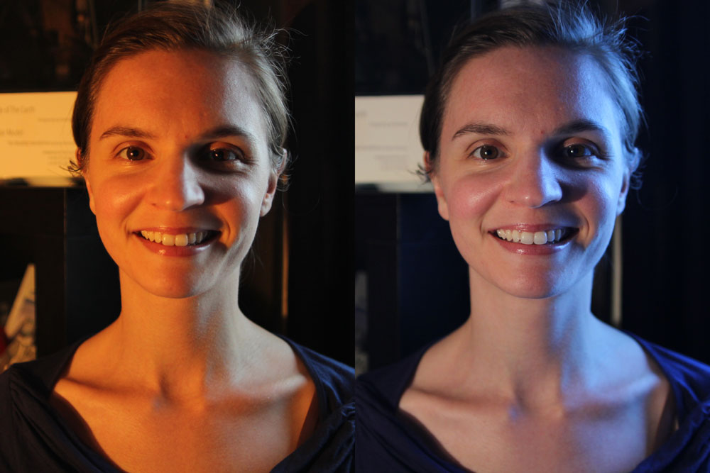
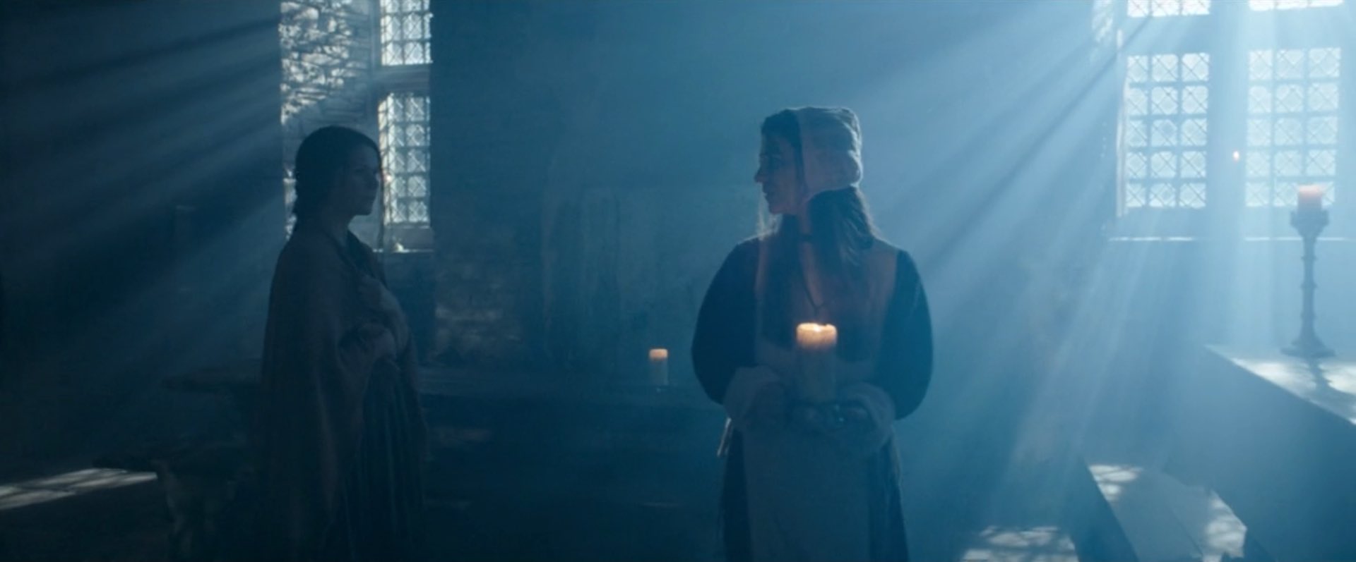
The difficulty with white balance is mixed lighting. A typical example is a person standing in a room with a window on one side of them and a tungsten lamp on the other. Set your camera’s white balance to daylight (perhaps 5,600K) and the window side of their face looks correct, but the other side looks orange. Change the white balance to tungsten (3,200K) and you will correct that side of the subject’s face, but the daylight side will now look blue.
Throughout much of the history of colour cinematography, this sort of thing was considered to be an error. To correct it, you would add CTB (colour temperature blue) gel to the tungsten lamp or perhaps even place CTO (colour temperature orange) gel over the window. Nowadays, of course, we have bi-colour and RGB LED fixtures whose colour temperature can be instantly changed, but more importantly there has been a shift in taste. We’re no longer tied to making all light look white.

To give just one example, Suzie Lavelle, award-winning DP of Normal People, almost always shoots at 4,300K, halfway between typical tungsten and daylight temperatures. She allows her practical lamps to look warm and cozy, while daylight sources come out as a contrasting blue.
It is important to understand colour temperature as a DP, so that you can plan your lighting set-ups and know what colours will be obtained from different sources. However, the choice of white balance is ultimately a creative one, perhaps made at the monitor, dialling through the kelvins to see what you like, or even changed completely in post-production.
How is Dynamic Range Measured?

Recently I’ve been pondering which camera to shoot an upcoming project on, so I consulted the ASC’s comparison chart. Amongst the many specs compared is dynamic range, and I noticed that the ARRI Alexa’s was given as 14+ stops, while the Blackmagic URSA’s is 15. Having used both cameras a fair bit, I can tell you that there’s no way in Hell that the Ursa has a higher dynamic range than the Alexa. So what’s going on here?
What is dynamic range?
To put it simply, dynamic range is the level of contrast that an imaging system can handle. To quote Alan Roberts, who we’ll come back to later:
This is normally calculated as the ratio of the exposure which just causes white clipping to the exposure level below which no details can be seen.
A photosite on a digital camera’s sensor outputs a voltage proportional to the amount of light hitting it, but at some point the voltage reaches a maximum, and no matter how much more light you add, it won’t change. At the other end of the scale, a photosite may receive so little light that it outputs no voltage, or at least nothing that’s discernible from the inherent electronic noise in the system. These upper and lower limits of brightness may be narrowed by image processing within the camera, with RAW recording usually retaining the full dynamic range, while linear Rec. 709 severely curtails it.
In photography and cinematography, we measure dynamic range in stops – doublings and halvings of light which I explain fully in this article. One stop is a ratio of 2:1, five stops are 32:1, thirteen stops are almost 10,000:1
It’s worth pausing here to point out the difference between dynamic range and latitude, a term which is sometimes regarded as synonymous, but it’s not. The latitude is a measure of how much the camera can be over- or under-exposed without losing any detail, and is dependent on both the dynamic range of the camera and the dynamic range of the scene. (A low-contrast scene will allow more latitude for incorrect exposure than a high-contrast scene.)
Problems of Measurement
Before digital cinema cameras were developed, video had a dynamic range of about seven stops. You could measure this relatively easily by shooting a greyscale chart and observing the waveform of the recorded image to see where the highlights levelled off and the shadows disappeared into the noise floor. With today’s dynamic ranges into double digits, simple charts are no longer practical, because you can’t manufacture white enough paper or black enough ink.
For his excellent video on dynamic range, Filmmaker IQ’s John Hess built a device fitted with a row of 1W LEDs, using layers of neutral density gel to make each one a stop darker than its neighbour. For the purposes of his demonstration, this works fine, but as Phil Rhodes points out on RedShark News, you start running into the issue of the dynamic range of the lens.
 It may seem strange to think that a lens has dynamic range, and in the past when I’ve heard other DPs talk about certain glass being more or less contrasty, I admit that I haven’t thought much about what that means. What it means is flare, and not the good anamorphic streak kind, but the general veiling whereby a strong light shining into the lens will raise the overall brightness of the image as it bounces around the different elements. This lifts the shadows, producing a certain amount of milkiness. Even with high contrast lenses, ones which are less prone to veiling, the brightest light on your test device will cause some glare over the darkest one, when measuring the kind of dynamic range today’s cameras enjoy.
Manufacturer Measurements
Going back to my original query about the Alexa versus the URSA, let’s see exactly what the manufacturers say. ARRI specifically states that its sensor’s dynamic range is over 14 stops “as measured with the ARRI Dynamic Range Test Chart”. So what is this chart and how does it work? The official sales blurb runs thusly:
The ARRI DRTC-1 is a special test chart and analysis software for measurement of dynamic range and sensitivity of digital cameras. Through a unique stray light reduction concept this system is able to accurately measure up to 15.5 stops of dynamic range.
The “stray light reduction” is presumably to reduce the veiling mentioned earlier and provide more accurate results. This could be as simple as covering or turning off the brighter lights when measuring the dimmer ones.
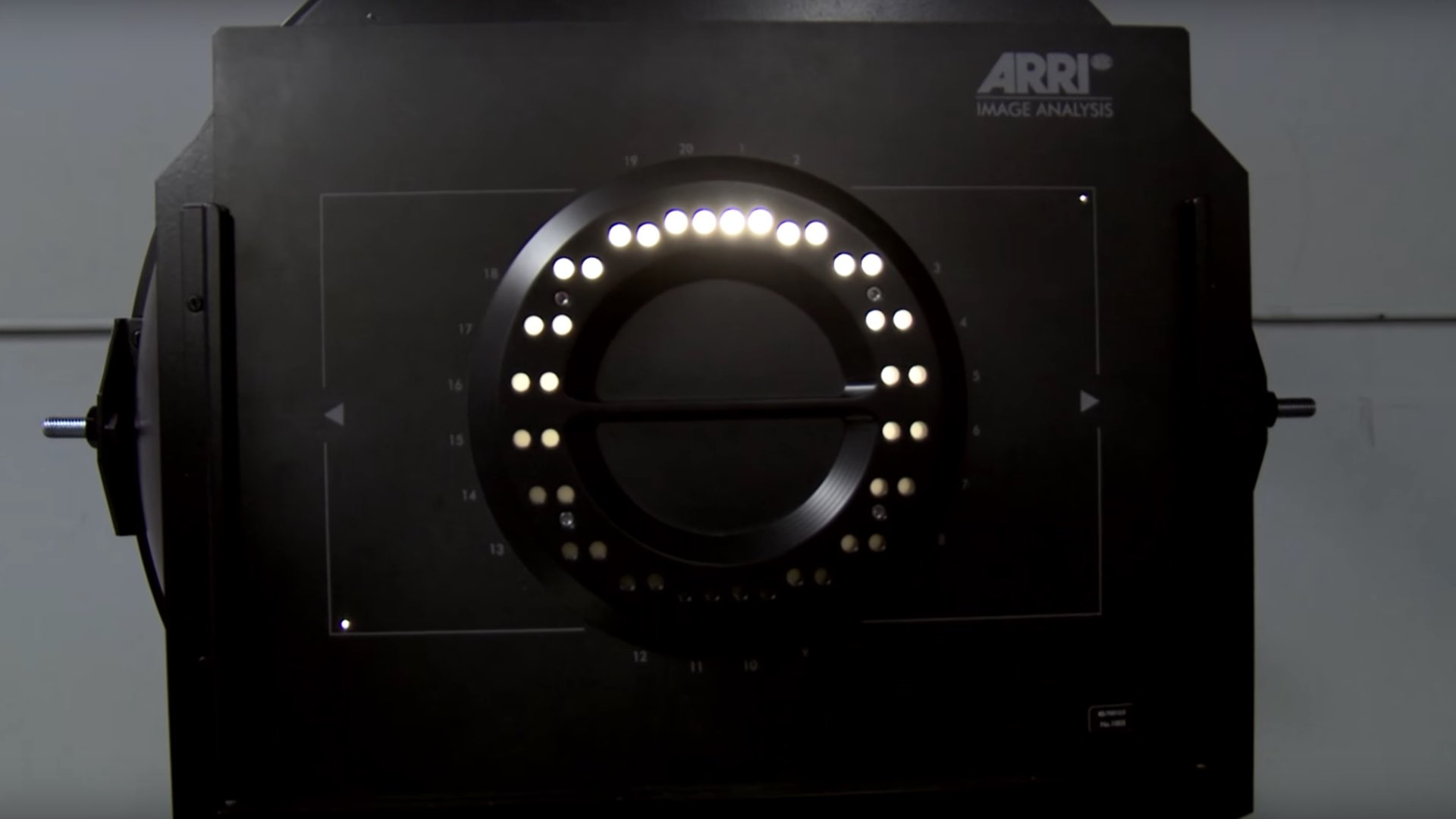
I found a bit more information about the test chart in a 2011 camera shoot-out video, from that momentous time when digital was supplanting film as the cinematic acquisition format of choice. Rather than John Hess’s ND gel technique, the DRTC-1 opts for something else to regulate its light output, as ARRI’s Michael Bravin explains in the video:
There’s a piece of motion picture film behind it that’s checked with a densitometer, and what you do is you set the exposure for your camera, and where you lose detail in the vertical and horizontal lines is your clipping point, and where you lose detail because of noise in the shadow areas is your lowest exposure… and in between you end up finding the number of stops of dynamic range.
Blackmagic Design do not state how they measure the dynamic range of their cameras, but it may be a DSC Labs Xlya. This illuminated chart boasts a shutter system which “allows users to isolate and evaluate individual steps”, plus a “stepped xylophone shape” to minimise flare problems.
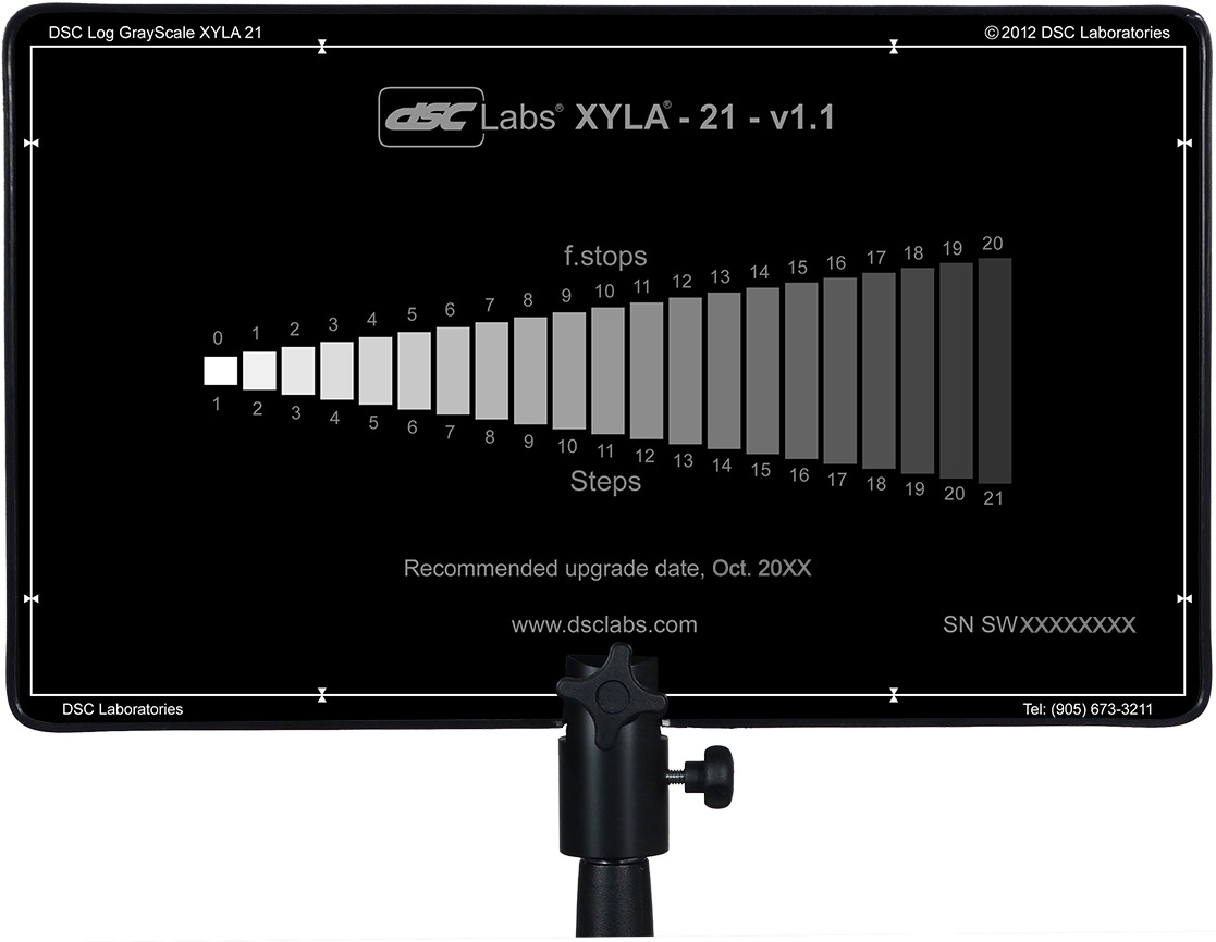
Art Adams, a cinema lens specialist at ARRI, and someone who’s frequently quoted in Blain Brown’s Cinematography: Theory & Practice, told Y.M. Cinema Magazine:
I used to do a lot of consulting with DSC Labs, who make camera test charts, so I own a 20-stop dynamic range chart (DSC Labs Xyla). This is what most manufacturers use to test dynamic range (although not ARRI, because our engineers don’t feel it’s precise enough) and I see what companies claim as usable stops. You can see that they are just barely above the noise floor.
Conclusions
Obviously these ARRI folks I keep quoting may be biased. I wanted to find an independent test that measures both Blackmagics and Alexas with the same conditions and methodology, but I couldn’t find one. There is plenty of anecdotal evidence that Alexas have a bigger dynamic range, in fact that’s widely accepted as fact, but quantifying the difference is harder. The most solid thing I could find is this, from a 2017 article about the Blackmagic Ursa Mini 4.6K (first generation):
The camera was measured at just over 14 stops of dynamic range in RAW 4:1 [and 13 stops in ProRes]. This is a good result, especially considering the price of the camera. To put this into perspective Alan measured the Canon C300 mkII at 15 stops of dynamic range. Both the URSA Mini 4.6 and C300 mkII are bettered by the ARRI Alexa and Amira, but then that comes as no surprise given their reputation and price.
The Alan mentioned is Alan Roberts, something of a legend when it comes to testing cameras. It is interesting to note that he is one of the key players behind the TLCI (Television Lighting Consistency Index), a mooted replacement for CRI (Colour Rendering Index). It’s interesting because this whole dynamic range business is starting to remind me of my investigation into CRI, and is leading me to a similar conclusion, that the numbers which the manufacturers give you are all but useless in real-world cinematography.
Whereas CRI at least has a standardised test, there’s no such thing for dynamic range. Therefore, until there is more transparency from manufacturers about how they measure it, I’d recommend ignoring their published values. As always when choosing a camera, shoot your own tests if at all possible. Even the most reliable numbers can’t tell you whether you’re going to like a camera’s look or not, or whether it’s right for the story you want to tell.
When tests aren’t possible, and I know that’s often the case in low-budget land, at least try to find an independent comparison. I’ll leave you with this video from the Slanted Lens, which compares the URSA Mini Pro G2 with the ARRI Amira (which uses the same Alev III sensor as the Alexa). They don’t measure the dynamic range, but you can at least see the images side by side, and in the end it’s the images that matter, not the numbers.
How Digital Sensors Work
Last week I delved into the science of how film captures an image. This time we’ll investigate the very different means by which electronic sensors achieve the same result.
CCD
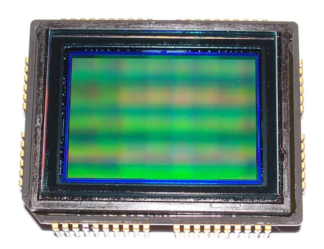
In the twentieth century, the most common type of electronic imaging sensor was the charge-coupled device or CCD. A CCD is made up of metal-oxide-semiconductor (MOS) capacitors, invented by Bell Labs in the late fifties. Photons striking a MOS capacitor give it a charge proportional to the intensity of the light. The charges are passed down the line through adjacent capacitors to be read off by outputs at the edges of the sensor. This techniques limits the speed at which data can be output.
My first camcorder, an early nineties analogue 8mm video device by Sanyo, contained a single CCD. Professional cameras of that time had three: one sensor each for red, green and blue. Prisms and dichroic filters would split the image from the lens onto these three CCDs, resulting in high colour fidelity.
A CCD alternates between phases of capture and read-out, similar to how the film in a traditional movie camera pauses to record the image, then moves on through the gate while the shutter is closed. CCD sensors therefore have a global shutter, meaning that the whole of the image is recorded at the same time.
CCDs are still used today in scientific applications, but their slow data output, higher cost and greater power consumption have seen them fall by the wayside in entertainment imaging, in favour of CMOS.
CMOS
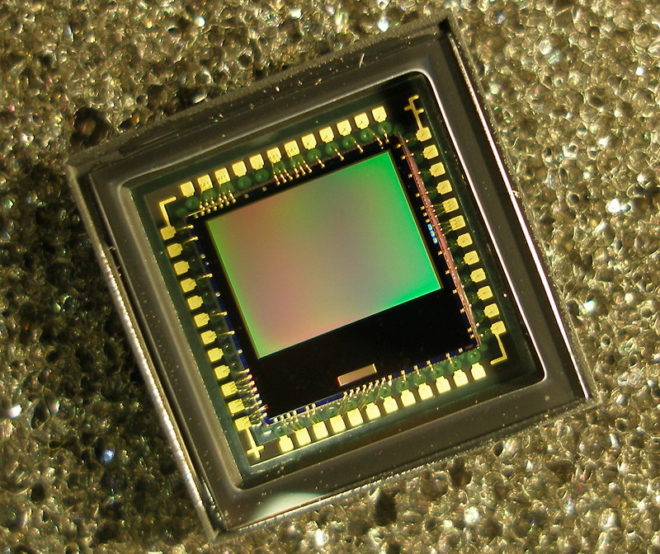
Complementary metal-oxide-semiconductor sensors (a.k.a. APS or active-pixel sensors) have been around just as long as their CCD cousins, but until the turn of the millennium they were not capable of the same imaging quality.
Each pixel of a typical CMOS sensors consists of a pinned photodiode, to detect the light, and a metal-oxide-semiconductor field-effect transistor. This MOSFET is an amplifier – putting the “active” into the name “active-pixel sensor” – which reduces noise and converts the photodiode’s charge to a voltage. Other image processing technology can be built into the sensor too.
The primary disadvantage of CMOS sensors is their rolling shutter. Because they capture an image row by row, top to bottom, rather than all at once, fast-moving subjects will appear distorted. Classic examples include vertical pillars bending as a camera pans quickly over them, or a photographer’s flash only lighting up half of the frame. (See the video below for another example, shot an iPhone.) The best CMOS sensors read the rows quickly, reducing this distortion but not eliminating it.
CMOS sensors are cheaper, less power-hungry, and not suspectible to the highlight blooming or smearing of CCDs. They are also faster in terms of data output, and in recent years their low-light sensitivity has surpassed CCD technology too.
Beyond the Sensor
The analogue voltages from the sensor, be it CCD or CMOS, are next passed to an analogue-to-digital convertor (ADC) and thence to the digital signal processor (DSP). How much work the DSP does depends whether you’re recording in RAW or not, but it could include things like correcting the gamma and colour balance, and converting linear values to log. Debayering the image is a very important task for the DSP, and I’ve covered this in detail in my article on how colour works.
After the DSP, the signal is sent to the monitor outputs and the storage media, but that’s another story.
How Film Works
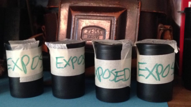
Over the ten weeks of lockdown to date, I have accumulated four rolls of 35mm film to process. They may have to wait until it is safe for me to visit my usual darkroom in London, unless I decide to invest in the equipment to process film here at home. As this is something I’ve been seriously considering, I thought this would be a good time to remind myself of the science behind it all, by describing how film and the negative process work.
Black and White
The first thing to understand is that the terminology is full of lies. There is no celluloid involved in film – at least not any more – and there never has been any emulsion.
However, the word “film” itself is at least accurate; it is quite literally a strip of plastic backing coated with a film of chemicals, even if that plastic is not celluloid and those chemicals are not an emulsion. Celluloid (cellulose mononitrate) was phased out in the mid-twentieth century due to its rampant inflammability, and a variety of other flexible plastics have been used since.
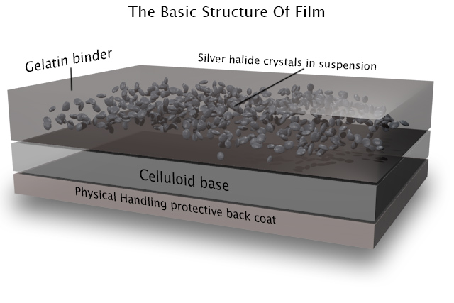
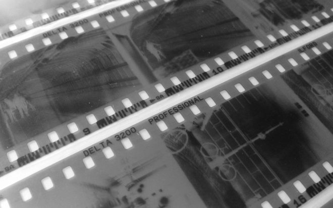
As for “emulsion”, it is in fact a suspension of silver halide crystals in gelatine. The bigger the crystals, the grainier the film, but the more light-sensitive too. When the crystals are exposed to light, tiny specks of metallic silver are formed. This is known as the latent image. Even if we could somehow view the film at this stage without fogging it completely, we would see no visible image as yet.
For that we need to process the film, by bathing it in a chemical developer. Any sufficiently large specks of silver will react with the developer to turn the entire silver halide crystal into black metallic silver. Thus areas that were exposed to light turn black, while unlit areas remain transparent; we now have a negative image.
Before we can examine the negative, however, we must use a fixer to turn the unexposed silver halide crystals into a light-insensitive, water-soluble compound that we can wash away.
Now we can dry our negative. At this stage it can be scanned for digital manipulation, or printed photo-chemically. This latter process involves shining light through the negative onto a sheet of paper coated with more photographic emulsion, then processing and fixing that paper as with the film. (As the paper’s emulsion is not sensitive to the full spectrum of light, this procedure can be carried out under dim red illumination from a safe-light.) Crystals on the paper turn black when exposed to light – as they are through the transparent portions of the negative, which you will recall correspond to the shadows of the image – while unexposed crystals again remain transparent, allowing the white of the paper to show through. Thus the negative is inverted and a positive image results.
Colour
Things are a little more complicated with colour, as you might expect. I’ve never processed colour film myself, and I currently have no intention of trying!
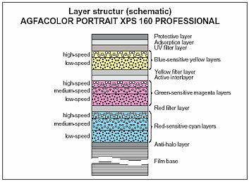
The main difference is that the film itself contains multiple layers of emulsion, each sensitive to different parts of the spectrum, and separated by colour filters. When the film is developed, the by-products of the chemical reaction combine with colour couplers to create colour dyes.
An additional processing step is introduced between the development and the fixing: the bleach step. This converts the silver back to silver halide crystals which are then removed during fixing. The colour dyes remain, and it is these that form the image.
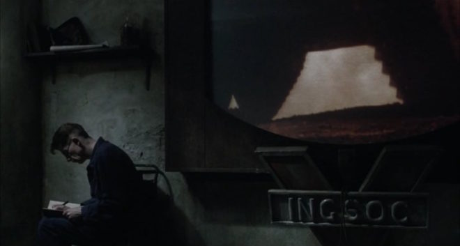
Many cinematographers will have heard of a process call bleach bypass, used on such movies as 1984 and Saving Private Ryan. You can probably guess now that this process means skipping or reducing the bleach step, so as to leave the metallic silver in the negative. We’ve seen that this metallic silver forms the entire image in black-and-white photography, so by leaving it in a colour negative you are effectively combining colour and black-and-white images in the same frame, resulting in low colour saturation and increased contrast.
Colour printing paper also contains colour couplers and is processed again with a bleach step. Because of its spectral sensitivity, colour papers must be printed and processed in complete darkness or under a very weak amber light.
Coming Up
In future posts I will cover the black-and-white processing and printing process from a much more practical standpoint, guiding you through it, step by step. I will also look at the creative possibilities of the enlargement process, and we’ll discover where the Photoshop “dodge” and “burn” tools had their origins. For those of you who aren’t Luddites, I’ll delve into how digital sensors capture and process images too!
The Science of Smoke
Smoke, haze, atmos, whatever you want to call it, anyone who knows me knows that I’m a big fan. But how does it work and what is the purpose of smoking up a set?
Aerial perspective
At the most basic level, smoke simulates a natural phenomenon called aerial perspective. If you look at – for example – a range of mountains receding into the distance, the further mountains will appear bluer, lighter, less contrasty and less colour-saturated than the nearer mountains.

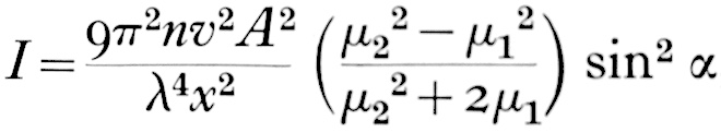
This effect is due to light being scattered by particles naturally suspended in the air, and by molecules of the air itself. It is described by the scary-looking Rayleigh Equation:
We don’t need to get into what all the variables stand for, but there are a couple of things worth noting:
- The symbol on the far right represents the angle between the incident light and the scattered light. In practice this means that the more you shoot into the sun – the more the air you’re photographing is backlit – the more scattering there will be. Place the sun behind your camera and scattering will be minimal.
- Lamda (the sort of upside-down y next to the x) is the wavelength of the light, so the shorter the wavelength, the more scattering. This is why things look bluer with distance: blue light has a shorter wavelength and so is scattered more. It’s also why shooting through an ultraviolet filter reduces the appearance of aerial perspective/atmospheric haze.
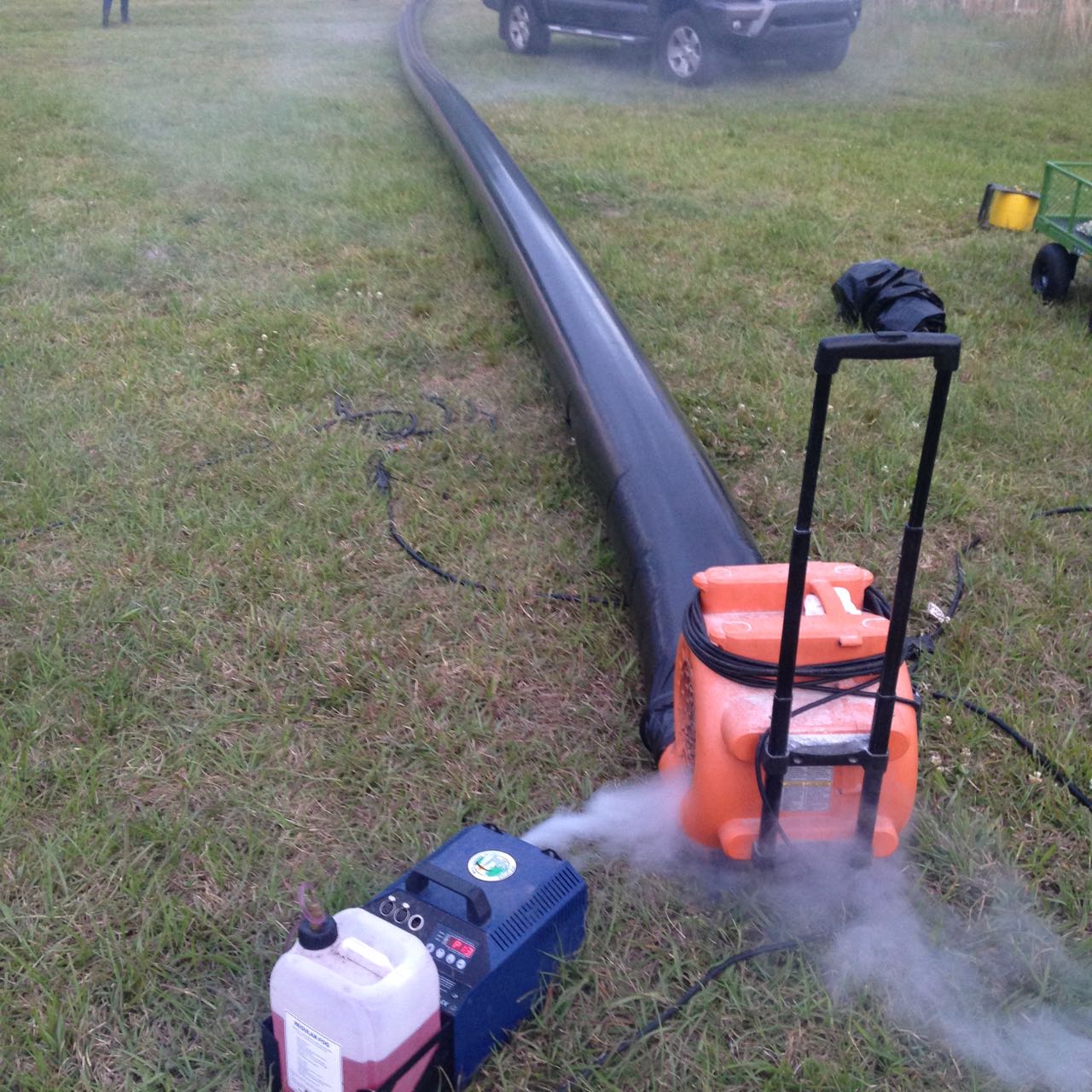
How smoke works
Foggers, hazers and smoke machines simulate aerial perspective by adding suspended particles to the air. These particles start off as smoke fluid (a.k.a. “fog juice”) which is made of mineral oil, or of a combination of water and glycol/glycerin.
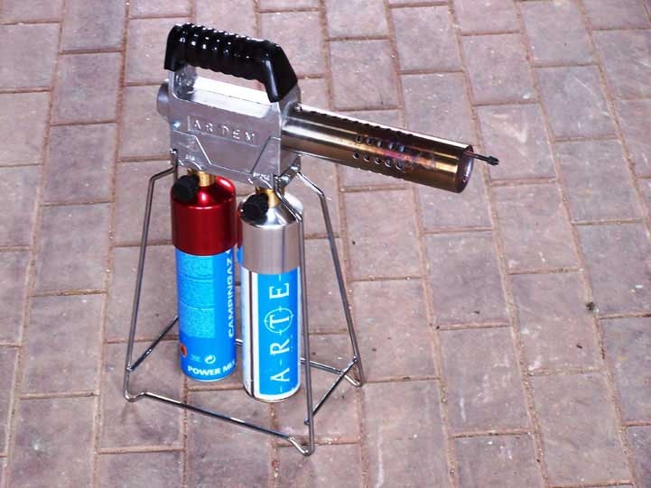
In a smoke machine or gas-powered smoke gun (like the Artem), smoke fluid is pushed into a heat exchanger which vaporises it. When the vapour makes contact with the colder air, it condenses to form fog.
A hazer uses compression rather than heat to vaporise the fluid, meaning you don’t have to wait for the machine to heat up. The particles are smaller, making for a more subtle and longer-lasting effect.
As a general rule, you should use only hazers for interior cinematography, unless there is a story reason for smoke to be present in the scene. Outdoors, however, hazers are ineffective. An Artem or two will work well for smaller exterior scenes; for larger ones, a Tube of Death is the best solution. This is a long, plastic inflatable tube with regularly-spaced holes, with a fan and a smoke machine (usually electric) at the end. It ensures that smoke is distributed fairly evenly over a large area.
The effects of smoke
Just like aerial perspective, smoke/haze separates the background from the foreground, as the background has more smoke between it and the camera. The background becomes brighter, less contrasty, less saturated and (depending on the type of smoke) bluer, making the foreground stand out against it.
Since smoke also obeys the Rayleigh Equation, it shows up best when it’s backlit, a bit when it’s side-lit and barely at all when front-lit.
Here are some of the other things that smoke achieves:
- It diffuses the image, particularly things further away from camera.
- It lowers contrast.
- It brightens the image.
- It lifts the shadows by scattering light into them.
- If it’s sufficiently thick, and particularly if it’s smoke rather than haze, it adds movement and texture to the image, which helps to make sets look less fake.
- It volumises the light, showing up clear shafts of hard light and diffuse pools of soft light. (For more on this, read 5 Tips for Perfect Shafts of Light.)
- Backlit smoke in front of a person or an object will obscure them, concealing identity.


How Big a Light do I Need?
 Experience goes a long way, but sometimes you need to be more precise about what size of lighting instruments are required for a particular scene. Night exteriors, for example; you don’t want to find out on the day that the HMI you hired as your “moon” backlight isn’t powerful enough to cover the whole of the car park you’re shooting in. How can you prep correctly so that you don’t get egg on your face?
There are two steps: 1. determine the intensity of light you require on the subject, and 2. find a combination of light fixture and fixture-to-subject distance that will provide that intensity.
The Required intensity
The goal here is to arrive at a number of foot-candles (fc). Foot-candles are a unit of light intensity, sometimes more formally called illuminance, and one foot-candle is the illuminance produced by a standard candle one foot away. (Illuminance can also be measured in the SI unit of lux, where 1 fc ≈ 10 lux, but in cinematography foot-candles are more commonly used. It’s important to remember that illuminance is a measure of the light incident to a surface, i.e. the amount of light reaching the subject. It is not to be confused with luminance, which is the amount of light reflected from a surface, or with luminous power, a.k.a. luminous flux, which is the total amount of light emitted from a source.)
Usually you start with a T-stop (or f-stop) that you want to shoot at, based on the depth of field you’d like. You also need to know the ISO and shutter interval (usually 1/48th or 1/50th of a second) you’ll be shooting at. Next you need to convert these facets of exposure into an illuminance value, and there are a few different ways of doing this.
One method is to use a light meter, if you have one, which you enter the ISO and shutter values into. Then you wave it around your office, living room or wherever, pressing the trigger until you happen upon a reading which matches your target f-stop. Then you simply switch your meter into foot-candles mode and read off the number. This method can be a bit of a pain in the neck, especially if – like mine – your meter requires fiddly flipping of dip-switches and additional calculations to get a foot-candles reading out of.
A much simpler method is to consult an exposure table, like the one below, or an exposure calculator, which I’m sure is a thing which must exist, but I’ll be damned if I could find one.
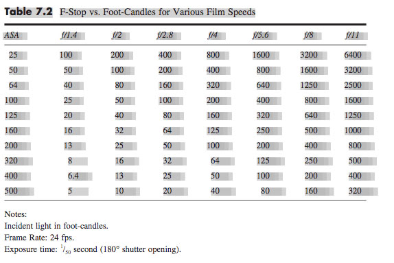
Some cinematographers memorise the fact that 100fc is f/2.8 at ISO 100, and work out other values from that. For example, ISO 400 is four times (two stops) faster than ISO 100, so a quarter of the light is required, i.e. 25fc.
Alternatively, you can use the underlying maths of the above methods. This is unlikely to be necessary in the real world, but for the purposes of this blog it’s instructive to go through the process. The equation is:

where
- b is the illuminance in fc,
- f is the f– or T-stop,
- s is the shutter interval in seconds, and
- i is the ISO.
Say I’m shooting on an Alexa with a Cooke S4 Mini lens. If I have the lens wide open at T2.8, the camera at its native ISO of 800 and the shutter interval at the UK standard of 1/50th (0.02) of a second…
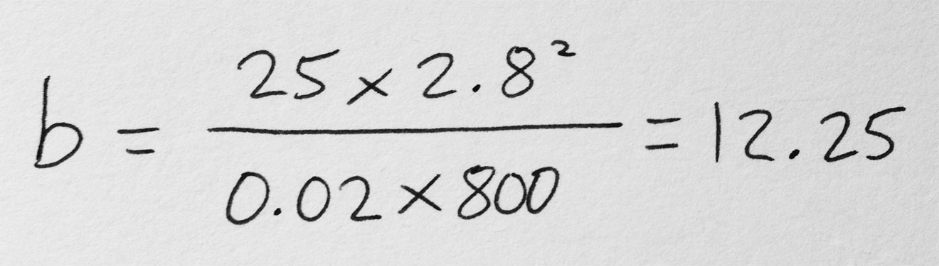
… so I need about 12fc of light.
The right instrument
In the rare event that you’re actually lighting your set with candles – as covered in my Barry Lyndon and Stasis posts – then an illuminance value in fc is all you need. In every other situation, though, you need to figure out which electric light fixtures are going to give you the illuminance you need.
Manufacturers of professional lighting instruments make this quite easy for you, as they all provide data on the illuminance supplied by their products at various distances. For example, if I visit Mole Richardson’s webpage for their 1K Baby-Baby fresnel, I can click on the Performance Data table to see that this fixture will give me the 12fc (in fact slightly more, 15fc) that I required in my Alexa/Cooke example at a distance of 30ft on full flood.
Other manufacturers provide interactive calculators: on ETC’s site you can drag a virtual Source Four back and forth and watch the illuminance read-out change, while Arri offers a free iOS/Android app with similar functionality.
If you need to calculate an illuminance value for a distance not specified by the manufacturer, you can derive it from distances they do specify, by using the Inverse Square Law. However, as I found in my investigatory post about the law, that could be a whole can of worms.
If illuminance data is not available for your light source, then I’m afraid more maths is involved. For example, the room I’m currently in is lit by a bulb that came in a box marked “1,650 lumens”, which is the luminous power. One lumen is one foot-candle per square foot. To find out the illuminance, i.e. how many square feet those lumens are spread over, we imagine those square feet as the area of a sphere with the lamp at the centre, and where the radius r is the distance from the lamp to the subject. So:

where
- b is again the illuminance in fc,
- p is the luminous power of the souce in lumens, and
- r is the lamp-to-subject distance in feet.
(I apologise for the mix of Imperial and SI units, but this is the reality in the semi-Americanised world of British film production! Also, please note that this equation is for point sources, rather than beams of light like you get from most professional fixtures. See this article on LED Watcher if you really want to get into the detail of that.)
So if I want to shoot that 12fc scene on my Alexa and Cooke S4 Mini under my 1,650 lumen domestic bulb…

… my subject needs to be 3’4″ from the lamp. I whipped out my light meter to check this, and it gave me the target T2.8 at 3’1″ – pretty close!
Do I have enough light?
If you’re on a tight budget, it may be less a case of, “What T-stop would I like to shoot at, and what fixture does that require?” and more a case of, “Is the fixture which I can afford bright enough?”
Let’s take a real example from Perplexed Music, a short film I lensed last year. We were shooting on an Alexa at ISO 1600, 1/50th sec shutter, and on Arri/Zeiss Ultra Primes, which have a maximum aperture of T1.9. The largest fixture we had was a 2.5K HMI, and I wanted to be sure that we would have enough light for a couple of night exteriors at a house location.
In reality I turned to an exposure table to find the necessary illuminance, but let’s do the maths using the first equation that we met in this post:

Loading up Arri’s photometrics app, I could see that 2.8fc wasn’t going to be a problem at all, with the 2.5K providing 5fc at the app’s maximum distance of 164ft.
That’s enough for today. All that maths may seem bewildering, but most of it is eliminated by apps and other online calculators in most scenarios, and it’s definitely worth going to the trouble of checking you have enough light before you’re on set with everyone ready to roll!
See also: 6 Ways of Judging Exposure
Colour Rendering Index
Many light sources we come across today have a CRI rating. Most of us realise that the higher the number, the better the quality of light, but is it really that simple? What exactly is Colour Rendering Index, how is it measured and can we trust it as cinematographers? Let’s find out.
What is C.R.I.?
CRI was created in 1965 by the CIE – Commission Internationale de l’Eclairage – the same body responsible for the colour-space diagram we met in my post about How Colour Works. The CIE wanted to define a standard method of measuring and rating the colour-rendering properties of light sources, particularly those which don’t emit a full spectrum of light, like fluorescent tubes which were becoming popular in the sixties. The aim was to meet the needs of architects deciding what kind of lighting to install in factories, supermarkets and the like, with little or no thought given to cinematography.
As we saw in How Colour Works, colour is caused by the absorption of certain wavelengths of light by a surface, and the reflection of others. For this to work properly, the light shining on the surface in the first place needs to consist of all the visible wavelengths. The graphs below show that daylight indeed consists of a full spectrum, as does incandescent lighting (e.g. tungsten), although its skew to the red end means that white-balancing is necessary to restore the correct proportions of colours to a photographed image. (See my article on Understanding Colour Temperature.)

Fluorescent and LED sources, however, have huge peaks and troughs in their spectral output, with some wavelengths missing completely. If the wavelengths aren’t there to begin with, they can’t reflect off the subject, so the colour of the subject will look wrong.
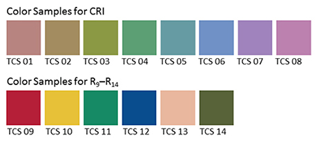
Analysing the spectrum of a light source to produce graphs like this required expensive equipment, so the CIE devised a simpler method of determining CRI, based on how the source reflected off a set of eight colour patches. These patches were murky pastel shades taken from the Munsell colour wheel (see my Colour Schemes post for more on colour wheels). In 2004, six more-saturated patches were added.
The maths which is used to arrive at a CRI value goes right over my head, but the testing process boils down to this:
- Illuminate a patch with daylight (if the source being tested has a correlated colour temperature of 5,000K or above) or incandescent light (if below 5,000K).
- Compare the colour of the patch to a colour-space CIE diagram and note the coordinates of the corresponding colour on the diagram.
- Now illuminate the patch with the source being tested.
- Compare the new colour of the patch to the CIE diagram and note the coordinates of the corresponding colour.
- Calculate the distance between the two sets of coordinates, i.e. the difference in colour under the two light sources.
- Repeat with the remaining patches and calculate the average difference.
Here are a few CRI ratings gleaned from around the web:
| Source | CRI |
| Sodium streetlight | -44 |
| Standard fluorescent | 50-75 |
| Standard LED | 83 |
| LitePanels 1×1 LED | 90 |
| Arri HMI | 90+ |
| Kino Flo | 95 |
| Tungsten | 100 (maximum) |
Problems with C.R.I.
There have been many criticisms of the CRI system. One is that the use of mean averaging results in a lamp with mediocre performance across all the patches scoring the same CRI as a lamp that does terrible rendering of one colour but good rendering of all the others.

Further criticisms relate to the colour patches themselves. The eight standard patches are low in saturation, making them easier to render accurately than bright colours. An unscrupulous manufacturer could design their lamp to render the test colours well without worrying about the rest of the spectrum.
In practice this all means that CRI ratings sometimes don’t correspond to the evidence of your own eyes. For example, I’d wager that an HMI with a quoted CRI in the low nineties is going to render more natural skin-tones than an LED panel with the same rating.
I prefer to assess the quality of a light source by eye rather than relying on any quoted CRI value. Holding my hand up in front of an LED fixture, I can quickly tell whether the skin tones looks right or not. Unfortunately even this system is flawed.
The fundamental issue is the trichromatic nature of our eyes and of cameras: both work out what colour things are based on sensory input of only red, green and blue. As an analogy, imagine a wall with a number of cracks in it. Imagine that you can only inspect it through an opaque barrier with three slits in it. Through those three slits, the wall may look completely unblemished. The cracks are there, but since they’re not aligned with the slits, you’re not aware of them. And the “slits” of the human eye are not in the same place as the slits of a camera’s sensor, i.e. the respective sensitivities of our long, medium and short cones do not quite match the red, green and blue dyes in the Bayer filters of cameras. Under continuous-spectrum lighting (“smooth wall”) this doesn’t matter, but with non-continuous-spectrum sources (“cracked wall”) it can lead to something looking right to the eye but not on camera, or vice-versa.
Conclusion
Given its age and its intended use, it’s not surprising that CRI is a pretty poor indicator of light quality for a modern DP or gaffer. Various alternative systems exist, including GAI (Gamut Area Index) and TLCI (Television Lighting Consistency Index), the latter similar to CRI but introducing a camera into the process rather than relying solely on human observation. The Academy of Motion Picture Arts and Sciences recently invented a system, Spectral Similarity Index (SSI), which involves measuring the source itself with a spectrometer, rather than reflected light. At the time of writing, however, we are still stuck with CRI as the dominant quantitative measure.
So what is the solution? Test, test, test. Take your chosen camera and lens system and shoot some footage with the fixtures in question. For the moment at least, that is the only way to really know what kind of light you’re getting.
How Colour Works
Colour is a powerful thing. It can identify a brand, imply eco-friendliness, gender a toy, raise our blood pressure, calm us down. But what exactly is colour? How and why do we see it? And how do cameras record it? Let’s find out.
The Meaning of “Light”
One of the many weird and wonderful phenomena of our universe is the electromagnetic wave, an electric and magnetic oscillation which travels at 186,000 miles per second. Like all waves, EM radiation has the inversely-proportional properties of wavelength and frequency, and we humans have devised different names for it based on these properties.
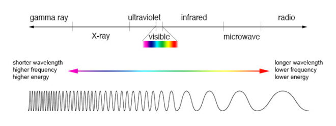
EM waves with a low frequency and therefore a long wavelength are known as radio waves or, slightly higher in frequency, microwaves; we used them to broadcast information and heat ready-meals. EM waves with a high frequency and a short wavelength are known as x-rays and gamma rays; we use them to see inside people and treat cancer.
In the middle of the electromagnetic spectrum, sandwiched between infrared and ultraviolet, is a range of frequencies between 430 and 750 terahertz (wavelengths 400-700 nanometres). We call these frequencies “light”, and they are the frequencies which the receptors in our eyes can detect.
If your retinae were instead sensitive to electromagnetic radiation of between 88 and 91 megahertz, you would be able to see BBC Radio 2. I’m not talking about magically seeing into Ken Bruce’s studio, but perceiving the FM radio waves which are encoded with his silky-smooth Scottish brogue. Since radio waves can pass through solid objects though, perceiving them would not help you to understand your environment much, whereas light waves are absorbed or reflected by most solid objects, and pass through most non-solid objects, making them perfect for building a picture of the world around you.
Within the range of human vision, we have subdivided and named smaller ranges of frequencies. For example, we describe light of about 590-620nm as “orange”, and below about 450nm as “violet”. This is all colour really is: a small range of wavelengths (or frequencies) of electromagnetic radiation, or a combination of them.
In the eye of the beholder
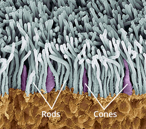
The inside rear surfaces of your eyeballs are coated with light-sensitive cells called rods and cones, named for their shapes.
The human eye has about five or six million cones. They come in three types: short, medium and long, referring to the wavelengths to which they are sensitive. Short cones have peak sensitivity at about 420nm, medium at 530nm and long at 560nm, roughly what we call blue, green and red respectively. The ratios of the three cone types vary from person to person, but short (blue) ones are always in the minority.
Rods are far more numerous – about 90 million per eye – and around a hundred times more sensitive than cones. (You can think of your eyes as having dual native ISOs like a Panasonic Varicam, with your rods having an ISO six or seven stops faster than your cones.) The trade-off is that they are less temporally and spatially accurate than cones, making it harder to see detail and fast movement with rods. However, rods only really come into play in dark conditions. Because there is just one type of rod, we cannot distinguish colours in low light, and because rods are most sensitive to wavelengths of 500nm, cyan shades appear brightest. That’s why cinematographers have been painting night scenes with everything from steel grey to candy blue light since the advent of colour film.

The three types of cone are what allow us – in well-lit conditions – to have colour vision. This trichromatic vision is not universal, however. Many animals have tetrachromatic (four channel) vision, and research has discovered some rare humans with it too. On the other hand, some animals, and “colour-blind” humans, are dichromats, having only two types of cone in their retinae. But in most people, perceptions of colour result from combinations of red, green and blue. A combination of red and blue light, for example, appears as magenta. All three of the primaries together make white.
Compared with the hair cells in the cochlea of your ears, which are capable of sensing a continuous spectrum of audio frequencies, trichromacy is quite a crude system, and it can be fooled. If your red and green cones are triggered equally, for example, you have no way of telling whether you are seeing a combination of red and green light, or pure yellow light, which falls between red and green in the spectrum. Both will appear yellow to you, but only one really is. That’s like being unable to hear the difference between, say, the note D and a combination of the notes C and E. (For more info on these colour metamers and how they can cause problems with certain types of lighting, check out Phil Rhode’s excellent article on Red Shark News.)
Artificial eye

Mimicking your eyes, video sensors also use a trichromatic system. This is convenient because it means that although a camera and TV can’t record or display yellow, for example, they can produce a mix of red and green which, as we’ve just established, is indistinguishable from yellow to the human eye.
Rather than using three different types of receptor, each sensitive to different frequencies of light, electronic sensors all rely on separating different wavelengths of light before they hit the receptors. The most common method is a colour filter array (CFA) placed immediately over the photosites, and the most common type of CFA is the Bayer filter, patented in 1976 by an Eastman Kodak employee named Dr Bryce Bayer.
The Bayer filter is a colour mosaic which allows only green light through to 50% of the photosites, only red light through to 25%, and only blue to the remaining 25%. The logic is that green is the colour your eyes are most sensitive to overall, and that your vision is much more dependent on luminance than chrominance.

The resulting image must be debayered (or more generally, demosaiced) by an algorithm to produce a viewable image. If you’re recording log or linear then this happens in-camera, whereas if you’re shooting RAW it must be done in post.
This system has implications for resolution. Let’s say your sensor is 2880×1620. You might think that’s the number of pixels, but strictly speaking it isn’t. It’s the number of photosites, and due to the Bayer filter no single one of those photosites has more than a third of the necessary colour information to form a pixel of the final image. Calculating that final image – by debayering the RAW data – reduces the real resolution of the image by 20-33%. That’s why cameras like the Arri Alexa or the Blackmagic Cinema Camera shoot at 2.8K or 2.5K, because once it’s debayered you’re left with an image of 2K (cinema standard) resolution.
colour Compression
Your optic nerve can only transmit about one percent of the information captured by the retina, so a huge amount of data compression is carried out within the eye. Similarly, video data from an electronic sensor is usually compressed, be it within the camera or afterwards. Luminance information is often prioritised over chrominance during compression.
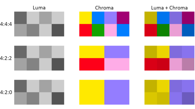
You have probably come across chroma subsampling expressed as, for example, 444 or 422, as in ProRes 4444 (the final 4 being transparency information, only relevant to files generated in postproduction) and ProRes 422. The three digits describe the ratios of colour and luminance information: a file with 444 chroma subsampling has no colour compression; a 422 file retains colour information only in every second pixel; a 420 file, such as those on a DVD or BluRay, contains one pixel of blue info and one of red info (the green being derived from those two and the luminance) to every four pixels of luma.
Whether every pixel, or only a fraction of them, has colour information, the precision of that colour info can vary. This is known as bit depth or colour depth. The more bits allocated to describing the colour of each pixel (or group of pixels), the more precise the colours of the image will be. DSLRs typically record video in 24-bit colour, more commonly described as 8bpc or 8 bits per (colour) channel. Images of this bit depth fall apart pretty quickly when you try to grade them. Professional cinema cameras record 10 or 12 bits per channel, which is much more flexible in postproduction.
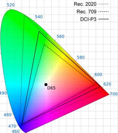
The third attribute of recorded colour is gamut, the breadth of the spectrum of colours. You may have seen a CIE (Commission Internationale de l’Eclairage) diagram, which depicts the range of colours perceptible by human vision. Triangles are often superimposed on this diagram to illustrate the gamut (range of colours) that can be described by various colour spaces. The three colour spaces you are most likely to come across are, in ascending order of gamut size: Rec.709, an old standard that is still used by many monitors; P3, used by digital cinema projectors; and Rec.2020. The latter is the standard for ultra-HD, and Netflix are already requiring that some of their shows are delivered in it, even though monitors capable of displaying Rec.2020 do not yet exist. Most cinema cameras today can record images in Rec.709 (known as “video” mode on Blackmagic cameras) or a proprietary wide gamut (“film” mode on a Blackmagic, or “log” on others) which allows more flexibility in the grading suite. Note that the two modes also alter the recording of luminance and dynamic range.
To summarise as simply as possible: chroma subsampling is the proportion of pixels which have colour information, bit depth is the accuracy of that information and gamut is the limits of that info.
That’s all for today. In future posts I will look at how some of the above science leads to colour theory and how cinematographers can make practical use of it.