The History of Virtual Production

Virtual production has been on everyone’s lips in the film industry for a couple of years now, but like all new technology it didn’t just appear overnight. Let’s trace the incremental steps that brought us to the likes of The Mandalorian and beyond.

The major component of virtual production – shooting actors against a large LED screen displaying distant or non-existent locations – has its roots in the front- and rear-projection common throughout much of the 20th century. This involved a film projector throwing pre-recorded footage onto a screen behind the talent. It was used for driving scenes in countless movies from North by Northwest to Terminator 2: Judgment Day, though by the time of the latter most filmmakers preferred blue screen.
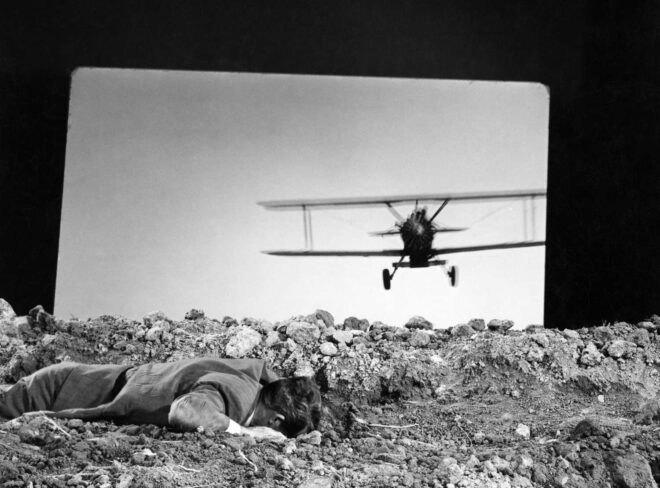
Cary Grant films the crop duster scene from “North by Northwest”

The problem with blue and green screens is that they reflect those colours onto the talent. If the screen is blue and the inserted background is clear sky that might be acceptable, but in most cases it requires careful lighting and post-production processing to eliminate the blue or green spill.

Wanting to replace these troublesome reflections with authentic ones, DP Emmanuel Lubezki, ASC, AMC conceived an “LED Box” for 2013’s Gravity. This was a 20’ cube made of LED screens displaying CG interiors of the spacecraft or Earth slowly rotating beneath the characters. “We were projecting light onto the actors’ faces that could have darkness on one side, light on another, a hot spot in the middle and different colours,” Lubezki told American Cinematographer. “It was always complex.” Gravity’s screens were of a low resolution by today’s standards, certainly not good enough to pass as real backgrounds on camera, so the full-quality CGI had to be rotoscoped in afterwards, but the lighting on the cast was authentic. 
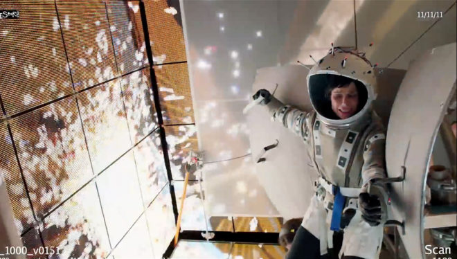
Sandra Bullock in “Gravity’s” LED box

Around the same time Netflix’s House of Cards was doing something similar for its driving scenes, surrounding the vehicle with chromakey green but rigging LED screens just out of frame. The screens showed pre-filmed background plates of streets moving past, which created realistic reflections in the car’s bodywork and nuanced, dynamic light on the actors’ faces.

Also released in 2013 was the post-apocalyptic sci-fi Oblivion. Many scenes took place in the Sky Tower, a glass-walled outpost above the clouds. The set was surrounded by 500×42’ of white muslin onto which cloud and sky plates shot from atop a volcano were front-projected. Usually, projected images are not bright enough to reflect useful light onto the foreground, but by layering up 21 projectors DP Claudio Miranda, ASC was able to achieve a T1.3-2.0 split at ISO 800. Unlike those of Gravity’s low-rez LED Box, the backgrounds were also good enough to not need replacing in post.
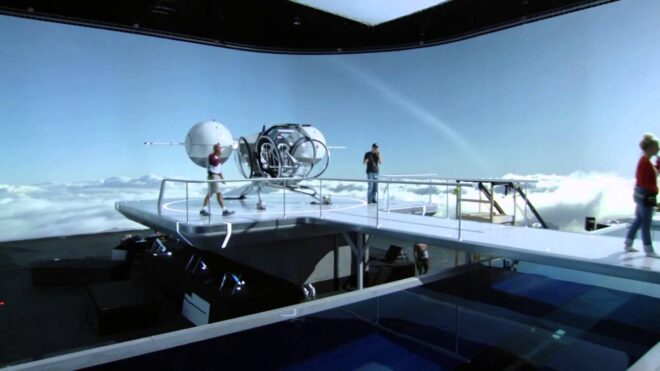
The set of “Oblivion” surrounded by front-projected sky backgrounds

It would take another few years for LED screens to reach that point.

By 2016 the technology was well established as a means of creating complex light sources. Deepwater Horizon, based on the true story of the Gulf of Mexico oil rig disaster, made use of a 42×24’ video wall comprising 252 LED panels. “Fire caused by burning oil is very red and has deep blacks,” DP Enrique Chediak, ASC explained to American Cinematographer, noting that propane fires generated by practical effects crews are more yellow. The solution was to light the cast with footage of genuine oil fires displayed on the LED screen.

Korean zombie movie Train to Busan used LED walls both for lighting and in-camera backgrounds zipping past the titular vehicle. Murder on the Orient Express would do the same the following year.
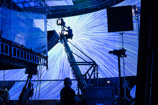
The hyperspace VFX displayed on a huge LED screen for “Rogue One”

Meanwhile, on the set of Rogue One, vehicles were travelling a little bit faster; a huge curved screen of WinVision Air panels (with a 9mm pixel pitch, again blocky by today’s standards) displayed a hyperspace effect around spacecraft, providing both interactive lighting and in-camera VFX so long as the screen was well out of focus. The DP was Greig Fraser, ACS, ASC, whose journey into virtual production was about to coincide with that of actor/director/producer Jon Favreau.

Favreau had used LED screens for interactive lighting on The Jungle Book, then for 2018’s The Lion King he employed a virtual camera system driven by the gaming engine Unity. When work began on The Mandalorian another gaming engine, Unreal, allowed a major breakthrough: real-time rendered, photo-realistic CG backgrounds. “It’s the closest thing to playing God that a DP can ever do,” Fraser remarked to British Cinematographer last year. “You can move the sun wherever you want.”

Since then we’ve seen LED volumes used prominently in productions like The Midnight Sky, The Batman and now Star Trek: Strange New Worlds, with many more using them for the odd scene here and there. Who knows what the next breakthrough might be?

The History of Virtual Production

The Pros and Cons of Master Shots

A master is a wide shot that covers all the action in a scene. The theory is that, should you run out of time or your lead actor suddenly gets injured or some other calamity prevents you shooting any coverage, at least you’ve captured the whole scene in a useable, if not ideal, form.

I have always been a fan of shooting masters. I remember once reading about a Hollywood film with a lot of puppets – it might have been Walter Murch’s 1985 Return to Oz – which fell seriously behind schedule. A producer or consultant was dispatched to the set to get things back on track, and concluded that part of the problem was a lack of masters. The director had been avoiding them because it was impossible to hide the puppeteers and rigging in wide shots, and instead was shooting scenes in smaller, tighter pieces. As a consequence, the cast and crew never saw the whole scene played out and struggled to understand how each piece fitted in, causing mistakes and necessitating time-consuming explanations.

For me, that’s the key benefit of masters: getting everyone on the same page so that the coverage goes faster.

A master shot of mine from “Forever Alone”, a student film I helped out on several years back 

You can dig yourself into holes if you don’t start with a wide. A small part of the set gets dressed and lit, a small part of the scene gets rehearsed, and then when you come to do the next part you realise it’s not going to fit together. A key prop that should have been in the background was forgotten because it wasn’t relevant to the first small piece; now you can’t put it in because you’ll break continuity. A light source that looked beautiful in that mid-shot is impossible to replicate in a later wide without seeing lamps or rigging. However much you might plan these things, inevitably in the heat of filming you get tunnel vision about the shot in front of you and everything else fades away. And it’s easy for a director, who has the whole film running on a cinema screen in their head, to forget that everyone else can’t see it as clearly.

Not starting with a wide also robs a DP of that vital, low-pressure time to light the whole set, getting all the sources in place that will be needed for the scene, so that re-lights for coverage can be quick and smooth. It also ties the editor’s hands somewhat if they haven’t got a wide shot to fall back on to get around problems.

So there are many benefits to masters. But lately I’ve been wondering if it’s dogmatic to say that they’re essential. I’ve worked with a few directors who have shot scenes in small, controlled pieces with great confidence and success.

Not shooting a master on “Harvey Greenfield is Running Late”. Photo: Mikey Kowalczyk

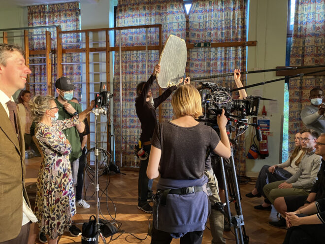
Last year I worked on a comedy that has a scene set at a school play, the main action taking place in the audience. Jonnie Howard, the director, was not interested in shooting a master of the hall showing the audience, the stage and the whole chunk of play that is performed during the action. All he wanted of the play was to capture certain, specific beats in mid-shots. He didn’t even know what was happening on stage the rest of the time. He knew exactly when he was going to cut to those shots, and more importantly that it would be funnier to only ever see those random moments. He also recognised that it was easier on the child actors to be given instructions for short takes, shot by shot, rather than having to learn a protacted performance.

Not shooting masters saved us valuable time on that film. It’s not the right approach for every project; it depends on the director, how well they’re able to visualise the edit, and how much flexibility they want the editor to have. It depends on the actors too; some are more able to break things down into small pieces without getting lost, while others always like to have the run-up of “going from the top”.

There is a halfway house, which is to rehearse the whole scene, but not to shoot it. This requires clear communication with the 1st AD, however, or you’ll find that certain actors who aren’t in the first shot are still tied up in make-up when you want to rehearse. Like any way of working, it’s always best to be clear about it with your key collaborators up front, so that the pros can be maximised, the cons can be minimised, and everyone does their best work most efficiently.

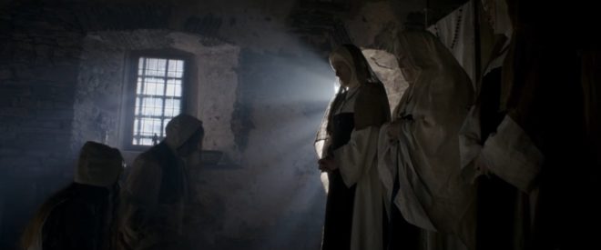
A rare master shot from “Heretiks”
The Pros and Cons of Master Shots

How to Work with Natural Light

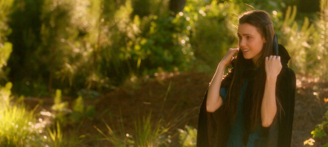
Poppy Drayton in a scene from “The Little Mermaid” where we were blessed with beautiful evening light

Natural light can be beautiful, but it is not easy for a cinematographer to work with. Continuity, dynamic range, hardness and intensity are all potential challenges.

The most obvious difficulty with natural light is that it is forever changing. It can do stunning and unexpected things, but if you don’t move quickly it’s gone. Anyone who’s ever filmed a sunset scene and had the director push for another take after the perfect light has gone knows the disappointment it can bring.

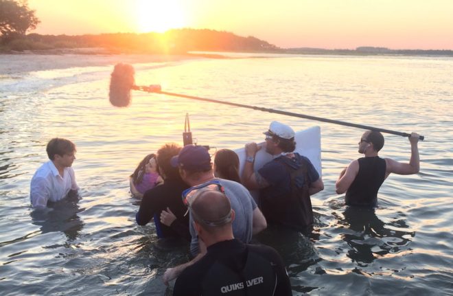
Preparation is key. Previewing the sun path using an app like Helios Pro or Sun Seeker is essential, as is working out the blocking to make the best use of the light. For The Little Mermaid I shot a sunset scene with three actors up to their waists in the Atlantic Ocean. I had to make sure, through rehearsals on dry land, that they would end up with their backs to the sun so that I would be shooting towards it.

Shooting the ocean scene for “The Little Mermaid”

I also had a grip next to me with a poly-board to bounce some of the sunlight back into the actors’ faces. This brings us to dynamic range, the fact that there may be too much or too little difference between the brightest and darkest areas. Too much contrast is common with exteriors under direct sun, or interiors with small windows or dark walls. Too little is often the case with overcast exteriors, or interiors with large windows or white walls.

As in my Mermaid example, shadows can be filled in using a reflector, be that the 5-in-1 collapsible kind that are widely and cheaply available, a white poly-board, a frame of Ultrabounce or even a white bedsheet. These will be much less effective indoors, where you may well need to add an artificial fill light, perhaps bounced off the ceiling.

If the light is too flat, contrast can be reduced using negative fill. Anything black can be used for this – a flag, a bedsheet, or the black side of a poly-board or 5-in-1 reflector. Typically this is placed to cut the light on the side of the talent’s face nearest camera to get the most shape in the image.

A demo of negative fill from my online course, “Cinematic Lighting”, available on Udemy

Direct sun is often too hard to be flattering, particularly in closer shots. The solution is to introduce some kind of diffusion between the actor and the sun. This could be anything from a shower curtain to a 12×12’ frame of Full Silk. 5-in-1 reflectors can be stripped down to a translucent white disc that works well for tight shots.

Indoors the trouble with natural light is that there might not be enough of it. If you like what it’s doing but just need more, try setting up a soft artificial source outside the window. A bigger production will often use 12K or 18K HMIs firing into Ultrabounce, but that requires a serious rental budget and a big generator. A smaller HMI pushing through a diffusion frame won’t be quite as soft but will be much cheaper. 

If that’s not possible either, the next best thing is a soft source like an LED panel rigged indoors above the window. By having the source indoors you will lose the natural shaping of the light that the window frame gives you, but some of this can be regained by fitting a honeycomb or egg-crate.

Hard reflector

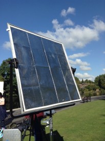
Another option is to place a hard reflector – essentially a mirror on a C-stand – outside the window and angle it to reflect the brightest part of the sky, or even direct sun, into the room. The great news for anyone working on a tight budget is that any old mirror will do, so long as you can find a way to position and angle it conveniently.

The opposite problem is one all DPs have to tackle at some point – namely direct sun coming into a room and moving across it, spoiling continuity. Choosing a north-facing location will save a lot of trouble here, otherwise flags will need to be rigged and regularly adjusted as the sun moves, unless you can move quickly enough to shoot everything before the light has noticeably changed.

Natural light can be one of the biggest challenges for a cinematographer, but also one of the greatest gifts and highest goals to emulate.

How to Work with Natural Light

Planning Camera Angles and Lighting

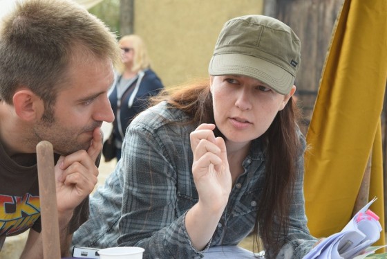
Discussing shots with director Kate Madison on the set of “Ren: The Girl with the Mark”. Photo: Michael Hudson

A thorough plan for shots and lighting can save lots of time on set, but no battle plan survives contact with the enemy. To what extent should a DP prepare?

How much camera angles are planned – and by whom – varies tremendously in my experience. Some directors will prepare a complete shot-list or storyboard and send it to the DP for feedback; others will keep it close to their chest until the time of shooting. Some don’t do one at all, either preferring to improvise on the day in collaboration with the DP, or occasionally asking the DP to plan all the shots alone.

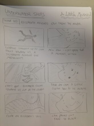
A shot-list can be hard to interpret by itself, particularly if there’s a lot of camera movement. Overhead blocking diagrams, perhaps done in Shot Designer or a general graphics app, make things a lot clearer. Storyboards are very useful too, be they beautifully and time-consumingly drawn, or hastily scribbled thumbnails.

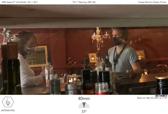
An Artemis shot from “Hamlet” using stand-ins

On a feature I shot last year, we were afforded the luxury of extensive rehearsals with the cast on location. I spent the time snapping photos with Artemis Pro, the viewfinder app, and ultimately output PDF storyboards of every scene; the 1st AD distributed these with the call-sheets every morning. That level of preparedness is rare unless complex stunts or VFX are involved, but it’s incredibly useful for all the departments. The art department in particular were able to see at a glance what they did and didn’t need to dress.

One of my unused storyboards from “The Little Mermaid”

Beware though: being prepared can kill spontaneity if you’re not careful. Years ago I directed a film that had a scene supposedly set at the top of a football stadium’s lighting tower; we were going to cheat it on a platform just a few feet high, and I storyboarded it accordingly. When we changed the location to a walkway in a brewery – genuinely 20ft off the ground – I stuck to the storyboards and ended up without any shots that showcased the height of the setting.

If the various departments have prepared based on your storyboards, not keeping to them can make you unpopular. So storyboards are a double-edged sword, and expectations should be carefully managed regarding how closely they will be adhered to.

The amount of planning that the DP puts into lighting will vary greatly with budget. On a micro-budget film – or a daytime soap like Doctors – you may not see the location until the day you shoot there. But on a high-end production shooting in a large soundstage you may have to agree a detailed lighting plot with the gaffer and pre-rigging crew days or weeks in advance.

Having enough crew to pre-rig upcoming scenes is one of the first things you benefit from as a DP moving up the ladder of budgets. Communicating to the gaffer what you want to achieve then becomes very important, so that when you walk onto the set with the rest of the cast and crew the broad strokes of the lighting are ready to go, and just need tweaking once the blocking has been done.

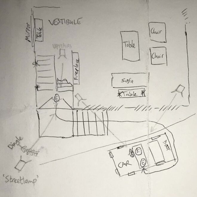
My lighting plan for a night exterior scene in “Exit Eve”

Blocking is usually the biggest barrier to preparedness. Most films have no rehearsals before the shoot begins, so you can never quite know where the actors will feel it is best to stand until they arrive on set on the day. So a lighting plan must be more about lighting the space than anything else, just trying to make sure there are sources in roughly the right places to cover any likely actor positions suggested by the script, director or layout of the set.

Whether a detailed lighting plan needs to be drawn up or not depends on the size and complexity of the set-up, but also how confident you feel that the gaffer understands exactly what you want. I often find that a few recces and conversations along with some brief written notes are enough, but the more money that’s being spent, the more crucial it is to leave no room for misunderstandings.

Again, Shot Designer is a popular solution for creating lighting plans, but some DPs use less specialised apps like Notability, and there’s nothing wrong with good old pencil and paper.

Overall, the best approach is to have a good plan, but to keep your eyes and mind open to better ideas on the day.

For more about apps that DPs can use to help them prep and shoot, see my article “Tools of the Trade” on britishcinematographer.co.uk.

Planning Camera Angles and Lighting

How to Light Efficiently and Minimise Changes Between Angles

Exciting title, right? It’s not the glamorous side of a DP’s job, but enabling a scene to be shot quickly is a skill which definitely has its place, as long as you balance it with creative and technical quality, of course.

When a scene has been blocked and the cast have gone off to have their make-up and costuming finished, and even the director has disappeared to make plans for future scenes, the DP is left on the set to light it. Though there is always time pressure on a film, it is at a minimum during this initial lighting period (usually for the wide shot). But once the wide is in the can, the DP is expected to move quickly when tweaking lights for the coverage, as all the cast and crew are standing around waiting for you.

So a wise DP always thinks ahead to the coverage, setting up as much as possible for it concurrently with the wide, or better still sets up the wide’s lighting so that it works for the coverage too.

If we boil things right down, light looks best when it comes in from the side or the back, not the front. A common technique is to block and/or light the scene so that the main light source, be that the real sun, a window or an artificial source, is behind the cast in the wide. Let’s imagine this from the top down with the camera at 6 o’clock, the key light at 12 o’clock, and the actors in the centre.

Because of the 180º Rule, otherwise known as the Line of Action, the camera positions for the coverage are likely to all be on the bottom half of the clock face between 3 o’clock and 9 o’clock. At either of those two positions the 12 o’clock key light is now coming in from the side, so your image still has mood.

This date scene in “Harvey Greenfield is Running Late” was cross-backlit; you can just see the second light in the top right of this photo.

Another common set-up is cross-backlight. Here you would have two lights, one at about 10:30 and the other at 1:30. These give a three-quarter backlight in the wide and a three-quarter key light in the singles.

Something basic to avoid is lights actually being in shot when you move to a new camera position. Early in my career I used to put all my lamps on stands because I didn’t know any better (or have any rigging kit to do anything else), but that means you’re forever moving them. Much better to rig things to the ceiling, or to position them outside the room shining in through doors and windows. 

Practicals lights are really helpful too, because you can get them in shot with impunity. You can save hours of pain on set by collaborating with the art department in pre-production to make sure there are enough practicals to justify light from all the angles you might need it. Put them all on dimmers and use a fast lens or high ISO and you may well find that when you change camera position you only need to dim down the frontal ones and bring up the back ones to get the shot looking nice.

A behind-the-scenes view of some of the lights we rigged in the “Heretiks” chapel.

I once had to light a scene in a medieval chapel for a horror film called Heretiks. The master was a Steadicam shot moving 360º around the set. The gaffer and I invested the time beforehand to rig numerous 300W and 650W tungsten fresnels around the tops of all the walls, connected to dimmers. (The light was motivated by numerous candles.) With a bit of practice the gaffer and sparks were able to dim each lamp as the camera passed in front of it – to avoid camera shadows and the flat look of front light – and bring them back up afterwards, so there was always a wrapping backlight. A convenient side effect was that when we moved onto conventional coverage we could light shots in seconds by turning a few dimmers down or off and others up.

DP Benedict Spence used a similar principle on the recent BBC series This is Going to Hurt; he had 250 Astera Titan tubes built into the hospital set. While this was time-consuming and expensive upfront, it meant that shots could be lit very quickly by making a few tweaks at a lighting desk. And since the tubes looked like fluorescent strip-lights, there was never any problem with getting them in shot.

Once you start shooting a scene it’s important to keep up the pace so that the cast can stay in the zone. Spending extra time in prep or when lighting the wides will pay dividends in faster coverage, giving the director more time to get the best performances and to tell the story, which is ultimately what it’s all about.

How to Light Efficiently and Minimise Changes Between Angles

The Sunny 16 Rule in Cinematography

If you’ve done much still photography, particularly on celluloid, you will probably have heard of the Sunny 16 Rule. It’s a useful shortcut for correctly exposing bright day exteriors without needing a light meter. Is it of any use in digital cinematography though? Yes, and I’ll explain how.


How the rule Works

Sunny 16 is very simple: if the sun is out, set your aperture to f/16 and your shutter speed denominator to the same as your ISO. For example, at ISO 100 set the shutter to 1/100th of a second. At ISO 400 set the shutter to 1/400th of a second – or 1/500th of a second, if that’s the closest option the camera permits – and so on.

You can use the rule to work out other combinations from there. Say your ISO is 100 but you want the sharper, less motion-blurred look of a 1/400th shutter. That’s two stops slower, so open the aperture from f/16 to f/8. (Check out my exposure series if this is all Dutch to you.)

The Sunny 16 Rule works because the sun outputs a constant amount of light and is a constant distance from the earth – at least constant enough to make no significant difference. The sun’s illuminance at the earth’s surface is about 10,000 foot-candles. The following formula relates illuminance (b) to f-stop (f), shutter speed (s) and ISO (i):

Using Sunny 16 in the case of ISO 100 and a shutter speed of 1/100th of a second, this formula gives us…

… 6,400 foot-candles. Less than 10,000fc, certainly, but remember this is only a rule of thumb – and one designed for film, which isn’t hurt at all by a little over-exposure. The rule probably accounts for the fact that you may want to see into the shadows a bit too. (See my article “How Big a Light Do I Need?” for explanations of illuminance and foot-candles and more on the above formula.)

Anyway, you can see from the equation why the shutter speed denominator and ISO cancel each other out if they’re the same.


Using the rule in cinematography

A few weeks ago when I was on the banks of the River Cam setting up for a scene in Harvey Greenfield is Running Late, my 1st AC Hamish Nichols asked which ND filter I wanted in the matte box. It was 5:30am; the sun had barely risen and certainly wasn’t high enough yet to reach me and my light meter over the trees and buildings on the horizon. But I knew that it would be hitting us by the time we turned over, and that the weather forecast was for a completely cloudless day, indeed the hottest day of the year at that time. So I was able to predict that we’d need the 2.1 ND.

How did I work this out? From the Sunny 16 Rule as follows:

  • I was shooting with a 1/50th of a second shutter interval (a 172.8° shutter angle at 24fps), so the Rule told me that f/16 (or T16) at ISO 50 would be the right exposure.
  • I was actually at ISO 800, which is four stops faster than ISO 50. (Doubling 50 four times gives you 800.)
  • I wanted to shoot at T5.6, which is three stops faster than T16.
  • That’s a total of seven stops too much light. To find the right optical density of ND filter you multiply that by 0.3, so 0.3 x 7 = 2.1. (More on this in my ND filters post.)

Everything on a film set sucks up time, so the more you know in advance, the more efficient you can be. Little tricks like this mean you don’t have to do a last-minute filter swing and waste five minutes that the director could have used for another take.

The Sunny 16 Rule in Cinematography

“Harvey Greenfield is Running Late”: Week 3 Part 2

Day 21

Photo by Jonnie Howard

A morning full of short running scenes, all shot as oners on the Steadicam by Luke Oliver. Pretty much every crew member had had a cameo by this point, and today it was my turn. My character: Nerdy Cyclist. Alright, technically it was just Cyclist. The nerdy bit was just me (a) beefing up my part and (b) playing to type.

For the afternoon we moved to The Lab, a cocktail bar, where we filmed one of the fantasy/imaginary scenes that cuts with the very first shot we did of Harvey back on Day 1. Mixologist Tom was dressed in an elaborate all-black costume so Stephen and I hit him with two tungsten lamps, one either side, at an angle somewhere between side-light and backlight. This cut him out from the background, showed up the layering in the costume, edge-lit the cocktail shaker and liquids being poured, and deliberately kept Tom’s face dark. Quadruple win!


Day 22

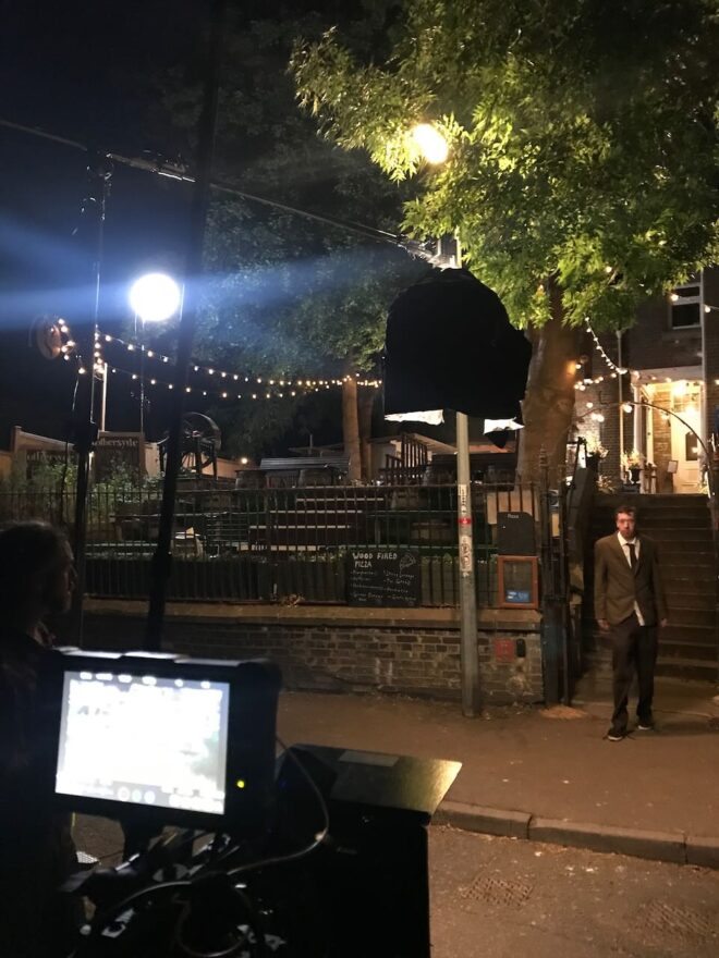
We returned to Othersyde to pick up the one scene we dropped there on our most packed day of principal photography, Day 7. I referred to the blog post to help get the vibe of the lighting the same. The main motivation was the real streetlamp at the front of the site, which we wrapped using an Aputure with a lantern attachment, rigged on a mini boom. Another Aputure lantern gave a cool moonlight wash on the venue’s terraced outdoor seating, and a blue-gelled 300W tungsten fresnel uplighter replicated what we did on the other side of the building last year. A 2K blasted light from the direction Harvey has come; this light represented the ongoing wedding, so we had a couple of people moving around in front of it for dynamic shadows.

I ended up turning off the first Aputure for the wide as it seemed to kill the mood, but we brought it back for the close-up to show more of Paul’s face. To represent the light of his phone as he turns it on, Stephen held a PavoTube just above the camera and twisted it quickly around to face Paul on cue. We adjusted the eyebrow on the camera to flag the tube’s light off the phone itself.

There were a few bitty pick-ups to do while we were outside with access to power, including a “BOV” – a POV of a bee. We did this with the probe lens on Jonnie’s Canon C200, which I had to float around and then jab into Paul’s neck. Sorry, Paul.

At 1am we moved into an adjacent industrial street – having decided that it was unreasonable to have Paul shouting dialogue in a residential area at that hour – for some Steadicam shots. I went to the Gemini’s low-light ISO 3200 and Stephen hand-bashed a lantern on a boom pole to fill Paul in between streetlamps, which became a fun dance when we had to do a 270° orbit!


Day 23

We convened at Cambridge’s Castle Hill. Nearby Indian restaurant Namaste Village kindly agreed to let us shoot a brief scene there at the last minute, even having one of the staff do a spot of acting. I posted a video breakdown on Instagram – here it is:


View this post on Instagram


A post shared by Neil Oseman (@neiloseman)

Back outside we filmed a nice sequence of shots ending with a 360° pan following Harvey as he walks around the top of Castle Hill talking on the phone. As the other end of the phone call had been shot with Steve’s head sometimes out of frame, we went the other way and gave Harvey loads of headroom, capturing some nice clouds along the way.

Then it was time for another pick-up from Day 7, reshooting the tent scene for continuity reasons. Again we put a light on one side and black-draped the other to get some shape into the light inside. This time we used a wider lens, the 14mm, and with the help of a runner I handheld it over Paul rather than trying to squeeze the tripod in around him like last time. He got a nasty shock when I accidentally knocked the matte box off and it hit him in the face. Er, sorry again.

After wrapping a few of us went back across the road to Namaste Village, where the food was excellent.


Day 24

On our last day we caught up to the elusive pick-up that was always meant to be a pick-up: the scenes with Harvey’s mum. We took over Rachel’s grandmother’s house for several hours, most of the shots being in a corner of her living room. Unusually I was drawn to a corner that didn’t have a window in it, because it had the best furniture and dressing to establish the character in our standard 24mm tableau shot.

But this meant – with all the windows behind camera – that it was a challenge to make the lighting interesting. We faked a window just off camera left using a diffusion frame with muslin and a grid over it; Stephen bounced the 600D into it from across the room. I closed the room’s curtains as much as I could get away with before the lack of natural fill light started to make it look like night. (For later scenes we closed them all the way and put a 300D behind the muslin, as pictured above.)

To add more interest to the shot I played around with the positions of two table lamps and a floor lamp. Pausing to check my script breakdown notes from last year I saw that I had written “a single practical floor lamp” in the lighting column; too many lamps would kill the scene’s sad tone. This is a good example of a breakdown keeping me honest as a DP and preventing me from getting carried away doing stuff on set just because I can (though that definitely still happens sometimes). I ended up with just one lamp in the back of the main shot.

After some variations on that main shot for later scenes, and a brief scene in the kitchen, we packed up and headed out for exteriors. Most of these were happy flashbacks from the early days of Harvey and Alice’s relationship, and Jonnie wanted to fill them with filmic references. First up was a Jules et Jim homage with the pair racing across a bridge, then a “remake” of one of Jonnie’s own amateur films with Harvey and Alice spinning around holding hands. For POV reverse shots we put the tripod on the point which they span around, and I set the panning tension to zero so that they could pull the camera around themselves by holding the moose bars (handgrips).

Next was a Manhattan-esque shot with the couple on a bench looking up at Ely Cathedral. We clearly weren’t going to light the cathedral on our budget, so we set up around sunset and waited for the streetlamps to come on and the ambient light to drop to a nice dusky level. We rolled when the daylight was metering at T1.4 at ISO 800, though I exposed at T2. To cut Harvey and Alice out from the background a bit Stephen stood just out of frame with an LED lantern motivated by a nearby streetlamp.

He pulled the same trick at our next location, a passageway beside Prezzo, where we did actually have to light a small portion of the cathedral wall as well, using a battery-powered Aputure (200X I think). We couldn’t have done it for long on the batteries we had, but fortunately it was a brief scene.

Our final set-up was a Poor Man’s shot of Harvey running at night. We did this on the green beside the cathedral because it was a handy open space where we could get a completely dark background save for a few dots of distant lights. Stephen armed a FalconEyes over Paul and swung it back and forth to create the illusion of passing streetlamps. The shot needed a tiny touch of fill, so we taped a PavoTube to the top of the matte box, setting it to 1% intensity and taping over most of it to get it down to a low enough level. (I was at ISO 3200 and on a 14mm lens, so mere inches from Paul’s face.)

Then Rob said the magic words, “It’s a wrap.” Like most micro-budget projects there are still a few loose ends to be shot, but those will be done with Jonnie’s camera and no crew. For most of the cast and crew Harvey Greenfield has run his course and I’ll see them at some distant time for the premiere. Thank you Stephen Allwright (gaffer), Jeremy Dawson (spark), Hamish Nichols (1st AC), Fiyin Oladimeji (2nd AC) and Nana Nabi (2nd AC daily) for all your hard work, and to Jonnie for bringing me onto this fun and creative film. Huge thanks also to Global Distribution, Red and Sigma who supported us with equipment which brought the whole thing up a level. The rough cut is already fantastic and I can’t wait to see it finished.

Read all my Harvey Greenfield is Running Late posts:

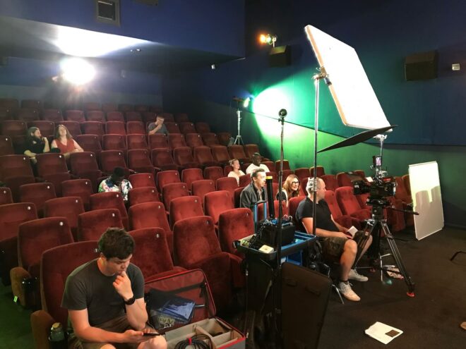
“Harvey Greenfield is Running Late”: Week 3 Part 2

“Harvey Greenfield is Running Late”: Week 3 Part 1

Photo by Jonnie Howard

Day 17

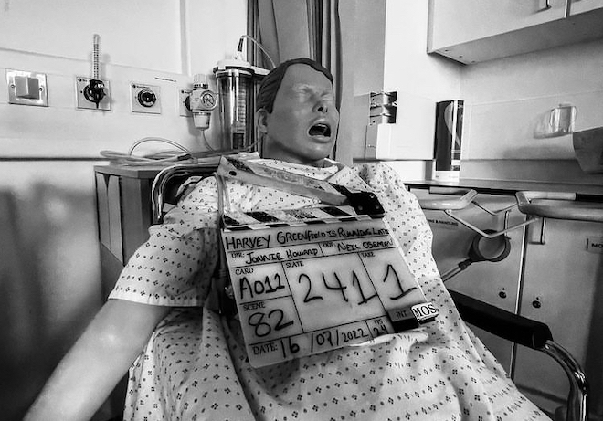
Our first location was a medical training ward populated by creepy dummies; we had a brief flashback scene to do around a hospital bed. When we arrived there was nice warm sunlight coming in through the frosted glass behind the bed, so we made sure that stuck around by putting an orange-gelled Aputure 600D out there. Inside we wrapped this with a FalconEyes and Stephen added some soft fill because I wanted the scene to feel romantic. To get some green into the frame (a calming colour in the film’s visual language) we stuck a couple of Nanlite PavoTubes into the background as practicals.

While Hamish (our new 1st AC) and Fifi were building the camera I faffed about with the Prosup Tango slider, trying to figure out a way to have the track go over the bed so we could pull straight back from Paul. It proved impossible simply because the track also ended up in frame, and instead we simply set it up beside the bed. It took a bit of clever blocking by director Jonnie to ensure that the camera could point directly along the axis of the track, rather than at an angle, which would have broken the established visual grammar of the film. This is the sort of thing that takes a bit of time to get back into after months away from the project, but it’s important to get it right.

Next we moved into the foyer, which we were playing as a bank. There was plenty of natural light but we made sure to keep that in the background, neg-filling behind the camera, and adding a key (a Rayzr MC 200) at 90° to the talent (Alex Wilber), who was partly facing towards a computer monitor on that side of camera anyway. A heavily dimmed 2K served as backlight.

After a brief panic when we thought we were missing our favourite lens, the 14mm, we moved to Cambridge 105’s studio a couple of blocks away. A special guest star played a Tony Blackburn-esque DJ and threw in some brilliant improvs.

We fought a battle against the high, bright sun that kept trying to come in the south-facing window, despite us having diffed a lot of it, and blacked out the whole top section, and having blinds partly lowered, and the windows having some special solar coating on them anyway. Once again we fired in the 600D, which probably did very little compared with that sun, and wrapped it inside with a FalconEyes, and added the PavoTubes into the background for colour. The DJ’s computer monitors were set to 60Hz, but I’d learnt my lesson from last year and immediately set the shutter to 144° to sort that out.


Day 18

We were at Anglia Ruskin University for the day, mostly in one of their media studios. Here we had to shoot a number of things against a black backdrop, mainly to cut into the climax of the film. These included a 180° camera move using the university’s track and dolly. I thought briefly about doing some elaborate lighting rig in which lamps would have to be dimmed up and down to maintain backlight and eliminate front-light as the camera circled, but then I came to my senses and we just fired a Source Four straight down onto the makeshift table that the two actors were hunched over so that it would bounce back up to them. I was using the Soft FX 1 to match the look of the Happy Place scenes from Day 3, which helped to take the harshness out of the highlights where the Source Four was directly hitting the cast.

A little later Jonnie started flinging things in front of the camera. Had he finally cracked? No, he just wanted some lovely slo-mo shots of key props arcing through a black void. We went to 120fps, the Red Gemini’s maximum 4K frame rate, and the higher native ISO of 3200. We were able to make a stop of somewhere between T4 and T5.6 by bouncing two 2Ks into an 8×4′ poly just out of frame, and using three triple banks of the uni’s linear cyc lights in the grid as backlight.

After lunch we came to a couple of crucial shots that were dropped from the night shoot on Day 10, meaning we had to replicate the lighting from Vinery Park. We used the cycs again, a Source Four on a stand as a special flaring backlight simulating the park’s streetlamp, and a couple of 2Ks through a diffusion frame as the key. Although we were back to 24fps we still needed loads of light because one of the set-ups was on an f/14 probe lens sliding into Harvey’s mouth! “It feels really weird,” Paul remarked. Yep. And sorry for bashing you in the teeth with it.

As our time on the campus ticked down we moved across to another building to shoot a call centre scene. We went for our 24mm “tableau” frame that we’ve used to establish all the characters who ring Harvey in their own environments, followed by a couple of other set-ups. We kept the talent’s (Kate Madison) eye-line between the camera and the windows for a nice short key, beefing it up with a FalconEyes, and added a dimmed 2K backlight and some warm PavoTubes in the background (orange being the stress colour in the film’s visual language).


Day 19

The good folks at BBC Breakfast were up bright and early, set up at the Granta beside Sheep’s Green, shooting live news footage of what was widely forecast to be a record-breakingly hot day. We were up pretty early too, watching from the banks of the Cam at 5:30am as the BBC drone flew over, and hoping that it wouldn’t ruin a take (which it didn’t).

We were shooting Harvey Greenfield‘s only stunt, which I probably shouldn’t spoil by describing. We’d given Stephen the day off, and my trusty 5-in-1 reflector was our only lighting gear, but of course there was no shortage of sunlight. I used the white side for most set-ups, running along beside the Steadicam later in the day to keep Paul’s face filled in when he wasn’t facing the sun.

There was an interesting moment when we had the sun in the background of a low-angle shot. As I’ve experienced before, the Soft FX filter reflected a rectangle of light onto the subject. But even when we took it out, the IRND filter did the same thing. Do all filters do it, I wonder? Must test that one day.

We wrapped a little after 3pm, as the heat was reaching its maximum. Despite all the dire warnings (and drone-worthy news coverage) it hadn’t been too hot to work. We were all sensible with hydration, shade and sunblock, and I even swam in the Cam a couple of times during the day to cool off. You don’t get to do that very often on a shoot!

Straight after wrap I went for another swim in Jesus Green Lido, whence a Channel 5 news crew were broadcasting live weather reports with the pool in the background. The presenter was positioned in the shade and they’d set up a 600D on either side of him to fill him in. Believe it or not, that would inspire the next day’s lighting.


Day 20

First up was a one-shot flashback scene at the Arts Picturehouse. We used the 600D as the “projector”, positioning it just barely out of the top of frame, and a 4×4′ poly armed over the camera as the screen bounce. During the takes Jeremy wiggled his hand in front of the 600D to create dynamics in the flare.

The day’s main scene was a fake advert starring a nineties keep-fit icon. The aim was a cheesy infomercial vibe, with a 4:3 aspect ratio and over-the-top acting. We cross-front-lit the scene with the Aputures 300D and 200X (thank you, Channel 5), with only a bit of diff on them. I over-exposed by a stop and took out the Soft FX filter to make the image even less filmic. I framed with a lot of headroom and even did a deliberately late tilt-down at one point. When the actual aerobics start, we went even more naff by adding two PavoTubes into the background and the Rayzr MC behind camera, all flashing nasty disco colours. It was great fun.

By the time we moved onto the last scene – another 24mm phone call, in a GP’s waiting room – it was at least 39°C in Cambridge and the UK’s temperature record had been broken.

There’ll be more from this shoot in next week’s post. In the meantime, you can read all the Harvey posts here. Note that the link will display them in reverse chronological order, so scroll down for the older ones.

“Harvey Greenfield is Running Late”: Week 3 Part 1

Is Modern Cinematography too Dark?

“Why are things so dimly lit today? Can barely see anything.” Such was a comment on a frame of my cinematography that I posted on Instagram last year. It was a night scene but far from the darkest image I’ve ever posted.

“The First Musketeer” (2015, DP: Neil Oseman)

I remembered the comment recently when double Oscar-winning cinematographer Janusz Kamiński said something similar in an interview with British Cinematographer. He lamented what he perceives as a loss of lighting skills that accompanied the transition from celluloid to digital filmmaking: “Now everyone shoots dark… Pictures are so murky you need to crank up the TV to see it… They just don’t know how to light.”

I think there’s a tremendous amount of talent in today’s world of digital cinematography, but the technology might have encouraged a trend towards darker images. With celluloid it was always better to err on the side of over-exposure, as highlights would fall off attractively but shadows could get lost in the grain. With digital it is more advisable to lean towards under-exposure, to avoid the harsh clipping of highlights.

We should also consider that modern digital cameras have more dynamic range than film, so there is less risk inherent in under-exposing a scene, especially as you can see on your histogram exactly what detail you’re retaining. But the same should be true of over-exposure too.

The demand from streaming platforms for HDR delivery also encourages DPs and colourists to play more with very dark (or very bright) images. Most viewers will still see the results in SDR, however, and some crucial information at the edges of the dynamic range could get lost in the transfer.

“Crimson Tide” (1995, DP: Dariusz Wolski, ASC)

The trend for darker images may have started even before the digital revolution though. “I think contemporary photography is going away from pretty pictures,” Dariusz Wolski told American Cinematographer in 1996, well over a decade before digital capture became the norm. “Something that is dark is really dark, and something that is bright is very bright. The idea is to stretch photography, to make it more extreme.”

Wolski may have been onto something there: a trend towards more naturalistic images. You have only to look at a film made in the first half of the 20th century to see that lighting has become much more realistic and less stylised since then. Darker doesn’t necessarily mean more realistic, but perhaps it has become a convenient trick to suggest realism, much like blue lighting is a convenient trick to suggest night that has very little basis in how things look in the real world.

The most noticeable increase in darker images has been in TV – traditionally bright and flat because of the inherently contrasty nature of the cathode ray tube and the many lights and reflections contaminating the screen in a typical living room. Flat-screens are less reflective, less contrasty and generally bigger – and a dimmer image is easier for the eye to interpret when it’s bigger.

Perhaps people are more likely to draw the curtains or turn off the lights if they’ve splashed out on a TV so large that it feels a bit like a cinema, but what about all the mobile devices we have today? I went through a phase of watching a lot of Netflix shows on an iPad Mini on trains, and I was forever trying to keep the daylight off the screen so that I could see what was going on. It was annoying, but it was my own fault for watching it in a form that the programme-makers couldn’t reasonably be expected to cater for.

A shot from “Games of Thrones: The Long Night” (2019, DP: Fabian Wagner, ASC, BSC) which has been brightened by disgruntled fans

“A lot of people… watch it on small iPads, which in no way can do justice to a show like that anyway,” said DP Fabian Wagner in defence of the infamously dark Battle of Winterfell in Game of Thrones. I’ve never seen it, and I’m all for a DP’s right to shoot an image the way they see fit, but it sounds like he might have gone too far in this case. After all, surely any technique that distracts the audience or takes them out of the story has defeated its purpose.

So, the odd extreme case like this aside, is modern cinematography too dark? I think there is an over-reliance on moodiness sometimes, a bit like how early DSLR filmmakers were too reliant on a tiny depth of field. DPs today have so much choice in all aspects of crafting an image; it is a shame to discount the option of a bright frame, which can be just as expressive as a dark one.

But if a DP wants to choose darkness, that is up to them. Risks like Fabian Wagner took are an important part of any art-form. Without them, cinematography would go stale. And I for one would certainly not want that, the odd negative Instagram comment notwithstanding.

Is Modern Cinematography too Dark?

“Red Dwarf VI”: Making a Sci-fi Sitcom in 1993

I have been a huge fan of the British sci-fi sitcom Red Dwarf since the age of 12 or 13. The show has undergone many changes over the years, and every fan has their own view about which era is the best, but for me seasons V and VI will always be my favourites. I discovered the show during season V and I remember the huge anticipation for the next season. During this time the show’s production values were very high but it was still extremely funny, with the main characters all well established and well rounded.

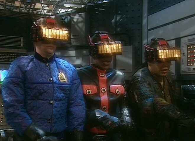
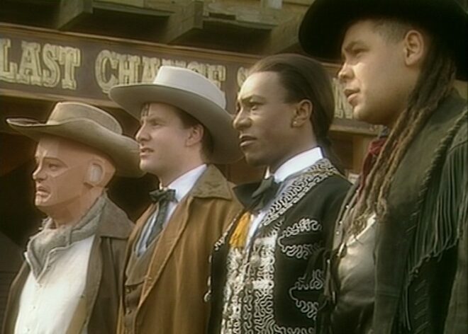
So I was delighted to come across Joe Nazzaro’s book The Making of Red Dwarf in a charity shop recently. It focuses on the production of the series’ most lauded episode, the International Emmy-winning “Gunmen of the Apocalypse” from 1993. The episode sees mechanoid Kryten deliberately contract a computer virus in order to save the Red Dwarf posse, and their efforts to help him battle the infection within the framework of a Wild West VR game representing his consciousness.

What I find fascinating is that the series, at that time at least, was made in such a different way to modern high-end TV or film, following instead the multi-camera sitcom pattern of rehearsing all week and recording in the evening on Saturday.

The cycle began on a Sunday, with production designer Mel Bibby removing the previous episode’s sets from Stage G at Shepperton and installing the new ones.

On Monday the director, writers and cast rehearsed on the set while certain crew members travelled to location – the Laredo Western Club in Kent – to pre-rig. A British sitcom at this time had no director of photography; instead the camera angles were chosen purely by the director and technically executed under the purview of the camera supervisor, while illumination was provided by the lighting director, in this case John Pomphrey. His work at Laredo included putting warm lights inside the buildings to match the look of the interiors which he planned for the studio.

Pomphrey lit a lot of rock and pop shows, and was inspired by concert lighting for such bands as Iron Maiden:

“If you look at them they’re into the same colours I am: oranges, deep blues; powerful colours. I don’t believe in understating something, because you’re generally watching it on a small screen in a well-lit room, so you’ve got to overstate the colours. In the cinema, you can get away with subtle tones, but I don’t think you can on this show… I’m a frustrated cinematographer: I want to make ‘Aliens’.”

Tuesday was the location shoot, conducted with multiple cameras (though not for every set-up) as director Andy DeEmmony worked through his storyboards. At this time all UK TV was 4:3 standard definition. While a high-end drama would have used 16mm film, most shows, including Red Dwarf, were captured on a tape format like Betacam SP. “Gunmen of the Apocalypse” saw the series make rare use of a crane, and behind-the-scenes photos also show at least one HMI shining through a diffusion frame. It was common practice at this time to use large HMIs to fill in shadows on sunny day exteriors.

On Wednesday rehearsals continued on stage, culminating in a tech run during which camera supervisor Rocket previewed shots using the classic hand-framing method. In the evening the production team convened to discuss the next episode, “Polymorph II: Emohawk”.

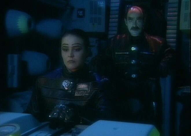
Thursday was known as the Pre-VT day: the day when all scenes too complex to shoot in front of the live audience must be recorded. With “Gunmen” this meant scenes inside the Last Chance Saloon which required such camera tricks as pulling knives out of antagonist Jimmy’s jacket on nylon wires so that in reverse it looked like the knives were pinning him to the wall, Rimmer’s bar fight with four cowboys, and a scene aboard the Simulant ship which is the source of Kryten’s infection.

Pomphrey would communicate by radio with Dai Thomas, who spent studio days in a darkened cabin operating a lighting desk while watching the action on two monitors.

Friday saw more rehearsals, while Tuesday and Thursday’s footage was edited to show to the live audience tomorrow.

Saturday began with blocking and camera rehearsals, before the doors opened to the public at 7pm and recording commenced at 7:30.

It seems that Shepperton Stage G was not equipped with a gallery like a dedicated TV studio; instead, vision mixing was done from the scanner – an outside broadcast truck. For those who don’t know, vision mixing is live editing, cutting from one camera to another in real time as a production assistant calls the shots from the director’s camera script. Elsewhere in the scanner, an engineer monitored the images, doing something akin to the job of a modern DIT, adjusting colours, sharpness and even remotely controlling the cameras’ irises. (Zoom and focus were controlled by the camera operators.)

It’s a testament to all concerned that the show looked so cinematic despite being made this way. Later seasons became even more cinematic, doing away with the live audience for a little while, then bringing it back and later kick-starting Ed Moore BSC’s career when he shot seasons XI and XII beautifully. By this time the show was produced by Dave (a channel named, appropriately enough, after Red Dwarf‘s slobbish hero Dave Lister). It was now captured in HD, on Red cameras of some flavour if I remember rightly, with a focus puller for each one and a more film-like crew structure .

It’s unclear at present if any more seasons will follow 2020’s “The Promised Land”, but if they do I’m sure the series will continue to evolve and embrace new technologies and working practices. Which is a very dull way to end a post about a very funny show, so instead I’ll leave you with one of my favourite jokes from the series, which will make no sense whatsoever unless you remember the set-up.

Kryten, no kitchen appliance should give a human being a double polaroid.

“Red Dwarf VI”: Making a Sci-fi Sitcom in 1993