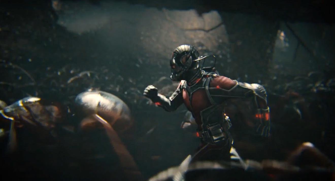
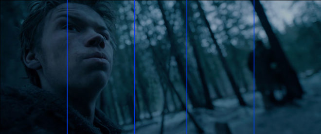
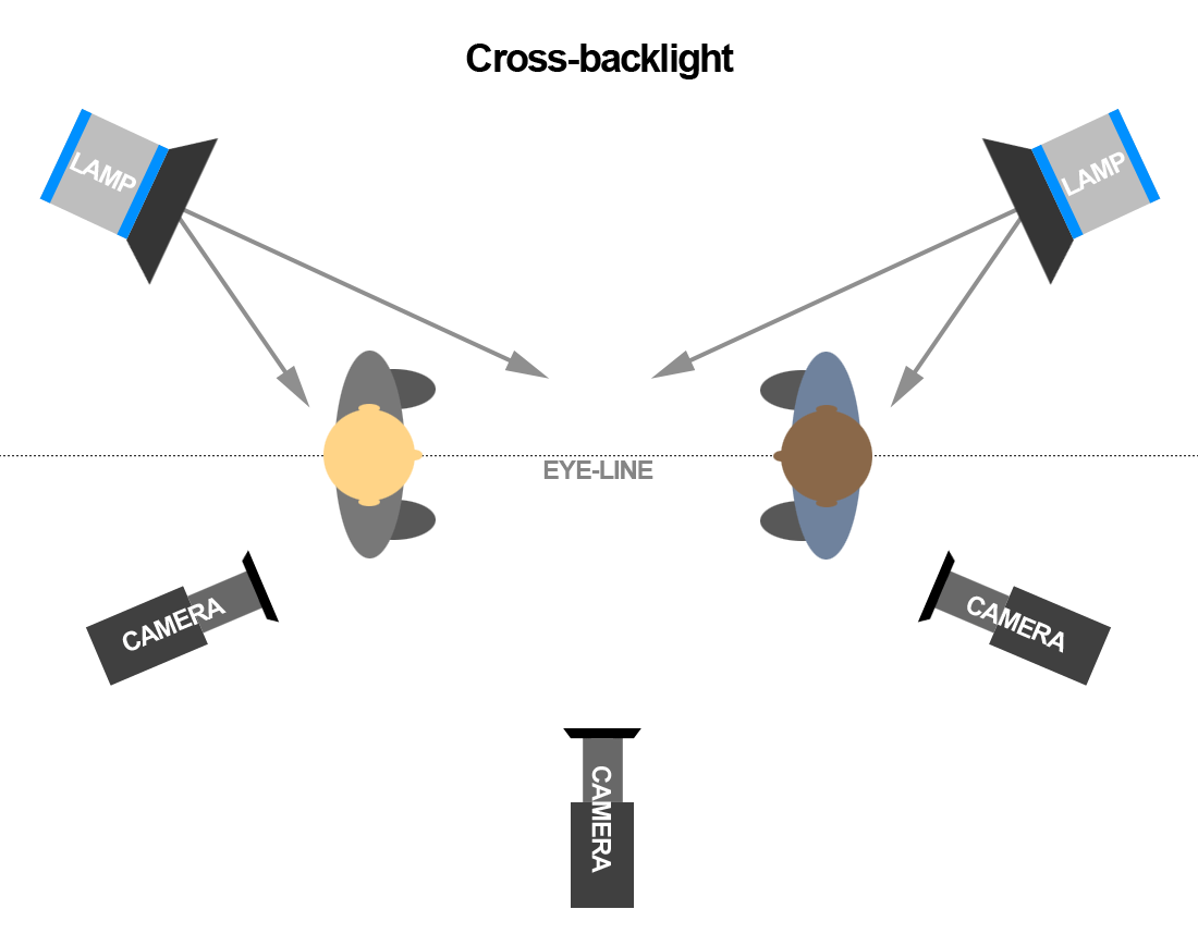
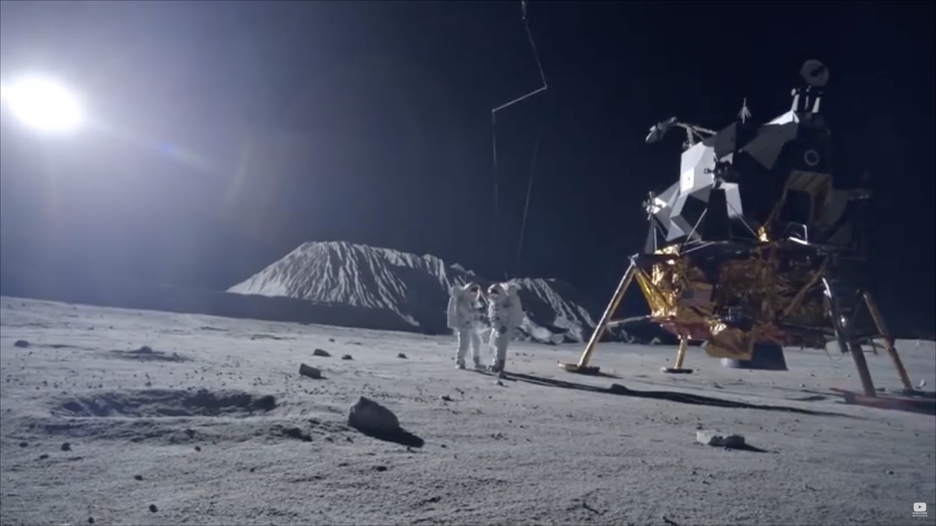
5 Steps to Lighting a Forest at Night

EXT. FOREST - NIGHT

A simple enough slug line, and fairly common, but amongst the most challenging for a cinematographer. In this article I’ll break down into five manageable steps my process of lighting woodlands at night.


1. Set up the moon.

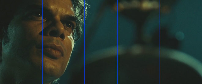
Forests typically have no artificial illumination, except perhaps practical torches carried by the cast. This means that the DP will primarily be simulating moonlight.

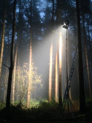
Your “moon” should usually be the largest HMI that your production can afford, as high up and far away as you can get it. (If your production can’t afford an HMI, I would advise against attempting night exteriors in a forest.) Ideally this would be a 12K or 18K on a cherry-picker, but in low-budget land you’re more likely to be dealing with a 2.5K on a triple wind-up stand.

Why is height important? Firstly, it’s more realistic. Real moonlight rarely comes from 15ft off the ground! Secondly, it’s hard to keep the lamp out of shot when you’re shooting towards it. A stand might seem quite tall when you’re right next to it, but as soon as you put it far away, it comes into shot quite easily. If you can use the terrain to give your HMI extra height, or acquire scaffolding or some other means of safely raising your light up, you’ll save yourself a lot of headaches.

In this shot from “The Little Mermaid” (dir. Blake Harris), a 12K HMI on a cherry-picker creates the shafts of moonlight, while another HMI through diffusion provides the frontlight. (This frontlight was orange to represent sunrise, but the scene was altered in the grade to be pure night.)

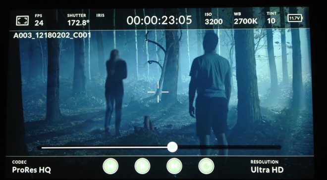
The size of the HMI is of course going to determine how large an area you can light to a sufficient exposure to record a noise-free image. Using a good low-light camera is going to help you out here. I shot a couple of recent forest night scenes on a Blackmagic Pocket Cinema Camera, which has dual native ISOs, the higher being 3200. Combined with a Speedbooster, this camera required only 1 or 2 foot-candles of illuminance, meaning that our 2.5K HMI could be a good 150 feet away from the action. (See also: “How Big a Light do I Need?”)


2. Plan for the reverse.

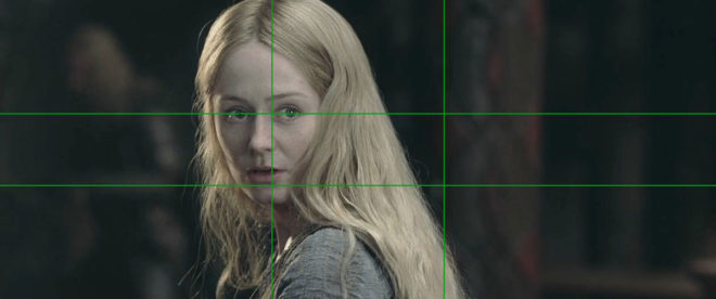
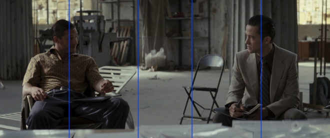
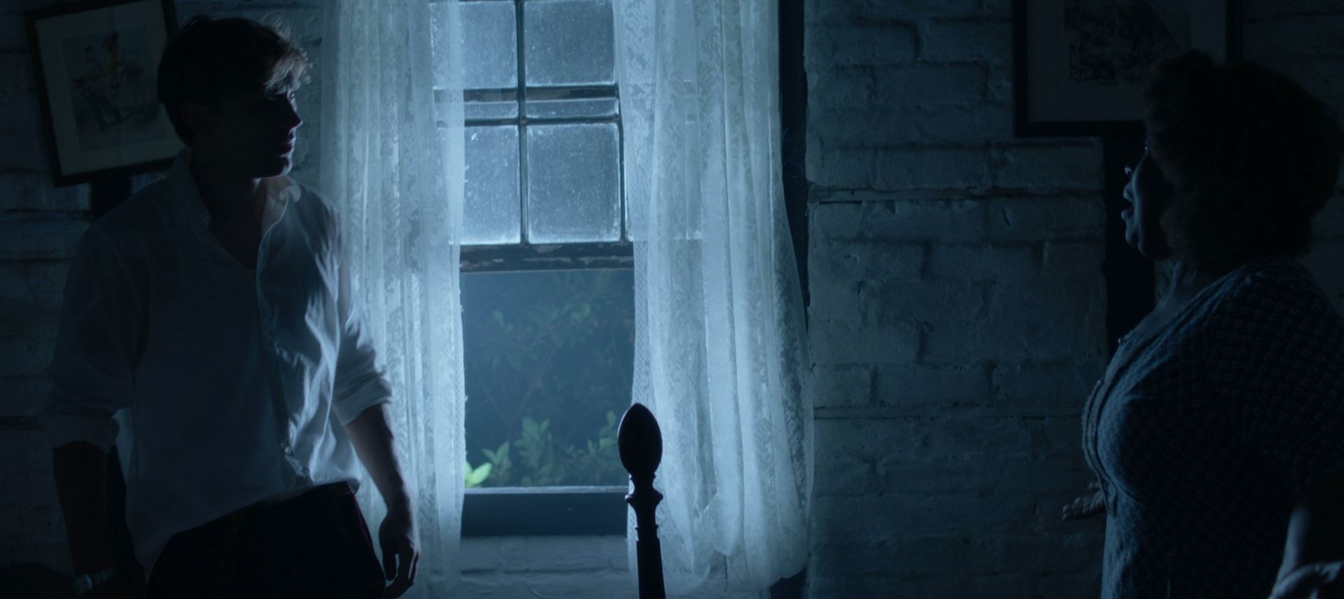
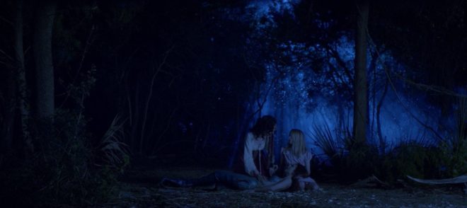
A fake moon looks great as a backlight, but what happens when it comes time to shoot the reverse? Often the schedule is too tight to move the HMI all the way around to the other side, particularly if it’s rigged up high, so you may need to embrace it as frontlight.

Frontlight is generally flat and undesirable, but it can be interesting when it’s broken up with shadows, and that’s exactly what the trees of a forest will do. Sometimes the pattern of light and dark is so strong and camouflaging that it can be hard to pick out your subject until they move. One day I intend to try this effect in a horror film as a way of concealing a monster.

One thing to look out for with frontlight is unwanted shadows, i.e. those of the camera and boom. Again, the higher up your HMI is, the less of an issue this will be.

If you can afford it, a second HMI set up in the opposite direction is an ideal way to maintain backlight; just pan one off and strike up the other. I’ve known directors to complain that this breaks continuity, but arguably it does the opposite. Frontlight and backlight look very different, especially when smoke is involved (and I’ll come to that in a minute). Isn’t it smoother to intercut two backlit shots than a backlit one and frontlit one? Ultimately it’s a matter of opinion.

An example of cheated moonlight directions in “His Dark Materials” – DP: David Luther


3. Consider Ground lights.

One thing I’ve been experimenting with lately is ground lights. For this you need a forest that has at least a little undulation in its terrain. You set up lights directly on the ground, pointed towards camera but hidden from it behind mounds or ridges in the deep background.

Detail from one of my 35mm stills: pedestrians backlit by car headlights in mist. Shot on Ilford Delta 3200

I once tried this with an HMI and it just looked weird, like there was a rave going on in the next field, but with soft lights it is much more effective. Try fluorescent tubes, long LED panels or even rows of festoon lights. When smoke catches them they create a beautiful glow in the background. Use a warm colour to suggest urban lighting in the distance, or leave it cold and it will pass unquestioned as ambience.

Put your cast in front of this ground glow and you will get some lovely silhouettes. Very effective silhouettes can also be captured in front of smoky shafts of hard light from your “moon”.


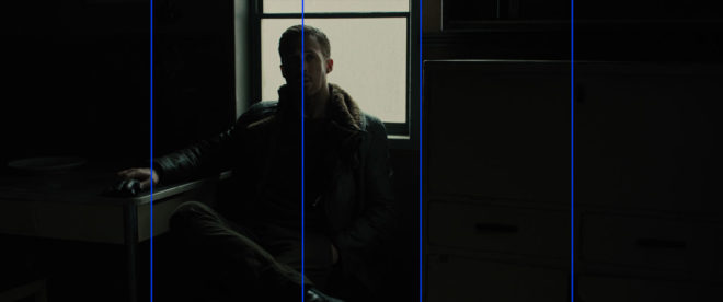
4. Fill in the faces.

All of the above looks great, but sooner or later the director is going to want to see the actors’ faces. Such is the cross a DP must bear.

On one recent project I relied on practical torches – sometimes bounced back to the cast with silver reflectors – or a soft LED ball on a boom pole, following the cast around.

Big-budget movies often rig some kind of soft toplight over the entire area they’re shooting in, but this requires a lot of prep time and money, and I expect it’s quite vulnerable to wind.

A recipe that I use a lot for all kinds of night exteriors is a hard backlight and a soft sidelight, both from the same side of camera. You don’t question where the sidelight is coming from when it’s from the same general direction as the “moon” backlight. In a forest you just have to be careful not to end up with very hot, bright trees near the sidelight, so have flags and nets at the ready.

This shot (from a film not yet released, hence the blurring) is backlit by a 2.5K HMI and side-lit by a 1×1 Aladdin LED with a softbox, both from camera right.


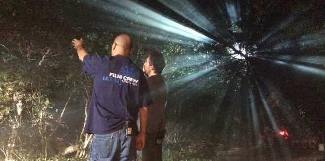
5. Don’t forget the Smoke.

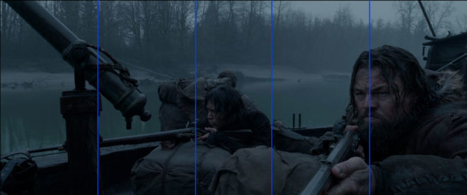
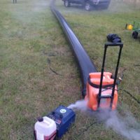
Finally, as I’ve already hinted, smoke is very important for a cinematic forest scene. The best options are a gas-powered smoke gun called an Artem or a “Tube of Death”. This latter is a plastic tube connected to a fan and an electric smoke machine. The fan forces smoke into the tube and out of little holes along its length, creating an even spread of smoke.

A Tube of Death in action on the set of “The Little Mermaid”

All smoke is highly suspectible to changes in the wind. An Artem is easier to pick up and move around when the wind changes, and it doesn’t require a power supply, but you will lose time waiting for it to heat up and for the smoke and gas canisters to be changed. Whichever one you pick though, the smoke will add a tremendous amount of depth and texture to the image.

Overall, nighttime forest work scenes may be challenging, but they offer some of the greatest opportunities for moody and creative lighting. Just don’t forget your thermals and your waterproofs!

5 Steps to Lighting a Forest at Night

Kickstarter Now Live for Ren: The Girl with the Mark

Ren: The Girl with the Mark, the fantasy web series with over 8 million views and 14 international awards which I’m the DP on, is crowdfunding new episodes right now. Of all the projects I’ve ever worked on, there are few that I’m as proud of as I am of Ren.

https://www.kickstarter.com/projects/mythica/ren2

Please head on over to the Kickstarter page and contribute if you can. You can back for as little as £1 (or the equivalent in your local currency – Kickstarter automatically converts it). If you’re not able to back it, please tell others about it, share the social media posts, like and comment. You can find the Ren Facebook page here, the Twitter feed here and the Instagram feed here.

There are many awesome rewards on offer, including DVDs, downloads, collectables and unique on-set experiences.

One of the rewards is getting access to a new Cinematic Lighting course which I’ve made. Across four one-hour modules, I set up, light and shoot little scenes inspired by Ren on real locations with real actors, along the way explaining every decision I make.

Another reward is the Cinematographer Experience, where you get to spend a day on set with me, picking my brains, learning from everyone in the camera and lighting departments, and you get access to the lighting plans and shot lists, and you can take part in a group chat with me after we’ve wrapped.

Other filmmaking-related rewards are the Director Experience and the Downloads & Vlogs package which includes access to exclusive behind-the-scenes video blogs from every day of the shoot.

So check out the Kickstarter now at: https://www.kickstarter.com/projects/mythica/ren2

Kickstarter Now Live for Ren: The Girl with the Mark

The Cinematography of “First Man”

A miniature Saturn V rocket is prepared for filming

If you’re a DP, you’re probably familiar with the “Guess the Format” game. Whenever you see a movie, you find yourself trying to guess what format it was shot on. Film or digital? Camera? Glass? Resolution?

As I sat in the cinema last autumn watching First Man, I was definitely playing the game. First Man tells the true story of Neil Armstrong’s (Ryan Gosling) extraterrestrial career, including his test flights in the hypersonic  X-15, his execution of the first ever docking in space aboard Gemini 8, the tragic deaths of his colleagues in the launchpad fire of Apollo 1, and of course the historic Apollo 11.

The game was given away fairly early on when I noticed frames with dust on, a sure sign of celluloid acquisition. (Though most movies have so much digital clean-up now that a lack of dust doesn’t necessarily mean that film wasn’t involved.) I automatically assumed 35mm, though as the film went on I occasionally wondered if I could possibly be watching Super-16? There was something of the analogue home movie about certain scenes, the way the searing highlights of the sun blasting into the space capsules rolled off and bloomed.

When I got home I tracked down this Studio Daily podcast and my suspicions were confirmed, but we’ll get to that in a minute.


Cinéma Vérité

Let’s start at the beginning. First Man was directed by Damien Chazelle and photographed by Linus Sandgren, FSF, the same team who made La La Land, for which both men won Oscars. What I remember most about the cinematography of that earlier film is the palette of bright but slightly sickly colours, and the choreographed Steadicam moves.

First Man couldn’t be more different, adopting a cinéma vérité approach that often looks like it could be real and previously-unseen Nasa footage. Sandgren used zoom lenses and a documentary approach to achieve this feeling:

When you do a documentary about a person and you’re there in their house with them and they’re sad or they’re talking, maybe you don’t walk in there and stand in the perfect camera position. You can’t really get the perfect angles. That in itself creates some sort of humbleness to the characters; you are a little respectful and leave them a little alone to watch them from a distance or a little bit from behind.

Similarly, scenes in the spacecraft relied heavily on POVs through the small windows of the capsule, which is all that the astronauts or a hypothetical documentary camera operator would have been able to see. This blinkered view, combined with evocative and terrifying sound design – all metallic creaks, clanks and deafening booms, like the world itself is ending – makes the spaceflight sequences incredibly visceral.


Multiple gauges

Scale comparison of film formats. Note that Imax is originated on 65mm stock and printed on 70mm to allow room for the soundtrack.

Documentaries in the sixties would have been shot on Super-16, which is part of the reason that Sandgren and Chazelle chose it as one of their acquisition formats. The full breakdown of formats is as follows:

  • Super-16 was employed for intense or emotional material, specifically early sequences relating to the death of Armstrong’s young daughter, and scenes inside the various spacecraft. As well as the creative considerations, the smaller size of Super-16 equipment was presumably advantageous from a practical point of view inside the cramped sets.
  • 35mm was used for most of the non-space scenes. Sandgren differentiated the scenes at Nasa from those at Armstrong’s home by push-processing the former and pull-processing the latter. What this means is that Nasa scenes were underexposed by one stop and overdeveloped, resulting in a detailed, contrasty, grainy look, while the home scenes were overexposed and underdeveloped to produce a cleaner, softer, milkier look. 35mm was also used for wide shots in scenes that were primarily Super-16, to ensure sufficient definition.
  • Imax (horizontally-fed 65mm) was reserved for scenes on the moon.


In-camera effects

In keeping with the vintage aesthetic of celluloid capture, the visual effects were captured in-camera wherever possible. I’ve written in the past about the rise of LED screens as a replacement for green-screen and a source of interactive lighting. I guessed that First Man was using this technology from ECUs which showed the crescent of Earth reflected in Ryan Gosling’s eyes. Such things can be added in post, of course, but First Man‘s VFX have the unmistakeable ring of in-camera authenticity.

Imposing a “no green-screen” rule, Chazelle and his team used a huge LED screen to display the views out of the spacecraft windows. A 180° arc of 60′ diameter and 35′ in height, this screen was bright enough to provide all the interactive lighting that Sandgren required. His only addition was a 5K tungsten par or 18K HMI on a crane arm to represent the direct light of the sun.

The old-school approach extended to building and filming miniatures, of the Saturn V rocket and its launch tower for example. For a sequence of Armstrong in an elevator ascending the tower, the LED screen behind Gosling displayed footage of this miniature.

For external views of the capsules in space, the filmmakers tried to limit themselves to realistic shots which a camera mounted on the bodywork might have been able to capture. This put me in mind of Christopher Nolan’s Interstellar, which used the same technique to sell the verisimilitude of its space vehicles. In an age when any conceivable camera move can be executed, it can be very powerful to stick to simple angles which tap into decades of history – not just from cinema but from documentaries and motorsports coverage too.


Lunar Lighting

For scenes on earth, Landgren walked a line between naturalism and expression, influenced by legendary DPs like Gordon Willis, ASC. My favourite shot is a wide of Armstrong’s street at night, as he and his ill-fated friend Ed White (Jason Clarke) part company after a drinking session. The mundane suburban setting is bathed in blue moonbeams, as if the the moon’s fingers are reaching out to draw the characters in.

Scenes on the lunar surface were captured at night on an outdoor set the size of three football pitches. To achieve absolute authenticity, Sandgren needed a single light source (representing the sun) fixed at 15° above the horizon. Covering an area that size was going to require one hell of a single source, so he went to Luminys, makers of the Softsun.

Softsuns

Softsuns are lamps of frankly ridiculous power. The 50KW model was used, amongst other things, to blast majestic streams of light through the windows of Buckingham Palace on The Crown, but Sandgren turned to the 100KW model. Even that proved insufficient, so he challenged Luminys to build a 200KW model, which they did.

The result is a completely stark and realistic depiction of a place where the sun is the only illumination, with no atmosphere to diffuse or redistribute it, no sky to glow and fill in the shadows. This ties in neatly with a prevailing theme in the film, that of associating black with death, when Armstrong symbolically casts his deceased daughter’s bracelet into an obsidian crater.

First Man may prove unsatisfying for some, with Armstrong’s taciturn and emotionally closed-off nature making his motivations unclear, but cinematically it is a tour de force. Taking a human perspective on extraordinary accomplishments, deftly blending utterly convincing VFX and immersive cinéma vérité photography, First Man recalls the similarly analogue and similarly gripping Dunkirk as well as the documentary-like approach of 1983’s The Right Stuff. The film is currently available on DVD, Blu-ray and VOD, and I highly recommend you check it out.

The Cinematography of “First Man”

Pick-ups for “Rory’s Way”

In August 2016 I was recommended to a production manager who was crewing up a small pick-ups shoot in London. The pick-ups were for Rory’s Way, or The Etruscan Smile as it was then known, a $12 million feature based on the best-selling novel of the latter name, starring Brian Cox and Thora Birch. Apparently test screenings had shown that the film’s ending wasn’t quite satisfying enough, and parts of it were to be remounted.

I was given a storyboard consisting of actual frame-grabs from the original version of the scene, alongside notes explaining how the action would be different. Not to give too much away, but the scene involves Brian’s character in bed, and a baby in a cot next to him. The changes simply involved Brian giving a different reaction to what the baby is doing. The bed was to be set up on stage against a blue screen, and composited into backgrounds extracted from the principal photography footage. The baby’s performance was not to be changed, so he was to be rotoscoped out of the original footage too.

I was sent the camera report, 2nd AC’s notebook and script notes from principal photography. The crew had known that the view out of the bedroom window would be added in post, and that separate takes of the baby and Brian would be digitally combined, so they recorded plenty of information for the VFX team. Between the three documents, I had the focal length, focal distance, aperture, white balance, shutter angle, filters, lens height and tilt of every set-up in the scene.

My next step was to email  the main unit DP, who was none other than Javier Aguirresarobe, ASC, AE – the man behind the lens on Thor: Ragnarok, Nicole Kidman vehicle The Others, two of the Twilight films, and Woody Allen’s Vicky Cristina Barcelona. Needless to say, I was honoured to be recreating the work of such an experienced cinematographer.

Unit still of Javier Aguirresarobe, ASC, AE on location in Scotland for “Rory’s Way”/”The Etruscan Smile”

Javier told me that he had shot with Arri/Zeiss Master Primes, and explained the feel and colour of lighting he had been going for. He had used an 81C (coral) filter to warm up the image a little, and a 1/8th Black Promist for diffusion.

After that, I sat down over coffee with Ben Millar, my gaffer. We analysed the footage from principal photography and reverse-engineered the lighting. I say “we”; it was mostly Ben. This is why a DP hires a good gaffer!

The pick-ups shoot was a single day. The afternoon before, the director and the camera department convened at the studio. The plan was to go through each of the set-ups using a stand-in in the bed. For each set-up, we first used the camera logs and script notes to put on the correct lens and filters, and set the sticks to the right height and tilt. Then, with a print-out of the original shot taped underneath the monitor, we nudged the camera around until we had the closest possible match in framing. This done, ACs Max Quinton and Bex Clives marked the tripod position on the floor with tape, writing the lens length, height, filters etc. on the tape itself to make things super-efficient the next day.

The pick-ups set was nothing more than a bed surrounded by blue screens. The bright gap between the screens represents the window from the original location.

On the morning of the shoot, the lighting department had two or three hours to set up before Brian was called. We used mostly Kinoflos, with a lot of flags to represent window frames through which light sources had been shining on the original set. The VFX supervisor Stephen Coren and I checked the histograms on the monitor to ensure the blue screen was lit evenly and to the level he required.

We were ready to roll in plenty of time, and things went more or less to plan, with the addition of an extra shot or two. The editorial team were in the next room, checking our shots against the original material, and they reported that all was well.

We finished up with a single wide night interior shot for an earlier scene in the movie. This was an interesting one, because we had to extrapolate the lighting for the whole room from a single close-up that had been shot in principal photography. Our wide shot, recorded entirely against blue, would be dropped into a wide shot from principal – a daylight wide shot, that would be digitally painted and retimed for night.

At the time of writing, Rory’s Way has just hit UK cinemas, but I have yet to see it. For all I know it might have been re-edited again, but hopefully my shots are still in there! Either way, it was a fascinating exercise to analyse and reproduce the work of a top cinematographer.

Pick-ups for “Rory’s Way”

Aspect Ratio and the Marvel Cinematic Universe

I used to be a casual follower of superhero films, until I was inducted into the Marvel Cinematic Universe via a movie marathon. Despite different directors for each instalment, the MCU has a fairly consistent look and feel, so I was a little surprised when we got to The Avengers to note that it differs visually in one significant way from all of its predecessors. Whereas the five previous films (and indeed most of the subsequent ones) were in the 2.39:1 aspect ratio, The Avengers was presented in the taller 1.85:1 ratio.

This initially struck me as counterintuitive. 2.39:1 was introduced in the 1950s to tempt watchers of the new-fangled TV back into the cinemas, and ever since then it has been associated with the biggest, most epic, most cinematic of movies. It seems like the natural choice for a superhero franchise, so it’s no surprise that the MCU adopted this ratio for most of its instalments. But if wider images mean a more epic movie, then surely The Avengers, the climax of Phase One and the coming-together of a whole team of superheroes, should be, if anything, even wider than its 2.39:1 predecessors?

“The Avengers” (2012, DP: Seamus McGarvey, BSC, ASC)

I’m certainly not the first person to be nonplussed by the choice. A quick google later on threw up plenty of forums where fans complained that The Avengers was “not cinematic enough” because of its aspect ratio. Some linked the choice of ratio to director Joss Whedon’s TV background, claiming he was more comfortable with that shape of frame.

The real reason for Whedon’s decision became clear as the action ramped up into the third act. The battle of New York is not a two-dimensional conflict; Thor and Iron Man are flying around, the Hulk climbs up buildings, the Chitauri ships float above the streets, and Stark Tower plays a key part in the action. The extra frame height of 1.85 was essential to tell that story.

“I wanted to feel the space around us, and use wider lenses,” said Whedon. “That’s why I went 1.85 instead of wider. In IMAX, I wanted it to fill your eyeball completely.”

“Ant-Man” (2015, DP: Russell Carpenter, ASC)

Continuing the movie marathon, the MCU does not return to 1.85 until Ant-Man, and director Peyton Reed initially encountered resistance from the studio when he advocated this ratio. “It’s a big conversation because it affects production design. It affects everything. And it felt to me… that shrinking was a vertical act and it was going to serve the movie even more. And I had to make a case for the fact that it was still going to be epic.”

I wonder if the days of wider aspect ratios being perceived as more epic are numbered. IMAX sequences are becoming more and more common in blockbusters, including the Marvel films. Digital IMAX has an aspect ratio of 1.90:1, very similar to the 1.85 which is so often perceived as the small-scale, poor man’s ratio. (To confuse matters, the 1.90 sequences are often cropped to 2.39 for ordinary cinemas and home entertainment release.) An epic feel is very much what the IMAX brand is selling, so the traditional perception is being turned on its head. Both Avengers: Infinity War and the recent Endgame were shot entirely in Imax 1.90:1, and are sure to be the very definition of epic for a while to come.

Things seem to be going the same way over in the DC universe too. On the social media platform Vevo, director Zak Snyder had this to say about Batman v. Superman and Justice League: “I had so much fun shooting the IMAX sections of my movie (BvS) [that I] sort of fell in love with that giant less rectangular aspect ratio and so that’s why I shot JL 1:85”.

Image size may have something to do with this shifting trend. After all, a larger image is surely more epic than a smaller one. In theory, 2.39 should result in the largest image, with curtains or masks at the sides of a cinema screen opening up for these widescreen presentations. In practice though, many smaller multiplex auditoria mask the top and bottom of their screens for 2.39, making for a smaller overall image than 1.85, just like when you watch 2.39 content at home on your TV or monitor (which is 1.78:1). My local multiplex recently converted its largest auditorium to IMAX, which involved no change to the width of the screen, but an increase in height.

Add to this the fact that 2.39 overtook 1.85 as the most common aspect ratio for top-grossing films over a decade ago, and it’s small wonder that filmmakers seeking to make their work stand out from the crowd are turning to taller frames.

“Avengers: Infinity War” (2018, DP: Trent Opaloch)

However the trend of aspect ratios ends up going, it’s important to remember that there’s no wrong or right. I’ve done jobs where directors have told me, “It’s a movie, it’s got to be 2.39,” or, “It’s a series, it’s got to be 1.78,” but there is always a choice. Are your sets tall or wide? Are your lead characters similar or dissimilar in height? Are landscapes or body language most important to this story? It’s factors like these that should really determine the best ratio for your movie, just as Whedon and Reed both realised.

See also:

Aspect Ratio and the Marvel Cinematic Universe

This Morning With Richard Not Judy

20 years ago today, I was on TV. I had my fifteen seconds of fame on a slightly obscure BBC2 Sunday morning show in the late nineties, primarily watched by stoned students. Yes, I was a King of the Show on Lee & Herring’s This Morning with Richard Not Judy.

https://youtu.be/9LXCjx97_-o?t=1084

The year was 1999. All anyone could talk about was The Phantom Menace and the Y2K bug. I had a rubbish beard that looked like the strap of a helmet. (Thank God beards have gone out of fashion, eh?) And I worked as an admin assistant for the Ministry of Agriculture, Fisheries and Food in Worcester.

On Sunday mornings (or sometimes Friday teatimes, for the edited repeat) I would turn on my comically huge cathode ray tube TV, receiving its hilariously archaic analogue UHF signals, and watch Stewart Lee and Richard Herring squeeze as many blasphemies and euphemisms as possible into what was most definitely a pre-watershed slot.

Trying on the Curious Orange head

Broadcast live, TMWRNJ (“TMWRNJ!“) was a surreal, sketch-packed affair loosely hung on the format of a spoof daytime show. Memorable characters included the Curious Orange, Simon Quinlank and his weak lemon drink, Jesus (“Aaaaah!”/”No, not ‘aaaah’!”) and an inexplicably jelly-obsessed Rod Hull.

Each week Lee and Herring would crown someone “King of the Show”, a largely ceremonial office with no real power. Usually it was a random member of the studio audience, but in an episode which saw Rich taking a shady product placement deal from Ian Cress of the Cress Marketing Board, a competition was announced. The next week’s King of the Show would be whoever could make the best advert for cress.

Immediately I picked up my amusingly quaint landline and tediously placed a call to my friend Matt Hodges by pressing a sequence of numbers associated with his own, equally quaint landline, a sequence of numbers I had to remember using my actual brain or possibly pen and paper. Do you remember the nineties, Stew? Weren’t they hilarious? Ahahahahahahaha!

Matt and I backstage with the Curious Alien, TV’s Emma Kennedy and Darth Maul

Matt was one of the poor unfortunates who regularly got roped into appearing in my amateur filmmaking efforts with my Video-8 camcorder. A massive Python fan, Matt’s influence had ensured that I churned out many surreal comedies in those halcyon days.

We quickly came up with four ideas for cress commercials, each one spoofing a different type of ad: McDonald’s, army recruitment, charity appeal and gay exchange. Sadly I no longer have copies of the latter three. I recall the army one involved a punnet of cress with a cardboard machine gun glued to it, abseiling down ropes to a bombastic voiceover (“Be the best!”). The charity appeal, shot in the sandpit of our local primary school, featured a cardboard cut-out of Mark Hamill pathetically farming in a desert. (“If you give Mark a punnet of cress, he can feed his family for a day. But give him the means to grow his own cress…”) The less said about the gay exchange one the better.

Matt contemplates his upcoming moment of fame in the glamorous BBC B&B. “I’m going to be on television,” reads the sign.

We sent off the four ads on a VHS tape (imagine Netflix but… oh, never mind) and crossed our fingers.

A few days later, I was sitting at my desk at MAFF, probably trying to skive proper work by writing macros in Excel, when the phone rang. I couldn’t quite believe it when the voice at the other end told me he was calling from TMWRNJ (“TMWRNJ!“), they loved our ads, we were going to be on the show on Sunday, travel and accommodation all paid by the BBC.

That Saturday, Matt and I caught the train to London. Even the decidedly-unglamorous Bayswater B&B we were booked into couldn’t quell our ex-like-a-bird’s-eggs-citement. We spent most of the evening trying to come up with witty proclamations to make when we were crowned. “I’d like to see Jamie open a passage with his magic torch,” was the punchline, but I forget the set-up.

The following morning a taxi dropped us at Riverside Studios in Hammersmith, where we felt very important muscling past the queueing audience and into the backstage area. I remember awkwardly hanging around Stew and Rich, agog at meeting actual famous people in real life.

Awkward

The show itself seemed to go by very quickly, and we didn’t get chance to deliver our hilarious Jamie gag. But afterwards we got to hang out and properly meet the cast, having lunch with them in the studio canteen.

Less awkward

Then we were given a tour of the studio and allowed to sit and watch – just the two of us, the rest of the audience having departed – while sketches for the next week’s episode were pre-recorded. These included an instalment of Histor & Pliny, a spoof children’s series featuring a pair of time-travelling crows puppeteered by Stew and Rich, whose dialogue on set that day was considerably bluer than what would ultimately be broadcast. (“Eat the fucking eggs, you cunt!”)

I vividly recall TV’s Emma Kennedy walking past us, dressed in some typically outlandish costume, remarking that she might have just farted a baked bean out of her bumhole. What a great day!

With TV’s Emma Kennedy

Later that year, Matt and I bumped into Stewart Lee on the platform of Worcester Foregate Street station while on our way to the Reading Festival. I asked Stew if we could have a regular slot on the next series of TMWRNJ (“TMWRNJ!“) and he replied in his usual lugubrious tone, “Firstly, we don’t know if we’re going to get another series. And secondly, no.”

We may not have become the next Adam & Joe, but my brief moment in the spotlight did have an impact on my career. It was only when I told the Rural Media Company’s head of production that I had appeared on TV because of a spoof advert I’d made that she agreed to look at my amateur showreel. She saw some potential and started hiring me, kicking off two decades of freelancing.

Egg egg egg-egg egg egg egg-egg-egg egg.

I’ll leave you with Rich’s own thoughts from his blog at the time…

Thanks to everyone who sent in cress photos etc. The lads from Malvern were actually two of the nicest people we’ve had as king and to be honest the clip we showed was not the best thing they sent us, but it was the shortest and most TV friendly. They did a great Gay Exchange parody which was just a bit too rude. We were also very impressed by the editing and choice of shots. Those 2 guys will go far, but I’ve already forgotten their names! Sorry!

This Morning With Richard Not Judy

Is the Rule of Thirds Right for 2.39:1?

The Rule of Thirds is the most well-known guide for framing an image. Simply imagine the frame divided into equal horizontal and vertical thirds – or don’t even bother imagining, just turn on your camera’s built-in overlay – and place your subject on one of those lines to get a pleasantly composed picture every time. Some filmmakers believe in the Rule so much that they refuse to even consider any other type of composition.

The Rule of Thirds in action on “The Aviator” (2004, DP: Robert Richardson, ASC), winner of the 2005 Best Cinematography Oscar

As I’ve previously written, I find the Rule of Thirds grossly overrated. In particular, when composing for a widescreen aspect ratio like Scope (CinemaScope, i.e.. 2.39:1), the Rule often doesn’t work for me at all.

In this post I’m going to look at an alternative compositional technique, but first let’s step back and find out where the Rule of Thirds actually comes from and why it’s so popular.


Origins of the Rule of Thirds

The first known appearance of the term “Rule of Thirds” is in a 1797 treatise Remarks on Rural Scenery by the English painter John Thomas Smith. It seems he read too much into a simple statement by fellow artist Sir Joshua Reynolds to the effect that, if a picture has two clear areas of differing brightness, one should be bigger than the other. Hardly a robust and auspicious start for a rule that dominates the teaching and discussion of composition today.

I suspect that the Rule has gained strength over the last two centuries from the fact that it encourages novice painters, designers and photographers to overcome their natural tendency to frame everything centrally. Another factor in the Rule’s ubiquity is undoubtedly its similarity to a much older and more reasoned rule: the Golden Ratio.


The Golden Ratio and the Phi Grid

A mathematical concept that’s been around since the time of the ancient Greeks, the Golden Ratio is approximately 1.6:1. It’s a special ratio because if you add the two numbers together, 1.6+1, you get 2.6, and 2.6:1.6 turns out to be, when boiled down, the same ratio you started with, 1.6:1.

Wikipedia puts it this way:

Two quantities are in the Golden Ratio if their ratio is the same as the ratio of their sum to the larger of the two quantities.

It’s difficult to get your head around, I know!

The Golden Ratio is found in nature, in the spiral leaves of some plants for example, and even in certain crystals at the atomic level. There is a long history of artists believing that using the Ratio produces a more aesthetically pleasing image.

The Golden Ratio is most simply applied to composition in the form of a Phi Grid, which resembles a Rule of Thirds grid, but in different proportions, namely 1.6:1:1.6 rather than 1:1:1.

Andrew Lesnie, ACS, ASC applies the Phi Grid – though not necessarily deliberately – to “The Lord of the Rings: The Two Towers”

The Rule of Thirds and the Phi Grid both feel quite limiting in Scope because out of all that horizontal space you’ve only got two vertical lines to place your subject on. There is another technique though, one which provides more options.


The Squares within the rectangle

In his book The Mind of the Photographer, Michael Freeman writes about a composition guideline which dates back to the Middle Ages. You imagine two squares, the same height as the frame, and aligned with either side of the frame, then place your subject on the centre or inner edge of one of these squares.

Applied to a Scope frame it looks like this:

We can simplify it down to this:

When I first read about this technique, it really chimed with me. I’ve long believed that a “Rule of Fifths” would be a more effective guide for Scope composition than the Rule of Thirds, and the above diagram isn’t far away from fifths.

Below I’ve overlaid this grid on a few shots from Scope movies that won Best Cinematography Oscars: There Will Be Blood (DP: Robert Elswit, ASC), Slumdog Millionaire (Anthony Dod Mantle, DFF, ASC, BSC), Inception (Wally Pfister, ASC), The Revenant (Emmanuel Lubezki, ASC, AMC) and Blade Runner 2049 (Roger Deakins, CBE, ASC, BSC).

Let me provide a disclaimer first, though. You could draw any grid you wanted and find some shots from movies that matched it. The purpose of this article is not to convince you to ditch the Rule of Thirds and start following this “rule of squares within a rectangle” instead. (For a start, that name is never going to catch on.) This “rule” chimes with me because it’s similar to the way that I was already instinctively composing, but if it doesn’t work for you then don’t use it. Develop your own eye. It’s a creative medium, so compose creatively, not like a robot programmed with simple rules.

I’ll leave you with this quote from the great photographer Ansel Adams:

The so-called rules of photographic composition are, in my opinion, invalid, irrelevant and immaterial.

See also:

And if you want to read a thorough debunking of the Rule of Thirds, check out this article on Pro Video Coalition.

Is the Rule of Thirds Right for 2.39:1?

The 4:3 Aspect Ratio is Not Dead

This summer I shot Exit Eve, a short film from director Charlie Parham dealing with the exhausting and demeaning life of an au pair. We took the unusual decision to shoot it in 4:3, a ratio all but obsolete, but one which felt right for this particular story. Before I look at some of the ratio’s strengths and challenges, let’s remind ourselves of the history behind it.


History

William Kennedy Dickson

The 4:3 motion picture aspect ratio, a.k.a. 1.33:1, was created about 120 years ago by William Kennedy Dickson. This Thomas Edison employee was developing a forerunner to the movie projector, and decided that an image height of four perforations on 35mm film gave the ideal shape. In 1909 the ratio was declared the official standard for all US films by the Motion Picture Patent Company.

When the talkies arrived two decades later, room needed to be made on the film prints for the optical soundtrack. The Academy of Motion Pictures Arts and Sciences responded by determining a new, very slightly wider ratio of 1.37:1, known fittingly enough as the Academy Ratio. It’s so similar to 4:3 that I’m going to lump them together from hereon in.

When television was invented it naturally adopted the same 4:3 ratio as the big screen. The popularity of TV led to falling cinema attendance in the 1950s, to which the Hollywood studios responded with a range of enticing gimmicks including widescreen aspect ratios. Widescreen stuck, and for the next generation 1.85:1 and 2.39:1 were the ratios of cinema, while the narrower 4:3 was the ratio of TV.

By the time I entered the industry in the late 1990s, 4:3 was much maligned by filmmakers. It seemed boxy and restrictive compared with widescreen, and reminded those of us in the guerrilla world that we didn’t have the budgets and equipment of the Hollywood studios. Meanwhile, the wide compositions of big movies were butchered by pan-and-scan, the practice of cropping during the telecine process to fit the image onto a 4:3 TV without letterboxing. 4:3 was ruining our favourite movies, we felt.

Then, in the 21st century, 16:9 television became the norm, and the 4:3 aspect ratio quietly disappeared, unmourned…. Or did it?


Contemporary Cinema

Although they are firmly in a minority, a number of filmmakers have experimented with 4:3 or Academy Ratio in recent years. Some, like Andrea Arnold and the late Éric Rohmer, rarely shot anything else.

Arnold wanted a combination of intimacy and claustrophobia for her Bafta-winning 2009 drama Fish Tank. She carried the ratio over to her next film, an adaptation of Wuthering Heights, despite the prevalence of big landscapes which would have prompted most directors to choose 2.39:1. The Academy Ratio focuses the viewer’s attention much more on the characters and their inner worlds.

“Fish Tank” – DP: Robbie Ryan, BSC

Mark Kermode has this to say about the 1.37:1 work of Arnold and her DP Robbie Ryan: “What’s wonderful about it is the way [Ryan] uses that squarer format not to make the picture seem compressed but to make it seem taller, to make it seem larger, to make it seem oddly more expansive.”

Meek’s Cutoff (2010), a modern western by Kelly Reichardt, recalls the early Academy classics of the genre. As with Wuthering Heights, characters are placed in the landscape without being dominated by it, while the height of the frame produces bigger skies and an airier feel.

“Meek’s Cutoff” – DP: Chris Blauvelt

Pawel Pawlikowski’s 2013 Oscar-winner Ida deliberately goes against the grain, shooting not only in 4:3 but in black and white as well. It’s the perfect format to convey the timeless, spartan existence of the titular Ida and her fellow nuns. The tall frame allows for copious headroom, inspiring thoughts of Heaven and God, beneath which the mortal characters seem small.

The 2017 animated feature Loving Vincent, meanwhile, adopted 4:3 because it was closer to the shape of Van Gogh’s paintings.

David Lowery, director of last year’s A Ghost Story, wanted to trap his deceased title character in the boxy ratio. “It gave me a good opportunity to really hammer home the circumstances this ghost finds himself trapped in, and to dig into and break down the claustrophobia of his life within these four walls… And it was also a way to tap into some degree of nostalgia, because it feels old-fashioned when you see a movie in a square aspect ratio.”

4:3’s nostalgia factor has allowed it to be used very effectively for flashbacks, such as those in the recent Channel 4/Netflix series The End of the F***ing World. Wes Anderson delineated the three time periods of The Grand Budapest Hotel (2014) with different aspect ratios, using 1.37:1 for scenes set in 1932, the very same year in which that ratio was standardised by the Academy.


“Exit Eve”

Nostalgia, intimacy, claustrophobia, isolation – these are just some of the feelings which cinema’s original aspect ratio can evoke. For Charlie and I on Exit Eve, it was the sense of being trapped which made the ratio really fit our story. 

I’m also a great believer in choosing a ratio that fits the shape of your primary location, and the converted schoolhouse which we were shooting in had very high ceilings. 4:3 allowed us to show the oppressive scale of these rooms, while giving the eponymous Eve little horizontal freedom to move around it. One additional practical consideration was that, when lensing a party scene, the narrower ratio made it easier to fill the frame with supporting artists!

It wasn’t hard to get used to framing in 4:3 again. A lot of Exit Eve was handheld, making for fluid compositions. There were a couple of tripod set-ups where I couldn’t help thinking that the extra width of 1.85:1 would be useful, but for the most part 4:3 worked well. 

We were shooting on an Alexa Plus with a 16:9 sensor, meaning we were cropping the image at the sides, whereas ideally we would have hired a 4:3 model to use the full width of the sensor and a larger proportion of our lenses’ image circles. This would have allowed us to get slightly wider frames in some of the location’s smaller rooms.

Our sound department had to adapt a little. The boom op was used to being able to get in just above the actors’ heads, but with the generous headroom I was often giving, she had to re-learn her instincts.

Classic 4:3 overs in “Star Trek: The Next Generation”

I had forgotten how well dialogue scenes are suited to 4:3. With wider ratios, over-the-shoulder shots can sometimes be tricky; you can end up with a lot of space between the foreground shoulder and the other actor, and the eye-line ends up way off camera. 4:3 perfectly fits a face, along with that ideal L-shape of the foreground shoulder and side of head, while keeping the eye-line tight to camera.

Not every project is right for 4:3, far from it. But I believe that the ratio has served its sentence in the wilderness for its pan-and-scan crimes against cinema, and should now be returned to the fold as a valid and expressive option for filmmakers.

See also:

The 4:3 Aspect Ratio is Not Dead

“The Little Mermaid”: Sun, Sea and Cinematography

(Spoiler alert!) The denouement of The Little Mermaid takes place in the waves on a picturesque beach, where Cam (William Moseley) has carried Elizabeth (Poppy Drayton). In true fairytale style, our hero and heroine finally share their first kiss, parting to reveal the flaring orange sun behind them, just above the horizon. By the time we got to this sequence, we had already shot some water scenes, but those were in controlled, studio-like conditions. Working with natural light and real waves was going to be a whole different ball-game.

Here are some extracts from my diary, revealing how this magical moment was ultimately captured.


Day 22

Scenes at the beach today, with actors in the ocean. We’ve been worried about this sequence since the earliest stages of preproduction. Will the cast get too cold? Will it be too dangerous with waves and jellyfish and razor-sharp oyster beds? Will we get the magical dawn lighting the script requires? Building a partial beach set against green-screen was considered for a long time, but eventually shooting on a real beach, and this one particular beach, turned out to be our only option. (We’re back on Tybee Island, the same island we did the Shirley Shoot on so very long ago, and Baywatch seems to have all the other beaches tied up.)

The weather is good, with a cloudless sky. We’re cheating sunset for sunrise, and I know exactly where the sun will go down, thanks to the Helios and Sun Tracker apps.

We get ready to go into the water shortly after 6pm. The ACs put the camera in the splash bag and we bring it into the ocean. It starts to leak. Which is pretty much the last thing you want to happen. We pull it out before the camera gets damaged, but now we’re wondering how to shoot the scene. Someone suggests I just put the camera on my shoulder (I’m only going in up to my waist) and a couple of the crew spot me to make sure I don’t drop it. Sounds risky, doesn’t it? But it works. Meanwhile Captain Dan joins us in his waders to hand-bash a polyboard bounce, and the ‘B’ camera team are on a pontoon trying to get alternate angles.

Perhaps the most important thing I do today is ask Will to pick Poppy up the other way around. You see, when we’re about to turn over, Will picks up Poppy with her head to his right and her tail to his left. But I can see that if they play the scene with Poppy this way around, I will end up framing the two-shot with my back to the sun, losing that magical image of the low sun in the background, and probably casting camera shadows on them to boot. So I ask Will to pick Poppy up the other way around.

As the sun races towards the horizon, we get two magical takes. I’m constantly reframing to keep the setting sun in the background, and as the hero and heroine kiss, it flares out perfectly between them. Everyone is ecstatic.


Day 23

‘B’ cam 1st AC Geran Daniels on the pontoon with the Alexa XR Studio and the hefty Angenieux 19.5-94mm Optimo

It’s another beautiful day, and the first task is to go out on the pontoon and shoot Poppy’s double swimming about in the mermaid tail. I use the Angenieux zoom for only the second time (it normally lives on the ‘B’ camera), and for the first time on my shoulder. Damn, that thing’s heavy. But my shoulder has worse to come today.

As sunset approaches, we must shoot pick-ups for Saturday’s water scene with the principal cast. Today the tide is much lower at sunset, and getting out to a deep enough spot (up to around waist or chest level) means walking over very squelchy mud which you sometimes sink in up to your knees, and sharp oyster beds. So instead we get into the water via the pontoon. This boat has a limited capacity, so I’m dropped off on the first trip, before it returns to the dock twice more to get the rest of the cast and crew who are needed. It’s extremely pleasant to swim about in the ocean (more of an estuary really) while we wait.

In the water with 2nd AC Kane Pearson and some expensive electronics. The white patch on the splash bag is the $5 of tape!

Line producer Fabio has proudly repaired the leaky splash bag with a $2 bicycle inner tube patch. 2nd AC Kane, a big spender, added $5 of tape, and we successfully tested it before we set sail.

Because the splash-bag doesn’t fit our Alexa’s viewfinder, Kane has to hand-bash a 5.6” monitor in a ziplock bag (along with a Teradek receiver and battery) so that I can see what I’m shooting. This works pretty well though. The hardest thing is the mud; it’s impossible to find a firm spot, so during the takes I’m always sinking and trying to keep my balance and follow the action at the same time. Kane has to prop me up on a couple of occasions.

For all the material in the ocean I stick to a (Cooke S4i) 32mm lens; the zoom won’t fit in the splash housing, and lens changes take too long. (The cast can only be in the water for 30 minutes at a time, according to Screen Actors Guild rules.) Although we mostly shoot at water level, where the splash bag floats and is easy to control, one set-up requires me to put it on my shoulder. The weight is quite something, but with help I get the shot.

With the water scenes wrapped, and the tide now higher, we swim back to shore. We’ve been in the water at least three hours, and it was exhausting but a lot of fun too.

That concludes my blog series on The Little Mermaid. If you missed any of the earlier instalments, here are the links:

Don’t forget, if you’re in the UK, the film is currently available from all good high-street DVD retailers and on Amazon as a DVD or download.

SaveSave

SaveSave

SaveSave

“The Little Mermaid”: Sun, Sea and Cinematography

“The Little Mermaid”: Lighting from the Back

So far, this blog series about my cinematography of The Little Mermaid has covered the biggest and most complex scenes in the movie. Today I’m going to look at some smaller scenes, and how I employed the cinematography tenet of lighting from the back to quickly build a look for these which has depth, mood and drama.

Many of these examples are specifically cross-backlighting, something I covered in my Lighting Techniques series, but I’ll quickly recap since it has so much relevance here. It involves lighting two characters facing each other with two sources, on the far side of the eye-line (short key), crossed so that each source keys one character and often backlights the other too.

So with that in mind, let’s proceed to the examples from my shooting diary.


Day 1

The first week is pretty much all in houses with just a few principals, so an easy start. Day 1’s schedule is tight though. We start in a third floor bedroom – no way lamps are getting up to those windows from outside, so I’m relying on natural light augmented with a bit of cross-backlight cheated inside the room. (There’s a Kino Flo shining at Elle over Cam’s right shoulder, for example.) Once the haze is in it looks great. After we get the main coverage, we head out to the garden for the next scene, while the ‘B’ camera team steps in to pick up a couple of inserts…


Day 3

…It’s a night scene and the grips have tented the window. To get a nice blue glow coming in, I have two 4×4 Kino Flos set either side of the window (outside), and they give a great wrapping backlight to the actors and the set dressing. Smoke and a cool white balance of 3,200K (the Kinos are tubed for 5,600K) complete the look. It owes a lot to a scene from Hook, one of Blake’s (director Blake Harris) reference movies which I watched during preprod. This stuff definitely filters in and inspires things!


Day 13

Our first day on stage. It’s weird to be back at the former supermarket I spent five weeks of preproduction in. The first set, Locke’s chamber, is very confined and the walls don’t wild, so it’s quite slow-going to work in there. We fire a 5K fresnel through the stained glass window at the back of the set. Then I fall back on the tried and tested method of cross-backlighting even though I know that it will be hard to hide the lamps (a 650W fresnel in both of the upper rear corners of the set) from camera. In the end I have the art department dress drapes in front of them. For the villain’s single I leave the light hard, but for the hero’s single we use bounce boards to wrap the light around his face more…


Day 28

We start with the fortune-teller’s tent, another small set constructed on stage. In fact, it’s just an Easy-Up artfully draped with fabrics. Initially there’s nowhere to get light in from except the front, but I know that this will leave the scene looking flat and fake, so I work with the art department again to make holes in the top rear corners. Through those we shine tungsten-bubbled “Fat Boy” Kino Flos. (These 2ft 4-bank units are giving the dual kickers on Cam in the centre, and the beautiful down-light on the background fabrics, bringing out the ruching. Each one also provides a little key-light on the two ladies.) The other sources are “moonlight” coming in through the entrance, linking us to the circus exteriors, and a stylised slash of light across Thora’s eyes from a Source Four, suggested by Jason (key grip Jason Batey). Adding foreground practicals is an important final touch to expand the depth and scale of the set…


Day 31

It’s the last day of principal photography. Our big scene of the day is the newspaper office where Cam works, which is a set in the front of the studio, using the building’s real windows. We fire the 12K in and gel it with half CTS for a nice morning sunlight effect. We’re shooting towards the windows, which have blinds, so we get some nice shafts of light, though sometimes it’s a little too smokey. Running haze is a pretty skilled and tricky job, and involves considering the lens length and backlight, which both affect how much the smoke shows up on camera. When we get it right, combined with the dark wood period furniture, it totally sells the 1937 setting. Apparently people at video village are loving it, saying it looks like Mad Men….

Next week, in the final part of my blog series on The Little Mermaid, I’ll share my experiences of shooting the sunset denouement while up to my waist in the Atlantic Ocean.

“The Little Mermaid”: Lighting from the Back