“Harvey Greenfield is Running Late”: Week 3 Part 1

Photo by Jonnie Howard

Day 17

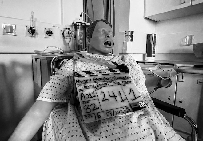
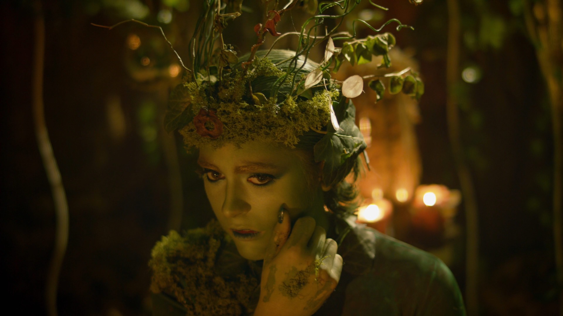
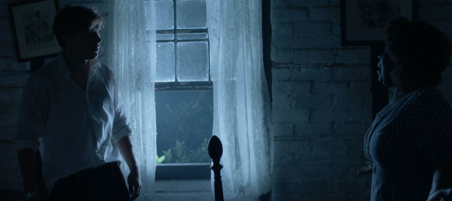
Our first location was a medical training ward populated by creepy dummies; we had a brief flashback scene to do around a hospital bed. When we arrived there was nice warm sunlight coming in through the frosted glass behind the bed, so we made sure that stuck around by putting an orange-gelled Aputure 600D out there. Inside we wrapped this with a FalconEyes and Stephen added some soft fill because I wanted the scene to feel romantic. To get some green into the frame (a calming colour in the film’s visual language) we stuck a couple of Nanlite PavoTubes into the background as practicals.

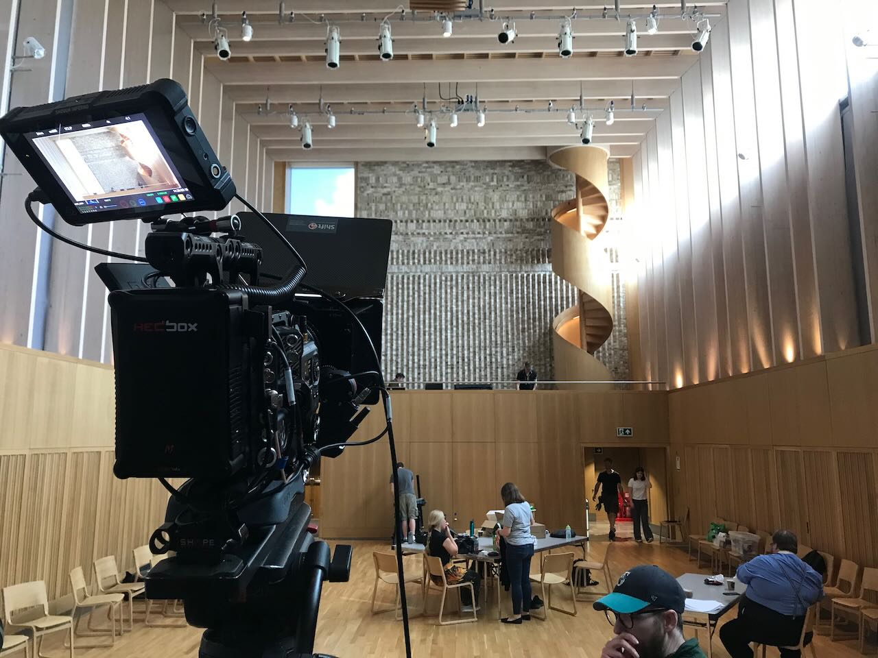
While Hamish (our new 1st AC) and Fifi were building the camera I faffed about with the Prosup Tango slider, trying to figure out a way to have the track go over the bed so we could pull straight back from Paul. It proved impossible simply because the track also ended up in frame, and instead we simply set it up beside the bed. It took a bit of clever blocking by director Jonnie to ensure that the camera could point directly along the axis of the track, rather than at an angle, which would have broken the established visual grammar of the film. This is the sort of thing that takes a bit of time to get back into after months away from the project, but it’s important to get it right.

Next we moved into the foyer, which we were playing as a bank. There was plenty of natural light but we made sure to keep that in the background, neg-filling behind the camera, and adding a key (a Rayzr MC 200) at 90° to the talent (Alex Wilber), who was partly facing towards a computer monitor on that side of camera anyway. A heavily dimmed 2K served as backlight.

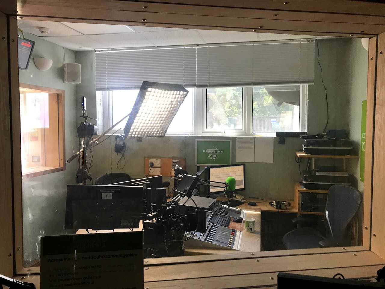
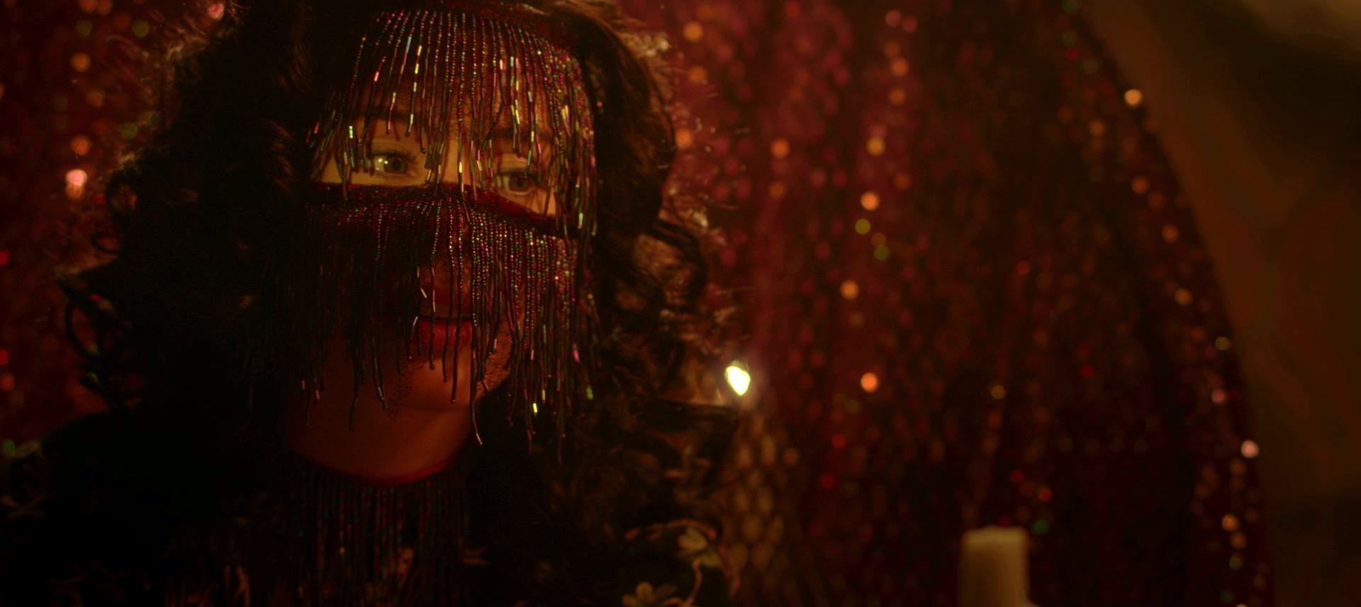
After a brief panic when we thought we were missing our favourite lens, the 14mm, we moved to Cambridge 105’s studio a couple of blocks away. A special guest star played a Tony Blackburn-esque DJ and threw in some brilliant improvs.

We fought a battle against the high, bright sun that kept trying to come in the south-facing window, despite us having diffed a lot of it, and blacked out the whole top section, and having blinds partly lowered, and the windows having some special solar coating on them anyway. Once again we fired in the 600D, which probably did very little compared with that sun, and wrapped it inside with a FalconEyes, and added the PavoTubes into the background for colour. The DJ’s computer monitors were set to 60Hz, but I’d learnt my lesson from last year and immediately set the shutter to 144° to sort that out.


Day 18

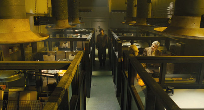
We were at Anglia Ruskin University for the day, mostly in one of their media studios. Here we had to shoot a number of things against a black backdrop, mainly to cut into the climax of the film. These included a 180° camera move using the university’s track and dolly. I thought briefly about doing some elaborate lighting rig in which lamps would have to be dimmed up and down to maintain backlight and eliminate front-light as the camera circled, but then I came to my senses and we just fired a Source Four straight down onto the makeshift table that the two actors were hunched over so that it would bounce back up to them. I was using the Soft FX 1 to match the look of the Happy Place scenes from Day 3, which helped to take the harshness out of the highlights where the Source Four was directly hitting the cast.

A little later Jonnie started flinging things in front of the camera. Had he finally cracked? No, he just wanted some lovely slo-mo shots of key props arcing through a black void. We went to 120fps, the Red Gemini’s maximum 4K frame rate, and the higher native ISO of 3200. We were able to make a stop of somewhere between T4 and T5.6 by bouncing two 2Ks into an 8×4′ poly just out of frame, and using three triple banks of the uni’s linear cyc lights in the grid as backlight.

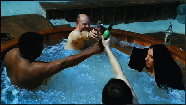
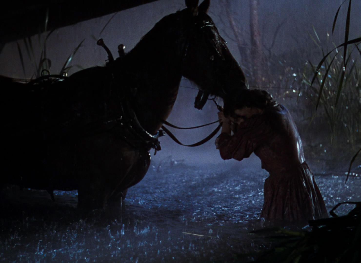
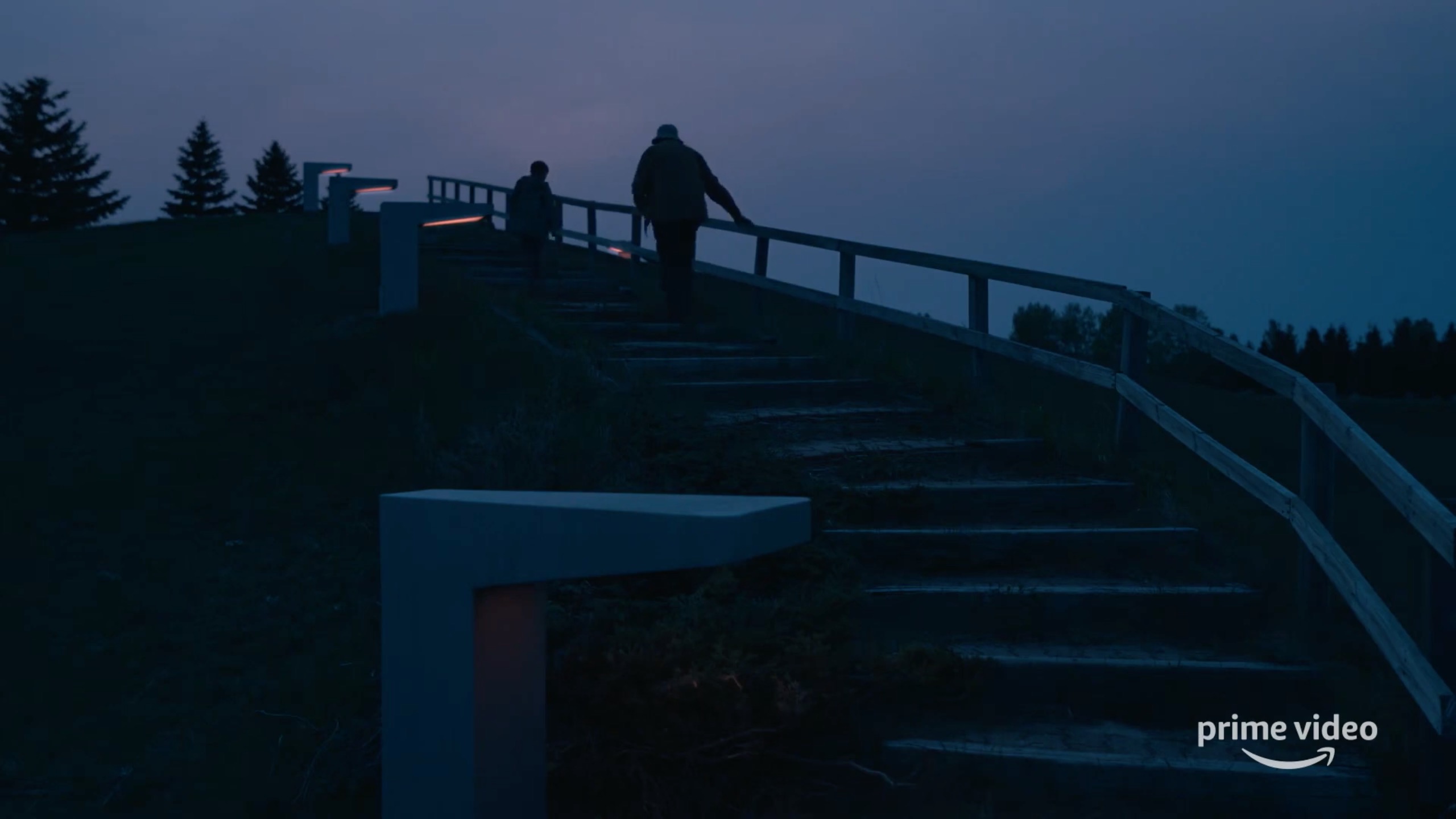
After lunch we came to a couple of crucial shots that were dropped from the night shoot on Day 10, meaning we had to replicate the lighting from Vinery Park. We used the cycs again, a Source Four on a stand as a special flaring backlight simulating the park’s streetlamp, and a couple of 2Ks through a diffusion frame as the key. Although we were back to 24fps we still needed loads of light because one of the set-ups was on an f/14 probe lens sliding into Harvey’s mouth! “It feels really weird,” Paul remarked. Yep. And sorry for bashing you in the teeth with it.

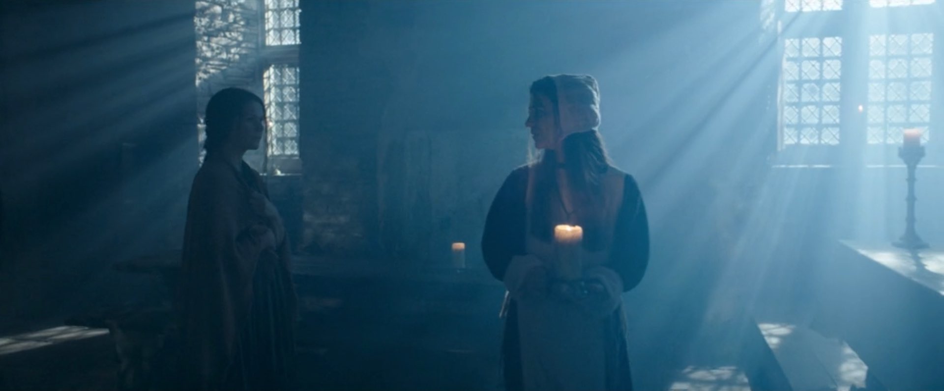
As our time on the campus ticked down we moved across to another building to shoot a call centre scene. We went for our 24mm “tableau” frame that we’ve used to establish all the characters who ring Harvey in their own environments, followed by a couple of other set-ups. We kept the talent’s (Kate Madison) eye-line between the camera and the windows for a nice short key, beefing it up with a FalconEyes, and added a dimmed 2K backlight and some warm PavoTubes in the background (orange being the stress colour in the film’s visual language).


Day 19

The good folks at BBC Breakfast were up bright and early, set up at the Granta beside Sheep’s Green, shooting live news footage of what was widely forecast to be a record-breakingly hot day. We were up pretty early too, watching from the banks of the Cam at 5:30am as the BBC drone flew over, and hoping that it wouldn’t ruin a take (which it didn’t).

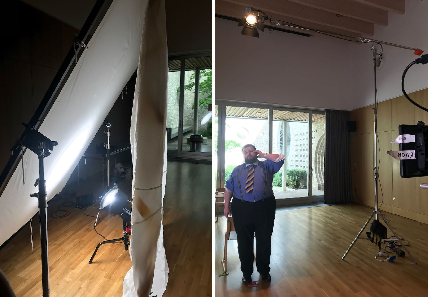
We were shooting Harvey Greenfield‘s only stunt, which I probably shouldn’t spoil by describing. We’d given Stephen the day off, and my trusty 5-in-1 reflector was our only lighting gear, but of course there was no shortage of sunlight. I used the white side for most set-ups, running along beside the Steadicam later in the day to keep Paul’s face filled in when he wasn’t facing the sun.

There was an interesting moment when we had the sun in the background of a low-angle shot. As I’ve experienced before, the Soft FX filter reflected a rectangle of light onto the subject. But even when we took it out, the IRND filter did the same thing. Do all filters do it, I wonder? Must test that one day.

We wrapped a little after 3pm, as the heat was reaching its maximum. Despite all the dire warnings (and drone-worthy news coverage) it hadn’t been too hot to work. We were all sensible with hydration, shade and sunblock, and I even swam in the Cam a couple of times during the day to cool off. You don’t get to do that very often on a shoot!

Straight after wrap I went for another swim in Jesus Green Lido, whence a Channel 5 news crew were broadcasting live weather reports with the pool in the background. The presenter was positioned in the shade and they’d set up a 600D on either side of him to fill him in. Believe it or not, that would inspire the next day’s lighting.


Day 20

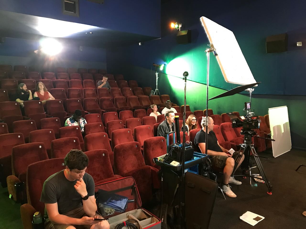
First up was a one-shot flashback scene at the Arts Picturehouse. We used the 600D as the “projector”, positioning it just barely out of the top of frame, and a 4×4′ poly armed over the camera as the screen bounce. During the takes Jeremy wiggled his hand in front of the 600D to create dynamics in the flare.

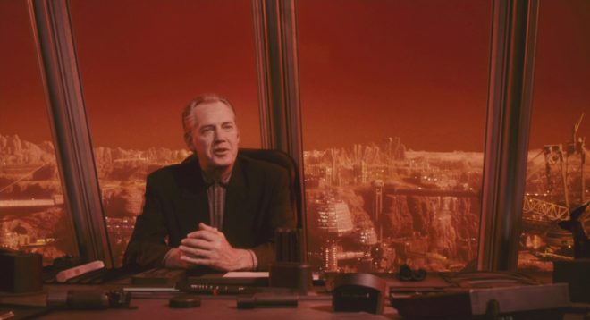
The day’s main scene was a fake advert starring a nineties keep-fit icon. The aim was a cheesy infomercial vibe, with a 4:3 aspect ratio and over-the-top acting. We cross-front-lit the scene with the Aputures 300D and 200X (thank you, Channel 5), with only a bit of diff on them. I over-exposed by a stop and took out the Soft FX filter to make the image even less filmic. I framed with a lot of headroom and even did a deliberately late tilt-down at one point. When the actual aerobics start, we went even more naff by adding two PavoTubes into the background and the Rayzr MC behind camera, all flashing nasty disco colours. It was great fun.

By the time we moved onto the last scene – another 24mm phone call, in a GP’s waiting room – it was at least 39°C in Cambridge and the UK’s temperature record had been broken.

There’ll be more from this shoot in next week’s post. In the meantime, you can read all the Harvey posts here. Note that the link will display them in reverse chronological order, so scroll down for the older ones.

“Harvey Greenfield is Running Late”: Week 3 Part 1

What Makes a Good Shot?

It’s a very difficult question to answer, but let’s look at a few major things a cinematographer considers each time they set up their camera.


Tonal Range

“Above the Clouds” (2020, dir: Leon Chambers, DP: Neil Oseman)

TV sets and other moving-image devices, especially if they are non-HDR, cannot display as wide a dynamic range as most scenes have in real life. So it is often seen as desirable to make the most of what contrast a screen can reproduce by including at least one area of the blackest black and one of the whitest white, with a good distribution of all the tones in between.

Contrast makes an image richer and also easier for the viewer’s brain to interpret, but as with all of these rules, it is perfectly possible to break it with excellent results. For example, you may want to keep a scene in a prison entirely in the shadows, so that when the prisoner escapes into the daylight the viewer will feel the impact of the highlights. Tonal distribution has a big impact on mood, and thought should be given to what mood a DP wants to convey. 


Colour Schemes

“Alder” (2019, dir: Vanda Ladeira, DP: Neil Oseman)

Since Isaac Newton invented the colour wheel in 1704, artists have devised several colour schemes which can evoke different feelings, the most common in cinematography being complementary and analogous.

A complementary colour scheme uses two hues on opposite sides of the wheel for maximum colour contrast, punch and vibrancy. Think Ripley’s yellow power loader against the blue lighting of Aliens, or the infamous teal-and-orange grading of Michael Bay’s films.

An analogous colour scheme uses hues adjacent to each other on the wheel for a harmonious or oppressive effect. Think the greens of The Matrix, or the reds of Mars in Paul Verhoeven’s Total Recall.

There’s more on colour schemes in this post.


Composition

“Perplexed Music” (2018, dir: Mark McGann, DP: Neil Oseman)

“The so-called rules of photographic composition are, in my opinion, invalid, irrelevant and immaterial,” said the great American photographer Ansel Adams. I might not go that far, but they can certainly be overrated.

The Rule of Thirds, for example, is intended to produce a balanced image, but what if you don’t want a balanced image? Placing a character in an unusual part of the frame, as is frequently done in Amazon’s Mr. Robot, can be powerfully unsettling and say much about the character’s status and mindset. Breaking rules for the sake of breaking rules may not be wise, but breaking them in a single shot to make the viewer sit up and take notice, or breaking them subtly but consistently throughout a film to subconsciously cue the audience into a theme or character trait, is a good use of cinematic technique.

As for camera moves, some believe that they should always be motivated. Some like them to be expressive. Some simply like to keep dollying the camera back and forth to add energy to a scene. As long as the movement helps to immerse rather than distract the viewer, it is serving its purpose.


Depth

“The Gong Fu Connection” (2016, dir. Ted Duran, DP: Neil Oseman)

As film and TV are usually monoscopic media, cinematographers often aim to compensate by enhancing other types of depth cues. Commonly this is through lighting – using backlight to cut a layer out from the background, using colour to separate layers, or alternating light and dark layers. Haze and camera movement can also be used to create a greater sense of depth, as can lens choice, be it a wide lens which exaggerates perspective, or a long lens that throws backgrounds out of focus.

The result is not just impact but clarity, ensuring the viewer is not distracted from the story trying to figure out what they’re seeing. Again though, you may sometimes want just the opposite, to disorientate the viewer or make them work to find the important element in the frame.

This post has some good examples of depth cues.


Production Value

“The Little Mermaid” (2018, dir: Blake Harris, DP: Neil Oseman)

A DP has the responsibility of capturing on film or digital media the work of every other department on the production (except sound!). If the costumers have spent weeks sewing beads onto a period dress, a cross-light to bring out the texture is the least the DP can do. If the make-up department are struggling to hide the joins in a prosthetic, softening or dimming the lighting will help. If a huge set has been built or an expensive location hired, showing it off in at least one wide shot is probably advisable.


Story and Character

“Ren: The Girl with the Mark” (2016, dir: Kate Madison, DP: Neil Oseman)

As I’ve hinted throughout, the most important thing is that every aspect of the shot is working towards telling the story, revealing or enhancing character, and conveying the right overall mood. This might be by keeping everything quiet and conventional to let the performances shine through, or it might be through crazy framing, crunchy contrast and dramatic movements. The possibilities are endless.

What Makes a Good Shot?

“Harvey Greenfield is Running Late”: June 2022 Pick-ups

Last summer I lensed Harvey Greenfield is Running Late, a hilarious comedy feature starring Paul Richards, based on his acclaimed one-man play, soon to have its 100th performance. We had a 14-day window in Paul’s schedule for the shoot, during which we captured two thirds of the film – less than we’d hoped, but still a remarkable achievement given the resources we had and the production value we achieved. This summer we shoot the rest.


Day 15

Ten months on, we returned to the house from days 11 and 12. It’s on the verge of being sold, and this was our last chance to mop up the outstanding material here.

We eased into it gradually with simple inserts, recreating the look and lighting in the kitchen using Fifi’s camera notes, clips from the assembly edit, and this blog (yes, it’s not just for you, dear reader). At times like this I wish I recorded even more information – intensity and colour temperature readings for every source would be extremely useful, but is that really practical?

After traumatising Paul with a reshoot of a scene in which he gets slapped (accidentally for real the first time around) we popped outside to get a shot of him on the street, filmed through a car windscreen. Last year we captured the first monologue of the film as a oner, but with hindsight director Jonnie Howard decided it needed breaking up; this windscreen shot is one of several that he has added to illustrate the things Harvey monologues about. Proving that there are no easy shots, it took me an embarrassingly long time to eliminate annoying reflections in the glass by covering shiny parts of the dashboard with matt black tape and putting a polarising filter in the matte box.

Next we moved to the back garden for one of the film’s most complicated shots. It starts off as a two-shot of Harvey and Alice (Liz Barker) in a nighttime interior setting then – via a low-tech, Michel Gondry-style transition – becomes a single of Harvey in a daytime exterior. Gaffer Stephen Allwright and spark Jeremy Dawson built a dark box out of flags and bolton, parts of which had to swing away to let in the natural light during the transition. A light had to be panned off and a reflector swung in too, while production designer Amanda Stekly and her helpers performed their own magic with the set. By the time we got it in the can we were losing the light, but the result was well worth it.

The dusk gave us just the look we needed for a quick scene in the bedroom, then we were into full nighttime scenes. I climbed into the wardrobe to get the right camera angle – we were without our beloved 14mm lens this time around, so the locations felt a little tighter!

Later we had to recreate the lighting of the aforementioned oner, so we could shoot coverage, again with extensive reference to the camera notes, rushes and R3D metadata, this blog, and on-set photos captured on my phone. Last year we dialled a custom cyan colour into the Astera tubes and I really wish I had noted the XY or HSL numbers so that we could have dialled those into the Rayzr MC 200 that was replacing them for the pick-ups. Instead we had to judge it by eye.

It was now about midnight and we still had an important sequence in the kitchen and living room to shoot; we ultimately captured it in two set-ups and an insert. This day’s filming had seen the most extreme examples of the colour scheme I planned last year: orangey-red colours to represent Harvey’s stress, and cooler, greenish shades for calmer moments. By the end of the night it was starting to look like The Neon Demon and I was wondering if I had gone too far. I guess I will find out when it’s all cut together.


Day 16

A pleasant cycle ride through Cambridge and out across a meadow brought me to the brand-new village of Eddington and the impressive Storey’s Field Centre where we would be filming the office of Harvey’s boss, Bryan (Alan Hay). First up was a fantastic shot of Harvey huffing and puffing up a spiral staircase in the centre’s main hall. The high-tech building had its lights and two layers of blinds controlled electronically, and Stephen was able to completely reshape the natural light in the huge wide shot and even put a glorious streak of light on the staircase just by pressing a few buttons. If only every location was equipped so.

A smaller, but still obscenely spacious, hall served as Bryan’s office. French windows faced east into a beautiful courtyard garden. High windows on the opposite side of the room featured motorised blinds again, which sadly would not stop halfway, forcing us to close them completely to control the light. An overhang above the French windows, combined with the high walls of the courtyard, meant that very little natural light now entered the room. For a key, Stephen constructed a book-light by pointing an Aputure 600D up into a tilted frame of Ultrabounce and then hanging some diffusion (half grid, I think) off the top edge. We added a tungsten fresnel on a boom to give some orange, stress-themed hair-light to characters in the middle of the room.

The first shot was effectively the POV of a dartboard, so we stuck three darts to the matte box with Blu Tack. Sharp points and oily substances – exactly the things you want right next to your lens! – but it looked great.

The next couple of shots featured co-writer Raymond Howard’s baby daughter. One was a contra-zoom, captured on the 18-35mm which I zoomed manually off the barrel while pushing in on the Tango ProSup slider. The other required me to brandish the handheld camera right in baby’s face for a very long time until she eventually cried.

Then it was onto the big scene. This featured Bryan referring to a PowerPoint presentation, which meant a lighting transition as the screen came down and the projector fired up. For Harvey’s angle, with his back to the projector, we boomed an Aputure 300D behind him to simulate the projection beam, and sat a pocket LED light on the matte box to represent the bounce off the screen; these faded up as the 600D book-light and tungsten hair-light dimmed down. For Bryan’s angle the real projection light wasn’t doing enough on his face, so we “extended” the practical lamp on his desk with a small tungsten fresnel. For the wide shot we could get away with re-angling the practical so that it cast a dramatic, Citizen Kane-esque shadow from Bryan up onto the screen.

All in all, the day’s work added a huge amount of scale and humour to the movie. It was lovely to see and work with everyone again for the weekend. Next month most of us will be back for eight more days of running late.

“Harvey Greenfield is Running Late”: June 2022 Pick-ups

The Colour of Moonlight

What colour is moonlight? In cinema, the answer is often blue, but what is the reality? Where does the idea of blue moonlight come from? And how has the colour of cinematic moonlight evolved over the decades?


The science bit

According to universetoday.com the lunar surface “is mostly oxygen, silicon, magnesium, iron, calcium and aluminium”. These elements give the moon its colour: grey, as seen best in photographs from the Apollo missions and images taken from space.

When viewed from Earth, Rayleigh scattering by the atmosphere removes the bluer wavelengths of light. This is most noticeable when the moon is low in the sky, when the large amount of atmosphere that the light has to travel through turns the lunar disc quite red, just as with the sun, while at its zenith the moon merely looks yellow.

Yellow is literally the opposite (or complement) of blue, so where on (or off) Earth did this idea of blue cinematic moonlight come from?

One explanation is that, in low light, our vision comes from our rods, the most numerous type of receptor in the human retina (see my article “How Colour Works” for more on this). These cells are more sensitive to blue than any other colour. This doesn’t actually mean that things look blue in moonlight exactly, just that objects which reflect blue light are more visible than those that don’t.

In reality everything looks monochromatic under moonlight because there is only one type of rod, unlike the three types of cones (red, green and blue) which permit colour vision in brighter situations. I would personally describe moonlight as a fragile, silvery grey.

Blue moonlight on screen dates back to the early days of cinema, before colour cinematography was possible, but when enterprising producers were colour-tinting black-and-white films to get more bums on seats. The Complete Guide to Colour by Tom Fraser has this to say:

As an interesting example of the objectivity of colour, Western films were tinted blue to indicate nighttime, since our eyes detect mostly blue wavelengths in low light, but orange served the same function in films about the Far East, presumably in reference to the warm evening light there.

It’s entirely possible that that choice to tint night scenes blue has as much to do with our perception of blue as a cold colour as it does with the functioning of our rods. This perception in turn may come from the way our skin turns bluer when cold, due to reduced blood flow, and redder when hot. (We saw in my recent article on white balance that, when dealing with incandescence at least, bluer actually means hotter.)

Whatever the reason, by the time it became possible to shoot in colour, blue had lodged in the minds of filmmakers and moviegoers as a shorthand for night.


Examples

Early colour films often staged their night scenes during the day; DPs underexposed and fitted blue filters in their matte boxes to create the illusion. It is hard to say whether the blue filters were an honest effort to make the sunlight look like moonlight or simply a way of winking to the audience: “Remember those black-and-white films where blue tinting meant you were watching a night scene? Well, this is the same thing.”

This scene from “Ben Hur” (1959, DP: Robert Surtees, ASC) appears to be a matte painting combined with a heavily blue-tinted day-for-night shot.
A classic and convincing day-for-night scene from “Jaws” (1975, DP: Bill Butler, ASC)

Day-for-night fell out of fashion probably for a number of reasons: 1. audiences grew more savvy and demanded more realism; 2. lighting technology for large night exteriors improved; 3. day-for-night scenes looked extremely unconvincing when brightened up for TV broadcast. Nonetheless, it remains the only practical way to show an expansive seascape or landscape, such as the desert in Mad Max: Fury Road.

Blue moonlight on stage for “Gone with the Wind” (1939, DP: Ernest Haller)
Cold stage lighting matches the matte-painted mountains in “Black Narcissus” (1947, DP: Jack Cardiff, OBE)

One of the big technological changes for night shooting was the availability of HMI lighting, developed by Osram in the late 1960s. With these efficient, daylight-balanced fixtures large areas could be lit with less power, and it was easy to render the light blue without gels by photographing on tungsten film stock.

Cinematic moonlight reached a peak of blueness in the late 1980s and early ’90s, in keeping with the general fashion for saturated neon colours at that time. Filmmakers like Tony Scott, James Cameron and Jan de Bont went heavy on the candy-blue night scenes.

“Beverly Hills Cop II” (1987, DP: Jeffrey Kimball, ASC)
“Flatliners” (1990, DP: Jan de Bont, ASC)
“Terminator 2: Judgment Day” (1991, DP: Adam Greenberg, ASC) uses a lot of strong, blue light, partly to symbolise the cold inhumanity of the robots, and partly because it’s a hallmark of director James Cameron.

By the start of the 21st century bright blue moonlight was starting to feel a bit cheesy, and DPs were experimenting with other looks.

“The Fast and the Furious” (2001, DP: Ericson Core) has generally warm-coloured night scenes to reflect LA’s mild weather after dark, but often there is a cooler area of moonlight in the deep background.
“War of the Worlds” (2005, DP: Janusz Kaminski, ASC)

Speaking of the above ferry scene in War of the Worlds, Janusz Kaminski, ASC said:

I didn’t use blue for that night lighting. I wanted the night to feel more neutral. The ferryboat was practically illuminated with warm light and I didn’t want to create a big contrast between that light and a blue night look.

The invention of the digital intermediate (DI) process, and later the all-digital cinematography workflow, greatly expanded the possibilities for moonlight. It can now be desaturated to produce something much closer to the silvery grey of reality. Conversely, it can be pushed towards cyan or even green in order to fit an orange-and-teal scheme of colour contrast.

“Pirates of the Carribean: Dead Man’s Chest” (2006, DP: Darius Wolski, ASC)

Darius Wolksi, ASC made this remark to American Cinematographer in 2007 about HMI moonlight on the Pirates of the Caribbean movies:

The colour temperature difference between the HMIs and the firelight is huge. If this were printed without a DI, the night would be candy blue and the faces would be red. [With a digital intermediate] I can take the blue out and turn it into more of a grey-green, and I can take the red out of the firelight and make it more yellow.

Compare Shane Hurlbut, ASC’s moonlight here in “Terminator Salvation” (2009) to the “Terminator 2” shot earlier in the article.
The BBC series “The Musketeers” (2014-2016, pilot DP: Stephan Pehrsson) employed very green moonlight, presumably to get the maximum colour contrast with orange candles and other fire sources.

My favourite recent approach to moonlight was in the Amazon sci-fi series Tales from the Loop. Jeff Cronenweth, ASC decided to shoot all the show’s night scenes at blue hour, a decision motivated by the long dusks (up to 75 minutes) in Winnipeg, where the production was based, and the legal limits on how late the child actors could work.

The results are beautiful. Blue moonlight may be a cinematic myth, but Tales from the Loop is one of the few places where you can see real, naturally blue light in a night scene.

“Tales from the Loop” (2020, DP: Jeff Cronenweth, ASC)

If you would like to learn how to light and shoot night scenes, why not take my online course, Cinematic Lighting? 2,300 students have enrolled to date, awarding it an average of 4.5 stars out of 5. Visit Udemy to sign up now.

The Colour of Moonlight

The Art and Science of White Balance

Mixed colour temperatures in “Annabel Lee”

Colour temperature starts with something mysterious called a “black body”, a theoretical object which absorbs all frequencies of electromagnetic radiation and emits it according to Planck’s Law. Put simply, Planck’s Law states that as the temperature of such a body increases, the light which it emits moves toward the blue end of the spectrum. (Remember from chemistry lessons how the tip of the blue flame was the hottest part of the Bunsen Burner?)

Colour temperature is measured in kelvins, a scale of temperature that begins at absolute zero (-273°C), the coldest temperature physically possible in the universe. To convert centigrade to kelvin, simply add 273.

Tungsten bulbs emit an orange light - dim them down and it gets even more orangey.The surface of the sun has a temperature of 5,778K (5,505°C), so it emits a relatively blue light. The filament of a tungsten studio lamp reaches roughly 3,200K (2,927°C), providing more of an orange light. Connect that fixture to a dimmer and bring it down to 50% intensity and you might get a colour temperature of 2,950K, even more orange.

Incandescent lamps and the sun’s surface follow Planck’s Law fairly closely, but not all light sources rely on thermal radiation, and so their colour output is not dependent on temperature alone. This leads us to the concept of “correlated colour temperature”.

Colour temperature chartThe correlated colour temperature of a source is the temperature which a black body would have to be at in order to emit the same colour of light as that source. For example, the earth’s atmosphere isn’t 7,100K hot, but the light from a clear sky is as blue as a Planckian body glowing at that temperature would be. Therefore a clear blue sky has a correlated colour temperature (CCT) of 7,100K.

LED and fluorescent lights can have their colour cast at least partly defined by CCT, though since CCT is one-dimensional, measuring only the amount of blue versus red, it may give us an incomplete picture. The amounts of green and magenta which LEDs and fluorescents emit varies too, and some parts of the spectrum might be missing altogether, but that’s a whole other can of worms.

The human eye-brain system ignores most differences of colour temperature in daily life, accepting all but the most extreme examples as white light. In professional cinematography, we choose a white balance either to render colours as our eyes perceive them or for creative effect.

6000K HMI lighting photographed at 3200K to give a moonlight feel to “Heretiks”

Most cameras today have a number of white balance presets, such as tungsten, sunny day and cloudy day, and the options to dial in a numerical colour temperature directly or to tell the camera that what it’s currently looking at (typically a white sheet of paper) is indeed white. These work by applying or reducing gain to the red or blue channels of the electronic image.

Interestingly, this means that all cameras have a “native” white balance, a white balance setting at which the least total gain is applied to the colour channels. Arri quotes 5,600K for the Alexa, and indeed the silicon in all digital sensors is inherently less sensitive to blue light than red, making large amounts of blue gain necessary under tungsten lighting. In an extreme scenario – shooting dark, saturated blues in tungsten mode, for example – this might result in objectionable picture noise, but the vast majority of the time it isn’t an issue.

Left: daylight white balance preset (5,600K). Right: tungsten white balance preset (3,200K)

The difficulty with white balance is mixed lighting. A typical example is a person standing in a room with a window on one side of them and a tungsten lamp on the other. Set your camera’s white balance to daylight (perhaps 5,600K) and the window side of their face looks correct, but the other side looks orange. Change the white balance to tungsten (3,200K) and you will correct that side of the subject’s face, but the daylight side will now look blue.

Throughout much of the history of colour cinematography, this sort of thing was considered to be an error. To correct it, you would add CTB (colour temperature blue) gel to the tungsten lamp or perhaps even place CTO (colour temperature orange) gel over the window. Nowadays, of course, we have bi-colour and RGB LED fixtures whose colour temperature can be instantly changed, but more importantly there has been a shift in taste. We’re no longer tied to making all light look white.

A practical light of the “wrong” colour temperatures in “Finding Hope”

To give just one example, Suzie Lavelle, award-winning DP of Normal People, almost always shoots at 4,300K, halfway between typical tungsten and daylight temperatures. She allows her practical lamps to look warm and cozy, while daylight sources come out as a contrasting blue.

It is important to understand colour temperature as a DP, so that you can plan your lighting set-ups and know what colours will be obtained from different sources. However, the choice of white balance is ultimately a creative one, perhaps made at the monitor, dialling through the kelvins to see what you like, or even changed completely in post-production.

The Art and Science of White Balance

Working with White Walls

White walls are the bane of a DP’s existence. They bounce light around everywhere, killing the mood, and they look cheap and boring in the background of your shot. Nonetheless, with so many contemporary buildings decorated this way, it’s a challenge we all have to face. Today I’m going to look back on two short films I’ve photographed, and explain the different approaches I took to get the white-walled locations looking nice.

Finding Hope is a moving drama about a couple grieving for the baby they have lost. It was shot largely at the home of the producer, Jean Maye, on a Sony FS7 with Sigma and Pentax stills glass.

Exit Eve is a non-linear narrative about the dehumanisation of an au pair by her wealthy employers. With a fairly respectable budget for a short, this production shot in a luxurious Battersea townhouse on an Arri Alexa Classic with Ultra Primes.


“Crown”-inspired colour contrast

Cheap 300W dimmers like these are great for practicals.

It was January 2017 when we made Finding Hope, and I’d recently been watching a lot of The Crown. I liked how that series punctuated its daylight interior frames with pools of orange light from practicals. We couldn’t afford much of a lighting package, and I thought that pairing existing pracs with dimmers and tungsten bulbs would be a cheap and easy way to break up the white walls and bring some warmth – perhaps a visual representation of the titular hope – into the heavy story.

I shot all the daylight interiors at 5600K to get that warmth out of the pracs. Meanwhile I shaped the natural light as far as possible with the existing curtains, and beefed it up with a 1.2K HMI where I could. I used no haze or lens diffusion on the film because I felt it needed the unforgiving edges.

For close-ups, I often cheated the pracs a little closer and tweaked the angle, but I chose not to supplement them with movie lamps. The FS7’s native ISO of 2500 helped a lot, especially in a nighttime scene where the grieving parents finally let each other in. Director Krysten Resnick had decided that there would be tea-lights on the kitchen counter, and I asked art director Justine Arbuthnot to increase the number as much as she dared. They became the key-light, and again I tweaked them around for the close-ups.

My favourite scene in Finding Hope is another nighttime one, in which Crystal Leaity sits at a piano while Kevin Leslie watches from the doorway. I continued the theme of warm practicals, bouncing a bare 100W globe off the wall as Crystal’s key, and shaping the existing hall light with some black wrap, but I alternated that with layers of contrasting blue light: the HMI’s “moonlight” coming in through the window, and the flicker of a TV in the deep background. This latter was a blue-gelled 800W tungsten lamp bounced off a wobbling reflector.

When I saw the finished film, I was very pleased that the colourist had leant into the warm/cool contrast throughout the piece, even teasing it out of the daylight exteriors.


Trapped in a stark white townhouse

I took a different approach to colour in Exit Eve. Director Charlie Parham already knew that he wanted strong red lighting in party scenes, and I felt that this would be most effective if I kept colour out of the lighting elsewhere. As the film approaches its climax, I did start to bring in the orange of outside streetlamps, and glimpses of the party’s red, but otherwise I kept the light stark and white.

Converted from a Victorian schoolhouse, the location had high ceilings, huge windows and multiple floors, so I knew that I would mostly have to live with whatever natural light did or didn’t shine in. We were shooting during the heatwave of 2018, with many long handheld takes following lead actor Thalissa Teixeria from room to room and floor to floor, so even the Alexa’s dynamic range struggled to cope with the variations in light level.

For a night scene in the top floor bedroom, I found that the existing practicals were perfectly placed to provide shape and backlight. I white-balanced to 3600K to keep most of the colour out of them, and rigged black solids behind the camera to prevent the white walls from filling in the shadows.

(Incidentally, the night portions of this sequence were shot as one continuous take, despite comprising two different scenes set months apart. The actors did a quick-change and the bed was redressed by the art department while it was out frame, but sadly this tour de force was chopped up in the final cut.)

I had most control over the lighting when it came to the denouement in the ground floor living area. Here I was inspired by the work of Bradford Young, ASC to backlight the closed blinds (with tungsten units gelled to represent streetlights) and allow the actors inside to go a bit dim and murky. For a key moment we put a red gel on one of the existing spotlights in the living room and let the cast step into it.

So there we have it, two different approaches to lighting in a while-walled location: creating colour contrast with dimmed practicals, or embracing the starkness and saving the colour for dramatic moments. How will you tackle your next magnolia-hued background?

For another example of how I’ve tackled white-walled locations, see my Forever Alone blog.

Working with White Walls

“The Little Mermaid”: Lighting from the Back

So far, this blog series about my cinematography of The Little Mermaid has covered the biggest and most complex scenes in the movie. Today I’m going to look at some smaller scenes, and how I employed the cinematography tenet of lighting from the back to quickly build a look for these which has depth, mood and drama.

Many of these examples are specifically cross-backlighting, something I covered in my Lighting Techniques series, but I’ll quickly recap since it has so much relevance here. It involves lighting two characters facing each other with two sources, on the far side of the eye-line (short key), crossed so that each source keys one character and often backlights the other too.

So with that in mind, let’s proceed to the examples from my shooting diary.


Day 1

The first week is pretty much all in houses with just a few principals, so an easy start. Day 1’s schedule is tight though. We start in a third floor bedroom – no way lamps are getting up to those windows from outside, so I’m relying on natural light augmented with a bit of cross-backlight cheated inside the room. (There’s a Kino Flo shining at Elle over Cam’s right shoulder, for example.) Once the haze is in it looks great. After we get the main coverage, we head out to the garden for the next scene, while the ‘B’ camera team steps in to pick up a couple of inserts…


Day 3

…It’s a night scene and the grips have tented the window. To get a nice blue glow coming in, I have two 4×4 Kino Flos set either side of the window (outside), and they give a great wrapping backlight to the actors and the set dressing. Smoke and a cool white balance of 3,200K (the Kinos are tubed for 5,600K) complete the look. It owes a lot to a scene from Hook, one of Blake’s (director Blake Harris) reference movies which I watched during preprod. This stuff definitely filters in and inspires things!


Day 13

Our first day on stage. It’s weird to be back at the former supermarket I spent five weeks of preproduction in. The first set, Locke’s chamber, is very confined and the walls don’t wild, so it’s quite slow-going to work in there. We fire a 5K fresnel through the stained glass window at the back of the set. Then I fall back on the tried and tested method of cross-backlighting even though I know that it will be hard to hide the lamps (a 650W fresnel in both of the upper rear corners of the set) from camera. In the end I have the art department dress drapes in front of them. For the villain’s single I leave the light hard, but for the hero’s single we use bounce boards to wrap the light around his face more…


Day 28

We start with the fortune-teller’s tent, another small set constructed on stage. In fact, it’s just an Easy-Up artfully draped with fabrics. Initially there’s nowhere to get light in from except the front, but I know that this will leave the scene looking flat and fake, so I work with the art department again to make holes in the top rear corners. Through those we shine tungsten-bubbled “Fat Boy” Kino Flos. (These 2ft 4-bank units are giving the dual kickers on Cam in the centre, and the beautiful down-light on the background fabrics, bringing out the ruching. Each one also provides a little key-light on the two ladies.) The other sources are “moonlight” coming in through the entrance, linking us to the circus exteriors, and a stylised slash of light across Thora’s eyes from a Source Four, suggested by Jason (key grip Jason Batey). Adding foreground practicals is an important final touch to expand the depth and scale of the set…


Day 31

It’s the last day of principal photography. Our big scene of the day is the newspaper office where Cam works, which is a set in the front of the studio, using the building’s real windows. We fire the 12K in and gel it with half CTS for a nice morning sunlight effect. We’re shooting towards the windows, which have blinds, so we get some nice shafts of light, though sometimes it’s a little too smokey. Running haze is a pretty skilled and tricky job, and involves considering the lens length and backlight, which both affect how much the smoke shows up on camera. When we get it right, combined with the dark wood period furniture, it totally sells the 1937 setting. Apparently people at video village are loving it, saying it looks like Mad Men….

Next week, in the final part of my blog series on The Little Mermaid, I’ll share my experiences of shooting the sunset denouement while up to my waist in the Atlantic Ocean.

“The Little Mermaid”: Lighting from the Back

“The Little Mermaid”: Pools of Light

Although The Little Mermaid takes place mostly on dry land, there were some key scenes involving tanks and pools. These include the moment which introduces the audience to the mermaid herself, played by Poppy Drayton. Here are some extracts from my diary covering the challenges of creating a magical, fairytale look while filming in and around water.


Day 10

Today we’re inside the big top all day – actually all NIGHT. We can’t shoot during the day because too much daylight bleeds through the canvas of the tent.

We are setting up when a storm hits. The tent starts to blow about in a slightly alarming fashion, rain lashes down outside (and inside, because the tent isn’t very waterproof) and lightning flashes. We are ordered out of the tent, and I run into a waiting mini-van with Joe from art and some of the camera crew. We sit watching the rain and telling stories for half an hour before we can press on.

Setting up with a stand-in next to the mermaid tank (centre, behind the monitors). In the top right you can see the 575W HMI backlight for the tank, and below that, grip Sawyer Oubre stands ready to fake watery rippling light with a par can and a blue gel frame.

Around the wall of the tent the art department have hung canvas posters; at the suggestion of gaffer Mike Horton, we uplight these with par cans and par 38s. The design of these fixtures hasn’t changed since the 30s, so we can get away with seeing them in shot. The art dept have sourced four period spotlights which we use as background interest (they’re not powerful enough to really illuminate anything), as well as string-lights.

Ambience comes from a Maxi Brute, with just a couple of bubbles on, firing into the tent roof. After seeing a video test of various diffusers during preproduction, I asked for Moroccan Frost to be added to our consumables list, and we use it for the first time on this Maxi Brute. It gives a lovely muted orangey-pink look to the scene.

Steadicam operator Chris Lymberis. Photo: Kane Pearson

We’re shooting our mermaid for the very first time, in a tank in the circus ring. The initial plan is to fire a Source Four straight down into the water to create genuine watery rippling light, while bouncing a par can off a wobbling frame of blue gel to beef up the effect. In the end the Source Four isn’t really cutting it, so instead we rig a 575W HMI, gelled with Steel Blue, to a menace arm and fire it into the tank as toppy backlight. This Steel Blue gelled daylight source, blued up slightly further by the water itself, contrasts beautifully with the Moroccan Frost tungsten ambience which the Maxi Brutes are giving us.

In her mermaid tail and costume, Poppy Drayton looks stunning in the tank. We shoot steadicam angles and some slo-mo to get the most out of the set-up.


Day 15

The rocky pool set with two of the side-lighting Kino Flos and the 1.2K HMI backlight (centre) in place

Back on stage, and we’re shooting the rocky pool. This set was built before I even arrived in Savannah, so I’ve been waiting a long time to shoot it. It’s built almost right up to the ceiling of the studio (a former supermarket) so it’s challenging to light. The grips build four menace arms and poke two 4×4 Kinos and two 575W HMIs over the sides to cross-light the set and bring out all the texture in it. Where the set ends they put up a 20×20′ greenscreen, which we light with two Kino Flo Image 80s fitted with special chroma green tubes.

After a wide (which didn’t make the final cut), the next set-up is a 2-shot of our leads in the pool itself. We consider arming the camera out over the pool using a jib, but ultimately decide that it’s better for me to join the cast in the pool, with the camera on my shoulder in a splash bag. 2nd AC Kane Pearson joins the pool party as well, and ends up hand-bashing a monitor for me since the splash bag’s designed for a Panaflex film camera and the viewfinder doesn’t line up. I’m reminded of my frustrating splash bag experience on See Saw back in 2007, but this time at least within a few minutes I’ve found a comfortable and effective way to operate the camera, under-slinging it and allowing it to partially float so I don’t have to support the whole weight.

For this shot we’ve added our par-can-bounced-off-a-wobbling-blue-gel gag for watery light ripples, and combined with the real light ripples and the reflections of a 1.2K HMI backlight, the image looks beautiful.


Day 19

After lunch we shoot the singles for the rocky pool scene. The pool itself has been removed, and the actors sit on stools in a paddling pool, with the set behind them. The paddling pool serves two functions: it catches the water that make-up pours over the actors to make them look wet, and it reflects rippling light onto their faces. This light originates from a par can. At first it flattens out the look, then we figure out that we need to lay black fabric on the bottom of the pool. This stops the par can’s light bouncing directly, while retaining the rippling highlights off the water’s surface. (Check out my article on shooting water for more tips like this.)

The low-tech solution for the pool pick-ups

In the final edit this was all intercut with some beautiful footage by underwater DP Jordan Klein, shot both at a local diving pool in Savannah and at Weeki Wachee Springs State Park in Florida. The main unit shot another scene in the actual ocean, but I’ll cover that later in this series. In the meantime, next week I’ll reveal some of the tricks and techniques used in shooting The Little Mermaid‘s many sequences in moving vehicles.

“The Little Mermaid”: Pools of Light

Colour Rendering Index

Many light sources we come across today have a CRI rating. Most of us realise that the higher the number, the better the quality of light, but is it really that simple? What exactly is Colour Rendering Index, how is it measured and can we trust it as cinematographers? Let’s find out.


What is C.R.I.?

CRI was created in 1965 by the CIE – Commission Internationale de l’Eclairage – the same body responsible for the colour-space diagram we met in my post about How Colour Works. The CIE wanted to define a standard method of measuring and rating the colour-rendering properties of light sources, particularly those which don’t emit a full spectrum of light, like fluorescent tubes which were becoming popular in the sixties. The aim was to meet the needs of architects deciding what kind of lighting to install in factories, supermarkets and the like, with little or no thought given to cinematography.

As we saw in How Colour Works, colour is caused by the absorption of certain wavelengths of light by a surface, and the reflection of others. For this to work properly, the light shining on the surface in the first place needs to consist of all the visible wavelengths. The graphs below show that daylight indeed consists of a full spectrum, as does incandescent lighting (e.g. tungsten), although its skew to the red end means that white-balancing is necessary to restore the correct proportions of colours to a photographed image. (See my article on Understanding Colour Temperature.)

Fluorescent and LED sources, however, have huge peaks and troughs in their spectral output, with some wavelengths missing completely. If the wavelengths aren’t there to begin with, they can’t reflect off the subject, so the colour of the subject will look wrong.

Analysing the spectrum of a light source to produce graphs like this required expensive equipment, so the CIE devised a simpler method of determining CRI, based on how the source reflected off a set of eight colour patches. These patches were murky pastel shades taken from the Munsell colour wheel (see my Colour Schemes post for more on colour wheels). In 2004, six more-saturated patches were added.

The maths which is used to arrive at a CRI value goes right over my head, but the testing process boils down to this:

  1. Illuminate a patch with daylight (if the source being tested has a correlated colour temperature of 5,000K or above) or incandescent light (if below 5,000K).
  2. Compare the colour of the patch to a colour-space CIE diagram and note the coordinates of the corresponding colour on the diagram.
  3. Now illuminate the patch with the source being tested.
  4. Compare the new colour of the patch to the CIE diagram and note the coordinates of the corresponding colour.
  5. Calculate the distance between the two sets of coordinates, i.e. the difference in colour under the two light sources.
  6. Repeat with the remaining patches and calculate the average difference.

Here are a few CRI ratings gleaned from around the web:

Source CRI
Sodium streetlight -44
Standard fluorescent 50-75
Standard LED 83
LitePanels 1×1 LED 90
Arri HMI 90+
Kino Flo 95
Tungsten 100 (maximum)


Problems with C.R.I.

There have been many criticisms of the CRI system. One is that the use of mean averaging results in a lamp with mediocre performance across all the patches scoring the same CRI as a lamp that does terrible rendering of one colour but good rendering of all the others.

Demonstrating the non-continuous spectrum of a fluorescent lamp, versus the continuous spectrum of incandescent, using a prism.

Further criticisms relate to the colour patches themselves. The eight standard patches are low in saturation, making them easier to render accurately than bright colours. An unscrupulous manufacturer could design their lamp to render the test colours well without worrying about the rest of the spectrum.

In practice this all means that CRI ratings sometimes don’t correspond to the evidence of your own eyes. For example, I’d wager that an HMI with a quoted CRI in the low nineties is going to render more natural skin-tones than an LED panel with the same rating.

I prefer to assess the quality of a light source by eye rather than relying on any quoted CRI value. Holding my hand up in front of an LED fixture, I can quickly tell whether the skin tones looks right or not. Unfortunately even this system is flawed.

The fundamental issue is the trichromatic nature of our eyes and of cameras: both work out what colour things are based on sensory input of only red, green and blue. As an analogy, imagine a wall with a number of cracks in it. Imagine that you can only inspect it through an opaque barrier with three slits in it. Through those three slits, the wall may look completely unblemished. The cracks are there, but since they’re not aligned with the slits, you’re not aware of them. And the “slits” of the human eye are not in the same place as the slits of a camera’s sensor, i.e. the respective sensitivities of our long, medium and short cones do not quite match the red, green and blue dyes in the Bayer filters of cameras. Under continuous-spectrum lighting (“smooth wall”) this doesn’t matter, but with non-continuous-spectrum sources (“cracked wall”) it can lead to something looking right to the eye but not on camera, or vice-versa.


Conclusion

Given its age and its intended use, it’s not surprising that CRI is a pretty poor indicator of light quality for a modern DP or gaffer. Various alternative systems exist, including GAI (Gamut Area Index) and TLCI (Television Lighting Consistency Index), the latter similar to CRI but introducing a camera into the process rather than relying solely on human observation. The Academy of Motion Picture Arts and Sciences recently invented a system, Spectral Similarity Index (SSI), which involves measuring the source itself with a spectrometer, rather than reflected light. At the time of writing, however, we are still stuck with CRI as the dominant quantitative measure.

So what is the solution? Test, test, test. Take your chosen camera and lens system and shoot some footage with the fixtures in question. For the moment at least, that is the only way to really know what kind of light you’re getting.

SaveSave

SaveSaveSaveSave

SaveSave

SaveSave

SaveSave

SaveSave

SaveSave

SaveSave

SaveSave

SaveSave

Colour Rendering Index

Colour Schemes

Last week I looked at the science of colour: what it is, how our eyes see it, and how cameras see and process it. Now I’m going to look at colour theory – that is, schemes of mixing colours to produce aesthetically pleasing results.


The Colour wheel

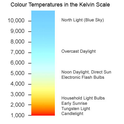
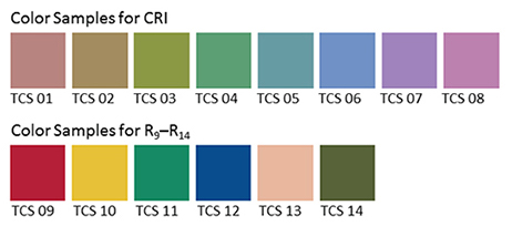
The first colour wheel was drawn by Sir Isaac Newton in 1704, and it’s a precursor of the CIE diagram we met last week. It’s a method of arranging hues so that useful relationships between them – like primaries and secondaries, and the schemes we’ll cover below – can be understood. As we know from last week, colour is in reality a linear spectrum which we humans perceive by deducing it from the amounts of light triggering our red, green and blue cones, but certain quirks of our visual system make a wheel in many ways a more useful arrangement of the colours than a linear spectrum.

One of these quirks is that our long (red) cones, although having peak sensitivity to red light, have a smaller peak in sensitivity at the opposite (violet) end of the spectrum. This may be what causes our perception of colour to “wrap around”.

Another quirk is in the way that colour information is encoded in the retina before being piped along the optic nerve to the brain. Rather than producing red, green and blue signals, the retina compares the levels of red to green, and of blue to yellow (the sum of red and green cones), and sends these colour opponency channels along with a luminance channel to the brain.

You can test these opposites yourself by staring at a solid block of one of the colours for around 30 seconds and then looking at something white. The white will initially take on the opposing colour, so if you stared at red then you will see green.

Hering’s colour wheels

19th century physiologist Ewald Hering was the first to theorise about this colour opponency, and he designed his own colour wheel to match it, having red/green on the vertical axis and blue/yellow on the horizontal.

RGB colour wheel

Today we are more familiar with the RGB colour wheel, which spaces red, green and blue equally around the circle. But both wheels – the first dealing with colour perception in the eye-brain system, and the second dealing with colour representation on an RGB screen – are relevant to cinematography.

On both wheels, colours directly opposite each other are considered to cancel each other out. (In RGB they make white when combined.) These pairs are known as complementary colours.


Complementary

A complementary scheme provides maximum colour contrast, each of the two hues making the other more vibrant. Take “The Snail” by modernist French artist Henri Matisse, which you can currently see at the Tate Modern; Matisse placed complementary colours next to each other to make them all pop.

“The Snail” by Henri Matisse (1953)

In cinematography, a single pair of complementary colours is often used, for example the yellows and blues of Aliens‘ power loader scene:

“Aliens” DP: Adrian Biddle, BSC

Or this scene from Life on Mars which I covered on my YouTube show Lighting I Like:

I frequently use a blue/orange colour scheme, because it’s the natural result of mixing tungsten with cool daylight or “moonlight”.

“The First Musketeer”, DP: Neil Oseman

And then of course there’s the orange-and-teal grading so common in Hollywood:

“Hot Tub Time Machine” DP: Jack N. Green, ASC

Amélie uses a less common complementary pairing of red and green:

“Amélie” DP: Bruno Belbonnel, AFC, ASC


Analogous

An analogous colour scheme uses hues adjacent to each other on the wheel. It lacks the punch and vibrancy of a complementary scheme, instead having a harmonious, unifying effect. In the examples below it seems to enhance the single-mindedness of the characters. Sometimes filmmakers push analogous colours to the extreme of using literally just one hue, at which point it is technically monochrome.

“The Matrix” DP: Bill Pope, ASC
“Terminator 2: Judgment Day” DP: Adam Greenberg, ASC
“The Double” DP: Erik Alexander Wilson
“Total Recall” (1990) DP: Jost Vacano, ASC, BVK


There are other colour schemes, such as triadic, but complementary and analogous colours are by far the most common in cinematography. In a future post I’ll look at the psychological effects of individual colours and how they can be used to enhance the themes and emotions of a film.

SaveSave

Colour Schemes