The Cinematography of “Perplexed Music”

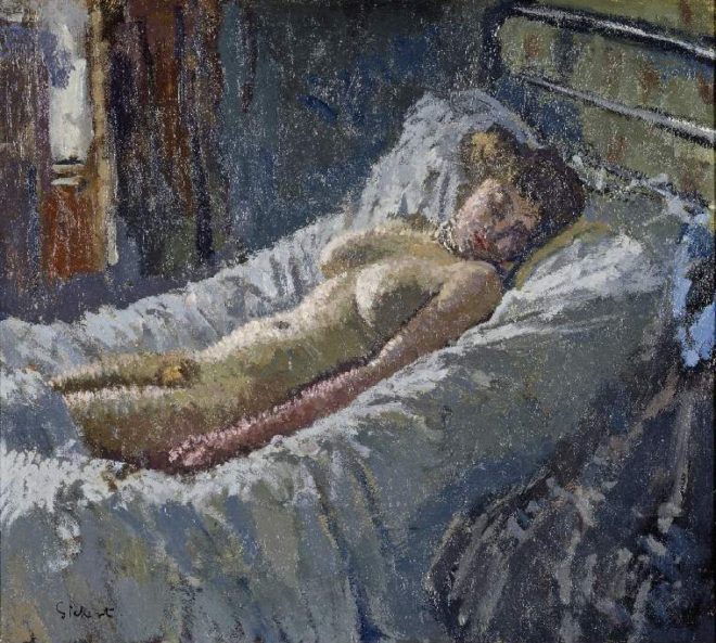
In June I was recommended by a mutual friend to shoot a short drama called Perplexed Music, inspired by the Elizabeth Barrett Browning sonnet of the same name. It’s a passion project from writer-director Mark McGann, with his brother Paul McGann (Doctor Who, Alien 3, Withnail & I) in the lead role of a man grieving for his deceased partner.

Paul and Mark pose with one of the supporting artists between takes.

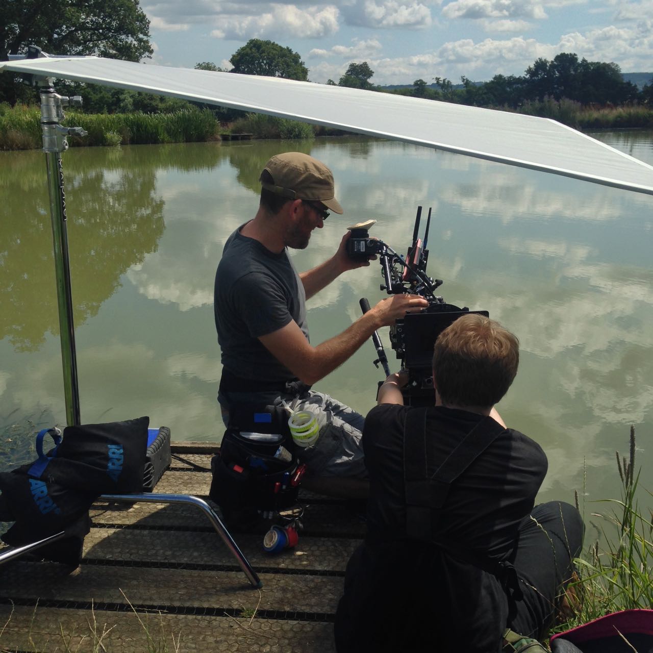
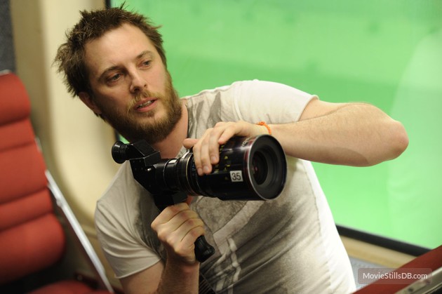
Mark was keen from the outset to shoot on an Alexa, and I was quick to agree. Arri Rental very kindly gave us an amazing deal on an Alexa Classic and a set of Ultra Primes. As on Above the Clouds, we used a Blackmagic Micro Cinema Camera as a B-cam, capturing two specific angles that were impossible on the Alexa with our limited grip budget.

Throughout July, Mark and I had a very satisfying creative dialogue about the cinematic techniques we would use to tell the story of Paul’s character, The Man, who never speaks. I had been watching a lot of Mr. Robot, and was keen to use unusual compositions as that show does. The visual grammar that we ultimately developed eschewed The Rule of Thirds, either squeezing The Man right into the side of frame – at times when things are too much for him – or placing him dead centre for moments of clarity and acceptance, and for flashbacks to when his partner was alive.

The Blackmagic Micro Cinema Camera is mounted on a combo lighting stand to capture a high angle through a streetlamp.

While testing lenses at Arri Rental a few weeks prior to the shoot, I took the opportunity to shoot some frame-rate tests between 24 and 48fps. Since the film has so little dialogue, I figured there was nothing to stop us using a lot of slow motion if we wanted to. I didn’t want it to look like a music video though. I thought perhaps a very subtle over-cranking, creating languid blinks and slightly heavier movement, would add to the burden of The Man’s grief. Mark agreed as soon as he saw the tests, and we ended up shooting a number of set-ups at 28 and 30fps, plus 40fps for a pivotal sequence.

I also tested various ISO settings on the Alexa (click here for full details, stills and video from this test). Based on these, I decided to use ISO 1600 for the majority of the film, partly for the extra latitude in the highlights, and partly to add grittiness to The Man’s grief-stricken world, in the form of a little picture noise. When we started shooting the flashbacks, on the spur of the moment I decided to switch to ISO 400 for these. A few years back I shot the music video below on a Red Epic and, for reasons I forget, one set-up was done at a lower ISO than the rest. I remember the feeling this gave, when I saw the final edit, of everything suddenly being smooth and hyper-real. I thought that would be a great feeling to give to the flashbacks.

1st AC Rupert Peddle and 2nd AC Ben Davies set up a lakeside close-up under a diffusion frame which will soften the light on Paul.

Much of Perplexed Music was day exterior, but a couple of sequences required lighting. In the opening café scene, I fired HMIs through two windows, but kept their light away from The Man, keying him with a practical to put him in his own little world. Meanwhile, a happy couple he’s watching are bathed in sunlight (sometimes real, sometimes not) warmed up with a quarter CTO, and bouncing beautifully off their table to give them a healthy glow.

For night interiors at The Man’s home, I was keen to rely on practicals as much as possible. Firstly there wasn’t much space in the little cottage, secondly I didn’t want the hassle of having to shift them around to keep them out of frame when we changed angle, and thirdly it just looks more natural. So aside from a tungsten bounce in a corner of the living room we knew would never be seen, I stuck to practical table lamps and exterior lighting.

Setting up for a night exterior shot. Photo: Gary Horton

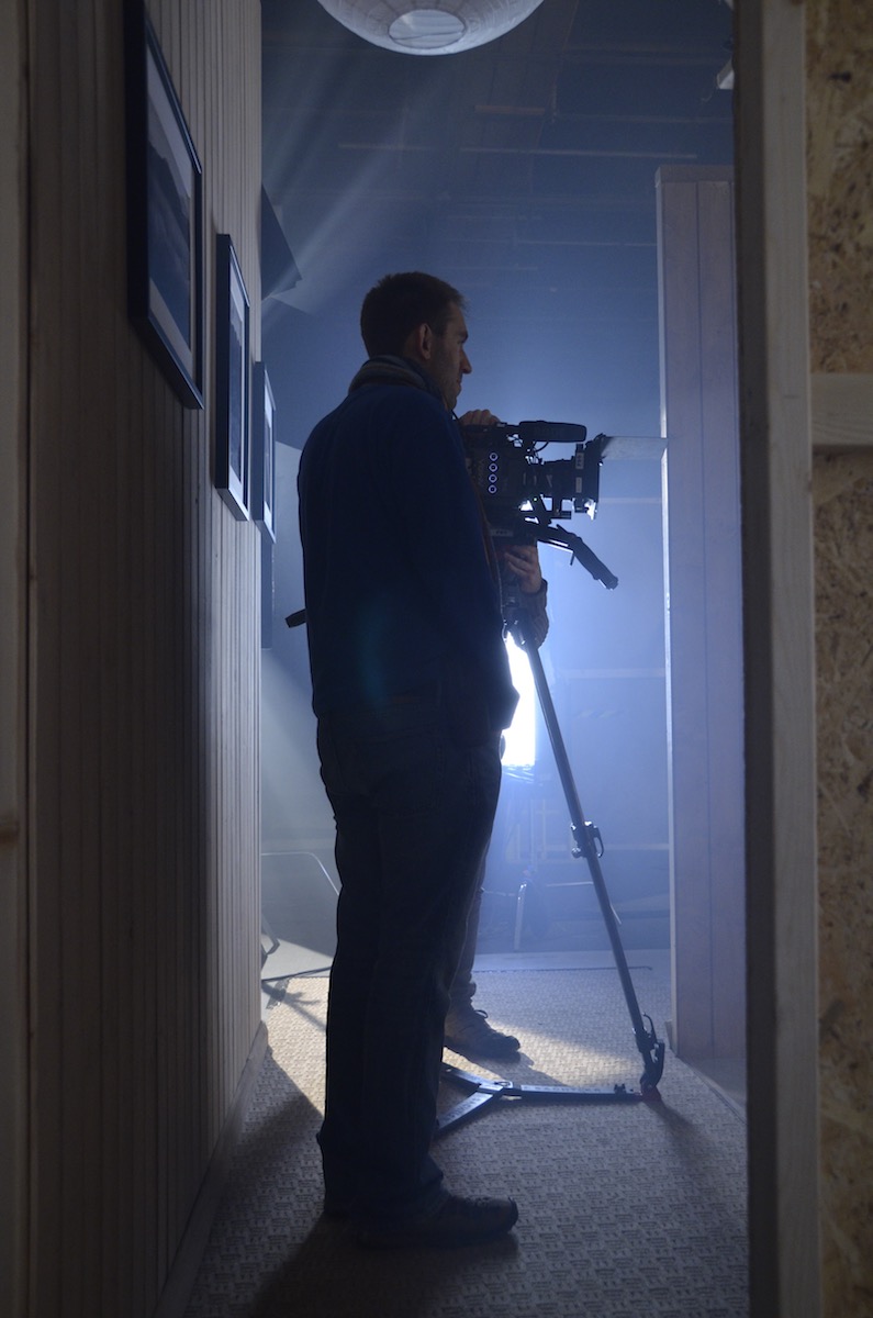
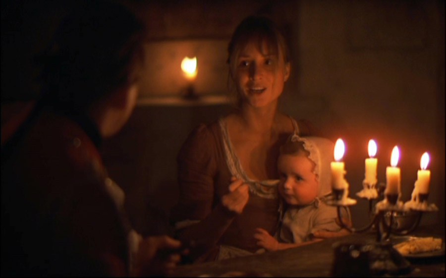
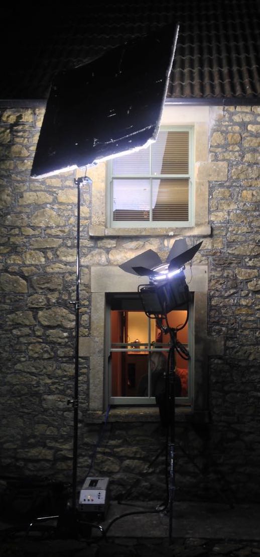
I had planned to use direct HMI sources for moonlight through the windows, but my gaffer Sam suggested going softer so that we wouldn’t have hard shadows inside which would need filling. I saw that he was right, so we used a kino through one window and a 2.5K HMI bounced into poly through another (pictured at left).

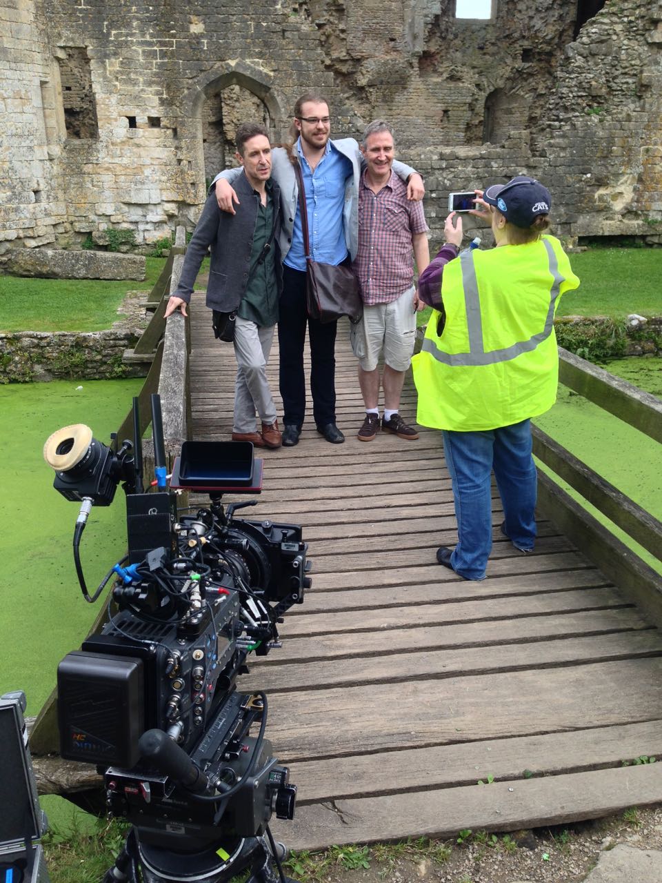
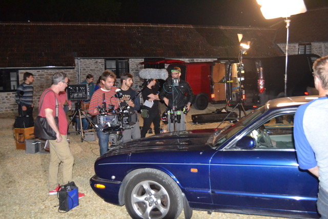
Perplexed Music was shot over five days in Frome in Somerset and Rame in Cornwall. The latter provided us with a spectacular cliff-top and the isolated St. Michael’s Chapel on the peak of the headland. Here we employed the services of The Fly Company, who captured two dramatic, sweeping shots on their DJI Inspire 2 drone. We were all extremely impressed by what they were able to achieve, especially as it was done in very windy conditions, in between rain showers.

We completed the final set-ups of the schedule as the winds began gusting up to 60mph, and poor Paul could barely stand upright! I was certainly glad we picked the Alexa to shoot on, because anything lighter would probably have shaken during takes, if not blown over!

Lining up a shot with director Mark McGann. Photo: Gary Horton

I had a fantastic time working with Mark and Paul, and the whole cast and crew. We were sad to part ways at the end of the week, and we all look forward to seeing the finished film soon. And at this point, dear reader, I ask for your help. Currently a Kickstarter campaign is underway for postproduction. It’s well over 50% funded at the time of writing, but every little helps in our quest to reach the finishing line. Rewards for backers include thank you video messages from Paul and Mark, and tickets to a private screening in December. Even if you can’t contribute, please consider sharing the page on social media. Thanks!

https://www.kickstarter.com/projects/perplexedmusic/perplexed-music-post-production

The Cinematography of “Perplexed Music”

How to do Scenes on a Moving Train

Behind the scenes of “Last Passenger”

The publicity machine is ramping up for Kenneth Branagh’s Murder on the Orient Express remake, and it’s got me thinking about the challenges of a script set largely on a moving train. There are a number of ways of realising such scenes, and today I’m going to look at five movies that demonstrate different techniques. All of these methods are equally applicable to scenes in cars or any other moving vehicle.

1. For Real: “The Darjeeling limited”

https://www.youtube.com/watch?v=S92KktyxGY0

Wes Anderson’s 2007 film The Darjeeling Limited sees three brothers embarking on a spiritual railway journey across India. Many of the usual Anderson tropes are present and correct – linear tracking shots, comical headgear, Jason Schwartzman – but surprisingly the moving train wasn’t done with some kind of cutesy stop-motion. Production designer Mark Friedberg explains:

The big creative decision Wes made was that we were going to shoot this movie on a moving train. And all that does is complicate life. It makes it more expensive, it makes the logistics impossible. It made it incredibly difficult to figure out how many crew, what crew, what gear… but what it did do is it made it real.

Kenneth Branagh has stated that at least some of Murder on the Orient Express was shot on a real moving train too:

They painstakingly built a fully functioning period authentic locomotive and carriages from the Orient Express during the golden, glamorous age of travel. It was a train that moved… All of our actors were passengers on the train down the leafy lanes of Surrey, pretending to be the former Yugoslavia.


2. Poor Man’s Process: “The Double”

Director Richard Ayoade

Although best known as The IT Crowd‘s Moss and the new host of the Crystal Maze, Richard Ayoade is also an accomplished director. His last feature was a darkly beautiful adaptation of Dostoyevsky’s classic identity-crisis novella The Double. 

Unlike the other movies on this list, The Double only has short sequences on a train, and that’s a key point. So named because it’s a cheap alternative to rear projection (a.k.a. process photography), Poor Man’s Process is a big cheat. In order to hide the lack of motion, you keep the view outside your vehicle’s windows blank and featureless – typically a night sky, but a black subway tunnel or a grey daytime sky can also work. Then you create the illusion of motion with dynamic lighting, a shaky camera, and grips rocking the carriage on its suspension. Used judiciously, this technique can be very convincing, but you would never get away with it for a whole movie.

Poor Man’s works particularly well in The Double, the black void outside the subway car playing into the oppressive and nightmarish tone of the whole film. In an interview with Pushing Pixels, production designer David Crank explains how the subway carriage set was built out of an old bus. He goes on to describe how the appearance of movement was created:

We put the forks of a forklift under the front of the bus, and shook it… For the effect of moving lights outside the train, it was a combination of some spinning lights on stands, as well as lights on small rolling platforms which tracked back and forth down the outside of the bus.

Part 2 of the Darjeeling Limited featurette above reveals that Poor Man’s Process was also used occasionally on that film, when the train was stuck in a siding due to heavy rail traffic. I used Poor Man’s myself for night-time train sequences in two no-budget features that I made in the early noughties – see the BTS clip below – and I’ve also written a couple of blog posts in the past about my use of the same technique on a promotional video and in a fantasy web series.


3. Green screen: “Source Code”

https://www.youtube.com/watch?v=ildCiVpLM8s

Duncan “Zowie Bowie” Jones followed up his low-budget masterpiece Moon with Hollywood sci-fi thriller Source Code, a sort of mash-up of Quantum Leap and Groundhog Day with a chilling twist. It takes place predominantly on a Chicago-bound commuter train, in reality a set surrounded by green screen. In the featurette above, Jones mentions that shooting on a real moving train was considered, but ultimately rejected in favour of the flexibility of working on stage:

Because we revisit an event multiple times, it was absolutely integral to making it work, and for the audience not to get bored, that we were able to vary the visuals. And in order to do that we had to be able to build platforms outside of the train and be able to really vary the camera angles.

In the DVD commentary, Jones also notes that the background plates were shot in post from a real train “loaded up with cameras”.

Director Duncan Jones on the set of “Source Code”

Cinematographer Don Burgess, ASC discusses lighting the fake train in a Panavision article:

It’s difficult to make it feel like natural light is coming in and still get the sense of movement on a train… We worked with computer programs where we actually move the light itself, and brighten and dim the lights so it feels as if you are travelling… The lights are never 100% constant.

When I shot The Little Mermaid last year we did some train material against green screen. To make the lighting dynamic, the grips built “branch-a-loris” rigs: windmills of tree branches which they would spin in front of the lamps to create passing shadows.


4. Rear projection: “Last Passenger”

Perhaps the most low-budget film on this list, Last Passenger is a 2013 independent thriller set aboard a runaway train. Director Omid Nooshin and DP Angus Hudson wanted a vintage look, choosing Cooke Xtal anamorphic lenses and a visual effects technique that had long since fallen out of favour: rear projection.

Before the advent of optical – and later digital – compositing, rear projection was commonly used to provide moving backgrounds for scenes in vehicles. The principle is simple: the pre-recorded backgrounds are projected onto a screen like this…

Rear projection in use on “River of no Return” (1954)

Hudson goes into further detail on the technique as used for the Last Passenger:

To capture [the backgrounds] within our limited means, we ended up shooting from a real train using six Canon 5D cameras, rigged in such a way that we got forward, sideways and rear-facing views out of the train at the same time. We captured a huge amount of footage, hours and hours of footage. That allowed us to essentially have 270 degrees of travelling shots, all of which were interlinked.

Because rear projection is an in-camera technique, Nooshin and Hudson were able to have dirt and water droplets on the windows without worrying about creating a compositing nightmare in postproduction. Hudson also notes that the cast loved being able to see the backgrounds and react to them in real time.


5. L.E.D. Panels: “Train to Busan”

https://www.youtube.com/watch?v=3nKVBSHvxi8

Enabling the actors to see the background plates was also a concern for Yeon Sang-ho, director of the hit Korean zombie movie Train to Busan. He felt that green screen would make it “difficult to portray the reality”, so he turned to the latest technology: LED screens. This must have made life easier not just for the cast, but for the cinematographer as well.

You see, when you travel by train in the daytime, most of the light inside the carriage comes from outside. Some of it is toplight from the big, flat sky, and some of it is hard light from the sun – both of these can be faked, as we’ve seen – but a lot of the light is reflected, bouncing off trees, houses, fields and all the other things that are zipping by. This is very difficult to simulate with traditional means, but with big, bright LED screens you get this interactive lighting for free. Because of this, and the lack of postproduction work required, this technique is becoming very popular for car and train scenes throughout the film and TV industry.

This brings us back to Murder on the Orient Express, for which 2,000 LED screens were reportedly employed. In a Digital Spy article, Branagh notes that this simulated motion had an unintended side effect:

It was curious that on the first day we used our gimballed train sets and our LED screens with footage that we’d gone to great trouble to shoot for the various environments – the lowlands and then the Alps, etc… people really did feel quite sick.

I’ll leave you with one final point of interest: some of the above films designed custom camera tracks into their train carriage sets. On Last Passenger, for example, the camera hung from a dolly which straddled the overhead luggage racks, while The Darjeeling Limited had an I-beam track designed into the centre of the ceiling. Non-train movies like Speed have used the same technique to capture dolly shots in the confines of a moving vehicle.

“Last Passenger”s luggage rack dolly
How to do Scenes on a Moving Train

“Above the Clouds”: Summer 2017 Pick-ups

This time last year, principal photography had just wrapped on Above the Clouds, a comedy road movie directed by Leon Chambers. We always knew that there would be additional photography, and several days of this have been scattered over the past year.

In May I spent a few odd days with Leon and the Yellow Peril, primarily capturing car-to-car tracking shots. Leon had already shot some of these without me up in Cumbria, so he had the technique down. He attached his Blackmagic Micro Cinema Camera to his roof rack with clamps and suction cups – three points of contact in all, to eliminate vibrations.

The focus was left fixed at the approximate distance the cars would be apart, and I could reach out of the passenger window and tweak it, along with the variable ND filter, if necessary. Recording was triggered from the custom remote which Leon had made for the camera last year when we used it for the autumn pick-ups. I monitored on a 5″ Blackmagic Video Assist which – thanks to a firmware update – now has a false colour display, which was very useful for keeping an eye on the exposure.

We had no means of panning or tilting the camera during takes, so we would frame the car centrally, allowing the maximum space to each side for when we went around the bends. This had the nice effect of making the Peril look small in the landscape, surrounded by it on all sides.

And speaking of the Peril looking small, it had shrunk considerably when I next saw it. But so had the landscape.

To keep the audience informed of the characters’ progress across Great Britain, Leon planned to cut to a map at a few strategic moments. At some point the original plan of shooting an Ordnance Survey map on a wall turned into something much more elaborate, a work of art featuring found objects, such as the lead character Charlie might have made herself.

Leon knew he wanted to use his jib to drift the camera over the map. But what camera? We both agreed that these shots needed to have a noticeably different look to the rest of the movie. Both Super-8 and Super-16 were discussed, but ultimately neither were viable. Then I suggested shooting on a full-frame DSLR to get a tiny depth of field. I imagined the camera having fixed focus as it skimmed over the map, with features coming in and out of focus as they passed through the field. We didn’t end up doing that, but Leon did like the DSLR idea.

Asahi Pentax-M 50mm/f1.4

So the decision was made to shoot on a Canon 5D Mk III belonging to focus puller Max Quinton. We ended up shooting everything on a single lens, my Asahi Pentax-M 50mm/f1.4. This is a vintage K-mount stills lens which is beautifully sharp, and we mounted it with a passive EF adapter. 50mm on full-frame is equivalent to 35mm on Super 35, very close to the 32mm which was our most used lens length during principal photography.

I added a half Soft FX filter as I usually do. I had briefly considered omitting it, to further differentiate the map shots from the rest of the film, but undiffused shots in a mostly diffused movie draw attention to the filtration and can be quite jarring.

I offered Leon two options for the lighting. One was to simulate the natural light you would see if shooting the British Isles from a high altitude, i.e. a hard sun source and ambient toplight. The other, which he went for, was to carry on the suggestion of Charlie making the map herself, and make it look like she had lit it herself too, with an eclectic mix of practicals around the edge. A couple of tungsten Chinese lanterns were hung overhead as well for soft fill. To help the camera’s limited dynamic range, I put tough-spun diffuser inside some of the practicals’ shades, on the camera side.

The Blackmagic 5″ Video Assist can be seen here mounted on the back of the camera.

There were a couple of “night” scenes on the shot list. For these we turned off the Chinese lanterns and turned on a desk-lamp practical with a blue-ish LED bulb to suggest moonlight. We also used a string of LED fairy lights to represent a road with streetlights.

For the smallest possible depth of field, everything was shot at f1.4. Even at ISO 320, in the daylight scenes it was necessary to add a 0.45 ND filter to bring the exposure down to f1.4.  We shot on a neutral picture profile, piping the images via HDMI to the Blackmagic Video Assist, where they were recorded in ProRes 422 HQ.

After a few years shooting on Blackmagics, FS7s and Alexas, the 5D’s colour saturation and contrast seemed very pronounced to me, but that really suited the toy-like nature of the map. And the tiny depth of field made everything look even smaller and cuter than it already was.

So, that’s a wrap on Above the Clouds finally and forever. Apparently.

See all my Above the Clouds posts here, or visit the official website..

“Above the Clouds”: Summer 2017 Pick-ups

8 Ways “Barry Lyndon” Emulates Paintings

Stanley Kubrick’s 1975 period epic Barry Lyndon, although indifferently received upon its original release, is considered a masterpiece by many today. This is largely due to its painterly photography with strong, precisely composed frames that leave the viewer feeling more like they’ve wandered through an art gallery than watched a movie. Today I’m going to look at eight methods that Kubrick and his team used to create this feel. It’s an excellent example of how a director with a strong vision can use the many aspects of filmmaking to realise that vision.


1. Storytelling

The American Cinematographer article on Barry Lyndon notes that “Kubrick has taken a basically talky novel and magically transformed it into an intensely visual film.” You have only to look at a series of frame-grabs from the movie to see just how much of the story is contained in the images. Just like a painter, Kubrick reveals a wealth of narrative within a single frame. The shot above, for example, while recalling the landscapes of artists like Constable in its background and composition, also clearly tells the story of a courtship threatened by a third party with violent designs.


2. Design

Kubrick was keen for Lyndon to feature the type of rich fabrics which are often seen in 18th century art. He referred costume designer Milena Canonero to various painters of the period. “Stanley wanted beautiful materials,” she recalls in the documentary Stanley Kubrick: A Life in Pictures, “because as he quite rightly said, that’s why in those paintings they gave that wonderful light.”


3. Aspect ratio

There was much confusion and controversy surrounding Kubrick’s intended ratio for Lyndon. The negative was apparently hard-masked to 1.6:1, with the result that VHS and DVDs used this ratio, while the images were vertically cropped to 1.78:1 for the later Blu-ray release. However, the discovery in 2011 of a letter from Kubrick to cinema projectionists finally proved that 1.66:1 was the ratio he wanted audiences to see the film in.

1.66:1 was a standard ratio in parts of Europe, but unusual in the UK and USA. It’s not far off the golden ratio (1.6180:1) – a mathematically significant ratio which some artists believe to be aesthetically pleasing. There is evidence that Kubrick was not a fan of wide aspect ratios in general, perhaps because of his background as a photographer, but it can be no coincidence that Lyndon distances itself from the cinematic ratios of 1.85 and 2.39, and instead takes a shape closer to that of a typical painting.

(Most of the images in this post come from Evan Richards’ Cinematographers Index, and he in turn grabbed them from the 1.78:1 Blu-ray. The image above is in 1.66:1 but shows the 1.78:1 crop-lines.)


4. Composition

“The actual compositions of our setups were very authentic to the drawings of the period,” says DP John Alcott, BSC in his interview with American Cinematographer. Perhaps the film’s most obvious compositional nod to classical art is the large amount of headroom seen in the wide shots. As this article by Art Adams explains, the concept of placing the subject’s head at the top of the frame is fairly new in the history of image creation. Plenty of traditional art includes lots of headroom, and Lyndon does the same.


5. Camera movement

There is little camera movement in Barry Lyndon, but there are 36 zoom shots. Unlike a physical dolly move, in which the parallax effect causes different planes of the image to shrink or enlarge at differing rates, a zoom merely magnifies or reduces the whole image as a single element. This of course only serves to enhance the impression of a two-dimensional piece of art. In fact, the zooms resemble nothing so much as the rostrum camera moves a documentary filmmaker might make across a painting – what today we’d call a Ken Burns effect.

It’s interesting to note that, although Barry Lyndon is famous for its fast lenses – the f/0.7 Zeiss Planar primes – the movie also used a very slow lens, a custom-built T9 24-480mm zoom. From various accounts, other zooms used seem to include a Cooke T3.1 20-100mm and possibly a 25-250mm of some description. Of course, none of the zoom lenses were anywhere near fast enough for the candlelit scenes, so in those instances the filmmakers were forced to use a Planar and pull back physically on a dolly.


6. Lighting

“In preparation for Barry Lyndon we studied the lighting effects achieved in the paintings of the Dutch masters,” Alcott says. “In most instances we were trying to create the feeling of natural light within the houses, mostly stately homes, that we used as shooting locations.”  The DP closely observed how natural light would come in through the windows and emulate that using diffused mini-brutes outside. This made it possible to shoot long days during the British winter when natural light was in short supply. Last week I covered in detail the technical innovations which allowed Alcott and Kubrick to shoot night scenes with just genuine candlelight, as 18th century painters would have seen and depicted them.


7. Contrast

Film stock in the seventies was quite contrasty, so Alcott employed a few methods to adjust his images to a tonal range more in keeping with 18th century paintings. He used a Tiffen No. 3 Low Contrast Filter at all times, with an additional brown net for the wedding scene “where I wanted to control the highlights on the faces a bit more,” he explains. He also used graduated ND filters (as in the above frame) both outdoors and indoors, if one side of the room was too bright. Most interestingly, he even went so far as to cover white fireplaces and doorways with fine black nets – not on the lens but on the objects themselves.


8. Blocking

The blocking in Barry Lyndon is often static. While this is certainly a creative decision by Kubrick, again recalling painted canvases and their frozen figures, it was also technically necessary in the candlelit scenes. Whenever the f/0.7 lenses were in use, the cast were apparently instructed to move as little as possible, to prevent them going out of focus. As one YouTube commenter points out, the stillness imposed by these lenses mirrors the stillness required of a painter’s model.

8 Ways “Barry Lyndon” Emulates Paintings

“Barry Lyndon”: The Full Story of the Famous f/0.7 Lenses

After seeing Barry Lyndon (1975) on the big screen this week, I felt compelled to write a blog post about its cinematography. But what aspect of the cinematography? The painterly look? The many zooms? The use of natural light?

What I knew for certain is that I should definitely not write about the entirely candlelit scenes lensed on f/0.7 Nasa glass, because everyone knows that story. However, reading the vintage American Cinematographer article and some other material, I found the details surrounding this groundbreaking use of high-speed lenses so interesting that I decided to do it anyway.


The Vision

Barry Lyndon is the 18th century tale of a low-born Irishman who strives – through various misadventures, and ups and downs of fortune – to become a gentleman. The key visual influence of director Stanley Kubrick and DP John Alcott, BSC were the great painters of the story’s era, such as Vermeer.

Next week’s post will look at this painterly influence in Barry Lyndon more closely, but for now the important thing is the use of candlelight on those classical canvases, and Kubrick’s desire to replicate that look. According to lens expert Ed DiGuilio, who was tasked with adapting the f/0.7 glass for Lyndon, Kubrick “wanted to preserve the natural patina and feeling of these old castles at night as they actually were”.

Typically in movies, a candle in frame may motivate the lighting, but most of the illumination on the actors actually comes from an orange-gelled lamp just out of frame. Kubrick wasn’t interested in shooting Lyndon that way. He wanted all the light in those night interior scenes to genuinely come from the candles themselves.


The Problem

How much light does a candle shed? Conveniently, there is a unit of illumination called the foot-candle. One foot-candle is the amount of light received from a standard candle one foot away. Without going into the detail of what a “standard” candle is, it is enough for our purposes to say that the scene below has a key light of about three foot-candles…

… because there are three candles, about a foot away from the actor’s face. (The level of your key light, and consequently where you set your aperture, is almost always measured at your subject’s face, as that is usually the focus of the shot and the most important thing to get correctly exposed. This is why we DPs are always waving light meters in actors’ faces.)

If we look at an exposure table, such as this one, we can see that a three foot-candle key can be correctly exposed with an aperture of T1.4 and an EI (exposure index) of 800. Today that would be no problem, with many digital cameras having a native EI of 800, and the availability of fast lenses like Zeiss Master Primes and Super Speeds.

In the mid-seventies however, long before the advent of digital cameras, things were not so simple. Kubrick and Alcott had little choice but to shoot on Eastman Kodak 100T 5254. Those first three digits denote the film stock’s exposure index: 100. Alcott pushed the stock (brought the brightness up during processing) one stop, re-rating it to an EI of 200. But it still needed four times more light, or two stops more light than our modern-day Alexa or Red. (Check out my post on f-stops and T-stops if you’re getting lost.)

If we’re losing two stops on the EI, we need to gain two stops on the aperture to compensate. And two stops up from T1.4 is T0.7. You may notice that T0.7 isn’t on that table I linked to. This is because a lens with such a large relative aperture pretty much doesn’t exist.

Pretty much…


The Solution

Kubrick obsessively researched the problem. He eventually discovered that Nasa had commissioned Carl Zeiss to build ten Planar 50mm f/0.7 stills lenses in the sixties, which were used to take photos of the dark side of the moon. (I was unable to find out the T-stop of these lenses, but I’ll assume it was close enough to T0.7 for it to make little difference to my calculations above.) The developments leading to these lenses stretched back through Nazi military applications during WW2 all the way to the late Victorian era, when the double-Gauss cell at the core of the lenses was first invented.

Anyway, Kubrick promptly bought three of the Zeiss Planars. He liked to own equipment himself, rather than hire it in, and to this end he had also purchased at least one Mitchell BNC camera. As befits Kubrick’s perfectionism, these were perhaps the world’s most precisely engineered cameras, previously used for special effects work.

This is where Ed DiGuilio comes in: “[Kubrick] called one day to ask me if I thought I could fit a Zeiss lens he had procured… to his BNC.” It wasn’t simply a case of the f/0.7 glass having the wrong mount. The rear element was so large and needed to be so close to the film plane that DiGuilio had to extensively modify the camera, literally cutting parts out of it.

Ed DiGuilio (left), President of Cinema Products Corporation, working on adapting a zoom lens for Kubrick’s Mitchell BNC

Once this was done, extensive testing ensued. The focus scale (distances marked on the barrel) had to be calibrated from scratch, and indeed the focus ring was re-engineered to allow the precision focusing that the lens’ tiny depth of field would require. Whereas the focus ring on a stills lens will turn about 90° to go from infinity to close focus, and the ring on a cine lens might turn 270°, the rings on these unique Planars now turned a whopping 720° – two whole revolutions!

50mm is a very useful lens length for close-ups, but Kubrick understandably wanted a wider option as well. Accordingly, DiGuilio located an adapter designed to adjust the throw of cinema projector lenses. Mounted onto one of the 50s, it gave an effective focal length of 36.5mm with only very minor light loss. A 24mm version was also tested, but Kubrick disliked the amount of distortion in its images, and rejected it.


The Execution

The colour brown and the trousers of Doug Milsone, Barry Lyndon‘s focus puller, cannot have been strangers to each other. Imagine trying to hold focus on this dolly-back at f/0.7!

By my calculations (which were difficult, because most depth of field tables/calculators don’t go to f/0.7!) an MCU on Kubrick’s 50mm Planar with the subject at 2.5m (8.2ft) and the iris wide open would have had a depth of field of about 43mm (1.7″). To get this same depth of field at f2.8, a popular working stop for cinematographers today, the subject would have to be just 1m (3.3ft) from the sensor plane, which would be a biggish close-up. And remember that focus monitors, peaking and Cine Tape did not exist in the seventies.

To give Milsone a fighting chance, a unique system of focus assist was developed. While the main camera shot an actor from the front, a CCTV camera captured them in profile. This profile image was piped to a monitor, over which a grid was placed. This grid was marked off with distances so that Milsone could see how much the actor had moved by, far more accurately than judging it by eye from beside the lens.

Another problem thrown up by the low-light cinematography was with the viewfinder. Interestingly, the Mitchell BNC was a non-reflex camera, meaning that it didn’t have a mirror on the shutter, reflecting the image to the viewfinder when the shutter was closed. Instead, the camera body racked over to one side to allow the viewfinder to get an image during line-ups and rehearsals, and when it was actually rolling the operator got their images from a side viewfinder with its own lens – just like in a disposable 35mm stills camera. The original prism-based viewfinder on Kubrick’s Mitchell BNC suffered from far too much light loss for a candlelit image to be visible through it, so it was replaced with a mirror-based viewfinder adapted from a Technicolor camera.

The shots resulting from all of these technical challenges are quite soft to the modern eye, but I think that only adds to their beauty. Barry Lyndon captured the exquisite fragility of candelight, and 42 years on the images are still unique and captivating.

“Barry Lyndon”: The Full Story of the Famous f/0.7 Lenses

5 Lighting Tips from Classic Art

A few weeks ago I discussed compositional techniques which we can learn from the work of JMW Turner. This time I’m looking at the use of light, and I’m broadening the scope to cover a few other classical artists whose works have caught my eye at galleries lately.

Without artificial illumination, these old masters had to make the most of the light God gave them. Here are five examples of their techniques which we can trace directly forward to cinematographic techniques of today.


Cross-light

“Mornington Crescent Nude” (circa 1907) – Walter Richard Sickert

Decades before DPs started encouraging directors to shoot interior scenes towards windows to achieve the most interesting modelling, Sickert had the same idea. See how the light from the window in the background throws the model’s body into relief, giving it form and dimension? Cross-light is commonly used today in commercials for sport and fitness products, to emphasise muscle tone.

See also: Lighting Techniques #6: Cross-light


Background strokes

“Tancred’s Servant Presenting the Heart of Guiscard in a Golden Cup to Guismond” (circa 1675) – Adriaen van der Werff

What caught my eye about this painting was the slash of light on the background wall in the top left corner. It may seem trivial, but a little stroke of background light like this can really elevate the quality of a shot. Here it anchors the corner of the composition and gives us a hint of the room’s decor, adding interest to what would otherwise be a black void behind Guismond.

While lighting the subject of the shot is clearly a DP’s priority, it’s important to find time to paint in the surroundings even if they’re in the deep background or extreme foreground.

“Drive” (DP: Newton Thomas Sigel)

See also: 5 Ways to Use Hard Light Through a Window


Haze

“Chloe Idille” (1811) – Salomon Gessner & Carl Wilhelm Kolbe

This monochrome etching has a tremendous feeling of depth, and it is achieved purely through contrast. The further away an object is, the more air there is between that object and your eye. Since air isn’t 100% transparent, that distant object appears lighter and lower-contrast than closer objects. Gessner and Kolbe capture this effect beautifully here.

Many cinematographers today use hazers to create or enhance this atmospheric effect, even for interiors. In the days of miniature effects, smoke was often used to create atmospheric haze and increase the feeling of scale. On Blade Runner, for example, Douglas Trumbull’s VFX crew sealed the motion control stage and used infra-red sensors linked to hazers to automatically keep the smoke level constant during the long-exposure passes over the futuristic cityscape.

“Blade Runner” (DP: Jordan Cronenweth)

See also: Depth Cues in Cinematography


Golden hour

“Abingdon” (1806) – Joseph Mallord William Turner

Painters figured out centuries ago that the most beautiful light is found at the beginning and end of the day. It’s partly due to the cross-light effect (see above) of the lower sun, and partly due to the beautiful orange colour caused by the greater amount of atmosphere the sun’s rays must pass through. To shoot the perfect sunset, you’ll need patience, and a sun-tracker app or at least a compass. Ensure the schedule permits you to try again another day if clouds spoil the view.

“Raiders of the Lost Ark” (DP: Douglas Slocombe)

See also: Sun Paths


Wet-Downs

“The Boulevard Montmartre” (1897) – Camille Pissarro

This is the only night image in a series of impressionist oil paintings which Pissarro executed from a hotel window overlooking the Boulevard Montmartre. What makes it particularly beautiful is the wet street, turning what might otherwise have been a dull grey central swathe of the image into an arena of alternately shadowy and glittering reflections.

Cinematographers shooting night exteriors on streets will often have the tarmac hosed down for four reasons: (1) as already noted, the beauty of the reflections; (2) the deeper blacks and increased contrast; (3) the extra exposure gained by the light sources bouncing off the water; and (4) avoidance of continuity problems if it rains.

A scene from “Terminator 2” (DP: Adam Greenberg) on a street that’s been wetted down

See also: 7 Considerations for Night Shooting

5 Lighting Tips from Classic Art

12 Tips for Better Instagram Photos

I joined this social media platform last summer, after hearing DP Ed Moore say in an interview that his Instagram feed helps him get work. I can’t say that’s happened for me yet, but an attractive Instagram feed can’t do any creative freelancer any harm. And for photographers and cinematographers, it’s a great way to practice our skills.

The tips below are primarily aimed at people who are using a phone camera to take their pictures, but many of them will apply to all types of photography.

The particular challenge with Instagram images is that they’re usually viewed on a phone screen; they’re small, so they have to be easy for the brain to decipher. That means reducing clutter, keeping things bold and simple.

Here are twelve tips for putting this philosophy into practice. The examples are all taken from my own feed, and were taken with an iPhone 5, almost always using the HDR (High Dynamic Range) mode to get the best tonal range.


1. choose your background carefully

The biggest challenge I find in taking snaps with my phone is the huge depth of field. This makes it critical to have a suitable, non-distracting background, because it can’t be thrown out of focus. In the pub photo below, I chose to shoot against the blank pillar rather than against the racks of drinks behind the bar, so that the beer and lens mug would stand out clearly. For the Lego photo, I moved the model away from a messy table covered in multi-coloured blocks to use a red-only tray as a background instead.


2. Find Frames within frames

The Instagram filters all have a frame option which can be activated to give your image a white border, or a fake 35mm negative surround, and so on. An improvement on this is to compose your image so that it has a built-in frame. (I discussed frames within frames in a number of my recent posts on composition.)


3. try symmetrical composition

To my eye, the square aspect ratio of Instagram is not wide enough for The Rule of Thirds to be useful in most cases. Instead, I find the most arresting compositions are central, symmetrical ones.


4. Consider Shooting flat on

In cinematography, an impression of depth is usually desirable, but in a little Instagram image I find that two-dimensionality can sometimes work better. Such photos take on a graphical quality, like icons, which I find really interesting. The key thing is that 2D pictures are easier for your brain to interpret when they’re small, or when they’re flashing past as you scroll.


5. Look for shapes

Finding common shapes in a structure or natural environment can be a good way to make your photo catch the eye. In these examples I spotted an ‘S’ shape in the clouds and footpath, and an ‘A’ shape in the architecture.


6. Look for textures

Textures can add interest to your image. Remember the golden rule of avoiding clutter though. Often textures will look best if they’re very bold, like the branches of the tree against the misty sky here, or if they’re very close-up, like this cathedral door.


7. Shoot into the light

Most of you will not be lighting your Instagram pics artificially, so you need to be aware of the existing light falling on your subject. Often the strongest look is achieved by shooting towards the light. In certain situations this can create interesting silhouettes, but often there are enough reflective surfaces around to fill in the shadows so you can get the beauty of the backlight and still see the detail in your subject. You definitely need to be in HDR mode for this.


8. Look for interesting light

It’s also worth looking out for interesting light which may make a dull subject into something worth capturing. Nature provides interesting light every day at sunrise and sunset, so these are good times to keep an eye out for photo ops.


9. Use lens flare for interest

Photographers have been using lens flare to add an extra something to their pictures for decades, and certain science fiction movies have also been known to use (ahem) one or two. To avoid a flare being too overpowering, position your camera so as to hide part of the sun behind a foreground object. To get that anamorphic cinema look, wipe your finger vertically across your camera lens. The natural oils on your skin will cause a flare at 90° to the direction you wiped in. (Best not try this with that rented set of Master Primes though.)


10. Control your palette

Nothing gives an image a sense of unity and professionalism as quickly as a controlled colour palette. You can do this in-camera, like I did below by choosing the purple cushion to photograph the book on, or by adjusting the saturation and colour cast in the Photos app, as I did with the Canary Wharf image. For another example, see the Lego shot under point 3.


11. Wait for the right moment

Any good photographer knows that patience is a virtue. Waiting for pedestrians or vehicles to reach just the right spot in your composition before tapping the shutter can make the difference between a bold, eye-catching photo and a cluttered mess. In the below examples, I waited until the pedestrians (left) and the rowing boat and swans (right) were best placed against the background for contrast and composition before taking the shot.


12. Quality control

One final thing to consider: is the photo you’ve just taken worthy of your Instagram profile, or is it going to drag down the quality of your feed? If it’s not good, maybe you should keep it to yourself.

Check out my Instagram feed to see if you think I’ve broken this rule!

12 Tips for Better Instagram Photos

5 Principles of Cinematography We Can Learn from Turner

Yesterday I took a trip to The Tate Britain to see what I could learn about light and composition from the world of traditional art. My background is more technical than fine art, so this world is quite new to me. Within quarter of an hour of arriving, I had fallen in love with the work of JMW Turner. The way this man captured the natural moods of light and weather is breathtaking.

Here are five of Turner’s techniques for creating beautiful images which we can apply to cinematography.


1. Negative space

One of the most powerful things you can do with an area of the frame is to let it go black. A great example is Bill Pope’s work on The Matrix. But 200 years before that, Turner was embracing the darkness, emphasising those areas in the light, and allowing the viewer’s imagination to fill in the gaps.

“Jason” (1802) – That dragon is lurking in the shadows like a dodgy monster costume in a B-movie.
“Sketch of a Bank, with Gipsies” (1809) – The titular gypsies are barely visible in the black shadows, betrayed only by the smoke from their fire.


2. Layering

Any artist creating a 2D image strives to give the impression of depth and dimensionality. There are a number of techniques that can be used to achieve this, but one which Turner uses repeatedly is layering. See how the paintings below delineate foreground (light), midground (dark) and background (light again). The midgrounds sink into shadow, becoming negative space, reinforcing the link and relationship between the foregrounds and backgrounds. At the same time, the foreground figures stand out clearly and eye-catchingly against the shade behind them.

“The Tenth Plague of Egypt” (1802)
“The Goddess of Discord Choosing the Apple of Contention in the Garden of the Hesperides” (1806) – This painting contains five layers: light-dark-light-dark-light, highlighting the two groups of people and the monster in the distance.


3. Framing

Although most images we see are framed, be it by a gilt picture frame or by the black edges of a phone screen, there is something aesthetically pleasing about adding a second frame within the image itself. An extreme example would be shooting through a window, framing the image on all four sides, but more commonly we frame two or three sides of the image. Turner frequently does this using trees, buildings and shadowy ground.

“The Decline of the Carthaginian Empire” (1817) – A backwards-‘J’-shaped frame is created by the dark foreground: the wall on the left, the shadowed floor across the bottom, and the dark space in the lower right. To balance the shorter part of the ‘J’ on the righthand side, the sun and its reflection (the focal point of the image) are placed left of centre.
“England: Richmond Hill, on the Prince Regent’s Birthday” (1819) – The dark ground and dark tree to the right create a backwards-L-shaped frame which appears to cradle the rest of the image like a waiter cradling plates in the crook of his elbow.


4. Dynamic Composition

The composition of the two paintings below fascinates me. Both seem to be two images in one: a deep view of a settlement on the left, and a tapering tunnel perspective on the right. As I studied them, I found my eyes “panning” from one side to the other. As cinematographers, we can use actual camera movement to create a dynamic shot, but we should not forget Turner’s lesson here, that there can also be dynamism in static frames.

“Rome, from the Vatican. Raffaelle, Accompanied by La Fornarina, Preparing his Pictures for the Decoration of the Loggia” (1820)
“Palestrina – Composition” (1828)


5. Colour Contrast

Apart from stunningly demonstrating Turner’s power to create mood and atmosphere (a core skill for any DP), the two paintings below are great examples of warm/cool colour contrast. The yellows, oranges and reds of fire and sunset are juxtaposed with the blues of the sky. The result is pictures that really “pop”, arresting the viewer’s attention. A modern cinematographer can readily achieve a similar effect by playing natural daylight, and daylight sources like HMIs and Kinos, against practicals and other tungsten sources.

“Peace – Burial at Sea” (1842) – Contrast in both hue and luminance make this a powerfully evocative painting.
“War. The Exile and the Rock Limpet” (1842) – Note how Napoleon’s blue uniform causes him to stand out against the oranges of the sky, whilst the unimportant, red-garbed soldier behind him is allowed to blend into the background.

 
See also: my trip to the National Portrait Gallery.

5 Principles of Cinematography We Can Learn from Turner

9 Fun Photic Facts from a 70-year-old Book

Shortly before Christmas, while browsing the secondhand books in the corner of an obscure Herefordshire garden centre, I came across a small blue hardback called The Tricks of Light and Colour by Herbert McKay. Published in 1947, the book covered almost every aspect of light you could think of, from the inverse square law to camouflage and optical illusions. What self-respecting bibliophile cinematographer could pass that up?

Here are some quite-interesting things about light which the book describes…


1. SPHERES ARE THE KEY to understandING the inverse square law.

Any cinematographer worth their salt will know that doubling a subject’s distance from a lamp will quarter their brightness; tripling their distance will cut their brightness to a ninth; and so on.  This, of course, is the inverse square law. If you struggle to visualise this law and why it works the way it does, The Tricks of Light and Colour offers a good explanation.

[Think] of light being radiated from… a mere point. Light and heat are radiated in straight lines and in all directions [from this point]. At a distance of one foot from the glowing centre the whole quantity of light and heat is spread out over the surface of a sphere with a radius of one foot. At a distance of two feet from the centre it is spread over the surface of a sphere of radius two feet. Now to find an area we multiply two lengths; in the case of a sphere both lengths are the radius of the sphere. As both lengths are doubled the area is four times as great… We have the same amounts of light and heat spread over a sphere four times as great, and so the illumination and heating effect are reduced to a quarter as great.


2. MIRAGES ARE DUE TO Total internal reflection.

This is one of the things I dimly remember being taught in school, which this book has considerably refreshed me on. When light travels from one transparent substance to another, less dense, transparent substance, it bends towards the surface. This is called refraction, and it’s the reason that, for example, streams look shallower than they really are, when viewed from the bank. If the first substance is very dense, or the light ray is approaching the surface at a glancing angle, the ray might not escape at all, instead bouncing back down. This is called total internal reflection, and it’s the science behind mirages.

The heated sand heats the air above it, and so we get an inversion of the density gradient: low density along the heated surface, higher density in the cooler air above. Light rays are turned down, and then up, so that the scorched and weary traveller sees an image of the sky, and the images looks like a pool of cool water on the face of the desert.


3. Pinhole images pop up in unexpected places.

Most of us have made a pinhole camera at some point in our childhood, creating an upside-down image on a tissue paper screen by admitting light rays through a tiny opening. Make the opening bigger and the image becomes a blur, unless you have a lens to focus the light, as in a “proper” camera or indeed our eyes. But the pinhole imaging effect can occur naturally too. I’ve sometimes lain in bed in the morning, watching images of passing traffic or flapping laundry on a line projected onto my bedroom ceiling through the little gap where the curtains meet at the top. McKay describes another example:

One of the prettiest examples of the effect may be seen under trees when the sun shines brightly. The ground beneath a tree may be dappled with circles of light, some of them quite bright… When we look up through the leaves towards the sun we may see the origin of the circles of light. We can see points of light where the sun shines through small gaps between the leaves. Each of these gaps acts in the same way as a pinhole: it lets through rays from the sun which produce an image of the sun on the ground below.


4. The sun isn’t a point source.

“Shadows are exciting,” McKay enthuses as he opens chapter VI. They certainly are to a cinematographer. And this cinematographer was excited to learn something about the sun and its shadow which is really quite obvious, but I had never considered before.

Look at the shadow of a wall. Near the base, where the shadow begins, the edge of the shadow is straight and sharp… Farther out, the edge of the shadow gets more and more fuzzy… The reason lies of course in the great sun itself. The sun is not a mere point of light, but a globe of considerable angular width.

The accompanying illustration shows how you would see all, part or none of the sun if you stood in a slightly different position relative to the hypothetical wall. The area where none of the sun is visible is of course in full shadow (umbra), and the area where the sun is partially visible is the fuzzy penumbra (the “almost shadow”).


5. Gravity bends LIGHT.

Einstein hypothesised that gravity could bend light rays, and observations during solar eclipses proved him right. Stars near to the eclipsed sun were seen to be slightly out of place, due to the huge gravitational attraction of the sun.

The effect is very small; it is too small to be observed when the rays pass a comparatively small body like the moon. We need a body like the sun, at whose surface gravity is 160 or 170 times as great as at the surface of the moon, to give an observable deviation…. The amount of shift depends on the apparent nearness of a star to the sun, that is, the closeness with which the rays of light from the star graze the sun. The effect of gravity fades out rapidly, according to the inverse square law, so that it is only near the sun that the effects can be observed.


6. Light helped us discover helium.

Sodium street-lamps are not the most pleasant of sources, because hot sodium vapour emits light in only two wave-lengths, rather than a continuous spectrum. Interestingly, cooler sodium vapour absorbs the same two wave-lengths. The same is true of other elements: they  emit certain wave-lengths when very hot, and absorb the same wave-lengths when less hot. This little bit of science led to a major discovery.

The sun is an extremely hot body surrounded by an atmosphere of less highly heated vapours. White light from the sun’s surfaces passes through these heated vapours before it reaches us; many wave-lengths are absorbed by the sun’s atmosphere, and there is a dark line in the spectrum for each wave-length that has been absorbed. The thrilling thing is that these dark lines tell us which elements are present in the sun’s atmosphere. It turned out that the lines in the sun’s spectrum represented elements already known on the earth, except for one small group of lines which were ascribed to a hitherto undetected element. This element was called helium (from helios, the sun).


7. Moonlight is slightly too dim for colours.

Our retinas are populated by two different types of photoreceptors: rods and cones. Rods are much more sensitive than cones, and enable us to see in very dim light once they’ve had some time to adjust. But rods cannot see colours. This is why our vision is almost monochrome in dark conditions, even under the light of a full moon… though only just…

The light of the full moon is just about the threshold, as we say, of colour vision; a little lighter and we should see colours.


8. MAGIC HOUR can be longer than an hour.

We cinematographers often think of magic “hour” as being much shorter than an hour. When prepping for a dusk-for-night scene on The Little Mermaid, I used my light meter to measure the length of shootable twilight. The result was 20 minutes; after that, the light was too dim for our Alexas at 800 ISO and our Cooke S4 glass at T2. But how long after sunset is it until there is literally no light left from the sun, regardless of how sensitive your camera is? McKay has this to say…

Twilight is partly explained as an effect of diffusion. When the sun is below the horizon it still illuminates particles of dust and moisture in the air. Some of the scattered light is thrown down to the earth’s surface… Twilight ends when the sun is 17° or 18° below the horizon. At the equator [for example] the sun sinks vertically at the equinoxes, 15° per hour; so it sinks 17° in 1 hour 8 minutes.


9. Why isn’t Green a primary colour in paint?

And finally, the answer to something that bugged me during my childhood. When I was a small child, daubing crude paintings of stick figures under cheerful suns, I was taught that the primary colours are red, blue and yellow. Later I learnt that the true primary colours, the additive colours of light, are red, blue and green. So why is it that green, a colour that cannot be created by mixing two other colours of light, can be created by mixing blue and yellow paints?

When white light falls on a blue pigment, the pigment absorbs reds and yellows; it reflects blue and also some green. A yellow pigment absorbs blue and violet; it reflects yellow, and also some red and green which are the colours nearest to it in the spectrum. When the two pigments are mixed it may be seen that all the colours are absorbed by one or other of the components except green.


If you’re interested in picking up a copy of The Tricks of Light and Colour yourself, there is one on Amazon at the time of writing, but it will set you back £35. Note that Herbert McKay is not to be confused with Herbert C. McKay, an American author who was writing books about stereoscopic photography at around the same time.

9 Fun Photic Facts from a 70-year-old Book

“Above the Clouds”: February 2017 Pick-ups

Last weekend saw many of the crew of Above the Clouds reunite to shoot the remaining scenes of this comedy road movie. Principal photography was captured on an Alexa Mini during summer 2016 on location in Kent, on the Isle of Skye, and at Longcross Studio in Buckinghamshire, with additional location shooting on a Blackmagic Micro Cinema Camera in October.

The outstanding scenes were to be photographed on stage, at Halliford Studio in Shepperton, this time on an Arri Amira. The Amira uses the same sensor as the Alexas, allowing us to match the look from principal photography in the most cost-effective way. With the addition of a Premium license, the camera is capable of the same ProRes 4444 recording codec as the Alexas too. As per last summer, our glass was a set of Arri/Zeiss Ultra Primes, with a half Soft FX filter to take the digital edge off.

Director Leon Chambers designed and built the set himself, sending me photos of a scale model well in advance. He was also specific about certain lighting cues and states that were required across the two sets and six scenes we would be recording to complete the movie. Based on this information, I concocted a lighting plan, which I communicated to Halliford’s in-house gaffer Micky Reeves by Photoshopping stock images of lamps onto Leon’s set model photos.

Last Saturday was devoted to pre-lighting the sets, mainly the kitchen, while construction work continued on the second set.


Day 24 / Sunday

We begin with a morning scene. A 5K fresnel serves as a low sun, streaking across the back wall of the set (see my post about lighting through windows). Even with this direct light four stops over, the natural bounce off the set isn’t enough to bring actor Philip Jackson – with his back to the window – up to key. Micky rigs a Dedo firing into a soft silver bounce just out of frame to solve the problem.

Also coming through the window are two 4×4 kinos, rigged on goalposts above the window. Their daylight tubes reflect off the blinds, serendipitously creating the illusion of a blue sky “outdoors”, where in fact there is only a wall and a white backdrop.

Philip exits into the hallway and disappears from view, supposedly to go out through the front door. No door exists. Instead there is a flag which spark Amir Moulfi rotates in front of a 2K, creating a momentary oblong of light in which Philip’s shadow appears.

The next scene follows on from an exterior captured last October at dusk, when the natural light was soft, flat and cool in colour, cheated even cooler with the white balance. This failing daylight is to be the only source of illumination now in the kitchen set, until Philip enters and turns on the lights. This is the main reason that the daylight 4×4 kinos outside the window were rigged. A third kino from the direction of the front door is added, plus a small LED reporter light to pick an important prop out of the shadows.

Lead actress Naomi Morris enters, silhouetted against the windows. Then Philip enters and hits the lights. Simultaneously, Amir flips a breaker on a lunchbox, activating a hanging practical fixture above the breakfast bar and the 5K which that practical motivates.

Generally I don’t like toplight. It throws the eyes – those windows to the soul… or windows to the performance – into shadow. But with the hanging practical in shot, whatever I was going to use to beef it up had to be somewhat toppy or it wouldn’t make sense. I considered space-lights and Jem balls, but in consultation with Micky I ultimately picked a 5K with a chimera, coming in at a 45 degree back/toplight angle. As you can see from the photos, this looks almost comically large. But large and close means soft, which is what I want. It had to be soft enough to wrap both actors when they faced each other across the bar.


But why such a large lamp? Why not use a 2K, like Micky suggested yesterday? Bitter experience has always taught me to go with a bigger unit than you think you need, particularly if you’re softening it, and particularly if it’s going to take a while to rig. (The 5K was hung from another goalposts set-up.) We ended up dimming the 5K to 50% and scrimming it down a stop and a half. But having too much light like that is easy to deal with. If we had put up a 2K and it wasn’t bright enough, we would have to have taken the whole thing down and re-rigged with a 5K. And even if the 2K had seemed sufficient to begin with, blocking can often take actors into unexpected, dark corners of the set. Being able to turn up a dimmer a couple of notches to handle that kind of situation is very useful.

Besides the 5K, there are a few other sources playing: some 300W hairlights, a pup bouncing off the side of a cupboard to bring up the area around the cooker, a China ball in the hallway, and Leon’s Rosco LitePads serving as practical under-cabinet down-lighters.


Day 25 / Monday

I probably shouldn’t say what today’s set is, because it’s a little bit of a spoiler. There are some lighting similarities to the kitchen: again we have a character flicking a light switch, bringing on two hanging overhead practicals and a 2K with a chimera to beef them up.

A practical lamp on a desk was supposed to be turned on during the scene as well, but we all forget until it’s too late. It would have bounced off the desk and given Philip a little eye-light, and at first I regret losing this. But soon I realise that it is more appropriate for the scene not to have that level of refinement, for the lighting to be a little raw. The toppy, “broken key” angle of the chimera’s light works well for this tone too.

We wrap just before noon, releasing Naomi to high-tail it to Oxford to appear on stage in a musical this evening. Eventually there will be second-unit-style GVs and establishing shots to do, but there will only be three or four of us for that. For the cast and most of the crew, today brings Above the Clouds to an end, eight months after the camera first rolled.

See all my Above the Clouds posts here, or visit the official website.

“Above the Clouds”: February 2017 Pick-ups