Exposure Part 1: Aperture

This is the first in a series of posts where I will look in detail at the four means of controlling the brightness of a digital video image: aperture, neutral density (ND) filters, shutter angle and ISO. It is not uncommon for newer cinematographers to have only a partial understanding of these topics, enough to get by in most situations; that was certainly the case with me for many years. The aim of this series is to give you an understanding of the underlying mechanics which will enable you to make more informed creative decisions.

You can change any one of the four factors, or any combination of them, to reach your desired level of exposure. However, most of them will also affect the image in other ways; for example, aperture affects depth of field. One of the key responsibilities of the director of photography is to use each of the four factors not just to create the ideal exposure, but to make appropriate use of these “side effects” as well.


f-stops and t-stops

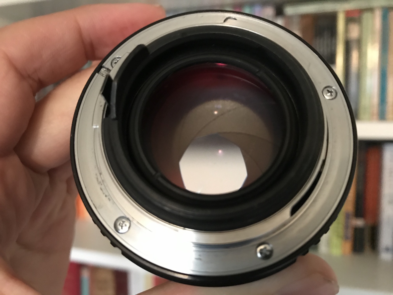
The most common way of altering exposure is to adjust the aperture, a.k.a. the iris, sometimes described as changing “the stop”. Just like the pupil in our eyes, the aperture of a photographic lens is a (roughly) circular opening which can be expanded or contracted to permit more or less light through to the sensor.

You will have seen a series of numbers like this printed on the sides of lenses:

1      1.4      2      2.8      4      5.6      8      11      16      22     32

These are ratios – ratios of the lens’ focal length to its iris diameter. So a 50mm lens with a 25mm diameter iris is at f/2. Other lengths of lens would have different iris diameters at f/2 (e.g. 10mm diameter for a 20mm lens) but they would all produce an image of the same brightness. That’s why we use f-stops to talk about iris rather than diameters.

But why not label a lens 1, 2, 3, 4…? Why 1, 1.2, 2, 2.8…? These magic numbers are f-stops. A lens set to f/1.4 will let in twice as much light as (or “one stop more than”) a lens set to f/2, which in turn will let in twice as much as one set to f/2.8, and so on. Conversely, a lens set to f/2.8 will let in half as much light as (or “one stop less than”) a lens set to f/2, and so on. (Note that a number between any of these f-stops, e.g. f/1.8, is properly called an f-number, but not an f-stop.) These doublings or halvings – technically known as a base-2 logarithmic scale – are a fundamental concept in exposure, and mimic our eyes’ response to light.

If you think back to high-school maths and the πr² squared formula for calculating the area of a circle from its radius, the reason for the seemingly random series of numbers will start to become clear. Letting in twice as much light requires twice as much area for those light rays to fall on, and remember that the f-number is the ratio of the focal length to the iris diameter, so you can see how square roots are going to get involved and why f-stops aren’t just plain old round numbers.

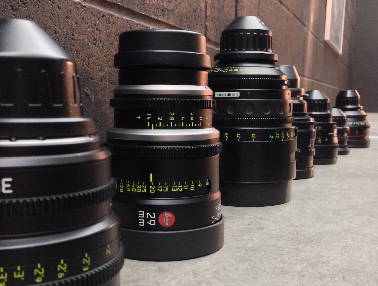
If you’re shooting with a cine lens, rather than a stills lens, you’ll see the same series of numbers on the barrel, but here they are T-stops rather than f-stops. T-stops are f-stops adjusted to compensate for the light transmission efficiency. Two different lenses set to, say, f/2 will not necessarily produce equally bright images, because some percentage of light travelling through the elements will always be lost, and that percentage will vary depending on the quality of the glass and the number of elements. A lens with 100% light transmission would have the same f-number and T-number, but in practice the T-number will always be a little bigger than the f-number. For example, Cooke’s 15-40mm zoom is rated at a maximum aperture of T2 or f/1.84.


Fast and slow lenses

When buying or renting a lens, one of the first things you will want to know is its maximum aperture. Lenses are often described as being fast (larger maximum aperture, denoted by a smaller f- or T-number like T1.4) or slow (smaller maximum aperture, denoted by a bigger f- or T-number like T4). These terms come from the fact that the shutter speed would need to be faster or slower to capture the same amount of light… but more on that later in the series.

Faster lenses are generally more expensive, but that expense may well be outweighed by the savings made on lighting equipment. Let’s take a simple example, and imagine an interview lit by a 4-bank Kino Flo and exposed at T2.8. If our lens can open one stop wider (known as stopping up) to T2 then we double the amount of light reaching the sensor. We can therefore halve the level of light – by turning off two of the Kino Flo’s tubes or by renting a cheaper 2-bank unit in the first place. If we can stop up further, to T1.4, then we only need one Kino tube to achieve the same exposure.


Side effects

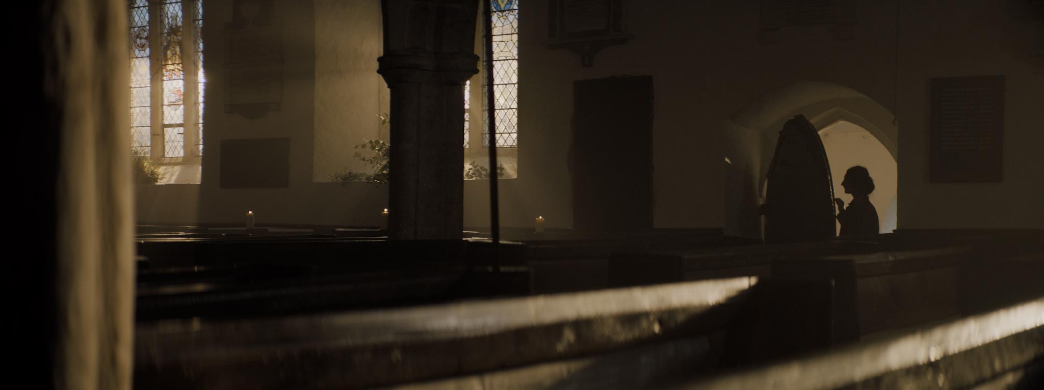
One of the first things that budding cinematographers learn is that wider apertures make for a smaller depth of field, i.e. the range of distances within which a subject will be in focus is smaller. In simple terms, the background of the image is blurrier when the depth of field is shallower.

It is often tempting to go for the shallowest possible depth of field, because it feels more cinematic and helps conceal shortcomings in the production design, but that is not the right look for every story. A DP will often choose a stop to shoot at based on the depth of field they desire. That choice of stop may affect the entire lighting budget; if you want to shoot at a very slow T14 like Douglas Slocombe did for the Indiana Jones trilogy, you’re going to need several trucks full of lights!

There is another side effect of adjusting the aperture which is less obvious. Lenses are manufactured to perform best in the middle of their iris range. If you open a lens up to its maximum aperture or close it down to its minimum, the image will soften a little. Therefore another advantage of faster lenses is the ability to get further away from their maximum aperture (and poorest image quality) with the same amount of light.

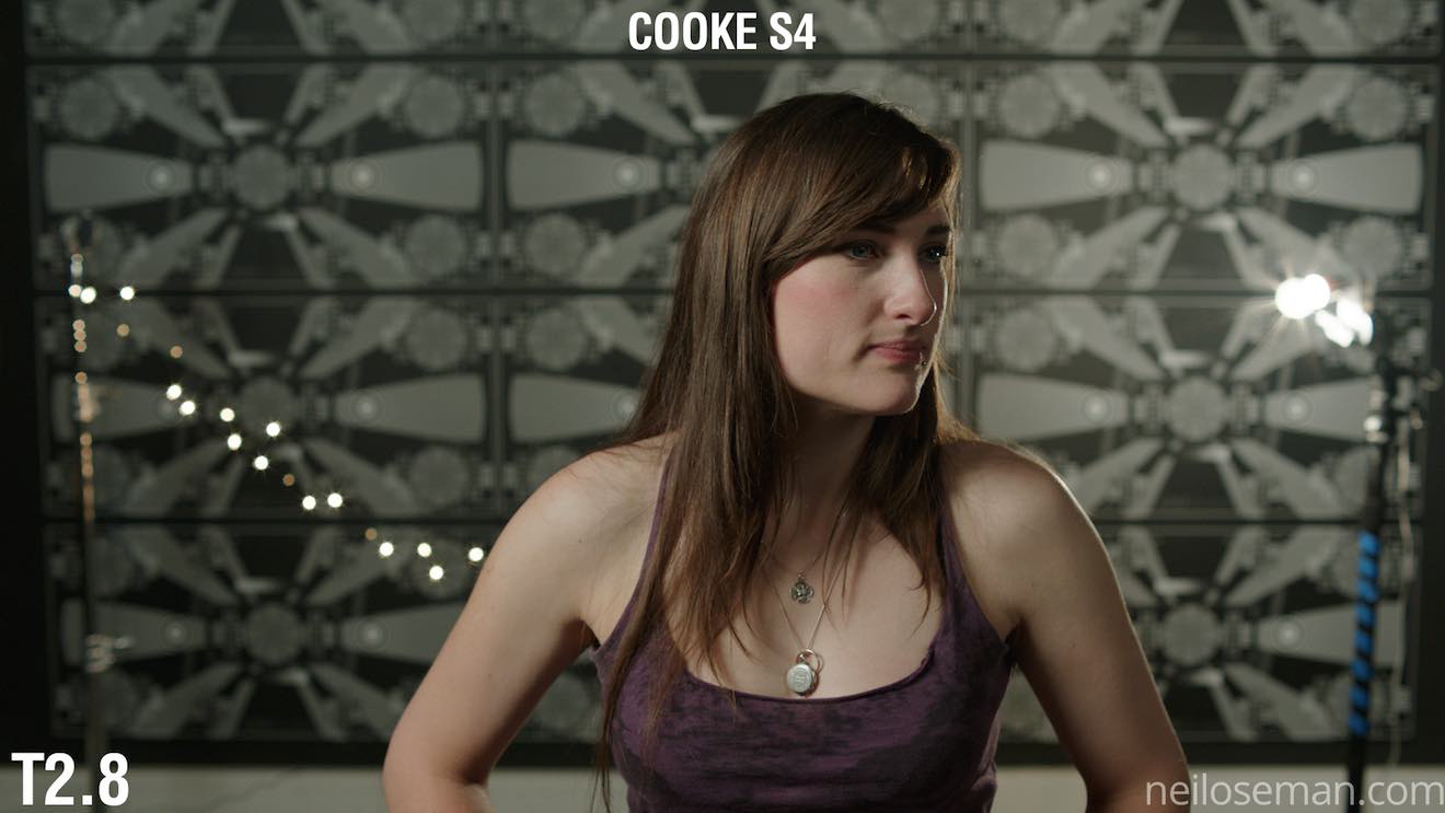
Finally it is worth noting that the appearance of bokeh (out of focus areas) and lens flares also changes with aperture. The Cooke S4 range, for example, renders out-of-focus highlights as circles when wide open, but as octagons when stopped down. With all lenses, the star pattern seen around bright light sources will be stronger when the aperture is smaller. You should shoot tests – like these I conducted in 2017 – if these image artefacts are a critical part of your film’s look.

Next time we’ll look at how we can use ND filters to control exposure without compromising our choice of stop.

Learn how to use exposure practically with my Cinematic Lighting online couse. Enter voucher code INSTA90 for an amazing 90% off.

Exposure Part 1: Aperture

The First Light a Cinematographer Should Put Up

Where do you start, as a director of photography lighting a set? What should be the first brushstroke when you’re painting with light?

I believe the answer is backlight, and I think many DPs would agree with me.

Let’s take the example of a night exterior in a historical fantasy piece, as featured in my online course, Cinematic Lighting. The main source of light in such a scene would be the moon. Where am I going to put it? At the back.

The before image is lit by an LED panel serving purely as a work-light while we rehearsed. It’s not directly above the camera, but off to the right, so the lighting isn’t completely flat, but there is very little depth in the image. Beyond the gate is a boring black void.

The after image completely transforms the viewer’s understanding of the three-dimensional space. We get the sense of a world beyond the gate, an intriguing world lighter than the foreground, with a glimpse of trees and space. Composing the brazier in the foreground has added a further plane, again increasing the three-dimensional impression.

Here is the lighting diagram for the scene. (Loads more diagrams like this can be seen on my Instagram feed.)

The “moon” is a 2.5KW HMI fresnel way back amongst the trees, hidden from camera by the wall on the right. This throws the gate and the characters into silhouette, creating a rim of light around their camera-right sides.

To shed a little light on Ivan’s face as he looks camera-left, I hid a 4×4′ Kino Flo behind the lefthand wall, again behind the actors.

The LED from the rehearsal, a Neewer 480, hasn’t moved, but now it has an orange gel and is dimmed very low to subtly enhance the firelight. Note how the contrasting colours in the frame add to the depth as well.

So I’ll always go into a scene looking at where to put a big backlight, and then seeing if I need any additional sources. Sometimes I don’t, like in this scene from the Daylight Interior module of the course.

Backlight for interior scenes is different to night interiors. You cannot simply put it where you want it. You must work with the position of the windows. When I’m prepping interiors, I always work with the director to try to block the scene so that we can face towards the window as much as possible, making it our backlight. If a set is being built, I’ll talk to the production designer at the design stage to get windows put in to backlight the main camera positions whenever possible.

In the above example, lit by just the 2.5K HMI outside the window, I actually blacked out windows behind camera so that they would not fill in the nice shadows created by the backlight.

Daylight exteriors are different again. I never use artificial lights outdoors in daytime any more. I prefer to work with the natural light and employ reflectors, diffusion or negative fill to mould it where necessary.

So it’s very important to block the scene with the camera facing the sun whenever possible. Predicting the sun path may take a little work, but it will always be worth it.

Here I’ve shot south, towards the low November sun, and didn’t need to modify the light at all.

Shooting in the opposite direction would have looked flat and uninteresting, not to mention causing potential problems with the cast squinting in the sunlight, and boom and camera shadows being cast on them.

You can learn much more about the principles and practice of cinematic lighting by taking my online course on Udemy. Currently you can get an amazing 90% off using the voucher code INSTA90 until November 19th.

For more examples of building a scene around backlight, see my article “Lighting from the Back”.

The First Light a Cinematographer Should Put Up

5 Ways to Fake Firelight

Real SFX run a fishtail on the set of “Heretiks”

Firelight adds colour and dynamism to any lighting set-up, not to mention being essential for period and fantasy films. But often it’s not practical to use real firelight as your source. Even if you could do it safely, continuity could be a problem.

A production that can afford an experienced SFX crew might be able to employ fishtails, V-shaped gas outlets that produce a highly controllable bar of flame, as we did on Heretiks. If such luxuries are beyond your budget, however, you might need to think about simulating firelight. As my gaffer friend Richard Roberts once said while operating an array of flickering tungsten globes (method no. 3), “There’s nothing like a real fire… and this is nothing like a real fire.”


1. Waving Hands

The simplest way to fake firelight is to wave your hands in front of a light source. This will work for any kind of source, hard or soft; just experiment with movements and distances and find out what works best for you. A layer of diffusion on the lamp, another in a frame, and the waving hands in between, perhaps?

Visit my Instagram feed for loads more diagrams like this.

One of my favourite lighting stories involves a big night exterior shot from The First Musketeer which was done at the Chateau de Fumel in the Lot Valley, France. We were just about to turnover when a bunch of automatic floodlights came on, illuminating the front of the chateau and destroying the period illusion of our scene. We all ran around for a while, looking for the off switch, but couldn’t find it. In the end I put orange gel on the floodlights and had someone crouch next to each one, wiggling their hands like a magician, and suddenly the chateau appeared to be lit by burning braziers.


2. Wobbling Reflector

This is my go-to technique – quick, easy and effective. It’s demonstrated in my Cinematic Lighting course on Udemy and also in this episode of Lensing Ren:

All you need is a collapsible reflector with a gold side, and an open-face tungsten fixture. Simply point the latter at the former and wobble the reflector during the take to create the flickering effect.


3. Tungsten Array

If you want to get more sophisticated, you can create a rig of tungsten units hooked up to a dimmer board. Electronic boxes exist to create a flame-like dimming pattern, but you can also just do it by pushing the sliders up and down randomly. I’ve done this a lot with 100W tungsten globes in simple pendant fittings, clipped to parts of the set or to wooden battens. You can add more dynamics by gelling the individual lamps with different colours – yellows, oranges and reds.

John Higgins’ 2MW firelight rig from “1917”

Larger productions tend to use Brutes, a.k.a. Dinos, a.k.a. 9-lights, which are banks of 1K pars. The zenith of this technique is the two megawatt rig built by gaffer John Higgins for Roger Deakins, CBE, BSC, ASC on 1917.


4. Programmed L.E.D.

Technological advances in recent years have provided a couple of new methods of simulating firelight. One of these is the emergence of LED fixtures with built-in effects programmes like police lights, lightning and flames. These units come in all shapes, sizes and price-ranges.

Philip Bloom’s budget fire-effect rig on location for “Filmmaking for Photographers”

On War of the Worlds: The Attack last year, gaffer Callum Begley introduced me to Astera tubes, and we used their flame effect for a campfire scene in the woods when we were having continuity problems with the real fire. For the more financially challenged, domestic fire-effect LED bulbs are cheap and screw into standard sockets. Philip Bloom had a few of these on goose-neck fittings which we used extensively in the fireplaces of Devizes Castle when shooting a filmmaking course for Mzed.


5. L.e.D. Screen

A logical extension of an LED panel or bulb that crudely represents the pattern of flames is an LED screen that actually plays video footage of a fire. The oil rig disaster docu-drama Deep Horizon and Christoper Nolan’s Dunkirk are just two films that have used giant screens to create the interactive light of off-camera fires. There are many other uses for LED screens in lighting, which I’ve covered in detail before, with the ultimate evolution being Mandalorian-style virtual volumes.

You don’t necessarily need a huge budget to try this technique. What about playing one of those festive YouTube videos of a crackling log fire on your home TV? For certain shots, especially given the high native ISOs of some cameras today, this might make a pretty convincing firelight effect. For a while now I’ve been meaning to try fire footage on an iPad as a surrogate candle. There is much here to explore.

So remember, there may be no smoke without fire, but there can be firelight without fire.

5 Ways to Fake Firelight

Will “The Mandalorian” Revolutionise Filmmaking?

Last week, Greig Fraser, ASC, ACS and Baz Idoine were awarded the Emmy for Outstanding Cinematography for a Single-camera Series (Half-hour) for The Mandalorian. I haven’t yet seen this Star Wars TV series, but I’ve heard and read plenty about it, and to call it a revolution in filmmaking is not hyperbole.

Half of the series was not shot on location or on sets, but on something called a volume: a stage with walls and ceiling made of LED screens, 20ft tall, 75ft across and encompassing 270° of the space. I’ve written before about using large video screens to provide backgrounds in limited aways, outside of train windows for example, and using them as sources of interactive light, but the volume takes things to a whole new level.

In the past, the drawback of the technology has been one of perspective; it’s a flat, two-dimensional screen. Any camera movement revealed this immediately, because of the lack of parallax. So these screens tended to be kept to the deep background, with limited camera movement, or with plenty of real people and objects in the foreground to draw the eye. The footage shown on the screens was pre-filmed or pre-rendered, just video files being played back.

The Mandalorian‘s system, run by multiple computers simultaneously, is much cleverer. Rather than a video clip, everything is rendered in real time from a pre-built 3D environment known as a load, running on software developed for the gaming industry called Unreal Engine. Around the stage are a number of witness cameras which use infra-red to monitor the movements of the cinema camera in the same way that an actor is performance-captured for a film like Avatar. The data is fed into Unreal Engine, which generates the correct shifts in perspective and sends them to the video walls in real time. The result is that the flat screen appears, from the cinema camera’s point of view, to have all the depth and distance required for the scene.

The loads are created by CG arists working to the production designer’s instructions, and textured with photographs taken at real locations around the world. In at least one case, a miniature set was built by the art department and then digitised. The scene is lit with virtual lights by the DP – all this still during preproduction.

The volume’s 270° of screens, plus two supplementary, moveable screens in the 90° gap behind camera, are big enough and bright enough that they provide most or all of the illumination required to film under. The advantages are obvious. “We can create a perfect environment where you have two minutes to sunset frozen in time for an entire ten-hour day,” Idoine explains. “If we need to do a turnaround, we merely rotate the sky and background, and we’re ready to shoot!”

Traditional lighting fixtures are used minimally on the volume, usually for hard light, which the omni-directional pixels of an LED screen can never reproduce. If the DPs require soft sources beyond what is built into the load, the technicians can turn any off-camera part of the video screens into an area of whatever colour and brightness are required –  a virtual white poly-board or black solid, for example.

A key reason for choosing the volume technology was the reflective nature of the eponymous Mandalorian’s armour. Had the series been shot on a green-screen, reflections in his shiny helmet would have been a nightmare for the compositing team. The volume is also much more actor- and filmmaker-friendly; it’s better for everyone when you can capture things in-camera, rather than trying to imagine what they will look like after postproduction. “It gives the control of cinematography back to the cinematographer,” Idoine remarks. VR headsets mean that he and the director can even do a virtual recce.

The Mandalorian shoots on the Arri Alexa LF (large format), giving a shallow depth of field which helps to avoid moiré problems with the video wall. To ensure accurate chromatic reproduction, the wall was calibrated to the Alexa LF’s colour filter array.

Although the whole system was expensive to set up, once up and running it’s easy to imagine how quickly and cheaply the filmmakers can shoot on any given “set”. The volume has limitations, of course. If the cast need to get within a few feet of a wall, for example, or walk through a door, then that set-piece has to be real. If a scene calls for a lot of direct sunlight, then the crew move outside to the studio backlot. But undoubtedly this technology will improve rapidly, so that it won’t be long before we see films and TV episodes shot entirely on volumes. Perhaps one day it could overtake traditional production methods?

For much more detailed information on shooting The Mandalorian, see this American Cinematographer article.

Will “The Mandalorian” Revolutionise Filmmaking?

5 Things Bob Ross Can Teach Us About Cinematography

I’m certainly glad you could join me today. It’s a fantastic day here and I hope it is wherever you’re at. Are you ready to read a fantastic little blog post? Good, then let’s get started.

For twelve years, across 400 episodes, Bob Ross entertained all generations of Americans with his public access TV series, The Joy of Painting. Although he floated up to join the happy little clouds in 1995, in recent years YouTube and Twitch have brought his shows to a new audience, of which I am a humble member. Bob’s hypnotic, soft-spoken voice, his unfailingly positive attitude, and the magical effects of his wet-on-wet oil-painting technique make his series calming, comforting and captivating in equal measure.

Having watched every episode at least twice now, I’ve noticed several nuggets of Bob Ross wisdom that apply just as well to cinematography as they do to painting.


1. “The more plains you have in your painting, the more depth it has… and that’s what brings the happy buck.”

Bob always starts with the background of his scene and paints forward: first the sky with its happy little clouds; then often some almighty mountains; then the little footy hills; some trees way in the distance, barely more than scratches on the canvas; then perhaps a lake, its reflections springing forth impossibly from Bob’s brush; the near bank; and some detailed trees and bushes in the foreground, with a little path winding through them.

“Exile Incessant” (dir. James Reynolds)

Just as with landscape painting, depth is tremendously important in cinematography. Creating a three-dimensional world with a monoscopic camera is a big part of a DP’s job, which starts with composition – shooting towards a window, for example, rather than a wall – and continues with lighting. Depth increases production value, which makes for a happy producer and a happy buck for you when you get hired again.


2. “As things get further away from you in a landscape, they get lighter in value.”

Regular Joy of Painting viewers soon notice that the more distant layers of Bob’s paintings use a lot more Titanium White than the closer ones. Bob frequently explains that each layer should be darker and more detailed than the one behind it, “and that’s what creates the illusion of depth”.

“The Gong Fu Connection” (dir. Ted Duran)

Distant objects seem lighter and less contrasty because of a phenomenon called aerial perspectivebasically atmospheric scattering of light. As a DP, you can simulate this by lighting deeper areas of your frame brightly, and keeping closer areas dark. This might be achieved by setting up a flag to provide negative fill to an object in the foreground, or by placing a battery-powered LED fixture at the end of a dark street. The technique works for night scenes and small interiors, just as well as daytime landscapes, even though aerial perspective would never occur there in real life. The viewer’s brain will subconsciously recognise the depth cue and appreciate the three-dimensionality of the set much more.


3. “Don’t kill the little misty area; that’s your separator.”

After completing each layer, particularly hills and mountains, Bob takes a clean, dry brush and taps gently along the bottom of it. This has a blurring and fading effect, giving the impression that the base of the layer is dissolving into mist. When he paints the next layer, he takes care to leave a little of this misty area showing behind it.

“Heretiks” (dir. Paul Hyett)

We DPs can add atmos (smoke) to a scene to create separation. Because there will be more atmos between the lens and a distant object than between the lens and a close object, it really aids the eye in identifying different plains. That makes the image both clearer and more aesthetically pleasing. Layers can also be separated with backlight, or a differentiation of tones or colours.


4. “You need the dark in order to show the light.”

Hinting at the tragedy in his own life, Bob often underlines the importance of playing dark tones against light ones. “It’s like in life. Gotta have a little sadness once in a while so you know when the good times come,” he wisely remarks, as he taps away at the canvas with his fan-brush, painting in the dark rear leaves of a tree. Then he moves onto the lighter foreground leaves, “but don’t kill your dark areas,” he cautions.

“Closer Each Day” promo (dir. Oliver Park)

If there’s one thing that makes a cinematic image, it’s contrast. It can be very easy to over-light a scene, and it’s often a good idea to try turning a fixture or two off to see if the mood is improved. However bright or dark your scene is, where you don’t put light is just as important as where you do. Flagging a little natural light, blacking out a window, or removing the bubble from a practical can often add a nice bit of shape to the image.


5. “Maybe… maybe… maybe… Let’s DROP in an almighty tree.”

As the end of the episode approaches, and the painting seems complete, Bob has a habit of suddenly adding a big ol’ tree down one or both sides of the canvas. Since this covers up background layers that have been carefully constructed earlier in the show, Bob often gets letters complaining that he has spoilt a lovely painting. “Ruined!” is the knowing, light-hearted comment of the modern internet viewer.

“Synced” (dir. Devon Avery)

The function of these trees is to provide a foreground framing element which anchors the side of the image. I discussed this technique in my article on composing a wide shot. A solid, close object along the side or base of the frame makes the image much stronger. It gives a reason for the edge of the frame to be there rather than somewhere else. As DPs, we may not be able to just paint a tree in, but there’s often a fence, a pillar, a window frame, even a supporting artist that we can introduce to the foreground with a little tweaking of the camera position.

The ol’ clock on the wall tells me it’s time to go, so until next time: happy filming, and God bless, my friend.

If you’re keen to learn more about cinematography, don’t forget I have an in-depth course available on Udemy.

5 Things Bob Ross Can Teach Us About Cinematography

The Cinematography of “Chernobyl”

Like many of us, I’ve watched a lot of streaming shows this year. One of the best was Chernobyl, the HBO/Sky Atlantic mini-series about the nuclear power plant disaster of 1986, which I cheekily binged during a free trial of Now TV.

In July, Chernobyl deservedly scooped multiple honours at the Virgin Media British Academy Television (Craft) Awards. In addition to it claiming the Bafta for best mini-series, lead actor Jared Harris, director Johan Renck, director of photography Jakob Ihre, production designers Luke Hull and Claire Levinson-Gendler, costume designer Odile Dicks-Mireaux, editors Simon Smith and Jinx Godfrey, composer Hildur Gudnadóttir, and the sound team all took home the awards in their respective fiction categories.

I use the phrase “took home” figuratively, since no-one had left home in the first place. The craft awards ceremony was a surreal, socially-distanced affair, full of self-filmed, green-screened celebrities. Comedian Rachel Parris impersonated writer/actor Jessica Knappett, and the two mock-argued to present the award for Photography & Lighting: Fiction. Chernobyl’s DP Jakob Ihre, FSF gave his acceptance speech in black tie, despite being filmed on a phone in his living room. In it he thanked his second unit DP Jani-Petteri Passi as well as creator/writer Craig Mazin, one of the few principal players not to receive an award.

Mazin crafted a tense and utterly engrossing story across five hour-long instalments, a story all the more horrifying for its reality. Beginning with the suicide of Harris’ Valery Legasov on the second anniversary of the disaster, the series shifts back to 1986 and straight into the explosion of the No. 4 reactor at the Chernobyl Nuclear Power Plant in the Soviet Ukraine. Legasov, along with Brosi Shcherbina (Stellan Skarsgård) and the fictional, composite character Ulana Khomyuk (Emily Watson) struggle to contain the meltdown while simultaneously investigating its cause. Legions of men are sacrificed to the radiation, wading through coolant water in dark, labyrinthine tunnels to shut off valves, running across what remains of the plant’s rooftop to collect chunks of lethal graphite, and mining in sweltering temperatures beneath the core to install heat exchangers that will prevent another catastrophic explosion.

For Swedish-born NFTS (National Film and Television School) graduate Jakob Ihre, Chernobyl was a first foray into TV. His initial concept for the show’s cinematography was to reflect the machinery of the Soviet Union. He envisaged a heavy camera package representing the apparatus of the state, comprised of an Alexa Studio, with its mechanical shutter, plus anamorphic lenses. “After another two or three months of preproduction,” he told the Arri Channel, “we realised maybe that’s the wrong way to go, and we should actually focus on the characters, on the human beings, the real people who this series is about.”

Sensitivity and respect for the people and their terrible circumstances ultimately became the touchstone for both Ihre and his director. The pair conducted a blind test of ten different lens sets, and both independently selected Cooke Panchros. “We did a U-turn and of course we went for spherical lenses, which in some way are less obtrusive and more subtle,” said Ihre. For the same reason, he chose the Alexa Mini over its big brother. A smaller camera package like this is often selected when filmmakers wish to distract and overwhelm their cast as little as possible, and is believed by many to result in more authentic performances.

When it came to lighting, “We were inspired by the old Soviet murals, where you see the atom, which is often symbolised as a sun with its rays, and you see the workers standing next to that and working hand in hand with the so-called ‘friendly’ atom.” Accordingly, Ihre used light to represent gamma radiation, with characters growing brighter and over-exposed as they approach more dangerous areas.

Ihre thought of the disaster as damaging the fabric of the world, distorting reality. He strove to visualise this through dynamic lighting, with units on dimmers or fitted with remote-controlled shutters. He also allowed the level of atmos (smoke) in a scene to vary – normally a big no-no for continuity. The result is a series in which nothing feels safe or stable.

The DP shot through windows and glass partitions wherever possible, to further suggest a distorted world. Working with Hull and Levinson-Gendler, he tested numerous transparent plastics to find the right one for the curtains in the hospital scenes. In our current reality, filled with perspex partitions (and awards ceremonies shot on phones), such imagery of isolation is eerily prescient.

The subject of an invisible, society-changing killer may have become accidentally topical, but the series’ main theme was more deliberately so. “What is the cost of lies?” asks Legasov. “It’s not that we’ll mistake them for the truth. The real danger is that if we hear enough lies, then we no longer recognise the truth at all.” In our post-truth world, the disinformation, denial and delayed responses surrounding the Chernobyl disaster are uncomfortably familiar.

This article first appeared on RedShark News.

The Cinematography of “Chernobyl”

How is Dynamic Range Measured?

The high dynamic range of the ARRI Alexa Mini allowed me to retain all the sky detail in this shot from “Above the Clouds”.

Recently I’ve been pondering which camera to shoot an upcoming project on, so I consulted the ASC’s comparison chart. Amongst the many specs compared is dynamic range, and I noticed that the ARRI Alexa’s was given as 14+ stops, while the Blackmagic URSA’s is 15. Having used both cameras a fair bit, I can tell you that there’s no way in Hell that the Ursa has a higher dynamic range than the Alexa. So what’s going on here?


What is dynamic range?

To put it simply, dynamic range is the level of contrast that an imaging system can handle. To quote Alan Roberts, who we’ll come back to later:

This is normally calculated as the ratio of the exposure which just causes white clipping to the exposure level below which no details can be seen.

A photosite on a digital camera’s sensor outputs a voltage proportional to the amount of light hitting it, but at some point the voltage reaches a maximum, and no matter how much more light you add, it won’t change. At the other end of the scale, a photosite may receive so little light that it outputs no voltage, or at least nothing that’s discernible from the inherent electronic noise in the system. These upper and lower limits of brightness may be narrowed by image processing within the camera, with RAW recording usually retaining the full dynamic range, while linear Rec. 709 severely curtails it.

In photography and cinematography, we measure dynamic range in stops – doublings and halvings of light which I explain fully in this article. One stop is a ratio of 2:1, five stops are 32:1, thirteen stops are almost 10,000:1

It’s worth pausing here to point out the difference between dynamic range and latitude, a term which is sometimes regarded as synonymous, but it’s not. The latitude is a measure of how much the camera can be over- or under-exposed without losing any detail, and is dependent on both the dynamic range of the camera and the dynamic range of the scene. (A low-contrast scene will allow more latitude for incorrect exposure than a high-contrast scene.)


Problems of Measurement

Before digital cinema cameras were developed, video had a dynamic range of about seven stops. You could measure this relatively easily by shooting a greyscale chart and observing the waveform of the recorded image to see where the highlights levelled off and the shadows disappeared into the noise floor. With today’s dynamic ranges into double digits, simple charts are no longer practical, because you can’t manufacture white enough paper or black enough ink.

For his excellent video on dynamic range, Filmmaker IQ’s John Hess built a device fitted with a row of 1W LEDs, using layers of neutral density gel to make each one a stop darker than its neighbour. For the purposes of his demonstration, this works fine, but as Phil Rhodes points out on RedShark News, you start running into the issue of the dynamic range of the lens.

It may seem strange to think that a lens has dynamic range, and in the past when I’ve heard other DPs talk about certain glass being more or less contrasty, I admit that I haven’t thought much about what that means. What it means is flare, and not the good anamorphic streak kind, but the general veiling whereby a strong light shining into the lens will raise the overall brightness of the image as it bounces around the different elements. This lifts the shadows, producing a certain amount of milkiness. Even with high contrast lenses, ones which are less prone to veiling, the brightest light on your test device will cause some glare over the darkest one, when measuring the kind of dynamic range today’s cameras enjoy.


Manufacturer Measurements

Going back to my original query about the Alexa versus the URSA, let’s see exactly what the manufacturers say. ARRI specifically states that its sensor’s dynamic range is over 14 stops “as measured with the ARRI Dynamic Range Test Chart”. So what is this chart and how does it work? The official sales blurb runs thusly:

The ARRI DRTC-1 is a special test chart and analysis software for measurement of dynamic range and sensitivity of digital cameras. Through a unique stray light reduction concept this system is able to accurately measure up to 15.5 stops of dynamic range.

The “stray light reduction” is presumably to reduce the veiling mentioned earlier and provide more accurate results. This could be as simple as covering or turning off the brighter lights when measuring the dimmer ones.

I found a bit more information about the test chart in a 2011 camera shoot-out video, from that momentous time when digital was supplanting film as the cinematic acquisition format of choice. Rather than John Hess’s ND gel technique, the DRTC-1 opts for something else to regulate its light output, as ARRI’s Michael Bravin explains in the video:

There’s a piece of motion picture film behind it that’s checked with a densitometer, and what you do is you set the exposure for your camera, and where you lose detail in the vertical and horizontal lines is your clipping point, and where you lose detail because of noise in the shadow areas is your lowest exposure… and in between you end up finding the number of stops of dynamic range.

Blackmagic Design do not state how they measure the dynamic range of their cameras, but it may be a DSC Labs Xlya. This illuminated chart boasts a shutter system which “allows users to isolate and evaluate individual steps”, plus a “stepped xylophone shape” to minimise flare problems.

Art Adams, a cinema lens specialist at ARRI, and someone who’s frequently quoted in Blain Brown’s Cinematography: Theory & Practice, told Y.M. Cinema Magazine:

I used to do a lot of consulting with DSC Labs, who make camera test charts, so I own a 20-stop dynamic range chart (DSC Labs Xyla). This is what most manufacturers use to test dynamic range (although not ARRI, because our engineers don’t feel it’s precise enough) and I see what companies claim as usable stops. You can see that they are just barely above the noise floor.


Conclusions

Obviously these ARRI folks I keep quoting may be biased. I wanted to find an independent test that measures both Blackmagics and Alexas with the same conditions and methodology, but I couldn’t find one. There is plenty of anecdotal evidence that Alexas have a bigger dynamic range, in fact that’s widely accepted as fact, but quantifying the difference is harder. The most solid thing I could find is this, from a 2017 article about the Blackmagic Ursa Mini 4.6K (first generation):

The camera was measured at just over 14 stops of dynamic range in RAW 4:1 [and 13 stops in ProRes]. This is a good result, especially considering the price of the camera. To put this into perspective Alan measured the Canon C300 mkII at 15 stops of dynamic range. Both the URSA Mini 4.6 and C300 mkII are bettered by the ARRI Alexa and Amira, but then that comes as no surprise given their reputation and price.

The Alan mentioned is Alan Roberts, something of a legend when it comes to testing cameras. It is interesting to note that he is one of the key players behind the TLCI (Television Lighting Consistency Index), a mooted replacement for CRI (Colour Rendering Index). It’s interesting because this whole dynamic range business is starting to remind me of my investigation into CRI, and is leading me to a similar conclusion, that the numbers which the manufacturers give you are all but useless in real-world cinematography.

Whereas CRI at least has a standardised test, there’s no such thing for dynamic range. Therefore, until there is more transparency from manufacturers about how they measure it, I’d recommend ignoring their published values. As always when choosing a camera, shoot your own tests if at all possible. Even the most reliable numbers can’t tell you whether you’re going to like a camera’s look or not, or whether it’s right for the story you want to tell.

When tests aren’t possible, and I know that’s often the case in low-budget land, at least try to find an independent comparison. I’ll leave you with this video from the Slanted Lens, which compares the URSA Mini Pro G2 with the ARRI Amira (which uses the same Alev III sensor as the Alexa). They don’t measure the dynamic range, but you can at least see the images side by side, and in the end it’s the images that matter, not the numbers.

How is Dynamic Range Measured?

Beautiful/Realistic/Cheap: The Lighting Triangle

We’re all familiar with the “good/fast/cheap” triangle. You can pick any two, but never all three. When it comes to lighting films, I would posit that there is a slightly different triangle of truth labelled “beautiful/realistic/cheap”. When you’re working to a tight budget, a DP often has to choose between beautiful or realistic lighting, where a better-funded cinematographer can have both.

I first started thinking about this in 2018 when I shot Annabel Lee. Specifically it was when we were shooting a scene from this short period drama – directed by Amy Coop – in a church. Our equipment package was on the larger side for a short, but still far from ideal for lighting up a building of that size. Our biggest instrument was a Nine-light Maxi Brute, which is a grid of 1KW par globes, then we had a couple of 2.5K HMIs and nothing else of any signifcant power.

Director Amy Coop during the church recce for “Annabel Lee”

The master shot for the scene was a side-on dolly move parallel to the central aisle, with three large stained-glass windows visible in the background. My choices were either to put a Maxi Brute or an HMI outside each window, to use only natural light, or to key the scene from somewhere inside the building. The first option was beautiful but not realistic, as I shall explain, the second option would have been realistic but not beautiful (and probably under-exposed) and the third would have been neither.

I went with the hard source outside of each window. I could not diffuse or bounce the light because that would have reduced the intensity to pretty much nothing. (Stained-glass windows don’t transmit a lot of light through them.) For the same reason, the lamps had to be pretty close to the glass.

The result is that, during this dolly shot, each of the three lamps is visible at one time or another. You can’t tell they’re lamps – the blown-out panes of glass disguise them – but the fact that there are three of them rather gives away that they are not the sun! (There is also the issue that contiguous scenes outside the church have overcast light, but that is a discontinuity I have noticed in many other films and series.)

I voiced my concerns to Amy at the time – trying to shirk responsibility, I suppose! Fortunately she found it beautiful enough to let the realism slide.

But I couldn’t help thinking that, with a larger budget and thus larger instruments, I could have had both beauty and realism. If I had had three 18K HMIs, for example, plus the pre-rig time to put them on condors or scaffolding towers, they could all have been high enough and far enough back from the windows that they wouldn’t have been seen. I would still have got the same angle of light and the nice shafts in the smoke, but they would have passed much more convincingly as a single sun source. Hell, if I’d had the budget for a 100KW SoftSun then I really could have done it with one source!

There have been many other examples of the beauty/realism problem throughout my career. One that springs to mind is Above the Clouds, where the 2.5K HMI which I was using as a backlight for a night exterior was in an unrealistic position. The ground behind the action sloped downwards, so the HMI on its wind-up stand threw shafts of light upwards. With the money for a cherry-picker, a far more moon-like high-angle could have been achieved. Without such funds, my only alternative was to sacrifice the beauty of a backlight altogether, which I was not willing to do.

The difference between that example and Annabel Lee is that Clouds director Leon Chambers was unable to accept the unrealistic lighting, and ended up cutting around it. So I think it’s quite important to get on the same page as your director when you’re lighting with limited means.

I remember asking Paul Hyett when we were prepping Heretiks, “How do you feel about shafts of ‘sunlight’ coming into a room from two different directions?” He replied that “two different directions is fine, but not three.” That was a very nice, clear drawing of the line between beauty (or at least stylisation) and realism, which helped me enormously during production.

The beauty/realism/cost triangle is one we all have to navigate. Although it might sometimes give us regrets about what could have been, as long we’re on the same page as our directors we should still get results we can all live with.

Beautiful/Realistic/Cheap: The Lighting Triangle

The Long Lenses of the 90s

Lately, having run out of interesting series, I’ve found myself watching a lot of nineties blockbusters: Outbreak, Twister, Dante’s Peak, Backdraft, Daylight. Whilst eighties movies were the background to my childhood, and will always have a place in my heart, it was the cinema of the nineties that I was immersed in as I began my own amateur filmmaking. So, looking back on those movies now, while certain clichés stand out like sore thumbs, they still feel to me like solid examples of how to make a summer crowd-pleaser.

Let’s get those clichés out of the way first. The lead character always has a failed marriage. There’s usually an opening scene in which they witness the death of a spouse or close relative, before the legend “X years later” fades up. The dog will be saved, but the crotchety elderly character will die nobly. Buildings instantly explode towards camera when touched by lava, hurricanes, floods or fires. A stubborn senior authority figure will refuse to listen to the disgraced lead character who will ultimately be proven correct, to no-one’s surprise.

Practical effects in action on “Twister”

There’s an intensity to nineties action scenes, born of the largely practical approach to creating them. The decade was punctuated by historic advances in digital effects: the liquid metal T-1000 in Terminator 2 (1991), digital dinosaurs in Jurassic Park (1993), motion-captured passengers aboard the miniature Titanic (1997), Bullet Time in The Matrix (1999). Yet these techniques remained expensive and time-consuming, and could not match traditional methods of creating explosions, floods, fire or debris. The result was that the characters in jeopardy were generally surrounded by real set-pieces and practical effects, a far more nerve-wracking experience for the viewer than today, when we can tell that our heroes are merely imagining their peril on a green-screen stage.

One thing I was looking out for during these movie meanders down memory lane was lens selection. A few weeks back, a director friend had asked me to suggest examples of films that preferred long lenses. He had mentioned that such lenses were more in vogue in the nineties, which I’d never thought about before.

As soon as I started to consider it, I realised how right my friend was. And how much that long-lens look had influenced me. When I started out making films, I was working with the tiny sensors of Mini-DV cameras. I would often try to make my shots look more cinematic by shooting on the long end of the zoom. This was partly to reduce the depth of field, but also because I instinctively felt that the compressed perspective was more in keeping with what I saw at the cinema.

I remember being surprised by something that James Cameron said in his commentary on the Aliens DVD:

I went to school on Ridley [Scott]’s style of photography, which was actually quite a bit different from mine, because he used a lot of long lenses, much more so than I was used to working with.

I had assumed that Cameron used long lenses too, because I felt his films looked incredibly cinematic, and because I was so sure that cinematic meant telephoto. I’ve discussed in the past what I think people tend to mean by the term “cinematic”, and there’s hardly a definitive answer, but I’m now sure that lens length has little to do with it.

“Above the Clouds” (dir. Leon Chambers)

And yet… are those nineties films influencing me still? I have to confess, I struggle with short lenses to this day. I find it hard to make wide-angle shots look as good. On Above the Clouds, to take just one example, I frequently found that I preferred the wide shots on a 32mm than a 24mm. Director Leon Chambers agreed; perhaps those same films influenced him?

A deleted scene from Ren: The Girl with the Mark ends with some great close-ups shot on my old Sigma 105mm still lens, complete with the slight wobble of wind buffeting the camera, which to my mind only adds to the cinematic look! On a more recent project, War of the Worlds: The Attack, I definitely got a kick from scenes where we shot the heroes walking towards us down the middle of the street on a 135mm.

Apart from the nice bokeh, what does a long lens do for an image? I’ve already mentioned that it compresses perspective, and because this is such a different look to human vision, it arguably provides a pleasing unreality. You could describe it as doing for the image spatially what the flicker of 24fps (versus high frame rates) does for it temporally. Perhaps I shy away from short lenses because they look too much like real life, they’re too unforgiving, like many people find 48fps to be.

The compression applies to people’s faces too. Dustin Hoffman is not known for his small nose, yet it appears positively petite in the close-up below from Outbreak. While this look flatters many actors, others benefit from the rounding of their features caused by a shorter lens.

Perhaps the chief reason to be cautious of long lenses is that they necessitate placing the camera further from the action, and the viewer will sense this, if only on a subconscious level. A long lens, if misused, can rob a scene of intimacy, and if overused could even cause the viewer to disengage with the characters and story.

I’ll leave you with some examples of long-lens shots from the nineties classics I mentioned at the start of this post. Make no mistake, these films employed shorter lenses too, but it certainly looks to me like they used longer lenses on average than contemporary movies.


Outbreak

DP: Michael Ballhaus, ASC


Twister

DP: Jack N. Green, ASC


Daylight

DP: David Eggby, ACS


Dante’s Peak

DP: Andrzej Bartkowiak, ASC


Backdraft

DP: Mikael Salomon, ASC

For more on this topic, see my article about “The Normal Lens”.

The Long Lenses of the 90s

Working with White Walls

White walls are the bane of a DP’s existence. They bounce light around everywhere, killing the mood, and they look cheap and boring in the background of your shot. Nonetheless, with so many contemporary buildings decorated this way, it’s a challenge we all have to face. Today I’m going to look back on two short films I’ve photographed, and explain the different approaches I took to get the white-walled locations looking nice.

Finding Hope is a moving drama about a couple grieving for the baby they have lost. It was shot largely at the home of the producer, Jean Maye, on a Sony FS7 with Sigma and Pentax stills glass.

Exit Eve is a non-linear narrative about the dehumanisation of an au pair by her wealthy employers. With a fairly respectable budget for a short, this production shot in a luxurious Battersea townhouse on an Arri Alexa Classic with Ultra Primes.


“Crown”-inspired colour contrast

Cheap 300W dimmers like these are great for practicals.

It was January 2017 when we made Finding Hope, and I’d recently been watching a lot of The Crown. I liked how that series punctuated its daylight interior frames with pools of orange light from practicals. We couldn’t afford much of a lighting package, and I thought that pairing existing pracs with dimmers and tungsten bulbs would be a cheap and easy way to break up the white walls and bring some warmth – perhaps a visual representation of the titular hope – into the heavy story.

I shot all the daylight interiors at 5600K to get that warmth out of the pracs. Meanwhile I shaped the natural light as far as possible with the existing curtains, and beefed it up with a 1.2K HMI where I could. I used no haze or lens diffusion on the film because I felt it needed the unforgiving edges.

For close-ups, I often cheated the pracs a little closer and tweaked the angle, but I chose not to supplement them with movie lamps. The FS7’s native ISO of 2500 helped a lot, especially in a nighttime scene where the grieving parents finally let each other in. Director Krysten Resnick had decided that there would be tea-lights on the kitchen counter, and I asked art director Justine Arbuthnot to increase the number as much as she dared. They became the key-light, and again I tweaked them around for the close-ups.

My favourite scene in Finding Hope is another nighttime one, in which Crystal Leaity sits at a piano while Kevin Leslie watches from the doorway. I continued the theme of warm practicals, bouncing a bare 100W globe off the wall as Crystal’s key, and shaping the existing hall light with some black wrap, but I alternated that with layers of contrasting blue light: the HMI’s “moonlight” coming in through the window, and the flicker of a TV in the deep background. This latter was a blue-gelled 800W tungsten lamp bounced off a wobbling reflector.

When I saw the finished film, I was very pleased that the colourist had leant into the warm/cool contrast throughout the piece, even teasing it out of the daylight exteriors.


Trapped in a stark white townhouse

I took a different approach to colour in Exit Eve. Director Charlie Parham already knew that he wanted strong red lighting in party scenes, and I felt that this would be most effective if I kept colour out of the lighting elsewhere. As the film approaches its climax, I did start to bring in the orange of outside streetlamps, and glimpses of the party’s red, but otherwise I kept the light stark and white.

Converted from a Victorian schoolhouse, the location had high ceilings, huge windows and multiple floors, so I knew that I would mostly have to live with whatever natural light did or didn’t shine in. We were shooting during the heatwave of 2018, with many long handheld takes following lead actor Thalissa Teixeria from room to room and floor to floor, so even the Alexa’s dynamic range struggled to cope with the variations in light level.

For a night scene in the top floor bedroom, I found that the existing practicals were perfectly placed to provide shape and backlight. I white-balanced to 3600K to keep most of the colour out of them, and rigged black solids behind the camera to prevent the white walls from filling in the shadows.

(Incidentally, the night portions of this sequence were shot as one continuous take, despite comprising two different scenes set months apart. The actors did a quick-change and the bed was redressed by the art department while it was out frame, but sadly this tour de force was chopped up in the final cut.)

I had most control over the lighting when it came to the denouement in the ground floor living area. Here I was inspired by the work of Bradford Young, ASC to backlight the closed blinds (with tungsten units gelled to represent streetlights) and allow the actors inside to go a bit dim and murky. For a key moment we put a red gel on one of the existing spotlights in the living room and let the cast step into it.

So there we have it, two different approaches to lighting in a while-walled location: creating colour contrast with dimmed practicals, or embracing the starkness and saving the colour for dramatic moments. How will you tackle your next magnolia-hued background?

For another example of how I’ve tackled white-walled locations, see my Forever Alone blog.

Working with White Walls